Welcome to Earth in the Future!
Welcome to Earth in the Future!Our planet is warming!
Our planet is warming. Data shows that the average temperature of Earth has increased by 1.46oC since 1850. The Northern Hemisphere just recorded its 606th month with temperatures above the 20th-century average. Here are some details from the last four years, all trademarks of climate change. In summer 2026, a Super El Nino is fueling major heatwaves in Europe and North America. France has recorded temperatures up to 111 deg F and this has resulted in more than 2700 deaths. In July 2025 137 people died in flash floods in Texas that were the result of major rainfall fueled by climate change. January 2025 and fires were raging in Los Angeles. Fire season in California used to be limited to fall but with climate change its an all-year event. In September 2024, Hurricane Helene devastated parts of six states and killed more than 200 people was fueled by an ultra warm Gulf of Mexico. July 2023 saw the hottest daily global temperatures since records have been taken. Phoenix Arizona recorded 31 consecutive days over 110 degrees F. Intense heatwaves occurred in North America, southern Europe and Asia with temperature records shattered everywhere. The ocean temperature off the Florida Keys exceeded 100 degrees F, killing scores of sea life, and late 2023 and 2024 ocean temperatures have been so warm, climate scientists are stunned. The area of sea ice in the Arctic and off Antarctica is at historic lows. Truly devastating wildfires in Hawaii in August 2023 are almost certainly linked to climate change.
Video: Monthly Warming Trend from 1885-2024 (0:30) (No Audio)
Transcript: Video: GISTEMP Lines Rotate 2024 degF
The data set visualized in the video tracks monthly global surface temperatures from 1885 to 2024 relative to a baseline period. The baseline used for each month was established using data from 1951-1980. The months are shown along the x axis. The y axis has the difference from baseline in both negative and positive. There are some ups and downs between months but overall each year’s line is above the previous year’s- indicating a rise in global surface temperatures.
Greater jumps between years are seen in more recent years. At the end there is a dramatic shift in perspective when the whole graph rotates. Now the years between 1885 and 2024 are along the x axis. This clearly shows greater increase in the amount of temperature rise since the 1950s.
In fact, the whole Earth is warming at a rate not experienced for many millions of years, if ever before. This warming and a myriad of associated environmental changes will challenge modern society throughout the 21st century. Scientists are striving to improve predictions of how the environment will change, as well as understand the impacts on humans. This course, Earth in the Future: Predicting Climate Change and Its Impacts Over the Next Century is designed to provide the state of the art of climate science, the impacts on humans and natural ecosystems, as well as ways that humans can mitigate and adapt to climate change.
The 2021 Intergovernmental Panel on Climate Change (IPCC) report
Speaking of science and scientists, the 2021 report by the Intergovernmental Panel on Climate Change (IPCC) a large group of the top climate scientists in the world flashed red warning lights about the threats of climate change and the need for immediate action.
The world has already warmed by 1.1 degrees C since preindustrial (1850) levels and it is almost inevitable that we will cross the 1.5 degrees C of warming which is the level at which most climate scientists agree the types of impacts we are seeing now will become more common and markedly worse. The big question is how fast we will reach this milestone.
The 2021 report stresses that we need to make deep cuts in carbon emissions to delay the time we reach that point. Carbon from the burning of fossil fuels remains in the atmosphere for many years and on current rates of input we will blow past 1.5 degrees C and approach much more dangerous levels of warming, 3 and 4 degrees C, where the consequences will be truly devastating, our climate will look unrecognizable, and large parts of Earth will become uninhabitable. What is notable is that this is the first IPCC report that states unequivocally that humans are to blame for the warming we are experiencing.

If you look at the graph above, you will see several purple lines which represent warming trends based on different projections of the amount of carbon we in the future. The darker curves are the ones where we emit more carbon, including the curve labeled “high” which is close to the rate we are emitting right now. You also see orange and red diamonds, orange for the point at which we reach 1.5 degrees C of warming, progressively darker red for 2.0 degrees C, and the dangerous 3.0 and 4.0 degree C levels. It is clear from this graph that the darker the purple line, the sooner we reach the dangerous thresholds. Moreover, what is also important is that only the lighter purple, medium, low and very low emission curves will not take us to the dangerous warming levels. So we need to make cuts now.
The changes will definitely have to be drastic. Carbon emissions due to the burning of fossil fuels such as oil, natural gas and coal are surging increased by 2 billion metric tons (or tonnes) or 6% in 2021, the largest amount in history. So we need to make major changes in how we derive our energy to make these cuts. Fortunately an agreement to do that is in place, the Paris Climate Agreement signed in 2015 by some 195 countries, this agreement is designed for countries to reduce their emissions with the goal of curbing warming to the 2 degree C level and at a best case scenario to 1.5 degrees C.
The 2021 IPCC report made some other key conclusions:
- Climate Extremes including heatwaves, droughts, and floods are becoming more frequent and hurricanes are becoming stronger
- By 2050 the Arctic Ocean could be completely ice fee in summer
- Seas will rise for hundreds or thousands of years no matter how we curb emissions, but the extent will vary dramatically. 1.5 degrees C warming will lead to 2-3 meters (6-10 feet) of sea level rise and 3-4 degrees of warming could cause levels approaching 15 meters by 2300
- Most important the report stressed that we are running out of time. The longer we wait to bring new forms of energy online the more drastic the changes will have to be.
Dramatic changes in CO2 emissions!
Video: Carbon dioxide pumphandle (2:51)
So the science is clear, the warming we are observing is a direct response to the burning of fossil fuels. The concentration of CO2, the most important greenhouse gas, now stands at 428 parts per million (see Daily CO2 Earth for the most recent estimate) the highest level in the last 800 thousand years. For context, the level was just 398 ppm when the course opened in 2012! Play the animation above left and watch the movie above right and you'll see the remarkable increase in CO2 over the short and long term. Scientists have not succeeded in making their case to the general population—only about 60% of people in the US believe that warming is a result of human activities. The goal of this course is not to focus on this ongoing debate or to take sides. The goal of this class is to understand the science of climate and consider the implications of climate change on Earth, no matter what its causes. How do we forecast the climate? What will Earth be like in the year 2100? How habitable will the planet be at that time? A key factor, completely separate from climate change, is that projections show the global population increasing from about 7 billion people today possibly up to 14 billion at the end of this century. Like climate, the population is very difficult to forecast, hence the range of estimates is very broad. In fact, habitability is a central part of population projections, with lower estimates factoring in significant increases in mortality as a result of overpopulation as well as decreases in fertility.

How our planet is changing
Let's take a quick look at how the physical nature of the planet has changed over the last fifty or so years. Mountain glaciers have lost over 4000 cubic kilometers of water and the Arctic sea ice has lost 10% of its area. Sea level has risen by 9 cm. That might not sound like a lot, but it sure made a difference to flooding during Hurricane Sandy! The ocean surface temperature has increased by 0.5oC and its pH has decreased (it has become more acidic), making it more hostile for many invertebrate animals that make shells out of calcium carbonate. For example, coral reefs are having a harder and harder time growing under increasingly acidic conditions. Today, the world’s forests are being cleared at a rate of 20 football fields per minute! And the Sahara desert is expanding southward at a rate of 48km per year. Today, by many estimates, more than 50% of the species on the planet are considered threatened. The following time-lapse videos show dramatic changes in our planet from 1984 to today, including urbanization, deforestation, and rapidly receding glaciers.
Time-Lapse Videos
Warning Signs of Climate Change
Here are some of the warning signs of climate change shown in graphic images.
Drought
Flooding
Ocean Acidification
Warming and Sea Level Rise
Deforestation and Desertification
So where are we headed? Will the large ice sheets completely melt in the next 90 years? Will the oceans become so acidic that no animals and plants can live? Will grasslands and other semi-arid regions completely dry up, leading to famine for entire nations? The answer to these questions is almost certainly no. However, it is likely by the year 2100, if not considerably before, that ships will be able to sail from New York to Tokyo through the Northwest Passage (the route between the Atlantic and Pacific Oceans that runs through the Arctic) without icebreakers, that many species of coral will be extinct as a result of acid oceans and other causes, and that we will have witnessed the migration of massive numbers of people as a result of drought, famine, and sea-level rise.
Governments around the world are planning for these major changes. For example, the Pentagon is evaluating the impact of an open Northwest Passage on national security, energy policy, and fisheries. Biologists are evaluating the ability of species of coral to adapt to an ocean with lower pH and warmer temperatures. And nations from the developed and developing world are pursuing technologies that will expand the limits of habitable land.
The goal of this class is to survey the health of the planet today, with a strong emphasis on climate, and to provide an understanding of how scientists forecast this health will change in the future. We will learn that there are significant uncertainties in these forecasts that means that we must develop a playbook of strategies to deal with the possible changes that are to come. At the same time, we will monitor the impact of climate and other environmental changes on ecosystems, all the way from microscopic algae to humans.
Fortunately, Earth has witnessed rapid changes in climate and environment in the past and geologists have considerable expertise in extracting information on the exact nature of this change as well as how it affected life on the planet.
Quick Facts about Earth 103N
Authors
Drs. Timothy J. Bralower and David M. Bice, Professors of Geosciences, College of Earth and Mineral Sciences, The Pennsylvania State University
Instructor
Dr. Timothy J. Bralower
Overview
Earth in the Future is an introduction to Earth's climate system and the challenges we will face in the near future because of these changes. Earth in the Future is required for the Certificate in Earth Sustainability and the Minor in Earth and Sustainability, and an entry-level course for Earth Science and Policy BS degree.
Topics of Study
The content of this course is divided into 12 lessons (modules). Each module will be completed in approximately 1 week.
| Module | Title |
|---|---|
| Module 1 | Past Episodes of Climate Change |
| Module 2 | Recent Climate Change |
| Module 3 | Earth's Climate System |
| Module 4 | Introduction to General Circulation Models |
| Module 5 | Global Carbon Cycle |
| Module 6 | Ocean Circulation and its Impact on Climate |
| Module 7 | Ocean Acidification, Harmful Algal Blooms, and Monster Jellyfish |
| Module 8 | Water Resources and Climate Change |
| Module 9 | Climate Change and Food Supply |
| Module 10 | Future Sea Level Change |
| Module 11 | Terrestrial Ecosystems in Peril |
| Module 12 | Adaption to and Mitigation of Climate Change |
Acknowledgments
Earth Futures is the brainchild of Eric Barron, founding Director of Earth System Science Center, former Dean of the College of Earth and Mineral Sciences at Penn State, and former President of Penn State. We are also deeply grateful to learning designer April Millet in the John A. Dutton Institute of Teaching and Learning Excellence, Earth and Mineral Sciences at Penn State who took the materials and brought them to life. April not only kept us on task, but she also continues to provide sage advice about the way we present science. This online course could not have been possible without her and Khusro Kidwai who gave us initial guidance. Thanks also to Dutton directors Annie Taylor and David DiBiase for encouragement, inspiration, and leadership.
Numerous people have helped point us in the right direction for parts of the course, although they are by no means to be held responsible for the content. They include Donna Green, Katrin Meissner, and Shane MacGregor at the Climate Change Research Centre, University of New South Wales, Kamini Singha at Colorado School of Mines and Erica Smithwick at Penn State, Walter Barnhardt at the USGS, Scott Wing at the Smithsonian, Ellen Currano at Wyoming, and Dennis McGillicuddy at Woods Hole. We thank the staff of the Climate Change Research Centre, University of New South Wales for their hospitality while this course was being developed.
Finally, the course would not have been possible without funding from NASA and the Australian-American Fulbright Commission.
This course is offered as part of the Repository of Open and Affordable Materials at Penn State. You are welcome to use and reuse materials that appear on this site (other than those copyrighted by others) subject to the licensing agreement linked to the bottom of this and every page.
Want to join us? Students who register for this Penn State course gain access to assignments and instructor feedback and earn academic credit. Official course descriptions and curricular details can be reviewed in the University Bulletin.
Module 1: Past Episodes of Climate Change
Module 1: Past Episodes of Climate ChangeVideo: Earth 103 Quarry Module (1:10)
Earth 103 Quarry Module
Good morning, we've just crossed an important threshold in Earth history. Global CO2 concentrations now are above 400 parts per million. That is really significant because, as we'll learn a lot about in this class, CO2 is a very potent greenhouse gas and it's responsible for the warming and climate that we're seeing. Now, you have to go back many millions of years to find CO2 concentrations in the atmosphere as high as they are today. It is really critical to understand what happened in Earth's past because it can inform us about what's going to happen in the future. Now, I'm standing here in a quarry in rural Pennsylvania and these rocks behind me were deposited in a shallow ocean about 450 million years ago, and geologists have worked really hard to establish chemicals and fossils that can tell us about conditions in the past. So, by studying the chemicals and fossils in rocks such as these, we can learn what's in store for the future of the Earth.
Introduction
The geologic record is an incredibly detailed archive of Earth's history. Visit the Library of Congress and you can find out any information on the history of the United States of America. Only a very small part of the history of the Earth has been recorded by humans. Much of the history is, in fact, contained within naturally-formed, geologic materials. Sample sedimentary rock sequences and ice cores, and you can glean an incredibly detailed record of Earth's climate, environment, and life history. Earth's history book goes back over four billion years, but interpreting this history is not nearly as simple as reading the history of our nation. The Earth's book has been buried under hundreds and thousands of meters of rock and ice and that has altered the signals that geologists use to reconstruct climate, environment, and life history. Imagine a history book that has been burned, soaked, and torn apart many times, and you might then understand the difficulty geologists have interpreting the history of the Earth.

Over the last century, geologists have made remarkable progress unraveling Earth's history, and what an amazing record it is! As we will learn in this module, we now know that there are times in the past when palm trees grew on the shores of Alaska and on the plains of Wyoming, and when reptiles colonized the islands of northern Canada. There are other times when ice sheets apparently encircled the entire globe and, more recently, when an armada of giant icebergs swept off Canada and Greenland and covered large swaths of the Atlantic Ocean. Crucially, for today’s climate the geological record tells us that Earth has not been as warm as it is today for 125,000 years!.
We will learn in this class that climate and environmental change is threatening modern ecosystems, and that this threat will increase substantially in the future. But Earth history informs us that there are times in the past when 90% of species in the ocean were eradicated during mass extinction events, but the remaining 10% were able to survive, and, in fact, take advantage of the open niche space. Life in the past was extraordinarily resilient to some of the harshest environmental changes one can imagine. For example, the asteroid impact that wiped out the dinosaurs 65 million years ago caused large wildfires, followed by weeks or months of nearly complete darkness and cold. Yet, life hung on by a thread. If life could survive that level of harshness, then why are many ecosystems today in such distress? This is a central question of modern ecology, and something we will explore in great detail later in the course.
But let's start by discussing how Earth's great historical archive is recorded. As we will see shortly, the archive is actually built from a number of materials besides sediments and ice. Corals, stalactites formed in caves, and trees also carry signals of the environmental conditions when they were living or were formed. But here, we will focus on sediments and ice that carry the majority of the historical record.

The sediment archive covers the entire record of the Earth. In fact, the archive holds the majority of the history, especially in what geologists call “deep time”, before the last million years or two. Sediments are deposited in a wide range of environments including lakes, rivers, deserts, and the ocean all the way from the beach to the deep sea. These sediments contain a range of different particles, depending on where their material derives from. Sediments formed on land are largely made of what is known as clastic materials, minerals derived from the weathering of rocks. Some of these environments such as lakes also contain the fossilized remains of living organisms. Marine sediments, especially those that were laid down in the deep ocean, are largely composed of these fossils. Sediments are deposited by water, wind, and ice, in a “layer cake” fashion, with the older layers underlying the newer layers. Each layer represents a unique period in Earth’s history and preserves the environmental snapshot of that time interval. One of the main challenges with this record is determining how old individual layers are. To do this, geologists use a combination of the fossils in the layers, the orientation of magnetic grains, as well as minerals that contain radioactive decay products such as carbon-14 and lead. However, with a great deal of intensive and laborious work, geologists have provided the age control that enables the interpretation of a truly remarkable record of Earth’s climate environment and life history.
On top of glaciers in places such as Greenland and Antarctica, but also in mountainous regions, snowfall accumulates layer upon layer in much the same way as marine sediment. As this snow is buried by other layers, it is gradually compacted to form ice. Ice accumulates extremely consistently, and annual layering is usually very apparent, so obtaining age control in ice is much simpler than dating sediments. In addition, ice can be dated using carbon-14 as well as very thin layers of material called ash that derives from volcanic eruptions.
So, now, down to the brass tacks. How is information on climate obtained? This is yet another really detailed and impressive story.
Goals and Learning Outcomes
Goals and Learning OutcomesGoals
On completing this module, students are expected to be able to:
- explain how sediments, ice cores, and tree rings record geological time;
- explain how proxy information on past climates is extracted from geological materials;
- infer the nature of climate change from proxy records;
- consider how ancient events can inform us of changes to come in the future.
Learning Outcomes
After completing this module, students should be able to answer the following questions (hint: each of these topics is the subject of one quiz question!):
- In what materials is evidence of ancient geologic environment recorded?
- What is the "Hockey Stick"?
- What gases do ice bubbles contain?
- What is a piston corer?
- What are the processes that fractionate oxygen and carbon isotopes?
- What are the other proxies for temperature?
- How do tree rings record climate?
- What are foraminifera?
- What are the characteristics of leaves from tropical environments?
- What is moraine?
- What are the changes that occurred during glacial-interglacial cycles?
- How was the PETM initiated and what happened during the event?
- What was the impact of global warming during the PETM on life?
Assignments Roadmap
Assignments RoadmapBelow is an overview of your assignments for this module. The list is intended to prepare you for the module and help you to plan your time.
Assignments
- Lab 1: PETM
- Submit Module 1 Lab 1 (Graded).
- Take Module 1 Quiz.
- Yellowdig Entry and Reply
Climate Records
Climate RecordsGoogle the words “hockey stick,” and in addition to advertisements for sporting equipment, you will find links to one of the most chronicled and scrutinized datasets in modern science, the climate record of the last millennium. The curve was originally documented in a paper authored by Professor Michael Mann and his colleagues. As shown in the figure below, the curve shows fairly constant temperatures or even a modest cooling from 1000 to about 1900 AD. About 1900, a sharp warming trend began, the base of the hockey stick. This warming has continued almost unabated to the present day. It so happens that the base of the stick corresponds to later stages of the industrial revolution, a time when the release of greenhouse gases from fossil fuels to the atmosphere spiked. The correlation of warming and the increase in levels of greenhouse gases, which are known to trap heat in the Earth’s atmosphere, is hard to argue with.

Perhaps the most scrutinized aspect of the hockey stick graph, and where the scientific controversy has focused, is that a part of the data set derives from temperature measurements that have been made since about 1900. The remainder of the curve derives from historical records and "proxy" measurements that are made indirectly. "Proxies" are substitute measurements that are made to determine the conditions at times before humans could measure climate directly. Such proxies serve as the basis for our understanding of past climate. In this module, we will learn how proxy measurements are made.
Fortunately, the history of the earth, including the evolution of its physical environment and its life forms, is beautifully preserved by a variety of Earth processes. For example, as we discussed briefly on the last page, sediments deposited in the ocean basins accumulate in a layer-cake fashion and entrap the fossil remains of once-living organisms. In addition, when these organisms, including species of clams and corals, were living, they recorded Earth’s climate history in the chemistry of layer upon layer of their shell. Images of a layered clamshell and coral skeleton are shown below.
Samples of Climate Records
Video: Sedimentation (1:02)
There are three different sources of sediment to the deep sea sedimentary record. The first is terrigenous material that is delivered via rivers into the oceans. The second is dust that is blown in from the continents by winds. And the third is biogenic material, formed by organisms that lived on the surface of the ocean that died and then subsequently rained down through the water column to the seafloor. Regardless of source, these types of material are buried in the deep sea sedimentary record. The nature of the sedimentation process is such that the youngest material lies close to the sea floor, and as the sediment becomes progressively deeper, it becomes progressively older. Thus, the deep sea sedimentary record provides a beautiful inventory of ancient climate from younger to older.
As we will detail below, chemical proxies allow the climate to be reconstructed from shell materials many hundreds of millions of years old. In fact, some of the best records of Earth’s climate are obtained from mile upon mile...., sorry kilometer upon kilometer, of cores removed from the ocean floor. The current ocean basins are less than 180 million years old, meaning that only the last 180 million years of Earth’s history are preserved in the current ocean. Fortunately, large-scale Earth tectonic processes have elevated vast piles of sedimentary rocks onto the land, where they are preserved in mountains and elsewhere. These materials can be sampled in road cuts and cores and climate information gleaned from them, taking our understanding of climate history much further back.

The major ice sheets have accumulated layer by layer over time. These layers record temperature, precipitation, and wind patterns at the time the ice formed. Tiny gas bubbles trapped within the ice preserve the composition of the atmosphere including levels of CO2 and methane (CH4). Kilometer upon kilometer of cored ice and the bubbles within it preserve an incredible record of Earth's climate variations for hundreds of thousands of years. See the images shown below of the GISP2 Ice Core and a sample of atmospheric gas bubbles in ice.

Video: Ice Accumulation (1:34)
Ice cores provide valuable inventories of ancient climate. This slide here shows various levels of the ice core, illustrating how the physical properties of ice change from the surface down to the bottom. Ice formed from snow that was precipitated on the top of the glacier. The uppermost panel shows the properties of snow, very loosely compacted, showing the few annual layers that we'll describe later on, in the snow, and very small trapped bubbles of air. In the middle panel, from deeper within the glacier, approximately 1838 meters down, the ice is more compacted and shows a very strong annual banding with darker layers indicating slow accumulation rates of ice during the warmer months, and lighter layers showing the rapid accumulation of ice during the winter months. In this layer, you can see, nicely trapped bubbles of gas. Close to the bottom of the glacier, where erosion of the underlying bedrock is common, the glacier has a dirty color, a brown color, because of the content of eroded minerals and rock particles in the ice. This here shows the glacier close to the base, at about 3000 meters below the surface.
The accumulating ice also preserves dust, smoke, pollen, and ash from volcanic eruptions. The texture of summer snow and winter snow is very different, and the resulting layers provide very accurate means to determine the age of ice cores, as does C-14 dating of the CO2 trapped in ice bubbles. In this way, the composition of the atmosphere can be determined hundreds of thousands of years back in the past. Imagine this, the air that your great-great-great-great grandparents breathed has been collected in some lab around the world!

Check Your Understanding
Climate Records: Sampling
Climate Records: SamplingSections of ocean sediments have been sampled extensively by a suite of coring operations dating back to the 1940s. These operations include a variety of different drill ships as well as rigs like the ones that are used in oil exploration. In all cases, the retrieval of continuous cores from the seafloor requires a drill string, a continuous line of pipe that is assembled to extend from the ship or platform to the seafloor.
Once the drill string reaches the seafloor, a metal core barrel is lowered through the pipe to recover sediment. Typically, each core that is extracted is between 2 and 10 m long. At the head of the core barrel, is the bottom hole assembly, a device that is positioned to cut the core. A variety of different techniques are used to cut sediment. Where the sediment is young and soft, as occurs in younger layers close to the seafloor, cores can be cut using a piston-coring device (see figure below). The piston is situated inside the core, and it is triggered when the bottom hole assembly is close to the ocean bottom. When it hits the bottom, the piston rapidly moves up, so the mud fills the empty pipe as it sinks. At the end of the bottom hole assembly is a drill bit that actually helps cut through the core. In the case of the piston core, the bit is a sharp, knife-like device that helps the rapidly advancing core cut readily through the soupy sediment. If the formation is harder, as occurs deeper in the sediment column where the overlying burial has led to compaction and cementation, cores can only be retrieved using a hard bit that cuts the rock by rotating at high speeds assisted by water, and, in some cases, drilling mud (this is known as rotary coring). Compared to the piston core which advances in seconds or less, this rotary coring can take a very long time, often up to an hour for each meter of core; moreover, some of the sediment can be lost during coring, as pressure from water or mud must be applied to cut through the rock. Once the coring mechanism is fully extended, a core catcher slips into place underneath the coring device and a wire line is used to retrieve the core to the ship or drilling platform.

Probably the best-known and longest-running drilling operation, the Integrated Ocean Drilling Program (IODP) has been in operation for more than 40 years. The program began as the Deep Sea Drilling Project in 1969 and is a collaborative scientific operation between a number of different countries. The ship chartered by the program is the JOIDES Resolution, a highly sophisticated drilling platform that has the ability to take cores in locations where the ocean is 6000 meters deep. The ship is about 150 meters long, with a drilling derrick that is about 50 meters high. The deepest hole drilled by IODP exceeds 2000 meters. The ship can operate in stormy seas with large waves and strong currents as it is held in position by powerful turbines, and the drill pipe is stabilized by a device called a heave compensator that keeps the drill bit on target even when the ship is listing. The Resolution has berths for about 120 engineers, scientists, drilling “rough necks,” and caterers, and typically stays out to sea for six- to eight-week expeditions.

As we will see below, valuable information about Earth’s climate has been obtained by drilling in the ocean basins. However, rocks that were deposited in continental environments and marine sediments that have been uplifted onto the continents via plate tectonics also provide important information about past climates. These rocks are much more readily accessible and can be sampled in road cuts, stream beds, and many other places. In addition, sedimentary rocks on land can be sampled via coring with much less expense than their oceanic counterparts.

Samples of land materials are often taken by digging a trench to obtain fresher material beneath the weathered surface zone. If the material is indurated, samples of core are removed using a saw and samples of outcrop are removed using a hammer. Soft material usually in cores can be sampled by inserting plastic tubes into the sediment. Once the samples are taken, the material is ready for analysis.

Over the long term, cores of sediment are usually kept in refrigerators to keep them from drying out. Cores of ice are housed in warehouse-sized refrigerators that are cooled to -30oC. The longest ice core sampled is the three-kilometer long Dome C core from Antarctica that extends back some 750,000 years.
The following video provides an excellent overview of how cores are collected by the Integrated Ocean Drilling Program. Click the play button in the center of the video to watch it.
Video: Core on Deck!: The Journey of how the Samples travel from the Rig Floor to the Core Lab (7:26)
Text on screen: Exploration, Discovery, Understanding. Integrated Ocean Drilling Program. Understanding Earth History via Scientific Ocean Drilling. Part One: Collecting and Processing Sediment Cores.
Hi, my name is Tim Brock. I'm an assistant lab officer on the Joides Resolution. My job here is to supervise a group of marine lab specialists and to ensure that the core that we've brought up is processed in a timely manner and accurate manner. Joides Resolution or the JR, as we call her, is 470 feet long 70 feet wide and can drill in 29,000 feet or 8800 meters of water. The Joides Resolution and the research it supports make up the integrated ocean drilling program. It all began with the Mohole project in the 1950s and that showed deep-ocean drilling to be a viable means of obtaining geological samples. Ocean drilling has the advantage in that the samples are undisturbed from atmospheric and surface conditions, and that provides a better geological record. The sediment and the hard rock that we harvest are in the form of cores, and locked within them is no less than the history of our planet. Each expedition has been carefully chosen by an international group of scientists, for its scientific value and its location. They are currently exploring the Bering Sea and its unique formations which lie underneath its waters. Harvesting the core is an immensely complex process. I'm standing on the core receiving platform, or the catwalk, as we call it, and I'm here to explain one small part of the process: how the core gets from the rig floor to the core receiving platform, to the core laboratories. Voice over a loudspeaker: On deck, grande. Those words announce the arrival of the core barrel from its long journey from the seafloor. Contained inside are answers to the questions which the scientists seek. The cutting shoe is removed from the end of the core barrel. It contains a core catcher which secures the sediment-filled core liner inside. The core catcher is taken to a bench to be disassembled. Next, the liner is removed. The 10 meters of core is carried to the core receiving platform. The technicians must work quickly, as another coring tool is already on its way down to the seafloor. There is only a limited amount of time. The core liner must be cleaned, cut, curated, engraved, and labeled before the next core hits the rig floor. The core is measured, to be cut into 150-centimeter sections. A specialized cutting tool is used to cut the core liner. Now, the core is more easily handled. Here, a microbiologist cuts the core with a sterilized spatula and take small plugs of sediment. This sediment will be tested for the presence of microbes living at extreme environmental limits. A sample of sediment is given to a paleontologist. Microfossils found within are used to determine the age of the sediment. The remaining sediment is carefully repackaged into a section of core liner. The core liner section is sealed with colored end caps, indicating the orientation of the core. Acetone is applied to the end cap and seals the cap to the liner by chemically melting the plastic. At last, the sections are taken into the core lab. Each section has its unique core number and section number engraved into the core liner, and a barcode label attached. So, there you have it. The ship never sleeps. We drill 24 hours a day, seven days a week. This happens hundreds of times over a normal two-month expedition. Thanks for your time. I've got to get to work.
Proxy Techniques: Stable Isotopes, Trace Elements and Biomarkers
Proxy Techniques: Stable Isotopes, Trace Elements and BiomarkersOxygen Isotopes
Since we cannot travel back in time to measure temperatures and other environmental conditions, we must rely on proxies for these conditions locked up in ancient geological materials.
The most widely applied proxy in studying past climate change are the isotopes of the element oxygen. Isotopes refer to different elemental atomic configurations that have a variable number of neutrons (neutrally charged particles) but the same number of protons (positive charges) and electrons (negative charges). As you might remember from your chemistry classes, protons and neutrons have equivalent masses, whereas electrons are weightless. So, because different isotopes of the same element have different weights, they behave differently in nature.
Oxygen has three different isotopes: oxygen 16, oxygen 17 and oxygen 18. These isotopes are all stable (meaning they do not decay radioactively). O-16 is by far the most common isotope in nature, accounting for more than 99.8% of all oxygen atoms, and O-17 is exceedingly rare, but O-18 is abundant enough in nature to be measured. The masses of O-16 and O-18 are different enough that these isotopes are effectively separated by natural processes. This separation process is known as fractionation. Without going into too much detail, O-16 and O-18 are fractionated by the process of evaporation as well as when minerals, including shells of animals and plants, are precipitated from water. The main driver of the evaporation effect in most geological intervals is the amount of water that has been removed from the ocean and is sequestered in ice (see video clips below). Evaporation selectively removes the lighter isotope, O-16 from water leaving higher concentrations of the heavier isotope, O-18. Thus, shells and other materials formed in the ocean tend to have more O-18 during colder, glacial intervals than during warmer intervals. However, as a portion of the evaporate ends up falling as snow which is then converted to ice, the reverse holds for ice sheets, such as those in Greenland and Antarctica. Ice formed in glacial intervals has more O-16 than ice grown in warmer times. Superimposed on the evaporation effect is a temperature effect. Shells that grow in warmer water hold more O-16 than shells that grow in colder water, as explained in the following clips:
Video: Stable Isotopes 1 (1:34)
Stable Isotopes 1
Oxygen has three major isotopes: oxygen 16, oxygen 17, and oxygen 18. All of these isotopes have eight protons, but oxygen 16 also has eight neutrons. Oxygen 17 has nine neutrons, and oxygen 18 has 10 neutrons. Because these substances have different weights, they behave differently in nature, and this allows environmental processes to fractionate them. By fractionation, I mean separation of the various I States by natural processes. And this fractionation allows geologists to use the isotopes as proxies. Here we consider the temperature proxy of oxygen isotopes. Oxygen 16 is much more abundant in nature than oxygen 18, but its mass provides for mass-dependent fractionation from oxygen 18. And this is a result of vibrational frequency differences that operate at different temperatures. For example, in the formation of calcite (CaCo3), warmer water will lead to the inclusion of more oxygen 16 in the calcite molecule. In colder water, more oxygen 18 will be included in the calcite molecule. This allows us to use the relative ratio of oxygen 16 and oxygen 18 in the calcite of foraminifera as a proxy for paleo temperature.
Video: Stable Isotopes 2 (1:42)
Stable Isotopes 2
The second way in which oxygen isotopes are fractionated is via kinetic processes, for example, evaporation. Evaporation acts on oxygen isotopes because the light isotope of oxygen, oxygen-16, is more readily evaporated from water than oxygen-18. Thus, clouds contain more oxygen-16 than oxygen-18. And the rainfall that comes from these clouds also contains more oxygen-16 than oxygen-18, as does the snow that forms from the rain. When you have a warm climate without snow, most of this oxygen-16 that is included in these clouds evaporates, precipitates, and is returned to the oceans. When you have a cold climate, most of the oxygen-16 becomes locked up in ice. And therefore, the water, the seawater from which this evaporation ultimately drives, becomes more enriched in oxygen-18. Thus, when we have calcite--foraminiferal calcite-- that forms from seawater, in a cold climate, the foraminifera will tend to be enriched in oxygen-18. Whereas, in a warm climate, the foraminifera will tend to be enriched in oxygen-16. Likewise, when we have snow and ice forming in a cold climate, it will tend to be enriched in oxygen-16. Whereas, when we have a little bit of snow or ice forming in a warm climate, it will tend to be more enriched in oxygen-18.
A range of materials from the geological record demonstrates significant variations in their levels of O-16 and O-18 as a result of changes in climate. These changes are a combination of temperature and evaporation effects. The materials include shells of clams, corals, and plankton called foraminifera that inhabit the surface of the ocean, as well as cores taken from glacial ice that has formed at high latitudes (a term that describes the cooler regions closer to the poles) and high elevations, and even stalactites formed in caves. Later in this module, we will study the isotope records of several intervals of rapid climate change in the geological record.
Other temperature proxies: Mg/Ca and TEX-86
As we have seen, there are a number of assumptions that need to be made to convert oxygen isotope values to temperature. At times when there were major ice sheets, the proxy can be difficult to apply and in fact, most applications of oxygen isotopes during cold intervals focus on changes in ice volume, not warming or cooling. Thus, it is fortunate that there are other proxies that can be applied to determine temperature. Here, we consider two of these, the ratio of magnesium to calcium in fossil CaCO3 shells and the TEX-86 ratio in organic carbon.
Mg/Ca
Organisms that construct shells of the two CaCO3 polymorphs, aragonite and calcite, include magnesium in very small amounts in their shells. As it turns out that amount is heavily dependent on temperature as a result of somewhat complex kinetic processes. The higher the temperature, the more Mg is included in the shell. Unfortunately, there are a few complications that need to be considered. Like oxygen isotopes, the Mg/Ca proxy requires that all of the calcite or aragonite is original and that it has not been altered during burial of the shell. Second, the ratios appear to differ from one species to another, thus there have to be careful calibrations for individual species. These calibrations focus on developing a relationship between the Mg/Ca of the shell and the temperature of the water in which it grew. This can only be done in living obviously. For extinct species, assumptions need to be made and they result in some uncertainty. Workers are careful to restrict their Mg/Ca analysis to individual species. Third, the Mg/Ca ratio of seawater has changed slowly over time and this ratio can impact the absolute temperatures when the focus of study extends over many millions of years. The proxy is most useful when the study interval is short, the fossil shells are unaltered and the species are still living. Since Mg/Ca is not impacted by the volume of ice as are oxygen isotopes, the proxy is often used along with the latter system to determine the volume of glaciers in cold geologic period.
TEX-86
TEX-86 is a complex organic (meaning material that is composed largely of carbon, nitrogen, and phosphorus) proxy. This proxy is applied to compounds made by archaea or single-celled prokaryotes (organisms that do not have a differentiated nucleus). The archaea in question live in the oceans and are called crenarchaeota, and the TEX-86 proxy is based on changes in the composition of the lipid membranes of these organisms. The detailed structure of the membrane changes with temperature. The proxy is called TEX-86 because it is based on the tetraether index in carbon-86 atoms (you do not need to remember this!). TEX-86 has been calibrated in the modern oceans, meaning the indices of samples have been compared to the temperatures of the water in which they grow. The main uncertainty of the system revolves around the fact that the organisms of interest do not live right on the ocean surface so the temperatures theoretically are lower than surface levels. In addition, it appears that the index is impacted by the growth rate of the organism. Application of the TEX-86 is restricted to marine sediments and is most useful where there are no shells to measure for oxygen isotopes or Mg/Ca. Regardless of the uncertainties, the TEX-86 proxy is extremely useful to check results from these other two systems. Where two different proxies agree for the temperature of an interval the results are much more certain.


Carbon Isotopes
Oxygen is not the only abundant element with isotopes that can be used as environmental proxies. The isotopes of the element carbon also are used as proxies in environmental reconstruction. Carbon has a number of isotopes including C-14, which is radioactive, and two stable (i.e. non-radioactive) isotopes, C12 and C13. C-14 are widely applied in dating recently formed natural materials that contain significant amounts of carbon such as shells, charcoal, and even materials that contain trace amounts of carbon such as pots and cloth, since its abundance can be accurately determined using an accelerator, and its rate of decay is rapid.
Video: Stable Isotopes 3 (1:40)
Stable Isotopes 3
The three main isotopes of carbon are carbon-12, carbon-13, and carbon-14. Carbon-12 has six protons and six neutrons, carbon-13 has six protons and seven neutrons, and carbon-14 has six protons and eight neutrons. Carbon-14 is a radioactive isotope and disappears after a hundred thousand years. In addition, carbon-12 is much more abundant in nature than carbon 13. Because Carbon-12 and carbon-14 have different atomic weights, these isotopes are fractionated via a number of different biological processes. The main process that fractionates carbon-12 in nature is photosynthesis. Because carbon-12 is much lighter than carbon-13, the organic material formed via photosynthesis is enriched in carbon 12, and the material from which this organic material forms, the atmosphere or the ocean, remains enriched in the other isotope, carbon-13. Other processes that fractionate carbon-12 and carbon-13 include respiration and the formation of methane. Because biological processes operate over time and fractionate carbon-12 and carbon-13, the ratios of carbon-12 and carbon-13 in natural materials is changed significantly over time and this fractionation has a number of different applications, as we will see later in the module.
However, because of its rapid decay, C-14 disappears in a short time (about 100,000 years). The isotopes C-12 and C-13 are not radioactive, are common in natural materials, and are fractionated by environmental processes in a way that they can be applied as proxies. C-12 has 6 protons and 6 neutrons and is the most abundant of all of the isotopes of carbon. C-13 has 6 protons and 7 neutrons and is much less abundant than C-12, but still can be measured by mass spectrometry (the technique used to measure the abundance of stable isotopes). C-12 and C13 are strongly fractionated during photosynthesis, when plants convert CO2 and sunlight into food; it requires less energy for a plant to incorporate an atom of the lighter isotope C-12 than it does an atom of C-13. In fact, when plant material is formed via photosynthesis, thousands of times more C-12 is incorporated than is C-13. As we will see, carbon isotopes are key indicators of the sources of greenhouse gas in the atmosphere, both today and in the past. C isotopes can be used as proxies for nutrient cycling and deep water circulation, as well as the source of plant materials.
Check Your Understanding: Oxygen Isotope Question
Proxy Techniques: Fossils and Rocks
Proxy Techniques: Fossils and RocksTree Rings
Tree rings have been widely applied in climate reconstruction. Rings are produced as a result of seasonal variations in the growth rate of tree bark. Wood produced during rapid growth, for example in spring in temperate regions, tends to be less dense than wood produced during slower growth phases during the late summer and early autumn. Where seasonal growth is highly variable, as in temperate regions, rings are strongly etched in the bark.

As shown in the image above, tree rings are especially powerful paleo climate indicators because the number of rings can be counted to determine the age of the tree or the age of the ring that is providing paleoclimate information. The width of tree rings can be interpreted in terms of temperature and precipitation variations; however, there are a number of factors that complicate this interpretation.
Video: Tree Rings Explained (1:54)
Tree Rings Explained
TIM BRALOWER: Tree rings preserve an amazing inventory of Earth's climate. This photograph shows a section through part of a tree, a living tree, and it contains dozens of tree rings. An individual ring consists of a lighter part and a darker part. The lighter part is preserved, or grown, during the rapid growth season in late spring and early summer, whereas the darker part, which is made of denser wood, hence its darker color, is grown, or preserved during the latter part of the summer and the fall. Combined, the light and the dark layer preserve one annual growth cycle of the tree. Therefore, the number of rings can be counted to provide an estimate of the age of the tree. Additionally, the thickness of the ring gives us a measure of the suitability for the growth of that tree at that time.
So a thicker combination of light and dark indicates good growing conditions, such as warm temperatures and high rainfall, whereas thin rings indicate poorer growing conditions, such as colder conditions and a lower rainfall, or more arid conditions. Sometimes a tree doesn't grow at all during the year, in which case, the ring isn't preserved at all for that time period, and this would complicate using the number of rings for dating the tree. In temperate regions, tree rings are very well-preserved because the growth changes from summer to winter, whereas in tropical regions, rings are not as well-preserved because the tree is growing pretty well continuously.
Fossils
Fossils represent the remains of life that once thrived in the oceans or on land. They range in size from dinosaurs to shells of clams and oysters, all the way down to microscopic remains of algae, fractions of a millimeter in size. Although many groups of fossils can yield information on climate and environment, in this module we focus on the fossil remains of plants as well as those of the microplankton and microbenthos. These microfossils include a number of key groups that live in the ocean and in freshwater bodies such as lakes.

Diatoms
The diatoms are a group of plankton that makes their shell out of opal (microcrystalline SiO2). These organisms are autotrophic, meaning they fix CO2 dissolved in seawater or lake water via photosynthesis. The delicate diatom shell, or frustule, consists of two valves that fit together like a pillbox. The diatom cell lives inside the frustule and the plastids or chloroplasts use light as a source of energy in photosynthesis. Diatoms thrive where nutrient and silica levels are high: in lakes, the coastal ocean, and in the Southern Ocean, the ocean that circles the globe just north of Antarctica. Diatoms reproduce asexually (vegetatively), and, where conditions are right and nutrient levels elevated, diatoms can rapidly produce cell counts of many millions of cells per liter of seawater. In certain cases, as we will see in Module 7, these count levels are called red tides, and in some of these cases, diatoms produce toxins.

Dinoflagellates
The dinoflagellates are a group of plankton that is mostly autotrophic but can also be heterotrophic. The dinoflagellates thrive in the coastal ocean and have a complex life cycle in which a floating, motile stage alternates with a dormant resting stage. The dinoflagellates make their tests out of cellulose, which is rarely preserved; however, the cyst stage of dinoflagellates is composed of sporopollenin, a polymer that preserves readily during burial. The dinoflagellates are the group primarily responsible for red tides; we will discuss them in detail in Module 7.

Coccolithophores
The coccolithophores, like the diatoms and dinoflagellates, are a group of marine autotrophic plankton. The coccolithophores, however, make their delicate shell out of the mineral calcite, or CaCO3, and have a more ocean-wide distribution than the diatoms. Today, the coccolithophores are adapted to live where the diatoms and dinoflagellates cannot, in parts of the ocean where nutrient levels are lower. Like the other groups, the coccolithophores are able to produce extremely large numbers of cells per liter in so-called blooms. Unlike the other two groups, the coccolithophores are threatened by ocean acidification, as we will see in Module 7.

Pictures of Foraminifera and Coccolithophores
Foraminifera
The foraminifera are zooplankton, meaning they consume tiny phytoplankton to get their energy. The foraminifera, or forams as they are known, make their shell out of calcite or CaCO3. The delicate foram shells have a variety of shapes and are adapted to the life mode of the individual species. The forams have two very different modes of life. The planktonic forams float passively in the water column, whereas the benthic forams live on the seabed, either resting on the bottom or burrowing into the soft sediment. The foraminifera have been critical in the reconstruction of ancient ocean temperatures via stable isotopes and trace element proxies, as we will see below.
The following video provides an overview of the foraminifera.
Video: Fossils and Rocks (2:10)
Fossils and Rocks Video
TIM BRALOWER: The foraminifera are a group of planktonic and benthic protists. That means they are single-celled organisms that float on the surface of the oceans or sit on the bottom of the oceans and live there. Foraminifera make their shells out of the mineral calcite (CaCo3). Planktonic foraminifera have a shell that's adapted to be buoyant in the water. Whereas benthic foraminifera have a shell that's adapted to either rest on the bottom of the ocean or burrow in the sediment. This photograph shows a planktonic foraminifera, which has a chambered shell. Individual chambers are formed and they rotate, with the outermost chamber being the chamber in which the organism inhabits.
The foraminifera extends protoplasm from its outermost chamber and this protoplasm is used to grab its prey, specifically other protists, including the coccolithophores, diatoms, and dinoflagellates. At the same time, the protoplasm actually holds zooxanthellae, which are dinoflagellates that live in a symbiotic relationship with the planktonic foraminifera. The dinoflagellates help in the calcification of the foraminiferal shell. Benthic foraminifera live on the bottom of the ocean, and they have a very strong application in providing depth information about the ancient sediments in which they're living. They also tell us about the oxygen supply on the bottom and the amount of food that's delivered through the water column. Planktonic foraminifera are most widely used in reconstructing paleo temperatures. Their shells also tell us a lot about geologic time, as their shell morphology has evolved through the course of geological history.
Radiolaria
The radiolaria are zooplankton like the foraminifera. The radiolaria are one of the longest-lived plankton groups, extending back to the early part of the Cambrian period about 500 million years before present. The group makes a spaceship-like test out of opal (SiO2) and, like the diatoms, is restricted to places in the ocean where nutrient levels are elevated. The radiolaria thrive in the tropical regions where upwelling currents bring nutrients to the surface ocean.

Plant Fossils
Plant fossils have been widely used in paleoclimate studies. These studies are based firmly on the distribution of modern plant species and on physical characteristics of those plants that are related to climate. The distribution of tropical plant species such as palms, cycads or groups of ferns can be used as evidence for warmer climates in the geologic record, for example, during the Cretaceous when these groups are found in places such as Alaska that have much colder climates today. Plants also provide more quantitative proxies. For example, the morphology of the margin and size of leaves is closely related to temperature and precipitation, respectively. Warmer climates tend to produce leaves that are smoother, whereas colder climates tend to produce leaves that are more jagged in shape. Wetter climates tend to produce leaves that are larger than drier climates with the same temperatures. Using the shape and size of leaves from modern locations with a range of temperatures and rainfall, equations relating margin and size to temperature and rainfall have been developed and these allow these climatic parameters to be determined from studies of ancient leaves.

The density of the stomata, small pores typically found on the underside of leaves that provide a pathway for CO2 to enter the leaf, are related to the partial pressure of CO2. Thus stomatal density has been used as a proxy of ancient CO2

Coals/Evaporites
Certain types of sedimentary rocks are, by their very nature, indicative of certain climatic conditions. For example, in the arid subtropical regions, evaporation rates are so high that waters near the margins of the oceans readily evaporate. Once salinities reach certain levels, a sequence of minerals begins to precipitate directly from seawater. These minerals include gypsum (CaSO4H2O), anhydrite (CaSO4), dolomite (CaMg(CO3)2), halite (NaCl), and sylvite (KCl). The group of minerals is known as evaporites, and when found in the geologic record, are indicative of arid climates. Today the suite of evaporite minerals is being formed in the Persian Gulf. In the past, very thick sequences of evaporites were deposited in the Mediterranean during the late Miocene (6 million years ago), and in Texas and New Mexico during the Permian (250-300 million years ago).

Just as evaporates indicate hot and dry climates, occurrences of coal in the geologic record suggest hot and wet climates. Today in tropical and subtropical regions with ample rainfall, trees, and other plants grow quickly. For example, tropical rainforest cover large areas in the Amazon basin, and mangrove forests grow along subtropical coasts in places like the Mississippi Delta and the coast of Florida. When this vegetation dies, it is rapidly buried in sediment in rivers, deltas, and beaches. Once encased beneath hundreds of meters of overlying sediment, and heated and pressurized over millions of years, the vegetation is transformed into coal. So just as evaporites are indicative of hot and dry conditions, coal is a sign of hot and wet conditions in the geological record. Please take a few moments to check out the photographic evidence below.
Coals and Evaporites Examples
Ancient Climate Events
In the next stage of the module, we will consider a number of climate events that took place in the geological record. The events we chose to present have one thing in common; they begin very abruptly, thus they provide some lessons about modern climate change. The events include both warming and cooling intervals and span a large part of the geologic record from over 2 billion years ago to 8.2 thousand years ago.
Ancient Climate Events: Pleistocene Glaciation
Ancient Climate Events: Pleistocene GlaciationSome of the most abrupt and dramatic climate changes occurred very recently in Earth’s past, a geologic heartbeat ago if we consider the complete 4.6 billion years of the planet’s history. Materials including sediments deposited in the deep sea, ice formed in massive glaciers, stalactites formed in caves, wooly mammoths, and other large mammals, and spores and pollen of plants, provide evidence for very large and frequent oscillations in Earth’s climate that began about 2.5 million years ago. These oscillations involve the repeated advance and retreat of glaciers in the Northern Hemisphere. At their peak, ice-covered the northern parts of North America, Europe, and Asia, and the climate fluctuations also caused major changes in vegetation and animal habitats, as well as significant changes in ocean circulation.

Glaciers deposit very diagnostic landforms and sediments that are often full of large boulders eroded from wide swaths of land over which the ice has traveled. More than a century ago, geologists determined using such evidence that at the coldest time of the Pleistocene, glaciers covered Edinburgh, Scotland; Moscow, Russia; and Detroit and Chicago in the US. In fact, from the glacial deposits alone, glaciologists had inferred several major advances and retreats of the two major ice sheets, the Laurentide in North America and the Fennoscandian in Europe and Asia.

At the height of the last major glaciation, known as the Last Glacial Maximum (LGM),18,000 years before the present, ice sheets covered Chicago, Boston, Detroit, and Cleveland (see maps below).

Our understanding of the climate of the Pleistocene surged in the 1950s when coring of sediment began in the deep sea and when the potential of oxygen isotopes in reconstructing ancient climate began to be realized. Cores showed dramatic alternations or cycles in the type of sediment with sharp color changes from red or pink to white or gray. The cycles were found to correspond to changes in the amount of the mineral CaCO3 that is derived from the shells of deep-sea organisms. The alternations were interpreted as major switches in the circulation of the deep ocean with corresponding changes in the ventilation and corrosiveness of the waters in which the sediments were deposited. Planktonic foraminifera, in different phases of the cycles, were found to have different oxygen isotope ratios that were interpreted as fluctuating sea surface temperature and glacial ice volume.

From studying cores of ice and deep-sea sediment, we now know that there have been more than 25 different advances and retreats over the last 2.5 million years. In fact, as the sediment and ice cores were gleaned, it was found that a number of the proxies fluctuated in a regular and periodic fashion. It had long been known from theoretical astronomy that the Earth’s orbit around the sun varies as a function of regular fluctuations in the shape of the orbit (called Eccentricity), the tilt of the axis of rotation (called Tilt or Obliquity), and the wobble of that axis (called Precession) (please see video below). Since these fluctuations control the amount of solar insolation received at the Earth’s surface, there was known to be a strong climate effect. These changes are cyclic with regular frequencies (the time from beginning to end of one cycle). From astronomical theory, the Eccentricity cycle is known to have a frequency of 100,000 and 400,000 years (two different cycles), Tilt/Obliquity a frequency of 40,000 years and Precession a frequency of 20,000 years. The Pleistocene proxy records were found to contain some of the same frequencies as these orbital fluctuations, and this is proof that changes in the amount of solar insolation were the ultimate control on the Pleistocene ice ages. The figure below shows an oxygen isotope record with prominent 41,000 and 1000,000-year cycles.

Credit: Five Myr Climate Change from Wikimedia, licensed under CC BY-NC-ND 2.0
The video below provides an overview of how the Earth's orbit varies and how it affects climate.
Video: Earth's Orbit and Climate (1:49)
Earth's Orbit and Climate
The Earth's orbit around the Sun varies in a number of ways that impact the amount of solar radiation and its distribution on the Earth's surface. This variation is cyclical, meaning that over a number of years the parameter increases and decreases in a periodic fashion. The orbital parameters can be observed in a number of paleo-climate records ranging from the waxing and waning of ice sheets to paleo-temperature records. The first orbital parameter is known as eccentricity. This has a cycle of 400,000 years and 100,000 years and describes the shape of the Earth's orbit around the Sun, which varies from a shape that's more elliptical to less elliptical. The second orbital parameter is known as obliquity. It's also known as tilt, and this parameter has a periodicity of 41,000 years and it describes the tilt of the Earth's axis as it circles the Sun. The third parameter is known as precession. Precession has a periodicity of 23 thousand years and precession describes the time of year at which the earth is closest to the Sun and farthest away from the Sun. All three parameters describe the amount and distribution of solar radiation received at any point on the Earth's surface.
The figure below shows temperature (derived from O-isotopes), atmospheric CO2 measured from gas bubbles, and dust concentrations in ice samples from the famous Vostok ice core from Antarctica. The climate fluctuations shown by these data are some of the most abrupt and regular in the geologic record. The data show a close relationship between temperature and atmospheric CO2 content that is not fully understood but probably is related to intensified ocean circulation during glacial intervals that led to vigorous upwelling in the Southern Ocean. The Southern Ocean is one of the most productive areas in the oceans and intensified upwelling and photosynthesis could have led to the increased removal of CO2 from the atmosphere. Intensified atmospheric circulation during the glacial periods is thought to have transported more dust over Antarctica causing the increase in dust concentrations.

The image displays three line graphs, each representing different environmental data from the Vostok ice core in Antarctica, plotted over time. The graphs are arranged vertically on a black background with white grid lines, and each is drawn in a distinct color.
- Top Graph (Blue) - Temperature (Derived from O-Isotopes): This graph shows temperature variations over time, inferred from oxygen isotope ratios in the ice core. The blue line fluctuates significantly, with several peaks and troughs indicating abrupt climate changes. It starts at a moderate level, dips slightly, rises to a peak, experiences smaller fluctuations, and then trends upward toward the end, suggesting a general warming trend with periodic oscillations. These fluctuations are some of the most abrupt and regular in the geologic record, reflecting significant climate shifts.
- Middle Graph (Green) - Atmospheric CO2 (Measured from Gas Bubbles): This graph depicts atmospheric CO2 concentrations, measured from gas bubbles trapped in the ice. The green line shows a fluctuating pattern with a noticeable upward trend over time. It begins at a lower level, dips slightly, rises sharply to a peak, dips again, and then steadily increases with minor fluctuations, ending at a higher CO2 level than at the start. The data suggest a close relationship between temperature and CO2 content, potentially linked to intensified ocean circulation during glacial periods, particularly in the Southern Ocean, where vigorous upwelling and increased photosynthesis may have removed CO2 from the atmosphere.
- Bottom Graph (Red) - Dust Concentrations: This graph illustrates dust concentrations in the ice samples, plotted in red. The line is highly erratic, with frequent, sharp spikes and drops, resembling a noisy signal. The spikes vary in height, with some taller peaks early on, while the overall amplitude of fluctuations decreases slightly toward the end, though the line remains volatile. The increased dust concentrations are thought to result from intensified atmospheric circulation during glacial periods, which transported more dust over Antarctica.
The graphs collectively highlight the relationship between temperature, CO2 levels, and dust concentrations over time, with the Vostok ice core data revealing abrupt and regular climate fluctuations. The lack of specific axis labels makes it difficult to determine the exact time scale or numerical values, but the grid lines help visualize the relative changes in each dataset. The data suggest that glacial intervals, marked by lower temperatures, likely led to intensified ocean and atmospheric circulation, influencing CO2 removal and dust transport in the Southern Ocean and Antarctica.
As the study of the Pleistocene period has intensified, we now know that glacial-interglacial cycles also corresponded to:
- more pronounced temperature changes in the high latitudes than the low latitudes (regions near the tropics). Temperature changes in high latitude regions are thought to be about 10oC between glacials and interglacials. The variation in oxygen isotope ratios of tropical planktonic foraminifera are thought to be largely a result of ice volume changes, not temperature changes;
- abrupt swings in atmospheric circulation with wind belts such as the Intertropical Convergence Zone (ITCZ) shifting latitudinally by several degrees;
- rises and falls of sea level by up to 120 meters and advances and retreat of the shoreline across the continental shelves;
- massive floods of freshwater down rivers such as the St. Lawrence and Mississippi rivers at times when the ice melted;
- northward and southward movements of vegetation belts across the continent.
You will notice one key thing from the temperature plot above. The temperatures were higher than today about 125,000 years ago -- this interval is known as isotope Stage 5e or more informally the last interglacial. Since this time was well before humans were producing large volumes of CO2 the warming was a result of natural processes related to Earth’s orbital configuration and insolation. So this is a key interval and one very interesting facet of it is that sea levels were higher than they are today likely by between 2 and 5 meters. Since temperatures were about 2 degrees C higher during the last interglacial, this gives us some important constraints on how fast sea level may rise in coming decades depending on CO2 emissions.
The last glacial peak occurred 18,000 years ago, and since that time the planet has been steadily warming (with a number of reversals as we will see shortly). Since these fluctuations in the Earth’s orbit continue, at some stage in the future, Earth will begin to cool. At the last glacial, maximum temperatures were considerably cooler in the high latitudes. Also, the sea level was over 120 meters lower.
Video: Feedback (:57)
Feedback
Feedback is when a natural process amplifies or dampens climate change. The feedback may be positive when the natural process amplifies climate change, or negative when the natural process dampens climate change. An example of positive feedback is methane dissociation in permafrost. Warming leads to the breakdown of permafrost, leading to the outgassing of methane into the atmosphere, which leads to more warming, which will, in turn, lead to more methane dissociation in permafrost. An example of negative feedback is the weathering cycle. Global warming amplifies weathering and weathering draws down C02, which will dampen further global warming.
These fluctuations have significant potential in informing us about future climate changes. For example, the shape of the glacial climate cycles illustrates that the warming arm is rapid but the cooling arm is much slower. This distinction tells us about the mechanics of positive and negative feedbacks in Earth's climate.
Check Your Understanding
Pleistocene Question
Ancient Climate Events: Snowball Earth
Ancient Climate Events: Snowball EarthAt the other end of the temperature spectrum from the PETM are the Snowball Earth events that occurred in the Proterozoic Era (543 million to 2.5 billion years ago), a time when only very primitive organisms inhabited the planet and oxygen levels were considerably lower than today. The aptly named Snowball Earth represents some of the most bizarre climate conditions ever experienced by the Earth, with strong evidence for ice sheets in equatorial locations. The evidence comes from sedimentary layers with a mixture of fine particles and large boulders, that look just like the rocks deposited by modern glaciers. These layers are found at locations known to be near the poles, which is not surprising, but also at those that are thought to have been near the equator, which is really unusual. This apparent global distribution of layers is why the events are termed "Snowball Earth". The main snowball events occurred about 2220 million years ago (2.22 billion), 710 million years ago and 640 million years ago.

Underneath and at the front of modern glaciers lie thick sediments that are characterized by a wide mixture of different grain sizes, from clay all the way up to large, angular boulders. Very similar, jumbled rocks are found in the Snowball events. It is not a surprise that such deposits exist at high latitude locations where large ice sheets have existed at a number of times in the past. What is so unusual is that glaciers are thought to have covered the tropics. Continents have been moving throughout geologic time, so it's natural to ask how we know the locations of Snowball deposits back in the Proterozoic. The best evidence for this is the orientation of magnetic grains in the sediments.
Video: Evidence for Tropical Ice Sheets (1:36)
TIM BRALOWER: The earth has a magnetic field that is driven by motions of fluid iron in the outer core. This magnetic field acts like a simple bar magnet with motion lines traveling through the center of the earth then wrapping around the earth, pointing back towards the North Magnetic Pole, as shown in this diagram. As we can see, if one is standing close to the equator, the field will be fairly flat. Whereas, if one is standing close to the pole, the field will be much more vertical. This direction is called the inclination. The magnetic field of the earth is captured in sedimentary and igneous rocks, at the time of their deposition and formation. That means geologists can capture these rocks or sample these rocks, take them to the lab and measure the field when they were formed. If the field is flat, that means the rocks were formed closer to the equator and if that inclination is closer to vertical, that means that the rocks were formed close to the poles. For the snowball earth hypothesis, it is very very interesting that many of the rocks that capture glaciation, that contained evidence of glaciation, were formed close to the equator with flat inclinations, and this is one of the major pieces of evidence that glaciers covered equatorial regions during the snowball earth.
Credit: Dutton Institute. Evidence for Tropical Ice Sheets. YouTube. February 13, 2013.
So how cold was the Snowball Earth? If, as it appears, the planet was covered by ice from pole to pole, all of the sun’s radiation would be reflected back to space and temperatures must have been frigid. Models suggest that the global average temperature was about -50oC and the temperature at the equator would be similar to that at the poles today, about -20oC. With these conditions, most parts of the planet would have been under ~1 km of ice. With no ability to retain heat, it is hard to imagine how Earth recovered from a Snowball event, but surprisingly the end of the glacial events appear to have been extraordinarily abrupt.
An integral part of the Snowball story is that the glacial layers are overlain by layers called cap carbonates, shown in the image to the right. These layers contain no glacial material at all, being composed entirely of the minerals calcite (CaCO3 and dolomite (CaMg(CO3). These carbonates look like they were deposited in relatively shallow water on platforms in a similar setting to the modern-day Bahamas. The carbonates often have large ripples formed by strong underwater currents, as well as evidence for bacterial activity.

The juxtaposition of glacial deposits and cap carbonates have fascinated geologists and spurred a lot of debate. Among the major questions that have been puzzled over are how glaciers could have melted so fast and how such concentrated carbonate material could have been deposited. The abrupt melting of ice must have been driven by the build-up of CO2in the atmosphere. Atmospheric CO2 is provided by processes such as volcanism, which presumably continued during the Snowball. CO2 is removed by processes such as photosynthesis and weathering of rocks, however, neither of these processes would have been active during a Snowball. Thus, it is thought that CO2would have risen unchecked to a point when a super greenhouse radiative effect was triggered, global temperatures rose rapidly, and the ice melted.

The origin of highly concentrated carbonate is likely connected to the ability of weather reactions to increase the saturation of minerals such as calcite and dolomite in the ocean. Perhaps more perplexing is how life, primitive as it was at the time, survived on a glacial planet. Available fossils suggest that organisms at the time included both cyanobacteria that used chemicals as a source of energy and also red algae that used light. Microbes are known to exist close to the surface of modern glaciers. Perhaps the ice was considerably thinner near the equator, or possibly there were small ice-free refuges. The Snowball remains a fascinating climatic puzzle.

Check Your Understanding
Ancient Climate Events: Paleocene Eocene Thermal Maximum
Ancient Climate Events: Paleocene Eocene Thermal MaximumThe Paleocene-Eocene Thermal Maximum (PETM) at 56 million years before present is arguably the best ancient analog of modern climate change. The PETM involved more than 5oC of warming in 15-20 thousand years (actually a little slower than rates of warming over the last 50 years), fueled by the input of more than 2000 gigatons (a gigaton is a billion tons!) of carbon into the atmosphere. The PETM was associated with the largest deep-sea mass extinction event in the last 93 million years and remarkable diversification of life in the surface ocean and on land. Because of its potential significance, geologists have swarmed to study the event, and it's been the topic of great interest, and more than a little controversy, for the last 25 years. For this reason, also, we devote considerable attention to the event here.

Evidence for global warming at the Paleocene Eocene thermal maximum from a core located off the coast of Antarctica.
The benthic foraminifera extinction is illustrated by the red arrow. Decreasing oxygen isotope values indicate the warming of the surface ocean (planktonic foraminiferal isotope values) and deep ocean (benthic foraminiferal isotope values). Decreasing carbon isotope values indicate the input of greenhouse gas from either organic (i.e. biological) or volcanic reservoirs. During 170k years C levels spiked, dropped but not to the previous level, O spiked and dropped back.
- Left Section (Core Description):
- Vertical sediment core section labeled "Site 690"
- Depth scale: 166 to 176 meters below seafloor (mbsf)
- Geological periods marked:
- Upper Paleocene at 172 mbsf
- Paleocene-Eocene boundary at ~170 mbsf (indicated by a red arrow)
- Main Diagram (Isotope Graphs):
- Two side-by-side graphs plotting isotopic data vs. depth (166 to 176 mbsf on y-axis)
- Left Graph (δ13C):
- Carbon isotope ratio (δ13C) in per mil (‰), ranging from -2 to 4‰ on x-axis
- Right Graph (δ13O):
- Oxygen isotope ratio (δ13O) in per mil (‰), ranging from -3 to 1‰ on x-axis
- Data points connected by lines, representing:
- Benthic (bottom-dwelling) species
- Thermocline (mid-depth) species
- Mixed layer planktonic (surface-dwelling) species
- Labels for each category are provided on the diagram
- Key Observations:
- Significant isotopic excursions around the Paleocene-Eocene boundary (~170 mbsf)
- Notable shifts in both δ13C and δ13O values
- δ13C record shows a sharp drop around the boundary
- Data points exhibit variability, reflecting major environmental changes during the transition
The evidence for warming comes from a variety of sources, the most compelling of which is the oxygen isotopes of planktonic and benthic forams in deep-sea cores. These data suggest significant warming of 6-8o C of ocean surface waters at a range of latitudes, as well as of deep waters. We don’t need to go into the detail here, but this converts to 4-5 oC of the average Earth temperature, which is pretty significant. For comparison, global warming since the industrial revolution is about 1.2 oC. Today, warming is a result of human activities, but only very primitive primates were around at the time of the PETM, and they did not drive cars (!), so what caused the warming back then?
Corresponding to the oxygen isotope shift is a large and negative 4 to 5 per mil change in carbon isotopes that is used to define the geological extent of the event. The isotope excursion has been identified in sediments deposited in the ocean and those laid down in terrestrial environments such as lakes and rivers. It is called a golden spike because it can be correlated around the world, and it marks a precise time horizon, in fact, the excursion is now the formal definition of the boundary between the Paleocene and Eocene eras. Moreover, the excursion in terrestrial sediments allows us to correlate the changes that occurred on land during the PETM with those that took place in the ocean. Below is what the PETM looks like in the Big Horn Basin in Wyoming.

The content of CO2 in the atmosphere increased 3-4 times during the PETM. Regardless of whether it comes from cars, factories or from non-human sources, CO2 is a greenhouse gas, and it causes the atmosphere to warm. As a consequence, surface ocean temperatures at the peak of the event were extremely warm, especially in the high latitudes. Off the coast of Antarctica, a location today that is close to freezing, the oceans were about 20oC (68 oF) at the peak of the PETM! Imagine jumping into the ocean from Antarctica today! Tropical ocean temperatures were really hot. A recent paper indicates that temperatures off the coast of West Africa were 36 o C which is 97 oF! Now I’ve been swimming in Miami in August, and it feels like a bathtub at 88 oF, but 97 oF is virtually uninhabitable! The PETM was also associated with major changes in the properties of the deep ocean. Unlike today, when deep ocean waters are characterized by temperatures close to freezing, PETM deep waters were 10-15o C. This may not seem that warm all considering, but there is no doubt that is caused a fundamental change in the way circulation in the ocean worked. Sea level was quite a bit higher during the PETM, and the continents were in different positions, as shown on the map below.

Likely, the cause of these warm deep waters was that they came from different surface ocean locations than they do today (see Module 6 for more detail on the sources of modern deep waters), combined with the warming that took place in the surface ocean. As warmer waters hold less oxygen than cold waters, PETM deep waters in many locations likely were possibly close to a condition that is known as hypoxia (we will learn more about this in Module 6). The word hypoxia does not sound too distressing but imagine for a minute that you are a fish, and you needed oxygen for respiration. Hypoxia would have been truly awful for such a creature! Finally, the input of so much CO2 into the ocean caused ocean waters to become more acidic and led to a condition known as ocean acidification (sorry to keep jumping ahead, but we will learn a lot more about this in Module 7!). Acidification of the deep ocean during the PETM is well accepted and is observed by complete dissolution of all CaCO3 shells that rained down on the seafloor. For creatures that require a shell for protection against predators and to protect the soft cellular parts from the harsh ocean, acidification would have been disastrous. By comparison, the shallow ocean experienced a much more minor decrease in its acidity and shelly creatures continued to thrive there.

PETM: Effects on Life
PETM: Effects on LifeBefore you read this section, please make sure that you have read the section on different fossil groups under Proxy techniques: Fossils and Rocks
Paleontologists have studied the response of many different groups of organisms in the PETM fossil record, from tiny plankton such as foraminifera in the oceans all the way up to small primates on land. The event also has a spectacular plant record, especially if you love tropical species. One of the prime areas on land is in the spectacular Big Horn Basin in Wyoming where geologists have scoured the rocks for primates and plant material and an exceptional record of the PETM exists, correlated precisely to the deep sea record using the carbon isotope shift. The land record shows the introduction of small primates and tiny ancestors to horses right near the beginning of the PETM along with a burst of tropical vegetation (refer to photos). It's almost impossible for the primates and horses to evolve so quickly, what is much more likely is that warming during the event led to the opening of land bridges in places such as Alaska and Siberia and that appearance in North America is merely an immigration from another continent such as Eurasia. The beautiful Big Horn plant record shows a change from moist subtropical vegetation before the event to dry subtropical vegetation during it. Imagine the landscape in northern Florida changing in a geologic heartbeat to that of dusty southern Texas.
The task of studying fossils is the ocean in part of the PETM is somewhat difficult. PETM cores from the deep sea are devoid of CaCO3 in the early part of the PETM as a result of acidification of the deep ocean. This acidification was so strong that shells that had already been buried on the bottom of the ocean also dissolved! The chief biological impact of the PETM was the mass extinction of deep-sea benthic forams. Approximately 35-50% of all species of this group went extinct during the event. Almost certainly, acidification was the main culprit, but it couldn’t have helped that the sea floor was often hypoxic and, in some parts of the ocean, food supply was limited. Life on the bottom of the ocean during the PETM was not fun, that is for sure!

Interestingly, the benthic forams were almost unaffected by the environmental impacts at the Cretaceous-Tertiary (K-T) boundary, a time when the dinosaurs and many other groups went extinct. This paradox reflects the fact that the PETM had a far more severe impact on deep-water environments, whereas the K-T boundary has more impact on the surface ocean and land.
Evidence for ocean acidification at the sea surface at the very outset of the PETM is more elusive, partially because the fossil materials of coccolithophores and planktonic foraminifera that would hold the evidence were dissolved as they rained down through the acidic deep ocean or lay on the seafloor. However, later in the event, the fossil record is spectacular. Coccolithophores display signs of deformation, which has been observed in modern species grown in the lab under elevated CO2. So, it could be that there was a minor amount of acidification in the ocean surface. This is confirmed by a proxy for pH based on boron isotopes. But acidification was clearly not the driver of change among animals and plants that lived at the sea surface.
Although extinction was focused in the deep sea, the PETM actually did result in abrupt changes to life in the surface ocean, one of the most dramatic of which was the occurrence of blooms of dinoflagellates in the coastal oceans.
These dinoflagellate blooms, which can be thought of as ancient red tides, are a sign of major environmental stress in the coastal zone possibly as a result of the increased runoff of water from the land. This runoff delivered nutrients from the land which resulted in a process called eutrophication which led to rapid blooms of algal growth and hypoxia on the sea floor. Elsewhere in the oceans, the environmental changes during the PETM led to shifts in the distribution of plankton groups, with tropical species invading the high latitudes and high-latitude species dwindling in abundance. As we said earlier, the tropics could have been like a warm bathtub (close to 100o F) so you can imagine all of these tiny coccolithophores and foraminifera fleeing these conditions in a mass exodus! Clearly, temperature was the big factor for surface plankton away from the coastal zone.
Another very cool aspect of the change in plankton is shown by the tropical and subtropical planktonic foraminifera, which contain a unique set of morphologies during the PETM. It’s unclear whether these morphologies represent new species or just variations of existing species, but it's pretty amazing that such variation arose in a geologic heartbeat and then disappeared at the end of the event. Quite possibly, these new forms represent the adaptation to a deeper environment, the species were forced to exodus the very surface of the ocean because of the uninhabitable conditions.
One final thing about the plankton during the PETM. At the end of the event, the distributions and abundance of different taxa reverted to close to where they were before. The structure of communities changed a little, but for the surface species, it was almost as if the event never happened. Life there was very resilient, but on the sea floor, it was a different story, life was altered forever.

The chief biological impact of the PETM was the mass extinction of deep-sea benthic forams. Approximately 35-50% of all species of this group went extinct during the event. Although extinction was focused in the deep sea, the PETM actually did result in abrupt changes to life in the surface ocean, one of the most dramatic of which was the occurrence of blooms of dinoflagellates in the coastal oceans.

These dinoflagellate blooms, which can be thought of as ancient red tides, are a sign of major environmental stress in the coastal zone, possibly as a result of the increased runoff of water from the land. Elsewhere in the oceans, the environmental changes during the PETM led to shifts in the distribution of plankton groups, with tropical species invading the high latitudes and high-latitude species dwindling in abundance. However, at the end of the event, the distributions and abundance of different taxa reverted to close to where they were before the PETM.
The burst of CO2 proposed for the PETM is consistent with the carbon isotope excursion as well as the rapid warming. Because the PETM involved very rapid warming and was caused by a burst of greenhouse gas, the event has been used to model the potential effects of modern climate change on life and the environment.
Faunas from the PETM
PETM: Causes
PETM: CausesThe source of the greenhouse gas is still the subject of active debate. One thing we know for sure, the PETM CO2 could not have come from humans or those early primates! There are five potential candidate causes: (1) gas hydrates in marine sedimentary rocks, (2) coals in terrestrial sedimentary rocks, (3) extensive wildfires, (4) melting of permafrost, and (5) volcanism in the North Atlantic Ocean coincident with the opening of the sea between Norway and Greenland. Each of these sources could have liberated sufficient CO2 or methane (CH4) to cause the warming and the carbon isotope excursion. This is explained in the video below.
- Gas hydrates are ice-like structures that hold methane (CH4) that, like CO2, is a powerful greenhouse gas. These compounds are only stable at a combination of pressures and temperatures not found at the surface. Today, these conditions exist several hundred meters below the seafloor along continental margins like off the coast of Florida, but in the past, they may have been stable at shallower burial depths.
- Coal is found interlayered in rocks under the surface in Norway and Greenland, and it has been hypothesized that volcanic lava injections in the subsurface could have driven methane from the coal and released it to the atmosphere.
- There is some evidence for wildfire during the PETM. Sediments deposited during the event in New Jersey and Maryland contain charcoal. However, so do sediments above and below the event, so this is not unique.
- Permafrost is like frozen soil that is often rich in plant material, contains a lot of methane and is a possible source of warming today. The concern is that warming due to human CO2 emission will melt permafrost, allowing it to release its methane into the atmosphere. Since the Earth was already warm before the PETM, there was probably not a lot of permafrost, so this mechanism is somewhat unlikely.
- Finally, volcanism occurred in the North Atlantic as the ocean opened up between Norway and Greenland. This volcanism included the injection of horizontal and vertical layers of magma (magma is lava below the Earth’s surface) as well as the release of volcanic CO2 into the oceans and ultimately the atmosphere.
Geologists have several ways to decide between these different mechanisms. There are independent means of determining the sources of carbon. The best way is the carbon isotope ratio of the different sources, which is very different. For example, methane hydrate has a ratio of – 60; coal and permafrost are about -20, while volcanism has a ratio of about -6. This means to cause an isotope excursion of -4 to -5, there needs to be almost 10 times more volcanic carbon than methane hydrate carbon.
Another way is the volume of carbonate dissolved by acidification in the deep sea. This can be estimated by looking at changes in the amount of CaCO3 in different sites. The third is from the magnitude of the change in pH, determined from the boron isotope proxy. Since the results from one proxy are not unique, geologists must use two proxies to constrain the source of CO2. These estimates give quite different results, unfortunately. Estimates from carbon isotopes and carbonate point to a source such as permafrost or coal, or a mix of volcanism and methane while those from boron and carbon isotopes and also point to a mixture from volcanism and one of the other sources. Thus, it is likely that there was a mixture of sources of greenhouse gas that fueled the PETM.
One of the key aspects of this debate is the evidence for some of these mechanisms actually exist. We know that there was volcanic activity in the North Atlantic, and dates from these lavas are almost precisely the same as the PETM. We know that this volcanic magma was injected through coal. There are also signs of disturbance on the sea floor off the coast of Florida that could have been caused by the release of methane hydrates. The evidence is thus stronger for volcanism, coal, and methane hydrate than it is for permafrost and wildfire, but the problem is far from solved.
One other key piece of evidence is the rate of CO2 addition. Methane hydrate, coal, and permafrost tend to be released in a more catastrophic fashion, whereas volcanism tends to be a little slower over time. If CO2 is released quickly, then a large part of it is absorbed in the surface ocean, leading to surface ocean acidification. On the other hand, CO2 added slowly generally bypasses the surface ocean and acidifies the deep. The lack of evidence for significant surface ocean acidification is more consistent with slow emission and volcanism.
One of the most important parts of the PETM is that it allows us to learn how the Earth operates in a warm mode with higher CO2 levels than today. As we learned, the current CO2 concentration in the atmosphere is 400 parts per million (ppm) and the PETM levels were likely double or triple this concentration (800-1200 ppm). Warm conditions during the height of the PETM led to increased break down of minerals, a process called weathering, and this removed CO2 from the atmosphere. It could be that increased weathering in the warm PETM atmosphere was the beginning of the end of the event. In addition, the process whereby the ocean absorbed CO2 leading to dissolution of CaCO3 would also have led to the termination of the event.
Video: Paleocene Eocene Thermal Max (2:00)
Paleocene Eocene Thermal Max
Understanding the ultimate cause of the Paleocene Eocene Thermal Maximum represents an unresolved problem. The mechanism must explain the large input of greenhouse gas that contributed to the warming, as well as a significant negative carbon isotope excursion. Currently, there are four candidates. The first is the dissociation of gas hydrates or clathrates, from underneath the ocean floor. Clathrates are molecules of ice and methane that are trapped at high pressure underneath the sea floor. If somehow, these molecules are exposed to atmospheric pressures, they rapidly dissociate and potentially deliver large quantities of methane to the atmosphere. The second mechanism is the inclusion of coals via dikes and sills upon the rifting of the North Atlantic igneous province. These coals and intrusions are found next to one another in places such as Greenland and Norway. Intrusion of the coal via hot material could deliver a lot of methane to the atmosphere. The third mechanism is the destruction of large amount of plant material via wildfires. This also has the potential to deliver large amounts of carbon dioxide to the atmosphere. Finally, the fourth mechanism, is the melting of permafrost. Permafrost will deliver large amounts of methane to the atmosphere once it is melted, and this also can explain both the carbon isotope excursion as well as the warming during the Paleocene Eocene Thermal Maximum. Ultimately, we will need more evidence to determine which mechanism can explain the event.
Check Your Understanding
Lab 1: PETM
Lab 1: PETMLab 1: Global warming during the Paleocene-Eocene Thermal Maximum (PETM)
Download this lab worksheet as a Word document: Earth 103 Lab 1 Practice Word Document (Please download required files below.)
In this lab, we explore the magnitude of the warming that took place during the PETM based on proxy data. We compare PETM temperatures with current temperatures. We will look at Mg/Ca, oxygen isotope, and TEX-86 proxy temperatures from a number of cores of marine PETM sediments drilled in the oceans and on land, as well as margin analysis of leaves from land sections, to determine the temperature change. If you have not read the relevant material on proxies and the PETM in this module, please go back and do this before you begin the lab.
Note: The data for this lab are provided in Google Earth files. The goals of this lab are:
- To compare the magnitude and rate of warming at the PETM with that of today;
- To get comfortable with Google Earth software, especially turning maps on and off.
Remember you cannot do this lab on the Web version of Google Earth! You must download the App. at: Google Earth Pro
Files to Download
Get used to manipulating these files in Google Earth. This short video shows you the basics of how you will need to do this for the lab (and it will be critical for future labs too):
Video: Lab 1 Basics (3:15)
Lab 1 Basics
Hi students. I'm going to give you a quick tutorial as to how to open these Google Earth files for the PETM lab. And then I'll show you how to turn them on and off in Google Earth and to move around a little bit. This is going to be critical for doing the lab in module one. Okay, so the first thing you need to do is go to the lab, and I'm going to show you how to download a file. You just click on that file, like this, and then it'll open it directly in Google Earth Pro. You can see that. So I go "OK" and now it's opening my site locations with the site information. I'm gonna move the location here a little bit so that we're centered in the middle there. And let's say I want to open the Tanzania file to get the data out of it. I'm gonna click on that placemark, like that, and then I can read the data right off there. Oxygen 30.5 degrees centigrade pre-event; oxygen 41.9 degrees centigrade PETM. So you can then just type those numbers right into your spreadsheet. When I moved to another location, I'm gonna rotate it around, let's pick 527 site. And I click on that again, pre-event Magnesium calcium, PETM magnesium calcium, just put those right into your spreadsheet. It's really easy. Okay, so notice that my PETM data files are over here in my places. Right there, actually in my temporary places for now. When I close Google Earth, it will ask me if I want to save them. So you can turn this on and off just by clicking, like this, bingo off they go. Bingo, back they come. Alright, and then here are the other files that I've actually preloaded. My paleogeography, my future climate, and my current sea surface temperatures, paleogeography current temperatures, future temperatures. So if I want to turn on my paleogeography, I just go to click, and on it comes. You can see the locations of the continents, there we're a little bit different. I want to turn it off, BAM, off it goes. I want to turn on my future temperature file, there it is. This is for one of the climate reconstructions for the future. It's a bit blurry, but you can still read the numbers. You can see 2.4, .8. These are temperature changes that you'll be able to compare with the PETM warming, which was part of the last part of this lab. And then current sea surface temperatures, BAM, here it goes. There are my current sea surface temperatures and you have the scale at the bottom. So once again, you just need to make sure, as you go through this lab, that you're comfortable turning on and off these different layers because you'll need some of them on and some of them off at individual times, as is explained to you the instructions. So that's a quick go over as how to do the main functions that you'll need for module one lab. And please let Robert and me know if you have any questions and I will talk to you guys later on. All right, now I need to turn this off, and have a good day everybody.
Instructions
Load the PETM Data.kmz file into Google Earth. The map shows continental positions and the extent of the ocean during the PETM. The red markers show the site positions that you will use for this lab. If you click on them, you will get several pieces of information: (1) the proxy used to determine temperature; (2) the temperature just before the PETM (pre-event) and (3) the PETM temperature. I recommend you make a table similar to the example below, that shows all of the data, as well as your calculated temperature change.
| Site Positions | Proxy | Pre-event Temperature | PETM Temperature | Temperature Change |
|---|---|---|---|---|
Next, practice turning on the modern sea surface temperature (SST) map in the Modern SST.kmz file to compate the PETM temperatures with those of today.
Note that since the continents have moved a long way in 55 million years since the PETM, there are places in the PETM ocean which now lie in the position of the modern continents and thus don’t have equivalent modern temperatures (you will see some PETM sites in the dark blue area of the modern continents). But if you turn on the PETM Paleogeography kmz file, you will see more accurate reconstructions of the margins of the continents and the locations of the sites relative to them.
After you have made the table from the data that you collected and feel comfortable comparing the data with temperatures read from the temperature kmz maps, please answer the practice questions below. Once you feel good about your answers, go to Lab 1 in Module 1. There will be two labs available to you, Lab 1 Submission (Practice) and Lab 1 Submission (Graded). You will have a chance to answer practice questions and get the correct answers before taking the Lab 1 Graded questions for credit. Please make sure you fully understand the practice questions before you start the graded questions for credit. You may want to review some of the content in Module 1 to help prepare. Keep in mind that you will only get one chance to complete the graded labs.
Practice Questions
- What is the temperature increase at Bass River during the PETM (give your answer in degrees centigrade)?
- What is the temperature increase at Siberian Sea Site during the PETM (give your answer in degrees centigrade)?
- Which oceanic site (i.e., only site with numbers located in the ocean basins) has the smallest temperature change?
Now turn on the Modern temperature map and answer the following questions: - Compared to modern temperatures, is the location of Site 277 warmer or colder during the PETM?
- Which oceanic site (i.e., only sites with numbers located in the ocean basins) has the smallest temperature difference between PETM and modern?
Module Summary and Final Tasks
Module Summary and Final TasksEnd of Module Recap
In this module, you should have mastered the following concepts:
- Geological materials offer valuable archives of ancient climate.
- This record can be deciphered using proxies for climate including stable isotopes, fossils, and leaf margin analysis.
- Rapid change between cold and warm climate occurred during a number of intervals in the Earth's past including the Quaternary (0-2 million years ago), the Paleocene-Eocene thermal maximum (55 million years ago), and the Snowball Earth (0.64-2.2 billion years ago).
- These events have the potential to inform us about changes to come including the impact of climate change on environments including the ocean and on life, and the processes that terminate warming events.
Assignments
You should have read the contents of this module carefully, completed and submitted any labs, taken the Module Quiz and added your entry and reply in the Yellowdig discussion. If you have not done so already, please do so before moving on to the next module. Incomplete assignments will negatively impact your final grade.
Lab
- Lab 1: PETM
Module 2: Recent Climate Change
Module 2: Recent Climate ChangeVideo: Module 2 Introduction (1:13)
Module 2 Introduction
Tim Bralower: Hi, everybody. Welcome to module 2 on recent climate. And I'm standing here in Duke Gardens. It's 2019, and if you came to Duke Gardens 12 years ago, 15 years ago, you would never see so much lush subtropical vegetation. And the vegetation has changed here because climate has changed in this region, and that is happening everywhere. And the predictions are for more severe storms, and that has already borne out with Hurricane Katrina, 2005, Hurricane Sandy, 2012, that struck New York, and Hurricane Harvey in 2017 that dumped 56 inches of rain in metro Houston.
So all of the predictions are coming true for climate change, and this is what's being borne out in the recent climate record. I just wanted to mention one other thing. Last year was a devastating fire year in California, and drought and fires are definitely part of the prediction for global climate change in arid regions such as the US Southwest. So I think in this module, you'll learn a lot about the recent climate record and how that projects to the future of what we'll see with continued global climate change. I hope you enjoy the module.

The image consists of two graphs showing global temperature anomalies over time, measured in degrees Celsius (°C), with a focus on historical climate data and the influence of human and natural factors.
- Left Graph (Historical Temperature Reconstruction):
- Time Scale: Spans from the year 1 to 2020.
- Y-Axis: Temperature anomaly in °C, ranging from -1.0 to 2.0°C.
- Data Representation: A shaded area represents the reconstructed temperature anomaly, showing fluctuations over time.
- Key Annotations:
- A label at around 1850-2020 states: "Warming is unprecedented in more than 2,000 years."
- Another label at around 500-1000 states: "Warmest multi-century period in more than 100,000 years."
- The graph shows a relatively stable temperature anomaly (around 0°C) until around 1850, followed by a sharp increase to about 1.0°C by 2020, labeled as "observed."
- Right Graph (Simulated vs. Observed Temperature):
- Time Scale: Spans from 1850 to 2020.
- Y-Axis: Temperature anomaly in °C, ranging from -0.5 to 2.0°C.
- Data Representation:
- Two sets of data are plotted:
- "Simulated human & natural" (black line with a shaded uncertainty range in beige), showing a steep rise in temperature after 1950, reaching around 1.5°C by 2020.
- "Simulated natural only (solar & volcanic)" (black line with a shaded uncertainty range in blue), showing minimal change, fluctuating around 0°C throughout the period.
- The "observed" temperature anomaly (black line) closely follows the "simulated human & natural" trend, reaching around 1.5°C by 2020.
- Two sets of data are plotted:
- Key Observation: The graph highlights that natural factors alone (solar and volcanic) cannot account for the observed warming, which aligns with the combined human and natural simulation.
The overall message of the image is to illustrate the significant role of human activity in driving recent global warming, as the observed temperature increase since 1850 far exceeds what would be expected from natural factors alone.
One of the key findings of paleoclimate research (Module 1) is that the temperatures we are experiencing today have not been observed for about 125,000 years. The left panel in the figure above shows the recent temperature record reconstructed from proxies and observations. What you see is the sharp rate of warming Earth is experiencing today has not been recorded in the past. What is also very clear is that the rate (very fast) and amount (about 1.1 degrees C) of warming we have observed over the last 120 years cannot have been caused by natural processes, for example sunspots and volcanism. Climate models can simulate the temperature records pretty well based on the physics of the atmosphere and the amount of carbon input from various sources including fossil fuels. In the right panel of the figure above, the simulated natural inputs are shown in green, the simulated natural and current fossil fuel inputs are shown in brown, and the observed temperature curve in black (the Hockey Stick we briefly referred to in Module 1). Ranges of simulations are shown in shading. What they show very clearly is that the current rate and amount of warming cannot be caused by natural processes. The only way that this rapid rate and amount can occur in the simulations is to add fossil fuels at the rate we are adding them today. This is one of the central conclusions of the 2022 Intergovernmental Panel on Climate Change (IPCC) report, and we will come back to it in Modules 4 and 5
Earth’s climate is ever-changing and this is one of the main conclusions of Module 1. Before accurate measurements of temperature existed, we have historic records in addition to proxy records. We can observe in them the fall of dynasties as a result of climate change, for example the fall of the Mayans as a result of devastating drought in Central America in 900AD. Now, fast forward just a little, and we have multiple accounts and proxy records of two significant changes in climate that impacted medieval societies— the Medieval Warm Period (AD 950 to 1250) and the Little Ice Age (AD 1450-1850) see figure below. The Medieval Warm Period is famous because of its connection to some interesting events in the European and North Atlantic regions. During this time, it appears that wine production in Great Britain was abundant, even though in today's climate, wine grapes struggle at this high northern latitude. This is also the period of time when the Vikings colonized Greenland (they originally called it "Vinland"), indicating that this region was warmer than it is today. In a recent examination of climate proxy records from around the world, Michael Mann and his colleagues determined that the temperatures in the North Atlantic region were indeed warmer than the 1961 - 1990 period, but globally, the climate was not as warm as today, as can be seen in the below figure.
The Little Ice Age is similarly famous for its connections to European history. During this period, the winters in Europe were cold enough that the canals in the Netherlands froze over, allowing for skaters to travel through the countryside on these frozen pathways — this activity is recorded in some of the masterpieces of Dutch painters such as Bruegel. The Little Ice Age was a time of minor advances in many of the Alpine glaciers, and it also signaled the end of the Greenland colonization experiment. This was generally a difficult period in European history, marked by plagues, famine, fighting, and political turmoil. The cause of the Little Ice Age, like the cause of the Medieval Warm Period, is not entirely settled, but it does coincide with a period of volcanic eruptions, which should cool the climate and a period of decreased solar activity known as the Maunder Minimum. It has also been suggested that a slowdown in the thermohaline circulation in the oceans (see Modules 3 and 6) may have contributed to this cooling.

In the Medieval accounts, we can see that proxies and historic information are consistent. But the recent warming in the iconic Hockey Stick most certainly stands out in terms of its magnitude and its abruptness. In this module, we take a look at the wide range of observations that give us a sense of how the climate has been changing over past centuries but especially today. We will see the dire threats from persistent droughts, more devastating fire seasons, stronger hurricanes and melting ice sheets.
Goals and Learning Outcomes
Goals and Learning OutcomesGoals
On completing this module, students are expected to be able to:
- describe climate trends from recent changes in temperature, atmospheric water content and glacier length and mass;
- explain the difference between weather, climate, and the importance of time scales when looking at climate data;
- infer temperature trends from instrumental and borehole data.
Learning Outcomes
After completing this module, students should be able to answer the following questions:
- How was climate related to the rise and fall of the Mayans?
- What were the Medieval Warm Period and the Little Ice Age?
- What is the difference between weather and climate?
- How are global temperatures calculated?
- Where is the “blade” of the Hockey Stick, and what is the change in global temperature since then?
- What is El Niño-Southern Oscillation, and how does it impact global climate?
- How do volcanic eruptions impact global temperatures?
- In what latitudes has temperature increased most since 1880?
- How do boreholes reflect temperature change?
- How and why do ocean temperatures change differently from air temperatures?
- How has the water content of the atmosphere changed in the last 40 years and why?
- How has global precipitation changed over the last few decades?
- How has the frequency and intensity of large storms changed recently?
- Where in the US has drought increased since 1950?
- How are changes in ice sheet area determined?
- How has the volume of ice on glaciers changed recently?
- How has Arctic sea ice changed recently?
Assignments Roadmap
Assignments RoadmapBelow is an overview of your assignments for this module. The list is intended to prepare you for the module and help you to plan your time.
Assignments
- Lab 2: Hurricanes
- Submit Module 2 Lab 2 (Graded).
- Take Module 2 Quiz.
- Yellowdig Entry and Reply
Trends, Weather, and Climate Change
Trends, Weather, and Climate ChangeIn summer 2025, 10-15 inches of rain fell in just 12 hours in central Texas causing devastating flash flooding that led to 137 deaths. On June 29, 2021, the mercury at Portland, Oregon reached 116oF. December 10 and 11, 2021 saw EF4 tornadoes roar through Kentucky and other states, killing 88 and wounding more than 630. In December 2021, 202 inches of snow fell in the Sierra Nevada of California. Hurricane Sandy made landfall in New Jersey on October 29th, 2012, a very late point in the year for a storm to reach the northeastern US coast. January 8th, 2013 was the hottest day ever for Australia with an average temperature for the entire continent of 40.3oC (nearly 105oF). The AVERAGE (day and night) temperature in Phoenix in June 2017 was almost 95 degrees. And nearly 61 inches of rain fell around Houston during Hurricane Harvey in August 2017. Each of these events provoked arguments in favor or against global warming. Yet, on their own, none of them were definitive proof one way or another.
To make a case for climate change, we need to find the average global climate signal, which is often difficult to discern from the noise of short-term variations and regional differences associated with what we call weather. It is very important to remember that climate is the time-averaged weather, so when we are talking about climate change, we are not talking about the weather that you experience on a daily or seasonal basis — a single heat wave is not evidence of global climate warming, just as one cold snap does not constitute global climate cooling. But repeated, unusual heat waves will shift the average temperature of a region, and this can be taken as a manifestation of a warming climate. The climate is inherently variable over time and space, so detecting a meaningful trend is a challenge that requires great care, a lot of data and often some complex statistics.
Now, a word of warning, you might find the remainder of this page a little dull! However, it happens to be one of the most essential topics of the whole issue of climate change. We absolutely have to understand the significance of trends if we are going to interpret them!
Let’s consider a hypothetical case to help you better understand the nature of the problem. The mean annual temperature is the average temperature over the course of a year, and it varies in a way that we can simulate with a randomly generated string of numbers (geoscientists often refer to such variation as “noise”) added to a constant, long-term mean temperature. We would see something like this:

Hypothetical Temperature History
This is a line graph titled "Hypothetical Temperature History." The graph represents a dataset described as "random noise added to a constant long-term mean temperature." Here’s a detailed breakdown of the graph’s components:
Axes:
- The horizontal axis (x-axis) represents "Time in Years." It spans from 0 to 200 years, with major markers at intervals of 20 years (0, 20, 40, 60, 80, 100, 120, 140, 160, 180, 200).
- The vertical axis (y-axis) represents "Mean Annual Temperature" in degrees Celsius (°C). It ranges from 19.6°C at the bottom to 21.4°C at the top, with major markers at intervals of 0.2°C (19.6, 19.8, 20.0, 20.2, 20.4, 20.6, 20.8, 21.0, 21.2, 21.4).
Main Data:
- The graph shows a single blue line that represents the mean annual temperature over the 200-year period. The line fluctuates up and down in a jagged, irregular pattern, indicating random variations in temperature.
- These fluctuations are described as "random noise" added to a constant long-term average temperature.
Mean Temperature:
- A red dashed line runs horizontally across the graph at 20.4°C. This line is labeled "mean temperature," representing the constant long-term average temperature around which the data fluctuates.
- The blue line (temperature data) oscillates above and below this red dashed line throughout the graph.
Standard Deviation Band:
- A shaded green band surrounds the red dashed line (mean temperature). This band extends from 20.2°C to 20.6°C, meaning it covers a range of 0.2°C above and below the mean of 20.4°C.
- The band is labeled "± one standard deviation," indicating that most of the temperature data points (the blue line) fall within this range, as expected in a dataset with random noise following a normal distribution.
- The green band spans the entire width of the graph, from 0 to 200 years.
Highlighted Sections:
- There are two specific time periods highlighted on the graph:
- Blue Shaded Area (20 to 40 years):
- Between the 20-year and 40-year marks on the x-axis, a vertical blue shaded rectangle highlights this time period.
- During this period, the blue temperature line dips slightly below the mean temperature of 20.4°C, with some points approaching 20.2°C or slightly lower.
- This suggests a short-term cooling trend within the random fluctuations.
- Pink Shaded Area (100 to 120 years):
- Between the 100-year and 120-year marks on the x-axis, a vertical pink shaded rectangle highlights this time period.
- During this period, the blue temperature line shows a noticeable peak, rising above the mean temperature.
- A specific data point around the 110-year mark is marked with a red arrow pointing to the blue line, where the temperature reaches approximately 20.8°C.
- This indicates a short-term warming trend within the random fluctuations.
- Blue Shaded Area (20 to 40 years):
General Trend:
- Despite the short-term fluctuations highlighted in the blue and pink sections, the overall long-term trend of the temperature remains constant at the mean of 20.4°C.
- The random noise causes the temperature to vary, but there is no consistent upward or downward trend over the 200 years.
Purpose of the Graph:
- The graph illustrates how random noise can create short-term variations in temperature data, even when the long-term average temperature remains constant.
- The highlighted sections (cooling between 20-40 years and warming between 100-120 years) show how random fluctuations can sometimes appear as temporary trends, but these do not reflect a change in the long-term mean.
In this case, you might say that if the temperature strayed out of the green zone, you have unusually hot or cold weather, and you would expect this kind of temperature excursion to be a standard feature of the natural variability of the region's climate. But, the green zone has more or less fixed limits, so the standard for calling something a heat wave does not change over time.
Now, let’s look at another hypothetical case where the climate really is warming, but there is still the natural variability or noise on a shorter timescale.

In this case, the same random noise is added to a gradual increase, indicated by the straight red line, which represents a long-term warming trend.
This is a line graph titled "Hypothetical Temperature History." The graph represents a dataset described as "random noise added to a long-term warming trend." Here’s a detailed breakdown of the graph’s components:
Axes:
- The horizontal axis (x-axis) represents "Time in Years." It spans from 0 to 200 years, with major markers at intervals of 20 years (0, 20, 40, 60, 80, 100, 120, 140, 160, 180, 200).
- The vertical axis (y-axis) represents "Mean Annual Temperature" in degrees Celsius (°C). It ranges from 19.0°C at the bottom to 24.0°C at the top, with major markers at intervals of 0.5°C (19.0, 19.5, 20.0, 20.5, 21.0, 21.5, 22.0, 22.5, 23.0, 23.5, 24.0).
Main Data:
- The graph shows a single blue line that represents the mean annual temperature over the 200-year period. The line fluctuates up and down in a jagged, irregular pattern, indicating random variations in temperature.
- These fluctuations are described as "random noise" added to a long-term warming trend.
Mean Temperature Trend:
- A red dashed line runs diagonally across the graph, sloping upward from the bottom left to the top right. This line is labeled "steady increase in mean temperature," representing the long-term warming trend.
- The red dashed line starts at approximately 19.5°C at year 0 and rises steadily to about 23.5°C by year 200, indicating a consistent increase in the mean temperature over time.
- The blue line (temperature data) oscillates above and below this red dashed line throughout the graph, but the overall trend of the blue line follows the upward slope of the red dashed line.
Standard Deviation Band:
- A shaded light blue band surrounds the red dashed line (mean temperature trend). This band extends approximately 0.2°C above and below the red dashed line at any given point.
- The band is labeled "± one standard deviation," indicating that most of the temperature data points (the blue line) fall within this range, as expected in a dataset with random noise following a normal distribution.
- The light blue band spans the entire width of the graph, from 0 to 200 years, and slopes upward along with the red dashed line.
Highlighted Sections:
- There are two specific time periods highlighted on the graph:
- Blue Shaded Area (20 to 40 years):
- Between the 20-year and 40-year marks on the x-axis, a vertical blue shaded rectangle highlights this time period.
- During this period, the blue temperature line dips slightly below the red dashed line (mean temperature trend), with some points approaching 19.5°C or slightly lower.
- This suggests a short-term cooling anomaly within the overall warming trend.
- Pink Shaded Area (100 to 120 years):
- Between the 100-year and 120-year marks on the x-axis, a vertical pink shaded rectangle highlights this time period.
- During this period, the blue temperature line shows a noticeable peak, rising above the red dashed line.
- A specific data point around the 110-year mark is marked with a red arrow pointing to the blue line, where the temperature reaches approximately 21.5°C, while the red dashed line (mean trend) is around 21.0°C at that point.
- This indicates a short-term warming spike within the overall warming trend.
- Blue Shaded Area (20 to 40 years):
General Trend:
- The overall long-term trend of the temperature shows a steady increase, as indicated by the upward-sloping red dashed line. The mean temperature rises from about 19.5°C at year 0 to about 23.5°C by year 200, an increase of approximately 4°C over 200 years.
- The random noise causes the temperature to fluctuate around this trend, creating short-term variations like the cooling between 20-40 years and the warming spike between 100-120 years.
- Despite these fluctuations, the overall direction of the temperature data (blue line) follows the upward trend of the red dashed line.
Purpose of the Graph:
- The graph illustrates how random noise can create short-term variations in temperature data, even when there is a clear long-term warming trend.
- The highlighted sections (cooling between 20-40 years and warming between 100-120 years) show how random fluctuations can sometimes appear as temporary anomalies, but the long-term warming trend remains consistent.
If you think of the upper edge of the green zone on the previous figure as indicating the line for defining a heat wave, look what happens in a case where there is a steady warming of the climate, with the same kind of weather causing the rapid ups and downs. If at time 0, we said that a temperature of 21°C was a heat wave, that becomes the mean climate temperature by time 60 in the above figure — so, what previously was a rare warm spell is now just the standard. This means that, by older standards, "heat waves" become more common as time goes on.
Note that, once again, we can find areas in this above figure where a shorter time period would seem to indicate cooling or warming. This reinforces the idea that we can’t really talk about climate change by looking at just a few years, and leads to the question of how much time we do need to look at to get a good understanding of climate change. In general, the longer, the better. But just to illustrate this, consider the following, where we take the same kind of hypothetical temperature record as above and systematically find the linear trends over time, with windows of varying length that slide along through the 200-year record.

Three graphs of Temperature History-linear trends
The image consists of three line graphs stacked vertically, each showing the mean annual temperature over a span of approximately 200 years, from around year 0 to year 200. The y-axis of each graph represents the mean annual temperature, ranging from 20.0 to 22.5 degrees. The x-axis represents the years.
Each graph illustrates the temperature data with two types of lines:
- A blue line representing the raw mean annual temperature data, which fluctuates significantly year to year.
- A green line showing the linear trend of the temperature data over a specific time window.
The three graphs differ in the time window used to calculate the linear trend:
- The top graph uses a time window of 10 years. The green linear trend line shows more variability, closely following the short-term fluctuations in the blue temperature data, but still indicates a general upward trend over the 200-year period.
- The middle graph uses a time window of 20 years. The green linear trend line is smoother than in the 10-year window, showing less short-term variability but still reflecting an overall upward trend in temperature.
- The bottom graph uses a time window of 50 years. The green linear trend line is the smoothest of the three, with minimal short-term fluctuations, clearly depicting a steady upward trend in mean annual temperature over the 200 years.
Overall, all three graphs demonstrate a consistent long-term increase in mean annual temperature, with the longer time windows (20 and 50 years) providing a clearer view of the overall trend by smoothing out short-term variations.
Why do we care about this? There are all sorts of reasons why this is important and interesting, but here are three primary reasons.
- The first reason for studying recent climate is that if we understand how climate has been changing in the recent past, we can establish a trend that we can use to project into the future.
- The second reason for studying recent climate is that knowing the history of climate change gives us a chance to understand how the climate system responds to various controls; for instance, we know the histories of solar insolation, fossil fuel burning, land clearing, addition of other pollutants to the atmosphere (other greenhouse gases and particles that block sunlight), and volcanic eruptions. Knowing these histories and knowing how the climate has changed, we are in a position to develop a good understanding of the role that each of these controls plays in changing the climate, which helps us predict future climate change with greater confidence.
- Finally, if climate change is real, then we cannot ignore it when planning for our future. The consequences of future climate change may require some difficult choices, so we had better be sure that there is a firm basis for the reality of climate change.
Check Your Understanding
Temperature: Instrumental Records
Temperature: Instrumental RecordsTemperature is probably the most important observation regarding the global climate, but how to measure the temperature of something as large as the Earth is complex. Climate scientists have taken a variety of approaches to answering this question, depending on the timescale of interest; we’ll have a look at the results of these different approaches in this section.
The first approach is the most obvious — you use thermometer data; this is usually called the instrumental record of climate. Let’s take a look at what some of these data look like for a place familiar to the authors — State College, PA. These data come from the US Historical Climatology Network, where you can find data from stations around the US. These data are the monthly mean temperatures from 1849 to 1994, so there has already been some averaging of the data to remove the day-to-day variability.

The thin blue line is the monthly mean temperature, which shows a great deal of variation related to the annual cycle of temperature change here — a bit more than 20°C.
Outline Description of Audio Waveform Visualization
- Overview
- Three line graphs stacked vertically.
- Each graph displays monthly mean temperature over approximately 200 years.
- X-axis: Years (from 0 to 200).
- Y-axis: Monthly mean temperature (ranging from 20.0 to 22.5 degrees).
- Graph Components
- Thin Blue Line: Represents the monthly mean temperature data.
- Shows significant variation due to the annual cycle of temperature change.
- Variation is a bit more than 20°C, reflecting seasonal fluctuations.
- Green Line: Represents the linear trend of the temperature data.
- Calculated over different time windows for each graph.
- Thin Blue Line: Represents the monthly mean temperature data.
- Graph Details by Time Window
- Top Graph: Time Window = 10 Years
- Title: "Linear Trends; Time Window = 10 years".
- Thin blue line fluctuates widely due to monthly and seasonal changes.
- Green trend line shows more variability, following short-term trends.
- Indicates a general upward trend over the 200-year period.
- Middle Graph: Time Window = 20 Years
- Title: "Linear Trends; Time Window = 20 years".
- Thin blue line continues to show significant monthly variation.
- Green trend line is smoother than the 10-year window, reducing short-term variability.
- Still reflects an overall upward trend in temperature.
- Bottom Graph: Time Window = 50 Years
- Title: "Linear Trends; Time Window = 50 years".
- Thin blue line displays the same monthly variation of over 20°C.
- Green trend line is the smoothest, minimizing short-term fluctuations.
- Clearly shows a steady upward trend in temperature over 200 years.
- Top Graph: Time Window = 10 Years
- Overall Trend
- All three graphs indicate a consistent long-term increase in monthly mean temperature.
- The monthly data highlights a significant annual cycle with temperature variations exceeding 20°C.
- Longer time windows (20 and 50 years) provide a clearer view of the upward trend by smoothing out monthly and seasonal fluctuations.
What we are seeing in the above figure is weather, which is "noisy"; what we want is the climate record from this station, which is not obvious, but we will find it in the first lab exercise for this module. The data for this one station can give us a climate record for the immediate surroundings, but going from this record at one point to the global temperature requires a bit more work.
One approach is shown in the figure below. Say you have an array of weather stations on a map:

Schematic representation of a method to figure out the area represented by each weather station's temperature record. This is one of several different strategies.
- Overview
- A schematic diagram illustrating a method to calculate the area represented by a weather station's temperature record.
- Depicts one of several strategies for this purpose.
- Set against a solid black background.
- Central Element
- Hexagonal Shape:
- A gray hexagon with black outlines, positioned centrally.
- Represents a weather station's area of influence.
- Central Star:
- A blue star located at the center of the hexagon.
- Likely represents the weather station itself.
- Hexagonal Shape:
- Surrounding Elements
- Blue Stars:
- Six blue stars of varying sizes scattered around the hexagon.
- Positioned at different distances and directions from the central hexagon.
- Likely represent other weather stations or reference points.
- Connecting Arrows:
- Red Arrows:
- Three red arrows with dashed lines.
- Extend from the central blue star to three of the surrounding blue stars (top-right, right, and bottom-right).
- Indicate connections or distances between the central weather station and others.
- Green Arrow:
- One green arrow with a dashed line.
- Extends from the central blue star to the top-left corner of the hexagon.
- May represent a specific direction or boundary of influence.
- Red Arrows:
- Blue Stars:
- Interpretation
- The hexagon likely defines the area of influence for the central weather station.
- The surrounding stars and arrows suggest a method of triangulation or spatial analysis.
- Red arrows may indicate distances or relationships to nearby stations for calculating the area.
- The green arrow might highlight a specific boundary or direction in the method.
- The diagram simplifies a strategy for determining how much area a weather station's temperature record represents.
The general approach is to draw lines between a station and all of its nearest neighbors, then find the midpoints of these lines (circles in the figure) then make a polygon that connects the circles, giving an area (in gray). This area (in km2) represents a tiny fraction, fi, of the Earth’s surface that is associated with the temperature, Ti, of this station. If you do this for all stations, and sum all the Ti x fi values from each station, you would have a global temperature (all of the fi values would add up to 1.00).
You can see from the above example that if you have good weather stations spread uniformly across the planet (land and sea) and they have been recording continuously for a long time, then one can take the mean annual temperature of each station and calculate a simple global average for each year, and thus the history of temperature change for our planet. But, as you might imagine, the stations are not uniformly distributed — they are clustered in populated countries — and the number of stations declines as you go backward in time, so the actual process of assembling an instrumental record takes some care. A variety of groups have done this using slightly different data sets and approaches. The trick here is in how you combine the individual temperature records to come up with a global average. This is complicated by the fact that some weather stations may have problems related to things like the "urban heat island effect." Man-made materials retain heat better than open land and the lack of trees also amplifies warming in cities, which are currently warming at double the rate of the global average! Thus, if urban development encroaches on a weather station, the urban heat island effect will make the local temperature rise for reasons that are unrelated to any regional climate change. Researchers have found ways of ensuring that this effect does not skew the results, and many different groups come up with results that are nearly identical, giving us confidence that the data analysis is sound. Just in case you are wondering, the mean surface temperature of the Earth as a whole is 15o C (59o F)!
There are a number of good estimates of the recent history of global temperature change, and they are shown, plotted at the same scale, in the figure below.

Temperature reconstructions for the past 170 years from a variety of groups
The image is a line graph displaying global temperature anomalies from 1850 to around 2025. The x-axis represents the calendar year, ranging from 1850 to 2030, with major ticks at intervals of 20 years (1850, 1870, 1900, 1930, 1950, 1970, 1990, 2010, 2030). The y-axis represents the global temperature anomalies in degrees Celsius (°C) relative to the mean for the period 1961–1990, ranging from -0.5°C to 1.5°C, with major ticks at intervals of 0.5°C.
The graph includes four distinct lines, each representing temperature anomaly data from a different research group, as indicated by a legend in the top left corner:
- Berkeley (Berkeley Earth Surface Temperature project from the University of California) is shown in purple.
- GISTEMP (from NASA) is shown in green.
- NOAA (from the National Oceanic and Atmospheric Administration) is shown in red.
- HadCRUT5 (from the Climate Research Unit of the University of East Anglia, England) is shown in light blue.
Each line shows the global temperature anomalies over time, with all four datasets exhibiting a similar overall trend: a general increase in temperature anomalies from 1850 to the present. The lines fluctuate year to year, reflecting natural variability, but the upward trend becomes more pronounced after around 1980. From 1850 to 1900, the anomalies are mostly negative (below 0°C), ranging between -0.5°C and 0°C, with some variability. From 1900 to 1980, the anomalies hover around 0°C, with fluctuations between -0.3°C and 0.3°C. After 1980, all four lines show a steady increase, reaching approximately 1.2°C to 1.5°C by 2025.
The four lines are closely aligned, indicating that the different groups—Berkeley, GISTEMP, NOAA, and HadCRUT5—produce similar results despite using slightly different approaches to data selection and conversion of station data into global temperatures. However, there are minor differences in the year-to-year fluctuations, reflecting the variations in methodology among the groups. The graph effectively illustrates the consensus on global warming trends across these
The figure above shows anomalies relative to the mean for 1960-1980. GISTEMP is from NASA, CRUTEM4 is from the Climate Research Unit of the University of East Anglia in England, Berkeley is from the Berkeley Earth Surface Temperature project from the University of California, and NOAA is from NOAA (no surprise here). These different groups use essentially the same data, but they have slightly different approaches to selecting which data to use and how to convert the station data into global temperatures.
It is interesting to see how similar the curves are given that they use different strategies for averaging the data, and some of the records are based on slightly different sets of weather stations. In particular, note that none of these estimates show a general cooling trend over this length of time — they all show warming. Back in the 1800s, there were fewer weather stations, and so it is more difficult to estimate global temperature back then (see figure below), but it gets steadily better as time goes on, and for the last few decades, we have excellent data due to the satellites that now circle the globe taking temperature measurements of every spot on Earth (more on this in a bit). What we see in the figure above is a detail of the blade of the "Hockey Stick" — beginning about 1900, the temperature starts to rise, then it flattens out a bit in the 1950s and early 1960s, and then it increases again at a faster pace since that time. The total warming since 1900 is about 1.1°C as a global average. And many recent years have broken records, 2024 was the warmest year on average and about 1.5°C above 1900 (but its too early to say that this number if permanent warming).
Looking in more detail at the Berkeley temperature estimate, which is based on about 1.6 billion measurements, we can see that the uncertainty, indicated in the figure below by the green band surrounding the red line, gets progressively larger as we go back in time, but the uncertainty is practically zero for more recent decades.

This figure shows the Berkeley temperature reconstruction with the uncertainty indicated by the green zone, with the global mean temperature (as an anomaly) shown in the thick red line.
- Overview
- A line graph titled "1800–2011 Instrumental Temperature Record."
- Displays global annual temperature anomalies from 1800 to 2011.
- Data sourced from the Berkeley Earth Surface Temperature project (noted as "data from Berkeley Earth Surface Temperature, 2011").
- Includes a note: "1.6 Billion measurements!" indicating the dataset's scale.
- Axes
- X-Axis: Time
- Spans from 1800 to 2010.
- Major ticks at 50-year intervals (1800, 1850, 1900, 1950, 2000).
- Y-Axis: Global Annual Temperature Anomaly (°C)
- Ranges from -2.5°C to 1.5°C.
- Major ticks at 0.5°C intervals.
- X-Axis: Time
- Graph Elements
- Thick Red Line: Global Mean Temperature Anomaly
- Represents the global mean temperature as an anomaly over the period.
- Starts around -1.5°C in 1800.
- Fluctuates between -1.5°C and -0.5°C until around 1900.
- Shows a gradual increase from 1900 to 1980.
- Rises more sharply after 1980, reaching approximately 1.0°C by 2011.
- Green Shaded Area: Uncertainty Zone
- Surrounds the red line, indicating the uncertainty in the Berkeley temperature reconstruction.
- Wider in earlier years (1800–1850), around ±0.5°C, reflecting greater uncertainty.
- Narrows over time, especially after 1900, to about ±0.1°C by 2011.
- Reflects improved data reliability as more measurements become available.
- Thick Red Line: Global Mean Temperature Anomaly
- Trend and Interpretation
- Shows a clear long-term warming trend over the 211-year period.
- Significant temperature increase observed, especially in the 20th and early 21st centuries.
- Uncertainty decreases over time, correlating with the increase in measurement data.
- Highlights the reliability of the temperature reconstruction, with more precise data in later years.
This is a good point to explore a question about these records. Why does the annually averaged temperature rise and fall in such a complicated fashion? The sun does not vary in its brightness in such a dramatic fashion (the solar cycle related to sunspots can account for a global temperature variation of about a tenth of a degree), and the greenhouse gases that keep our planet warm do not vary in their concentration this much. Instead, it appears that a good deal of the variability seen in these records is related to things like volcanic eruptions and climate system oscillations like the El Niño – La Niña Southern Oscillation (ENSO), which is discussed in detail in Module 6. In short, ENSO is essentially a huge, sluggish, sloshing back and forth of warm water along the equator in the Pacific Ocean — it is like a wave that reflects back and forth between the two edges of the Pacific, and it has a global reach in terms of climate. During the El Niño phase of this oscillation, the warm water is pooled up on the eastern side of the equatorial Pacific and this has the effect of making the whole Earth warmer (the reasons for this are complex, but the effect is quite clear). Conversely, during the La Niña phase, the warm water is pooled up at the western edge of the equatorial Pacific and the whole globe tends to be cooler. The El Niño stage causes flooding rains in California, wet conditions in Florida (recommend you visit Disney during the La Niña!), but crippling drought in Australia and southern Africa.

The image is a line graph displaying global surface temperature anomalies from 1980 to around 2008. The x-axis represents the years, ranging from 1980 to 2010, with major ticks at 5-year intervals (1980, 1985, 1990, 1995, 2000, 2005). The y-axis represents the temperature anomaly in degrees Celsius (°C), ranging from -0.3°C to 0.7°C, with major ticks at intervals of 0.1°C.
The graph includes three types of data representations, as indicated by a legend in the top left corner:
- A blue line represents the monthly average temperature anomaly, showing significant short-term fluctuations.
- Black dots represent the annual average temperature anomaly, plotted at yearly intervals, providing a clearer view of year-to-year changes.
- A red line represents the five-year average temperature anomaly, smoothing out short-term variations to highlight longer-term trends.
The temperature anomaly data shows a general upward trend over the period. In 1980, the monthly average starts around 0°C, with the five-year average slightly below 0°C. There are noticeable dips and peaks in the monthly data, such as a dip around 1992 and peaks around 1998 and 2005. The annual averages (black dots) follow a similar pattern but with less variability, while the five-year average (red line) shows a steady increase, rising from near 0°C in 1980 to about 0.5°C by 2008.
Additional annotations on the graph include:
- A black vertical line labeled "Pinatubo Volcano," marking the 1991 eruption of Mount Pinatubo, which corresponds to a noticeable dip in temperature anomalies around 1992–1993 due to the cooling effect of volcanic aerosols.
- Horizontal dashed lines in blue and red, labeled "El Niño/La Niña," indicating periods of El Niño (red) and La Niña (blue) events. These events correspond to peaks (El Niño, e.g., 1998) and dips (La Niña, e.g., 1985, 1999) in the temperature anomalies, reflecting their influence on global temperatures.
Overall, the graph illustrates a clear warming trend over the 28-year period, with short-term variations influenced by natural events like volcanic eruptions and El Niño/La Niña cycles, while the five-year average highlights the long-term increase in global surface temperatures.
The above figure shows the last 25 years of globally averaged instrumental surface temperature measurements. Also shown is the recent history of fluctuations in ENSO and the period of atmospheric disturbance due to the eruption of Mount Pinatubo in the Philippines in 1991, one of the largest of the 20th century; the volcano injected ash and sulfur gases into the upper atmosphere, where they blocked enough sunlight to cool the global climate for a period of about 3 years.
Satellites offer another way of studying temperature changes and they are not subject to the same problems associated with weather station data — they provide a complete coverage of surface temperature on land and at sea. But, as can be seen below, there is a very good agreement between satellite measurements and the weather station data (NOAA surface in the figure below). The only problem is that the satellite data only go back to about 1980.

Global Temperature Anomaly chart by year relative to 1979-2000
- Overview
- A line graph showing global temperature anomalies from 1955 to around 2010.
- Compares data from satellite and surface measurements.
- Includes annotations for significant climate events affecting temperature.
- Axes
- X-Axis: Year
- Spans from 1955 to 2010.
- Major ticks at 10-year intervals (1955, 1965, 1975, 1985, 1995, 2005).
- Y-Axis: Global Temperature Anomaly (°C)
- Ranges from -0.4°C to 0.6°C.
- Relative to the 1979–2000 average.
- Major ticks at 0.2°C intervals.
- X-Axis: Year
- Graph Elements
- Data Sources (Lines):
- RSS MSU Satellite: Orange line.
- Represents temperature anomalies from the Remote Sensing Systems (RSS) Microwave Sounding Unit (MSU) satellite data.
- UAH MSU Satellite: Green line.
- Represents temperature anomalies from the University of Alabama in Huntsville (UAH) MSU satellite data.
- NOAA Surface: Blue line.
- Represents temperature anomalies from NOAA surface measurements.
- RSS MSU Satellite: Orange line.
- Trends:
- All three lines show a general upward trend in temperature anomalies over the period.
- From 1955 to 1980, anomalies fluctuate around -0.2°C to 0°C.
- After 1980, a steady increase is observed, with anomalies reaching around 0.4°C to 0.5°C by 2010.
- The three datasets are closely aligned, with minor differences in year-to-year fluctuations.
- Data Sources (Lines):
- Climate Event Annotations
- Shaded Areas and Labels:
- La Niña/El Niño:
- Blue shaded areas indicate La Niña events (e.g., 1975, 1989, 1999), corresponding to dips in temperature anomalies.
- Red shaded areas indicate El Niño events (e.g., 1983, 1998), corresponding to peaks in temperature anomalies.
- Volcanic Eruptions:
- Brown shaded areas mark major volcanic eruptions with cooling effects:
- "Agung" (1963): A dip in temperature around 1963–1964.
- "El Chichón" (1982): A dip around 1982–1983.
- "Pinatubo" (1991): A significant dip around 1991–1993.
- Brown shaded areas mark major volcanic eruptions with cooling effects:
- La Niña/El Niño:
- Impact:
- Volcanic eruptions cause temporary cooling, visible as dips in the temperature anomaly lines.
- El Niño events cause temporary warming, visible as peaks, while La Niña events cause cooling, visible as dips.
- Shaded Areas and Labels:
- Interpretation
- The graph shows a clear long-term warming trend from 1955 to 2010, consistent across satellite (RSS, UAH) and surface (NOAA) data.
- Short-term fluctuations are influenced by natural climate events like El Niño, La Niña, and volcanic eruptions.
- The agreement between satellite and surface data reinforces the reliability of the observed warming trend.
The figure above shows the global instrumental temperature record in blue (NASA GISTEMP) is compared to two versions of the microwave sounder satellite (MSS) data of lower atmospheric temperatures (UAH from Univ. of Alabama, Huntsville; RSS from Remote Sensing Systems, Inc.). The timing of the ups and downs in the satellite record are a near-perfect match with the instrumental record, but the magnitude of change is greater according to the satellite measurements. For comparison, we show the history of the El-Niño La-Niña oscillation and periods of volcanic eruptions that load the atmosphere with tiny particles of sulfuric gas that block sunlight and cool the planet. The eruption of Pinatubo in the Philippines had a big effect, and strong El-Niño periods lead to warming — together, these two variables (volcanoes, and El-Niño) along with small fluctuations in sunlight, account for the majority of the "noise" in these records. Another important point of this figure is that it confirms that the instrumental temperature record does a good job of representing what actually happened.
Next, we look at the spatial variations in the temperature over different spans of time.

Temperature Anomalies comparing the 2023 Mean Temperatures versus 1951-1980
- Overview
- A world map displaying global temperature anomalies for the year 2023.
- Sourced from Berkeley Earth, as indicated by the website "www.BerkeleyEarth.org" in the bottom right corner.
- Temperature anomalies are relative to the 1951–1980 average.
- Map Projection
- Uses an elliptical map projection (likely a Mollweide projection).
- Shows the entire globe, with continents outlined in black.
- Centered on the Atlantic Ocean, with Africa in the middle, North and South America to the left, and Europe, Asia, and Australia to the right.
- Color Scale and Legend
- Color Gradient:
- Represents temperature anomalies in degrees Celsius (°C).
- Ranges from -6°C (dark blue) to +6°C (dark red).
- Gradient: Dark blue (-6°C), light blue (-1°C), white (0°C), yellow (0.5°C), orange (2°C), red (4°C), dark red (6°C).
- Label:
- Located at the bottom, reads "Relative to 1951–1980 Average" and "Temperature Anomaly (°C)."
- Color Gradient:
- Temperature Anomaly Distribution
- Warming (Positive Anomalies):
- Most of the globe shows positive temperature anomalies (yellow to dark red).
- North America, Europe, and Asia exhibit significant warming, with large areas in orange to red (2°C to 4°C).
- Parts of the Arctic, northern Canada, and Siberia show the highest anomalies, reaching dark red (up to 6°C).
- Africa, South America, and Australia also show widespread warming, mostly in yellow to orange (0.5°C to 2°C).
- Cooling (Negative Anomalies):
- Very few areas show negative anomalies (blue).
- A small region in the Arctic near Greenland shows light blue (-1°C to 0°C).
- Neutral Areas:
- Some regions, particularly in the southern oceans and parts of the Pacific, are near neutral (white, around 0°C).
- Warming (Positive Anomalies):
- Interpretation
- The map indicates widespread global warming in 2023 compared to the 1951–1980 baseline.
- The most significant warming occurs in the Northern Hemisphere, particularly in the Arctic, consistent with polar amplification.
- Minimal cooling is observed, limited to a small area in the Arctic.
- The predominance of yellow, orange, and red colors underscores a global trend of rising temperatures.
The figure above shows the difference in instrumentally determined surface temperatures between the period January 1999 through December 2008 and "normal" temperatures at the same locations, defined to be the average over the interval January 1940 to December 1980. The average increase on this graph is 0.48 °C, and the widespread temperature increase is considered to be an aspect of global warming. The most striking feature of this map is that the temperature changes have not been uniform across the globe; the high latitudes (above about 50 degrees) in the Northern Hemisphere have warmed more than any other part of the Earth, while the tropics warmed far less. But Antarctica has been warming significantly too, and, most recently in 2022 there have been record temperatures 20 °C warmer than normal!
We now turn our attention to the spatial pattern of temperature change over a much longer range of time — back to 1884. Below is an animation of the temperature change based on the instrumental record. It is worth remembering that the quality and quantity of the data get better and better as time goes on, so the early parts of this animation have more uncertainty connected to them.
The movie below is from NASA’s reconstruction of surface temperature since 1884, and it shows how Earth has warmed over the last century plus in a very, very graphic and indisputable way. Just in case you can't see this, 2016 was the warmest year on record, and 16 of the 17 warmest years have occurred since 2000!
Video: Global Warming: 1880-2021 (00:31) This video is not narrated.
Global Warming: 1880-2023
Click here if the video above does not play
Play this movie and watch as the globe becomes dominated by the yellow, orange, and red colors signifying warmer temperatures. Note that the warming is not uniform across the globe, nor is it steady through time, but the warming trend is nevertheless clear to see.
Another way of looking at this history of warming is by taking the average temperature at each latitude for each year and then stringing those along the horizontal axis, as below:

Latitude-averaged temperature anomalies from the GISTEMP data shown in the movie referred to in the last figure. Here, time runs along the x-axis and each vertical swath of color represents the temperature anomalies for that time, averaged along lines of latitude.
- Overview
- A heatmap titled "12-month zonal mean anomalies vs 1951–1980."
- Displays global temperature anomalies across different latitudes over time.
- Covers the period from 1850 to around 2025.
- Axes
- X-Axis: Time (Years)
- Spans from 1850 to 2030.
- Major ticks at 10-year intervals (1850, 1860, 1870, ..., 2020, 2030).
- Y-Axis: Latitude
- Ranges from -90° (South Pole) to +90° (North Pole).
- Major ticks at 30° intervals (-90°, -60°, -30°, 0°, 30°, 60°, 90°).
- X-Axis: Time (Years)
- Color Scale and Legend
- Color Gradient:
- Represents temperature anomalies in degrees Celsius (°C) relative to the 1951–1980 average.
- Ranges from -4.73°C (dark purple) to +4.78°C (dark red).
- Intermediate colors: purple (-3.87°C), blue (-3.01°C), light blue (-2.15°C), cyan (-1.29°C), light green (-0.43°C), white (0°C), yellow (0.43°C), orange (1.29°C), red (2.15°C), dark orange (3.01°C), dark red (3.87°C to 4.78°C).
- Label:
- Located at the bottom, indicating the color scale and temperature anomaly values.
- Color Gradient:
- Temperature Anomaly Distribution
- 1850–1950 (Cooler Period):
- Predominantly cooler anomalies (blues and purples) across most latitudes.
- Southern Hemisphere (-90° to 0°) and Northern Hemisphere (0° to 90°) show temperatures below the 1951–1980 average.
- Polar regions (near -90° and 90°) exhibit darker purples (up to -4.73°C).
- Equatorial regions (around 0° latitude) are closer to neutral (white) or slightly negative (light blue).
- 1950–1980 (Transition Period):
- Gradual shift toward warmer anomalies.
- Some areas, especially in the Northern Hemisphere, begin showing yellows (0.43°C).
- Southern Hemisphere remains mostly neutral or slightly cool (white to light blue).
- 1980–2025 (Warming Period):
- Warmer anomalies (yellows, oranges, reds) become dominant across most latitudes.
- Northern Hemisphere (30° to 90°) shows significant warming, with large areas in orange and red (1.29°C to 3.01°C).
- Arctic (60° to 90°) exhibits extreme warming, with dark red patches (up to 4.78°C) by 2020–2025, indicating polar amplification.
- Southern Hemisphere (-90° to 0°) warms more slowly, with yellows and oranges (0.43°C to 2.15°C).
- Antarctic (-90° to -60°) shows some neutral or slight cooling areas (white to light blue).
- 1850–1950 (Cooler Period):
- Interpretation
- Illustrates a clear global warming trend over the 175-year period.
- Most pronounced temperature increases occur in the Arctic (60° to 90°) after 1980.
- Earlier periods (1850–1950) and southern latitudes show cooler anomalies relative to the 1951–1980 baseline.
- Polar amplification is evident, with the Arctic experiencing the most extreme warming.
In the figure above, as in the movie above, the temperatures are given as anomalies, or differences relative to a mean established from some arbitrary period of time (1951-1980 in this case). One thing that is clear is that the polar region of the Northern Hemisphere is the area that has warmed the most — more than 6°C during this time period, when the mean global temperature has risen by a bit less than 1°C. Also clear is the fact that, starting around 1990, nearly all of the globe is warming. It's pretty hard to argue with this plot, isn't it?
But if you are still unconvinced, we have another dataset up our sleeves that is completely independent of all of the atmospheric data we have shown so far: the ground has also warmed up!
Temperature: Borehole Temperatures
Temperature: Borehole TemperaturesWe next turn our attention to a very different means of reconstructing the temperature — studies of the temperatures measured in boreholes (i.e., holes drilled into the ground) at various locations around the Earth. The temperature profiles (how temperature changes with depth) for three representative boreholes in eastern Canada are shown in the figure below:

The image contains three line graphs, each depicting the relationship between ocean depth and temperature in degrees Celsius (°C). The graphs are arranged side by side, sharing a common y-axis but with slightly different x-axis ranges for temperature.
The y-axis, labeled "Depth (m)," represents the ocean depth, ranging from 0 meters at the top to 500 meters at the bottom, with major ticks at 100-meter intervals (0, 100, 200, 300, 400, 500). The x-axis, labeled "Temperature (°C)," represents the water temperature, with each graph having a slightly different range:
- The left graph ranges from 4°C to 10°C, with major ticks at 4, 5, 6, 7, 8, 9, and 10.
- The middle graph ranges from 4°C to 10°C, with major ticks at 4, 5, 6, 7, 8, 9, and 10.
- The right graph ranges from 4°C to 11°C, with major ticks at 4, 5, 6, 7, 8, 9, 10, and 11.
Each graph features a single dashed line representing the temperature profile:
- In the left graph, the temperature starts at around 9°C at the surface (0 m), decreases gradually to about 7°C at 100 m, then drops more sharply to around 5°C at 300 m, and continues to decrease slowly, reaching approximately 4°C at 500 m.
- In the middle graph, the temperature begins at around 8°C at the surface, decreases steadily to about 6°C at 100 m, then continues to drop to around 5°C at 300 m, and stabilizes near 4°C at 500 m.
- In the right graph, the temperature starts at around 10°C at the surface, decreases to about 8°C at 100 m, then drops to around 6°C at 300 m, and reaches approximately 5°C at 500 m.
The graphs illustrate the typical ocean temperature profile, where temperature decreases with increasing depth, reflecting the thermocline—a layer in the ocean where temperature decreases rapidly with depth. The slight variations in the temperature ranges and profiles across the three graphs may indicate different locations, seasons, or conditions affecting the ocean's thermal structure.
Note that in all three cases, the temperature curves around to higher temperatures near the surface — this reflects a response of soil and bedrock to warming from the atmosphere. In the absence of warming at the surface due to climate change, these temperature profiles would tend to follow the trends represented in the lower few hundreds of meters, and this would intersect the surface at around 3-4°C.
The basic idea here is a surprising one — that the way temperature changes down a borehole at the present time tells us something about how the surface temperature has changed in the past. This is indeed a remarkable and useful reality of some fairly basic physics of heat flow. It also provides us with an excellent way to filter out the “noise” in the climate record and focus on the main trends.
Heat is just a measure of the kinetic or vibrational energy of the atoms in some substance. If something is hot, its atoms are vibrating very fast, and because vibrating atoms affect neighboring atoms, heat can be transmitted; we often talk about this heat transmission as heat flow. Heat flows from hot regions to cold regions, and the rate of heat flow is proportional to what we call the thermal gradient — the rate of temperature change with distance. In our case, for distance, we are talking about depth in the Earth, and the center of the Earth is very hot — about 5000°C. The surface, instead, is quite cool at 15°C, so heat from the Earth tends to flow out to the surface, and this process is cooling the Earth very slowly. This situation leads to a geothermal gradient (rate of change of temperature with depth) that tends to be more or less steady at around 20 or 30°C per kilometer. The heat released to the surface is tiny compared to the energy coming from the Sun, so this geothermal heat, on a global basis, does not affect the climate.
When the surface temperature rises and becomes hotter than the temperature just below the surface, heat moves down into the ground, but it does this quite slowly. When the surface temperature becomes colder, heat flows up from the ground, cooling the ground, and this cooling is transmitted downward slowly. This general idea is illustrated schematically in the figure below:

- Overview
- A schematic diagram titled "Surface Temperature History."
- Illustrates the process of heat penetration into the ground over four sequential time stages.
- Consists of four panels, each showing a temperature-depth profile at a different time.
- Top Section: Surface Temperature History
- A small graph at the top showing surface temperature over time.
- X-axis: Time, labeled with four points (1, 2, 3, 4).
- Y-axis: Temperature (not labeled with specific values).
- The graph shows:
- A flat line from Time 1 to Time 2 (labeled "Starting Condition – Steady State").
- A sudden increase at Time 2 (labeled "Sudden Warming at Surface").
- A flat line from Time 2 to Time 4, indicating sustained higher surface temperature.
- Main Panels: Temperature-Depth Profiles
- Four panels labeled Time 1, Time 2, Time 3, and Time 4.
- Each panel shows a vertical cross-section of the ground with the atmosphere above.
- Y-Axis: Depth
- Labeled "Depth" on the left side of each panel.
- Extends from the surface (top) downward into the ground (bottom).
- No specific depth values provided.
- X-Axis: Temperature
- Labeled "Temperature" at the top of each panel.
- No specific temperature values provided.
- Arrows indicate increasing temperature to the right.
- Panel Details
- Time 1: Starting Condition – Steady State
- A straight red line slopes downward from the surface to deeper ground.
- Indicates a linear temperature gradient, typical of a steady-state condition where temperature decreases with depth.
- Time 2: Sudden Warming at Surface
- The red line shows a sharp increase in temperature at the surface (top of the panel).
- The line then slopes downward, similar to Time 1, but starts at a higher temperature.
- Indicates the immediate effect of surface warming, with heat beginning to penetrate downward.
- Time 3: Ground Begins to Warm as Heat Flows Down
- The red line shows a curved profile.
- Near the surface, the temperature is high (same as Time 2).
- The temperature decreases with depth but more gradually than in Time 1.
- A label "Depth of Heat Penetration" with an arrow points to the depth where the curve begins to steepen, indicating how far the heat has penetrated.
- Time 4: Warming Moves Down Slowly
- The red line continues to show a curved profile.
- The temperature near the surface remains high.
- The curve is less steep than in Time 3, indicating that heat has penetrated deeper.
- The "Depth of Heat Penetration" label and arrow show a greater depth compared to Time 3, reflecting the slow downward movement of heat over time.
- Time 1: Starting Condition – Steady State
- Interpretation
- The diagram illustrates how surface warming affects subsurface temperatures over time.
- Initially, the ground is in a steady state with a linear temperature gradient (Time 1).
- A sudden increase in surface temperature (Time 2) initiates heat flow downward.
- Over time, the heat penetrates deeper into the ground (Time 3 and Time 4), with the depth of penetration increasing gradually.
- The process demonstrates the slow conduction of heat through the ground in response to surface temperature changes.
Each of the four rectangles shows the variation of temperature with depth above and below the surface at different times. At the beginning (Time 1), the temperature below the surface increases steadily, while it is constant above the surface. Then at Time 2, the surface temperature suddenly rises and is hotter than the ground right at the surface. By Time 3, the ground temperature right near the surface warms, but that warming does not penetrate very deeply. At Time 4, the surface temperature has continued to remain high, and the heat flowing down into the ground has reached a greater depth.
Rocks have a very low thermal conductivity (conductivity is the term used to describe the way heat is transported at the molecular level) compared to many other materials, which means that it can take a long time for rocks underground to respond to changes in surface temperatures. Because of the way that the heat flows through rocks, short-term changes are smoothed out as the heat diffuses through the rocks. This means that the borehole temperature profiles provide information only about changes in the long-term average temperature.
Unlike most other methods for studying paleoclimate, borehole thermometry does not need to be calibrated against the instrumental record. Hence, borehole thermometry provides an independent record of paleoclimate against which other paleoclimate techniques can be validated. Below, we see the results of the analysis of a global data set of borehole temperatures, which give us an estimate of the global temperature change.

- Overview
- A schematic diagram titled "Surface Temperature History."
- Illustrates the process of heat penetration into the ground over four sequential time stages.
- Consists of four panels, each showing a temperature-depth profile at a different time.
- Top Section: Surface Temperature History
- A small graph at the top showing surface temperature over time.
- X-axis: Time, labeled with four points (1, 2, 3, 4).
- Y-axis: Temperature (not labeled with specific values).
- The graph shows:
- A flat line from Time 1 to Time 2 (labeled "Starting Condition – Steady State").
- A sudden increase at Time 2 (labeled "Sudden Warming at Surface").
- A flat line from Time 2 to Time 4, indicating sustained higher surface temperature.
- Main Panels: Temperature-Depth Profiles
- Four panels labeled Time 1, Time 2, Time 3, and Time 4.
- Each panel shows a vertical cross-section of the ground with the atmosphere above.
- Y-Axis: Depth
- Labeled "Depth" on the left side of each panel.
- Extends from the surface (top) downward into the ground (bottom).
- No specific depth values provided.
- X-Axis: Temperature
- Labeled "Temperature" at the top of each panel.
- No specific temperature values provided.
- Arrows indicate increasing temperature to the right.
- Panel Details
- Time 1: Starting Condition – Steady State
- A straight red line slopes downward from the surface to deeper ground.
- Indicates a linear temperature gradient, typical of a steady-state condition where temperature decreases with depth.
- Time 2: Sudden Warming at Surface
- The red line shows a sharp increase in temperature at the surface (top of the panel).
- The line then slopes downward, similar to Time 1, but starts at a higher temperature.
- Indicates the immediate effect of surface warming, with heat beginning to penetrate downward.
- Time 3: Ground Begins to Warm as Heat Flows Down
- The red line shows a curved profile.
- Near the surface, the temperature is high (same as Time 2).
- The temperature decreases with depth but more gradually than in Time 1.
- A label "Depth of Heat Penetration" with an arrow points to the depth where the curve begins to steepen, indicating how far the heat has penetrated.
- Time 4: Warming Moves Down Slowly
- The red line continues to show a curved profile.
- The temperature near the surface remains high.
- The curve is less steep than in Time 3, indicating that heat has penetrated deeper.
- The "Depth of Heat Penetration" label and arrow show a greater depth compared to Time 3, reflecting the slow downward movement of heat over time.
- Time 1: Starting Condition – Steady State
- Interpretation
- The diagram illustrates how surface warming affects subsurface temperatures over time.
- Initially, the ground is in a steady state with a linear temperature gradient (Time 1).
- A sudden increase in surface temperature (Time 2) initiates heat flow downward.
- Over time, the heat penetrates deeper into the ground (Time 3 and Time 4), with the depth of penetration increasing gradually.
- The process demonstrates the slow conduction of heat through the ground in response to surface temperature changes.
Clearly, the shapes of the curves, or the rates of temperature change over this time period, are in close agreement, which is important since they come from very different, independent data sources. The borehole temperature reconstruction does not match the last bit of this time period, in part because the measurements begin further down the hole, and many of the measurements were made in the 1980s and 1990s before the instrumental record ends.
Temperature: Ocean Warming
Temperature: Ocean WarmingThe oceans have absorbed over 90% of the excess heat resulting from greenhouse gas emissions since the 1970s. So if it weren’t for the ocean, the land would be a lot hotter than it is today. Since water absorbs a lot of heat, the ocean’s temperature has not increased as fast as the land’s though, but there have been some alarming trends in the last year or so (2023-2024).

Daily Global Sea Surface Temperature records from 1981-2024 showing the significant increases in the last two years.
This image is a line graph titled "Daily Sea Surface Temperature, World (60°S–60°N, 0–360°E)." The data comes from NOAA OISST version 2.1, and the image is credited to ClimateReanalyzer.org, Climate Change Institute, University of Maine.
- Y-Axis: Sea surface temperature in degrees Celsius
- Range: 19.5°C to 21.5°C
- X-Axis: Months of the year (January to December)
- Data Representation:
- Years 1981–2022: Thin, dashed black lines (dense cluster showing historical variability)
- 1982–2011 Mean: Solid black line
- 1982–2011 Mean ± 2σ: Dotted black lines
- 2023: Solid orange line
- Peaks mid-year, just above 21°C
- 2024: Solid black line
- Peaks early at 21.5°C, declines but stays above 2023 for most of the year
- Legend (at bottom):
- Lists years 1981–2024
- 2023 (orange), 2024 (black), historical mean, and ±2σ labeled
The graph highlights a notable increase in global sea surface temperatures in 2023 and 2024 compared to the historical data from 1981 to 2022.

Annual Global Sea Surface Temperature anomaly relative to the 1951-2000 time interval.
This image is a line graph titled "Annual Sea Surface Temperature Anomaly (°C) [1951-2000] World (90°S–90°N, 0°E–360°E)." The data is sourced from ECMWF ERA5 (0.5°x0.5° deg), and the image is credited to ClimateReanalyzer.org, Climate Change Institute, University of Maine.
- Y-Axis: Sea surface temperature anomaly in degrees Celsius
- Range: -0.3°C to 0.8°C
- X-Axis: Years (1940 to 2020)
- Data Representation:
- 1940–1980: Blue line with data points
- Fluctuates mostly below 0°C, with dips to -0.2°C
- Shaded blue area around the line indicates variability
- 1980–2020: Red line with data points
- Starts near 0°C, shows a general upward trend
- Peaks around 0.7°C in 2020
- Shaded red area around the line indicates variability
- 1940–1980: Blue line with data points
- Trend:
- Early years (1940–1980): Mostly negative anomalies (cooler than the 1951–2000 average)
- Later years (1980–2020): Increasingly positive anomalies (warmer than the 1951–2000 average)
The graph illustrates a clear warming trend in global sea surface temperatures from 1940 to 2020, with anomalies shifting from negative to significantly positive over the decades.
The instrumental record of temperature change in the oceans goes back to about 1850 and consists of thermometer measurements made on water samples taken by merchant and navy ships as they sailed the world’s oceans. The data are understandably best for parts of the oceans along major trade routes, and they are less abundant further back in time. These measurements, just like the land-based weather station data, have to be gridded to come up with a global average sea surface temperature. As might be expected, the sea surface temperature record is similar to the global temperature records, in part because the oceans make up almost 75% of Earth’s surface. But even if we separate out the land surface temperature from the global record and compare it to the ocean surface temperature, they are quite similar, as seen in the figure below.

Global Anomalies relative by decade relative to 1961-1990 Sea Surface Temperature (blue curve) compared to Land Surface Temperature (green curve)
This image is a line graph showing global sea surface temperature anomalies from 1850 to 2030. The data is presented relative to the 1961–1990 average, with two datasets compared: HadSST4 and CRUTEM5.
- Y-Axis: Global temperature anomalies in degrees Celsius
- Range: -1.5°C to 1°C
- X-Axis: Calendar years (1850 to 2030)
- Data Representation:
- HadSST4: Blue line
- Represents sea surface temperature anomalies
- Starts around -0.5°C in 1850, fluctuates, and rises to about 0.8°C by 2030
- CRUTEM5: Green line
- Represents land surface temperature anomalies
- Starts around -0.5°C in 1850, fluctuates, and rises to about 0.9°C by 2030
- HadSST4: Blue line
- Trend:
- Both datasets show similar patterns with fluctuations
- General upward trend from 1850 to 2030
- CRUTEM5 (land) shows slightly higher anomalies than HadSST4 (sea) in recent years
- Legend (top left):
- HadSST4 (blue line)
- CRUTEM5 (green line)
The graph illustrates a clear long-term increase in both sea and land surface temperature anomalies over the 180-year period, with land temperatures warming slightly more than sea temperatures in recent decades.
Although the two records are quite similar, there are some differences — the SST changes over a smaller range than the land surface temperature, and the land temperature is subject to more dramatic swings. This difference is largely due to the greater heat capacity of the oceans relative to the air — it takes a long time to heat and cool the oceans, but air temperature can change quite rapidly.
Measurements from a system of hundreds of buoys stationed throughout the oceans allow us to take the temperature of the oceans over a depth range of 2000 m. These measurements go back in time to 1955 and show that not just the surface of the oceans, but the whole upper half of the oceans are slowly warming — only about 0.1 to 0.2 °C averaged over the globe during the past 50 years — but this is a vast amount of water that has been warmed.
So, while the whole ocean has absorbed a huge amount of heat, its overall temperature has changed little. Nevertheless, the very surface of the ocean has warmed almost as much as the rest of Earth’s surface and from the middle of 2023 through to 2024 the surface warming has been quite alarming with temperatures almost a degree warmer than in 2016.
Summary of Temperature Reconstructions
Summary of Temperature ReconstructionsWe should pause and make a point or two about these temperature reconstructions because they are very important to our understanding of how Earth's climate has been changing.
- The temperature reconstructions from multiple proxies (see the Borehole Temperatures page) compare well with the instrumental record — this gives us a basis for thinking that the reconstructions are reliable. They are also in good agreement with the temperature reconstructed from borehole data — this gives us even more confidence in the multi-proxy reconstruction.
- What we see is a very dramatic warming that begins around 1900 — the blade of the "Hockey Stick" — that is far larger in magnitude and far more abrupt than any climate change we see in the reconstructed climate history.
- The recent warming does not appear to be part of a cycle — if it were part of a cycle, then we should expect to see a similar abrupt large cooling that preceded the warming, but nothing of the sort appears in the record.
- The oceans have been warming slower than the land and are absorbing the majority of the excess heat as a result of greenhouse gas emission.
Check Your Understanding
Atmospheric Water
Atmospheric WaterWe now turn our attention to water in the atmosphere. Water is a tremendously important part of the climate system, and it has a huge influence on the weather we experience every day. Clouds are made of water droplets or tiny ice crystals, and obviously, precipitation is water; but you also can sense the hidden water vapor in the form of humidity. If you don't understand the concept of humidity, plan a trip to the Magic Kingdom in Orlando, or, worse still, New Orleans in August! As we will learn in Module 3, water is one of the most important ways of transporting energy in the climate system. When water evaporates, it takes heat energy from the surface and carries that heat with it until it condenses back into liquid water, at which point it releases that heat into the atmosphere — this is what powers energetic storms. If you watch a large fluffy cloud building up on a summer day, expanding and growing up to greater and greater heights, just remember that all of that swirling movement is driven by the energy releases from water vapor.
The evaporation of water speeds up when it gets warmer. You could confirm this by doing an experiment with two pots of water on the stove, with the burner beneath each set to a different temperature — the hotter one will always evaporate faster. The same is also true with Earth's climate system — a warmer planet means more evaporation, which means more energy added to the atmosphere. And warmer air can hold more moisture than can colder air. If we study the laws of thermodynamics, we find that for a 1°C increase in the air temperature, the atmospheric water content should increase by about 7%. Until recently, it was difficult to measure the global water content in the atmosphere, but with the advent of satellites, we can now do this.

Global map of humidity
This image is a world map showing the difference from average humidity levels globally, measured in grams per kilogram (g/kg). The map uses a color gradient to indicate variations in humidity compared to the average.
- Map Type: World map
- Measurement: Difference from average humidity (g/kg)
- Color Scale (bottom of the map):
- Range: -2 g/kg to 2 g/kg
- Colors: Orange (drier, -2) to green (wetter, 2), with white at 0 (average)
- Regions with Notable Differences:
- Drier Areas (orange):
- Western North America
- Central Africa
- Parts of the Middle East
- Northern South America
- Wetter Areas (green):
- Central Asia
- Parts of Southeast Asia
- Southern Africa
- Eastern South America
- Near Average (white):
- Most of Europe, Australia, and the polar regions
- Drier Areas (orange):
The map highlights global variations in humidity, with significant drying in parts of North America and Africa, and increased moisture in regions like Central Asia and Southeast Asia.
This map above shows the relative changes in humidity (atmospheric water content) at the end of 2010 compared to the average over the period of satellite observations (1981 - 2010) — so this is a type of humidity anomaly map for the year 2011. The green areas are more humid than normal and the brown/orange areas are drier than normal. On the whole, you can see that the globe is moister than normal. You can also see that the eastern side of the equatorial Pacific Ocean is drier than normal — this is because 2010 was a La Niña year, and warm water was pooled up on the western side, cooler water on the eastern side; the cooler water evaporates less, hence the drier atmosphere above that region.
If we look at the longer record of the globe as a whole, we can see how the water content of the atmosphere has been changing over the last 40 years.

Change in global humidity over the last 40 years.
This image is a line graph titled "Global Atmospheric Humidity Change," showing changes in specific humidity from 1970 to 2010. The data is presented as an anomaly in grams of water per kilogram of air, relative to the 1979–2003 mean, with an additional comparison to the Niño 3.4 SST Index.
- Y-Axis (Left): Specific humidity anomaly (g water/kg air)
- Range: -0.2 to 0.4 g/kg
- Y-Axis (Right): Niño 3.4 SST Index anomaly (°C)
- Range: -3°C to 4°C
- X-Axis: Years (1970 to 2010)
- Data Representation:
- Specific Humidity Anomaly: Green line
- Fluctuates around 0 g/kg
- Peaks around 1998 at 0.3 g/kg, dips around 1992 to -0.1 g/kg
- Shows a slight upward trend over time
- Niño 3.4 SST Index Anomaly: Blue dashed line
- Fluctuates more dramatically
- Peaks around 1998 at 3°C, dips around 1975 and 1989 to -2°C
- Also shows a slight upward trend
- Background: Light purple shading
- Represents variability in the Niño 3.4 SST Index
- Specific Humidity Anomaly: Green line
The graph illustrates a correlation between global atmospheric humidity and the Niño 3.4 SST Index, with both showing a slight increase over the 40-year period, alongside significant fluctuations tied to El Niño and La Niña events.
The thick green line in the figure above is the global humidity anomaly (data from NOAA), with its best fit linear trend as the blue dashed line. Over this time period, the water content has risen by about 5%. The thin blue line is the history of the El Niño - La Niña oscillation — the seesaw sloshing of warm water back and forth along the equatorial Pacific Ocean. Positive values (scale on the left) indicate an El Niño year when more of the warm water sloshes over to the eastern Pacific (the South American side); negative values mean the warm water is pooled up on the western side near Indonesia. As can be seen, some of the fluctuations in global humidity correspond to the El Niño history, with more moisture generally associated with an El Niño year. But the general trend is rising humidity, and the El Niño history does not show a similar rise — this tells us that while El Niño is important, the underlying trend is more likely related to a warmer planet.
The central point here is that a warming Earth should have a more humid atmosphere and indeed that is the case, and more water vapor means more energy in the atmosphere.
Precipitation
PrecipitationGuadeloupe River Flooding Summer 2025
Summer 2025 will long be remembered for the deadly flooding along the Guadeloupe River in central Texas. The devastating flooding was caused by massive amounts of rain from the remnants of a tropical system. Up to 20 inches of rain fell over a few hours early on July 4. The area is prone to flash flooding because the steep limestone cliffs and thin soils do not allow much water to infiltrate. So much of the water ends up in the Guadeloupe. On July 4, the river in rose by 26 feet in 45 minutes in some places and crested up to 38 feet above normal in other places. Numerous summer camps for kids and other campgrounds were situated in the flood plain and these were ravaged by the rapidly rising water. At least 136 people were killed by the floodwaters, tragically including many young campers. There have been tough discussions about the lack of warning to the camps along the river. The NWS put out a warning for life threatening flash flooding early on July 4, but for a variety of reasons word did not reach the campers. That will clearly change in the future.
There is no doubt that the intensity of the rainfall that caused this devastating flooding is related to climate change. A key fact to understand is that for every one degree of temperature increase, an air mass can hold 7% more moisture, so as the atmosphere warms it becomes wetter. The type of downpours that occurred in central Texas are now happening in many parts of the country and flash flooding is now part of life in many areas.
In the summer of 2021, Western Europe experienced severe and deadly flooding. The rainfall was extraordinary, possibly a 1000 year event as a storm system stalled for several days dumping 11 inches in 48 hours in eastern Belgium including 9 inches in the populated city of Liege, and up to 8 inches of rain in 9 hour period in Germany. Flooding occurred over a wide area including Belgium, Germany, Luxembourg, the Netherlands, Switzerland, and Austria. In Europe 243 people died, including 196 in Germany. In Belgium, floodwaters caused buildings to collapse and washed away cars. The floods were called the greatest natural disaster the country has ever experienced. In Germany, the Ahr river valley was particularly bad because gorges caused extensive flooding. The country’s flood warning system was cited for a monumental failure, although it appears that local authorities take some of the blame.

Fast forward to California in the winter of 2022-2023 and a series of atmospheric rivers bringing moisture from the tropics dumped huge amounts of rain on the coast and inland areas and snow on the Sierra Nevada. 78 trillion gallons of moisture fell during this time with over 30 inches and major flooding in lowland areas and up to 58 feet of snow in the mountains.
Video: Atmospheric rivers hitting California in January 2023 (0:12) (No Narration)
One near unanimous source of blame among scientists was climate change, with the flooding even exceeding current forecasts. Warmer atmosphere can hold more moisture. In addition, melting Arctic ice is causing the jet stream to weaken and this is leading the storms systems that move slower or stall. Combined these factors are leading to more extreme events including days of flooding rains.
As stated above, warm air holds more moisture than cooler air. What does a moister atmosphere mean for precipitation? It means two things — more precipitation over the globe and a higher frequency of extreme precipitation events. The spatial pattern of precipitation is complex — far more so than for temperature — and measuring the frequency of extreme events is a challenging statistical problem. But some progress has been made on these questions, at least for certain regions of the globe.
First, let's take a quick look at the precipitation pattern of the globe, which is now being measured in great detail by NASA's Aquarius satellite.

Rainfall averages in terms of mm/day for the month of March 2019.
This image is a world map showing average rainfall over the last 30 days as of April 1, 2019. The map uses a color gradient to indicate rainfall amounts in millimeters per day across the globe.
- Map Type: World map
- Measurement: Average rainfall for the last 30 days (mm/day)
- Date: April 1, 2019
- Color Scale (bottom of the map):
- Range: 0 mm/day to 20 mm/day
- Colors: Blue (0 mm/day) to red (20 mm/day), with green and yellow in between
- Regions with Notable Rainfall:
- High Rainfall (red, 15–20 mm/day):
- Equatorial Pacific (stretching across the ocean)
- Parts of Southeast Asia
- Northern South America (Amazon region)
- Southern Africa
- Moderate Rainfall (yellow to green, 5–15 mm/day):
- Central Africa
- Parts of South America
- Southeast Asia
- Low Rainfall (blue, 0–5 mm/day):
- Most of North America, Europe, and Australia
- Northern Africa and the Middle East
- High Rainfall (red, 15–20 mm/day):
The map highlights significant rainfall in equatorial regions, particularly the Pacific and Amazon, while showing drier conditions in North America, Europe, and Australia during this period.

Rainfall anomaly for the month of March 2019
This image is a world map showing rainfall anomalies over the last 30 days as of April 1, 2019. The map uses a color gradient to indicate deviations from average rainfall in millimeters per day across the globe.
- Map Type: World map
- Measurement: Rainfall anomalies for the last 30 days (mm/day)
- Date: April 1, 2019
- Color Scale (bottom of the map):
- Range: -15 mm/day to 15 mm/day
- Colors: Red (drier, -15) to blue (wetter, 15), with yellow at 0 (average)
- Regions with Notable Anomalies:
- Drier Areas (red, -15 to -5 mm/day):
- Northern South America (Amazon region)
- Parts of Southeast Asia
- Wetter Areas (blue, 5 to 15 mm/day):
- Equatorial Pacific (stretching across the ocean)
- Southern Africa
- Parts of South America (southern Brazil)
- Near Average (yellow, -5 to 5 mm/day):
- Most of North America, Europe, and Australia
- Central Africa
- Drier Areas (red, -15 to -5 mm/day):
The map highlights significant rainfall deficits in the Amazon and Southeast Asia, while showing above-average rainfall in the equatorial Pacific and parts of southern Africa during this period.
The two images above show the rainfall averages in terms of mm/day for the month of March 2019, above, and the rainfall anomaly for the same month, below.
Earlier satellites did not have the same resolution, but the record goes back to the late 1970s, allowing us to get a picture of the longer-term mean precipitation patterns, which can be seen in the video below. Watch this movie a few times through to see the annual patterns of precipitation, and focus especially on the region around India, where the summer monsoons show up beautifully.
Video:IMERG Monthly Precipitation Climatology (2001 - 2022) (00:16) This video is not narrated.
On a global scale, there is no clear sign that the amount of precipitation is increasing, as can be seen in this next figure, which plots the global average precipitation rate for each month.

Monthly average precipitation rates, averaged over the globe from 1979 to 2012.
This image is a line graph titled "Globally Averaged Precipitation History From Satellites," showing the average precipitation rate from 1980 to 2010. The data is derived from satellite measurements and presented in millimeters per day.
- Y-Axis: Average precipitation rate (mm/day)
- Range: 2.5 mm/day to 2.8 mm/day
- X-Axis: Years (1980 to 2010)
- Data Representation:
- Raw Data: Pink line
- Shows high-frequency fluctuations
- Varies between 2.5 and 2.8 mm/day
- Smoothed Data: Blue line
- Represents a smoothed trend of the raw data
- Fluctuates more gradually, staying around 2.6 to 2.7 mm/day
- Raw Data: Pink line
- Trend:
- No clear long-term increase or decrease
- Periodic fluctuations, with peaks around 1983, 1998, and 2007
- Dips around 1992 and 2001
The graph indicates that global precipitation rates have remained relatively stable over the 30-year period, with short-term variations but no significant long-term trend.
The figure above shows the history of the monthly average precipitation rates, averaged over the globe — kind of a difficult thing to swallow at first. Think of the values plotted along the y-axis as being the precipitation rate, averaged over the whole globe for a given month. As you can perhaps see, there is a strong seasonal cycle (with peaks in the fall each year) — I've removed the seasonal variation from the raw data to give the thicker blue line, showing variability that is not related to the seasonal cycle. One thing that is clear is that there is no general upward or downward trend over this period, although there are ups and downs, some of which correspond to the El Niño oscillations.
So, global precipitation, on the whole, is not going up, as far as the data reveal. What this means is that although the atmosphere is getting moister, the new addition of moisture is not coming out as precipitation — the atmosphere is retaining this extra water vapor.
But because the trend suggests there will be extra water vapor in the atmosphere in the future, when the conditions are right for a big precipitation event, the event might be bigger than today or in the past. In addition, predictions suggest there might be more storm events that exceed a certain threshold so that they are classified as extreme precipitation events.
More regionally, the El Niño cycle produces a dramatic change in precipitation patterns in parts of the globe, with Southeastern Australia becoming dry in summer and more prone to bushfires. In the US, El Niño corresponds to heavy winter rainfall in California as the so-called "Pineapple Express" picks up and transports heat and moisture from the tropical Pacific. Folks in California always hope that El Niño events put an end to drought. More on that in Module 8. El Niño is generally not a good time to visit Florida in the winter, as the same pattern extends across the southern US.

Impact of El Niño-La Niña on US Precipitation
This image is a diagram titled "Typical January-March Weather Anomalies and Atmospheric Circulation During Moderate to Strong El Niño & La Niña." It consists of two maps of North America, one for El Niño and one for La Niña, showing weather patterns and anomalies during these climate events.
- El Niño Map (Top):
- Title: El Niño
- Atmospheric Features:
- Low pressure (marked "L") over the eastern Pacific
- Persistent extended Pacific jet stream (red arrow) stretching across the Pacific
- Polar jet stream (purple arrow) over northern North America
- Weather Anomalies:
- Warm (red): Western Canada and Alaska
- Wet (green): Southern U.S. and Mexico
- Cool (blue): Central U.S.
- Dry (brown): Northern U.S. and parts of Canada
- La Niña Map (Bottom):
- Title: La Niña
- Atmospheric Features:
- High pressure (marked "H") over the eastern Pacific
- Variable Pacific jet stream (orange arrow) with a wavy pattern
- Polar jet stream (purple arrow) over northern North America
- Weather Anomalies:
- Cold (blue): Western Canada and Alaska
- Wet (green): Pacific Northwest and Great Lakes region
- Dry (brown): Southern U.S. and Mexico
- Warm (red): Southeastern U.S.
The diagram illustrates how El Niño brings wetter and cooler conditions to the southern U.S. with a strong jet stream, while La Niña results in drier conditions in the south, wetter conditions in the northwest, and a more variable jet stream.
Drought
DroughtDrought is a very familiar foe in parts of the US, significant regions of Africa, and much of Australia. Drought is often called a creeping disaster, as it decimates a region slowly. We will talk a lot more about drought in Modules 8 and 9. Here, we briefly consider the recent record of drought. As we saw previously with research on drought and the Mayans, oxygen isotopes of stalactites can be interpreted in terms of precipitation. Another indicator of drought is the width of tree rings. One of the most comprehensive tree-ring data sets is shown in a compilation of precipitation in New Mexico from 137 BC to 1992 (The New York Times, The Longest Measure of Drought: 21 Centuries of Rainfall in New Mexico). The data set shows that with the exception of a wet phase in the last decade, much of the 20th century was dry in New Mexico, and, in general, the data suggest that western North America has become drier over the last 1000 years.
As it turns out, there is solid evidence that the severity of droughts has increased over the long term in many parts of the world. And, as it turns out, climate models predict that drought will become a part of everyday life in many regions in the coming century. In the US, these areas include large parts of the west and south central (Kansas, Oklahoma, Texas). Especially in California, climate models suggest that warmer years in the future are more likely to also be drier years, and this will increase the severity of future droughts.
So, how is the severity of drought quantified? The most widely used method to measure drought today and in the past is the Palmer Drought Severity Index (PDSI). This index is an accounting of the balance of supply of moisture via precipitation and demand for moisture via potential evapotranspiration (PE). The PE is the amount of water that could be evaporated given an unlimited supply of water. The National Oceanic and Atmospheric Association (NOAA) publishes a map of the PDSI over the US every month (see figure below).

Palmer Drought Severity Index, September 2021
This image is a map of the United States titled "Palmer Drought Severity Index, September 2021," produced by the National Centers for Environmental Information (NOAA). The map uses a color gradient to show drought severity across the U.S. during this period.
- Map Type: U.S. map
- Measurement: Palmer Drought Severity Index (PDSI)
- Date: September 2021
- Color Scale (bottom of the map):
- Range: -4.00 (extreme drought) to 4.00 (extremely moist)
- Colors: Dark red (extreme drought, -4.00) to dark green (extremely moist, 4.00)
- Categories: Extreme drought, severe drought, moderate drought, mid-range, moderately moist, very moist, extremely moist
- Regions with Notable Conditions:
- Extreme Drought (dark red, -4.00):
- Western U.S. (California, Nevada, Utah, Montana, Idaho)
- Parts of the Upper Midwest (Minnesota, North Dakota)
- Severe Drought (red, -3.00 to -3.99):
- Much of the Western U.S. (Oregon, Washington, Wyoming, Colorado)
- Parts of the Great Plains (Nebraska, South Dakota)
- Moderate Drought (orange, -2.00 to -2.99):
- Southwest (Arizona, New Mexico)
- Parts of the Midwest (Iowa, Wisconsin)
- Mid-Range (white, -1.99 to 1.99):
- Central U.S. (Kansas, Oklahoma, Missouri)
- Parts of the Northeast (New York, Pennsylvania)
- Moderately Moist (light green, 2.00 to 2.99):
- Southeast (Georgia, Alabama, Mississippi)
- Parts of the Midwest (Illinois, Indiana)
- Very Moist (green, 3.00 to 3.99):
- Parts of the Southeast (Louisiana, Arkansas)
- Parts of the Northeast (Maine, Vermont)
- Extremely Moist (dark green, 4.00):
- Small areas in the Southeast (parts of Louisiana)
- Extreme Drought (dark red, -4.00):
The map shows severe to extreme drought conditions dominating the Western U.S. and Upper Midwest, while the Southeast and parts of the Northeast experienced moist to extremely moist conditions in September 2021.
The PDSI has increased (become drier) for the driest parts of the globe since 1950. For most of the US, the PDSI has decreased for this time period. However, the last century has seen severe droughts in certain regions. For example, the major drought of the 1930s Dust Bowl in the Central US caused severe hardship for farmers and others in this region. The 1950s and 1980s also saw severe droughts in the Great Plains of the US. We will find out in Module 4 how models project that the severity of droughts will increase in many parts of the globe with future climate change. Moreover, we will learn more about the impact of drought on water supply in Module 8 and on food in Module 9.
Drought is currently at a critical level out west. Lake Powell, which is the second largest reservoir in the western US is currently at its lowest level in history and approaching the level where water and hydroelectric power supplies are threatened. This event would be especially devastating for communities that rely on the lake for water, such as Las Vegas, Nevada. We will come back to this issue in Module 8.

The latest (2022) report of the Intergovernmental Panel on Climate Change (IPCC), the large international team of scientists tasked with predicting our climate future and its impact, issues stern warnings about drought in the western US, Australia, the Mediterranean region and sub-Saharan Africa. Drought will have a major impact on human health, largely because of its effect on accessibility to clean drinking water, and require major adaptation of communities. Adaptation can involve conservation measures as well as finding new sources of water, for example desalinization. Such adaptation will be easier in developed countries like the US compared to the developing world, where countries like Yemen and Madagascar are already struggling with the devastating impact of drought and do not have the resources required to adapt.

Fire
FireLos Angeles Fires 2025
January 2025 will forever be remembered for the fires that decimated parts of Los Angeles. The fires lasted for 24 days caused a total of $250-275 billion in damage, an estimate that will likely keep rising. The fires destroyed 18,000 structures, burned 57,000 acres and caused 29 fatalities; 200,000 people were forced to evacuate. The fires started during a stretch of warm and very dry conditions, the driest 9-month period in California history with almost no rain at all, and were spread by strong Santa Ana winds which gusted up to 100 mph, producing literal firestorms that proved very difficult to contain.
It's still uncertain what triggered the fires, but it is likely sparks from electrical equipment. There were eight separate blazes, but two areas were most devastated, Pacific Palisades near the coast and Altadena more inland. The scale of the fires was unprecedented and firefighters had a hard time fighting so many fires simultaneously.
The Palisades fire in Pacific Palisades, Topanga and Malibu destroyed 6800 structures, burned 23,000 acres and killed 12 people. The fire spread extremely rapidly and covered 1200 acres in a matter of hours. Major evacuations were ordered because of the major threat and major traffic jams resulted. Residents reported leaving homes without most of their possessions and pets were also left behind. The area covered by the Palisades fire is the home of many Hollywood celebrities, so the fire got a lot of press coverage. The fire got so large so fast that hydrants ran out of water for a short period of time early in the blaze and this hindered firefighting efforts. The fire burned for 24 days till it was contained and became the third most destructive fire in California history.
The Eaton fire in Altadena destroyed 9000 structures including 4400 family homes and killed 17 people with 24 still missing. When the fire started the winds were so strong embers settled on structures a mile away and the fire spread very quickly, rapidly burning 1000 acres and growing to 2200 acres including surrounding mountainous areas. 100,000 people were placed under evacuation orders. The cause of the fire is unknown, but it was likely started by sparks from powerlines. Lawsuits have already been brought against Southern California Edison, the local power company. Like the Palisades fire, it took 24 days to extinguish the Eaton fire. By that time, it was the second most destructive fire in California history
The aftermath of the two fires included severe air pollution as the burnt structures that contained lead paint, asbestos, and vehicles, and solar powered batteries and panels, that contained various heavy metals. Wildfire smoke contains a number of pollutants including fine particulate matter (PM 2.5). These tiny particles can invade the lungs and penetrate the bloodstream causing a number of respiratory and cognitive illnesses along with cancer. Residents were told to stay inside even after the fires were extinguished. The threat continued as subsequent heavy rainfall led to mudflows laden with toxic materials.
Hawaii Fires 2023
Summer 2023 will be remembered for the truly devastating and catastrophic fires that destroyed the historic tourist city of Lahaina in Maui. As of the date of writing the fire caused 115 fatalities with 66 people still unaccounted for. More than 2200 buildings were destroyed and damage expected to exceed $6 billion. The cause of the tragedy is still under investigation, but it was likely sparked by electric utility poles downed by hurricane force winds. These same winds were responsible for the exceedingly rapid spread of the fires that made evacuation extremely difficult. The failure of warning systems to alert residents is also under investigation. Almost certainly, climate change is at least partially responsible for the fires. A lush tropical island, Maui like the rest of Hawaii, has become much drier since 1990 especially during the summer wet season. Hotter temperatures result in thinner clouds which hold less rainfall. Another critical factor is the area around Lahaina, once the site of sugar cane farms, is now covered by invasive grasses that acted like a tinderbox during the fires. Sadly the Lahaina tragedy is a sign of the future of many places around the globe.

The 2023 summer began with smoke-filled skies across the eastern US from fires raging in Canada. The quality of the air in New York City was the worst of any large city in the world. The last five years have brought devastating fires to California and other western states! Images from the news have shown San Francisco’s air full of smoke and glowing red. Every year brings new records and new tragedies. Deadly fires are not unique to California; in fact, Australia has a history of particularly devastating fires. And climate change is going to provide all of the ingredients for more fires in the future: more fuel (from extreme rainfall events), more effective natural ignition (often dry lightning) and often, sadly, arson, as well as the conditions to keep fires burning (drought and heat). The latest IPCC report issues some stern warnings about fire, predicting that the livelihood of millions of people will be impacted by wildfires in the future. The citizens of California, Australia and other parts of the world need to get used to apocalyptic fires. The last five years have been a wake up call.
California Fires
The Camp Fire, November 2018
The deadly Camp fire, the most deadly and destructive fire in California history, began November 8th, 2018 from a spark from an electrical wire. By the time it was finished two weeks later, the fire had burned more than 1500,000 acres around the town of Paradise. The fire occurred late in the season and was whipped up by strong winds and abundant fuel from the previous rainy season. A virtual firestorm quickly converged on Paradise, a ridge-top town that was used to fires but had grown fast and without good evacuation planning. On November 8th, the evacuation order came too late, and many folks did not receive it because cell towers were down. Because the call was so late, evacuation could not occur in an orderly fashion, from one side of the town to the other. Hundreds of vehicles quickly jammed the three routes out of town and the fire quickly trapped many people in their cars. Folks who did not get the evacuation order were trapped in their homes. A total of 86 people in Paradise were killed and the town was almost completely burned down.
In the wake of the fire, the large utility company PG&E filed for bankruptcy to avoid major lawsuits. Turns out the company discussed turning off the power grid in the days before the fire began but decided not to. Now in the wake of the fire, companies will be much more likely to turn off the grid if there is a chance of fire and this will impact millions of customers in California.
As it turns out the Camp fire was only one of two major fires that began on November 8th. The massive Woolsey fire west of LA also began that day, burned 97,000 acres, killed three people, and forced the evacuation of 295,000 people.
The Camp and Woolsey fires are the “new normal” for California and the state must deal with difficult issues such as vegetation management, sensible development, evacuation planning, and regulation of power companies.

The record breaking 2020 fire season
2020 was a record-breaking fire year in California. More acres burned than ever before (over 4.3 million), at least in recent times, with over 9200 separate fires including the first “gigafire”, the August Complex Fire that burned more than 1 million acres (over 1500 square miles)! Total damages exceeded $2.5 billion and 32 people perished. Although arson was to blame for some of the fires, more often they were sparked by lightning that occurred in thunderstorms without rain. The largest fires in Northern California, the SZU Lightning Complex fire, the LNU Lightning Complex Fire, and the August fire were all started by lightning strikes.
California wildfires evening update: September 9, 2020 (09:32)
Transcript: California wildfires evening update: September 9, 2020 (09:32)
MADISON WADE, ABC10 NEWS ANCHOR: The wildfires are raging throughout the state.
CHRIS THOMAS, ABC10 NEWS ANCHOR: That’s right, more than two and a half quarter million acres burned in California this year already.
MADISON WADE: We have live team coverage tonight. Abc10’s John Bartell and Monica Coleman, covering the Bear fire which is burning in the Plumis National Forest.
CHRIST THOMAS: Mayde Gomez is live at the newest threat at the Willow fire burning in Yuba County near Collins lake. And meteorologist Monica Woods is tracking the air-quality from all of the smoke. But first, let’s get you up to speed on the Bear fire. This is part of the North Complex which has burned more than 250,000 acres and is only 38 percent contained. Fire officials say it is moving so fast it’s burning at a rate of 1000 acres per half hour. Evacuation orders are in effect for parts of Yuba, Plumas, and Butte counties. This is actually just south of where the camp fire burned back in 2018. Let’s go back to abc10’s John Bartell, live in Lake Orville where many are being evacuated. John.
JOHN BARTELL, NEWS ANCHOR: Yeah, Curtis. The smoke is very thick and the burn scars here are still very fresh. Take a look over here. This is what’s left of a house right off of Simmons Road. That’s on the eastern side of Lake Orville here, right off Highway 162. And this is one of the areas that was actually evacuated. And the reason that it was evacuated is that this fire was moving very fast, and it was very windy. Take a look.
With smoke so thick it’s difficult to see, but boats are still floating at Bidwell Canyon Marina, and California’s first mother orange tree is still standing next to the historic Bidwell Bridge. But it’s a much different story up on Highway 162. There is a reason these roads are shut down here. Oh my gosh, it’s so hard to see! There is fire everywhere. Burn scars cover the hillside all along the eastern edge of Lake Oriville. Flames are not far up Simmons Road. So these house fires are really random in this area. You’ll find a house like this on fire down the road, and then just up the road you’ll find houses untouched by the flames. Intermittent winds intensify the fire. This time lapse video shows just how fast the flames can burn through a home.
Fire crews spread out in an attempt to put out flames and create a fire line as wildlife of all kinds flee the area. It really further down Simmons Road, water hoses were left around the home but with weak water pressure our efforts were minimal to get the ground wet. With each gust of wind, Phil and I watch as brush piles around his home of eighteen years burn like matches.
PHIL, RESIDENT: Seems pretty safe here, you know? Got everything pretty cleaned up around here and....
JOHN BARTELL: Fire crews keep a close eye. But Phil went to great lengths this spring to create defensible space around his home. So this doesn’t worry at all. Like, it’s pretty close.
PHIL: Nah. It should be okay.
JOHN BARTELL: Phil ignored evacuation orders. Defensible space or not, the fire on Simmon’s road is dangerous and unpredictable.
And thankfully, that wind has died down out here in this area, but I want you to take a look at this here. The major fire has gone through, but there’s still some of these small fires burning within these trees making it extremely dangerous for anyone walking through these forests here. And it is extremely dangerous as we go up to the lake here and my colleague, Monica Coleman, is actually at Berry Creek. It’s about 25 miles from here. And Monica I can only imagine the damage you’re seeing up in that area.
MONICA COLEMAN, NEWS ANCHOR: Yeah, John. Let me show you exactly what the damage looks like. I’m right off the Highway 162 and this power line behind me is down. And I want to show you the power pole that fell right before my eyes. Right here there’s still flames coming out of the pole. You can smell it. You can feel the heat. And you can see the smoke coming out of this power pole right here. Just destruction everywhere you go when you’re coming down Highway 162. When I went to Berry Creek, we spoke with some people who said they’re staying to defend their homes while others evacuated and now for the first time without anything.
RESIDENT: We ran last night. We got half of our animals. We couldn’t get the other half. We had to run and get the truck and go. I’m 55 years old, and I’ve never been homeless. It’s gonna be rough.
MONICA COLEMAN: I want you all to take a look right behind me. This is lake Orville. You can barely see it, but there are still a couple boats docked out that way. But earlier today it was a little bit clearer, as the night comes to a fruition it’s getting smokier and smokier. The skies are orange. The sun is red. As the smoke just fills the air. Chris.
CHRIS THOMAS: It is just heartbreaking to hear him talking about his new reality right now. The community really is devastated from these fires our Monica Coleman giving us a live look at what they’re dealing with tonight. And I want to show you this from all the fires people in the Bay Area woke up to - look at that - orange and red skies. The smoke blocking the sun, some say it feels apocalyptic. Want to show you a live look at the Bay Bridge right now. Again you see that orange haze in the sky. Monica tells us more about the air quality and how dangerous it is for all of us right now. Monica.
MONICA WOODS, WEATHER ANCHOR: Absolutely. Now we’re starting to see a shift in our wind coming out of the southwest. We have those predominate north and east winds yesterday, which brought in this smoke from the north complex fire. Now we’re starting to pull in just a little bit from the August complex which is, by the way, now the second largest fire in California history. Here’s a look at our current air quality, and you can see some of the dots they’re representing unhealthful and unhelpful for sensitive groups. Who we have some very unhelpful and hazardous air a little closer to the coast where we’re seeing some of those golden pictures. Those eerie pictures coming out of the Bay Area.
Southwest winds are like I said, starting to change up this smoke pattern ever so slightly. Here’s what it’s looking like for most of the day. You can see what appears to be cloud cover. That’s all smoke moving through the valley. There’s no clouds to be found out there. Up the Tahoe Basin, it’s actually clear skies with blue skies up there. Temperatures meantime, because of the dense smoke have stayed about fourteen to almost thirty degrees cooler than yesterday at this time, holding in the sixties and seventies for the most part. It’s warmer for some of the foothill locations that are actually seeing just a little bit less smoke. Again, tonight we see a shift in our weather pattern with our winds. That’s going to push some of that smoke a little further off to the east in the foothills and the Sierra. We’ll talk about that and the cooler weather ahead coming up.
MADISON WADE: Thank you, Monica. The winds are not helping the newest fire. The Willow Fire in Yuba County. This one started overnight in Loma Rica and burned 1000 acres. It is not contained, and mandatory evacuations are in effect. We’re going to go abc10 Mayde Gomez, when we can, but reception… Mayde actually is here. Let’s go right to her about this Willow fire. Mayde what’s the latest with this one burning in Yuba County?
MAYDE GOMEZ, NEWS ANCHOR: Hey Madison, so what I can tell you is that right now the Thousand Trails community is currently under voluntary evacuation orders. We’re on Marysville Road in unincorporated Yuba County. This is about five miles southwest of Loma Rica where 3000 people were evacuated overnight because of the Willow fire. Now you can’t see much from where I’m standing here, except that ominous glow behind me in the sky. But let me show you what the affected area looked like last night. This video was taken by Cal Fire as their trucks were driving by. A couple, you can definitely see the flames on their left and on their right side as they’re driving by. Now, a couple hours ago we were told by Cal Fire that the Willow fire currently stands at over 30 hundred acres, with zero percent containment. Over 700 structures are threatened. Fourteen homes have either been destroyed or damaged. Luckily, no injuries have been reported. Cal Fire says the cooler temps have helped, but the fire fight is not over.
FIREFIGHTER: The wind is obviously subsided here, and so that worked in our advantage. So now we have to deal with the low humidities we’re still experiencing. Some of the rapid fire growth and spread has to do with these steep hills and canyons that we’re dealing with.
[HELICOPTER NOISE]
MAYDE GOMEZ: you heard there, the fire fight continues. Now, I asked Cal Fire when the evacuated community of Loma Rica would be able to return. They said as soon as the fire is out, and it is determined to be safe. They will, of course, let people know. Now they couldn’t give me an exact timeline because as we know, fire is very unpredictable. But as things stand right now, we are looking a little bit better. I also wanted to mention that a cat was saved from a burning area by a firefighter. Now this was on Sky View road. So if this is your cat. If you’re missing your cat, please let us know, and of course, we’re going to help you reunite with your cat. I’m going to turn it back to you, Madison.
MADISON WADE: Oh, Mayde, thank you so much! It’s so sweet of you to mention that. I know so many people right now are searching for answers, and hopefully, we will be able to bring that to you comping up on the news at five.
The fires were caused by the continued drought in the state and across the western US, and, indeed, large fires occurred over much of the region as far east as Colorado and as far north as Washington state. In all over 52,000 fires consumed almost 9 million acres.
The year was also notable for fires that encroached on Seattle and especially Portland. In fact, wildfires caused an especially scary situation in the latter metropolitan area where 40,000 people had to be evacuated and 500,000 lived in evacuation warning zones at the height of the blazes. These fires in the northern part of California, Oregon, and Washington were responsible for extremely hazardous air quality for weeks, and in all over 17 million people experienced unhealthy or hazardous air this year. In fact, the air in Marion County in Oregon was so polluted it registered off the measurement scale. The air quality in Northern California, including Sacramento and San Francisco, was unhealthy for weeks, and young, elderly, and people with asthma, COPD, and other preexisting conditions were advised to remain indoors. The smoke can cause burning eyes and lung ailments including bronchitis, and aggravate heart and lunch diseases. The elevated levels of fine particulates, including hazardous compounds, may also cause longer-term health issues. This public health situation was especially difficult as it superimposed on Covid-19.
2020 will be remembered for the scale of the western fires but also for their profound impact on public health. On top of the possibility of evacuation and loss of property, many residents of the western states were awakened to the prospect that their “new normal” fire season included toxic air.
Australian Bushfires
The 2020 fire season in California was the worst on record. However, these are not the most devastating fires in Earth’s recent past. Black Saturday Bushfires in February 2009 in Victoria, Australia were fueled by extraordinary heat and strong winds. At the peak of the inferno, there were some 400 blazes. Conditions leading up to the fires were extraordinary. Mercury hit 116 degrees in Melbourne in a heatwave that started the week before the fire, and in the peak of the summer drought, the dry brush was perfect fuel. On the fateful Saturday, the first fire was started by arson. Falling power lines and lightning ignited other fires. Fires consumed some 1.1 million acres, destroyed whole towns, caused some $4.4 billion in damage, and killed 173 people. Most of the damage was done in the first few days, but the blazes raged for weeks. One of the astounding aspects of the fires were observations by firefighters of sideways mini-tornadoes, technically called horizontal convective rolls. As the air at the surface warmed and rose, it was forced to move in a corkscrew pattern-oriented parallel to the ground. This created bands of alternating fast and slower surface winds. Fast winds surpassed 30 mph and ignited huge swaths of land in a catastrophic fire. There are terrifying stories of people getting swept up in the flames trying to escape the inferno on tiny mountain roads.
The late part of 2019 and the early stages of 2020 have brought more intense wildfire to Australia, especially near Sydney in the southeast. The season began very early as a result of the decade long drought and intense heatwaves (see Heatwave page this module). As of this reporting fires have burned millions of acres, destroyed thousands of buildings, and killed dozens of people and millions of animals including koala and kangaroos. The smoke has caused unhealthy air in eastern Australian cities and the plume has drifted as far as New Zealand. The fires have caused a political upheaval because Australia has a large emission of carbon per capita and produces a significant amount of energy from coal. Given how susceptible it is to climate change, many citizens feel that the country is not doing enough to curb emissions. 2019-2020 is a glimpse of the future for Australians.

Relationship between fire and climate change
So, how is increased fire activity related to climate change? Fire is very much a part of the ecosystem in places like Australia, California, South Africa, and Southern Europe. Even before people were around, fires ignited by lightning occur regularly in environments with dry seasons, as nature’s way of germinating drought-resistant species and fertilizing the soil. But people have made fire events much more common. First, many fires are started by arson or in the cases of the Lahaina and Camp fires by downed electric utility poles. Clearly, heat and drought are good for fire, and as we have seen, both of these ingredients will increase in the future as a result of anthropogenic climate change. But the other key aspect of fire is fuel and which is supplied by precipitation and active growth of vegetation. Climate change in California will cause more summer drought as well as more extreme rain in winter. This "climate whiplash", increased variability in temperature and precipitation will create more contrast between drought and wet years. This will lead to greater fire risk. The heavy rains in California in the winter cause a significant growth of vegetation in uncultivated hills and canyons surrounding residential areas and this dries out in the hot and dry summer. Then, once the warm fall Santa Ana winds arrive, the recipe for disaster is all ready.
The main culprit for the increase in fires in the western US and Hawaii is the long-term drought. However, development in forested and brushy areas that are prone to burn. Clearing of brush in populated areas has led to the establishment of invasive plant species that grow very rapidly and provide fuel when they die back in the dry season. There has been constant friction between responsible forest management with regulation and development. The potential for gigafires will force a reckoning between planning and forestry departments in the future so that forest and brush can be managed through controlled burns. Many communities are also replanting native plant species and using animals to clear out areas overwhelmed by invasives. At the same time, growth needs to be managed so that safe evacuation can occur in the case of a large fire. Sadly, highly destructive wildfires are part of California’s future.
As are mudslides. The huge Thomas fire destroyed so much vegetation that held hill-slopes in place. They were followed in early January by major rains that led to torrents of mud from hills into valleys. The catastrophic mudslides killed at least 20 people and caused massive property damage. Fire and mud are intricately related.

One of the main messages from the 2022 IPCC report is the need to adapt to a future in which fire is more common and more deadly. In fact California is already making progress adapting its communities to live with the threat. In some areas, development is being banned in risky locations near forests for example, and best practices are being applied for clearing brush and maintaining fire breaks. Australia has been applying these best practices for a number of years also.
What is also clear from the IPCC report is that wildfires like drought will have a major impact on human health especially for children, the elderly and the poor. The impact will also be more severe in the developing world where fires set for the purpose of deforestation are having a major effect on human health as well as wiping out large numbers of species, a topic we will return to in Module 11.
Heatwaves
HeatwavesHeat waves are days to week-long events with extremely high temperatures. These events are becoming more common with a changing climate, are forecasted to become frequent in many parts of the world in the future and occur earlier in the year. Heatwaves are often part of extended droughts and associated with wildfires. They are major public health risks, especially for very young and older populations, as well as the poor who do not have access to air conditioning or basic hydration. In the developing world, heat waves can be very deadly, in India in 2015 more than 2200 people died due to excessive heat.
Some of the most drastic heatwaves occur in Australia, a continent which is also characterized by devastating drought and perilous wildfires. The last few years have seen major heatwaves across the continent, shattering local and continental temperature records. In 2013 Australia got so hot that they had to add new colors to the temperature map. There were days that year when the center of the continent topped 125 degrees F (52 degrees C).

This map of Australia shows maximum temperatures in December 2018 and January 2019.
This image is a map of Australia titled "Highest Maximum Temperature (°C) December 2018 to January 2019," produced by the Australian Bureau of Meteorology. The map uses a color gradient to show the highest maximum temperatures recorded across Australia during this period.
- Map Type: Australia map
- Measurement: Highest maximum temperature (°C)
- Period: December 2018 to January 2019
- Color Scale (right side of the map):
- Range: 14°C to 48°C
- Colors: Light blue (14°C) to dark purple (48°C), with green, yellow, orange, and red in between
- Regions with Notable Temperatures:
- Extremely High (dark purple, 46°C to 48°C):
- Central Australia (Northern Territory, parts of South Australia)
- Very High (red to purple, 40°C to 46°C):
- Most of Western Australia, Northern Territory, and South Australia
- Parts of Queensland and New South Wales
- High (orange to red, 34°C to 40°C):
- Eastern Australia (Queensland, New South Wales)
- Parts of Victoria
- Moderate (yellow to green, 26°C to 34°C):
- Coastal areas of Western Australia and Victoria
- Tasmania
- Lower (blue, 14°C to 26°C):
- Small areas in Tasmania and southern Victoria
- Extremely High (dark purple, 46°C to 48°C):
The map shows that central and northern Australia experienced extremely high temperatures, often exceeding 40°C, while coastal and southern regions, including Tasmania, had cooler maximum temperatures during this period.
In 2019 Australia broke records again in a summer of wildfires, drought, and heat. On December 19, the average high for the whole continent was 107.4 degrees F (41.9 degrees C) shattering the record set the day before by over a degree C.
In the US, heatwaves in the desert southwest including Phoenix and Las Vegas are part of a normal summer. Phoenix regularly reaches 112 degrees F (44.4 degrees C) and it has been known to exceed 120 degrees F (48.9 degrees C). These are shade temperatures, corresponding temperatures can reach 168 degrees F (76 degrees C) in the sun right above the ground level. Because concrete traps heat, cities like Phoenix get particularly hot and are prone to heatwaves. In fact, this “heat island” effect makes cities as much as 7 degrees F warmer during the day. Nighttime often does not provide much relief, with temperatures above 80 deg F for many nights in a row.
June 2021 was a sign of things to come in the northwest US and western Canada, with temperatures topping out at 116 degrees F in Portland and 108 degrees F in Seattle. Lytton in British Columbia reached 121 degrees F, the hottest temperature ever recorded in Canada. These temperatures smashed records for these cities that are normally cool in the early summer.

Predicted high temperatures for western Washington on June 28, 2021
This image is a temperature forecast map for the Pacific Northwest of the United States, titled "High Temperatures June 28, 2021," produced by NOAA's National Weather Service in Seattle. The map shows predicted high temperatures in degrees Fahrenheit for various locations in Washington state on that date.
- Map Type: Regional map (Pacific Northwest, Washington state)
- Measurement: High temperatures (°F)
- Date: June 28, 2021
- Color Scale (bottom of the map):
- Range: 65°F to 115°F
- Colors: Green (65°F) to dark purple (115°F), with yellow, orange, and red in between
- Regions and Temperatures:
- Extremely High (purple, 110°F to 115°F):
- Seattle: 113°F
- Olympia: 112°F
- Bremerton: 109°F
- Kent: 112°F
- North Bend: 113°F
- Snoqualmie Pass: 102°F
- Very High (red, 100°F to 110°F):
- Forks: 108°F
- Quinault: 106°F
- Aberdeen: 101°F
- Everett: 107°F
- Monroe: 113°F
- Darrington: 109°F
- High (orange to yellow, 90°F to 100°F):
- Port Angeles: 94°F
- Port Townsend: 90°F
- Friday Harbor: 92°F
- Mount Vernon: 105°F
- Stevens Pass: 94°F
- Mount Baker: 93°F
- Moderate (green, 65°F to 90°F):
- Neah Bay: 87°F
- Westport: 79°F
- Chehalis: 110°F (outlier in a cooler zone)
- Paradise: 88°F
- White Pass: 93°F
- Extremely High (purple, 110°F to 115°F):
- Additional Info:
- Created: 04:52 AM PDT, June 28, 2021
- Source: weather.gov/Seattle
The map indicates an extreme heatwave across Washington state, with most areas experiencing temperatures above 100°F, and some coastal areas slightly cooler but still unusually warm for the region.
The heat caused a minimum of 500 fatalities in the US and Canada among vulnerable populations, including the elderly. These cities are not adapted to extreme heat, with a low percentage (about 40%) of homes having air conditioning. The heat was so extreme that up to a billion of clams and other shellfish were cooked inside their shells in an ecologic catastrophe. The heat caused major wildfires to rage throughout the area, including the town of Lytton which was virtually destroyed. Several weeks later and further south, temperatures reached 130 deg G in Death Valley, matching the world record the hottest temperature ever recorded.
July 2022 saw record breaking temperatures in Europe and notably in London where it reached 40.2 deg C or 104.4 deg F, an all-time record. That city is not adapted to temperatures that high and will have to invest significantly in areas like air-conditioning public transportation in the future.
Heatwaves will become more common and more extreme in most places in the future as the planet warms. Europe and Australia are going to experience more and more of them, as are places in India. The southern US will seem more like the Middle East in the future, with cities like Austin and El Paso becoming as hot as Dubai is today and Phoenix approaching Baghdad, Iraq temperatures. Washington DC is going to seem more like Austin in the summer, Boston will seem more like Philly and Billings, Montana more like El Paso.
More dramatically, there may be places in the Middle East and Northern India where humans may not be able to live in the future because it is impossible for the human body to cope with the searing heat. To be more precise, a wet bulb temperature that factors heat and humidity of 95 degrees F or 35 degrees C is where it is thought that a combination of kidney, heart, or even brain failure may commence, especially for vulnerable populations.

Temperatures in India in June 2019 (in degrees C).
This image is a temperature map of India showing air temperatures in degrees Celsius across various cities. The map uses a color gradient to indicate temperature variations, highlighting a significant heatwave in the region.
- Map Type: India map
- Measurement: Air temperature (°C)
- Color Scale (bottom of the map):
- Range: 38°C to 50°C
- Colors: Yellow (38°C) to dark red (50°C), with orange and red in between
- Regions and Temperatures:
- Extremely High (dark red, 48°C to 50°C):
- Jacobabad (Pakistan, near the border): 50°C
- Delhi: 48°C
- Lucknow: 48°C
- Very High (red, 45°C to 47°C):
- Ludhiana: 48°C
- Agra: 49°C
- Kanpur: 48°C
- Patna: 45°C
- Bhopal: 46°C
- Nagpur: 45°C
- Jaipur: 47°C
- High (orange, 40°C to 44°C):
- Ahmedabad: 46°C
- Moderate (yellow, 38°C to 40°C):
- Hyderabad: 39°C
- Extremely High (dark red, 48°C to 50°C):
- Geographic Context:
- Surrounding areas: Pakistan, Arabian Sea, Bay of Bengal
- Scale: 200 km (bottom left)
The map shows a severe heatwave affecting northern and central India, with temperatures reaching up to 50°C in Jacobabad and exceeding 45°C in many cities, while southern regions like Hyderabad are relatively cooler at 39°C.
Like drought and fire, the 2022 IPCC report stresses the need for adaptation to heat. This is already taking place in the developed world where cities are reducing the heat island effect by, for example, planting more trees, making roofs green by covering with plants, and using materials for pavement that reflects heat as opposed to absorbing it. Unfortunately, these strategies are more difficult to apply in developing nations where necessities like air conditioning are also less available. Thus, it is likely that heatwaves will become increasingly deadly in coming decades.

Ice
IceAntarctica and Greenland, the two large ice sheets, represent some of the most bleak and hostile places on Earth. Not many geoscientists have the mettle to explore these remote places, but they remain one of the essential frontiers for research. These large and thick ice sheets look relatively homogeneous compared to other parts of the planet, but in fact, their behavior is not completely understood. The fact remains that if the ice sheets on Antarctica and Greenland were to melt, a feat that cannot happen over decades or even centennial time scales, don't worry, global sea level would rise by about 70 meters which would drown most coastal cities such as New York, Shanghai, Mumbai, and Jakarta. Just this threat should cause global leaders to stay up at night, though!
Ice is the frozen segment of the atmospheric moisture cycle. As you will remember from the discussions of Snowball Earth and the Pleistocene ice ages in Module 1, it is a very important component of Earth’s climate system — ice is the most reflective material on the surface, and as such it can exert an important control on how much sunlight the Earth absorbs, which directly affects the Earth’s temperature.
Ice is also an important and highly sensitive indicator of climate change in the polar regions and in areas of high altitude where mountain glaciers occur. Glaciers will grow or shrink in response to changes in temperature and precipitation. The temperature response is pretty obvious — glaciers melt as the temperature rises. The precipitation response is perhaps less obvious, but glaciers can expand if winter precipitation increases, and they shrink if the winter precipitation decreases. Just as the ground temperatures respond somewhat sluggishly to surface temperature changes, glaciers respond sluggishly to climate changes, which is good in the sense that they give us a better sense of the important trends in climate change that might otherwise be obscured by short-term variations. In the following pages we discuss the key different types of ice and how it is changing: glaciers in mountainous regions, sea ice in the Arctic, and the large Antarctic and Greenland ice sheets.
Mountain Glaciers
Mountain GlaciersWe’ll start with some striking images taken by glaciologists around the world — these are photos of mountain glaciers taken from the same spot at different times, and they provide us with some fairly shocking observations on just how much glaciers can change and have done so recently.

For another Alaskan example, we turn to satellite imagery of Columbia Glacier, which obviously does not reach back into time as far, but nevertheless, there are some dramatic changes evident here:

The above scene is from 1986, and at this point in time, the end of the glacier (terminus) is located down near the bottom of the image. Below, we jump forward in time to 2011:

As you can see, the terminus here has retreated by about 15 km in just 25 years — a very impressive rate.

Grinnell Glacier, in Glacier National Park, Montana, as seen from the same vantage point over a 67 year period. The glaciers in this famous national park are all in such rapid retreat that the park may need a new name in a few decades.
Glaciers in the Alps are shrinking too. Check out SwissEduc Glaciers online to see one good example — at the bottom of the page is a comparison that flips back and forth from the past to the present as you move your mouse over the image.
The same story as seen in Alaska, Montana, and the Alps holds for glaciers in more tropical settings, as can be seen from the images of Qori Kalas glacier in the Andes Mountains of Peru, below.

Studies of glaciers around the world show that an overwhelming majority are losing mass over time. In most cases, this loss of mass is reflected in the glaciers' retreating, so the length of the glacier becomes smaller. The figure below shows a selection of data from glaciers around the world, documenting this pattern of retreat.

This figure shows examples of glacier length records from different parts of the world. Data points are scarce before 1900; after 1900 a considerable number of records have an annual resolution. Data from Oerlemans, 2005, Science, v. 308, p. 675.
This image is a scatter plot showing the retreat of several glaciers over time, titled with the data points representing the length of glaciers relative to their 1950 positions. The glaciers tracked are from different regions, and the data spans from around 1650 to 2000.
- Graph Type: Scatter plot
- Y-Axis: Length relative to 1950 (km)
- Range: -2 km to 3 km
- X-Axis: Years (1650 to 2000)
- Data Representation:
- Nigardsbreen, Norway: Red line with dots
- Starts at 3 km in 1650, steadily decreases to around 0 km by 2000
- Hansbreen, Svalbard: Blue line with dots
- Starts at 1 km in 1900, decreases to around -1 km by 2000
- Franz-Josef Glacier, New Zealand: Green line with dots
- Starts at 0 km in 1900, fluctuates, and ends around -1 km by 2000
- Wedgemount, Western Canada: Black line with dots
- Starts at 0 km in 1900, decreases to around -1 km by 2000
- Sorbreen, Jan Mayen: Orange line with dots
- Starts at 0 km in 1900, decreases to around -1 km by 2000
- Nigardsbreen, Norway: Red line with dots
- Trend:
- All glaciers show a general retreat (negative length change) over time
- Nigardsbreen has the longest record and most significant retreat, losing about 3 km since 1650
The scatter plot illustrates a consistent retreat of glaciers across different regions over the past few centuries, with a notable acceleration in retreat since the 1900s.
The vast majority of glaciers on Earth are melting, and this melting began about the time that the temperature records indicate the beginning of warming, around the beginning of the 1900s.
If you combine the records of glacier length changes from around the world into one graph, we can get a pretty clear idea of what is happening.

Change in the average length of all glaciers around the world
This image is a line graph showing the retreat of a glacier over time, with the data representing the glacier's length relative to its 1950 position. The graph is sourced from a study by Oerlemans (2005), published in Science (DOI: 10.1126/science.1107046).
- Graph Type: Line graph
- Y-Axis: Length relative to 1950 (meters)
- Range: -500 m to 1500 m
- X-Axis: Years (1700 to 2000)
- Data Representation:
- Glacier Length: Blue line
- Starts around 1200 m in 1700
- Remains relatively stable with minor fluctuations until around 1850
- Begins a steady decline after 1850
- Drops to around -500 m by 2000
- Glacier Length: Blue line
- Trend:
- Stable length from 1700 to 1850
- Significant retreat (about 1500 m) from 1850 to 2000
The graph illustrates a clear and consistent retreat of the glacier over the past 150 years, with the most significant length reduction occurring after 1850.
On the graph above, the y-axis plots the length of the glaciers relative to their length in 1950 — so this is a kind of length anomaly. A positive number means that on average, glaciers were longer than they were in 1950; negative numbers mean they were shorter. Here, we can see that beginning around 1850, glaciers around the world begin to shrink, and this trend continues to the present. The average glacier has retreated almost 2 kilometers in this time.
It is possible to estimate the magnitude and history of temperature change needed to produce this history of glacial retreat, and Oerlemans (2005) did this using a simple model; the results are shown below.

Modeled temperature change required to cause glacial retreat compared to proxy and instrumental temperature data
This image is a line graph showing global temperature anomalies from 1600 to 2000, derived from three different data sources: glacier records, multi-proxy reconstructions, and instrumental measurements. The anomalies are measured in degrees Celsius relative to a baseline.
- Graph Type: Line graph
- Y-Axis: Temperature anomaly (°C)
- Range: -0.4°C to 0.5°C
- X-Axis: Calendar years (1600 to 2000)
- Data Representation:
- Glaciers: Blue line
- Starts around -0.3°C in 1600
- Remains relatively stable with minor fluctuations until 1850
- Rises sharply after 1850, reaching about 0.4°C by 2000
- Multi-Proxy: Green line
- Starts around -0.2°C in 1600
- Shows more variability, with fluctuations between -0.3°C and 0.1°C until 1900
- Rises after 1900, reaching about 0.3°C by 2000
- Instrumental: Red line
- Starts around 1850 at 0°C
- Shows high variability, with peaks and dips
- Rises steadily after 1900, reaching about 0.4°C by 2000
- Glaciers: Blue line
- Trend:
- All three datasets show a general increase in temperature anomalies after 1850
- Glacier and instrumental data align closely in the 20th century, showing a sharp rise
The graph illustrates a significant warming trend in global temperatures since the mid-19th century, with all three data sources confirming a rise of about 0.4°C by the year 2000.
The thick blue line here is the temperature history needed to produce the timing and magnitude of the glacial retreat history shown in the previous figure. For comparison, we also see the instrumental temperature record in red (Jones and Moburg, 2003) and the temperature reconstruction based on multiple climate proxies (Mann et al., 1999). Note the excellent match with the instrumental record in the last century.
Greenland and Antarctic Ice Sheets
Greenland and Antarctic Ice SheetsJust like their smaller counterparts, the huge ice sheets of Greenland and Antarctica are also shrinking. This is critical as melting of these ice sheets impacts climate through albedo feedback (Module 3) as well as global sea level (Module 10). Melting of all of the ice in these ice sheets would raise global sea level by about 70 meters (actually, Greenland would produce 6 meters and Antarctica about 60 meters). Don't worry, this isn’t going to happen any time soon, but the concern is that large glaciers on the edge of the continents are becoming increasingly unstable and will fail in coming years. The Thwaites glacier also known as the doomsday glacier is the one scientists are most concerned about. Collapse of this glacier could happen very rapidly and raise global sea level by 65 cm. We discuss this glacier in more detail in Module 10.
Given the remoteness and difficulty associated with studying these ice sheets, we only have good data on their size for the last decade, thanks to the advent of satellite systems that can monitor these glaciers. In particular, the GRACE satellite system has provided some very important data on the changes occurring in Greenland and Antarctica. This ingenious satellite system consists of a pair of satellites that are chasing each other in the same orbit around the Earth. The distance between the satellites changes according to subtle changes in gravity on the surface of Earth. As the lead satellite approaches a region of stronger gravity (due to more mass near the surface), it pulls away from the trailing satellite and then slows down as it passes the region of excess mass. In this way, the satellites can measure the subtle changes in gravity, and since the satellites pass over the same area every few days, they can detect changes in the gravity of a certain spot over time. If a big ice sheet loses mass due to melting, its gravitational effect on the satellites diminishes, and in this way, the satellites can detect the changes in the mass of these ice sheets — they are effectively “weighing” these glaciers, which is an extraordinary achievement. The results can be seen in the videos below. Note: videos do not have audio.
Video: Greenland Ice Loss as measured by GRACE and GRACE-FO (No Audio) (:52)
Video Description: Greenland Ice Loss as measured by GRACE and GRACE-FO (No Audio) (:52)
This video shows the mass of ice melted from Greenland from 2002 to 2025 in graph and map form. The graph shows the mass loss is steady from the start to the end, just with seasonal cycles of minor regrowth followed by more major melting. The map shows the majority of the ice lost during this time period is on the margins of the continent.
Video: Antarctic ice sheet mass loss with superimposed ice sheet velocity streamlines (No Audio) (:52)
Video Description: Antarctic ice sheet mass loss with superimposed ice sheet velocity streamlines
This video shows the mass of ice melted from Antarctica from 2002 to 2025 in graph and map form. The graph shows the mass loss is steady from the start to the end, just with seasonal cycles of minor regrowth followed by more major melting. The map shows the majority of the ice lost during this time period is on the margins of the continent, especially in western Antarctica.
These simulations above show the time series of Greenland and Antarctic ice mass changes from GRACE satellite data. You can see that melting is concentrated near the edges of the ice sheets and occurs in fits and starts (i.e., it is not gradual). The edges of the ice sheets, the ice shelves that float on the ocean, are holding the ice sheets back in a process known as buttressing. So once the ice shelves melt fast, this speeds up the melting of the edges of the ice sheet.
Other satellites passing over these ice sheets can measure the areas where surface melting produces small ponds of melt during the melting season. Much of the meltwater freezes back into the ice, but in some places near the edges of the ice sheets, the water sinks down into crevasses and travels all the way to the bottom of the ice, where it can lubricate the base and help accelerate the flow of the ice.

The above image shows the Greenland melt anomaly, measured as the difference between the number of days on which melting occurred in 2007 compared to the average annual melting days from 1988-2006. The areas with the highest amounts of additional melt days appear in red, and areas with below-average melt days appear in blue. Although faint streaks of blue appear along the coastlines, namely in northwestern and southeastern Greenland, red and orange predominate, especially in the south.
Sea Ice
Sea IceOne of the most striking examples of climate change is related to the Arctic sea ice; the video below shows the drastic changes in the extent of Arctic sea ice over the last 40 years. The ocean is now permanently open to shipping in the summer.
Video: Annual Arctic Sea Ice Minimum Area 1979-2023, With Graph (00:46) (No Narration)
The graph is titled "Annual Arctic Sea Ice Minimum Area" and displays the extent of Arctic sea ice at its annual minimum, measured in millions of square kilometers (km²), over a time period from 1975 to 2025.
- X-Axis (Time): The horizontal axis represents the years, ranging from 1975 to 2025, with major ticks marked at 5-year intervals (1975, 1980, 1985, etc.).
- Y-Axis (Sea Ice Area): The vertical axis represents the Arctic sea ice area in millions of km², ranging from 3 to 7 million km², with major ticks at intervals of 1 million km².
- Data Representation: The data is plotted as a red line with red dots at each yearly data point, showing the annual minimum sea ice area.
- Trend and Observations:
- In 1975, the sea ice area starts at around 7 million km².
- From 1975 to around 1995, the sea ice area fluctuates between approximately 6 and 7 million km², showing some variability but no clear long-term trend.
- Starting around 1995, a noticeable downward trend begins.
- By 2005, the sea ice area drops below 6 million km² and continues to decline with significant year-to-year variability.
- The decline becomes more pronounced after 2010, with several years dipping below 4 million km².
- By 2025, the sea ice area reaches its lowest point on the graph, around 3 million km².
- Overall Trend: The graph shows a clear long-term decline in the annual minimum Arctic sea ice area over the 50-year period, with a more rapid decrease occurring after the mid-1990s.
The graph visually emphasizes the significant reduction in Arctic sea ice over the past five decades, likely reflecting the impacts of global warming and climate change.
This visualization shows the age of the Arctic sea ice between 1979 and 2023. Younger sea ice, or first-year ice, is shown in a dark shade of blue, while the ice that is four years old or older is shown as white. The graph displayed quantifies the area covered sea ice 4 or more years old in millions of square kilometers.
The Arctic sea ice undergoes large fluctuations over the course of a year, and, like all aspects of the climate system, there is a good deal of natural variability. So, while one or two extreme years do not necessarily make a trend, they may be part of a trend. Visit NASA's Earth Observatory to see a nice set of maps looking down on the North Pole showing the sea ice extent over the last 12 years; each map shows the long-term mean ice extent in a yellow line. One thing that becomes apparent is that there is much more variability in the end-of-summer minimum ice extent than the end-of-winter maximum; another thing that is apparent is that the reduction in Arctic sea ice is now a long term trend.
In the figure below, we see a summary of data on the ice extent, reported as an anomaly (departure from the mean), and it now becomes apparent that there has been a more or less steady decline since about 1970.

Sea ice extent departures from monthly means for the Northern Hemisphere. For January 1953 through December 1979, data have been obtained from the UK Hadley Centre and are based on operational ice charts and other sources. For January 1979 through December 2018, data are derived from passive microwave (SMMR / SSM/I).
This image is a line graph titled "Arctic Sea Ice Extent Standardized Anomalies, January 1953 – October 2018." The graph shows the deviation of Arctic sea ice extent from the 1981–2010 mean, measured in standard deviations, over the specified period.
- Graph Type: Line graph
- Y-Axis: Anomaly (standard deviations from 1981–2010 mean)
- Range: -5 to 5 standard deviations
- X-Axis: Years (1953 to 2018)
- Data Representation:
- Monthly Anomaly: Blue line
- Shows high variability, fluctuating between -4 and 4 standard deviations
- Peaks around 1955 and 1975, dips significantly after 2000
- 12-Month Running Mean: Pink line
- Smoothed trend of the monthly data
- Starts around 0 in 1953, fluctuates slightly until 1980
- Shows a steady decline after 1980, reaching around -3 by 2018
- Monthly Anomaly: Blue line
- Trend:
- Early years (1953–1980): Fluctuations around the mean (0)
- Post-1980: Consistent decline in sea ice extent
- By 2018: Anomaly reaches approximately -3 standard deviations
The graph illustrates a significant and ongoing decline in Arctic sea ice extent since the 1980s, with the 12-month running mean showing a clear downward trend over the 65-year period.
In addition to the reduced area of coverage, the Arctic ice is also becoming thinner. The thickness of the ice in the Arctic has been monitored for a long time by the US Navy, using submarines. Now, satellites can measure ice thickness. The comparison below shows a 40% to 50% decrease in the thickness of ice from the average over 1958-1976 compared to the present.

Data from Kwok and Rothrock (2009; doi:10.1029/2009GL039035).
| Thickness at: | 1958-1976 | 1993-1997 | 2003-2007 |
|---|---|---|---|
| Chukchi Cap | 1.9m | 1.0m | 0.7m |
| Beaufort Sea | 1.9m | 1.0m | 1.0m |
| Canada Basin | 3.4m | 2.1m | 1.7m |
| North Pole | 3.7m | 2.3m | 1.8m |
| Nansen Basin | 3.8m | 2.0m | 2.2m |
| Eastern Arctic | 3.3m | 1.3m | 1.2m |
This reduction in the coverage of Arctic sea ice is significant since it means that during the summer months when the sun is at its brightest in the polar region, and there are 24 hours of daylight, the reflective ice cover is being reduced, allowing for the absorption of a much greater quantity of solar energy that can then warm the whole polar region. This change in sea ice coverage is not just an Arctic phenomenon — in the Antarctic, the sea ice is also decreasing in area as the map below illustrates.

Finally, a word on sea level. The melting of ice sheets and mountain glaciers is partially responsible for a significant rise in sea level---20 cm in the last 100 years. However, thermal expansion of seawater as a result of warming is equally, if not more, important. Also, since sea ice is already at ocean level, its melting does not contribute to sea level rise.
Check Your Understanding
Hurricanes
HurricanesHurricane Andrew came ashore in the southern Miami suburbs early morning of August 24, 1992 with sustained winds of 165 mph with gusts estimated to be as high as 212 mph. That same day, I was on my way down to Miami to catch a charter flight to Cuba for fieldwork. I loaded my truck with propane, bottled water, first aid kits and tarps, and was one of the first people to arrive in the city after the storm hit. The devastation was absolutely staggering as you will see in the photos I took below. I spent three days putting tarps on roofs in searing heat and removing water damaged furniture from homes before my flight, but the images of destruction remain with me almost 35 years later. Andrew is widely seen as a storm of the future because a hotter atmosphere resulting from climate change will make storms stronger. As we will see from more recent storms, climate change will also make storms wetter because a hotter atmosphere can hold more moisture, and slower moving, able to do damage well inland
Here we are going to focus on storms from 2017 to 2024. We start by looking at the year 2017. Harvey, Irma, Maria, three massive hurricanes occurred in three weeks! The big question is whether 2017 was just an unusually active year, or if these monster storms are a new normal, the grand result of a warming planet.
Hurricane Harvey, August 2017
Each of these storms had some incredible elements. The eye of Harvey roared ashore in south Texas more than a hundred miles south of the booming metropolis of Houston, the fourth-largest city in the US with a population of close to 6 million people. The storm moved north towards the city and literally parked there for 4 or 5 days drawing moisture in from the warm Gulf of Mexico. By the time the storm moved on to the north, parts of Houston had received close to 52 inches of rain. Harvey dumped a grand total of 33 trillion gallons of water on Houston and points north, causing catastrophic flooding. Just for context, 33 trillion gallons would fill a cube with sides of 3 miles, it’s a massive amount of water! Several small creeks north of the city were over 19 feet over their banks. The storm was the single largest rain event in the lower 48 states of the US ever! The total damage, still rising as I write this, is estimated to be about $150 billion, again one of the largest ever catastrophes. Harvey caused 82 deaths in the US.
At the outset, Houston is a very flood-prone city. Houston lies on a flat plain near the ocean. The natural landscape is grassland that is drained by creeks called bayou. The city lies very close to the Gulf of Mexico, which gets very warm in the late summer, close to 87 degrees F! This warmth is transferred to the air keeping coastal areas warm and humid. The Gulf is an enormous heat and water factory. A key fact to understand is that for every one degree of temperature increase, an air mass can hold 3 % more moisture, so as the Gulf has warmed over recent years it contributes more energy and rain to hurricanes making them most intense and much wetter.


Houston might have been able to absorb this change in its natural state, but the city has grown very rapidly over the last two decades as industry has surged and jobs have been plentiful. The city prides itself on being business-friendly and as a result, it has no zoning, meaning that there are few limits on construction. A shopping mall or factory can be located right next to a housing development or a city park. As a result, the city has a massive amount of concrete, roads, parking lots, and rooftops with very little consideration paid to drainage. This contributed in a major way to flooding during Harvey as the photographs below testify. Harvey was a 1000-year event, meaning the levels of rainfall are only expected that rarely. But as it turns out, the storm was the third 500-year event in the last three years. So, it is clear that it is part of a new normal. After Harvey the city has started to make minor changes to the way it is developing requiring new homes in the floodplain to be built higher, but it still is resisting zoning measures that would keep homes out of flood-prone areas.


Video: When the roads turned to rivers: Texas in the aftermath of Hurricane Harvey (11:38)
When the Roads Turned to Rivers: Texas in the Aftermath of Hurricane Harvey
GLORIA ANDERS: It start thundering. And the lights like kind of flickered. Then the rain came. It was fine. It stopped. Saturday, the rain came. It start thundering and the lights, the lights went off.
MELVIN WOOLRIDGE: Forty-two years been living in Houston Texas, this is the worst that we have ever had on record. You know, whole city's under water.
TILFORD CURTIS: It was wild. It was like, I would think I wouldn't believe it till I seen it. When I seen all that water, you know what I'm saying. Oh sure. So you know the water was up here to me in my home. My neighbor was taller than me. So the water was up to his chest. So I had to tiptoe. I know, I know it flood out there, but when I seen it for myself and I had to get in the water, oh man, I was terrified. I was like, oh man they got snakes and stuff out there.
MARVA DANIELS: I really got frightened when the water came inside the house. And the water came all the way up to my knees.
GREG WHITE: I live right there. He just comes by and asks you if you need help.
HOWARD HARRIS: I live right there and the last time we flooded like this I went and bought this jon boat. And I'm like, if it ever happens again I'm going to have a boat here. If anybody needs anything I'll help them the best I can. I want everybody to be safe and be able to get out of the neighborhood and stuff, you know.
MAN: Don't wait on the help. We are the help.
WOMAN: Coordinate. Maybe one team go with these boats one team go with these boats. And another team go with these boats. That way we know medical training is in that area.
JOHN MCQUEEN: This is a chance for us to do some good. We will certainly give it a shot.
BEN THERIOT: We're heading over to try to head as far west as we can see if we can help people out. Man I flooded last year in 2016 in August and people came and helped me and it's a chance for me to give back.
BRYAN RAUBEND: You know we'll never forget, you know, when they came to our rescue basically. So we just want to help out in any way we can.
ANDRE MCDANIEL: I was able to take some time away from home. I've got an able body and some hands and my cousin's got a boat, and there's a lot of people that need help right now.
DYLAN GAUDET: We're going to help out as much as we can. We was in the flood last year. We know how it feels. So we're gonna give, help out as much as we can.
TIM ISOM: And it looks like we're headed towards a subdivision. There's an area where the roads are washed out. They're saying that they need some help.
WOMAN: You're in a situation like this, and myself, I can't swim. And when you're in a situation like this and you don't know what to do or where to run, that's hard. And some people you know, when they tell you to evacuate, do it.
MAN: Normally I'm fixing these things not riding in the bucket of it.
WOMAN: We just wanted to get out. It was just too much. No water. No lights. And we know that there's going to be another rainstorm coming in.
MAN: Hello.
MAN: We're going to come back by here in just a minute okay?
WOMAN:Just being there, seeing all of this and not being able to do anything, for anybody.
JENNIFER WADYKA: We're just helping people. These streets that are flooded. And we thought we saw a couple of people down here in boats. They looked like they need help. So we decided to come out here and help them. I've never seen nothing like this in my life. I wasn't here for any of the hurricanes or nothing like that. So this is craziness. A lot of sadness.
GABE VAUGHN: We just look for people on their porch waving. Or you try to find somebody who maybe who has help written on their door. Maybe a white towel hanging or something like that so that they can signal somebody that they need some help. Everybody wants to stay till it gets dark. And when it gets dark everybody wants to get out.
LEE WHEELER: I may not be in as good a shape as I used to be, but the least I can do to help.
KAREN MORENO: We lost everything. Everything.
JAMIE MORENO: Yeah my mom lost everything. So, it sucks.
MAN: OK, we've got room. We're coming to get you.
WOMAN: I'm worried, I ain't gonna have a place to lay down or nothin.
EAN DUPLANZAN: You'll have a place to lay down, I can take care of that. Look at me. Look at me. I can promise you that.
MAN: Search and rescue, anyone home? We are search and rescue, you all OK?
WOMAN: Yeah we're good.
MAN: If ya'll need to get out now's the time.
JAMAR CRISWELL: Wasn't no running water no electricity, so we started dipping buckets to flush toilets and stuff. I was ready to get out of here.
WOMAN: It had already gotten up to the furniture in the living room. And I'm sure that my bed and my television, all of this is gone.
MAN: Watch that curb guys, fire hydrant.
JAY DILLON: We were dispatched to a house on fire and was surrounded by three feet of water. The only thing we could do was connect a hose directly to the fire hydrant, which was underwater. We had a little bit of challenge finding the hydrant that was underwater. Once we were able to find the hydrant and connect to it we got our initial hose line on there and we basically just protected the exposure surrounding the house. It was burning. It was nearly fully involved when we arrived.
MAN: Fire, I mean they're keeping it off of the (inaudible), but we just don't have enough water pressure.
TWYLA LADAY: Everybody on the bottom floor were evacuated or they left, but we tried to stick it out on the second floor because we were on the second floor, but the water kept rising. So we had to get really just leave when the police officers came by.
GLORIA ANDERS: Just like that we went in and before we can do anything the water had already gushed into the house. And I said well y'all we can't stay here so. And it was coming up higher and higher. I lost everything, everything. I lost stove, refrigerator, food. We had just grocery shopped and just filled up the deep freezer for the month. And we lost everything.
MAN: Clothes, shoes, furniture. I gotta start all over again.
WOMAN: Our apartment, we had over six feet of water. My car, I lost it. This is a truck and this is my car here underwater.
WOMAN: I lost everything. And I was praying and hoping that it wasn't going to be this bad, but it was.
AMBREEN RAJAN: We opened the door and looked inside. It was all broken. The smell is really bad. It's really, really, really bad. I mean, I can't even breathe. I was about to throw up. A lot to clean up. The whole city is a mess right now. It's a mess.
YASMIN MEDRANO: I came inside and the first thing that I went to see my room. I was like, oh my room. It was the first one to get flooded, my room. The water started coming from my room first. So I went inside and it was still water in there. And I was like wow. And all my clothes they were just on the ground. My bed, it up to my bed. Everything got ruined. I was, I started crying because it was really bad.
AUSTIN FINEFROCK: The water damage, you can see the line. It was about two feet up in here. It happens. Stuff happens, you know, but everyone's all right, everyone's safe. You know my family's safe, my kid's safe. So we're just on to the next phase of what happened.
OPAL RODRIQUEZ: We care about each other. We love each other. And when things get hard, we all come out, hundreds and thousands, to help each other.
JAMES MCBRIDE: I'm 50 years old, and it's enough to make you cry. It's amazing to see. A lot of people come out and help those that are, that are in need. Had it not been for the volunteers, a lot of people probably would have lost their lives.
NATALIE MOTT: And we're going to get through this. We got through Katrina and we're going to get through any other storm, anything that comes our way.
LUIS CARTDENAS: I've lived here all my life. And with this disaster coming, it was just amazing how people have stepped out, you know, to help.
NOEL GEER: It's the best part of people. And it gives me hope for the future that, you know, people are able to come together for this and that we're more alike than we are different.
CJ BROWN: People coming down from Dallas, from Austin, and San Antonio, you know, just to, you know, spend their life to help us, you know, regroup, and you know get back on our feet again and start going.
ANDRE AZIZI: People care more than you think. And people are more resilient than you think.
Hurricane Irma, September 2017
Irma arose rapidly in the tropical Atlantic, and at one point it had sustained wind speeds of 185 mph. This storm intensified rapidly, which is a characteristic of a large hurricane, increasing by 45 mph in one day. hit the islands of Barbuda, Antigua, St Martin and St. Barthelemy and caused catastrophic damage in these locations. The island of Barbuda, in particular, was literally flattened. Irma next set her eyes on Cuba, where it came ashore as a magnitude 5 storm with sustained winds of 160 mph and a massive storm surge. The storm led to collapsed buildings and flooding of coastal areas including the historic Malecón in Havana. Fortunately, Cuban authorities had evacuated close to a million people from low-lying areas.

A few kilometers make a major difference in the history of a hurricane and the landfall in Cuba, which was not initially predicted, weakened the storm significantly. Initial forecasts were for Irma to come ashore near Miami with wind speeds near 155 mph, but the storm tracked a little further to the west and made landfall in the Florida Keys with maximum winds of 130 mph, then again in Marco Island on the west coast of Florida with winds of 115 mph. As it turns out, there have been far larger storms in Florida, including Hurricane Andrew in 1992, which flattened the Miami suburbs. But Irma was yet another reminder of how vulnerable the state is to storms. Much of the southern half of Florida is a natural swamp or marshland that originally looked like the Everglades National Park. But as in Houston, commercial interests, and in the case of Florida, the desire of citizens to own a small piece of paradise, have led to massive construction in the last decade, runaway development with insufficient environmental regulation. So, instead of swampland that served to absorb moisture and drain it back towards the ocean, large expanses of concrete funnel it into walls of water in cities and suburbs. Mangroves forest that previously protected the coast has been flattened. In fact, the Florida environment was destroyed a long time before this, as the Army Corps of Engineers modified the natural drainage to provide water for the sugar industry.


As it turns out, Irma was less of a wind event than a storm surge event. As a hurricane moves towards land, it pushes water ahead of it, literally a wall of water. The result is storm surge. Hurricane Katrina in 2005 was also a storm surge event, with a surge of 28 feet measured at Pass Christian, Mississippi, just outside of New Orleans, the largest surge ever measured in a US hurricane. New Orleans is at or even below sea level and its levee system, upgraded after Katrina, is designed to deal with surge, but still, it remains highly vulnerable. The surge from Irma was about 10 feet in the Keys and Marco Island, enough to cause significant damage. Nevertheless, the storm was generally viewed by experts as another wake-up call to what will likely happen in the future if a major storm with winds over 160 miles an hour and a 20-foot storm surge hits Miami or Tampa which is extremely flood-prone. In all, Irma caused over 100 fatalities, most of which were in the Caribbean.

Hurricane Maria, September 2017
Barely a week later, monster storm Maria developed as Irma had…this storm also developed by rapid intensification with an increase in wind speed of over 60 mph in one day! By the time it hit Dominica, Maria had sustained winds of 160 mph and it caused utter devastation and killed 15 people, then it took aim at Puerto Rico. The storm hit the east coast of the island with sustained winds of 155 mph and dumped up to 3 feet of rain in mountainous areas. The impact on Puerto Rico is like the combined effect of Harvey in Houston and Irma in Barbuda. Maria caused massive destruction on the island. The power grid was destroyed leaving all 3.4 million residents without electricity. Many people had no running water for days, and sewers and cell phone networks were also out. Dams were in danger of breaching. 60,000 homes lost most or all of their roofs and only 392 out of 5000 miles of roads remained open. The storm defoliated a large number of trees on the island and led to the loss of 80 percent of the agriculture. The total damage is estimated at $90 billion, but that does not include the misery the storm caused humans. Diseases spread due to the lack of clean drinking water. The water-borne bacterial infection leptospirosis was widespread. Overall, the storm directly or indirectly led to as many as 3000 deaths but the true number may never be known, and, years later, the island is still recovering from the storm.
Hurricane Dorian, September 2019
None of these storms compared to Dorian that hammered the Bahamas in 2019. Dorian made landfall on September 1, 2019, on Grand Abaco Island with sustained winds of 185 mph and gusts over 220 mph making it one of the strongest storms on record in the Atlantic and Pacific.
Dorian was an unusual storm in several ways. The storm was enormous. Dorian was particularly deadly because the devastating winds were combined with an extremely slow forward motion of about 5 mph so that the storm ravaged the Bahamas for days. Devastating storms like Andrew and Katrina had much faster motion but the slow speed of Dorian made the damage much, much worse. After pummeling the Abacos, a group of islands in the northeast Bahamas, the storm went back over open water and made landfall without weakening on September 2 on Grand Bahama, the largest Bahama island, where it literally stalled for a day before weakening a little and moving back over open water. The damage to the Bahamas was truly catastrophic.
At landfall on the Abacos and again on Grand Bahama, Dorian’s intense winds were accompanied by a massive storm surge of about 6-9 meters (20-25 feet) and heavy rain. In total about a meter (3 feet) of rain fell over most of the northern Bahamas. There are harrowing tales of people clinging on to trees and other harrowing survival stories, but sadly many were not so fortunate. The official death toll from Dorian is 70 but is almost certainly much, much higher because there were many undocumented citizens living in shantytowns. Initially, there were over 1000 people missing, and now that number is around 300, so the death toll is likely to be 500-600. The true number may never be known.
Hurricane Ian, late September, 2022
Now to Hurricane Ian that hit southwest Florida in late September 2022. The storm was notable because of how rapidly it intensified, with windspeeds increasing from 75 mph to a 155 mph in just two days. The very large storm came ashore at Cayo Costa island just to the north of Fort Myers on September 28th 2022. Sustained windspeeds at landfall were 150 mph likely with higher gusts. It was the fifth strongest storm ever to hit the 50 contiguous states.
But the damage in southwest Florida was not just inflicted by the wind. Since the path of the storm closely paralleled the coast as it approached land, and because the highest surge is in the right front quadrant of the storm due to its counter-clockwise circulation, the storm surge over large areas was devastating.
The storm surge was between up to 15 feet above normal sea level along the barrier islands of Captiva, Sanibel and Fort Myers Beach. This wall of water caused massive devastation in these areas as observed in the photographs below.
Ian moved slowly to the northeast direction across the Florida peninsula and this slow path caused heavy rainfall over a wide area, with precipitation totals up to 17 inches over a 12-24 hour period. This rainfall caused widespread flooding well inland in places such as Orlando.
One of the main stories of the storm was prediction. The different forecast models agreed closely as the storm approached southwest Florida, but because the path was so close to parallel to the coast a small change led to a major difference in the landfall location. Two days out the path was more northerly with the eye forecasted to make landfall near Tampa, but then a day out a minor jog in the forecast to the east shifted the eye well south. This change led to some delays in evacuation in the Fort Myers area.
The storm caused massive damage over a widespread area with catastrophic damage to housing along the coast, especially in Fort Myers, Sanibel Captiva and Port Charlotte. More than 2.7 million people lost power at the height of the storm and a large number without clean water. Overall the storm led to 136 fatalities in Florida and a total of $50 billion in damage.
Hurricane Helene, September 2024
Hurricane Helene arose as a depression in the Caribbean. The storm rapidly intensified over the unusually warm Gulf of Mexico as it moved towards the Big Bend region of Florida where it made landfall on the evening of September 26, 2024, as a category 4 hurricane with sustained winds of 140 mph. The hurricane was also very large and had a high storm surge along a long area of the western Florida coastline from about 10 feet in the Big Bend to about 7 feet in the Tampa Bay region, causing extensive flooding along the whole coast.
Since the storm was moving so rapidly it maintained its strength inland and it was still a hurricane when it hit southern Georgia. Wind damage was severe well inland in both states.
Helene was still a tropical storm when it moved across northern Georgia near Atlanta, South Carolina near Greenville, and North Carolina near Asheville. In these regions, some damage was caused by wind, but most of it was done by water. A stalled frontal boundary had dumped up to 9 inches of rain over the mountains of western North Carolina before the storm arrived. The ground was therefore already saturated when the storm arrived, and this led to extensive tree damage from tropical-storm-force winds. Rainfall totals of up to 32 inches in the mountainous terrain caused many landslides and mudslides. The water rushed down the hillslopes causing rivers to rise rapidly, and overflow their banks leading to extensive flash flooding. River levels were at record levels, for example, the French Broad and Swannanoa rivers in Asheville were up to 5 feet above historic levels, breaking a record set in 1916. The results were absolutely catastrophic in Asheville and small mountain towns all over western South Carolina, North Carolina, and Tennessee. Extensive flash flooding swept away single-family homes and mobile homes, and flooded businesses.
The most dire result of Helene was loss of life. The storm was the most deadly since Hurricane Katrina with over 280 dead. Over 100 of these deaths occurred in western North Carolina, where many more are still missing at the time of writing. The storm was also the costliest since Katrina with estimates of over $50 billion with billions of dollars of uninsured flood damages.
Hurricanes and climate change
So, finally, we come back to the question of whether climate change is responsible for the surge in powerful hurricanes in 2017-2025. At the outset, we must stress that this question cannot be answered unequivocally. However, there are several factors that make it safe to say that large storms will be more common in the future and that they will cause increasing amounts of damage. To develop, storms need warm temperatures (over 80 degrees), abundant moisture, and circulation, as you can see in the video below.
Video: Fuel for the Storm (2:19)
Fuel for the Storm
As we will see in the lab at the end of this module, the ocean has warmed by 1 to 2 degrees C (3-4 degrees F) over the last century, and this leads to a 12-16 percent increase in moisture (3% per degree). Thus, there is a lot more fuel for hurricane development. The formation of hurricanes is also helped by weather disturbances often off West Africa, but there is not yet a relationship between these events and climate change.
In the case of Harvey, the volume of water is clearly a result of an extra warm ocean; for Irma and Maria, the ferocity of the winds and the rapid intensification is also related to water temperature. For Dorian and Helene, size and slow movement is a result of a warmer atmosphere. Helene maintained its strength and moisture far inland. So, climate change is adding fuel to the fire for large, wet and long lasting hurricanes, and the last decade is a harbinger of things to come. There is one other factor to consider, perhaps one that will prove the most devastating in decades to come. Sea level rise. The ocean is now about a foot higher than it was in 1900. Projections are for a possible 6-foot rise in sea level by the end of this century if we don’t cut greenhouse gas levels significantly. We will discuss the issue of sea-level rise in great detail in Module 10. Such a rise would mean that even a storm such as Irma with a moderate storm surge would be catastrophic.
As with other impacts of climate change, the latest IPCC report stresses the need for adaptation to the threat of stronger hurricanes. Coastal communities will need to adapt to this threat by building homes higher and stronger, building sea walls and surge barriers, and gradually pulling back from the coast, an initiative called managed retreat. This is already happening near New York City and elsewhere in the US but again will be much more difficult to achieve in the developing world.
Severe Storms (not including Hurricanes)
Severe Storms (not including Hurricanes)The night of December 10 and early morning of December 11, 2021 saw devastating tornadoes tear across the central US from Arkansas to Kentucky. Up to 71 different tornadoes have been confirmed rated up to EF-4 with wind speeds up to 190 miles per hour. The tornadoes caused massive damage totaling $3.9 billion, destroying whole communities, causing 88 fatalities and over 600 injured. 71 tornadoes have been confirmed. The worst damage was in the town of Mayfield, Kentucky, which was leveled by a strong EF-4 tornado. Much of the center of the town was irreparably damaged with houses and stores receiving devastating damage, 22 people died in that town alone. The tornado forecasts were generally highly accurate that night, but sadly, warnings weren’t always acted upon. What was particularly significant about the outbreak is how late in the season they occurred. Tornadoes in the central US are frequent in spring, when warm and cold air-masses collide over the region. It is very unusual for these strong storms to occur in the winter.

By studying the network of weather stations across the US, researchers have found a couple of interesting results — the biggest storms recorded in a given year not including tornadoes are increasing in strength, and the frequency of extreme storms is also increasing. In addition the area known as "tornado alley" where touch-downs are common is shifting eastward from Texas, Oklahoma and Kansas to Arkansas, Louisiana, Mississippi, Alabama and Tennessee.

In addition, the frequency of extreme storms is also increasing. An extreme storm is one where the rate of precipitation exceeds by a certain amount the long-term mean rate of precipitation for a given site (so an extreme storm in a wet region like the northeast US has a much higher precipitation rate than an extreme storm for a drier region). So, you might be asking yourselves whether these results translate into more frequent, massive tornadoes. This is a somewhat controversial topic. The consensus answer is that with a warmer atmosphere, tornadoes will definitely become more powerful (just like hurricanes), but the word is still out whether they will become more frequent. What is obvious from the December 2021 tornadoes is that these powerful weather systems will occur throughout the year in the future.

Check Your Understanding
Lab 2: Hurricanes
Lab 2: HurricanesDownload this lab as a Word document: Lab 2: Hurricanes (Please download required files below.)
In this lab, we will observe the tracks of the largest storms of the last century, and learn about the impacts of those storms on land.
The goals of the lab are:
- to determine the main causes of damage from storms including wind, rainfall and flooding, and storm surge;
- to observe the relationship between storm intensity and warming.
Files to Download:
Instructions
There are two Google Earth maps to load, the first, Hurricane Tracks kmz file, shows tracks of storms from 1900 to 2017. The second, Temperature Anomalies kmz file, shows average August temperatures for each year calculated relative to the average temperature between 1900 and 1910. You can switch back and forth between maps. Both maps have sliders at the top left of the screen that allow you to look at storms as well as temperature over time. The storm tracks have points that show the wind speed and pressure at different stages in its development. We definitely recommend that you don’t try to look at the storms all at once or you will see a maze of lines. Please make sure that the slider at the top left has the relevant range of dates on it. Otherwise, you will not be able to view tracks for the desired storm. Also, there are a few storms including Betsy whose names do not show unless you zoom in close. Note also, we break up the 2000-2010 and 2010-2017 decades.
As in the lab for Module 1, we begin with some practice questions that you can take in the Lab 2 practice submission, where you will receive the answers to the questions. Once you feel good about these questions, move on to the graded assignment. If you have any questions about the practice questions, please let us know. Remember, you only get one attempt at the graded assignment.
The video below will help you with operations in Google Earth. We HIGHLY recommend you watch it to learn exactly how to manipulate the files and use the historical imagery.
Video: Controls for Module 2 Lab (06:35)
Controls for Module 2 Lab
TIM BRALOWER: Okay, students. So today I'm going to show you the controls for the module 2 lab. And I have two files that I've opened over here at the KMZ files - temperature anomalies and hurricane tracks, on the left side here. And I'm gonna start by showing you hurricane track controls. Click on the triangle to open up the different decades. These hurricanes are grouped by decades, and you can see here 2015's, which is 2015 to 2017. Here are my three recent hurricanes - Maria, Irma, and Harvey. And I'm gonna open these. And here you can see the tracks for these three storms - Harvey, Maria, and Irma. And why don't these all three occur? The problem is here I've got my historical imagery up on the left, which we're going to use for later on, and I'm gonna back this out a little bit, and I'm gonna go forward a little bit, and you can see them all come on. The problem was that I didn't have the right time window in my historical imagery. So if anything goes wrong with this lab, with the Google Earth buzzes lab, please look at your historical imagery to make sure you're in the right time window. Okay, so here I'm showing all data between 2014 and 2017.
Okay, so I'm going to start off by looking at meteorological data for Hurricane Harvey, for example, which will show you the sorts of controls you need. And I'm going to zoom in on the Texas coast, and you can see these points, which provide the actual data for landfall, and you can see this point here is Harvey 10, which is very close to the landfall. You click on the point, the wind speed is 115, the pressure is 938 millibars, and the precipitation is 60.6 inches. That is an example. So if I go back out aways again, and I look at Hurrican Irma when it came into Florida. Click on this point here, I get 95 miles per house wind speed, 938 pressure.
Okay, so that's the first control that you're gonna need to know how to do for the first part of the lab. And then we're going to start looking at historical imagery for the labs. This is a little bit more tricky. So let's say I'm gonna go to New Orleans. Let me go to North Claiborne Avenue in New Orleans, which is one of your locations. And I can't type. Claiborne. C L A B O U R NE Avenue in New Orleans. I'm gonna go search. Should take me right in there. Here we go. So in we go towards North Claiborne Avenue. Hope you don't get dizzy. And I'm gonna look at this general vicinity for the storm, which was called Katrina, most of you probably remember Hurricane Katrina. And this part of the lab is all about your historical imagery, which is up here. Okay, my historical imagery is on, and I can turn it off with this little globe here, it's actually a clock. So I'm turning it off, turning it on. Okay, so it's on/off. Sometimes I don't know which is which, but you just have to click back and forth. Now the critical thing here is, remember that you're looking in 2005, so you've got to arrange this historical imagery thing - slider not a thing - to show 2005 in detail. So here I am, I'm going to slide it back to start in 2005. Here it is. I'm going to slide this back a little bit further to 2008. You can see the images changing. I'm going to move this forward here to about 2005, beginning of 2005, and then I'm gonna press plus, plus, plus. And the critical thing is, this is showing you the date here, so as I run this back the way to control this is not with the arrows, but running them back like this. So here we are getting all the dates and I go 2007, 2006, and here I am 2005, November. And then we go November 10th, October 10th, oh that's 2006, I'm sorry. You just got to play with this, guys. So I'm going back further. Here is December, November, 2005. We're now in 2005. Here we are in early November. Sliding this further, October, late September. You can see a lot of damage. Early, late August, before the storm, and then here we are just after the storm is flooding. So my overarching direction is make sure that you have this in the right place using this using the controls on either end. But when you want to look in detail you have to be using this here, this control here, rather than the arrows because I spent a large amount of time using these arrows and fumbling around and not getting the resolution so that you can look at really fine changes over short time periods. So make sure you use the slider. Slide this along once you have the right time window. Okay? So that is historical imagery, which I think you'll really enjoy.
And now I'm going to zoom out and show you how to look at the temperature anomaly data. I'm just going to go out to Florida and come way out. And so I'm going to turn this image off here. And I'm gonna close my hurricane tracks. And now I'm going to open my temperature anomaly file. And this will allow you to look at changes in temperature over decades. So this is 1960 relative to 1900 to 1910. 1965 you can see things cooling and then warming up again. And what's critical is, if you're going to be looking at Katrina, 2005, you click in 2005 you can see it was a fairly warm year. And then if you want to look at 2017, you click in here. That's very straightforward. You're gonna be able to rotate the globe so you can see the temperature and the Eastern Equatorial Atlantic, where the storms originated. So that's basically the controls for the module 2 lab. Once again the historical imagery can be really tricky, but just spend some time and play with it. Make sure it's on. And I think you'll really enjoy the lab. So let us know if you have any questions and we'll talk to you later on.
Practice Questions
Part A. In the first part of the lab, we look at the tracks of hurricanes. You will need to look for the storm names. Load the name of the storm once you have found it and click on a point to find the wind speed and pressure. For certain storms, we will include the storm surge as well as the precipitation in areas near the landfall. You will also need to observe the elevation of areas close to the coast and look at historical imagery to determine the impact of the storm on coastal communities.
- What was the wind speed of Hurricane Gilbert just before US landfall (click on the point closest to land)?
- What was the strongest storm in the 1960s at US landfall based on wind speed?
- Observe the storm surge of Hurricane Rita at Gueydan, LA (10 feet) and from the elevation, which is the closest to the extent of inland flooding? (Make sure terrain is switched on to read elevations and run the cursor over the map to see how elevation changes around the location of interest).
- About half of the town would be flooded
- None of the town would be flooded
- All of the town would be flooded
- What is the percentage of rainfall from Hurricane Georges near landfall compared to the average annual rainfall of southern Alabama (60 inches)? Please give your answer as a percentage.
- Here we are going to look at historical imagery to answer questions about the impact of storms on urban areas and the landscape. We will look at the 2005 Hurricane Katrina and its impact on Gulfport Mississippi. Enter “Gulfport” in the search box and fly to an elevation between 2000 and 4000 feet above the city. Turn on the historical imagery (clock at top left) and go back and forth between July 2005 and August 29, 2005 (right after the storm) photos using the slider. You will need to click the + button on the slider to get that scale of time change. Answer the following questions:
- What is the yellow material in the streets and parking lots very close to the coast after the storm?
- What is missing from the marina after the storm after the storm? We are looking for single words so your answers can be one word.
- Look at the parking lot across the four-lane road from the harbor area, what are the white boxes? (Look at both photos.)
- Does it look like the neighborhoods a block away from the four-lane road are inhabited? Yes or No
Part B. In the second part of the lab, we will observe the change in temperatures of the Atlantic Ocean over the last century that is related to the generation of more powerful hurricanes. Load and turn on the temperature anomaly kmz. By pressing the year buttons on the left, you can observe the temperature anomalies in August every five years (from 1910 to 2000) and annually from (2000 to 2017) relative to the average temperature from 1900 to 1910 file.
Center the map over the Atlantic Ocean so you can see Africa as well as North America including the Gulf of Mexico. As we have learned, the warmer the temperature the more energy to fuel hurricanes as well as the ability to hold more moisture.
- Which is the warmest year in the central Atlantic Ocean between 1910 and 1950?
- Which of the following is a year that the Gulf of Mexico had the highest potential to fuel strong storms based on temperature?
- 1965
- 1975
- 1985
- 1995
- 2005
- Which year would temperatures in the Atlantic have been favorable for hurricane development?
- 1960
- 2017
- 1990
- 2000
- 2007
- What is the general trend for temperature change between 1900 and 2017?
- Warming
- Cooling
- Stayed consistent
- Which decade would have been slow for hurricane generation in the Atlantic based on temperatures?
- 2000-2010
- 1990-2000
- 1970-1980
Conclusions
ConclusionsIn this module, we have covered a broad range of observations that are pertinent to recent climate change. Here is a quick recap:
Surface Temperature
Instrumental Record
This goes back to 1880; multiple analyses yield similar results, indicating a warming of about 1-1.5°C averaged over the globe in the past 150 years. The majority of the warming has occurred in the last 50 years. The map-view pattern reveals that the polar region of the Northern Hemisphere has warmed much more than other regions of the globe.
Satellite Measurements
Available for a much shorter time period, these results essentially confirm the analysis of the instrumental temperature record.
Ocean Warming
Sea surface temperature (SST) records from ships go back to 1850 and make up an important part of the data that provide global temperature estimates; these records are similar, though somewhat subdued in comparison to just land surface temperatures. The SST, though, represents just the skin of the oceans; to see deeper, we rely on measurements from a system of buoys that shows the oceans are slowly warming — only about 0.1 to 0.2 °C averaged over the globe during the past 50 years — but this is the temperature change in the whole upper 700 m of the oceans, which is a vast amount of water. So while the ocean has absorbed a huge amount of heat, its overall temperature has changed little.
Proxy Reconstructions
Through the use of multiple proxies, the average global temperature has been reconstructed about 2000 years into the past. These results indicate a Medieval Warm Period (AD 950 – 1250) that was almost as warm as today, and a Little Ice Age (AD 1350 - 1850) that was more than a degree colder than today, followed by the modern warming trend.
Borehole Reconstructions
The temperature versus depth measurements from boreholes preserve a smoothed record of the history of surface temperature change; global studies of these records provide a smoothed temperature history that goes back to the year 1500. This temperature history is in good agreement with the instrumental record.
Ice
Glacier Lengths
Mountain glaciers from around the world are shrinking; some at astounding rates. The history and magnitude of melting indicate a warming history that closely matches the results from the instrumental surface temperature record.
Ice Sheet Mass
Satellite data reveal the mass changes of the two large ice sheets; both are losing mass fast (2.3e15 kg of ice in 6 yr), contributing about 8 mm to sea level rise in this short period.
Arctic Sea Ice
Submarine sonar readings and satellite measurements show that the sea ice in the Arctic Ocean is declining in thickness and in areal extent, so much so that the Northwest Passage is now open for a month or two each summer.
Sea Level
Based on tide gauges, this record shows that sea level has risen about 20 cm in the past 100 years (2 mm/yr). This rise is a result of the melting of ice combined with the thermal expansion of the warmer ocean. Much more on this is Module 11.
After reviewing all of the data, here is what the leading scientific academies of the US, UK, Russia, China, France, Germany, Italy, Brazil, Japan, Canada, and India (the G8 climate change roundtable first held in Davos, Switzerland in 2005) jointly concluded:
Climate change is real. There will always be uncertainty in understanding a system as complex as the world’s climate. However, there is now strong evidence that significant global warming is occurring. The evidence comes from direct measurements, of rising surface air temperatures and subsurface ocean temperatures and from phenomena such as increases in average global sea levels, retreating glaciers, and changes to many physical and biological systems. This warming has already led to changes in the Earth's climate.
This is the consensus from leading scientists around the world, not politicians, journalists, or business people who may stand to gain financially from taking a stand on climate change. The motivation of these scientists is to understand what the data mean and to help the broader public understand the implications of the data. At the end of the day, the data tell us that the climate is changing; the real challenge before us lies in finding ways to respond to this change through some combination of taking steps to minimize the change and finding ways to adapt to the change.
Module Summary and Final Tasks
Module Summary and Final TasksEnd of Module Recap:
In this module, you should have mastered the following concepts:
- the difference between weather and climate; the importance of averaging over a long enough time period to remove the "noise" of weather;
- how temperature records are analyzed to reveal meaningful information about climate change;
- many different groups have used different approaches to estimate the history of global temperature, and they all reach similar conclusions — the Earth is warming;
- looking further back in time, we see that recent warming is unusually abrupt and is not part of a natural cycle — but natural variation in climate is important, and it is superimposed on the warming trend;
- virtually everything we can think of measuring that records the temperature at the surface and the near sub-surface tell us the same general story about the warming — there has been about 1.1°C warming over the past 70 or so years, with most of it in the last 50, and most of it concentrated in the high latitude regions of the Northern Hemisphere, where warming reduces the area and time period of coverage by snow and ice, and where, consequently, the snow-free ground absorbs much more solar energy;
- glaciers are shrinking around the globe, and the shrinking coincides in time with the warming trend seen in the instrumental temperature record. Arctic sea ice is also shrinking, and at an alarming rate. The big ice sheets of Greenland and Antarctica are also melting, contributing to sea level rise.
- sea level is on the rise during the same time period that the other records indicate warming. Seawater expands as it gets warmer, so it takes up more room, and so sea level must rise. Melting glaciers and ice sheets (but not sea ice) contribute to sea level rise as well.
- along with a warming climate comes increased water vapor in the atmosphere, which means more energy in the atmosphere, thus increasing the chances for extreme weather events; The evidence indicates that heat waves and extreme rainfall events are increasing along a trajectory that is similar to the surface temperature warming; in contrast, the total amount of precipitation does not appear to be changing in a significant way for the Earth as a whole (although various regions have been getting drier or wetter).
Assignments
You should have read the contents of this module carefully, completed and submitted any labs, the Yellowdig Entry and Reply and taken the Module Quiz. If you have not done so already, please do so before moving on to the next module. Incomplete assignments will negatively impact your final grade.
Lab
- Lab 2: Hurricanes
Module 3: Earth's Climate System
Module 3: Earth's Climate SystemVideo: Module 3 Introduction (1:14)
Module 3 Introduction
TIM BRALOWER: Hi, students. Welcome to module 3 on climate models. I grew up in London back in the 1960s, and weather forecasts were always wrong. They would predict a storm--it would be perfectly sunny. They would predict sunny weather, and there would be a storm. They were always wrong. Now we're at a time when weather prediction is really good, and that is because the computer side of the models is very strong and very advanced, and we're getting much better at predicting climate in the future as well.
So in this module, you'll learn about how CO2 levels and forecasted levels of CO2 drives climate models. The amount of CO2 in the atmosphere will definitely be related to the temperature in the future, as well as the global rainfall in the future, storm tracks, and storm intensity in the future, fire forecasts in the future, and sea level rise. And what we're going to learn about in this module is how different levels of CO2 that are controlled by human activity in the future will definitely be used to predict temperature, rainfall, hurricane intensity, as well as sea level rise. I think you're going to learn a lot about this module, how it's important for your future, and I hope you enjoy it.
Introduction
This course is all about the Earth’s climate. Thus, it is essential that you have a solid understanding of how the climate system works. This module is all about the climate system. It is by far the most technical module in the course, and our philosophy is to lay out the science in a comprehensive way, equations and all, so that you can see that Earth's climate is in part fairly simple, governed by physical relationships that describe how heat from the Sun is exchanged on the surface of the Earth and in its atmosphere. Then, there are some very complex aspects of the Earth's climate that we will not devote much time to.
Here is an example of why this module is important. The Polar Vortex has become a household name in the US in recent years. In Texas in the winter of 2021, the cold air from the vortex caused unusually cold temperatures and this crippled the power system that was not built to withstand such temperatures. The power cuts caused chaos, up to 5 million people were without power often for many days, 12 million people lost water service due to freezing pipes, and 151 people died as a result of hypothermia and carbon monoxide poisoning.
Video: Deep freeze in Texas: Millions without power, 21 dead in historic snowstorms (2:54)
Deep Freeze in Texas
[Music throughout video]
TEXT ON SCREEN: Deep freeze in Texas. Homes and roads blanked in deep snow and temperatures colder than Alaska…
[Icicles on house]
[Several scenes of snow covered streets and roads]
TEXT ON SCREEN: Historic and deadly winter storms have sent the souther US state of Texas into a deep freeze with temperatures plummeting to as low as -18C in some places. In a state more used to heat and sunshine and ill-equipped for Arctic conditions.
[Scenes of ice covered landscapes]
BURKE NIXON, HOUSTON RESIDENT: We have no water. We woke up this morning, our pipes are all frozen, and we have no water in the house. Our neighbor just got us some propane to try to thaw our pipes because they are frozen. We’re not used to this in Texas.
[Scene of a truck going down a snow-covered road]
TEXT ON SCREEN: For many, the conditions have been made tougher by being left without power. With the storm knocking out about a third of the state’s energy production capacity.
[A man filling up a generator with gasoline in front of his garage. Then starts generator.]
TEXT ON SCREEN: As of late Tuesday, more than 4 million cross the state were still without electricity.
BIRGIT KAMPS, HOUSTON RESIDENT: We were getting ready to cook dinner and all of a sudden, lights went off, power went off, everything went off. And I was like, “Wow, now what do I do?” And, I grabbed a bunch of blankets. So we cuddled up with our three dogs, one cat, my daughter and, you know, made it through the night.
[Scenes from, Louisville, Kentucky: Snowy UPS facility with planes]
TEXT ON SCREEN: Winter storms have hit vast swathes of central and southern US since the weekend.
[Scenes from, Telluride, Colorado: vehicles driving down a snow-covered street in blizzard conditions and Icicles hanging from a house]
[Scenes from, Ciudad Juarez, Mexico: a grown up and child playing in the snow]
TEXT ON SCREEN: and even seen rare snowfall and caused power outages in northern Mexico.
[Snow-covered cars on a wet road and a traffic cop with warm clothes on]
[Scenes from, Chicago, Illinois: Man shoveling snow from around a vehicle along the street]
TEXT ON SCREEN: At least 21 people have been killed across four US states,
[View from inside a vehicle while driving down a snow-covered highway]
TEXT ON SCREEN: including in falls and traffic accidents.
[Scenes from, Brunswick County, North Carolina: Arial view of homes destroyed by tornadoes]
TEXT ON SCREEN: The extreme conditions have also triggered at least four tornadoes, including one in coastal North Carolina that killed at least three people.
[Person running in a snow-covered road]
TEXT ON SCREEN: The freezing weather is expected to continue to grip much of the United States until the weekend.
[Person shoveling their pathway]
Fast forward to late January 2026 and those of us on the east coast of the US and Canada, experienced extreme cold as a result of the expansion of the polar vortex. Record low temperatures were set all the way from upstate New York where it reached -34oF to Minnesota where it reached -42oF. Snow fell as far south as Texas and Florida. In Canada it reached -44oF in Ontario and it remained below freezing for 16 straight days in Toronto. The vortex even caused seasonally cold temperatures as far south as Mexico, Belize and Cuba where it froze for the first time in recorded history. This cold was a result of the southward expansion of the polar vortex, a whirlwind of cold dense air that is normally restricted to the area around the poles. Understanding the polar vortex, and how it became unstable and swept across the Midwest and eastern parts of Canada and US, is key to interpreting the significance of the extreme cold in early 2026. Without this understanding, you might think that the expansion of cold air is a sign of cooling climate. However, it is likely that the opposite is the case; the recent cold snap is actually a result of warming. This is how it works. As you will learn in this module, the northern high latitudes are warming more rapidly than the rest of the globe as a result of melting sea ice. You will also learn that such warming leads to diminished wind velocities, including the polar vortex. As the vortex weakens, it becomes less stable and begins to wobble and stray from the region around the North Pole. It turns out that the recent cold snap was just one of these wobble events, and the projections are for polar vortices to become more common over North America in the future, just as other extreme events like extratropical hurricanes such as Sandy, heat waves and droughts become more frequent.

Now, right off the bat, we need to make it clear that the "simple" relationships are often portrayed in the module in terms of equations. You do not need to be a Math major to understand these equations, nor do we want you to memorize them. The point of showing the equations is not to cause great anxiety, but to provide an understanding of the relationship between two variables. For example, you should be looking to distinguish relationships that are linear (such as a=b*x [where * is multiplied by]) from those that are quadratic (such as a=bx2). This is the level at which we expect you to understand equations. One last word, the lab for this module is designed to strengthen the fundamentals you learn in the reading. By experimenting with climate in the lab, you should come away with a really solid understanding of the climate system.
Goals and Learning Outcomes
Goals and Learning OutcomesGoals
On completing this module, students are expected to be able to:
- describe how energy is absorbed, stored, and moved around in Earth's climate system;
- distinguish how the amount of energy stored determines the temperature;
- interpret the importance of feedback mechanisms that make our climate system sensitive to forcings, but also provide a stabilizing influence;
- infer how temperature responds to changes in solar input, albedo, and greenhouse gas concentrations;
- evaluate how simple (i.e., STELLA) models can be used to make projections of climate variables.
Learning Outcomes
After completing this module, students should be able to answer the following questions:
- What are heat and thermal energy?
- What are the different types of electromagnetic radiation?
- What is blackbody radiation and what is the significance of the Stefan-Boltzmann law?
- What is emissivity and what is its significance?
- What is albedo and what are albedo values for different materials?
- What is the solar constant and how is it measured?
- What is insolation and what are its geographic and annual distributions?
- What does sunspot history look like and how is it related to solar intensity?
- What are the relative heat capacities of different materials?
- What is the greenhouse effect and what are the different greenhouse gasses?
- What are the basic energy flows in the atmosphere?
- What is positive and negative feedback and what are examples of each?
- What are the energy budgets of different latitudes?
- How is heat transferred in the atmosphere?
- How is heat transferred in the oceans?
- What is the Global Conveyor Belt and what is its significance?
Assignments Roadmap
Assignments RoadmapBelow is an overview of your assignments for this module. The list is intended to prepare you for the module and help you to plan your time.
Assignments
- Lab 3: Climate Modeling
- Submit Module 3 Lab 3 (Graded).
- Take Module 3 Quiz.
- Yellowdig Entry and Reply
Global Climate
Global ClimateWe begin with a quick glimpse of the global climate — and then we’ll try to understand why it looks this way. But first, what does climate mean? In the simplest sense, it is the average weather of a region — the average temperature, rainfall, air pressure, humidity, cloud cover, wind direction, and wind speed. This means that climate is not the same as weather; weather implies a very short-term description of the atmospheric conditions, and it tends to change in a complex manner over short time scales, making it notoriously difficult to predict. In contrast, the climate is less variable — it smoothens out the variability of the short-term weather. This course is about climate, how it is changing, and what that means for our future; as we move through this class, you should remind yourself periodically that we are not talking about the weather — our time frame is much longer.
So, let’s have a look at the climate as expressed by temperature:

The average near-surface air temperature (sea surface temperature over the oceans) of the Earth for the period from 1961-1990.
This image is a world map showing the annual mean temperature across the globe, measured in both degrees Fahrenheit and Celsius. The map uses a color gradient to represent temperature variations, with colder regions in blue and warmer regions in red.
- Map Type: World map
- Measurement: Annual mean temperature
- Color Scale (bottom of the map):
- Range: -40°F (-40°C) to 80°F (30°C)
- Colors: Dark blue (-40°F/-40°C) to dark red (80°F/30°C), with purple, green, yellow, and orange in between
- Regions with Notable Temperatures:
- Coldest (dark blue, -40°F/-40°C to 0°F/-18°C):
- Polar regions (Arctic and Antarctic)
- Northern Canada, Greenland, and Siberia
- Cool (green to light blue, 0°F/-18°C to 40°F/4°C):
- Northern Europe, parts of Russia, and the northern U.S.
- Moderate (yellow to orange, 40°F/4°C to 60°F/15°C):
- Southern Europe, the central U.S., and parts of China
- Warm (red, 60°F/15°C to 80°F/30°C):
- Most of Africa, South America, India, Southeast Asia, and Australia
- Parts of the Middle East and Central America
- Coldest (dark blue, -40°F/-40°C to 0°F/-18°C):
The map illustrates the global distribution of annual mean temperatures, with the coldest temperatures in polar regions and the warmest in equatorial and tropical areas.
As you can see, the equatorial regions are the warmest, and the poles are the coldest, with Antarctica being noticeably colder than the Arctic. The temperature varies more within the continents than the oceans, and there is a pronounced northward extension of warm water in the North Atlantic.
The global climate system is like a big machine receiving, moving, storing, transferring, and releasing heat or thermal energy. The machine consists of the oceans, the atmosphere, the land surface, and the biota on land and in the oceans; in short, it consists of everything at the Earth’s surface. The average state of this system — the global climate — is represented most simply by the pattern of temperatures and precipitation at the surface.
In order to really understand this complex machine, we will have to understand something about its parts, but we also need to begin with some fundamental ideas about energy, heat, and temperature, including the source of the energy for the climate system — the sun.
Useful Terms and Definitions Related to the Energy of the Climate System
Energy
In the broadest terms, energy is a quantity that has the ability to produce change in a physical system; it includes all kinds of kinetic energy (energy of motion) and potential energy (energy based on the body's position) and is measured in joules. One joule represents the amount of energy needed to exert a force of one Newton over a meter; so 1 Joule = 1Nm.
Power
Energy expended over a period of time is a measure of power, and in the context of climate, power is expressed in terms of Watts (1 Watt = 1 joule per second). This is also called a heat flux — the rate of energy flow.
Heat
This is simply the thermal energy of a body, measured in joules. Think of this as the average kinetic energy (vibrations) of the atoms of a material.
Heat Flux Density
This is a measure of how concentrated the energy flow is and is given in units of Watts per square meter.
Temperature
This is obviously closely related to heat, but it is the average kinetic energy within some body. Materials can be the same temperature, but they may have different amounts of thermal energy — for instance, a volume of water has much more thermal energy than a similar volume of air at the same temperature. Remember that there are 3 temperature scales: Fahrenheit, Celsius, and Kelvin. We’ll use Celsius and Kelvin, which have the same scale, just offset so that 0°C = 273°K.
Simple Climate Model
Simple Climate ModelWe begin with a very simple analog model for our planet’s climate (figure below) in which solar energy enters the system, is absorbed (some will have been reflected), stored (some will have been transformed or put to work), and then released back into outer space. The amount of energy stored determines the temperature of the planet. The balance between the incoming energy and the outgoing energy determines whether the planet becomes cooler, warmer, or stays the same. Notice the little arrow connecting the box to the Energy Out flow — this means that the amount of energy released by the planet depends on how hot it is; when it is hotter, it releases, or emits, more energy and when it is cooler, it emits less energy. What this does is to drive this system to a state where the energy out matches the energy in — then, the temperature (energy stored) is constant. This energy balance, sometimes called radiative equilibrium, is at the heart of all climate models.

Global Climate System
Global Climate SystemNow, let’s consider the connection between this idea of an energy flow system to the actual Earth. As shown in the figure below, this system includes the atmosphere, the oceans, volcanoes, plants, ice, mountains, and even people — it is intimately connected to the whole planet. We will get to some of these other components of the climate system later, but to begin with, we will focus on just the energy flows — the yellow and red arrows shown below.

Global Climate System
The image is a labeled diagram titled "The Global Climate System," illustrating various processes and components that influence Earth's climate. It depicts interactions between the atmosphere, land, ocean, and Earth's interior, with numbered annotations and a key explaining the symbols used.
- Overall Structure:
- The diagram is a cross-sectional view of Earth, showing the atmosphere, ocean, land (continental and oceanic crust), and the underlying lithospheric mantle and asthenosphere.
- The asthenosphere is depicted in red at the bottom, indicating its semi-fluid nature.
- Atmospheric Components:
- 1: Short-wavelength (SW) solar radiation (yellow wavy arrows) enters the atmosphere from the top.
- 2: Some solar radiation is reflected back into space (yellow wavy arrows pointing upward).
- 3: Long-wavelength (LW) radiation (red wavy arrows) is emitted from the Earth's surface upward.
- 4: Clouds reflect solar radiation back into space (yellow arrows) and trap long-wavelength radiation (red arrows).
- 5: Some solar radiation is absorbed by the atmosphere (yellow arrows curving within the atmosphere).
- 7: Clouds release precipitation (blue arrows pointing downward), contributing to the water cycle.
- 8: Evaporation from the ocean surface (blue arrows pointing upward) adds water vapor to the atmosphere.
- 9: Evaporation from land surfaces (blue arrows pointing upward) also contributes to atmospheric moisture.
- Land and Ocean Components:
- 6: Ice on land reflects solar radiation (yellow arrows bouncing off ice).
- 10: Ocean currents (black arrows) show the movement of water within the ocean.
- 11: Transfer of CO₂ between the ocean and atmosphere (green arrows) indicates carbon exchange.
- 15: Ice melts, contributing to the water cycle (blue arrows from ice to ocean).
- 16: Runoff from land to ocean (blue arrows) shows the movement of water.
- 17: Human activities, depicted as factories and vehicles on land, release CO₂ into the atmosphere (green arrows).
- Geological Components:
- 12: A volcano on the continental crust releases CO₂ (green arrows) and ash (gray cloud) into the atmosphere.
- 13: Volcanic eruptions emit particles and gases (gray cloud) that can influence climate.
- 14: Weathering of rocks on the continental crust (green arrows) removes CO₂ from the atmosphere.
- Earth's Interior:
- The diagram shows the continental crust and oceanic crust as part of tectonic plates.
- The lithospheric mantle (part of the plate) is labeled beneath both the continental and oceanic crust.
- Black arrows indicate the movement of plates, with a divergent boundary at the oceanic crust where new crust is formed (red area).
- The asthenosphere beneath the lithospheric mantle is shown in red, indicating its role in plate movement.
- Key (Bottom of Diagram):
- Long-wavelength (LW) radiation: Red wavy arrows.
- Short-wavelength (SW) solar radiation: Yellow wavy arrows.
- Transfer of CO₂: Green arrows.
- Movement of water: Blue arrows.
- Movement of plates: Black arrows.
The diagram visually represents the complex interactions within the global climate system, highlighting the roles of solar radiation, the carbon cycle, the water cycle, geological processes, and human activities in shaping Earth's climate.
Numbers in the figure refer to the following key:
- Incoming short-wavelength solar radiation
- Reflected short-wavelength solar radiation
- Emission of long-wavelength radiation (heat) from surface
- Absorption of heat by greenhouse gases and emission of heat from the atmosphere back to the surface (the greenhouse effect)
- Emission of surface heat not absorbed by the atmosphere
- Evaporation cools the surface, adds water to the atmosphere
- Condensation of water vapor releases heat to the atmosphere, precipitation returns water to the surface
- Evapotranspiration by plants cools the surface
- Chemical weathering of rocks consumes atmospheric CO2
- Oceans store and transfer thermal energy
- Sedimentation of organic material and limestone (CaCO3) transfers carbon to sediment on the ocean floor
- Melting and metamorphism of sediments sends carbon back to surface
- Emission of CO2 from volcanoes
- Emission of CO2 from burning fossil fuels
- Cold oceans absorb atmospheric CO2
- Warm oceans release CO2 to the atmosphere
- Photosynthesis and respiration of plants and soil exchange CO2 between the atmosphere and biosphere
The figure above includes some new words and concepts, including short-wavelength and long-wavelength radiation, that will make sense if we devote a bit of time to a review of some topics related to energy.
Electromagnetic Spectrum
Electromagnetic SpectrumBrief Review of Electromagnetic Radiation
The energy we are concerned with here comes in the form of electromagnetic radiation, so it will help us to review some aspects of this form of energy. Electromagnetic (EM) radiation comes in a spectrum of waves, each consisting of an electrical and a magnetic oscillation of particles called photons; this spectrum is shown in the figure below:

The image is a diagram titled "The Electromagnetic Spectrum," illustrating the range of electromagnetic radiation types, their wavelengths, and their relationship to the temperature of objects emitting them. The diagram is structured vertically, with various segments representing different types of radiation, their wavelengths, and associated temperatures.
- Title: "The Electromagnetic Spectrum" is written at the top.
- Main Structure: The diagram is a vertical bar divided into segments, each representing a type of electromagnetic radiation, with wavelengths and temperatures labeled on the sides.
- Wavelength Scale (Right Side):
- Wavelengths are shown in a logarithmic scale, ranging from 0.01 nm (nanometers) at the top to 1000 m (meters) at the bottom.
- Specific wavelength ranges are marked:
- 0.01 nm (10-11 m) for gamma rays
- 1 nm (10-9 m) for X-rays
- 10 nm for ultraviolet (UV)
- 100 nm to 1000 nm (10-6 m) for visible light (400 nm to 700 nm highlighted in a color gradient from purple to red)
- 10 μm (micrometers, 10-5 m) for infrared (IR)
- 100 μm for thermal IR
- 1000 μm (10-3 m) for far IR
- 1 cm (10-2 m) for microwaves
- 10 cm for radar
- 1 m for FM radio and TV
- 10 m to 1000 m (103 m) for AM radio
- Types of Radiation (Center):
- From top to bottom, the types of electromagnetic radiation are labeled:
- Gamma rays
- X-rays
- Ultraviolet (UV)
- Visible light (with a color gradient from purple at 400 nm to red at 700 nm)
- Near IR (infrared)
- Thermal IR
- Far IR
- Microwaves
- Radar
- FM radio, TV
- AM radio
- From top to bottom, the types of electromagnetic radiation are labeled:
- Temperature Scale (Left Side):
- The left side shows the temperature of objects whose energy peaks at specific wavelengths, based on blackbody radiation principles.
- Temperatures are marked with corresponding radiation types:
- 29,000°K (Kelvin) for objects emitting gamma rays
- 290°K for objects emitting in the solar spectrum (visible light)
- 29°K for objects emitting in the Earth's thermal IR spectrum
- 2.9°K for objects emitting in the microwave spectrum
- Spectral Curves:
- Two curves are overlaid on the diagram, showing the blackbody radiation spectra:
- A yellow curve labeled "Solar" peaks around the visible light range (290°K), indicating the Sun's emission spectrum.
- A blue curve labeled "Earth's" peaks in the thermal IR range (29°K), indicating Earth's emission spectrum.
- Two curves are overlaid on the diagram, showing the blackbody radiation spectra:
- Visible Light Section:
- The visible light portion (400 nm to 700 nm) is highlighted with a color gradient, transitioning from purple (400 nm) to blue, green, yellow, orange, and red (700 nm).
The diagram effectively illustrates the relationship between wavelength, type of electromagnetic radiation, and the temperature of objects emitting that radiation, emphasizing the Sun's peak in visible light and Earth's peak in thermal infrared.
Blackbody Radiation
Blackbody RadiationIn the realm of physics, a blackbody is an idealized material that absorbs perfectly all EM radiation that it receives (nothing is reflected), and it also releases or emits EM radiation according to its temperature. Hotter objects emit more EM energy, and the energy is concentrated at shorter wavelengths. The relationship between temperature and the wavelength of the peak of the energy emitted is given by Wien’s Law, which states that the wavelength, lambda, is:
(λ is in m, T in kelvins)
But the energy emitted covers a fairly broad range, as described by Planck’s Law, as shown below:

The image is a graph titled "Blackbody Emission from Objects of Different Temperatures," illustrating the energy emitted by blackbodies at various temperatures as a function of wavelength, based on Planck's law of blackbody radiation. The graph also references Wien's Law to highlight the wavelength at which the energy emission peaks for each temperature.
- Title: "Blackbody Emission from Objects of Different Temperatures" is written at the top.
- Axes:
- X-Axis (Wavelength): Labeled "Wavelength (μm)" and ranges from 0 to 30 micrometers (μm), with major ticks at intervals of 5 μm (0, 5, 10, 15, 20, 25, 30).
- Y-Axis (Energy): Labeled "Energy Emitted" with arbitrary units, ranging from 0 to 6, with major ticks at intervals of 1 (0, 1, 2, 3, 4, 5, 6).
- Data Representation:
- Three curves are plotted, each representing the energy emitted by a blackbody at a specific temperature:
- 300°K (Kelvin): Plotted in blue.
- 400°K: Plotted in green.
- 500°K: Plotted in red.
- Each curve shows the energy emitted across the wavelength range, with a distinct peak indicating the wavelength at which the maximum energy is emitted.
- Three curves are plotted, each representing the energy emitted by a blackbody at a specific temperature:
- Curve Characteristics:
- 300°K (Blue Curve): Peaks around 10 μm, with a maximum energy of about 1 unit, then gradually decreases toward longer wavelengths.
- 400°K (Green Curve): Peaks around 7.5 μm, with a maximum energy of about 2 units, showing a higher and sharper peak compared to the 300°K curve.
- 500°K (Red Curve): Peaks around 5.5 μm, with a maximum energy of about 5 units, exhibiting the highest and sharpest peak among the three curves.
- Annotation:
- A label near the 500°K curve states: "energy peaks at a wavelength of 0.0029/T (Wien's Law)," explaining that the peak wavelength is inversely proportional to the temperature (T) of the blackbody, as per Wien's Displacement Law. The constant 0.0029 is in meter-Kelvin units (m·K), so when divided by temperature in Kelvin, it gives the peak wavelength in meters (which is then converted to μm in the graph).
- Overall Trend:
- As the temperature increases from 300°K to 500°K, the peak of the emission curve shifts to shorter wavelengths (from ~10 μm to ~5.5 μm), and the total energy emitted (the area under the curve) increases significantly, consistent with the Stefan-Boltzmann Law and Wien's Law.
The graph visually demonstrates how blackbody radiation varies with temperature, showing that hotter objects emit more energy and at shorter wavelengths, which is a fundamental concept in understanding thermal radiation and its role in climate science (e.g., Earth's and the Sun's emission spectra).
The total amount of energy radiated from an object is also a function of its temperature, in a relationship known as the Stefan-Boltzmann law, which looks like this:
where σ is the Stefan-Boltzmann constant, which is 5.67e-8 Wm-2K-4 (this is another way of writing 5.67 x 10⁻⁸; so 100 is 1e2, 1000 is 1e3, one million is 1e6, etc.), T is temperature of the object in °K, and so F has units of W/m2. If you multiply this by the surface area of an object, you get the total rate of energy given off by an object (remember that Watts are a measure of energy, Joules, per second). As you can see, the amount of energy emitted is very sensitive to the temperature, and that can be seen in the figure above if you think about the area beneath the curves of different color. This sensitivity to temperature is very important in establishing the radiative equilibrium or balance of something like our planet — if you add more energy, that warms the planet, and then it emits more energy, which tends to oppose the warming effect of more energy added. Conversely, if you decrease the energy added, the planet cools and emits far less energy, which tends to minimize the cooling. This is a very important example of a negative feedback mechanism, one that works in opposition to some imposed change. The thermostat in your house is another good example of a negative feedback — it works to stabilize the temperature in your house, bringing it into radiative equilibrium.
The version of the Stefan-Boltzmann law described above applies for an ideal blackbody object, but it can easily be adapted to describe all other objects by including something called the emissivity, as follows:
Here, epsilon is the emissivity, which is a unitless value that is a measure of how good an object is at emitting (giving off) energy via electromagnetic radiation. A blackbody has epsilon=1, but most objects have lower emissivities. A very shiny object has an emissivity close to 0, and human skin is between 0.6 to 0.8.
Check Your Understanding
Albedo
AlbedoAs mentioned earlier, an ideal blackbody will absorb all incident light, but in the real world, things absorb only part of the incident light. The fraction of light that is reflected by an object is called the albedo, which means whiteness in Latin. Black objects have an albedo close to 0, while white objects have an albedo of close to 1.0. The table below lists some representative albedos for Earth surface materials. Most of these albedos are sensitive to the angle at which the sunlight hits the surface; this is especially true for water. When the Sun is at angles of 40° and higher relative to the horizon, the albedo of the water is fairly constant, but as the angle decreases from 40°, the albedo increases dramatically so that it is about 0.5 at a Sun angle of 10° and 1.0 at a sun angle of 0°. You are aware of this in the form of glare coming off the water in the early morning or in the evening before sunset.
| Substance | Albedo (% reflectance) |
|---|---|
| Whole Planet | 0.31 |
| Cumulonimbus Clouds | 0.9 |
| Stratocumulus Clouds | 0.6 |
| Cirrus Clouds | 0.5 |
| Water | 0.06 - 0.1 |
| Ice & Snow | 0.7 - 0.9 |
| Sand | 0.35 |
| Grass lands | 0.18 - 0.25 |
| Deciduous forest | 0.15 - 0.18 |
| Coniferous forest | 0.09 - 0.15 |
| Rain forest | 0.07 - 0.15 |
Most people have an intuitive sense for the effects of albedo on reflectance and solar energy absorption. This is why people wear white clothes in hot sunny climates and dark clothes in cold sunny climates. What should you wear if it is cloudy and cold?
In the above table, we see that the Earth’s average albedo is 0.31, but there is considerable variation in this value over the surface of the Earth and over time as well — this spatial and temporal variation in albedo of the Earth is shown in the figure below.

Check Your Understanding
Radiative Equilibrium
Radiative EquilibriumWe have already mentioned the idea of radiative equilibrium, where the incoming energy and the outgoing energy are in balance, resulting in a steady temperature, but now we are in a position to combine a few other ideas to express this notion in a simple equation that is at the heart of all climate models. Before we begin, we introduce the solar constant, which is the amount of incoming solar electromagnetic radiation per unit area. Just for your information, this amount is measured on a plane perpendicular to the Sun's rays and at the mean distance from the Sun to the Earth.
We begin with the energy (in units of W/m2):
Here, S is the solar constant — 1370 W/m2, and a is the albedo, which is about .31 based on satellite measurements. Then we deal with the energy out, using the Stefan-Boltzmann law:
Combining energy in (Ein) and energy out (Eout), we get:
Now, we can solve this to find what the equilibrium temperature of our planet is:
adding numbers,
Yikes! This is too cold — we know the mean temperature of the Earth is more like 15°C (288°K or 59°F). What have we left out? The simple answer is the emissivity, which makes sense since we know the Earth is not an ideal blackbody. (Remember that emissivity is a measure of how good an object is at emitting (giving off) energy via electromagnetic radiation; in the above, we have effectively assumed an emissivity of 1, which is for a perfect black body material). Using the equation above, let’s see what that emissivity number should be:
So, then, even if all of these equations have you seeing stars, what does this basically mean? There is something about the Earth that prevents it from emitting as much energy as it should. What is this something? It is the greenhouse effect — the key that makes our planet a nice place to live.
Check Your Understanding
Insolation
InsolationInsolation — Incoming Solar Radiation
It all starts with the Sun, where the fusion of hydrogen creates an immense amount of energy, heating the surface to around 6000°K; the Sun then radiates energy outwards in the form of ultraviolet and visible light, with a bit in the near-infrared part of the spectrum. By the time this energy gets out to the Earth, its intensity has dropped to a value of about 1370 W/m2 —as we just saw this is often called the solar constant (even though it is not truly constant — it changes on several timescales):

Sun's energy shining onto Earth
Since the Earth spins, the insolation is spread out over an area 4 times greater than the disk shown in the figure above, so the solar constant translates into a value of 343 W/m2. This is a bit less than six 60 Watt light bulbs shining on every square meter of the surface, which adds up to a lot of light bulbs since the total surface area of Earth is 5.1e14 m2. How much energy do we get from the Sun in a year? Take 1370 W/m2, multiply by the area of the disk (pi x r2 where r=radius of Earth, 6.37e6 m), and this gives us an answer in Watts, which has units of joules per second, so if we then multiply by the number of seconds in a year, then we get the total energy in joules per year. The number is staggering — 5.56e24 Joules of energy — and is 10,000 times greater than all of the energy generated and consumed by humans each year.

Earth's Orbit, Axial Tilt, and Seasons
The Earth orbits around the Sun with its spin axis (the line connecting the North and South Poles) tilted at 23.4° from a line perpendicular to the orbital plane. This tilt, or obliquity, gives rise to the variation in seasons, and the larger the tilt angle, the greater the contrast in seasons (this tilt changes on a timescale of about 40,000 years). If the tilt were 0°, there would be no real difference between winter and summer; the difference in distance between perihelion (the closest point of the orbit) and aphelion (the farthest point) is very small at present, but this, too, changes. The degree of ellipticity is called the orbital eccentricity; it changes on timescales of 95,000, 125,000, and 405,000 years. A very nice animated version of Earth’s orbit can be found here.
- Central Elements:
- The Sun is depicted in the center as an orange circle.
- Earth's elliptical orbit around the Sun is shown as a black oval path, with Earth positioned at four points corresponding to the seasons.
- Earth’s Positions and Seasons:
- Summer (Northern Hemisphere):
- Earth is shown on the left side of the orbit, tilted with the Northern Hemisphere facing the Sun.
- Labeled "Summer Northern Hemisphere."
- An annotation reads: "the South Pole receives no sunlight during this part of the orbit."
- The position is marked as "Aphelion – Jul. 4, 1.01671 AU," indicating Earth is farthest from the Sun (1.01671 Astronomical Units).
- Spring (Northern Hemisphere):
- Earth is shown at the top of the orbit, with its axis tilted at an angle.
- Labeled "Spring Northern Hemisphere."
- Winter (Northern Hemisphere):
- Earth is shown on the right side of the orbit, tilted with the Northern Hemisphere facing away from the Sun.
- Labeled "Winter Northern Hemisphere."
- An annotation reads: "the North Pole receives no sunlight during this part of the orbit."
- The position is marked as "Perihelion – Jan. 4, 0.98329 AU," indicating Earth is closest to the Sun (0.98329 Astronomical Units).
- Fall (Northern Hemisphere):
- Earth is shown at the bottom of the orbit, with its axis tilted at an angle.
- Labeled "Fall Northern Hemisphere."
- Summer (Northern Hemisphere):
- Axial Tilt Annotation:
- A label on the right side of the diagram reads: "Earth’s spin axis is tilted relative to the orbital plane," explaining the cause of seasonal variations.
- The tilt angle is marked as 23.5° on the Earth diagrams.
- Visual Details:
- Each Earth is depicted as a globe with visible continents, primarily showing North and South America.
- The tilt of Earth’s axis is indicated by a dashed line running through the center of each Earth, with the North Pole (marked with a small symbol) tilted toward or away from the Sun depending on the season.
- Arrows on the orbital path indicate the direction of Earth’s movement around the Sun (counterclockwise).
The insolation is not constant over the surface of the Earth — it is concentrated near the equator (first figure on the page) because of the curvature of the Earth. But, the situation is complicated by the fact that the Earth’s spin axis is tilted by 23.4° relative to a line perpendicular to the Earth’s orbital plane (see the second figure on the page), so that as Earth orbits around the Sun, the insolation is concentrated in the Northern Hemisphere (the Northern Hemisphere summer) and then the Southern Hemisphere (winter in the Northern Hemisphere). This tilt of the spin axis, also called the obliquity, is the main reason we have seasons.

Insolation with latitude graph
The image is a graph titled "Insolation v. Latitude," showing the variation in average daily insolation (solar energy received per unit area) across different latitudes on Earth. The graph includes three curves representing insolation at different times of the year, with a note indicating Earth's tilt angle as 23.45°.
- Axes:
- X-Axis (Latitude): Labeled "Latitude," ranging from -80° (Southern Hemisphere) to 80° (Northern Hemisphere), with major ticks at intervals of 20° (-80, -60, -40, -20, 0, 20, 40, 60, 80). The equator is at 0°.
- Y-Axis (Insolation): Labeled "Average Daily Insolation W/m²," ranging from 0 to 600 watts per square meter (W/m²), with major ticks at intervals of 100 W/m² (0, 100, 200, 300, 400, 500, 600).
- Data Representation:
- Three curves are plotted, each representing the average daily insolation at different times:
- Winter Solstice (Dec. 21): Plotted in blue, labeled "winter Dec. 21 solstice."
- Summer Solstice (June 21): Plotted in red, labeled "summer solstice."
- Annual Average: Plotted in green, labeled "Annual avg."
- Three curves are plotted, each representing the average daily insolation at different times:
- Curve Characteristics:
- Winter Solstice (Dec. 21, Blue Curve):
- Shows high insolation in the Southern Hemisphere, peaking at around 500 W/m² near -20° latitude.
- Insolation decreases sharply toward the Northern Hemisphere, dropping to nearly 0 W/m² at 80° latitude (North Pole), reflecting minimal sunlight during the Northern Hemisphere's winter.
- Summer Solstice (June 21, Red Curve):
- Shows high insolation in the Northern Hemisphere, peaking at around 500 W/m² near 20° latitude.
- Insolation decreases sharply toward the Southern Hemisphere, dropping to nearly 0 W/m² at -80° latitude (South Pole), reflecting minimal sunlight during the Southern Hemisphere's winter.
- Annual Average (Green Curve):
- Shows a more balanced distribution, peaking at around 400 W/m² near the equator (0° latitude).
- Insolation gradually decreases toward both poles, reaching around 150 W/m² at ±80° latitude, reflecting the yearly average sunlight received.
- Winter Solstice (Dec. 21, Blue Curve):
- Overall Trend:
- The graph illustrates how Earth's axial tilt causes significant seasonal variations in insolation, with the Northern Hemisphere receiving more sunlight during the summer solstice (June 21) and the Southern Hemisphere receiving more during the winter solstice (Dec. 21).
- The annual average curve shows that the equator receives the most consistent and highest insolation year-round, while the poles experience the greatest seasonal extremes.
The graph effectively demonstrates the relationship between latitude, Earth's tilt, and the distribution of solar energy, which drives seasonal climate patterns
The tilt of the spin axis also means that day length changes, and these changes are most dramatic at the poles, which experience 24 hours of daylight during their summers and no daylight during their winters. The varying day length, along with the angle of incidence of the Sun’s rays, combine to control the average daily insolation variation (see figure above). On a yearly average, the equatorial region receives the most insolation, so we expect it to be the warmest, and indeed it is.
Earlier, we mentioned the Solar Constant — a measure of the amount of solar energy reaching Earth. In reality, this value is not a constant because the Sun is a dynamic star with lots of interesting changes occurring. One of the best known of these changes is the solar cycle, related to sunspots. Sunspots are dark regions on the surface of the Sun related to intense magnetic activity, and measurements have shown that the greater the number of sunspots, the greater the energy output of the Sun. Early observations of these sunspots revealed a pronounced cyclical pattern to them, varying on an 11-year cycle, as shown below.

The image is a graph showing two overlapping time series, likely representing climate-related data such as temperature anomalies or another paleoclimate proxy, over a period of time. The graph lacks specific labels for the axes and title, but the y-axis appears to represent a measurement scale, and the x-axis likely represents time, with specific years marked on the right side.
- Axes:
- Y-Axis: The vertical axis ranges from -50 to 200, with major ticks at intervals of 50 (-50, 0, 50, 100, 150, 200). The units are not specified but could represent temperature anomalies (e.g., in °C or a proxy like δ¹⁸O in ‰).
- X-Axis: The horizontal axis is not explicitly labeled with a time scale, but specific years are marked on the right side, suggesting a time series. The years are not shown on the x-axis itself but are inferred from the right-side labels.
- Data Representation:
- Two curves are plotted:
- A blue line representing one dataset.
- A pink line representing another dataset.
- Both lines show similar patterns, indicating they might be measuring related variables or the same variable from different sources.
- Two curves are plotted:
- Curve Characteristics:
- Both the blue and pink lines exhibit significant variability, with frequent peaks and troughs.
- The values generally fluctuate between -50 and 150, with occasional peaks reaching close to 200.
- The two lines closely follow each other, suggesting a strong correlation between the datasets, though there are slight differences in amplitude and timing of peaks.
- Year Markers (Right Side):
- Specific years are marked on the right side of the graph, corresponding to certain points on the curves:
- 1967 at the top (around 150 on the y-axis).
- 1964.5 (around 100 on the y-axis).
- 1964 (around 50 on the y-axis).
- 1963.5 (around 0 on the y-axis).
- 1963 (around -50 on the y-axis).
- These years suggest the data spans at least from 1963 to 1967, though the full time range of the graph is not clear without x-axis labels.
- Specific years are marked on the right side of the graph, corresponding to certain points on the curves:
- Overall Trend:
- The graph shows cyclical fluctuations with no clear long-term trend over the visible period.
- The data appears to oscillate around a mean value (possibly around 50 on the y-axis), with periodic increases and decreases.
- The close alignment of the blue and pink lines indicates consistency between the two datasets, possibly representing different measurements of the same phenomenon or related climate variables.
The graph likely represents a paleoclimate or climate variability record, showing short-term fluctuations over a few years in the 1960s, but without specific labels, the exact nature of the data (e.g., temperature, isotopic ratios, or another proxy) remains unclear.
Here, in blue, we see the annual number of sunspots and in red we see the reconstructed solar intensity or Solar Constant. The reconstruction is made by studying the relationship between sunspot number and solar intensity in the last few decades, where we have good direct measurements of the solar intensity — this provides a relationship that is fairly simple and directly proportional. Higher sunspot numbers correspond to higher solar intensity. Both records are characterized by a strong 11-year cycle, often called the sunspot cycle.
The magnitude of variation in the Solar Constant, however, is quite small, and we shall see in our lab activity for this module that this amounts to a very small change in the temperature of the Earth.
Check Your Understanding
Heat Capacity and Energy Storage
Heat Capacity and Energy StorageWhen our planet absorbs and emits energy, the temperature changes, and the relationship between energy change and temperature change of a material is wrapped up in the concept of heat capacity, sometimes called specific heat. Simply put, the heat capacity expresses how much energy you need to change the temperature of a given mass. Let’s say we have a chunk of rock that weighs one kilogram, and the rock has a heat capacity of 2000 Joules per kilogram per °C — this means that we would have to add 2000 Joules of energy to increase the temperature of the rock by 1 °C. If our rock had a mass of 10 kg, we’d need 20,000 Joules to get the same temperature increase. In contrast, water has a heat capacity of 4184 Joules per kg per °K, so you’d need twice as much energy to change its temperature by the same amount as the rock.

Cooling history of air and water
This image is a line graph showing the cooling of air temperature over time in comparison to a constant water temperature. The graph plots temperature in Kelvin against time in hours, illustrating the cooling process of air.
- Graph Type: Line graph
- Y-Axis: Temperature (K)
- Range: 17 K to 293 K
- X-Axis: Hours
- Range: 0 to 200 hours
- Data Representation:
- Water Temperature (T_water): Red line
- Constant at 293 K (labeled as 2) throughout the 200 hours
- Air Temperature (T_air): Blue line
- Starts at 155 K (labeled as 1) at 0 hours
- Decreases rapidly within the first 50 hours, approaching 17 K
- Levels off near 17 K after 100 hours, remaining stable through 200 hours
- Water Temperature (T_water): Red line
- Trend:
- Air temperature cools significantly from 155 K to near 17 K within the first 100 hours
- Water temperature remains unchanged at 293 K
The graph demonstrates the rapid cooling of air over time while the water temperature remains constant, highlighting the difference in thermal behavior between air and water over a 200-hour period.
The heat capacity of a material, along with its total mass and its temperature, tell us how much thermal energy is stored in a material. For instance, if we have a square tub full of water one meter deep and one meter on the sides, then we have one cubic meter of water. Since the density of water is 1000 kg/m3, this tub has a mass of 1000 kg. If the temperature of the water is 20 °C (293 °K), then we multiply the mass (1000) times the heat capacity (4184) times the temperature (293) in °K to find that our cubic meter of water has 1.22e9 (1.2 billion) Joules of energy. Consider for a moment two side-by-side cubic meters of material — one cube is water, the other air. Air has a heat capacity of about 1000 Joules per kg per °K and a density of just 1.2 kg/m3, so its initial energy would be 1000 x 1 x 1.2 x 293 = 351,600 Joules — a tiny fraction of the thermal energy stored in the water. If the two cubes are at the same temperature, they will radiate the same amount of energy from their surfaces, according to the Stefan-Boltzmann law described above. If the energy lost in an interval of time is the same, the temperature of the cube of air will decrease much more than the water, and so in the next interval of time, the water will radiate more energy than the air, yet the air will have cooled even more, so it will radiate less energy. The result is that the temperature of the water cube is much more stable than the air — the water changes much more slowly; it holds onto its temperature longer. The figure above shows the results of a computer model that tracks the temperature of these two cubes.
One way to summarize this is to say that the higher the heat capacity, the greater the thermal inertia, which means that it is harder to get the temperature to change. This concept is an important one since Earth is composed of materials with very different heat capacities — water, air, and rock; they respond to heating and cooling quite differently.
The heat capacities for some common materials are given in the table below.
| Substance | Heat Capacity (Jkg-1K-1) |
|---|---|
| Water | 4184 |
| Ice | 2008 |
| Average Rock | 2000 |
| Wet Sand (20% water) | 1500 |
| Snow | 878 |
| Dry Sand | 840 |
| Vegetated Land | 830 |
| Air | 1000 |
Check Your Understanding
The Greenhouse Effect and the Global Energy Budget
The Greenhouse Effect and the Global Energy BudgetEarlier, we noticed that if you do the energy balance calculation to figure out the temperature of our planet, it suggests that Earth should be -19 °C, which is 34 °C colder than the observed average global temperature of 15 °C. Why is Earth warmer than it should be? The answer lies in the greenhouse effect — gases in our atmosphere (including CO2, CH4 (methane) and H2O water vapor) trap much of the emitted heat and then re-radiate it back to Earth’s surface. This means that the energy leaving our planet from the top of the atmosphere is less than one would expect given the known temperature of our planet. As mentioned earlier, this effect can be represented in the simple energy balance equation as a term called the emissivity.
The fact of this greenhouse effect comes out of the very simple calculation we did above, but it can also be observed in great detail from satellite measurements of the infrared energy leaving Earth’s atmosphere.
As we discussed on the topic of black body radiation, the temperature of a body (a planet, for instance) gives us a sense of what the spectrum of energy should look like — that is, a range of wavelengths and intensity of radiation at those wavelengths. For the Earth, this spectrum, as seen from satellites looking down on the surface, is very different from the expected. The figure below shows the difference between the expected and the observed.

CO2 H20 CH4 O3 absorb energy differences
The image consists of two related diagrams illustrating the spectrum of energy emitted by Earth and the absorption of this energy by greenhouse gases across different wavelengths. The diagrams highlight the role of greenhouse gases in trapping Earth's emitted energy, contributing to the greenhouse effect. The image is credited to Robert Rhode and includes a source link.
- Top Diagram (Energy Emission Spectrum):
- Axes:
- X-Axis (Wavelength): Labeled "Wavelength," ranging from 1 μm (micrometer) to 70 μm, with major ticks at 1, 5, 10, and 70 μm.
- Y-Axis (Energy Emitted): Labeled "Energy Emitted," with no specific units provided, but the scale is relative, showing the intensity of emitted energy.
- Data Representation:
- Yellow Curve: Represents the theoretical blackbody emission spectrum for a planet at Earth's temperature (~288 K) without greenhouse gases, peaking around 10 μm.
- Red Curve: Represents the actual spectrum of energy emitted by Earth, showing significant reductions at certain wavelengths due to absorption by greenhouse gases.
- The area between the yellow and red curves is shaded red, indicating the energy absorbed by the atmosphere.
- Trend: The yellow curve follows a smooth blackbody radiation curve, while the red curve shows dips at specific wavelengths where greenhouse gases absorb energy, reducing the amount of energy escaping to space.
- Axes:
- Bottom Diagram (Absorption by Greenhouse Gases):
- Title and Label: The bottom diagram shows the "% Absorption From All Greenhouse Gases" and breaks down the absorption contributions from individual gases.
- Axes:
- X-Axis (Wavelength): Matches the top diagram, ranging from 1 μm to 70 μm, with major ticks at 1, 5, 10, and 70 μm.
- Y-Axis (Absorption): For the topmost graph, labeled "% Absorption From All Greenhouse Gases," ranging from 0 to 100%, with major ticks at 0, 50, and 100%.
- Data Representation:
- Topmost Graph (Yellow with Blue Shading): Shows the percentage of Earth’s emitted energy absorbed by all greenhouse gases combined (blue shading) at each wavelength, with the red curve from the top diagram overlaid to show the emitted energy that escapes.
- Individual Gas Absorption Graphs: Below the combined absorption graph, separate graphs show the absorption spectra for specific greenhouse gases:
- Water Vapor (Blue): Strong absorption around 5–7 μm and beyond 20 μm.
- Carbon Dioxide (Green): Significant absorption around 4 μm and 15 μm.
- Oxygen and Ozone (Gray): Absorption primarily around 9–10 μm.
- Methane (Brown): Absorption around 3.5 μm and 7–8 μm.
- Nitrous Oxide (Dark Brown): Minor absorption around 4.5 μm and 8 μm.
- A label on the right side reads: "these absorption spectra add up to the total absorption spectrum for green-house gases," indicating that the combined absorption (topmost graph) is the sum of the individual contributions.
- Trend: The absorption graphs show that different gases absorb energy at specific wavelengths, with water vapor and carbon dioxide being the most significant contributors to the overall absorption.
The diagrams together illustrate how greenhouse gases absorb Earth’s outgoing infrared radiation, reducing the energy that escapes to space and contributing to the greenhouse effect. The absorption spectra of individual gases highlight their specific roles in this process.
In fact, the same thing happens to the energy the Earth receives from the Sun — various gases in the atmosphere absorb that energy, so the amount we receive on the surface is less than what arrives at the top of the atmosphere.

Spectrum of Solar Radiation
The image is a graph titled "Spectrum of Solar Radiation," showing the energy intensity of solar radiation across different wavelengths, comparing the radiation above the atmosphere to that at sea level. It highlights the effects of atmospheric absorption by various gases.
- Title: The title at the top reads: "Spectrum of Solar Radiation."
- Axes:
- X-Axis (Wavelength): Labeled "Wavelength (nm)," ranging from 250 to 2500 nanometers (nm), with major ticks at intervals of 250 nm (250, 500, 750, 1000, 1250, 1500, 1750, 2000, 2250, 2500).
- Y-Axis (Energy Intensity): Labeled "Energy Intensity (W/m2/nm)," ranging from 0 to 2.5 watts per square meter per nanometer (W/m2/nm), with major ticks at intervals of 0.5 (0, 0.5, 1.0, 1.5, 2.0, 2.5).
- Data Representation:
- Two curves are plotted:
- Radiation Above the Atmosphere: Represented by a smooth yellow curve labeled "Radiation Above the Atmosphere," also referred to as "Black Body at 5250°C." This curve approximates the Sun's emission as a blackbody at 5250°C (approximately 5523 K, close to the Sun's surface temperature of ~5773 K).
- Radiation at Sea Level: Represented by a red curve labeled "Radiation at sea level," showing the solar radiation after passing through the atmosphere.
- The area between the yellow and red curves is shaded red, indicating the energy absorbed by the atmosphere.
- Two curves are plotted:
- Spectral Regions:
- The graph is divided into three regions along the x-axis:
- UV (Ultraviolet): From 250 nm to ~400 nm.
- Visible: From ~400 nm to ~700 nm.
- Infrared: From ~700 nm to 2500 nm.
- These regions are marked with vertical dashed lines separating UV, visible, and infrared.
- The graph is divided into three regions along the x-axis:
- Absorption Bands:
- Specific absorption bands are labeled along the red curve, indicating where atmospheric gases absorb solar radiation:
- O₃ (Ozone): Absorbs strongly in the UV range (around 250–350 nm).
- O₂ (Oxygen): Absorbs around 750 nm.
- H₂O (Water Vapor): Absorbs at multiple wavelengths, notably around 900 nm, 1100 nm, 1400 nm, and 1900 nm.
- CO₂ (Carbon Dioxide): Absorbs around 2000 nm.
- These absorption bands cause dips in the red curve, showing reduced energy intensity at sea level compared to above the atmosphere.
- Specific absorption bands are labeled along the red curve, indicating where atmospheric gases absorb solar radiation:
- Curve Characteristics:
- Yellow Curve (Above Atmosphere): Peaks around 500 nm in the visible range at an intensity of about 2.0 W/m2/nm, then gradually decreases toward longer wavelengths, reaching near 0 W/m2/nm by 2500 nm.
- Red Curve (At Sea Level): Follows the yellow curve but with significant reductions at specific wavelengths due to absorption. It peaks slightly below 2.0 W/m2/nm around 500 nm and shows pronounced dips corresponding to the absorption bands of O3, O2, H2O, and CO2.
- Overall Trend:
- The graph illustrates that while solar radiation above the atmosphere follows a smooth blackbody curve, the radiation reaching sea level is significantly altered by atmospheric absorption.
- The visible range (400–700 nm) experiences relatively less absorption, allowing most of the sunlight in this range to reach the surface, while UV and infrared regions are more heavily absorbed by atmospheric gases.
The graph effectively demonstrates the impact of Earth's atmosphere on incoming solar radiation, highlighting the role of specific gases in absorbing energy at different wavelengths.
How do gases absorb this energy? It is basically a matter of vibrations of gas molecules being in sync with some of the frequencies of energy associated with insolation or infrared energy given off by Earth. You can think of the bonds between atoms in an H2O molecule like springs that stretch, twist, and bend at specific frequencies (nice animation of H2O movement), and if energy hits those molecules at just the right frequency, the bonds of the molecule absorb that energy and oscillate and stretch and twist more strongly.
There are numerous ways to demonstrate this heat-trapping ability of some gases — here is a nice laboratory demonstration of heat-trapping — but you can also think of the difference between the cold nighttime temperatures when the air is dry (little water vapor) compared to the warmer nighttime temperatures when the air is humid. The fact of the greenhouse effect is one of the most important things to understand about our climate system. This greenhouse effect, which is probably better described as warming produced by heat-trapping gases, is incredibly powerful — it returns more energy to the surface than we absorb from the Sun, and its strength is closely tied to the global carbon cycle, and thus the oceans, and all the biota on Earth.
Let’s try to put a lot of this together now and have a glance at the energy budget for Earth’s climate. The figure below attempts to illustrate where all the energy goes in the climate system. We start with 100 units of energy, which represents the total amount of energy Earth receives from the Sun in a year.

Energy Flows in the Climate System
The image is a diagram titled "Energy Flows in the Climate System," illustrating the flow of solar energy through Earth's climate system, including the atmosphere and surface reservoirs. It quantifies the energy in units (relative to 100 units of incoming solar radiation) and highlights processes like reflection, absorption, heat transfer, and the greenhouse effect. The diagram is attributed to Kiehl and Trenberth (1997).
- Overall Structure:
- The diagram is divided into three main sections: incoming solar radiation (left), the atmosphere (center), and the surface reservoir (bottom). Arrows and numerical values indicate the flow and distribution of energy.
- Incoming Solar Radiation (Left Side):
- 100 units: Represented as a yellow arrow labeled "Incoming Solar Radiation," entering from the top left.
- 9 units: Reflected off the land surface, labeled "Insolation Reflected off Land Surface" (yellow arrow pointing back upward).
- 23 units: Reflected by clouds and aerosols, labeled "Insolation Reflected by Clouds & Aerosols" (yellow arrow pointing upward).
- Total Reflected: 9 + 23 = 32 units of the incoming 100 units are reflected back to space.
- Atmosphere (Center Section):
- 19 units: Absorbed by the atmosphere, labeled "Absorbed by Atmosphere" (yellow arrow curving into the atmosphere).
- 16.5 units: Labeled "Atmosphere Reservoir," indicating the energy stored in the atmosphere.
- 11 units: Lost to space as heat, labeled "Heat Lost to Space" (purple arrow pointing upward).
- 133 units: Transferred from the surface to the atmosphere, labeled "Heat Transfer to Atmosphere" (red arrow pointing upward).
- 57 units: Radiated into space from the top of the atmosphere, labeled "Heat Radiated into Space from top Atmosphere" (purple arrow pointing upward).
- 95 units: Returned to the surface via the greenhouse effect, labeled "Heat Returned to Surface (Greenhouse Effect)" (green arrow pointing downward).
- A section labeled "Energy Recycles" indicates the cycling of energy between the surface and atmosphere.
- Surface Reservoir (Bottom Section):
- 49 units: Absorbed by the surface, labeled "Insolation Absorbed by Surface" (yellow arrow pointing downward).
- 271.2 units: Labeled "Surface Reservoir (30% land; 70% water)," indicating the total energy at the surface.
- A note within the surface reservoir states: "(boxed values indicate thermal energy stored in a reservoir)," referring to the 271.2 units.
- Another note states: "(circled values indicate energy flows)," referring to the other numerical values in the diagram.
- Energy Balance Note (Bottom Left):
- A note at the bottom left reads: "Here, 100 energy units = ~5.56E24 Joules/yr; the total annual solar energy received (averages ~342 W/m² over the surface of the Earth)," providing the scale for the energy units used in the diagram.
- Visual Elements:
- The diagram uses color-coded arrows to represent different energy flows:
- Yellow for incoming and reflected solar radiation.
- Red for heat transfer from the surface to the atmosphere.
- Purple for heat lost to space.
- Green for heat returned to the surface via the greenhouse effect.
- Clouds are depicted in the atmosphere, and the surface is divided into land (30%) and water (70%).
- The diagram uses color-coded arrows to represent different energy flows:
The diagram effectively illustrates the energy balance of Earth's climate system, showing how incoming solar radiation is distributed, reflected, absorbed, and re-radiated, with a significant portion recycled through the greenhouse effect, as quantified by Kiehl and Trenberth in 1997.
When the insolation strikes the atmosphere, 23 units are reflected back to space from clouds and aerosols, which are tiny particles suspended in the atmosphere. Another 19 units are absorbed by the atmosphere, as described in the figure above, thus adding thermal energy to the atmosphere. The remaining 58 units of energy reach the Earth’s surface, where 9 units are reflected back into space, and the remaining 49 units are absorbed by the surface, warming the planet. The Earth’s surface is mostly water, and by virtue of its temperature and heat capacity, it has a lot more thermal energy than the atmosphere (271.2 vs 16.5). Energy flows up from the surface to the atmosphere in a variety of ways — mainly by emission of infrared radiation, heat transfer by evaporation, and then condensation of water. When water evaporates, it “steals” energy from the surface; this energy is needed to make the phase change from liquid to vapor, and the same energy is then released when water vapor condenses to form liquid water droplets. As you can see from the diagram, the combined flow of energy from the surface is greater than the amount we get from the sun! Of this energy given off by the surface, a little bit (7 units) escapes the atmosphere because there are no gases that absorb infrared energy at wavelengths between 10 to 15 microns; the rest is absorbed by the atmosphere, which then emits infrared energy from its top to outer space and from its bottom back to the surface; this atmospheric absorption of infrared energy and its return to the surface is called the greenhouse effect. Since the bottom of the atmosphere is much warmer than the top, much more energy is returned to the Earth’s surface than is emitted to outer space.
The remarkable thing to observe and remember here is that the surface receives almost twice as much energy from the greenhouse effect than it does directly from the Sun! But, if you look at the diagram a bit, you can see that the energy sent to the surface from the atmosphere is essentially recycled energy, whose origin is the Sun.
Check Your Understanding
Feedback Mechanisms
Feedback MechanismsEnergy Flows in the Climate System
The image is a diagram titled "Energy Flows in the Climate System," illustrating the flow of solar energy through Earth's climate system, including the atmosphere and surface reservoirs. It quantifies the energy in units (relative to 100 units of incoming solar radiation) and highlights processes like reflection, absorption, heat transfer, and the greenhouse effect. The diagram is attributed to Kiehl and Trenberth (1997).
- Overall Structure:
- The diagram is divided into three main sections: incoming solar radiation (left), the atmosphere (center), and the surface reservoir (bottom). Arrows and numerical values indicate the flow and distribution of energy.
- Incoming Solar Radiation (Left Side):
- 100 units: Represented as a yellow arrow labeled "Incoming Solar Radiation," entering from the top left.
- 9 units: Reflected off the land surface, labeled "Insolation Reflected off Land Surface" (yellow arrow pointing back upward).
- 23 units: Reflected by clouds and aerosols, labeled "Insolation Reflected by Clouds & Aerosols" (yellow arrow pointing upward).
- Total Reflected: 9 + 23 = 32 units of the incoming 100 units are reflected back to space.
- Atmosphere (Center Section):
- 19 units: Absorbed by the atmosphere, labeled "Absorbed by Atmosphere" (yellow arrow curving into the atmosphere).
- 16.5 units: Labeled "Atmosphere Reservoir," indicating the energy stored in the atmosphere.
- 11 units: Lost to space as heat, labeled "Heat Lost to Space" (purple arrow pointing upward).
- 133 units: Transferred from the surface to the atmosphere, labeled "Heat Transfer to Atmosphere" (red arrow pointing upward).
- 57 units: Radiated into space from the top of the atmosphere, labeled "Heat Radiated into Space from top Atmosphere" (purple arrow pointing upward).
- 95 units: Returned to the surface via the greenhouse effect, labeled "Heat Returned to Surface (Greenhouse Effect)" (green arrow pointing downward).
- A section labeled "Energy Recycles" indicates the cycling of energy between the surface and atmosphere.
- Surface Reservoir (Bottom Section):
- 49 units: Absorbed by the surface, labeled "Insolation Absorbed by Surface" (yellow arrow pointing downward).
- 271.2 units: Labeled "Surface Reservoir (30% land; 70% water)," indicating the total energy at the surface.
- A note within the surface reservoir states: "(boxed values indicate thermal energy stored in a reservoir)," referring to the 271.2 units.
- Another note states: "(circled values indicate energy flows)," referring to the other numerical values in the diagram.
- Energy Balance Note (Bottom Left):
- A note at the bottom left reads: "Here, 100 energy units = ~5.56E24 Joules/yr; the total annual solar energy received (averages ~342 W/m² over the surface of the Earth)," providing the scale for the energy units used in the diagram.
- Visual Elements:
- The diagram uses color-coded arrows to represent different energy flows:
- Yellow for incoming and reflected solar radiation.
- Red for heat transfer from the surface to the atmosphere.
- Purple for heat lost to space.
- Green for heat returned to the surface via the greenhouse effect.
- Clouds are depicted in the atmosphere, and the surface is divided into land (30%) and water (70%).
- The diagram uses color-coded arrows to represent different energy flows:
The diagram effectively illustrates the energy balance of Earth's climate system, showing how incoming solar radiation is distributed, reflected, absorbed, and re-radiated, with a significant portion recycled through the greenhouse effect, as quantified by Kiehl and Trenberth in 1997.
The view of the climate system depicted in the adjacent figure is one of stability — energy flows in and out, in perfect balance, so the temperature of the earth should stay the same. But if we can learn anything from studying Earth’s history, we learn that change is the rule and stability the exception. When change occurs, it almost always brings feedback mechanisms into play — they can accentuate and dampen change, and they are incredibly important to our climate system. There are many good examples of feedback mechanisms, but here are a few to illustrate the idea.
Ice — Albedo Feedback
Ice reflects sunlight better than almost any other material on Earth, and in reflecting sunlight, it lowers the amount of insolation absorbed by Earth, which makes it colder. If the Earth becomes colder, more ice may grow, covering more area and thus reflecting even more insolation, which in turn cools the Earth further. Thus cooling instigates ice expansion, which promotes additional cooling, and so on — this is clearly a cycle that feeds back on itself to encourage the initial change. Since this chain of events furthers the initial change that triggered the whole thing, it is called a positive feedback (but note that the change may not be good from our perspective). Positive feedback mechanisms tend to lead to runaway change — some small initial change is thus accentuated into a major change.
Weathering Feedback
Rocks exposed at the surface interact with water and the atmosphere and undergo a set of chemical and physical changes we call weathering. The chemical part of weathering often involves the consumption of carbonic acid (formed from water and carbon dioxide) in dissolving minerals in rocks. This process of weathering is thus a sink for atmospheric carbon dioxide, which is an important greenhouse gas. If you remove carbon dioxide from the atmosphere, you weaken the greenhouse effect and this leads to cooling of the Earth. Like many chemical reactions, this chemical weathering occurs more rapidly in hotter climates, which are associated with higher levels of carbon dioxide. So consider a scenario in which some warming occurs; this will encourage faster weathering, which will consume carbon dioxide, which will lead to cooling. In this case, the initial change triggered a set of processes that countered the initial change — this is called a negative feedback (even though it may have beneficial results) because it works in opposition to the change that triggered it.
Cloud Feedback
Another important negative feedback mechanism involves the formation of clouds. On the whole, clouds in today's climate have a slight net cooling effect — this is the balance of the increased albedo due to low clouds and the increased greenhouse effect caused by high cirrus clouds. As a general rule, as the atmosphere gets warmer, it can hold more water vapor, and with more water vapor, we expect more clouds, and the increased clouds will then tend to limit the warming that initiated the increased clouds — thus we have another negative feedback mechanism.
Positive and Negative Feedbacks — Yin and Yang
In Asian philosophy, yin and yang can be thought of as interacting, interconnected forces that are essential components of a dynamic system. In the Earth system, positive and negative feedbacks are a bit like yin and yang — they are essential components of the whole system that ultimately play an important role in maintaining a more or less stable state. Positive feedback mechanisms enhance or amplify some initial change, while negative feedback mechanisms stabilize a system and prevent it from getting into extreme states. In many respects, the history of Earth’s climate system can be seen as a bit of a battle between these two types of feedback, but in the end, the negative feedbacks win out and our climate is generally stable with a limited range of change (excepting, of course, a few extremes such as the Snowball Earth events back around 750 Myr ago).

Positive and Negative Feedback Mechanisms
The image consists of two sets of diagrams illustrating feedback mechanisms in the climate system, specifically focusing on positive and negative feedback loops. The diagrams use arrows and labels to show the relationships between different climate variables.
- Top Section: Positive Feedback Mechanism
- Left Diagram (Cooling Cycle):
- Components and Flow:
- "Cooling" (in blue) leads to "Ice Growth" (with a "+" sign indicating a positive relationship).
- "Ice Growth" leads to "Increase Albedo" (more ice reflects more sunlight).
- "Increase Albedo" leads to "Less Insolation Absorbed" (less solar energy absorbed due to higher reflectivity).
- "Less Insolation Absorbed" loops back to "Cooling," completing the cycle.
- Description: This cycle shows that cooling promotes ice growth, which increases albedo (reflectivity), reducing the absorption of solar energy and further enhancing cooling—a self-reinforcing loop.
- Components and Flow:
- Right Diagram (Warming Cycle):
- Components and Flow:
- "Warming" (in red) leads to "Ice Melting" (with a "+" sign indicating a positive relationship).
- "Ice Melting" leads to "Decrease Albedo" (less ice means less reflectivity).
- "Decrease Albedo" leads to "More Insolation Absorbed" (more solar energy absorbed due to lower reflectivity).
- "More Insolation Absorbed" loops back to "Warming," completing the cycle.
- Description: This cycle shows that warming causes ice to melt, decreasing albedo, which increases the absorption of solar energy and further enhances warming—another self-reinforcing loop.
- Components and Flow:
- Left Diagram (Cooling Cycle):
- Bottom Section: Negative Feedback Mechanism
- Title: "Negative Feedback Mechanism" is written below the positive feedback section.
- Left Diagram (Warming to Cooling):
- Components and Flow:
- "Warming" (in red) leads to "Increased Weathering" (with a "−" sign indicating a negative relationship).
- "Increased Weathering" leads to "Weaker Greenhouse" (weathering removes CO2 from the atmosphere, reducing the greenhouse effect).
- "Weaker Greenhouse" leads to "Cooling" (in blue).
- "Cooling" loops back to "Warming," completing the cycle.
- Description: This cycle shows that warming increases weathering, which weakens the greenhouse effect by removing CO2, leading to cooling—a self-regulating loop that counteracts the initial warming.
- Components and Flow:
- Right Diagram (Cooling to Warming):
- Components and Flow:
- "Cooling" (in blue) leads to "Decreased Weathering" (with a "−" sign indicating a negative relationship).
- "Decreased Weathering" leads to "Stronger Greenhouse" (less CO2 removal allows the greenhouse effect to strengthen).
- "Stronger Greenhouse" leads to "Warming" (in red).
- "Warming" loops back to "Cooling," completing the cycle.
- Description: This cycle shows that cooling reduces weathering, allowing CO2 to accumulate and strengthen the greenhouse effect, leading to warming—a self-regulating loop that counteracts the initial cooling.
- Components and Flow:
- Visual Elements:
- Arrows indicate the direction of influence between variables.
- "+" signs in the positive feedback diagrams indicate that the variables reinforce each other.
- "−" signs in the negative feedback diagrams indicate that the variables counteract each other.
- "Cooling" is written in blue, and "Warming" is written in red to differentiate the temperature changes.
The diagrams effectively illustrate how positive feedback mechanisms (like the ice-albedo feedback) amplify climate changes, while negative feedback mechanisms (like the weathering-greenhouse feedback) act to stabilize the climate system by counteracting changes.
Check Your Understanding
Tipping Points
Tipping PointsEarth’s climate systems are characterized by thresholds, levels that once crossed herald a new climate state. For example, we often talk about the 1.5 or 2oC thresholds across which the impacts of climate change become dangerous, for example including long heatwaves, devastating droughts and more common extreme weather events. Thresholds can become tipping points if, once crossed, there is no going back from the new climate state, at least temporarily. One of the best examples of a tipping point is the cessation in Atlantic meridional overturning circulation (AMOC) which we will learn about in Module 6 and which is a key driver of heat transport around the globe. This circulation drives the formation of ocean deep waters which in return feeds the Gulf Stream which warms northern latitudes including Western Europe, making them more habitable. It also fuels monsoon rains in places like India. In the past, AMOC has turned off, driving Northern Europe into an ice age. The system is highly complex and difficult to predict, but there have been warning signs that it has been edging closer to that potentially devastating tipping point in recent decades. The system becomes more variable as a tipping point is reached, and that variability is currently showing signs of increasing. Tipping points may involve positive feedbacks. For example, melting and disintegration of the West Antarctic Ice sheet will lower planetary albedo resulting in further melting, and at some stage the feedback will make the system irreversible, at least temporarily. Another example is the melting of permafrost in the Arctic region. Tipping points can lead to cascading changes if they impact one another, for example, significant melting of Antarctic ice can cause enough warming to exacerbate permafrost melting. More examples of tipping points are showing in the figure below.

The image is a world map highlighting various regions with potential climate tipping points, where small changes in climate conditions could lead to significant, often irreversible shifts in the Earth system. The map uses color-coded regions and labels to indicate specific tipping elements and their potential impacts.
- Map Overview:
- The map is a global projection centered on the Atlantic Ocean, showing continents in gray with specific regions highlighted in colors (red, green, blue, orange) to indicate climate tipping points.
- Labels are placed over the highlighted regions to describe the tipping elements and their potential changes.
- Highlighted Regions and Tipping Points:
- Arctic and Northern Regions:
- Melt of Greenland Ice-Sheet: Highlighted in orange over Greenland, indicating potential ice loss due to warming.
- Climatic Change-Induced Ozone Hole?: Highlighted in orange over the Arctic, suggesting possible changes in atmospheric chemistry.
- Boreal Forest Dieback: Highlighted in green over northern North America (Canada and Alaska) and northern Eurasia (Siberia), indicating potential forest loss due to climate stress.
- Permafrost and Tundra Loss?: Highlighted in blue over northern Siberia, suggesting potential thawing of permafrost and loss of tundra ecosystems.
- Atlantic Ocean:
- Atlantic Deep Water Formation: Highlighted in orange in the North Atlantic, indicating potential disruption of ocean circulation patterns like the Atlantic Meridional Overturning Circulation (AMOC).
- South America:
- Dieback of Amazonas Rainforest: Highlighted in green over the Amazon Basin, indicating potential forest loss due to drying and deforestation.
- Africa:
- Sahel Greening: Highlighted in green over the Sahel region (south of the Sahara Desert), suggesting potential vegetation growth due to changing rainfall patterns.
- West African Monsoon Shift: Highlighted in green over West Africa, indicating potential changes in monsoon patterns.
- Indian Subcontinent:
- Indian Monsoon Chaotic Multistability: Highlighted in red over India, suggesting potential unpredictable shifts in monsoon behavior.
- Antarctica:
- Instability of West Antarctic Ice Sheet: Highlighted in blue over West Antarctica, indicating potential ice sheet collapse and sea level rise.
- Changes in Antarctic Bottom Water Formation?: Highlighted in blue around Antarctica, suggesting potential disruption of deep ocean water formation.
- Global Ocean:
- Change in ENSO Amplitude or Frequency: Highlighted in red over the equatorial Pacific Ocean, indicating potential changes in the El Niño-Southern Oscillation (ENSO) patterns.
- Arctic and Northern Regions:
- Color Coding:
- Red: Used for regions with potential changes in ENSO and the Indian Monsoon, indicating high-impact, dynamic shifts.
- Green: Used for regions like the Amazon, Sahel, West Africa, and boreal forests, indicating potential ecosystem changes (dieback or greening).
- Blue: Used for polar regions (Siberia, Antarctica), indicating ice and permafrost-related tipping points.
- Orange: Used for the Arctic, Greenland, and North Atlantic, indicating ice melt and ocean circulation changes.
- Visual Elements:
- The map uses a gray background for continents not highlighted, with colored overlays for the tipping point regions.
- Labels are written in black, with question marks in some cases (e.g., "Climatic Change-Induced Ozone Hole?" and "Permafrost and Tundra Loss?") indicating uncertainty or ongoing research.
The map effectively illustrates the global distribution of climate tipping points, highlighting regions where the climate system may undergo significant and potentially irreversible changes due to global warming and other climate stressors.
Tipping points represent one of the most dire threats of climate change due to their irreversible nature. Because of this, they are very much a key driver of the warming thresholds and emissions targets. In fact, there are signs that some we are approaching, or in some cases have even crossed, some of these tipping points, including slowdown of meridional circulation, dieback of Amazon Rainforest, and Stability of Antarctic Icesheet.
A Satellite's View of the Climate Energy Budget
A Satellite's View of the Climate Energy BudgetEnergy Flows in the Climate System
The image is a diagram titled "Energy Flows in the Climate System," illustrating the flow of solar energy through Earth's climate system, including the atmosphere and surface reservoirs. It quantifies the energy in units (relative to 100 units of incoming solar radiation) and highlights processes like reflection, absorption, heat transfer, and the greenhouse effect. The diagram is attributed to Kiehl and Trenberth (1997).
- Overall Structure:
- The diagram is divided into three main sections: incoming solar radiation (left), the atmosphere (center), and the surface reservoir (bottom). Arrows and numerical values indicate the flow and distribution of energy.
- Incoming Solar Radiation (Left Side):
- 100 units: Represented as a yellow arrow labeled "Incoming Solar Radiation," entering from the top left.
- 9 units: Reflected off the land surface, labeled "Insolation Reflected off Land Surface" (yellow arrow pointing back upward).
- 23 units: Reflected by clouds and aerosols, labeled "Insolation Reflected by Clouds & Aerosols" (yellow arrow pointing upward).
- Total Reflected: 9 + 23 = 32 units of the incoming 100 units are reflected back to space.
- Atmosphere (Center Section):
- 19 units: Absorbed by the atmosphere, labeled "Absorbed by Atmosphere" (yellow arrow curving into the atmosphere).
- 16.5 units: Labeled "Atmosphere Reservoir," indicating the energy stored in the atmosphere.
- 11 units: Lost to space as heat, labeled "Heat Lost to Space" (purple arrow pointing upward).
- 133 units: Transferred from the surface to the atmosphere, labeled "Heat Transfer to Atmosphere" (red arrow pointing upward).
- 57 units: Radiated into space from the top of the atmosphere, labeled "Heat Radiated into Space from top Atmosphere" (purple arrow pointing upward).
- 95 units: Returned to the surface via the greenhouse effect, labeled "Heat Returned to Surface (Greenhouse Effect)" (green arrow pointing downward).
- A section labeled "Energy Recycles" indicates the cycling of energy between the surface and atmosphere.
- Surface Reservoir (Bottom Section):
- 49 units: Absorbed by the surface, labeled "Insolation Absorbed by Surface" (yellow arrow pointing downward).
- 271.2 units: Labeled "Surface Reservoir (30% land; 70% water)," indicating the total energy at the surface.
- A note within the surface reservoir states: "(boxed values indicate thermal energy stored in a reservoir)," referring to the 271.2 units.
- Another note states: "(circled values indicate energy flows)," referring to the other numerical values in the diagram.
- Energy Balance Note (Bottom Left):
- A note at the bottom left reads: "Here, 100 energy units = ~5.56E24 Joules/yr; the total annual solar energy received (averages ~342 W/m2 over the surface of the Earth)," providing the scale for the energy units used in the diagram.
- Visual Elements:
- The diagram uses color-coded arrows to represent different energy flows:
- Yellow for incoming and reflected solar radiation.
- Red for heat transfer from the surface to the atmosphere.
- Purple for heat lost to space.
- Green for heat returned to the surface via the greenhouse effect.
- Clouds are depicted in the atmosphere, and the surface is divided into land (30%) and water (70%).
- The diagram uses color-coded arrows to represent different energy flows:
The diagram effectively illustrates the energy balance of Earth's climate system, showing how incoming solar radiation is distributed, reflected, absorbed, and re-radiated, with a significant portion recycled through the greenhouse effect, as quantified by Kiehl and Trenberth in 1997.
Here 100 energy units = 5.56e24J/year, the total annual solar energy received averages 342 W/m^@ over the surface of the Earth
Incoming solar radiation: 100
Insolation Reflected by Clouds and Aerosols: 23
Insolation Reflected off Land Surface: 9
Insolation Absorbed by Surface: 49
Atmosphere Reservoir: 16.5
Surface Reservoir (30% Land, 70% Water): 271.2
Heat Transfer to Atmosphere: 133
Heat Lost to Space: 11
Heat returned to Surface (Greenhouse Effect): 95
Heat Radiated into Space from top of Atmosphere: 57
The diagram we have just been considering (repeated above), presents a good overview of how energy flows through the Earth’s climate system, but it does not give us a sense of how that energy is distributed across the surface of the globe and there are some important things to be learned from looking at this spatial pattern. For many years now, satellites have been monitoring these energy flows using spectrometers that measure the intensity of energy at different wavelengths flowing to the Earth and from the Earth. So, let’s see what can be learned from a quick study of these satellite views. First, we consider the insolation at the top of the atmosphere averaged for the month of March.

Of course, not all of this insolation strikes the surface — remember that just 49% of it reaches the ground. If we then look at the insolation reaching the ground, we see the following:

Notice that the highest flux is about 190 W/m2; far less than the maximum of almost 440 W/m2 that reaches the top of the atmosphere. The difference is due to reflection from clouds, reflection from the surface, and absorption by atmospheric gases.
Now, let’s look at what comes back from the Earth, in the form of long wavelength energy, for the same time period.

At the simplest level, we see that the tropics emit much more energy than the poles. This makes sense since we know they are warmer, and the Stefan-Boltzmann law tells us that the amount of energy emitted varies as the fourth power of temperature, and the tropics are warmer because they receive much more insolation (see figures above). Looking closely at the nearest above image, we see some interesting variations near the tropics — look at South America, Central Africa, and Indonesia, where the emitted energy is far less than we see elsewhere at these same latitudes. Why is this? Is it colder there? No, it is not colder there, which leads to another question — is the atmosphere above these regions absorbing more of the infrared energy emitted by the surface? Recall that one of the main heat-absorbing gases is water, and where you have a lot of water, you have a lot of clouds. So, let’s have a look at the typical average cloud cover for this time of year.

So, it is indeed the case that the amount of energy leaving the Earth varies according not only to the temperature but also to the concentration of heat-absorbing gases such as water.
Recall that we are focused on the energy budget here and whenever you do a budget, at the end, you look at the balance between what is coming in and what is going out. So, let’s do that now with the energy as measured by the satellites.

As can be seen in the figure above, the tropics receive more energy than they emit, while the poles emit more than they receive. This picture can also be seen in a somewhat simpler diagram in which we average the net energy flow at each latitude.

The image is a graph titled "Net Energy: Insolation - LW Emission, March, 1960," showing the net energy balance (incoming solar radiation minus outgoing longwave radiation) across different latitudes on Earth for the month of March 1960. The graph highlights regions of energy surplus and deficit.
- Axes:
- X-Axis (Latitude): Labeled "Latitude," ranging from -90° (South Pole) to 90° (North Pole), with major ticks at intervals of 30° (-90, -60, -30, 0, 30, 60, 90). The equator is at 0°.
- Y-Axis (Net Radiation): Labeled "Net Radiation (W/m2)," ranging from -160.0 to 160.0 watts per square meter (W/m²), with major ticks at intervals of 32.0 W/m² (-160.0, -96.0, -32.0, 32.0, 96.0, 160.0). The zero line represents a balance between incoming and outgoing radiation.
- Data Representation:
- The graph is a single curve plotted in red, representing the net energy (insolation minus longwave emission) at each latitude.
- The area above the zero line (positive values) is shaded gray and labeled "Energy Surplus," indicating where incoming solar radiation exceeds outgoing longwave radiation.
- The areas below the zero line (negative values) are shaded with a crosshatch pattern and labeled "Energy Deficit," indicating where outgoing longwave radiation exceeds incoming solar radiation.
- Curve Characteristics:
- Energy Surplus: The curve peaks around the equator (0° latitude), reaching a maximum of approximately 96 W/m², indicating a significant energy surplus in the tropics. The surplus extends from about -30° to 30° latitude.
- Energy Deficit: The curve dips below the zero line at higher latitudes, showing an energy deficit. It reaches a minimum of around -160 W/m2 at the poles (-90° and 90° latitude), indicating a significant energy deficit in polar regions.
- The curve crosses the zero line (net energy balance) at approximately -30° and 30° latitude, marking the transition between energy surplus and deficit zones.
- Overall Trend:
- The graph shows a clear latitudinal pattern: the tropics (near the equator) experience an energy surplus due to high insolation and relatively lower longwave emission, while the polar regions experience an energy deficit due to low insolation (especially in March, during the polar night in the Southern Hemisphere) and high longwave emission.
- The energy surplus in the tropics drives global atmospheric and oceanic circulation, as excess energy is transported toward the poles to balance the energy deficit.
The graph effectively illustrates the latitudinal variation in Earth's energy balance for March 1960, highlighting the role of solar insolation and longwave emission in creating energy surpluses and deficits that influence global climate patterns.
Check Your Understanding
Process of Heat Transfer
Process of Heat TransferThe atmosphere and oceans are constantly flowing, and this motion is critical to the climate system. What makes them flow? In general, the movement is due to pressure differences — things flow from regions of high pressure to low pressure and the resulting surface winds distribute heat at the Earth's surface.

The pressure changes are themselves due to density and height differences — higher density in the air or the oceans leads to higher pressures. The density differences are due to changes in composition and temperature; this works slightly differently for air and water. In air, the important compositional variable is water vapor content — more water means lower density air. When we say more water, we mean that for a given number of molecules in a volume of air, a greater percentage of them are water, and water, as shown below, is lighter than a nitrogen molecule, which is the most abundant molecule in our atmosphere.
Density of Air
Inverse relationship with Temperature:
Higher temp = lower density → rising air
Weight of H2O= 18
Lower temp = higher density → sinking air
Weight of N2 = 28
Inverse relationship with water content:
More water = lower density → rising air
Less water = higher density → sinking air
As indicated above, density differences can cause either rising or sinking of air masses. Because Earth’s gravity decreases as you move away from the surface, there is a kind of equilibrium profile of density with height above the surface, as shown by the green curve below:

The image is a simple graph labeled "Equilibrium profile of density," depicting the relationship between density and an unspecified variable, likely altitude or depth, in a fluid medium such as the atmosphere or ocean. The graph consists of a single curve on a black background with minimal labeling.
- Curve:
- The curve is plotted in cyan and shows a smooth, exponential-like decay.
- It starts at a higher value on the left side and decreases as it moves to the right, approaching a lower value asymptotically.
- The curve suggests that density decreases with increasing altitude (if the x-axis represents height in the atmosphere) or increases with depth (if the x-axis represents depth in the ocean).
- Axes:
- The graph lacks explicit axes labels or numerical scales.
- The x-axis likely represents the variable with which density changes (e.g., altitude, depth, or another parameter), increasing from left to right.
- The y-axis likely represents density, decreasing from left to right as the curve slopes downward.
- Trend:
- The curve indicates an equilibrium state where density decreases exponentially with increasing altitude (or increases with depth), which is typical in atmospheric or oceanic profiles due to gravitational effects and pressure gradients.
The graph visually represents a fundamental concept in atmospheric or oceanic science, showing how density varies in a stable, equilibrium state, likely influenced by factors such as gravity, temperature, and pressure. The lack of specific axes labels makes the exact context (e.g., atmosphere vs. ocean) ambiguous, but the shape of the curve is characteristic of such profiles.
If we lower the density of air at the surface from A to B, then the air rises from B to C. Then, if we increase the density of air at point C, moving it to D, it will sink back down to point A near the surface.
We start with the movement of the atmosphere, which we will try to make as simple as possible by first concentrating on the flow as seen in a vertical slice from pole to pole. The story begins at the equator, where air is warmed and lots of evaporation adds water to the air, giving it a low density:

The image is a simple graph depicting a temperature profile in the atmosphere, likely illustrating the concept of the lapse rate or temperature variation with altitude. The graph consists of a single curve on a black background with minimal labeling.
- Curve:
- The curve is plotted in blue with a dashed line style.
- It forms a smooth, parabolic shape, starting at a higher value on the left, reaching a peak at the center, and then decreasing symmetrically to a lower value on the right.
- The curve likely represents temperature as a function of altitude, with the peak indicating a temperature maximum (possibly at the tropopause or another atmospheric layer) and the decrease on either side representing cooling with increasing altitude.
- Axes:
- The graph lacks explicit axes labels or numerical scales.
- The x-axis likely represents altitude, increasing from left to right.
- The y-axis likely represents temperature, with the peak at the center indicating the highest temperature in the profile.
- Additional Element:
- At the bottom center of the graph, there is a small rectangular box with the symbol "L" inside it, possibly indicating the lapse rate (the rate of temperature decrease with altitude) or another related parameter.
- Trend:
- The curve suggests a temperature profile where temperature increases with altitude up to a certain point (the peak) and then decreases, which is characteristic of the troposphere-stratosphere transition in the atmosphere.
The graph visually represents a fundamental concept in atmospheric science, showing how temperature varies with altitude in a simplified manner, likely focusing on the lapse rate or a specific atmospheric layer.
This air rises until it gets to the top of the tropopause, which is a bit like a lid on the lower atmosphere. It then diverges, with some of the air flowing north and some flowing south. As it rises and moves away from the equator, the air gets colder, water vapor condenses and rains out and the air grows drier — the cooling and drying both make the air grow denser and by the time it reaches about 30°N and 30°S latitude, it begins to sink down to the surface.

- Diagram Overview:
- A simple diagram illustrating a low-pressure system in the atmosphere.
- Features a blue dashed parabolic curve on a black background.
- Curve Details:
- The blue dashed curve dips to a minimum at the center.
- Represents a pressure profile with altitude or horizontal distance.
- Indicates the lowest pressure at the center of the curve.
- Labeling:
- A light blue box labeled "Low pressure" is placed at the center below the curve.
- Marks the point of lowest pressure in the system.
- Surrounding Elements:
- Two red upward-curving shapes on either side of the "Low pressure" label.
- Indicate higher pressure regions surrounding the low-pressure center.
- Interpretation:
- Suggests the structure of a low-pressure system where air rises at the center.
- Often associated with weather phenomena like storms due to the pressure gradient.
The sinking air is dense and dry, creating zones of high pressure in each hemisphere that are associated with very few clouds and rainfall — these are the desert latitudes. The sinking air hits the ground and then diverges. Some flows south and some flows north; the parts of this divergent flow that return towards the equator complete a loop or a convection cell, a Hadley Cell, named after Hadley, a famous meteorologist. Now, let’s turn our attention to the air that flows away from the equator. Moving along the surface, it warms and picks up water vapor, and so, its density decreases, and it eventually rises up when it gets to somewhere between 45° and 60° latitude in each hemisphere.

- Diagram Overview:
- A simple diagram illustrating a high-pressure system in the atmosphere.
- Features a blue dashed parabolic curve on a black background.
- Curve Details:
- The blue dashed curve peaks at the center, forming a convex shape.
- Represents a pressure profile with altitude or horizontal distance.
- Indicates the highest pressure at the center of the curve.
- Pressure Elements:
- Two red upward-curving shapes on either side of the center, indicating low-pressure regions.
- Three light blue boxes with a "J" symbol, placed at the far left, center, and far right below the curve, representing high-pressure points.
- Interpretation:
- Suggests the structure of a high-pressure system where air sinks at the center.
- Often associated with clear, stable weather due to the sinking air in the high-pressure region.
Once again, the rising air runs into the tropopause (which is lower at these higher latitudes) and diverges, with some of it returning toward the equator, thus completing another convection cell called the Ferrel Cell. The air that flows pole-ward sinks down at the poles, creating yet another convection cell known as the Polar Hadley Cell. These convection cells create bands of low and high pressure that roughly follow lines of latitude that exert a big influence on the climate at different latitudes. The air flowing within these convection cells does not simply move north and south as depicted above — the Coriolis effect alters the flow directions, giving us a surface pattern that is dominated by winds flowing east and west.

- Diagram Overview:
- A diagram titled "Simplified View of Global Circulation in the Atmosphere."
- Depicts a cross-section of Earth's atmosphere, showing circulation patterns from the equator to the poles.
- Atmospheric Layers and Latitudes:
- The troposphere is shown at the top, with the tropopause as a wavy line.
- Latitudes are marked: 0° (equator), 30°, 60°, and 90° (poles) on both hemispheres.
- Circulation Cells:
- Hadley Cells: Near the equator (0° to 30°), with rising air at the equator (low pressure) and sinking air at 30° (high pressure).
- Ferrel Cells: Between 30° and 60°, with rising air at 60° (low pressure) and sinking air at 30° (high pressure).
- Polar Hadley Cells: Between 60° and 90°, with rising air at 60° (low pressure) and sinking air at the poles (low pressure).
- Pressure and Flow Patterns:
- Red arrows indicate rising air (low pressure, labeled "LOW P") at 0° and 60°, and sinking air (high pressure) at 30° and the poles.
- Blue arrows show the direction of air movement within the cells, looping between high and low pressure zones.
- Polar fronts are marked at 60° latitude in both hemispheres, where air masses converge.
- Weather Patterns:
- Green labels indicate dominant weather patterns:
- "Precipitation Dominates" at 0° and 60° (rising air leads to rain).
- "Evaporation Dominates" at 30° (sinking air leads to dry conditions).
- Green labels indicate dominant weather patterns:
- Interpretation:
- Illustrates the three-cell model of atmospheric circulation (Hadley, Ferrel, Polar Hadley).
- Shows how pressure differences drive global wind patterns and weather, with precipitation and evaporation varying by latitude.
Note that the boundary between the Polar Hadley Cell and the Ferrel Cell (often called the Polar Front, and associated with the mid-latitude jet stream) is highly variable, with big loops in it. These loops, or waves, change over time to a much greater extent than the boundaries between the other convection cells.
The Coriolis Effect
The Coriolis EffectThe Coriolis Effect arises because our planet is spinning, which means that objects near the equator are moving at much faster velocities than objects at higher latitudes. If you were standing on the equator, you would be traveling at about 1600 km/hr; if you were standing at the North Pole, you would be traveling at 0 km/hr. This means that a parcel of air moving across the surface moves into regions where the whole planet is traveling either slower or faster. The physics of this phenomenon are well-understood, and without getting into the mathematics behind it, we can summarize it with 4 simple statements:
- objects moving in the Northern Hemisphere get deflected to the right as you look in the direction of motion;
- objects moving in the Southern Hemisphere get deflected to the left as you look in the direction of motion;
- the strength of this effect, this deflection, is greater as you approach the poles; and
- the strength of the effect is more important at higher velocities (e.g., a glacier does not respond to Coriolis).

Let’s think for a minute about what this general circulation of the atmosphere does. Among other things, it mixes the atmosphere quite thoroughly, and this means that the concentrations of things like greenhouse gases get homogenized. It also means that heat gets transferred. Polar air finds its way toward lower latitudes, where it cools the surface and in so doing warms itself, and warmer air finds its way to higher latitudes, where it gives up its heat to the surroundings and thus cools.
But this general circulation does more — it drives the circulation of the surface waters in the ocean.
Ocean Circulation
Ocean CirculationThe oceans swirl and twirl under the influence of the winds, Coriolis, salinity differences, the edges of the continents, and the shape of the deep ocean floor. We will discuss ocean circulation in detail in Module 6, but since ocean currents are critical agents of heat transport, we must include them here as well. In general, the surface currents of the oceans are driven by winds, Coriolis, and the edges of continents, and the deep currents that mix the oceans are driven by density changes related to temperature and salinity as well as the shape of the deep ocean floor.
The pattern of circulation is shown in the figure below, which represents the average paths of flow; on a shorter term, the flow is dominated by eddies that spin around.

- Map Overview:
- A world map titled "Ocean Surface Currents," showing major ocean currents and gyres.
- Continents are in beige, oceans in white, with currents depicted as arrows.
- Ocean Gyres:
- North Pacific Gyre: Labeled in green, with currents like the Kuroshio and California currents (blue arrows).
- North Atlantic Gyre: Labeled in green, includes the Gulf Stream and North Atlantic Drift (red arrows).
- South Pacific Gyre: Labeled in green, with the Peru Current (blue arrows).
- South Atlantic Gyre: Labeled in green, includes the Brazil Current (red arrows).
- South Indian Gyre: Labeled in green, with the Agulhas Current (red arrows).
- Equatorial Currents:
- North Equatorial Currents: Labeled in both Pacific and Atlantic (blue arrows).
- South Equatorial Currents: Labeled in Pacific, Atlantic, and Indian Oceans (blue arrows).
- Equatorial Counter Currents: Labeled between North and South Equatorial Currents (red arrows).
- Circum-Antarctic Currents:
- Labeled in green around Antarctica, with blue arrows indicating the Antarctic Circumpolar Current.
- Antarctic Subpolar: Labeled in green, with blue arrows showing subpolar flow.
- Other Currents:
- Oyashio Current: In the North Pacific (blue arrows).
- West Australian Current: In the Indian Ocean (blue arrows).
- Benguela Current: In the South Atlantic (blue arrows).
- Flow Patterns:
- Red arrows indicate warm currents (e.g., Gulf Stream, Brazil Current).
- Blue arrows indicate cold currents (e.g., Peru Current, Oyashio Current).
- Arrows show the direction of flow, forming large gyres in each ocean basin.
- Interpretation:
- Illustrates the global pattern of ocean surface currents driven by wind and the Coriolis effect.
- Highlights the role of gyres in redistributing heat and influencing climate.
In this map, the different colors correspond to the warm currents (red), cold currents (blue), and currents that move mostly along lines of latitude and thus do not transport waters across a temperature gradient (black). These latter currents may involve warm or cold water, but they do not move that water to warmer or colder places. As mentioned earlier, these arrows depict average flow paths, but on a shorter timescale, the water is involved in eddies that move along the directions indicated by these arrows. These ubiquitous eddies are important since they mix up the surface of the oceans, just as swirling a spoon in a coffee cup mixes the coffee. There are several ways of forming eddies, including intermittent winds combining with the Coriolis effect, opposing currents interacting with each other, and currents interacting with coastlines. As this pattern of currents indicates, surface ocean circulation moves a lot of warm water to colder portions of the Earth; it also moves cold water back down to warmer regions — the net effect is to exchange heat and bring the tropics and the poles a little closer to each other in terms of temperature. Or, in other words, this (along with the winds) moves surplus energy from the tropics to the regions of energy deficit near the poles.
It is important to realize that these currents, by themselves, would eventually homogenize the temperature on the surface, were it not for the huge difference in solar energy between the tropics and the poles. In addition, the strength of these air and ocean currents is sensitive to the temperature difference between the poles and the equator — the greater the temperature difference, the stronger the currents.
The surface currents described above are generally confined to the upper hundred meters or so of the oceans, and considering that the average depth of the oceans is about 4000 meters, the surface currents represent a very small part of the ocean system. The rest of the oceans are also in motion, moving much more slowly under the influence of density differences caused by temperature and salinity changes. Cold, salty water is dense, while warm, fresh water is light, and the resulting density differences drive a system of flows sometimes referred to as the thermohaline circulation. In today’s world, there are two principal places where deep waters form — the North Atlantic and Antarctica, as shown below:

- Map Overview:
- A world map titled "Thermohaline Circulation," showing global ocean circulation patterns.
- Continents are in beige, oceans in white, with currents depicted as colored arrows.
- Circulation Patterns:
- Surface Flow (Red Arrows): Warm surface currents flow from the equator toward the poles, e.g., in the Atlantic from the Gulf of Mexico to the North Atlantic.
- Deep Flow (Blue Arrows): Cold deep currents flow from the poles toward the equator, e.g., from the North Atlantic southward.
- Deepest Flow (Purple Arrows): The deepest currents, primarily in the Southern Ocean, connecting the Atlantic, Indian, and Pacific Oceans.
- Key Features:
- Yellow dots mark areas of deep water formation, mainly in the North Atlantic (near Greenland) and the Southern Ocean (near Antarctica).
- Arrows show a continuous loop, indicating the global conveyor belt of ocean circulation.
- Annotations:
- A note in the bottom right reads: "about 1 kyr to make a loop," indicating the circulation takes about 1,000 years to complete.
- The map is credited to "Rahmstorf, 2002" in the bottom left.
- Color Coding:
- Red arrows for surface flow (warm water).
- Blue arrows for deep flow (cold water).
- Purple arrows for the deepest flow.
- Interpretation:
- Illustrates the thermohaline circulation, driven by temperature and salinity differences.
- Shows how surface and deep currents connect globally, redistributing heat and influencing climate.
In the North Atlantic, warm, salty water from the Gulf Stream comes into contact with cold Arctic air, and as the water cools it becomes very dense and sinks to the bottom of the ocean — this is called the North Atlantic Deep Water (NADW). When NADW forms, a tremendous amount of heat is transferred from the water to the air; this heat is equivalent to about 30% of the thermal energy received by the whole polar region, so it can influence the Arctic climate in a major way. In the Antarctic, as sea ice forms at the edge of the ice sheet, pure water is removed from seawater, thus increasing the salinity of the remaining water; the resulting density increase makes this the densest water in oceans, and it sinks to the bottom — this water mass is called the Antarctic Bottom Water (ABW). Of these two deep water flows, the NADW is much greater, and it flows in a complex path, hugging the bottom of the ocean as it moves through the Atlantic and into the Indian and Pacific Oceans, by which point it has warmed and mixed with the surrounding water to rise back up into the surface, where it starts its return path back into the North Atlantic, completing the loop in something like a thousand years. This flow is sometimes called the Global Conveyor Belt (we will talk a lot more about this in Module 6), and it represents an important means of mixing the global oceans.
These deep currents are very important to the global climate system in a couple of ways. One of these ways, described above, is the way that NADW formation influences the Arctic climate; this, in turn, can influence the formation or melting of ice in the polar region, which can trigger the ice-albedo feedback mechanism (see below). Another way these deep currents influence the global climate is by transporting CO2 to the deep waters of the oceans. The CO2 is dissolved into the seawater at the surface, so when deep waters form, they bring that CO2 with them, thus removing it from the atmosphere. What this does is to effectively increase the volume of ocean water that can hold CO2, which increases the total mass of carbon the oceans can hold. Indeed, these deep currents are already transporting anthropogenic CO2 and other gases such as CFCs into the deep ocean (we will talk a lot more about this in Modules 5 and 7).
Check Your Understanding
Lab 3: Climate Modeling (Introduction)
Lab 3: Climate Modeling (Introduction)In this activity, we’ll explore some relatively simple aspects of Earth’s climate system, through the use of several STELLA models. STELLA models are simple computer models that are perfect for learning about the dynamics of systems — how systems change over time. The question of how Earth’s climate system changes over time is of huge importance to all of us, and we’ll make progress towards understanding the dynamics of this system through experimentation with these models. In a sense, you could say that we are playing with these models, and watching how they react to changes; these observations will form the basis of a growing understanding of system dynamics that will then help us understand the dynamics of Earth’s real climate system.
What is a STELLA model?
What is a STELLA model?It is a computer program containing numbers, equations, and rules that together form a description of how we think a system works — it is a kind of simplified mathematical representation of a part of the real world. Systems, in the world of STELLA, are composed of a few basic parts that can be seen in the diagram below:

- Diagram Overview:
- A STELLA model diagram titled "STELLA Model Diagram," representing a system dynamics model for energy flow.
- Illustrates the flow of energy through a thermal energy reservoir.
- Components:
- Reservoir: A gray box labeled "Thermal Energy," representing stored energy.
- Flows: Two flows connected to the reservoir:
- "Energy Added" (left, with a cloud and valve symbol), flowing into the reservoir.
- "Energy Lost" (right, with a valve and cloud symbol), flowing out of the reservoir.
- Converter: A circle labeled "Temperature," connected to the reservoir.
- Connector: A pink arrow labeled "Connector," linking the reservoir to the temperature converter.
- Flow Directions:
- Blue arrows indicate the direction of energy flow:
- From "Energy Added" into the "Thermal Energy" reservoir.
- From the "Thermal Energy" reservoir to "Energy Lost."
- A blue arrow from the reservoir to the temperature converter shows the influence of thermal energy on temperature.
- A pink arrow from the temperature converter back to the reservoir indicates feedback.
- Blue arrows indicate the direction of energy flow:
- Interpretation:
- Models the dynamics of thermal energy in a system, where energy is added, stored, and lost.
- Temperature is influenced by the thermal energy and provides feedback to the system, affecting energy loss.
A Reservoir is a model component that stores some quantity — thermal energy in this case.
A Flow adds to or subtracts from a Reservoir — it can be thought of as a pipe with a valve attached to it that controls how much material is added or removed in a given period of time. The cloud symbols at the ends of the flows signify that the material or quantity has a limitless source, or sink.
A Connector is an arrow that establishes a link between different model components — it shows how different parts of the model influence each other. The labeled connector, for instance, tells us that the Energy Lost Flow is dependent on the Temperature of the planet.
A Converter is something that does a conversion or adds information to some other part of the model. In this case, Temperature takes the thermal energy stored in the Reservoir and converts it into temperature.
To construct a STELLA model, you first draw the model components and then link them together. Equations and starting conditions are then added (these are hidden from view in the model) and then the timing is set — telling the computer how long to run the model and how frequently to do the calculations needed to figure out the flow and accumulation of quantities the model is keeping track of. When the system is fully constructed, you can essentially press the ‘on’ button, sit back, and watch what happens.
Introduction to a Simple Planetary Climate Model
Introduction to a Simple Planetary Climate ModelOur first model is slightly more complicated than the diagram shown above because there are quite a few other parameters that determine how much energy is received and emitted and how the temperature of the Earth relates to the amount of thermal energy stored. The complete model is shown below, with three different sectors of the model highlighted in color:

- Diagram Overview:
- A STELLA diagram titled "STELLA Diagram for the Planetary Climate Model."
- Models the energy balance and climate dynamics of Earth.
- Components:
- Reservoir: A gray box labeled "Earth Heat," representing stored thermal energy.
- Flows:
- "Insolation" (left, with a cloud symbol), flowing into the reservoir, labeled "ENERGY IN."
- "Heat emitted" (right, with a cloud symbol), flowing out of the reservoir, labeled "ENERGY OUT."
- Converters (Circles):
- Energy In (Yellow Section): Includes "Solar Constant," "Albedo," and "Surf Area," influencing "Insolation."
- Energy Out (Blue Section): Includes "LW int," "LW slope," and "Surf Area," influencing "Heat emitted."
- Temperature (Pink Section): Includes "Temperature," "heat capacity," "Ocean Depth," and "Water Density," influencing the system.
- "Initial Temp" (top left) sets the starting temperature.
- Connections:
- Pink arrows connect converters to flows and the reservoir:
- "Solar Constant," "Albedo," and "Surf Area" to "Insolation."
- "Temperature," "LW int," "LW slope," and "Surf Area" to "Heat emitted."
- "Temperature" to "Earth Heat," with feedback from "heat capacity," "Ocean Depth," and "Water Density."
- Pink arrows connect converters to flows and the reservoir:
- Interpretation:
- Models Earth's climate by balancing incoming energy (insolation) and outgoing energy (heat emitted).
- Temperature is influenced by Earth’s heat, ocean properties, and surface area, with feedback loops affecting the energy balance.
The Energy In sector (yellow above - albedo, solar constant, surf area, and insolation) controls the amount of insolation absorbed by the planet. The Solar Constant converter is a constant, as the name suggests — 1370 Watts/m2. This is then multiplied by the cross-sectional area of the Earth — this is the area that faces the Sun — giving a result in Watts (which you should recall is a measure of energy flow and is equal to Joules per second). This is then multiplied by (1 – albedo) to give the total amount of energy absorbed by our planet. In the form of an equation, this is:
S is the Solar Constant (1370 W/m2), Ax is the cross-sectional area, and a is the albedo (0.3 for Earth as a whole).
The Energy Out sector (blue above - surf area, LW int, LW slope) of the model controls the amount of energy emitted by the Earth in the form of infrared radiation. This is simply described by the Stefan-Boltzmann Law as being the surface area times the emissivity times the Stefan-Boltzmann constant times the temperature raised to the fourth power:
A is the whole surface area of the Earth, e is the emissivity, s is the Stefan-Boltzmann constant, and T is the temperature of the Earth.
The Temperature sector (brown above - water density, ocean depth, heat capacity, temp) of the model establishes the temperature of the Earth’s surface based on the amount of thermal energy stored in the Earth’s surface. In order to figure out the temperature of something given the amount of thermal energy contained in that object, we have to divide that thermal energy by the product of the mass of the object times the heat capacity of the object. Here is how it looks in the form of an equation (with units added):
Here, E is the thermal energy stored in Earth’s surface [Joules], A is the area of the planet [m2], d is the depth of the oceans involved in short-term climate change [m], ρ is the density of sea water [kg/m3] and Cp is the heat capacity of water [Joules/kg°K]. We assume water to be the main material absorbing, storing, and giving off energy in the climate system since most of Earth’s surface is covered by the oceans. The terms in the denominator of the above fraction will all remain constant during the model’s run through time — they are set at the beginning of the model and can be altered from one run to the next. This means that the only reason the temperature changes is because the energy stored changes.
The model has a few other parts to it, including the initial temperature of the Earth, which determines how much thermal energy is stored in the Earth at the beginning of the model run. There are also some converters that divide the energy received and the energy emitted by the surface area of the Earth to give a measure of the intensity of energy flow, of the flux, in terms of Watts/m2, which is a common form for expressing energy flows in climate science.
One unit of time in this model is equal to a year, but the program will actually calculate the energy flows and the temperature every 0.01 years.
Now that you have seen how the model is constructed, let’s explore it by doing some experiments. Here is the link to the model.
The First Run
What will happen to the temperature of the Earth if we run the model for 30 years with the following initial conditions:
Initial Temp = 0°C
Albedo = 0.3 (this will not change over time)
Emissivity = 1.0 (this will not change over time)
Ocean Depth = 100 m (this will not change over time)
Solar Constant = 1370 W/m2
These are the values you see when you first launch the model.
Video: Climate Model Introduction (3:22)
Climate Model Introduction
NARRATOR: Click on the model link. You should see a screen that looks like this, that has a graph here in the middle, that's got different pages you can toggle back and forth between. There's page 1. And then some controls for our model, including the albedo up here, the ocean depth, the emissivity, the initial temperature, and we can change the solar constant here if we want to. So, first, I'm going to run the model and just talk about what we see. So, you click the run button, here, and wait for it to execute. And then, when it's done, it'll display the results of this model run, which is going to go for 30 years here in this case. And here, it's showing us two parameters, one in magenta is the temperature, and it starts off at 0 degrees because we told it to start at zero.
Then, you can see that that temperature drops, and it continues to drop as you move along here and ends up kind of flattening off at a temperature of just about minus 18 degrees Celsius. And that's at about 30 years. Notice that when I put the cursor over one of these curves and then click on the mouse button, it'll tell me the value of that parameter. So, there I can see the temperature at any time the model run. So here, I start off at a temperature of zero, and it cooled very quickly to a temperature of minus eighteen. And that's in part because we have the emissivity here set at one and that means that this model planet has no greenhouse whatsoever. So, this is the presumed temperature of our planet if we had no greenhouse.
In this first set of experiments, we're going to have you do a couple of things. One is to change the initial temperature and see to what extent that affects the model's outcome, and then change the albedo up here, and then also change the emissivity. You can change these parameters by doing a couple of things. So, I'm just going to change the initial temperature here to, let's see, 20 degrees, like that. So, I can change it by moving that slider, or I can just click here in this box and type in whatever number I want. So, now I'm going to change it to 10. So, if I do that and then run the model, you can see what happens. It's going to start off at 10 degrees, and then it will evolve after that starting condition. So, here you can see it starts at 10, and it drops off as well.
You can restore it to the initial value here by clicking that little “U” and it does undo that change. And then, you can change the emissivity and run it, or change the albedo and run it. After you've made these changes to albedo or emissivity, you want to always click that “U” so you kind of return that value to its starting position. What we're going to do here is to kind of investigate the effects of changing initial temperature, emissivity, and albedo on the performance of this climate model, and we want to look at these things one at a time. Okay, so that's it.
Video: Sample Problem (2:38)
Sample Problem
NARRATOR: When we ran this initial model, we saw that the temperature of our planet cooled. Here, we see it starting at 10 because that was the last initial temperature that I'd used, and it dropped from 10 to a temperature of about minus 18. Now the question is, why? Why did that happen? Let's consider a couple of things here. We clicked to page two here, we see a couple of other parameters graphed here. One is the energy flux in, so that's just the energy added to our planet in blue. And here's the energy out, the energy flux out, that's the energy leaving the Earth in the form of infrared radiation. And so, look what happens initially. Let's take the energy in to begin with, that starts off with a value of about 240 roughly, 239.
Okay, and that doesn't change at all throughout this model run. That has the same value of about 240. And the energy out instead, it starts quite high, 358 watts per meter squared. So, at the beginning of time, the planet is losing a lot more energy than it's gaining here at this blue line. And that continues until eventually, watch that energy flux out, it eventually gets down to be about 240. So, at this point in time, those two have exactly the same value, the energy in and energy out. When the energy in and the energy out have the same value, then our model is in what we call a steady state and the temperature won't change.
One thing just to note here is that each of these curves, the red, and the blue, are plotted with their own different scales on the vertical axis. And that's why out in this region here the two curves appear to be offset, but they actually have the same value here, right? So, it's just a little trick in the vertical axis that's misleading us a little bit there. So, the answer to the question of why did the planet cool is simply that, initially given its initial temperature, the energy leaving the planet was much higher than the energy coming into the planet, so the temperature has to drop.
Lab 3: Climate Modeling
Lab 3: Climate ModelingLab 3: Climate Modeling Instructions
Once you are done answering the questions below, enter your answers into the Module 3 Lab Submission (Practice) to check your answers. If you didn’t do as well as you'd hoped, review the course materials, including the instructional videos, or post questions to the Yammer group to ask for clarification of a particular topic or concept. After that, open the Module 3 Lab Submission (Graded) and complete the graded version of the lab. The graded lab mostly includes questions similar to the practice lab, but has some additional questions.
Download this lab as a Word document: Lab 3: Climate Modeling (Please download required files below.)
Use this Model for Questions 1 - 4. Please Note: The model in the videos below may look slightly different than the model linked here. Both models, however, function the same.
Video: The Simplest Climate Model (Questions 1-3) Part 1 (3:21)
The Simplest Climate Model (Questions 1-3) Part 1
NARRATOR: Click on the model link. You should see a screen that looks like this, that has a graph here in the middle, that's got different pages you can toggle back and forth between. There's page 1. And then some controls for our model, including the albedo up here, the ocean depth, the emissivity, the initial temperature, and we can change the solar constant here if we want to. So, first I'm going to run the model and just talk about what we see. So, you click the Run button here and wait for it to execute. And then when it's done, it'll display the results of this model run, which is going to go for 30 years here in this case. And here it's showing us two parameters, one in magenta is the temperature and it starts off at 0 degrees because we told it to start at zero. Then you can see that that temperature drops, and it continues to drop as you move along here, and ends up kind of flattening off at a temperature of just about minus 18 degrees Celsius. And that's at about 30 years.
Notice that when I put the cursor over one of these curves and then click on the on the mouse button, it'll tell me the value of that parameters. There I can see the temperature at any time in the model run. So, here I start off at a temperature of zero and it cooled very quickly to a temperature of minus eighteen. And that's in part because we have the emissivity here set at one. And that means that the planet, this model planet, has no greenhouse whatsoever. So this is the presumed temperature of our planet if we had no greenhouse. In this first set of experiments, we're going to have you do a couple of things. One is to change the initial temperature and see to what extent that affects the model's outcome. And then change the albedo up here, and then also change the image emissivity. You can change these parameters by doing a couple of things. So, I'm just going to change the initial temperature here, to let's see 20 degrees, like that. So, I can change it by moving that slider or I can just click here in this box and type in whatever number I want.
So, now I'm going to change it to 10. So, if I do that, and then run the model, you can see what happens. It's going to start off at 10 degrees and then it will evolve after that starting condition. So, here you can see it starts at 10 and it drops off as well/ You can restore it to the initial value here by clicking that little "u", it just undoes that change. And then you can change the emissivity and run it or change the albedo and run it. After you've made these changes to albedo or emissivity, you want to always click that "u" so you kind of return that value to its starting position. What we're going to do here is to kind of investigate the effects of changing initial temperature, emissivity, and albedo on the performance of this climate model. We want to look at these things one at a time. Okay. So, that's it.
Video: The Simplest Climate Model (Questions 1-3) Part 2 (2:38)
The Simplest Climate Model (Questions 1-3) Part 2
NARRATOR: When we ran this initial model, we saw that the temperature of our planet cooled. Here we see it starting at 10 because that was the last initial temperature that I'd used. And it dropped from 10 to a temperature of minus 18. Now the question is, why? Why did that happen? Let's consider a couple of things here. We clicked to page two here. We see a couple of other parameters graphed here. One is the energy flux in. So that's just the energy added to our planet in blue. And here's the energy out, the energy flux out, that's the energy leaving the earth in the form of infrared radiation. And so look what happens initially. Let's take the energy in to begin with. That starts off with a value of about 240 roughly, 239.
Okay. And that doesn't change at all - all throughout this model run. That has the same value of about 240. And the energy out, instead, it starts quite high 358 watts per meter squared. So, at the beginning of time, the planet is losing a lot more energy than it's gaining here at this blue line. And that continues until eventually watch that energy flux out. It eventually gets down to be about 240. So, at this point in time, those two have exactly the same value. The energy in and energy out. When the energy in and the energy out have the same value, then our model is in what we call a steady state and the temperature won't change. One thing, just a note here, is that each of these curves, the red in the blue, are plotted with their own different scales on the vertical axis.
And that's why, out in this region here, the two curves appear to be offset, but they actually have the same value here, right. So it's just a little trick in the vertical axis that's misleading us a little bit there. So the answer to the question of why did the planet cool, is simply that initially, given its initial temperature, the energy leaving the planet was much higher than the energy coming into the planet. So the temperature has to drop.
Changing Initial Temperature
How will changing the initial temperature affect the model? We saw that when we started with an initial temperature (remember that this is the global average temp.) of 0°, the model ended up with a temperature of about -18°C. What will happen if we start with a different initial temperature? Change the initial temperature to 1, then run the model and take note of the ending temperature by placing your cursor over the curve at the right-hand side (where the time is 30 years) and then click and you should see the little box that tells you the position of your cursor. You should round this temperature to the nearest whole number. Select your answer from the following:
- 10°
- -8°C
- -18°C
- -33°C
Click on the Restore all Devices button when you are done, before going on to the next question.
Changing the Albedo
What will happen to our climate model if we change the albedo? Recall that a low albedo represents a dark-colored planet that absorbs lots of solar energy, while a higher albedo (it can only go up to 1.0) represents a light-colored planet that reflects lots of solar energy. Change the albedo to 0.5, then run the model and find the ending temperature, and select your answer from the following:
- about -38(plus or minus 1)
- about 2 (plus or minus 1)
- about -1 (plus or minus 1)
- about -16 (plus or minus 1)
Click on the Restore all Devices button when you are done, before going on to the next question.
Changing the Emissivity
Next, we will see what happens when we change the emissivity. Recall that if the emissivity is 1.0, the planet has no greenhouse effect and as the emissivity gets smaller, it represents a stronger greenhouse effect — so, how will this change our climate model? Change the emissivity to 0.3, then run the model and find the ending temperature, and select your answer from the following:
- about -18 (plus or minus 1)
- about 47 (plus or minus 1)
- about 16 (plus or minus 1)
- about 71 (plus or minus 1)
Click on the Restore all Devices button when you are done, before going on to the next question.
Changing the Solar Constant
Video: The Simplest Climate Model (Question 4) (3:24)
Click here for a transcript of The Simplest Climate Model video.NARRATOR: For problem number four, we're gonna see what happens to the climate model in response to a brief change in the solar constant. We’re gonna increase the solar constant for a little bit and see how the model reacts. But before doing that, we're going to try to set the model up, to begin with, in such a way that it represents something like our earth. So, we're going to change the emissivity first to .61, that's an emissivity value that kind of represents the strength of our greenhouse. We're going to change the initial temperature of our planet to 15, and we'll leave the other things the same. Then we're going to go to the solar constant here and click on that. And right here in the middle of this graph, I'm going to position the cursor right here and click one little tick mark up.
There, so I've made a graph now of the solar constant so that it's steady at 1370, then it bumps up to 1372 here for a little bit, and then it drops back down like that to 1370 for the rest of the time. You hit okay, and now we're ready to run the model to see what happens. So, it's evaluating it, and we're about to see the results here. So, we see in magenta now the temperature of our climate model is staying constant at 15, up until the point where the solar constant starts to increase. And then, as it increases, the planetary temperature increases to 15.05, it peaks there. And notice that that peak occurs at 16.6 years, 16.7 years, something like. That's about 1.7 years after the peak in the solar constant value. So, that's what we call a lag time, a difference in time between the peak of some kind of forcing (like the solar constant) and the response, which is the planetary temperature.
So, it peaks at about 1.7, 1.8 years later. And then it drops back down. It doesn't quite get back down to 15 after we have restored the solar constant to 1370 because the system takes a while to sort of settle down again, and that's a function of the kind of thermal mass of the climate system, which is related to the ocean temperature. And so, what we're going to do in this question, is to change the ocean depth from its default value of 100 to different values, by simply typing in a different value here. So, there's 200, and then running the model and comparing the response of the model to this kind of control version here that we're looking at in this little video. So you might want to, in fact, you should, take note of the maximum temperature rise of the model, following this spike in the solar constant, and the timing of that as well.
Credit: Dutton Institute. Earth103Mod4SA4. YouTube. January 30, 2018.The solar constant is not really constant for any length of time. For instance, it was only 70% as bright early in Earth’s history, and it undergoes smaller, more rapid fluctuations (and much smaller) in association with the 11-year sunspot cycle. Let’s see how the temperature of the planet reacts to changes in the solar constant. First, we need to run a “control” version of our model, as is shown in the video above. Set the model up with the following parameters:
Initial Temp = 15°C
Albedo = 0.3
Emissivity = 0.6147 (enter the value manually in the box)
Ocean Depth = 100 m
Solar Constant — alter graph as shown in the video. Note the lines in the Solar Constant graph do not line up exactly with numbers. To get the exact number (1372) click on the Solar Constant Plot, then on Graph and enter the value at X=15 Y-1372.
Record the peak temperature (should be 15.04 deg C) and the time lag (should be 1.7 years).
What we are going to look at now is how the ocean depth affects the way the model responds to this spike in the solar constant. In our control, the ocean depth is 100 m — this means that only the upper 100 m of the oceans are involved in exchanging heat with the atmosphere on a timescale of a few decades. If the oceans were mixing faster, this depth would be greater, and if they were mixing more slowly, the depth would be less. Change the ocean depth to 50 m. Then run the model and note the peak value of the temperature and estimate the lag time, for comparison with the control version. Select your answer from the following:
- Peak temp > control; lag time > control
- Peak temp < control; lag time > control
- Peak temp > control; lag time < control
- Peak temp < control; lag time < control
Adding a Feedback
Use this Model for Question 5. Please Note: The model in the videos below may look slightly different than the model linked here. Both models, however, function the same.
Now, we’re ready to try something more challenging and more realistic. In the real world, the surface temperature has a big impact on the albedo — when it gets very cold, snow and ice will form and increase the albedo. So, there is a feedback in the system — a temperature change will cause an albedo change, which will cause a temperature change, and so forth. To explore this feedback, we need to work with an altered version of the model, where we have defined the relationship between albedo and temperature as follows:
 Relationship between albedo and temperature in the revised modelCredit: David Bice © Penn State University is licensed under CC BY-NC-SA 4.0
This graph implies that there is a kind of threshold temperature of about -10 to -15°C, at which point the whole planet becomes frozen. The suggestion is that even with a very cold global temperature of 0 °C, the equatorial region might be relatively ice-free and would thus have a low albedo, but as the temperature gets colder, even the tropics become covered by snow and ice. Once that happens, the planetary albedo changes only slightly. Likewise, at higher temperatures, the albedo decreases only slightly since there is so little snow and ice to remove.
This important to understand what this model includes — a link between planetary temperature and planetary albedo. As the temperature changes, so the albedo changes, and as the albedo changes, so the insolation changes, and as the insolation changes, so the temperature changes — this is a feedback mechanism. Feedback mechanisms are very important components of many systems, and our climate system is full of them.
Video: Simple Planetary Climate Model (Question 5) (4:20)
Click here for the Simple Planetary Climate Model (Question 5) video.NARRATOR: For problem number five, we have a slightly different model of the climate system that's got a few new features to it. We see the initial temperature and albedo and ocean depth from before. The solar multiplier here is just something that, if it's one, it's not going to change the solar input at all. If I make that greater, like 2 or 1.5 or 3, or something, that's going to increase, it's going to multiply solar constant by 1.3 in this case. I'm going to do that here. It also has something called a CO2 multiplier, and it does the same thing to the CO2 concentration. So, here it is set at 1 initially. I could make that 2 and then in that case instead of having 380 parts per million CO2, we'd have 760.
So, we would double it. And if I made this be 0.5, then we would cut our CO2 concentration in half, and in doing that, we're changing the greenhouse effect of the climate model. We could change the history of atmospheric CO2 using this graph here, but we're not going to work with that in number five. It also has a couple of switches down here, one for a solar cycle and one for the albedo switch. And this albedo switch is the most important thing for this problem. When it's in this position, it's off. And then, we have just a constant albedo that's assigned up here in this box. But if we turn that thing on by going “click”, like that, it's suddenly now is going to make the albedo be a function of temperature, and that creates a feedback mechanism that does some interesting things. You'll kind of explore that in this problem. Let me just show you a few things here. So, if we restore everything to the way it was when you first opened the model, and you just run it. You see that in page 1 of this graph pad, everything is just constant all the way across here. CO2, solar input, and temperature are staying the same. I'm going to switch to page 3 of this and this shows the temperature for the first run here. Now, if I switch the albedo switch on, I'm activating that feedback mechanism. But if I run it, it doesn't change anything at all.
Okay, now watch this. I'm going to turn that back off. I'm going to decrease the CO2 multiplier. I'm going to make it be point something very small, point one, let’s say. Let's change that to point one, and now I'm going to run the model and see what happens. So, it gets quite a bit colder because we've taken a lot of CO2 out of that atmosphere here. It gets down to 8.3 at the end of eighty years. Now, if I turn the albedo switch on, see what happens now. Now, the temperature really drops. It drops to -5.6. So, the difference between -5.6 and this 8.3, that's the impact of the feedback mechanism. It has an effect, a cooling effect, from 8.3 to -5.6, so something more than 13 degrees of a negative shift in temperature for that feedback mechanism. So, in this problem, you're going to be assigned a CO2 multiplier value and you'll type that in here. It'll be something like 0.25 or 0.5 or 2 or 4 or something along those lines. You enter that number in there. Let's say you've got 4, and then you run the model with the albedo switch off and then you run it again with the albedo switch on, and you look at the temperature difference between those two runs of the model to get a sense of how big the albedo feedback effect is in our climate system.
Credit: Dutton Institute. Earth103Mod3SA5A. YouTube. January 31, 2018.By definition, feedback mechanisms are triggered by a change in a system — if it is in steady state, the feedbacks may not do much. In the above graph, you may notice that at a temperature of 15°C (our steady state temperature), the albedo is 0.3, which is the albedo of our steady state model. So, if we run the model with an initial temperature of 15 °C, and an unchanging solar constant of 1370, our system will be in a steady state and we will not see the consequences of this feedback. But, if we impose a change on the system, things will happen.
The change we will impose involves the greenhouse effect. The model includes something called the CO2 Multiplier. When this has a value of 1, it gives us a CO2 concentration of 380 ppm, which is the default value that gives us a temperature of 15°C. If we change it to 2, we then have 760 ppm and a stronger greenhouse, which leads to warming. If we change it to 0.5, we then have 190 ppm and a weaker greenhouse, thus cooling.
You will be given a value for the CO2 Multiplier; enter that into the model and run it with the Albedo Switch in the off position (see the video) and note the ending temperature. Then turn the Albedo Switch on, which activates the feedback mechanism, and run the model again, noting the ending temperature. The difference between these two temperatures is what you need for your answer. For example, if you set the CO2 Multiplier to 3 and run the model with the Albedo Switch turned off, you see an ending temperature of 18.17°C, and then with the switch turned on, the ending temperature is 24.86°C, so the temperature difference due to the albedo feedback is +6.69°C — this is the answer you would select.
Set the CO2 Multiplier to 6.0
What is the temperature difference due to the albedo feedback? Choose the answer that most closely matches your result. Be sure to study page 3 of the graph pad to get your results.
- about -5°C
- about +11°C
- about +18°C
- about -20°C
Causes of Climate Change
Use this Model for Questions 6-7. Please Note: The model in the videos below may look slightly different than the model linked here. Both models, however, function the same.
Things that can cause the climate to change are sometimes called climate forcings. It is generally agreed upon that on relatively short time scales like the last 1000 years, there are 4 main forcings — solar variability, volcanic eruptions (whose erupted particles and gases block sunlight), aerosols (tiny particles suspended in the air) from pollution, and greenhouse gases (CO2 is the main one). Solar variability and volcanic eruptions are obviously natural climate forcings, while aerosols and greenhouse gases are anthropogenic, meaning they are related to human activities. The history of these forcings is shown in the figure below.
 The reconstructed record of important climate forcings over the past 1000 years (data from Crowley, 2000). Positive values lead to warming, while negative values lead to cooling. Note that although volcanoes have very strong cooling effects, these effects are very short-lived.Credit: David Bice © Penn State University is licensed under CC BY-NC-SA 4.0
Volcanoes, by spewing ash and sulfate gases into the atmosphere block sunlight and thus have a cooling effect. This history is based on the human records of eruptions in recent times and ash deposits preserved in ice cores (which we can date because they have annual layers — we count backward from the present) and sediment cores for older times. Note that although the volcanoes have a strong cooling effect, the history consists of very brief events. The solar variability comes from actual measurements in recent times and further back in time, on the abundance of an isotope of Beryllium, whose production in the atmosphere is a function of solar intensity — this isotope falls to the ground and is preserved in ice cores. The greenhouse gas forcing record is based on actual measurements in recent times and ice core records further in the past (the ice contains tiny bubbles that trap samples of the atmosphere from the time the snow fell). The aerosol record is based entirely on historical observations and is 0 earlier in times before we began to burn wood and coal on a large scale.
In this experiment, we will add the history of these forcings over the last 1000 years and see how our climate system responds, comparing the model temperature with the best estimates for what the temperature actually was over that time period. Solar variability, volcanic eruptions, and aerosols all change the Ein or Insolation part of the model, while the greenhouse gas forcing change the Eout part of the model. We can turn the forcings on and off by flicking some switches, and thus get a clear sense of what each of them does and which of them is the most important at various points in time.
We can compare the model temperature history with the reconstructed (also referred to in the model as “observed”) temperature history for this time period, which comes from a combination of thermometer measurements in recent times and temperature proxy data for the earlier part of the history (these are data from tree rings, corals, stalactites, and ice cores, all of which provide an indirect measure of temperature). This observed temperature record, shown in graph #1 on the model, is often referred to as the “hockey stick” because it resembles (to some) a hockey stick with the upward-pointing blade on the right side of the graph.
First, open the model with the forcings built-in, and study the Model Diagram to get a sense of how the forcings are applied to the model. If you run the model with all of the switches in the off position, you will see our familiar steady state model temperature of 15°C over the whole length of time. The model time goes from the year 1000 to 1998 because the forcings are from a paper published in 2000.
Graph #1 plots the model temperature and the observed temperature in °C, graph #2 plots the 4 forcings in terms of W/m2, graph #5 plots the cumulative temperature difference between the model and the observed temperature (it takes the absolute value of the temperature difference at each time step and then adds them up — the lower this number at the end of time, the closer the match between the model and the observed temperatures), and graph #6 shows the same thing, but it begins keeping track of these differences in 1850, so it focuses on the more recent part of the history. Graph #1 gives you a visual comparison of the model and the observed temperatures, while graphs #5 and 6 give you a more quantitative sense of how the model compares with reality.
Video: A Simple Climate Model with 1000 years of Forcings (Questions 6-7) (3:33)
Click here for a transcript of the Simple Climate Model with 1000 years of Forcings (Questions 6-7).NARRATOR: The model that you're going to use for problems six and seven is this one here. It's the same climate model that we've worked at before, in essence, but here we're running it for a much longer time, from the year 1000 up until 1998. And over that time, we're applying to the model, the best estimates of four different climate forcings, things that can change the climate. One is greenhouse gas concentrations, another is aerosols, these are fine particulates, essentially pollution in the atmosphere. Then there are volcanic forcings, so whenever there is an eruption, all the particles thrown up into the atmosphere tend to block sunlight and cause cooling. And then there's a solar variability, that's another forcing, and that changes over the course of time as the Sun gets brighter or dimmer.
So, each of these forcings has a switch associated with it. You can turn them. They’re in the on position now. You can turn them off here, and we'll just run the model really quickly here, and you'll see two things on this graph. One is in red, the model temperature, so our climate model temperature, about 15 degrees steady through time. And then, in blue, is the observed temperature. This is the reconstructed temperature over this time period based on all sorts of studies of different climate proxies. And so, the idea is that if we have a relatively good climate model and we apply these four principal forcings to it, we should be able to kind of closely match this observed temperature curve here in blue. So, we can turn these things on and see what they do. There's the greenhouse gas concentration, here's the aerosol concentration combined with greenhouse gases. And I'm going to combine the volcanic forcing, and finally, the solar forcing. So, we see all four kinds of principal climate forcings added in here.
One variable here is the ocean depth, the depth of the ocean water that's involved in relatively short-term climate change. Watch what happens if I increase that. I’ll just increase it to four hundred and something. I'll run it again and watch what happens to these abrupt little cooling spikes that are associated with volcanic eruptions. You see they get diminished greatly if the ocean depth is greater, and that's just because these volcanic eruptions are such short-lived forcings, that if the ocean that's involved in climate is very deep, it doesn't change much, it doesn't have time to change much because these volcanic events are so short. So, that really dampens the cooling effect there, and you get a much closer match to the curve here. So, in these questions, you'll be asked to try out various combinations of these forcings and evaluate the match between the model temperature and the observed temperature here, and there are two questions to answer with respect to this model.
Credit: Dutton Institute. Earth103 Mod3 SA6. YouTube. January 26, 2018- Before running the model set the ocean depth to 50 m. Run the model 4 times with each of the forcing switches turned on separately (i.e., only one forcing switch turned on for each model run) and evaluate which of the forcings does the best job of matching the shape of the observed temperature curve from 1800 to 1998. Which one provides the best match?
- GHG
- Aerosols
- Volcanoes
- Solar
- Before running the model, set the ocean depth to 150 m. Run the model 3 times — once with only the natural forcing switches turned, once with only the anthropogenic forcings turned on, and once with all of them turned on. Which combination does the best job of matching the shape of the observed temperature curve from 1800 to 1998?
- natural forcings
- anthropogenic forcings
- all forcings
- natural and anthropogenic forcings are about the same.
Module Summary and Final Tasks
Module Summary and Final TasksEnd of Module Recap: Please go down this list carefully and make sure you understand all of the points below.
- Earth's climate system is essentially an energy balance system, where the energy in (from sunlight or insolation) is balanced by the energy emitted (energy out) (via heat or infrared radiation).
- The energy in varies with latitude and season (and also orbital cycles like precession, axial tilt, and eccentricity mentioned in Module 1 regarding the Ice Ages). The energy in also varies as a function of the albedo (fraction of sunlight reflected); ice and snow have high albedo, water has low albedo, and the land surface is in between, varying according to the type and density of vegetation.
- The energy out depends on temperature and the greenhouse effect, or emissivity, as described by the Stefan-Boltzmann Law.
- The rate at which different parts of the Earth warm and cool is a function of the heat capacity; a larger heat capacity means that things warm and cool more slowly, and they also store much more heat.
- The greenhouse effect is not a theory — it is directly measured by satellites and represents a kind of energy recycling mechanism wherein particular gases in the atmosphere absorb heat emitted from the surface and then re-radiate some of that heat back to the surface.
- Without the greenhouse effect, our planet would be about 33 °C colder!
- Water, carbon dioxide, and methane are the main greenhouse gases. Water contributes the greatest amount of warming, but the atmosphere is saturated with water, and it cycles through the atmosphere very fast, so it cannot drive climate change (even though it is a very important part of the climate system). Carbon dioxide, on the other hand, is not close to saturation, and it cycles through the atmosphere more slowly, so it can drive climate change. Methane is far less abundant in the atmosphere and is quickly converted to carbon dioxide, so it is less important as a greenhouse gas.
- Our climate system is filled with feedback mechanisms. Positive feedback mechanisms like the ice-albedo feedback are triggered by a small climate change and then enhance the strength of that climate change. Negative feedbacks like the weathering feedback are triggered by a small climate change and then act to counter that change — these tend to stabilize the climate.
- If we look at the Earth as a whole, we see that the tropics get more heat than they emit back to space, and the polar regions emit more heat back to space than they get — the balance on a global scale comes about from the transport of heat through the winds and ocean currents.
- Winds and ocean currents are initiated by density differences that create pressure differences (or gradients). Pressure gradients (change in pressure over a certain distance) drive these flows, but the flows are modified by the Coriolis effect caused by the spinning of the Earth.
- Finally, we looked at the effects of historical variations in the four major drivers of the Earth’s climate system — the amount of sunlight, volcanoes, greenhouse gases, and pollutants (aerosols) — on a simple climate model. We saw that combined, they make our climate model warm and cool in a pattern that is pretty close to the reconstructed temperature history, and that among these, the greenhouse gas effect is by far the most important factor in the climate change of the last 100 years or so.
Assignments
You should have read the contents of this module carefully, completed and submitted any labs, the Yellowdig Entry and Reply, and taken the Module Quiz. If you have not done so already, please do so before moving on to the next module. Incomplete assignments will negatively impact your final grade.
Lab
- Lab 3: Climate Modeling.
Module 4: Introduction to General Circulation Models
Module 4: Introduction to General Circulation ModelsModule 4: Introduction to General Circulation Models Introduction
On the evening weather report on October 15th, 1987, weatherman Michael Fish uttered the now infamous words "Earlier on today a woman rang the BBC to say she'd heard there was a hurricane on the way. Well, if you're watching: don't worry, there isn't." As it happens, an extra-tropical hurricane swept across the British Isles that night with wind speeds up to 100 mph leading to 18 deaths, $1.6 billion in damage and the loss of 15 million trees. And Michael Fish now is a weather legend for all the wrong reasons. Up to the latest part of the 20th century, British weather forecasters, in general, had a miserable reputation. If forecasters back then said rain, it was just as likely to be sunny and no one took much notice. However, since 1987, weather forecasting has become much more of a science than an art, with highly sophisticated models operated by powerful computers making weather predictions. You can rely on weather forecasts to be accurate in the most part. For example, extreme weather forecasts for events like hurricanes, tornadoes and snow storms are generally accurate as a result of these improved models. Some of these same models are now used to make projections about climate change. In this module, you will learn how models work and what predictions they are giving for the future.
We have already learned about very simple climate models that represent the whole earth in one box and slightly more advanced models that represent the Earth in a few latitudinal bands. As you might imagine, there is a whole spectrum of models, and at the far end in terms of complexity are GCMs — which can mean either General Circulation Model or Global Climate Model. There are GCMs that model just the atmosphere (AGCMs), just the oceans (OGCMs) and those that include both (AOGCMs). These models divide the Earth up into a big 3-D grid and then treat each little cube or cell similar to the way we treat reservoirs in STELLA models. The basic structure of a GCM can be seen in the figure below:

Schematic structure of a General Circulation Model
This image is a diagram illustrating the Earth's energy balance, showing the interactions between short-wavelength (SW) solar radiation and long-wavelength (LW) radiation with the atmosphere, lithosphere, and ocean. The diagram highlights the exchange of heat and CO2 across different components of the Earth system.
- Diagram Type: 3D schematic
- Components:
- Atmosphere: Top layer
- Contains clouds
- Receives short-wavelength (SW) solar radiation (yellow arrows) from the sun
- Emits long-wavelength (LW) radiation (red arrows) as heat
- Lithosphere: Bottom layer
- Includes vegetation, soil, and ice sheets
- Interacts with the atmosphere through the exchange of heat and CO2 (black arrows)
- Ocean: Middle layer
- Contains sea ice
- Shows circulation patterns (curved arrows)
- Exchanges heat and CO2 with the atmosphere (black arrows)
- Atmosphere: Top layer
- Processes:
- SW solar radiation (yellow arrows) enters the atmosphere, some reflecting off clouds
- LW radiation (red arrows) is emitted from the Earth’s surface and atmosphere
- Heat and CO2 exchange occurs between the atmosphere, lithosphere, and ocean
The diagram visually represents how solar energy drives Earth's climate system, with interactions between the atmosphere, land, and ocean influencing heat distribution and CO2 cycling.
As you can see, the models include land, air, and ocean domains, and each of these domains is treated somewhat separately since different processes act within the various domains. The more cells in a model, the closer it can approximate the real Earth, but too many cells would require more computing power than is available. The history of these models is closely connected to the history of advances in computing power, and the current generation of high-end GCMs are among the most computationally-intensive programs in existence. Models are in a continuing state of development and evolution, so in the future, they will be more complex and realistic; with continued advances in computational power and reduction in the cost of runs, models are set to take on more ambitious tasks such as making very fine projections about an ever-expanding number of environmental variables. Combine them with robots and look out!
What’s so important about these models that people would devote their careers to building and refining programs that take days to run on the fastest computers? The power and utility of these models is that they can show us how climate changes on a regional scale, which is of utmost importance in planning for our future. In our future, we are probably going to be the most effective in dealing with climate change on the scale of regions like states and countries, so having a model that shows us what those regional changes are likely to be is a very important tool.
A key aspect of using models is understanding the uncertainty of their predictions. They are simulations, after all. As you will see, most of the results are cast in terms of ranges, for instance, the temperature predictions for 2100 under the different emission scenarios are given with significant bands of uncertainty. The reading for this module is the Summary of the Intergovernmental Panel on Climate Change for Policy Makers. When you read this, you will see how scientists convey the uncertainty of model predictions.
Goals and Learning Outcomes
Goals and Learning OutcomesGoals
On completing this module, students are expected to be able to:
- explain how general circulation climate models work;
- describe the different emission scenarios that are used for future model predictions and distinguish their relative impact;
- evaluate regional climate model predictions for the worst-case emissions scenario;
- assess how scientists communicate model predictions to policymakers.
Learning Outcomes
After completing this module, students should be able to answer the following questions:
-
What does GCM stand for?
- What does the typical model grid look like?
- What are the inputs that drive models?
- What is the significance of pressure in models?
- Key to this module: What are the economic and environmental bases for the four main emission scenarios, A2, A1B, B1, and B2?
- What is the main driver for each scenario, and how does it change in the next century?
- Predicted temperature increase for each scenario in 2100?
- Which part of the globe warms the most and which the least under the different scenarios?
- Under A2, how much does the US warm in summer and winter?
- What parts of the US become drier under A1B and A2?
- Globally, where does stream flow decrease most drastically under A1B?
Assignments Roadmap
Assignments RoadmapBelow is an overview of your assignments for this module. The list is intended to prepare you for the module and help you to plan your time.
Assignments
- Take Module 4 Quiz.
- Yellowdig Entry and Reply
Understanding GCMs
Understanding GCMsEver wonder how weather forecasts are so accurate? How predictions are made over days and weeks? How hurricanes and blizzards are forecasted? General circulation models (GCMs) are instrumental in weather forecasting. They are highly detailed grid-based simulations of weather that use atmospheric physics to predict events over hours, days, and even further into the future. These models are commonly used to predict climate change over years, decades, and centuries. GCMs have become more and more accurate as the physics of the atmosphere has become better understood. As computers have become more capable computationally, the models have become more accessible to the general public. Before, they required a mainframe computer. You can now run them on laptops! In this module, we explore how GCMs work.
How do GCMs Work?
How do GCMs Work?In a highly simplified sense, the operation of GCMs can be thought of in a few basic steps.
- Divide up the atmosphere and oceans into a complex 3-D grid; each grid may represent 2° of latitude and 2° of longitude (roughly 200 km on a side), and the models typically have 20 - 40 vertical layers, which would give you about half a million cells.
- Assign the starting conditions for each grid — the type of material (air, soil, water, etc.), temperature, salinity of the oceans, humidity of the air, greenhouse gas concentrations, insolation, and a whole host of other variables and constants. Typically, these starting conditions are a simplified snapshot of the current climate on Earth.
Based on the temperature, salinity, and humidity, the program calculates the pressure in each grid cell, which combines with the rotation of the Earth to determine the velocities in each cell (see figure below). The velocities then determine how the cells will exchange heat, moisture, salinity, etc., with their neighboring cells. The program then makes all of these transfers, and then updates the conditions of each cell — these new conditions then determine how things will move in the next time step. These calculations are done in very short time increments (typically a few minutes), and the result is that they can simulate the circulation of the atmosphere and the oceans.

Mean Atmospheric Pressure and Winds from the NCAR GCM. The air pressure at the surface is shown in the colors — blue represents low pressure; red is high pressure. Also shown are the approximate average wind directions and strengths that would result from this map of pressure difference. The winds move from high-pressure areas to low-pressure areas, but they are bent by the Coriolis effect.
The map illustrates global atmospheric pressure patterns and surface wind circulation, highlighting high-pressure systems in the subtropical regions and low-pressure zones near the equator and polar regions, with corresponding wind patterns.
Click for a text description of Air Pressure and Winds map.This image is a world map titled "Mean Annual Atmospheric Pressure at Sea Level and Surface Winds," showing a 10-year simulation from the CCM1 PMIP Pre-Industrial model with computed sea surface temperatures from the cm1 R15L12 model. The map displays sea level pressure in hectopascals (hPa) and surface wind patterns, sourced from the National Center for Atmospheric Research (NCAR).
Map Type: World map Measurement:
- Sea level pressure (hPa)
- Surface winds (m/s)
Color Scale (bottom of the map):
- Pressure: 1000 hPa (blue) to 1020 hPa (red)
- Wind speed: 0 m/s (no arrows) to 4.9 m/s (longer arrows)
Regions with Notable Pressure:
- High Pressure (red, 1015–1020 hPa):
- North Pacific (Aleutian High)
- South Pacific (near South America)
- North Atlantic (Azores High)
- Low Pressure (blue, 1000–1005 hPa):
- Equatorial regions (near the Intertropical Convergence Zone)
- Southern Ocean (around Antarctica)
Surface Winds:
- Represented by black arrows
- Stronger winds (longer arrows) in the Southern Ocean and North Atlantic
- Weaker winds (shorter arrows) in equatorial regions
Additional Info:
- Data source: NCAR
- Data specifics: Min = 999.0 hPa, Max = 1032.1 hPa
Credit: David Bice © Penn State University is licensed under CC BY-NC-SA 4.0
This figure comes from a run of the NCAR model, called CCM (Community Climate Model) and represents the atmospheric pressure at sea level averaged over 10 years. Also shown is the pattern of winds that results from the combination of the forces due to the pressure differences (air flows from high to low pressure, driven by a Pressure Gradient Force and the Coriolis Force, which is related to the rotation of the Earth. The length of the arrows is proportional to the strength of the winds. Note that the model produces belts of pressure that are very similar to the observed pressure belts — low pressure near the equator, high pressure at 30N and 30S, low pressure at 50-60N and 50-60S, and high pressure again near the poles, patterns we learned about in Module 3.
- Based on temperature, pressure, flow patterns, and humidity, the models simulate the formation of clouds, which then impact the albedo (reflectance of sunlight) and the absorption of heat emitted from the surface.
- The models also calculate the evaporation of water from the surface and the precipitation of water, and its runoff over the land back to the oceans. The evaporation and precipitation are associated with big transfers of energy, and the model keeps track of this, too.
- All models represent land topography. Many models also include representations of photosynthesis on land, the exchange of CO2 between the plants, soil, oceans, and atmosphere, and sedimentation in the ocean.
Check Your Understanding
How Good are GCMs?
How Good are GCMs?This is obviously a very important question — if we are to rely on these models to guide our decisions about the future, we need to have some confidence that the models are good. The most important approach is to see if the model can simulate the known climate history. We set the model up to represent the state of the climate at some point in the past — say 1900 — and then we see how well the model can reproduce what actually happened.
As you can see in the figure below, the models are collectively quite good:

Temperature anomaly by year
This image is a line graph showing global temperature anomalies from 1900 to 2000, measured in degrees Celsius. The graph includes multiple data series to represent uncertainty, with annotations marking significant volcanic eruptions that influenced global temperatures.
- Graph Type: Line graph
- Y-Axis: Temperature anomaly (°C)
- Range: -1.0°C to 1.0°C
- X-Axis: Years (1900 to 2000)
- Data Representation:
- Temperature Anomalies: Multiple black lines
- Represent various data series, showing uncertainty
- Fluctuate between -0.5°C and 0.5°C until 1980
- Rise sharply after 1980, reaching around 0.8°C by 2000
- Mean Trend: Red line
- Smoothed average of the black lines
- Starts around -0.3°C in 1900
- Shows a gradual increase, with a steeper rise after 1980
- Temperature Anomalies: Multiple black lines
- Annotations (Volcanic Eruptions):
- Santa Maria: Around 1902
- Agung: Around 1963
- El Chichón: Around 1982
- Pinatubo: Around 1991
- Each eruption corresponds to a temporary dip in temperature
- Trend:
- General upward trend in temperature anomalies over the century
- Temporary cooling periods following major volcanic eruptions
The graph illustrates a long-term warming trend in global temperatures over the 20th century, with notable short-term cooling events caused by volcanic eruptions, followed by a significant temperature increase after 1980.
In this figure, the black line is the instrumental global average temperature (as an anomaly, which is a departure from the mean value from 1901 to 1950), the yellow lines represent the output from 58 model runs by 14 different models, and the red is the average of those 58 runs. The vertical gray lines are times of major volcanic eruptions, which are always followed by a few years of cooler temperatures.
Now, let’s look at how closely the models can simulate the spatial pattern of temperatures over the Earth. To begin with, we’ll look at January temperatures for the time between 2003 and 2005 — here is what we can reconstruct from observations (which are better in some places than others — we know the Sea Surface Temperature (SST) much better than the land temperature, since SST is very precisely measured by satellites).

Observed mean January temperature, 2003 – 2005.
This image is a globe view showing daytime surface temperatures across North America, with data sourced from SIO, NOAA, U.S. Navy, NGA, and GEBCO, and presented via Google Earth. The map uses a color gradient to represent temperatures in degrees Celsius, captured at a specific location and altitude.
- Map Type: Globe view (North America focus)
- Measurement: Daytime surface temperature (°C)
- Location and Altitude:
- Coordinates: 0°19'46.45" N, 52°32'03.18" W
- Elevation: 0 m
- Eye altitude: 131372.71 km
- Color Scale (bottom of the map):
- Range: -60°C to 50°C
- Colors: Dark blue (-60°C) to dark red (50°C), with green, yellow, and orange in between
- Regions with Notable Temperatures:
- Coldest (dark blue, -60°C to -20°C):
- Arctic regions (northern Canada, Greenland)
- Cool (green to light blue, -20°C to 0°C):
- Central and northern Canada
- Parts of Alaska
- Moderate (yellow to orange, 0°C to 20°C):
- Most of the continental U.S.
- Southern Canada
- Warm (red, 20°C to 50°C):
- Southern U.S. (Texas, Arizona, Florida)
- Mexico and Central America
- Coldest (dark blue, -60°C to -20°C):
- Additional Info:
- Data source: SIO, NOAA, U.S. Navy, NGA, GEBCO
- Copyright: 2012 Cnes/Spot Image
- Platform: Google Earth
The globe view highlights a stark temperature gradient, with extremely cold temperatures in the Arctic, moderate temperatures across most of the U.S., and warmer conditions in the southern U.S. and Central America.
Now, we look at the same time period from a model simulation.

Model mean January temperature 2003 – 2005
This image is a globe view showing daytime surface temperatures across North America, with data sourced from SIO, NOAA, U.S. Navy, NGA, and GEBCO, and presented via Google Earth. The map uses a color gradient to represent temperatures in degrees Celsius, captured at a specific altitude.
- Map Type: Globe view (North America focus)
- Measurement: Daytime surface temperature (°C)
- Altitude:
- Eye altitude: 131372.71 km
- Color Scale (bottom of the map):
- Range: -60°C to 50°C
- Colors: Dark blue (-60°C) to dark red (50°C), with green, yellow, and orange in between
- Regions with Notable Temperatures:
- Coldest (dark blue, -60°C to -20°C):
- Arctic regions (northern Canada, Greenland)
- Cool (green to light blue, -20°C to 0°C):
- Central and northern Canada
- Parts of Alaska
- Moderate (yellow to orange, 0°C to 20°C):
- Most of the continental U.S.
- Southern Canada
- Warm (red, 20°C to 50°C):
- Southern U.S. (Texas, Arizona, Florida)
- Mexico and Central America
- Coldest (dark blue, -60°C to -20°C):
- Additional Info:
- Data source: SIO, NOAA, U.S. Navy, NGA, GEBCO
- Copyright: 2012 Cnes/Spot Image
- Platform: Google Earth
The globe view highlights a significant temperature gradient, with extremely cold temperatures in the Arctic, moderate temperatures across most of the U.S., and warmer conditions in the southern U.S. and Central America.
You can see that in general, they are quite similar to each other, but we can gain a bit more insight into the relationship between the observations and the model by subtracting the model from the observations — the result is this:

Observed temperatures
This image is a globe view showing the difference between observed and modeled surface temperatures across North America, with data sourced from SIO, NOAA, U.S. Navy, NGA, and GEBCO, and presented via Google Earth. The map uses a color gradient to represent temperature differences in degrees Celsius, captured at a specific altitude.
- Map Type: Globe view (North America focus)
- Measurement: Observation minus model temperature (°C)
- Altitude:
- Eye altitude: 131372.71 km
- Color Scale (bottom of the map):
- Range: -30°C to 30°C
- Colors: Dark blue (-30°C) to dark red (30°C), with green, yellow, and orange in between
- Regions with Notable Differences:
- Colder than Modeled (blue, -30°C to -10°C):
- Arctic regions (northern Canada, Greenland)
- Slightly Colder than Modeled (green to light blue, -10°C to 0°C):
- Central and northern Canada
- Parts of Alaska
- Near Model Prediction (yellow to orange, 0°C to 10°C):
- Most of the continental U.S.
- Southern Canada
- Warmer than Modeled (red, 10°C to 30°C):
- Southern U.S. (Texas, Arizona, Florida)
- Mexico and Central America
- Colder than Modeled (blue, -30°C to -10°C):
- Additional Info:
- Data source: SIO, NOAA, U.S. Navy, NGA, GEBCO
- Copyright: 2012 Cnes/Spot Image
- Platform: Google Earth
The globe view highlights discrepancies between observed and modeled temperatures, with the Arctic showing colder-than-modeled conditions, the U.S. generally aligning with model predictions, and the southern U.S. and Central America being warmer than modeled.
Here, you can see that the model and the observations are generally quite close, within a couple of degrees of zero, where zero would be a perfect match. Areas that are yellow to orange are regions where the actual temperature is greater than the modeled temperature; blue areas are regions where the actual temperature is lower than the model. It would be a challenging task to figure out the cause of these differences, but at a very fundamental level, it is related to the fact that things like clouds are very important to the climate system, and the processes that actually form clouds occur on such a small scale that the models cannot resolve them. Cloud formation is one example of what the modelers call a sub-grid process, and modelers have to devise clever ways of getting around this. This is an area where refinements continue to occur, but for the time being, we see that the models do an impressive job, but not a perfect job. As you can see in the above results, models tend to underestimate the temperatures on land, so we should consider model results for the future to also underestimate the true temperatures.
If we average over longer time periods and also average many model results together, we get what climate modelers refer to as an ensemble mean, and these ensemble means do a remarkably good job of matching the observations, as is shown below.

Ensemble Mean
This image is a world map labeled "a)" showing temperature anomalies in degrees Celsius across the globe. The map uses a color gradient to indicate deviations from the average temperature, with contour lines marking specific temperature values.
- Map Type: World map
- Measurement: Temperature anomaly (°C)
- Color Scale (bottom of the map):
- Range: -5°C to 5°C
- Colors: Dark blue (-5°C) to dark red (5°C), with light blue, white, and yellow in between
- Regions with Notable Anomalies:
- Colder than Average (blue, -5°C to -1°C):
- Northern North America (Canada, Alaska)
- Parts of Siberia
- Contour lines: -16°C in northern Canada, -8°C in Siberia
- Warmer than Average (red, 1°C to 5°C):
- Southern Ocean (around Antarctica)
- Contour lines: 48°C near Antarctica
- Near Average (white to yellow, -1°C to 1°C):
- Most of Europe, Africa, and South America
- Contour lines: 0°C in central Africa, 24°C in the equatorial Pacific
- Colder than Average (blue, -5°C to -1°C):
- Additional Features:
- Latitude lines: 60°N, 30°N, EQ, 30°S, 60°S
- Longitude lines: -180°, -120°, -60°, 0°, 60°, 120°, 180°
The map highlights significant temperature anomalies, with colder-than-average conditions in northern North America and Siberia, and much warmer-than-average conditions in the Southern Ocean near Antarctica.
In this figure, the observed annual mean temperatures for the time period 1961-1990 are represented by the black contour lines, labeled in °C (-56°C in Antarctica and about 24°C in equatorial Africa). The colors represent the model temperatures (from 14 models, for the same 1961-1990 time period) minus the observations; positive values mean the models estimate temperatures that are too high. On the whole, the models slightly underestimate the temperatures, and they have particular problems at very high latitudes and in areas that are topographically complex.
As mentioned above, one of the important aspects of GCMs is that they calculate the precipitation, and this provides another means of evaluating how good the models are. The figure below shows a comparison of the observed annual precipitation and the average of the 14 models used by the IPCC study.

Comparison of the observed annual precipitation and the average of the 14 models used by the IPCC study
This image consists of two world maps, labeled "a)" and "b)," showing sea surface height anomalies in centimeters across the globe. The maps use a color gradient to indicate variations in sea surface height, likely related to oceanographic phenomena such as El Niño or La Niña.
- Map Type: Two world maps (a and b)
- Measurement: Sea surface height anomaly (cm)
- Color Scale (bottom of the maps):
- Range: 0 cm to 330 cm
- Colors: Yellow (0 cm) to dark blue (330 cm), with orange, red, and purple in between
- Map a):
- Regions with Notable Anomalies:
- High Anomalies (blue, 240–330 cm):
- Equatorial Pacific (stretching from South America to Indonesia)
- Moderate Anomalies (red to purple, 120–240 cm):
- Surrounding areas of the equatorial Pacific
- Low Anomalies (yellow to orange, 0–120 cm):
- Most of the Atlantic and Indian Oceans
- Polar regions
- High Anomalies (blue, 240–330 cm):
- Latitude Lines: 60°N, 30°N, EQ, 30°S, 60°S
- Longitude Lines: 0°, 60°, 120°, 180°, -120°, -60°
- Regions with Notable Anomalies:
- Map b):
- Regions with Notable Anomalies:
- High Anomalies (blue, 240–330 cm):
- Central equatorial Pacific (more concentrated than in map a)
- Moderate Anomalies (red to purple, 120–240 cm):
- Surrounding areas of the equatorial Pacific
- Low Anomalies (yellow to orange, 0–120 cm):
- Most of the Atlantic and Indian Oceans
- Polar regions
- High Anomalies (blue, 240–330 cm):
- Latitude Lines: 60°N, 30°N, EQ, 30°S, 60°S
- Longitude Lines: 0°, 60°, 120°, 180°, -120°, -60°
- Regions with Notable Anomalies:
The maps illustrate variations in sea surface height, with map a) showing a broader high anomaly across the equatorial Pacific, and map b) showing a more concentrated high anomaly in the central equatorial Pacific, suggesting changes in ocean conditions between the two periods.
As can be seen, the models, on average, do quite well at simulating the global pattern of precipitation.
AOGCMs calculate the circulation and temperature of the world’s oceans, and we compare their ability in that regard by comparing the model-generated temperatures averaged over 1957 to 1990 with the observations from that time period.

Latitude-averaged observed ocean temperature from 1957 to 1990.
This image is a cross-sectional diagram showing ocean temperature anomalies in degrees Celsius across a latitudinal range from 90°N to 90°S, with depth extending from the surface to 4000 meters. The diagram uses a color gradient and contour lines to indicate temperature variations at different depths and latitudes.
- Diagram Type: Cross-sectional view
- Y-Axis: Depth (meters)
- Range: 0 m to 4000 m
- X-Axis: Latitude
- Range: 90°N to 90°S
- Color Scale (bottom of the diagram):
- Range: -2.5°C to 2.5°C
- Colors: Dark blue (-2.5°C) to dark red (2.5°C), with light blue, white, and yellow in between
- Temperature Anomalies:
- Colder than Average (blue, -2.5°C to -0.5°C):
- Near the surface at 90°N (Arctic)
- Contour lines: -2.5°C at the surface
- Warmer than Average (red, 0.5°C to 2.5°C):
- Surface waters from 60°N to 60°S
- Contour lines: 15°C at the surface near the equator, 12.5°C at 200 m depth
- Near Average (white to yellow, -0.5°C to 0.5°C):
- Deeper waters (below 1000 m) across all latitudes
- Contour lines: 0°C at 1000 m depth
- Colder than Average (blue, -2.5°C to -0.5°C):
- Additional Features:
- Contour lines: 0°C, 2.5°C, 5°C, 7.5°C, 10°C, 12.5°C, 15°C, 20°C
- Latitude markers: 90°N, 60°N, 30°N, EQ, 30°S, 60°S, 90°S
The diagram illustrates that surface waters, particularly in the tropics, are significantly warmer than average, while deeper waters remain closer to average temperatures, with the Arctic surface showing colder-than-average conditions.
In this figure, we see the latitude-averaged observed ocean temperature from 1957 to 1990 in the contours, and the average model ocean temperatures minus the observed temperatures in colors. For most of the oceans, the models are ± 1°C from the observations.
In sum, it should be fairly clear that although these models are incredibly complicated, they do a fairly good job of reproducing the temporal and spatial characteristics of our climate, especially when we look at longer time averages. In other words, if we compare the model results for a given day with the actual observations of that day, the agreement is not very good; the agreement gets better on a monthly-averaged basis, and it gets even better on an annually-averaged basis. Today, models are in a constant state of improvement, with certain elements, such as the impact of clouds, needing a lot more understanding.
Check Your Understanding
Model Scenarios
Model ScenariosBefore we look at the results of GCMs that run into the future, we have to understand a few things about the experimental setups that go into these models. In order to do these experiments, the modelers have to apply forcings just as we did with our simple climate model in Module 3, and the primary variable is CO2 (carbon emissions) added to the atmosphere through human activities such as burning fossil fuels, farming, making cement, etc.
The IPCC (Intergovernmental Panel on Climate Change) has developed a whole set of scenarios (about 40) that represent the possible carbon emissions history for the next 100 years. The carbon emission is used as a key variable in driving climate modeling for each scenario. These scenarios are known as Representative Concentration Pathways (RCPs) and each one is based on an emissions trajectory. The IPCC has focused on several individual RCPs that provide a range of emissions and climate scenarios. At the outset for simplicity in this module we do not use the RCP emissions terminology because it is not very intuitive. Instead, we use groups of RCPs known as families (also developed by the IPCC) defined by the severity of the cuts (or lack thereof!) and the amount of cooperation between countries. Each family or scenario is based on a bunch of assumptions about population growth, economic growth, and choices we might make regarding steps to minimize carbon emissions. You can read more about the whole set of emissions scenarios at Wikipedia: Special Report on Emissions Scenarios. But for our purposes, we'll focus on 3 families representing very different emissions scenarios.

The basis of the different emission scenarios.
This image is a 2x2 matrix diagram illustrating four climate change scenarios based on two axes: economic focus (global vs. regional) and environmental focus (economic vs. environmental). Each quadrant represents a different scenario, labeled A1, A2, B1, and B2, with distinct characteristics.
- Diagram Type: 2x2 matrix
- Axes:
- X-Axis: Economic focus
- Left: Global
- Right: Regional
- Y-Axis: Environmental focus
- Top: Economic
- Bottom: Environmental
- X-Axis: Economic focus
- Quadrants:
- A1 (Top Left, Orange):
- Global economic focus
- Economic priority
- Labels: B-balanced, F1-fossil intensive, T-non fossil
- A2 (Top Right, Red):
- Regional economic focus
- Economic priority
- B1 (Bottom Left, Green):
- Global economic focus
- Environmental priority
- B2 (Bottom Right, Blue):
- Regional economic focus
- Environmental priority
- A1 (Top Left, Orange):
The matrix visually categorizes future climate scenarios based on whether societies prioritize global or regional economic development and whether they focus on economic growth or environmental sustainability, with A1 including sub-scenarios emphasizing different energy strategies.
The first of these scenarios is called SRES A2, and it is commonly known as business-as-usual — in other words, it leads to a continuation of increased annual carbon emissions through fossil fuel burning that follows the recent history. In effect, this scenario represents a somewhat divided world, one in which we just can't reach agreements on what to do about limiting emissions of CO2, so each country does what seems to be in its own best interests. This world is characterized by independently operating, self-reliant nations. This world also includes a continuously increasing population — it does not level off during this time period. Above all, in this world, decisions are based primarily on perceived economic interests, and the assumption is made that these interests do not include the development of alternative energy sources.
The second scenario, called SRES A1B is a bit more optimistic. This scenario envisions an integrated world characterized by rapid economic growth, a population that reaches 9 billion by 2050 and then declines gradually, and the rapid development of alternative energy sources (like solar and wind) that facilitate increased economic growth while limiting and eventually reducing carbon emissions. This scenario also assumes that there will be rapid development and sharing of technologies that help us reduce our energy consumption. One of the keys to this scenario is that countries are integrated — they act together and find ways to improve the conditions for everyone on Earth. At this point in time, A1B is an optimistic but realistic scenario; B1 would take a revolution in the way the world economies work. And A2 or "business as usual," well, we will show you this is not the road we want to travel!
The third scenario, called SRES B1, represents an even more integrated, more ecologically friendly world including rapid conversion to renewable energy sources (e.g. solar and wind), but one in which there is still steady and strong economic growth. As in scenario SRES A1B, the population in this scenario peaks at 9 billion in 2050 and then declines. One way to think of this scenario is that it represents a rapid, strong, and global commitment to the reduction of carbon emissions — it represents the best we could possibly do, and yet it does not rely on miracle technologies. The only real miracle it requires is that we all quickly figure out how to think and act globally and not focus solely on our own national interests. Most projections ignore scenario B2, as the combination of regional and environmental strategies is highly unlikely.
In graphical form, here are the three emissions scenarios.

Emissions of fossil fuels in gigatons of carbon per year under the three IPCC emissions scenarios discussed above
This image is a line graph comparing three different trends over time, represented by three distinct lines in blue, pink, and brown. The graph lacks labeled axes, but it appears to show changes in some variable over a period, possibly related to climate or environmental data.
- Graph Type: Line graph
- Lines:
- Blue Line:
- Starts low, rises to a peak around the midpoint
- Declines steadily afterward, ending lower than the starting point
- Pink Line (with dots):
- Starts low, rises gradually
- Peaks slightly after the blue line, then declines slowly
- Ends slightly above the starting point
- Brown Line:
- Starts low, rises steadily throughout
- Shows a consistent upward trend with no decline
- Ends significantly higher than the starting point
- Blue Line:
- Trend:
- Blue line shows a rise and fall pattern
- Pink line shows a moderate rise with a slight decline
- Brown line shows a continuous increase
The graph illustrates three distinct trends over time, with the blue line peaking and declining, the pink line showing a more moderate rise and fall, and the brown line indicating a steady increase throughout the period.
Each scenario shows emissions of carbon to the atmosphere (mainly from fossil fuel burning — FFB) in units of Gigatons of carbon per year (Gt C/yr; a GT is a billion tons!), so this is an annual rate. In terms of a STELLA model (which we will return to in the next Module), this represents a flow into the atmosphere. Roughly half of the carbon emitted will remain in the atmosphere and lead to a stronger greenhouse effect, which will, in turn, increase global temperature and change the climate in a variety of ways.
Next, we'll have a look at the main driver for emissions reduction, the Paris Climate Agreement and then frame the model scenarios in terms of their implications for climate change and climate policy.
Check Your Understanding
The Paris Climate Agreement
The Paris Climate AgreementThe Paris Accord is a really big deal. This global climate agreement brokered by the United Nations and signed in December 2015 by some 195 countries went into effect in October 2016. A key goal of the accord is for all member countries to reduce greenhouse gas emissions to keep global temperature rise below 2o C of pre-industrial levels (measured in 1880). This is a threshold level above which most scientists agree that the impacts of climate change will be catastrophic, including flooding of large coastal cities by sea level rise, brutal heat waves, and droughts that could cause widespread starvation in developing countries. The agreement also lays the groundwork for countries to strive to reduce emissions to keep temperature increase below 1.5o C or 2o C. 1.5o C is considered to be the best case scenario given that we are currently at 1.1o C above 1880 levels, and it would need very drastic emissions cuts very quickly. Above 1.5o C low-lying island nations in the Pacific and Indian Oceans would likely end up underwater. The agreement also acknowledges that 2o C is a more likely warming target. As we've seen before, this is a significant amount of warming but much more favorable than the 3 or 4oC which would produce catastrophic climate effects.

Parties and signatories of the Paris Climate Agreement
This image is a world map highlighting specific regions in different colors, likely indicating participation in a global agreement, organization, or event. The map uses color coding to differentiate between regions with distinct statuses.
- Map Type: World map
- Color Coding:
- Dark Blue:
- Most of Europe
- Represents a specific group, possibly indicating full participation or membership
- Yellow:
- Middle Eastern countries: Iraq, Syria, Lebanon, Jordan, and parts of North Africa (Libya, Egypt)
- Represents a different status, possibly indicating partial participation or a specific regional grouping
- Light Blue:
- Rest of the world (North and South America, most of Africa, Asia, Australia)
- Represents another status, possibly indicating non-participation or a different level of involvement
- Dark Blue:
- Additional Features:
- Country borders are outlined in black
- Oceans are in black, and polar regions (Arctic and Antarctic) are in white
The map visually distinguishes between regions with different levels of involvement in a global context, with Europe in dark blue, parts of the Middle East and North Africa in yellow, and the rest of the world in light blue.
There have been numerous previous climate agreements in the past, most notably the 1997 Kyoto Protocol that laid out stringent emissions targets for the countries that signed on. One of the reasons the Paris Accord was adopted by so many nations (only Syria and Nicaragua did not sign initially, but both now have) is because the impacts of climate change are becoming increasingly urgent. Although 127 countries signed on to Kyoto, the US did not.
The second reason the accord was so widely adopted is that the emission targets are voluntary, set by the individual countries based on what they believe is feasible. For example, the US’s goal was to reduce emissions by 26 percent by 2025. Once a country sets its target, it is required to abide by it and present supporting monitoring data. A country can change targets every five years. The downside of the flexibility is that many experts believe that with current targets, 1.5o C is impossible, 2o C is highly unlikely and 3o C is more realistic. So, countries will have to reduce emissions radically and rapidly to stave off the highly adverse impacts of climate change.
Two other key provisions of the Paris Accord is that richer developed countries have made a financial commitment to help poorer developing nations meet their targets, although there were no firm amounts in the agreement. President Obama pledged $2.5 billion to this fund while he was in office, but only $500 million was paid. Another key provision is that the agreement recognizes and addresses deforestation as a key element of emission reduction and for countries to use forest management strategies as part of their emissions goals. In fact at the climate summit in 2021, 100 countries including Brazil where deforestation has been particularly devastating, agreed to stop deforestation entirely by 2030, which would be a major step forward.
For the US, one of the key components of the emissions reduction strategies was the Clean Power Plan, introduced in 2014 under President Obama. The CPP set out to reduce emissions from electrical power generation by 32% based on the reduction of emissions from coal-fired power plants and the conversion to renewable sources of energy including wind, solar, and geothermal.
So, the strength of the Paris accord is that it is voluntary, highly transparent and collaborative. The downside is that it is voluntary! The general fear is that the agreement may not go far enough, fast enough.
Back and Forth History of the Paris Agreement
However, that said, this is by far the most widely adopted agreement and the global scope is a massive accomplishment. So, it was a major disappointment on June 1st, 2017 when President Donald Trump signaled that the US would withdraw from the Paris Accord in 2020, the earliest time the US could pull out under the agreement guidelines. The fear is that if the US, the second largest producer of carbon, does not abide by its emissions goals, other countries might not as well. Trump's reasons were largely economic, that the conversion to renewable energy would be too expensive and hinder the bottom line of businesses, especially the fossil fuel industries. However, as we will see in this class, conversion to renewables has begun and has the potential to be a very large and highly profitable business. Moreover, cities, states, and businesses themselves, especially those in the northwest and on the west coast are already committed to reducing emissions, so at least part of the US will continue to collaborate with other countries to address the critical issue of climate change.
Trump's overall strategy involves defunding and repealing the Clean Power Plan, which happened in 2019. It was replaced by the Affordable Clean Energy Rule, which was invalidated by the courts in 2021.
Former President Biden reentered the Paris Agreement on 19 February 2021 and set even more ambitious US emissions targets than those originally agreed upon. The Inflation Reduction Act passed in 2022 includes $369 billion to help individuals, communities, and industries switch to renewable energy. This would help the US meet its Paris targets, and possibly more importantly, the legislation shows important leadership on the international stage. However, fast forward to 2025 and President Trump signed an executive order to leave the Paris agreement on 2026. if this happens the US will be one of four countries outside of the agreement along with Iran, Libya and Yemen. After this announcement Former New York Mayor Michael Bloomberg committed to funding the US financial commitments to the agreement. So stay tuned on that. Also in 2025 most of the clean energy funding for the Inflation Reduction Act was repealed by Congress, a majot setback for the US meeting its Paris goals.
We will refer to the Paris Agreement in the remainder of the course. In this module, we discuss how models simulate the climate of the future. In closing, remember the 2oC number, it's going to come up over and over again.
Highlights of GCM Predictions
Highlights of GCM PredictionsIn this section, we explore GCM predictions for future changes in temperature, precipitation, and surface water using three of the emission scenarios, A2, A1B, and B1. The models are driven primarily by estimates of CO2 input over the coming decades in each scenario.
Temperature
TemperatureIn this section, we explore the predictions from GCMs regarding the temperature under different IPCC emissions scenarios described in the previous section. As part of the 2022 IPCC Assessment Report, all of the major GCM modeling groups around the world ran their models with the same Representative Concentration Pathways (RCPs) and emissions scenario families (A2, A1B, and B1) in order to provide the best estimate of what the future climate might look like under these scenarios. Each model is different, and so their results are also different. The figure below gives a sense of how much variability and similarity there is in these models. Remember that climate scientists believe that it is key that we maintain the warming below 2oC; above that level the consequences, including drought, heatwaves, melting of ice sheets, could be dire.

This image is a line graph displaying the output of multiple Global Climate Models (GCMs) under the SRES A2 scenario, often referred to as the "business as usual" scenario. The graph shows the average global temperature anomaly in degrees Celsius from 1900 to 2099, with each thin colored line representing a different GCM's projection.
- Graph Type: Line graph
- Y-Axis: Global temperature anomaly (°C)
- Range: Not explicitly labeled, but spans approximately -1°C to 5°C
- X-Axis: Years (1900 to 2099)
- Data Representation:
- Individual GCMs: Multiple thin colored lines (blue, red, green, yellow, orange, purple, etc.)
- Each line represents a different GCM's projection
- Lines start around -0.5°C in 1900, showing historical fluctuations
- All lines exhibit a general upward trend, with increasing spread by 2099
- Spread in 2099: Roughly 2°C to 5°C, showing a similar range of warming
- Mean of GCMs: Thick gray line
- Represents the average of all GCM outputs
- Starts around -0.5°C in 1900
- Rises steadily, reaching approximately 3.2°C above the present temperature by 2099
- Individual GCMs: Multiple thin colored lines (blue, red, green, yellow, orange, purple, etc.)
- Trend:
- 1900–2000: Lines show historical warming of about 1.1°C, with fluctuations
- 2000–2099: All models project continued warming, with the mean increasing by about 3.2°C
- The projected warming by 2099 is roughly three times the warming experienced in the last century (1.1°C)
The graph illustrates the projected global temperature increase under the SRES A2 scenario, with a significant spread among GCMs but a consistent upward trend, culminating in a mean warming of 3.2°C by the end of the century, highlighting the potential for substantial climate change under a business-as-usual emissions pathway.
Each of the thin colored lines represents the output from a different GCM — here we see the average global temperature through time, starting in 1900 and going until 2099, using the SRES A2 scenario, which is the one we sometimes call "business as usual." There is obviously a big spread in the results, but they all have more or less the same general form and a similar range (the difference between the minimum and maximum temperatures). The thicker gray line is the mean from all these models, and we can see that by the end of the century, the mean rises by about 3.2 °C above the present temperature — this is roughly three times the warming we have experienced in the last century (about 1.1oC).
The differences in these curves reflect, among other things, different starting conditions, and if we force them to all have the same temperature today, the similarities are more apparent:

This image is a line graph showing the relative global temperature changes projected by multiple climate models over the period from 1900 to 2099. Each thin colored line represents the output from a different climate model, illustrating the variability in their projections.
- Graph Type: Line graph
- Y-Axis: Relative temperature change (°C)
- Range: Not explicitly labeled, but spans approximately -1°C to 5°C
- X-Axis: Years (1900 to 2099)
- Data Representation:
- Individual Models: Multiple thin colored lines (blue, red, green, yellow, orange, purple, etc.)
- Each line represents a different climate model's projection
- Lines start around -0.5°C in 1900, showing historical fluctuations
- All lines exhibit a general upward trend, with increasing spread by 2099
- Spread in 2099: Less than 2°C (roughly 2°C to 4°C)
- Most models fall within 0.5°C of the mean temperature
- Mean Temperature: Thick gray line
- Represents the average of all model outputs
- Starts around -0.5°C in 1900
- Rises steadily, reaching approximately 3.2°C by 2099
- Individual Models: Multiple thin colored lines (blue, red, green, yellow, orange, purple, etc.)
- Trend:
- 1900–2000: Lines show historical fluctuations with a slight upward trend
- 2000–2099: All models project continued warming, with the mean increasing to 3.2°C
- The mean warming of 3.2°C by the end of the century is noted as disastrous for the planet
The graph highlights the variability among climate models in projecting future temperature changes, with a spread of less than 2°C by 2099, but most models clustering within 0.5°C of the mean. The mean warming of 3.2°C underscores the potential for significant and harmful climate impacts.
This view gives a sense of how much the models differ in their relative temperature changes over the next century. You can see that by the end of the century, the spread of temperatures is a bit less than 2°C, but most of the models fall within a half a degree from the mean temperature — the thick gray line. As we have discussed, this mean warming of 3.2 °C would be disastrous for the planet.
The lesson here is that the similarities in the models are far more important than their differences, and that they forecast a significant temperature rise by the end of the century as we essentially continue with our emissions of carbon into the atmosphere.
Next, let’s have a look at what the models say about the different emissions scenarios. Just to refresh your memories, here are those emissions scenarios again:
This image is a line graph comparing three different trends over time, represented by three distinct lines in blue, pink, and brown. The graph lacks labeled axes, but it appears to show changes in some variable over a period, possibly related to climate or environmental data.
- Graph Type: Line graph
- Lines:
- Blue Line:
- Starts low, rises to a peak around the midpoint
- Declines steadily afterward, ending lower than the starting point
- Pink Line (with dots):
- Starts low, rises gradually
- Peaks slightly after the blue line, then declines slowly
- Ends slightly above the starting point
- Brown Line:
- Starts low, rises steadily throughout
- Shows a consistent upward trend with no decline
- Ends significantly higher than the starting point
- Blue Line:
- Trend:
- Blue line shows a rise and fall pattern
- Pink line shows a moderate rise with a slight decline
- Brown line shows a continuous increase
The graph illustrates three distinct trends over time, with the blue line peaking and declining, the pink line showing a more moderate rise and fall, and the brown line indicating a steady increase throughout the period.
Recall that in these emissions scenarios, we talk about the annual rate of carbon emissions to the atmosphere and that carbon takes the form of CO2 in the atmosphere.
Here are the corresponding global temperature histories from the collection of models for these different scenarios:

Mean Global Model Projected Warming for the three Different Emission Scenario.
This image is a line graph comparing three different trends over time, represented by three distinct lines in blue, pink, and gray. The graph lacks labeled axes, but it appears to show changes in some variable over a period, possibly related to climate or environmental data.
- Graph Type: Line graph
- Lines:
- Blue Line:
- Starts low, shows small fluctuations initially
- Rises steadily after the midpoint, continuing upward
- Pink Line (with dots):
- Starts low, mirrors the blue line initially
- Rises more sharply after the midpoint, surpassing the blue line
- Ends significantly higher than the starting point
- Gray Line:
- Starts low, rises steadily throughout
- Shows a consistent upward trend, similar to the blue line but slightly higher
- Ends above the blue line but below the pink line
- Blue Line:
- Trend:
- Blue and gray lines show a steady, gradual increase
- Pink line shows a steeper increase in the latter half
- All lines exhibit an overall upward trend
The graph illustrates three distinct trends over time, with the blue and gray lines showing a steady increase, while the pink line demonstrates a more pronounced rise in the latter part of the period.
As expected, the A2 scenario results in the highest temperature rise, followed by the A1B and the B1 scenarios. Remember that the A1B scenario represents a pretty optimistic view of how we will react to the challenge of climate change, but even in that case, the temperature rises by about 2.3 °C in the next century, which is above the Paris 2.0oC target. And even in the dramatic reduction in emissions envisioned in the B1 scenario, the temperature still rises by about 1.4°C — greater than what we’ve experienced in the last century. The lesson here is that we need to be prepared for continued climate change even if we take steps to limit carbon emissions into the atmosphere. And note that only B1 keeps us below the catastrophic 2.0oC threshold discussed earlier.
Next, we turn to the really interesting aspect of the GCM results, which are the spatial patterns of climate change. Why is this so interesting and important? The reason is that what really matters to us is how the climate changes in key areas -- areas that will affect sea level through melting of glacial ice, areas where people are concentrated, and areas where we produce food to feed ourselves. Remember that the climate of the Earth is highly variable, and if we talk about a global temperature rise of 3.2 °C, we have to remember that the temperature will rise more than that in some places (such as the polar regions) and less than that in the tropics.
We begin with a look at the climate of the future as predicted by the NCAR (National Center for Atmospheric Research in Boulder, Colorado) model — this model seems to often fall close to the mean of all the other models.

Projected January and July Warming for Future Decades Compared to the 1960-1990 mean under Scenario A1B
This image consists of four world maps showing temperature anomalies in Kelvin (K) under the SRES A1B scenario for two different periods: July 2046–2065 and July 2080–2099, as well as January 2046–2065 and January 2080–2099. Each map uses a color gradient to indicate temperature changes relative to a baseline.
- Diagram Type: Four world maps
- Measurement: Temperature anomaly (K)
- Color Scale (bottom of the maps):
- Range: -3.0 K to 3.0 K
- Colors: Dark blue (-3.0 K) to dark red (3.0 K), with light blue, white, and orange in between
- Maps:
- July 2046–2065 Temperature Anomaly (Top Left):
- Warmer than Average (red, 1.5 K to 3.0 K):
- Central Africa, Middle East, India
- Slightly Warmer (orange, 0 K to 1.5 K):
- Most of North America, Europe, Asia
- Near Average or Cooler (white to blue, -3.0 K to 0 K):
- Parts of the Arctic, southern South America
- Warmer than Average (red, 1.5 K to 3.0 K):
- January 2046–2065 Temperature Anomaly (Top Right):
- Warmer than Average (red, 1.5 K to 3.0 K):
- Arctic regions, northern North America, Siberia
- Slightly Warmer (orange, 0 K to 1.5 K):
- Most of the Northern Hemisphere
- Near Average or Cooler (white to blue, -3.0 K to 0 K):
- Southern Hemisphere, especially southern South America
- Warmer than Average (red, 1.5 K to 3.0 K):
- July 2080–2099 Temperature Anomaly (Bottom Left):
- Warmer than Average (red, 1.5 K to 3.0 K):
- Central Africa, Middle East, India, central North America
- Slightly Warmer (orange, 0 K to 1.5 K):
- Most of the globe
- Near Average or Cooler (white to blue, -3.0 K to 0 K):
- Small areas in the Arctic, southern South America
- Warmer than Average (red, 1.5 K to 3.0 K):
- January 2080–2099 Temperature Anomaly (Bottom Right):
- Warmer than Average (red, 1.5 K to 3.0 K):
- Arctic regions, northern North America, Siberia
- Slightly Warmer (orange, 0 K to 1.5 K):
- Most of the Northern Hemisphere
- Near Average or Cooler (white to blue, -3.0 K to 0 K):
- Southern Hemisphere, especially southern South America
- Warmer than Average (red, 1.5 K to 3.0 K):
- July 2046–2065 Temperature Anomaly (Top Left):
- Additional Features:
- Latitude lines: 90°N to 90°S
- Longitude lines: 180°W to 180°E
The maps illustrate projected temperature anomalies under the SRES A1B scenario, showing significant warming in July and January for both periods, with the most pronounced increases in the Arctic during January and in tropical regions during July, intensifying by the end of the century.
Here, we see 4 views of the surface temperature anomaly relative to the 1960-1990 mean. The upper 2 panels represent the mean temperature anomaly for the 20-year period from 2046 to 2065 in the month of July on the left and January on the right. In the lower 2 panels, we see similar views for the 20-year period from 2080 to 2099. The color scale below is for all of the panels and shows the anomaly in °K, but you can also think of this as °C.
Let’s start with the mid-century forecast. It calls for moderate warming in the range of 2 °C relative to the 1960-1990 mean. For both months, the warming is slightly higher on land than in the oceans, and there are a couple of spots of cooling: at the southern edge of the Sahara, one in the Southern Ocean around Antarctica, and one in the North Atlantic. The striking feature of this model result is the big change in the high latitudes of the Northern Hemisphere in January, where a large region will experience much warmer winter temperatures — up to 10° C warmer. The changes are even more dramatic for the end of the century, with the northern winters warming by up to 20° C above the 1960-1990 mean! This clearly spells the end of polar ice, which already is at its lowest extent ever. Notice also that much of Canada and Siberia warm by up to 10° C; this has important implications for the reduction in permafrost, which will increase the flow of carbon into the atmosphere via positive feedback (more on this in the next module).
The pattern of warm winters is important for a number of reasons. For one thing, it means that there will be less growth of ice in glaciers during the time of the year that they accumulate ice; thus they will shrink faster, and sea level will rise at a higher rate. Another unexpected result of warmer winters is increased problems from some insect pests whose populations normally are greatly reduced by cold winters, and when it does not get cold enough in the winter, they expand their range and cause greater damage. This is already happening in the western US with the pine bark beetle, whose population has exploded in recent years, leading to the decimation of large forested areas. These dead pine trees are then fuel for large forest fires whose scale exceeds fires in the historical record.
On the other hand, warmer winters lead to lower energy demands for heating, but this is offset by the greater energy demands for cooling during the summer months (the season where cooling would be required will also increase).
For comparison, we now compare the end-of-century forecast for the other 2 scenarios, A2, which is our business as usual case, and B1, which is our optimistic case with the A1B forecast.
First, we have the A2 scenario, which leads to the highest warming:

For July, this scenario leads to warming of the continents that is between 5 and 10° C — very little of the US would escape warming in excess of about 6° C; the same is true for much of Europe. Winter shows an even more dramatic warming, with vast regions warming by more than 20 °C. A2 would result in a major increase in the number of days over 90o F in places such as Atlanta Austin, Dallas and Phoenix literally half of the days of the year would exceed that level of discomfort. And polar ice would melt much faster than in A1B or B1.
Now, for the other extreme, the B1 scenario at the end of the century:

As expected, the warming is far less dramatic, but still shows an impressive warming at the high latitudes of the Northern Hemisphere in the winter months. But, for most of the land areas, where people are concentrated and where we grow a lot of our food, the climate changes generally do not exceed a warming of 2°C.
These comparisons demonstrate the importance of reducing emissions to scenario B1 levels.
Check Your Understanding
Precipitation
PrecipitationNext, we turn to precipitation, and we will be looking at anomaly maps, showing the difference between the model’s precipitation rate (i.e., mm/month or mm/day) and the average precipitation rate for 1960-1990. It will help us to begin with a glimpse of actual typical precipitation rates for the two months of interest here — January and July. Below, we see this pair of maps:

Global Map of Precipitation, July 2001-December 2019
This image is a world map titled "Global Precipitation July 2010," showing the distribution of precipitation in millimeters per day (mm/day) across the globe for that month. The map uses a color gradient to indicate precipitation levels, with data statistics provided at the bottom.
- Map Type: World map
- Measurement: Precipitation (mm/day)
- Color Scale (bottom of the map):
- Range: 0.0 mm/day to 15.0 mm/day
- Colors: Dark blue (0.0 mm/day) to dark red (15.0 mm/day), with light blue, yellow, and orange in between
- Regions with Notable Precipitation:
- High Precipitation (red, 12.0–15.0 mm/day):
- Equatorial regions, particularly the Intertropical Convergence Zone (ITCZ)
- Central America, northern South America (Amazon Basin)
- West Africa, India, and Southeast Asia
- Moderate Precipitation (yellow to orange, 3.0–12.0 mm/day):
- Parts of the eastern U.S., eastern China, and northern Australia
- Low Precipitation (blue, 0.0–3.0 mm/day):
- Most of the Northern Hemisphere (outside the ITCZ)
- Southern South America, southern Africa, and central Australia
- High Precipitation (red, 12.0–15.0 mm/day):
- Data Statistics (bottom of the map):
- Minimum: 0.0 mm/day
- Maximum: 35.8 mm/day
- Mean: 2.7 mm/day
The map illustrates global precipitation patterns for July 2010, with the highest rainfall concentrated along the equator, particularly in Central America, the Amazon, West Africa, and Southeast Asia, while much of the Northern and Southern Hemispheres outside these regions experienced lower precipitation.

Global Map of Precipitation, January 2001-December 2019
This image is a world map titled "Global Precipitation January 2010," showing the distribution of precipitation in millimeters per day (mm/day) across the globe for that month. The map uses a color gradient to indicate precipitation levels, with data statistics provided at the bottom.
- Map Type: World map
- Measurement: Precipitation (mm/day)
- Color Scale (bottom of the map):
- Range: 0.0 mm/day to 15.0 mm/day
- Colors: Dark blue (0.0 mm/day) to dark red (15.0 mm/day), with light blue, yellow, and orange in between
- Regions with Notable Precipitation:
- High Precipitation (red, 12.0–15.0 mm/day):
- Equatorial regions, particularly the Intertropical Convergence Zone (ITCZ)
- Northern South America (Amazon Basin), Central America
- Southeast Asia, parts of Indonesia, and northern Australia
- Moderate Precipitation (yellow to orange, 3.0–12.0 mm/day):
- Southern Brazil, parts of West Africa
- Eastern Australia, parts of the southern U.S.
- Low Precipitation (blue, 0.0–3.0 mm/day):
- Most of the Northern Hemisphere (North America, Europe, Asia)
- Southern Africa, central Australia, and southern South America
- High Precipitation (red, 12.0–15.0 mm/day):
- Data Statistics (bottom of the map):
- Minimum: 0.0 mm/day
- Maximum: 26.2 mm/day
- Mean: 2.8 mm/day
The map illustrates global precipitation patterns for January 2010, with the highest rainfall concentrated along the equator, particularly in the Amazon Basin, Southeast Asia, and northern Australia, while much of the Northern Hemisphere and non-equatorial Southern Hemisphere regions experienced lower precipitation.
Here, red is used to show high rainfall, and blue is used to show low rainfall. The precipitation rates here are shown in terms of millimeters of rain per day (the high value here of 15 mm/day is about 0.6 inches/day). In the eastern US, for instance, the July rainfall is about 1 mm/day.
Looking into the future, we will again utilize the results from the NCAR model, looking at 20-yr. means from the climate model results to get a smoothed out version of the results. We focus here on the SRES A1B scenario, looking at the months of July and January.

Projected change in precipitation for future decades compared to today under emission scenario A1B
This image consists of four world maps showing precipitation anomalies under the SRES A1B scenario for two different periods: July 2040–2069 and July 2070–2099, as well as January 2040–2069 and January 2070–2099. The anomalies are measured in kg m^-2 s^-1, with a color gradient indicating changes in precipitation relative to a baseline.
- Diagram Type: Four world maps
- Measurement: Precipitation anomaly (kg m^-2 s^-1)
- Color Scale (bottom of the maps):
- Range: -0.0001 to 0.0001 kg m^-2 s^-1
- Colors: Dark blue (-0.0001) to dark red (0.0001), with light blue, white, and yellow in between
- Maps:
- July 2040–2069 Precipitation Anomaly (Top Left):
- Increased Precipitation (red, 0.00005 to 0.0001 kg m^-2 s^-1):
- Central Africa, northern South America, Southeast Asia
- Decreased Precipitation (blue, -0.0001 to -0.00005 kg m^-2 s^-1):
- Mediterranean, parts of the Middle East, southern North America
- Near Average (white to yellow, -0.00005 to 0.00005 kg m^-2 s^-1):
- Most of the Northern Hemisphere, Australia
- Increased Precipitation (red, 0.00005 to 0.0001 kg m^-2 s^-1):
- January 2040–2069 Precipitation Anomaly (Top Right):
- Increased Precipitation (red, 0.00005 to 0.0001 kg m^-2 s^-1):
- Northern North America, northern Europe, Siberia
- Decreased Precipitation (blue, -0.0001 to -0.00005 kg m^-2 s^-1):
- Parts of the Southern Hemisphere, including southern South America
- Near Average (white to yellow, -0.00005 to 0.00005 kg m^-2 s^-1):
- Equatorial regions, most of Africa
- Increased Precipitation (red, 0.00005 to 0.0001 kg m^-2 s^-1):
- July 2070–2099 Precipitation Anomaly (Bottom Left):
- Increased Precipitation (red, 0.00005 to 0.0001 kg m^-2 s^-1):
- Central Africa, northern South America, Southeast Asia (more pronounced than 2040–2069)
- Decreased Precipitation (blue, -0.0001 to -0.00005 kg m^-2 s^-1):
- Mediterranean, Middle East, southern North America (more intense than earlier period)
- Near Average (white to yellow, -0.00005 to 0.00005 kg m^-2 s^-1):
- Parts of the Northern Hemisphere, Australia
- Increased Precipitation (red, 0.00005 to 0.0001 kg m^-2 s^-1):
- January 2070–2099 Precipitation Anomaly (Bottom Right):
- Increased Precipitation (red, 0.00005 to 0.0001 kg m^-2 s^-1):
- Northern North America, northern Europe, Siberia (more pronounced than 2040–2069)
- Decreased Precipitation (blue, -0.0001 to -0.00005 kg m^-2 s^-1):
- Southern South America, parts of the Southern Hemisphere
- Near Average (white to yellow, -0.00005 to 0.00005 kg m^-2 s^-1):
- Equatorial regions, most of Africa
- Increased Precipitation (red, 0.00005 to 0.0001 kg m^-2 s^-1):
- July 2040–2069 Precipitation Anomaly (Top Left):
- Additional Features:
- Latitude lines: 90°N to 90°S
- Longitude lines: 180°W to 180°E
The maps illustrate projected precipitation anomalies under the SRES A1B scenario, showing increased precipitation in tropical regions during July and in northern high latitudes during January, with decreased precipitation in the Mediterranean and southern regions, intensifying by the end of the century.
The units here are a bit odd — kilograms per meter squared per second — but it is still a rate, and if we do a conversion, we find that 0.0001 of these units equals 25 centimeters per month, or a bit less than one centimeter per day, which is 10 millimeters per day. Have a look at the map for July 2040 to 2069. In the eastern US, the precipitation anomaly is about 2e-5 kg/m2s. At first, it is difficult to get a sense of whether this is important. This anomaly translates to about 45 mm/month, or about 1.5 mm/day. From the July 2001-December 2019 map above, we see that the typical rate for July in this region is on the order of about 4-5 mm/day, so an increase of 1.5 mm/day is about a 30% increase — fairly significant.
Interestingly, there is not much of a change in the anomaly for this region (eastern US) as we move to the end-of-the-century map in the lower left panel above. And in both cases, the western US is drier by a bit. If we look at the January maps, we see a bigger change between the two time periods, getting drier by the 2080-2099 period. For January, it is important to note that in the Western US, the precipitation is decreased; this could mean problems for the water supply out west, where the winter snows, as they melt in the summer, represent a major part of the water budget.
What about the other scenarios? Below, we see the precipitation anomaly maps for the A2 scenario — the one that leads to a hotter climate — for the 2080-2099 time period.

Projected change in precipitation for 2080-2099 compared to today under emission scenario A2
This image consists of two world maps showing precipitation flux anomalies under the SRES A2 scenario for the period 2080–2099, one for July and one for January. The anomalies are measured in kg m^-2 s^-1, with a color gradient indicating changes in precipitation relative to a baseline, and additional scales for percentage changes and millimeters per month.
- Diagram Type: Two world maps
- Measurement: Precipitation flux anomaly (kg m^-2 s^-1)
- Color Scale (bottom of the maps):
- Range: -1.8e-4 to 1.8e-4 kg m^-2 s^-1
- Colors: Dark blue (-1.8e-4) to dark red (1.8e-4), with light blue, white, and yellow in between
- Additional Scales:
- Percentage change: -42% to 42%
- mm/month: -125 to 125 mm/month
- Maps:
- July 2080–2099 Precipitation Anomaly (Left):
- Increased Precipitation (red, 0.9e-4 to 1.8e-4 kg m^-2 s^-1, 21% to 42%, 62.5 to 125 mm/month):
- Central Africa, northern South America, Southeast Asia
- Decreased Precipitation (blue, -1.8e-4 to -0.9e-4 kg m^-2 s^-1, -42% to -21%, -125 to -62.5 mm/month):
- Mediterranean, Middle East, southern North America, parts of Australia
- Near Average (white to yellow, -0.9e-4 to 0.9e-4 kg m^-2 s^-1, -21% to 21%, -62.5 to 62.5 mm/month):
- Most of the Northern Hemisphere, southern South America
- Increased Precipitation (red, 0.9e-4 to 1.8e-4 kg m^-2 s^-1, 21% to 42%, 62.5 to 125 mm/month):
- January 2080–2099 Precipitation Anomaly (Right):
- Increased Precipitation (red, 0.9e-4 to 1.8e-4 kg m^-2 s^-1, 21% to 42%, 62.5 to 125 mm/month):
- Northern North America, northern Europe, Siberia
- Decreased Precipitation (blue, -1.8e-4 to -0.9e-4 kg m^-2 s^-1, -42% to -21%, -125 to -62.5 mm/month):
- Southern South America, parts of the Southern Hemisphere
- Near Average (white to yellow, -0.9e-4 to 0.9e-4 kg m^-2 s^-1, -21% to 21%, -62.5 to 62.5 mm/month):
- Equatorial regions, most of Africa, Australia
- Increased Precipitation (red, 0.9e-4 to 1.8e-4 kg m^-2 s^-1, 21% to 42%, 62.5 to 125 mm/month):
- July 2080–2099 Precipitation Anomaly (Left):
The maps illustrate projected precipitation anomalies under the SRES A2 scenario for 2080–2099, showing increased precipitation in tropical regions during July and in northern high latitudes during January, with significant decreases in the Mediterranean, southern North America, and parts of the Southern Hemisphere.
Compared to the A1B scenario for the same time period, we see a generally drier picture for the US, though the differences are actually quite small. Note that in this scenario, as in others, the tropics get wetter.
For scenario SRES B1, the one where the temperature at the end of the century is only slightly higher than the present, the precipitation changes are generally quite small, as can be seen in the map below:

Projected change in precipitation for 2080-2099 compared to today under emission scenario B1
This image is a world map titled "Global Precip Anomaly SRES B1 July 2080-2099," showing precipitation flux anomalies in kg m^-2 s^-1 under the SRES B1 scenario for the period of July 2080–2099. The map uses a color gradient to indicate changes in precipitation relative to a baseline, with data statistics provided at the bottom.
- Map Type: World map
- Measurement: Precipitation flux anomaly (kg m^-2 s^-1)
- Color Scale (bottom of the map):
- Range: -1.0e-04 to 1.0e-04 kg m^-2 s^-1
- Colors: Dark red (-1.0e-04) to dark blue (1.0e-04), with yellow, white, and light blue in between
- Regions with Notable Anomalies:
- Increased Precipitation (blue, 0.5e-05 to 1.0e-04 kg m^-2 s^-1):
- Northern North America, northern Europe, Siberia
- Parts of Southeast Asia and the equatorial Pacific
- Decreased Precipitation (red, -1.0e-04 to -0.5e-05 kg m^-2 s^-1):
- Central America, northern South America (Amazon Basin)
- Parts of West Africa and the Mediterranean
- Near Average (white to yellow, -0.5e-05 to 0.5e-05 kg m^-2 s^-1):
- Most of the Southern Hemisphere, including southern South America, Africa, and Australia
- Parts of the Northern Hemisphere, including central North America and central Asia
- Increased Precipitation (blue, 0.5e-05 to 1.0e-04 kg m^-2 s^-1):
- Data Statistics (bottom of the map):
- Minimum: -5.2e-05 kg m^-2 s^-1
- Maximum: 7.1e-05 kg m^-2 s^-1
The map illustrates projected precipitation anomalies under the SRES B1 scenario for July 2080–2099, showing increased precipitation in northern high latitudes and parts of the equatorial Pacific, while regions like Central America, the Amazon Basin, and the Mediterranean experience decreased precipitation.
Here, the very light colors indicate slight increases and decreases in the precipitation rate for July — the same picture holds for January as well.
In summary, the precipitation results indicate that in general, there are very complicated patterns of precipitation change, and for much of the globe, they are quite minimal. The model predicts that there will be wetter areas and drier areas, and what really matters is how these changes correlate with the regions where people live and grow their food. Under the A2 scenario (business-as-usual), we should expect a generally drier western and south-central US and a generally wetter northeastern U.S. We will revisit this issue in Module 8.
Check Your Understanding
Surface Water
Surface WaterAs was mentioned in the previous section on precipitation predictions from GCMs, there are some important implications for water supplies. In this section, we will take a look at how the model results might impact surface water in the future.
Surface water is of great importance since it is the primary source of water for agriculture. It is estimated that 69% of worldwide water use is for irrigation, and of this, about 62% comes from surface water which includes streams, lakes, and reservoirs.
When rain falls on the surface, most of it is absorbed by the soil, and then from there, it slowly migrates to streams, and from there into lakes and reservoirs, but it ultimately leaves a region, through stream flow and evaporation, to return to the oceans or the atmosphere — this is just a part of the large global water cycle. The total amount of water flowing in the streams of a region provides a useful measure of how much water is available for agriculture. We'll discuss this in depth in Module 9.
It takes around 3,000 liters of water to produce enough food to satisfy one person's daily dietary needs. This is a considerable amount when compared to that required for drinking, which is just 2-5 liters. To produce food for over 7 billion people who inhabit the planet today requires the water that would fill a canal ten meters deep, 100 meters wide and 7.1 million kilometers long – that's enough to circle the globe 180 times!
As we have seen, a GCM will predict the amount of rainfall over the surface of the Earth, and if we combine that with a model of the topography of the land areas (which is included in the GCMs), we can figure out how much water will flow as surface water through different regions. This has been done by taking the average precipitation from 20 GCMs operating under the SRES A1B scenario and then calculating how that surface water flow compares to the long-term average from 1900 to 1970. The resulting data provide us with a very good idea of what to expect in the future if we follow the A1B scenario.
The results of the surface water predictions can be seen here, but we will focus in on 3 snapshots from this history in a series of maps. We begin with a view of the predictions for the year 2020.

This image is a world map titled "% Runoff Change, Relative to 1900-1970 for the SRES A1B scenario." The map shows projected changes in runoff (the flow of water over the Earth's surface) as a percentage relative to the 1900–1970 baseline, based on the SRES A1B climate scenario, which assumes rapid economic growth and balanced energy sources.
- Map Type: World map
- Measurement: Percentage change in runoff (%)
- Color Scale (bottom of the map):
- Range: -60.0% to 60.0%
- Colors: Red (decrease, -60.0%) to blue (increase, 60.0%), with white at 0% (no change)
- Data range: Min -28.7%, Max 65.8%
- Regions with Notable Changes:
- Significant Decrease (red, -60% to -12%):
- Southern Europe (Mediterranean region)
- Parts of Central America
- Small areas in the Middle East
- Moderate Decrease (orange, -12% to 0%):
- Western U.S.
- Parts of South America (southern Brazil, Argentina)
- Central Africa
- No Change (white, around 0%):
- Most of North America, Australia, and Asia
- Large parts of South America and Africa
- Moderate Increase (light blue, 0% to 12%):
- Northern Europe
- Parts of Russia and Central Asia
- Eastern Africa
- Significant Increase (blue, 12% to 60%):
- Arctic regions (northern Canada, Siberia)
- Parts of Southeast Asia
- Small areas in South America (northern Andes)
- Significant Decrease (red, -60% to -12%):
The map illustrates a varied global impact on runoff, with significant reductions projected in southern Europe and parts of Central America, while increases are expected in Arctic regions and parts of Southeast Asia under the SRES A1B scenario.
This image is a 30-year average, centered on the year 2020. The blue areas will see an increase in streamflow, and the red areas will see a decrease. The map includes contour lines that separate the values according to the labeled tick marks on the map scale. As we might expect, the changes are relatively small at this point, but the Mediterranean region has noticeably less streamflow.
As we move forward in time, to 2050, the changes become more dramatic.

This image is a world map titled "% Runoff Change, Relative to 1900-1970 for the SRES A1B scenario." The map illustrates projected changes in runoff (surface water flow) as a percentage compared to the 1900–1970 baseline, according to the SRES A1B climate scenario, which assumes rapid economic growth and balanced energy sources.
- Map Type: World map
- Measurement: Percentage change in runoff (%)
- Color Scale (bottom of the map):
- Range: -60.0% to 60.0%
- Colors: Red (decrease, -60.0%) to blue (increase, 60.0%), with white at 0% (no change)
- Data range: Min -45.4%, Max 100.3%
- Regions with Notable Changes:
- Significant Decrease (red, -60% to -12%):
- Southern Europe (Mediterranean region)
- Parts of Central America
- Small areas in the Middle East
- Moderate Decrease (orange, -12% to 0%):
- Western U.S.
- Parts of South America (southern Brazil, Argentina)
- Central Africa
- Northern Australia
- No Change (white, around 0%):
- Most of North America, eastern Brazil, and sub-Saharan Africa
- Large parts of Asia and Australia
- Moderate Increase (light blue, 0% to 12%):
- Northern Europe
- Parts of Russia and Central Asia
- Eastern Africa
- Significant Increase (blue, 12% to 60%):
- Arctic regions (northern Canada, Siberia)
- Parts of Southeast Asia
- Southern South America (southern Chile, Argentina)
- Significant Decrease (red, -60% to -12%):
The map highlights a varied global pattern of runoff changes, with notable reductions projected in southern Europe and Central America, and increases in Arctic regions and Southeast Asia under the SRES A1B scenario.
And as we continue into the future, the picture in 2080 looks like this:

This image is a world map titled "% Runoff Change, Relative to 1900-1970 for the SRES A1B scenario." It shows projected changes in runoff (surface water flow) as a percentage compared to the 1900–1970 baseline, based on the SRES A1B climate scenario, which assumes rapid economic growth and balanced energy sources.
- Map Type: World map
- Measurement: Percentage change in runoff (%)
- Color Scale (bottom of the map):
- Range: -60.0% to 60.0%
- Colors: Red (decrease, -60.0%) to blue (increase, 60.0%), with white at 0% (no change)
- Data range: Min -58.7%, Max 100.9%
- Regions with Notable Changes:
- Significant Decrease (red, -60% to -12%):
- Southern Europe (Mediterranean region)
- Parts of Central America
- Small areas in the Middle East and Central Asia
- Moderate Decrease (orange, -12% to 0%):
- Western U.S.
- Parts of South America (southern Brazil, Argentina)
- Central Africa
- Northern Australia
- No Change (white, around 0%):
- Most of North America, eastern Brazil, and sub-Saharan Africa
- Large parts of Asia and Australia
- Moderate Increase (light blue, 0% to 12%):
- Northern Europe
- Parts of Russia and Central Asia
- Eastern Africa
- Significant Increase (blue, 12% to 60%):
- Arctic regions (northern Canada, Siberia)
- Southern South America (southern Chile, Argentina)
- Parts of Southeast Asia
- Significant Decrease (red, -60% to -12%):
The map depicts a varied global pattern of runoff changes under the SRES A1B scenario, with significant reductions in southern Europe and Central America, and notable increases in Arctic regions and southern South America.
By the year 2080, we see that there are some fairly stark differences in streamflow. A large swath around the Mediterranean, including much of Europe, North Africa, and the Middle East all will have significant reductions in streamflow, which will add stress to an agricultural system that is already operating at close to its limit. Consider also that the world by this time will certainly have a minimum of 10 billion people. Much of the Southwestern US (including California) and Central America will also experience a reduction in streamflow. This is clearly bad news for a place like California, which is already going to great lengths to bring surface water to its cities and major agricultural production areas via a system of canals. And for Central America, continuing drought will lead to even more mass migration to the US southern border. We will discuss this in much more detail in Module 9.
On the other hand, consider where most of the Earth's population is — China and India. Both of these regions, according to the model results, should experience an increase in surface water availability, which is good news.
Another big trend is that the high latitudes of the Northern Hemisphere experience a very large increase in surface runoff. This could be important if population patterns shift northward in a warming world.
We now consider how these changes add up over the whole globe — is surface runoff increasing or decreasing as we go into the future? The 3 maps shown above have been averaged along lines of latitude to give a simpler sense of the change, and then these latitudinal averages are summed and weighted according to the different areas each latitudinal band represents to give a global sum.

This image is a line graph showing the percentage of global average sea ice extent over time, with data for the years 2000, 2012, and 2020. The graph compares the sea ice extent for these specific years against the global average, expressed as a percentage above or below the average.
- Graph Type: Line graph
- Y-Axis: Percentage of global average sea ice extent (%)
- Range: Not explicitly labeled, but visually spans from below -3% to above 3%
- X-Axis: Time (not explicitly labeled with months or days, but implied to cover a yearly cycle)
- Data Representation:
- 2000: Green line
- Labeled as +1.6% global average
- Starts above the average, fluctuates slightly, and ends slightly above the average
- 2012: Red line
- Labeled as +1.3% global average
- Starts below the average, dips significantly mid-year, and recovers slightly but remains below the average
- 2020: Blue line
- Labeled as -3.2% global average
- Starts below the average, fluctuates with notable dips, and ends significantly below the average
- 2000: Green line
- Trend:
- 2000 shows a relatively stable extent above the global average
- 2012 shows a significant decline mid-year, ending slightly above the average
- 2020 shows consistently lower extent, with a marked decrease compared to the average
The graph illustrates a trend of decreasing sea ice extent over the two decades, with 2020 showing a substantial reduction compared to 2000 and 2012, indicating a loss of global sea ice relative to the average.
As can be seen, the tropics and the high latitude regions tend to get wetter through time, while the mid-latitudes tend to become drier, and on a global scale, there is slightly more surface water runoff as we move into the future — though a 3.3% change is not too large. Nevertheless, remember the map pattern of the change — this is the more important aspect of the model data.
So, in summary, as with precipitation, the future seems to hold a mixture of more and less surface water runoff, and this will have some important implications for where we will produce our food in the future and which places may be better suited for human habitation in the future. We will discuss the implications of the projections for regional drought in places such as the south-central US and Australia in more detail in Modules 9.
Check Your Understanding
Module Summary and Final Tasks
Module Summary and Final TasksEnd of Module Recap:
In this module, you should have grasped the following concepts:
- General Circulation Models (GCMs) provide us with a means to generate detailed pictures of the climate of the future. They are complex models that try to simulate the physics of the circulation of the atmosphere and oceans and the movement of heat, water, and greenhouse gases through the climate system.
- GCMs, taken as a group, do a very good job of simulating the present climate and the climate of the recent past — this is the primary basis for trusting these models with respect to their predictions of the future climate.
- A GCM model typically involves an imposed history of greenhouse gas emissions into the atmosphere as the force that drives changes; the emissions scenarios discussed here represent 3 very different ideas about how the world will work together (or not!) to limit carbon dioxide emissions. Even in the most optimistic scenario, the temperature of the planet rises by more than 1.4°C by the end of the century. In the least optimistic scenario, the temperature rise in the next century is more than 3°C, taking the mean of more than 20 GCM model results.
- The Arctic region experiences the greatest warming in these GCM results — warming in excess of 20°C over the next century. This kind of Arctic warming was last seen about 3 million years ago, at a time when the atmospheric CO2 concentration is believed to have been about 400 ppm (close to today's) and sea level was about 20 m higher than today.
- The regional differences and the month-to-month differences have important implications for where we will live and how much we will have to spend on cooling in the future.
- GCMs also predict important changes in precipitation and surface water availability, that, for some important regions of the globe (the US and Europe) will mean not only hotter climates, but less water for agricultural use, which will present some serious challenges given the fact that we will have about 10 billion people to feed at the end of the century.
Assignments
You should have read the contents of this module carefully, completed and submitted any labs, the Yellowdig Entry and Reply, and taken the Module Quiz. If you have not done so already, please do so before moving on to the next module. Incomplete assignments will negatively impact your final grade.
Reading
- IPCC, 2007: Summary for Policymakers. In: Climate Change 2007: The Physical Science Basis. Contribution of Working Group I to the Fourth Assessment Report of the Intergovernmental Panel on Climate Change [Solomon, S., D. Qin, M. Manning, Z. Chen, M. Marquis, K.B. Averyt, M.Tignor and H.L. Miller (eds.)]. Cambridge University Press, Cambridge, United Kingdom and New York, NY, USA.
Module 5: Global Carbon Cycle
Module 5: Global Carbon CycleVideo: Earth 103 Carbon Removal (1:20)
TIM BRALOWER: Good morning, we're here today at the Susquehanna Shale Hills Critical Zone Observatory. And all around me, processes are removing carbon dioxide from the atmosphere. Above me, in the trees, photosynthesis is occurring, and that process removes CO2 from the atmosphere and converts it to oxygen that we breathe. If it weren't for photosynthesis, the earth would not be habitable. And it's going to be incredibly important moving forward, that we preserve the forests of the world, because of their role in photosynthesis and removal of CO2. There's another process that's going on near me here in Shale Hills, and that process is called weathering.
Weathering is a much slower process that includes the breakdown of rocks below the surface by chemicals and bacteria. And the mixture of those breakdown products, with the degradation of organic material that's produced by trees and plants, and the mixture of the degraded organic material and the minerals that are produced by weathering of rocks, produces soil. And you can see a beautiful example of a soil profile right behind me. So, in this module, we're going to learn, in detail, what happens to the CO2 that humans put into the atmosphere and what will happen in the future as we continue to put more CO2 in.
Introduction
In summer 2022, the Brazilian Amazon rainforest was on fire. By far the largest rainforest on Earth, the Amazon is often called the lungs of the planet for its role in replacing carbon dioxide with oxygen. The fires are a double whammy: The fires are emitting large quantities of CO2 warming the planet, at the same time the removal of forest reduces the long term ability of this vital “scrubber” of CO2 which will lead to warming in the future.
In the 2000s and early 2010s, there was a global effort to preserve the rainforest, home to a tenth of the world's species, and a vital part of the climate system due to its role in sequestering CO2. This changed with the election of President Jair Bolsonaro in 2019, and his government turned a blind eye to logging in the forest combined with burning to make new agricultural land, and the clearing was focused on indigenous territory.
There were 3,358 wildfires in the Amazon om 22 August 2022. Smoke filled the air in cities and the is clearly visible on satellite images. The impact won’t be felt for a while, but the scale and significance of the Amazon in the carbon cycle are sure for there to be a serious cost in the future of atmospheric CO2 and warming. Fortunately things have been getting better since the election of President Lula da Silva in 2022 who has vowed to protect the Amazon and the number of fires has dropped by 30 percent or more.

Carbon is unquestionably one of the most important elements on Earth. It is the principal building block for the organic compounds that make up life. Carbon's electron structure gives it a plus 4 charge, which means that it can readily form bonds with itself, leading to a great diversity in the chemical compounds that can be formed around carbon; hence the diversity and complexity of life. Carbon occurs in many other forms and places on Earth; it is a major constituent of limestones, occurring as calcium carbonate; it is dissolved in ocean water and fresh water; and it is present in the atmosphere as carbon dioxide, the second most voluminous greenhouse gas and the trigger for the bulk of current global climate change.
The flow of carbon throughout the biosphere, atmosphere, hydrosphere, and geosphere is one of the most complex, interesting, and important of the global cycles. More than any other global cycle, the carbon cycle challenges us to draw together information from biology, chemistry, oceanography, and geology in order to understand how it works and what causes it to change. The major reservoirs for carbon and the processes that move carbon from reservoir to reservoir are shown in the figure below. You do not need to understand this figure yet, but just appreciate that there are many reservoirs and a lot of exchanges. The carbon cycle is anything but simple! We will discuss these processes in more detail, and then, we will construct and experiment with various renditions of the carbon cycle, but first, we will explore some of the history of carbon cycle studies.

This image is a diagram is illustrating the reservoirs and flows of carbon across various Earth systems as estimated in 1994. The data is slightly modified from Stegenthaler and Sarmiento (1995) and Kwon and Schnoor (1995). The diagram includes a cross-sectional view of the Earth's surface, showing interactions between the atmosphere, oceans, land, and geological components, with annotations detailing carbon stocks and fluxes.
- Diagram Type: Cross-sectional schematic
- Components:
- Reservoirs (in Gigatons of carbon, GtC):
- Atmosphere: 750 GtC
- Land Biota: 610 GtC
- Soil: 1580 GtC
- Warm Surface Ocean: 620 GtC
- Cold Surface Ocean: 350 GtC
- Warm Marine Biota: 2 GtC
- Cold Marine Biota: 1 GtC
- Deep Ocean: 38,000 GtC
- Sedimentary Rocks: 1,000,000 GtC
- Flows (in Gigatons of carbon per year, GtC/yr):
- Fossil Fuel Burning: 5 GtC/yr
- Volcanic Emissions: 0.6 GtC/yr
- Uptake of CO₂ by cold surface waters: 90 GtC/yr
- Photosynthesis of marine biota in cold surface waters: 18 GtC/yr
- Respiration of living marine biota and recycling in cold surface waters: 14 GtC/yr
- Sinking of dead marine biota (organic and inorganic carbon) from cold to deep water: 4 GtC/yr
- Downwelling of cold surface water (mainly near poles): 62 GtC/yr
- Advection (horizontal transfer) from warm to cold surface water: 10 GtC/yr
- Sedimentation on seafloor (organic and inorganic carbon): 0.6 GtC/yr
- Release of CO₂ by warm surface waters: 90 GtC/yr
- Photosynthesis of marine biota in warm surface waters: 32 GtC/yr
- Respiration of living marine biota and recycling in warm surface waters: 26 GtC/yr
- Sinking of dead marine biota (organic and inorganic carbon) from warm to deep water: 6 GtC/yr
- Upwelling of deep water (at equator and along continents): 106.6 GtC/yr
- River runoff (1/3 cold, 2/3 warm) from land to sea: 0.6 GtC/yr
- Deforestation and land clearing releases CO₂: 1.5 GtC/yr
- Photosynthesis of land biota: 110 GtC/yr
- Respiration of land biota: 50 GtC/yr
- Respiration of microorganisms in soil releases CO₂: 59.4 GtC/yr
- Reservoirs (in Gigatons of carbon, GtC):
- Visual Elements:
- Atmosphere: Positioned at the top, with arrows indicating CO₂ exchanges with oceans and land.
- Oceans: Divided into Cold Surface Ocean, Warm Surface Ocean, and Deep Ocean, with marine biota and arrows showing carbon flows (e.g., photosynthesis, upwelling, sinking).
- Land: Includes Land Biota (trees) and Soil, with arrows for photosynthesis, respiration, and litter fall.
- Geological: Sedimentary rocks and ocean crust are depicted, with volcanic emissions and sedimentation flows.
- Human Activities: Fossil fuel burning and deforestation are shown with arrows contributing carbon to the atmosphere.
- Key to Flows: A detailed list at the bottom explains each numbered flow, quantifying carbon movement between reservoirs.
The diagram provides a comprehensive view of the global carbon cycle, highlighting the balance between natural processes (e.g., photosynthesis, respiration) and human-induced contributions (e.g., fossil fuel burning, deforestation) as understood in 1994.
The global carbon cycle is currently the topic of great interest because of its importance in the global climate system, and also because human activities are altering the carbon cycle to a significant degree. The potential effects of human activities on the carbon cycle and the implications for climate change were first noticed and studied by the Nobel Prize-winning Swedish chemist, Svante Arrhenius, in 1896. He realized that CO2 in the atmosphere was an important greenhouse gas and that it was a by-product of burning fossil fuels (coal, gas, oil). He even calculated that a doubling of CO2 in the atmosphere would lead to a temperature rise of 4-5°C -- amazingly close to the current estimates obtained with global, 3-D climate models that run on supercomputers. This early recognition of human perturbations to the carbon cycle and the climatic implications did not raise many eyebrows at the time, but humans' "experiment" inputting massive amounts of CO2 to the atmosphere was just beginning then. We will be referring to this "experiment" throughout the module.
Goals and Learning Outcomes
Goals and Learning OutcomesGoals
On completing this module, students are expected to be able to:
- explain the different components of the marine and terrestrial carbon cycle;
- recognize that atmospheric CO2 has changed through time and how that variation has impacted climate;
- interpret how the carbon cycle impacts Earth's climate;
- project through modeling how the amount and rate of future carbon emission impact climate and the chemistry of the oceans.
Learning Outcomes
After completing this module, students should be able to answer the following questions:
- Why is the global carbon cycle important to climate change?
- How have humans perturbed the global carbon cycle?
- What are the changes in values of pCO2 since (1) 1900 and (2) the late 1950s?
- What is the current pCO2 value?
- What is the significance of the annual cycle in atmospheric CO2 concentrations?
- What is the correlation of CO2 concentrations with glacial cycles?
- Generally speaking, what are the volumes of the different carbon reservoirs?
- What is the role of photosynthesis and CO2 fertilization?
- What is the role of respiration and permafrost?
- How does the air sea exchange work?
- What is marine carbonate chemistry?
- What are the biologic pump, upwelling, downwelling and sedimentation; explain their role in the marine carbon cycle.
- What are the main types of fossil fuels and their relative contribution to recent CO2 increases?
- What are the big polluters (countries) in total amount and per capita?
- What are the volumes of carbon and their trajectories for the different emissions scenarios?
- What is the role of deforestation and soil erosion in pCO2 changes?
Assignments Roadmap
Assignments RoadmapBelow is an overview of your assignments for this module. The list is intended to prepare you for the module and help you to plan your time.
Assignments
- Lab 5: Carbon Cycle Modeling
- Submit Module 5 Lab (Graded).
- Take Module 5 Quiz.
- Yellowdig Entry and Reply
Carbon Dioxide Through Time
Carbon Dioxide Through TimeIn the late 1950s, Roger Revelle, an American oceanographer based at the Scripps Institution of Oceanography in La Jolla, California began to ring the alarm bells over the amount of CO2 being emitted into the atmosphere. Revelle was very concerned about the greenhouse effect from this emission and was cautious because the carbon cycle was not then well understood. So, he decided that it would be wise to begin monitoring atmospheric concentrations of CO2. In the late 1950s, Revelle and a colleague, Charles Keeling, began monitoring atmospheric CO2 at an observatory on Mauna Loa, on the big island of Hawaii. Mauna Loa was chosen because its elevation and location away from industrial centers made it as close to a global signal as any other location. The record from Mauna Loa, one of the most classic plots in all of science, shown in the figure below, is a dramatic sign of global change that captured the attention of the whole world because it shows that this "experiment" we are conducting is apparently having a significant effect on the global carbon cycle. The climatological consequences of this change are potentially of great importance to the future of the global population. The CO2 concentration recently crossed the 400 ppm mark for the first time in millions of years! In 2025, the level has risen above 429 ppm (see CO2.Earth Webite for most up to date estimate).

This image is a line graph titled "Mauna Loa Observatory, Hawaii* Monthly Average Carbon Dioxide Concentration," displaying the monthly average CO₂ concentration from 1958 to 2024, with data from the Scripps CO2 Program, last updated in May 2024. The caption below the graph explains the seasonal cycles and long-term trends observed in the data.
- Graph Type: Line graph
- Y-Axis: CO2 concentration (parts per million, ppm)
- Range: 310 ppm to 420 ppm
- X-Axis: Years (1958 to 2024)
- Data Representation:
- CO2 Concentration: Black line with data points
- Starts at around 315 ppm in 1958
- Shows a steady upward trend with seasonal oscillations
- Reaches approximately 420 ppm by 2024
- Maunakea Data: Blue points
- Noted as "Maunakea data in blue," indicating specific measurements from Maunakea included in the dataset
- CO2 Concentration: Black line with data points
- Trend:
- The graph shows a clear long-term increase in CO2 concentration, rising by about 100 ppm over the 66-year period
- Seasonal cycles are evident, with annual fluctuations of a few ppm, peaking in spring and dipping in autumn due to Northern Hemisphere photosynthesis and soil respiration
- Additional Info:
- Source: Scripps Institution of Oceanography, UC San Diego
- Caption: "The record of CO2 measured at Mauna Loa, Hawaii shows seasonal cycles superimposed on a longer-term rise in the yearly average (black line). The seasonal cycles are related to seasonal variations in photosynthesis and soil respiration in the Northern Hemisphere, where most of the land mass is located at present. The long-term trend is related to the addition of CO2 to the atmosphere through the combustion of fossil fuels."
The graph visually demonstrates the steady rise in atmospheric CO₂ levels, driven by fossil fuel combustion, alongside seasonal variations linked to natural processes in the Northern Hemisphere.
As the Mauna Loa record and others like it from around the world accumulated, a diverse group of scientists began to appreciate Revelle's concern that we really did not know too much about the global carbon cycle that ultimately regulates how much of our CO2 emissions stay in the atmosphere.
The importance of present-day changes in the carbon cycle, and the potential implications for climate change became much more apparent when scientists began to get results from studies of gas bubbles trapped in glacial ice. As we learned in Module 1, the bubbles are effectively samples of ancient atmospheres, and we can measure the concentration of CO2 and other trace gases like methane in these bubbles, and then by counting the annual layers preserved in glacial ice, we can date these atmospheric samples, providing a record of how CO2 changed over time in the past. The figure below shows the results of some of the ice core studies relevant for the recent past -- back to the year 900 A.D.

This image is a graph titled depicts the atmospheric CO2 concentration and related data from approximately 900 to 2000. The graph combines data from ice core records and Mauna Loa observations, illustrating changes in CO2 levels and carbon isotope composition (δ13C). The caption explains the data sources and the relationship between CO2 rise, fossil fuel combustion, and δ13C decline.
- Graph Type: Multi-line plot with inset
- Axes:
- X-Axis: Time (years, from 900 to 2000)
- Y-Axis (Left): Not explicitly labeled, but represents CO₂ concentration (ppm) and δ13C (per mil)
- Y-Axis (Right): Fossil fuel emissions (Gigatons of carbon per year, GtC/yr)
- Data Representation:
- CO2 Concentration (Ice Core): Blue line with white dots
- From 900 to ~1800, remains stable around 280 ppm
- Begins rising in the late 1800s, reaching ~300 ppm by 1900
- CO2 Concentration (Mauna Loa): Blue line
- Starts in 1958 at ~315 ppm, rises steadily to ~370 ppm by 2000
- δ13C (Ice Core and Observations): Green line
- Stable around -6.5 per mil from 900 to 1800
- Declines from the late 1800s, reaching ~ -8 per mil by 2000
- Fossil Fuel Emissions (FF): Orange dashed line
- Starts near 0 GtC/yr in 1800, rises sharply after 1850, reaching ~6 GtC/yr by 2000
- CO2 Concentration (Ice Core): Blue line with white dots
- Inset:
- Focuses on 1850–2000
- Shows detailed trends:
- CO2 rises from ~280 ppm to ~370 ppm
- δ13C declines from ~ -6.5 to ~ -8 per mil
- Fossil fuel emissions increase from near 0 to ~6 GtC/yr
- Annotations:
- Labels for "Ice core" and "FF" (fossil fuel) on data lines
- "Mauna Loa" label on the modern CO₂ data
- Indicates the onset of the Industrial Revolution (~1800) as the start of the CO₂ increase
- Caption:
- "The recent history of atmospheric CO2, derived from the Mauna Loa observations back to 1958, and ice core data back to 900, shows a dramatic increase beginning in the late 1800s, at the onset of the Industrial Revolution. At the same time, the carbon isotope composition (δ13C is the ratio of 13C to 12C in atmospheric CO2) of the atmosphere declines, as would be expected from the combustion of fossil fuels, which have low values of δ13C. The inset shows a more detailed look at the last 150 years, where we can see that the rise in CO2 coincides with the rise in the burning of fossil fuels."
The graph visually demonstrates a stable CO₂ level for centuries until the Industrial Revolution, followed by a sharp increase in CO₂ and fossil fuel emissions, accompanied by a decline in δ13C, consistent with the impact of burning fossil fuels.
The striking feature of these data is that there is an exponential rise in atmospheric CO2 (and methane, another greenhouse gas) that connects with the more recent Mauna Loa record to produce a rather frightening trend. Also shown in the above figure is the record of fossil fuel emissions from around the world, which show a very similar exponential trend. Notice that these two data sets show an exponential rise that seems to begin at about the same time. What does this mean? Does it mean that there is a cause-and-effect relationship between emissions of CO2 and atmospheric CO2 levels? Although we should remember that science cannot prove things to be true beyond all doubt, it is highly likely that there is a cause-and-effect relationship -- it would be an extremely bizarre coincidence if the observed rise in atmospheric CO2 and the emissions of CO2 were unrelated.
How serious is our modification of the natural carbon cycle? Here, we need a slightly longer perspective from which to view our recent changes, so we return to the records from ice cores and look deeper and further back in time than we did in the figure we have been examining.

This image is a graph that depicts atmospheric CO₂ concentrations over the past 400,000 years, with an inset focusing on the last 2,000 years. The data combines ice core records and modern observations from the Mauna Loa Observatory, illustrating both long-term natural fluctuations and the recent dramatic rise in CO₂ levels. The caption emphasizes the unprecedented nature of the modern CO₂ increase compared to historical patterns.
- Graph Type: Line graph with inset
- Main Graph:
- X-Axis: Time (thousands of years ago, from 400 kyr ago to present)
- Y-Axis: CO₂ concentration (parts per million, ppm)
- Range: 200 ppm to 300 ppm (main graph), up to 400 ppm (including recent data)
- Data Representation:
- Ice Core Data: Multiple colored lines (blue, green, red, cyan)
- Shows cyclical fluctuations between ~180 ppm and ~280 ppm over 400,000 years
- Cycles correspond to Ice Age cycles, with a periodicity of about 100,000 years
- Recent Data: Black line
- Sharp increase starting around 0 years ago (present), rising to ~400 ppm
- Ice Core Data: Multiple colored lines (blue, green, red, cyan)
- Trend:
- Regular oscillations tied to Ice Age cycles, with CO₂ varying by ~80 ppm
- Abrupt rise in CO2 in the last century, breaking the historical pattern
- Annotation:
- "Ice Age Cycles" label highlights the periodic fluctuations in CO₂
- Inset Graph (Top Left):
- Title: "The Industrial Revolution Has Caused A Dramatic Rise in CO₂"
- X-Axis: Year (AD, from 1000 to 2000)
- Y-Axis: CO2 concentration (ppm)
- Range: 280 ppm to 400 ppm
- Data Representation:
- Colored lines (blue, green, red, cyan) for ice core data, stable at ~280 ppm until ~1800
- Black line for Mauna Loa data, showing a steep rise from ~280 ppm in 1800 to ~400 ppm by 2000
- Trend:
- Stable CO2 levels until the Industrial Revolution (~1800)
- Rapid increase post-1800, accelerating in the 20th century
- Caption:
- "The record of atmospheric CO2 over the last 400,000 years shows that the recent rise in CO2 is unlike anything we’ve seen in the past 400 kyr both in terms of the rate of increase and the levels to which it is rising. Before this recent rise, CO2 fluctuated by about 80 ppm in connection with the ice ages (which as you can see have a regularity to their timing); this pattern has clearly been interrupted by the recent trend. The data shown here come from a variety of ice cores (blue, green, red, and cyan) and the Mauna Loa observatory (black)."
The graph visually contrasts the stable, cyclical CO2 variations tied to Ice Age cycles over 400,000 years with the unprecedented and rapid rise in CO2 since the Industrial Revolution, reaching levels not seen in the historical record.
In addition to providing a record of the past concentration of CO2 in the atmosphere, as we learned in Module 1, the ice cores also give us a temperature record. By studying the ratios of stable isotopes of oxygen that make up the glacial ice, we can estimate the temperature (in the region of the ice) at the time the snow fell (glacial ice is formed by the compression of snow as it gets buried to greater and greater depths). From these data, shown in the figure below, we can see the natural variations in atmospheric CO2 and temperature that have occurred over the past 160,000 years (160 kyr).

This image is a multi-line graph depicting data from the Vostok (Antarctica) ice core over the past 160,000 years (160 kyr BP, or "before present"). The graph shows the relationship between atmospheric concentrations of two heat-trapping gases—carbon dioxide (CO2) and methane (CH4)—and the temperature at Vostok. The caption explains the data sources and the relationship between gas concentrations and temperature.
- Graph Type: Multi-line plot
- X-Axis: Time in thousands of years before present (kyr BP)
- Range: 160 kyr BP to 0 kyr BP
- Y-Axes (three separate scales):
- Left (Top): CH4 concentration (parts per billion, ppb)
- Range: 300 ppb to 800 ppb
- Left (Middle): CO2 concentration (parts per million, ppm)
- Range: 180 ppm to 300 ppm
- Left (Bottom): Vostok temperature (°C)
- Range: -10°C to 0°C
- Right: CO2 concentration (ppm, for recent data)
- Range: 200 ppm to 410 ppm
- Left (Top): CH4 concentration (parts per billion, ppb)
- Data Representation:
- CH4 Concentration: Green line
- Fluctuates between ~350 ppb and ~700 ppb
- Peaks around 140, 120, 100, 70, 10 kyr BP; dips between these peaks
- Sharp rise near 0 kyr BP, reaching ~800 ppb
- CO₂ Concentration: Blue line
- Fluctuates between ~190 ppm and ~280 ppm
- Peaks align with CH4 peaks (140, 120, 100, 70, 10 kyr BP)
- Dashed blue line at 0 kyr BP shows a recent rise to ~410 ppm (indicated by an arrow)
- Vostok Temperature: Red line
- Fluctuates between ~-8°C and ~-2°C
- Peaks and dips closely correlate with CO₂ and CH₄, showing warmer periods at ~140, 120, 100, 70, 10 kyr BP
- Sharp rise near 0 kyr BP, aligning with gas increases
- CH4 Concentration: Green line
- Trends:
- Strong correlation between CO2, CH4, and temperature over 160 kyr
- Cyclical patterns with peaks roughly every 20–30 kyr, corresponding to glacial-interglacial cycles
- Recent data (dashed blue line) shows an unprecedented CO₂ rise to 410 ppm, far exceeding historical peaks
- Caption:
- "Data from the Vostok (Antarctica) ice core for the past 160 kyr show the relationship between variations in heat-trapping gases CO2 (carbon dioxide) and CH4 (methane) concentrations in parts per million (ppm) and parts per billion (ppb) and the temperature at Vostok. Note that each curve has its own scale for the vertical axis, but they all share the same time scale. The dashed blue line at the end shows the very recent rise in CO2 to the present day value of about 410 ppm, indicated by the arrow. The gas concentrations come from tiny bubbles trapped in the ice as it forms near the surface, while the temperature variations come from studying isotopes of oxygen and hydrogen in the ice itself. The ice cores thus provide us with an exceptional picture of atmospheric gas concentrations in the past and their relationship with temperature."
The graph illustrates the tight coupling of CO2, CH4, and temperature over 160,000 years, with cyclical fluctuations tied to glacial cycles, and highlights the dramatic, unprecedented rise in CO₂ in recent times, as captured by the Vostok ice core data.
In fact, looking at this much longer span of time enables us to clearly see that the present CO2 concentration of the atmosphere is unprecedented in the last several hundreds of thousands of years. As geoscientists, we are interested in more than just the last few hundred kiloyears, and so we look back into the past using sediment cores retrieved from the deep sea. Geochemists studying these sediments have been able to reconstruct the approximate concentration of CO2 in the atmosphere and the sea surface temperature (SST).

This image is a graph depicting the long-term history of atmospheric CO₂ concentrations over the past 45 million years (Ma), reconstructed from deep-sea sediment studies. The graph includes an inset focusing on the last 5 million years to highlight recent trends. The caption provides context about the CO₂ levels, their implications for Earth's climate, and comparisons to past conditions.
- Graph Type: Area plot with inset
- Main Graph:
- X-Axis: Time in millions of years ago (Ma)
- Range: 45 Ma to 0 Ma (present)
- Y-Axis: Atmospheric CO2 concentration (parts per million, ppm)
- Range: 0 ppm to 2500 ppm
- Data Representation:
- CO₂ Concentration: Green shaded area
- Represents the range of estimated CO2 concentrations
- Peaks around 40 Ma at ~2000–2500 ppm
- Declines gradually, with fluctuations, to ~300–500 ppm by 10 Ma
- Drops significantly after 10 Ma, reaching ~300 ppm by 0 Ma
- Trend:
- High CO₂ levels (>1000 ppm) dominate before 30 Ma
- Gradual decline with notable drops around 35 Ma and 10 Ma
- Relatively stable at ~300–400 ppm in the last 5 Ma
- CO₂ Concentration: Green shaded area
- X-Axis: Time in millions of years ago (Ma)
- Inset Graph (Top Right):
- X-Axis: Time in millions of years ago (Ma)
- Range: 5 Ma to 0 Ma
- Y-Axis: Atmospheric CO2 concentration (ppm)
- Range: 300 ppm to 450 ppm
- Data Representation:
- CO2 Concentration: Blue shaded area
- Shows upper and lower estimates of CO2 concentration
- Fluctuates between ~300 ppm and ~450 ppm
- Midpoint rises above current levels (~410 ppm) around 2.5 Ma ago
- Trend:
- Less precise estimates due to data limitations
- Indicates CO2 levels were last above modern levels ~2.5 Ma ago
- CO2 Concentration: Blue shaded area
- X-Axis: Time in millions of years ago (Ma)
- Annotations:
- Dashed line at ~2.5 Ma in the inset highlights when CO2 was last above current levels
- Sources cited: Pagani et al., 2005 (Science, 309, 600–603) for main graph; Pagani et al., 2010 (Nature Geoscience, 3, 27–30) for inset
- Caption:
- "The longer history of atmospheric CO2 as reconstructed from studies of deep-sea sediments. In the upper right, the blue region represents the upper and lower estimates back through time — you can see that it is difficult to be too precise going back this far in time — and you can see that the last time the midpoint of these estimates rose above the current level was around 2.5 Myr ago. This was a time when there was far less ice on Earth; the Arctic was apparently 15 to 20°C warmer than it is today, and sea level was about 20 meters higher than the present. As we go further back in time, we see that the atmospheric CO2 concentration rises to very high levels. The Earth was a very different place before about 30 Myr ago — sea level was perhaps 100 m higher and there was practically no ice on Earth."
The graph illustrates the long-term decline in atmospheric CO2 from extremely high levels (~2000–2500 ppm) 40 million years ago to modern levels (~410 ppm), with a significant drop after 30 Ma. The inset highlights that CO2 was last above current levels ~2.5 Ma ago, a period with warmer climates and higher sea levels, underscoring the unique climatic conditions of earlier Earth.
To find atmospheric CO2 levels equivalent to the present, we have to go back 2.5 million years. This means that, to the extent that the state of the carbon cycle is closely linked to the condition of the global climate, we are pushing the system toward a climate that has not occurred any time within the last several million years -- not something to be taken lightly.
The farther back in time we go, the more difficult it is to figure out how CO2 concentrations have changed, but that has not stopped some from attempting:

This image consists of two graphs illustrating the model-derived history of atmospheric CO₂ and its relationship to sea level over the past 550 million years (Ma). The upper graph shows CO₂ concentrations, and the lower graph shows approximate "Eustatic" sea level changes. The caption highlights the high CO₂ levels during specific periods and their correlation with high sea levels.
- Upper Graph:
- Title: Model-Derived History of Atmospheric CO₂
- X-Axis: Time (millions of years ago, Ma)
- Range: 550 Ma to 0 Ma (present)
- Y-Axis: Atmospheric CO₂ relative to present (RCO₂)
- Range: 0 to 20 (times the present CO2 level)
- Secondary Y-Axis: Global average temperature (°C)
- Range: 13.0°C to 9.1°C (calculated using equations of Varekamp, 1987)
- Data Representation:
- CO2 Concentration: Gray shaded region
- Represents the range of uncertainty in estimates
- Peaks around 500 Ma and 100 Ma, reaching ~15–18 RCO₂ (15–18 times present levels)
- Dips around 300 Ma and 50 Ma, dropping to ~2–4 RCO₂
- Recent levels (0 Ma) are around 1 RCO2 (present baseline)
- Geological Periods: Labeled above the graph
- Paleozoic (C, O, S, D, C, P)
- Mesozoic (T, J, K)
- Cenozoic
- CO2 Concentration: Gray shaded region
- Trend:
- High CO₂ levels (>10 RCO₂) before 350 Ma and around 100 Ma
- Lower levels (~2–4 RCO2) between 300 Ma and 50 Ma
- Gradual decline toward present levels
- Annotation:
- "Shaded region indicates range of uncertainty"
- Source: Data from Berner, 1991
- Lower Graph:
- Title: Approximate "Eustatic" Sea Level
- X-Axis: Time (millions of years ago, Ma)
- Range: 550 Ma to 0 Ma (aligned with upper graph)
- Y-Axis: Sea level (meters)
- Range: Low to High (qualitative scale, not numerically labeled)
- Approximate range: -200 m to 300 m relative to present
- Data Representation:
- Sea Level: Black line with shaded area
- Peaks around 500 Ma and 100 Ma, reaching ~200–300 m above present
- Dips around 300 Ma and 50 Ma, dropping to ~0 m or below
- Present sea level marked as "today's sea level"
- Sea Level: Black line with shaded area
- Trend:
- High sea levels correlate with high CO2 periods (before 350 Ma and ~100 Ma)
- Lower sea levels align with lower CO2 periods (~300 Ma and ~50 Ma)
- Caption:
- "The history of atmospheric CO2 over the last 550 Ma, based on modeling, shows extremely high levels about 100 Ma (million years ago) and before 350 Ma. Note that there are huge uncertainties associated with these estimates, but the mid-range of the estimates suggests that CO2 levels were very high during this time period. Interestingly, these periods of high CO2 more or less coincide with periods of high sea level, as can be seen in the lower panel."
The image illustrates that atmospheric CO₂ was significantly higher (up to 15–18 times present levels) during the early Paleozoic (~500 Ma) and Cretaceous (~100 Ma), with large uncertainties. These high-CO₂ periods correspond closely with elevated sea levels, suggesting a link between CO₂ concentrations and global climate conditions over geological time.
One thing that is clear is that further back in time, CO2 levels have been much, much higher, and the average global temperatures have also been much higher. Why does the CO2 concentration change so much? This is a big question whose answer involves many factors, but consider two that are relevant to what we'll learn about in this module. Photosynthesis only started in the Silurian (S on the timescale in the figure above), and photosynthesis is a major sink or absorber of atmospheric CO2. Sea level was much higher during the two big peaks in CO2 — this leaves less room for photosynthesis and it also decreases the planet's albedo, making it warmer. A warmer ocean cannot absorb atmospheric CO2 and instead, it releases it to the atmosphere.
In conclusion, from this brief look at the record of fossil fuel emissions and atmospheric CO2 concentrations, it is clear that we have cause for concern about the effects of the global CO2 "experiment". Because of this concern, there is a tremendous effort underway to better understand the global carbon cycle. In the remainder of this module, we will explore the global carbon cycle by first examining the components and processes involved and then by constructing and experimenting with a variety of models. The models will be relevant to the dynamics of the carbon cycle over a period of several hundred years -- these will enable us to explore a variety of questions about how the system will behave in our lifetimes and a bit beyond.
Check Your Understanding
Overview of the Carbon Cycle from a Systems Perspective
Overview of the Carbon Cycle from a Systems PerspectiveThe global carbon cycle is a whole system of processes that transfers carbon in various forms through the Earth’s different parts. The carbon that is in the atmosphere in the form of CO2 and CH4 (methane) doesn’t stay in the atmosphere for long — it moves from there to other places and takes different forms. Plants use the CO2 from the atmosphere in photosynthesis to make carbohydrates and other organic molecules, and from there it may return to the atmosphere as CO2, or it may enter the soil as still different compounds that contain carbon. Some carbon is deposited in sedimentary rocks from the oceans, and much later, this carbon may be released to the atmosphere. So, carbon moves around — it flows — from place to place.
Because CO2 is such an important greenhouse gas, the way the carbon cycle works is central to the operation of the global climate system. Later in this module, we will work with a computer model of the carbon cycle to do experiments that will help us understand how it works, but it will help to begin with an overview of the carbon cycle from the systems perspective.
What is meant by a systems perspective? It just means that we focus on the places where carbon resides (the reservoirs, in systems terminology), how it moves from reservoir to reservoir, how much of it moves from place to place, and what controls those movements. This same perspective is behind the simple climate model we worked on in Module 3.
First, let’s consider the main reservoirs of carbon. These can be seen in the diagram below, where each box represents a different reservoir, and remember that in each of them, the carbon may be in very different forms. Note a GT or gigaton is a billion metric tons or 1015 grams which is a whole lot of carbon!

This image is a diagram illustrating the major reservoirs of carbon in the global carbon cycle, quantified in gigatons (GT) of carbon. The diagram uses color-coded boxes to represent different carbon storage compartments on Earth, arranged to show their relative sizes and roles in the carbon cycle.
- Diagram Type: Block diagram
- Components (Reservoirs with Carbon Stocks):
- Atmosphere:
- 750 GT
- Represented by a light blue horizontal box at the top
- Land Biota:
- 610 GT
- Green box, positioned below the atmosphere
- Surface Oceans:
- 970 GT
- Light blue box, positioned to the right of Land Biota
- Ocean Biota:
- 3 GT
- Small green box, positioned to the right of Surface Oceans
- Soil:
- 1580 GT
- Orange box, positioned below Land Biota
- Deep Oceans:
- 38,000 GT
- Large light blue box, positioned below Surface Oceans
- Mantle:
- "Huge amount" (not quantified)
- Green box, positioned below Soil
- Sedimentary Rocks:
- 1,000,000 GT
- Purple box, positioned below Deep Oceans
- Atmosphere:
- Visual Layout:
- The boxes are arranged in a grid-like pattern, with sizes roughly proportional to the carbon stored in each reservoir
- The Atmosphere, Land Biota, Surface Oceans, and Ocean Biota are at the top, indicating their relatively smaller but active roles
- Soil and Deep Oceans are larger, reflecting their significant carbon storage
- Sedimentary Rocks is the largest box, emphasizing its massive carbon reservoir
- The Mantle is noted as having a "huge amount," but no specific value is given, suggesting its vast but less accessible carbon pool
The diagram provides a clear visual summary of the distribution of carbon across Earth's major reservoirs, highlighting the dominance of sedimentary rocks and deep oceans in long-term carbon storage, while the atmosphere, biota, and surface oceans play more dynamic roles in the carbon cycle.
The mantle reservoir is huge and somewhat removed from the other reservoirs, thus we will not really bother with it. Among the other reservoirs, you can see that there is a huge range in the sizes. The ocean biota contain a very small amount of carbon relatively speaking, while sedimentary rocks contain a vast quantity (in the form of calcite — CaCO3 — that forms limestones, and coal, petroleum, etc.).
Now, let’s look at the system with the flows included, as arrows connecting the reservoirs:

This image is a diagram of the global carbon cycle, focusing on the major reservoirs of carbon and the flows between them, with an emphasis on human-related activities. The diagram uses color-coded boxes to represent carbon reservoirs and arrows to indicate carbon flows, with red arrows highlighting flows altered by human activities and green arrows showing natural temperature-sensitive flows.
- Diagram Type: Block diagram with flow arrows
- Reservoirs (in Gigatons of carbon, GT):
- Atmosphere: 750 GT (light blue box, top)
- Land Biota: 610 GT (green box, middle left)
- Surface Oceans: 970 GT (light blue box, middle right)
- Ocean Biota: 3 GT (green box, top right)
- Soil: 1580 GT (orange box, below Land Biota)
- Deep Oceans: 38,000 GT (light blue box, below Surface Oceans)
- Mantle: "Huge amount" (green box, bottom left)
- Sedimentary Rocks: 1,000,000 GT (purple box, bottom right)
- Flows:
- Red Arrows (human-related activities):
- From Sedimentary Rocks to Atmosphere: Labeled "Fossil Fuel Burning," indicating carbon release from burning fossil fuels
- From Land Biota to Atmosphere: Represents deforestation and land-use changes releasing carbon
- From Soil to Atmosphere: Likely indicates carbon release from soil disturbance (e.g., agriculture)
- Green Arrows (labeled with "T," temperature-sensitive flows):
- Between Atmosphere and Land Biota: Photosynthesis and respiration, sensitive to temperature changes
- Between Atmosphere and Surface Oceans: CO₂ exchange, affected by temperature
- Between Surface Oceans and Deep Oceans: Carbon transfer via ocean circulation, temperature-dependent
- Red Arrows (human-related activities):
- Annotations:
- Text at top: "Red arrows are flows that are related to human activities, Green T = Flows sensitive to temperature"
- The diagram emphasizes human impacts (fossil fuel burning, deforestation) and natural processes influenced by temperature (e.g., photosynthesis, ocean CO₂ uptake)
The diagram visually summarizes the global carbon cycle, highlighting the significant role of human activities in increasing atmospheric carbon through fossil fuel burning and land-use changes, alongside natural temperature-sensitive carbon exchanges between the atmosphere, land, and oceans.
The black arrows represent natural processes of carbon transfer, while the red arrows represent changes humans are responsible for. The magnitudes of the flows are shown in units of gigatons of carbon per year. The diagram as constructed here represents a steady state if we just consider the black arrows; the flows going into each reservoir are equal to the flows going out of the reservoir — in other words, there is a balance. We will step through this system, talking about the processes involved in the flows, but first, let’s try to learn something from the numbers themselves in this diagram.
First, just a bit more on the notion of steady state. The diagram below illustrates some simple systems, one of which is not in a steady state, and the others of which are.

This image is a simple diagram consisting of three green rectangular boxes stacked vertically against a black background. Each box contains the number "20" in black text centered within it.
- Diagram Type: Stacked rectangular blocks
- Components:
- Three green rectangles, each identical in size and color
- Each rectangle has the number "20" displayed in the center
- Layout:
- The boxes are aligned vertically, evenly spaced, with small gaps between them
- The black background provides high contrast, making the green boxes and white text stand out
The image lacks additional context, labels, or annotations, so its specific meaning or purpose is unclear. It could represent a count, a value, or a placeholder in a larger diagram or presentation.
In the first example, A, more (10 units per time) is subtracted from the reservoir than is added (5 units per time), and so over time, the amount in the reservoir will decline — it will not remain constant, or steady. In each time step, it will lose 5 units of whatever the material is. In the other two (B,C), the amount added is the same as the amount subtracted, so these reservoirs will be in a steady state. If you look at example C, you see that the sum of inflows (5+5) is equal to the outflow (10).
When a system is in a steady state, we can say something about the average time something will spend in the reservoir — this is called the residence time for the reservoir. Here is a simple example — if there are 40,000 students at Penn State, and 10,000 students enter each year and 10,000 students graduate each year, then the system is in a steady state. The residence time is the total number of students divided by either the number entering or graduating each year — this give 4 years as the average residence time. Here is a figure to explain the idea further:

This image is a simple diagram featuring a single green rectangular box against a black background. The box contains the number "20" in black text centered within it.
- Diagram Type: Single rectangular block
- Components:
- One green rectangle
- The number "20" displayed in the center of the rectangle
- Layout:
- The green box is positioned centrally within the black background
- The black background provides high contrast, making the green rectangle and black text stand out
The image lacks additional context, labels, or annotations, so its specific meaning or purpose is unclear. It could represent a count, a value, or a placeholder in a larger diagram or presentation.
The concept of residence time is a useful one in studying any kind of system because it tells us something about how quickly material is moving through a system, and more important, it tells us how quickly some part of the system, or the system as a whole, can respond to changes. If something has a short residence time, it can respond quickly to changes, whereas if it has a long residence time, it responds very slowly. Mathematically, the residence time is the same as something called the response time which, as the name implies, is a measure of how much time it takes for the system to respond to a change. The word "respond" in this context means "return to a steady state."
Although the residence time and the response time are often the same value, they represent different ideas. As we said earlier, the residence time is a measure of the average length of time something spends in a reservoir — like the average length of time a carbon atom spends in the atmosphere. The response time, instead, is a measure of how quickly something returns to steady state after some disturbance that knocks it out of steady state. So, response time is only meaningful in cases where a system has a tendency to remain in a steady state.
Now, let’s turn to the carbon cycle and consider some of the flows in and out of the reservoirs. What is the residence time for the atmosphere? To get this, we take the amount in the reservoir (750 GT) and divide it by the sum of the inflows or the outflows. Let’s take the outflows: 100 GT C/yr for photosynthesis + 90 GT C/yr going into the oceans. The residence time is thus:
This is a pretty short residence time. Now, let’s look at the deep ocean (which is the vast majority of the oceans) — its residence time is:
We use 10 for the inflow/outflow value because we use the net of the water flux into and out of the deep ocean. The result, 3,800 years, is much longer than the atmosphere, and what this means is that the carbon cycle has some parts that respond quickly, but other parts that respond very slowly, and the very slow parts tend to put a damper on how quickly the other parts can change. In other words, if we suddenly inject carbon dioxide into the atmosphere, you might think that the short residence time of the atmosphere means that the excess CO2 can be removed very quickly, but because these reservoirs are linked together, it turns out that the deep ocean must return to its steady state before the atmosphere can get back to its steady state.
Check Your Understanding
A Simple Analogy
A Simple AnalogyWe're going to take a step backwards for a second and think about a much simpler system, but one that has some things in common with the global carbon cycle. First, however, we need to recognize that the natural carbon cycle is something that always varies a bit, but it has some important feedbacks in it that tend to make it stable or steady. And then, along come humans, burning an impressive amount of fossil fuel and creating a new flow in the carbon cycle. To get a sense of how a system with a tendency to remain in a steady state might respond to a new flow, we turn to a simpler model.
Our simple model is a water tub with a drain and two faucets.

This image is a diagram titled "WATER TUB," illustrating a simplified model of a water tub system with inflows and outflows, analogous to a dynamic system reaching a steady state. The diagram uses arrows and labels to show the flow of water into and out of the tub, with a caption explaining the specific model parameters and outcomes.
- Diagram Type: Flow diagram
- Components:
- Water Tub: A central rectangular box labeled "WATER TUB," representing the reservoir of water.
- Inflows:
- Natural Faucet: An arrow labeled "natural faucet" entering the tub from the left, representing a constant water inflow.
- Extra Faucet: Another arrow labeled "extra faucet" entering the tub from the left, contributing additional inflow.
- Faucet Total: A circular node labeled "faucet total" where the natural and extra faucet inflows combine before entering the tub.
- Outflow:
- Drain: An arrow labeled "drain" exiting the tub to the right, leading to a circular node with a "k" (likely a rate constant) and then to a cloud-like symbol, indicating water leaving the system.
- Feedback:
- A red dashed arrow loops from the drain back to the tub, suggesting the drain rate is dependent on the amount of water in the tub.
- Annotations:
- The diagram does not include numerical values or scales directly on the components, but the caption provides specific parameters.
- Caption:
- "This graph shows the model results from a case where the initial amount of water in the tub was 10 liters and the faucet rate was 3 liters per time unit. The initial drain flow rate is just 10% of the starting amount of water -- 1 liter per time unit -- so the amount of water in the tub increases until it reaches 30 liters, at which point the drain flow rate is 3 liters per time unit, the same as the faucet rate. When the faucet (inflow) rate is equal to the drain (outflow) rate, the system is in a steady state. The figure also shows how the response time is defined for this kind of a system that evolves into a steady state."
The diagram visually represents a dynamic system where water accumulates in the tub until the inflow (3 liters per time unit from the faucet) equals the outflow (drain rate, which increases to 3 liters per time unit when the tub reaches 30 liters), achieving a steady state. The red dashed feedback loop indicates that the drain rate depends on the water volume, illustrating the system's response time to reach equilibrium.
One faucet represents the natural addition of water to the tub, while the other represents a new flow. The tub has a drain in it, and it takes out 10% of the water in a given time interval (the value of k is 0.1 and the drain flow is just the amount in the tub times k). When you first open the model, the extra faucet is set to zero, and if you run the model you will see that it is in a steady state — the faucet and drain are equal, so the amount in the reservoir remains constant. What happens to the system if you increase the faucet flow using the upper knob to the right of the graph? If the faucet flow increases, then at first it will be greater than the drain and the amount in the tub will increase; but as faucet flow increases, so will the drain flow, and it will eventually become equal to the faucet flow and the system will return to steady state, but one with more water in the tub. Give it a try, and see what happens. At steady state, you can write a simple equation that says:
It turns out that the response time for this system is just 1/k. In this example model, k = 0.1 so the response time is 10 time units (the units depend on how the flows are given — liters per second or minute). This response time is not the length of time required for the system to get into a steady state — it is the time required to accomplish 63%, or the change to the new steady state. Why 63%? There is some math behind this choice, but in essence, it is just a convention that helps us avoid the problem of picking the time when steady state is achieved, which is difficult since it does so asymptotically. The figure below shows how this looks. In the graphs below, the blue line for the water tub is hidden beneath the red curve of the drain — these have different scales on the left hand side, but they are the same exact shape, so one plots over the other.

This image is a screenshot from a "Bathtub Model" simulation, depicting the dynamics of water accumulation in a tub based on inflow and outflow rates. The interface includes a graph showing the model's output, a diagram of the system, and controls for running the simulation. The caption is not provided, so I will describe the image based on its visual content.
- Interface Title: Bathtub Model
- Components:
- Graph (Center):
- Title: Model Diagram
- X-Axis: Time (unitless, range: 0 to 60)
- Y-Axis: Volume of water in the tub (liters)
- Range: 0 to 30 liters
- Data Representation:
- Red line labeled "WATER_TUB": Shows water volume starting at 10 liters, rising to a steady state of ~30 liters around time 45
- Pink dashed line labeled "% change": Indicates the percentage of total change in water volume, reaching ~63% around time 15 (labeled "Response Time")
- Horizontal pink line at 30 liters marks the steady-state volume
- System Diagram (Top Right):
- Elements:
- Natural Faucet: A control knob set to 3.0 liters per time unit (range: 0 to 5)
- Faucet Total: A node combining inflows, set to 3.0 liters per time unit
- Drain: A control knob labeled "k" set to 0.10 (range: 0 to 1), representing the drain rate constant
- Connections:
- Arrows show water flow from Natural Faucet to Faucet Total to WATER_TUB
- Feedback loop from WATER_TUB to Drain, indicating the drain rate depends on the tub's water volume
- Elements:
- Extra Faucet (Top Left):
- A pink square with a grid, labeled "extra faucet," set to 0.0 liters per time unit (range: 0 to 2)
- Controls (Bottom):
- Buttons labeled "Run" and "Stop" for controlling the simulation
- Page indicator: "Page 1"
- Additional Settings (Left):
- WATER_TUB initial value: 10 liters (range: 0 to 30)
- Time step: 0.25 (range: 0 to 2)
- Response Time: 3 (not adjustable)
- Graph (Center):
The image illustrates a dynamic system where water enters the tub at a constant rate (3 liters per time unit) and drains at a rate proportional to the water volume (k = 0.1). The graph shows the water volume increasing from 10 liters to a steady state of 30 liters, with the response time (time to reach ~63% of the total change) marked at approximately 15 time units. The simulation interface allows users to adjust parameters like faucet rates and observe the system's behavior.
I changed the faucet here to 3, and the water in the tub rose until it reached a value of 30, where the drain value then became equal to the faucet value and the system reached a new steady state. As shown by the blue arrow above, this takes 10 time units to accomplish 63% of the change.
So, this is a system that has negative feedback (the drain) that drives it to a steady state, which means that regardless of the values of the faucet or the drain constant, k, the system will find a steady state.
Now, look at what happens if we turn on a new faucet — add a new flow to a system that is in a steady state. In the figure below, you see what happens if we turn the extra faucet on for a bit and then turn it off.

The screen presents a "Bathtub Model" simulation interface, designed to illustrate water flow dynamics in a bathtub over time. The interface includes a title "Bathtub Model" with a "Model Diagram" button at the top. A central graph features a time axis (0 to 60 units) and a volume axis (0 to 18,000 units), displaying a pink "1: WATER_TUB" curve peaking at 16,000 units around 15 time units and an orange "2: drain" curve peaking slightly later, both declining to zero. A pink "extra faucet" diagram with a faucet symbol pointing to a square labeled "1" is on the left. On the right, dials for "faucet_total" (5.0, range 0-10) and "k" (0.10, range 0-1.00) are shown. At the bottom, "RUN" and "STOP" buttons and a "Page 1" label complete the layout.
- Bathtub Model Interface
- Title: Bathtub Model
- Button: Model Diagram
- Graph
- X-axis: Time (0 to 60 units)
- Y-axis: Volume (0 to 18,000 units)
- Curves:
- Pink curve: Labeled "1: WATER_TUB"
- Peaks at ~16,000 units at 15 time units
- Declines to zero
- Orange curve: Labeled "2: drain"
- Peaks slightly after pink curve
- Declines to zero
- Pink curve: Labeled "1: WATER_TUB"
- Left Diagram
- Label: extra faucet
- Content: Flowchart with faucet symbol pointing to a square labeled "1"
- Color: Pink
- Right Dials
- Faucet_total
- Value: 5.0
- Range: 0 to 10
- k
- Value: 0.10
- Range: 0 to 1.00
- Faucet_total
- Bottom Controls
- Buttons: RUN, STOP
- Label: Page 1
The system gets thrown out of its steady state temporarily, but returns to the original steady state when the extra faucet is turned back off. Note that there is a lag time here — the water tub peaks about 5 time units after the faucet peaks (this is the sum of the two faucets). If we were to decrease k, then the response time would lengthen, and the lag time would also lengthen. Think of this spike in the extra faucet as being equivalent to a short-term addition of CO2 into the atmosphere. But what if we turn the extra faucet on and then leave it on for some time at a steady rate? This might be equivalent to us adding CO2 to the atmosphere and then keeping those emissions constant (sometimes referred to as the "stabilization" of emissions). We can simulate this scenario with our simple model, and the results are shown below.

The screen displays a "Bathtub Model" simulation interface for visualizing water flow dynamics, updated with new parameters compared to the previous image. The title "Bathtub Model" is at the top with a "Model Diagram" button. A central graph plots time on the x-axis (0 to 60 units) and volume on the y-axis (0 to 40,000 units), showing a pink curve labeled "1: WATER_TUB" that rises steadily to around 30,000 units by 60 time units, and an orange curve labeled "2: drain" that increases more gradually to about 5,000 units. On the left, a pink "extra faucet" diagram shows a faucet symbol pointing to a square labeled "1." On the right, dials show "faucet_total" at 5.0 (range 0-10) and "k" at 0.50 (range 0-1.00). At the bottom, "RUN" and "STOP" buttons are present, with the interface labeled "Page 1."
- Bathtub Model Interface
- Title: Bathtub Model
- Button: Model Diagram
- Graph
- X-axis: Time (0 to 60 units)
- Y-axis: Volume (0 to 40,000 units)
- Curves:
- Pink curve: Labeled "1: WATER_TUB"
- Rises steadily to ~30,000 units by 60 time units
- Orange curve: Labeled "2: drain"
- Increases gradually to ~5,000 units by 60 time units
- Pink curve: Labeled "1: WATER_TUB"
- Left Diagram
- Label: extra faucet
- Content: Flowchart with faucet symbol pointing to a square labeled "1"
- Color: Pink
- Right Dials
- Faucet_total
- Value: 5.0
- Range: 0 to 10
- k
- Value: 0.50
- Range: 0 to 1.00
- Faucet_total
- Bottom Controls
- Buttons: RUN, STOP
- Label: Page 1
What you see is that the system responds by increasing the water in the tub until a new steady state is reached. The length of time needed to achieve the new steady state is determined by the response time of the system, which again, is governed by the magnitude of the drain constant, k.
In the real carbon cycle, this response time is measured in tens of thousands of years. For example, remember that the residence time of the deep ocean is about 3,800 years. The response time of the whole carbon cycle must be much longer than this because CO2 emissions are cycled through more than just the deep ocean. Unfortunately, you can't add up the residence time of the individual reservoirs to get the response time of the whole carbon cycle which is really what we want to know, the system is much more complex than this. The natural carbon cycle will find a new steady state (it will "stabilize") in response to our carbon emissions, but it will take many thousands of years to do so. In the meantime, the system will continue to change as it makes this adjustment.
The Terrestrial Carbon Cycle
The Terrestrial Carbon CycleCarbon moves through the terrestrial realm through five main processes, which are represented as blue arrows in the figure below:

The image illustrates the carbon cycle in a terrestrial ecosystem. It features a forest with trees and grass above a soil layer. Arrows indicate carbon movement:
- Photosynthesis: An arrow from the sun to the trees shows plants absorbing carbon dioxide during photosynthesis.
- Plant Respiration: An arrow from the trees upward indicates carbon dioxide release through plant respiration.
- Litterfall: An arrow from the trees to the ground shows carbon transfer via falling leaves and organic matter.
- Soil Respiration: An arrow from the soil upward represents carbon dioxide release from soil microbes breaking down organic matter.
- Run-off: An arrow from the soil outward illustrates carbon loss through water run-off.
We will briefly explore these processes, beginning with photosynthesis.
Photosynthesis
Photosynthesis
The image illustrates the carbon cycle in a terrestrial ecosystem. It features a forest with trees and grass above a soil layer. Arrows indicate carbon movement:
- Photosynthesis: An arrow from the sun to the trees shows plants absorbing carbon dioxide during photosynthesis.
- Plant Respiration: An arrow from the trees upward indicates carbon dioxide release through plant respiration.
- Litterfall: An arrow from the trees to the ground shows carbon transfer via falling leaves and organic matter.
- Soil Respiration: An arrow from the soil upward represents carbon dioxide release from soil microbes breaking down organic matter.
- Run-off: An arrow from the soil outward illustrates carbon loss through water run-off.
Since its origin over 3 billion years ago, photosynthesis has been one of the most important processes on Earth, helping to make our planet habitable, in stark contrast to the other planets. The basic idea is that plants capture light energy and use it to split water molecules and then combine the products with carbon dioxide to make carbohydrates, which are used for fuel and construction of plants; oxygen which is crucial to making Earth habitable, is a by-product of this reaction, which is summarized as:

The image depicts the chemical equation for photosynthesis. It consists of four labeled boxes in a horizontal sequence, representing the reactants and products:
- The first box, labeled "6CO2" in gray, represents carbon dioxide.
- The second box, labeled "6H2O" in light blue, represents water.
- The third box, labeled "C6H12O6" in pink, represents sugar (glucose), with the word "Light" in yellow above it, indicating the requirement of light energy.
- The fourth box, labeled "6O2" in light green, represents oxygen.
The equation shows that six molecules of carbon dioxide (6CO2) and six molecules of water (6H2O), in the presence of light, produce one molecule of glucose (C6H12O6) and six molecules of oxygen (6O2).
This process takes places in the chloroplasts located in the interiors of leaves. Here, chlorophyll absorbs solar energy in the red and blue parts of the spectrum. This energy is then used to split a water molecule into hydrogen and oxygen; in the process, the plants gain chemical energy that is used in a companion process that converts carbon dioxide into carbohydrates represented by C6H12O6 in the above equation.
The rate of consumption of CO2 by photosynthesis is mainly a function of water availability, temperature, the concentration of CO2 in the atmosphere, and key nutrients such as nitrogen. The importance of water in plant growth is obvious from looking at the equation above. Temperature is an important factor in many life processes, and photosynthesis is no exception. As a general rule, the rates of most metabolic processes increase with temperature, but there is usually an upper limit where the high temperatures begin to destroy important enzymes, or otherwise inhibit life functions. The fact that photosynthesis depends on the concentration of CO2 is not obvious, but it is very important. Plants take in their CO2 through small openings about 10 microns in diameter called stomata, which the plant can control like valves, opening and closing to adjust the rate of transfer. The more they let in, the faster the rate of photosynthesis and the faster the growth — but if they open their stomata wide to let in a lot of CO2, they can lose a lot of water, which is not so good. However, if there is a greater concentration of CO2 in the atmosphere, then the plants will get a good dose of CO2 by opening their stomata just a little bit, allowing them to conserve water. What this amounts to is increased efficiency of growth at higher levels of CO2. We call this effect CO2 fertilization, and it is an important way in which plants are our friends in helping to minimize the rise of CO2 in the atmosphere. You can see this effect in the graph below, which shows the theoretical relationship between the CO2 concentration in the atmosphere and the uptake of carbon from photosynthesis by land plants, summed up for the whole globe.

The following video explains photosynthesis in great detail:
Video: Photosynthesis (12:26)
[Music]
Phtotsynthesis
PAUL ANDERSEN: Hi, it's Mr. Anderson. And in this podcast, I'm going to talk about photosynthesis. I love photosynthesis because it gives me two things that I need. I need to breathe, so it gives me oxygen, and I need to eat, and so it's going to give me food. And so, I love photosynthesis. You might think it's only found in these things, plants, but it's also found in bacteria, it's found in algae, and so it's found in produce, it's found everywhere. And so, photosynthesis has been around a long time. It's super important that you understand how it works. And so, let's start with the site in eukaryotic cells of photosynthesis, and that's the chloroplast.
So, this is a number of cells, and you can see how many chloroplasts we could have in a typical cell. So there's a whole bunch of them. There are a few terms that you should be familiar with and where they are. First one is a thylakoid membrane. Thylakoid membrane is going to be organized like this. And basically, that's where the light reaction is going to take place. If you got a stack of thylakoids like this, together, we call that a Granum. The other big thing to understand photosynthesis is that this is filled with a liquid, and that liquid is called the stroma. That's going to be the site of the Kelvin cycle.
Chromatography
If we were to grind up a leaf, what we would find is that there's not only one pigment, chlorophyll A, that does photosynthesis, but there's a number of them that are working together. And so, if you grind up a leaf into some chromatography paper, and then you put it in a solvent, what you'll get is chromatography. It's going to separate into all its different parts. And so, this right here would be chlorophyll A and chlorophyll B, and this would be like carotene and xanthophylls. And they're all working together.
You'll see these other pigments in the fall when the chlorophyll moves back into the leaf and is reabsorbed. But if we look at what light they absorb, here's chlorophyll A and here's B, this is what's called their absorption spectrum, what color of light they're able to absorb. And you can see that they absorb a lot of the blue, a lot of the red, but they don't absorb a lot of this in the middle, this green.
And so, a question could be, what is their least favorite color plants, and the right answer would be green because they reflect that green light. Now, this is actually puzzled scientists for a long time, and we really don't have a definitive answer as to why plants are green. Know this, that if they were black, they probably would get a little bit too hot. They would absorb too much light. And so, let's start with an equation because this is simply a chemical reaction. It's a chemical reaction with a number of steps. But what are the reactants? Water and carbon dioxide.
And so, how does a plant grow? It's basically taking water in from its roots, and it's taking carbon dioxide in through its leaves, through its stomata. The other thing it needs is light. And so, it's just taking these simple ingredients, and then it's weaving those together into glucose, this monster molecule here, and then oxygen. And so, this is the food that I get, and this is the oxygen that I breathe. Now, are plants just nice? No. They're making this sugar for themselves, so they can break it down using cellular respiration. And in fact, if I put this arrow in the other direction, that becomes cellular respiration. So they're making food for themselves, and they're also going to make some of the structures, so like the cellulose in the cell walls of a plant is made from that as well.
Synthesis Calvin cycle
Okay, so whenever I try to think, what are the different steps in photosynthesis? I always imagine this picture right here. There's photo and synthesis in the word. Photo means light, and synthesis means to make. And so, there are two steps in photosynthesis. The light reaction, and those are going to take place in the thylakoid membrane, and then the Calvin cycle. We used to call this the dark reactions, which is a silly term. It doesn't happen during the dark. It happens during the light. And so basically, the person who worked this all out is Melvin Calvin, and so we named it after him. Whereas this take place, you guess it takes place in the stroma or this liquid portion. And so, let's do a cartoon version of photosynthesis. What are the reactants again? Water, light, and carbon dioxide. What are going to be the products that come out of this? It's going to be oxygen and glucose.
Let's watch what happens. In the light-dependent reaction, water and light go into the thylakoid membrane, and they produce two things. They produce oxygen. Oxygen is simply a waste product. And then they're going to produce these chemicals, NADPH and ATP. So, they have energy now. Let's watch what happens to them while the energy is going to transfer to the Calvin cycle, where carbon dioxide comes in and then glucose goes out. And so, this is the big picture of photosynthesis. But now let's dig in a little bit deeper and talk about the light reaction.
Light Reaction
Okay, so where are we? We're in a thylakoid membrane. So, we're in this membrane right here. So, if we were to zoom into that membrane right here, that's what this diagram is. Okay, so what are the two things coming in? Well, the first one is going to be light. So, light's coming in here, light's coming in here. What's the next thing that we're going to have coming in, and that's going to be water.
Okay, so let's look at some of the other big features in this thylakoid membrane. So, this is the outside or the stroma, and this is going to be the lumen or the inside. And so, there's a couple of big things right here. What's in here? Well, these are basically is going to be proteins with chlorophyll on the inside of it. And so, we call that whole thing together a photosystem. So, this first one is actually called photosystem two. And then we go to photosystem one. And the reason we go backwards is that photosystem one was discovered first. So basically, what comes in light? What's that light used to do? Well, that light is used to power the movement of an electron through an electron transport chain. So that electron is going through proteins, carrier proteins, and eventually that electron is going to go to here. It's going to go to NADPH, because remember, that's one of the products of the light-dependent reaction.
Okay, what happens to the water then? So, the water is going to be split right away. If you split water, what do you get? Well, you get oxygen. So that's the O2 that's going to diffuse out of a cell, and that's the oxygen that you're actually breathing right now. And then we're going to have these protons, which are simply hydrogen ions. So, they're hydrogen atoms that have lost their electron. Okay, so this is getting messy. So let's look what happens next.
As that electron moves through the electron transport chain, and again, it's powered by the introduction of light here and light here, that electron is going to be moving all the way down here. And every time it goes through one of these proteins, it’s pumping protons to the inside. So, it's pumping protons to the inside. Now, protons have a positive charge. So basically, what's happening is that you're building up a positive charge on the inside. So, there's a positive charging here. If you know how cellular respiration works, you'll realize that this is the opposite of that.
So now we have all these positive charges on the inside. Where do they go? Well, there's only one hole that they can go through, and that is to go through this protein here. As those protons move out, they're moving through a protein called ATP synthase, and it works almost like a little rotor. And every time a proton goes through, we make another ATP. So, what have we made in the light dependent reaction? We've made NADPH, and we've made ATP. And what's nice about that is they're now just sitting right here in the stroma, and so they're able to go on to the Kelvin cycle, which is going to be the next step in this process. And so who's providing the energy? Light. Who's providing the electrons? Water. And then a base or a waste product of that is simply going to be oxygen.
Okay, let's go to the Kelvin cycle then. So, what's happening in the Kelvin cycle? You can see here's those reactants. So, we've got our ATP here, ATP here, and NADPH. What are they providing? Simply energy. We also have this molecule here. It's called R-U-B-P. Basically, it's a five-carbon molecule. And then we have carbon dioxide coming in. So, it moves through the stomata of the leaf, and it's going to diffuse its way in. Carbon dioxide is a one-carbon molecule. So basically, there's an enzyme here called RuBisCo, and it's going to attach this one carbon molecule to a five carbon molecule. It immediately breaks into two, three carbon molecules, and then it gets energy from ATP and NADPH. And when we're done, it's creating this chemical down here called G3P. What does G3P become? Well, it can be assembled quickly into glucose or sucrose or maltose or whatever they need to do, that's going to be produced right in here by the G3P.
So that's where we're synthesizing. In other words, we're taking carbon and we're fixing it. We're making it usable. Now, some of that G3P is released, but a lot of it is recycled again to make more of this RUBP. And so that's why it's a cycle over and over again. What's the big picture? If we don't have ATP, if we don't have NADPH, then this process is going to shut down. What's the other thing that could shut it down if we don't have carbon dioxide?
Photorespiration
Okay, so that's basically photosynthesis. And again, it's been working for billions of years. But there's a slight problem, and that problem is called Photorespiration. What is photorespiration? Well, photorespiration occurs only when we don't have enough carbon dioxide. So, if we don't have enough carbon dioxide, let me cross that out. Well, we certainly can't make our G3P, but something worse happens. Oxygen can actually jump into the Calvin cycle, and using RuBisCo can form another chemical. Now, that chemical doesn't do anything. In other words, it has no purpose, and the cell actually has to break it down. And so, as a result of that, plants, and we call almost all plants C3 plants. And the reason we call them C3 plants is this G3P is going to be a three-carbon molecule.
So these C3 plants, photorespiration is bad. In other words, they don't get anything out of it. And so, they're going to lose based on that oxygen jumping into the Calvin cycle. And so, you might think, evolutionarily, why would this have even evolved? Well, remember, photosynthesis shows up first, and then oxygen in the atmosphere shows up much later. And so, it wasn't a problem initially, but it became a problem.
Another question you might think is, when are we not going to have enough carbon dioxide? When wouldn't we have carbon dioxide? Well, how do they get carbon dioxide? A plant is going to have a stomata, and it's surrounded by guard cells. And so basically, when a plant opens up its stomata, carbon dioxide can diffuse in. And so, the only time the plant wouldn't have carbon dioxide because we have tons of carbon dioxide in the atmosphere, is when it's actually closed. And when would it be closed in a plant? The only time it's closed is when it's really, really hot, and a plant doesn't want to lose water because through transpiration, you're constantly losing water. And so if you're a plant, if it's a hot day, you have this really tough choice. If you open up your stomata, you're going to lose water. You could triple up. If you close it, you can't get carbon dioxide in, and then you're going to start doing photorespiration.
Evolutionary Solutions
And so, of course, nature has come up with solutions to this over time. And it's only going to be found in plants that live in a really hot environment. So, here's the first solution, and this totally makes sense. So, this is in camp plants. CAM plants, an example would be a jade plant or like a pineapple. Basically, what they do is they only open their stomata at night. And so, at night, they open up their stomata, and then the carbon dioxide will come in, and they'll create malic acid out of it. So, they're going to store it in vacuoles inside the cell.
Okay, so now when it's daytime, what they can do is they can close the stomata because they don't want to lose water. And now they can actually take that carbon dioxide out of the malic acid, and they can use it in the Calvin cycle to make sugars. So the great thing about a CAM plant is, again, they're only taking in carbon dioxide at night when it's cool, and then during the day, they can close their stomata, and they don't lose water.
Another example of this would be in C4 plants. What they do is instead of doing it day and night, what they'll do is they'll take that carbon dioxide in, and they'll actually use enzymes to make a four-carbon molecule out of it. That four-carbon molecule will move to some cells on the inside of the leaf called the bundle sheath cells, and then they can simply introduce carbon dioxide in the Calvin cycle here. And so, again, both of these solutions are basically taking in carbon dioxide when you can get it, creating a chemical out of it, and then they can introduce that chemical into the Calvin cycle, and they don't have to wait for carbon dioxide to diffuse in.
Now, of course, there's going to be extra steps in here, so it's going to require more energy. And so, we only see this in areas where it's really, really warm. But an example of a C4 plant that we all eat and use a lot of, in fact, most of us are just made out of this stuff, is corn. And so that's photosynthesis. A simple problem is photorespiration, but I hope that's helpful.
If the video does not play above, click here to be directed to the Photosynthesis video on YouTube.
Plant Respiration and Litter Fall
Plant Respiration and Litter FallIf we think of photosynthesis as the process of making fuel (carbohydrates), then respiration can be thought of as the process of burning that fuel — using it for maintenance and growth. This process can be described in the form of a reaction, just like photosynthesis. The chemical reaction is just the reverse of photosynthesis.
Through respiration, plants (and animals) release water, carbon dioxide, and they use up oxygen. Do the carbon flows involved in respiration and photosynthesis balance each other, as the equations seem to imply? The answer is no — otherwise, how could organisms grow?
Experiments on a variety of plants indicate that the ratio of photosynthesis to respiration is generally about 2 to 1. When plants are young, and growing rapidly, but with not much biomass to maintain, this ratio is even higher; in older, larger plants, this ratio is lower since more carbon needs to go towards maintenance.
Litter Fall
Dead plant material enters the soil in two ways -- it falls on the surface as litter, and it is contributed below the surface from roots. The relative importance of these two pathways into the soil varies according to the plants in an ecosystem, but it appears that the two are commonly about equal, which may seem a bit surprising since loss of organic carbon from root systems is a process that we generally don't see. The flow of carbon associated with litter fall is roughly the difference between the photosynthetic uptake of carbon and the return of carbon through plant respiration. If this were not the case, then the size of the global land biota reservoir would be growing or declining, and although some regions are growing, others are shrinking, and they nearly balance out.

Soil Respiration, Permafrost and Runoff
Soil Respiration, Permafrost and RunoffRespiration (sometimes called decay) also occurs within the soil, as microorganisms consume the dead plant material. In terms of a chemical formula, this process is the same as described above for plant respiration (the reverse of photosynthesis).
There is an unseen but fascinating universe of microbes living within the soil, and they are the key means by which nutrients such as carbon and nitrogen are cycled through the soil system. A great diversity of microorganisms live in the soil, and they are capable of consuming tremendous quantities of organic material. Much of the organic material added to the litter (the accumulated material at the surface of the soil) or within the root zone each year is almost completely consumed by microbes; thus there is a reservoir of carbon with a very fast turnover time — on the order of 1 to 3 years in many cases. The by-products of this microbial consumption are CO2, H2O, and a variety of other compounds, and are collectively known as humus (not the same as Hummus, the Mediterranean chickpea purée!). Humus is a much less palatable compound, as far as microbes are concerned, and is not decomposed very quickly. After it is produced at shallow levels within the soil, it generally moves downward and accumulates in regions of the soil with high clay content. Part of the reason it accumulates in the lower parts of the soil is that there tends to be less oxygen in that environment, and the lack of oxygen makes it even more difficult for microbes to work on this humus and decompose it further. But eventually, due to various processes (animals burrowing, people plowing, etc.) that stir the soil, this humus moves back up to where there is more oxygen, and then the microbes will eventually destroy the humus and release some more CO2. This humus then constitutes another, longer-lived reservoir of carbon in the soil. Carbon 14 (14C) dates on some of this soil humus give ages of several hundred to a thousand years old. Taken together, the fast and slow decomposition processes, both driven by microbes, lead to an average carbon residence time of around 20 to 30 years for most soils. The data used in our global carbon cycle model lead to a residence time of about 26 years for the global soil carbon reservoir.
These microbes (considered in terms of their respiratory output) are very sensitive to the organic carbon content of the soil as well as the temperature and water content, respiring faster at higher carbon concentrations, higher temperatures and in moister conditions.
Permafrost - an unknown
In recent years, increasing attention has been directed at permafrost soil carbon, since the polar regions are warming much faster than the rest of the globe. Permafrost is soil that has been frozen for at least two years. As the permafrost melts, carbon that was added to these soils by processes like litter fall will become available for soil microbes to respire and release to the atmosphere. In fact, it is almost surely happening already, but given that much of the permafrost is still frozen, we have probably not seen the real manifestation of this source of carbon. Estimates are variable, but a figure like 1000 to 1500 Gt of carbon reflects the current thinking; this is a huge amount of carbon and has the potential to significantly alter the future of atmospheric CO2 levels. As the permafrost begins to melt, some estimates are that it will contribute something in the range of 2-5 Gt C/yr, which is large compared to the human-related changes. Of course, some of this released carbon will be offset by new carbon sequestered into these formerly frozen soils, but initially, the system will not be in equilibrium and these regions can be expected to be a net source of CO2 to our atmosphere.

Runoff
Although most of the carbon loss from the soil reservoir occurs through respiration, some carbon is transported away by water running off over the soil surface. This runoff is eventually transported to the oceans by rivers. The actual magnitude of this flow is a bit uncertain, although it does appear to be quite small. The most recent estimates place it at 0.6 Gt C/yr.
All Together
All TogetherHere are the terrestrial flow processes once again, but this time with the estimated magnitudes of flows included. Most of these are very large flows, and they have a seasonality to them — photosynthesis is obviously big in the growing season, but it is small in the winter. If land masses and land plants were equally divided in the northern and southern hemispheres, this seasonality would cancel out, but in today's world, a large majority of land and plants are in the Northern Hemisphere, so around July, photosynthesis is very strong. In fact, this on and off aspect of photosynthesis is the primary reason for the seasonal changes in atmospheric CO2 concentrations seen in the Mauna Loa record.

This image illustrates the terrestrial carbon cycle in a forest ecosystem. At the top left, there is a bright yellow sun with the word "estria" written on it, emitting three yellow, wavy arrows downward to represent sunlight. Below the sun, a row of green trees with brown trunks stands on a grassy surface, with a brown soil layer beneath. Blue arrows indicate the movement of carbon through various processes:
- A blue arrow curves from the sunlight down to the trees, representing carbon absorption through photosynthesis.
- Another blue arrow points upward from the trees into the air, labeled "49 GtC/yr," indicating carbon dioxide release through plant respiration.
- A blue arrow curves from the trees downward to the ground, labeled "litterfall," showing carbon transfer via fallen leaves and organic matter.
- A blue arrow rises from the soil into the air, labeled "49 GtC/yr," representing carbon dioxide release through soil respiration.
- A blue arrow extends horizontally from the soil to the right, indicating carbon loss through run-off.
The word "SOIL" is written in black within the brown soil layer. The background is solid black, emphasizing the elements of the carbon cycle.
Check Your Understanding
The Marine Carbon Cycle
The Marine Carbon CycleProcesses of Carbon Flow in the Oceanic Realm
Far less obvious to us than the terrestrial processes we just discussed, the cycling of carbon in the oceans is tremendously important to the global carbon cycle. For example, the oceans absorb a large portion of the CO2 emitted through anthropogenic activities. As with the terrestrial part of the global carbon cycle, we will explore here the various processes involved in transferring carbon in and out of the oceans.
Below, we see a general depiction of the flows involved in the oceanic realm, along with the flow magnitudes.

This image illustrates the oceanic carbon cycle, focusing on carbon flow in marine environments. At the top center, a bright yellow sun labeled "FLOW" emits three yellow, wavy arrows downward, representing sunlight. Below the sun, the ocean is depicted in layers, with labels and red arrows showing carbon movement:
- The top layer, labeled "SURFACE WATERS" in black, is a light blue section. A red arrow labeled "10 GtC/yr marine biota" points within this layer, indicating carbon uptake by marine life.
- A red arrow labeled "ere" points from the surface waters into the atmosphere above, showing carbon dioxide exchange.
- A red arrow labeled "92.2 GtC/yr downwelling" points downward from the surface waters to the deeper layers, representing carbon sinking.
- Below the surface waters is a darker blue layer labeled "DEEP WATERS" in black. A red arrow labeled "105.6 GtC/yr bio-pump" points downward within this layer, showing the biological pump moving carbon deeper.
- A red arrow labeled "90.6 GtC/yr upwelling" points upward from the deep waters back to the surface waters, indicating carbon rising through upwelling.
- At the bottom, a brown layer labeled "OCEAN SEDIMENT" in black represents the ocean floor. A red arrow labeled "0.6 GtC/yr sedimentation" points downward from the deep waters into the sediment, showing carbon deposition.
- On the right side, two red arrows extend from the deep waters and surface waters into the atmosphere, indicating carbon release back to the air.
The background is solid black, highlighting the ocean layers and carbon flow processes. All text is in black, and the arrows are red, providing clear contrast.
Ocean - Atmospheric Exchange
Ocean - Atmospheric ExchangeCarbon dioxide can be dissolved in seawater, just as it can be dissolved in a can of soda. It can also be released from seawater, just as the CO2 from soda can also be released. This transfer of gas back and forth between a liquid and the atmosphere is an extremely important process in the global carbon cycle, since the oceans are such an enormous reservoir with the potential to store and release significant quantities of CO2.
The exchange of a gas like CO2 between the air and seawater is governed by the differences in concentrations, as shown in the figure below, where the solid red line represents the concentration (increasing to the right) in the air and in the ocean. The dashed line indicates what the concentration might look like after some exchange of CO2 occurs — lower concentration in the atmosphere, and higher in the oceans. But note that the change in concentration is less in the ocean than in the atmosphere, which is a result of some chemistry we will explore in just a bit.

Air-Sea CO2 Exchange
This image illustrates the movement of gases between two layers of seawater. The image is divided into two horizontal sections, both depicting seawater but with different properties, against a solid black background.
- The top section has the text "SEAWATER (stagnant)" in black on the left and is a light blue layer. At the top of this section, a yellow triangular shape points downward, representing a source of gases.
- The bottom section has the text "SEAWATER (mixed)" in black on the left and is a slightly darker cyan layer.
- A red dashed line runs diagonally from the top right of the stagnant layer to the bottom left of the mixed layer, indicating the boundary between the two layers.
- A black arrow with the text "O2" points downward from the yellow triangle, passing through the stagnant layer, across the red dashed line, and into the mixed layer, showing oxygen moving from the stagnant to the mixed seawater.
- Another black arrow with the text "pCO2" points downward alongside the O2 arrow, following the same path, indicating the partial pressure of carbon dioxide also moving from the stagnant to the mixed layer.
The image uses contrasting colors and clear labels to highlight the gas exchange between the two seawater layers. A text description at the bottom says: Here, the atmosphere has a higher concentration (pCO2) than the ocean, so it will flow into the ocean; this will decrease the concentration in the atmosphere and raise it in the ocean. If the concentration gradient goes the other way–higher in the water than the air–the flow of CO2 goes up into the air.
As depicted in the figure above, the concentrations in the air and the sea are relatively constant (spatially, not temporally) since these two media undergo rapid and turbulent mixing that would tend to even out any systematic variations. The exception to this is a thin layer of water, just 20 to 40 microns thick (a micron is one thousandth of a millimeter), which, because of the surface tension of the water, is unable to mix well. This stagnant film is the barrier across which the diffusion has to occur. The rate of gas transfer is a function of the concentration difference and the thickness of the stagnant film of water (which thins when the winds are strong).
In general, this flow depends on the concentration of CO2 in the atmosphere and the oceans, but it gets a little complicated because the concentration of CO2 in seawater depends on a number of other factors. To understand this process, and to see why the atmosphere's concentration changes more than the ocean, we need to have some sense of what happens to CO2 once it gets dissolved in seawater.
Carbonate Chemistry of Seawater
When CO2 from the atmosphere comes into contact with seawater, it can become dissolved into the water where it undergoes chemical reactions to form a series of products, as described in the following:
- CO2 (dissolved gas) + H2O <=> H2CO3 (carbonic acid)
- H2CO3 (carbonic acid) <=> H+ + HCO3- (hydrogen ion + bicarbonate)
- HCO3- <=> H+ + CO3-2 (hydrogen ion + carbonate)
The amount of CO2 as dissolved gas is what controls the concentration of CO2 shown in the figure above. This concentration depends strongly on the temperature — it is low in cold water and it is high in warm water, which means that the colder parts of the ocean absorb CO2 from the atmosphere and the warm parts of the ocean release CO2 into the atmosphere.
All of these reactions mean that in seawater, you can find all of these different forms or species of inorganic carbon co-existing, dissolved in seawater. In reality, though, bicarbonate (HCO3-) is the dominant form of inorganic carbon; carbonate (CO32-) and dissolved CO2 are important, but secondary (see figure below).

Relationship between carbon species and pH
The image is a graph titled "Relationship between Carbon Species and pH." It shows the fraction of Dissolved Inorganic Carbon (DIC) on the y-axis (ranging from 0.0 to 1.0) versus the pH of water on the x-axis (ranging from 4 to 12). Three curves represent different carbon species:
- A red curve labeled "dissolved CO2" peaks around pH 5 and decreases sharply as pH increases.
- A green curve labeled "HCO3-" rises from pH 4, peaks around pH 8, and then declines.
- A blue curve labeled "CO32-" starts near zero at pH 4, increases steadily, and dominates at pH values above 10.
A vertical dashed line at pH 8.04, labeled "modern seawater," intersects the curves. Below the graph, text reads: "pH = 7.04. The relative proportions of the different carbon species depends on the alkalinity and the total DIC; these proportions in turn determine the pH. Salinity and temperature also exert some control on the proportions of carbon species. In the oceans today, most of the carbon is in the form of HCO3⁻, with relatively small amounts of CO32- and dissolved CO2. (after Homen, 1992)". A text description in the image says: The relative proportions of the different carbon species depends on the alkalinity and the total DIC; these proportions in turn determine the pH. Salinity and temperature also exert some control on the proportions of carbon species. In the oceans today, most of the carbon is in the form of HCO3-, with relatively small amounts of CO3 (2-) and dissolved CO2.
In the above equations (1-3), the double-headed arrows mean that the reactions can go in both directions, and generally do, until some balance of the different compounds is achieved -- a chemical equilibrium.
Notice that in the equations above, the hydrogen ion appears in a number of places — the concentration of H+ in seawater is what determines the pH of the water, or in other words, its acidity. Remember that low pH means more acidic conditions. It turns out that the ratio of bicarbonate (HCO3) to carbonate (CO3) is proportional to the pH; at lower pH conditions, more of the carbon is in the form of bicarbonate than carbonate, and the result is that the fraction of dissolved CO2 gas also goes up, and this tends to cause CO2 gas to move from the seawater into the atmosphere. As we will see in Module 7, higher acidity (lower pH) also has important implications for organisms that live in the sea.
Obviously, the ratio of these two forms of carbon is important, so we need to ask what controls this. Without getting into the chemistry too much, the ratio depends on two main things, and it depends on these things because they determine the electrical charge balance in the water — the charges from all the positive and negative ions dissolved in the water have to add up to zero, and you can see that if you have more carbonate (minus 2 charge) than bicarbonate (minus 1 charge), you have more total negative charge. So, the 2 important factors here are:
- the total amount of positive charge in the oceans that has to be canceled by the carbonate and bicarbonate — called the alkalinity;
- the total amount of dissolved inorganic carbon in the oceans (DIC for short).
If the alkalinity is high, then more of the DIC has to take the form of carbonate (minus 2 charge), and a result is that the pH is higher, meaning less acidic. If the total DIC is large, then to get the charges to balance, more of the DIC has to be in the form of bicarbonate (minus 1 charge), which leads to lower pH and more acidic conditions.
Let’s return now to the figure that showed the exchange of CO2 between the atmosphere and ocean and the question about why the ocean’s CO2 concentration changed less than the atmosphere. The reason for this is the carbon chemistry reactions that shift some of the CO2 dissolved gas into the forms of bicarbonate and carbonate — this reduces the amount of carbon in the form of dissolved CO2 gas, so the concentration of dissolved CO2 does not increase as much as it would if these reactions did not take place.
As you can see, the chemistry of carbon in seawater is relatively complex, but it turns out to be extremely important in governing the way the global carbon cycle operates and explains why the oceans can swallow up so much atmospheric CO2 without having their own CO2 concentrations rise very much.
Summary of Carbonate Chemistry
Let's see if we can summarize this carbonate chemistry — it is important to have a good grasp of this if we are to understand how the global carbon cycle works.
- Carbon can exist in three main inorganic forms in seawater — CO2, HCO3-, and CO32-, and there is a rapidly-achieved equilibrium between these species.
- The ratio of HCO3- to CO32- along with the water temperature determines the CO2 concentration of seawater and also the pH.
- The temperature of the water also controls how much CO2 occurs in the form of dissolved gas, thus affecting the concentration of CO2 gas in seawater.
- The alkalinity of seawater represents the positively-charged ions that need to be countered by negatively-charged carbonate and bicarbonate ions.
- The concentration of the total dissolved inorganic carbon (DIC), along with the alkalinity, determines the ratio of HCO3- to CO32-, and thus the CO2 concentration of seawater. If we increase DIC without changing the alkalinity, then more carbon must be in the form of HCO3-, which increases both pH and the CO2 concentration of seawater.
- The CO2 concentration of seawater, relative to the atmospheric CO2, determines whether the oceans absorb or release CO2. Currently, the cold parts of the oceans absorb atmospheric CO2 and the warm regions of the oceans add CO2 to the atmosphere.
- The ability of carbon to switch back and forth between these three forms means that only a portion of the CO2 absorbed by the oceans will remain as CO2.
In the real world, there are important variations in the gas transfer between the ocean and atmosphere. This can be seen in the figure below, which represents a kind of snapshot of this transfer across the globe. The units here are grams of C per m2 per year, and each box is about 1e6 m2. The red, orange, and yellow colors represent places where the oceans are giving up CO2 to the atmosphere; the blue and purple areas are places where the oceans are sucking up atmospheric CO2. Summing these up, we find that the oceans are taking up around 92-93 Gt C/yr and they are releasing about 90 Gt C/yr — for a net flow of 2-3 Gt C/yr into the oceans — this represents something like 25-30% of the carbon we are adding to the atmosphere by burning fossil fuels. This exchange is variable in space and time, but a few general features can be pointed out. In general, the colder parts of the oceans absorb CO2 and the warmer parts release CO2 into the atmosphere. This makes sense because CO2 is more soluble in colder water.

Flux of CO2 across the Air-Sea Interface in 2000
The image is a world map titled "Mean Annual Air-Sea Flux for 2000 [REV Jun 09] (NCEP II wind, 3,040K, T=-26)." It shows the net flux of carbon (in grams C m2 yr-1) between the atmosphere and the ocean for the year 2000. The map uses a color gradient to represent flux values, with a scale at the bottom ranging from -108 (deep blue) to +108 (deep red), passing through green (around 0).
- The map is overlaid with a grid of latitude and longitude lines, with latitude marked from 80°N to 80°S and longitude from 180°W to 180°E.
- Oceans are colored based on carbon flux:
- Areas in deep blue (e.g., parts of the North Atlantic, Southern Ocean) indicate strong carbon uptake by the ocean (negative flux, up to -108 g C m2 yr-1).
- Areas in red (e.g., equatorial Pacific, parts of the Indian Ocean) indicate carbon release to the atmosphere (positive flux, up to +108 g C m2 yr-1).
- Green areas (e.g., parts of the mid-latitudes) indicate near-neutral flux (close to 0 g C m2 yr-1).
- Landmasses, such as North and South America, Africa, and Australia, are shown in gray.
- A timestamp in the bottom left corner reads "2000-Jan 2 14:37:51."
The map visually highlights regions where the ocean acts as a carbon sink or source, with significant uptake in high-latitude regions and outgassing in equatorial zones.
Marine Biota Exchange — The Biologic Pump
Marine Biota Exchange — The Biologic PumpThe surface waters of the world’s oceans are home to a great number of organisms that include photosynthesizing phytoplankton at the base of the food chain. These plants (and cyanobacteria) utilize CO2 gas dissolved in seawater and turn it into organic matter, and just like land plants, phytoplankton also respires, returning CO2 to the surface waters.
At the same time, many planktonic organisms extract dissolved carbonate ions from seawater and turn them into CaCO3 (calcium carbonate) shells. When these planktonic organisms die, their soft parts are mainly consumed and decomposed very quickly, before they can settle out into the deeper waters of the oceans. This decomposition thus returns carbon, in the form of CO2, to seawater.

However, some of the organic remains and the inorganic calcium carbonate shells will sink down into the deep oceans, thus transferring carbon from the shallow surface waters into the huge reservoir of the deep oceans. This transfer is often referred to as the biologic pump, and it causes the concentration of CO2 gas, and also DIC in the surface waters to be less than that of the deeper waters. This can be seen in the figure below, which shows the vertical distribution of DIC (and also alkalinity) in a profile view for some of the major regions of the world's oceans.

Graph of Profiles of Alkalinity and DIC in the World's Oceans
The image, titled "Profiles of Alkalinity and DIC (ΣCO2) in the World’s Oceans," presents two graphs illustrating the vertical distribution of alkalinity and dissolved inorganic carbon (DIC or ΣCO2) across different ocean regions, sourced from Holmes (1992). The left graph plots alkalinity (μEq/kg) from 2250 to 2450 against depth (0 to 5 km), while the right graph plots ΣCO2 (μmol/kg) from 2000 to 2400 against the same depth range. Five ocean regions—North Atlantic (N.Atl), South Atlantic (S.Atl), North Pacific (N.Pac), South Pacific (S.Pac), and Antarctic—are represented by distinct colored lines (red, orange, blue, green, and purple, respectively). The accompanying caption explains that surface waters are depleted in alkalinity and DIC due to the biological pump, which exports carbon to the deep ocean. In deeper waters, the dissolution of marine biota releases Ca²⁺ ions, increasing alkalinity, while organic carbon decomposition elevates DIC levels, ultimately depleting surface ocean alkalinity.
Outlined Readout:
- Title: Profiles of Alkalinity and DIC (ΣCO2) in the World’s Oceans
- Source: Holmes (1992)
- Graph 1: Alkalinity
- X-axis: Alkalinity (μEq/kg), 2250 to 2450
- Y-axis: Depth (km), 0 to 5
- Regions:
- North Atlantic (N.Atl): Red line
- South Atlantic (S.Atl): Orange line
- North Pacific (N.Pac): Blue line
- South Pacific (S.Pac): Green line
- Antarctic (Antarctica): Purple line
- Graph 2: ΣCO2 (DIC)
- X-axis: ΣCO2 (μmol/kg), 2000 to 2400
- Y-axis: Depth (km), 0 to 5
- Regions:
- North Atlantic (N.Atl): Red line
- South Atlantic (S.Atl): Orange line
- North Pacific (N.Pac): Blue line
- South Pacific (S.Pac): Green line
- Antarctic (Antarctica): Purple line
- Caption:
- Purpose: Represents typical inorganic carbon profiles
- Surface Waters:
- Depleted in alkalinity and DIC
- Cause: Biological pump exports carbon to deep ocean
- Deep Waters:
- Marine biota dissolve, releasing Ca²⁺ ions
- Effect: Increases alkalinity
- Organic carbon decomposition adds to DIC
- Overall Effect: Depletes surface ocean alkalinity
Why is the alkalinity reduced in the surface waters? For the same reason that DIC is depleted. Planktonic organisms make shells of CaCO3, and when these sink to the seafloor, they carry Ca2+ ions with them, thus reducing the alkalinity. Much of this CaCO3 is later dissolved when it reaches deeper parts of the oceans, which explains the higher alkalinity values in the deep waters, as seen in the figure above. By controlling the concentration of CO2 gas dissolved in the surface waters, the planktonic organisms exert a strong influence on the concentration of CO2 in the atmosphere. For instance, if the biologic pump were turned off, atmospheric CO2 would rise to about 500 ppm (relative to the current 408 ppm); if the pump were operating at maximum strength (i.e., complete utilization of nutrients), atmospheric CO2 would drop to a low of 140 ppm. Clearly, this biologic pump is an important process.
Alkalinity is very important, because when it is reduced, species that make shells out of CaCO3 will dissolve. Today, the most sensitive species are those that make shells out of a form of CaCO3 called aragonite which is more susceptible to dissolution than calcite, the other form of CaCO3. Coral is an aragonite group that is very susceptible as we will see in Module 7.
What controls the strength of this biologic pump? The photosynthesizing plankton require nutrients in addition to CO2 in order to thrive; specifically, they require nitrogen and phosphorus. Most of these plants need P, N, and C in a ratio of 1:16:125, and since at present the ratio of P to N in ocean water is about 1:16, both P and N limit the growth of these phytoplankton. Photosynthetic activity of plankton can be mapped out by satellites tuned to record differences in water color due to the presence of chlorophyll. This distribution is shown in the figure below.

If the nutrients in seawater were being utilized to the maximum extent possible, there would be practically no P and N dissolved in seawater. But in fact, as shown by the figure below, the concentration of P tells us that the biologic pump is not operating at maximum efficiency. In the map below, the purple regions represent regions with no phosphate in the surface water of the oceans, meaning that there is simply a lack of nutrients, or that all the nutrients are utilized. In particular, it is the cold, polar regions that are not utilizing all of the available nutrients. This may be due in part to the temperature, but it may also be related to a paucity of iron, a minor nutrient that is apparently lacking in the colder regions, especially in the Southern Ocean ringing Antarctica.

In addition to nutrients, the strength of this biological pump is sensitive to the pH of the ocean water. The organisms in the oceans are adapted to a pH of around 8.3 or 8.4, but as we discussed earlier, if the oceans take up too much CO2 too quickly, the pH will decrease and move it outside the optimum range for the organisms in the oceans. Thus, lower pH levels (i.e., higher acidity) will probably mean a reduction in the strength of the biological pump, which will, in turn, limit the oceans ability to absorb more carbon.
Downwelling
As mentioned above, downwelling (sinking of dense water) transfers cold and/or salty surface waters into the deep interior of the oceans, and as a result, carbon is transferred as well. The magnitude of the flow is thus a function of the volume of water flowing and the average concentration of carbon in the cold surface waters, which is itself a function of the total amount of carbon stored in this reservoir, assuming that the size of the reservoir is not changing appreciably over the few hundred years that this model is intended to be used for.
Downwelling occurs primarily near the poles, where surface waters are strongly cooled by contact with the air. This cooling leads to a density increase. The formation of ice from seawater at the margins of Antarctica increases the salinity of the seawater there, adding to the density of the water. This dense water then sinks and flows through the deep oceans, effectively mixing them on a timescale of about 1000 years or so (the Atlantic Ocean mixes somewhat faster, which helps explain the smaller ΣCO2 and alkalinity gradients seen in the figure above).
Upwelling
Upwelling is just the opposite of downwelling, and as deep waters rise to the surface, they bring with them carbon, nutrients, and alkalinity. The total transfer of carbon is thus a function of the volume of water involved in this flow and the amount of carbon stored in the deep ocean reservoir. Upwelling occurs in areas of the oceans where winds and surface currents diverge, moving the surface waters away from a region; in response, deep waters rise up to fill the "void". Upwelling occurs along the equator, where there is a strong divergence, and also along the margins of some continents, such as the west coast of South America. This upwelling water also brings with it nutrients such as nitrogen and phosphorus, making these waters highly productive.
Note that the amount of carbon transferred by this flow is greater than the downwelling flow. This is not because the volume of flow is different in these two processes, but rather because the concentration of carbon in the deep waters of the ocean is greater than that in the shallow surface waters, due in part to the operation of the biologic pump mentioned above.
Sedimentation
Some of the carbon, both organic and inorganic (i.e., calcium carbonate shells) produced by marine biota and transferred to the deep oceans settles out onto the sea floor and accumulates there, eventually forming sedimentary rocks. The magnitude of this flow is small — about 0.6 Gt C/yr — relative to the total amount transferred by sinking from the surface waters — 10 Gt C/yr. The reason for this difference is primarily because the deep waters of the oceans dissolve calcium carbonate shell materials; below about 4 km, the water is so corrosive that virtually no calcium carbonate material can accumulate on the seafloor. In addition, some of the organic carbon is consumed by organisms living in the deep waters and within the sedimentary material lining the sea floor. This consumption results in the release of CO2 into the bottom waters and thus decreases the amount of carbon that is removed from the ocean through this process. It is worth noting that the process of organic carbon consumption on the seafloor is another microbial process and is very similar to the soil respiration flow described earlier. Since the microbes living on the seafloor require oxygen to efficiently accomplish this task, the supply of oxygen to the seafloor by deep currents is an important part of this process.

Volcanism and Metamorphism
When sedimentary rocks deposited on oceanic crust are subducted at a trench where two tectonic plates of Earth’s surface converge, they may melt or undergo metamorphism; in either case, the carbon stored in calcium carbonate -- limestone -- is liberated in the form of CO2, which ultimately is released at the surface. The CO2 may come out when a volcano erupts, or it may slowly diffuse out from the interior via hot springs, but in both cases, it represents a transfer of carbon from the reservoir of sedimentary rocks to the atmosphere. The magnitude of this flow is quite small and is adjusted here to a value of 0.6 Gt C/yr in order to create a model in steady state. This flow is defined as a constant in the model, although in reality, it will vary according to the timing of large volcanic eruptions. An extremely large volcanic eruption may emit carbon at a rate of around 0.2 Gt C/yr for a year or two, creating a minor fluctuation.
Check Your Understanding
Human Influences on the Global Carbon Cycle
Human Influences on the Global Carbon CycleProcesses of Carbon Flow in the Human Realm
Humans have exerted an enormous influence on the global carbon cycle, largely through deforestation and fossil fuel burning. In this section, we explore how these processes have led to changes in the dynamics of carbon in the atmosphere.
Fossil Fuel Burning
Another pathway for carbon to move from the sedimentary rock reservoir to the atmosphere is through the burning of fossil fuels by humans. Fossil fuels include petroleum, natural gas, and coal, all of which are produced by slow transformation of organic carbon deposited in sedimentary rocks — essentially the fossilized remains of marine and land plants. In general, this transformation takes many millions of years; most of the oil and gas we now extract from sedimentary rocks is on the order of 70-100 million years old. New fossil fuels take a very long time to form, and we are using them up much, much faster than they are being formed, meaning that if we keep using fossil fuels at the rate we are today, we will run out! This run out date depends on new discoveries and our ability to extract fuels more efficiently by processes like fracking, but we will be close to running out late this century.
These fossil fuels are primarily composed of carbon and hydrogen. For instance, methane, the main component of natural gas, has a chemical formula of CH4; petroleum is a more complex compound, but it, too, involves carbon and hydrogen (along with nitrogen, sulfur, and other impurities). The combustion of fossil fuels involves the use of oxygen and the release of carbon dioxide and water, as represented by the following description of burning natural gas:
Beginning with the onset of the industrial revolution at the end of the last century, humans have been burning increasing quantities of fossil fuels as our primary energy source.


As a consequence, the amount of CO2 emitted from this burning has undergone an exponential rise that follows the exponential rise in the human population. The magnitude of this flow is currently about 9 Gt C/yr. This number also includes the CO2 generated in the production of cement, where limestone is burned, liberating CO2.

The image is a line graph illustrating the growth trends of five distinct data series over an unspecified time period. Each series is represented by a different colored line: blue, green, red, cyan, and gray. The x-axis represents time, though specific dates or intervals are not labeled, while the y-axis represents the data values, increasing from bottom to top, without specific numerical labels. All series show a general upward trend, with the blue, green, and red lines displaying the most significant growth, marked by sharp increases and noticeable volatility. In contrast, the cyan and gray lines exhibit more gradual growth with minimal fluctuations. A legend in the top left corner identifies the colors for each series, though the series themselves are not named. The graph features a black background with white grid lines for reference.
Outlined Readout:
- Graph: Line graph of five data series
- X-axis: Time (unspecified dates or intervals)
- Y-axis: Data values (increasing, no specific numerical labels)
- Data Series:
- Blue line: Significant growth, sharp increases, volatile
- Green line: Significant growth, sharp increases, volatile
- Red line: Significant growth, sharp increases, volatile
- Cyan line: Gradual growth, minimal fluctuations
- Gray line: Gradual growth, minimal fluctuations
- Legend: Located in top left corner, identifies colors for each series (no specific names provided)
- Trends:
- General upward trend for all series
- Blue, green, red lines: Most significant growth with volatility
- Cyan, gray lines: More modest growth, less fluctuation
- Design:
- Background: Black
- Grid lines: White, for reference
As you can see in the graph above, this flow has changed considerably over time, as human population has increased and as our economies have become more industrialized with a big thirst for the energy provided from the combustion of fossil fuels. The model we will work within the lab activity for this module includes this history, beginning in 1880 and going up to 2010; beyond 2010 is the realm of future projections, which can be altered to explore the consequences of choices we might make or not make in the future. Part of the new energy economy that is key to our future is the use of so-called renewable energy sources, including wind, solar and geothermal energy, that emit little or no carbon. There are some interesting map view representations of this history of fossil fuel carbon emissions in the video below:
Video: Annual Fossil-Fuel CO2 Emissions (2:03) (No Narration)

Land-Use Changes - Forest Burning and Soil Disruption
The other form of human alteration of the global carbon cycle is through forest cutting and burning and the disruption of soils associated with agriculture. When deforestation occurs, most of the plant matter is either left to decompose on the ground, or it is burned, the latter being the more common occurrence. This process reduces the size (the mass) of the land biota reservoir, and the burning adds carbon to the atmosphere. Land-use changes other than deforestation can also add carbon to the atmosphere. Agriculture, for instance, involves tilling the soil, which leads to very rapid decomposition and oxidation of soil organic matter. This means that in terms of a system, we are talking about two separate flows here — one draining the land biota reservoir, the other draining the soil reservoir; both flows transfer carbon to the atmosphere. Current estimates place the total addition to the atmosphere from forest burning and soil disruption at around 2-3 Gt C/yr; estimates divide this into 70% to 50% forest burning, with soil disruption making up the remainder. Deforestation is a particular problem in the Amazon, as we will see in Module 9.
Deforestation
The actual history of this alteration to the natural carbon cycle is not well-constrained — not nearly as well known as the fossil fuel burning history — but we include a reasonable history that reflects patterns of land settlement and forest clearing.
Lab 5: Carbon Cycle Modeling (Introduction)
Lab 5: Carbon Cycle Modeling (Introduction)The goals of this lab are to:
- Simulate the fate of CO2 added to the atmosphere;
- Interpret what happens when we increase the rate of fossil fuel burning;
- Evaluate how the rate of carbon addition affects the maximum temperature and minimum pH attained under fossil fuel burning;
- Simulate the impact of the different emission scenarios on global temperature;
- Evaluate how permafrost melting amplifies warming under the different emission scenarios.
Please make sure that you read the Introduction to the lab. Skipping it will result in a lot of confusion and a lower score on the assignment.
Introduction
In the lab activity for this module, we will be working with a STELLA model of the global carbon cycle that is attached to the climate model we used in Module 3. This model incorporates the processes of carbon transfer in the terrestrial and oceanic realms discussed in the previous sections; it also includes the history (from 1880 to 2010) of human impacts on the carbon cycle in the form of emissions from burning fossil fuels, burning forests, and disrupting the soil. The model is initially set up to represent the carbon cycle in a steady state just before the industrial revolution, at which point human alterations to the carbon cycle began in earnest. We will use this model to explore different carbon emissions scenarios for the future, to see how the climate and carbon cycle might respond.
Here is what the model looks like, in a very simple, stripped-down form:

In this figure, you can see the initial amounts of carbon in each reservoir in GT and the annual flows of carbon between reservoirs in GT C/yr. A couple of things should be pointed out about this model. In some cases, flows have been combined into things called bi-flows that have arrows on each end; this means that carbon can flow either way. There is a bi-flow connecting the atmosphere and surface ocean that represents the two-way transfer of ocean-atmosphere exchange. There is another bi-flow connecting the surface and deep ocean that represents upwelling and downwelling combined into one.
The real model is quite a bit more complex-looking, as can be seen below:

The complications here arise from the fact that most of the flows are expressed by rather complicated equations. Most of the flows have small red arrows attached to them; these show you what things affect the flow rate. Think of the circle in the middle of the flow pipe as being a valve on a water pipe that controls how much water moves through the pipe. In many cases, the red arrows come from the reservoir that is being drained by the flow; this means that the outflow is dependent on how much is in the reservoir — when you have more in a reservoir, the outflow is often greater, and in essence, the outflow is a percentage of how much is in the reservoir.
Note that the atmosphere reservoir is connected to a converter called pCO2 atm — this is the concentration of CO2 in the atmosphere and the units are in parts per million or ppm, the same units that CO2 concentrations are typically given in. In this model, the initial amount of carbon in the atmosphere gives a pCO2 value of 280 ppm (and by now, it is just over 400 ppm). The pCO2 atm converter is in turn connected to the same climate model we used in Module 3, where it determines the strength of the greenhouse effect. The climate model calculates the temperature at each moment in time and then passes that information back to the carbon cycle model in the form of a converter called global temp change, which is the change in global temperature relative to the starting temperature — this is like a temperature anomaly.
The global temp change converter is then attached to a couple of other converters that attach to the photosynthesis flow and the soil respiration flow. Both of these flows are sensitive to temperature and the temperature combines with something called a temperature sensitivity. You can see something above called the Tsens sr — this is the temperature sensitivity for soil respiration. Both photosynthesis and soil respiration are sensitive to the temperature; they increase with temperature. Global temp change is also connected to the surface temperature of the oceans (T surf) via a "ghosted" version of the converter — a dashed line version that helps eliminate so many long connecting arrows running all over the diagram.
The photosynthesis flow has lots of converters associated with it since it is dependent on numerous factors, but the main things are temperature and the atmospheric CO2 concentration.
The model also includes a whole set of connected converters in the upper right that do all of the calculations related to the carbon chemistry in the oceans; this is where the pH or acidity of the surface ocean is calculated.
At the very top right of the model, there is a converter called Observed Atm CO2 that contains the observed history of atmospheric CO2 concentration since 1880. This is in the model so that we can test how good the model is. If our carbon cycle model is good, then it should calculate a pCO2 that closely matches the observed record.
The model includes the history of carbon emissions from burning fossils fuels shown in the previous section; it also includes a history of land use changes that impact the carbon cycle. These land use changes are broken up into tree burning (that accompanies deforestation) and soil disruption (related to farming); they are then additions to the flow of carbon from the land biota and soil back into the atmosphere. These human alterations to the carbon cycle are shown in the model by clicking on the pink graph icons labeled ffb and land use changes on the right side of the model, as shown below.
As before, the model we will work runs on a browser; here is a link to the model. When you follow the link, you should see a screen like this (note the model has changed but the functions are similar):

You can think of this as the control panel for the model, where you can run it, stop it, make changes, and look at the results in the form of different graphs. You can access the different graphs by clicking on the triangular tab at the lower left of the graph window. The controls here consist of a set of switches you can turn on or off — these will determine which of 3 different emissions scenarios are applied to the model. The three buttons on the right-hand side show what the 3 emissions scenarios look like. The video below explains how to work the switches. There is also a switch that can be used to either include or exclude the carbon emissions to the atmosphere from human-related land-use changes such as deforestation and soil disruption, but we will not mess around with this switch — just leave it in the "on" or up position as it is in the diagram above.
This initial model is set up to run from 1880 to 2100. Later, we will work with a model that runs farther into the future.
This is the interface to the carbon cycle model that we will be working with in this module. If we click on this button here, we would see a view of what the carbon cycle looks like that's implemented in this model. It's a complicated thing, but it's a very realistic carbon cycle model that's going to allow us to explore, in a pretty realistic way, what will happen to atmospheric CO2 and to other aspects of the carbon cycle as we change the burning of fossil fuels and the human effect on this particular system. This carbon cycle model here is attached to a little climate model, that you can see the edge of it over here, that's the same one that we worked with in Module 3. And so, the carbon cycle model will control the atmospheric CO2 concentration here, and then that will feed into the climate model here and control the greenhouse effect. And then the temperature, determined by the climate model, will then come back and affect different parts of the carbon cycle model here.

So, let me show you how to work this model. If you run it just the way you first open it, you'll see it calculates the global temperature change over time. So, zero is the temperature at 1880, but this is temperature relative to that time. And then, the temperature rises as we go to the year 2000 and 2100. Now, these switches down in here control different histories or scenarios of fossil fuel burnings. The business-as-usual emission scenario is what we ran first. So, when this switch is on, it uses that business-as-usual scenario, and it looks like this, where the carbon emissions just go up and up and up with no change all the way to 2100.
If we click this off, and leave this switch off, it's going to implement a scenario in which the fossil fuel burning just levels off. So, after the year 2010, it just levels off like this. So, we hold emissions constant, and we can see what happens to the temperature in the rest of the system in that case. If we turn this switch on, like that, it will implement this scenario here. It's a very unrealistic one, where after 2010, we drop quickly down to zero fossil fuel burning for the rest of time. So, this is a really dramatic case, just to see how the system will respond to that change.
Now, you can graph different parts of the system. Here, we can look at the atmospheric CO2 concentration. Here, we can look at the ocean pH. Here, we can look at where the carbon goes, what fraction of it stays in the atmosphere, what fraction goes into the biosphere, and what fraction goes into the oceans. This shows us the details of the fossil fuel burning history that we applied in that case. This plots both the atmospheric CO2 concentration and the fossil fuel burning history together, so you can see how they compare. This shows the values of carbon and all the different reservoirs in the carbon cycle model. This is the cumulative amount of carbon that we've released over time, so it just gets bigger and bigger and bigger. This is not the annual amount, but the cumulative.
Now, this is an interesting one to look at because it goes from 1880 to 2010, so the period of time that we know something about. And it plots in red the actual observed atmospheric CO2 level and in blue the CO2 level that the model calculates. And so, you can see that those two are very close throughout this whole time. And so, that means that our carbon cycle model, coupled with the climate model, is giving us a result that matches a historical record. And so, we say we have a good model, and we can essentially trust what it tells us in terms of projections off into the future.
Lab 5: Carbon Cycle Modeling
Lab 5: Carbon Cycle ModelingLab 3: Climate Modeling
Download this lab workbook as a Word document: Practice Lab Module 5. (Please download required files below.)
Please use Chrome for this lab.
Answer the questions in the workbook. Then, when you are ready, complete the Module 5 Lab 5 Practice Submission. Make sure you have the model ready to run, as we will be asking additional questions as indicated below. Once you are ready you can take the Module 5 Lab 5 GradedSubmission in a timed environment.
STEP 1. Please Note: The STELLA model in shown in the video below, which explains the controls.
Video: Carbon Cycle Intro (4:15)
Tim Bralower: Hi, everybody, so this is the model that we're going to use in the first part of the lab, and I want you to really familiarize yourself with the controls before you really get started, okay? I think it's really important. And, it can be a lot of fun to experiment with this and really get used to playing with it before you start the lab. And I think if you do that, then the lab will be very straightforward.
So basically, what we have here is a carbon cycle, very complicated. This is the STELLA version of the carbon cycle here, and you can basically see all the knobs and bells and whistles with these STELLA connections. And over on this side is the ocean model that we already used in Module 3 lab. So you really don't need to understand this, of course, but it shows you how complicated it is, and we'll see later on why it's such a good model.
Ok, so the bottom line is we have three different emissions scenarios that are controlled down here by these switches, okay? We have a business as usual (BAU) switch, which is basically the worst case scenario, emission scenario A2. And you can see that is here. It goes all the way up and actually, then it drops off, but still it goes all the way up through 2100. We continue fossil fuel burning through 2100 without stopping. Okay, that's this switch. So that's with this on. And you can read about this down here. So if I turn this switch off, and I leave this switch off, and I'll explain this switch in a minute, then what we do is we level off fossil fuel burning around 2010. We just level it off, okay? Which obviously didn't happen because we've gone through 2010. But it just shows you what happens if we slow down fossil fuel burning, don't completely stop it, okay? And then the third switch is what we do is if we all of a sudden drastically stop fossil fuel burning, FFB Halt. And what that shows is that around 2010, we stop. Let's see if I can move this up. But anyway, it's down here. You can see we stop fossil fuel burning at 2010. It goes down to zero. Ok, so that's basically what happens with that third switch.
So the three switches are, the three scenarios are, business as usual (BAU) with this switch on, this switch off. Both switches off, is Leveling Off at 2010. And then with this switch on, we halt fossil fuel burning (FBB) at 2010. Ok, don't worry about the land use switch for this part of the lab.
All right now, the critical thing is we can run, let's run business as usual (BAU). I want to show you one other thing. You run this model here, and let's say you want to then run another model. Let's say we'll turn it off and run the second one. You can see these two curves side by side, so you can see business as usual (BAU), and then you can see the leveling off of fossil fuel burning (FFB). And then if you want to run the third one. Excuse me, sorry about that. We're just going to turn this on. And then you see the third scenario here, 3. So, 1 - business as usual (BAU), 2 - leveling off (Leveling Off), 3 - fossil fuel burning (FFB). But what I wanted to show you also, is that if you want to then start over again and do something different, you restore everything. Okay? In general, it's a good idea between experiments to restore everything, to get everything back to back to usual, back to normal. And then why not?
One other tip that I just thought about is if, for some reason, the model isn't working for you, and you aren't using Google Chrome. Switch to Chrome because it's the most stable. It's the most stable browser for STELLA models.
All right, so let me show you the output that we can get. So let's have business as usual (BAU). This is global temperature change, and as I said, the emissions, the fossil fuel burning stops at 2150, or so. And so you'll see this temperature decrease, which isn't really important for the lab. CO2, you can see it rises steadily here, and then drops here. pH goes down and then rises a little bit, but you can see it's going down. This is ocean pH.
And then one other thing I wanted to show you is make sure you can read the values here. So I'm going to click on the curve, and you can see it running along the curve. It shows you the values down on the bottom rung, 8.14987. And then moving down the curve, you can see the values. You can see both the year and the values. So now I'm 2040, and I'm now at 2083, my value is 7.844. And now I'm down at 2040, excuse me, 2153, at the bottom and my value is 7.55. Ok, so make sure that you can run the cursor along the curve and read the values not only of the year, but the values of pH, temperature, CO2, et cetera. All of these different curves you can do this, which is really, really helpful and very important for the lab. All right? So, then we also have how much of the CO2 is absorbed by the air? How much is absorbed by the ocean? How much is absorbed by the biosphere in the purple curve, number 3.
Moving along, page 5 shows you fossil fuel burning, which shuts off, as I said earlier, around 2050, or so. This is both CO2 and fossil fuel burning. Fossil fuel burning in red, CO2, atmospheric CO2 total, in blue, comparing those two curves. This here shows you what happens in the biosphere. It's the atmosphere in 1, the land biota in 2. How much CO2 is absorbed by land. How much is absorbed by soil. How much is absorbed by permafrost. And then this here shows how much it's absorbed by surface ocean and deep ocean. This here shows you the gigatons of carbon from fossil fuel burning. And then finally, a comparison of the model and observations.
So this shows you in blue the model run. This is the model run that we have established with this carbon cycle. And in red, we show the observed atmospheric CO2. This is measured in the atmosphere through twenty ten, and you can see how close they are together, which shows that this model works really well. All right, so that's a good summary of what this model does. This is for the first part of the lab step one, and I will be producing another video for step two.
To begin with, we will use this model of the carbon cycle (which is coupled to the same climate model we used in Module 3) to learn a few basic things about how the model responds to different scenarios of carbon emissions from fossil fuel burning (FFB). Note, the A2 scenario is also known as “Business-as-Usual” (BAU) in which we make no efforts to limit carbon emissions. Be sure to watch the video that introduces this model and explains how to use the switches to change the FFB scenarios. To get the right answers, it is imperative that you have switches in the correct positions. If in doubt, try reloading the model (reloading the web page) and restoring all devices.
Before running the model, try to guess what will happen to global temperature change under the two reduced emissions scenarios — in one of them (the leveling off scenario), the emissions are held constant after 2010, and in the other (the halt scenario), they drop to zero after 2010.
- Which scenario has the largest impact on temperature in 2100?
- BAU
- FFB Hal
- FFB leveling off
- Will the global temperature keep rising through 2100 in the BAU scenario?
- Yes
- No
Now run all three emissions scenarios (keep the land use switch in the on position) in the following sequence:
A2 (BAU), then FFB Leveling Off, followed by FFB Halt.
- Focus on A2 (BAU) — what happens to the global temperature change when there is no attempt to lower emissions?
- Temperature keeps rising till 2200
- Temperature rises then starts falling at about 2170
- Temperature levels off after 100 years
- Now turn to the FFB Level Off scenario — what happens to the global temperature change when the FFB emissions leveling begins about 2030?
- The rate of temperature rise slows very slightly beginning at 2040
- The rate of temperature rise keeps increasing through 2100 before decreasing
- Temperature levels off at 2030
STEP 2. Please Note: The model in the videos below may look slightly different than the model (linked below) that you will use to complete Step 2. Both models, however, function the same.
Now we turn to a version of the model that has three emissions scenarios from the IPCC.
Video: Carbon Cycle (4:39)
Tim Bralower: Hi, students, this is the model for step two, the second part of the lab, and I want you to familiarize yourself with this model before you get started. So basically, what we have here are three different switches down the bottom, that I'm going to explain, and we have the scenarios up here on the right side and the carbon cycle model, which is basically the same model as we used in the first part of the lab. So let me explain these switches. So what we have is the business as usual (BAU), which we talked about in the first step, A2, and this is the scenario here, A2 with fossil fuel burning, just keeps going up and up and up and up. And in the second one, we can turn this off. We have B1, which is our best case scenario, and turn that on. And then that is our drastic reduction of fossil fuel burning at around 2010, 2020, somewhere in there. Doesn't really matter when it is, but you can see it comes down significantly.
Ok, so that's the two, A2 with that switch on, B1 with that switch off and this switch on. And the third model, this is what's critical, is with both of these switches off, business as usual and B1. We have the A1B model, the basically likely, the likely scenario where fossil fuel burning starts to decrease in the later part of the century. Ok. It doesn't come down to zero, but it starts to decrease 2030, 2050, somewhere in there.
All right. So basically, those are our three scenarios. A2, B1, and A1B with both of these switches off. Ok. And finally, over here, we have a permafrost burning switch. This is going to this is going to show you what happens when we start burning permafrost and putting all that methane and CO2 into the atmosphere that is with this switch on. Ok, with this switch off, we do not introduce that methane and CO2 into the atmosphere. All right. So let me show you what happens. Basically, it's the same controls as we had in the... It's the same graphs we had in the last part of the lab.
All right. So let's run through them again really quickly. Let's do it with the A1B scenario. So we can run the A1B, and you'll see temperature in 1, CO2 in 2, and again, if you run your cursor along here, it gives you a value in a year, calendar year, and a value, which you need to be able to do well in this lab. pH comes down, and you can see that doesn't flatten out. And this shows you some of the same things we explained in the last lab. How much of the carbon is absorbed by the air. How much is absorbed by the ocean. How much is absorbed by terrestrial biosphere. This shows you fossil fuel burning in A1B.
This shows you permafrost, which we don't have on, obviously. This shows you how much is absorbed by the atmosphere, how much is absorbed by soil, how much is absorbed by land biota, and we don't have permafrost on. This shows you surface in deep ocean. This shows you how much carbon we put in from fossil fuel burning. And this, again, shows you the comparison between the real data and read the observed data and the model that we ran here.
Ok, so let me just show you a couple more things before I set you free to work on this. So what we can do again is we can run different scenarios and compare them side by side so we can do that. This is A1B. Let's turn A2 on. So there's our A2 scenario, business as usual (BAU). Let's turn B1 on. And then that's our third one. That's our business, our B1 scenario, the best case scenario. Ok, and then finally, let me restore everything. Ok, let's run A1B. And now let me show you what happens when I turn permafrost burning on. And you can see a lot more fossil fuels, or a lot more carbon ends up into the atmosphere. And you can compare the curves side by side.
So I think you'll have a lot of fun with this. Make sure you understand these controls before you start. And please let me know if you have any questions.
Again, the A2 scenario is also known as “Business-as-Usual” in which we make no efforts to limit carbon emissions; the A1B scenario is one of modest reductions in emissions; the B1 scenario is one of more drastic reductions. Run all three emission scenarios (A2, A1B, and B1) with the permafrost switch off and the land use switch on, then answer the following questions.
Temperature (Page 1 of the graph pad)
- Which scenario produces the smallest warming in 2100?
- Which scenario produces the largest warming in 2100?
- What is the temperature difference between the A2 and A1B scenarios? (answer to 2.d.p)
Atmospheric CO (pCO2 atm on Page 2 of the graph pad)
- Which emission scenario has the smallest impact on drawing down CO2?
- When does the rate of CO increase in A2/BAU start to decrease? Hint: Look at the slope of the curve
pH (Page 3 of the graph pad)
pH is a measure of the acidity of the ocean — it is related to the amount of CO2 dissolved in the oceans. More CO2 in the oceans lowers the pH, which means the water is more acidic (a phenomenon known as Ocean Acidification). We will see in Module 7 that the key variable controlling the precipitation of reefs and other organisms that make shells of CaCO is a variable called saturation, which is indirectly related to the pH. Let’s assume for the next four questions that coral framework precipitation in a species of coral declines at a pH of 8.0 and that it can no longer form any below a pH of 7.8 (again this is hypothetical since saturation is key).
- Select all the emission scenarios that result in a slow-down in shell precipitation at any time during the model run (i.e., pH drops below 8.0).
- Will coral reefs survive under A1B?
- Will coral reefs begin to recover in the period observed under A1B?
STEP 3.
Now, we will see what impact permafrost melting might have on the carbon cycle and climate. First, hit the “refresh” button on the browser to return the model to its original state. Run the A2 scenario with the PF switch in the off position, and then run it again with the PF switch turned on.
- How much additional warming is caused by 2100 in the A1B scenario by the permafrost melting?
- How much does the pCO2 atm increase by 2100 as a result of the permafrost melting?
- Does permafrost melting impact the survival of corals under A1B?
Module Summary and Final Tasks
Module Summary and Final TasksEnd of Module Recap:
In this module, you should have grasped the following concepts:
- Carbon flows through the Earth system by a combination of biological, chemical, and physical mechanisms.
- The global carbon cycle is a critical part of the climate system since it controls the concentration of CO2 in the atmosphere, and CO2 is, because of its long residence time in the atmosphere, the main greenhouse gas "driver" of climate change.
- The carbon cycle is complicated by the fact that it has fast and slow parts to it, with the deep ocean exerting a lot of inertia that limits rapid changes; it also has a variety of positive and negative feedback mechanisms in which the flow rates depend on temperature. Finally, it has a number of important human components to it — burning fossil fuels, deforestation, and soil disruption.
- The global carbon cycle is probably never in a steady-state, but it has negative feedback mechanisms that drive it toward a steady state. The response time of the system is very long, measured in tens of thousands of years, due to the vast, sluggish deep ocean part of the system. Some parts of the system can respond (partially) to changes very quickly, as evidenced by the seasonal variations in atmospheric CO2 seen in the Mauna Loa record.
- The human alterations to the carbon cycle are significant — we now add more than 10 times as much carbon to the atmosphere as volcanoes. Roughly half of this fossil fuel carbon has remained in the atmosphere, with the rest being taken up by the oceans and land plants.
- Land plants respond to higher CO2concentrations in the atmosphere by increasing their efficiency, which enables them to take up increased amounts of CO2 from the atmosphere, but this effect has a saturation point — an atmospheric CO2 level where the uptake of CO2 does not increase any more.
- The oceans are also an important part of the uptake of carbon, aided by chemical reactions that convert CO2 gas into carbonate ions in solutions that are then exported to the deep ocean through the sinking of calcium carbonate shells, a process called the biological pump.
- The chemical reactions associated with the uptake of CO2 by the oceans also influence the acidity of the oceans. If the oceans take up too much atmospheric CO2, the acidity will increase — this acidification of the oceans is made worse if the rate of carbon emissions goes up. If the oceans become too acidic, it may have a detrimental impact on biological productivity in the oceans and thus the biological pump may be weakened, which will limit the amount of carbon the oceans can absorb.
- The various IPCC emissions scenarios all lead to increased temperatures in the next century — even if we reduce the rate of emissions from current levels, the atmospheric CO2 concentration will increase, and thus the temperature will increase.
- There are some important unknowns in the carbon cycle, including how soil respiration will respond to temperature — if it is very sensitive, then at higher temperatures the soil reservoir will become a source of carbon rather than a sink. Furthermore, warming in the high latitudes of the northern hemisphere may lead to important emissions of carbon from permafrost. Permafrost is, in fact, currently melting, and the soil trapped in these frozen soils could increase the global warming of the next century by an additional degree C.
Assignments
You should have read the contents of this module carefully, completed and submitted any labs, the Yellowdig Entry and Reply, and taken the Module Quiz. If you have not done so already, please do so before moving on to the next module. Incomplete assignments will negatively impact your final grade.
Labs
- Lab 5: Carbon Cycle Modeling
Module 6: Ocean Circulation and its Impact on Climate
Module 6: Ocean Circulation and its Impact on ClimateIntroduction
Approximately 71% of the Earth’s surface is covered by water. Moreover, well over 99% of the total heat budget of the earth is contained in the ocean. We have already seen how heat is the engine behind climate dynamics. It logically follows, therefore, that the oceans are an integral part of climate. In this section, we will focus on the physics of ocean circulation and how it helps drive climate. We will show that the effect on climate can be very large (including the whole ocean) or more regional, limited to an individual storm system. Finally, we will focus on the ways in which the ocean is likely to change in the future and how that change will have a profound impact on climate.

If you have spent time at the beach or in a coastal city, you will likely appreciate the way in which the ocean affects the weather and climate of the coastal region. Oceans have tremendously high heat capacity, so they have a large damping effect on climate. In the summer, the ocean acts to cool the land, and in the winter, the opposite effect occurs and the land is kept warmer. Take coastal California, for example. In the months of June and July, San Francisco is one of the coldest locations in the United States, yet in the winter, the city is among the warmest places. This dichotomy is a result of the effect of heat from the Pacific Ocean influencing the climate of the California coastline.
Goals and Learning Outcomes
Goals and Learning OutcomesGoals
On completing this module, students are expected to be able to:
- describe surface and deep ocean properties;
- explain how surface and deep ocean circulation work;
- illustrate how ocean circulation affects weather and climate;
- predict changes in key ocean parameters and circulation patterns as a result of climate change;
- interpret deep sea circulation patterns from water column properties.
Learning Outcomes
After completing this module, students should be able to answer the following questions:
- What is the warmest temperature in the oceans today?
- What is the coldest temperature in the oceans today?
- What factors impact salinity of surface ocean waters?
- What is primary productivity and what controls it?
- What factors control dissolved oxygen contents of ocean waters?
- What factors control dissolved CO2 contents of ocean waters?
- What drives surface ocean circulation?
- What are the Coriolis effect, gyres, upwelling and downwelling?
- How do deep water masses form?
- What are the major deep water masses in the oceans and their properties?
- What is the significance of the Global Conveyor Belt, deep water aging, properties of the oldest waters in the ocean?
- What is ENSO?
- What are the impacts of ENSO on global weather patterns?
Assignments Roadmap
Assignments RoadmapBelow is an overview of your assignments for this module. The list is intended to prepare you for the module and help you to plan your time.
Assignments
- Take Module 6 Quiz.
- Yellowdig Entry and Reply
- After completing all Lesson 6 assignments, take Midterm 1.
Study of the Oceans
Study of the OceansHumans have been involved in the scientific study of the ocean for hundreds of years. Most early ocean voyages were focused on exploration, colonization and economic gain. However, these early pioneers had to have an understanding of the ocean to survive their time at sea. It wasn’t until late in the 19th century that expeditions had the single goal of learning about the ocean. Charles Darwin’s famous five-year voyage on the HMS Beagle from 1831 to 1836 provided a literal treasure trove of information about the ocean and especially its geology and natural history. The HMS Challenger Expedition from 1872-1876 made even more important discoveries about oceanography.

World War II from 1939-1945 ushered in a new era in ocean exploration. The importance of naval operations, and particularly submarines in combat, provided a major incentive for a much more accurate understanding of the bathymetry of the ocean as well as the acoustic properties of seawater. The urgency of acquiring this information intensified in the Cold War interval from 1946 to 1991 when submarines played a central role in covert operations. Around the world, federal investment in oceanographic research ballooned, and research ships were built with the sole purpose of mapping the oceans and studying their properties. This age brought major discoveries of the ocean and its geology, the life it supports, its chemistry, and its effect on climate.
The scientific discovery of the oceans was originally focused on ships, but more recently our technological capabilities have surged, and now submersibles and unmanned remotely operated vehicles (ROVs) and autonomous underwater vehicles (AUVs) provide a relatively low operating cost means of acquiring many different types of data.
Examples of Submersibles
This technology is changing the way that oceanography is being conducted, as demonstrated in the following video. Click play to watch the video.
Video: Tethys - A new breed of undersea robot (2:03)
NARRATOR: Tethys is a new breed of underwater robot developed at the Monterey Bay Aquarium Research Institute. Tethys is an autonomous underwater vehicle or an AUV. AUVs are programmed at the surface then released to follow a path beneath the ocean, collecting data as they go. Unlike existing AUVs, Tethys can travel rapidly for hundreds of kilometers, hover in the water for weeks at a time, and carry a wide variety of instruments. In designing this an AUV we were trying to make a fundamental change in how we do oceanography. Tethys is designed to travel to a spot in the ocean and park there until something interesting happens. If an algal bloom occurs, Tethys can move fast enough to follow the bloom and watch it evolve the way a biologist on land might follow and study a herd of deer. Tethys is small enough and light enough that it can be launched from a small boat at relatively low cost.
In October 2010 we use Tethys for the first time to track patches of microscopic algae, as they were carried around Monterey Bay by the ocean currents. Tethys was created to be as energy efficient as possible, with a custom-designed hull, motor, and propeller. Like a fish, it can control its buoyancy and the angle at which it swims through the water. Tethys can dive hundreds of meters below the ocean surface and travel up to a meter per second. This is four times faster than existing long range vehicles, which allows Tethys to react more rapidly to changes in the ocean. While Tethys is at sea, we can monitor its progress from shore using computers or even cell phones. We can also view the data that the robot has collected. We're still in the testing phase, but our hope is that this little robot will eventually be able to travel all the way from California to Hawaii on a single set of batteries. This is Jim Bellingham for the Monterey Bay Aquarium Research Institute.
At the same time, satellites provide continuous information about the ocean surface, while data such as temperature and surface current velocity is obtained from long-term deployments of instruments attached to buoys. In addition, seismological data are acquired by seismometers anchored on the sea bottom. Nevertheless, modern oceanography still relies heavily on sea-going vessels for sampling waters and biotas from plankton to fish, for deploying instruments that measure in-situ properties, and for taking cores. We have already learned about such coring techniques in Module 1.
Data Collection Technologies
In the future, seagoing research vessels are likely to be extremely high-tech. For example, the SeaOrbiter is due to launch in the near future. Part giant ship and part giant submarine, the vessel will enable study of the sea surface simultaneously with its depths. One of the goals of the SeaOrbiter is to allow scientists to remain at sea and study underwater for extended periods, a pursuit not possible in a traditional submarine.

Check Your Understanding
Surface Water Properties
Surface Water PropertiesWe begin this module with an overview of the properties of seawater and follow with a thorough discussion of the circulation of different water masses.
Most of you have spent time at the beach or taken a boat trip from the coast. The realm that you have seen is the surface layer of the ocean. This is the warm, generally illuminated layer that is exchanging heat and gases with the atmosphere. The surface layer extends down usually a few hundred meters and accounts for only a small fraction of the total ocean volume. As such, it is very much like the skin of a piece of fruit. Yet this layer is home for much of the marine food chain. At the base of the surface ocean, is a sharp temperature drop at a layer known as the thermocline. Below the thermocline, ocean deep waters, by contrast, are generally cold, dark, and inhospitable. However, the deep ocean plays a vital role in heat transport, and thus we will spend considerable time considering deep-water masses.
Temperature
In terms of climate, the key property of seawater is its temperature. Temperature levels also help define the surface and deep ocean masses. Temperature of the surface ocean water varies seasonally, with warmer temperatures recorded in summer and colder temperatures in winter. When we study ocean temperatures, we usually consider the annual average. On this basis, surface ocean temperatures range from about 28oC in the tropical western Pacific to –3oC off the coast of Antarctica. Because seawater is salty, it does not freeze even though its temperature is below 0oC.

The following video shows real sea surface temperature data as well as the distribution of ice from 1985 to 1997. Note the way temperature bands and ice sheets shift from south to north with the seasons.
Video: 40 Years of Sea Surface Temperatures (2:00) This video is not narrated.
Video Description: 40 Years of Sea Surface Temperatures
This video shows global sea surface temperatures running from 1980 to 2019 with red indicating warm waters over 25 deg C and blue indicating cold waters under 7 deg C. Oranges, yellows and greens are temperatures in between. The video shows northern hemisphere summer expansion of warm waters in the northern hemisphere winter with expansion of warm eaters in the southern hemisphere. These expansions increase over time as the oceans warm.
Temperature has a major influence on the density of seawater and thus plays a large role in deep ocean circulation, as we will see. Warm water expands and thus is less dense (less mass per unit area) than cold water.
Salinity

A key property of seawater that also has a significant effect on the behavior of water masses is salinity. This variable is a measure of the amount of dissolved salts such as sodium, potassium, and chlorine in the water, and, like temperature, it has a major effect on seawater density. The higher the salinity (the more salt), the denser the seawater. The major factor that controls salinity at a location is the balance of evaporation and precipitation. Where evaporation is higher than precipitation, salinity levels are higher; where precipitation exceeds evaporation, salinity levels are lower. The units of salinity are parts per thousand (ppt or o/oo), which refers to the weight of dissolved salt (in grams) in 1000 grams (or a kilogram) of water. The most saline surface waters are found in basins in highly arid regions with high rates of evaporation, such as the Persian Gulf, the Red Sea, and the eastern Mediterranean. Lowest salinities are found in locations with high levels of precipitation and runoff from land, typically near where large rivers enter the ocean. Highly saline water has more salt contained between the water molecules, and thus is denser than low salinity water.
Surface Ocean Circulation
Surface Ocean CirculationThe circulation of the surface ocean is driven primarily by surface winds. As we have seen, winds blow from areas of high atmospheric pressure to regions of low atmospheric pressure. These winds are generally transferring heat from areas where there is excess incoming radiation (the tropics and subtropics) to temperate and higher latitude regions, where there is a net loss of heat. Typically speaking, the distribution of pressure on the Earth’s surface is zonal or meridional, with high-pressure bands covering the subtropics and polar regions and low-pressure bands, the equatorial regions, and subpolar regions.
Where winds and surface currents are moving along a coastline, they draw the surface water away from the coast. The surface waters are replaced by waters from below by the upwelling described earlier. This is shown in the figure below.

The image is a diagram illustrating the process of upwelling along a coastline. It features a cross-sectional view of a coastal area with mountains on the left, transitioning into a body of water on the right. A wind arrow points parallel to the coast, driving surface water movement. The diagram highlights the upwelling process, where deeper, nutrient-rich water rises to the surface, depicted with labeled sections for the coast, wind, upwelling, and seafloor.
- Left Section
- Feature: Mountains
- Color: Green with white peaks
- Position: Left side of the diagram
- Coastal Area
- Label: Coast
- Position: Adjacent to mountains, transitioning into water
- Color: Yellowish-brown
- Water Body
- Color: Blue, with darker blue indicating deeper water
- Sections:
- Surface water: Moved by wind
- Deeper water: Source of upwelling
- Wind Indicator
- Label: Wind
- Representation: Arrow pointing parallel to the coast
- Color: Black
- Position: Above the coastal water surface
- Upwelling Process
- Label: Upwelling
- Description: Rising of deeper water to the surface
- Position: Central water area, shown as an upward flow
- Color: Dark blue transitioning to lighter blue
- Seafloor
- Label: Seafloor
- Position: Bottom of the water body
- Color: Dark brown

The image is a diagram illustrating ocean water movement, highlighting convergence zones, divergence zones, upwelling, and downwelling processes. It features a cross-sectional view of the ocean, with the ocean surface at the top and the ocean floor at the bottom. The diagram shows water circulation patterns with arrows indicating movement: green arrows represent upwelling (water rising from the ocean floor) and downwelling (water sinking from the surface), while blue arrows indicate broader circulation. The convergence zones are marked where water flows meet and sink, and the divergence zone is where water spreads apart and rises.
- Top Section
- Feature: Ocean Surface
- Color: Light blue
- Position: Top of the diagram
- Bottom Section
- Feature: Ocean Floor
- Color: Light brown
- Position: Bottom of the diagram
- Water Circulation Patterns
- Color: Blue arrows for general flow
- Green arrows for specific movements:
- Upwelling: Water rising from the ocean floor
- Downwelling: Water sinking from the ocean surface
- Convergence Zones
- Label: Convergence Zones
- Description: Areas where water flows meet and sink
- Position: Top center, marked with black arrows pointing inward
- Color: Indicated by overlapping blue flow lines
- Divergence Zone
- Label: Divergence Zone
- Description: Area where water spreads apart and rises
- Position: Central area, marked with green upwelling arrows
- Color: Indicated by spreading blue flow lines
Upwelling also happens in parts of the ocean where winds cause surface currents to diverge or move away from one another. Downwelling is the opposite process to upwelling, where surface waters flow downwards and replace deep waters. This occurs in parts of the ocean where surface winds are converging. One place this happens is in the centers of gyres.
Check Your Understanding
The Coriolis Effect
The Coriolis EffectWinds generally blow out from the subtropics towards the equator and subpolar regions, and from the polar regions to the subpolar latitudes. Complicating matters is that the rotation of the Earth causes the winds to rotate as they move (the Coriolis effect). The rotation of the Earth causes an object to deflect towards the right (as viewed by a stationary observer) in the Northern Hemisphere, which results in a clockwise motion, and to deflect towards the left (as viewed by a stationary observer) in the Southern Hemisphere, which results in a counterclockwise motion. These rotations combined with the zonal distribution result in enormous, nearly ocean-scale major cells or gyres of surface winds.
Video: Coriolis Effect (1:00)
TIM BRALOWER: The Coriolis force is the deflection of objects observed in a rotating reference frame. If a person is standing in a fixed position in the Northern Hemisphere, an object moving away from him or her will tend to rotate towards the right in the Northern Hemisphere, and the left in the Southern Hemisphere, as a result of the rotation of the earth. This effect is called the Coriolis force. The Coriolis force is very small because the rotation of the earth is very slow, 360 degrees in one day. However, the Coriolis force affects all air masses whether they be giant hurricanes, such as Hurricane Katrina here, with a rotation towards the right and clockwise because it is in the Northern Hemisphere, cyclones, typhoons, as well as the large ocean gyres.
Major Surface Wind Maps
Gyres
GyresVideo: Gyres (1:04)
Gyres
Tim Bralower: Surface ocean currents are driven by surface wind patterns. For example, the trade winds in the tropics and the westerlies in the mid-latitudes. The trade winds in the tropics drive surface currents from the east towards the west, and in return, the westerlies drive surface currents from the west back towards the east. In addition, the Coriolis force results in gyres, rotational systems in each of the ocean basins that are clockwise in the Northern Hemisphere, for example, the North Atlantic gyre, and counterclockwise in the Southern Hemisphere, for example, the South Atlantic gyre. These gyres move warm waters from the south towards the north and in addition, they move cool waters from the north towards the south. Each gyre has a major effect on ocean circulation in that part of the ocean basin.
As surface winds push the surface layer of the ocean with them, the surface wind gyres result in surface ocean current gyres. Along coastlines, the direction of movement of a gyre has a significant impact on continental climate. For example, a current moving from south to north in the Northern Hemisphere, or north to south in the Southern Hemisphere, will generally deliver warmer water to the coastal region, whereas a current moving from the north to south in the Northern Hemisphere or south to north in the Southern Hemisphere will generally deliver colder water. The flow of warm water will generally cause a larger moderating influence on coastal climate than will the flow of cold water. Take, for example, the Gulf Stream in the North Atlantic. This warm current has a major heating effect on the shores of Great Britain and other parts of Northern Europe, keeping these regions relatively balmy compared to locations at comparable latitudes. After it bathes the shores of Britain, the North Atlantic gyre bends towards the south, thus bringing relatively cold waters to the shores of Spain, Portugal, and Morocco further to the south, keeping these areas cooler than areas not influenced by the currents.
This NASA video provides an excellent summary of surface ocean currents:
Video: Perpetual Ocean (3:02) There is no narration.
Major Deep Water Masses
Major Deep Water Masses
The image is a diagram illustrating ocean water movement, highlighting convergence zones, divergence zones, upwelling, and downwelling processes. It features a cross-sectional view of the ocean, with the ocean surface at the top and the ocean floor at the bottom. The diagram shows water circulation patterns with arrows indicating movement: green arrows represent upwelling (water rising from the ocean floor) and downwelling (water sinking from the surface), while blue arrows indicate broader circulation. The convergence zones are marked where water flows meet and sink, and the divergence zone is where water spreads apart and rises.
- Top Section
- Feature: Ocean Surface
- Color: Light blue
- Position: Top of the diagram
- Bottom Section
- Feature: Ocean Floor
- Color: Light brown
- Position: Bottom of the diagram
- Water Circulation Patterns
- Color: Blue arrows for general flow
- Green arrows for specific movements:
- Upwelling: Water rising from the ocean floor
- Downwelling: Water sinking from the ocean surface
- Convergence Zones
- Label: Convergence Zones
- Description: Areas where water flows meet and sink
- Position: Top center, marked with black arrows pointing inward
- Color: Indicated by overlapping blue flow lines
- Divergence Zone
- Label: Divergence Zone
- Description: Area where water spreads apart and rises
- Position: Central area, marked with green upwelling arrows
- Color: Indicated by spreading blue flow lines
The deep ocean is generally considered to include the ocean below a transition known as the thermocline. The thermocline is the sharp temperature decrease that lies at the base of the surface mixed layer, where waters are generally uniform in temperature as a result of convection. Deep-water masses are produced at the surface of the ocean and transported to depth via downwelling. Generally, downwelling occurs where the surface ocean is cool, or, rarely, unusually saline. Downwelling water travels along lines of equal density known as isopycnals and spreads out horizontally at the level where it is equal in density to the surrounding water mass.
The production of deep-water masses via downwelling occurs in high-latitude regions of the northern and southern hemispheres, where the surface ocean is cooled by winds. Wind moving over the water both cools it and causes an increase in evaporation. This evaporation targets just the water molecules, resulting in an increase in the salinity of the water. Falling temperature and increasing salinity render these surface water masses denser, allowing them to downwell. In certain locations, the formation of sea ice also causes an increase in salinity as the freezing removes fresh water, leaving the salt behind in a process known as brine exclusion. Pockets of salty water around the margins of the ice sink as a result of their higher density. Moreover, brine exclusion intensifies the cooling by wind.

A map depicting ocean circulation patterns in the North Atlantic Ocean, focusing on the movement of water masses. It shows the North Atlantic region, including parts of North America, Europe, Africa, Greenland, and Iceland. An orange path labeled "warm salty surface water" flows from the southwestern North Atlantic near North America, moving northward past Europe and looping around Iceland and Greenland. A blue arrow labeled "upper NADW" (North Atlantic Deep Water) and "lower NADW" indicates deeper water flowing southward, intersecting the orange path. Another blue arrow labeled "AABW" (Antarctic Bottom Water) flows northward at the deepest level. Numbers along the paths (e.g., 3.5, 8) likely represent salinity or temperature values.
- Ocean Circulation Paths
- Warm Salty Surface Water
- Label: Warm salty surface water
- Path: Orange line starting near North America, moving northward past Europe, looping around Iceland and Greenland
- Values: Marked with 8 near Iceland and Greenland
- Color: Orange
- North Atlantic Deep Water (NADW)
- Labels: Upper NADW, Lower NADW
- Path: Blue arrow flowing southward, intersecting the orange surface water path
- Value: Marked with 3.5 near North America
- Color: Blue
- Antarctic Bottom Water (AABW)
- Label: AABW
- Path: Blue arrow flowing northward at the deepest level
- Position: Southern part of the map, below NADW
- Color: Blue
- Warm Salty Surface Water
- Geographic Features
- North America: Western boundary of the map
- Europe: Eastern boundary of the map
- Africa: Southeastern boundary of the map
- Greenland: Northern region, west of Iceland
- Iceland: Northern region, east of Greenland
- North Atlantic Ocean
- Position: Central area of the map
- Color: Light blue
- Latitude Markings
- Range: 20° to 60° latitude
- Position: Along the vertical edges of the map
Today there are three major deep ocean masses. North Atlantic Deep Water or NADW is mainly produced where the surface ocean is cooled in the Norwegian Sea in the northern part of the North Atlantic on the north side of a ridge that runs between Greenland, Iceland, and Scotland. This cooled water seeps through the ridge and downwells. Portions of NADW are also produced in the Labrador Sea and in the Mediterranean. This water mass is 1-2.5oC and 35 ppt. NADW travels down the west side of the North Atlantic Ocean at a depth of 2000-4000m and through the west side of the South Atlantic. Much of NADW upwells in the Southern Ocean, but portions join the Antarctic Circumpolar Current and travel at depth into the Indian and Pacific Oceans.

A cross-sectional diagram illustrating ocean water movement near Antarctica, focusing on the interaction between different water masses and the ocean floor. It depicts a layered view of the ocean, with the ocean surface at the top and the ocean floor at the bottom. The diagram shows the North Atlantic Deep Water flowing from the left, Antarctic Circumpolar Deep Water in the middle, and various water movements such as upwelling and downwelling. The Antarctic continent is on the right, with a mid-ocean ridge on the ocean floor. Labels indicate key features like the volume front and differences in water masses.
- Top Section
- Feature: Ocean Surface
- Color: Light blue with white patches indicating ice or foam
- Position: Top of the diagram
- Bottom Section
- Feature: Ocean Floor
- Color: Brown
- Position: Bottom of the diagram
- Specific Feature: Mid-ocean Ridge
- Label: Mid-ocean Ridge
- Position: Central area of the ocean floor
- Color: Dark brown
- Water Masses
- North Atlantic Deep Water
- Label: North Atlantic Deep Water
- Position: Left side, flowing from the left
- Color: Dark blue
- Antarctic Circumpolar Deep Water
- Label: Antarctic Circumpolar Deep Water
- Position: Central area, above the mid-ocean ridge
- Color: Medium blue
- North Atlantic Deep Water
- Water Movement
- Upwelling and Downwelling
- Representation: Arrows indicating water flow
- Color: White arrows
- Position: Throughout the diagram, showing vertical movements
- Volume Front
- Label: Volume Front
- Position: Left side, near the surface
- Description: Boundary between water masses
- Differences
- Label: Differences
- Position: Near the surface, above the volume front
- Description: Indicates variations in water properties
- Upwelling and Downwelling
- Antarctic Continent
- Label: Antarctica
- Position: Right side of the diagram
- Color: Brown with a white top indicating ice
- Ocean Layers
- Color: Gradient of blue, darker at the bottom, lighter at the top
- Description: Represents depth and different water masses
Antarctic Bottom Water or AABW is produced by evaporative cooling off the coast of Antarctica and under the Ross ice shelf. With this source, AABW is amongst the coldest water in the ocean with a temperature of -0.4oC. This water is relatively fresh (average 34.6 ppt). AABW travels northward along the western side of the South Atlantic underneath NADW. Some of the water mass spills over into the eastern part of the South Atlantic, while the remainder travels into the equatorial channel between South America and Africa.
The third major source of deep water is called Antarctic Intermediate Water or AIW. AIW is produced near the Antarctic Convergence or Polar Front, where downwelling occurs as a result of the convergence of surface currents. AIW has a temperature of 3-7oC and a salinity of 34.3 ppt. It travels a considerable distance northward into the Atlantic, Indian and Pacific Ocean basins.

A diagram titled "Atlantic Meridional Overturning Circulation," illustrating the movement of water masses in the Atlantic Ocean. It features a cross-sectional view with sea ice at both the left and right edges, a blue ocean layer above a brown ocean floor, and arrows showing water circulation. The diagram highlights the Gulf Stream carrying warm Atlantic intermediate water northward, with deeper flows of Atlantic deep water and bottom water moving southward. The circulation pattern forms a loop, indicating the overturning process.
- Top Section
- Feature: Sea Ice
- Position: Left and right edges
- Color: White
- Bottom Section
- Feature: Ocean Floor
- Color: Brown
- Position: Bottom of the diagram
- Water Masses and Circulation
- Gulf Stream
- Label: Gulf Stream
- Description: Warm Atlantic intermediate water
- Path: Northward flow near the surface, indicated by white arrows
- Color: Light blue
- Atlantic Deep Water
- Label: Atlantic deep water
- Path: Southward flow in the middle layer, indicated by white arrows
- Color: Medium blue
- Bottom Water
- Label: Bottom water
- Path: Southward flow at the deepest layer, indicated by white arrows
- Color: Dark blue
- Gulf Stream
- Circulation Pattern
- Representation: White arrows forming a looping pattern
- Description: Shows the northward surface flow and southward deep flow
- Position: Throughout the ocean layer
Other Deep Water Masses
Other Deep Water MassesThere are numerous other deep water masses, especially at intermediate depths, for example, North Pacific Intermediate water. As deep-water masses travel through the ocean, they gradually mix with surrounding water masses. For example, NADW mixes with AABW and AIW.
Downwelling supplies oxygen to the deep ocean and therefore ventilates this body of water. It does not bring nutrients. Deep water currents generally move very slowly, with a velocity of several cm per second. Typically, surface currents move 10-100 times faster than this. At these rates, deep water currents take thousands of years to encircle the globe. In fact, the oldest deep water in the ocean (in the North Pacific) is about 1500 years old. As deep waters circle the globe, their properties change. They mix with waters around them, and their chemistry changes as they acquire nutrients such as phosphate and CO2 from decaying organic matter and lose oxygen.
The opposite process of downwelling is upwelling. Upwelling is where a deep-water mass that is lighter than waters around it rises to the level where it is no longer buoyant. This situation generally results when surface winds move the surface water masses away from a location, resulting in the upward movement of water from depth to fill the void. Upwelling is frequent in coastal regions, especially those in subtropical regions, where high pressure results in a dominant offshore wind flow. In addition, the ocean divergences where winds move surface current by Ekman transport are frequented by upwelling. Upwelling is crucial to the supply of nutrients to surface water masses, fueling high levels of productivity in the surface ocean. The most prolific fisheries of the world in coastal regions occur in nutrient-rich waters such as Peru and California and are supplied by upwelling.
As we have seen, the circulation of the deep ocean is driven by density differences that arise as a result of temperature and salinity of the different water masses. This type of circulation is known as thermohaline (temperature=thermo; haline=salt or salinity). Strictly speaking, since surface ocean currents are not driven by thermohaline mechanics but by winds and to a much lesser degree, tides, the circulation of the ocean as a whole is often called the meridional overturning circulation. However, we will continue to use the term thermohaline when addressing deep-water circulation.
Check Your Understanding
Dissolved Nutrients
Dissolved Nutrients
Probably the most important property of seawater in terms of its effect on life in the oceans is the concentration of dissolved nutrients. The most critical of these nutrients are nitrogen and phosphorus because they play a major role in stimulating primary production by plankton in the oceans. These elements are known as limiting because plants cannot grow without them. However, there are a number of other nutrients that also play a role, including silicon, iron, and zinc. Nutrients in the ocean are cycled by a process known as biological pumping, whereby plankton extract the nutrients out of the surface water and combine them in their organic matrix. Then, when the plants die, sink and decay, the nutrients are returned to their dissolved state at deeper levels of the ocean. The abundance of nutrients determines how fertile the oceans are. A measure of this fertility is the primary production, which is the rate of fixation of carbon per unit of water per unit time. Primary production is often mapped by satellites using the distribution of chlorophyll, which is a pigment produced by plants that absorbs energy during photosynthesis. The distribution of chlorophyll is shown in the figure above. You can see the highest abundance close to the coastlines, where nutrients from the land are fed in by rivers. The other location where chlorophyll levels are high is in upwelling zones, where nutrients are brought to the surface ocean from depth by the upwelling process.
The image is a cross-sectional diagram illustrating ocean water movement near Antarctica, focusing on the interaction between different water masses and the ocean floor. It depicts a layered view of the ocean, with the ocean surface at the top and the ocean floor at the bottom. The diagram shows the North Atlantic Deep Water flowing from the left, Antarctic Circumpolar Deep Water in the middle, and various water movements such as upwelling and downwelling. The Antarctic continent is on the right, with a mid-ocean ridge on the ocean floor. Labels indicate key features like the volume front and differences in water masses.
- Top Section
- Feature: Ocean Surface
- Color: Light blue with white patches indicating ice or foam
- Position: Top of the diagram
- Bottom Section
- Feature: Ocean Floor
- Color: Brown
- Position: Bottom of the diagram
- Specific Feature: Mid-ocean Ridge
- Label: Mid-ocean Ridge
- Position: Central area of the ocean floor
- Color: Dark brown
- Water Masses
- North Atlantic Deep Water
- Label: North Atlantic Deep Water
- Position: Left side, flowing from the left
- Color: Dark blue
- Antarctic Circumpolar Deep Water
- Label: Antarctic Circumpolar Deep Water
- Position: Central area, above the mid-ocean ridge
- Color: Medium blue
- North Atlantic Deep Water
- Water Movement
- Upwelling and Downwelling
- Representation: Arrows indicating water flow
- Color: White arrows
- Position: Throughout the diagram, showing vertical movements
- Volume Front
- Label: Volume Front
- Position: Left side, near the surface
- Description: Boundary between water masses
- Differences
- Label: Differences
- Position: Near the surface, above the volume front
- Description: Indicates variations in water properties
- Upwelling and Downwelling
- Antarctic Continent
- Label: Antarctica
- Position: Right side of the diagram
- Color: Brown with a white top indicating ice
- Ocean Layers
- Color: Gradient of blue, darker at the bottom, lighter at the top
- Description: Represents depth and different water masses
Another critical element for the health of the oceans is the dissolved oxygen content. Oxygen in the surface ocean is continuously added across the air-sea interface as well as by photosynthesis; it is used up in respiration by marine organisms and during the decay or oxidation of organic material that rains down in the ocean and is deposited on the ocean bottom. Most organisms require oxygen, thus its depletion has adverse effects for marine populations. Temperature also affects oxygen levels, as warm waters can hold less dissolved oxygen than cold waters. This relationship will have major implications for future oceans, as we will see.
The final seawater property we will consider is the content of dissolved CO2. CO2 is nearly opposite to oxygen in many chemical and biological processes; it is used up by plankton during photosynthesis and replenished during respiration as well as during the oxidation of organic matter. As we will see later, CO2 content has importance for the study of deep-water aging.

Dissolved CO2

Check Your Understanding
The Global Conveyor Belt
The Global Conveyor Belt
a world map illustrating global ocean circulation patterns, highlighting the movement of warm and cold water currents. The map shows continents including North America, South America, Europe, Africa, Asia, Australia, and Antarctica, with the Arctic Ocean covered by ice at the top and the Southern Ocean at the bottom. Red arrows indicate warm currents: the Gulf Stream and North Atlantic Deep Water flow northward from the Atlantic Ocean, while the Indian Warm Current and Pacific Current circulate through their respective oceans. Blue arrows represent cold currents: the Deep Cold Current and Antarctic Bottom Water flow southward from the Arctic and around Antarctica. Labels also note "Sinking Cold, Salty Water" and "Sea to Air Heat Transfer" in the Arctic region.
- Continents
- North America: Northwest region
- South America: Southwest region
- Europe: Western region
- Africa: Central region
- Asia: Eastern region
- Australia: Southeast region
- Antarctica: Southern region
- Oceans
- Arctic Ocean: Top, covered by ice
- Pacific Ocean: Central-east
- Atlantic Ocean: Central-west
- Indian Ocean: Central-south
- Southern Ocean: Bottom
- Warm Currents (Red Arrows)
- Gulf Stream
- Path: Northward from the Atlantic Ocean near North America
- North Atlantic Deep Water
- Path: Northward continuation from the Gulf Stream
- Indian Warm Current
- Path: Circulates through the Indian Ocean
- Pacific Current
- Path: Loops through the Pacific Ocean
- Gulf Stream
- Cold Currents (Blue Arrows)
- Deep Cold Current
- Path: Southward from the Arctic Ocean
- Antarctic Bottom Water
- Path: Circulates around Antarctica
- Deep Cold Current
- Arctic Region Features
- Sinking Cold, Salty Water
- Position: Near the Arctic Ocean
- Sea to Air Heat Transfer
- Position: Near the Arctic Ocean
- Sinking Cold, Salty Water
- Additional Notes
- Arctic Circle: Marked near the top
- Color Coding: Red for warm currents, blue for cold currents
As we have seen, surface ocean currents are the dominant sources of deep water masses. In fact, it is a little more complicated than this, as other deep water masses also feed one another. However, in a generalized sense, the surface and deep ocean currents can be viewed as an integrated system known as the Global Conveyor Belt, a concept conceived by the brilliant Geoscientist Wally Broecker of Columbia University. Diagrams of the Global Conveyor Belt (GCB) are two-dimensional and therefore simplified and do not, for example, include all of the intermediate water masses or surface water currents. However, the key of the Global Conveyor Belt concept is that it explains the general systems of heat transport as well as bottom water aging and nutrient supply in the oceans.
Global Conveyor Belt
The following animation traces the path of water through the surface and deep ocean, showing the dominant features of the GCB, including formation of NADW in the North Atlantic.
Video: The Thermohaline Circulation - The Great Ocean Conveyor Belt (2:46) This video is not narrated.
Video Description: The Thermohaline Circulation - The Great Ocean Conveyor Belt
The video shows the Global Conveyor Belt (GCB) with the initial frames showing surface water in light arrows returning to the North Atlantic as the Gulf Stream. This water cools and sinks north of Iceland as North Atlantic Deep Water, and flows back through the deep North then South Atlantic as deep water in dark arrows. There it splits in two to flow into the Indian and Pacific Oceans. In these locations, upwelling of the deep water mass produces surface water currents that generally flow back towards the original source of deep water in the North Atlantic.
The GCB shows the dominant source of deep water in the oceans as North Atlantic Deep Water, and how this splits in two to flow into the Indian and Pacific Oceans. In these locations, upwelling of the deep water mass produces surface water currents that generally flow back towards the original source of deep water in the North Atlantic. For heat supply, the conveyor belt involves the transport of heat and moisture to northwest Europe by the Gulf Stream; this accounts for about 30% of the heat budget for the Arctic region, making the GCB extremely important for climate in the Arctic.
Because deep-water masses circulate very slowly, the GCB takes about 1500 years to complete, meaning that the oldest water in the oceans is about this age. In addition, because oxygen is gradually depleted in deep waters as they age, and because CO2 contents and nutrients conversely increase, the oldest water masses of the ocean in the North Pacific are among the most nutrient-rich, CO2 rich, and oxygen-depleted waters in the ocean. Conversely, the newly produced NADW waters are among the most nutrient-depleted, CO2 depleted, and well-oxygenated waters in the world.
As it turns out, recent research on the detailed configuration of surface and deep currents shows that circulation is much more complex than the GCB. Floats deployed in the ocean don’t always follow expected pathways in the GCB model. Wind actually plays a more significant role in causing downwelling than previously thought. Moreover, mixing by small systems or eddies plays a large role in driving surface currents.
Check Your Understanding
El Niño-Southern Oscillation (ENSO)
El Niño-Southern Oscillation (ENSO)Overview
El Niño, the most powerful control on weather across the planet, is rearing its ugly head as we speak. The telltale signs are building, and atmospheric scientists are predicting one of the most powerful El Niño events in history, certainly the strongest since 1998. This actually could be very good news for drought-stricken California, as El Niño typically delivers a lot of rain and snow to the state. In the case of California, the drought has been so severe that rains last winter caused massive mudslides. And the rain caused so much new vegetation to grow, and this served as fuel for the fires in Summer 2017. Southern Australia becomes very dry in El Niño years, and the drought causes great hardship for farmers and can often lead to very dangerous bushfires. And in Peru, El Niño comes with changing ocean currents that lead to the collapse of fisheries and great financial hardships. In this section, we learn about ocean circulation and how it impacts climate on a global scale.
One of the clearest examples of the influence of the oceans on climate is the El Niño Southern Oscillation (ENSO). This is the strongest inter-annual (i.e. periodic) variation in the modern climate system. The ENSO cycle lasts between two to seven years (average of 4 years) and corresponds to sea surface and thermocline temperatures and atmospheric pressure changes in the Pacific Ocean that ultimately have effects on weather and surface ocean conditions across the globe. The ENSO cycle consists of two main climatic intervals, the El Niño interval and the La Niña interval. The El Niño stage begins with an increase in sea surface temperatures across the eastern Pacific as warm waters spread from the west.

Typically, there is a very large east to west SST gradient across the Pacific, but El Niño virtually erases this gradient. For reasons that are not fully understood, the El Niño stage is characterized by high atmospheric pressure in the western Pacific. The opposing La Niña stage is characterized by relatively cool waters in the eastern tropical Pacific and low atmospheric pressure in the western Pacific. The westward trade wind flow piles up warm water in the western Pacific and this causes sea level to be higher by about 20 cm in the western compared to the eastern Pacific (so sea level is, relatively speaking, higher in the eastern Pacific during El Niño). To compensate for this wind flow, the thermocline slopes down upwards towards the eastern Pacific, resulting in greater stratification in the east. The slope of the thermocline shallowing changes markedly during ENSO. As El Niño piles up warm water in the eastern Pacific, the thermocline deepens in that location, whereas the La Niña part of the cycle corresponds to a very shallow thermocline in the eastern Pacific.
The following animation shows how an El Niño event in 1997 developed in the tropical Pacific Ocean:
Video: Visualizing El Niño From NASA Scientific Visualization Studio (2:28)
Visualizing El Niño
[Music]
NARRATOR: El Niño, the world's biggest climate phenomenon, returned stronger than ever in 1997. Satellite, ship, and buoy observations show the onset of this warming of the Eastern Pacific Ocean as early as May. El Niño globally changes precipitation and temperature patterns, often with destructive results. Visualizing how three key data sets differ from normal conditions reveals the magnitude of the 1997-1998 event and gives new insights into how the ocean and atmosphere couple to produce El Niño.
First, we look at sea surface height. The gray sheet rises and dips as much as 30 centimeters from normal. Next, we map sea surface temperature. Red is 5 degrees celsius above normal and blue, 5 below normal. Finally, black arrows are added to mark sea surface winds. A weakening of the trade winds in the far western Pacific fuels an eastward moving wave. Sea level is raised as the wind-swept wave progresses.
The wave's arrival at the South American Coast reduces the normal upwelling of cold water and warms the surface by as much as 5 degrees celsius. Intense atmospheric convection associated with Equatorial Ocean warming causes local winds to converge, abating the trade wind's strength and extending the warm pool of water into the Eastern Pacific.
Beneath the ocean surface, warm and cold waters are separated by the thermocline, a boundary at 20 degrees celsius. El Niño flattens the thermocline, squeezing the warm bulge of water eastward into a long, shallow pool. As scientists collect more detailed data through efforts such as NASA's Earth Observing System, visualization will be crucial in probing the elaborate interactions and far-flung effects of future El Niños.
Visualizing how three key datasets differ from normal conditions reveals the magnitude of the 1997-98 event and gives new insights into how the ocean and atmosphere couple to produce El Niño. First, we look at sea surface height. The gray sheet rises and dips as much as 30 centimeters from normal. Next, we map sea surface temperature. Red is 5 degrees Celsius above normal and blue 5 degrees below normal. Finally, black arrows are added to mark sea surface winds.
A weakening of the trade winds in the far western Pacific fuels an eastward moving wave. Sea level is raised as the windswept wave progresses. The waves arrival at the South American coast reduces the normal upwelling of cold water and warms the surface by as much as five degrees Celsius. Intense atmospheric convection associated with equatorial ocean warming causes local winds to converge, abating the trade winds strength and extending the warm pool of water into the eastern Pacific. Beneath the ocean surface, warm and cold waters are separated by the thermocline, a boundary at 20 degrees Celsius. El Niño flattens the thermocline, squeezing the warm bulge of water eastward into a long, shallow pool. As scientists collect more detailed data through efforts such as NASA's Earth observing system, visualization will be crucial in probing the elaborate interactions and far-flung effects of future El Niños.
As you may recall from Module 2, there is a good correlation between El Niño events and warmer temperatures on a global scale; in fact, a good part of the temperature variation superimposed on the general warming trend of the last 60 years can be explained by ENSO variability. This can be seen in the figure below (from Module 2).
During an El Niño event (red parts of the ENSO curve), more water vapor is added to the atmosphere, making it warmer, and during a La Niña event (blue parts of the ENSO curve), less water vapor makes it into the atmosphere, so the global temperature drops. Remember that water vapor is a greenhouse gas, and it also transports heat to the atmosphere when the vapor condenses to form water droplets (clouds and rain).
ENSO has major implications on weather across the globe. For example, drought conditions in 2012 in the Midwest are a direct result of the ENSO cycle. El Niño intervals correspond to increased precipitation in California and eastern South America, due largely to the ability of warm water to hold more moisture than cold water. The warm surface water in the eastern Pacific also increases surface ocean stratification and decreases upwelling offshore Peru and Ecuador. The implications of diminished upwelling are severe for coastal fisheries in these countries. Warm water also increases the occurrence of bleaching in the Caribbean and eastern Pacific corals. The position of the high-pressure region in the Pacific affects the tracks of Pacific cyclones. In the Atlantic, increased wind shear during El Niño intervals inhibits the formation of hurricanes. El Niño intervals also correspond to cooler and wetter winters in Florida and the southeastern US, and warmer and drier winters across the northern tier of the US and in Canada. The La Niña phase corresponds to the opposite conditions from El Niño, most notably an increase in the frequency in Atlantic hurricanes as conditions become more favorable for their formation (i.e., less shear in the tropical Atlantic).
Check Your Understanding
Ocean Futures
Ocean FuturesOverview
Since records have been kept, the average temperature of the global surface ocean has warmed by more than 1oC. Models suggest that all areas of the surface ocean will warm significantly more than this by 2100, especially in the high latitudes. This warming will have major implications for a number of key processes in the oceans, some of which will impact climate and weather patterns on land. In this section, we discuss the impact of climate change on the intensity and frequency of hurricanes, the potential shutdown of the global conveyor belt, the intensity of the ENSO cycle and the occurrence of oceanic hypoxia.
Hurricanes

Many of you learned about the devastating force of hurricanes when Katrina hit New Orleans in August 2005. In fact, there have been a number of devastating hurricanes over the last few decades with Hurricane Hugo (Charleston) in 1989, Hurricane Andrew (South Florida) in 1992, and Typhoon Yasi in the Pacific (Australia) in 2011. Atlantic Hurricanes and Cyclones in the Pacific Ocean get their energy from the warm tropical ocean, so wouldn’t it follow that a warmer ocean will fuel more deadly hurricanes? Well, it’s not quite that simple and is more than a little controversial.
Early in spring, Bill Gray from Colorado State University puts out an annual hurricane forecast for the late summer and fall Atlantic Hurricane season. Gray’s forecast is based on a number of factors including sea surface temperatures in the tropical Atlantic, a number of atmospheric parameters, and the stage of the ENSO cycle. While hurricane experts agree about the feasibility of season forecasting, there is much less consensus among them about the effect of climate change on storms. Part of the problem is that coupled climate-ocean models do not have the resolution to forecast storms with a great deal of accuracy.
Since 1980 there has been a marked increase in the SSTs in the tropical Atlantic from August to October, the interval when hurricanes are formed, and the maximum power dissipation of hurricanes, which is the product of the summed maximum wind speed cubed and its duration. In fact, the agreement between these parameters is exceptional. Yet over the same time period, there is no observed increase in the frequency of hurricanes. In fact, when climate modelers downscale models of future climate to attempt to observe predictions for smaller regions than models typically yield, the result is a prediction of increased hurricane intensity but actually fewer storms in the future.
Global Conveyor
As we have seen earlier, the North Atlantic Ocean is the central driver of the global conveyor. Changes in density of surface waters in the Norwegian Sea as a result of warming, increased precipitation and melting of Greenland Ice can impact the flow of water downwelling as NADW. Sufficient changes in density could potentially shut down the production of NADW and literally halt the global conveyor. This, in turn, would have major implications for global climate.
You might find it hard to believe that such a massive engine of water and heat transport could possibly shut down. However, it has happened numerous times in the past, and this is perhaps the strongest evidence that it could happen in the future. Moreover, the past shutdowns have occurred over very short time intervals. Here, we will summarize our current understanding of the likelihood of GCB shutdown.
Approximately 8200 years ago, in the midst of the gradually warming climate of the current interglacial, a very abrupt cool period occurred that was likely the result of rapid melting of the Northern Hemisphere ice sheet and the flow of massive amounts of freshwater into the North Atlantic Ocean. The event was about 10-15 years long---a geologic heartbeat---and was likely due to a massive breach of the meltwater over a barrier in the St Lawrence Seaway. The impact of the flood of freshwater across the surface of the North Atlantic Ocean was to decrease the density of the water to such an extent that downwelling virtually stalled. The switching off of thermohaline circulation drastically slowed oceanic heat transport, which in turn led to rapid cooling in the Northern Hemisphere, especially in Northern Europe.
Moving on to the present day, flow of NADW is likely weakening due to increasing SSTs and freshening of the North Atlantic. Freshening is the result of melting of Greenland ice, as well as increased moisture transport in a warmer atmosphere. However, detection of a slowdown is very difficult as the meridional overturning circulation is highly variable, with a yearly average of 18.7 Sverdrup (a Sverdrup is one million m3 per second), but a range of 4.4 to 35.3 Sverdrup. Weakening is likely to continue into the future, also as a result of increased precipitation in northern high latitudes. However, most coupled ocean-models suggest that under realistic emission scenarios, thermohaline circulation will continue to slow but not shut down. The consensus of model runs suggests reductions of 10-50% in meridional overturning circulation intensity in the year 2100. However, these predictions are somewhat difficult because the relationships between many of the variables are not linear, rather there appear to be thresholds or tipping points that make prediction difficult.
What does this weakening of the NADW mean for the climate? Most ocean models show that as it weakens, less of the Gulf Stream warmth travels to high latitudes. Today, this warmth accounts for something like 30% of all the heat supplied to the Arctic region, so as the NADW weakens, models predict less heat moving into the Arctic. This might lessen the expected dramatic warming in the Arctic, but if it slows too much, there is a chance that the Arctic could become much colder — and very rapidly — as it did during the Younger Dryas event about 11 thousand years ago.
ENSO
The connection between climate change and changes in the duration and intensity of ENSO events has been hotly debated as the relationship of extreme weather events (often connected to ENSO) and climate change has been debated. Are extreme events getting more extreme as a result of climate change or is this just a part of the normal ENSO variability? Examples include major blizzards in the northeastern US during La Niña years and intense “Pineapple Express” rainfall in California during the El Niño stage of the ENSO cycle. As easy as it is to attribute such extreme events to climate change, reality is not nearly that simple, as these events fall under weather and not climate and much longer-term changes are required before an empirical connection can be made with certainty.
Models do not agree on the effects of warming on the ENSO cycle and so we will have to wait to see what happens in the future.

Ocean Dead Zones or Hypoxia
Another great threat to marine environments is hypoxia, a condition in which seawater or freshwater becomes deficient in oxygen. As with harmful algal blooms, the main culprit for hypoxia is nitrification from agriculture or pollution. This oxygen deficiency can cause massive fish kills that can devastate coastal economies. Since warm waters can hold less oxygen than cold waters, climate change will render coastal regions more prone to hypoxia in the future. Hypoxia tends to occur when waters become increasingly stratified, which is gradually occurring in many coastal areas.

A diagram illustrating the ecological impact of nutrient-rich water on marine life near a coast, focusing on oxygen depletion and its effects. It presents a cross-sectional view with the coast on the left, extending 25 miles into the ocean on the x-axis, and depth from 0 to 80 feet on the y-axis. The diagram is divided into numbered steps: (1) nutrient-rich water near the coast, (2) algae growth feeding on nutrients, (3) zooplankton consuming algae, (4) bacteria feeding on fecal pellets and dead algae, (5) bacteria depleting oxygen in the water, and (6) marine life dying due to low oxygen levels (2.0 mg/l or 1.0 mg/l). Green and brown shading indicates oxygen-deficient zones at different depths.
- Axes
- X-axis: Distance from the coast (0 to 25 miles)
- Y-axis: Water depth (0 to 80 feet)
- Coastal Area
- Position: Left side
- Color: Brown
- Steps of Ecological Process
- Step 1: Nutrient-rich water
- Position: Near the coast
- Color: Green shading
- Step 2: Algae grow, feed
- Position: Near the surface, 0-20 feet depth
- Representation: Small green dots
- Step 3: Zooplankton eat algae
- Position: Near the surface, 0-20 feet depth
- Representation: Small black dots
- Step 4: Bacteria feed on fecal pellets and dead algae
- Position: Mid-depth, 20-60 feet
- Representation: Small brown dots
- Step 5: Bacteria deplete the water of oxygen
- Position: Mid-depth to bottom, 20-80 feet
- Color: Brown shading
- Oxygen Levels: 2.0 mg/l and 1.0 mg/l zones marked
- Step 6: Marine life dies (2.0 mg/l or 1.0 mg/l)
- Position: Bottom layer, 60-80 feet
- Representation: Text indicating impact
- Step 1: Nutrient-rich water
- Oxygen-Deficient Zones
- 2.0 mg/l Zone
- Color: Light brown
- Position: 20-60 feet depth
- 1.0 mg/l Zone
- Color: Dark brown
- Position: 60-80 feet depth
- 2.0 mg/l Zone
- Water Body
- Color: Blue, with green and brown shading for nutrient and oxygen levels
- Position: Central and right side of the diagram
The northern Gulf of Mexico is a region where a seasonal dead zone is now well established. This dead zone was first noted in the 1970s and has gradually grown in size and intensity since. The critical driver for hypoxia is the outflow of nutrients from the Mississippi River. The Mississippi drains an enormous agricultural region of the mid-continent and thus acquires a very high level of nutrients. These spur production by algae in the surface ocean, which in turn rains down and utilizes oxygen in the deeper water column. The dead zone appears in spring as nutrient loads increase and peaks in late summer as oxygen becomes steadily depleted, exacerbated by the fact that warmer waters hold less oxygen than colder waters. Other regions with prominent dead zones include the Chesapeake Bay and Long Island Sound in the US and the Baltic Sea in Northern Europe. These areas will be more prone to hypoxia in the future.
The following video gives an overview of how hypoxia develops in the Gulf of Mexico.
Video: Gulf of Mexico Dead Zone (3:50) This video is not narrated.
The Dead Zone in the Gulf of Mexico
TEXT ON SCREEN: The Dead Zone
Nutrient Runoff Creates Hypoxia in the Gulf of Mexico
Data provided by: Maria A. Faust (Smithsonian Institution)
Katja Fennel (Dalhouse Univ)
Robert Hetland (Texas A&M)
Did you know that half of the oxygen that we breathe comes from tiny organisms that live in the ocean? It’s true! These microscopic marine organisms, called phytoplankton, produce oxygen just like land plants. But phytoplankton are not plants, they are Protists, single celled organisms. They are so small that thousands of them can fit in a single drop of water. In order to study phytoplankton, scientists often use microscopes or satellites.
From space we see Earth like this… but some satellites see Earth like this… a dance of rainbow colors. In this case, the colors represent the concentration of phytoplankton in the oceans; red is high concentration; blue is low concentration.
Phytoplankton depend on nutrients and the proper temperature and light conditions to grow and reproduce. Coastal areas are extremely rich in nutrients, which have been washed off the land by rivers. Areas such as the open ocean have lower concentrations of phytoplankton because of the limited amount of nutrients there.
The mouth of the Mississippi River is a perfect example of how nutrient run-off creates plankton blooms. 41% of the United States drains into the Mississippi River and then out to the Gulf of Mexico. That’s a total of 3.2 million square kilometers of land, or about 600 million football fields. About 12 million people live in urban areas that border the Mississippi, and these areas constantly discharge treated sewage into rivers. However, the majority of the land in the Mississippi’s watershed is farm land. Each spring as farmers fertilize their lands preparing for crop season, rain washes fertilizer off the land and into streams and rivers. All of the urban and farm discharge includes nutrients such as nitrogen and phosphorus that are very important for the growth of phytoplankton. Incredibly, about 1.7 million tons of these nutrients are dumped into the Gulf of Mexico every year. Once the Gulf of Mexico receives this huge influx of nutrients, massive phytoplankton blooms occur. These blooms result in an area called the Dead Zone — areas with such low oxygen concentration that few organisms can survive there.
But if phytoplankton blooms produce oxygen, then why does a Dead Zone occur? For animals, such as microscopic zooplankton and fish, phytoplankton blooms are like an all-you-can-eat buffet. Small animals eat the phytoplankton, and are in turn eaten by bigger fish. All along, these animals are releasing waste, which falls to the bottom of the Gulf. There lurk bacteria that decompose the waste, and in the process use up the oxygen, creating hypoxic conditions. The different densities of fresh water from the Mississippi and salt water from the Gulf create barriers that prevent mixing between the surface and deep waters. Soon there is not enough oxygen for other organisms to use. The Dead Zone has arrived. But as summer turns to fall, winds help to stir up the water, allowing the layers to mix and replenish oxygen throughout the water. Eventually, the Gulf and its fish population return to normal… until next year.
Check Your Understanding
Module Summary and Final Tasks
Module Summary and Final TasksEnd of Module Recap:
In this module, you should have grasped the following concepts:
- techniques used to study the oceans and their properties;
- distribution of the major properties (temperature, salinity, oxygen, nutrients) of surface and deep water and the processes that control them;
- the drivers of surface ocean circulation and how it impacts climate;
- the drivers of deep ocean circulation and the dominant deep water masses;
- upwelling and downwelling and how they impact ocean properties;
- El Niño Southern Oscillation and how it impacts global weather patterns;
- the global conveyor belt;
- likely changes in the ocean circulation in the future and how they will impact climate.
Assignments
You should have read the contents of this module carefully, completed and submitted any labs, the Yellowdig Entry and Reply, and taken the Module Quiz. If you have not done so already, please do so before moving on to the next module. Incomplete assignments will negatively impact your final grade.
Module 7: Ocean Acidification, Harmful Algal Blooms, and Monster Jellyfish
Module 7: Ocean Acidification, Harmful Algal Blooms, and Monster JellyfishModule 7: Ocean Acidification, Harmful Algal Blooms, and Monster Jellyfish Introduction
There is one definite advantage of being over the age of fifty. If you were lucky enough as a kid, you had the opportunity to snorkel or dive in a place like the Florida Keys or the Bahamas when coral reefs were healthy and diverse, colorful, and teeming with life. There are very few places on Earth where this is the case today. Tragically, the large majority of reefs are in a profound state of decline, with limited growth of new coral, and overgrowth by slimy green or brown films of algae. Piles of coral debris are commonplace. The water is often muddy, and the plethora of life has departed. Reefs are no longer magical places. There is absolutely no argument about it, the decline in coral reefs is human inflicted. To this point, the largest culprit is probably pollution, but that will change in coming decades. Enter Ocean Acidification, a process that has already begun, tied to our excessive CO2 emissions, and one that will accelerate soon. Corals cannot grow once the pH drops below a certain level, and if we don't act fast, that level will approach by mid-century. Reefs have survived the two largest mass extinctions the Earth has faced, but they may not survive the mass extinction humans are causing.
Ecosystems, such as reefs, are governed by a delicate balance of interactions between animals and plants. Yin and Yang. If that balance is upset even slightly and one part of the ecosystem is favored at the expense of others, havoc can break out. The recent surge in harmful algal blooms along many coasts and the outbreaks of massive jellyfish in the western Pacific Ocean are signals of Yin or Yang, but not both. Our oceans are getting out of whack.
In the latter part of Module 6, we learned about changes in circulation and health of the oceans that are predicted to occur with climate change. In this module and Modules 8-11, we continue to address the impacts of climate change on natural systems. These changes are very much central to the issue of sustainability of the planet and its populations. "Sustainability" has a variety of definitions, and, in particular, the meaning for environmentalists is substantially different from the meaning for businesses. Regardless of where you might be coming from, sustainability means the preservation of society and our way of life. Most directly, we are concerned with maintaining the needs of people today and in the future, and this very much hinges, as we will see in this module, on sustaining the life support systems of the planet.
Global warming and an array of environmental changes resulting from human activities are already causing profound impacts on organisms across the spectrum of the marine food chain. Warming of the ocean and subtle changes in its chemistry are combining with pollution and overfishing to alter the habitat of many marine creatures. In the near future, these habitats look to be further impacted, and potentially destroyed, with possibly devastating biological and economic consequences, including very negative impacts on people. The goal of this module is to learn about three very different but equally significant impacts of climate change and human activity on life in the ocean: ocean acidification, red tides, and blooms of jellyfish.
To set the stage, watch the Award Winning video Sea Change, produced by Craig Welch.
Video: Craig Welch on "Sea Change" in Indonesia (2:32)
Introduction
CRAIG WELCH, SEATTLE TIMES ENVIRONMENTAL REPORTER: Here in the Coral Triangle in Malaysia, Thailand, Indonesia, Papua New Guinea, this part of the world relies heavily on coral reefs and fish that will be affected by ocean acidification for its food. So, we decided to find a community that relies on ocean fish for its protein more than some others.
The Village
VILLAGER, TRANSLATED BY CRAIG WELCH: We wound up in this village of former sea gypsies in the South Sulawesi region of Indonesia. It is a stark and amazing way to live, and an incredible place to work as a journalist.
CRAIG WELCH: The first thing you notice, of course, is that people here live in houses built on stilts above the water. But the next thing you notice, right away, is that everything here is loud, between the wind and the waves and the coughing diesel engines. People here are just used to constant shouting. It’s hard to explain how far removed this place is from the Western world. Just getting here from Seattle took six flights and a three-hour boat ride. We stayed on nearby Hoga Island, at a mostly empty research station, where monitor lizards fought over kitchen scraps and the walking paths were frequented by banded sea crates, a deadly type of ocean snake. Our translator, Immon, connected us with a boatman, and every day we paid that boatman, Duda, to take us to the stilt village to visit with his neighbors. Duda, like most villagers, never let an opportunity on the water pass without attempting to catch some fish. Talking to some of the more senior villagers, such as Ambelia, required working with multiple translators.
Poverty
The poverty at times was overwhelming. We met a widow who made her living getting paid to collect dead coral and to stack it below people's homes for support. The everyday risks were sometimes hard to ignore. We saw adults who had lost limbs to dynamite fishing accidents. Adults and children alike daily traverse crumbling boardwalks. Some of the homes were connected to these boardwalks by a single flimsy, treacherous log. Our attempts to cross provided villagers no end of amusement. But the Sama people, often referred to as Bajau, were open to us from the start. They shared their homes and their lives without question. No matter what happens with climate change in ocean acidification, it's clear that the people who live here don't have many options. They will continue to go out on the water and fish every day, and the women will go to the marketplace and sell that fish wherever they can because, for the moment at least, they don't appear to have any other options.
Goals and Learning Outcomes
Goals and Learning OutcomesGoals
On completing this module, students are expected to be able to:
- describe the physical, chemical and biological controls on the livelihood of coral reefs, calcareous plankton, dinoflagellates, and jellyfish;
- explain how human activity is causing ocean acidification, coral bleaching, red tides and blooms of jellyfish
- interpret evidence for the decline in reef health and its relationship with changing sea surface temperature
Learning Outcomes
After completing this module, students should be able to understand the following topics:
- projected change in pH in 2100 under SRES A2
- significance of pH, omega
- dissolution and precipitation reactions
- diversity of reef environments
- biology of corals, polyps, hard and soft corals, reproduction, role of zooxanthellae
- changes in calcification in the Great Barrier Reef
- causes and effects of bleaching
- coralline algae and their significance
- impact of acidification on plankton, pteropods, foraminifera, and coccolithophores
- causes of HABs
- life cycle of dinoflagellates and diatoms
- general impacts of toxins on fish and humans
- Pfiesteria controversy
- origin of CyanoHABs
- origin of giant jellyfish blooms
- impact of giant jellyfish blooms on coastal ecosystems
Assignments Roadmap
Assignments RoadmapBelow is an overview of your assignments for this module. The list is intended to prepare you for the module and help you to plan your time.
Assignment
- Lab 7: Reef Ecology
- Submit Module 7 Lab 7.
- Take Module 7 Quiz.
- Yellowdig Entry and Reply
Ocean Acidification
Ocean AcidificationBackground
Increasing levels of CO2 in the atmosphere are slowly causing the surface of the ocean to become more acidic. This is because the ocean absorbs some of the CO2, forming a weak carbonic acid. At present, the ocean absorbs about a third of fossil fuel emissions, but this amount is likely to increase to 90% in the future. Over the last century, the average pH of the ocean has decreased, and there are hints that the current levels are beginning to impact organisms that make their shells out of the minerals aragonite and calcite (both composed of CaCO3). Aragonite is more susceptible to dissolution in more acidic waters than calcite. Coral reefs that are made of the mineral aragonite and are particularly vulnerable to ocean acidification. A recent study has found, for example, that the area of coral covering the Great Barrier Reef in Australia has been cut in half since 1985. However, coccolithophores and foraminifera, organisms that serve a vital role at the base of the marine food chain that are composed of calcite, are becoming increasingly susceptible. Moreover, the future appears to be even more bleak; some CO2 projections suggest by the year 2100 there will be a 150% increase in the ocean’s acidity compared to preindustrial times. Here we review the chemical changes in seawater that result from increasing CO2, and then we discuss the impact on reefs and planktonic organisms in the ocean. Finally, we discuss the evidence for acidification in ancient oceans and its impact on life in the past.

A diagram illustrating the impact of ocean acidification over time, spanning from the Pleistocene era to a projected future in 2100. It shows a timeline with key periods: Pleistocene, Industrial Revolution, 1900, 2000, and 2100, created by David Fierstein in 2007 for MBA. The diagram depicts a marine environment with decreasing pH levels over time, from 8.2 in the Pleistocene to 7.8 by 2100, due to increasing CO2 absorption in the ocean, as shown by a chemical equation (CO2 + H2O → HCO3- + H+). Visual elements include a mammoth on land in the Pleistocene, factories emitting smoke during the Industrial Revolution, a ship with fish in 2000, and a diver in a degraded coral reef by 2100. Microscopic images of marine organisms highlight their decline due to acidification.
- Timeline Periods
- Pleistocene
- pH: Stable at ~8.2
- Visual: Mammoth on land, mountains in the background
- Industrial Revolution
- pH: 8.2
- Visual: Factories with smokestacks emitting smoke
- 1900
- pH: Not specified
- Visual: Transition period, no specific element highlighted
- 2000
- pH: 8.1
- Visual: Ship on the ocean surface, fish swimming below
- 2100
- pH: 7.8
- Visual: Diver in a degraded coral reef, sparse marine life
- Pleistocene
- Ocean Environment
- Surface: Blue water with waves
- Underwater: Coral reefs and marine life
- Pleistocene: Vibrant coral reefs, microscopic image of a healthy marine organism
- 2000: Fish swimming, healthy marine environment
- 2100: Degraded coral reefs, microscopic image of a damaged marine organism
- CO2 Impact
- Label: CO2 absorption
- Chemical Equation: CO2 + H2O → HCO3- + H+; CO3^2- + H+ → HCO3-
- Position: Top right, with an arrow pointing to the ocean
- CO2 Levels: 280 ppm (Pleistocene) to 377 ppm (2000)
- Visual Elements
- Land: Mountains and factories in earlier periods
- Ocean: Fish, coral reefs, and a diver in later periods
- Microscopic Images: Healthy marine organism (Pleistocene), damaged organism (2100)
The following video provides a thorough overview of the potential impact of acidification on the oceans.
Video: Acid Test: The Global Challenge of Ocean Acidification (21:34)
Acid Test
[MUSIC PLAYING]
SIGOURNEY WEAVER, NARRATOR: The ocean keeps secrets. Hidden beneath its waves are worlds within worlds. Over billions of years, the ocean has created endless varieties of life, life that enchants us, that sustains us. And despite our science, life that mystifies us still.
STEVE PALUMBI, PH.D., STANFORD UNIVERSITY: The oceans are an incredible place full of the most amazing kinds of life, life that you can never imagine really working. Things that if somebody just thought of them and showed them to you, you'd think, that's ridiculous. Nothing like that could ever live. But it does.
BRUCE STEELE, COMMERCIAL FISHERMAN: In 35 years of diving, it's quite a picture. I've spent my life on the bottom of the ocean with black sea bass. I've seen white sharks underwater. I've been in schools of bait that would be so big that they will dark out the sun. I can only hope that the ocean maintains that vitality. It's an incredible place of mystery, and it's something that's beautiful beyond description.
LISA SUATONI, PH.D., NATURAL RESOURCES DEFENSE COUNCIL: People rely on the oceans in so many ways. Some ways are obvious, like food, recreation, transportation.
STEVE PALUMBI: They clean our shores. They protect our coastlines from storms.
LISA SUATONI: The oceans regulate climate and provide the world with most of its oxygen.
SIGOURNEY WEAVER: But we are now certain of one awesome fact. The ocean's power to create life is rivaled by our own power to destroy it.
[MUSIC PLAYING]
TEXT ON SCREEN: Acid test. The global challenge of Ocean Acidification
SIGOURNEY WEAVER: Scientists refer to ocean acidification as the other carbon problem. The first, of course, is global warming.
LISA SUATONI: People have heard about global warming for years, but it's only over the past five years that experts really understood that the carbon dioxide is causing a problem for the oceans as well. And what's worrisome is it hasn't even been on our radar.
SIGOURNEY WEAVER: Carbon dioxide pollution is transforming the chemistry of the ocean, rapidly making the water more acidic. In decades, rising ocean acidity may challenge life on a scale that has not occurred for tens of millions of years. So we confront an urgent choice, to move beyond fossil fuels or to risk turning the ocean into a sea of weeds.
KEN CALDEIRA, PH.D., CARNEGIE INSTITUTION: When we burn coal, oil, and gas, we introduce carbon dioxide into the atmosphere. But the atmosphere touches the ocean over 70% of Earth's surface. [THUNDER] So this carbon dioxide we're putting into the atmosphere we are also getting into the ocean.
SIGOURNEY WEAVER: Carbon dioxide, or CO2, exists naturally in our atmosphere. Plants need it to grow. Animals exhale it in every breath. But carbon dioxide is also a byproduct of burning fossil fuels. And in large amounts, it is a dangerous pollutant. Since the Industrial Revolution, the ocean has absorbed roughly one-quarter of the carbon dioxide produced by burning fuels. Scientists once thought this beneficial. After all, that carbon dioxide would otherwise accelerate global warming. But what happens when so much carbon dioxide, 22 million tons of it each day, mixes with ocean water? In terms of chemistry, the answer is simple. It becomes an acid.
LISA SUATONI: Since the Industrial Revolution, the ocean acidity has increased by 30%. With mathematical models, scientists have demonstrated that if we continue to pollute as we are now, the ocean acidity will double by the end of the century compared to pre-industrial times. That is a big problem.
SIGOURNEY WEAVER: Scientists only recently stopped to think about what this would mean for life in the ocean. Thousands of ocean species build protective shells to survive. Some are so prolific they can be seen from space. These organisms create their shells, which can be paper thin, by drawing certain molecules from the water around them. But rising acidity depletes those molecules.
KEN CALDEIRA: So by removing the essential building block for shell formation, it's making the organisms work a lot harder to build their shells. And that means they have less energy to get food. They have less energy to reproduce. And eventually, the organism can no longer compete ecologically. The surprise is how sensitive some marine organisms are to this increased acidity from carbon dioxide.
SIGOURNEY WEAVER: And when acidity gets too high, shells dissolve.
STEVE PALUMBI: We're changing the basic rules of everything. And because of that, a lot of organisms may not be able to survive.
KEN CALDEIRA: Already we've seen water showing up off the coast of northern California that's acidic enough to start actually dissolving sea shells. It's thought that this kind of corrosive water showing up will become more and more common.
BRUCE STEELE: Most of the West Coast of North America's shellfish-- that's Dungeness crabs, lobsters, mussels, oysters, sea urchins, shrimp-- all those life forms are at risk.
KEN CALDEIRA: By mid-century, if we continue emitting carbon dioxide the way we have been, entire vast areas of both the Southern Ocean and the Arctic Ocean will be so corrosive that it will cause seashells to dissolve.
SIGOURNEY WEAVER: Scientific models show that in just a few decades we will profoundly alter the ocean's chemistry. Such conditions haven't existed since the extinction of the dinosaurs. Recreating those conditions so quickly could leave many ocean animals unable to adapt. What if shellfish could no longer build shells? Would they cease to exist? Perhaps. Shelled creatures such as corals and plankton play a key role in the ocean food web. Terrapods are a kind of plankton that live all around the world and in great abundance in polar waters. Terrapods are especially vulnerable.
PERSON USING COMPUTER, CALIFORNIA STATE UNIVERSITY: Should I focus in that?
VICTORIA FABRY: Yeah, maybe right in here.
PERSON USING COMPUTER Right in there?
VICTORIA FABRY: Mm-hm. We're looking at terrapod shells, which are planktonic snails with a calcium carbonate shell, that we collected from Antarctica this past winter. And you can see it looks like there's this lip where it may have already started to dissolve and kind of curled over. Because that's what it looks like when it dissolves. It kind of melts, almost like a candle and wax melting. The shell thickness along that leading edge right here is less than one micrometer thick. These are the thinnest terrapod shells I've ever seen.
SIGOURNEY WEAVER: There's growing alarm that higher acidity will extinguish creatures like terrapods that are a basic food source for fish. In many parts of the world, fish are a basic food source for people.
STEVE PALUMBI: So you can't just worry about the big things in the ocean. You have to worry about what they eat and where their food comes from. If the smallest things in the ocean are affected by ocean acidification, then it ripples all the way up the food web, making the largest things in the ocean even more endangered.
[WHALE VOCALIZATIONS]
SIGOURNEY WEAVER: As individual strands disappear, the entire food web becomes weaker, more vulnerable, less beneficial to humans.
OVE HOEGH-GULDBERG, PH.D., UNIVERSITY OF QUEENSLAND: And many of us are concerned about what that means for the Earth's marine ecosystems, but also for the many millions of people that depend on these systems for their food and income.
SIGOURNEY WEAVER: Ocean acidity will rise most quickly in cold water regions and areas where deep water wells up to the surface.
LISA SUATONI: That is disconcerting because it coincides with the regions of the most productive fisheries in the world.
BRUCE STEELE: I'm a fisherman. Every single day I have to make a prediction where I'm going to go fishing, whether I'm going to find fish where I go. And every single day the decisions I make make the difference between whether I stay a fisherman and make a profit. I can make predictions. I think these things are dire problems. Either we change what we're doing on land, or it will have profound effects on fisheries as we know them.
SIGOURNEY WEAVER: Marine life that might withstand warming temperatures or rising acidity may succumb when confronted by both. Coral reefs already struggle to survive in warming waters. Rising ocean acidity puts them in double jeopardy.
OVE HOEGH-GULDBERG: We know that coral reefs are particularly sensitive to ocean acidification. And the reason for that is that corals are unable to form their skeletons as quickly as they used to. And reefs are starting to crumble and disappear. We may lose those ecosystems within 20 or 30 years. And in those structures live an estimated million species. One in every four species in the ocean lives on a coral reef. We've got the last decade in which we can do something about this problem. But it's very, very clear that if we don't start to deal with it right now with very, very stern cuts to emissions, we are going to condemn oceans to an extremely uncertain future.
KEN CALDEIRA: We're really in the last decades of coral reefs on this planet for at least the next, say, a million-plus years unless we do something very soon to reduce CO2 emissions. We're moving from a world of rich biological diversity into essentially a world of weeds.
STEVE PALUMBI: Today we're in a really remarkable history of the ocean. 100 years ago it was inexhaustible. You couldn't touch it. You couldn't harm it. In 100 years, it might be dead.
KEN CALDEIRA: When people say there was high CO2 100 million years ago so we have nothing to worry about, that high CO2 was achieved over a slow process of millions of years. And if we achieve high CO2 over millions of years, the Earth will be able to handle it. If we achieve high CO2 over decades, the ocean is in big trouble.
SIGOURNEY WEAVER: Earth is the only planet we know of where life exists. To understand our own actions, we sometimes need to view them in a larger context. Planet Earth was formed 4 and 1/2 billion years ago. 3 and 1/2 billion years ago, life began. 250 million years ago, dinosaurs appeared. And 200,000 years ago, homo sapiens. Within that framework, human civilization is brand new, our industrial society but an instant. Yet in that instant, we have altered the course of nature. We have heated the Earth's surface, acidified its oceans, and consumed much of its natural habitat. Now something extraordinary looms, a mass extinction of animals and plants caused not by volcanic eruption or the collision of a meteor but by the actions of one species, ours.
KEN CALDEIRA: If we destroy these ecosystems, it will take millions of years for them to recover. It's as if somebody, just because they had the ability to do it, decided to run through the Metropolitan Museum with a knife slashing the great paintings of the world.
SIGOURNEY WEAVER: We have created this problem. We should be able to solve it. The ocean, after all, is resilient. Given the chance and enough time, it can heal itself. So how can we give the ocean that chance? Marine protected areas like national parks in the sea shelter ocean life from industry and development. Sustainable fishing practices allow fish stocks to regenerate. The ocean can better defend itself against rising acidity and temperature if its systems are healthy.
LISA SUATONI: To make the oceans more resilient to these changes, we need to do a better job of keeping the oceans healthy. That means restoring depleted fish populations, establishing marine protected areas all around the globe, and reducing pollution, particularly nutrient pollution in the coastal zones.
STEVE PALUMBI: Solving those local problems gives those ecosystems a chance to survive, a chance to make it through while we solve the global problem. We know how to solve the local problems of marine ecosystem health. We know how to solve the global problems. The question is, will we?
[JET ENGINE]
SIGOURNEY WEAVER: The only way to stop acidification is to emit less carbon dioxide. Our Industrial Revolution began more than two centuries ago. Technology has advanced rapidly since then. But we still make energy as we have for hundreds of thousands of years, by setting things on fire. Often, we squander the energy we make, using more than necessary to accomplish our goals. But now we know how to use energy more efficiently, how to do more with less.
RALPH CAVANAGH, CO-DIRECTOR, ENERGY PROGRAM, NATURAL RESOURCES DEFENSE COUNCIL: There was a time when people thought about energy efficiency and conservation as sacrifice, doing without-- dark homes, shuttered economies. That is emphatically not what we're talking about. We're talking about getting dramatically more work out of less energy with better technology. Those energy efficiency solutions are particularly promising because the whole world will want to adopt them. If we take that initial step, we will also, in addition to reducing carbon pollution, have the very welcome dividend in the form of economic stimulus because we will be reducing energy bills.
SIGOURNEY WEAVER: We know how to capture energy cleanly from sunlight, wind, tides, and the heat of the Earth's core.
RALPH CAVANAGH: Imagine that you're living in a house that gets some of its electricity from its own solar panels, feeds some of that back into your own vehicle when it's plugged in at night, provides you with energy services-- and maybe this is the most important single piece of it-- at costs below those you're paying now. That double dividend was never more needed by the US and world economy than it is right now.
SIGOURNEY WEAVER: We are on the verge of a green industrial revolution, a revolution that will expand our economy, protect our resources, and give us real energy independence. There is much we don't know about how carbon pollution will affect our world. Still, we have to choose. We can go on as we have, forcing future generations to survive somehow without the vast ocean resources that have sustained us. Or we can move beyond fossil fuels, securing a future that works for all of us, for all living things. What will we choose?
[MUSIC PLAYING]
KEN CALDEIRA: You're not going to use this. I'm going to just say it, though. What makes a Greek tragedy a tragedy is that you can see it coming. Oedipus goes and marries his mother and eventually tears his eyes out. And you want to tell him, look, no, don't marry your mother. You can stop this process now.
STEVE PALUMBI: And you think, if I could only go back and change that one little tiny instant, then things would have been different. I think we're in that instant right now.
KEN CALDEIRA: We sit by feeling almost helpless because we see this unraveling, leading to its tragic end.
LISA SUATONI: Researchers are predicting significant substantial changes in the next two decades to our oceans. So it is not necessarily a problem we're passing off to future generations. It's a problem that we're generating for ourselves.
OVE HOEGH-GULDBERG: I think what gets me up in the morning is that I don't want to see coral reefs disappear on my watch. And I know that my fellow scientists feel this way as well. So we feel compelled to communicate the message that this is a serious issue and that changes that haven't happened for millions of years are starting to happen right before our eyes. I think it's important to point out that it's not all over yet.
BRUCE STEELE: I don't expect people to understand what terrapods or what various forms of plankton are likely to survive or not survive. But I do expect our policy-makers to take serious an issue that is so closely tied to life on this planet and the future of life on this planet. I have hope. You can't fish and not have hope.
Chemistry 101
The ocean contains a massive reservoir of dissolved CO2, hundreds of times more than in the atmosphere, and, actually, by contrast, the amount derived from fossil fuel burning is relatively modest. Since the beginning of the industrial revolution, about 340 to 420 petagrams carbon (a petagram or Pg is 1015 grams) in the form of CO2 has been emitted to the atmosphere, with about a third of that amount absorbed by the ocean, approximately 118 Pg. Seawater today may already contain more CO2 than at any time in many millions of years.
As we discussed in Module 5 on the Carbon Cycle, the absorption of CO2 in the ocean forms weak carbonic acid (H2CO3). Some of this acid dissociates in seawater releasing H+ ions, which make the water more acidic, as well as HCO3- (bicarbonate ions) and CO32- (carbonate ions). This reaction is as follows:

A diagram illustrating the process of ocean acidification caused by increased atmospheric carbon dioxide, created by the National Research Council and the National Academies. It shows a coastal scene with land on the left, featuring a car, houses, and factories emitting CO2, and the ocean on the right with marine life like fish and coral. The diagram explains the chemical reactions: atmospheric CO2 dissolves into the ocean, combining with water (H2O) to form carbonic acid (H2CO3), which dissociates into bicarbonate ions (HCO3-) and hydrogen ions (H+). These hydrogen ions then react with carbonate ions (CO3^2-) to form more bicarbonate ions, reducing the availability of carbonate ions needed for calcium carbonate (CaCO3) formation in shells and coral skeletons.
- Left Section (Land)
- Features: Car, houses, factories emitting CO2
- Background: Hills, trees, and a sun in the sky
- Color: Green hills, gray factories, blue sky
- Right Section (Ocean)
- Features: Fish, coral, and other marine life
- Color: Blue water with colorful marine organisms
- Chemical Process
- Atmospheric Carbon Dioxide
- Label: Atmospheric Carbon Dioxide (CO2)
- Position: Top, emitted from factories
- Reaction 1: CO2 Dissolves into Water
- Equation: CO2 + H2O
- Position: Center, above the ocean
- Reaction 2: Formation of Carbonic Acid
- Equation: CO2 + H2O → H2CO3
- Label: Carbonic Acid (H2CO3)
- Position: Center, within the ocean
- Reaction 3: Dissociation into Ions
- Equation: H2CO3 → HCO3- + H+
- Labels: Bicarbonate Ions (HCO3-), Hydrogen Ions (H+)
- Position: Center-right, within the ocean
- Reaction 4: Hydrogen Ions React with Carbonate Ions
- Equation: H+ + CO3^2- → HCO3-
- Labels: Carbonate Ions (CO3^2-), Bicarbonate Ions (HCO3-)
- Position: Right, within the ocean
- Atmospheric Carbon Dioxide
- Impact on Marine Life
- Calcium Carbonate (CaCO3)
- Label: CaCO3 (shells, coral skeletons)
- Description: Reduced availability due to fewer carbonate ions
- Position: Center-right, near marine life
- Calcium Ions
- Label: Calcium Ions (Ca^2+)
- Position: Center-right, part of CaCO3 formation
- Calcium Carbonate (CaCO3)
- Visual Elements
- Arrows: Indicate the flow of reactions from CO2 to HCO3-
- Marine Life: Fish, coral, and shells affected by acidification
- Color Coding: Red arrows for chemical reactions, blue for ocean, green for land
Going back to your elementary chemistry course, you might remember that a pH of greater than 7 is regarded as alkaline whereas a pH of less than 7 is acidic. Surface ocean waters have a pH of between about 7.9 and 8.3, which means that they are, by definition, alkaline. Anthropogenic CO2 is thought to have decreased the mean pH of the ocean by 0.1 unit since 1800. This may not sound like that much, but more ominous is the projection that if CO2 levels continue to rise unabated (i.e., projections based on SRES A2 “business as usual”, pH levels will drop a further 0.3 by 2100. As we will see below, in parts of the ocean, these levels would be extremely damaging to organisms that build their skeletons out of CaCO3, which is very sensitive to CO2 addition.
CaCO3 is the dominant material used by invertebrate organisms to build their skeletons. There are two different minerals made of CaCO3, known as polymorphs: calcite and aragonite. These minerals have the same composition but different crystal lattice structure and thus their properties and behavior in seawater differ, including their ability to dissolve. To understand how CaCO3 dissolves and precipitates, we need to introduce a term Ω that represents the saturation state of the water. Where waters are highly saturated with respect to CaCO3 and Ω is high, calcite and aragonite are less likely to dissolve than where these waters are less saturated or even undersaturated and Ω is low. Likewise, calcite and aragonite are more likely to precipitate under higher Ω values. The dissolution and precipitation reactions are as follows:
Dissolution reaction:
Precipitation reaction:
An increase in CO2 from the atmosphere presents a double whammy for skeletons formed from CaCO3, both aragonite and calcite. The H+ ions and carbonate ions (CO32-) that derive from the dissociation of carbonic acid combine to form bicarbonate ions (HCO3-). This rapid reduction in available carbonate ions decreases Ω and limits calcification by organisms with aragonite- and calcite-based skeletons. However, here we need to dispel two myths. The first myth is that the precipitation of CaCO3 is directly controlled by pH. In fact, precipitation is affected principally by the decrease in CO32, which is coincident with the addition of H+ ions, and reduction in pH. The second myth is that precipitation of CaCO3 can occur in any water that is oversaturated with respect to the particular CaCO3 mineral. In fact, both corals and coccolithophores have been shown to have difficulty calcifying in environments when waters were actually oversaturated. Different organisms can calcify at very different Ω values, but for most the decrease in saturation that results from decreasing CO32- content is a direct threat to calcification. Fiinally, it is key to move that aragonite is more susceptible to dissolution than calcite. Thus, shells made of the CaCO3 polymorph aragonite, including the corals, will be the first to dissolve, followed by those made of the polymorph calcite.
The following video explains the threat of ocean acidification to the calcareous plankton.
Video: The Other Carbon Dioxide Problem (3:57)
The Other Carbon Dioxide Problem
Marine pteropods, or sea butterflies, are found throughout the ocean and are a major food source for fish and other organisms. In laboratory experiments, this pteropod shell dissolved over the course of 45 days, in seawater adjusted to an ocean chemistry projected for the year 2100.
What changes in the ocean might be putting pteropods at risk? The burning of fossil fuels has caused levels of carbon dioxide in the atmosphere to rise. This carbon dioxide, or CO2, doesn't just stay in the atmosphere. Roughly 30% of it is absorbed by the ocean. When co2 reacts with water, it forms carbonic acid, which quickly releases a hydrogen ion, or H+. The more hydrogen ions, or the lower the pH, or more acidic, a solution is. As CO2 levels increase over time, seawater will progress towards the acidic end of the pH scale, a process called ocean acidification.
We can make projections of this change in the ocean pH over time. It is expected that later this century, if CO2 emissions continue at the current rate, the average pH of the ocean will drop from 8.2 to 7.8. This relatively small decrease in pH may not seem significant, but it could impact many species of marine life. For pteropods, corals, and other species that depend on shells and exoskeletons, ocean acidification will lead to a decreased availability of dissolved calcium and carbonate, the chemical building blocks they use to make their shells and skeletons. If ocean chemistry changes as expected, shells with calcium carbonate mineral structures may begin to dissolve, depending on where they live in the ocean.
How do we know that ocean acidification is happening? Scientists at NOAA, and across the world, have measured these chemical changes over the past 40 years during research cruises, taking hundreds of thousands of ocean water samples. Shown here are the results from cruises in 1991 and 2005, where the availability of the shell mineral was sampled. In both years the highest concentration of available shell minerals were found in the surface waters, as shown by the dark yellow colors. Deeper waters naturally have very low availability of these minerals. However, when we look at how these values have changed between 1991 and 2005, we see that the availability of the shell mineral decreased much more in the surface waters, as indicated by the blue colors. In other words, ocean acidification is impacting shallower areas much more than deep areas. Shallow waters are where the bulk of the ocean productivity occurs, including the most diverse and economically important species and habitats. And these changes aren't occurring in just certain parts of the ocean, they're occurring throughout the entire ocean.
Today, repeated research cruises and permanent sampling stations continue to monitor changes in pH and availability of calcium carbonate minerals. As the ocean approaches a critical transition between shell building and shell dissolving, food webs in the world's oceans could be impacted. Phytoplankton and zooplankton, like pteropods, form the basis of most oceanic food chains. Coral reefs form the foundations of the most diverse marine habitats. And shellfish, such as oysters and crabs, and finfish, such as salmon, support economically important fisheries in many of the world's coastal communities. People depend on the viability of these species to ensure a healthy future of our own.
The saturation of CaCO3 in the oceans is also a function of temperature and pressure. A delicate balance exists between the production of CaCO3 via the formation of skeletons in the shallow part of the ocean and the dissolution of this aragonite and calcite in the colder and deeper realms of the ocean where waters are less saturated. In most parts of the ocean, undersaturation occurs far below the surface. However, recent increase in dissolved CO2 is leading to a shoaling of the saturation horizon of CaCO3, and, in the future, this will impact especially the organisms that live at depth or in colder waters as well as those that make their shells of the mineral aragonite, which is more soluble in seawater than calcite.
Check Your Understanding
Coral Reef Introduction
Coral Reef IntroductionCoral Reefs
Introduction
Coral reefs have existed for hundreds of millions of years and provided a habitat for some of the richest diversity on the Earth’s surface. They are the marine version of tropical rainforests. Reefs harbor a slice of the marine food chain, all the way from tiny autotrophic protistans (autotrophs fix carbon through photosynthesis) to large, predatory fish. Hundreds of millions of humans live near reefs and receive important resources from them. Reefs host productive fisheries; they also provide protection to low-lying coastal areas from storms and are vital for a number of key habitats, including mangrove forests.
Examples of Reef Corals
Examples of Deep Water Corals
The organisms that have constructed reefs, largely corals, have evolved over time, and with that change so have the locations of reefs and the dynamics of the reef community changed. Over their long history, reefs have had several intervals of crisis; in particular, they almost ceased to exist at the Permian-Triassic boundary, where over 90% of marine species became extinct, and during the Cretaceous about 100 million years ago when giant clams took over these structures for several tens of millions of years. Both of these ancient times were potentially characterized by ocean acidification. However, reefs have been remarkably resilient over geologic time and generally have been able to adapt to environmental change. For example, as we will see in Module 10, they are able to grow fast enough to keep up with very rapid rates of sea level rise.

A diagram comparing the effects of high carbon emissions versus reduced carbon emissions on ocean chemistry, created by the Great Barrier Reef Foundation, Australia, in 2008. It features a cross-sectional view of a coastal environment with land on both sides and the ocean in the center. On the left, under "High carbon emissions," factories and vehicles emit carbon dioxide (CO2), which dissolves into the ocean, forming carbonic acid (H2CO3) that dissociates into hydrogen ions (H+) and bicarbonate ions (HCO3-), reducing carbonate ions (CO3^2-) and damaging coral structures. On the right, under "Reduced carbon emissions," wind turbines and vegetation indicate lower CO2 levels, resulting in less carbonic acid formation, higher pH (8.2), and healthier coral growth. A magnified inset on each side shows the contrast in coral health.
- Left Section (High Carbon Emissions)
- Label: High carbon emissions
- Features: Factories, vehicles, and a person on land
- Emissions: Carbon dioxide (CO2)
- Ocean Process:
- CO2 dissolves into water → Carbonic acid (H2CO3)
- Dissociates into Hydrogen ions (H+) and Bicarbonate ions (HCO3-)
- Reduces Carbonate ions (CO3^2-)
- pH: Lower (not specified)
- Visual: Damaged coral, sparse marine life
- Inset: Magnified view of eroded coral with labels for carbonic acid, hydrogen, and carbonate
- Right Section (Reduced Carbon Emissions)
- Label: Reduced carbon emissions
- Features: Wind turbines, vegetation, and a car on land
- Emissions: Reduced CO2
- Ocean Process:
- Less CO2 → Less carbonic acid formation
- Higher Carbonate ions (CO3^2-) availability
- pH: 8.2
- Visual: Healthy coral, thriving marine life
- Inset: Magnified view of healthy coral with labels for carbonic acid, hydrogen, and calcium carbonate
- Ocean Environment
- Color: Blue water with green and brown shading for coral and land
- Position: Central area between land sections
- Chemical Labels
- Carbon dioxide (CO2)
- Carbonic acid (H2CO3)
- Hydrogen ions (H+)
- Bicarbonate ions (HCO3-)
- Carbonate ions (CO3^2-)
- Calcium carbonate (CaCO3)
- Land Features
- Left: Industrial landscape with buildings and vehicles
- Right: Renewable energy landscape with turbines and trees
With this background, recent human activity has placed reefs in as precarious a position as at almost any time in their history. The last fifty years have witnessed an extremely dramatic decline in the health of many of the major reefs around the world, including reefs of the Caribbean, the Bahamas, and the Florida Keys as well as those in the Indian and Pacific Oceans, including the massive Great Barrier Reef of Australia. The outlook for these rich and complex ecosystems is about as bleak as any ecosystem on Earth. As it turns out, ocean acidification is one of several environmental threats to reefs, with warming, pollution, overfishing and physical destruction all exerting major threats to reefs in the future. As we will see, acidification is perhaps the greatest of all of these threats long term.
Coral Biology, Growth and Evolution of an Atoll
Coral Biology, Growth and Evolution of an AtollBefore we start, let's consider how reefs grow. The main organism that constructs modern reefs, the coral, includes a number of species belonging to the Cnidaria, a phylum of organisms that uses stinging cells to capture their prey. Modern corals are colonial structures of millions of individual polyps that grow primarily in shallow and clear tropical and subtropical waters, restricted to these areas by light levels and temperatures as well as by nutrients.

Both types of coral reproduce both sexually and asexually. Asexual reproduction involves simple cell division, or budding, and takes place within the colony, whereas sexual reproduction involves the release of gametes into seawater. This is an amazing process that for many species happens once a year, timed by the lunar cycle. The fertilized egg forms a larval planula that settles before forming a new colony.
Video: Coral Reefs 101 National Geographic (3:54)
Coral Reefs 101
Intro
NARRATOR: Coral reefs, their bright, vivid colors, can be seen in tropical ocean waters around the globe. Beyond their brilliant appearance lies a hidden significance.
What are corals
Coral are animals. Though they may look like colorful plants, coral are, in fact, made up of tiny animals called polyps. These invertebrates can range from the size of a pinhead to a bit larger than a basketball. Each polyp consists of a soft, saclike body topped by a mouth covered in stinging tentacles. To protect their soft bodies and add support, the polyps secrete limestone skeletons, or calicles.
How do corals grow
Corals are mega builders. Polyp calicles connect to one another, creating a colony that acts as a single organism. As colonies grow over hundreds and thousands of years, they join with other colonies and become reefs that can grow to hundreds of miles long. The largest coral reef is Australia's Great Barrier Reef, which began growing about 20,000 years ago.
Coral reef biodiversity
Coral reefs are some of the most diverse ecosystems on Earth. Though they cover less than 1 percent of the ocean floor, coral reefs are home to 25 percent of all marine creatures. It's been estimated that up to two million species inhabit coral reefs, rivaling the biodiversity of the rain forest. The reefs provide rich habitat that helps protect young fish as they grow.
Coral color
Coral are translucent. Coral reefs get their rainbow of colors from algae, or zooxanthellae, that live in their tissue. Though corals use their tentacles to capture some food, most of their food comes from the algae they house. When coral become stressed by pollution or other factors, they evict their algae. Coral bleaching results, revealing corals' white skeletons. Coral provide a window to the past. As coral grow, their limestone skeletons form layers, similar to tree rings, that vary in composition and thickness based on ocean conditions at the time. With some coral reefs growing for thousands or even millions of years, scientists can study these layers to reveal what the Earth's climate may have been like in the ancient past. Unfortunately, climate change is putting coral's future in danger, along with the millions of species that inhabit the reefs and the half-billion people that rely on reef fish for food. Warming waters result in prolonged coral bleaching that kill coral reefs or leave them vulnerable to other threats. Without significant action on climate change, our oceans could lose many of their colorful reefs by the end of the century.
Large reef structures including fringing and barrier reefs, as well as atolls, represent the growth of these colonies over many thousands or millions of years.
Evolution of an Atoll (1:20)
Evolution of an Atoll
TIM BRALOWER: Many reefs develop in shallow, tropical, volcanic islands. In this situation, the reef evolves in a manner first described by Charles Darwin. Initially, very few coral polyps will settle upon the volcanic island, but once the volcano becomes dormant, the reef will rapidly colonize the island in a manner called a fringing reef. In the fringing reef, the reef lies right next to the island itself. As the island becomes further eroded, the reef becomes a barrier reef and is separated from the island by a shallow lagoon. This is often what we think about when we think about a tropical island with a reef.
When the island itself becomes completely eroded, we have what is known as an atoll, in which the reef lies along a ring separated by a shallow lagoon in the middle. Many reefs that lie along continents are either fringing reefs, where the reef is right next to the land, or barrier reefs, like the Great Barrier Reef in Australia, where the continent and the reef are separated by some distance.
Examples of modern corals living in symbiosis with dinoflagellate algae called Zooxanthellae

The algae live within the coral polyp and receive CO2 from the polyp that it requires for photosynthesis. Through photosynthesis, the Zooxanthellae convert the CO2 to O2 and provide this vital gas to the coral as well as crucial nutrients. This is important because by removing CO2, the Zooxanthellae drives up saturation which facilitates calcification in the coral skeleton. Reefs are made up of much more than corals and their algal symbionts. Other organisms, including coralline algae (algae that secrete high magnesium calcite and conduct photosynthesis on their own), are active framework builders in modern reefs. Today, sponges, sea anemones, sea urchins, a diverse array of fish, and many other organisms live within reefs, some playing a vital role in building reefs and keeping them healthy and others taking advantage of their decline.
Examples of Sea Urchins, Sponges, Sea Anemone and Coral Reef
Check Your Understanding
Coral Bleaching and Calcification
Coral Bleaching and CalcificationAlthough, as we will see, ocean acidification is only just beginning to affect reef growth, there is already another very serious affliction in many reefs around the world---coral bleaching. One of the key changes in corals over the last few decades has been an increase in the frequency and severity of bleaching events. As we have discussed, shallow-water coral species live in symbiosis with algae called a dinoflagellate or Zooxanthellae whose colorful pigments give living corals such beautiful colors, purple, brown, green, yellow, and more. As discussed the symbiosis is key to the coral, the Zooxanthellae removed CO2 from the water, boosts the saturation, and facilitates calcification of the coral. When temperatures become too hot, however, the coral become physically stressed and expels the Zooxanthellae leading to a bleached white color.

Bleaching today is common when temperatures increase very slightly (by about 1°C) in summer months and thus is often an annual summer event. Bleaching is accompanied by slower growth and increased coral mortality. The response to bleaching differs considerably between different species. Some species are able to recover normal growth rates quite rapidly, whereas others are more vulnerable and unable to recover. Bleaching also changes the ecology of a reef, promoting the growth of algae that blanket corals, making the recovery of corals more difficult.

Coral Bleaching - Have you ever wondered how a coral becomes bleached?
- Healthy coral - coral and algae depend on each other to survive: Corals have a symbiotic relationship with microscopic algae called zooxanthellae that live in their tissues. These algae are the coral's primary food source and give them their color.
- Stressed coral - if stressed, algae leaves the coral: When the symbiotic relationship becomes stressed due to increased ocean temperature or pollution the algae leave the coral's tissues
- Bleached coral - coral is left bleached and vulnerable: without the algae, the coral loses its major source of food, turns white or very pale, and is more susceptible to disease
What causes coral bleaching?
- Change in ocean temperature: increased ocean temperature caused by climate change is the leading cause of coral bleaching
- Runoff and pollution: storm-generated precipitation can rapidly dilute ocean water and runoff can carry pollutants–these can bleach near-shore corals
- Overexposure to sunlight: when temperatures are high, solar irradiance contributes to bleaching in shallow-water corals
- Extreme low tides: exposure to the air during extreme low tides can cause bleaching in shallow corals
A major coral bleaching event took place in the Florida Keys in summer 2023 when water temperatures rose to 101 deg F and there was widespread bleaching. It is too soon to determine the long-term impacts of this bleaching on the reefs in the Keys but the images are dramatic and the future does not look promising.

Some of the most significant bleaching events took place in 2016 and 2017 in the Great Barrier Reef of Australia. This catastrophic event caused by warmer than average water led to 50% coral mortality in some areas. Bleaching was also extreme in 2020 and you can see from the maps below that it extended southward which in the southern hemisphere means it afflicted cooler waters. The extent of bleaching shocked ecologists and is clearly a window into the future. Now it seems every year, bleaching is a threat to the Great Barrier Reef, and with the warm El Nino conditions, the Austral summer of 2024-2025 may be the most severe bleaching event ever. One scientist has remarked that the reef recently looked like it had been "carpet-bombed".

Video: Australia’s Great Barrier Reef hit by mass coral bleaching (2:37)
Australia’s Great Barrier Reef hit by mass coral bleaching
SARAH CLARKE: These are some of the first images from the aerial assessment of coral bleaching in the Great Barrier Reef. Bleaching occurs when warmer ocean temperatures and pollution force coral to expel the algae that live in their tissues. The algae give the coral their range of colors. Scientists have declared 2024 a mass bleaching event.
DAVID WACHENFELD, AUSTRALIAN INSTITUTE OF MARINE SCIENCE: We call a mass coral bleaching when we see the majority of corals on many of the reefs that we survey across large areas of the in a marine park are bleaching, and that's the situation we're in at the moment. Coral bleaching is just a stress reaction from corals. You could compare it, for example, to heat stroke in a human.
SARAH CLARKE: Until now, coral in the Southern section of the 2000 km stretch of reef had largely escaped the most severe consequences of bleaching. But heat stress caused by an extreme marine heatwave over an extended period of time means some structures, hundreds of years old, have been severely damaged.
JODIE RUMMER, MARINE BIOLOGIST, AMES COOK UNIVERSITY: It's disturbing, to say the least. It's sad. It's infuriating, really, because we know the cause.
SARAH CLARKE: Marine biologist Jody Rummer has witnessed five mass beaching events on the Great Barrier Reef in the past eight years. She says ocean temperatures are increasing at a rate never seen before, and that's an ominous sign for the biggest coral system in the world.
JODIE RUMMER: We're seeing this back to back, year upon year. The reef needs many years to recover from these heat waves, and it's just not getting it.
SARAH CLARKE: What's happening here on the Great Barrier Reef is also happening on reefs around the world. Over the last 12 months, warming sea surface temperatures have caused bleaching events in the northern hemisphere, and the El Niño conditions in the Pacific have amplified the situation. Scientists say widespread bleaching in both the northern and southern hemisphere puts the world on the cusp of a global bleaching event.
MARK READ, GREAT BARRIER REEF MARINE PARK AUTORITY: We're certainly seeing a year-on-year increase in temperatures, and in many ways for us, that's meant that we've actually started to recognize that every year there's going to be some exhibition of thermal stress for species like corals.
SARAH CLARKE: Unesco's World Heritage Committee will decide if the Great Bay Reef should be listed as in danger when it meets a New Delhi in July. Sarah Clarke, Aljazeera, Townsville.
MARK READ: Make sure to subscribe to our channel to get the latest news from Aljazeera.
Deep Water Corals
Not all corals live in shallow water. A very diverse group of corals are able to thrive in the deep realms of the oceans. These corals lack Zooxanthellae and are able to calcify at cooler temperatures and lower levels of saturation than exist in the shallower waters. The number of known deep-water species has increased dramatically with new methods of exploring the deep oceans, including ROVs (remotely operated vehicles) and AUVs (autonomous underwater vehicles).
Examples of Deep Water Corals
These organisms exist in isolated patches at depths down to 2000 meters. In these conditions, the corals grow considerably slower than shallow-water reefs. They feed on zooplankton and in some cases use chemicals coming out of the sea floor for a source of nutrition. Like their shallow-water counterparts, deep coral reefs provide a habitat for a diverse array of creatures. However, at the same time, it is clear that deep corals are in a particularly precarious situation, as we will see later on.
Corals and Calcification
The growth rate of corals, known as the rate of calcification, corresponds more closely to aragonite Ω rather than any other variable. Cores of corals from the Great Barrier Reef indicate a 14% decrease in calcification rates from 1990 to 2005. Corals generally maintain a high Ω at the site of calcification, but with decreasing CO32-, precipitation of aragonite requires more energy, hence the decrease in calcification rate. Overall, the net calcification rates of reefs decrease to zero when the Ω of aragonite is <1, and thus we can predict that worldwide reefs will switch from actively growing via calcification to shrinking via dissolution when CO2 doubles to 560 ppm (the year 2050 in emission scenario A1B). The same logic leads to predictions of decreases in calcification rates of 10-50% by 2050. Experiments show that modern coral species have very different abilities to grow in water with lower saturation, with some species able to continue growing while others can't.
Experiments are one of the best ways to forecast the future, but they have significant limitations. In particular, it is impossible to replicate natural growing conditions in the lab, and further, experiments are conducted at intervals that are significantly shorter than the changes that are occurring in nature.
Field studies and experiments often show very different results. Strangely, field results indicate a much higher susceptibility of growth rates to decreasing levels of saturation than do laboratory experiments. These studies suggest that there is much left to learn about calcification and how it will change in the future. At the same time, it is clear that there is significant variability between species; some species having a much greater likelihood of survival in the future. Moreover, even within individual species, it is apparent that some reefs likely have the ability to survive better than others. Factors such as community composition, growth rate, nutrient levels, and local variations in seawater chemistry and sediment composition will also play a vital role in determining which reefs will survive.
Since the coralline algae are more tolerant of colder waters, they have a very widespread distribution in the oceans, extending from the tropics to polar regions. The algae are also able to use low light levels for photosynthesis and therefore live considerably deeper than most corals. Their distribution suggests that they have great potential to adapt to variable environments. As it turns out, however, they may be in a more precarious position than the corals.
The recent decrease in CO32- has also begun to lower calcification rates of the coralline algae. These species are composed of high Mg calcite, which is the most soluble form of CaCO3 (more so than low Mg calcite and aragonite), so they are particularly prone to ocean acidification. Experimental work confirms that calcification of the coralline algae is particularly sensitive to CO2 levels with growth rates slowing significantly, and actually, dissolution beginning at moderately high CO2 contents.
Perhaps the coralline algae will be the “canary in the coal mine” for the dissolution of all framework structures under rising CO2. For the corals, it is very apparent that the threat varies considerably from reef to reef. Deep-water corals are in particular jeopardy because calcification rates are lower in colder waters because saturation levels at these depths are lower, and because, in the future, saturation stands to decrease more rapidly in deep than in shallow waters. However, the fate of reefs in the tropics is also likely to vary significantly.
Future Predictions
Making predictions about the exact impact of ocean acidification in the future of coral reefs of all types is inherently difficult. Acidification will occur in parallel with other deleterious effects such as bleaching and sea level rise. Species that are most susceptible to the effects of bleaching may turn out to also be more susceptible to extinction. For example, by impacting zooxanthellae, bleaching impacts calcification and thus may exacerbate the impact of acidification. However, these same corals also have the ability to recover from bleaching events more quickly, possess shorter generation times, and thus may have the ability to evolve more rapidly to tolerate bleaching in the future. At the same time, nutrient levels in reef environments have and will continue to decrease as stratification of the upper ocean increases, and this will put considerable strain on future reefs. Temperatures, nutrient levels, local rates of sea level rise, and human activities are factors that will likely decide which reefs are the most vulnerable, possibly with acidification pushing the most threatened systems over the edge into extinction.
Probably the largest uncertainty with respect to the future of reefs is whether corals will be able to adapt to lower saturation levels, increased temperatures, and lower nutrient levels, and if so, how rapidly. As we have seen earlier, corals have shown great resilience in surviving numerous environmental threats in the past. So, why do reefs recovered after times of environmental stress in the past, at times when temperatures were even warmer than they are today, and CO2 levels higher, appear to be in such dangerous territory today? The answer to this question is that in the past, temperature and CO2 perturbations occurred slowly enough that ultimate increases in weathering (remember feedbacks we discussed in Module 3) essentially decreased the rate of CO2 addition and buffered the ocean with CO32- before extinction occurred. What concerns scientists is that warming today and CO2 addition are rapid enough that the weathering feedback will lag the decrease in saturation by several thousand years.
So, we are left with a lot of questions: will the rates of saturation decrease and temperature rise be too rapid for modern species to adapt? Will algae take over the niche of shallow-water corals and dominate the low pH oceans of the future? Or will a few species of coral and possibly coralline algae develop the ability to calcify rapidly enough to survive the current threats and take over the niche of species that do not? Will Zooxanthellae themselves be able to adapt and assist corals in calcifying? Finally, when will feedbacks, largely through weathering, come into play and make conditions more favorable for calcifying organisms? For some of these questions, it’s a matter of wait and see. However, ongoing research should shed light on others. For example, the genetics of coral populations are currently being explored to understand the ability of corals to adapt to environmental change.
At this stage, however, any outcome is possible for corals, ranging from complete extinction by late in the 21st century to the adaptation to a new set of environmental parameters. Ultimately, like many elements of the ecosystem, the fate of reefs may rest on how well we manage CO2 emissions in the future.
Check Your Understanding
Lab 7: Reef Ecology
Lab 7: Reef EcologyThe goal of this lab is to:
- observe and compare the health of reef by exploring different parts of the ocean.
Introduction
First, you will be watching videos from the Catlin Seaview Survey as well as photos to learn how to determine the health of reefs. Then you will be looking at before and after photos of reef bleaching events. Finally, you will be looking at the risk to reefs in the future.
Please watch the videos below. It is easiest to watch the videos in your browser (click button top right of Google Earth) in full screen mode. To move around, insert your cursor in the videos to manipulate the camera and stop on particular items of interest or to change direction. The best way to move the camera is with your keyboard arrows (side to side) and cursor for up and down.
The goal of this part of the lab is for you to show you can identify different types of coral as well as overall health of the reef at different locations. Make sure you have read the material on reefs in the module before attempting to complete the lab. Below are the different types of coral for you to identify. In addition, we show pictures of algae that colonize reefs as well as reef damage from storms. Healthy corals show a variety of colors from the different algal symbionts. Unhealthy corals show fewer colors, more algal colonization, more breakage and often are bleached white. Remember, algae are some of the key markers of an unhealthy reef.
Photographs of different types of coral
Photographs of algal colonization
The following images show some of the range of morphologies and colors of colonizing algae
Photographs of reef damage from storms or people
Files to Download
Prep and Instructions
Load the ReefsAllFin.kmz file. The locations of reefs of interest are shown with flags. The videos are shown with diver markers, the still photographs are shown with wave markers. The videos run best if you open them a browser such as Firefox (see Google Earth window, top right). Before submitting your lab, let’s begin with the practice. Make sure you do this part of the lab to get comfortable with the tasks you will be asked to do and to receive feedback about your answers. Watch the videos at the following locations and answer the questions below. Make sure you maneuver up and (especially) down, as well as side-to-side.
Practice Questions
Part A
In this section, you will be looking at the health of reefs using their color, the presence and abundance of algal overgrowth and the and the presence of bleaching. Go to the Belize reef (click on the flag in Google Earth, then open the address in your browser). Look around the reef and answer the following questions.
- Is there living coral? (look for different colored coral) (Yes/No)
- Is there brain coral? (Yes/No)
- Which types of coral do you see?
A. Table bottom
B. Table bottom and staghorn
C. Staghorn and brain
D. Table bottom, staghorn, and brain - Is there any bleached coral? (Yes/No)
- Is there any algal overgrowth? (Yes/No)
- How would you describe the health of the reef?
A. Very healthy
B. Moderately healthy
C. Not healthy
Part B
In this part of the lab, you will compare photographs from before and after major events that have impacted reefs. Answer the questions about the changes in the abundance of different types of coral, algal overgrowth, or percent bleaching.
Go to Lizard Island. Please look at the two pictures and answer the following questions.
- Which picture has the healthiest reef? (upper/lower)
- What is most diagnostic of the health of the upper photograph?
A. The healthy reef has very tall coral
B. The healthy reef has a lot of different colors
C. The healthy reef has bleached corals - What is most diagnostic of the health of the lower photograph?
A. The unhealthy reef is bleached
B. The unhealthy reef is growing quickly
C. The unhealthy reef is covered by algae
Acidification: Effect on Plankton
Acidification: Effect on PlanktonIntroduction
Corals and coralline algae are not the only organisms highly susceptible to ocean acidification. Coccolithophores, foraminifera, pteropods, three very different groups of plankton (a term that refers to organisms that float passively in the upper ocean) are also threatened by increasing atmospheric CO2 levels. Pteropods, often called sea butterflies, are tiny snails made of aragonite that thrive in shallow waters and play a particularly important role in polar ecosystems.
Pteropods


Because of the susceptibility of aragonite to decreasing saturation levels combined with the effect of temperature (calcification requires more energy in cold water) on saturation, pteropods may cease to exist in polar latitudes by the middle of the 21st century. In some polar areas, these organisms account for over 60% of the zooplankton biomass, thus their extinction or migration to warmer regions could have major repercussions to organisms up the food chain.
Foraminifera and Coccolithophores
The coccolithophores and foraminifera are constructed of low-Mg calcite and therefore are more stable than pteropods under conditions of increasing CO2.
As we have learned earlier, foraminifera are groups of zooplankton with habitats both near the surface of the ocean (planktonic foraminifera) and on the ocean bottom (benthic foraminifera).
Foraminifera
The planktonics are sensitive to changes in CO2, have shown subtle changes in shell mass during the Pleistocene in response to CO2 fluctuations, and have already begun to get lighter in response to recent CO2 increase. This recent thinning of shells is likely a result of the effect of decreasing CO32- on calcification by foraminifera. Interestingly, many planktonic species also harbor dinoflagellate symbionts that play a role in calcification. Changes in calcification appear to be a threat to the planktonic foraminifera, but we do not yet know how serious this threat is. However, we do know that the foraminifera are also threatened by the potential loss of their dominant source of food, the coccolithophores, as a direct result of CO2 addition.

Coccolithophores
Coccolithophores are ubiquitous in the oceans, essentially serving as the dominant species of phytoplankton in vast regions of the open ocean that are characterized by lower nutrient levels. For this reason, considerable attention has been devoted to the potential effects of increasing CO2 on the coccolithophores.
Coccolithophores are haptophyte or golden brown algae (similar to diatoms) that produce tiny calcite scales known as coccoliths during certain phases in their life cycle.
The plates are several microns in diameter and can remain attached to the cell covering the soft organelles with a protective shield or break off after they are fully grown. Coccolithophores reproduce asexually, and, given the right conditions have the potential to multiply rapidly. When conditions are suitable, coccolithophores can form blooms of millions of cells per liter of seawater. These organisms are consumed by foraminifera and copepods, and transported to the bottom of the ocean as marine snow.
Video: Marine Snow (00:33)
Marine Snow
TIM BRALOWER: Much of the calcite and aragonite transported to the seafloor is delivered by particles known as marine snow. Marine snow is aggregates, compounds of calcite and aragonite, that are held together by mucus secreted by phytoplankton and bacteria. In addition to marine snow, calcite and aragonite particles are also transported by fecal pellets that are excreted by zooplankton.
Because of their prolific production and global distribution, coccolithophores are a vital part of the carbon and carbonate cycle of the oceans. Modern coccolithophorids are dominated by the species Emiliania huxleyi, a species with very small (1-2 micron) and delicate coccoliths. Due to their size and ecology, coccolithophores are inherently more difficult to study in the natural environment than are corals. However, samples can be collected using filters and cores of sediments can be studied to determine the effects of past changes of CO2 on coccolithophore morphology. Coccolithophores can also be cultured in the laboratory where CO2, CO32- and pH levels can be altered to observe the effect of these variables on calcification. Although the results of both field and lab studies are by no means simple, it appears that in the case of E. huxleyi, increasing CO2 and decreasing CO32- has the effect of causing thinner coccoliths with smaller masses. In addition, laboratory studies show that such conditions also lead to malformations in E. huxleyi coccoliths, which are a potential sign of difficulty in calcification. Such trends of decreasing mass are by no means universal, however. Some lab experiments and field collections in particular environments show that species other than E. huxleyi actually grow thicker in low CO32- conditions and even E. huxleyi recently has increased in mass in parts of the ocean. More study is required to determine the precise outcome of the coccolithophores in a high CO2 world. However, the current signs generally point to significant reduction in the rate of calcification, which could lead to significant changes both in marine ecosystems and in the carbon cycle.
Coccolithophores have a spectacular 220 million year fossil record. This record allows paleontologists to observe the effects of past climate change, including increasing CO2, on the livelihood of this group of plankton. Ancient global warming events, including those at 120 million years before present and 55 million years before present, have been gleaned for evidence of ocean acidification in the morphology of coccolithophores. The event at 120 million years shows evidence for a decrease in coccolith size, but this change is not apparent in the 55 million year event. As the species existing during these ancient events was entirely different from those at the present time, it could be that ancient species responded in a different fashion from those living today. Alternatively, the changes in ancient plankton assemblages may be in response to environmental variables other than CO32-, for example, temperature and nutrients. The coccolithophores, like the corals, have been able to survive intervals of great ecological upheaval in the past. However, given that the rates of modern environmental change are so rapid compared to ancient events, we cannot assume that these same groups will have the ability to adapt to the changes that are to come. Moreover, while the coccolithophores appear to be less endangered by increasing CO2 than the corals, largely as a result of their mineralogy, the impact of the decline of these vital algae would likely be even more devastating to the oceans.
Harmful Algal Blooms Introduction
Harmful Algal Blooms IntroductionI remember that the grouper was delicious. Blackened, spicy, with an ear of corn and some slaw. On a white paper plate. I polished it off with a Heineken. It was a warm early January day, a seafood festival in Florida City. We went canoeing after lunch. I remember waking up the next morning with an intense thirst and extreme nausea. When I tried to get out of bed, I sprawled on the floor, my left side was completely paralyzed! I rolled to the sink, crawled up, and poured myself a glass of water, I gulped it down, and to my horror, it felt boiling hot! The neurological symptoms soon went away, but nausea and fatigue lasted weeks, I lost 17 pounds. The doctors took that long to diagnose the problem---I had Ciguatera poisoning. That delicious grouper had ingested a lot of a toxin bearing dinoflagellate Gambierdiscus and transmitted the toxins to me. My first experience with harmful algae.
Harmful algal blooms (HABs) are common events in warm and polluted coastal oceans but also can occur in fresh water. They form when microscopic algae including dinoflagellates, diatoms and cyanobacteria explode to huge population levels.
As you will find out in the pages to follow, HABs can be major public health hazards. They also have the potential to cause major economic damage to coastal states in the US through lost revenue to fisheries and tourism industries. Red tides are the most widespread HAB events, associated with dinoflagellates. Because the dinoflagellates have red plastids, the waters literally turn red. Dinoflagellates take advantage of harsh environmental conditions that kill off other organisms. Climate change will make red tides more prevalent for a number of reasons as we will see. Fortunately, today, the medical community is much more aware of the threat that harmful algae pose, so my Ciguatera poisoning would likely have been diagnosed quickly.

Red tides represent one of the most serious threats to coastal ecosystems today. Most red tides result from the input of an excessive amount of nutrients from fertilizers, sewage, and soils of nearby land areas to bays, estuaries, and shallow seas. These nutrients cause explosive growth of microscopic species of algae, a number of which carry toxins that are harmful or even lethal to other organisms. Red tides can be caused by major storms such as hurricanes, which cause excess runoff from the land and resuspension of the seed stages of the algae.
Red tides occur when dinoflagellates, and rarely diatoms, grow in massive quantities in surface waters. The photosynthetic organelles of these organisms, known as plastids or chloroplasts, are red, or golden brown in the case of diatoms, and the profusion of cells in surface waters imparts a red or brown color. Some of the culprit dinoflagellate and diatom species produce by-products that are highly toxic to many other organisms living in the coastal zone, all the way from fish to turtles to large mammals such as dolphins, manatees, and whales, as well as to humans. In some cases, shellfish or small fish such as sardines that consume the plankton are not harmed by the toxin but concentrate it for organisms that feed on them, a process known as bioaccumulation. Ingestion of the toxins can result in developmental, immunological, neurological, and reproductive damage of the host organism. For this reason, red tides are also known as harmful algal blooms (HABs). In fact, we will use the term HAB here because these events are not associated with ocean tides, because many HABs are not associated with a red color, and because blooms of dinoflagellates are often not harmful.
Examples of Dinoflagellates and Diatoms
Harmful algal blooms are a global phenomenon and have increased in frequency in the last thirty years. Part of the increase may result from awareness of the phenomenon, but increasing pollution is also considered responsible. There are a number of reasons why climate change may further increase the occurrence of HABs. For examples, the increase in the frequency of large storms such as hurricanes will lead to greater runoff and input of nutrients from land. In addition, changes in temperature, wind patterns, upwelling, and stratification will alter the distribution of species. Because the degradation of a large amount of cellular material produced in HABs consumes oxygen, HABs can result in hypoxic or anoxic conditions.
Check Your Understanding
Harmful Algal Bloom 101
Harmful Algal Bloom 101Dinoflagellates are a group of microscopic single-celled organisms or protists that are dominantly autotrophic (i.e., primary producers). Interestingly, many species are also mixotrophic, having the ability to ingest their prey as a source of energy. Some species are entirely heterotrophic, lacking chloroplasts or plastids, and have been termed carnivorous. In fact, there have been reports in the scientific literature that some species have the ability to consume fish after having paralyzed them with neurotoxins. These claims are controversial but have given dinoflagellates a near-mythical reputation among the oceanic plankton.

Simplified life cycle of a dinoflagellate
Life Cycle of a Single Algal Cell
- For certain red tide species, a resting cyst lays dormant on the ocean floor, buried in sediment. If undisturbed by physical or natural forces, it could stay in this state for weeks, months, even years.
- Warm temperatures and increased light cause the cyst to germinate. It breaks open and a swimming cell emerges. The cell reproduces by simple division within a few days of "hatching."
- If condition remains optimal, cells will continue to divide, reproducing exponentially 2 to 4 to 8 to 16. A single cell could produce 6000 to 8000 cells within one week.
- (and 5.) When nutrients are gone, growth stops and gametes are formed. Two gametes join to form one cell, which develops into a zygote and then into a cyst. This falls to the ocean bottom, ready to germinate.
Diatoms and dinoflagellates are most common in the coastal oceans but also have the ability to live in freshwater environments and in intermediate salinity environments where fresh and marine waters mix in estuaries. They are the most prolific group of primary producers in the ocean. Dinoflagellates have a highly complex life cycle that consists of an alternation between a motile stage and a resting or cyst stage. In short, dinoflagellates enter the resting stage via sexual reproduction when conditions in the surface ocean are not suitable for them to thrive. They can remain dormant for weeks, months or years before they “excyst,” when surface conditions improve, reproduce vegetatively, and populate the surface ocean. Excystment and repopulation are triggered by changes in temperature, light, or oxygen levels or even resuspension of cysts by storms. Dinoflagellates generally thrive when nutrient levels are elevated, and, under conditions of extremely high nutrient levels, cell division can be so rapid that extremely high cell counts (millions of cells per milliliter of seawater) are reached, resulting in red tides. The cyst stage acts as a very effective mechanism for seeding blooms.
Dinoflagellates
The following video summarizes the life cycle of the dinoflagellates.
Video: Life Cycle of the Dinoflagellates (1:27)
Life Cycle of the Dinoflagellates
TIM BRALOWER: The basis of red tides are dinoflagellates. Dinoflagellates are incredible organisms that have the ability to reproduce extremely rapidly, producing large amounts of toxin that compose red tides. The original stage of the dinoflagellate is the cyst. The cyst is the stage that resides in the sediment, and it can stay in this location for many years. When there's a trigger in the overlying water column, often increase in nutrients or increase in temperature, the dinoflagellate will excyst into the vegetative stage.
The vegetative stage is a stage that reproduces asexually and this reproduction can occur extremely rapidly, producing many millions of cells in the overlying water column in a short period of time. When conditions change, often decreasing amounts of nutrients or lower light levels, cooling temperatures, the dinoflagellate will reproduce sexually producing gametes. And these gametes will form the zygote stage that will then, in turn, form the cyst stage which will fall to the bottom of the ocean and reside in the sediment once again, for years, until conditions change again.
Dinoflagellates have a broad range of different ecologies. As we saw earlier in the module, they can be endosymbionts of corals, facilitating calcification in the host colony. They have this same role in foraminifera and radiolarian, a group of siliceous zooplankton.
Diatoms
Diatoms are autotrophic protists that produce a delicate, microscopic test of opaline silica.

They are non-motile, and, for most of their life cycle, they reproduce asexually. Many nearshore diatom species also have a resting stage akin to the dinoflagellates, allowing them to exit the surface zone when conditions are unfavorable for their growth. This may occur in winter when surface waters are cold or at times when nutrients are depleted. The resting spore stage actually may resemble the vegetative stage of dinoflagellates. Like the dinoflagellates, diatoms are able to reproduce extremely rapidly by simple cell division, and this allows them to rapidly dominate the surface ocean when nutrients are readily available.
Video: Diatom Life Cycle (1:38)
Diatom Life Cycle
TIM BRALOWER: Normal diatom reproduction is dominated by asexual or vegetative cell division. In this type of reproduction, an individual diatom will divide, and the new diatom cells will reside in two new diatom shells, one which has one valve from the parent, and one which has the other valve from the parent. Because this is the way that the cell divides and the shells form, over time the shells become smaller and smaller and smaller. And as a result, if this can process continued unabated, diatoms would become minuscule. When the cell reaches a certain size it becomes fertile, and it reproduces sexually, releasing eggs and sperm and fusing into a new diatom cell, that forms a stage called an auxospore. The auxospore stage is naked, in that it does not contain a silica shell, and this auxospore stage expands and forms an initial cell, which is much larger than the fertile cell size. In this way, the vegetative cycle begins again, with the size of the diatom restored to its original level.
Species that are harmful belong to the pennate diatoms that are long and thread-like and have the ability to attach to a host, although the relationship is not symbiotic. Both dinoflagellates and diatoms cysts can move around the oceans by currents, storms, dredging of the ocean bottom, and when cysts act as ballast on ships or even higher-level organisms. Toxins are not known in the cyst stage of either group.
HAB Species
HAB SpeciesOf some 60 or so species that cause red tides, only a handful is known to be toxic. Dominant dinoflagellate HAB genera include Alexandrium, Karenia, and Pfiesteria. The diatom genus most commonly associated with HABs is Pseudo-nitzschia. Each of these genera produces a different toxin and thus has a different role on organisms further up the food chain. Next, we discuss some of the HAB species in detail.

Alexandrium spp. is the dominant taxon in coastal regions of New England and eastern Canada but it is also found from California to Alaska.
It is a heterotrophic dinoflagellate that produces a saxitoxin, one of the most powerful known types of neurotoxins. These toxins destroy the function of nerve cells and can thereby cause paralysis. Saxitoxins are most effectively concentrated by shellfish such as clams, quahogs, mussels, scallops and oysters that filter large volumes of seawater to acquire their nutrition. Although the saxitoxin does not harm these shellfish, even in small quantities, the toxin can be extremely dangerous for humans, resulting in a serious illness known as paralytic shellfish poisoning (PSP). The saxitoxin attacks the human nervous system within 30 minutes of ingestion with symptoms that may include numbness, tingling, weakness, partial paralysis, incoherent speech, and nausea. In severe cases, the toxin can lead to respiratory failure and death within a few hours. Alexandrium spp. toxins have also been harmful to whales, sea otters and birds.
The following videos describe the causes and impacts of red tides, as well as possible antidotes for shellfish poisoning.
Video: Florida's toxic red tide is a perfect storm for the Gulf Coast (7:47)
Florida's toxic red tide is a perfect storm for the Gulf Coast
PBS REPORTER: The growth of an algae, known as red tide, has exploded in Florida this year, growing bigger and lasting longer than years before. It has killed huge numbers of marine life and dealt a hard blow to the gulf coast economy. As William Brangham reports from Sanibel Island, there are many causes driving this red tide, including warmer waters tied to climate change. And there are other questions about what role humans are playing. It's part of our weekly series on the leading edge of science, technology, and medicine.
WILLIAM BRANGHAM: This is now a typical morning on Florida's gulf coast. Not a tourist in sight, just work crews cleaning up the daily toll of dead fish. They were killed by red tide, an almost annual bloom of algae in the Gulf of Mexico. At high levels, the algae release a neurotoxin that's deadly to marine life. It poisons them or makes it so they can't breathe. But this year's bloom, which actually began last fall, has been particularly bad.
FEMALE REPORTER: It now spreads across 130 miles of coast.
MALE REPORTER 1: Thousands of dead fish floating along Lido Beach.
MALE REPORTER 2: This red tide bloom is being called the worst in more than a decade.
BRANGHAM: In the last few months, red tide has killed dolphins, sea turtles, manatees, even a 26-foot whale shark.
DR. HEATHER BARRON, VETERINARIAN, CLINIC FOR THE REHABILITATION OF WILDLIFE: It's definitely some deformities here.....
WILLIAM BRANGHAM: Veterinarian Dr. Heather Barron runs the Clinic for the Rehabilitation of Wildlife on Sanibel Island. These baby loggerhead turtles just came in. Barron suspects that they or their mom was poisoned by the red tide.
DR. BARRON: There's probably not a whole lot we're going to be able to do for them.
WILLIAM BRANGHAM: She says they've seen four times the number of sea turtles poisoned by red tide this year.
DR. BARRON: It is overwhelming and catastrophic the number of patients that are coming in. We've had as many 100 patients come in in two days, all affected with red tide, way out of the ordinary. And so, when that happens, one of the things that you sometimes have to do is to be able to triage those animals and decide who are you likely to be able to save, who needs help the most, and who are you probably not going to save regardless.
WILLIAM BRANGHAM: This pelican came in near-death several weeks ago. But after intensive treatment, he seems to be turning the corner. So too are these sea turtles.
DR. BARRON: I think, even if you're not a bunny hugger like I am, you know, even if you don't care about the wildlife, you should care about what that means for your health and your children's health, and your pet's health, and your food supply's health, it's not going to be just wildlife that' going to be affected by this.
WILLIAM BRANGHAM: While the red tide is obviously devastating to wildlife, it's also difficult for humans as well. The toxins emit a terrible smell, they burn your eyes, they burn your throat, and as you can see, nobody is on these beaches. This year's red tide has been brutal to tourism, blanketing more than 100 miles of southwest Florida. Here on Sanibel Island, the Chamber of Commerce estimates eleven million dollars in lost income in just the first half of August.
TRASI SHARP, OVER EASY CAFE: We're probably off about another 45-50 percent of what we usually do this time of year. Thank you guys for coming in.
WILLIAM BRANGHAM:Traci Sharp owns and runs the Over Easy Cafe. I's a small breakfast and lunch spot in Sanibel, just a few blocks off the beach. But, it's scary.
TRASI SHARP: Well, somehow we'll get through this. We're hoping it doesn't last at this pace for too long.
BEN BURY: You couldn't drive 100 years without passing a thousand or ten thousand dead fish.
WILLIAM BRANGHAM: Ben Bury is a charter boat captain on Sanibel. He makes his living taking tourists out to fish, and picnic, and swim - things that many people just don't want to do right now.
BEN BURY: I know as a captain, my business for the month of August, was down somewhere around 80 percent.
WILLIAM BRANGHAM: 80 percent?
BEN BURY: Yeah. I don't think there' anyone that's in the tourism business in our area right now, or in any business that's on the water, that isn't really suffering right now.
DR. RICK BARTLESON, ECOLOGIST, SANIBEL CAPTIVA CONSERVATION FOUNDATION: This is an optical oxygen sensor.
WILLIAM BRANGHAM: In fact, things have been so slow for Bury, that he's volunteered his boat to scientists who are studying the red tide, like his friend Dr. Rick Bartleson. Bartleson's an ecologist with the Sanibel Captiva Conservation Foundation. He's checking the water at various spots, measuring the concentration of red tide cells. He says with a usual red tide, one that will kill some fish, you'd see a hundred to two hundred thousand red tide cells per liter of water. But this year, the red tide has been ten times worse.
DR. BARTLESON: Instead of 200 thousand, we're seeing 2 million or 20 million cells per liter.
WILLIAM BRANGHAM: I mean, that's a huge jump up.
DR. BARTLESON: Right, the other day we saw 40 million cells per liter about a kilometer off the coast.
WILLIAM BRANGHAM: While the red tide has been disastrous for the gulf, this summer it's been compounded by a bloom of blue-green algae in Florida's freshwaters. It's created a perfect storm for fish, wildlife, and humans, and it's leading some to wonder if one is exacerbating the other.
STEVE DAVIS, THE EVERGLADES FOUNDATION: You can see the green algae, here, on the Cape Coral side.....
WILLIAM BRANGHAM: The Everglades Foundation's Steve Davis took us along the Caloosahatchee River about 70 miles east, to show us one source of the problem. For thousands of years in Florida, water flowed down into Lake Okeechobee where it flooded out and south through Florida's everglade marshes. But as farming expanded around the lake, Lake Okeechobee was damned up, forcing that water to the east and to the west.
STEVE DAVIS: The massive volumes of freshwater that are released from the lake to the Caloosahatchee, they result in harm.
WILLIAM BRANGHAM: Davis says this causes two problems. One, that freshwater kills crucial habitat that needs saltier water, and two, that water is so polluted with runoff from farms and towns that it could be delivering a huge nutrient-boost to the red tide.
STEVE DAVIS: When you think about red tide, it's really another bloom of algae, but offshore. And these blooms of algae, they require large loads of nutrients in order to sustain themselves. It's kind of like thinking of a wildfire that requires fuel in order for it to continue burning.
WILLIAM BRANGHAM: Davis and others argue water needs to again flow south, like it once did, to address both the green-blue algae and any potential impact on red tide. But the powerful agricultural industry in Florida, has successfully stymied these efforts before.
AD ON THE TV: It's killing sealife, battering our economy, and making people sick, and it's fair to blame Rick Scott.
WILLIAM BRANGHAM: And now, ahead of the mid-term elections, water quality is a central issue.
TRAS SHARP: We need the state and federal help. There's industry and farming that dumps into the water, s of Okachobee, but also it's on everyone - fertilizers in people's yards, the dumping of waste of various companies along the river. We just need to do something, or this is going to last generations.
BEN BURY: That's all I care about this election, is I want people that are going to get out there and do something and make things better, that are gonna make it possible for me to continue to do what I love for a living.
WILLIAM BRANGHAM: A strong storm or cold front could break up this current red tide, and Tropical Storm Gordon, which just passed over Florida, may have done just that. But it's just a few months until the next potential bloom reemerges from the Gulf. For the PBS News Hour, I'm William Brangham, Sanibel, Florida.
FEMALE REPORTER: Such important reporting. Thank you, William.
Video: Prized Science Episode 4: Taming the Red Tides (4:28)
Taming the Red Tides
[MUSIC PLAYING]
PERSON QUOTING BIBLICAL SCRIPTURE: "And all the waters that were in the river were turned to blood, and the fish that was in the river died and the river stank. And the Egyptians could not drink of the water of the river."
NARRATOR: The Book of Exodus in the Holy Bible may give us the first account of a red tide. Red tides are a phenomenon in which certain pigmented algae, toxic algae, undergo population explosions. They bloom in enormous numbers, staining the water reddish brown. Toxins or poisons released by the algae periodically kill millions of fish and cause billions of dollars in losses to the global commercial fishing industry.
If health officials detect a red tide, they ban fishing for oysters, shrimp, and other shellfish. If they didn't, unsuspecting consumers would get hit with a virtual tidal wave of discomfort in the form of neurotoxic shellfish poisoning. This terrible form of food poisoning causes noxious nausea and vomiting, but tingling of the mouth, arms, and legs, as well as poor coordination and other very unpleasant symptoms. With no specific treatment, victims may suffer for days on end.
That may change thanks to the research of Michael Crimmins, a scientist at the University of North Carolina in Chapel Hill. His work focuses on brevetoxin A, the compound that causes neurotoxic shellfish poisoning. It could even lead to the world's first antidote for this painful condition. For that research, the American Chemical Society awarded Crimmins its 2010 Ernest Guenther award in the chemistry of natural products.
Natural products are chemical compounds produced by plants, animals, and other living things. Natural products or substances derived from them have been the source of almost one out of every three of our prescription drugs. For more, here's Dr. Crimmins.
MICHAEL CRIMMINS: So brevetoxin A is a very complex structure that was isolated from red algae. And this red algae, the scientific name is karenia brevis. It creates these massive algae blooms in the Gulf of Mexico and the Pacific in various places. And these massive growths of algae create what is called red tides. And these red tides are these red algae that have grown sort of out-of-control over miles and miles and miles of ocean. They can be 50, 100 miles wide or long. And these algae produce a series of neurotoxic compounds, of which brevetoxin A is one of those compounds.
NARRATOR: When shellfish encounter algae in these red tides, they take up the toxins. People who eat contaminated shellfish then become ill. The algae can also produce a toxic mist which is swept along by the wind, like fog. People along the beach or in ships can become sick simply by inhaling this contaminated sea mist. In their quest to develop medicines to treat neurotoxic shellfish poisoning, Crimmins and his colleagues have been gathering knowledge about brevetoxin A and related toxins.
MICHAEL CRIMMINS: What we've been trying to do is to develop a synthesis of these compounds in the laboratory. While they're incredibly toxic, they're not really available in very large quantities from the natural sources. So we've been trying to develop a chemical synthesis of the compounds in an effort to perhaps develop analogs that would be effective antidotes to these compounds.
NARRATOR: Dr. Crimmins is talking about a potential cure for neurotoxic shellfish poisoning. For those who might encounter the toxin, that could reduce an ancient health threat of biblical proportions to a mere ripple.
Karenia is the dominant taxon causing red tides in Florida and Texas, but rarely species of Karenia have also been found up the east coast in North Carolina.
Examples of Karenia
It produces a toxin known as a brevetoxin (named after a species of Karenia, K. brevis). Like saxitoxins, brevetoxins damage nerve cells, leading to disruption of normal neurological processes and causing neurotoxic shellfish poisoning (NSP). In humans, gastrointestinal symptoms and a variety of neurological ailments result, but there are no known fatalities. However, in fish, the brevetoxins attack the central nervous system and cause respiratory failure. Karenia dinoflagellates are responsible for massive fish and bird kills in the Gulf of Mexico. The brevetoxins are colorless, odorless, and heat and acid stable, thus they survive food preparation.

The genus Gambierdiscus lives in tropical waters, usually in reefs, and produces a toxin known as Ciguatoxin that causes gastrointestinal problems followed by mild neurological symptoms. This syndrome is known as Ciguatera fish poisoning. Because the toxin is fat soluble, it gets concentrated up the food chain by bioaccumulation from seaweed to smaller fish than to larger fish. The larger fish, which are the most dangerous to eat because they have the highest toxin concentrations, include commercially available seafood such as grouper, snapper, and barracuda. Ciguatera is responsible for more human illnesses—estimated between 10,000 to 50,000 cases annually—than any other HAB toxin.

Pseudo-nitzschia and the species Nitzschia navis-varingica are common diatom genera in Californian red tides. These taxa produce domoic acid, which is concentrated by filter-feeding shellfish. This neurotoxin can also bioaccumulate in fish such as anchovies that feed directly on the diatoms. Domoic acid causes a variety of gastrointestinal ailments, memory loss and brain damage in humans and is hence referred to as amnesic shellfish poisoning. Rarely, the neurotoxin can be fatal. It can also affect marine mammals, causing seizures.

The species Pfiesteria piscicida and P. shumwayae have been the most common dinoflagellate species in red tides in estuaries and bays along the east coast of the US from Delaware to Florida. The species occur in environments where freshwater and saltwater mix and have not been reported from freshwater environments or the open ocean. Pfiesteria blooms are restricted to summer months. Species have been associated with massive kills of menhaden and other estuarine fish in the Chesapeake Bay and the Tar-Pamlico and Neuse River Estuaries in North Carolina. The fish in contact with Pfiesteria rapidly develop bleeding lesions and have skin actively flake off them, and it has been proposed that the presence of live fish stimulates the production of toxin in the dinoflagellate. Ultimately the open lesions may destroy gill function and lead to death. Nevertheless, the connection between fish mortality and Pfiesteria is still doubted by some scientists. In fact, the effects of Pfiesteria on fish and human health has been one of the largest and nastiest controversies in marine science over the last 25 years and it does not appear that the conflict is anywhere near over.
The following video explains some of the research on Pfiesteria.
Video: Pfiesteria Update: An Enduring Debate (4:57)
Pfiesteria Update: An Enduring Debate
NARRATOR: In the spring of 1997, sick fish began showing up in the pound nets of watermen working along the Pocomoke River.
And soon after, some of those same watermen began showing up in doctors' offices. In these pound nets, floating among the sick fish, was a microbe called Pfiesteria piscicida, first identified in the wild by a North Carolina scientist named JoAnn Burkholder. She claimed this one-celled organism could sometimes release a toxin in the presence of fish, and that toxin could make people sick. Pfiesteria could also change shape, shifting through 24 life cycle stages from tiny zoospores all the way to large amoeba forms.
The search for more answers about this new organism has led to conflicting, even contradictory findings, kicking off complicated debates among marine scientists. When Wayne Litaker investigated Pfiesteria, he found a very simple life cycle with no amoeba forms at all. He used sophisticated molecular RNA probes as well as computer-controlled photography.
DR. WAYNE LITAKER, NOAA BEAUFORT LABORATORY: So, you actually have the computer turn the microscope on every so often, turn the lights on, and take a picture, turn it off, and then you put it all together in a movie. And you can actually follow what's happening through time. We never saw any transformations. We saw a normal seven stage dinoflagellate life cycle. So, we didn't see any of those transformations whatsoever.
NARRATOR: Other researchers contradicted Burkholder's claim that Pfiesteria used a toxin to kill fish. At the Virginia Institute of Marine Science, Wolfgang Vogelbein announced evidence that Pfiesteria kills fish by directly feeding on them, not by releasing a toxin.
WOLFGANG VOGELBEIN: OK, what you're seeing here is the tail fin of an anesthetized fish. These fish and these dinoflagellates are directly attacking the fish and feeding on the skin. It's that simple.
NARRATOR: Vogelbein put a filter between his hungry Pfiesteria and his tiny test fish, a filter that would keep any Pfiesteria out, but let any toxin pass through. A simple experiment with repeatable results. None of his fish died.
WOLFGANG VOGELBEIN: We can actually see what's happening, and we're finding out that there isn't an exotoxin here, at least not in our cultures.
NARRATOR: Fish were not dying from Pfiesteria toxin, but from Pfiesteria feeding.
WOLFGANG VOGELBEIN: This happens. You've seen it today, we've shown it to you. Firsthand. You've seen it. It happens. This is how fish die in our cultures.
Others say toxins kill their fish. Fine, let's do a comparative study, let's get to the bottom of it.
JOANN BURKHOLDER: Toxic Pfiesteria is not on trial here. Toxic Pfiesteria exists. There is no question. It's been cross confirmed in multiple laboratories.
NARRATOR: Andrew Gordon runs one of the laboratories where a Pfiesteria connected toxin is killing fish. His technique runs water from a toxic culture through a filter removing all the Pfiesteria cells, then tests this filter in Pfiesteria-free water on small fish.
ANDREW GORDON: I have no doubt that in these systems in the presence of Pfiesteria, that there is a soluble toxin produced. And we've seen it. I've had undergraduates do the experiment; they're seeing it; they're all over the country now. And they're believers because they've done the experiment themselves. It's a very simple experiment to do.
NARRATOR: A simple experiment with repeatable results. In most of his experiments, all of his fish died.
ANDREW GORDON: The toxin that's produced is Pfiesteria-associated. You never see it in the absence of Pfiesteria, and you see it in the presence of Pfiesteria. So, that's pretty clear.
NARRATOR: What is not so clear so far from all the studies in the laboratory is how much harm these toxins can cause in our rivers, either to fish or to people.
JOANN BURKHOLDER: We have a long ways to go, and we just don't understand what turns on and off toxin production in these creatures. I wouldn't be surprised if the so-called nontoxic or non-inducible strains of Pfiesteria make toxin. But just can't somehow turn it on or activate it. And we'll be finding that out, I think, in the next couple of years.
NARRATOR: By the time Pfiesteria blooms again in the Chesapeake, scientists may have more answers to some of these contentious questions.
At least part of the debate has been fueled by the popular press, who have focused attention on the organism after studies suggested that it was carnivorous. These studies indicated that Pfiesteria species ingested the skin of fish after it flaked off. In fact, lab studies have shown that when fish were left in tanks with Pfiesteria, the fish died within hours. For this to occur, however, the dinoflagellate and fish must be in direct contact. Without contact, the same studies show that fish suffered no ill effects. Some scientists alternatively point to water molds or fungi including the species Aphanomyces invadans as the pathogen cause of the ulcerative lesions, skin loss, and damage to gills. A. invadans and other fungi are universally present in fish with ulcers and skin loss. Also weakening the case for Pfiesteria, this genus is still known to exist in North Carolina estuaries, but fish kills have become less frequent recently. Moreover, where lesions on the fish menhaden were observed, nearby fish including catfish, perch, and carp were unaffected. These disparities have cast some doubt on whether Pfiesteria is harmful to fish at all. In fact, great differences exist among public health professionals, and warnings from different state agencies are in conflict.
Examples of Pfiesteria
The health impact of Pfiesteria on humans is also uncertain, as is the method of transmission of the potential toxin. Scientists working with Pfiesteria in the laboratory have suffered from long-term neurological symptoms, such as memory loss, fatigue, and dermatological problems, and fisherman in contact with Pfiesteria-related fish kills have also suffered from similar ailments. However, other groups of fishermen who have come in close contact with lesion-covered fish have not reported adverse effects. There are reports that the hypothetical Pfiesteria toxin is transmitted via aerosols.
Until recently, the missing link in the Pfiesteria conundrum is that the toxin produced by this organism has been elusive. However, in 2007 scientists in a government lab claimed the first positive identification of a toxin associated with Pfiesteria. Even with this identification, questions remain; for one, the toxin is unstable in the natural environment, and second, it is not been proven to have adverse health effects. Thus, the controversy about Pfiesteria is far from over. In all reality, a number of factors may result in the fish kills; in particular, the fish in estuaries may have already been under great stress from other biological agents (bacteria, viruses, fungi, parasites), exposure to chemicals (pollutants, toxins), suboptimal water quality, and rapid water temperature change, that have the potential to cause lesions to form.
Far less controversial than the relationship of Pfiesteria with fish kills are studies that directly relate fish kills to low oxygen levels caused by algal blooms. In a number of estuaries along the eastern US, warmer waters in summer combined with increased production by algae, as a result of increased runoff and eutrophication, lead to severely decreased oxygen levels and major fish kills without the involvement of a toxin.
Check Your Understanding
Cyanobacteria and CyanoHABs
Cyanobacteria and CyanoHABsFinally, HABs are not always produced by dinoflagellates and diatoms. Cyanobacteria, or blue-green algae, another group of single-celled organisms, but one that is prokaryotic rather than eukaryotic, is also known to produce extremely potent toxins that can cause illness in fish, birds, and mammals including humans. Because of their potential to be harmful, this group is known as CyanoHABs. Cyanobacteria are some of the oldest species on Earth and are known to tolerate very tough conditions including hot, cold, salty waters and darkness. They live under ice sheets, near hydrothermal vents, and were some of the first organisms to colonize the ocedans after the massive asteroid that killed the dinosaurs.
Samples of CyanoHABs
Although the full scale of health effects of CyanoHABs on humans is not yet determined, the toxins may have gastrointestinal, respiratory, allergic, and neurological responses, and potentially lead to liver damage. There is also a possible link between long-term exposure to a Cyanobacterial neurotoxin and a high incidence of amyotrophic lateral sclerosis (ALS) in lakes in New Hampshire. In addition, prolific growth of cyanobacteria can block sunlight, which can harm other organisms, and use up oxygen which can lead to hypoxia and anoxia. As in the case of the HAB dinoflagellates, the growth of CyanoHABs may be stimulated by nitrogen loading from agricultural industrial runoff, as well as sewage disposal.
HAB Ecological Forecasting
HAB Ecological ForecastingAs we have seen, there is a great variety in the biology and ecology of HAB species. However, they share one major thing in common: all of them have the ability to wreak havoc on coastal fisheries. Since the growth of most if not all of the species directly responds to nitrogen loading, limiting the harm on fisheries will require significant changes in agricultural practices combined with modifications of drainage in coastal regions. Such changes will be difficult, if not impossible, to accomplish in the near term. Thus, the best strategies to deal with HABs focus on the integration of highly detailed algal sampling programs, ecological forecasts, and resource management. For example, if HABs can be predicted, then warnings can be issued and areas placed off-limits to fisheries. Such strategies are being employed in areas where HABs are common, including the Gulf of Maine, the Gulf of Mexico, and the Pacific Northwest.
HAB forecasts integrate ecological models, based on the physics, chemistry, and biology of nearshore and offshore regions, with satellite data and in situ measurements of cell counts and toxin levels. For example, models can be used to predict the development and movement of a HAB in the region of interest. Models can be used to identify HAB triggers (i.e., nutrients or temperature), likely areas of cyst seedbeds, likely bloom toxicity based on cell density, and progression of the toxin through the food chain, as well as the ultimate decline of the HAB.
Giant Jellyfish
Giant JellyfishI’d been camping in the Australian outback. It was hot and I’d been looking forward to a swim in the ocean all week. When I finally got to the beach there were signs everywhere. No swimming due to Box Jellyfish! The Box Jellyfish is one of most venomous animals in the world. One sting can cause heart failure and death in minutes. An individual Box Jellyfish carries enough venom in its tentacles to kill 60 humans! Most beaches have nets to protect swimmers, but the remote beach I’d arrived at did not. Needless to say I did not swim that day!
As it turns out, jellyfish populations are on the rise everywhere as ocean health declines. This is a real threat to global fisheries. But nowhere is the threat as big as in the Sea of Japan where the Giant Nomura’s Jellyfish is wreaking havoc with local fisheries.
Jellyfish populations are normally held in check by fish, mostly because these two groups compete for the same food sources. However, overfishing in many parts of the ocean has led to increasing jellyfish populations. Jellyfish may also be aided by warming ocean temperatures, which favors their development, and by the destruction of habitats of other natural predators such as turtles.
The massive Nomura’s jellyfish is a great threat to Chinese, Japanese and Korean fisheries. These creatures can grow to two meters diameter (the size of large refrigerators) with a weight of 200 kg.
Examples of Giant Jellyfish
Because of their size, they consume massive amounts of zooplankton, depleting this vital part of the food chain for other organisms. The key threat of the Nomura’s derives from the fact that this jellyfish reproduces extremely rapidly. A mature jellyfish has the ability to produce billions of eggs at a time, and they can do this when they are attacked. Once fertilized, these eggs develop into a resting polyp stage that also has the ability to multiply rapidly, effectively carpeting areas of the seafloor. When conditions are suitable, the polyp reproduces asexually, developing into the medusa stage, which grows into the mature jellyfish.
Video: Jellyfish Life Cycle (1:41)
Jellyfish Life Cycle
TIM BRALOWER: The lifecycle of a jellyfish is similar in many ways to that of coral or a dinoflagellate. The mature jellyfish is called the Medusa, and that's what we recognize as a typical jellyfish that we encounter at the beach. The Medusa floats around in the surface of the ocean and often reproduces extremely readily, releasing millions of eggs on a daily basis, often triggered by light levels. Once fertilized, these eggs form the planula stage. And the planula continues to float in the ocean, until it finds a suitable substrate to colonize, often concrete or rock.
The polyp is the next stage and this is the stage that colonizes the hard rock, or the substrate, and this stage will continue to reproduce, this time asexually, forming new polyps. These polyps then continue to grow and often will bud to form colonies. Once conditions are right, often triggered by water temperature or nutrient levels, the polyp stage will then reproduce again asexually to form the new Medusa stage, which will then grow into the mature jellyfish. Because jellyfish are so productive, both in the Medusa stage and in the polyp stage, they are able to colonize massive areas with individuals. And this is the major threat of jellyfish, especially when overfishing in areas reduces their primary predator.

Once ideal conditions develop, either by increasing nutrients or warming of the surface ocean, Nomura’s jellyfish populations literally explode and render fishing virtually impossible because nets become filled with jellyfish. These jellyfish can also continue to reduce the number of fish in the oceans by feeding on their eggs. Moreover, there is evidence that jellyfish can tolerate conditions, like hypoxia, that fish cannot.
The following video summarizes the impact of giant jellyfish on Japanese fisheries.
Video: Monster Jellyfish (2:35)
Monster Jellyfish
[MUSIC]
TEXT ON SCREEN: A sleepy Japanese fishing village is under threat
NON-ENGLISH SPEAKING SINGAPORE RESIDENT: In my heart I pray to God that there will be no jellyfish this year.
[MUSIC]
TEXT ON SCREEN: A monster rising from the deep
[MUSIC]
TEXT ON SCREEN: Killers drifting with the tide. Over two meters long. Heavy as a sumo wrestler.
BOAT WORKER: This year, we have more jellyfish than ever before. Tens of thousands are just caught in the net per day.
[MUSIC]
TEXT ON SCREEN: An industry fighting for its survival
[MUSIC]
BOAT WORKER SPEAKING IN JAPANESE: We cannot handle all of these jellyfish.
[MUSIC]
TEXT ON SCREEN: The battle lines have been drawn
[UPBEAT MUSIC]
BOAT WORKER: They carry nearly a billion eggs. Reproductive potential of this jellyfish is just enormous.
[MUSIC]
TEXT ON SCREEN: Science is their only weapon
MAN POINTING TO A COMPUTER: This is the baby jellyfish.
[MUSIC]
TEXT ON SCREEN: But...Time is running out
[DRAMATIC MUSIC]
TEXT ON SCREEN: The attack has begun. Jellyfish are the ultimate survivors
[DRAMATIC MUSIC]
TEXT ON SCREEN: Giant jellyfish invasion
Blooms of other jellyfish species are being reported in many other parts of the ocean. In the Gulf of Mexico, for example, the last thirty years populations of two species of jellyfish, the sea nettle, and the moon jellyfish, have exploded especially in dead zones as these are one of the few organisms that can tolerate hypoxia. Jellyfish in the Gulf now swarm over hundreds and perhaps even thousands of square miles each summer.

Here also, invasive species of jellyfish, including the Australian jellyfish, have been reported. Several other factors besides hypoxia have caused the increase in Gulf of Mexico jellyfish. As in the Sea of Japan, overfishing has reduced one of the main jellyfish competitors. In addition, drilling platforms have provided habitats in which jellyfish polyps can multiply. As in the Sea of Japan, jellyfish in the Gulf of Mexico are impacting the fishing industry.
Jellyfish swarms, too, have plagued other regions; they include northern Australia where the highly venomous box jellyfish has expanded its range, the Black Sea, and the Bering Sea off Alaska. Worldwide, jellyfish are one of the few organisms that can thrive in dead zones. With the spread of such dead zones in the oceans as a consequence of marine pollution and climate change, we could be entering the age of the jellyfish.
Module Summary and Final Tasks
Module Summary and Final TasksEnd of Module Recap:
In this module, you should have learned the following concepts:
- factors that cause the pH of the oceans to change and how it impacts saturation of the minerals calcite and aragonite;
- the biology and ecology of reef environments and how they are likely to change in the future with acidification and rising temperature;
- the potential impact of acidification on calcareous plankton groups and implications for the marine food chain;
- the biology of harmful algae including dinoflagellates and diatoms;
- factors that cause blooms of harmful algae, why they are likely to increase in the future, how they can be forecasted, and how they impact human health;
- about Cyanobacteria and the factors that cause them to bloom;
- about large jellyfish and factors that have led to major increases in their populations.
Assignments
You should have read the contents of this module carefully, completed and submitted any labs, the Yellowdig Entry and Reply, and taken the Module Quiz. If you have not done so already, please do so before moving on to the next module. Incomplete assignments will negatively impact your final grade.
Labs
- Lab 7: Reef Ecology
Module 8: Water Resources and Climate Change
Module 8: Water Resources and Climate ChangeVideo: Earth 103 Water Module (2:04)
Earth 103 Water Module
TIM BRALOWER: Today, there are more than a billion people living without access to clean drinking water and that's really hard for us to imagine on the east coast of the United States, where there is water everywhere. Today, I'm standing in a stream near Lemont, Pennsylvania. And if I were here a hundred years ago, I would have readily taken a sample of this water and drunk it. But I’m not quite so sure about that today. There are factories around, there's farms around, and this water is probably not quite good enough to drink. This stream behind me is a tributary to the Chesapeake, and ultimately this water ends up in the Chesapeake Bay, and if I can't drink this water here in rural Pennsylvania, can you imagine what it's like by the time this water gets to the Chesapeake? It would definitely be a bad decision to drink the water flowing into the Chesapeake Bay today.
The other part about being on the east coast of the United States is we're in a lush region, and climate change here is forecasted to make this region maybe a little bit more lush and a little bit higher rainfall in the future. We'll never have a problem with access to drinking water in this part of the world. But if we go out to the western part of the U.S., climate change forecasts predict that the region will become a lot drier, and communities out west in the U.S. are going to have to make really tough decisions as to how they manage their water resources. Such tough decisions have already been made in places around the world such as Australia, where devastating droughts over the last two decades have led rivers to virtually reverse course, and communities have had to make very tough decisions about how they manage their water resources.
So, in this module, we'll learn a lot about how water behaves on the surface of the planet, what is going to happen in the future with climate change, and the choices communities are going to face with dwindling water resources. Now, enjoy it, and please get started.
Introduction
There is a new generation of super-rich, highly influential people who are starting to invest massive amounts of money and influence in truly important causes. The Gates Foundation (Bill and Melinda Gates) in global health, Warren Buffett in reproductive health and food, the Jolie-Pitt Foundation (Angelina Jolie and Brad Pitt) in community development, and the Katrina recovery effort, and Mackenzie Scott primarily in education. Now, enter Matt Damon and Gary White who have co-founded water.org, an organization dedicated to developing and delivering solutions to the global water crisis. Visit water.org and you will find an impressive array of information and programs. Here are direct facts from that site that convey the magnitude of the current global water emergency.
- Nearly 1 billion people are living without accessible water
- 2.5 billion without adequate sanitation
- 440 million school days lost
- 220 million hours each day are spent collecting water
- 3.7 miles walked each day by women and children
- 4100 children under five die each day from a preventable water-related illness
- 3.4 million people die each year from a preventable water-related disease
More than any other resource, with the exception of food, water is crucial for human survival. Ancient civilizations were repeatedly forced to deal with the threat of diminishing water supply. Now, climate change presents a new threat by causing the supply and distribution of water to change over the coming decades and centuries. This situation will be made significantly more dire by explosive population growth in parts of the world where water is scarce and by pollution that will continually limit the supply of clean drinking water. The IPCC (2007) stated the situation very clearly: “Water and its availability and quality, will be the main pressures on, and issues for, societies and the environment under climate change.” The latest 2022 report stresses the need for adaptation. This will be much easier in the developed world than in developing countries where resources are limited.
Because groundwater systems recover very slowly from human impacts, remediation can be extremely difficult and expensive. In this module, we begin by examining the distribution and behavior of water close to the Earth’s surface; next, we consider how climate change will alter the supply of water and how population growth will change the demand; finally, we present management strategies that will hopefully preserve the supply of water for humans around the globe.
Ancient civilizations developed in some of the driest realms of the planet. Populations in Egypt and Mesopotamia (an area that includes parts of modern Iran, Iraq, Syria, and Turkey) learned how to survive in an arid environment. For example, ancient Egyptians and Mesopotamians constructed an extensive network of canals to transport water away from the Nile River for irrigation. Shadufs, which are contraptions consisting of buckets at the end of a boom which could be lowered with a rope, were used to haul water out of the canals and onto the fields. These civilizations routinely had to live with highly irregular precipitation consisting of periods when large amounts of rainfall flowed through the canals and flooded large areas, alternating with times of almost no rainfall.
Examples of Ancient Civilizations
As the population has increased, and especially with the rise of industry in developed nations, so has demand for water soared. Moreover, industry has increased competition often for the cleanest drinking water supplies.
Nowhere has the interplay between the increasing demand and limited supply of water been more complicated than in the desert southwest of the US. The city of Los Angeles receives a meager 38 cm (15 in) of rain a year. Yet, the city has the highest water usage in California and some of the highest use rates in the country. You would never know by looking at the number of golf courses and car washes and the abundance of lush, green lawns that the city is located in a desert. The same is true for Las Vegas, which receives significantly lower rainfall and is one of the fastest growing cities in the US.
Los Angeles uses much more water than it receives from precipitation and, thus, it imports water from the northern part of California and from states to the east via the Colorado River. In fact, much of the development of Los Angeles was fueled by this supply of water from the Owens Valley in the Sierra Nevada and the Colorado River to the east. Water from the Colorado River began to flow into Los Angeles in the 1920s and 1930s and included the construction of Parker Dam and the Colorado River Aqueduct.
Water Supply and Demand
The growth of other cities that lie in arid locations closer to the Colorado River, including Denver and Phoenix, will likely lead to bitter litigation over water rights in the southwest in the coming decades. Water supply to the Colorado River is declining markedly as a result of climate change and this is clashing with booming growth of these soutwestern cities. In Spring 2023, the US government brokered a deal with the southwestern states that includes a 13 percent decrease in water supply from the river. This will mandate major consrvation efforts and slower growth. Overseas, countries in arid parts of the globe, for example, Turkey, Iraq, and Syria have also had major disputes about water rights and management. Turkey, which lies at the source of the Tigris and Euphrates rivers, has constructed dams on both rivers for irrigation purposes as well as for hydroelectricity, and this has led to long conflicts with countries downriver including Syria and Iraq.
With projections for the increasingly rapid growth of world population and coupled demand for water for drinking and agriculture, as well as for industry, maintaining a clean water supply looks to be one of the grand challenges of the 21st century. The goals of this module are to learn about how water is cycled on the Earth’s surface and how climate change coupled with the growth of the population will accentuate the global water crisis.
Goals and Learning Outcomes
Goals and Learning OutcomesGoals
On completing this module, students are expected to be able to:
- describe the processes that affect the flow of water in aquifers;
- explain how human activity is impacting the quality of water;
- predict how climate change will affect water supply in different locations;
- propose strategies to cope with an increasingly thirsty planet.
Learning Outcomes
After completing this module, students should be able to explain the following concepts:
- the uneven distribution of water on Earth’s surface
- how water is cycled near the Earth’s surface
- behavior of water in aquifers
- the concepts of permeability, porosity, water table
- causes of land subsidence
- causes of cone of depression and groundwater contamination
- arsenic groundwater contamination crisis
- cause of saltwater incursion
- climate change predictions for water supply
- drought and its consequences in different parts of the globe
- water management, including desalinization
- the growing battle over water in the western US
Assignments Roadmap
Assignments RoadmapBelow is an overview of your assignments for this module. The list is intended to prepare you for the module and help you to plan your time.
Assignments
- Lab 8: Stream Flow
- Submit Module 8 Lab 1.
- Take the Module 8 Quiz.
- Yellowdig Entry and Reply
Distribution of Water on the Earth’s Surface
Distribution of Water on the Earth’s SurfaceIntroduction

A diagram illustrating the distribution of Earth's water, focusing on the proportions of saline (ocean) water and freshwater sources. It features three rectangular blocks representing different water categories. The largest block on the left, labeled "Saline (ocean)," is green and occupies 97% of the total water. The middle block represents freshwater, divided into two sections: "Ground water" at 30.1% (light brown) and "Icecaps and Glaciers" at 68.7% (dark brown). The smallest block on the right, in blue, represents surface freshwater, with "Lakes" at 87% and "Swamps" at 11% of this portion.
- Saline Water Block (Left)
- Label: Saline (ocean)
- Proportion: 97%
- Color: Green
- Position: Leftmost block
- Freshwater Block (Middle)
- Sections:
- Ground Water
- Proportion: 30.1%
- Color: Light brown
- Position: Top section
- Icecaps and Glaciers -লProportion: 68.7%
- Color: Dark brown
- Position: Bottom section
- Ground Water
- Position: Center block
- Sections:
- Surface Freshwater Block (Right)
- Sections:
- Lakes
- Proportion: 87%
- Color: Blue
- Position: Bottom section
- Swamps
- Proportion: 11%
- Color: Light blue
- Position: Top section
- Lakes
- Position: Rightmost block
- Sections:
- Visual Elements
- Blocks: Three rectangular blocks of varying sizes
- Proportions: Percentages labeled within each section
- Color Coding: Green for saline, brown for groundwater and icecaps, blue for lakes and swamps
The distribution of water on the Earth’s surface is extremely uneven. Only 3% of water on the surface is fresh; the remaining 97% resides in the ocean. Of freshwater, 69% resides in glaciers, 30% underground, and less than 1% is located in lakes, rivers, and swamps. Looked at another way, only one percent of the water on the Earth’s surface is usable by humans, and 99% of the usable quantity is situated underground.
All one needs to do is study rainfall maps to appreciate how uneven the distribution of water really is. The white areas on the map below had annual rainfall under 400 mm for the last year, which makes them semi-arid or arid. And, remember, projections are for significant aridification to occur in many dry regions and for more severe rainfall events to characterize wet regions.

A world map showing accumulated precipitation in millimeters from October 24, 2011, to October 22, 2012, sourced from the CPC Unified (gauge-based) Precipitation dataset. The map uses a color gradient to represent precipitation levels, ranging from 400 mm (light green) to 2900 mm (dark red). High precipitation areas (red and orange) are concentrated in parts of South America, Southeast Asia, and the western Pacific, with values exceeding 2000 mm. Moderate precipitation (green to yellow) is widespread across North America, Africa, and Australia, ranging from 400 to 1400 mm. Low precipitation areas (light green) are seen in northern regions like Canada and Russia.
- Precipitation Scale
- Range: 400 mm to 2900 mm
- Color Gradient:
- 400 mm: Light green
- 800-1400 mm: Green to yellow
- 1800-2300 mm: Orange
- 2600-2900 mm: Dark red
- Position: Right side of the map
- High Precipitation Areas
- Regions: South America (e.g., Amazon Basin), Southeast Asia, Western Pacific
- Values: Exceeding 2000 mm (orange to dark red)
- Color: Orange to dark red
- Moderate Precipitation Areas
- Regions: North America, Africa, Australia
- Values: 400 to 1400 mm
- Color: Green to yellow
- Low Precipitation Areas
- Regions: Northern Canada, Russia, parts of Antarctica
- Values: Around 400 mm
- Color: Light green
- Geographic Features
- Continents: North America, South America, Africa, Europe, Asia, Australia, Antarctica
- Latitude: 80N to 60S
- Longitude: 180W to 180E
The Water Cycle
The Water CycleThe following video provides a schematic summary of the water cycle.
Video: The Water Cycle This video is not narrated and is set to music. (1:23)
Video Description: The Water Cycle
This animation shows one rotation of the globe showing rain falling over the earth’s surface followed by one rotation of the globe showing the net evaporation. This is followed by one rotation of the globe showing soil moisture then a final rotation showing river drainage systems.
The hydrologic cycle describes the large-scale movement of water between reservoirs including the ocean, rivers and lakes, the atmosphere, ice sheets, and underground storage or groundwater.

A diagram titled "The Water Cycle," created by the U.S. Geological Survey and the U.S. Department of the Interior. It illustrates the continuous movement of water on, above, and below Earth's surface. The diagram features a landscape with mountains, a forest, and an ocean under a partly cloudy sky with a sun. Blue arrows indicate the flow of water through various processes: evaporation from the ocean, condensation in the atmosphere, precipitation as rain or snow, water storage in the atmosphere, ice, and snow, snowmelt runoff to streams, surface runoff, streamflow, freshwater storage in springs, infiltration into the ground, ground-water discharge, and ground-water storage. The ocean is labeled as "Water storage in oceans."
- Diagram Overview
- Title: The Water Cycle
- Creators: U.S. Geological Survey, U.S. Department of the Interior
- Type: Illustrated diagram of water movement
- Landscape Features
- Mountains: Left side, with snow
- Forest: Central area, green with trees
- Ocean: Right side, blue with waves
- Sky: Partly cloudy with a sun on the right
- Water Cycle Processes (Indicated by Blue Arrows)
- Evaporation
- Position: From the ocean to the atmosphere
- Condensation
- Position: In the atmosphere, forming clouds
- Precipitation
- Position: From clouds to the ground as rain or snow
- Water Storage in the Atmosphere
- Position: Within clouds
- Water Storage in Ice and Snow
- Position: On mountains
- Snowmelt Runoff to Streams
- Position: From mountains to streams
- Surface Runoff
- Position: From land to the ocean
- Streamflow
- Position: Through rivers and streams
- Freshwater Storage
- Label: Spring
- Position: Near the base of mountains
- Infiltration
- Position: From surface to underground
- Ground-water Discharge
- Position: From underground to the ocean
- Ground-water Storage
- Position: Below the surface
- Water Storage in Oceans
- Position: Right side of the diagram
- Evaporation
- Visual Elements
- Arrows: Blue, showing the direction of water movement
- Colors: Blue for water, green for land, white for clouds and snow
- Additional Notes
- Sun: Top right, indicating solar energy driving the cycle
- Labels: Clearly marked for each process and storage type
Water evaporates from bodies of water such as the ocean and lakes to form clouds. The moisture in clouds ultimately falls as rain or snow, some of which returns back to the ocean, lakes, and rivers. The remainder percolates into the soil, where it reacts with organic material and minerals and ultimately moves downwards to form groundwater. The amount that percolates depends strongly on evaporation as well as soil moisture, as shown in the video below.
Video: NASA Land Globe Animation (1:00) This video is not narrated.
As rain and snow fall to earth over the land, the increase in water competes with the loss of water due to daylight evaporation.
Precipitation:
0.01 to 10 millimeters per hour in steps of (0.01, 0.1, 1, 10)
Different kinds of soil retain different amounts of water in the ground, so the flow of rivers and the filling of underground aquifers can be hard to predict.
Rate of change of total land water:
-1.5 to 1.5 grams per square meter per second in steps of (0.5)
Freshwater used for drinking, agriculture, and industry derives dominantly from rivers, lakes, and groundwater, with the latter reservoir accounting for approximately 30 percent of freshwater on the earth’s surface by % of potable (i.e., safe drinking) water. In the US, 86% of households derive water from public suppliers, and 14% supply their own water from wells. Nevertheless, households utilize only one percent of water extracted, the remaining 99% of water is supplied to industry (4%), agriculture (37% compared to 69% worldwide), and thermoelectric power plants (41%). Water use in most areas of the US has increased substantially over the last century.
Check Your Understanding
Lab 8: Stream Flow
Lab 8: Stream FlowDownload this lab as a Word document: Lab 8: Stream Flow (Please download required files below.)
In this lab, we will observe the impact of drought and excessive precipitation on stream flow and flooding. The practice and graded sequence of steps are similar. Please go through the following sequence of questions for the practice, check your answers in the Practice Lab, then take the Graded Lab when ready.
Practice Questions
River Height and Discharge
Using Google Earth, we will observe discharge (in cubic feet per second) for various points along the Mississippi during the devastating floods of 2011. Stream gages are planted in the middle of the river, and the gage measures the volume of water passing through a known volume during a known time. The units are in cubic feet per second.
Please load the Google Earth Mississippi River Stream Gages kmz file. Make sure you look at the dates correctly as well as the discharge axis scale.
Questions
- What is the peak discharge (in cubic feet per second) at Bemidji Minnesota? (to nearest 1,000 cubic feet per second). Just give a number.
- What is the peak discharge (in cubic feet per second) at Brainerd, Minnesota? (to nearest 1,000 cubic feet per second). Just give a number.
- What is the peak discharge (in cubic feet per second) at Winona, Minnesota (to nearest 50,000 cubic feet per second)? Just give a number.
- What is the peak discharge (in cubic feet per second) at McGregor, Iowa (to nearest 50,000 cubic feet per second)? Just give a number.
- Roughly when is peak discharge at McGregor, Iowa ? Give your answer in month date format (e.g. November 05 for November 5th).
- What is the peak discharge (in cubic feet per second) at Clinton, Iowa (to nearest 50,000 cubic feet per second)? Just give a number.
- Generally, is stream flow increasing up or down river?
- Roughly when is peak discharge at Thebes, Illinois? Give your answer in month date format (e.g. November 05 for November 5th).
- Roughly when is peak discharge at Chester, Illinois ? Give your answer in month date format (e.g. November 05 for November 5th).
- Roughly when is peak discharge at St Louis, Missouri ? Give your answer in month date format (e.g. November 05 for November 5th).
- What is the peak discharge (in cubic feet per second) at St Louis, Missouri? (to nearest 50,000 cubic feet per second). Just give a number.
- Why does discharge increase so abruptly at the site considered in the last question?
- Because the Missouri river enters the Mississippi
- Because water flows up the Mississippi from the south
- Because runoff from St Louis adds water
- What is the peak discharge (in cubic feet per second) at Chester, Illinois? (to nearest 50,000 cubic feet per second). Just give a number.
- What is the peak discharge (in cubic feet per second) at Thebes, Illinois? (to nearest 50,000 cubic feet per second). Just give a number.
- Generally, is stream flow increasing up or down river?
Behavior of Water
Behavior of WaterBecause of the significance of this groundwater for human use, we consider the behavior of water underground in some detail here. It might seem complex at first, but water flow follows very simple laws of physics.
Water Tables and Aquifers
Water at the surface of the Earth seeps slowly into the soil, a process known as percolation. Water will percolate through the uppermost layer of soil and loose material that contains air, the aerated zone, down to a level called the water table. The water table is at the top of the permanently waterlogged or saturated level.

A cross-sectional diagram illustrating the distribution of groundwater and related zones beneath the Earth's surface. It shows a forested landscape with trees on the left, transitioning to a body of surface water on the right. The diagram is divided into layers: the unsaturated zone above the water table, where air and water coexist in the soil, and the saturated zone below, where all pore spaces are filled with groundwater. The water table marks the boundary between these zones. Below the saturated zone, there is a layer of creviced rock on the left, containing water (not groundwater) held by molecular attraction in rock crevices, with all openings below the water table filled with groundwater. On the right, a gravel layer is shown, also saturated with groundwater. Labels indicate the land surface, surface water, and the approximate level of the water table.
- Surface Features
- Land Surface
- Position: Left side
- Visual: Forested area with trees
- Color: Green with brown soil
- Surface Water
- Position: Right side
- Visual: Body of water
- Color: Blue
- Land Surface
- Subsurface Zones
- Unsaturated Zone
- Position: Above the water table
- Description: Soil with air and water in pore spaces
- Color: Light brown with white patches
- Water Table
- Position: Boundary between unsaturated and saturated zones
- Visual: Dashed blue line
- Saturated Zone
- Position: Below the water table
- Description: All pore spaces filled with groundwater
- Color: Blue with white speckles
- Ground Water
- Position: Within the saturated zone
- Description: Water filling all pore spaces
- Unsaturated Zone
- Rock and Gravel Layers
- Creviced Rock
- Position: Bottom left
- Description: Water (not groundwater) held by molecular attraction in rock crevices
- Visual: Gray rock with blue water in crevices
- Note: All openings below water table full of groundwater
- Gravel
- Position: Bottom right
- Description: Saturated with groundwater
- Visual: Rounded pebbles with blue water filling spaces
- Creviced Rock
- Labels and Annotations
- Approximate Level of the Water Table
- Visual: Dashed blue line across the diagram
- Water (not ground water) Held by Molecular Attraction
- Position: Near the creviced rock section
- All Openings Below Water Table Full of Ground Water
- Position: Below the creviced rock section
- Approximate Level of the Water Table
The water table is a critical level because it determines the level of groundwater available for drinking and irrigation. The flow of water underground is controlled by a number of factors, including the permeability of the aquifer and the hydraulic gradient. Explained simply, the hydraulic gradient between two wells is the difference in hydraulic pressure (known as hydraulic head) divided by the distance between them. If the difference in hydraulic head is high, water will flow readily; if the difference is nil, then water will only flow if pumped. The hydraulic gradient at points at the top of the water table is generally level.

Schematic diagram showing the relationship between porosity and permeability.
Relationship between porosity and permeability
- Crystalline Igneous Rock - low porosity and low permeability
- Clay-rich layer (many small pore spaces) - high porosity and low permeability
- Quartz Sandstone - high porosity and high permeability
- Glacial Till - low porosity and low permeability
The permeability of a rock is a function of a number of factors that include the amount of pore space, the arrangement of pores, and the amount of surface tension from grains, especially tiny (micron-sized) clay minerals that have very high surface area. The larger the pore space, the more connected the grains and the less clay, the higher the permeability, and the more easily water flows. Conversely, where pore space is tight and poorly connected, and there is a lot of clay, permeability is low and water cannot flow readily.
The best aquifers are often made of rocks with both high porosity and high permeability, such as sandstone, but rocks with generally lower porosity can also be highly permeable. For example, limestone is often jointed and is readily dissolved by groundwater, leaving the rock highly permeable; rocks such as granite and basalt are often heavily fractured allowing water to flow readily. Some of the most productive aquifers are called “contained” or “confined,” and are sandwiched between low-permeability layers called “aquicludes.” Common aquicludes are shale and mudstone layers. Such contained aquifers can have a high hydraulic gradient because the aquicludes hold a significant hydraulic head; confined aquifers often produce wells called artesian wells that, owing to substantial confining pressure, produce water without pumping.

A diagram titled "Aquifers and wells," sourced from Environment Canada, illustrating the structure and function of different types of aquifers and wells. It features a cross-sectional view of a landscape with a house, trees, and a river, showing subsurface layers. The diagram includes an unconfined aquifer near the surface with a water table, accessible by an artesian well and a flowing artesian well where water rises naturally above the surface. Below this, a confined aquifer is separated by a confining (impermeable) layer, accessed by another artesian well. A piezometric surface is shown above the confined aquifer, indicating the potential water level in a well. Labels highlight the top of the confined aquifer, water in the unconfined aquifer, and a well in the confined aquifer.
- Diagram Overview
- Title: Aquifers and wells
- Source: Environment Canada
- Type: Cross-sectional view of subsurface water systems
- Surface Features
- Landscape: House, trees, and a river
- Color: Green land, blue water
- Subsurface Layers
- Unconfined Aquifer
- Position: Near the surface, above the confined aquifer
- Description: Contains water table, accessible by wells
- Color: Light blue
- Confining Layer (Impermeable)
- Position: Between unconfined and confined aquifers
- Description: Prevents water movement
- Color: Brown
- Confined Aquifer
- Position: Below the confining layer
- Description: Contains pressurized water
- Color: Blue
- Unconfined Aquifer
- Wells
- Artesian Well
- Position: Left side, in unconfined aquifer
- Description: Well with water level at or below the surface
- Flowing Artesian Well
- Position: Center, in unconfined aquifer
- Description: Water rises naturally above the surface
- Well in Confined Aquifer
- Position: Right side
- Description: Accesses confined aquifer water
- Artesian Well
- Piezometric Surface
- Position: Above the confined aquifer
- Description: Indicates potential water level in a well
- Visual: Dashed line with a bubble
- Position: Above the confined aquifer
- Labels and Annotations
- Top of the Confined Aquifer
- Position: Within the confined aquifer
- Water in Unconfined Aquifer (in water table well)
- Position: Within the unconfined aquifer
- Approximate Level of the Water Table
- Visual: Dashed line across the diagram
- Top of the Confined Aquifer
In other cases, the tops of aquifers are not confined by an impermeable layer. Such aquifers are called unconfined and will, all other things being equal, be characterized by less confining pressure. Groundwater is continuously exchanging with other reservoirs in the hydrological cycle. Aquifers are recharged with water from rain and snow percolating through the aerated zone. Conversely, groundwater flows back into rivers and lakes or into wells and springs in a process known as discharge. The time water spends underground is called the residence time, which varies from a few days to 10,000 years or more. As we will see later, the water table can move downward as a result of drought, and this is happening in arid areas today.
Check Your Understanding
Current Water Problems
Current Water ProblemsIntroduction
Communities around the world are facing a variety of different problems related to the supply of water. Many of these are not new, having been faced by ancient civilizations, for example, the problem of irrigation in desert regions. A number of problems are becoming more urgent as a result of population growth and demand on aquifers. Improving understanding of groundwater behavior and remediation and advancing technology are helping to solve some of the most pressing problems; however, many groundwater issues continue to become more dire through time, especially in developing nations. Here, we discuss some of the most pressing problems. We stress that these problems are experienced globally, although we provide regional and local examples.
Land Subsidence
Land Subsidence
Like any layer in the subsurface, aquifers, and aquitards structurally support the overlying strata, and in turn, the ground level. If an aquifer is excessively pumped, water is drawn in from the surrounding aquitards. In cases where the aquitards are soft and unconsolidated, for example, composed of clays and silts, overpumping can cause these layers to fail structurally, expel much of their water, and literally collapse. When this happens, the overlying ground level can be lowered as a consequence, a process known as subsidence.
In the case of arid regions where aquifers are naturally recharged at very slow rates and where they are pumped intensively, significant subsidence can result. Some of the most drastic and best-known subsidence resulting from overuse of aquifers occurs in the San Joaquin and Sacramento Valleys of California, where the land level has subsided up to 10 meters in the last 90 years.
The San Joaquin and Sacramento rivers flow together in an area called the Sacramento-San Joaquin River Delta, an inland version of the Mississippi Delta where a series of tributary channels meander over a low-lying, flat plain. The area is an inland estuary with the Pacific Ocean on its western edge. The Delta area, as it is known, is some of the most productive farmland in the nation and provides 70% of the water supply of northern California. The water in the Delta channels has been controlled by human-made earthen levees to prevent flooding of low-lying agricultural areas as well as large developed areas including parts of the cities of Tracy, Stockton, and Sacramento. The 2600 mile long levee system has been built over more than 100 years and is beginning to suffer from the test of time. Subsidence has occurred as a result of oxidation of organic material in soils and compaction from farming, and the structures have been weakened by erosion and seepage. Areas behind the levees have subsided by up to 25 feet, placing further strain on the structures. Failure of levees has already occurred over 30 times in the last three decades, leading to substantial flooding, massive evacuation and six fatalities in Marysville in 1997.
Flooding in California due to levee breaks
Levees in the delta are maintained by the Army Corps of Engineers to withhold the strain of a 100-year flood. However, increased precipitation as a result of climate change has led some to question the Corps’ definition of the 100-year flood, and the same critics warn of catastrophic levee collapse, which could lead to massive numbers of fatalities and enormous property damage. Ultimately, what is required is a significant investment in fortifying levees to prevent this from happening.
Subsidence as a result of overpumping is actually a relatively common problem, especially in areas with rapid population growth, for example around Las Vegas, which until recently was the most rapidly growing city in the US. In Las Vegas, water use has exceeded recharge for many decades, leading to structurally controlled subsidence of up to 2 meters along pre-existing geological faults. Subsidence of some 3 meters has also occurred in the area around Houston as a result of population growth combined with extraction of large amounts of oil and gas from the subsurface.

As we will study in detail in Module 10, significant subsidence in the Mississippi Delta region around New Orleans has resulted partially as a result of over-pumping. Even along the east coast of the US in the Carolinas, subsidence, although not as severe as out west and along the Gulf Coast, has resulted from over pumping for agriculture and industry. In fact, one of the major demands on water in the Carolinas is for golf courses (see the lush grass in the photograph above), which account for about 60% of irrigation usage in some areas.
Without major changes in water usage and conservation, subsidence will continue and even accelerate into the foreseeable future.
Cone of Depression
Cone of Depression
a diagram illustrating the impact of pumping wells on the water table, titled "Pumping wells can drawdown the water table." It features a cross-sectional view of a landscape with trees, a stream on the right, and a cloudy sky with precipitation. The diagram shows precipitation falling from clouds, infiltrating into the ground, and contributing to the water table. A pumping well is depicted, extracting groundwater and causing a drawdown or lowering of the water table. Arrows indicate groundwater flow toward the well and a confining unit beneath the surface. The stream on the right is shown as part of the groundwater system.
- Surface Features
- Sky: Cloudy with precipitation
- Visual: Gray clouds with raindrops
- Land: Green trees and brown soil
- Stream: Blue water body on the right
- Sky: Cloudy with precipitation
- Water Processes
- Precipitation
- Position: Top, falling from clouds
- Visual: Black arrows pointing downward
- Infiltration
- Position: From surface into the ground
- Visual: Arrows moving downward through soil
- Water Table
- Position: Boundary between unsaturated and saturated zones
- Visual: Dashed line affected by pumping
- Precipitation
- Pumping Well
- Label: Pumping well
- Position: Center, extracting groundwater
- Description: Causes drawdown of the water table
- Visual: Well structure with arrows showing water extraction
- Groundwater Flow
- Position: Below the water table, toward the well
- Visual: Black arrows indicating flow direction
- Confining Unit
- Position: Bottom layer
- Description: Impermeable layer beneath the aquifer
- Visual: Brown layer at the base
Overuse of groundwater does not have to lead to major land subsidence before it causes problems. On a more local scale, over-pumping can result in lowering of the water table in a process called “cone of depression,” a generally concentric pattern of water table drawdown. Such over-pumping often results from industry or agriculture, but individual landowners often feel the repercussions.
Alternatively, a cone of depression can result when housing developments, particularly those with many small lots, use wells for water supply. A cone of depression can drastically decrease water pressure, or worse, lower the water table below the level of the well, leaving a home or a farm without a water supply. The only solution for this is to drill the well deeper, which can be an expensive proposition for an individual landowner. Left unchecked, a cone of depression can modify the flow of groundwater as well as the distribution of pollutants,
Groundwater Contamination: Arsenic
Groundwater Contamination: ArsenicContamination of groundwater supply can occur as a result of natural processes as well as industry and agriculture. There are a bunch of hazardous chemicals that enter drinking water supply that are not directly related to climate change but are very serious public health hazards. Probably, the most lethal and extensive groundwater pollution problem globally is actually natural in origin: the contamination of groundwater with high concentrations of arsenic. Approximately 100 million people globally are exposed to high levels of arsenic in groundwater. Nowhere is the problem more devastating than over large regions of Bangladesh and the West Bengal region of India, where millions have been poisoned by arsenic. This area is intensively irrigated, which has changed the flow of groundwater over a large region. As a result, a shallow aquifer is the source of groundwater for 35-77 million inhabitants who obtain their water from shallow tube wells.
Arsenic in Groundwater
High levels of arsenic in this water likely derive from microbial activity that dissociates arsenic from organic material. Arsenic is highly poisonous and carcinogenic and long-term exposure to it can lead to high incidences of skin lesions, bladder, lung, skin and kidney cancer, respiratory disease, and liver and kidney disease. Because the threatened regions are heavily populated, this pollution has made millions of people sick and caused thousands of deaths each year. Even though the hydrology of the affected areas is not well understood, the solution to the arsenic contamination issue involves a combination of extensive monitoring, closing down high-concentration wells, distribution of filters and chemicals to remove arsenic from drinking water, and ultimately tapping deeper aquifers.
The following video provides an overview of the arsenic problem in Bangladesh.
Video: Bangladesh: Traces of Poison in Water (5:03)
Bangladesh: Traces of Poison in Water
[MUSIC]
ANNOUNCER From United Nations television: This is UN In Action.
NARRATOR: Bangladesh awash with an abundance of water. Monsoon rains blanket the country during the wet season. All over the countryside, thousands of shallow wells have been dug using this traditional technique.These wells offer life during the long, dry season: water to drink, water to clean, water to live. But in early 1990s, dangerous levels of arsenic water were detected in these shallow wells. Suddenly, an unseen poison threatened Bangladesh's water supply. The crisis has led to a long and arduous search for safe water in the country over the past 20 years. Dr. M. Khaliquzzaman from the World Bank.
DR. M. KHALIQUZZAMAN: The arsenic issue was identified in the early 90s in Bangladesh, and roughly about 35% of the whole country is now infested with this problem. The amount of people involved is more than 50 million. So, this is a huge, huge problem.
NARRATOR Almost overnight, one of the country's bountiful blessings became a deadly curse. Yan Zheng from UNICEF.
YAN ZHENG: Arsenic is very interesting because interacts with cells the genes in many, many different ways. So, it is a toxin. It's probably one of the only environmental toxins that attacks more than one organ in human body. And it also causes various gene mutation or expression differences that other environmental carcinogens just incapable of doing.
NARRATOR: This villager has dealt with the effects of arsenicosis for over 20 years. Arsenic can create painful lesions on the skin and cause various cancers.
VILLAGER (TRANSLATION): It was hurting so much, I wanted to cut it out.
NARRATOR:: As part of the arsenic mitigation efforts,, the International Atomic Energy Agency (IAEA), in collaboration with the Bangladesh Atomic Energy Commission, has used nuclear techniques since 1999 to help locate safe water. Called isotope hydrology, they discovered that arsenic occurred naturally in the groundwater. By analyzing the age of groundwater and tracking its movement, they have helped predict where safe water can be found. Once the cause was discovered, villages were discouraged from digging shallow wells. Water from this well might be used to clean clothes but will not be safe for drinking or cooking. Nasir Ahmed from the Bangladesh Atomic Energy Commission.
NASIR AHMED: This shallow aquifers is highly contaminated. The deep aquifer is one of the solutions for providing the safe and sustainable the water supply to the rural people.
NARRATOR: Working in 12-hour shifts, these men drill deep into the ground to find safe water for a village. It will take a week to reach 700 feet, where water is free from arsenic. In the town of Chapai Nawabganj, the IAEA and World Bank have used isotope analysis to find safe water. The discovery helps Bangladesh to save lives and money and investments needed for arsenic removal and water treatment plans. People now know that the best treatment for arsenic poisoning is drinking safe water, says this villager.
VILLAGER (TRANSLATED): If we get safe water, that's the real medication for us. Water is life. No one can live without safe water.
NARRATOR: Enormous progress has been made in projects like these over the past 20 years. Yet more needs to be done to ensure that clean drinking water in this country would remain arsenic-free long into the future. This report was produced by Dana Sachetti for the United Nations

A cross-sectional diagram illustrating sources of groundwater contamination and the movement of groundwater. It depicts a landscape with urban and rural areas, showing various human activities and their impact on the unsaturated and saturated zones beneath the surface. On the left, urban features include landfills, a petrol station with oil storage tanks, and urban runoff. In the central rural area, elements include leaking sewers, industrial storage/contaminated land, a public water supply, a septic tank, pesticide and fertilizer application, manure spreading, uncovered road salt, and ploughing. Arrows indicate transpiration and evaporation from vegetation. The diagram shows groundwater flow with blue arrows moving through the saturated zone, influenced by an impermeable layer at the bottom.
- Surface Features
- Urban Area (Left)
- Landfills
- Petrol Station with Oil Storage Tanks
- Urban Runoff
- Color: Gray buildings, green land
- Rural Area (Center)
- Leaking Sewers
- Industrial Storage/Contaminated Land
- Public Water Supply
- Septic Tank
- Pesticide and Fertilizer Application
- Manure Spreading
- Uncovered Road Salt
- Ploughing
- Vegetation with Transpiration and Evaporation
- Color: Green fields, brown soil, purple building
- Urban Area (Left)
- Subsurface Zones
- Unsaturated Zone
- Position: Above the saturated zone
- Description: Area where water and air coexist
- Color: Light brown
- Saturated Zone
- Position: Below the unsaturated zone
- Description: Fully saturated with groundwater
- Color: Blue
- Unsaturated Zone
- Groundwater Flow
- Position: Throughout the saturated zone
- Visual: Blue arrows indicating flow direction
- Impermeable Layer
- Position: Bottom of the diagram
- Description: Prevents water movement downward
- Color: Dark brown
- Additional Elements
- Transpiration
- Position: From vegetation upward
- Visual: Green arrows
- Evaporation
- Position: From land and water upward
- Visual: Blue arrows
- Transpiration
Pollution from agricultural and industrial sources is common, although not always as lethal as arsenic poisoning. Typical sources of industrial pollution include solvents, gasoline and other hydrocarbons, paint, and heavy metals. Pollution from agricultural sources includes pesticides, herbicides, and fertilizers. Many of these pollutants are carcinogenic. Both sources of pollution can lead to the growth of toxic microbes. Agricultural and industrial runoff can deliver pollutants into groundwater systems
Human and agricultural sewage is another potential source of pollution. This pollution leads to a variety of different impacts on health all the way from gastrointestinal illness to, in severe cases, cholera, typhoid, amoebiasis, giardiasis, and E. coli.
The following video explains the sources of groundwater contamination.
Video: Groundwater Contamination (4:35)
NARRATOR: Do you know where your drinking water comes from? Do you know what happens to all of the chemicals that you use day to day? Things such as cosmetics that wash down the drain? Pharmaceuticals that flush down the toilet? Motor oil running off parking lots, and even paint down a drain? Many of these chemicals eventually make it into the water that flows underground. Dr. Barb Mahler, a scientist at the United States Geological Survey, an adjunct professor at the University of Texas, is studying what happens to chemicals like these after most of us forget about them.
DR. BARB MAHLER: Most people don't think about the fact that there's water underground. And what happens is when it rains, some of that water infiltrates into the surface, and some it makes it all the way down to the water table. And that water table isn't static, water actually moves underground. And so, that's why we have water in creeks. Water is flowing underground and discharging into creeks, and then it becomes surface water. In karst aquifers, the water is flowing through spaces that have dissolved out of the rock. And we don't usually think of rock as dissolving. I mean, granite doesn't dissolve. And that's the interesting property that limestone has, is that when it comes into contact with water that's just a little bit acid, like rain water's a little bit acid, soil water is even a little bit more acid, there's a chemical reaction. And the rock, itself, dissolves.
Karst aquifers, such as the Edwards Aquifer in Central Texas, can be more vulnerable to contamination. But why is this? Dr. Mahler is studying what happens in aquifers with a class of contaminants known as PAHs.
DR. MAHLER: You can kind of imagine, most aquifers you could think of as a big sandbox. And the karst aquifer you'd think of maybe as a block of concrete that you'd cracked and then dissolved out some tubes through it, a system of tubes. And if you were to pour something poisonous, like a pesticide or an herbicide, or some other type of contaminant, on top of those two systems, that it would move really slowly through the sand grain aquifer. And some of it would stick to the sand grains and some of it would get filtered out. Whereas, in the karst aquifer, it would just be funneled, or focused, into those zones of what we call preferential flow, those pipes going through the rocks. So, in karst aquifers there's this very important interaction between what goes on at the surface and what goes on underground because they're so closely connected. So, really anything that we use at the surface is going to find its way underground, and it's going to find its way underground quickly, and it's going to move through the underground very, very quickly to come out at springs. One category of contaminants are pesticides: insecticides, herbicides, things that we put on our landscaping and our gardens and on golf courses to try and control weeds and try and control pests. Well, those things are, by design, toxic.
They're meant to kill things, so they are contaminants. And whenever it rains, they wash off the surface, and they go into the groundwater system, and they can move very quickly, sometimes in a matter of hours, from the surface to come out at Barton Springs. Another category of contaminants that we're all familiar with are things like gasoline, gasoline spills and oil spills. Also, leaking from underground gasoline storage tanks. Those can enter karst aquifers very quickly and can cause contamination that can move through the system in pretty much the same concentrations that we find them at the surface, they could come out the springs. Yet a third kind of contaminant is sediment, and contaminants that are associated with sediments. So, there are some contaminants that tend to adhere to sediment. And if the sediment moves through the system, they'll bring those contaminants with them. The reason that you find them in karst is that the openings in the subsurface are large enough for contaminants on sediment to move through and for that sediment to not get filtered out. So, these are contaminants that sorb to solid phases, rather than being dissolved in water, and in karst systems, we can find those as well.
PFAS: Forever Chemicals and Hexavalent Chromium
PFAS: Forever Chemicals and Hexavalent ChromiumPFAS: Forever Chemicals
Another hazardous set of chemicals that are major threats to public health are known as PFAS, Per- and polyfluoroalkyl substances, that are synthetic and breakdown extremely slowly. That’s why these compounds are called forever chemicals. PFAS have been around for almost a century and were originally developed for Teflon used in non-stick cooking ware. Today they have much broader applications, including in paints, fire-fighting foam, water-proof clothing, cosmetics, food packaging, and mobile phone screens.

PFAS cause an array of serious health problems as they are carcinogens and endocrine disruptors. Exposure to them mostly through drinking water can cause various cancers, liver damage, infertility, and fetal and child developmental delays. PFAS are found in soil, groundwater, wastewater and river waters near factories, landfills, airports, and wastewater treatment plants. They can be airborne and contaminate soil and drinking water over large regions. Because they are so resistant to breakdown, they can be regional public heath hazards. This video is a heartbreaking account of the impact of PFAS in the Cape Fear River in North Carolina and its impact on people who have been exposed to PFAS and similar chemicals like GenX.
Video: Forever Chemicals - North Carolina's Toxic Tap Water (25:22)
Transcript: Forever Chemicals - North Carolina's Toxic Tap Water
TOGGLER_CONTENT
Many states have imposed strict regulations on the amount of PFAS and GenX in drinking water. Federally, the EPA imposed national limits under the Safe Drinking Water act, rules that could impact the safety of about 100 million people. Unfortunately, some of these regulations were relaxed in 2025-2026, so the nightmare for many looks set to continue.
Hexavalent Chromium
Hexavalent chromium (CrVI) is another contaminant and major public health hazard. It’s a common industrial product in production of paints and primers, welding, stainless steel production and chromium plating commonly for rust-proofing cars. Chromium has a number of valence states and Cr(VI) is used in the above applications because it is a powerful oxidant, so it has very strong anti-rusting properties. It is a very toxic form of chromium that can enter the body through the lungs, through skin contact, from food or drinking contaminated water. There is a slew of serious health issues associated with hexavalent chromium poisoning. The most widespread include respiratory problems, kidney and liver damage, severe skin irritation and eye irritation. Longer term exposure may lead to lung cancer, and cancers of the nasal cavity, sinuses, stomach and gastrointestinal tract.
Hexavalent chromium became a well know health hazard after the Oscar Winning Movie Erin Brockovich starring Julia Roberts. The movie is a true story about the real life Erin Brockovich whose persistence uncovered a rash of cancers and health problems in Hinkley California and pinned the blame on the Utility PG&E that had knowingly been polluting groundwater near the town.
Here is a scene from the movie:
Video: Learning About Hinkley's Poisoned Water -- Erin Brockovich (1:36)
Transcript: Learning About Hinkley's Poisoned Water -- Erin Brockovich
Erin Brockovich: That means that it was right up on the PG&E property over there.
Donna: And you say that this stuff, this hexavalent chromium— Well, it's poisonous.
Erin Brockovich: Yeah.
Donna: Well— Erin, it's just got to be different than what's in our water, 'cause ours is okay. The guys from PG&E told me. They sat right in the kitchen and told me that it was fine.
Erin Brockovich: I know, I know, but the toxicologist that I've been talking to, he gave me a list of problems that can come from hexavalent chromium exposure. Everything you all have is on that list.
Donna: No, no, no. No, that's not what— That's not what our doctor said. He said that— Well, that one's got absolutely nothing to do with the other.
Erin Brockovich: Right. But PG&E paid for that doctor.
Donna: Ashley! Jenna! Get out of the pool! because I said so, that's why.
Brockovich’s perseverance won a massive settlement from PG&E and led to national and state standards on CrVI through OSHA and the EPA. States including California also imposed strict regulations. But sadly, they did not make the problem go away because CrVI has a long residence time, as shown in the following clip of the real life Erin Brockovich talking about the recent situation:
Video: CNN: 'Erin Brockovich' town still poisoned (4:39)
Transcript: CNN: 'Erin Brockovich' town still poisoned
Julie Roberts playing Erin Brockovich: That is my work!
Dan Simon, CNN: In the movie Erin Brockovich, Julia Roberts played the tough and relentless paralegal who brought PG&E, Pacific Gas and Electric, to its knees. One memorable scene: Brockovich fighting PG&E lawyers to compensate her clients, the residents of Hinkley, California.
Julie Roberts playing Erin Brockovich: I want you to think real hard about what your spine is worth, Mr. Walker, or what you might expect someone to pay you for your uterus, Miss Sanchez. Then you take out your calculator and you multiply that number by 100. Anything less than that is a waste of our time.
Dan Simon: PG&E eventually wrote checks totaling $333 million to more than 600 residents. So they come to you and they say $333 million, and you were like—
Erin Brockovich: Holy shit. I mean, you know, I mean, it's pretty cool. I was excited for these people.
Dan Simon: 13 years later, the excitement is now replaced with fear. Recent evidence indicates the same underground chemical plume that caused so much illness and heartbreak here is growing.
Erin Brockovich: And I'm thinking somebody, somewhere has been asleep at the wheel.
Dan Simon: After an enormous settlement and the worldwide attention that came with a Hollywood film, people who live here thought their problems would have ended a long time ago. But it turns out those toxic chemicals have been spreading over time. That's a finding by the State Water Control Board. Brockovich puts the blame squarely on PG&E.
Erin Brockovich: This is a company that has great technology. They certainly have the money. You can't control this plume here in Hinkley after everything that's happened? It makes no sense to me.
Dan Simon: The plume is 2 miles long and nearly a mile wide. It's made up of hexavalent chromium, a chemical once used by PG&E in the '50s and '60s to prevent rust in the machinery at a nearby plant. It's the same chemical that seeped into the groundwater here and can cause life-threatening illnesses. Roberta Walker received an undisclosed amount of money in the settlement for illnesses she blames on the contamination.
Roberta Walker, Hinkley CA resident: I've had several stomach surgeries, I've had a hysterectomy, I've had several lumps removed from my breast, and I've got asthma now.
Dan Simon: So when Walker learned the hexchromium is now moving towards the very home she moved to to get away from the danger, she naturally thought,
Walker: Oh my God, it's like being struck by lightning twice, you know. It's like, how can this possibly be happening to me again? It's like a cancer.
Dan Simon: PG&E says great strides have been made in cleaning up the contamination. So how could this happen after everything the community endured? A top company official agreed to meet with us at its San Francisco headquarters.
Dan Simon: These people, they're concerned about their water. They're concerned about their way of life. Are those concerns justified?
PG&E Official: The approach that we're taking with the residents in Hinkley is we're committed to working with those individuals that live in Hinkley, either directly over the plume or in the adjacent vicinity to the plume.
Dan Simon: The utility denies it's been asleep at the wheel and says it's difficult to contain the chemical, but also says it has a comprehensive plan to do so. Including pumping in more than 100,000 gallons of fresh water each day into the underground plume to block the contaminants from advancing. It says the water quality on or near the plume meets safety guidelines set by the state of California. But with growing unrest, not to mention bad PR, the utility, as of last week, took the momentous step of offering to buy all the properties of those affected. We're told it could be as many as 100 homes.
Dan Simon: You can look at residents in the eye and tell them that if they're near this plume or on the plume, you'll buy their house?
PG&E Official: Yes. Really and truly, what really matters is what the residents think. And so if the residents feel that you need to do more, if they have health concerns, then what we've got to do is we have to do more and we have to be committed to addressing those concerns.
Dan Simon: Whether that will be enough to stem rising anxiety remains to be seen.
Dan Simon: Do you see a second lawsuit here?
Erin Brockovich: That I don't know yet. I, I wish, and I don't want to see lawsuits in this instance being the solution. It's going to do nobody any good to drag them through the mud again for 5 years. What I do want to see is a company take accountability for what they've done, come out here and make it right by these people.
Dan Simon: PG&E promises it will. Brockovich and others will be watching. Dan Simon, CNN, Hinckley, California.
Flint Water Crisis
Flint Water CrisisYou can’t mention lead in groundwater without telling the terrible story of Flint, Michigan. Flint has had a rough economic time with General Motors pulling out of the city in the 1980s, and this is partially responsible for significant unemployment and high levels of poverty. The city is 57% African American. Minority communities have been subject to terrible inequity in terms of access to clean air and drinking water, and Flint is one of the most devastating cases of all.
The city used to derive its water supply from Lake Huron, as did the city of Detroit. This high-quality water was very expensive, and as the city was carrying great debt, back in Spring 2014 the state decided to switch the water management agency and at the same time to supply water to the city from the Flint River. Treating water from a river is far more difficult than treating water from a lake, and the processing facility wasn’t equipped to handle the poor quality of the river water. In particular, the water wasn’t treated with additives to lower its corrosiveness. Moreover, the water had very high levels of bacteria. So the end result was the water delivered to the citizens of Flint came out of the faucets dirty, smelling bad and tasting terrible. Even after citizens protested and showed jugs of this nasty water, officials told them the water was safe to drink. Turns out the water was so corrosive that it stripped lead from the antiquated pipe system of the city. In most cities, old pipes have been replaced, but that was not the case in Flint.
The high levels of the bacterial Legionella led to an outbreak of Legionnaires Disease. This waterborne disease causes a severe flu including respiratory, gastrointestinal and even neurological symptoms, and it can be fatal. In Flint, 12 people died and almost 90 became sick. There have been numerous investigations of the connections between Legionnaires and the Flint drinking water, and in all the most logical finding is that the high bacterial levels were a result of low chlorine in the water because it had reacted with the high lead and iron levels.
Video: Lead In The Water In Flint, Michigan (1:05)
Lead in the water in Flint, Michigan
TEXT ON SCREEN: Foul smells, bad tases, and discolored water. That's what came out of the tap in Flint, Michigan when resident's drinking water was pulled from this river.
[People shouting and protesting]
TEXT ON SCREEN: 18 months later, the number of children with abnormal levels of lead in their blood had doubled. The problem began when the city switched from Detroit's water system to the Flint River to cut costs. But salt water from the river corroded old pipes. Though the water failed tests several times after the switch, residents weren't alerted for nine months. Federal officials stepped in to investigate, and Governor Rick Snyder finally declared a state of emergency this week.
LEANNE WALTERS: In April, beginning of April, we found out my child had lead poisoning.
TEXT ON SCREEN: People are now cooking with bottled water.
LEANNE WALTERS: We feel like we live in a Third World country. We're getting poison water and we have no rights.
TEXT ON SCREEN: The state has committed $10.6 million to try to fix the mess.
But the lead is what is likely to cause the most permanent damage, 100,000 people were exposed to high lead levels, including about 9,000 children who drank this dangerous water for up to 18 months. And it took the state 9 months to inform the citizens that they had discovered the lead. Children are more susceptible to long-term impact of lead poisoning because their bodies are developing. Lead exposure can cause permanent brain damage, learning and development problems including lower IQ and speech and hearing issues lasting for a lifetime. Tests showed that lead levels had doubled or tripled in Flint children.
The city switched back to old water supply in October 2015, but that was not the end of the story. Lead was still in the water because of the damage to the pipes. The outrage from Flint citizens was a major reason for the state and federal response to the crisis. They joined with environmental and legal groups to petition the EPA to research the environmental impacts and to sue the city and state to provide safe drinking water. And they won. The judge mandated that thousands of lead pipes be replaced and bottled water be delivered to all citizens. Now several years later, the legal battles continue with criminal charges pending for numerous city and state leaders. Most of the active lead-bearing pipes have been replaced, but even now, there is still widespread mistrust surrounding drinking the city water.
Saltwater Incursion
Saltwater IncursionA serious problem can result from the overuse of groundwater in coastal regions. Here, there is the potential for salt water to flood into the void where aquifers are drained excessively. This process, which is termed saltwater incursion or saltwater intrusion, happens readily because salt water has a higher density than fresh water, hence the pressure under a column of seawater is greater than the pressure under an equivalent volume of fresh water. This results in flow into freshwater aquifers near the coast. Humans and other mammals cannot process large amounts of sodium in water. Ultimately, it leads to renal (kidney) failure. This is why early explorers who became lost at sea were told not to drink seawater. Likewise, salt water kills crops.

A cross-sectional diagram illustrating the interaction between fresh water and salt water in an aquifer near Biscayne Bay, with depth in feet on the y-axis (0 to -1600 feet) and distance from the bay in feet on the x-axis (0 to 1600 feet). It shows sea level at the top, with Biscayne Bay on the right. Fresh water flows from the left toward the bay, forming a lens above denser salt water, which extends deeper and further inland. The diagram includes contour lines indicating the interface between fresh water and salt water at depths of -500, -10,000, -15,000, and -18,500 feet, with arrows showing the direction of water movement. The base of the aquifer is marked at the bottom.
- Surface Features
- Sea Level
- Position: Top of the diagram
- Color: Gray
- Biscayne Bay
- Position: Right side
- Color: Blue
- Sea Level
- Water Layers
- Fresh Water
- Position: Upper layer, left to right
- Description: Flows toward the bay
- Color: Light blue
- Visual: Arrows pointing right
- Salt Water
- Position: Lower layer, extending inland
- Description: Denser, beneath fresh water
- Color: Dark blue
- Visual: Arrows pointing left
- Fresh Water
- Contour Lines (Interface)
- Depths: -500, -10,000, -15,000, -18,500 feet
- Position: Curved lines showing the fresh-salt water boundary
- Visual: Black lines with depth labels
- Depths: -500, -10,000, -15,000, -18,500 feet
- Base of Aquifer
- Position: Bottom of the diagram
- Description: Underlying layer
- Color: Gray-brown
Saltwater incursion can occur in one of three ways, all as a result of over-pumping. The first is large-scale, lateral flow into the coastal aquifer, the second is vertical upward flow, and the third is flow into the aquifer from coastal streams and canals, often forced by tidal movements.
Probably the most well-studied example of saltwater intrusion occurs in south Florida, where development combined with highly irregular precipitation patterns have stressed local aquifers. The Biscayne aquifer is the main source of drinking water in the Miami metropolitan area. The aquifer is unconfined, meaning that it is not overlain by aquitards, i.e., it lies at the surface. This renders the Biscayne sensitive to changes in rainfall, evaporation, and over-pumping. Saltwater intrusion occurs as a wedge underneath the surface with a transitional interface with the overlying Biscayne aquifer.

Two side-by-side maps comparing water flow patterns in a region, likely the Everglades in Florida. The left map, labeled "Historic Flow," shows a broad, continuous flow of water in blue, moving southward across a large green area, representing natural wetlands and water bodies, with minimal human interference. The right map, labeled "Current Flow," illustrates a significantly altered flow pattern, with water confined to narrow channels and canals depicted by blue lines. The green area is reduced, and there are white patches indicating urban or developed land, with red arrows showing the direction of water flow, primarily southeastward, reflecting modern water management systems.
- Left Map (Historic Flow)
- Label: Historic Flow
- Water Flow: Broad, continuous southward flow
- Color: Blue
- Position: Across a large green area
- Landscape: Predominantly green wetlands and water bodies
- Color: Green
- Human Interference: Minimal, natural flow pattern
- Right Map (Current Flow)
- Label: Current Flow
- Water Flow: Narrow channels and canals
- Color: Blue lines
- Direction: Red arrows indicating southeastward flow
- Landscape: Reduced green wetlands, white patches for urban/developed land
- Color: Green for wetlands, white for developed areas
- Human Interference: Extensive, with water management systems
- Additional Notes
- Region: Likely the Everglades in Florida
- Comparison: Highlights changes from natural to managed water flow
The history of incursion dates back to the 1900s as defined by the first measured increase in salinity (chloride levels) in the Biscayne aquifer. Construction of drainage canals began in 1909 and this resulted in the further inland intrusion of salt water. Intrusion continued unabated until 1946 when salinity-control structures were constructed to prevent inland, tidal movements of salt water. In the 1960s, a large drainage canal system was constructed as part of the massive development of south Florida.

The canals included flow-control structures to prevent excessive drainage from the canal system. However, the design of the structures led to a lowering of freshwater levels in the Biscayne aquifer, leading in turn to increased saltwater intrusion, especially during drought years. Continued movement of the saltwater lens towards the coast and inland has occurred as the new parts of the aquifer have been developed and others tapped less intensively. As in other coastal regions, saltwater intrusion is an ongoing issue that will require constant monitoring as development continues, and demand on aquifers increases. The potential of saltwater intrusion is one issue behind the development of desalinization technology in arid regions.
Sea level rise will increase salinization of coastal aquifers, especially in areas that are dry or subject to seasonal rainfall variability.
Check Your Understanding
Climate Change Predictions
Climate Change PredictionsAs we have seen, climate change will alter precipitation patterns on a global scale, leading to higher rainfall in some areas and significantly lower rainfall in others.
Superimposed on this will be changes in evaporation, runoff, and soil moisture, which will generally exacerbate droughts in areas where rainfall decreases. Generally speaking, regions that are already dry will not get wetter in the next century, and many will become significantly drier.

Regions that are already wet will often become much wetter in the future. Climate change will act in tandem with stressors on the water sector as a result of population increase. Therefore, climate change will generally render precipitation patterns more unequal than they are today. Further, as stated by the Intergovernmental Panel on Climate Change (IPCC),
The negative impacts of climate change on water resources….will outweigh the positive impacts in all regions of the world. Those places in which precipitation and runoff are projected to decline are likely to derive less overall benefit from freshwater resources. In those places that receive more annual runoff, the benefits of increased water flows are expected to be offset by the adverse effects that greater precipitation variability and changes in seasonal runoff have on water supply, water quality, and risk of flooding. (Intergovernmental Panel on Climate Change)
In more detail, recently observed trends of decreasing precipitation over latitudes 30°N to 10°S are projected to continue. Thus, arid and semi-arid regions in the south-central US, Southern Africa, and the Mediterranean are expected to experience decreasing water supply. In some of these regions, water availability is projected to decrease 10-30% by 2050. The UN predicts by 2050, three out of four people worldwide could face drought impacts.

The areas that are expected to suffer some of the worst consequences of changing precipitation are generally some of the least developed and poorest nations, with some of the highest rates of population growth. This combination will likely lead to significantly reduced groundwater recharge, declining surface water reservoir levels, increase in the frequency of groundwater pollution, and most critically, to rapid declines in per capita water availability.
Increased precipitation intensity, more extreme events, increased runoff, decreased infiltration, increased likelihood of contamination with sewage, fertilizers and farm wastes, less ice and snow storage, and increased droughts even in areas that receive more precipitation all will place burdens on water supplies in the future.
Check Your Understanding
Drought and its Consequences
Drought and its ConsequencesDrought could be one of the most serious consequences of climate change from a human and an economic perspective. On a global scale, droughts will likely lead to losses in revenue from agriculture on the scale of billions of dollars, and worse, force the migration of millions of people in arid regions of the world. Not every country can afford to engineer its way out of drought the way that Southern California has done for the last century.
As we have already seen, drought has plagued civilization for millennia and humans have learned to adapt to areas where water supplies are not plentiful or regular. However, the critical difference today is explosive population growth that is placing much more pressure on water supplies. Combined with projections that parts of the globe will become significantly drier in coming decades, drought will likely be much more of a serious issue in the future than it has in the past.
The following video provides an excellent summary of the global drought problem.
Video: Droughts 101 - National Geographic Society (2:58)
Droughts 101 - National Geographic Society
NARRATOR: Its signs are subtle and slow. The earth dries. Water levels fall. The rains do not come. And the land is gripped by drought. At its most basic, a drought occurs when more water is used than is replenished. It is a balance between supply and demand, with both natural and human factors in play. The weather is constantly in flux. A low-pressure system allows moist air to rise, cool, and form rain clouds. A high-pressure system traps the air beneath it and banishes the clouds. Droughts form when changing wind patterns cause high-pressure systems to last for months, or even years.
Aggravating the problem is society's demand for water. Farms are heavily dependent on water to irrigate crops and provide pasture for livestock. Urban areas also place huge demands on available water supplies. If the demand can't be reduced, then the drought begins to take its toll. Crops eventually wither and die. Soil erodes away into clouds of dust. Forest fires spread rapidly. The damage to the environment has large-scale consequences for its human population. Short-term droughts cause stress on both the environment and people. Long-term droughts can lead to war, famine, disease, or mass migrations. In the 1930s, a severe drought in the Great Plains caused massive crop failures. In some places, the drought lasted eight years. So much soil blew away, it became known as the Dust Bowl.
Over 50 million acres of land were affected, forcing many farmers to abandon their own property. But by historical standards, the Dust Bowl was mild and short-lived. Some droughts have lasted for decades. The famines they create have killed over 40 million people in the 20th century alone. Like other forms of weather, droughts are one of the Earth's natural processes. There is very little we can do to stop them. The best we can do is prepare for when droughts do come, before everything blows away.
Here, we provide two modern-day case studies of the impacts of drought on water supplies in Australia and China and how these countries are responding to them.
Australia: The Murray-Darling Basin
Australia: The Murray-Darling BasinUntil 2011, much of Australia was in a decade-long drought, providing a grim picture of what the future possibly holds for the driest continent. The Murray-Darling Basin is the most productive agricultural areas in the country, producing a third of Australia’s food. The basin covers over a million square kilometers, about one-seventh of the whole continent, and includes some 20 rivers, most notably the nominate rivers, the Murray and Darling. The region is generally dry (average precipitation is about 500 mm). The total flow of water carried by the Murray and Darling Basin Rivers is significant compared to other Australian rivers, but the amount is dwarfed by the flow of other river systems with equal drainage areas. Thus, the region is prone to drought, and there have been numerous times in the past when the Murray, and especially the Darling, have completely dried up. The Murray- Darling basin produces wool, cotton, wheat, sheep, cattle, dairy produce, rice, oil-seed, wine, fruit, and vegetables. And three-quarters of Australia's irrigated crops and pastures are grown in the basin. Thus, the rivers are vital to the Australian livelihood.
Drought in the Murray-Darling Basin
Between 2006 and 2009, precipitation in the mountains in the eastern part of the drainage area, which supplies nearly 40% of the water to the rivers, was lower than at any historical time. Other parts of the basin had a total rainfall deficit of about 1.5 meters below normal for the period 1996-2008. Overall, warmer temperatures that led to higher evaporation rates exacerbated the impact of the drought. For example, the 1oC warming in the basin area is roughly equivalent to a 10% increase in evaporation.
In recent decades, studies have repeatedly confirmed that the environmental health of the Murray-Darling Basin is in decline. On top of the drought, over-extraction of water as a result of past entitlement system has combined with high salinity levels and overall poor water quality, the growth of blue-green algae, declining wildlife, and land degradation to provide a dismal outlook for the basin.

To preserve the water resources of the Murray-Darling, the Australian government has developed a basin plan with a critical provision: an annual water usage (termed a level of take) from the Murray-Darling rivers of 10,873 gigaliters per year (GL/y) that is environmentally and ecologically sustainable for the long term. This take is a cut of about 2750 gigaliters over current levels and will be instituted over a seven-year period. The government is also setting aside some $6 billion to invest in infrastructure, including upgrades to irrigation systems. The plan, which became law in 2012, divides the basin into different surface water (i.e., rivers and lakes) and groundwater areas and sets goals for water usage by agriculture and communities in each of these areas.

Moreover, these districts will have the right to trade water with one another. Overall, the plan is one of the world’s most forward-thinking water use policies. However, it is turning out to be highly controversial. Environmentalists have charged that the plan is too little, too late, insufficient to ensure continued flow through the basin, and not enough to alter the high salt loads in river waters. Politically, there are also significant issues, with some areas targeted for much more drastic reductions in water use than others. However, the policy has the most serious implications for individuals, especially farmers in areas where the most stringent reductions are slated. Enforcement of the water restrictions will almost certainly cause many farmers to go out of business. You can Google “Murray Darling water” for the latest on how this policy plays out.
China: A National Water Emergency
China: A National Water EmergencyChina faces some of the most serious water issues on the planet. The problems stem from explosive population growth and an inadequate water supply, which has pitted demand for clean drinking water against the demand for industry and agriculture. So in China, drought and pollution combine to make devastating water problems. To put the problem in context, the country has 20% of the world’s population with less than 8% of its water; in other words, the Chinese per-capita water supply is a quarter of the world average. Half of China’s large cities, including Beijing, face a water shortage.

Superimposed on the overall shortage is a significant disparity in supply with the northern tier of China being significantly more arid and the southern tier being significantly more moist. Just under 50 percent of the population of China lives in the northern tier, and close to 60 percent of cultivated land is also in this area, yet only 14 percent of the country's total water resources are found in the region. Production of grain has gradually shifted from the south of China to the north, exacerbating this problem. As a result, the water table is dropping by 1.5 meters per year in parts of the northern portion of the country.
In all, explosive population growth and rapid industrialization have fueled the demand for water nationwide over the last sixty years with the construction of more than 86,000 reservoirs, drilling of more than four million wells, and development of 580,000 square kilometers of irrigated land that generates 70% of the country's total grain production. Generally, lax Chinese environmental controls have led to some of the worst water quality in the world with widespread pollution. Factories are very often situated on river banks for water supply, yet a shortage of water treatment plants results in about 80% of wastewater bring discharged untreated back into the same rivers it came from, and about 75% of rivers are polluted. Worse, approximately 90% of groundwater in urban areas is polluted. Unfortunately, farmers have no choice but to use contaminated water for their crops. And an estimated 700 million people drink contaminated water every day. In some parts of the country, high incidences of digestive cancers (stomach, esophagus, intestine) have been tied to water pollution.
Examples of Pollution in China
Video: China's 'cancer villages' reveals the dark side of economic boom (4:58)
China's 'cancer villages' reveals the dark side of economic boom
WOMAN SPEAKING CHINESE (TRANSLATED): The doctor told me I have a disease. It's cancer.
MAN SPEAKING CHINESE (TRANSLATED): My father died from cancer in 1997. My aunt got cancer too, in 2009.
ANOTHER MAN SPEAKING CHINESE (TRANSLATED): All kinds of diseases that did not exist in the past have started to appear.
NARRATOR: The village of Xinglong in Yunnan province is a rural idyll next to an industrial hell hole. Before the factories came, this was a healthy community. Now, everyone here knows someone who has died of cancer. Xiao Lian lost his aunt and father to the disease after the village streams change color.
XIAO LIAN SPEAKING CHINESE (TRANSLATED): When I was a child, we used to water our cows here. The stream used to be crystal clear, surrounded by trees and grass. Now, it is polluted. The water here is red. Our former spring is yellow, polluted by the chemical factory. Before the factories were built, there was no cancer. We were free of strange diseases. Now, we hear every year that this person or that person has cancer. Especially lung and liver cancer. My aunt never drank alcohol or smoked. Her cancer was completely caused by pollution.
NARRATOR: The government doesn't recognize the problem, nor do the factory owners. But the local doctor has no doubt that 3,000 residents are at risk.
LOCAL DOCTOR SPEAKING CHINESE (TRANSLATED): Local doctor speaking Chinese (translated): In the past, cancer was not obvious...but in recent years, it has become a very evident problem. Last year alone, we had five cancer cases. Most cases are stomach or lung cancer. People tried to protest, but they were not allowed to do so. The chemical factories here are not state-owned...but they contribute a great deal to the local economy.
Toxins from the chemical and paper factories enter the food chain through water, cattle, and crops. The impact may well have spread beyond the village, but local farmers say they have no choice.
LOCAL FARMER SPEAKING CHINESE (TRANSLATED): When the wind blows in this direction, a thick layer of soot settles on my peach trees. Lots of fruit turn black and fall to the ground. I dare not eat the rice I plant and harvest because the pollution is so bad. I sell it on the street.
NARRATOR: There is said to be more than 100 cancer villages in China. Jongu Mae has reason to fear her community has become another.
JONGU MAE SPEAKING CHINESE (TRANSLATED): I have cancer, and I am now getting treatment. See? My hair has fallen out...The poison comes from chemical factories. the rice we eat and the water we drink are polluted. That caused my cancer...My brother-in-law has cancer like me. He is dead already. I want to tell the factories that they make too much pollution. Because of them, Xinglong village is sick.
NARRATOR: Today, it's a personal tragedy, but wider questions about the sickness villages like Xinglong will be asked for generations to come.

Mismanagement of water resources is commonplace. Diversion of rivers for industrial purposes and irrigation has caused water shortages in areas that once had a steady water supply. The Yellow River, once a sizeable waterway and source of water for agriculture, has been diverted for irrigation and dries up for increasing portions of the year, in 2010 for more than 200 days. As in many parts of the world, industrial demand for water has trumped demand for agriculture. Even when water remains for agriculture, a large amount is wasted through evaporation. The total lost from canals and irrigation systems is 60-80% of the supply.
The following video discusses the water pollution problem in China. Watch the first 10 minutes or so.
Video: China: Shifting Nature (59:03)
China: Shifting Nature
ALL SINGING IN CHINESE (TRANSLATED): Not fragrant like a flower nor tall as a tree. I'm a little blade of grass, no one knows about me. I'm never worried, never lonely. Look, my friends reach to the edge of heaven. Spring wind, oh spring wind? You have made me green. Sunshine, oh sunshine? You have shone on me. Flowing rivers, mountain streams, you have nurtured me. My mother earth hold me tight.
[MUSIC]
TEXT ON SCREEN: China
NARRATOR: China's people are paying the price for her rapid economic growth. The prosperity touches some. The pollution touches all.
WU DENGMING, ENVIRONMENTAL CAMPAIGNER (INTERPRETED): People welcome the factories. Because with factories moving in, we could earn some money and prosper. But then once the factories were here, people realized, our water is being polluted. We can't drink it. Our soil has been polluted, and grain production has fallen. Our fruit trees have died of pollution. Our pigs have died. Our sheep have died. And our people have died, too-- died of cancer. Then they thought, we don't want the benefit like this, factories like these. At first, we wanted money. But now, we want quality of life.
[MUSIC]
NARRATOR: Nature in China is becoming a battleground, contested by scientists, environmentalists, government, and ordinary people-- 1.3 billion of them-- whose water, air, and soil are at stake.
[MUSIC]
PAN YUE, DEPUTY MINISTER, ENVIRONMENTAL PROTECTION ADMINISTRATION (INTERPRETED): The environmental challenge isn't just to provide our children with future happiness, but the real question of whether our generation can survive intact.
NARRATOR: Development creates human as well as environmental cost. Giant construction projects involve resettling people in new cities, uprooting millions from land, job, and home.
TEXT ON SCREEN: EPISODE 3: Shifting Nature
NARRATOR: There are places in China which remind us what it must all have once been like....
[MUSIC]
NARRATOR: When the rivers were at the center of daily life, when the water was clean enough to wash vegetables in....
[MUSIC]
NARRATOR: when the air was pure enough to dry meat safely, when taming nature meant using cormorants to catch fish.
[MUSIC]
NARRATOR: And the Chinese also have a long history of improving nature. Two and a half thousand years ago, they started building the Grand Canal, linking rivers and cities.
[MUSIC]
NARRATOR: By the 1950s, heavy industrialization was the priority.
MAO ZEDONG: [SPEAKING CHINESE]
NARRATOR: Chairman Mao Zedong urged the Chinese people to conquer nature, thereby freeing themselves from it. Half a century on, China opens a new coal power station every week of the year and emits more greenhouse gases than any country other than America.
LEI HENGSHUN, PROFESSOR, SUSTAINABLE DEVELOPEMENT EXPERT (INTERPRETED): You can't solve the problem of poverty without economic development. But as you speed up economic development, you can't help but destroy the environment.
LEI HENGSHUN (INTERPRETED): To cultivate more land, you have to build roads, chop down forests. You have to do the same to build a factory. And with this kind of economic development, emissions of industrial waste and gases massively increase, as does human sewage with the rise in population density and living standards. And so, there's more and more pollution.
PAN YUE (INTERPRETED): Of the world's 10 most polluted cities, five, unfortunately, are in China. Such severe pollution is undoubtedly a grave threat to the physical health of the Chinese people.
NARRATOR: The Huai River flows for over 600 miles across the middle of China, providing water for 150 million people.
HUO DAISHANIN, ENVIRONMENTAL CAMPAIGNER (INTERPRETED): I was born on the banks of the Huai River. It was in 1987 that I grew worried about the problem of water pollution in the river. I'd gone back to take pictures of the scenery, but there no longer was any scenery. Instead, I found myself taking photos of people dredging up dead fish.
NARRATOR: Huo Daishan gave up his job as a news photographer to save the Huai. Research took him to its main tributary, the Shaying. Nearly half a million tons of human sewage a day are tipped into it. There's a million tons of untreated wastewater from paper mills, tanneries, chemical works. Some used process is banned elsewhere. Their effluents include ammonia, cyanide, arsenic.
HUO DAISHAN (INTERPRETED): Water from this river has flowed through irrigation channels into villages and sunk into the ground. People who drank this polluted groundwater just became ill. The water of this river-- black and stinky water-- takes death with it wherever it flows. It really is a river of death. Before, the local rate for cancer was 1 in 100,000. Now, in some villages, it's 1 in 100. Cancer doesn't differentiate between age or gender. This cancer sufferer is one-year-old. A grandfather, grandmother, father, and mother have all died from tumors and cancers.
She has cancer of the liver and has had an operation which left a deep scar. This woman had esophagus cancer and had an operation followed by chemotherapy. She lost all her hair. When I saw her, she was already beyond cure, was preparing for death, and had put on her burial clothes. This is an esophagus cancer sufferer from Huangmengying Village. Her name was [? Jiang Weijia. ?] The cancer had blocked her whole gullet. Not even a drop of water could get through it. Shortly after I took this photo, she died.
WANG CANFA, ENVIRONMENTAL LAWYER (INTERPRETED): It's widely reported that because of Huai River pollution, there are cancer villages. But if you sue through the courts, the requirements for evidence are very strict. If you don't have this evidence, you might lose the case. And where the cause of illness is pollution, it's very difficult to gather evidence. So, say you've got a disease like stomach cancer or lung cancer, and you say it's caused by polluted water. It's extremely difficult to prove the causal connection between the two.
NARRATOR: The scales are tipped firmly against the victims. To secure proof, they need independent forensic analysis.
WANG CANFA (INTERPRETED): I've been advocating the establishment of just such an organization to inspect and evaluate water, but there isn't one yet. There are two environmental medicine research institutes, but they don't normally carry out inspections for victims. They usually investigate cases handed them by the government, and they don't publish the results of their investigations.
NARRATOR: Vice Minister Pan Yue does not need convincing of the link between people's health and their environment.
PAN YUE (INTERPRETED): Two million of our people die from cancer every year. We don't have accurate figures. We haven't done the sums, but many cancer cases are related to environmental pollution.
NARRATOR: But a booming economy is one of China's priorities. And the environment administration has limited power to hinder that.
PAN YUE (INTERPRETED): Our environmental law has tens of sections. But it stipulates that we can only play a supervisory role and don't have the power to shut down polluting companies. It's surprising that in all these sections, we haven't been granted this authority. We don't have the power. So what are we to do? The fines that can be imposed are tiny. The cost of observing the law is high, but it costs very little to break it. So, why would anyone listen to what we have to say and stop polluting? Of course, they won't.
NARRATOR: Another problem is the complex web of links between local industry and local government. These range from legitimate common interests like maintaining employment to out-and-out corruption. Some liberal governments even part own polluting factories. And treating waste eats into profits.
HUO DAISHAN (INTERPRETED): Local protectionism is everywhere. These big companies are pillars of the economy. They're powerful taxpayers. They play an important, supported role for local finance and development.
NARRATOR: Environmental campaigners like Huo Daishan operate in a gray area. Nationally, they could be taken as heroes, fighting for cleaner, safer China. But locally, they can seem more like troublemakers.
HUO DAISHAN (INTERPRETED): I've had anonymous, threatening phone calls, saying this isn't any of your business, so keep out of it. Don't stick your nose into matters that don't concern you. That's one thing, but it's not all. I've been beaten up.
NARRATOR: One result of local protectionism is that some officials tip off factory forces that inspectors are on the way. Then the factories hurriedly treat the waste, making the river flow clear for a while.
HUO DAISHAN (INTERPRETED): There's a folk song going around with the words, meeting clear water is the sign that soon it's official inspection time.
NARRATOR: China's official news agency Xinhua has said that around 50,000 people along the Shaying River have been found to have cancer-- As for Huangmengying, the original cancer village, local government was shamed by Huo Daishan and these photos into giving the villagers a deep well with safe water, but only after 118 of them had died.
HUO DAISHAN (INTERPRETED): The situation there is improving, but Huangmengying Village isn't a special case. It isn't a chance incident. These high cancer rates we're seeing-- these cancer villages are just the tip of the iceberg.
NARRATOR: The scale of the problem is daunting. Almost anywhere there are people, there's pollution. And pollution is easily spread. This river flows from Tibet into India and Bangladesh. A third of the world's population uses water from China. China's acid rain falls on Korea and Japan. Pollution from its factory chimneys lands in Canada. There's little incentive for individuals or industry to take responsibility for waste.
[BIRDS SQUAWKING]
[MUSIC]
NARRATOR: Here's a typical scenario. A small factory on the edge of a village. Around the side, an outflow for waste from the industrial process.
[MUSIC]
NARRATOR: This is then piped into an irrigation channel, which provides water for farmers' crops.
[MUSIC]
NARRATOR: This is called the Clear River, but it's being killed by the waste from a pulp factory.
[MUSIC]
NARRATOR: China grades water into five categories. Over half the country's major river systems are below level three and so are unfit for any human use. A third is so polluted, they don't even make level five. One of the few lawyers in China who take on pollution cases is Wang Canfa.
[TWO INDIVIDUALS LOOKING AT A COMPUTER SPEAKING CHINESE]
WANG CANFA, ENVIRONMENTAL LAWYER (INTERPRETED): Let's see the photos from Pinnan. The pollution there is terrible.
[WOMAN TALKING (NOT INTERPRETED)]
NARRATOR: He's won nearly 18 environmental cases, securing restitution for victims.
WANG CANFA: They've dumped rubbish on the hill. The trees have all died
NARRATOR: He helps draft environmental laws and trains judges, but it's hard getting justice in pollution cases.
WANG CANFA (INTERPRETED): This is the pond where a child drowned.
[UNINTERPRETED CROSSTALK]
WANG CANFA (INTERPRETED): It used to be bamboo and trees, but now it's all dead.
WANG CANFA (INTERPRETED): According to our system, the courts are financed by local government. So if a court finds a local business in the wrong and orders it to cease production, the local government will stop receiving tax revenues. That's why there's often interference in court cases, so you can't get a fair judgment. If we had a lever for forcing local governments to see the protection of the environment as their responsibility, even their mission, then environmental protection would be improved.
[MUSIC]
NARRATOR: There's no consistent pattern. Some local governments resist environmental protection groups. Others encourage them. The Han River in Hubei Province runs through areas of heavy industrial pollution. But it has guardian angels, both in Communist Party offices and along its banks.
[WOMAN HANDING A FLYER TO A MAN]
WOMAN (INTERPRETED): It needs more than us you see. More people than we do
NARRATOR: Yun Jianli leads the Green Han River Group on a campaign and field trip. Their members include teachers, engineers, policemen, and businessmen. Senior local party official Ma Li sees them as allies.
MA LI, XIANGFAN PARTY COMMITTEE (INTERPRETED): The government has always supported these activities. We think that having such a beautiful mother river-- we should treasure it as we do our own eyes. We take pride in the fact that you can drink water straight from the middle reach of the Han River.
NARRATOR: One of the group's main tasks is getting local people to help look after the river.
WOMAN (INTERPRETED): Criminals who pollute the water won't dare if the people are watching. The places where people have cancer didn't protect the water. So we must protect the environment. Some people just want to make money and leave a legacy of gold. But it's better to leave green hills and clear water.
[PEOPLE SINGING IN CHINESE]
NARRATOR: The group is worried about heavy use of chemical fertilizers and pesticides, which run off the fields into the river. Yun Jianli preaches green values to a poultry farmer.
YUN JIANLI (INTERPRETED): Pick up any plastic bags you see. Put the duck manure on the fields. Put the duck manure on the fields. We don't throw it in the river. We should protect our ancestors' river.
NARRATOR: A mile downstream, another member of the group decides to taste the water.
UNKNOWN PERSON STANDING WITH OTHER AT RIVER: Don't drink it! It's not flowing water from midstream.
NARRATOR: What gives the Green Han River Group the freedom to operate is the approval of local officials who put the environment ahead of local commercial interests.
MA LI (INTERPRETED): There's a fermented soya paste factory in the upper reach of the Han River. And the waste it produced heavily polluted the river. Around a thousand people worked in this factory, but we shut it down. We shut it down without any hesitation. And there have been many cases like this-- cement factories, paper factories. There's a lot list. Whether it's governmental organizations or NGOs, we pursue the same aim-- a better life, a better environment.
[MUSIC]
NARRATOR: In the north of China, millions of people don't even have dirty water.
MA LI, NINGXIA VILLAGER (INTERPRETED): It'd be OK if it rained. The trees would grow in the mountains. We'd have water to drink. The wheat would grow, so we'd have food to eat. The problem is, it doesn't rain.
NARRATOR: China is trying to feed 20 percent of the world's population on just 7 percent of the world's arable land. Over a quarter of China is sand. And an awful lot of that sand is in Ningxia, a partly Muslim region in Northern China.
[MUSIC]
NARRATOR: The terraced fields have been plowed, waiting for rain that doesn't come. This village is even called Crying Out for Water. The people of Ningxia are among the poorest in China. Some like Ma Li follow tradition by making their homes in caves.
MA LI (INTERPRETED): We have nothing. You see there's nothing here. We don't wash much. No water, no washing things. Water costs money. No money, no water.
NARRATOR: Ningxia's main source of water is the Yellow River. It's also been Ningxia's barrier against the Gobi Desert to the north. But people have chopped down the trees, which once lined and protected its banks. Forest has given way to sand, pushing up soot levels in the river. The Gobi Desert is now spreading into Ningxia. Some people have overplowed and overgrazed, turning grasslands to desert. Add climate change and the result is sandstorms, hunger, poverty, but not for all.
MA ZANLIN, DIRECTOR, RESETTLEMENT PROJECT (INTERPRETED): Hongsibu was virtually part of the Gobi Desert. It really was a desert with one sand dune after another. And now, it's being turned into an oasis.
NARRATOR: The Chinese have created fertile farmland in the desert at a cost of 200 million pounds.
[MUSIC]
NARRATOR: Pumping stations and canals bring precious water up from the Yellow River 20 miles away.
[MUSIC]
NARRATOR: 150 square miles of desert is now producing crops.
[MUSIC]
NARRATOR: Millions of trees have been planted to strengthen embankments and act as windbreaks. And with the hydraulic engineering, there's social engineering. 400,000 people have been resettled here from the driest parts of Ningxia
MA ZANLIN (INTERPRETED): They see it as their right to survival and development. Our country, among others, now advocates human rights. But if people don't even have subsistence rights, how can you talk about their rights to development? So, as long as the state can afford it, we should try our best to move people up here from the south.
NARRATOR: The first house in this new village was built by Ma Yingzhong.
MA YINGZHONG (INTERPRETED): People are very happy to come here. It's not like we don't want to. Even if you didn't want to move, what could you do without rain? There was no way of surviving. The wind was slight yesterday and didn't blow away the sand. Big improvement. Wherever there's water, things are good. That's why we have a summer harvest on the land here.
NARRATOR: But they can't afford to move everyone. 1.7 million people will have to remain in the arid areas.
MA LI (INTERPRETED): I want to go. And I'd take mom, dad, and everyone with me. Who doesn't want to move? But we're not being moved. We have to stay here.
NARRATOR: Ma Zanlin isn't worried. He believes the pressures will ease on those left behind.
MA ZANLIN (INTERPRETED): Take one chopstick out of a bunch, and you lose the rest. So, relocating one family helps three families.
NARRATOR: But the argument that there'll be more water to go round doesn't work where there isn't any water in the first place.
MA LI (INTERPRETED): The other day, I said to a government official if you won't move us, can you at least give us running water? Running water? he said. That would be a bit tricky. You see, we're too far and too high. They can't get the water up here.
NARRATOR: Drought in the Gobi Desert are creeping across Northern China. The Gobi is just 100 miles from the outskirts of Beijing. Leading hydraulic engineer Liu Zihui puts the problem in practical terms.
LIU ZIHUI (INTERPRETED): People from Northern China like eating dumplings-- Chinese dumplings. And when they finish the dumplings, they like drinking the broth. As there's a shortage of water in the region, you could eat as many dumplings as you want in a restaurant, but you won't get any more broth.
NARRATOR: Beijing's 10 million people rely for their water on Miyun Reservoir, 50 miles from the capital. But the level has dropped to a third of its capacity. The water's edge has receded so far that farmers now cultivate the land.
LIU ZIHUI (INTERPRETED): The mayor of Beijing would be very nervous if there weren't enough water in the reservoir. If the water supply stopped, it would be a disaster for Beijing. A crisis like that would affect the stability of people's lives, the stability of our society.
NARRATOR: 200 million people across the north of China face the real possibility that one day the water will run out. To head off this catastrophe, their leaders plan to spend 32 billion pounds, diverting water from the south of China to the north. Three new canals will be created, each hundreds of miles long. It's the biggest hydraulic project in the history of the world. Professor Liu is responsible for this-- the middle canal.
LIU ZIHUI (INTERPRETED): You could describe this project as extremely big. Its total length will be 900 miles. We're talking, in effect, about building a new river, a rather large man-made river, running from the south to the north.
NARRATOR: All three waterways involve mighty feats of engineering. At Danjiangkou Reservoir, they'll have to raise the height of the dam by 50 feet to increase water capacity. Here, Professor Liu's canal will burrow under the Yellow River itself. The eastern line will commandeer the ancient Grand Canal, studding it with pumping stations, forcing the water uphill to Beijing. But the most challenging and uncertain route requires tunneling for 160 miles, through the mountains of the Tibetan Plateau. The whole project will take perhaps 50 years to complete.
LIU ZIHUI (INTERPRETED): I don't feel we are conquering nature. We think nature itself isn't very fair. God isn't fair. Why is that? He's given Southern China so much water, but given the North so little. It's good land. Nice, flat land up there, but it's got so little water. So, we say, as God isn't fair, we are trying to balance out God's unfairness.
NARRATOR: But there's no point in balancing it out with dirty water. The Grand Canal is so polluted that the northern city of Tianjin with low reserves and 10 million people is reluctant to accept water from it.
[MUSIC]
NARRATOR: And what effect will the South-North Diversion itself have on China's environment?
ZHANG JIYAO, SOUTH NORTH WATER DIVERSION PROJECT (INTERPRETED): We'll assess the ecological impact during the process of the project's implementation. That's precisely why we've divided the project into several stages. According to our current assessment, the South-North Water Diversion would not have much effect on China's ecology.
NARRATOR: But all that water going north has to come from somewhere. And the less water there is in a river, the higher the proportion of pollution. The river which is going to provide much of the water for the middle line is the Han River. So Yun Jianli and the Green Han River Group are out campaigning again to foresters at a riverside plantation.
YUN JIANLI (INTERPRETED): Our water is good and Beijing is short of water. The South-North deversion will take a third of our water. We must cut our pollution or its proportion will rise. Then our water will no longer be good.
LEI HENGSHUN, SUSTAINABLE DEVELOPMENT EXPERT (INTERPRETED): We've been forced into the South-North Diversion because of China's particular situation. Of course, a lot of experts are against it. The most crucial thing is to guarantee the quality of water. If it's dirty water being diverted over thousands of miles, then the losses will outweigh the gains.
[MUSIC]
NARRATOR: The Han River flows into the Yangtze at Wuhan. This booming city has realized that water pollution now threatens its very character. But for once, rivers aren't the problem.
[MUSIC]
NARRATOR: A suction pipe blows a geyser of black mud into the sky.
[MUSIC]
NARRATOR: Dead fish pull up at the edge of water too dangerous to paddle it.
[MUSIC]
NARRATOR: A drain is backed up, sending raw sewage into another of the city's ornamental lakes. Wuhan was once famed for its hundred beautiful lakes. But as the city has grown, it's used them as dumps for industrial waste and raw sewage. Now, the people who go boating on Lotus Lake take not picnics, but funnels, filters, sample bottles. Professor Wu Zhenbin is an expert on water in the environment. He's running an experimental project over three years to try and clean up just six of Wuhan's lakes.
WU ZHENBINM, PROFESSOR, INSTITUTE OF HYDROBIOLOGY (INTERPRETED): We're collecting samples to analyze the water quality and its biological composition. We collect samples four times a week. The water may look all right, but its quality is actually very poor. If you touch it, it's bad for you. And just standing near it, you can tell it stinks. So, it's no good for people's health. 30 years ago, people used to be able to swim in water. Not anymore. But we really want to use the lakes.
NARRATOR: The cleanup has already begun using natural methods. Water is pumped up from the lake and pass through rows of plants, which absorb and break down pollutants. It then seeps through a bed of earth, which acts as a second filter.
WU ZHENBIN (INTERPRETED): Having gone through two levels of treatment in this experimental system, the water comes out over there, having been nicely purified. That's how the water in this small lake is being improved.
NARRATOR: Professor Wu plans to reopen connections between the lakes and flush them through with water, drawn from the Han River by this new channel. Cities around China are watching to see if his solutions will work for them.
WU ZHENBIN (INTERPRETED): It looks like what we're doing is changing things. Actually, what we're doing is recovering things. We're trying our best to get everything back to its original state. Our work benefits the environment as well as the quality of people's lives. That's how I see it. We don't think we're changing nature. We're trying to get back closer to nature, to how things used to be.
NARRATOR: He has more than the water to clean up. The toxic mud which forms the lake beds must be dredged out completely. It'll take 10 years to get to the lakes up to level 4, which is still unfit for any human use. Some of the rarest mammals on the planet live in the Wuhan area. Here, too, scientists are working to recover a desperate situation.
WANG DING, PROFESSOR, INSTITUTE OF HYDROBIOLOGY (INTERPRETED):The porpoises living in the Yangtze River are the only freshwater porpoises in the world. You can't find them anywhere else. And they're different from the ones living in the sea. That's why they are unique. They're very special.
NARRATOR: The porpoises are rarer than pandas. And the pandas' environment can be protected, whereas the porpoises have to take their chances in the busy waters of the Yangtze. Pollution is only part of their problem. The South-North Water Diversion will reduce levels of the Yangtze, increasing underwater noise from ships' engines and propellers.
WANG DING (INTERPRETED): The porpoises use the sonar system and echolocation to survive and communicate, but the noises greatly disrupt their sonar system. Sometimes, especially during the low-water season along the narrow channels, we find them killed by propellers.
NARRATOR: This female porpoise is pregnant. Professor Wang will release her and her young with the others into a protected backwater of the Yangtze.
WANG DING (INTERPRETED):: China is the most populous country in the world. Given this competition for resources is inevitable between man and animals as well as other living beings. Humans are always on top. But as they develop, they mustn't damage the environment too much. Because in the end, humanity as a whole will have to face the consequences.
[MUSIC]
NARRATOR: According to official Chinese figures, 160 million people in China's cities breathe air considered very dangerous to health.
[MUSIC]
NARRATOR: 400,000 of them die prematurely from air pollution every year, mostly from lung and heart-related diseases.
[MUSIC]
NARRATOR: Environmental activist Dai Qing puts herself into the mind of a corrupt official who protects polluters, rather than their victims.
DAI QING (INTERPRETED): Whatever I can grab, I grab and the rest. Whether others live or die, the environment, air quality-- I don't care. If there's money, I'll take it. And then when the country has got no clean water or air, so I'll emigrate-- sneak my money away and live a quiet life. But what if everyone in China did this?
WANG CANFA (INTERPRETED):: Environment protection departments should emphasize law enforcement. And they can't just rely on one or two operations here and there to deal with companies that break the law, but should enforce the law on a daily basis. They must build strong mechanisms to enforce environmental laws. They've got to be ready at anytime to arrest those who don't abide by environmental laws and punish them.
NARRATOR: Chongqing on the Yangtze River is Western China's industrial powerhouse.
[HONKING]
WU DENGMING (INTERPRETED): The main pollutant being pumped out is sulfur dioxide. This comes from Chongqing's high-sulfur coal. The coal used in our power stations hasn't had the sulfur taken out. Now, the state is gradually introducing requirements for sulfur removal. But in order to cut costs, the power stations just emit the sulfur dioxide anyway.
NARRATOR: The mountainous cost of cleaning up all this environmental damage would effectively cancel out China's remarkable growth rate of around 8% a year.
PAN YUE (INTERPRETED): I think it's reasonable to say that the loss to our economy caused by the environment is 15 percent of our GDP. I want all Chinese officials to understand the linkage between the economy and protecting the environment. Economic growth alone can't solve the increasingly serious problems of overpopulation, shortage of resources, and environmental pollution.
NARRATOR: Human costs in China are not just about pollution, as the Three Gorges Dam shows. Its purpose is to generate electricity and control flooding on the Yangtze River. But there have long been serious concerns about its environmental impact and the plight of the one million people forced to relocate.
At the National People's Congress in 1992, two delegates protested, as only supporters of the dam we're allowed to speak. With a third of the delegates abstaining or voting against the project, Professor Lei and others pushed through a key amendment, giving them the right to monitor the project and highlight problems.
LEI HENGSHUN, PROFESSOR, CHONGQING UNIVERSITY (INTERPRETED): I think this was an historic achievement. It provided the legal basis for people like me to carry out research in this area. Through this resolution, the state acknowledged that any problems discovered should be further investigated and solved accordingly. So, after taking part in the 1992 National People's Congress, I turned the focus of my scientific research towards the Three Gorges Dam Reservoir area.
NARRATOR: Almost every year since then, Professor Lei has made field trips into the area of the dam.
LEI HENGSHUN (INTERPRETED): I'm an academic. I can't just trot out what other people say. I have to do research in person.
NARRATOR: First stop is a tree-planting scheme about 50 miles upstream of the dam. But even though the professor has won the right to ask straight questions about progress on the dam, he has no guarantee of straight answers.
LEI HENGSHUN (INTERPRETED): How big is your test area?
XIONG TONGFU (INTERPRETED): What test area?
LEI HENGSHUN (INTERPRETED): This green area
XIONG TONGFU (INTERPRETED): Er...what we've already...
LEI HENGSHUN (INTERPRETED): What are your targets?
XIONG TONGFU (INTERPRETED): Let me think
LEI HENGSHUN (INTERPRETED): How much have you planted?
XIONG TONGFU (INTERPRETED): over fifty acres
LEI HENGSHUN (INTERPRETED): How many trees per acre?
XIONG TONGFU (INTERPRETED): I'm not sure
LEI HENGSHUN (INTERPRETED): What?
XIONG TONGFU (INTERPRETED): I'm not in charge of that. That's one for the Reservoir Planting Department
LEI HENGSHUN (INTERPRETED): So what's your department?
XIONG TONGFU (INTERPRETED): Propaganda
LEI HENGSHUN (INTERPRETED): So no one here today knows the exact area or how many trees have been planted?
XIONG TONGFU TALKING TO A THIRD MAN (INTERPRETED): Do you have the figures?
[A THIRD MAN SPEAKS BUT NOT INTERPRETED]
XIONG TONGFU: (INTERPRETED): What? You didn't bring the plants. We sent you some stuff and said we'd look at the planting and you said no need
LEI HENGSHUN (INTERPRETED): No I didn't
NARRATOR: Professor Lei strikes out on his own to talk directly to the tree planters.
LEI HENGSHUN (INTERPRETED): You're working hard!=
WORKER (INTERPRETED): It's not too bad
NARRATOR: The reason he's so interested in the tree planting is because after the valley is flooded, it'll be the trees that'll help stabilize the upper slopes.
LEI HENGSHUN: You've got to dig that deep!=
NARRATOR: No sooner does the professor join the tree planters, then he is joined by another official.
OTHER OFFICIAL: You've got to dig that deep!
NARRATOR: She, too, it turns out is from the Propaganda Department.
LEI HENGSHUN: What kind of tree is that?
WORKER: It's a fig
NARRATOR: The professor finally gets the answer he wants from the tree planters themselves.
WORKERS: We plant 1200 trees an acre.
LEI HENGSHUN: Let's go!
OTHER OFFICIAL: They're all local
LEI HENGSHUN: Right
OTHER OFFICIAL: They earn money
LEI HENGSHUN: Right
OTHER OFFICIAL: Thanks to the Three Gorges Dam
LEI HENGSHUN: Right
NARRATOR: It's clearly the business of the Propaganda officials to paint as positive a picture of the dam as possible. But even they can't conceal what it'll do to this valley.
LEI HENGSHUN (INTERPRETED): So how much will be submerged?
XIONG TONGFU: (INTERPRETED): Everything up to the tree line
LEI HENGSHUN (INTERPRETED): And below that?
XIONG TONGFU: (INTERPRETED): Nothing but water
NARRATOR: As well as the world famous gorges, whole cities, towns, villages, and fertile farmland will be submerged for 400 miles. And how clean will all this water be? Xiong Tongfu, local director of Propaganda, is adamant.
XIONG TONGFU (INTERPRETED): The Yangtze River water is very, very clean. We protect our mother river and the reservoir area. Everyone, young and old is protecting the environment.
NARRATOR: The Xinhua news agency admits that the city of Chongqing alone tips over a billion tons of untreated waste into the Yangtze every year.
DAI QING, JOURNALIST AND CAMPAIGNER (INTERPRETED): In the area of the dam, I've not only seen rubbish like polystyrene boxes and plastic bags bobbing about, but also excrement, human excrement. I've seen a dead body floating past. I've seen all these things.
NARRATOR: Professor Lei now visits Yunyang, a new town being built for over 100,000 people, whose homes are to be flooded by the Three Gorges Dam. Here, the propaganda officials agreed to stand back and let the locals talk freely. As in Ningxia, if your previous life was harsh, you welcome resettlement.
YUNYANG RESIDENT 1 (INTERPRETED): If we hadn't been moved because of the dam, we'd still be in our old town where things were a lot worse. We're quite happy now.
YUNYANG RESIDENT 2 (INTERPRETED): Since moving here, our living conditions have got a lot better.
YUNYANG RESIDENT 3 (INTERPRETED): It's like heaven.
[LAUGHTER]
YUNYANG RESIDENT 2 (INTERPRETED): We never thought we'd be able to move to a house like this. It's been good for us.
[MUSIC]
NARRATOR: But 11 cities are being submerged. People have lost jobs as well as homes. Many farmers are being moved off land they've worked for generations. Modest compensation payments are soon spent. And what's a farmer to do in a block of flats?
LEI HENGSHUN (INTERPRETED):: It's not enough for a person just to have a house to live in. How can they make a living? No job, no income. The housing is great. For peasants, they're mansions, but there's no safety net. They're slipping into poverty. People say they're beggars, beggars living in mansions. That's what ordinary people say. It's a vivid image. And it lays bare the nature of the problem.
NARRATOR: It's a long day for Professor Lei, but he's still curious to learn more about life after resettlement. He comes upon a group of people with new homes in Yunyang, but no jobs.
LEI HENGSHUN (INTERPRETED): Ah, they're playing chess
NARRATOR: They become increasingly relieved that someone is interested in their problems.
LEI HENGSHUN (INTERPRETED): Hello, I'm from Chongqing University. I see you're playing chess. I just wanted to chat. What job do you do?
YUNYANG RESIDENT 1 (INTERPRETED): We've been laid off
LEI HENGSHUN (INTERPRETED): So now what?
YUNYANG RESIDENT 1 (INTERPRETED): I'm looking for a solution
LEI HENGSHUN (INTERPRETED): Do you have any plans?
YUNYANG RESIDENT 1 (INTERPRETED): Not really
LEI HENGSHUN (INTERPRETED): How many people in your family?
YUNYANG RESIDENT (INTERPRETED): Four or five
LEI HENGSHUN (INTERPRETED): How many have been laid off?
YUNYANG RESIDENT 1 (INTERPRETED): Everyone
YUNYANG RESIDENT 2 (INTERPRETED): We're so deprived. I can't afford my child's school fees. We need help from privileged people like you. I don't want to have to sell my home to pay the school fees.
YUNYANG RESIDENT 3 (INTERPRETED): If we could only pay last year's school fees on time
NARRATOR: Finally, the professor is taken aside by a man who hints at even darker local problems.
YUNYANG RESIDENT 4 (INTERPRETED): The police can't do anything. We need the county government to act. Resettled people are having serious problems. It's affecting at least 12,000 of us. You're from Chongqing University so could you help us? Tell the city government about us. Tell them to send someone down to the riverside. That's where the poorest of the poor live.
LEI HENGSHUN (INTERPRETED): In my opinion, because of China's particular situation, there are things being done today which aren't ideal, but get done anyway.
[LAUGHTER]
LEI HENGSHUN (INTERPRETED): That's my personal opinion, not necessarily ideal, but they still have to be done. Why? Because the problems of survival and development of China's billion-odd people have become a real headache. Firstly, we don't have enough economic power. Secondly, our science and technology aren't very advanced. Also, most of our people are not very sophisticated. Given these circumstances, which can't be altered in the short term, all we can do is to balance advantages and disadvantages. As long as the disadvantages don't outweigh the advantages, we can do it, but it might not be the best plan. I think it's a choice borne of helplessness.
NARRATOR: The South-North Water Diversion scheme will dwarf the Three Gorges Dam. And its advantages won't be felt for decades and won't ever be felt by those who have to make sacrifices for it. Because raising the height of Danjiangkou Dam will raise the water level of the reservoir and the rivers feeding it. People living along hundreds of miles of fertile banks will have to move out.
LIU ZIHUI (INTERPRETED): Our government is relocating 300,000 people in order to maintain long-term security and stable lives for 200 to 300 million people. So, the advantages from water diversion outweigh the disadvantages of relocating people. Our bottom line is to make sure that living standards after resettlement will be noticeably improved.
[MUSIC PLAYING]
NARRATOR: Fu Anyin and his wife Ai Wanying have lived, farmed, and raised their family on the upper Han River for over 30 years.
[MUSIC PLAYING]
NARRATOR: On the hill opposite is Long Bi tower, an ancient shrine said to protect the area from flooding. But it's no match for the South-North Water Diversion.
AI WANYING (INTERPRETED): It's policy from the top. If the authorities tell you to go, you have to go. You can't stay. The people in Beijing will be drinking this water. In 2008, the water will go there. We all know that. In 2007, we all leave.
[COW MOOING]
FU ANYIN (INTERPRETED): People who've been here a long time believe it's better for a village to be poor than uprooted. The people our age are more understanding. I'll move if the party asks us to, for the sake of the country's construction. Individuals can't stand in the way. It's for the good of the majority.
AI WANYING (INTERPRETED): It's easy fishing here.
FU ANYIN (INTERPRETED): The fish here taste good-- the shallow water fish.
AI WANYING: (INTERPRETED): We don't want to leave here. Our lives are all right. We earn enough to eat and get by. If we move, we are too old to start again.
[COW MOOING]
AI WANYING: (INTERPRETED): All we can hope for is to be moved to a good place. If the new place isn't as good as here, we don't want to move. We have orange trees. We grow them to sell.
[ROOSTER CROWING]
AI WANYING: (INTERPRETED): The oranges are this big. If you come up to my home, I'll give you some to taste. There are some at home. Come and try them.
[MUSIC]
NARRATOR: Next on China, how free are the Chinese to worship as they please, to read the truth in newspapers, to speak their minds? What are the limits of freedom and the threat to stability. And that's next Tuesday at 9:00. The newshounds face the writers. Next-- tonight on BBC, tune in to University Challenge Special. And on BBC Four, an extraordinary account of a deeply traumatic childhood, a unique and moving film: Tarnation
[MUSIC]

Water shortage presents a major obstacle to growth in China, moreover, pollution is a potential environmental catastrophe. To increase the supply of water to areas in the north of the country, China has developed one of the largest public works projects in the world, the South-North Water Diversion Project. This program is designed to divert water from the Yangtze River in the middle of China to rivers in the northern part of the country. Three major routes are being considered for this project, each consisting of tunnels, canals, and dams. However, the project is extremely expensive, and its success is not completely ensured. Thus plans remain in limbo. In the meantime, the Chinese government pledged $600 million in 2009 to improve water management and combat contamination problems.
You are certain to hear a lot more in the future about continued attempts to provide safe water for the Chinese population and agriculture, especially in the light of climate change.
Check Your Understanding
Management in the Future
Management in the FutureIn areas that are forced to deal with more regular droughts and less regular rainfall, a number of management strategies will become increasingly vital over the coming decades. In rural areas especially in underdeveloped countries, potential strategies include techniques already being piloted in many places including rainwater storage, household treatment using filters, planting of drought-tolerant crops, and drilling of shallow boreholes or tube wells. As we have already seen, poor and disadvantaged populations in developing nations will bear the brunt of adverse effects of climate change. Yet these nations also have less potential to adapt as a result of limited resources. Thus, developed nations will be under great pressure to help their developing counterparts. Adaptation will be the most difficult for sub-Saharan Africa.
In more developed countries, management strategies include conservation, groundwater recharge, storm-water control and capture, preparation for extreme weather events, diversification of the water supply, and resilience to changes in water quality.
Resource Management
The following video is a great summary of our current water situation and what you can do to help out:
Video: Virtual Water and Sustainability (12:41)
Virtual Water and Sustainability
Intro
NARRATOR: Water. H2O. Dihydrogen monoxide. It's the stuff of life. You may not feel it, but we're in the midst of a water crisis. Really, an impending doom for humans worldwide if we don't do something about it soon. In this video, we're going to talk a little about the problem surrounding water supply today, some new ways to view your water consumption, and how you can contribute towards a sustainable solution to the current water crisis. What better way than to jump right in.
The Current Water Crisis
TEXT ON SCREEN: Part 1 The Water Crisis
NARRATOR: So, where is all this water? 97.5 percent is in the oceans, and the rest of the 2.5 percent is limited fresh water. Of that fresh water, 70 percent is locked in the ice caps and snow cover in mountains. About 30% is in groundwater, and just 0.3 percent is fresh water found in lakes and rivers. Very little is available to us. Of the water that the world uses, about 70 percent is used for irrigation and agriculture, about 22 percent for industrial use, and about 8 percent for domestic use.
Rivers don't just transport water, they provide a habitat for plants and animals. And very importantly, they carry silt and nutrients that are vital to the natural process of carrying water from the headlands down to the ocean. They shape and create the land around them, and provide productive wetlands and floodplains where many millions of people farm.
Unfortunately, humans have changed these natural processes. We build dams, dump pollutants into waterways, and divert flows to irrigate for crops and provide water for cities. These actions cause serious change in local, regional, and even worldwide environments. Let's start with an example close by in the US, the Colorado River. The Colorado River is 1,450 miles long, bringing water to cities and croplands and generating hydroelectricity for seven states.
Virtually all of its water is used up for these purposes before reaching the ocean. All that water is carefully regulated, legally doled out state by state. However, the total water flow has been diminishing due to drought. Dam reservoirs simply hold less water than was expected when they were built. There is serious worry that there isn't enough water for all the people and cities that depend on the Colorado River.
Here's another problem, salt is building up. Normal river flow brings salt wash down from the mountains and irrigated lands all the way to the ocean. But now, none of it gets that far. Remember how almost none of the water makes it to the ocean? It's all used up. Greater evaporation at wide irrigated croplands and vast reservoirs where water is spread out at the surface causes the concentration of salt to increase. Increasing levels of salt water poison more and more fields of crops.
Here's an example you may have heard about. The Ogallala Aquifer, also known as the High Plains Aquifer, is a shallow, underground storage of water that stretches across portions of eight states in the Great Plains of the US. The Ogallala provides irrigation water for about 30% of the nation's crops. The problem is that this aquifer gets recharged, or rather, water is added, at a very slow rate that takes years and years to come back. We are literally drying up all that water, and we'll virtually never see it again.
All around the world, water projects are undertaken to provide water to people and to produce the products we consume, but the side effects are catching up. Rotting vegetation in an artificially flooded reservoir to generate hydroelectricity in the Amazon rainforest actually pollutes more through methane emissions than it would through an equivalent fossil fuel run power plant.
Remember how rivers naturally carry silt? Well, sediments are piling up in reservoirs, especially in China, but also elsewhere in the world, effectively rendering dams useless without an easy fix. In many efforts to control water and provide for growing populations, dams are constructed on major rivers. Over time, many dams across China, India, and the rest of the world have failed, spilling over with water, or bursting open with the fury of an entire reservoir of contained water. These are the dams that claim to provide stable flood control and bring peace through irrigation and hydroelectricity. But more often than not, they are met with failure.
Even if there is access to water, it doesn't necessarily mean it's safe. In developing countries, about 80% of illnesses are linked to poor water and sanitation conditions. More than one in six people worldwide don't have access to the recommended level of safe fresh water for daily use. As you can see, the water crisis is a real deal. All over the world, humans draw upon and exploit natural resources of water in order to feed, clothe, and provide for a growing population. This exploitation may have provided in the past, but the problems surrounding dams and other water control technologies are unnatural and are just setting us up for major failure.
Virtual Water
NARRATOR: So let's pull things in a little closer and talk about the water you and I use. Of course, we encounter water each and every day. We drink it, shower, wash our hands, flush the toilet, jump in puddles, et cetera. This is the water we see directly. What you might not consider, or have never thought about, is the concept of virtual water. This is the term for the water that is involved in the growing and manufacture of products traded all around the world.
A lot of water is used and polluted from the manufacturing of goods, like T-shirts, cars, plastics, and electronics. It also takes a lot of water to grow corn, wheat, rice, vegetables, and fruits. For instance, water is used in immense amounts, not only to water the plants, but also in the process of creating artificial fertilizers that we depend upon to grow our food.
Then there's the water used up in finding, collecting, and processing the fossil fuels used to make these fertilizers and run farm equipment. We use up water to create this artificial energy, which is then used to grow food energy. In the end, it's a large waste of water in order to grow the amount of crops for the population. It takes even more water to grow crops to feed and care for livestock like cows, pigs, and chickens, who eat those crops for you.
We could go on and on about the water used to grow the cotton in that T-shirt you might be wearing, the water used to mine the metal and process it into your car, the water used to get the coal to burn and generate electricity. But in the end, water is everything, and our decisions as consumers dictate water use around the world. The products that we buy influence water in geographically diverse areas.
That Egyptian scarf that you bought consumed water from the driest areas of Egypt, depriving local people of fresh water because of pollution from textile mills. Food, or other products, imported from around the world influence those local people. In the end, it is not OK to forget about virtual water consumption in Massachusetts just because we live in a wet climate. The products you consume have effects on water systems around the entire globe.
Let's look at a typical day. Maybe you spend about 15 minutes in the shower and use 22 gallons of water. Then you brush your teeth, shave, wash your face, whatever else, while the faucet runs, maybe another gallon or two. Over the course of the day, you use six gallons of water by flushing the toilet. Then the dishwasher uses 10 gallons of water.
We'll cut it off there, but that's already over 40 gallons. The average American uses 100 gallons of water a day directly. The amount of water that you use indirectly is staggeringly greater, but you can radically change that total by being mindful of the types of things you consume.
Let's compare some products and the differences virtual water behind them. One pound of beef takes 1,799 gallons of water to produce. Compare that to one pound of pork, which takes 576 gallons, one pound of chicken, which takes 408 gallons, and 1 pound of goat at 127 gallons. Take a look at some other product comparisons.
Some of the biggest decisions you can make to influence your consumption of virtual water is to watch what you consume. Just think about. Think about what you buy. Though you wouldn't immediately think so, everything costs water in some way. If we buy less, there's more money saved and less of a water footprint. Think about what you eat. Try to eat less meat, especially beef and pork. Choose vegetable and grain options that are both healthier for you and reduce your consumption of virtual water.
You can try once a week Meatless Mondays, or even try cutting it out altogether. After you reduce your consumption of stuff and reuse what you can, think about recycling. All products and packaging use water to produce, so recycling can be important in reducing water used to make new goods. A lot of virtual water is consumed when processing and exporting waste materials that are shipped to other countries or put in local landfills, so it's really important to reduce, reuse, and recycle,
Now, don't get the idea that saving water only matters in considering what you eat and what you consume. Your every day and weekly routines matter, too. While we've talked a lot about virtual water affecting the globe through consumption, there is also direct water use from the faucet. This affects your local and regional water that might just be down the street or across town.
Use only full loads of clothes in your washing machine with cold water. Use the dishwasher only when it's full. Pay attention to how long you leave the water on when brushing your teeth or when taking a shower. We use a lot of precious drinking water in all of these situations and it's something we can't afford to waste.
Just think. You're not only saving the water used, but also the fossil fuels used to heat the water and the sewage system that has to manage the water afterwards. Drink tap water and don't buy bottles. Plastic waste alone is enough of a worry, but it also wastes a lot in burning fossil fuels to make the plastic to transport the bottles and to keep them cold, not to mention that bottles of water are expensive. You're paying 2,900 times the cost of tap water.
Educate yourself. Think about where your drinking water comes from. If you're a student at UMass Amherst, your water comes from the Atkins Reservoir, as well as the ground water pumps in the swampy region of South Amherst. Go visit and see what your water source looks like. You'll make a connection with where your water is coming from, see that it's limited, and begin to care about how you treat it.
Now you've learned how humans are impacting water around the world and using it up in unsustainable ways. You have the power, as a consumer, to make decisions to limit your consumption of direct water and virtual water, as we strive forward for a sustainable water future. Interested in learning more about the water crisis, virtual water, and what you can do? Check out these websites.
It is likely that many or all of these strategies will be required for populations to adapt to declining water resources. One technology, desalinization, has great potential to provide large quantities of water in arid regions, especially those along coastlines.
Desalinization
DesalinizationIntroduction
My one experience with boogie boarding in Hawaii was a disaster. I got caught in no man's land with 15 feet waves breaking on me and my board around my ankles. It took me five minutes to escape to shore, by which time I had consumed a lot of seawater. I had to take a night flight back to the mainland and all I can say was it was not fun! The largest body of water on Earth is the ocean. Desalinization, the removal of salt from seawater, offers great promise to supply citizens in arid regions in the future to come. Here we explore the technology and potential of this technique.
Water desalinization (often termed desalination) has enormous potential for supplying clean water for drinking as well as for irrigation, especially in regions that are arid or have irregular precipitation and are near the ocean. Desalinization is carried out in a number of ways. The most productive method in terms of the amount of water produced is multi-stage flash distillation (MSFD), which produces over 80% of the global volume of desalinized water today. MSFD is carried out in a plant divided into different units, each with a heat exchanger and a collector for the condensate.
Examples of Desalinization
The units or reservoirs are maintained at different temperatures, and critically, also at different pressures. The pressure of each reservoir is determined by the boiling point of water at the temperature of the reservoir (lower temperatures require higher pressure for boiling). A brine-heating unit is positioned near the highest-temperature reservoir. Seawater coming into the plant is pumped from the coldest reservoir towards the hottest reservoir and is gradually heated by water traveling the other side of heat exchangers. When the water is pumped into the brine heater it is heated further, then it is cycled back progressively through the lower temperature stages, returning on the other side of the heat exchangers that warmed it on its entry to the plant. In each of these stages, the water is above the boiling point and is warmer than the water on the other side of the heat exchanger. This water then begins to condense leaving desalinized water and brine, which settles in the reservoir. The key aspect of the technique is that it is extremely energy efficient, as water provides much of the heat to itself. However, there are issues in that the water produced still can have impurities if there isn’t significant treatment before entry into the plant. In addition, the technique leaves a large about of brine that needs to be disposed of (this waste is usually disposed of in the ocean).
There are other desalinization processes that also use distillation for the removal of salt and other chemicals. However, the main alternatives to MSFP are those that use reverse osmosis (RO). RO is the most common process used in desalinization, even though RO desalinization plants currently produce about 15% of desalinated water by volume.

- Sea water inflow
- Fresh water flow (40%),
- Concentrate flow (60%),
- Sea water flow (60%),
- Concentrate (drain),
- Pump flow (40%),
- Circulation pump,
- Osmosis unit with membrane,
- Pressure exchanger
Like MSFD, RO requires significant pretreatment to remove solids and bacteria, and to adjust the pH and chemistry so that products such as calcium carbonate and metal colloids do not form. This is critical in the case of seawater, which contains high amounts of turbidity, and organic materials that can clog RO membranes. RO takes place when water is exposed to pressure as it passes through a membrane. As its name implies, the process is the reverse of osmosis, which is the process whereby solutions separated by a barrier such as a membrane flow from the side with low concentration to that with high concentration. When pressure is applied to the membrane in excess of the osmotic pressure, the fluid will flow from the side with the high concentration to that with the low concentration. In so doing, solutes remain on the membrane and the fluid flows from one side to the other. In RO plants, water passes through a number of membranes before it is pure enough for drinking.
The key factor besides purity in the viability of desalinization to produce large quantities of drinking water and water for irrigation is cost, usually referred to as the cost per volume of drinking water produced. The most significant cost is the construction of the plant, but once developed, the key expense involved in desalinization is that of energy. The increasing price of energy could limit the viability of desalinization in many places.
Desalinization is critical to growth and sustainability in countries in the Middle East, and much of the technology was developed here. Today, Saudi Arabia is the largest producer of desalinized water, followed by the United States. In the US, desalinization plants are focused in California and Florida. Countries such as Australia, with extensive arid regions and highly irregular precipitation, are gearing up to increase the amount of water produced by desalinization. For example, in Australia, investment in desalinization will involve a tripling of the number of plants between 2004 and 2013.
Desalinization technologies have applications beyond seawater. For example, desalinization is applied to treat groundwater in inland areas that are too salty for drinking or for irrigation, for example in the El Paso region of Texas. Desalinization can also be used to treat effluent from sewage treatment plants.
In summary, the future of desalinization is very promising, and this technology will likely play an increasing role in countries that can afford to develop it.
Check Your Understanding
The Growing Battle Over Water
The Growing Battle Over WaterEven in regions where desalinization has the potential to add water and strict management practices are underway, water is such a vital commodity that water rights of communities, cities, and even states are often contested in court. Such legal battles sometimes stem from old agreements about the distribution of rivers and groundwater between municipalities that were drawn up before substantial growth occurred. With population growth requiring water for drinking, domestic use, agriculture, and industry, the value of water has increased substantially, and old agreements are often extremely prohibitive to growth. Some of the most bitter water disputes occur in the western US, where, as we have seen, southern California relies heavily on water derived via aqueducts from the Colorado River to the east and the Owens Valley in the Sierra Nevada Mountains to the north.
California Aqueducts
Owens Valley
The City of Los Angeles has had brutal showdowns with farmers and environmentalists in the Owens Valley, from where it derives about half of its water. The city built the first of two aqueducts from the valley between 1908 and 1913 and the second in 1970. These aqueducts substantially lowered water levels in Mono and Owens Lake and the Owens River and took a terrible toll on farming in the Owens Valley. The impact was so negative that farmers used dynamite to breach the aqueduct and temporarily return the flow to the Owens River. After the second aqueduct was built, a series of litigation began between municipalities in the Owens Valley and ultimately the Sierra Club. The net result has been rulings in favor of the Owens Valley, and some increases in water levels in bodies such as Mono Lake, but ultimately southern California continues to withdraw water at a faster rate than it is being replenished, so the conflict is by no means over.
The Colorado River Compact
To the east of Los Angeles, water rights for the Colorado River were defined by the Colorado River Compact of 1922, which divided states bordering the river into upper basin states (in the Rocky Mountains) and lower basin states (in the plains to the west). The compact appropriated the annual amount of water each group of states could withdraw from the river with the upper basin states receiving the same amount as the lower basin states.
Today forty million people from Wyoming to Mexico receive water from the Colorado River, so the river is vital to communities small and large and for residential and agricultural use. Since the compact was developed, the lower basin states (Arizona, California, Nevada) have developed especially rapidly and now use a lot more water than they did in 1922. Cities such as Phoenix and Las Vegas have experienced some of the most rapid growth in the country.
The compact was modified when the Hoover Dam was constructed, at which time the lower basin states were allocated annual withdrawal amounts. These amounts have led to fierce litigation between Arizona and California, which changed the appropriations in Arizona’s favor. For a long time, only California has completely utilized its quota each year and its surplus was guaranteed by the Secretary of the Interior until 2016. By that time, surging development in Arizona and southern Nevada required full use of their quotas from the Colorado so that the surplus was no longer available to California.
Two major reservoirs exist in the lower Colorado River basin, Lake Mead and Lake Powell, bounded by the Hoover Dam and the Glenn Canyon Dam, respectively. These reservoirs were designed for water management, but both have been drying up recently. The situation is dire in both reservoirs, as the images below show. Let’s start with Lake Powell. This reservoir provides water and electricity generated through turbines in the Glen Canyon Dam to millions of people. The level in Lake Powell is lower than it has ever been. As of June 2023, the level was at 3580 feet with the normal level being 3700 feet. If the level drops below 3490 feet (a level known as “dead pool”), water cannot flow downstream to the lower basin states from the reservoir. In addition, the dam would not be able to generate electricity, potentially cutting off power to millions.
Lake Mead’s issues may be even more pressing, as the lake provides 90 percent of nearby Las Vegas’s water. The largest reservoir in the country had a level of 1049 feet in May 2022 which was 170 feet below the maximum capacity. The level was so low that sunken boats resurfaced and an intake valve (for pumping to Las Vegas and other communities) was exposed. Las Vegas was taking water from the lower intake valves, which were installed to retrieve water at lower lake levels. Fortunately, there was a massive amount of snow in the mountains in the winter of 2022-2023 and the level has risen somewhat. But regardless, Las Vegas is planning for a future when low water supply is the new normal and frequent dead pool” events when no water flows out of Lake Mead. Fortunately, a third intake valve and pumping station for Las Vegas’s water has been installed below the dead pool level, so the city will still receive water, but the city is already imposing severe water restrictions including banning grass in yards and strictly limiting watering of grass on golf courses. The city also recycles a lot of its water. These and other measures have been successful in reducing the demand for water: over the last twenty years the population has grown by 49% but water use has shrunk by 26%. Regardless, the future looks bleak as the decades long drought in the area is forecasted to continue.
So, the situation is dire for both Lake Mead and Lake Powell, and recently in 2023 the US government brokered a temporary deal whereby the lower basin states (California, Arizona and Nevada) must lower their water extraction from the Colorado by 13 percent. However, a longer term deal must be reached by 2027 and this will likely involve some tough negotiation. Essentially, the original 1922 compact was developed at a very wet time in the west, and the upper basin states (Colorado, Wyoming and New Mexico) can’t afford to give 50% of the water to the lower basin states when they need the water to fuel growth in cities such as Denver and Albuquerque as well as provide the water farmers and ranchers desperately need. As of February 2026 there is no deal, with the upper basin states insisting that the lower basin states make the needed cuts.
A sign of the times to come, Phoenix just imposed restrictions on development in the fastest growing suburbs where the supply comes from groundwater. The new rules say that no new development can take place without an alternate source of surface or recycled water. Such controls are likely in all of the southwestern cities in the future as climate change leads to even lower water supplies.
Video: 40 Million People Rely on the Colorado River, and Now It's Drying Up (9:32)
40 Million People Rely on the Colorado River, and Now It's Drying Up
JACK SCHMIDT, DIRECTOR, CENTER FOR COLORADO RIVER STUDIES, UTAH STATE UNIVERSITY: What a mess. What an absolute mess. I mean, each time you say, Oh, this is different than it was. What's it going to be like in October? What's it going to be like next to April?
JOSH HERSH, VICE NEWS: There isn't a lot about the Colorado River that Jack Schmidt doesn't know. He's been making research trips on it for decades, but he's never seen the river this low.
JACK SCHMIDT: Look at this.
MIKE FIEBIG, PROGRAM DIRECTOR, AMERICAN RIVERS: Yeah, you used to be able to back a truck in here right into the water.
JOSH HERSH: Is this new this year, essentially?
MIKE FIEBIG: Yeah, it's happened within the past six months.
JACK SCHMIDT: I am stunned by how horrible this is.
JOSH HERSH: The Colorado is the lifeline of the American Southwest. It runs nearly 1,500 miles, supplying water and electricity to seven states in Mexico. Some 40 million people rely on its resources. For 20 years of drought made worse by climate change have brought things to a moment of crisis. This part of the river was once the upper end of Lake Powell, one of the two main reservoirs.
JACK SCHMIDT: Lake Powell filled for the first time in 1980. That concrete ramp was filled with houseboats, people backing in motorboats, people water skiing. And now look at that. Essentially, 1999, 2000 was the last time the water was up at the base of that concrete ramp. And now it's lower than it's ever been. It's since it filled.
JOSH HERSH: It's not only Powell. Lake Mead, the river's other major reservoir above the Hoover Dam, is only about a third full. Unless things change, which they won't. This month, officials will declare a tier one shortage for the first time ever. That means next year, major cutbacks are coming, starting with Arizona farmers. When that happens, a lot of farms will look like Nancy Caywood. She relies on water from another river, a tributary to the Colorado. But it got so low, she was totally cut off in April.
JOSH HERSH: So this out here, just looking at this, I mean, is this dead now?
NANCY CAYWOOD, OWNER, CAYWOOD FARMS: Well, we don't think it's going to green back up.
JOSH HERSH: What were you growing here?
NANCY CAYWOOD: Alfalfa. See the seed lines? And how it's just all dead. Our dam has no water. We have no water, period. So this is my granddad, and he bought the farm in about 1930. And here he's in the '40s, and he's listing a field getting ready to plant cotton.
JOSH HERSH: It's an amazing photo.
NANCY CAYWOOD: It's about the only picture I have of him on the farm. This is our family. And this was out in a cotton field. It's really hot. Everybody's sweating. It was in August.
JOSH HERSH: What I'm struck by looking at this picture, you said it's August, but you're standing in a bright green field.
NANCY CAYWOOD: Beautiful green. It's right over where that dead alfalf is. Isn't that gorgeous? That was taken in 2019.
JOSH HERSH: I feel like we've been talking about this moment as a future thing for a long time, this idea that there's going to be a time when we have to reduce water usage. We have to pay attention to that. But being out here, it feels like that moment's here already.
NANCY CAYWOOD: It's here. Here we are.
JOSH HERSH: And there's no turning back.
NANCY CAYWOOD: No. Right now, the population is not going to feel affected. Farmers are going to feel it.
JOSH HERSH: Does that create a little bit of a divide where farmers are in this place where you're taking the-
NANCY CAYWOOD: Well, it doesn't seem fair to me. Well…. Yeah, I think it does. There's a big push for land development here, encouraging industry to come in here, new businesses, which means more homes. And as that happens, they're going to be using water just like we are.
JOSH HERSH: The decisions over who loses water first were largely made back in 2019 as part of a drought contingency agreement between the states that used the river. It took six years to work out and was set to expire in seven. That means negotiators are already starting to worry about how they'll do it all again, with many states still trying to build new pipelines and developments and even less water to go around. Tom Buszatzky is responsible for making Arizona's case and navigating all of these tensions.
TOM BUSCHATZKE, DIRECTOR, ARIZONA DEPT. OF WATER RESOURCES: Starting with the continuously planned discussions in 2018 and 2019. We have been talking about climate change and the hotter and drier future, really putting that point out there to the water users that we have to be prepared for that. I think a lot of what's going on with the Colorado River is the hotter, drier future is already here, and it might get a little bit worse.
JOSH HERSH: Is it fair that farmers who ostensibly are doing something that's essential, growing food for us to live, that they're having to cut back when other people are watering their lawns and not to limit their shower length?
TOM BUSCHATZKE: That is a debate that has been growing. But the way the legal priority system works for water supplies, the farmers have that lower priority than the cities.
JOSH HERSH: Do you think as this gets harder over the coming years, that the interstate negotiations are going to get trickier?
TOM BUSCHATZKE: The harder it is in your state, the harder it will be between the states. The answer is clearly yes to that question. It remains to be seen what will If something happened, I know that we collectively will negotiate something. We will. What it's going to be, I don't know. When it's going to be, I don't know. But failure is not an option. It isn't. Because otherwise, Mother Nature is going to take over.
JOSH HERSH: There are no easy answers for this, are there?
TOM BUSCHATZKE: There are not. In water, there never are.
JOSH HERSH: Do you think we're at a critical point?
JACK SCHMIDT: I think we're at a point where the old ways will not suit us forward. We are at a political critical point where we need to really have hard nose talks about where is the best place to use water to do the best good for human society. We have lived with the imagination that there is more water to develop, and so we can increase development, and it won't hurt anybody. But it is a zero-sum game. There's not any more extra water to develop.
[MUSIC]
TEXT ON SCREEN: CLARK COUNTY, NV
PATTI AARON, PUBLIC AFFAIRS OFFICER, U.S. BUREAU OF RECLAMATION: Hoover Dam was the first major dam of its kind that was built, and at the time it was built, it was the largest in the world. It impounded Lake Mead, and downstream agriculture was the primary reason that it was built. We just recently passed a historic low in Lake Mead. It's now at the level that it's been since it filled in the 1930s. In 2000, Lake Mead was at about 95 percent, which was about 15 feet below that walkway right there.
JOSH HERSH: Just 20 so years ago?
PATTI AARON: 2000.
JOSH HERSH: Wow. That's impossible to picture right now. Standing here?
PATTI AARON: It's dramatic.
JOSH HERSH: Do you expect it'll get back to that point?
PATTI AARON: We need at least four or more years of consecutive good runoff into the upper basin, good snow pack, for the reseviours to be able to rebound completely.
[MUSIC]
JOSH HERSH: Can you talk me through what these structures are?
PATTI AARON: These are intake towers. Water goes in, spins a turbine, which spins a generator, and creates hydropower, which goes out to all of these power lines that you see.
JOSH HERSH: That's how Las Vegas is lit up at night.
PATTI AARON: Las Vegas is lit up at night, and Arizona and California also receive power from Hoover Down.
[MUSIC]
JOSH HERSH: I'm waiting to feel my ears pop.
PATTI AARON: We produce our own power. These are little generators. There's one on the Nevada side, too, and this is the power for the dam itself.
JOSH HERSH: For the dam itself.
PATTI AARON: The way it works as the reservoir level is high, there's more pressure pushing the water into the pipes, to the turbines. As it lowers, there's less pressure.
JOSH HERSH: Is there a lower limit to how little water there can be in here for them to still work?
PATTI AARON: Elevation 950 is the lowest that we'd be able to go and still produce hydropower.
JOSH HERSH: The water level at Lake Mead is currently around 1,067 feet. So if the water level gets below 950, this dam will no longer really function as a generator of power.
PATTI AARON: That is true, but we don't anticipate that happening.
JOSH HERSH: Is it a little despairing for you to come out and see?
PATTI AARON: It's concerning. I mean, all of us are concerned, but I also have a lot of faith in the people that are working on the problem.
The following animation shows how Lake Powell has dried up since 1999.
Video: Earth 103: Water Level in Lake Powell (:42)
Video Description: Earth 103: Water Level in Lake Powell
This vide shows a map of water level in Lake Powell from 1999 to 2012 with blue and green colors indicating deeper waters and brown colors indicating shallow or no water. The time series shows an overall change from blue waters in the winter and green waters in the summer in the early years to green and blue waters in the winter and mostly dried up or brown waters in the summer. The video shows the Colorado River flowing into the lake.
Check Your Understanding
Module Summary and Final Tasks
Module Summary and Final TasksEnd of Module Recap:
In this module, you should have learned the following concepts:
- how water is distributed on the Earth's surface;
- the processes that control the movement of water in the Earth's subsurface;
- the causes of major problems associated with groundwater including subsidence, contamination and saltwater incursion;
- forecasts for precipitation changes related to climate change and how they will play out in terms of groundwater;
- major droughts in the past and their impacts on groundwater;
- water management strategies, examples from the Murray Darling Basin;
- desalinization technologies;
- potential battles over water in the western US and their historical context.
Assignments
You should have read the contents of this module carefully, completed and submitted any labs, the Yellowdig Entry and Reply and taken the Module Quiz. If you have not done so already, please do so before moving on to the next module. Incomplete assignments will negatively impact your final grade.
Labs
- Lab 8: Stream Flow
Module 9: Climate Change and Food Supply
Module 9: Climate Change and Food SupplyVideo: Earth 103 Food Systems Module (1:25)
Earth 103 Food Systems Module
TIM BRALOWER: Good morning. You can't talk about food supply without talking about population. When many of you were born, global population stood at about 5 billion people. By the middle part of this century, the population will rise to about 9 billion people. And that's an astonishing increase, and the increase in population will surely impact food supply. It's really hard standing here in the middle of a cornfield in rural Pennsylvania to think that there are hungry people everywhere, and there are hungry people just a few miles away from where I'm standing. The main issue with the food supply that we'll discuss in this module is how climate change will impact it into the middle part of the century.
And there's nowhere more devastating than sub-Saharan Africa, where drought and increased temperature will impact food supply and the ability of countries to feed people. The main thing that I really worry about with food supply is the ethical issue. The countries that are emitting the most CO2 into the atmosphere-- the United States in particular-- is a country that can feed its people if it tries to, whereas those countries that are not emitting as much CO2 into the atmosphere are the countries that are going to be impacted by food supply issues in the most devastating way into the middle part of this century.
Introduction
Locusts, a group of swarming grasshoppers, are legendary pests. Plagues of locusts that demolished crops are described in the Bible and Quran; more recently, such plagues have occurred episodically in North Africa, the Middle East, and elsewhere. And research suggests that climate change may make such plagues even more frequent in the future. Locusts include species of grasshoppers that have solitary and swarming phases in their life cycle. Research indicates that swarming occurs when the density of locusts is elevated. Swarms can include billions or even trillions of individuals and each locust can fly as far as 500 km and eat the equivalent of their own weight in a day. A single swarm can eat enough food for 2,500 people in one day! Locusts, especially the desert locust of North Africa, have been known to completely demolish crops, and the only strategy is to hold populations in check with pesticides. There is evidence that swarms develop best when unusually wet weather is followed by prolonged warm conditions. The wet phase, which causes lush vegetation to grow, allows for prolific reproduction, and the warm phase enhances the gregarious, swarming behavior. Since climate change will cause more frequent intervals of elevated precipitation and heat waves, plagues may be more frequent, more populous in places such as North Africa, Southern Europe, the Middle East, China, and Australia. Such massive and unrelenting plagues will be difficult to control with pesticides.

Insects are just one of many challenges that will make it harder and harder for humankind to receive ample nutrition. As we will show in this module, food is most definitely one of the Grand Challenges of the 21st Century, and feeding the increasing global population will require a very different approach to the production and distribution of crops and other sources of nutrition. Climate change will make matters increasingly difficult, in particular in regions where food shortages already exist.
Video: Climate Change Brings Hunger to East Africa (1:51)
Transcript: Climate Change Brings Hunger to East Africa
[Music]
Narrator: As the effects of climate change become increasingly pronounced across the African continent, more than a fifth of its 1.3 billion people don't have enough to eat, with water shortages and extreme weather events being the main contributing factors. Somalia, though, is at the epicenter of this deepening climate and hunger crisis that is gripping most severely the East Africa region. Bloomberg traveled to Galcayau in Central Somalia last month, where the impact of the worst drought to impact the country in four decades was laid bare.
Vast tracks of countryside were transformed into barren wasteland. Crops had been decimated, and children were dying of starvation. One woman, Nemo Hassa, had lost five of her 10 children to starvation and disease within the past year after the drought wiped out most of her family's goat herd, its main source of income. Official data shows that 900 other children under the age of five have died across Somalia since January.
The true tally is unknown and unlikely exponentially higher because vast areas are under the control of Al Shabbat insurgents and inaccessible to officials and aid workers. In the area surrounding Galcayau, more than half of the children are already considered malnourished.
Countrywide, more than 350,000 Somalian children have been treated for the condition this year. Almost half of Somalia's 17 million people are in urgent need of aid, and more than one million have abandoned their homes in search of food and grazing. Rains have failed for five consecutive seasons, and water shortages are even worse than in the early 1990s, when a famine claimed about 260,000 lives. The UN expects a famine to be declared soon in three isolated regions of the country.
Goals and Learning Outcomes
Goals and Learning OutcomesGoals
On completing this module, students are expected to be able to:
- describe the impact of climate and other anthropogenic changes on different sources of food;
- predict how climate change and changing land use will impact food supply in different regions;
- project how trends in global population will impact supply of food in different parts of the globe;
- propose strategies to cope with an increasingly hungry planet.
Learning Outcomes
After completing this module, students should be able to answer the following questions:
- How variable are projections for global population increase in the next century, and what is the cause of the uncertainty?
- What are Thomas Malthus’ predictions and why they are largely right?
- What are the projections of climate change on food supply of different regions and developing versus developed world?
- What are the causes and magnitude of famines in the past?
- What are the impacts of projected changes in different climatic and other variables (temperature, heat waves, precipitation, drought, CO2, ozone) on food supply?
- What are the projected climate change impacts on food production in North America?
- What are the projected changes in production by subsistence and smallholder agriculture, crops, pasture and livestock farms?
- What are the problems facing fisheries, and how will fisheries change in the future?
- What are the projections for insect pests and weeds and their impacts on agriculture?
- What are the advantages of biofuels as an energy source, and what are the ethical and environmental problems?
- What methods can be used to adapt to changing climate?
- What are the causes of food security issues?
Assignments Roadmap
Assignments RoadmapBelow is an overview of your assignments for this module. The list is intended to prepare you for the module and help you to plan your time.
Assignments
- Take the Module 9 Quiz.
- Yellowdig Entry and Reply
Future Population Increase and its Impact on Food Supply
Future Population Increase and its Impact on Food SupplyEarth is becoming increasingly crowded. Global population stands at just over 8 billion and is rising by 78 million people per year. Now, if that number does not sound like a lot to you, think about it this way--we are adding close to the population of Germany every year to our crowded planet! Currently, 134 million children are born every year, that is 367 thousand per day, and there are approximately 56 million deaths per year. At this rate, the population is predicted to reach 9 billion by about 2046. It's mind-boggling to think that global population when many of you were born stood at just over 5 billion! The graph below shows the massive increase in global population as well as these scary projections. It demonstrates how global population increase has been driven by surging populations of Africa and, especially, Asia.

The video below portrays the recent growth in population as well as the outlook.
Video: 7 Billion, National Geographic Magazine (2:57) This video is set to music and not narrated.
[MUSIC]
TEXT ON SCREEN: 7 billion is a big number. By the end of 2011, YOU will be one of 7 billion people living on earth. It would take 200 years just to count to 7 billion out loud. 7 billion steps would take you around the globe 133 times. In 1800, the world’s population was 1 billion.
130 years later, 1930 = 2 billion. 1960 = 3 billion. 1974 = 4 billion. 1987 = 5 billion. 1999 = 6 billion. 2011 = 7 billion. In 2045, it could be 9 billion.
About every second 5 people are born, 2 people die. In the time you’ve watched this video, our population has increased by 170 people. And nearly everywhere, we’re living longer. In 2010, the average person lived 69 years. In 1960 the average person lived 53 years.
In 2008, for the first time ever, more of us lived in cities than rural areas. Megacity = population greater than 10 million. In 1975 there were 3 megacities: Mexico. Tokyo, and New York City. Right now there are 21 megacities. By 2050, 70% of us will be living in urban areas but… we don’t take up as much space as you’d think. Standing shoulder to shoulder, all 7 billion of us would fill the city of Los Angeles.
So it’s not space we need. It’s balance. 5% of us consume 23% of the world’s energy. 13% of us don’t have clean drinking water. 38% of us lack adequate sanitation.
7 billion people, speaking more than 7,000 languages, living in 1994 countries. 7 billion reasons to think about.
In 1798, Thomas Malthus wrote An Essay on the Principle of Population. In this work, he predicted that populations of nations would be restricted by the availability of food because nations would not be able to control birth rate. The essay has been intensely debated by evolutionary biologists, economists, and many others for the last two centuries. Repeated famines around the globe generally support Malthus' hypothesis.
Regardless, we find ourselves in a position today where the world is currently not able to feed all of its inhabitants. Currently, more than one billion people are estimated to lack sufficient food, and more than twice that number do not receive adequate nutrition. This situation will likely become a lot more dire in the future. In fact, predictions for population increase diverge significantly in the later parts of the century because some models assume mass mortality due to widespread famine. To make matters worse, climate change is predicted to cause major problems to crop yields, especially in parts of the world where the population is growing the fastest. These shortages will likely lead to mass migration of huge numbers of people, possibly entire nations.

Agriculture is an essential part of every society. Forty percent of the Earth’s surface is managed for cropland and pasture. That is more than for any other activity including forestry, which comprises 30% of Earth's area. In underdeveloped countries, approximately 70% of the population live in rural areas where agriculture is the major activity. There are many diverse sources of food, and populations around the world have very different diets and demands. In addition to crop and livestock, fish is a stable diet in many countries. Projections for climate change differ significantly for these various food sources, thus we will discuss them separately. For crop farming, in particular, the impact of climate change is very different for agro-businesses run by multinational corporations in the developed nations than for family-operated farms in the developing world.
Family Farming
Climate change will have very different impacts on different continents, and socio-economic factors will govern the abilities of nations to respond. Even though the south-central and southwestern US are likely to face extreme drought in the coming decades, inhabitants and businesses should by and large be able to adapt. It will be a starkly different situation in Southern Africa, India and Southeast Asia, Mexico, northeast Brazil, southern Africa, and West Africa, where climate change will be coupled with a general lack of coping mechanisms. In all of these regions, the impact of climate change, and the inability of societies to fully cope with it will potentially result in security issues including soaring food prices and military conflicts.
Food shortages will not be a new problem in many places. Mass migrations driven by food supply have been an important part of human evolution and a tragic part of the history of many nations, especially those in Africa. As we saw in Module 2, famine caused by drought is thought to have caused the collapse of the Mayan civilization in Central America around 850 AD. More recently in China, famine in the late part of the 19th century caused the death of some 60 million people. Famine is possible even in the developed world. The Irish potato famine between 1845 and 1852 caused by a potato disease called potato blight led to approximately 1 million deaths, between 20 and 25% of the population of that country. This problem does not appear to be improving with time. In the 20th century, 70 million people are thought to have died during famines: 30 million alone in China between 1958 and 1961, and 7-10 million in India in 1943.

Nowhere is the history of famine more devastating than in Africa. Famines on the African continent, like elsewhere, have often resulted from a combination of drought and political conflicts, oppressive military regimes, and war. Most recently, the conflict in the Darfur region of Sudan erupted over water in 2003. One side of the conflict, consisting of migratory farmers, has displaced large numbers of sedentary farmers to parts of the country without sufficient food and water. Mass mortality has largely been caused by disease. Estimates of the number of dead are uncertain, but are between 180,000 and 460,000. This number is much less than the number of mortalities in the Biafran conflict of Nigeria between 1967 and 1970 when nearly a million people died from conflict and starvation. Today, more than a third of Africans suffer from hunger.

The following video portrays the tragic history of famines.
Video: Famines throughout the ages: 19th-21st Century Pt. 2 of 2 (10:14) Set to music.This video is not narrated.
Famines Throughout the Ages: 19th-21st Century, Part 2 of 2
Famines throughout the Ages: 19th Century to Present Day. Is your country at risk?
19th century
1800-1801 famine in Ireland. Four famines - in 1810, 1811, 1846, and 1849 - in China claimed nearly 45 million lives. 1811-1812 famine devastated Madrid, taking nearly 20,000 lives. 1815 eruption of Tambora, Indonesia. Tens of thousands died of subsequent famine. 1816-1817 famine in Europe (Year Without a Summer). 1830 famine killed almost half the population of the Cape Verde Islands. 1830’s Tenpo famine. 1835 famine in Egypt killed 200,000. 1844-1846 famine in Belgium. 1845-1857 Highland Potato Famine in Scotland in result 2 million Scots emigrated. 1845-1849 Great Irish Famine killed more than 1 million people.1846 famine led to the peasant revolt known as “Maria da Fonte” in the north of Portugal. 1850-1873 as a result of Taiping Rebellion, drought, and famine, the population of China drop by over 60 million people. 1866 Orissa famine in India; one million perished. 1866-1868 Famine in Finland. About 15% of the entire population died. 1869 Rajputana famine in India; one million and a half perish. 1879 Famine in Ireland. 1870-1871 famine in Persia is believed to have caused the death of 2 million persons. 1873-1874 famine in Anatolia. All mortality avoided in Bihar famine of 1873 -74 in India (This is a success story). 1876-1879 ENSO Famine in India, China, Brazil, Northern Africa (and other countries). Famine in northern China killed 13 million people. 5.25 million die in the Great Famine of 1876-78 in India. 1878-1880 famine in St. Lawrence Island, Alaska. 1888 famine in Sudan. 1888-1892 Ethiopian Great famine. About one-third of the population died. Conditions worsen with cholera outbreaks (1889-92), a typos epidemic, and a major smallpox epidemic (1889-90). 1891-1892 famine in Russia caused 375,000 to 500,000 deaths. 1896-1897 ENSO Famine in northern China leading in part to the Boxer Rebellion. 1896-1902 ENSO Famine in India.
20th Century
1906, 1911 famines in Russia. 1907, 1911 famines in east-central China. 1914-1918 Mount Lebanon famine during World War I which killed about a third of the population. 1914-1918 famine in Belgium.
Food as a weapon. Ukraine was the wheat growing bread basket of Europe. But in 1932, when the mostly Christian Ukranians planned independence from the brutal communist regime of the Soviet Union, the ruling Jewish Bolsheviks, headed by dictator Josef Stalin, sent in the Red Army to confiscate and lock away their grain. Ukraine borders were then sealed. No food could get in, and no one could escape. Unspeakable horror followed. In the two years of this man-made famine, 10 million people and their animals starved to death in inhuman suffering. Stalin made films convincing the outside world all was fine in the Ukraine. The 20-30 million starved and shot, ended the revolution. Only now is this Zionist-inspired genocide talked about. Food as a weapon. It still happens.
1915-1916 Armenian Genocide. Armenian deportees starved to death. 1916-1917 famine caused by the British blockade of Germany in WWI. 1916-1917 winter famine in Russia. 1917-1919 famine in Persia. As much as 1/4 of the population living in the north of Iran died in the famine. 1917-1921 a series of famines in Turkestan at the time of the Bolshevik revolution killed about a sixth of the population. 1921 famine in Russia killed 5 million. 1921-1922 famine in Tatarstan. Some people in Russia were so hungry they ate their own children. 1921-1922 famine in Volga German colonies in Russia. One-third of the entire population perished. 192801929 famine in northern China. The drought resulted in 3 million deaths. 1928-1929 famine in Ruanda-Burundi, causing large migrations to the Congo. 1932-1933 Soviet famine in Ukraine (Holdomor), some parts of Russia and North Caucaus area. 2.6 to 10 million people may have died. Six million perish in Soviet famine. Peasant’s crops seized, they and their animals starve. 1932-1933 famine in Kazakhstan killed 1.2-1.5 million. 1936 famine in China, with an estimated 5 million fatalities. 1940-1943 famine in Warsaw Ghetto. 1941-44 Leningrad famine caused by a 900-day blockade by German troops. About one million Leningrad residents starved, froze, or were bombed to death in the winter of 1941-42, when supply routes to the city were cut off & temperatures dropped. 1941-44 famine in Greece caused by the Axis occupation. An estimated 300,000 people perished. 1942-1943 famine killed one million in China. 1943 famine in Bengal. 1943 famine in Ruanda-Urundi, causing migrations to the Congo. 1944 famine in the Netherlands during World War II, more than 20,000 deaths. 1945 famine in Vietnam. 1946-47 famine in Soviet Union killed 1-1/5 million. 1958 famine in Tigray, Ethiopia, claimed 100,000 lives. 1959-1961 Great Leap Forward/The Great Chinese Famine (China). The official statistic is 20 million deaths, as given by Hu Yaobang. 1965-1967 drought in India responsible for 1.5 million deaths. 1967-1970 Biafran Faine caused by Nigerian blockade. Life: Starving Children of Biara war. 1968-1972 Sahel drought created a famine that killed a million people. 1973 famine in Ethiopia; failure of the government to handle this crisis led to fall of Haile Selassie and to Derg rule. 1974 famine in Bangladesh. 1975-1979 Khmer Rouge. An estimated 2 million Cambodians lost their lives to murder, forced labor, and famine. 1980 famine in Karamoja, Uganda. 1984 famine in Ethiopia. 1991-1993 Somalian famine. 1996 North Korean famine. Scholars estimate 600,000 died of starvation (other estimates range from 200,000 to 3.5 million). 1993 famine in Sudan caused by water and drought.
Pulitzer 1994 Kevin Carter
The PHOTO in the mud is the “Pulitzer Prize” winning photo taken in 1994, during the Sudan famine. The picture depicts a famine-stricken child crawling towards an United Nations food camp, located a kilometer away. The vulture is waiting for the child to die so that it can eat it. This picture shocked the whole world. No one knows what happened to the child, including the photographer Kevin Carter who left the place as soon as the photograph was taken. Three months later he committed suicide due to depression.
1998 ENSO Famine in Northeaster Brazil. 1998-2000 famine in Ethiopia. The situation worsened by Eritrean-Ethiopian War. 1998-2004 Second Congo War. 3.8 million people died, mostly from starvation and disease. 2000-2009 Zimbabwe’s food crisis caused by Mugabe’s land reform policies.
21st Century
2003 famine in Sudan/Darfur (Darfur conflict). 2005 Malawi food crisis. 2005-06 Niger food crisis. 2006 Horn of Africa food crisis. 2008-Myanmar food crisis. The Cyclone Nargis devastated Burma’s major rice-producing region. 2008-North Korean famine. 2008-Horn of Africa food crisis. 2008 Afghanistan food crisis. 2008-Bangladesh food crisis. 2008 East Africa food crisis. 2008 Tajikistan food crisis. 2009 Kenya food crisis. 10 million Kenyans face starvation. How much confidence do you have in your flood suppliers? Most of the people in this country have no idea what it takes to put food on their table. What does it take? What’s wrong with the bees? If you want to grow fruits vegetables or nuts on a commercial basis in the United States, you need to have soil. Sun seeds water and honeybees. Millions and millions of honeybees trucked in from all over the country to pollinate the crops. On average, Hackenberg and his bees log 60,000 miles a year on the road wintering in Florida to work citrus and cantaloupe. Then back north in the spring for apples and cherries, maybe even to California for the almond crop. He's just a small part of an industry that pollinates 90 different crops worth an estimated 15 billion dollars. And most people don't even know it exists.
CCD/Colony Collapse Disorder
One documentary writer who was here and looked at these two months after I was here, described this not as bee hives, but as a graveyard with these empty white boxes with no bees left in them. Now I'm going to sum up a year's worth of work in two sentences. To say that, we have been trying to figure out what the cause of this is and what we know is that it's as if the bees have caught a flu and this flu has wiped through the population of bees. And the question that keeps us up at night is, why have the bees suddenly become so susceptible to this flu? And why are they so susceptible to these other diseases? And we don't have the answer to that yet. And we spend a lot of time trying to figure that out. If we had taken out all those ingredients the bees had indirectly or directly pollinated, we wouldn't have much on our plate. Could you grow these pumpkins without bees? It wouldn't be profitable. What happens if you have another big die-off? I'm probably out of this. If there's another big die-off of bees, some beekeepers, maybe many beekeepers, are going to go out of business. And what does that do to vegetables and fruits in the supermarket? We won't have the quality fruits. We may not have the quantity of fruits and vegetables. And this could mean higher prices at the grocery store, and it'll hit the public directly. Why is that? What does the Bible say will happen in the last days? Do you depend on commercial farming? What will happen if they go out of business? Are you growing your own foods? Or storing it? If not, you’re at risk!
Check Your Understanding
Climate Change Forecasts that Affect Food Supply
Climate Change Forecasts that Affect Food SupplyA number of different physical variables impact agriculture. These include temperature, precipitation, humidity, wind speed, and radiation. The absolute levels of these variables and their variability on a daily, monthly, and annual basis, affect crop yields as well as livestock health.
Crops are particularly sensitive to absolute temperature variation even over short time scales, in some cases a few hours (for extreme cold) and days (for warmth). Likewise, extreme events such as floods, and inter-annual variations in rainfall connected with cycles such as ENSO can also impact crops significantly. For example, the major drought in Australia from 1998-2010 led to significantly lower crop yields. Major cold snaps in Florida in 1983 and 1985 killed a third of all citrus trees, with an accompanying loss of $2 billion. At the other end of the spectrum, the North Atlantic Oscillation has caused sunnier summers in Britain, leading to increased wheat yields.
As it turns out, anthropogenic impacts can greatly magnify the effects of climate change on crops, livestock, and fisheries. For example, soil erosion, overgrazing, air pollution, salinization of groundwater, and pests and overuse of pesticides tend to exacerbate the impacts of the changing climate such as droughts and heatwaves. Here, we describe the forecasts and impacts of changes in climate variables, followed by anthropogenic changes.
Human impacts on crops
Temperature and Heat Waves
Temperature and Heat WavesModel forecasts under SRES A1B and A2 are for 2-4oC warming by 2100 with the most significant increase in high-latitude regions. In addition, the forecasts indicate a much higher likelihood of heat waves in the future. As it turns out, an increase in average temperature can have a positive impact on agriculture, lengthening the growing season in regions with cool spring and fall seasons. Regional and global simulations allow predictions of temperature increase on crop yield. The results (see figure below) show that modest temperature increases produce increased yields for some crops. Warming will also lead to a decrease in the occurrence of severe winter cold stress on crops, causing a pole-ward shift in the feasibility of regions for agricultural activities. This is especially important for high-yield tropical crops such as rice. Warming will have a greater impact in the Northern Hemisphere, where there is more cultivated area in high latitude areas.

However, warming ultimately reaches a limit where yield curves start to decrease for all crops. Globally, this threshold is reached at temperature increases over about 3oC. Crop yields also decline precipitously at temperatures above 30oC; although plants develop faster in warm temperatures, photosynthesis has a temperature optimum in the range of 20° to 25°C, and, above this range, plants have less time to accumulate carbohydrates, fats, and proteins. Because individual plants cannot move, they have developed mechanisms that allow them to tolerate higher temperatures and adapt to changing soil conditions. These mechanisms include the production of proteins that lessen heat-shock, as well as the ability to conduct photosynthesis during periods of heat. Such adaptations will partially determine where a crop can survive the impact of climate change.

Warming will have negative impacts on crop yield in regions where summer heat limits production, and it will lead to more frequent extreme high heat stress on crops. Heat stress varies by plant but includes lack of emergence of new plant material or damage to it, water deficit as a result of high evaporation, damage to reproductive development, and death. In addition, climate change will lead to increased soil evaporation rates, which stress crops and also increase the intensity of droughts.
Heat waves are usually known for their human toll. For example, the Great Chicago heat wave of 1995 led to over 700 deaths as a result of five extremely warm and humid days with a heat index reaching 125 degrees. A prolonged heat wave in Northern Europe in 2003 killed more than 40,000 people and led to a 20 to 36% decrease in the yields of grains and fruits. Heat waves are defined differently in different places, but usually, are defined as a specific number of days over a certain temperature. Prolonged heat waves can also cause significant damage to crops and livestock, with major economic losses. In Russia, an extended heat wave in 2010 caused 50,000 deaths and a loss of 25% of the grain yield at a cost of $15 billion. In the central US, more than 6000 cattle died in the July 2011 heat wave. And the heat wave of 2012 in the same region resulted in the worst corn crop in two decades.

Check Your Understanding
Precipitation
PrecipitationModels indicate that precipitation will increase in high latitudes including places such as Northern Europe and Canada, but decrease in most subtropical land regions, including the southern tier of states from Texas to California. Droughts will become longer and more intense in these areas. A decrease in precipitation can reduce soil moisture over the short term and increase soil erosion rates over the long term. Likewise, as we have seen, the intensity of extreme events such as cyclones and hurricanes is likely to increase, also leading to potentially more significant crop damage, and also potentially, soil erosion. Waterlogged soils can cause severe damage to root systems and limit the uptake of nutrients. Flooding can cause permanent loss of many crops. One of the most significant periods of flooding in the US took place in the Midwest in 1993 when the Mississippi and Missouri rivers flooded their banks and submerged huge areas of farmland, a total of nine million acres. The estimated crop losses during this event were $7 billion. In the 2008 Midwest floods, Iowa alone lost $4 billion in damaged crops.

Precipitation may be crucial for determining the impact of climate on crops. Decreases in precipitation and evaporation-precipitation ratios in marginal areas that are currently entirely fed by rain may change ecosystem function to the point where irrigation is required. Estimates suggest that impact of increased evaporation will require increased irrigation requirements of 5-8% globally with higher amounts (15%) in Southeast Asia.
A key variable controlled by a combination of heat stress and rainfall is the 120-day growing period, the minimum duration required for crops such as corn to survive. Climate change has the potential to shrink the 120-day growing period, and this will greatly impact the sustainability of crop production.

Drought can be devastating to agriculture. During the decade-long “Federation” drought in Australia, from 1901-1903, an estimated 52 million sheep perished. In the long Dustbowl of the 1930s, over 75% of topsoil was lost in areas of Kansas, Oklahoma, and Texas, and crops were ruined. In fact, in many areas, agriculture never recovered from the drought, and the economic losses and human suffering are still legendary.

The following videos describe recent droughts in Texas and Australia:
Video: Texas-sized drought for Lone Star state (2:26)
Texas-sized drought for Lone Star state
CHRIS: In the South, it's not just the heat. It's the drought, which stretches from Florida all the way to Texas. CBS News correspondent Don Teague is in West Texas with more for us this morning. Don, good morning.
[COWS MOOING]
DON TEAGUE: Good morning, Chris. Texas is now in its third-worst drought in history for this time of year. Most of this state is 10 to 20 inches below normal rainfall totals. And that's hitting the cattle industry here and farmers hard.
DON TEAGUE: Third-generation farmer Henry Polansky has worked the land just north of Waco, Texas, for all of his 63 years.
HENRY POLANSKY: The crops are really hurting right now.
DON TEAGUE: He's seen droughts come and go.
HENRY POLANSKY: We rely so much on the weather.
DON TEAGUE: But the dry spell that's gripping Texas this year could prove disastrous.
DON TEAGUE: It's low here. And this corn should be over our heads?
HENRY POLANSKY: Oh, yes.
DON TEAGUE: His 520 acres of corn is struggling to grow at all.
HENRY POLANSKY: And this is all blight. It's not even going to make any seed here.
DON TEAGUE: At best, he figures his withering corn fields will only produce half of what they should this year, and that's if it rains soon.
HENRY POLANSKY: The rain will still help. But if we don't get any rain, like I said, in another couple of weeks, it's going to be over with.
DON TEAGUE: Already the drought in Texas has cost farmers and ranchers more than $1.5 billion. Neighboring states from New Mexico to Louisiana are almost as dry. And in New Orleans, thousands of trees planted in the aftermath of Hurricane Katrina are at risk of dying from lack of water. But Texas is by far the worst with 92% of the states suffering severe drought conditions.
[COWS MOOING]
DON TEAGUE: Cattle ranchers are selling off their herds because there's not enough grass to feed them.
DAVID HORNIK, CATTLE RANCH HAND: It's not going to last long before everybody has to cut down real bad or even sell out completely.
DON TEAGUE: Even horses can barely find enough to graze on. And Henry Polansky, along with millions of Texans, is hoping, even praying for rain.
[COWS MOOING]
DON TEAGUE: Well, these cattle here will all be auctioned off later today, most because of this ongoing drought. The temperatures have been scorching here as well. We've already had several 100-degree days in this part of Texas. Forecasters say no rain expected here any time soon. Chris?
CHRIS: Not the news they're looking for. CBS's Don Teague in West Texas for us this morning. Don, thanks.
Video: Extreme Drought in Australia - BBC Science (2:42)
Extreme Drought in Australia
[MUSIC AND HELICOPTER SOUNDS]
NARRATOR: Three hours away by plane from Sydney Harbor, and a world away from the boats and waterfronts, farming communities like Bourke are living at the sharp end of global warming.
[MUSIC]
NEWS ANCHOR: Now to 2WEB's weather forecast for Bourke, New South Wales. To all our farmers listening-- unfortunately, there is no rain in the forecast this week. Six years without significant rain. Times must be tough, but hang in there. Rain has to come soon.
NARRATOR: The Thompsons have been farmers for generations. They have 2000 acres of cotton that relies on water to grow. Unfortunately, they have been stuck in the worst drought in living memory and haven't been able to grow anything for six years.
MR. THOMPSON: Normally, this time of year, the crop would be up about two feet high, just almost starting to be a solid mass of green. You know, it's almost to the stage where you'd start to struggle to see up and down the rows.
[MUSIC]
NARRATOR: And the situation gets worse when you get down the river.
FARMER: Well, we're in the bed of the mighty Darling River, which is the longest river system in Australia. As you can see, it's bone dry. To my left here is our river pumps, which is what we use to extract water out of this river for irrigation.
NARRATOR: Only 14 months ago, this arid field was a lake. The Thompsons remember the good times playing in the water.
MRS. THOMPSON: We've got a jet ski. And the kids all can ski-- and wakeboards and kneeboards. It's really good when there's water here. You get sick of seeing the dirt and the dust, and the beautiful blue skies.
MR. THOMPSON: The worst case scenario is that the drought continues on for a couple of years and the equity that we have in our farm diminishes back to not much, or to nothing, then. I guess it's a forced sale. Ugh, I'd be devastated. Yeah, I'd be totally devastated.
We started with nothing when we came here.
[DEFEATED LAUGH]
[SOBBING]
MR. THOMPSON: To have a drought that's now, I think, classified as a one in 200-year drought sort of makes me think that there's probably something else going on. And I guess the issue of global warming probably has some merit.
CO2
CO2All SRES emission scenarios call for CO2 levels to increase significantly over the course of the 21st century. Even with drastic actions, levels are predicted to reach 550 ppm mid-century before decreasing. Worst-case scenarios have levels continuing to rise beyond 650 ppm at the end of the century. Compared to other climate variables, increasing CO2 generally has a positive impact on crops, leading to increased crop yields (see figure below). CO2 is key to photosynthesis; the gas is what is known as a limiting nutrient for plant growth. Without a certain amount of CO2, plants will fail to grow. CO2 acts as a fertilizer for crops like rice, soybeans, and wheat and enhances growth rates. The impact of increased CO2 is only known via experiments, and they show increases in production from 5-20% at CO2 levels of 550 ppm. The key uncertainty is how realistic experiments are at predicting the real world. There is a consensus among scientists that the real changes in yield might be slightly less than those in the lab.

Pollution and other Factors
Pollution and other FactorsPollution from industry will increase tropospheric ozone levels. Ozone levels in the lower atmosphere are determined by both emissions and temperature, thus ground levels are almost certain to increase. Higher levels of ground-level ozone limit the growth of crops.

As with temperature and precipitation, the negative impact of increasing ozone on crops will offset the beneficial impact from elevated CO2 levels. At the same time, the ozone layer is becoming thinner in other areas, leading to increases in UV-B exposure. The future impact of ozone and UV-B on crops is not completely understood, as the increasing CO2 may possibly increase or decrease the effect. Increasing ozone and UV-B exposure can lead to reduced rates of photosynthesis and a number of other measures of crop stress, including sensitivity to drought.
Other Factors
Food production will be affected by a number of other factors, including rising sea level (see Module 10) that will swamp low-lying coastal areas that include some of the most productive areas of the world today. The potential area of crop production is also being reduced by desertification and salinization (increase in harmful salt levels in topsoil as a result of excess evaporation) as well as soil erosion over vast areas of the world. Soil erosion can result directly from climate change, for example, from increased precipitation in major storms. However, it is also a product of over-cultivation of crops and other poor agricultural practices.

Impact of climate change on North America
The impact of climate change (summarized in the figures below) on North American agriculture varies significantly by region. Projections suggest yield increases of 5-20 percent over the first decades of the century as a result of warming and higher CO2, with generally positive effects for the nation as a whole for much of the century. However, regions of the continent will be much more vulnerable than others. In particular, the Great Plains will likely face declining yields as a result of drought. Crops that are limited by growing season, for example, fruit in the northeastern US, will benefit from improved growing conditions, whereas those crops that are near their climate thresholds, for example, grapes in California (as a result of low rainfall) will likely face lower yields and poorer quality. Drought in California will likely impact the yields of numerous crops.


Impact of Climate Change on Terrestrial Food Sources
Impact of Climate Change on Terrestrial Food SourcesTo feed the burgeoning global population, food supply is going to have to increase, but it is not going to be easy. The Food and Agriculture Organization (FAO) predicts there will be a 55% increase in crop production from 2030 and an 80% increase by 2050 (both compared to 2000 levels). To allow for this increase, a 19% increase in rain-fed land area and a 30% increase in the area of irrigated land will be required. This areal increase will take place in developing countries, including Latin America and Sub-Saharan Africa. Crop yields/acre are expected to rise in these countries. Even still, the rate of growth in global crop production is predicted to decline from 2.2%/year in 1970-2000 to 1.6%/year in 2000-2015, 1.3%/year from 2015 to 2030 to 0.8%/year from 2030 to 2050. Thus, producing sufficient food to feed our growing population will become increasingly challenging. Here, we discuss the different types of agricultural business and how they will change in the future.
Subsistence and smallholder agriculture
Subsistence agriculture refers to rural production in developing countries where farms are run by families, and farming provides the main source of income. Seventy-five percent of the world's 1.2 billion poor people live in rural areas. These people, with poor technology and more limited access to markets, have a much more difficult time farming than large agribusinesses. Subsistence and smallholder agriculture (SSA) is more threatened by climate change than any other type of agriculture largely because of the lack of technology and limited resources to fall back on during tough times. However, SSA is also remarkably resilient. The availability of extended family labor and indigenous knowledge can overcome significant hardship.

SSA will likely decrease in importance with the gradual migration of the population of under-developed countries from rural to urban areas. Urban population recently overtook rural population, and in rural areas, there has been a movement away from SSA to other forms of subsistence. Thus, in many areas of the world, SSA is becoming increasingly rare as a way of life.
Crops
By far, the most important source of food for humans are grains, wheat, corn, and rice. All three crops will be hit hard by heatwaves in places such as the Canadian, US and Russian heartlands which are key grain producing regions. However, wheat is likely the most susceptible crop. Wheat is a cool season crop and recent research suggests that warming over the last 50 years has resulted in a 5 percent decline in production. Climate change is projected to cause a hotter summer every other year than the hottest summer recorded, and this would cause a 25% decrease in wheat production.
Drought will impact the production of all three grains, drive up their prices, and potentially lead to famine and political unrest.
Pasture and livestock
Pasture includes both grassland and an ecosystem known as rangeland, which includes deserts, scrub, chaparral, and savannah. Grassland often occurs in semi-arid locations, such as the steppes of Central Asia and the prairies of North America. Grassland can also be found in wetter locations, for example, northwestern Europe. Rangeland is found on every continent, especially in locations where temperature and rainfall limit other vegetation types. Grassland is very sensitive to climate change because many grass species are fast growing and have short growing seasons. In the lab, increases in CO2 has been shown experimentally to decrease grassland diversity.

As we have seen, heat stress also decreases the productivity of livestock, especially cattle, as well as fertility, and can be life-threatening. Conception rates are also particularly an issue for cattle that breed in spring and summer months. Heat stress puts a limit on dairy milk yield regardless of food consumption.
Check Your Understanding
Fisheries
FisheriesThe world’s fisheries are in a state of crisis. Environmental changes and pollution combined with over-fishing and the rise of invasive species are deteriorating the health of the global fishing industry. Nothing is more symptomatic of this decline than the history of cod in the North Atlantic. Cod has long been a staple diet for societies in the region including Iceland and Scandinavia, and a century ago, they were so abundant that whole fisheries thrived on this one fish. Now, however, cod has been so overfished that conflicts over fishing rights have erupted (between Iceland and England in the 1950s to 1970s, dubbed the "cod wars") and populations have plummeted. The same countries that depleted the stock of cod are now overfishing other species, including haddock and skate.
All of this comes at a time of growing consumption of fish. The Intergovernmental Panel on Climate Change (IPCC) predicts that global fish production will increase from 2012 to 2020, but not as rapidly as will demand. Wild fish will comprise the majority of fish caught in sub-Saharan Africa and the US, but in other parts of the world, aquaculture will increase in importance. It could be that aquaculture or fish farming will dominate fisheries by the end of the century. However, aquaculture has its own set of issues. For carnivorous fish such as salmon, fish farming utilizes a considerable supply of feeder fish. Moreover, fish farms are at a significant risk of environmental problems and are susceptible to outbreaks of disease.
The superb overview of the state of the modern ocean by Jeremy Jackson identifies several distinct habitats and ecosystems that are in a significant state of decline:

- One of the richest habitats for fish are forests made up of giant seaweed called kelp. Overfishing has led to the removal of the predators of herbivores such as sea urchins that consume kelp, and this had caused a drastic reduction in the area of this key habitat, especially in the Northern Hemisphere.
- Seagrass beds are another key habitat, especially in tropical and subtropical lagoons and bays and on continental shelves. These beds are vital habitats for manatees, sea turtles, rays, and sharks as well as invertebrates such as oysters. The area of seagrass beds has declined by about 30% since 1980 due to nutrients in sewage and run-off from agricultural areas.
Healthy and unhealthy seagrass bed

- On the coast and over the continental shelf, commercial overfishing has depleted ecosystems and destroyed habitats over large swaths of coastline and further out on the continental shelves. Fishing using trawling nets has depleted fish stocks as well as shellfish beds. The total loss of biomass has been enormous, and a number of large fish species are now absent from these environments.
- Pollution of the coastal environment has led to eutrophication and red tides of toxic dinoflagellates (see Module 7). This has caused significant problems for coastal fisheries around the world. On top of this, introduction of species such as lionfish, which come from home aquariums and are fierce predators of other fish, have often turned out to be invasive.

- We have documented the decline to coral reef ecosystems in Module 7. Destruction of reef tracts, due to physical damage, pollution, and bleaching, has led to the loss of habitats for many species of fish and invertebrates. As we saw in Module 7, algae are taking over many areas of modern reefs.
- Phytoplankton at the base of the marine food chain are also suffering. Some estimates suggest a 40% reduction in phytoplankton production since the 1950s. Such a scale is certain to have an impact on all marine food webs.
As a result of all of these changes, over 100 species of fish are currently on the extinction watch list. Estimates suggest that biomass produced by fish has declined by more than 50% in the last 40 years. Some scientists are warning of a complete collapse of marine fisheries by 2050, which would be a devastating problem for communities that rely on fish as the major source of food.
The following video describes the stark future of global fisheries as a result of overfishing:
Video: Overfishing - The consequences (2:34) This video is set to music and not narrated.
[MUSIC]
TEXT ON SCREEN: For every pound [of seafood] that goes to market, more than 10 pounds, even 100, may be thrown away as by-catch. Sylvia Earle
90% of large predatory fish such as tuna, swordfish, sharks, are now gone.
90% of large whales, 60% of the small ones are also now gone from estuaries and coastal waters. 100 million sharks are killed every year. 100,000 albatross are killed every year while fishing!
A study done by the Dalhousie University of Canada projects that by 2048 all the species that we fish today will be extinct. That is in 38 years.
So, aside from those of us who enjoy the occasional salmon sashimi, spicy tuna rolls, salted grouper, or pan roasted Chilean sea bass, why should humanity care about the extinction of these species? We are destroying a food chain system kept in balance by evolution through millennia. There will be no big fish to eat the medium fish. And too many medium fish to eat all the small fish. And then there is no one to eat the really small organisms: the plankton, the algae, etc.
The result, slime: shorthand for the increasingly frequent appearance of dead zones, red tides, and jellyfish that, when they die out, sink to the bottom of the ocean to mix with dissolved oxygen while they rot. Nothing can live in these oxygen-depleted waters, except… bacteria. So it’s like we are getting rid of the complex, sophisticated organisms that took millions and millions of years to develop.
And… replacing them with the most basic ones. Not the wisest of evolutionary strategists, are we?
Green Forum Oceans
abc planet
Check Your Understanding
Weeds, Diseases, and Insect Pests
Weeds, Diseases, and Insect PestsIn the US and Canada, warming trends have led to earlier spring activity of insects. Down the road, entomologists predict that many species of insects may thrive on a warmer planet, and populations may explode. This is because research shows that insects that are adapted to warmer climates have faster population growth rates. Insect species generally have short life cycles, fast and prolific reproduction and rapid mobility, thus warming can readily result in massive increases in populations.
Insects have a number of responses to warming. Some species may avoid warmer temperatures by moving to cooler regions. Others may adapt to warmer climates by changing their biochemistry or their behavior. Of course, some insects may not adapt at all and disappear, but those that can adapt will thrive in warmer environments. In general, insects are expected to benefit most in mid and high latitudes. For example, in Alaska and Siberia, longer summers are already producing demographic explosions in defoliating and wood-eating insects that have led to the devastation of thousands of forest acres and millions of dollars in damage. In the future, it is certain that other groups of insects, locusts, and many others will cause even more significant losses for crops across the globe.

The research on weeds and climate change is a little more complicated. Some weeds are not expected to thrive with higher CO2 levels. These are weeds that belong to the C4 plant groups that typically do well under lower CO2 conditions. However, some of the most invasive weeds belong to the C3 plant groups. These include Canada thistle, star thistle, quackgrass, lambsquarter, and spotted knapweed. In addition, the use of herbicides to control weeds is potentially problematic at high CO2 levels.Experiments suggest that certain weeds become tolerant to chemicals such as Roundup at high CO2 concentrations.

Check Your Understanding
Biofuels
BiofuelsBiofuels are fuels that derive their energy from biological carbon fixation via photosynthesis. Biofuel sources include a whole variety of plants such as corn, sugar cane, soybeans, sunflowers, maize as well as aquatic algae. The most common compounds used to make fuels are sugars, starch and vegetable oil. A wide variety of fuel types are included under the biofuel umbrella including bioalcohol (most often known as bioethanol), biodiesel, vegetable oil, and solid biofuel. Biofuels were recently considered a vital part of the world's future energy portfolio, and the most compelling argument for their production in the US was energy independence and the low of cost production. Recently, however, traditional biofuels have fallen somewhat out of favor, partly as a result of environmental and ethical concerns, and partly due to the surge of natural gas production.

Biofuels are a very complicated and constantly evolving issue as research on them intensifies and the global energy portfolio changes. Research is being directed at fuel production, for example, the development of fuels that produce the most energy and the least land area to grow. However, the key ethical issue is that the production of biofuels uses land that could also be used to grow crops to feed people. In Brazil, which is the world's second-largest producer of bioethanol, large agribusinesses are devoted to its production. However, subsistence farmers often make more money producing biofuels than crops for food, and this has led to a loss in land area for producing crops for consumption. In addition, deforestation to develop acreage for biofuel production helps to accelerate climate change. Finally, the use of agricultural land to produce biofuels has the potential to drive up the price of food.
These ethical issues are forcing the biofuel industry as well as governments around the world to invest in research into fuels that are ethically acceptable. If biofuels are to be an accepted part of our energy future, fuel sources must be developed that require less land area and less water per unit of energy. Alternatively, fuel such as cellulosic ethanol can be produced from crops or waste products that cannot be consumed; other potential fuel sources include aquatic algae and agricultural or human waste.

The following video describes the advantages and disadvantages of biofuels. Please note that the video must be watch on YouTube, so click the Watch on YouTube link.
Biofuels - the Green alternative (2:04)
Biofuels - the Green alternative
SPEAKER: The EU, like most of the world, needs to reduce its dependence on oil and gas. By 2020, it wants 10% of energy used in the transport sector to come from renewable sources. In order to meet this target, manufacturers have been developing cars which run on alternative fuels such as electricity and biofuels. Biofuels are byproducts of industrial waste. For example, gases, alcohols, organic compounds, and oils. They originally come from vegetable or animal matter.
There are two main types of so-called first-generation biofuels. Biodiesels made, for example, from rapeseed, sunflower, or soybean oil; and bioethanol, produced from plants such as sugar beet, sugar cane, cereal crops, wheat or maize, and blended with diesel. The advantage of this alternative energy source, it helps reduce greenhouse gas emissions. The drawback, its production can have damaging environmental consequences, such as water pollution, deforestation, and change of land use. For example, farmland traditionally used to grow crops for food supply is often being diverted for biofuels production. This was one of the triggers of the 2007-2008 world food price crisis.
To counter the problem, researchers are developing ways of replacing current biofuel production methods with so-called second generation processes, using what is known as biomass, organic waste, wood chippings, straw, and hay. This reduces the impact on the food chain, but is a more complicated process, requiring sophisticated technology. The semi-chemical route involves producing combustible gas or liquids, such as diesel or jet fuel. The biochemical method typically uses the cellulose found in plants to ferment ethanol.
In the future, researchers also hope to produce biofuels from microalgae and microorganisms
Adaptation
AdaptationAgriculture in developed countries is less likely to be vulnerable to climate change than in developing nations. In both places, the impact will depend on the nature of the climate changes, as well as the ability of agriculture to adapt through technological advances and changing food demand. For example, the management of water resources (see Module 8) will be critical for agriculture in arid and sub-arid environments facing increasing drought. Advanced soil management and crop rotations can also help maintain healthy soil conditions. In the following, we describe a menu of adaptation strategies that have the potential to maintain and increase food production over the coming decades.
Adaptation Strategies for Food Production
- Green farming: A number of environmentally friendly approaches have been very effective in Asia and Africa. These include the biological control of major insect pests, the development of hardy rice varieties, and drought and parasitic-weed-resistant crops.

- Genetically modified crops (GMC) have been produced on over 300 million acres in 25 countries, more than half of which were in the developing world. GMC include crops that are insect resistant, herbicide, and drought tolerant. Proponents argue that GMCs increase productivity and reduce the need for pesticides, herbicides, and tilling. Nevertheless, environmentalists and others are concerned that GMCs may carry health risks. There have been no incidents in 13 years of production; however, this may be too short for health effects to emerge.

- Precision agriculture is the application of satellite data, geographic information systems and microcomputers to manage a variety of information including soil and crop conditions, application of fertilizers and irrigation, and the automated operation of machinery. These techniques have been applied in a variety of developed and underdeveloped countries in vineyards, vegetable and fruit farms, general crops, and pasture management for livestock.

- Sustainable intensification is the production of more food from the same area of land while reducing the environmental impacts. This includes a combination of techniques that optimize output for example through reduced tillage, contour farming, mulching, and cover crops, and technologies to apply water, nutrients, and pesticides only where they are needed. In addition, the integration of management of pests for different crops, the management of livestock waste and the planting of forests can all be used to offset greenhouse gases.

- Reducing Waste. In many parts of the world, considerable waste results from the inadequacy of storage techniques. Estimates suggest that 30-40% of food globally is lost to waste. In underdeveloped countries, decreasing this waste will require investment in cold storage facilities along with improved supply-chain management.
- Changing Diets. The demand for meat and dairy products has increased rapidly over the last 50 years, driven largely by counties such as India and China, resulting in a 1.5 times increase in the number of cattle, sheep, and goats, a 2.5 times increase in the number of pigs, and a 4.5 times increase in the number of chickens grown for their products. All of these animals require additional crops for their sustenance, thus the demand for meat and dairy is straining crop production. A diet rich in grains and vegetables is considered more healthful than one rich in meat. However, the situation is not as simple as advising all citizens to become vegetarians. A significant part of the increase in livestock is grass-fed, and the grasslands on which they live are unsuitable for other crops; pigs and poultry are often fed on human food waste. Moreover, meat is the most concentrated source of minerals and vitamins in developed countries. And in these locations, new breeds of animals are optimizing meat production. However, there have been a number of controversial proposals to reduce the production of beef, partly because of the health risks associated with high-fat foods and partly because of the greenhouse gas emissions of livestock.
- Aquaculture, mainly of fish and other aquatic species such as oysters and shrimp, is already a major source of food, providing nearly 3 billion people with at least 15% of their protein intake. The advantages include the ability to control the environment in which the fish and other species live and not have to worry about external factors such as pollution and changing ocean conditions. The technology stands to improve with advances in hatchery systems, refinement of stock to species that require shorter breeding cycles, and those that are more tolerant to a wider range of temperature and salinity. In addition, aquaculture does have negative environmental impacts, for example, releasing waste into the natural environment, which is a significant source of pollution. This can be improved by integrating land and ocean production; for example, using waste from the land as food and nutrients for aquaculture and concentrating on species such as oysters that produce less waste and use filtration to keep the water clean. Aquaculture is not yet a globally applied technique, and there is much to gain from its application in parts of the world such as Africa. This will take a major investment in infrastructure.

All of these approaches have been tested and yield positive results. However, their implementation will require decisions by governments as well as substantial investment. Such investment is most challenging in under-developed nations, where policies will need to be conducive to promoting family-run farms. Nevertheless, consideration of these approaches must increase for nations to attempt to feed their citizens in the face of population increase and climate change.
Check Your Understanding
Food Security Issues
Food Security IssuesFood security refers to a wide range of factors that affect the supply of food in sufficient quantities to keep populations nourished. As we have seen, a number of scenarios related to climate change have the potential to disrupt that supply. The most drastic food supply issues derive from extreme events such as natural disasters, political unrest, as well as climate change. For example, floods and heat waves can drastically reduce the supply of food. Currently, estimates suggest that more than 1 billion people are estimated to lack sufficient dietary energy availability, and at least twice that number suffer micronutrient deficiencies.

A key component of availability of food is the price. Recently, in the US, food prices have increased significantly. This situation has been part of a global increase in the price of food, driven in part by weather events such as the prolonged drought in Australia, and floods in the Midwest and parts of Southeast Asia. This increase has led to demonstrations and rioting in more than 14 countries. The situation is particularly bad in Haiti, where citizens have eaten mud cakes just to survive, and hunger and starvation constantly have the potential to cause anarchy.

Food prices are controlled by many other factors besides climate change; for example, currency fluctuations, import and export policy, energy costs, as well as population growth. In the future, climate change and population growth are likely to cause major food security problems. Solutions to the problem must include a combination of concerted efforts to protect people all over the world who are facing hunger and starvation, changes to agricultural practices discussed previously, as well as action to reduce greenhouse gases.

A line graph titled "FAO Food Price Index," depicting the food price index values from 1990 to 2013. The x-axis represents dates, marked at quarterly intervals (e.g., Q1 1990 to Q1 2013), while the y-axis shows the index value ranging from 80 to 250. The graph shows a fluctuating trend: a gradual increase from 1990 to around 1996, a decline until the early 2000s, a steady rise from 2003, a sharp peak around 2008-2011 exceeding 230, followed by a decline and subsequent fluctuations toward 2013.
- Graph Overview
- Title: FAO Food Price Index
- Type: Line graph
- Time Period: 1990 to 2013
- Axes
- X-axis: Dates (Q1 1990 to Q1 2013)
- Y-axis: Index value (80 to 250)
- Trend
- 1990-1996: Gradual increase
- 1996-2003: Decline
- 2003-2008: Steady rise
- 2008-2011: Sharp peak above 230
- 2011-2013: Decline with fluctuations
As we have seen, biofuels have the potential to cause major food security issues. Ethanol produced from corn requires a lot of crops compared to other biofuel sources. In fact, one gas tank’s worth of ethanol fuel requires the same amount of corn that could feed one person for an entire year. Thus, competition for corn between food suppliers and energy producers has the potential to increase corn process drastically and potentially lead to shortages. This has led many to question the ethics of using corn as a source of fuel. Subsidies for biofuel production by farmers in the US and Europe are therefore extremely controversial.
One of the most difficult problems facing agriculture is that the industry itself is a major contributor to greenhouse gases. A considerable amount of energy is used up producing fertilizers, running the factories that convert crops into packaged food, and transporting the food to market. Currently, agricultural activities around the world are responsible for 12% of greenhouse gas emissions, actually more like 30% if the impact of deforestation and the production of nitrogen fertilizers are included. Because more fertilizer and more deforestation will be required to feed the world’s growing populations, this number is set to increase.

So, where is all of this headed? It's very hard to predict. Food, like water, is so vital for human livelihood, and climate change is almost certain to cause shortages in some regions of the planet. The likelihood, therefore, is for intensifying conflict in these parts of the globe in the future.
Check Your Understanding
Module Summary and Final Tasks
Module Summary and Final TasksEnd of Module Recap:
In this module, you should have mastered the following concepts:
- population increase and how it will challenge supplying food;
- climate change forecasts that affect the food supply;
- impact of climate change on terrestrial food sources;
- what the future of fisheries may be;
- climate change and its impact on weeds, diseases, and insect pests
- the biofuel debate: advantages and ethical and environmental problems
- adapting food production to increasing population and climate change
- food security issues in the future
Assignments
You should have read the contents of this module carefully, completed and submitted any labs, the Yellowdig Entry and Reply and taken the Module Quiz. If you have not done so already, please do so before moving on to the next module. Incomplete assignments will negatively impact your final grade.
Module 10: Rising Seas
Module 10: Rising SeasIntroduction
Video: Module 10 Introduction (00:53)
Module 10 Introduction
TIM BRALOWER: Good morning, students. Welcome to module 10 on sea level rise. By 2100, sea level is forecasted to rise by about 60 centimeters. That's about this much. And that may not sound like a whole lot, but I'm standing here on Hilton Head Island in South Carolina, and 60 centimeters takes us all the way from the shore, where the waves are crashing, all the way up to the base of these dunes here behind me. That's about 60 centimeters.
So by 2100, the ocean level will be at the base of these dunes. And superimpose on that a hurricane with a storm surge of about 15 feet, and that will take the ocean right into those condos that are right behind me there.
So that's why folks up and down the East Coast and elsewhere around the world are very concerned about sea level rise moving into this century. We'll be learning a lot more about that in this module, and I hope you enjoy it very much.
Superstorm Sandy came ashore in New Jersey on October 29th, 2012. The storm caused 109 fatalities in the US and more than $71 billion in damage and lost business income. The destruction caused by a combination of wind, flooding, and storm surge was focused in New Jersey and New York City. An extremely large area hundreds of kilometers across received extensive damage. Half of the city of Hoboken flooded, a 50-ft segment of the Atlantic City boardwalk washed away, and hundreds of beachfront properties all over the New Jersey shore were damaged or destroyed. In New York City, the East River flooded its banks in lower Manhattan and the subway system suffered its worst flooding in history. A storm surge of almost 14ft flooded Battery Park and a 16ft surge hit Staten Island, where damage and casualties were particularly severe. However, lost in the discussion about the causes and impacts of the storm is this: scientists have known for a long time that the New York City region is very vulnerable to storm damage.
Hurricane Damage
Sandy has reinvigorated the debate about hurricanes and climate change (see Module 3). Remember, climate change is supposed to result in stronger and wetter storms, not necessarily more frequent storms, although there is still a lack of agreement among scientists in this forecast. The basic problem is that unlike temperature and precipitation, where we have massive amounts of data to see trends, run models and make projections, we have very few large storms to accurately forecast. Nevertheless, the amount of heat in the North Atlantic Ocean in October 2012, is a strong, if not irrefutable argument for a relationship between Sandy and climate change. And the interaction between a hurricane very late in the season for the northeast coast and a cold front more typical of that time of year was what made Sandy so large and so deadly, as well as steering indirectly towards the coast. The discussion about Sandy and climate change is bound to continue for a long time. However, we know for certain that global sea level is 1.5 ft higher than when New York City was hit by a storm of comparable size in 1821, the massive Norfolk and Long Island Hurricane, and that extra foot plus made a huge difference in Lower Manhattan.
Ten percent of the world's population, or approximately 600 million people, live on land that is within 10 meters of sea level. This low elevation coastal zone includes some of the world's most populous cities besides New York, including London, Miami, Calcutta, Tokyo, and Cairo. In the US, the situation is most dire in New Orleans where a large portion of the city lies below sea level making the city highly vulnerable to storms such as Hurricane Katrina. New Orleans is in an especially precarious positions because the land on which it is built is subsiding rapidly, at a rate far faster than modern sea level rise, as a result of the development of marshlands, and major decisions will need to be made in the future on whether to keep investing in infrastructure to keep the seas out or whether to retreat from low-lying areas. Such investment has already been made in the Netherlands, where a massive system of flood protection has been developed to keep the oceans at bay. However, tiny island nations in the Pacific and Indian Oceans that are within a meter's elevation of sea level do not have the resources available to protect the land from rising seas, and these nations are grappling with the distinct possibility that they will be completely submerged by the middle part of the century.
Flooding Around the World

This graph illistrates projected sea level rise from 1990 to 2100. The y-axis represents sea level rise in meters (0 to 1.0 m), while the x-axis shows years. The graph includes model projections mainly from ocean thermal expansion and glacier melting (gray shaded area), with additional contributions from ice-sheet dynamic processes (pink shaded area). Larger values beyond 1.0 m are noted as excluded. The sea level rise starts near 0 m in 1990 and increases steadily, with projections reaching up to 0.8 m by 2100, including potential higher rises from ice-sheet dynamics.
- Graph Overview
- Title: CSIRO
- Type: Projection graph
- Time Period: 1990 to 2100
- Axes
- Y-axis: Sea level rise (0 to 1.0 meters)
- X-axis: Year
- Projections
- Model Projections
- Description: Mainly from ocean thermal expansion and glacier melting
- Visual: Gray shaded area
- Additional Contributions
- Description: From ice-sheet dynamic processes
- Visual: Pink shaded area
- Larger Values
- Note: Excluded, above 1.0 m
- Visual: Red arrow and dashed line
- Model Projections
- Trend
- 1990: Near 0 m
- 2100: Up to 0.8 m, with potential higher rises
Average global sea level has risen about 23 cm since 1900 with considerable variability from place to place. The average global rate of sea level rise is about 3 mm per year, but in parts of the western Pacific, this rate is closer to 1 cm per year. New techniques enable extremely precise measurements of sea level, and this has allowed geoscientists to determine the vulnerability of different places to future sea level rise. As we have observed in Module 2, the large ice sheets of the world are melting at rapid rates. In fact, the Intergovernmental Panel on Climate Change predicts that sea level will rise by up to an additional 0.6 m by the year 2100 (see adjacent plot), although a great deal of uncertainty is associated with the unpredictability of ice sheet behavior combined with different emissions scenarios and warming trends.
In fact, if we go back 125,000 years before present to the last interglacial period, much of Greenland was ice-free and sea level was 4-6 meters above present. However, this amount is dwarfed by the sea level changes that have taken place in deep geologic time. For example, about 90 million years ago, sea level was hundreds of meters higher than today, and the ocean extended across the North American continent connecting the Gulf of Mexico to the Arctic Ocean.
The stakes are huge. Recent data suggests that the melting of the Greenland Ice sheet is accelerating. Imagine the consequences of this process should it continue for decades to come. Just one number should make the point clearly. A seawall which is being discussed to protect New York City and parts of New Jersey from future Sandys will cost about $23 billion. Imagine what it would cost to protect Boston, Philadelphia, Washington DC, Miami, Houston, Los Angeles, and San Francisco!
If we melt all the ice on the Antarctic and Greenland ice sheets, sea level will rise by about 70 meters. We are centuries away from this point at current warming rates, but the video below shows what the world would look like.
Video: How Earth Would Look If All The Ice Melted (No Audio) (2:44)
Check Your Understanding
Goals and Learning Outcomes
Goals and Learning OutcomesGoals
On completing this module, students are expected to be able to:
- describe the processes that cause sea level to rise and fall;
- explain the evidence for sea level change in the geologic record and over the last century;
- project sea level rise in coming decades and beyond and their impact on coastal communities;
- propose strategies to cope with rising seas in communities that are most threatened by sea level rise.
Learning Outcomes
After completing this module, students should be able to answer the following questions:
- How much is sea level forecasted to rise in 2100?
- What are the processes that are causing modern sea level rise and what is the relative role of each?
- How much would sea level rise if all of the ice on Greenland and Antarctica were to melt?
- What is the current rate of sea level rise?
- What instruments are used to measure modern sea level rise?
- What faunas can be used to reconstruct ancient (but fairly recent) sea levels?
- When in the last 25 thousand years were the fastest rates of sea level rise?
- What are some of the processes that are causing relative sea level change in the region around New Orleans, and how much are some parts of the city subsiding?
- What do the terms transgression, regression, and sequence refer to and how do they fit into the concept of relative sea level change?
- What is reflection seismology and how does it help determine ancient sea level?
- Why was sea level so high in the Cretaceous and Eocene?
- What is storm surge, and why did it do so much damage during Katrina?
- What strategies are being used to prevent flooding in the next Katrina?
- What strategies are being used to prevent flooding on the Outer Banks, Netherlands, and Venice?
- What is the future of sea level rise in Bangladesh, Pacific Islands, and the Torres Straits?
Assignments Roadmap
Assignments RoadmapBelow is an overview of your assignments for this module. The list is intended to prepare you for the module and help you to plan your time.
Assignments
- Lab 10:Impact of Sea Level Rise on Coastal Communities
- Submit Module 10 Lab 1.
- Take Module 10 Quiz.
- Yellowdig Entry and Reply
Processes that Cause Sea Level to Rise
Processes that Cause Sea Level to RiseFor most people, sea level rise is caused by melting ice sheets. It is so easy to visualize a glacier melting into the ocean. As it turns out, an equally important factor is the expansion of seawater as it warms. In this section, we explore these different mechanisms in some detail.
Growth and Melting of Ice Sheets
How are absolute changes in sea level caused? As we have seen, the most direct way is through the growth and melting of the major ice sheets, as discussed in the following video.
Video: NASA: A Tour of the Cryosphere 2009 (5:12)
NASA: A Tour of the Cryosphere 2009
[MUSIC]
Narrator: Though cold and often remote, the icy reaches of the Arctic, Antarctic, and other frozen places, affect the lives of everyone on Earth. We start our tour in Antarctica. Where they meet the sea, mountains of ice crack and crumble. The resulting icebergs can float for years. Ice shelves surround half the continent. They slow the relentless march of ice streams and glaciers, like dams hold back rivers. But the region is changing.
As temperatures increase, we see a growing number of melt ponds. As this heavy meltwater forces its way into cracks, ice shelves weaken and can ultimately collapse. After twelve thousand years, the Larsen B Ice Shelf collapsed in just five weeks. Offshore, sea ice forms when the surface of the ocean freezes, pushing salt out of the ice. The cold, salty, surface water starts to sink, pumping deeper water out of the way powering global ocean circulation. These currents influence climate worldwide. Most ice exists in the cold polar regions, but we see glaciers like these in the Andes, all over the world. Most are shrinking.
Here in North America, millions of people experience the cryosphere every year. Eastward moving storms deposit snow, like thick paint brushes. Mountain snow packs store water. Snowmelt provides three-quarters of the water resources used in the American West. Substantial winter snows produced a green Colorado in 2003, but drier conditions the previous year limited vegetation growth and increased the risk of fires. In the Rocky Mountains, there are patches of frozen ground called permafrost that never thaw.
These regions are unusual in the mid-latitudes, but farther north, permafrost is more widespread and continuous, covering nearly a fifth of the land surface in the Northern Hemisphere. Sea ice varies from season to season and from year to year. Data show that Arctic sea ice has shrunk dramatically in the last few decades. The effects could be profound. As polar ice decreases, more open water could promote greater heating. More heating could lead to faster melting, reinforcing the cycle. If this trend continues, the Arctic Ocean could be ice-free in the summer by the end of the century. These changes in ice cover are not limited to oceans.
Greenland's ice sheet contains nearly 10% of the Earth's glacial ice. Glaciers in western Greenland produce most of the icebergs in the North Atlantic. After decades of stability, Greenland's Jakobshavn ice stream, one of the fastest flowing glaciers in the world, has changed dramatically. The ice has thinned, and the front retreated significantly. Between 1997 and 2003, the glacier's flow rate nearly doubled to 5 feet an hour. These are just some of the cryospheric processes that NASA satellites observe from space. Continued observation provides a critical global perspective, as our home planet continues to change day to day, year to year, and further into the future.
Iceberg Images
The following videos describe melting of ice sheets on Greenland and Antarctica.
Video: "CHASING ICE" captures largest glacier calving ever filmed (4:41)
Transcript: Video: "CHASING ICE" captures largest glacier calving ever filmed
Speaker 1: I'm on the phone with Jim on one of our regular check-ins. Jim, just nothing's happening.
Speaker 2: Hey, Jim. It's going well. We had some serious bouts of wind, but other than that, things are fairly well set up here. We've got some continuous time-laps.
Speaker 1: It's starting, Adam. I think Adam is starting.
Speaker 2: Oh, wait, Jim. Jim, this is the big piece is starting to cast. Let me call you back. Hold on. Okay, bye.
Speaker 1: You're still going?
Speaker 2: Yeah. In that V section right there. Holy shit. Look at that big bird rolling. All four are running, right?
Speaker 1: Yeah.
Speaker 2: Look at that. You see? Look at the whole thing.
[Ice cracking noises and ocean water rushing]
Speaker 1: The calving face is 300, sometimes 400 feet tall. Pieces of ice were shooting up out of the ocean, 600 feet and then falling. The only way that you can really try to put it into scale with human reference is if you imagine Manhattan. And all of a sudden, all of those buildings just start to rumble and quake and peel off and just fall over and fall over and roll around. This whole massive city just breaking apart in front of your eyes. We're just observers. These two little dots on the side of the mountain. We watched and recorded the largest witness calving event ever caught on tape.
Speaker 1 at a podium: So how big was this calving event that we just looked at? We'll resort to some illustrations again to give you a sense of scale.
[Music]
Speaker 1: It's as if the entire lower tip of Manhattan broke off, except that the thickness, the height of it is equivalent to buildings that are two and a half or three times higher than they are.
[Music]
Speaker 1: That's a magical, miraculous, horrible, scary thing. I don't know that anybody's really seen the miracle and horror of that. It took 100 years for it to retreat 8 miles from 1900 to 2000. From 2000 to 2010, it retreated 9 miles. So in 10 years, it retreated more than it had in the previous 100.
Video: Antarctic Wilkins Ice Shelf Collapse (No Narration) (2:20)
Description: Antarctic Wilkins Ice Shelf Collapse
[Ambient Music]
0:00 – 0:24 | Geographic Context
The video opens with a static map of the Antarctic continent.
A red star and circular highlight indicate the location of the Wilkins Ice Shelf, situated on the southwestern side of the Antarctic Peninsula, bordering the Bellingshausen Sea.
The map zooms in to show the specific proximity of the ice shelf to the Rothera Research Station.
0:25 – 1:04 | Satellite Time-Lapse (Feb 28 – March 8, 2008)
Satellite imagery from February 28, 2008, shows a solid, white expanse of ice.
By February 29, dark fissures and "melt ponds" become visible on the surface.
On March 8, a massive "region of disintegration" is identified.
A massive section of the shelf, approximately 400 square kilometers, has shattered into a mosaic of small ice blocks and thin rectangular slivers.
A scale bar indicates the width of the main disintegration area is roughly 25 miles (40 km).
1:05 – 1:44 | Aerial Survey Footage
Footage taken from a Twin Otter aircraft flies low over the collapse zone.
The camera captures thousands of jagged, vertical ice fragments floating in dark blue seawater.
The edges of the remaining ice shelf are shown as sheer, high white cliffs, highlighting the depth of the shelf before it shattered.
1:45 – 2:10 | Scale and Satellite Detail
High-resolution satellite shots provide a top-down view of the debris field.
A 1 km scale bar appears on screen to illustrate the size of individual ice blocks, some of which are several hundred meters long.
The footage pans across the seemingly endless field of broken ice, contrasting the white ice against the dark ocean.
2:11 – End | Call to Action & Credits
The screen fades to black with white text: "YOU control Climate Change".
Followed by a list of actions: "Turn down, Switch off, Recycle, Walk. CHANGE".
Final credits credit the NSIDC, University of Colorado, and the British Antarctic Survey for imagery.
This process has been active over much of geologic time, all except for the very warmest time periods when there were no polar ice sheets. If we were to melt all of the ice on Antarctica and Greenland, we would see a sea level rise of almost 70 meters (Greenland would cause about 6 m of sea level rise, Antarctica about 60 m). This would take melting of the relatively stable interior of the ice sheets, which will take thousands of years to occur if modern warming rates continue unabated. However, there is much we do not understand about the behavior of the more dynamic areas of the ice sheets closer to the edges, and this imparts a great deal of uncertainty to any predictions of sea level rise in the coming centuries.

New research appears all the time that shows vulnerable parts of the Antarctic ice sheet, especially its shelves. Geologists are able to use radar instruments to image the base of the ice shelf and the seabed. Ice shelves refer to places where ice overlies seawater or bedrock that is below sea level. Recently, glaciologists have found places in West Antarctica where the underlying seabed is much smoother than expected, meaning that the glacier can advance readily under the right circumstances. Moreover, some of these places are vulnerable to being heated by warm ocean currents in the future. We presented the physical evidence for ice melting in Module 2, below are before and after photos from Alaska to remind you.
The second process that is causing sea level rise on human time scales is the physical expansion of seawater as a result of temperature increase. When materials are heated, they expand and, in the case of the oceans, this causes the surface of the water to rise. This thermal mechanism can cause absolute sea level changes on the order of millimeters and centimeters per decade. It varies geographically depending on how fast the ocean is warming in individual locations, and temporally depending on variations in ocean temperatures associated with climate oscillations such as El Niño . Hard as it is to imagine with all of the press attention over melting ice, but thermal expansion may actually cause more sea level rise in the 21st century.
The following video describes how satellites provide a very detailed picture of sea level change.
Video: How to Get NASA Sea Level Rise Data | Climate Analysis Tutorial (8:07)
Transcript: Video: How to Get NASA Sea Level Rise Data | Climate Analysis Tutorial
Narrator: Sea level may seem like just another number, but it's actually one of the clearest signals we have that Earth's climate is changing. With every millimeter of ocean rise, our planet is telling us something. Now, thanks to NASA's satellite observations, we can explore sea level data more clearly than ever before. In this tutorial, we're going to explore NASA's global sea level data, how it's collected, what it reveals about our warming world, and how you can access and analyze it yourself, whether you're a GIS analyst, student, or climate educator.
Let's begin with why sea levels are rising. Scientists identify two major drivers. The first is the melting of glaciers and massive ice sheets in places like Greenland and Antarctica. As this ice melts, it adds fresh water directly into the oceans. The second factor is thermal expansion. As water warms, it expands. This increase in volume causes sea levels to rise slowly but steadily. Now, here's a striking fact. Since 1993, global sea levels have risen by about 100 millimeters. That's 10 centimeters, roughly the height of a coffee cup. It may sound small, but this rise is happening across the entire surface of the world's oceans.And it's accelerating.
NASA tracks sea-level rise using satellite missions managed by the Goddard Space Flight Center. These satellites use altimeters to precisely measure changes in sea surface height over time. This data is incredibly valuable, giving a near continuous global view of ocean changes month by month, year after year. Let's look at what this data actually shows. The first graph presents satellite measurements from 1993 to the present. It shows a clear upward trend in global sea level. As of April 2025, the rise totals 99. 5 millimeters, with a margin of error of plus or minus 4 millimeters. While there are small seasonal fluctuations, the overall pattern is unmistakable. Sea level. Sea level is rising and the rate of change is increasing.
To understand longer term trends, NASA scientists combine satellite data with tide gage measurements that date back over a century. This is where the second graph comes in. The second graph extends from 1900 to 2018 and includes both coastal tide gage and satellite data. From 1900 to about 1950, sea level rise was slow and gradual. But after 1990, the trend steepens, showing a much faster rate of increase. This acceleration is largely due to intensifying ice melt and warming oceans, direct effects of human caused climate change.
This graph also shows the different factors that influence sea level rise or fall. You'll see plus signs where rising influences occur, like mountain glacier melt, Greenland and Antarctica ice sheet loss, and thermal expansion. You'll also see occasional negative influences, like major dam projects that temporarily stored water on land instead of in the ocean. Now, let's say you want to explore this data yourself. Start by visiting the NASA Climate Vital Signs page on sea level. The address is climate.nasa.gov/vitalsign/sea level. To download the full data set, you'll need to create a free Earth data account. Simply go to urs.Earthdata.nasa.gov, sign up with your email, and once your account is verified, return to the sea level page and click the Download Data button. The data set includes a range of variables listed across 13 columns. These columns are labeled as HDR1 through HDR13. The data starts with metadata like altimeter type and the cycle number of the satellite observation. It then includes the time of measurement, the number of observations used, and the variation in global means sea level, both with and without adjustment for land motion, also known as GIA or glacial isostatic adjustment.
Some columns show the raw sea level change, while others show smooth versions of the data using a 60-day Gaussian filter to remove short-term noise. There are also versions with annual and semi-annual seasonal signals removed to help clarify long-term trends. Once downloaded, you can import this data into a data visualization tool. Thanks to open access data from NASA, we now have the tools to explore, teach, and act on the truth that our oceans are rising. As GIS professionals, educators, and students, we have the responsibility the ability to use that knowledge for good. The sea is rising, the data is here, and you now have the tools to make sense of it.
In the past, the significant sea-level rise was caused by major episodes of volcanism that added crust in the ocean basins and displaced seawater towards land. This happened when processes deep in the interior of the earth caused seafloor spreading rates to increase and massive eruptions of volcanic submarine plateaus away from the ridge. These processes occur on very long or geological time scales and are not a factor today.
Check Your Understanding
The Doomsday Glacier
The Doomsday GlacierScientists are increasingly concerned about one massive glacier, the Thwaites glacier, on the edge of the West Antarctic Ice Sheet. Satellite images show that the Florida-sized glacier is rapidly becoming destabilized, with giant cracks criss-crossing its surface. These features suggest that collapse could happen within the next decade. A large part of the Thwaites glacier on its eastern side is held back by a giant ice shelf, which is the part of the glacier floating on the ocean surface. The ice shelf acts as a brace or a buttress, holding the giant ice sheet back and keeping it from disintegrating. The ice shelf is being heated from below by the warming ocean and scientists have recently noticed cracks and crevasses, which signify that it is thinning. Moreover, these features allow warm water to attack further inside the glacier, accelerating its melting. At some stage, the ice shelf will break up, a phenomenon that is happening in numerous places along the edge of Antarctica. This will cause the Thwaites glacier to rapidly collapse into the ocean. Estimates are that this collapse would cause a 65 cm rise in global sea levels over a few years. Remember that sea levels are currently rising by millimeters per year and have risen by 20 cm since 1900, so this sudden rise would be unprecedented and catastrophic for low-lying cities such as New York, Miami, Mumbai, and Shanghai.
Melting of the Thwaites glacier already accounts for about 10% of global sea level rise. The glacier itself is also being attacked by warm water along its base. The ice grounding line, which is where the edge of the base of the ice sheet runs across bare continental rock, is being melted by warm waters pumped under the ice shelf by tides. This zone is rugged and chaotic with broken up rock, blocks of ice and warm water mixed in. As it melts, an ever thickening stack of ice is exposed to the warm water.
The collapse of the Thwaites glacier could also lead to failure of other nearby ice sheets via a process known as Marine Ice Cliff Instability. This is where rapidly retreating ice sheets that are un-buttressed by ice shelves, expose large, unstable cliffs that readily collapse into the ocean. So the collapse of Thwaites would expose the front of adjoining glaciers to the warming ocean, leading in turn to their collapse. Models suggest that the collapse of Thwaites could ultimately lead to the collapse of much of the Western Antarctic Ice Sheet, leading to three meters of sea level rise via this process. For this reason, the Thwaites glacier is also known as the “Doomsday Glacier”. The timing of its demise is currently impossible to predict, but the signs are that it is beginning to happen and the resulting sea level rise will have a very profound impact on coastal cities around the world.

Video: Doomsday Glacier: Expers Raise Alarms About Cracking Antartctic Ice Shelf (7:08)
‘Doomsday Glacier’: Experts Raise Alarms About Cracking Antarctic Ice Shelf
CHRIS HAYES, MSNBC COMMENTATOR: Rolling Stone just published this incredibly frightening piece titled, “The Fuse Has Been Blown. And the Doomsday Glacier is Coming for Us All.” Which, yikes! It's about a huge glacier in the western Antarctic that's the size of the state of Florida. That glacier, known as, Weights, is basically holding back enough ice to raise sea level around the world by 10 feet.
A new study found that the ice shelf holding that ice in place could be gone in less than a decade. I’m going to quote for you from this new piece, “If the Weights Glacier collapses, it opens the door for the rest of the West Antarctic ice sheet to slide into the sea. Globally, 250 million people live within three feet of high tide lines. 10 feet of sea level rise would be a world-bending catastrophe. Not only goodbye Miami, but goodbye to virtually every low-lying coastal city in the world.”
Jeff Goodall is the author of that piece for rolling stone, and he joins me now. Jeff, you've been a great climate reporter for many years. I’ve read your last book about flooding. And, describe for me the finding here. Because there's a little, there's sort of a difference between like the shelf, the glacier is on the glacier? Is that right?
JEFF GOODALL, AUTHOR/REPORTER, ROLLING STONE: Yeah, there's been a lot of confusion about this. So what was recently been kind of revealed is that the ice shelf that works, it's like a kind of like a fingernail that grows off the glacier itself and is floating in the ocean, is cracking up. They found some major fissures and fractures in that ice shelf. And one of the scientists in this recent study has suggested that that ice shelf could crack up within five years. Which is a very big deal in itself, but that is not what's going to raise sea levels. The ice shelf is already floating. And so, like ice cubes in a glass of water, or something, when the ice keeps melting it doesn't raise the water level.
What the ice shelf does is work as a kind of buttress, kind of holding back of the glacier itself. And, as you said in the intro, Weights is a giant glacier. It's the size of Florida. And once that buttress is gone, there's no telling how long it will take for that glacier to begin collapsing. And what's really important to note about weights that's different than basically every other glacier in the world is that it's not melting like a popsicle on a sidewalk on a hot summer day. You know, because of warmer weather. It's melting because the changes in the ocean current temperature, just one or two degrees, that warmer water is getting underneath the ice shelf, and underneath the glacier itself. And the concern is that by melting it from below it will destabilize a lot of the glacier, or most of the glacier, and the whole thing will crumble and fall into the sea. Kind of like dumping a whole like bag of ice into the water at once. And that is a catastrophe.
CHRIS HAYES: Right, so you've got this ice shelf that is cracking. And that shelf, what's key about that is, it's a key protector for the glacier. It's a buffer zone. It's a shield. The thing that stands between it and the water. And to the extent that that goes away, that reduces the protection the entire glacier has. And now it's being attacked, essentially structurally, by warmer water, and the warmer water is being driven by climate change.
JEFF GOODALL: Exactly, exactly. And what's important is that, I mean there's many things that are important about this, but one of the things that's important is that you know it's a great example of how you know we talk about one degree of warming or two degrees of warming, and what the changes that will bring to our world. And of course, we're already seeing them in places like Alaska, like you showed in your intro, and the wildfires in Colorado right now. But what Antarctica really shows is that even tiny changes, literally one degree of change in the water temperature, is enough to destabilize this entire ice sheet. Which has huge consequences for our world.
CHRIS HAYES: Yeah, and it also speaks to the fact that it's happening. The most extreme places we're seeing, the most extreme manifestations of climate change we're seeing now, is in the North Pole, and are in those places in the world in the Arctic, where the changes are the most intense. But they have repercussions for all of us that don't live in the Arctic. I mean, that's the other obvious but fundamental thing to get your head around here.
JEFF GOODALL: Yeah, I mean, it's one of the really hard things to communicate about climate change, and about why this crisis is so urgent. Is that it's not just you know that it's 70 degrees, or 75 degrees today here in Texas where I am. It's not just what we see and feel in real time around us. It's these much larger changes that are happening to our world in places that are very remote from us but have incredible consequences.
I mean, when I was at the Weights Glacier, a couple of years ago I was there on a research vessel. And we went right up to the face of it. And it was this incredible moment of encountering this, sort of, I felt like being on another planet. But it was also, I know from my work as a journalist, that what happens there has a direct impact on Miami Beach real estate, and on the supply chains in Houston, and on the risks of extreme storms in, and flooding on, the Gulf Coast. So, it's making these larger links that is what's so hard to bend your mind around the climate crisis. And why it's so important to pay attention to this stuff.
CHRIS HAYES: Yeah, your last book is called, “The Water Will Come.” Is that the last book?
JEFF GOODALL: Yeah.
CHRIS HAYES: Yeah, I love that book. I would recommend it to people. It's a really, really good book. We should just also know, you mention the wildfires. There are wildfires right now outside Boulder. In December, I think, there’s including, I believe, if I’m not mistaken, a hospital, or at least been evacuated or threatened by these December wildfires. Which is obviously unheard of and unnatural, and another indicator of how awry things have already gone, and how much worse they will get if we don't do everything we can.Jeff Goodall, great reporting. Many thanks.
JEFF GOODALL: Thank you for having me, Chris.
CHRIS HAYES: So that does it for all in this year. I would just say, if you're about to go into this new year mourning someone that you lost this year, I wanted to offer my condolences. And, I tell you that a lot of people are thinking about people they lost this year, people that got sick this year, hardships they went through. And, I hope everyone can be as kind to each other as possible. Show each other grace in this new year, and struggle together for a better world.
[Music]
Sea Level: Measurement and Recent Trends
Sea Level: Measurement and Recent TrendsSea level is rising at present and this rise provides some important insight into recent climate change — a warmer planet means the transfer of glacial ice to the oceans, and warming of the oceans causes an expansion of seawater. There are two main ways to directly measure recent changes in sea level — tide gauges and satellites. Tide gauges are fairly simple devices that record the height of sea level at a particular spot; the records are dominated by the daily tides (see photo below), but the data can be used to estimate the average sea level height each year.
Tide Gauges

Tide gauges measure the height of sea level relative to the ground, and if the ground is stable, then they may be recording a global sea level change; if the ground is unstable, then the tide gauge record is difficult to interpret. Sites that are near the boundaries of tectonic plates are geologically unstable, so their tide gauge records are not reliable. Other sites located near the locations of formerly large ice sheets are also unstable in the sense that the land there is rising due to the removal of the ice from the last glacial age. This ice weighed a great deal (it was around 5 km thick) and its removal has triggered a very slow, steady rise of the crust — it’s like pushing down on a block of wood floating in the water and then removing your hand — the block rises up. Extending this analogy to the Earth, the block of wood is the crust and the water is the mantle, which is a very, very sluggish fluid, thus the crust does not spring up quickly, but takes several tens of thousands of years. If the land is rising up, then it would appear that sea level is falling, and indeed, this is seen in many tide gauge records from polar regions.

The scatter plot shows monthly mean sea level data in millimeters from 1940 to 2010. The y-axis represents sea level in millimeters, ranging from 6600 to 7800 mm, while the x-axis shows years from 1940 to 2010. The data points, plotted as blue dots, exhibit significant variability but reveal a general downward trend over the 70-year period, starting around 7400 mm in 1940 and decreasing to approximately 6700 mm by 2010.
- Graph Overview
- Title: Implied as Monthly Mean Sea Level (not explicitly stated)
- Type: Scatter plot
- Time Period: 1940 to 2010
- Axes
- Y-axis: Monthly mean sea level (6600 to 7800 mm)
- X-axis: Year (1940 to 2010)
- Data Points
- Representation: Blue dots
- Trend: General downward trend
- 1940: Around 7400 mm
- 2010: Around 6700 mm
- Variability
- Description: Significant fluctuations throughout the period
This tide gauge record comes from Churchill, Ontario (Canada), on the edge of Hudson’s Bay; here, you can easily see the downward trend, meaning that sea level appears to be falling, but this is just in a relative sense. The story here is that the crust is rising, so sea level appears to be falling. The crust is rising in response to the melting of an ice sheet about 5 km thick that was present during the last ice age.
Because of the problem of crustal stability, tide gauge records have to be selected very carefully if we want to learn something about how global sea level is changing. Not surprisingly, this work has been done (Douglas, 1997), and a set of 23 tide gauge records have been selected, shown in the figure below.

Satellites
The satellite data are interesting to consider — how can a satellite measure sea level changes? The answer is surprisingly simple at one level — it just measures the distance from the satellite to the sea level surface. The figure below shows how the system works, using a radar beam that bounces off the water surface and returns to the satellite. The height of sea level is actually the difference between the distance between the satellite and the sea surface and something called the reference ellipsoid, which is a kind of smoothed approximation of the Earth’s shape.

The diagram illustrates how the TOPEX/Poseidon satellite measures ocean characteristics. The satellite, in orbit, uses a radar altimeter for ranging, a microwave measurement system for water vapor in the column, and communicates with a GPS satellite for positioning. It also interacts with a DORIS beacon and a laser ranging station on the ground. The diagram shows the sea surface, sea level, geoid, sea-floor topography, and a reference ellipsoid, with arrows indicating the measurement paths from the satellite to the ocean and ground stations.
- Diagram Overview
- Title: TOPEX/Poseidon Measurement System
- Type: Illustrative diagram of satellite measurement
- Satellite Components
- Satellite: TOPEX/Poseidon
- Position: In orbit
- Features: Radar altimeter, microwave measurement system
- GPS Satellite: Assists with positioning
- Satellite: TOPEX/Poseidon
- Measurement Methods
- Radar Altimeter Ranging: Measures distance to sea surface
- Microwave Measurement: Assesses water vapor column
- Laser Ranging Station: Ground-based, interacts with satellite
- DORIS Beacon: Ground-based, supports satellite positioning
- Ocean Features
- Sea Surface: Top layer
- Sea Level: Average height
- Geoid: Gravitational surface
- Sea-Floor Topography: Ocean floor structure
- Reference Ellipsoid: Baseline for measurements
- Visual Elements
- Arrows: Indicate measurement paths
- Colors: Blue for ocean, beige for land, gray for stations
The satellite is orbiting the Earth at a height of around 1300 km and can cover the surface of the oceans in 10 days, making several hundreds of thousands of measurements during that time, and keeping very close track of where it is located relative to some control points on the Earth. As a result, this system can measure the mean sea level to within a few millimeters — quite a remarkable achievement.

These observations show that sea level is undoubtedly rising, but in a somewhat irregular pattern, and lead us to ask why. What is causing this rise in sea level? There are two main explanations for this rise. One is a simple expansion of seawater as it warms and becomes less salty — this is known as the steric effect. As seawater expands, it takes up a greater volume, and so the sea surface elevations rises. If the sea water warms by 1 °C, the steric sea level rise would be about 7 cm. An additional small increase comes from a slight freshening of the oceans — salty water is denser than fresh water. This steric effect is believed to account for the majority of the observed sea level rise. The other main reason for sea level rise is from the melting of glaciers, which transfers water previously stored above sea level back to the oceans. As we have seen, mountain glaciers around the globe are melting and so are the big ice sheets of Greenland and Antarctica.
The effect of warming and freshening of the oceans is believed to be behind the annual cycle seen in the above satellite data. As you might expect, the warming and freshening do not occur uniformly across the globe, so the global pattern of sea level rise and fall is somewhat complicated, and this goes a long way toward helping us understand why the tide gauge records (from the “stable” sites) show considerable variations.
Other Indicators
Looking further back, we must rely on the geologic record. Benthic foraminiferal species that live in marshes have narrow depth ranges. Foraminifera found in cores of tidal marsh sediments can yield the depth at which they live and dated to provide an age. In this way, geologists have determined changes in sea level of the North Carolina coastal zone back to 0 AD, before tidal gauges were employed. The curve shows a sharp increase in the rate of sea level rise in the middle of the 19th century, coincident with the Industrial Revolution.

The graph plots GIA-adjusted sea level in meters on the y-axis (-0.4 to 0.2 m) against years AD on the x-axis (0 to 2000). The graph includes data from Sand Point (gray) and Tump Point (blue) with error bands. It shows three distinct periods: a stable sea level from 0 to 855 AD (0 mm/yr), a slight rise from 855 to 1274 AD (+0.6 mm/yr), a stable period from 1274 to 1865 AD (-0.1 mm/yr), and a sharp increase from 1865 to 1892 AD (+2.1 mm/yr). Green change point indicators mark transitions at 855-1076 AD, 1274-1476 AD, and 1865-1892 AD.
- Graph Overview
- Title: Summary of North Carolina sea-level reconstruction (1 and 2σ error bands)
- Label: C
- Type: Line graph with error bands
- Time Period: 0 to 2000 AD
- Axes
- Y-axis: GIA-adjusted sea level (-0.4 to 0.2 m)
- X-axis: Year AD (0 to 2000)
- Data Sources
- Sand Point: Gray error bands
- Tump Point: Blue error bands
- Periods of Sea Level Change
- 0-855 AD: Stable (0 mm/yr)
- 855-1274 AD: Slight rise (+0.6 mm/yr)
- 1274-1865 AD: Stable (-0.1 mm/yr)
- 1865-1892 AD: Sharp increase (+2.1 mm/yr)
- Change Points
- 855-1076 AD: Transition to rising sea level
- 1274-1476 AD: Transition to stable sea level
- 1865-1892 AD: Transition to sharp increase
- Visual: Green peaks indicating change points
Corals provide a reliable way to determine sea level in the past since they grow within about 5 meters of the sea surface (see Module 7). If we find a coral submerged at 200 meters (see below), then sea level must have been 195-205 meters below current levels. In this way, sea level for the last 22 thousand years has been developed using the depths of corals, dated using carbon-14 or uranium isotopes, below current sea level.

Drowned Coral

Besides coral, there are other indications of sea level rise. Fjords are drowned glacial valleys, and estuaries, such as the Chesapeake Bay, are drowned river valleys. Both of these morphological features indicate that sea level has risen recently.
Sea Level Rise
We can see that sea level changes much more dramatically on the timescale of the ice ages. The last ice age peaked around 20,000 years (20 kyr) ago, and at that time, a great deal of water from the oceans was locked away in large ice sheets, so sea level was about 120 m lower than it is today! This is a colossal change and it would have dramatically changed the coastlines of the world. It is interesting to consider the rate of sea level change associated with this transition out of the last ice age. Sea level rose by about 120 meters in about 10 kyr, giving us a rate of 12 mm/yr, which is about four times faster than the average rate of sea level rise today.
Imagine what the world looked like 20,000 years ago when sea level was so much lower. To help, look at the figure below, which shows the elevation both above and below current sea level. The modern shoreline is easy to see — it is where the green colors begin. The black line offshore shows about where the shoreline was when sea level was 120 meters lower than today.

Now, more realistically, let's imagine what will happen to the coastal zone in coming centuries if sea level rise accelerates. We will observe flood maps in the following lab.
Check Your Understanding
Absolute Versus Relative Sea Level Change
Absolute Versus Relative Sea Level ChangeIn fact, changes in the height of the ocean as a result of melting ice or warming seas (absolute or eustatic sea level change) only tell part of the story. The level of the ocean can also change because the underlying land is rising or falling with respect to the ocean surface. Such relative sea level change usually affects a local or regional area, and in numerous cases, is actually outpacing the rate of sea level change.
Relative sea level changes can be caused by plate tectonic forces. For example, the Great Japan earthquake on March 11, 2011, caused part of the island of Honshu to rise up by nearly three meters. The sea floor can also drop when huge amounts of sediment are deposited by rivers and deltas. The weight of the sediment depresses the underlying crust, often at a faster rate than the sediment is being deposited. This process is happening along the east coast of the US today in places along the coasts of Maryland, North Carolina and Georgia, and the Gulf Coast, especially in the Mississippi Delta region. In parts of Florida where large amounts of water have been pumped out of aquifers for water supply, the land is also subsiding rapidly.
Relative
One of the most drastic examples of relative sea level change is around New Orleans, where sea level is rising with respect to the land at alarming rates. The map below left shows that in parts of the city, the land surface is subsiding at nearly 3 cm per year! There are two additional alarming parts of this story. The first is that the rates actually may have been faster in the past and have the potential to increase again; the second is that parts of the city already lie 4 meters below sea level (see map below left). The causes of the New Orleans subsidence are partially natural. The city sits on delta sediments that are accumulating very rapidly and causing the underlying crust to subside due to their weight. However, humans are also responsible. Draining wetlands, over pumping aquifers and diverting floodwaters from the Mississippi River are all contributing to rapid subsidence.
The New Orleans subsidence map is an excellent example of relative sea level change. However, the fact that the land the city is built upon is subsiding so rapidly makes it more prone than most areas to absolute sea level rise as a result of warming oceans and melting ice sheet. Late in this module, we will observe some of the changes the city has made to combat both sources of sea level rise. However, the rates of subsidence are so rapid that some scientists are advising retreat from the coast as the wisest option from an economic and safety point of view.
New Orleans Flooding Maps

The diagrams illustrating coastal changes due to sea level fluctuations. The top diagram shows a transgression phase where the shore migrates inland, with the shoreline moving over land due to rising sea levels, depicted with a blue ocean layer encroaching onto a green and brown landscape. The bottom diagram illustrates a regression phase, labeled "maximum limit of transgression," where the shore migrates seaward due to falling sea levels, exposing more land. It highlights uplift and erosion with a yellow arrow, showing sediment layers and a river system forming as the ocean (blue) retreats from the land (green and brown).
- Diagram Overview
- Type: Two cross-sectional views of coastal changes
- Top Diagram (Transgression)
- Description: Shore migrates inland
- Visual: Blue ocean layer encroaching on green and brown land
- Label: Shore migration inland
- Bottom Diagram (Regression)
- Description: Shore migrates seaward
- Labels: Maximum limit of transgression, shore migration seaward
- Visual: Blue ocean retreating, exposing green and brown land
- Additional Process: Uplift and erosion
- Visual: Yellow arrow indicating uplift and sediment layers
- Features: River system forming on exposed land
Once this regression reaches a certain point, much of the shelf becomes subaerial and characterized by sporadic deposition and erosion. This erosion makes a surface that is called an unconformity, which is essentially a gap in time. The unconformities end up bounding a package of strata that is deposited by one individual sea level rise and fall. Such packages are known as sequences. The multiple sea level rises and falls have produced sequence upon sequence underneath the continental shelf and slope. These sequences hold within them the history of relative and absolute sea level change.

The diagram Illustrates a cross-sectional view of layered sediment deposits. It shows various systems tracts labeled TST, HST, FSST, and LST, representing different phases of sediment deposition. The layers are color-coded: green for coastal plain, yellow for shallow-marine sandstone, and gray for offshore mudstone with subaerial erosion and exposure. A note indicates that not all systems tracts are present at any given location. Red lines mark the boundaries between the tracts.
- Diagram Overview
- Title: Complete depositional sequence
- Type: Cross-sectional view of sediment layers
- Systems Tracts
- TST (Transgressive Systems Tract)
- HST (Highstand Systems Tract)
- FSST (Falling Stage Systems Tract)
- LST (Lowstand Systems Tract)
- Visual: Labeled with red boundary lines
- Layer Types
- Coastal Plain
- Color: Green
- Shallow-Marine Sandstone
- Color: Yellow
- Offshore Mudstone and Subaerial Erosion and Exposure
- Color: Gray
- Coastal Plain
- Additional Note
- Text: Not all systems tracts present at any given location
Geophysicists can image the subsurface using a technique called reflection seismology. Basically, elastic waves from ships are produced by airguns, these waves travel down through the ocean and reflect back off the seafloor and the layers underneath it. It turns out that the unconformities between the sequences reflect a lot more energy than the conformable layers within the sequences, so the sequences can be mapped precisely using reflection seismology. Individual sequences can be age dated using microfossils (see Module 1) and in this way, the history of sea level can be determined. This technique is known as sequence stratigraphy.
Absolute
So, the big question is how we know whether sequence stratigraphy reflects relative sea-level change caused by changes in subsidence, sedimentation, and sediment loading, as we discussed in the previous section, or absolute or eustatic sea level changes? The way individual sequences can be confirmed as eustatic is when they are observed on different continental margins (it would be difficult to imagine how regional subsidence, sedimentation patterns, and sediment loading would impact margins in a different part of the world at the same time).

The graph shows sea level changes in meters on the y-axis (-150 to 400 m) over millions of years ago on the x-axis (0 to 542 million years). The graph features two data sets: a red line labeled "Hallam et al." and a blue line labeled "Exxon Sea Level Curve." Both lines fluctuate significantly, indicating sea level rises and falls across geological periods marked on the x-axis: Neogene (N), Paleogene (Pg), Cretaceous (K), Jurassic (J), Triassic (Tr), Permian (P), Carboniferous (C), Devonian (D), Silurian (S), Ordovician (O), and Cambrian (Cm). A notable drop occurs during the Last Glacial period, around 0-50 million years ago, with sea levels falling to around -100 m.
- Graph Overview
- Title: Global Sea Level Fluctuations
- Type: Line graph
- Time Period: 0 to 542 million years ago
- Axes
- Y-axis: Sea level change (-150 to 400 m)
- X-axis: Millions of years ago (0 to 542)
- Data Sets
- Hallam et al.: Red line
- Exxon Sea Level Curve: Blue line
- Geological Periods
- Neogene (N), Paleogene (Pg), Cretaceous (K), Jurassic (J), Triassic (Tr), Permian (P), Carboniferous (C), Devonian (D), Silurian (S), Ordovician (O), Cambrian (Cm)
- Key Event
- Last Glacial: Around 0-50 million years ago
- Sea Level: Drops to around -100 m
- Last Glacial: Around 0-50 million years ago
- Trend
- Description: Both lines show significant fluctuations, with peaks and troughs across periods
As it turns out, sea level curves such as the ExxonMobil curve have a hierarchy of cycles. Very short frequency cycles with frequencies lasting a few thousand years are superimposed on cycles with millions of year frequencies, and these are superimposed on long frequency cycles lasting 100s of millions of years. The current chart has five orders of cycles, all superimposed. The longer order cycles are almost certainly eustatic in origin. The shorter order cycles which cannot unequivocally be matched between continents are likely relative sea level changes. The big argument is whether the cycles in between represent absolute or relative sea level changes. Long order changes likely represent slow processes such as changes in seafloor spreading, whereas middle order cycles likely represent faster sea level changes associated with melting of glaciers.
Check Your Understanding
Ancient Sea Level: Concept of World Without Ice
Ancient Sea Level: Concept of World Without IceWe have been there before. There is plentiful evidence that the sea flooded the interior of continents multiple times in Earth history. These marine incursions alternated with times when the ocean receded to below the level of the current continental shelf. The sedimentary rocks that are found in the interiors of continents contain the fossilized remains of marine organisms such as clams, oysters, and corals, demonstrating that they were deposited below the sea. Geologists have known about these continent-scale sea level fluctuations for a long time. In the 1950s and 1960s, the brilliant geologist Larry Sloss of Northwestern University mapped out marine units across from one side of North America to the other and showed that they lasted many millions of years.

We now know that some of the highest sea levels took place at times when the climate was warm and there were no ice sheets covering the poles. Likewise, times when global sea level very low corresponded to cold intervals when the ice sheets were extensive. As we established in Module 5, one of the main drivers of climate during these times was the amount of CO2 in the atmosphere.
One period with high CO2 levels, the late part of the Cretaceous about 90 million years ago, was a time when the high latitudes were too balmy to maintain ice sheets. There is much evidence for late Cretaceous warmth, none less compelling than the discovery of fossils of palm trees and reptiles in northerly places such as Alaska and Ellesmere Island in northern Canada. Beginning in the late Eocene (about 40 million years ago) ice began to accumulate on Antarctica and in the late Pliocene (about 3 million years ago) the northern hemisphere ice sheets began to grow. These changes in the psychrosphere (the technical name for the major ice sheets) led to substantial changes in sea level. In fact, some estimates of sea level in the middle Cretaceous are 170 meters higher than at present and those in the Eocene are 100-150 meters higher (see curve below).
The graph shows sea level changes in meters on the y-axis (-150 to 400 m) over millions of years ago on the x-axis (0 to 542 million years). The graph features two data sets: a red line labeled "Hallam et al." and a blue line labeled "Exxon Sea Level Curve." Both lines fluctuate significantly, indicating sea level rises and falls across geological periods marked on the x-axis: Neogene (N), Paleogene (Pg), Cretaceous (K), Jurassic (J), Triassic (Tr), Permian (P), Carboniferous (C), Devonian (D), Silurian (S), Ordovician (O), and Cambrian (Cm). A notable drop occurs during the Last Glacial period, around 0-50 million years ago, with sea levels falling to around -100 m.
- Graph Overview
- Title: Global Sea Level Fluctuations
- Type: Line graph
- Time Period: 0 to 542 million years ago
- Axes
- Y-axis: Sea level change (-150 to 400 m)
- X-axis: Millions of years ago (0 to 542)
- Data Sets
- Hallam et al.: Red line
- Exxon Sea Level Curve: Blue line
- Geological Periods
- Neogene (N), Paleogene (Pg), Cretaceous (K), Jurassic (J), Triassic (Tr), Permian (P), Carboniferous (C), Devonian (D), Silurian (S), Ordovician (O), Cambrian (Cm)
- Key Event
- Last Glacial: Around 0-50 million years ago
- Sea Level: Drops to around -100 m
- Last Glacial: Around 0-50 million years ago
- Trend
- Description: Both lines show significant fluctuations, with peaks and troughs across periods
We have seen that if we melt all the ice on the Antarctic and Greenland ice sheets, that sea level will rise by about 70 meters. So how come sea level in the Cretaceous and Eocene was almost double this amount higher than at present?
The answer to this question is not just a climatic one. The Cretaceous, in particular, was a time of very active volcanism. Thick deposits of volcanic ash are found in Cretaceous marine sediment sequences, suggesting some gargantuan volcanic eruptions. Moreover, there is substantial evidence that volcanic activity was also more intense in the ocean basins themselves. Numerous large plateaus, known as large igneous provinces, or LIPS for short, date back to the Cretaceous. One of these, the Ontong Java Plateau in the western Pacific, is an area as large as Alaska and up to 30 km thick. In total, the Ontong Java eruptions lasted a few millions of years and spewed out 100 million cubic kilometers of lava. The period from 125 to 90 million years ago was characterized by very active volcanism. In addition to the Ontong Java Plateau, there are numerous other LIPS in the Pacific and Indian Oceans, as well as the Caribbean. In fact, much of the western part of the Pacific Ocean is characterized by a topographically elevated crust of Cretaceous age, known as the Darwin Rise, that was produced during times of very active volcanism. The Darwin rise is peppered with volcanic islands and seamounts.

There is evidence that the largest of the LIP eruptions including the Ontong Java Plateau and the Caribbean involved the outgassing of so much CO2 that they caused abrupt global warming events somewhat similar to the PETM. Because the ocean was already quite warm at these times, and warm water can hold less oxygen than cold water (as we saw in the section on hypoxia in Module 6), the Cretaceous LIP eruptions are thought to have triggered ocean wide hypoxic or anoxic events that led to the deposition of sediments called black shales. As it turns out, these black shales are thought to have sourced large amounts of the world’s petroleum, and the hypoxic events had major evolutionary consequences.

Emplacement of LIPs would have displaced a lot of seawater in the oceans. Thus, this volcanism can explain why sea level was significantly higher than the modern ocean, even with the complete melting of the ice sheets. The other potential reason is that the Cretaceous also saw higher rates of volcanism at mid-ocean ridges, which would also have displaced seawater and elevated sea level.
The Future of Sea Level Rise: The Role of Coastal Engineering
The Future of Sea Level Rise: The Role of Coastal EngineeringIn this section we explore current and future challenges posed by sea level rise. Our example case studies come from the developed and developing world. We will see that there will be a very different range of options in countries with ample resources from those without.
Mississippi Delta and North Carolina
Mississippi Delta and North CarolinaLet us assume that by 2100 sea level will rise by amounts similar to the upper bounds of the 2007 IPCC estimates, roughly 60 cm. At the same time, let's assume that subsidence rates on the New Orleans region continue at current rates between 2 and 28 mm/year. The result would be between 0.8 and 3.1m of sea level rise relative to the current land surface.
Even if sea level rise does not inundate low-lying coastal regions, it will make them more prone to flooding during storms and prolonged periods of heavy rainfall. In fact, this is the predominant fear in places like Bangladesh and the Mississippi Delta region near New Orleans. Let's consider the area around New Orleans where hurricanes are a constant threat. The extensive damage caused by Hurricane Katrina did not arise from wind or rain, rather the massive storm surge, the giant wall of water that was pushed up onto the land during the hurricane. This storm surge was over 9 meters to the northeast of the city and peaked at about 5 meters within the city limits. This water either overtopped the levees and flood walls that were built to protect low-lying areas of the city, or, more frequently, combined with the wave action to topple levees from the base upwards. In the aftermath of Katrina, the Army Corps of Engineers has rebuilt the levee and floodwall system in New Orleans, and upgraded pump stations, to defend the city from a similar storm surge in the future. The new system offers multiple lines of defense beginning outside of the perimeter of the city. The massive Inner Harbor Navigation Canal Lake Borgne Surge Barrier is the largest flooding structure in the US.
Levees
The following videos describe how subsidence is leading to sea level rise in the Mississippi Delta region and how engineering is being used to combat it.
Video: Sea-Level Rise, Subsidence, and Wetland Loss (9:44)
Sea-Level Rise, Subsidence, and Wetland Loss
[MUSIC]
TEXT ON SCREEN: Sea-Level Rise, Subsidence, and Wetland Loss
U.S. Geological Survey National Wetlands Research Center
Intro
NARRATOR: The earth is undergoing dramatic change over its geologic history. As the earth is cooled and warmed, ice fields have advanced and receded. During warming periods, ice melts and water expands, causing sea-level rise. Scientists are studying how sea-level rise may affect coastal wetlands. A key study site is the Mississippi River Delta, which is experiencing high rates of relative sea-level rise due to rapid land subsidence.
Subsidence and Sea-Level Rise
TEXT ON SCREEN: What is subsidence and how does it relate to sea-level rise?
NARRATOR: Subsidence is the process of sinking to a lower level. Sediment deposited by the river undergo subsidence due to compaction and dewatering. As water and gases are squeezed out of spaces between soil particles, soft sediment compacts. As the sediment compacts, subsidence occurs and the land gradually sinks. Buildings and other structures also sink along with the soil surface. The other process contributing to land loss is sea-level rise. As global temperatures rise and land-based ice melts, oceans expand. As ocean volume expands, sea level rises globally. This is known as eustatic sea-level rise. Relative sea-level rise is the combination of eustatic rise in sea level and land movement and is unique for each location. The combination of the two processes determines the rate of submergence in each coastal area.
Mississippi River Delta
TEXT ON SCREEN: Why is the Mississippi River Delta Subsiding?
NARRATOR: The Louisiana coast is a dynamic system, built in part by the action of the Mississippi River. To understand how subsidence affects the Mississippi River Delta and its wetlands, we first have to go back a few thousand years. Because glaciers were melting 8,000 years ago, sea levels were higher at that time, so much of the present-day coast was underwater.
TEXT ON SCREEN: Ancient Shoreline
Where New Orleans is located today was also under the sea. Sea level continued rising, forming a bay that would ultimately become Lake Pontchartrain. Sea-level rise then slowed, and the river began building up sediments along the coast.
TEXT ON SCREEN: Delta Cycle
Scientists call these deposits Delta lobes. Additional Delta lobes were formed as the river switched from east to west and back again. When the river switched to a new course, the abandoned lobe began to deteriorate, a process that caused formation of barrier islands. The last area to form is what is now the modern Delta. This cycle of land building, followed by deterioration and rebuilding, is a natural part of the Delta cycle which has created a vast expanse of marshes, swamps, and barrier islands.
The river periodically overflowed its banks each spring, delivering sediments to the coastal marshes and swamps.
TEXT ON SCREEN: European Settlement
Then Europeans arrived on the scene and established New Orleans in a bend of the Mississippi River. To prevent flooding of New Orleans, levees were built and these were extended as the city grew. Then in the 1920s, there were catastrophic floods, such as the great flood of 1927. Disastrous flooding prompted the construction of levees which eventually extended the entire length of the lower part of the river. Levees prevented natural sediment delivery to the wetlands in the Delta. Instead, sediment was shunted offshore into deep water and the wetlands sitting atop, compacting sediment, began deteriorating.
Canals
TEXT ON SCREEN: What other factors have caused wetland loss?
NARRATOR: Scientists attribute a portion of wetland loss to direct and indirect effects of canals, which were built for navigation as well as for access to oil and gas wells.
TEXT ON SCREEN: Canals have caused direct land loss and indirect loss by altering water movement
NARRATOR: Material was dredged from the wetland and deposited in spoil banks along the canals. These spoil banks acted like levees blocking natural tides and currents and generally altered the hydrology, increasing the depth and duration of flooding.
Flooding
TEXT ON SCREEN: How does flooding affect wetland plants?
NARRATOR:Wetland plants must tolerate periodic flooding. When a plant establishes in a well-drained soil, the pore spaces between soil particles are filled with oxygen. Upon flooding, however, soil pores become filled with water and respiration of microorganisms uses up oxygen faster than it can be replaced. Thus, flooded soils have little or no oxygen. Plants tolerate such low oxygen conditions by developing special airspace tissue inside the roots called aerenchyma, which creates an internal aeration pathway that allows oxygen and atmosphere to reach the roots. This is one mechanism that allows plants to survive flooding. Although wetland plants are adapted for growth in flooded soils, excessive flooding causes stress and lowered productivity. Over time, the vegetation thins and dies out, leaving ponds that coalesce forming open water behind the spoil banks, which ultimately subside and disappear.
TEXT ON SCREEN: Don't hurricanes destroy wetlands?
NARRATOR: Storms and hurricanes can also damage wetlands, causing shoreline erosion, burial with wrack, which smothers vegetation and other impacts. However, hurricanes may also deliver nourishing sediment that counterbalances subsidence. Hurricane Katrina, for example, delivered several centimeters of sediment to coastal marshes, raising soil elevations and reinvigorating marshes. Evidence of sedimentation from prehistoric hurricanes can be seen in cores collected from coastal marshes, indicating that storm sediments have also contributed to accretion in the past.
Saltwater
TEXT ON SCREEN: What about saltwater intrusion?
NARRATOR: Rising sea level can also bring saltwater farther inland. A common misconception, however, is that all wetland plants are harmed by saltwater. In fact, several coastal plant species are tolerant of sea-strength salinity due to special morphological and physiological adaptations. For example, the extensive salt marshes in the coastal zone are dominated by a plant which grows well in salt water, called smooth cordgrass. Another species common to the coastal fringe is the black mangrove. These species have salt glands in their leaves which excrete salts onto the leaf surface where they crystallize.
[MUSIC]
NARRATOR: This is just one of several special mechanisms allowing such species, known as Halophytes, to thrive in salt water. Other species common to coastal marshes have lower tolerances of saltwater. These are found in intermediate and brackish habitats where they grow well under low to moderate salinity levels. The most sensitive plants are found in freshwater wetlands. The species here can be killed by sudden pulses of salt water. However, depending on the duration of exposure and other factors, the community may recover from seeds contained in the seed bank.
Conclusion
TEXT ON SCREEN: What, then, is the cause of weland loss?
NARRATOR: The causes of wetland loss are complex and not the result of a single factor.
TEXT ON SCREEN: Natural and Human Processes
NARRATOR: Instead, wetland loss is the consequence of multiple interacting natural and human-induced factors, such as subsidence associated with the Deltaic cycle and the leveeing of the Mississippi River, in combination with regional and global changes, such as sea-level rise and climate change.
TEXT ON SCREEN: Global Processes
NARRATOR: One thing is certain, the Mississippi River Delta is a dynamic system that has undergone dramatic changes over its geologic history and will likely continue to change in the future.
[MUSIC]
Video: New Orleans Levees (2:07)
New Orleans Levees
NARRATOR: The US Army Corps of Engineers and the St. Bernard levee partners are in the process of constructing a new levee system to provide a 100-year risk reduction and to raise the protection level between 26 and 32 feet. In August 2005, Hurricane Katrina devastated St. Bernard Parish. At that time, the levee had an elevation of 14 to 15 feet. The storm surge from Hurricane Katrina was approximately 22 to 23 feet, which caused a significant amount of water to flow over the levees and flood the parish. The surge washed away thirteen and a half miles, or about 50 percent of the levees.
Today, the St. Bernard levee partners are building T wall levees. The T wall is a concrete and steel structure on top of the existing earthen levee. The top of the levee is cut down, wide enough for the base of the T wall. From there, a bower RTG piling rig will drive sheet pile at a depth of 25 to 40 feet. The primary purpose of the sheet pile is to stop water seepage. The construction of the levee has been designed to withstand the subsidence for the next 50 years. Once the sheet pile is driven, H piles are driven to a depth of 90 to 100 feet to support the T wall sections. After the piles are driven, a base slab and wall are poured.
The T walls are constructed in 50-foot monolith sections. A monolith is one section of T wall. The levee is designed in a way that the H piles support the footings of the T wall. Theoretically, everything underneath the T wall could wash out and the structure would remain standing like a bridge deck. The rebar is also tied into the footings through a system of stirrups to provide developmental strength in the concrete. The St. Bernard levee partners were given the notice to proceed in February 2010 and are expected to complete the project in June 2011.
The design of all of the New Orleans flood protection is based on the elevation of a flood that occurs every 100 years. In other words, there is a 1% chance that the system will fail each year. You might ask why this risk is being taken and the structures have not been built higher. The answer is that it costs a large amount of money to build of the structures to withstand higher water levels.
Although New Orleans has received much attention after Katrina, and rightly so, many other areas are also at great risk from hurricane winds, waves and storm surge.
Outer Banks, North Carolina
One of the most popular holiday spots on the East Coast, the Outer Banks (OBX) of North Carolina, is also highly susceptible to sea level rise. In fact, recent research suggests that the OBX may be experiencing some of the fastest sea level rise on the planet at least as a result of very rapid subsidence of the land. Sea levels in OBX have climbed as much as 3.7 centimeters (1.5 inches) per decade since 1980, while globally they've risen up to 1.0 cm (0.4 inches). Models suggest that sea level may rise by up to 1.6 meters (5 ft) by 2100! The Outer Banks are part of a chain of barrier islands that stretch from Florida to Massachusetts along the Atlantic seaboard. Barrier Islands are delicate sand bodies that are generally moving towards the adjacent continent as sea level rises; this process occurs largely because storms erode sand from the seaward side of the island and deposit it on the landward side. The OBX is moving at a rate that is quite alarming from a development point of view, a point illustrated best by the famous Cape Hatteras lighthouse. The lighthouse was built in 1870 some 1,500 feet from the ocean. By 1970, the lighthouse was just 120 feet from the ocean, and its fate was not very uncertain. Fortunately, the lighthouse was moved some 2900 feet inland. At the rate the OBX are shifting, all development is threatened. However, development modifies the response of the coastal environment to erosion from storms often increasing erosion rates along the undeveloped parts of the coastline.
The OBX are extremely vulnerable to storms as a result of their exposed position in the open Atlantic Ocean, which has led to a greater number of hurricanes. As we have seen, experts predict there will be fewer more powerful storms in the future. The impact of these storms will be amplified by the continuing sea level rise and a powerful hurricane could have an extremely destructive impact on the fragile barrier islands.
North Carolina Storm Damage
Check Your Understanding
Miami Beach and Rising Seas
Miami Beach and Rising SeasOne of the most vulnerable places for sea level rise in the US if not the world is Miami and more specifically Miami Beach, which lies on a fragile barrier island along the coast. Miami has a booming tourism and real estate industry, and Miami Beach and other beachside communities house some of the most luxurious developments in the country. According to Zillow, Miami contains 26 percent of homes at risk of rising seas. Sea level in the area is rising at a rapid rate, with six to ten inches of rise expected by 2030 and up to six feet by 2100. This is threatening everything. Six feet of rise would leave much of Miami Beach (and the Greater Miami area) underwater. Even six inches could be more damaging during hurricanes with storms surge pushing further inland and causing more destruction, but six feet would be truly devastating during these events. Left unchecked, the city could lose its thriving economy and be faced with massive damages from the rising waters within a couple of decades.
The last decade in Miami Beach has seen a dramatic increase in “sunny day” flooding events, which generally occur at monthly high tides, and some more drastic “king tide” flooding during the highest tides of the year. All of these events have led to flooded streets and parking lots. Rising seas also threaten Miami’s drinking water as salt water is beginning to seep into the city’s aquifer, threatening its water supply (the salt water incursion issue discussed in Module 8). Sea level rise also has the potential to destroy many of the city’s septic systems.


Faced with these threats, the city managers have taken on extremely proactive measures to stave off the rising seas and give the city a future. The city has raised taxes and employed some of the top coastal engineers to design systems to hold back the rising ocean. These systems include elevating the roads and building walls to protect key structures. Powerful pumps are being installed to drain water away during the king and sunny day high tides. Valves are being placed in drinking water systems to keep salt water out of the drinking water supply.
All of these measures are designed to ensure that the city stays vibrant well into the future even when the rate of sea level rise increases.
Video: Is Miami Beach Doomed? (6:28)
Is Miami Beach Doomed?
NEWS ANCHOR 1: Flooding emergency along coastal cities today in South Florida, as rising tides are leading to flooded streets.
NEWS ANCHOR 2: Another night of tidal flooding in Miami.
NEWS ANCHOR 3: Florida reportedly has the most number of big cities at risk from rising sea levels.
NEWS ANCHOR 3: Scientific models predict most of Miami Beach could be underwater by the end of the century.
PHILIP LEVINE, MAYOR, MIAMI BEACH: I think that in every generation there's going to be a big cause. There's going to be a challenge or a war. I think today we have sea level rise and climate change.
TEXT ON SCREEN: NOAA predicts the global sea level could rise up to 6.6 feet by 2100. The City of Miami Beach has taken unprecedented measures to protect itself.
MAN: This street…
PHILIP LEVINE:Okay, perfect. …
MAN: and all the, you know, like the better spots…
PHILIP LEVINE: Perfect, it's important. We have to have these everywhere because…
MAN: I'm on top of this…
PHILIP LEVINE: Go ahead. The more we communicate with the people, the better they understand what we're doing.
MAN: That's the whole point.
PHILIP LEVINE: Because we are rising above.
MAN: Yes.
PHILIP LEVINE: Thank you.
MAN: Yeah.
[MUSIC]
PHILIP LEVINE: So, what was going on, and people were seeing it more and more, we were having what's called sunny day flooding. Can you imagine? It's a beautiful sunny day on Miami Beach, which we have many of, and all of a sudden in certain streets we would see water coming up through our drains. So the streets would actually become flooded, which is very unnerving to the residents, to the tourists. It's been happening over a period of many years, but it seems over the last three, four, five, six, seven years it's gotten worse, and it's gotten faster.
We had areas where cars got underwater a bit, where it went into the bottom of the cars and ruined cars. The big challenge we have is that you know, in a city like Miami Beach, there are certain roads that are city roads, and there are certain roads that are state roads. So, for example, one of the main roads in our city is a state road called, Indian Creek Drive. In this road, underwater, underwater, underwater. But it's not our road, it’s the State of Florida. And the difficulty we're having is convincing the Governor and the Secretary of Transportation that they need to fix their road. But unfortunately, we have an administration in Tallahassee that doesn't believe in sea level rise. We can show them there are fish on the street. Water is coming over, and this road is you know, you can't even go on it. We had to close it down. We were forced to take immediate action. And, of course, I didn't realize as a mayor you had to become a hydrologist, but we all kind of learned very quickly. We have found that where we attack, we beat back the water.
Historically, the way the water would leave our city, it would go down the drains, and it would go out our sea walls back into the bay. Because the water level has risen so high in the bay, the actual out-falls on the sea walls are under the water level. So, what happens is the water reverses course and comes out our drains onto the street. So, what did we do? Number one, we put on one-way flex valves, so now the water goes out, and then the flex valve closes. The water can't return in. The second thing is, is that in order for that water to get out of that one one-way flex valve back into the bay, we had to put in pumps.
It's basically taking the water that's coming through our drainage system and pushing it out, opens up the Flex valve, and the water goes back into the bay. Raising our roads - we're literally building on top of our existing roads and making our roads higher. Your roads are higher, they won't get flooded. A third thing, of course, is sea walls. If the bay gets too high, it won't go over the seawall. The sea wall will protect the area.
JIMMY MORALES, CITY MANAGER, MIAMI BEACH: Our current plan is sort of how do we stay relatively dry for the next 30 to 50 years? The real long-term issue now is, how do we create a sustainable community that includes our land use codes? You know, our building codes and materials? Do we need to go to a landscaping plan that deals with more salt-tolerant species? How do we help individual property owners? How do they raise their houses? Or what's the alternative there? Is an insurance company going to ensure that home? Will rates go up? The early focus has been on the engineering solution. Now we’ve got to figure out what's our strategy going forward?
PHILIP LEVINE: We don't have all the answers. We have a lot of questions still, a lot of questions. Really, what it comes down to, of course, is predictions. Do we really know the real predictions? You have someone, say five feet, and three feet, and two feet, and six inches, and I think there's no necessary really true prediction. A lot of people say, you know, well, you pump, you're raising streets, you're changing building codes, you're raising sea walls. That's going to last you 30, 40, 50 years and I said you know what? That may be true. But I believe in human innovation, and I believe in entrepreneurship. I believe we're going to have such solutions through innovation. In the next 20-30 years that we're going to be astounded. I think we're going to be able to shoot the water down below, way below the aquifer. I think that we’re going to be able to pull water out of our city. We may need to potentially have, you know, little levees going through certain areas to carry water. I'm not sure. But I know that I believe in human innovation. And I know that Miami Beach is not going anywhere. As well as all the world coastal cities.
JIMMY MORALES: When you look at this map, you realize most of South Florida's fairly low-lying. So, you know, a lot of the talk is about Miami Beach. Sea-level rise is going to impact everything here along the coast. It's going to impact the Keys, and certainly, you have the Everglades recharging a freshwater brackish water ecosystem. There is no handbook. That's the real challenge we're facing. There is no handbook. No community has really done this. We're sort of at the front line of it, which is exciting and frightening at the same time.
PHILIP LEVINE: We show that we can make progress. We show that we have the formula. We know what to do. Now we're going to roll out this program citywide. It's a four hundred-million-dollar program. It's going to take another four or five years. Right now, we're shouldering the entire cost ourselves as a city. We really need state help. We need federal help.
CITIZEN 1: Yeah, the flooding is a problem. I think it will be good because we need to clean this area.
CITIZEN 2: Alton Road, it was just a flood every single day. And I got a young daughter, and it's like, I'd show her, and she's now she points out, look the bridge is filled over with the tide. It's definitely frightening.
JIMMY MORALES: Miami Beach is going to be here a hundred years from now. It probably won't look like this. The reality is, we may have to learn to live with a little bit of water, like they do in Venice. Like they do in the Netherlands. We may have to do that as well in the long term.
PHILIP LEVINE: I want to be the mayor of Miami Beach. I don't to be the mayor of Venice. Whether it's Florida, whether it's the United States, we're a part of the expression. We're in all in the same boat. Seas are rising, climate change is a reality, and you can see it right here in Miami Beach, this wonderful, incredible city in Florida, in the United States of America.
[MUSIC]
Venice and Holland
Venice and HollandVenice
Next, let's travel to Venice. The average rate of land subsidence is about 1mm/year, largely due to the consolidation of the sediment and pumping of aquifers. This low amount is at odds with reports of crumbling building foundations and regular flooding of city monuments. What is going on?
Flooding in Venice
Venice has a long legacy of devastating flooding and the severe threat of sea level rise rendering the historic city uninhabitable, and, potentially destroying art and architectural treasures and spoiling a major tourism industry. Today, the average elevation of Venice is close to sea level. The city lies in a location with a moderate (certainly not large) tidal range of less than one meter. Yet, high tides regularly cause flooding. In fact, flooding driven by high tides submerges the lowest 14 percent of the city four times a year. The situation is where it is today in part because the land the city is built upon is rapidly subsiding due largely to the removal of groundwater. The city subsided 12 centimeters in the two decades before 1970. The old buildings are constructed on wooden pilings that sink into the mud, making them even more susceptible to subsidence. With so much at stake, the city is fighting back. Construction is well underway in the MOSE (Modulo Sperimentale Elettromeccanico, Experimental Electromechanical Module) project to construct giant barricades to keep floodwater from the Adriatic Sea out of the city. The flood control system will consist of 78 giant barriers that will rise out of the water when floodwaters threaten and prevent water from entering the three entry points to the lagoon. The barriers are like giant airbags inflated by air that fills in response to the water level. Once the threat passes, the barriers will fill with water and be lowered back to the seabed. The project has suffered numerous delays and there is growing frustration that it will be too little too late when it is completed, hopefully in 2021. Meanwhile, the floods continue.
MOSE Project
Holland
The Netherlands is an extremely low-lying country, about a quarter of which lies below sea level and half of which is within a meter of sea level. The city of Rotterdam, Europe’s busiest port lies below sea level. Two-thirds of the country is vulnerable to flooding from the sea and from rivers. Even before the threat of sea level rise came on the horizon, the country had already invested a great deal in engineering projects to keep the sea at bay. Like New Orleans and Katrina, the Dutch had their own “wake-up” call in 1953 when a high-tide storm breached levees, flooded a massive area and killed 1900 people. The country responded by developing a major flood control enterprise, the most extensive storm protection system in the world. Currently, the land is protected by a massive system of human-constructed levees, storm-surge barriers, dunes, canals, pumping stations and floodgates that are emplaced when tides are abnormally high or storms threaten. The system is designed to survive flood levels that occur only every 10,000 years (note the new levee system in New Orleans is designed to withstand the 100 year flood), however with rising sea levels and the potential for increased storm activity, the Dutch are looking to increase their efforts to keep the sea at bay. They plan to invest over $2 billion per year for the next 100 years to change drainage patterns to relieve the current strain on certain canals, in part by flooding land that is dry today. The scheme also proposed to reclaim more land from the ocean and push the shoreline out to sea. Moreover, the Dutch are even mulling building construction of floating cities. With decades worth of engineering experience, countries that are threatened by rising seas are looking to the Dutch for advice and innovation.
Holland
The following video provides an overview of engineering in the Netherlands designed to combat sea level rise.
Video: Oosterschelde Storm Surge Barrier - Virtual Tour. This video is not narrated. (4:45)
Transcript: Oosterschelde Storm Surge Barrier - Virtual Tour. This video is not narrated. (4:45)
The Oosterschelde Storm Surge Barrier is a permeable barrier with gates that can be closed during storm surges. The rest of the time the dam is open. The barrier is 9 kilometer-long and consists of 65 huge concrete pillars separated by sliding barrier gates. This approach protects the land inland from flooding while preserving the natural dynamics of tides including maintaining the salinity of the seawater and protecting the expansive low lands inland of the barrier. The video shows a tour of the barrier from the outside and also the inside construction.
Check Your Understanding
Bangladesh, Pacific Islands, Torres Strait
Bangladesh, Pacific Islands, Torres StraitBangladesh
Finally, let's visit the country of Bangladesh, where a large swath of the populous coastal lies very close to sea level. In fact, a one-meter rise in sea level would inundate 30,000 km2 and displace 20 million people. This area is already extremely prone to flooding from cyclones, and this danger will increase with sea level rise.
Bangladesh Flooding
The following video provides a stark picture of flooding in Bangladesh in 2004.
Video: Complete Bangladesh Movie (3:33). This video is not narrated.
Complete Bangladesh Movie
[MUSIC]
Bangladesh 2004
July to September
70% of the country is less than 1m above sea level. The three main rivers are, Brahmaputra, Meghna, and Ganges. It is the world’s most densely populated country with 150 million people. Bangladesh has one of the world mega deltas, 52 rivers emptying to the Bay of Bengal. Every year, Bangladesh, suffers a monsoon and vast amounts of snow melt.
The Causes - Long Term
Global Warming
The global warming effect, causes more severe weather. In the example of Bangladesh it created more violent monsoons and snow melt, adding to flooding.
Urbanization
Huge cities are stopping the rain from reach the earth, making faster run-off and more chance of flooding. Poorly maintained river and lake embankments made the maximum river discharge very low, and increasing the chance of floods.
The Causes - Short Term
Spring Snow Melt
Each year, the snow melt puts the rivers to breaking point. In 2004, this combined with other factors made a huge flood.
Deforestation
Deforestation in Bangladesh has stopped interception, meaning that the rain gets to the rivers faster, increasing the chance of flooding. It was monsoon season, with the highest rainfall for 50 years, leaving the ground saturated.
Burst Dam
A dam at Tsatitsu Lake in the Himalayan kingdom of Bhutan had burst, spilling water into tributaries of the Brahmaputra.
The Events
Around 20 million families in need of emergency relief making six million people live in makeshift shelters, their homes destroyed. More than 2,000,000 acres of farming land was submerged and countless crops ruined. 500,000 cattle and poultry were killed. About two-thirds of the low-lying nation is underwater, polluted with sewage, exposing 5 million people to water-born diseases. Damaged transport blocked aid getting to people in rural areas, so the death toll rose. The flooding washed away entire rice plains, leaving millions without food. These millions then having to share the little aid that reached them, causing national, malnutrition, and starvation. The damage is thought to be in excess of $2.2 billion. The death toll was estimated at about 800. Although some people were not found, or not reported dead.
Responses - Short Term
Boats and emergency services sent to help the stranded and drowning… emergency food, medicine, and tents were sent to those who were not stranded. Aid from other countries and international help were sent. Repair to homes and to the sewage works started as soon as possible.
Responses - Long Term
New laws are in place to reduce deforestation. 350km of embankment seven meters high have been built. Seven large dams are under construction to store excess water. 5000 flood shelters built to hold the entire population. The Bangladesh floods of 2004 were a world catastrophe. Many died and many more became homeless or lost their livelihoods. Bangladesh has learned from the floods, and are working towards a safer, more secure country.
Credits: Christopher Cooper.
Pacific Islands
A dire picture also emerges in small island nations in the western Pacific, including Kiribati, Tuvalu and the Marshall Islands, where sea level rise over the next century could cause these nations to completely disappear. In fact, the President of the nation of Kiribati has publicly stated that the 100,000 citizens in his country may need to be relocated as a result of climate change and sea level rise. In Tuvalu, large tides occurring in January, February, and March, and August, September, and October, known as King Tides, flood some areas of the main island and capital city Funafuti. Before sea level rise was a problem, these tides did not cause extensive flooding. Now, they are responsible for salinization of the soil which makes it infertile and for spreading diseases because of the leaking septic tanks, as well as loss of inhabitable land.
Like in the Torres Straits, inhabitants on many low-level islands in the Pacific are building sea walls to keep the rising seas out. However, in many places, the walls are built out of coral, often obtained from fragile offshore reefs that themselves offer some protection from the rising seas.
Pacific Islands
Torres Strait
One hundred and fifty islands lie between Cape York Australia and Papua New Guinea, 17 of the islands are permanently inhabited by about 7000 people belonging to indigenous populations related to the Aboriginal peoples of mainland Australia. With an average elevation close to sea level and a large tidal range (spring tide is about 10 feet), the islands are very prone to the effects of sea level rise. Trends suggest that the island may be characterized by a slightly higher rate of sea level rise than the global average. Even if the islands remain emergent, as sea level rises, they will still be far more prone to the impact of extreme events such as tropical cyclones as well as regular high tides. With very limited resources, the islands have had a piecemeal response to rising sea levels by building sea walls along the low-lying area. Unfortunately, these walls are in dire need of repair and reinforcement. Torres Islanders have pleaded with the Australian government to help rebuild and fortify the sea walls to protect the vulnerable areas. In August 2011, the government appropriated $22 million to build the wall, however, they backtracked four months later and, thus, the plight of the islanders remains in jeopardy.
Torres Strait
So, a final word. As you can imagine, Hurricane Sandy has reinvigorated the call for flood barriers and sea walls at the entrance to the New York City harbor. Such structures are very expensive, but would have saved an enormous amount of destruction from the storm. This is not the only city where flood barriers will be needed in the future, as the video below describes graphically.
Video: RockWorks: EarthApps - Sea Level Rise Simulations (3:01)
RockWorks: EarthApps - Sea Level Rise Simulations
[OMINOUS MUSIC]
TEXT ON SCREEN: If the ice that lies above Antarctica were to melt, global sea level would rise by 61 meters (200 feet).....the results would be catastrophic.
NARRATOR: The following simulations depict 61 meter increases in sea level over the next 10 years.
TEXT ON SCREEN: San Francisco
This 10-year time period was chosen for dramatic purposes, completely unrelated to scientific observations. Instead, these simulations, coupled with ominous music and low-frequency narration, definitively answer the biggest challenge currently facing mankind.
In this simulation, the city of San Francisco, California is virtually destroyed.
[OMINOUS MUSIC]
TEXT ON SCREEN: London
NARRATOR: One of the few features left above water within London would be the clock at the top of Big Ben.
[OMINOUS MUSIC]
TEXT ON SCREEN: Sydney
NARRATOR: The Opera House in Sydney would be completely submerged.
[OMINOUS MUSIC]
TEXT ON SCREEN:Hong Kong
NARRATOR:Property values within Hong Kong would continue to rise.
[OMINOUS MUSIC]
NARRATOR: What can you do to prepare for these changes? Take your family and loved ones and head to high ground. Wait, first buy Rockware products, and then head to high ground.
Check Your Understanding
Lab 10: Impact of Sea Level Rise on Coastal Communities
Lab 10: Impact of Sea Level Rise on Coastal CommunitiesDownload this lab as a Word document: Lab 10: Impact of Sea Level Rise on Coastal Communities (Please download required files below.)
There are two parts of this lab. In the first, you will look at recent trends in sea level from tidal gauge data going back to about 1940. This will allow you to determine the places where sea level is rising the fastest. In the second part of the lab, you will be looking at future sea level rise projections for certain areas. The first part of the lab is in Google Earth; the second part is in a web browser (the Google Earth files for this type of analysis don’t work well yet).
Files to Download
Practice Questions
Part 1.
In this part of the lab, you will look at tide gauge data showing relative sea level rise data back to about 1940. The goal will be to determine trends from rather noisy data, determine places where relative sea level is rising faster than others, and the reason for the rapid rise. In the practice lab, we will focus on the West Coast of the US.
Load the PSMSL Tide gauge file in Google Earth. The file shows tide gauge data from around the world, which will allow you to explore the rates of sea level rise. The dots show stations organized by the last reported year. Click on stations, and you will see a PSMSL ID number; click on that, and you will get tidal gauge data in mm (for several locations, several dots appear; make sure you click on one of the dark green dots).
- Go to Crescent city in Northern California. Is relative sea level rising or falling over time?
- Rising
- Falling
- Roughly how much has relative sea level changed since the beginning of the record at Cresent City?
- Over a meter
- Over 0.25 m
- Under 0.25 m
- Now go to Neah Bay in Washington State in the tip of the Olympic Peninsula. Is relative sea level rising or falling over time?
- Rising
- Falling
- Roughly how much has relative sea level changed since the beginning of the record at Neah Bay?
- About 0.5 m
- About 0.3 m
- About 0.1 m
- Based on just these two records, what is the dominant process controlling relative sea level change in these locations?
- Isostatic rebound (removal of ice)
- Subsidence
- Uplift due to tectonic activity
Part 2.
Prediction of the extent of flooding that results from sea level rise is much simpler than predicting the absolute amount of sea level rise that will occur over coming decades. Flooding predictions are based on digital elevation maps that have great accuracy and resolution. The NOAA sea level rise and coastal flooding tool allows you to look at areas in detail and make predictions about the future under higher seas. At the top, you can enter an address to look closely at an area. For the practice, we will look at Tampa, FL, so enter this in the search window. Note: it can take a while for a clear image to come into view. Remember 1000 mm is a meter.
Go to NOAA Sea Level Rise Viewer and click on Get Started. You will see a map focused on the US, which is where we will be working. On the bottom left, please make sure the elevation scale is in meters, not feet. We will look at three different views: (1) sea level rise which allows you to see how the area floods as you move the slider up. (2) Flood frequency which shows the areas that currently flood frequently; and (3) vulnerability, which is a comprehensive assessment on how vulnerable certain regions are to sea level rise (based on elevation as well as population density and demographics such as the percentage of people living under the poverty line).
Using these three maps, answer the questions following questions
- At what sea level rise in meters does Davis Island begin to flood? (Give your answer as a number.)
- At what sea level does St. Pete Beach begin to flood? (Give your answer as a number.)
Q8-12 are in the Practice lab.
Module Summary and Final Tasks
Module Summary and Final TasksEnd of Module Recap:
In this module, you should have mastered the following concepts:
- the factors contributing to sea level rise;
- the techniques for measuring the rates of change in different places, and the result that rates of change are by no means uniform on a global basis;
- relative versus absolute sea level change;
- evidence for major changes in sea level in the past;
- impacts of sea level change in low-lying coastal areas including the North Carolina Barrier Islands, the Mississippi Delta, The Netherlands, Venice, and Pacific island nations, strategies to mitigate these impacts;
- prediction of future sea level change is extremely difficult, making it even more challenging to develop a strategy to deal with this serious threat to coastal communities in coming decades.
Assignments
You should have read the contents of this module carefully, completed and submitted any labs, the Yellowdig Entry and Reply and taken the Module Quiz. If you have not done so already, please do so before moving on to the next module. Incomplete assignments will negatively impact your final grade.
Lab
-
Lab 10: Impact of Sea Level Rise on Coast Communities
Module 11: Terrestrial Ecosystems in Peril
Module 11: Terrestrial Ecosystems in PerilVideo: Earth 103 Endangered Species Module (1:05)
Endangered Species Module
TIM BRALOWER: Good morning. Today, we're at Shaver's Creek Environmental Center, Pennsylvania, and I'm here to talk about endangered species. When we think about endangered species, we don't normally think about birds. But this bald eagle just behind me was recently removed from the endangered list. When we think about birds, the major problem today are domestic and feral cats. In the U.S. each year, alone, between two and three billion birds are killed by domestic and feral cats. So, obviously, this is a massive problem when we translate these numbers globally. In this module, we're going to learn about a number of different endangered species, including polar bears, birds, frogs, honeybees, and other groups that are in danger today. We're going to learn that if we continue business as usual, CO2 emissions, the problem of endangered species will expand rapidly in the future. Thank you very much.
Introduction
Imagine this. Martians come back to Earth 10 million years from now to study the apparent disappearance of what is described as a once thriving planet. They find textbooks with diagrams of the geological timescale and its divisions into eras, separated by the main mass extinctions. Then they take cores and sample bones in sediment deposits. What they find is the final mass extinction that took place 9.8 million years before their arrival, and 200,000 years before that, the beginning of a new era, the Anthropocene.
Now, the Martian part of this tale is fiction, but sadly the Anthropocene part is not. We have already entered that era, and paleontologists and ecologists combined believe that the sixth-largest mass extinction event in Earth’s 4.6 billion year history has already begun. Rates of species loss are as high as any other time in the last 65 million years, since the time the dinosaurs went extinct. And without a revolution in our stewardship of the planet we call home, these rates are bound to accelerate in the future.
Terrestrial ecosystems are in peril. Let's make it clear, climate change is not the sole culprit here. Humans have messed with ecosystems in numerous other ways. In this module, we will see how this has happened and what is at stake in the future. We will begin by presenting how extinction happens from a theoretical view. Then, we will present one threatened representative from many of the major phyla to observe the impact of human activities on them and attempt to predict their future fate. Finally, we will observe a few “winners” of the loss of global species diversity.
Goals and Learning Outcomes
Goals and Learning OutcomesGoals
On completing this module, students are expected to be able to:
- describe the record of extinction in deep geologic time;
- explain factors that place species at risk of extinction;
- describe how climate change and other factors have put species from a variety of different groups at risk for extinction;
- evaluate the factors used to place species on the critically endangered category and recommend conservation strategies to save them.
Learning Outcomes
After completing this module, students should be able to answer the following questions:
- What caused three of the five mass extinction events in Earth history?
- What is the rationale for naming the current time the Anthropocene?
- What is the cause of range shift?
- What is the significance of “adapt, move, or die”?
- What are the reasons islands, mountains, and high latitudes are vulnerable to climate change?
- How is extinction risk gauged?
- What are the major categories of the Red List of Threatened Species?
- How are biodiversity hotspots distributed?
- What are the causes and impacts of colony collapse disorder?
- What are the reasons birds as a group are threatened?
- What are the reasons amphibians as a group are threatened?
- What are the key elements of the ecology of polar bears?
- Why are polar bears threatened?
- How are fire ants winning from climate change?
- What is the impact of invasive species such as cane toads?
Assignments Roadmap
Assignments RoadmapBelow is an overview of your assignments for this module. The list is intended to prepare you for the module and help you to plan your time.
Assignments
- Take Module 11 Quiz.
- Yellowdig Entry and Reply
Extinction Over Earth's History
Extinction Over Earth's HistorySpecies are amazingly resilient to environmental change. We know this from the groundbreaking paleontological compilation of the global diversity of genera by David Raup and Jack Sepkoski from the University of Chicago (illustrated below). The compilation, based on a tabulation of all of the occurrences of fossil genera in the paleontological literature, shows millions upon millions of years with relatively low extinction rates punctuated by five intervals with extremely high rates. These five intervals represent major mass extinctions that had a profound impact on the history of life.

The graph shows sea level rise in millimeters on the y-axis (0 to 220 mm) from 1880 to 2016 on the x-axis. It features three data sets: a black line representing observed GMSLR, a blue line for tide gauge data, and a red line for satellite altimeter data. The observed GMSLR (black) starts near 0 mm in 1880, rises steadily, and reaches around 200 mm by 2016. The tide gauge data (blue) aligns closely with the black line from 1880 to the 1990s, while the satellite data (red) begins around 1993 and also tracks closely with the observed GMSLR, confirming the upward trend.
- Graph Overview
- Title: Global mean sea level rise (GMSLR)
- Type: Line graph
- Time Period: 1880 to 2016
- Axes
- Y-axis: Sea level rise (0 to 220 mm)
- X-axis: Year (1880 to 2016)
- Data Sets
- Observed GMSLR
- Color: Black line
- Trend: Rises from 0 mm to ~200 mm
- Tide Gauge Data
- Color: Blue line
- Period: 1880 to ~1990s
- Trend: Matches observed GMSLR
- Satellite Altimeter Data
- Color: Red line
- Period: 1993 to 2016
- Trend: Matches observed GMSLR
- Observed GMSLR
- Trend
- Description: Steady increase in sea level over the period
The three youngest mass extinction events were caused by extraordinary perturbations to the environment, associated in two cases (the Permian-Triassic and Triassic-Jurassic) by gigantic volcanic eruptions, and in the Cretaceous-Paleogene by the impact of a 10km wide asteroid with the Earth. The exact cause of death (referred to as the killing mechanism) of species during these events is still hotly debated, however.
In the case of the Permian-Triassic event, by far the most severe mass extinction in Earth history, when up to 96% of marine and 70% of terrestrial species were eradicated, it is possible that many species were asphyxiated or poisoned by low oxygen and excessive amounts of hydrogen sulfide and CO2. For the Triassic-Jurassic event, ocean acidification is the purported cause. And in the case of the Cretaceous-Paleogene boundary, a combination of repercussions of the impact, weeks to months of darkness and cessation of photosynthesis, extreme cold, global wildfires, and ocean acidification were likely responsible. The survivors of these events were either uniquely adapted to the environmental perturbations or lived in a refuge and escaped the extremity of the geologic conflagration. For example, the dinoflagellates, the same organisms that are responsible for modern red tides (Module 7), survived the Cretaceous-Paleogene event by resorting to their resting stage, while the calcareous plankton, including the coccolithophores and planktonic foraminifera (see Module 1) were nearly rendered extinct. The deep-sea benthic foraminifera also went through the Cretaceous-Paleogene relatively unscathed, as their habitat was not perturbed to nearly the same extent as the surface ocean and land.
Now, the species that went extinct during these mass extinction events were hit with environmental perturbations so severe that they could not adapt to them. By comparison, species have been able to adapt much better to more typical climate changes that have occurred during the majority of Earth history, and this explains the more modest background extinction in the compilation. Faced with environmental change, a species has three choices, in the words of biologist G. R. Coope from the University of London: adapt, move or die. The key part of any species’ survival is that it has developed tolerance to a range of environmental conditions, and if conditions change slowly enough, most species have the ability to adapt. If it cannot adapt, it can certainly move. If it cannot move any further, as we will see later in the module, it will become extinct.
In the paleontological record, species have gone extinct as a result of climate change because their populations have become so isolated that they cannot maintain a population size to remain viable. Frequently, it is likely that climate has caused the change of some other type of environmental variable that has led to the extinction. And in almost all cases, competition with other species for resources has ultimately caused the species’ demise.
Even though there are millions of extinct species to study in the paleontological record, and paleontologists have devoted a great deal of attention to unraveling the causes of their demise, we still cannot determine the exact reason for the extinction for the vast majority of them. Solving this puzzle requires constraining the environment at the time of the extinction, while proxies on which we rely for environmental information generally cannot give us sufficient detail on the range of parameters we require. More seriously, the geological record generally only provides us with time resolution at the millennial scale, while the fatal environmental changes likely occurred over decades and centuries.
As we will see in the remainder of this module, ecologists are making incredible progress understanding the causes of the demise of modern species. However, even with its shortcomings, the paleontological record offers important information about adaptation, species resilience, and their extinction risk. Times in the past when the climate warmed very rapidly, such as the Paleocene-Eocene thermal maximum (PETM) (Module 1), are of particular interest.
So, now, let's see how humans are causing the sixth-largest mass extinction.
Causes of Extinction
Causes of ExtinctionAll species have a range and a niche. The range of a species is the distribution of all populations of individuals belonging to it. The niche of a species is like its job, how it obtains resources and interacts with other species. Climate change is impacting the range and the niche of all modern species. We will provide several examples of range shift, changes in the distribution of species as a result of climate change, and how it can result in species extinction. Prediction of the future niche of a species, literally whether it will keep or lose its job, is much more difficult, as we will see.
As we saw in Module 7, corals have a significant possibility of extinction in coming centuries as a direct result of anthropogenically-related climate change. With the exception of a few deep-sea species, corals are restricted to a limited upper five meters of the ocean. They need to live in this zone to receive sunlight critical for their algal symbionts. This depth range is forecast to become inhospitable to corals, as decreasing saturation levels and increased temperature and consequent bleaching will render calcification more difficult. Corals will have nowhere to go. They cannot move deeper, so if they cannot adapt, they will become extinct. Remember, adapt, move, or die.
There is ample evidence that climate is impacting the abundance and distribution of modern terrestrial ecosystems as well. Terrestrial species have and will continue to become extinct when they reach the limits of their feasible range and are unable to adapt to the new conditions.
There is overwhelming data, for example, that warming is causing a shift in the ranges of species, generally towards higher latitudes (i.e., towards the poles) and higher elevations in mountainous areas, where conditions are cooler. Species can literally be driven off the top of a mountain as they, or their predators, seek a cooler habitat. A good example of this is the Toucan, a large-billed bird that inhabits mountainous areas of Central America and is being forced to relocate to higher elevations to seek out cooler and wetter conditions. The omnivorous Toucan has become a predator of the infant Quetzal, an extremely beautiful bird that lives in its new habitat elevations. The Toucan picks the baby Quetzals out of their nest with its long beak and is causing Quetzal populations to drop.
Birds
In the higher latitudes, species can be forced to the margins of a continent or have their natural habitat or food supply profoundly altered by climate change. Cases in point are the polar bears, discussed in significant detail later in this module, and penguins. Both Adelie and Emperor penguin populations have decreased by more than 50% in Antarctica as a result of melting sea ice and their continual poleward range shift in search of a stable habitat.
Island inhabitants are extremely sensitive to extinction as a result of climate change and other impacts of humans' activity. Island species have a limited gene pool and often have a very specialized niche. Range shift is an extremely effective extinction mechanism; there is literally nowhere to move to. The widely cited case in point are birds that were endemic to islands in the Pacific, from Micronesia to Polynesia and New Zealand. Research shows that the magnitude of bird extinction as a result of human colonization of the Pacific Islands was staggering, about two-thirds of bird species went extinct between the time humans colonized the island and the first European settlers arrived. As we saw in Module 10, islands are extremely susceptible to sea level rise and loss of habitat is also a potential extinction mechanism in the future. In the past, snakes have become extinct at high rates on Mediterranean islands as sea level rose in the last 18,000 years.
With the exception of high latitudes, mountainous regions and islands, range shift is not generally an extinction mechanism on its own. More threatening to the livelihood of a species is when its niche changes due to competition, or when other human-induced agents become involved. One of the most serious impacts on species' ability to thrive is invasive species and other introduced agents such as pathogens. Later in this module, we will see that pathogens may be responsible for the demise of the Golden Toad and the decline of the honey bees.
Cane Toads

There is almost nothing as disturbing to an ecosystem as an invasive species. And possibly the best example of the havoc an invasive species can wreak is the Cane Toad. Native to Central and South America, the Cane Toad is a large amphibian species that is a voracious consumer of insects. The toad was introduced to Caribbean Islands, Australia, and elsewhere in the hope that it would help control agricultural pests. The toad was brought to Australia in 1935 to help prevent the destructive cane beetle from consuming the sugar cane crop. This experiment has been a dramatic failure, and today the Cane Toad is possibly the most infamous invasive species in the world and the most hated creature in Australia.
The Cane Toad does eat voraciously. But unfortunately, it has not just fed on the cane beetle. Today it preys upon small rodents, snakes, and marsupials. One species that has become endangered as a direct result of Cane Toad predation is the Northern Quoll. Certain species of lizards and snakes have also declined. However, this is not the end of the story. The Cane Toad population has surged as a result of its ability to reproduce rapidly and the lack of a natural predator. An individual female can produce 8000-25000 eggs at once in gelatinous strings that are up to 20 meters in length. Juvenile toads grow rapidly and readily reach sexual maturity. As a result, the Cane Toad population in Australia has grown from the initial introduction of 100 individuals to over 200 million today. Because the toads are so large they can move rapidly, up to 40 kilometers per year, so they have spread over much of the northern tier of the continent.

The trait that makes the Cane Toad so potentially threatening, besides its explosive growth, is the poisonous secretions produced by its salivary glands when threatened. Even tadpoles are highly toxic. The toxins are particularly deadly to small animals, but they also threaten populations of crocodiles and turtles. The long-term impact of the Cane Toad is yet to be determined. However, the toad is a serious threat to ecosystems, and methods to control their populations have been unsuccessful. In the process of their remarkable expansion, Cane Toads have become an enemy of the Australian public, who fight them off with cricket bats and golf clubs.
Check Your Understanding
Extinction Risk
Extinction RiskEcologists have a great deal of difficulty predicting the future. As we have already described, and as we will see throughout this module, the threats to species today are extremely complex and difficult to quantify. However, because of the importance of predictions in conservation and policy, modeling extinction risk has become a part of the toolkit of ecologists. A wide array of data and methods are applied. However, the key aspect of a model of extinction risk is the population size and the area and the rate with which those parameters are likely to change with projected climate change. Extinction risk models often use climate and environmental projections (temperature drought) from the different emission scenarios (Module 5). Forecasts of extinction often cause great alarm. An infamous case was the 2004 prediction by conservation biologist Chris Thomas of the University of York that up to a million species would become extinct by 2050. The paper in which the models were described has become one of the most scrutinized publications in ecology. The consequent wrangling over technique and interpretation has exposed just how problematic forecasts are.
Without some kind of assessment of risk, however, it is not possible to develop a strategic plan for species conservation backed up by sound environmental policy. The International Union for Conservation of Nature (IUCN) was founded in 1948 with the goal of assessing the magnitude of the extinction threat of modern species and the measures that are being taken towards their conservation. The organization collects the latest ecological data on threatened species and evaluates their status and extinction risk. The IUCN compiles an up-to-date Red List of Threatened Species that summarizes the current status using a set of categories illustrated in the figure below.

The key categories in the Red List system are Critically Endangered, Endangered, and Vulnerable, and each of these categories is defined by very specific information on changes in the abundance and distribution of the species. For example, here are the requirements for a species to be considered Critically Endangered, quoted directly from the official Red List criteria (this information is provided to give you an appreciation of the metrics, you are not required to remember the details!).
A taxon is Critically Endangered when the best available evidence indicates that it meets any of the following criteria (A to E), and it is therefore considered to be facing an extremely high risk of extinction in the wild:
- Reduction in population size based on any of the following:
- An observed, estimated, inferred or suspected population size reduction of ≥90% over the last 10 years or three generations, whichever is the longer, where the causes of the reduction are clearly reversible AND understood AND ceased, based on (and specifying) any of the following:
- direct observation
- an index of abundance appropriate to the taxon
- a decline in area of occupancy, the extent of occurrence and/or quality of habitat
- actual or potential levels of exploitation
- the effects of introduced taxa, hybridization, pathogens, pollutants, competitors or parasites.
- An observed, estimated, inferred or suspected population size reduction of ≥80% over the last 10 years or three generations, whichever is the longer, where the reduction or its causes may not have ceased OR may not be understood OR may not be reversible, based on (and specifying) any of (a) to (e) under A1.
- A population size reduction of ≥80%, projected or suspected to be met within the next 10 years or three generations, whichever is the longer (up to a maximum of 100 years), based on (and specifying) any of (b) to (e) under A1.
- An observed, estimated, inferred, projected, or suspected population size reduction of ≥80% over any 10 year or three generation period, whichever is longer (up to a maximum of 100 years in the future), where the time period must include both the past and the future, and where the reduction or its causes may not have ceased OR may not be understood OR may not be reversible, based on (and specifying) any of (a) to (e) under A1.
- An observed, estimated, inferred or suspected population size reduction of ≥90% over the last 10 years or three generations, whichever is the longer, where the causes of the reduction are clearly reversible AND understood AND ceased, based on (and specifying) any of the following:
- Geographic range in the form of either B1 (extent of occurrence) OR B2 (area of occupancy):
- Extent of occurrence estimated to be less than 100 km2, and estimates indicating at least two of a-c:
- Severely fragmented or known to exist at only a single location.
- Continuing decline, observed, inferred, or projected, in any of the following:
- extent of occurrence
- area of occupancy
- area, extent, and/or quality of habitat
- number of locations or subpopulations
- number of mature individuals.
- Extreme fluctuations in any of the following:
- extent of occurrence
- area of occupancy
- number of locations or subpopulations
- number of mature individuals.
- Area of occupancy estimated to be less than 10 km2, and estimate indicating at least two of a-c:
- Severely fragmented or known to exist at only a single location.
- Continuing decline, observed, inferred, or projected, in any of the following:
- extent of occurrence
- area of occupancy
- area, extent, and/or quality of habitat
- number of locations or subpopulations
- number of mature individuals.
- Extreme fluctuations in any of the following:
- extent of occurrence
- area of occupancy
- number of locations or subpopulations
- number of mature individuals.
- Extent of occurrence estimated to be less than 100 km2, and estimates indicating at least two of a-c:
- Population size estimated to number fewer than 250 mature individuals and either:
- An estimated continuing decline of at least 25% within three years or one generation, whichever is longer, (up to a maximum of 100 years in the future) OR
- A continuing decline, observed, projected, or inferred, in numbers of mature individuals AND at least one of the following (a-b):
- Population structure in the form of one of the following:
- no subpopulation estimated to contain more than 50 mature individuals, OR
- at least 90% of mature individuals in one subpopulation.
- Extreme fluctuations in number of mature individuals.
- Population structure in the form of one of the following:
- Population size estimated to number fewer than 50 mature individuals.
- Quantitative analysis showing the probability of extinction in the wild is at least 50% within 10 years or three generations, whichever is the longer (up to a maximum of 100% years).
The differences in the definitions between Critically Endangered, Endangered, and Vulnerable are largely related to the percentages in the above definitions; Endangered percentages are 50% and 70% and Vulnerable involves percentages of 10% and 30%. Species can be moved from one category to another if none of the relevant criteria has been met for a period of five years.
The other means of describing extinction risk is by defining extinction "hot spots" areas, where species are generally more threatened by human activities. A current map of hotspots is shown below. You can see that they are focused in the tropics and subtropics, as well as islands and mountains.

The rest of the module is devoted to telling the stories of species that have become extinct or are in the extinction crosshairs.
Check Your Understanding
Collapse of the Honey Bees
Collapse of the Honey BeesPossibly the most threatened insects on the planet are the honey bees, an organism that plays a vital role in agriculture through pollination. The first signs of trouble were noticed in the US in 2006 when beekeepers noticed losses of up to 90% of their hives. Loss of hives is not uncommon over the winter months, but the magnitude of these losses was almost unprecedented. This problem, officially termed colony collapse disorder or CCD, is accelerating in the US and has spread to other Northern Hemisphere countries. When a colony is struck by the collapse disorder, it loses its function. Typically, the queen and immature bees remain, but few other adult bees are left in the hive. There is no honey, and, oddly, no dead bees are found.
US bee populations decreased by 34% between 1989 and 2008 then rose by about 20% till 2018, followed by a slow decline till 2023. After that there have been severe losses with 56% population decline between 2024 and 2025. 2025 alone could see up to 70% losses. So, its very much a crisis in this country. Interestingly populations on other continents are not in such bad shape, for example, in Europe and Asia in particular, populations have risen over the last 35 years.
Honey bee pollination is a crucial part of agriculture, responsible for some $15 billion in produce each year with crops including a diverse array of berries, fruits, and vegetables. These crops represent about one of every three bites of food in a typical diet. Honey bees are not the only potential pollinators for most crops, but they are the most prolific and easy to manage in agriculture. The one crop that can’t pollinate without honey bees is almonds. Almonds in the US are grown almost exclusively in California and are a multi-billion a year industry. The almond industry is very hive intensive, with about 800,000 acres devoted to the crop, requiring at least two hives per acre.
Researchers are still completely stumped by the causes of CCD. There are a number of hypotheses that are actively being investigated, but at this time, no one has been isolated as the main culprit. Quite possibly, the causes are synergistic, acting in concert with one another. Here are the candidates:
- Varroa mites, a virus-transmitting parasite of honey bees, have frequently been found in hives hit by CCD. Thus, the mites of the virus have been one of the postulated causes of the disorder. However, there are numerous other possible culprits.
- Pesticides, such as Coumaphos, that are used to treat bees for the Varroa mites, are damaging honey bee brains, interfering with the insect's ability to learn and remember.
- Herbicides and fungicides that are laced with regulators keep bees from maturing.
- Pathogens are common in CCD incidents, and several different pathogens have been identified. However, no one pathogen has been found in a majority of cases. Possibly, the pathogens are carrying viruses and bacteria that are responsible for the disorder.
- The third group of causes is associated with the way the pollination industry handles honey bees. Overcrowding and bee stress are associated with transportation over large distances.
- Scarcity or poor quality of pollen, drought, and contaminated water are possible culprits.
- Cell phone towers may also be a cause. The idea is that electromagnetic fields from the towers cause bees to become disoriented so they stop seeking out food and begin swarming.

However, new evidence is pointing to a type of pesticide called a Neonicotinoids. It is applied in really small doses and often embedded in seeds so that the plant itself kills the insects feeding on it. The problem with these pesticides is that they do not degrade rapidly, as do other varieties, and bees can carry contaminated pollen back to their hives where other bees feast on them for months. These chemicals have now been banned by the European Union.
The number of professional bee pollination services has declined over the course of the 20th century, even before the onset of CCD. The prospects are bleak for the honey bees, but it is unlikely that CCD will cause their extinction. The losses though will definitely threaten the viability of the bee pollination industry and undoubtedly the cost will be passed along to consumers in food prices.

Birds
BirdsBird populations around the world face a series of profound threats. Climate change and associated modification of the landscape is playing a major role in isolating bird populations and may play a huge role in the future. Development and conversion of agricultural land and forest to urban areas are literally isolating bird populations on "islands", making them vulnerable to extinction. This is increasingly significant, as the largest threat to birds today is not related to climate, but caused by humans and domestic animals.

In terms of sheer numbers of casualties, domestic and feral cats pose an enormous threat to bird populations. Introduced by humans either to help keep mice and rat populations at bay or merely for companionship, cats are natural hunters of small mammals and birds. Domestication in cats has not resulted in the same level of changes in behavior and anatomy as it has in dogs, so cats have maintained their ability to hunt and to survive in the wild, and still reproduce readily with feral cat populations. Domestic and feral cats possess strong night vision, a keen sense of smell and an ability to hear high-pitched sounds. Cats’ paws and claws are designed to keep very quiet when stalking prey. Once the prey is caught, the cat typically breaks its neck with its sharp canine teeth and its powerful jaws. In a nutshell, domestic and feral cat populations are lethal hunters.
Cats’ hunting ability and the threat to birds has long been appreciated, but only recently are we gaining an understanding of the magnitude of this threat. Cameras mounted on cats, together with extensive field studies, have provided more accurate estimates of the carnage, and it is staggering. In the US alone, cats kill between 1.4–3.7 billion birds annually, with feral populations accounting for the majority of that number. Each owned cat kills an average of between 4 and 18 birds, and each feral cat between 23 and 46 birds per year. Translate these numbers globally, and the problem is clearly massive.
Although domestic and feral cats represent a major threat to wild bird livelihood, the extinction risk is hard to determine at this point. For one, in the US at least, the list of prey species is extensive with no particular species impacted significantly more than others. However, the largest threat certainly exists on islands where populations are isolated or on the mainland for species that are already endangered.

Besides owning cats and letting them roam outside, humans are responsible for bird mortality in many other ways. An area of responsibility that has received a lot of recent press is wind farms. There have been numerous reports that wind turbines caused a significant number of bird and bat deaths, either from direct impact with blades or indirectly by disruption of their flight paths. However, reports of significant mortality have been contested, and it appears that if wind turbines are sited away from migratory paths and from endangered species, they pose no greater threat than other man-made structures. In fact, because of their sheer number, collisions of birds with buildings, especially windows, pose a much larger overall threat.
Habitat Destruction: The Northern Spotted Owl, the Amazon Rio Branco Antbird, and the Dodo Bird
For a number of reasons, the habitat of birds is under assault. Humans are clearing areas of forest at unprecedented rates for agriculture and urbanization. Urban sprawl is eating up forest and grasslands. Both of these activities are eradicating sensitive bird habitats and threatening populations. Not all habitat change is bad for birds; there are some cases where clearing has been advantageous for bird species. However, more often than not, habitat loss causes a fragmented bird population that can begin the downward spiral towards extinction.

No example epitomizes this problem better than the Northern Spotted Owl of the Pacific Northwest of the US. This beautiful species has been thrust into the battle between the logging industry and developers that seeks to remove the lush cedar, fir, hemlock, and spruce forests in which it nests and forages, and conservationists who are desperately trying to protect it. The billion-dollar logging industry has removed about 90% of the original “old-growth” forest, and the number of spotted owls has dwindled to approximately 2,000, most of them inhabiting federally-owned lands. After years of politically charged debate, the spotted owl was designated as an endangered species in 1990 and lumber companies were required to leave 40% of the old growth forests within 2 km of all spotted owl nests.
The spotted owl controversy is an interesting ethical debate. Should saving an endangered species prohibit the livelihood of citizens? It has been estimated that protection of the owl has cost billions of dollars in losses to the logging industry and over 25,000 jobs. On the other hand, it has been estimated that continued logging at the rate before the regulations were imposed would have removed all forest in about thirty years and forced all the mills to close anyway. The debate will certainly continue. Meanwhile, even with protection, the Northern Spotted Owl remains in rapid decline, especially in the northern part of its range. In British Columbia, there are only 20 breeding pairs left, and the species is predicted to be locally extinct in a few years.
Probably the most serious habitat loss for birds, as for many other groups, is in the Amazon. A third of all birds reside in the largest tropical rainforest in the world. Deforestation of the Amazon (as we observed in Module 10) has removed twenty percent of the original rainforest, and the rate is truly staggering, a football field area worth every minute! In the next 20 years, estimates are for a further twenty percent of the forest to be removed to create land for cattle grazing and growth of crops. Much of the clearing has been done by large commercial agribusinesses.
Besides removing nesting sites, clearing has destroyed food sources and made the remaining forest more susceptible to drought. Bulldozers and chainsaws used to clear land have caused noise pollution, fires have caused air pollution, and roads have disrupted habitats. The impact on birds and other creatures has been staggering, with 100 species now on the endangered list, ten of them critically endangered, meaning that extinction is likely.
One bird that has just been added to the list is the Rio Branco Antbird, a small bird that, as its name implies, survives on ants. This species is losing its battle with agribusinesses consuming its forest habitat in Northern Brazil and southern Guyana at a rapid clip. Based on current rates of deforestation, the bird will become extinct within twenty years if measures are not taken to preserve its habitat.
However, the risk of deforestation is not just for native birds. The area is a major winter feeding place for birds that breed in temperate latitudes in North America and South America. The impact of habitat loss on these species is hard to determine, however.
Islands represent some of the most delicate ecosystems to human destruction because migration is difficult and sometimes impossible. In fact, humans’ arrival on islands in the Pacific including Hawaii and Fiji 4000 years ago led to the extinction of about 169 species of large birds through habitat destruction and hunting. In New Zealand, one in four bird species has been wiped out since humans populated the island. The main victims are flightless birds such as the giant moa that can’t escape predators readily, as well as birds that nest on the ground or lay few eggs.
The grey colored Dodo Bird was approximately 3 feet tall, had a long hooked bill, yellow legs, and a tuft of curly feathers high on its tail (all known from drawings). It lived in New Zealand, Mauritius, and Micronesia, and was thriving when humans arrived in the 17th century, along with a brood of domestic animals. The Dodo was not accustomed to these newcomers and, because it was unable to fly, it became a very vulnerable prey. Accounts indicate that pigs, in particular, ate the bird and its eggs, and that humans cut down its forest habitat. The Dodo was completely extinct within decades of humans arrival.

Summary
Current global estimates are for ten bird species each year to go extinct unless humans make major modifications in behavior and put more resources towards conservation of at-risk species.
Amphibians
AmphibiansIntroduction
For the last 250 million years of their 350 million years evolutionary record, amphibians have been vulnerable to a number of natural threats. The group evolved in the Devonian and were one of the main predators on land for the first 100 million years of their range. However, after that point, the amphibians gave rise to the more versatile reptiles that rapidly diversified and became dominant. Since that time, amphibians, including frogs, toads, and salamanders, have occupied a very specialized niche. Today, this niche is becoming increasingly vulnerable to climate change and a litany of other human inflicted problems. Nearly 500 species of amphibians are threatened today.

The basis of an amphibians’ existence is the need to reproduce in water or in a moist substrate. The group lays gelatinous, unshelled eggs that readily desiccate. When the amphibians evolved from the fish, this strategy gave them the ability to search for new sources of food, namely plants on land. Thus, even though amphibians could forage away from the water, they had to return to it to reproduce. Later on, some amphibian species developed the ability to lay their eggs in moist substrates such as leaf litter. Because of their need to be near moisture for reproduction, a key amphibian habitat is rainforests and cloud forests in the tropics. These regions are thought to host the highest amphibian diversity on the planet, with the Americas hosting half of the global diversity.
Today, the amphibians are as threatened as any other group, and the numbers of potential species extinctions are at the center of global diversity loss. The causes of diversity loss and extinction are complicated and likely to be synergistic (a term that means acting in concert with one another). However, one of the key threats is periodic drought in temperate, and especially tropical, areas related to climate change.
The Case of the Golden Toad
As we have seen in Module 4, periodic drought is an integral part of climate change, even in the lush rainforests of the world. One of the most diverse amphibian habitats known is in the Monteverde Cloud Forest in Costa Rica. This is an area that, until recently, had a high amphibian species diversity, including species that are endemic to the region. This diversity has encouraged a great deal of ecological investigation. Periodic drought in Monteverde related to the ENSO cycle, and reduction in the area of moist clouds to higher elevations, has put pressure on the amphibian habitat. These dry conditions limit the reproduction of amphibians in bodies of water or leaf litter, and thus species are forced to shift their habitats to moister higher elevations. In many cases, these higher habitats are already occupied by other species. Drought may have caused dehydration, alternatively, it may have made frogs susceptible to a pathogen. Monteverde has lost 40% of its frog and toad species since 1987, including the famous Golden Toad. The Golden Toad, which was endemic to Monteverde is one of the surest identified victims of extinction. In 1987, 1500 individuals were observed in breeding pools, however, the spring was dry and few tadpoles developed. The following year, only one Golden Toad was observed in the same location, and the last sighting occurred in 1989. The species is now officially extinct. Drought appears to be the trigger of the Golden Toad extinction, but it did not cause it. The chytrid fungus, which is thought to thrive in drought, causes a fatal skin disease that eventually causes convulsions, skin loss, and death.
Golden Toad
Check Your Understanding
Human Impact on Amphibians
Human Impact on AmphibiansGeneral Impact of Humans on Amphibians
Climate change is not the only stressor on amphibian populations. Amphibians are more susceptible to pollution than other groups because their skin is permeable. For this reason, toxins are able to invade critical amphibian organs. Experimental and field studies suggest that amphibians are highly susceptible to common insecticides, pesticides, and herbicides such as Roundup. Chemicals cause a number of developmental problems including external deformities such as the formation of extra arms and legs, and the tendency of frogs to become hermaphroditic (the same individual bearing male and female reproductive organs), as well as damage to the central nervous system. Finally, increasing UV-B radiation is thought to cause genetic damage in amphibians. Many of the environmental changes and pollution don’t themselves cause the amphibians to become extinct, a related pathogen, fungus, or disease provides the final blow, similar to the Golden Toad. For example, drought may weaken the amphibian population, but a drought-related pathogen may be the ultimate cause of the frog extinction. For pesticides, the developmental or neurological problem does not appear to kill the amphibians, but it weakens them to a fungus that can cause a disease outbreak.
Human impact on amphibians
So, all of this points to a very perilous picture for the amphibians. This inconspicuous group is at ground zero of the Anthropocene mass extinction. With extinction rates over 200 times the global average and potential threatened species loss of over 25,000 times that average, coinciding with a general lack of stewardship needed to fully understand the root causes of their extinction, the amphibians will likely be the major casualty of climate and other anthropogenic activities. However, the story doesn’t stop there. And their loss may also have a direct impact on a lot of other species. Amphibians are an important part of the diet of a number of species of reptiles, birds, and mammals, as well as the main predator for a number of groups of insects; thus their extinction will have profound impacts on a broad part of the food chain. That is why many ecologists believe that the amphibians are the “canary in the coal mine” for the impact of human activities on global diversity.
Polar Bears
Polar BearsPolar bears, perhaps the fiercest predator on Earth, are rapidly becoming one of the most vulnerable victims of climate change. The significant threat to populations is a direct loss of changing habitats and reduction in prey. Polar bears hunt ringed and other species of seals through the sea ice and cover large areas during their winter hunting season. In summer, when the ice cover recedes, bears fast. Bears catch their seal prey through breathing holes, waiting often for hours or days for the seal to emerge and quickly biting it on the head, pulling it out of the hole and crushing its skull. Bears hunt on what is known as annual ice (i.e., ice that forms in winter and melts in summer) rather than permanent ice because it is thinner and more easily punctured by seals. They feast on the seal fat and blubber because it is easy to digest and a good source of energy. Bears are generally opportunistic hunters, meaning they eat most types of readily available food. Rarely, they feast on beluga whales and walruses. While on land, bears will hunt reindeer, birds, and rodents; they will also eat vegetation and garbage when hungry.
Polar bears spend the autumn and winter on moving ice floes and ice pack following seal populations. They can find themselves several hundred of miles away from land. A typical bear can have a range of up to 350,000 square kilometers! They are adapted to extremely cold temperatures, with two separate layers of fur and a thick 4-inch layer of blubber underneath. Their clear outer layer of fur provides them with an excellent camouflage for hunting. A male bear can weigh over 750 kilograms.

In the spring and summer time, polar bears retreat to land or permanent ice and fast on the energy reserves they have generated during the winter. It is during this time of year that females reproduce, with a gestation period of eight months. During the winter, the female bear builds a den for delivery of up to four cubs the following spring. She also spends much of this time in hibernation. Bears have to consume very large amounts of food to maintain their lifestyle and also to make it through the long winter. Females, in particular, must maintain a high body mass to reproduce. On average, a bear must catch a seal every week or so during the summer to thrive. Females often refrain from mating if they do not have substantial food sources or the necessary fat reserves. And even if they do reproduce, cub survival rates may be reduced.

Polar bears live in groups called populations in the US, Canada, Russia, Norway, and Greenland and are rapidly becoming a victim of disappearing sea ice. As sea ice thins, bears may actually have an advantage hunting, as seals can be detected more readily through the thin cover. Some years in the late 1970s were banner years for polar bears for this reason. However, as the recession of sea ice has accelerated in the last few decades, polar bears have been forced to retreat to land earlier in the season to avoid being stranded on ice floes. A female bear needs to weigh above 200 kg to sustain herself during hibernation and pregnancy, and her cubs after birth. With insufficient body mass and energy reserves, females cease to reproduce. Data show that the average weight of female polar bears has been decreasing steadily towards this 200 kg threshold, A female reproduces every two to three years and only five times in her lifetime. Thus, when females delay reproduction for one or more years, bear populations can decline rapidly. Thus, the polar bear population is extremely vulnerable to climate change.

Polar bears have increasingly encroached on settlements surrounding their habitat in search of human garbage. This has led humans to kill dangerous bears. Moreover, climate change has also caused grizzly bears to migrate and put them in competition with polar bears for resources.
The outlook for polar bears is bleak. Today the total population is between 20,000 and 25,000, but seven of the 19 bear populations are known to be in decline and predictions are for numbers to decline by 7000 to 8500 in the next 30 years. The shrinking sea ice habitat will threaten bear populations near the south of their range, and only the northern populations will likely hang on well into the future. Various counties and agencies have listed the polar bear as threatened and endangered.

The graph shows the contribution of ocean thermal expansion to sea level rise in millimeters on the y-axis (0 to 120 mm) from 1955 to 2015 on the x-axis. The graph features a blue line representing the thermal expansion contribution, starting near 0 mm in 1955 and steadily increasing to around 100 mm by 2015. Shaded gray areas around the line indicate uncertainty ranges. The trend shows a consistent rise, reflecting the impact of ocean warming on sea level rise over the 60-year period.
- Graph Overview
- Title: Thermal Expansion Contribution to Sea Level Rise
- Type: Line graph
- Time Period: 1955 to 2015
- Axes
- Y-axis: Sea level rise contribution (0 to 120 mm)
- X-axis: Year (1955 to 2015)
- Data
- Thermal Expansion Contribution
- Color: Blue line
- Trend: Increases from 0 mm to ~100 mm
- Uncertainty
- Visual: Shaded gray areas around the blue line
- Thermal Expansion Contribution
- Trend
- Description: Consistent rise due to ocean warming
Check Your Understanding
Climate Change Winners
Climate Change WinnersSome insects are thriving as a result of climate change and human activity. One of them is the fire ant, or Solenopsis Invicta, which is a relative of the bees. This species arrived on US soil in 1968 via a container ship from South America. Today, the fire ant occupies much of the south-central to the southeastern US, from Texas all the way to southeast Virginia and southern California. The fire ant behaves like a bee, with some colonies having one queen and others hundreds of queens. A colony has several queens whose role is to reproduce and then invade new territory. And the queens do that well; they can release 3,500 eggs in one day. Fire ants bite humans and small animals by anchoring themselves to the skin, then injecting their poison from their abdomen. In most cases, people are bitten by many ants at the same time.
In most cases, the stings are merely painful, and some swelling disappears rapidly; however, some people turn out to be very sensitive to fire ant bites, developing secondary infections and neurologic complications. There have been about 60 deaths in the US since the ants arrived. Fire ants create large mounds, cause physical damage to the soil, and hinder cultivation. They spread very rapidly, and several colonies have been found to have invaded a yard overnight.
Fire ants do not live where the soil is impacted by a hard freeze, and that is where climate change comes in. As winters become less harsh, and freezing becomes less widespread, the ants have their eyes set on Washington DC and further north.
Module Summary and Final Tasks
Module Summary and Final TasksEnd of Module Recap:
In this module, you should have learned the following concepts:
- In response to climate change, species can adapt, move, or die.
- Range shift and population size are key variables in predicting extinction.
- Mountains, high latitudes, and islands are very sensitive to range shift.
- Often, other anthropogenic impacts act in concert with climate change to cause species to become threatened or extinct (you should know what some of these impacts are).
Assignments
You should have read the contents of this module carefully, completed and submitted any labs, the Yellowdig Entry and Reply and taken the Module Quiz. If you have not done so already, please do so before moving on to the next module. Incomplete assignments will negatively impact your final grade.
Module 12: Adaptation and Mitigation
Module 12: Adaptation and MitigationIntroduction
Now, at the end of this course, we will explore what can be done about climate change. We know that it is happening and that the impacts of climate change are serious, affecting a broad range of important features of our habitat and our economic system. We also know that even if we take immediate serious steps to reduce emissions, climate change will continue to occur because of lag times in the climate system. This means that adapting to this changing world is a necessity. Intelligent adaptation also means mitigation. Mitigation of climate change refers to anything that can minimize the amount of climate change or damages from climate change. It makes sense to pursue both of these things at the same time as we plan for the future, and if we do these things intelligently, there is every reason to expect that we can continue to thrive — but there will be some big challenges. One of the biggest challenges has to do with the fact that the rich nations of the world are quite capable of managing these adaptations, but many of the less wealthy nations will face serious challenges; there will need to be some serious thinking and planning about international aid to make the global adaptations successful for all.
Humans have successfully dealt with dramatic climate change in the past, but it has been a long time since we've confronted this kind of change. Let us not forget that humans were around during the last deglaciation when the temperature rose and sea levels rose more than 125 meters (gradually, though), and even through the Younger Dryas event of ~ 11 kyr ago when the North Atlantic region cooled by > 5°C in a decade or so and then warmed that much a few hundred years later. So, in thinking about how we can cope with climate change, it is not a matter of whether or not we will survive (there can be no serious question about that), but rather how successfully and smoothly we can adapt.
By this point in the course, you also have learned about the observations that tell us how the climate is changing and how those changes are affecting and will continue to affect many aspects of the Earth that are of great importance to humans. In this module, we take a look at the economic dimensions of climate change to better understand the costs and benefits of different approaches to dealing with climate change. We will also explore some possible consequences of different policy decisions to deal with carbon emissions.
In many respects, we are living in the age of climate change — we have just recently assembled the scientific understanding of how the climate is changing and how it is likely to change in the future, and the changes are occurring fast enough that we need to make some decisions rather quickly about what we will do. In many respects, this is the biggest and most important global problem we face at the present time, and in the coming decades; it is a problem that touches most aspects of human activities and welfare.
One could say that there are two extreme responses we could take — do nothing, or do everything within our power to stop climate change immediately. Neither of these extremes makes sense from an economic standpoint. Ignoring problems that are obvious is not a smart move — by doing nothing now, we subject ourselves to huge damages in the future. But going overboard is not smart either — if we allocate all of our resources to counter climate change, we risk damage to the global economic system that we are all dependent upon. The trick then is figuring out what course of action makes the most sense — what course of action will lead to the greatest good for present and future generations. What can we do that will be effective in limiting the amount of climate change while keeping the global economy healthy?
This module will lay the groundwork for carrying out some experiments with a computer model that will allow us to see what the economic costs are of pursuing different policies regarding climate change.
Goals and Learning Outcomes
Goals and Learning OutcomesGoals
On completing this module, students are expected to be able to:
- describe the economic consequences of different scenarios of carbon emissions;
- explain the economic impacts of climate change;
- evaluate the strategies for limiting carbon emissions;
- project consumption, investment, depreciation, discount rate, and productivity changes as a result of climate change;
- propose adaptation/mitigation strategies relating to agriculture, energy, water resources, transportation, human health, and ecosystems;
- recommend mechanisms for global geoengineering to reduce CO2 and the potential benefits and dangers associated with these plans.
Learning Outcomes
After completing this module, students should be able to answer the following questions:
- What are the market and non-market costs of climate change?
- What are the costs associated with conversion to nonfossil-fuels sources of energy?
- How do carbon capture and storage work?
- What are the nuts and bolts of Cap and Trade policy?
- What are the nuts and bolts of Carbon Taxation?
- How can agriculture adapt to climate change uncertainties?
- What can countries do to adapt to predicted precipitation changes?
- Which energy-producing regions in the US are particularly sensitive to climate change?
- In what part of the US is energy production especially vulnerable to climate change?
- How can heat waves impact urban areas?
- Which infectious diseases are promoted by climate change?
- How and where will climate change lead to forced migration?
- How will transportation systems deal with climate change?
- What are geoengineering strategies designed to mitigate the impacts of climate change?
- How and where is climate change not equable?
Assignments Roadmap
Assignments RoadmapBelow is an overview of your assignments for this module. The list is intended to prepare you for the module and help you to plan your time.
Assignments
- Lab 12: Geoengineering Climate Model
- Submit Module 12 Lab 12.
- Take Module 12 Quiz.
- Yellowdig Entry and Reply
The Economic Costs of Climate Change
The Economic Costs of Climate ChangeThere are a variety of ways that climate change will have an economic impact — some are gradual changes such as increased cooling costs for buildings, while others are more dramatic, related to the higher frequency of extreme weather events, such as Superstorm Sandy or the heat wave of 2003 in Europe, which killed tens of thousands of people. The costs of storms like Sandy are immense — New York will spend upwards of 35 billion dollars responding to the damages. This is serious money, and it is the cost of just one storm in one state! Hurricane Katrina racked up damages that are estimated at 100 billion dollars or more.
Because climate change has been and will certainly continue to be variable across the globe, the economic consequences are likewise variable. Some regions are likely to experience a net benefit in many respects, while others are likely to suffer much more serious changes that pose great economic threats. Warming in some areas might lead to a gain in some sectors of the economy, while in others areas, warming might cause a significant economic loss in that same sector. Our goal in this section is to get a sense of what these costs are on a global basis, without losing sight of the fact that the story varies from region to region.
In a general sense, the economists who study this problem tend to divide the costs up into market and non-market costs. A market cost is a cost to some part of the economy that could be quantified in terms of dollars, while a non-market cost is a something that is not easily quantified because there is no market for it. A damaged ecosystem like a coral reef is an example of a non-market cost. The damage to reefs has a cost and the cost is probably multifaceted and widespread, but it is not something that can be measured or expressed in dollars. So, let's try to list some of the important market and non-market costs and then get around to the tricky business of trying to figure out how it might all add up on a global basis.
Market Sectors
Agriculture
All crops have an optimum range of temperature and precipitation and as these change throughout the globe, crops will either do better or worse. It is estimated that 80% of the global croplands and almost 100% of the global rangelands depend on rainfall, and as rainfall patterns shift, agricultural production will either increase or decrease. With temperature increases of less than 3°C, the agricultural impacts in the short term are mainly expected to be positive, but beyond 3°, the impacts will be mainly negative. It is likely that there will have to be shifts in the locations where we raise crops and graze animals, and those shifts will cost money as well.
Forestry
As with agriculture, the consequences of climate change in the forestry sector of the economy will vary from place to place, but one important factor is the spread of new diseases into forested areas that will decrease the productivity of this part of the economy. The recent spread of the pine bark beetle in the western US and the resulting devastation of coniferous forests there is a good example of the potential for future damages. Nevertheless, it is estimated that on a global scale, the forestry sector of the economy will show slight improvements.
Fisheries
Although natural fisheries are in decline globally, the attribution of this decline to climate change is not at all clear. In some regions, the dependence of a fishery on a broader ecosystem such as a coral reef will make it vulnerable to increased warming and acidification. On the whole, it is expected that there will be a continued shift to farmed fish production from the oceans, and this kind of managed food production appears to be less vulnerable to climate change.
Insurance
Insurance is actually the largest single industry in the world, and insurers are concerned about climate change because it is clear from their records of premiums collected and payments made in relation to weather catastrophes that they are losing their ability to effectively insure people against climate-related damages. The insurance industry is adapting and paying close attention to the relationship between global warming and more frequent severe weather events, but in the future, this will mean higher premiums and a greater cost to the economy.
Public Infrastructure
Global warming and consequent sea level rise will place burdens of the system of roads, pipelines, water supply, water treatment, power transmission lines, etc., that make up the infrastructure of countries. Governments will have to spend more to keep these systems running, and this will cause a drag on the economy.
Energy
As the climate warms, we will use more electricity for cooling and less energy for heating, but the balance will vary across the globe. For the US, the Environmental Protection Agency estimates that for a 1°C rise in temperature, we will use 5-20% more energy for cooling and 3-15% less energy for heating, so the net difference might be a very slight increase in energy consumption for cooling. It is interesting to note that the US is the largest user of air-conditioning in the world, but it is expected that China may surpass us by 2020. The best estimates on a global basis indicate that we will spend more on increased air-conditioning than we will save in reduced heating, so this is another economic burden.
Tourism/Recreation
In mountainous areas around the globe, more and more snow-makers are appearing, as ski resorts try to keep themselves viable by preventing the ski season from decreasing its duration. There are vast economic stakes in the tourism that is based on recreation of this type. Also, beach resorts face challenges from a rising sea level.
Non-Market Sectors
Human Health
As the climate changes, human health will face challenges that will ultimately cost money. The spread of tropical diseases, such as the West Nile Virus, into areas where these diseases were unknown before, make new demands on health care. Heat waves, which will likely become more severe and more frequent, can pose significant health risks (thousands died in France during a 2003 heat wave).
Ecosystems
Coral reefs and many other marine ecosystems are threatened by warming and acidification; coastal terrestrial ecosystems are threatened by sea level rise; polar ecosystems are threatened by loss of ice and warming. All of these are changes that are underway, but their costs to the global economy are nearly impossible to figure out.
Freshwater Resources
As glaciers melt and winter snows are diminished, an important source of freshwater will decline; as precipitation patterns change, surface water will decrease and groundwater aquifers will become depleted even faster. These costs are likely to be very significant in some regions, and those costs will undoubtedly be transmitted to the global economy in one way or another.
Summing up the Costs
Numerous economists have tried to sum up the costs of global warming, including William Nordhaus, who needed a formulation for these costs for his DICE model. In Nordhaus' view, the best way to do it is to express the damages as a percentage of the global economic output, and the relationship he adopted looks like this:

You can see that for a 4°C increase in global temperature, the climate damages amount to about 4% of the global economy, which puts Nordhaus' formulation in line with an estimate by the IPCC of between 2 and 5% for a 4°C rise. This is an exponential function so that the rate of increase in damages increases at increasing magnitudes of warming. Many people have suggested that this curve is probably too conservative at the high-temperature end, and that with such drastic levels of warming, we would experience much greater levels of economic damage.
It might seem like damages totaling 4% are not such a big deal, but consider that the recent devastating earthquake that hit Japan in 2011 caused damages equal to about 3% of Japan's GDP, and the country's economy was severely impacted.
Check Your Understanding
Abatement Costs: The Costs of Reducing Emissions
Abatement Costs: The Costs of Reducing EmissionsCarbon emissions can be reduced (abated) by a variety of means — improved efficiency, burning cleaner fuels (natural gas instead of coal), capturing the carbon dioxide emitted during combustion at power plants and sequestering it, and switching to alternative sources of energy such as wind, solar, or nuclear, all of which result in lower carbon emissions.
Improving efficiency is an obvious choice, and it involves things like improved mileage for vehicles, better insulation and energy management for dwellings, more efficient light bulbs such as LED lights. Efficiency can also be gained by modifying our behavior such that we do the same things in a way that uses up less energy. For instance, we could make fewer trips to do our shopping by planning more carefully, or we could make better use of carpools, or we could make public transportation really work in our cities.
We could also switch to burning cleaner forms of fuels to generate our electricity or power our vehicles. Natural gas (mostly methane) is a cleaner form of fuel than either coal or gasoline, in part because methane is a simpler form of hydrocarbon — CH4 — and its main combustion products are water and CO2, with minor amounts of nitrous and sulfurous gases that contribute to pollution. In contrast, coal burning releases substantial quantities of these gases along with other harmful gases, some of which contain mercury, which causes long-lasting environmental damage. It is estimated that the US has lowered its carbon dioxide emissions by something like 0.5 GT in the last year, thanks to the increase in gas-burning power plants, utilizing gas from the Marcellus Shale and other gas-rich formations.
Carbon capture and sequestration (CCS) is another way to reduce emissions into the atmosphere. In essence, this involves capturing carbon at the point where it is emitted into the atmosphere (like a big power plant), then liquefying it and injecting it into an underground reservoir. This is a fairly new technology, and many experiments are underway throughout the world to figure out how to make this work. One of the first large experiments is taking place beneath the North Sea, where the Norwegians have injected a large quantity of CO2 into a layer of sandstone from which they had previously extracted oil and gas. For this to work, the CO2 has to stay put and not leak back up to the surface; these experiments are being carefully monitored to see how much leakage occurs. CCS can also be achieved by pumping CO2 into large aquifers, where it reacts with minerals.
The other strategies for reducing emissions revolve around technologies that do not involve burning fossil fuels for energy. Wind and solar are certainly expanding, but they are still not as cheap as generating electricity from fossil fuels. The costs of generating electricity by various means have been studied by the US Energy Information Administration, and some of their results are shown in table below, ranking these energy sources in terms of the system levelized costs (in dollars per MWh of electricity) for a new plant that would come online in the year 2017. The system levelized costs here include the money needed to build and safely maintain a power plant, spread out over the lifetime of the plant.
Cost of Energy Sources
| Plant Type | Total System Levelized Cost |
|---|---|
| Natural Gas Advanced | 65.5 |
| Natural Gas Conventional | 68.6 |
| Hydroelectric | 89.9 |
| Wind | 96.8 |
| Geothermal | 99.6 |
| Conventional Coal | 99.6 |
| Advanced Coal | 112.2 |
| Advanced Nuclear | 112.7 |
| Biomass | 120.2 |
| Advanced Coal with CCS | 140.7 |
| Solar Photo-Voltaic | 156.9 |
| Solar Thermal | 251.0 |
| Wind - Offshore | 330.6 |
As you can see, natural gas is currently the cheapest form of electricity generation by a wide margin. But it is surprising to see that hydropower, wind power, and geothermal power are all cheaper than coal. Hydropower in the US is already at about its maximum level of generation, but wind and geothermal are currently underdeveloped. But to scale up these other, cleaner forms of energy to the point where they can generate the total demand of our energy system cannot happen overnight, and it will cost money. Part of the problem here is that it is hard to scale up these other energy forms when the price of natural gas is cheaper.
Reducing carbon emissions will almost certainly cost money in one way or another, and the question now is: How much? The answer is not obvious, and it will become cheaper as new technologies make these alternative cleaner energy forms more affordable, but based on the way things stand now, Nordhaus has tried to figure out an approximate answer. Nordhaus assumes that there are some easy gains that cost almost nothing (like the switch from coal to natural gas that has occurred in the US in the last year), but that if we try to make deeper cuts, we have to shift to non-fossil-fuel forms of energy, and then it starts to get expensive.
Here is what Nordhaus comes up with for abatement costs:

What this shows is how the abatement costs vary with the emissions control rate. The emissions control rate is the fraction by which the carbon emissions will be reduced; a value of 1 means that there is a complete stop to carbon emissions and when it has a value of 0, that means that we do nothing to reduce emissions. The abatement costs here are indicated in terms of a percentage of the global economic output, and it is worth noting that even in the extreme case of an emissions control rate of 1 (completely halting carbon emissions), it only costs 6% of the global economy. But, from an economic standpoint, one would say that those costs have to be compared with the possible benefits to all that might come from using that 6% to improve social well-being. How might we benefit from this kind of expense involved with reducing emissions? This is where we need to go back to the costs related to damages caused by global warming — it is a complicated question, one that can be best understood through the use of a model that will calculate the warming related to carbon emissions and at the same time calculate the costs of damages and abatement.
Strategies for Reducing Carbon Emissions
Strategies for Reducing Carbon EmissionsMost of the world's governments agree by now that global warming poses a serious threat to the future well-being of all people, and they agree that it is desirable to reduce the concentration of CO2 in the atmosphere by lowering our emissions of CO2. This consensus was expressed in part through the Kyoto Protocol (signed in 1997, put into place in 2005), which set targets for emissions reductions by the countries of the world (the US, Canada, Andorra, Afghanistan, and South Sudan are the only holdouts). This protocol calls for reductions in emissions that would effectively produce the SRES A1B scenario that we talked about earlier in the course. The individual countries are then left to figure out how to meet the emissions reduction goals. So, how could countries make this work — that is the question.
Outside of changing energy production to renewable sources, which we discuss briefly later, there are two strategies that a country might adopt — a carbon tax or a cap-and-trade system. The carbon tax approach would reduce emissions by providing a strong incentive to be more efficient and use cleaner energy sources. The cap-and-trade system instead sets an overall limit or cap on emissions and then allocates or auctions off the right to emit carbon, and then allows these emission rights to be bought and sold in a kind of carbon market.
Carbon Tax
Before we could consider a tax on carbon, we need to know what is the cost of emitting a certain quantity of carbon.
By emitting carbon into the atmosphere, we are effectively imposing an economic burden due to carbon dioxide's contribution to climate change, which will inevitably cost us money. The thing is, we don’t pay these costs as we emit carbon, but they are nevertheless costs that will add up. Economists call these kinds of things “externalities”. They estimate that one ton of carbon emitted to the atmosphere imposes a cost of about $40, and the per capita costs for an American are about $200. As you might expect, this is a very tricky thing to estimate and estimates vary quite a bit.
Let's try to put these numbers into perspective, beginning with the emissions related to a normal American's activities. If you drive 10,000 miles in a year and your car gets 28 miles per gallon of gasoline, you are emitting about one ton of carbon (this is equivalent to 3.67 tons of CO2). A normal household in America might use 10,000 kWh (kiloWatt hours) of electricity, and if this is coming from a coal-burning power plant, the household is emitting about 3 tons per year. If your electricity comes from burning natural gas, the same amount of electrical power use emits just 1.5 tons of carbon.
What if we said that we were going to pay for these externalities related to emitting carbon into the atmosphere via some kind of tax or fee to cover the $40/ton cost? This would mean something like a 10¢ per gallon increase in gasoline and about a 10% increase in the average household electric bill for electricity generated by coal. By doing this, we would be covering the anticipated future costs of our carbon emissions.
But covering the anticipated future costs of carbon emissions is only part of the goal. We also need policies that will help reduce emissions. One might think that the taxes or fees mentioned above could contribute to a reduction in emissions in the sense that by making things more expensive, people will use less, and this is probably true to a certain extent, but we can definitely do more. For instance, imposing a larger tax or fee on gasoline and electricity generated by fossil fuels would provide a stronger incentive to consume less and thus emit less carbon.
Cap-and-Trade
Another approach is one known as “cap-and-trade”. In this policy, a state or country establishes an overall limit or cap on the carbon emissions for each year and then allocates or auctions shares of this total to utilities, companies, etc. These entities receive shares (which are like permits for emitting a certain amount of carbon) and can then sell them to others (thus the “trading” aspect to this policy). The appeal of this kind of approach is that there is a fixed limit to the emissions — it is controllable and predictable, whereas a simple “carbon tax” approach does not guarantee any particular total emissions amount and if a country wanted to use such a tax to meet specific goals, the tax would have to be adjusted frequently, which businesses would have a hard time dealing with (they like predictability in things like taxes).
This is the approach that has already been adopted by the European Union, who, in 2005 launched the European Union Emission Trading Scheme. This is the largest greenhouse gas emissions trading scheme in the world and is one of the EU's central policies for meeting their cap set in the Kyoto Protocol. How is it working? The EU's total emissions have steadily declined over this time period, so it seems to be working.
AI data centers absorb a huge amount of energy, currently using 3.5% of all energy produced. By 2035 this will be 8.5%. Many data centers will be powered by dedicated solar power plants, however, the demand for energy is almost certain to drive energy prices up as well as CO2 emissions. Carbon taxation or Cap-and-Trade would be an excellent strategy to deal with this.
Check Your Understanding
Modeling the Economics of Climate Change
Modeling the Economics of Climate ChangeThe global climate system and the global economic system are intertwined — warming will entail costs that will burden the economy, there are costs associated with reducing carbon emissions, and policy decisions about regulating emissions will affect the climate. These interconnections make for a complicated system — one that is difficult to predict and understand — thus the need for a model to help us make sense of how these interconnections might work out.
Stella Model
The economic model we will explore here is based on a model created by William Nordhaus of Yale University, who is considered by many to be the leading authority on the economics of climate change. His model is called DICE, for Dynamic Integrated Climate-Economy model. It consists of many different parts, and to fully understand the model and all of the logic within it is well beyond the scope of this class, but with a bit of background, we can carry out some experiments with this model to explore the consequences of different policy options regarding the reduction of carbon emissions.
The DICE model includes a more primitive version of the global carbon cycle model we used in Module 5, but here we will make some adaptations to our carbon cycle model so that it includes the economic components of DICE.
The economic components are shown in a highly simplified version of a STELLA model below:

The diagram illustrates an integrated global carbon cycle and economic model from Module 5. It features two interconnected sectors: the carbon cycle and the economic system.
- Carbon Cycle Sector
- Reservoirs: Represented by gray boxes
- Description: Simplified components of the global carbon cycle
- Examples: Likely include atmosphere, oceans, terrestrial biosphere, and fossil fuels (not explicitly labeled)
- Flows: Black arrows with green circles in the middle
- Description: Indicate the transfer of carbon between reservoirs
- Examples: Likely represent processes like photosynthesis, respiration, and fossil fuel emissions
- Reservoirs: Represented by gray boxes
- Economic Sector
- Reservoir Components: Represented by brown boxes
- Global Capital
- Productivity
- Population
- Social Utility
- Description: Key elements of the economic model
- Reservoir Components: Represented by brown boxes
- Interconnections
- Carbon to Economic:
- Global Temp. Change: Part of the carbon cycle model
- Impact: Affects the economic sector through Climate Damage costs
- Economic to Carbon:
- Emissions Control: Part of the economic model
- Impact: Governs the emission of fossil fuel carbon into the atmosphere
- Visual: Arrows likely connect the two sectors, showing the flow of influence (e.g., emissions from economic activity to atmosphere, temperature change to economic costs)
- Carbon to Economic:
- Overall Structure
- The diagram intertwines the carbon and economic sectors, illustrating how carbon emissions from economic activities (via fossil fuel use) impact the carbon cycle, and how resulting temperature changes feed back into the economic system through climate-related damages.
In this diagram, the gray boxes are reservoirs of carbon that represent in a very simple fashion our global carbon cycle model from Module 5; the black arrows with green circles in the middle are the flows between the reservoirs. The brown boxes are the reservoir components of the economic model, which include Global Capital, Productivity, Population, and something called Social Utility. The economic sector and the carbon sector are intertwined — the emission of fossil fuel carbon into the atmosphere is governed by the Emissions Control part of the economic model and the Global Temp. Change part of the carbon cycle model affects the economic sector via the Climate Damage costs.
Economic Portions of the STELLA Model
Let’s now have a look at the economic portions of the model.
The Global Capital Reservoir
In this model, Global Capital is a reservoir that represents all the goods and services of the global economic system; so this is much more than just money in the bank. This reservoir increases as a function of investments and decreases due to depreciation. Depreciation means that value is lost, and the model assumes a 10% depreciation per year; the 10% value comes from observations of rates of depreciation across the global economy in the past. The investment part is calculated as follows:
Investment = Savings Rate x (Gross Output - Abatement Costs – Climate Damages)
The savings rate is 18.5% per year (again based on observations). The Gross Output is the total economic output for each year, which depends on the global population, a productivity factor, and Global Capital.
Abatement Costs
The Abatement Costs are the costs of reducing carbon emissions and are directly related to the amount by which we try to reduce carbon emissions. If we do nothing, the abatement costs are zero, but as we try to do more and more in terms of emissions reductions, the abatement costs go up. If we go all out in this department, the Abatement Costs can rise to be 15% of the Gross Output.
Climate Damages
Climate Damages are the costs associated with rising global temperatures. The way the model is set up, a 2°C increase in Global Temperature results in damages equal to 2.4% of Gross Output, but this rises to 9.6% for a temperature increase of 4°C, and 21.6% of Gross Output for a 6°C increase. This relationship between temperature change and damage involves temperature raised to an exponent that is initially set at 2 but can be adjusted.
Relative Climate Costs
It will be useful to have a way of comparing the climate costs, which is the sum of the Abatement Costs and the Climate Damages in a relative sense so that we see what the percentage of these costs is relative to the Gross Output of the economy. The model includes this relative measure of the climate costs as follows:
Relative Climate Costs = (Abatement Costs + Climate Damages)/Gross Output
Consumption
Also related to the Global Capital reservoir is a converter called Consumption. A central premise of most economic models is that consumption is good and more consumption is great. This sounds shallow, but it makes more sense if you realize that consumption can mean more than just using things it up; in this context, it can mean spending money on goods and services, and since services includes things like education, health care, infrastructure development, and basic research, you can see how more consumption of this kind can be equated with a better quality of life. So, perhaps it helps to think of consumption, or better, consumption per capita, as being one way to measure quality of life in the economic model, which provides a measure for the total value of consumed goods and services, which is defined as follows:
Consumption = (Gross Output – Climate Damages – Abatement Costs) – Investment
This is essentially what remains of the Gross Output after accounting for the damages related to climate change, abatement costs, and investment.
Population
The population in this model is highly constrained — it is not free to vary according to other parameters in the model. Instead, it starts at 6.5 billion people in the year 2000 and grows according to a net growth rate that steadily declines until it reaches 12 billion, at which point the population stabilizes. The declining rate of growth means that as time goes on, the rate of growth decreases, so we approach 12 billion very gradually.
Productivity Factor
The model assumes that our economic productivity will increase due to technological improvements, but the rate of increase will decrease, just like the rate of population growth. So, the productivity keeps increasing, but it does not accelerate, which would lead to exponential growth in productivity. This decline in the rate of technological advances is once again something that is based on observations from the past.
Emissions
The model calculates the carbon emissions as a function of the Gross Output of the global economy and two adjustable parameters, one of which (sigma) sets the emissions per dollar value of the Gross Output (units are in metric tons of carbon per trillion dollars of Gross Output) and something called the Emissions Control Rate (ECR). The equation is simply:
Emissions = sigma*(1 -ECR)*Gross_Output
Currently, sigma has a value of about 0.118, and the model we will use assumes that this will decrease as time goes on due to improvements in efficiency of our economy — we will use less carbon to generate a dollar’s worth of goods and services in the future, reflecting what has happened in the recent past. The ECR can vary from 0 to 1, with 0 reflecting a policy of doing nothing with respect to reducing emissions, and 1 reflecting a policy where we do the maximum possible. Note that when ECR = 1, then the whole Emissions equation above gives a result of 0 — that is, no human emissions of carbon to the atmosphere from the burning of fossil fuels. In our model, the ECR is initially set to 0.005, but it can be altered as a graphical function of time to represent different policy scenarios.
Social Utility
The social utility reservoir is perhaps the hardest part of the model to understand. This reservoir is the accumulated sum of something called the social utility function, which depends on the size of the global population, the per capita (per person) consumption, and something Nordhaus calls the social time preference factor, which includes a discount rate and another parameter (alpha) that expresses society’s aversion to inequality.
Social Utility and The Discount Rate
The Discount Rate
One of the most obvious ways of addressing climate change is to reduce carbon emissions. This can be done by developing alternative energy sources, by capturing and sequestering carbon from power plants, by developing more efficient technologies, etc., but all of these cost money, and they will continue to cost money into the future. How should we value those future costs at the present time?
The concept of a discount rate is an important one for this kind of economic modeling since it provides a way of translating future costs into present value. Here is how an economist might think about it: imagine you have a pig farm with 100 pigs, and the pigs increase at 5% per year by natural means. If you do nothing but sit back and watch the pigs do their thing, you’d have 105 pigs next year. So, 105 pigs next year can be equated to 100 pigs in the present, with a 5% discount rate. Thus, the discount rate is kind of like the return on an investment. Now, think about climate damages. If we assume that there is a 4% discount rate, then $1092 million in damages 100 years from now is $20 million in present-day terms. It may seem odd to treat damages like this — they do not reproduce naturally like pigs — but it does make sense, if you consider that our global economy is likely to grow quite a bit in 100 years so that something worth $20 million today will be worth $1092 million in 100 years. The 4% figure is the estimated long-term market return on capital.
Why is this important? We would like to be able to see whether one policy for reducing emissions of carbon is economically better than another. Different policies will call for different histories of reductions, and to compare them, we need to sum up the expected future damages associated with each policy. The discount rate is the way to do this. It is important to think a bit more about what this means. If the discount rate is higher, then huge damages way off in the future are given little weight in the present day, whereas if the discount rate is zero, then the damages in the future are considered to be huge in the present. So, an economic model with a larger discount rate tends to favor doing little at the present time; a smaller discount rate tends to favor policies that take significant steps in the immediate future, thus avoiding damages and costs further down the line.
Getting back to the social utility function, it may help to think of this as a function of the per capita consumption and the assumptions about discounting future costs and benefits. This part of the model does not feedback on any other part of the model, so it is kind of like a scorecard for the economic parts of the model.
In Nordhaus’s DICE model, the goal is to maximize this Social Utility reservoir — to make it as big as possible through different histories of emissions reductions. The emissions history that yields the largest Social Utility is then deemed to be the best course of action.
The Need for Regulation of Emissions
The Need for Regulation of EmissionsOne might wonder if there is a need for any kind of government regulation in order to curb emissions of carbon dioxide. Some people are of the opinion that there is already too much regulation and that these kinds of problems can just take care of themselves. Isn't it enough that we all recognize that to avoid the damages from climate change, we need to reduce our emissions of greenhouse gases?
The Tragedy of the Commons
The problem here is a lack of economic incentive in dealing with an entity like the global atmosphere that is shared by all and owned by none. This problem has been recognized for a long time, but was first made popular by an ecologist, Garrett Hardin, in 1968 and is commonly known as "The Tragedy of The Commons." Below is a video that describes the essence of this idea.
Video: The Tragedy of The Commons: Learn Liberty (3:19)
The tragedy of the Commons is a concern among biologists and social scientists alike. I'd rather refer to this as the problem of open access resources.
TEXT ON SCREEN: Tragedy of the Commons/Open Access Resource Problem: When individuals, acting independently and rationally, will deplete a shared resource, even when doing so is not in their interest.
NARRATOR: In short, the tragedy that Commons occurs because each user receives direct benefit of using the resource, but only bears a fraction of the cost of its exploitation. So, examples abound. I mean, it could be African elephants that are near extinction. It could be Amazon rainforest deforestation. It could be overfishing of many of the fisheries worldwide. It could be overfishing in the pond, say right here. The idea behind this has been around for many years. But Garrett Hardin, in his 1968 piece in Science, was the first to bring this to the forefront, about the time that the environmental movement began planning its first Earth Day. In Garrett Hardin’s example, he presents us with an open-access pasture.
NARRATOR: Anyone who wants to can bring their cattle to graze. Each rancher's goal is to maximize his or her private benefit. Every Rancher has the incentive to bring more and more cattle to the pasture because they receive the direct benefit of grazing their cattle there. Unfortunately, they only bear a fraction of the cost of the over-exploited pasture, so they're going to continue to add cow after cow until the pasture is over-grazed and destroyed and no longer usable as pasture land. In other words, their individual incentive invites overall ruin. For even if they recognize that the pasture is being exploited, somebody else will bring a cow if they don't, and so, they will continue to do so. It's not that they don't know the asset is being exploited, it's that if they wait and try to delay, it'll just be exploited by somebody else.
TEXT ON SCREEN: Lack of excludability
NARRATOR: The large issue here is there's a lack of excludability. The ranchers have no way of stopping others from adding cattle to the pasture. In his piece, Garrett Hardin suggested two main ways to go about solving the tragedy of the Commons.
TEXT ON SCREEN: Solutions to the Tragedy of the Commons: Privatization or Private ownership
NARRATOR: The first is through privatization or private ownership.
TEXT ON SCREEN: Public or Government Ownership
NARRATOR: The second is through public ownership or government ownership.
NARRATOR: So, whenever we have public ownership, I mean, one of the benefits is that we still all share the collective rights of this asset. This is one of the reasons why we have the National Park System, to protect natural open space at Yosemite and the beauty of Yellowstone and things of that nature. But one of the problems with public ownership is that the decision makers don't bear the cost of their actions, nor do they receive additional value from any good decisions they make.
For instance, imagine if you're a park ranger, and you find some innovative way to reduce large forest fires, that adds value to the park itself. You don't receive the direct benefit of your decisions. You and your staff are not going to receive large pay raises, are not going to receive the large stream of value that comes from that decision. However, private ownership does solve this problem. With private ownership, the decision-maker bears the direct cost of their actions, and so from any poor decision they're going to bear the costs. But any positive, innovative decision, they'll receive the benefits.
So, if you are a ranger or a park owner who found this innovative way to solve the problem with forest fires, then you would receive the stream of value from that good decision. There's not a silver bullet to the problem of open access resources. There's not a one-size-fits-all strategy. But we do know that limiting access and ensuring that decision-makers bear the costs of their actions, allows us to address key concerns with open access resource problems.
Hardin's concept is fairly simple, and he illustrated it with a kind of parable, as described in the video. Suppose there is a common piece of grassland in a village — the commons — and it is owned by no one but is available for all to use. These commons still exist in many areas, such as the village of Comberton in England.

In most cases, the use of the commons is regulated by the community, but in this case, we'll pretend there are no regulations. People start to graze their sheep on this nice grass and they benefit from that. Based on the size of the field and the rate of grass growth, there is a carrying capacity for the field — the maximum number of sheep the field can support in a sustainable manner. If you put more sheep on the land than the carrying capacity, the resource will dwindle and eventually disappear altogether and, at that point, it will be of no use to anyone. But as long as there is any grass at all, it is to each individual's benefit to continue to place new sheep in the field. So, overgrazing is inevitable in this case, and the common resource is depleted. There are many documented examples of this kind of occurrence, and they all are related to cases where there is an open-access resource available to everyone.
How can this tragedy of the commons be avoided? One way would be for the community to impose a cap-and-trade system on grazing. Here is how it could work. The community studies the problem and figures out what the carrying capacity of the field is in terms of the number of sheep. Then they allocate grazing share equally to everyone in the community. Community members can buy and sell these shares so that if someone does not want to deal with sheep, they can still benefit from the common resource by selling their shares to someone who is willing to graze more sheep. The shares would be re-allocated each year in case the carrying capacity changed. Another approach might be for the community to sell the land to individuals and then let each individual farmer manage their own plot of land, in which case they would have an economic incentive to manage their land in the best way possible, avoiding the overgrazing problem. The community might place some restrictions on what the owners could do with the land, like preventing them from putting up apartment buildings or a feedlot; this would effectively be like the zoning regulations that most communities have.
The point to take away from this is that when you have a commonly held resource with open access, everyone has to act together in a coordinated, regulated way in order to avoid depleting or damaging the resource and ensuring that the resource serves the best interests of everyone affected by the resource. In the case of carbon dioxide emissions into the atmosphere, the best interests of everyone can only be served if there is some form of a regulatory plan; otherwise, we will succumb to the tragedy of the commons. Furthermore, the reduction of carbon dioxide emissions has to be coordinated so that each country has confidence that if they do their part, the other countries will do their parts and the global concentration of CO2 will stabilize or even become lower. This has, in principle, already been done and agreed upon by most of the countries of the world through the Paris Climate Accord.
Inflation Reduction Act
Inflation Reduction ActThe Inflation Reduction Act of 2022 is likely the most aggressive step taken in the US policy realm towards emissions reduction. The Act includes numerous components including lowering the price of prescription drugs, increasing tax rates for large corporations, funding for IRS tax enforcement, and lowering the budget deficit. But the key part from a climate point of view is to promote the use of clean energy, thus reduce emissions and set the US on a path towards meeting its Paris climate goals. The Act includes significant funding for installation of solar panel by households using tax incentives and increased tax rebates for purchases of electric vehicles. More broadly, the Act includes funding for states and local municipalities to install charging stations for electric vehicles and to convert to renewable energy production. The Act also includes tax incentives for corporations to produce renewable energy. Finally, there is funding for cutting-edge technologies such as carbon capture and storage and clean hydrogen. The EPA has estimated that the Inflation Reduction Act will reduce US CO2 production from 2005 levels by 35 to 43 percent by 2030. This is a start, but more policies will be required in the near future if we are to limit warming to 1.5oC. As of early 2026, the funding funding of several of the initiatives has been cut by the new administration.

This pie chart details the estimated $391 billion cost of energy and climate programs as calculated by the Congressional Budget Office (CBO), with notes on potential inaccuracies due to uncertainties in tax credits and other factors. The chart is divided into segments representing different spending categories: Clean Electricity Tax Credits ($161 billion, 41%), Air Pollution, Hazardous Materials, Transportation, and Infrastructure ($40 billion, 10%), Individual Clean Energy Incentives ($37 billion, 9%), Clean Manufacturing Tax Credits ($37 billion, 9%), Clean Fuel and Vehicle Tax Credits ($36 billion, 9%), Conservation, Rural Development, Forestry ($35 billion, 9%), Building Efficiency, Electrification, Transmission, Industrial, DOE Grants and Loans ($27 billion, 7%), and Other Energy and Climate Spending ($18 billion, 5%). A note indicates percentages do not total 100% due to rounding.
- Chart Overview
- Title: What's in the Inflation Reduction Act?
- Source: CBO, Paul Horn / Inside Climate News
- Type: Pie chart
- Total Cost: $391 billion
- Spending Categories
- Clean Electricity Tax Credits: $161 billion (41%)
- Air Pollution, Hazardous Materials, Transportation, and Infrastructure: $40 billion (10%)
- Individual Clean Energy Incentives: $37 billion (9%)
- Clean Manufacturing Tax Credits: $37 billion (9%)
- Clean Fuel and Vehicle Tax Credits: $36 billion (9%)
- Conservation, Rural Development, Forestry: $35 billion (9%)
- Building Efficiency, Electrification, Transmission, Industrial, DOE Grants and Loans: $27 billion (7%)
- Other Energy and Climate Spending: $18 billion (5%)
- Notes
- Percentages do not equal 100% due to rounding
- Uncertainty in cost estimates due to tax credits and other factors
Agriculture
AgricultureAs we have seen in Module 9, climate change and population growth will present some major challenges for our agricultural system, and these challenges vary around the globe, and they also vary according to the kind of agricultural activity — raising livestock, growing grains, growing fruits, etc.
In the future, more carbon dioxide in the atmosphere will help some crops to grow faster — this is the CO2-fertilization effect we discussed in Modules 5 and 9. In many regions, a small bit of warming will also enhance plant growth. These two effects, combined, mean that under a moderate warming scenario such as that associated with the SRES A1B scenario (the optimistic one), the global agricultural output is expected to grow slightly.
However, most plants have an optimum growth temperature, and if the temperature rises too high, the growth of these plants declines rapidly. For instance, corn productivity declines rapidly above 95°F and soybeans decline rapidly above 102°F. In many areas, the warming will not exceed this optimum temperature range, so yields will probably increase slightly due to the combination of higher CO2 and warmer temperatures. However, more frequent floods and droughts may reduce yields, as can be seen in the recent history of corn production in the US:

The graph depicts a data trend over time, presented on a black background with a blue line. The x-axis likely represents time, while the y-axis represents a variable value, though specific labels and scales are not provided. The graph shows a general upward trend with noticeable fluctuations, starting at a low point and rising with periodic peaks and troughs, indicating variability in the data over the observed period.
- Graph Overview
- Type: Line graph
- Background: Black
- Data Line: Blue
- Trend
- Description: General upward trend with fluctuations
- Pattern: Starts low, rises with peaks and troughs
- Axes
- X-axis: Likely time (no specific labels)
- Y-axis: Likely variable value (no specific labels)
Furthermore, it appears that many weeds will also grow much better in a warmer climate, increasing the need for the use of herbicides in order to keep yields high.
Other types of crops will have different challenges in a warmer climate. For instance, some fruit crops do not necessarily benefit from any heating at all, and many fruit crops may be damaged by the earlier arrival of spring — they are encouraged by the early spring warmth to flower earlier, but this then leaves that year's crop vulnerable to a subsequent frost damage, which can severely limit the fruit production. These frosts following a premature warming are likely to increase in the future.
Livestock may be at risk, both directly from heat stress and indirectly from reduced quality of their food supply. The grasses in pastures do not respond much to increased CO2, but they do decline with higher temperatures and less water. A good portion of the rangeland in the US is in areas that can expect less precipitation and less surface water in the future, so livestock yields may suffer.
Fisheries will be affected by changes in water temperature that shift species ranges, make waters more hospitable to invasive species, and change lifecycle timing.
So, how can we adapt to these changes? One way is by being more careful about water management, focusing on water efficiency to deal with times of drought. Another measure is to plant a more diverse mix of crops in more regions of the country so that if a flood, drought, heat wave, or late frost occurs, not all of the agricultural production will be reduced. Yet another measure is to develop new strains of crops and grasses that are better suited to the new climate conditions. Developing new strains is expensive, but is made a bit easier by the fact that there is already a vast, diverse agriculture in the more tropical regions, and we can effectively adapt methods and crop varieties that are already utilized in these warmer areas. A final adaptation strategy involves changing the places where we grow certain crops, shifting the location to find the optimum set of growing conditions. This last option would be expensive if we attempted it over a short time span, but there is a gradual shift; the economic impacts are likely to be limited.
Water Resources
Water ResourcesThe issues with water supply are largely related to changing precipitation patterns that will leave many areas drier and with more frequent droughts, while other areas will have to cope with greater precipitation and more frequent severe floods. For the US and Central America, the prospects for changes in surface water are quite clear, as shown in the model prediction for the year 2080 under the optimistic A1B scenario:

If there is a silver lining to the red regions of the above map, it is that the water reductions will occur in a part of the country that has already had to confront water shortages — people in the west and southwest already know the importance of water conservation, and they are already taking measures to make sure that their water supply will be adequate. A big part of this is attitude adjustment — getting used to using less water. Another part of the adaptation strategy is to greatly increase water efficiency — doing the same basic things with less water. Another part is water storage in dams and aquifers to take advantage of the rainfall during wet years, making it available for drier years. Yet another part involves developing technologies for recycling water.
Many areas of the country will instead have to deal with more water, and the consequences include a greater strain on storm sewer systems and related flood-control systems. In the low-lying coastal parts of the country, sea level rise will lead to salt-water intrusion into shallow aquifers, rendering those aquifers unsuitable.
For the US, the EPA has already developed a long-term strategy for dealing with these water-related aspects of climate change, including programs to assist local and state governments and utilities to plan for the future challenges.
Energy Resources
Energy ResourcesThe most direct way to reduce carbon emissions is to transition from fossil fuel sources of energy to renewable sources (solar, wind, geothermal) and nuclear. We will only get into this issue very peripherally here. As of 2026, these renewable sources of energy account for about 9% of US energy consumption, with solar producing about 4%, wind producing about 5%, and geothermal producing 0.1%. Nuclear produces about 9% of our energy. Fossil fuel sources comprise the vast majority of our energy consumed.

Text description of the Energy consumption by source over time image.
This image is a stacked area chart titled “Energy consumption by source, United States.” It shows U.S. primary energy consumption from approximately 1965 to 2024, measured in terawatt-hours (TWh) using the substitution method.
The horizontal axis displays years from 1965 to 2024. The vertical axis ranges from 0 to 30,000 TWh.
Each colored band represents a different energy source, stacked on top of one another to show total energy use over time. The sources listed in the legend on the right are:
- Oil (bottom layer, blue)
- Coal (reddish-brown)
- Gas (green)
- Nuclear (orange)
- Hydropower (yellow)
- Wind (pink)
- Solar (bright magenta)
- Biofuels (light green)
- Other renewables (teal)
Total U.S. energy consumption rises steadily from the late 1960s through the early 2000s, reaching a peak slightly above 26,000 TWh around the mid-2000s. There is a noticeable drop around 2008–2009, corresponding to the financial crisis, followed by partial recovery. A sharp decline appears around 2020, followed by rebound in the early 2020s.
- Oil remains the largest energy source throughout the entire period. It rises through the 1970s, fluctuates, peaks in the mid-2000s, declines slightly, and then stabilizes.
- Coal increases until the early 2000s, then declines significantly after about 2008 and continues trending downward into the 2020s.
- Natural gas grows gradually through the late 20th century and increases more strongly after 2005, eventually surpassing coal and approaching oil in magnitude.
- Nuclear energy increases from the 1970s through the 1990s, then levels off and remains relatively stable.
- Hydropower remains relatively stable with modest fluctuations over time.
- Wind and solar are minimal until about 2005, then grow rapidly in the 2010s and 2020s, though they remain smaller than fossil fuels.
- Biofuels and other renewables increase gradually in the 2000s and 2010s.
The chart shows a long-term shift in the U.S. energy mix:
- Early dominance by oil and coal
- Growth of natural gas
- Decline of coal after 2008
- Rapid expansion of wind and solar in the last decade
- Overall energy consumption growth followed by stabilization
One piece of good news in the chart is that consumption of energy produced by coal, the dirtiest source of energy, is declining. However, you can see that the increase of energy produced from renewable sources is not increasing nearly fast enough to make a dent in the rising energy demand, you can see from the figure above that production by oil and gas have increased significantly.
Energy production and use are the most important means by which we are altering the global climate and, in turn, the changing climate will impact our energy production and consumption in a variety of ways.
Warming will be accompanied by decreases in demand for heating energy and increases in demand for cooling energy. The latter will result in significant increases in electricity use (most cooling uses electricity; heating uses a wider array of energy sources) and higher peak demand in most regions. This picture obviously changes around the country and the globe, but there has been more growth in the US in regions that are mainly cooling regions, thus exacerbating this effect. The general picture is illustrated by looking at 4 major cities in this graph that shows the degree days for heating and cooling at the present and as expected in the future under different emissions scenarios.

Four major cities in this graph show the degree days for heating and cooling at the present and as expected in the future under different emissions scenarios
The graph shows the percentage contribution of different sectors to global carbon emissions. The x-axis lists the sectors, while the y-axis represents the percentage (0% to 40%). The sectors and their contributions are: Electricity and Heat Production (30%, gray), Transportation (20%, blue), Industry (18%, orange), Residential (10%, green), Agriculture (8%, yellow), Commercial and Public Services (6%, purple), and Other Energy (8%, red). The graph visually emphasizes that Electricity and Heat Production is the largest contributor to carbon emissions.
- Graph Overview
- Title: Global Carbon Emissions by Sector (2016)
- Type: Bar graph
- Axes
- X-axis: Sectors
- Y-axis: Percentage (0% to 40%)
- Sectors and Contributions
- Electricity and Heat Production: 30% (gray)
- Transportation: 20% (blue)
- Industry: 18% (orange)
- Residential: 10% (green)
- Agriculture: 8% (yellow)
- Commercial and Public Services: 6% (purple)
- Other Energy: 8% (red)
- Visual Emphasis
- Electricity and Heat Production: Largest bar, highlighting its dominance
One heating degree day is one day where the outside temperature is 1°F below 65°F; two cooling degree days is either one day at a temperature of 67°F or two days at 66°F. If you then sum these up for a whole year, you have the data shown in this figure (Recent History bars). The colder cities like Chicago and New York have larger heating degree day sums than cooling degree day sums.
Energy production is likely to be constrained by rising temperatures and limited water supplies in many regions. Power plants are the second biggest user of surface water (after irrigation) and the hotter it is, the more water is needed to cool the plants. At the same time, as the water warms, you need more of it to accomplish the same cooling job. A powerful example of this effect comes from the French heat wave of 2003, during which a number of nuclear power plants had to halt production because the cooling water was not cool enough to safely continue generating electricity.
Energy production and delivery systems are exposed to sea-level rise and extreme weather events in vulnerable regions. A good example of this comes from Port Fourchon, Louisiana, which supports 75% of deepwater oil and gas production in the Gulf of Mexico, and its role in supporting oil production in the region is increasing. The Louisiana Offshore Oil Port, located about 20 miles offshore, receives 1.3 million barrels of oil per day and transfers it to refineries, accounting for 50% of our nation's refining capacity, making this one of the most important components of our energy production system. One road, Louisiana Highway 1, connects Port Fourchon with the nation, and it is increasingly vulnerable to flooding during storms due to the combined effects of sea level rise and ground subsidence. Louisiana is currently upgrading Highway 1, elevating it above the 500-year flood level in order to prolong its viability.
Climate change is also likely to affect some hydropower production in regions subject to changing patterns of precipitation or snowmelt.
How can we adapt to these coming changes? Part of the solution is to identify vulnerable features of our energy production system (such as Port Fourchon) and then safeguard them from the expected consequences of continued warming. Another big part of the adaptive strategy is to reduce our consumption of energy by increasing efficiencies in transportation (which we are already doing), home appliances, and buildings. New York City and Chicago have both undertaken massive programs to minimize the heat absorbed by their cities by planting trees and installing reflective or green roofs on buildings. Trees and green roofs cool by evapotranspiration, and the effect can be significant. These steps will reduce the cooling demands in these cities. We can also reduce the demand on power plants by more distributed, small-scale energy production that is carbon neutral. This is happening in a big way in many parts of Europe, where fields of solar panels have been springing up in farmers' fields — they are growing energy, attracted by strong support from the state-run utilities responsible for electricity.
Human Health
Human HealthThere are a variety of human health concerns associated with warming in the future. The most serious concern is related to deaths caused by heat waves.
As discussed in Module 2, late June 2021 saw record-breaking heat in the Pacific Northwest of the US and Canada, with Portland, Seattle, and Vancouver shattering previous temperature records. Temperatures reached 116 degrees C in Portland, 108 degrees C in Seattle, and 121 degrees C in Lytton in British Columbia. The heatwave resulted from a massive heat dome that developed and sat over the area. This dome of hot air was very dry and led to wildfires.
This area was truly vulnerable to heat as only about 40% of homes have air conditioning and residents are not used to extreme heat. Thus, estimates are that over 500 people died as a result of the heat, many of whom in vulnerable populations, older and poorer people.

_(50).jpg)
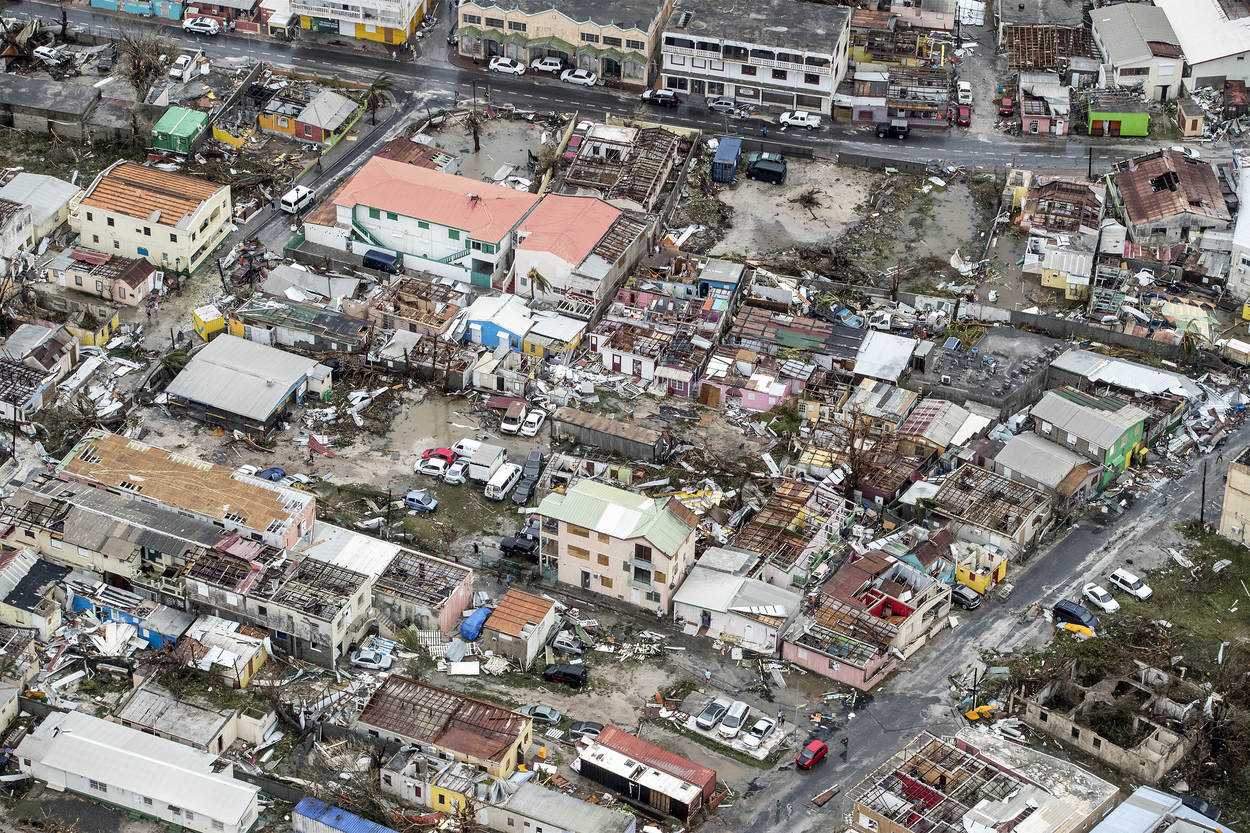
.jpg)
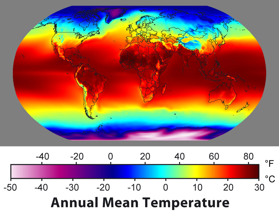
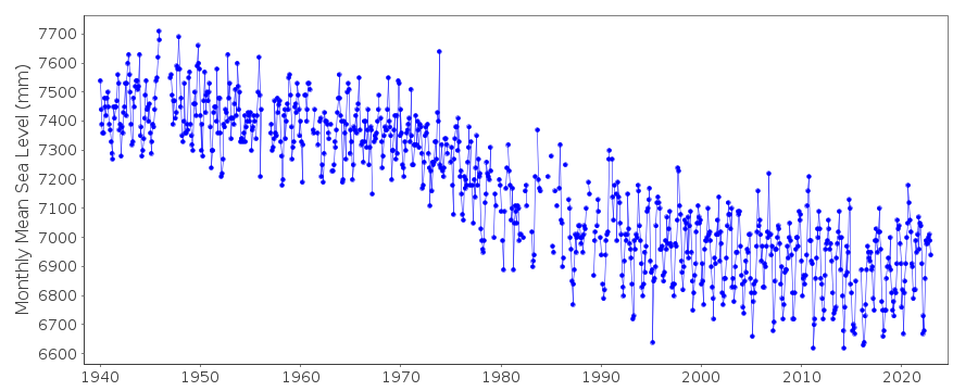
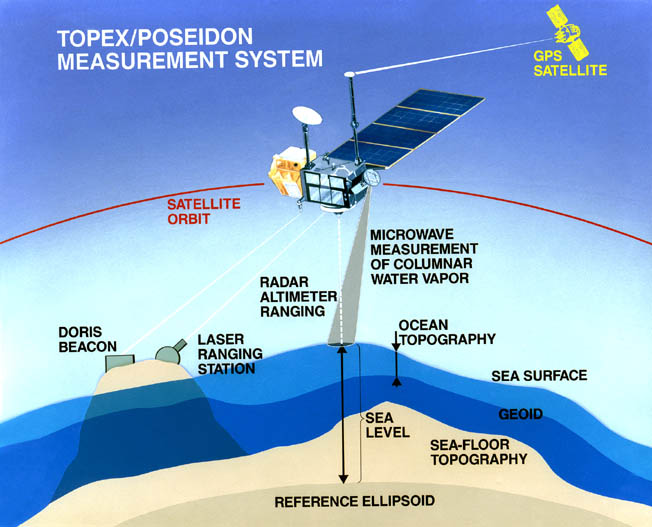
Climate models show that this region will need to become accustomed to the heat, and these severe temperatures will occur regularly as the 21st century progresses. In fact, temperature data clearly show warming in this region over the last century.

The graph shows the percent area of Oregon, Washington, and Idaho experiencing extremely hot daytime high temperatures from 1910 to 2020. The y-axis represents the percentage (0 to 100%), and the x-axis shows years in decades. The graph indicates a general increase in the affected area over time, with notable peaks around the 1930s, 1960s, and 2010s, where the percentage reaches or exceeds 80%, while earlier decades show minimal impact, mostly below 20%.
- Graph Overview
- Title: Expanding footprint of extreme summer heat in the Northwest
- Subtitle: Percent area of Oregon, Washington, and Idaho having extremely hot daytime high temperatures
- Source: NOAA Climate.gov, Data: NCEI CEI
- Type: Bar graph
- Time Period: 1910 to 2020
- Axes
- Y-axis: Percentage (0 to 100%)
- X-axis: Year (1910 to 2020, by decade)
- Trend
- Early 20th Century (1910-1940): Minimal impact, mostly below 20%
- Mid-20th Century (1940-1970): Peaks around 80% in the 1930s and 1960s
- Late 20th to Early 21st Century (1980-2020): Significant increases, with peaks exceeding 80% in the 2010s
- Visual
- Bars: Red, height representing percentage affected
In the US as a whole, the future almost certainly will have more frequent hot days and nights. This can be seen in the following set of maps, which show the number of days over 100°F for the recent past and the end of this century under two different emissions scenarios:

The message here is that throughout most of the country, we will be challenged with many more hot summer days. By the end of the century, a cool, northern state like Minnesota will have more +100°F days than the southern tip of Texas. What can be done about this? How can we adapt? Can we mitigate the impacts of these extreme heat events?
Some excellent examples of how to adapt to and mitigate the consequences of these extreme heat events come from several US cities. Philadelphia, in 1995, launched a Hot Weather Health Watch and Warning System to respond to health threats from more frequent heat waves. The system includes education, media alerts, information hotlines (no pun intended), and cooling shelters. They estimate that this system has already averted more than 100 heat-related deaths. Both New York City and Chicago have taken steps to cool their downtown areas by covering roofs with reflective materials and plants; these steps will mitigate the overheating in the city centers, where temperatures can be as much as 4°C warmer than the surroundings. In addition to minimizing heat-related deaths, these measures will also reduce the amount of electricity needed for cooling, thus providing an extra benefit. Many regions are modifying building codes to promote new buildings that are easier to keep cool (and easier to keep warm).
So, there are some relatively easy measures that can be taken to adapt to more frequent heat waves.
As the climate warms, many areas are already finding that new infectious diseases are becoming a problem. One familiar example of this is West Nile Disease, a disease spread by a species of mosquito that is normally found in warm regions of the world. This disease, once introduced to the US, has spread rapidly, aided by generally warmer temperatures. There have been more than 30,000 cases of West Nile Disease in the US and over 1,000 deaths. In the US, we are already adapting to this new disease through education and the use of pesticides to limit the spread of the mosquitoes. Similar new diseases can also be adapted to, but public health officials will have to be diligent in looking out for the arrival of the new diseases — which is something they already do.
In summary, although warming will bring new challenges to human health, the adaptations are relatively straightforward, and in many places, they are already beginning.
Check Your Understanding
Transportation
TransportationAs the climate warms, there will be a variety of impacts on our transportation system, which is a critical element of our entire economic system.
Sea-level rise and storm surge will increase the risk of major coastal impacts, including both temporary and permanent flooding of airports, roads, rail lines, and tunnels. Flooding from increasingly intense downpours will increase the risk of disruptions and delays in air, rail, and road transportation, and damage from mudslides in some areas. The increase in extreme heat will limit some transportation operations and cause pavement and track damage. In Alaska, the melting of permafrost has already begun to compromise roads, railways, and pipelines. On the plus side, decreased extreme cold will provide some benefits such as reduced snow and ice removal costs.
Federal, state, and local agencies are already taking steps to protect transportation systems from climate change impacts. Adaptation measures across the country are shaped by local impacts. Specific adaptation approaches include:
- raising the elevation of critical infrastructure,
- changing construction and design standards of transportation infrastructure, such as bridges, levees, roads, railways, and airports,
- abandoning or rebuilding important infrastructure in less vulnerable areas.
These adaptations are relatively easy to implement since the transportation infrastructure is in nearly constant need of upkeep — it simply will cost a bit more and will require some foresight in how upgrades are made.
At the same time, changes in transportation are a large part of the solution to the climate problem. In the US, cars and trucks are the largest producer of CO2, producing 28 percent of emissions annually. To adhere to the Paris Agreement emissions goals the US is going to have to control this output. The Obama administration established mandatory fuel standards for cars and trucks, specifically that automakers were to produce cars with an average of 51 miles per gallon by 2025. These standards were loosened by the Trump administration. However, recently the Biden administration strengthened the Obama fuel standards with stringent rules for cars and trucks produced after 2023, but also is requiring US automakers to produce 50% electric vehicles by 2030. This goal is now clearly feasible as battery technology has advanced so significantly recently. These strategies are a central part of the US pledge to cut emissions by 50% from their 2005 levels by 2030.
On a per passenger basis, planes emit a lot more CO2 than cars. Short flights are especially polluting so alternative forms of transportation such as trains are environmentally beneficial. Planes inject CO2 into the upper atmosphere where it has a longer residence time. There are many more cars than planes obviously so the total pollution is higher but cutting back on plane transportation is key to emissions reduction.
Migration/Relocation
Migration/RelocationSome aspects of climate change in the future are so challenging that the only real option is for people to migrate or relocate. One recent study concluded that there will be as many as 200 million climate-related migrants on the move in search of livable conditions by 2050. There are several different climate-related changes that may trigger migrations and relocations, but the main reasons have to do with rising sea level and reduction in surface water availability for agriculture and basic living.
Sea Level Related Migration/Relocation
Inhabitants of low-lying islands such as the Maldives (whose highest point is just 2.3 m above sea level), or low-lying coastal areas such as Bangladesh, are very clearly in for trouble as the sea rises. These areas are part of what has been called the Low Elevation Coastal Zone (LECZ) that lies within 10 meters of present sea level. Overall, this zone covers 2% of the world’s land area but contains 10% of the world’s population and 13% of the world’s urban population. Many of the countries with a large share of their population in this zone are small island countries, but most of the countries with large populations in the zone are large countries with heavily populated delta regions. Almost 65% of cities with populations greater than 5 million fall, at least partly, in the LECZ. In some countries (most notably China), urbanization is driving a movement in population towards the coast. Many of these places do not have the resources to keep building higher and higher sea walls to keep the water out, and even if they did, it might still be a losing battle. So, they will have to move to somewhere else.
Alaskan coastal and river communities are experiencing greater erosion and flooding because of increased storm activity and windiness; reduced sea-ice extent, which increases the intensity of storm surges; and thawing of permafrost, which increases susceptibility to erosion. Traditionally, many of these communities were semi-nomadic, moving inland during periods of severe storms, and had little permanent infrastructure. During the past 100 years, however, their mobility has been reduced by the building of houses, schools, airports, and other permanent facilities—changes that have increased their vulnerability to climate change. Six Alaskan communities are now planning some type of relocation. However, no funds have been appropriated to begin the relocation process. The U.S. Army Corps of Engineers has identified 160 additional villages in rural Alaska that are threatened by climate-related erosion, with relocation costs estimated at $30-50 million per village.
If we take a global inventory of the areas within the LECZ, we see a number of important features:

Population and Land Area in LECZ
| - | Population (millions) | Population (millions) | Land Area (1000km^2) | Land Area (1000 km^2) |
|---|---|---|---|---|
| Region | Total | Urban | Total | Urban |
| Africa | 56 | 31 | 191 | 15 |
| Asia | 466 | 238 | 881 | 113 |
| Europe | 50 | 40 | 490 | 56 |
| Latin America | 29 | 23 | 397 | 33 |
| Australia and New Zealand | 3 | 3 | 131 | 6 |
| North America | 24 | 21 | 553 | 52 |
| Small Island States | 6 | 4 | 58 | 5 |
| Wordl | 634 | 360 | 2700 | 279 |
In most of the regions of the world, the majority of the population in the LECZ reside in cities; Asia is the big exception to this. The fact that most of these at-risk people live in cities raises problems for relocation since cities are based on an extensive infrastructure that is not easy to recreate in another place, while more rural populations are probably easier to relocate. Asia, in addition to having the greatest overall population, also has by far the greatest number of people who will have to deal with moving to higher elevations as the sea level rises.
On an individual basis, some countries are much worse off than others, as can be seen in this ranking of countries based on the total population that lives in the LECZ:

Ranking of countries based on the total population that lives in the LECZ
| Country | Pop in LECZ (x1000) | % Pop in LECZ |
|---|---|---|
| China | 143,880 | 11 |
| India | 63,188 | 6 |
| Bangladesh | 62,524 | 46 |
| Vietnam | 43,051 | 55 |
| Indonesia | 41,610 | 20 |
| Japan | 30,477 | 24 |
| Egypt | 25,655 | 38 |
| USA | 22,859 | 8 |
| Thailand | 16,478 | 26 |
| Philippines | 13,329 | 18 |
Asian countries occupy 8 of the top 10 here, so this will be the region of greatest concern when it comes to relocation problems related to sea-level rise.
If you look at the ranking in terms of the percentage of the population at risk from sea-level rise, you see the following:

Ranking in terms of the percentage of the population at risk from sea level rise
| Country | Pop in LECZ (x1000) | % Pop in LECZ |
|---|---|---|
| Bahamas | 267 | 88 |
| Suriname | 318 | 76 |
| Netherlands | 11,717 | 74 |
| Vietnam | 43,051 | 55 |
| Guyana | 415 | 55 |
| Bangladesh | 62,524 | 46 |
| Djibouti | 289 | 41 |
| Belize | 91 | 40 |
| Egypt | 25,695 | 38 |
| The Gambia | 494 | 38 |
This list excludes countries with a total population less than 100,000, or smaller than 1,000 km2. If all countries were included, 7 of the top 10 would be places with populations of less than 100,000, the top 5 having more than 90% of their country in the LECZ (Maldives, Marshall Islands, Tuvalu, Cayman Islands, Turk and Caicos Island).
Surface Water Related Migration/Relocation
In many parts of the world, especially rural areas, the local economy is based on agriculture that is made possible through irrigation, and most of that irrigation water comes from the diversion of rivers. As the climate changes, many areas will see a decline in the surface water needed for agriculture, and so these local economies will struggle. The global pattern of change can be seen in this figure, which is an average from many different climate models for the 20 year period centered on 2080:

People will lose jobs — not just farmers, but also the many people whose work is somehow connected to agriculture — and these people will have to seek work elsewhere. Most of these people will move to cities, accelerating a general trend over the past few decades. Many of these migrations or relocations may not be dramatic or traumatic, but in some cases, they will cause real hardship. The vast majority of the people who will be required to move are lower-income people who do not have the means nor the political capital to make these transitions easily.
The above global map does not tell the whole story though, since the timing of water availability is important. In the whole region of Asia surrounding the Himalayan mountains, the rivers that drain from mountain glaciers are an essential part of agricultural economies. The glaciers melt back in the summer and provide important streamflow during a period of the growing season when rainfall is low. These glaciers are melting rapidly, and once they disappear, the dry-season glacial meltwater will not be there to supply the irrigation water. As a result, agricultural production and the work related to it will also dry up. In Pakistan, for example, 90% of the agriculture is based on irrigated water diverted from the Indus River, which is fed by Himalayan glaciers.
The global map above highlights an important reduction in surface water in the region of Central America. This is likely to increase the existing pressure for migration to the US.
Geoengineering
GeoengineeringGeoengineering is the intentional global-scale modification of Earth’s climate system, in order to reduce global warming. There are two general categories of geoengineering schemes — CO2 removal and insolation reduction.
Insolation Reduction
These projects seek to reduce the insolation (incoming solar radiation) by deflecting sunlight, or by increasing the albedo (reflectivity) of the atmosphere. They do not reduce greenhouse gas concentrations in the atmosphere, and thus do not seek to address problems such as ocean acidification caused by these gases. Solar radiation management projects appear to have the advantage of speed and, in some cases, costs. There are a variety of ways that we might achieve a reduction in insolation and thus cool the planet:
- Directly changing the albedo of the surface through the use of light-colored or reflective materials on buildings, glaciers, etc. For buildings, this has the added benefit of reducing the cooling costs, but it is not likely to be as effective on a global scale as some of the other schemes. However, it does hold promise for small-scale projects such as cities.
- Making the atmosphere more reflective through the injection of sulfur aerosols (this mimics what volcanoes do) or other particles such as aluminum oxide dust into the stratosphere, which will make the Earth more reflective. We know that this works because of the cooling that follows large, explosive volcanic eruptions that inject tiny aerosols (particles) of sulfate into the stratosphere. Based on the volcanic eruptions, we can estimate how much sulfur is needed to counteract a doubling of CO2 — about 5 Tg of S per year (one Tg or teragram is 10^12 g), which is about half the amount that injected into the atmosphere by the eruption of Mt. Pinatubo. The estimated cost of this would be on the order of $50 billion per year (consider that the US military expenditures are about $700 billion). These particles have a limited residence time (1-2 years) in the stratosphere, so this would require continual injection via airplanes, large naval guns, or balloons. The costs of doing this are surprisingly small, but it would have to be maintained.
- Reducing insolation with space-based mirrors or other structures. The most promising proposal here involves the placement of roughly 16 trillion small disks at a more or less stable position 1.5 million km above the Earth. Each disk would have a diameter of 60 cm and would weigh just one gram. They would not be true mirrors but would scatter enough sunlight to reduce the insolation by 2%, which might be sufficient. Getting these disks into place and then keeping them there would be a challenge, and it is estimated that it would take 10 years to put them into place using a special type of gun that could transport up to 10 million of them at a time. The total cost could be 5 trillion dollars every 50 years (the lifetime of the disks). This sounds a bit like science fiction, but it has been developed by a group of prominent astronomers and physicists.
Carbon Dioxide Removal
Carbon dioxide removal projects address the root cause of warming by removing greenhouse gases from the atmosphere. These projects are generally slower and more expensive than some of the insolation reduction schemes. There are a variety of ways that this could be done, including:
- Carbon capture and sequestration, which typically involve the removal of CO2 from power plants or other big sources, and then the injection of the liquefied CO2 into deep aquifers; a number of pilot projects of this type have already begun. This could double the cost of coal-generated electricity, making this an expensive proposition, but that in itself would encourage developing cleaner energy sources. Other means of carbon capture have been proposed, including the promotion of natural chemical weathering reactions of some rocks like basalts in places such as Iceland, in which atmospheric CO2 is consumed. There is a wide range of proposals to enhance the biological fixation and long-term storage of carbon. CO2 has been injected into oil reservoirs to force out more oil in a process called enhanced oil recovery.
- Iron fertilization of the surface waters in the southern oceans to promote plankton blooms, which use CO2 from the surface oceans, thus enabling them to absorb more from the atmosphere. It turns out that in many parts of the oceans, iron is a limiting nutrient for photosynthesizing plankton, so adding iron can help the plankton achieve their full potential in terms of CO2 consumption. A few small-scale experiments have been conducted, and they appear to work in the short-term, but scaling this up would be challenging, and the iron would have to be continuously applied, just as fertilizer is continuously applied to crops. Another trial has just launched, adding alkaline sodium hydroxide to the ocean to try to increase the pH. The advantage of this technique is it would ultimately lower CO2 and reduce the impact of ocean acidification.
Problems and Concerns
Although these geoengineering schemes may be attractive in the sense of providing a solution to the problem without having to get all the countries of the world to make a dramatic reduction in CO2 emissions, some of them clearly have potentially harmful consequences.
As a general rule, when people try to control natural systems, they find that the natural systems are more complex than they realized, with many unintended consequences. This is likely to be the case with geoengineering as well. With many of these schemes, there may be winners and losers — cooling the climate in one region (or the globe as a whole) may lead to devastating droughts, floods, or damaging cold in other regions. Adding sulfur to the atmosphere will lead to acid rain, and it may also deplete the ozone layer, exposing us to more harmful ultraviolet radiation from the sun.
The aerosol injection schemes are so inexpensive that one country could decide to take action unilaterally, and this would likely lead to serious problems in international relations. All of the insolation management schemes have the problem of not addressing the CO2 emissions, which would allow the CO2 concentration in the atmosphere to rise to very high levels; then if the geoengineering scheme failed for some reason, the climate would warm much faster than anything we have experienced so far.
Summary
Most scientists agree that geoengineering schemes should not be seen as the silver bullet that will solve our global warming problems quickly and painlessly. These schemes are like treating the symptoms of a disease rather than the root cause, a course of action that is never a real solution. But until we find a way to treat the root cause (reduce emissions of CO2), some of these schemes may buy us more time while helping us avoid serious climate damages. While many climate scientists believe that there may be an important role for these schemes in our future, we do not yet fully understand the potentially harmful side effects of these projects, so continued research is very important.
Check Your Understanding
Global Equity and Climate Adaptation
Global Equity and Climate AdaptationIf you live in a wealthy, highly-developed, technologically sophisticated country like the US, it is fairly easy to see how we will be able to adapt to climate change without undue suffering. Of course, we will suffer the consequences of severe storms and droughts, and we will eventually have to move a lot of people and activities from places like the Mississippi Delta region. But these are not existential threats of the type faced by the millions of people living on less wealthy low-lying islands, who will eventually see their island homes submerged. And many other nations do not have the technological abilities, wealth, and global influence to make the necessary adaptations.
This is very much a problem related to the tragedy of the commons mentioned in Module 11. The commons, in this case, is the global atmosphere, which is shared by all, and everyone has the freedom to put as much CO2 into the atmosphere as they want (unless they were to be truly restricted by something like the Paris Agreement. Everyone feels the effects of the total concentration of CO2, but not everyone contributes equally to this effect. But individual actors (countries) have little motivation to halt their CO2 emissions (which costs money) for the benefit of others. The only way to solve these kinds of problems is through regulation. But regulation does not help us with the question of how to deal with the problems associated with the climate change that will occur in the future. The map below shows that countries most impacted by climate change are not those emitting the majority of the CO2.

Try to place yourself for a moment in the shoes of a Maldive Islands citizen or someone in Fiji or the Solomon Islands. The sea level is rising and will continue to rise in the future due to global warming, and your country will no longer be viable for living — you will have to migrate and relocate somewhere else. But where? And how will you find the resources to make this move — acquiring a new house, a new job? (If you own a home or property, it will obviously be worthless.) You might very well ask yourself — whose fault is this? And you might feel that the blame lies primarily with the big emitters of CO2 — the big, wealthy nations of the world. But how can you get them to help you with your problem? What power do you have?
You can see that this is a tricky problem. There is a big question/problem of equity when it comes to climate change — the biggest emitters of CO2 bear the most responsibility for climate change, and these are also among the wealthiest nations. These big emitters are the ones best positioned to successfully adapt to climate change; they are also the ones with the resources to help some of the poorer victims of climate change. Should these big emitters help to bear the costs of climate adaption for the less wealthy nations that have emitted much smaller shares of CO2 into the atmosphere? If so, how could they be induced to do so? These are important questions, and they do not have good answers or widely-accepted answers at this point. Some people are advocating a globally assessed carbon tax, in which different countries would be taxed at different rates based on their historical emissions histories; the money would then be used to help with adaptation and relocation where necessary. But this is just a proposal. And to implement it would require the kind of international agreement that has proven elusive so far with respect to climate change.
This is very clearly an important aspect of climate change and our future that is in need of a solution.
Module 12 Lab: Options for the Future of Climate, Energy, and Economics, Including Geoengineering
Module 12 Lab: Options for the Future of Climate, Energy, and Economics, Including GeoengineeringThe goal of this exercise is to explore a range of scenarios for our future in such a way that our energy needs are met, our economy is strong, and our climate is controlled to some extent. The underlying premise is that if do nothing and continue down our current path, the climate will warm to truly dangerous levels, which will have serious consequences for our economy and thus our quality of life. The options we will explore include shifting to renewable energy sources, conserving energy (being more efficient so that we do the same things with less energy consumption) — both of these limit the carbon we emit to the atmosphere. We will also explore two other options that sometimes are called “geoengineering” — one involves injecting sulfate aerosols into the stratosphere to block a little of the sunlight and another involves the direct removal of carbon from the atmosphere, sometimes called negative carbon emissions.
All of these choices involve costs, and the model calculates these costs. Another kind of cost comes in the form of climate damages, and the model calculates these too. From an economic standpoint, the best scenario is one that minimizes the costs because these costs represent a drain on the global economy; the global economy will be better able to meet all of the needs of humanity if we can keep the costs down. The figure below, modified from the one you’ve seen before in Module 5 on the carbon cycle, shows the general scheme the model uses to calculate all of the costs.

The flowchart diagram illustrates a process with colored rectangular boxes and directional arrows. The boxes are arranged in a vertical and slightly overlapping sequence, with the following color coding: blue, green, yellow, and red. The flow begins with a blue box at the top, followed by a green box with a downward green arrow leading to another green box. A yellow box appears next, followed by a red box. Another red box is connected by a curved green arrow looping back to a lower red box, indicating a feedback or iterative process. Additional blue boxes are scattered throughout, suggesting parallel or alternative steps in the process.
- Diagram Overview
- Type: Flowchart
- Background: Black
- Boxes and Colors
- Blue Boxes: Scattered throughout, likely initial or parallel steps
- Green Boxes: Middle section, with downward flow
- Yellow Box: Single instance, following green
- Red Boxes: Lower section, with feedback loop
- Flow Direction
- Green Arrows: Indicate progression (downward and looping)
- Description: Starts at a blue box, moves through green and yellow, ends with red boxes including a feedback loop
It might help to look at this backward from the total costs, which sums the climate damage costs, the costs of fossil fuel energy, the costs of renewable energy, the costs related to energy conservation, and the costs related to geoengineering. The climate damage costs are related to the temperature change, and these costs go up as the square of the temperature increases, so that the costs related from going from 5°C to 6°C are considerably more than going from 1°C to 2°C. The fossil fuel costs, renewable costs, and conservation costs are related to how much energy is provided by those sources. The ideal thing from an economic standpoint is to have the smallest Total Costs because that means there is more money to pour back into the economy and to provide a higher quality of life.
At the core of this model is the global carbon cycle model coupled with the simple climate model — you’ve seen these before. The model also calculates the energy demands and carbon emissions that reflect the population size and choices we make about how much to pursue conservation and renewable energy sources. The model you will work with here has some additions that represent two geoengineering solutions — the addition of sulfate aerosols into the stratosphere to block some of the sunlight (SAG for sulfate aerosol geoengineering) and the direct removal of carbon dioxide from the atmosphere (DRC).
Sulfate Aerosol Geoengineering
The idea behind sulfate aerosol geoengineering has its origins in the studies of how volcanic eruptions affect the climate. When volcanoes erupt, they a combination of ash (tiny fragments of volcanic rock and glass) and gases, including water vapor, carbon dioxide, sulfur dioxide, and others. The sulfuric gases condense into little droplets called sulfate aerosols that can reflect sunlight, cutting down on the solar energy that drives our climate system — this causes a cooling effect that can last for a couple of years, ending when the aerosols finally fall back to the surface. The key to this is that if the force of the eruption is great enough, the sulfate aerosols end up in the stratosphere (higher than 15 km in altitude); gravity is weak there and there is essentially no water to wash the aerosols out, so they can stick around for a few years. The idea that we humans could add sulfate aerosols into the stratosphere to cool the climate (or prevent further warming) was first suggested by the Nobel Prize-winning atmospheric chemist Paul Crutzen in 2006. Crutzen admitted that a much smarter way of dealing with the problem of global warming was to drastically reduce our carbon emissions, but he pointed out that humanity has not yet shown the resolve needed to tackle this problem; so he proposed this as a potentially easier way to avoid the dangerous consequences of further warming.
This is kind of a thorny issue for a number of reasons. Some people worry that pursuing this kind of solution is dangerous because it just treats the symptoms of the problem without tackling the underlying cause, which is the excess CO2 we keep adding to the atmosphere. Many people see this as dangerous in the sense that tampering with natural systems almost always has hidden unintended consequences. In fact, sophisticated 3D climate model simulations with the addition of sulfate aerosols suggest that the cooling effects would not be uniform and it would change patterns of precipitation as well, which means that some areas of the globe might suffer, while others would see benefits. But, if you are in a car going down a hill and your brakes are not working, you may need to consider doing something other than stepping on the brake pedal — and time is of the essence!
How would this work? Crutzen and others since him have worked out a variety of scenarios for getting the sulfate into the stratosphere, including sending loads of it up in balloons and dumping it out of huge military airplanes that can fly high enough. The general idea is illustrated in the figure below, where the red plus and minus signs indicate changes to the solar energy caused by the sulfate aerosols.

The image is showing the global distribution of deserts. The map highlights desert regions in a distinct color (likely yellow or beige) against a standard world map background. Key desert locations include the Sahara Desert in North Africa, the Arabian Desert in the Middle East, the Gobi Desert in East Asia, the Kalahari Desert in Southern Africa, the Great Victoria Desert in Australia, and the Sonoran and Chihuahuan Deserts in North America. Major continents—Africa, Asia, Australia, and North America—are visible, with deserts spanning arid regions across these areas.
- Map Overview
- Title: Major Deserts of the World
- Type: World map
- Desert Locations
- Sahara Desert: North Africa
- Arabian Desert: Middle East
- Gobi Desert: East Asia
- Kalahari Desert: Southern Africa
- Great Victoria Desert: Australia
- Sonoran and Chihuahuan Deserts: North America
- Visual Elements
- Deserts: Highlighted in a distinct color (likely yellow or beige)
- Continents: Africa, Asia, Australia, North America
- Background: Standard world map layout
Although this is difficult to price out, some of the estimates (Robock et al., 2009) are that it would cost between 1 and 30 billion dollars per year to add one teragram of (1 Tg = 1012 g) of sulfate into the stratosphere per year. 1 Tg of sulfate, evenly distributed in the stratosphere is estimated to block about 1.3 W/m2 of solar energy, which is about 0.4% of the total. In our simple climate model, changing the solar input by 1 W/m2 changes the temperature by about 0.35°C. One of the challenges is that the sulfate aerosols fall out of the atmosphere, so we would have to constantly add it to maintain the desired level of solar reduction to combat the warming. In the model, if you activate this geoengineering scheme, you set a desired limit to the global temperature change and sulfate is added in the necessary amount to keep the temperature change close to this limit. This then generates a cost that affects the global economy.
Direct Carbon Removal
The idea of carbon sequestration has been around for a relatively long time — emissions from a fossil fuel-burning power plant can be captured at the source and processed to remove the CO2. The extracted CO2 is then pumped deep underground where it can reside in the pore spaces of sedimentary rocks. In some cases, it is pumped back into the rocks from which oil or gas have previously been removed. Carbon sequestration is expensive, but it can virtually eliminate the carbon emissions from some power plants. However, carbon sequestration does not actually remove CO2 from the atmosphere, and if we were to continue to burn fossil fuels in cars and in homes, then the concentration of CO2 in the atmosphere would continue to rise. Carbon sequestration has not really taken off because the extra expense means that it is far cheaper for a power company to produce new electricity using solar or wind systems.
The direct removal of CO2 from the atmosphere sometimes called negative emissions is a relatively new idea — the first facility was put into action in the fall of 2017 in Iceland. A Swiss company called ClimeWorks developed a partnership with a geothermal power plant to essentially test the technology. There are several other companies in Canada and the US at earlier stages in development. The general idea is to pump huge volumes of air through a chamber in which there are numerous small beads coated with a substance that effectively grabs onto CO2 molecules. When the beads have absorbed as much as possible, the chamber is sealed off and the CO2 is released by changing the humidity in the chamber. The resulting air in the chamber has a very high concentration of CO2; it is mixed with water and then pumped deep underground. The CO2-rich solution reacts with the basaltic bedrock and new minerals are formed, locking up the CO2. This process essentially takes the CO2 out of the air and turns it into rock — pretty clever! The general scheme is shown in the diagram below.

A schematic illustration of the Direct Carbon Removal (DCR) process, also known as "negative emissions," as implemented by Climeworks at their facility in Iceland. The diagram depicts the process of capturing CO2 from the atmosphere and sequestering it as new minerals. It begins with air containing CO2 being drawn into a capture unit (likely shown as a structure or fan system). The CO2 is extracted and combined with water to form carbonated water. This mixture is then injected into basaltic bedrock, illustrated as a layered underground formation. The interaction between the carbonated water and the basalt leads to the formation of new minerals, effectively sequestering the CO2. Arrows indicate the flow from air intake to CO2 capture, mixing with water, and final injection into the bedrock.
- Diagram Overview
- Title: Implied as Direct Carbon Removal (DCR) Process by Climeworks
- Type: Schematic illustration
- Process Steps
- Air Intake
- Description: Air with CO2 enters the system
- Visual: Likely a fan or structure on the left
- CO2 Capture
- Description: CO2 extracted from the air
- Visual: A capture unit or filter system
- Mixing with Water
- Description: CO2 combined with water to form carbonated water
- Visual: A mixing chamber or pipe
- Injection into Basaltic Bedrock
- Description: Carbonated water injected into basalt
- Visual: Layered underground formation
- Mineral Formation
- Description: CO2 sequestered as new minerals
- Visual: Indicated within the bedrock layer
- Air Intake
- Visual Elements
- Arrows: Show the flow of air, CO2, and carbonated water
- Colors: Likely blue for air/water, gray/green for bedrock
- Context
- Location: Climeworks facility in Iceland
- Purpose: Negative emissions through CO2 sequestration
This process is in the early stages of development, so it is difficult to know how much it will cost. The companies doing this believe that they can probably get the cost down to $366 billion per Gt C removed. There would have to be thousands of these units set up around the world in order to scale this up. In our model, we are going to assume that if we were to begin this process, we would initially be limited to 5 Gt C removed from the atmosphere per year, but that as time goes on, our capabilities would increase and we could draw more and more out of the atmosphere.
This process of direct removal of carbon from the atmosphere has some consequences for other parts of the carbon cycle. As we remove CO2 from the atmosphere, the concentration decreases, which means that CO2 stored in the oceans will begin to flow into the atmosphere. This means that we will need to remove much more carbon from the atmosphere than you might think if we are aiming for a given concentration of CO2.
Experiments
ExperimentsClick here to go to the model. Please Note: The model in the videos below may look slightly different than the model linked here. Both models, however, function the same.
When you open the model, you will see that there are a lot of controls, reflecting the full range of choices we can make about our future energy consumption and geoengineering. There are also 15 pages of graphs that show the results of the model. Be sure to watch the video below that introduces you to the model before proceeding.
Video: Module 12 Intro to Model (7:09) (note the Model we use looks different from that in the videos but it works exactly the same and the results should be identical)
Module 12 Intro to Model
NARRATOR: This is the model that we're going to be working with in this lab, and it's similar to one you've seen before, that combines a global carbon cycle with a global climate model. And it includes components that calculate our energy needs and our sources of energy, which then relate to the carbon emissions that affect the climate. It also monitors the economics of all these changes to our climate and energy. This one also includes some geoengineering options that I'll explain in a little bit.
So, over here there are a lot of controls. They're kind of color-coded according to the different things that they represent. So, green here represents conservation of energy. The purple or blue represents renewable energy. The red down here relates to one of the geoengineering schemes, which is the direct carbon removal from the atmosphere. And the orange down here deals with the other geoengineering scheme, which is the injection of sulfate aerosols into the stratosphere to block sunlight.
So, let me just show you a couple things about this. So, you open the model and you run it and it calculates this all out over a couple of hundred years. And this shows the global temperature change that results, and here we haven't really done anything to increase conservation or renewables, and the geoengineering switches are off, so this is kind of a do-nothing scenario. We have a very high temperature rise by the end of this time here, six and a half degrees warmer. So now, we could say, of course, well what if we conserve energy? So, this number here is the percent of our energy that we reduce by conservation methods. And this is the growth rate of that.
So, this is five percent increase per year, which is pretty good. So, if we run this and see what happens and compare it with the do nothing scenario, you see it lowers the temperature, but it's still unacceptably high. And so, you could say, well what if we increase our reliance on renewable energy? Let's bring this up to say seventy-five percent and we run that, and we see that this does a little bit better. But still, by the end of this, look, we're up at three point six degrees of global temperature rise, which is really quite alarming and by the year 2000 we're, 2100 rather, we're above that 2 degree limit that we sort of agreed upon as the upper limit in the Paris Climate Accords.
So now, we've added here some geoengineering options and these are kind of like, if we just can't manage our carbon emissions for conservation and switch to renewables, we might want to investigate some of these to help us prevent this climate disaster. And so, I'm gonna restore the renewables to where it was before. I'll just turn this on, so now, this is going to activate the direct removal of carbon from the atmosphere and then the burial and sequestration of that carbon underground. So, here's the time at which it starts, 2030, and in here you pick a target atmospheric CO2 concentration. So, here, I've got 400. Let's raise that to 450 here. And this is the rate of cost decline of that process, which is initially fairly expensive. And this represents how quickly our capability to do this grows. And this gives us the initial amount of carbon that we can withdraw from the atmosphere in one year, at the very start.
So, this is pretty generous because it can't really come close to doing one gigaton at the present time, but things are changing rapidly in this field. So, let's see what happens here. And we run this, and we see here's our result. Look, this brings us down, keeps us below two degrees for a fairly long time. So that is a fairly effective means of keeping our climate under control. If I switch on some of these other pages, you'll see that this, the blue is the CO2 concentration in the atmosphere, rises and then we start to get it in control and then we've brought it under control here, it's close to 450, it's a little bit above. Until this point in time, in which it drops down dramatically there just because we've run out of fossil fuels, and so we're no longer able to emit any to the atmosphere at this point in time. So 2197 or 98, something like that. So, that's the direct removal of carbon.
Another option is sulfate aerosol geoengineering, and we turn that on. This is where we inject sulfate aerosols, these little tiny particles into the stratosphere. They block some sunlight and so here's the starting time for this process, and here's the targeted temperature change that we're going to try to control to. So, this will try to keep the temperature change to two degrees or less and this is the cost decline rate. I've got this at zero right now, kind of assuming that this is not such a technologically tricky process, and probably we're not going to see huge advances in the sort of ability to do this per dollar. So, I've got that at zero initially.
Well, let's just run this and see what happens. You run the model, and there you see, this does a very good job of keeping it right at two degrees through this whole time. While all of these changes have economic consequences, and some of those you can see, on some of the other graphs here, let's see this one. Here's the total cost per person, per capita, that is in terms of thousands of dollars per year. And those last two that we ran, they both end up costing something like about $9,000 per person per year by the end of it. And that's to pay for all of our energy supply and all the climate damages that are associated with the temperature change.
So, this is just a brief introduction to the model. You can restore everything to this sort of an initial by clicking those two buttons. And so, we're going to do a series of experiments with this model to make some sort of assessments about what is the best thing, from the standpoint of the climate and also the economy, in terms of getting us to a future that includes a tolerable level of global warming.
Practice Questions
Part A. Climate Control by Conservation and Renewable Energy
Be sure to watch the video below that shows how to do problems 1-3.
Video: Module 12 Questions 1 - 3 (2:01) (note the Model we use looks different from that in the videos but it works exactly the same and the results should be identical)
Module 12 Questions 1 - 3
NARRATOR: In this video, I'm going to show you how to manipulate the model to get the answers to the first three questions of the practice assessment. So, I'm going to follow the instructions and change the green colored sliders so that this is 30, and this is zero point one. Renewable upper limit, I'm going to change to 85, and the renewable growth rate to zero point one. I've done that. Now, I'm going to run the model. And I'll look at the ending temperature change. So, let's see, it's about two point one three, two point one four at the very end. And so, looking at the choices, the correct answer is two point one degrees C. So, that's answer C on the on the test.
Well, number two is, what is the lowest pH of the oceans in this case? I'm going to have to go to graph page number two. So, here in pink is the pH and it's dropping all the way down to eight point zero six, or eight point zero eight, somewhere in there. So, the closest value and the possible answers is eight point zero eight. So, we'll select that one. So, A is the correct one.
Then, what is the total cost per person? I'm here and it says to click through to page fourteen, so we're gonna skip through all these other plots that show all sorts of other parameters to page 14. This is the total cost per capita in thousands of dollars. And you can see that it rises to two point four thousand per person at the end of the time here. So, that's D. So 3D is answer for that one.
In this first experiment, we will use a combination of conservation of energy and greater reliance on renewable energy sources to limit climate change. Open the model and run it without making any changes — we'll call this the "do nothing" scenario. You will see that we end up with 6.55°C of warming by the end of the model run in 2210, and if you look through the other graphs, you will see that the ocean pH drops to 7.68 (graph page 2). Looking at some of the other graphs, we see that this scenario results in a bit over 19 thousand dollars per person (graph page 14) in terms of the total costs (energy, conservation, climate damages, geoengineering), and an ending net economic output of about $460 trillion.
Now, change the model as described below:
Green colored sliders
- Conserve upper limit: 30
- Conserve growth rate: 0.1
Blue colored sliders
- Renew upper limit: 85
- Renew growth rate: 0.1
Then, run the model and answer the following questions by finding the values from the resulting graphs.
- What is the ending global temperature change that results from these changes (page 1)?
- 4.2 °C
- 3.6 °C
- 2.1°C
- 1.6°C
- What is the lowest pH of the oceans in this case (page 2)?
- 8.06
- 7.6
- 8.20
- 7.85
- What is the Total Cost Per Person (page 14)
- 12.4
- 8.2
- 7.7
- 2.4
Part B. Climate Control by Geoengineering
Now, we will try geoengineering alternatives, beginning with the direct removal of carbon — DCR. Be sure to watch the video below that shows how to get the answers to problems 4-7.
Video: Module 12 Questions 4-7 (3:08) (note the Model we use looks different from that in the videos but it works exactly the same and the results should be identical)
Module 12 Questions 4-7
NARRATOR: Now we're going to move on and look at how to get the answers to problems 4 through 7, the next section of this assessment. So here I've got to make some new changes. I'm going to cut down the conservation of energy, turn that to 1, and the growth rate stays at .1. The blue sliders are going to change so that the renewable upper limit is 20, all the way down here, and the growth rate is .1. I'm going to turn the DCR, direct carbon removal, switch on. Set the start time to 2030. The target atmospheric concentration, I'm going to set this to 470. The cost decline rate I'm going to make .02, so 2 percent per year decline in the cost of this process. The growth rate in terms of capacity is going to be 2% per year and the initial amount that we can withdraw from the atmosphere is 5 gigatons of carbon. So that's all set according to the instructions. Now I'm going to run it and see what the ending temperature is in this case. And here by the end we see we're down to just below 2, 1.97. So that's answer C.
Then 5 is what is the lowest pH In this case? I'm going to flip to page number 2. Looks like the lowest pH is back in here, that's about 8.06, so that's answer, A.
Then the next one is, what is the total cost per person? So that's page 14 of the graph pad. I'm going to get there this way, there's 14. We see that's up considerably higher now it's 9.2 thousand dollars or 9.2 thousand dollars per person at the at the end of time. So that's answer B.
Now the last question, seven, is why do the human fossil fuel emissions drop to zero around the Year 2095? So if we went back to let's say graph pad number two, you can see the the human fossil fuel burning emissions. This is gigatons of carbons rising, flattening off and then it just crashes, boom, to zero here. And so why is that? Well it turns out that if we cycle through here to page eleven on the graph pad, we see the fossil fuels, so this is in gigatons of carbon. And by the time we get to about 2095 or so we've essentially gone to zero. So we've run out of fossil fuels and so that that's why the emissions dropped is because we've got nothing left to burn. So that's answer C on the assessment.
Make the following changes to the model:
Green colored sliders
- Conserve upper limit: 1
- Conserve growth rate: 0.1
Blue colored sliders
- Renew upper limit: 20
- Renew growth rate: 0.1
Red colored sliders
- DCR switch: On
- DCR start time: 2030
- Target atm pCO2: 470
- DCR cost decline rate: 0.02
- DCR growth rate: 0.02
- DCR init: 5
Once you've made these changes, run the model, and answer the following.
- What is the ending global temperature change that results from these changes (page 1)?
- 4.2 °C
- 2.6 °C
- 1.97°C
- 3.3°C
- What is the lowest pH of the oceans in this case (page 2)?
- 8.06
- 7.6
- 8.20
- 7.85
- What is the Total Cost Per Person (page 14)?
- 11.2
- 9.2
- 6.7
- 2.4
- Why do the human FFB emissions drop to 0 around the year 2195 (page 2)?
- Our energy needs drop to 0 at this time
- The economy has collapsed at this time
- We run out of fossil fuels at this time
- Must be a glitch in the model
Now we will try sulfate aerosol geoengineering — as before, the following video shows how to do this section.
Video: Module 12 Questions 8 - 9 (1:49) (note the Model we use looks different from that in the videos but it works exactly the same and the results should be identical)
Module 12 Questions 8 - 9
NARRATOR: In this video, I'm going to show you how to get the answers to Questions 8 & 9 on the assessment. And so, we look at the instructions, and we see that we set the conserve upper limit at 1, its growth rate at 0.1, the renew upper limit at 20, and its growth rate at .1. Make sure the DCR switch is off, and we turn the sulphate switch on, and start time 2030. The target key range is 2, and the sulfate cost decline rate is zero. So, you do those things, and we run it, and you'll see the temperature will flatten off at about two degrees. Once it gets done running here, there we see it, so it stays at just a hair above two degrees throughout the time.
Now Question 8 is, what is the lowest pH of the oceans in this case? So, we go to graph number two, look at the pH curve in pink here, and it drops down to 7.58 here at the low point. So, that's answer D. So, that's correct answer for 8.
Nine is, what is the total cost per person? That's page fourteen, that's the graph page. Go back to page 14 and see the total costs per capita at the end is about 9.3 thousand dollars per person at the very end. So, that's answer B on the assessment and that's the answer.
Make the following changes to the model:
Green colored sliders
- Conserve upper limit: 1
- Conserve growth rate: 0.1
Blue colored sliders
- Renew upper limit: 20
- Renew growth rate: 0.1
Red colored sliders
- DCR switch: Off
Orange colored sliders
- Sulfate switch: On
- Sulfate start time: 2030
- Target T change: 2.0
- Sulfate cost decline rate: 0.0
Once you've made these changes, run the model and answer the following.
- What is the lowest pH of the oceans in this case (page 2)?
- 8.06
- 7.6
- 8.20
- 7.58
- What is the Total Cost Per Person (page 14)?
- 11.2
- 9.3
- 6.7
- 2.4
Part C. Comparison
Now, let's step back and consider what we have found here. Clearly, the "do-nothing" scenario is the worst in terms of temperature change and costs. But how about the other scenarios, each of which gets us to a temperature change of close to 2°C by the end of the model run — which is the best? The following video shows how to answer questions 10-12.
Video: Module 12 Questions 10 - 12 (3:46) (note the Model we use looks different from that in the videos but it works exactly the same and the results should be identical)
Module 12 Questions 10 - 12
NARRATOR: Today, I'm going to show you how to get the answers to Questions 10 through 12 on the assessment. And this is where we kind of step back and consider all these different options, these three basic options together and compare them. And in the first one, we kept the temperature close to about a two degree warming by the end of the model run, by energy conservation and increased reliance on renewable energy. The next one, we achieved that same temperature level, approximately, through geoengineering and direct carbon removal. And the third case, shown in the blue here, was the sulfate aerosol geoengineering.
And so, the question is for 10, which of these three scenarios is the best from an economic standpoint?There are lots of different ways of looking at the economic performance of each of these three, but I think the one that sort of sums it all up best is this total costs per capita. So, these are costs per person that we're gonna have to pay for producing the energy and the consequences of producing that energy in the form of climate change, or moderating it in terms of geoengineering costs. Then, you can see the two geoengineering cases here are pretty close to the same 9.3, 9.2 thousand. The conservation scenario and renewable energy one is considerably less expensive, so 2.4 thousand per person compared to nine. So, that's the clear winner. So, that's answer A for ten.
Eleven asks which of the three scenarios is best from an ocean pH standpoint? And so, here, we have to look at graph page number two, and these are shown in different scales. This just shows the pH for the last one, the conservation one, and that was at 8.06. And if you remember from before, that's about the same, close to the same, that we got with the DCR geoengineering. So, those two were about the same. Sulfate geoengineering, the ph got down to 7.58 , which is really a pretty dramatic acidification of the ocean. So, that's the worst by far. Conservation and renewables are close to the same. There's not a clear winner. So, the best answer is D, which is A and B are about the same.
And the last question of the assessment, twelve, asks from an overall environmental and economic standpoint, which of the three scenarios is the best? Well, as we saw in terms of ph, the conservation renewables and the dcr geoengineering are about the same. In terms of temperature, they're all more or less the same by the time we get to the the end of time. Although, you know, you could say that the conservation and renewable approach here, kept us at a lower temperature for more of the time, so that might be preferable in that sense. But then, the other thing, the economic standpoint as we saw before, this conservation and renewable scenario, shown here in green, that's the clear winner. So, if you take all these things together the conservation and renewable scenario is the best, overall, from an environmental and economic standpoint. That's answer A on the assessment and that's the correct answer.
- Which of the three scenarios is the best from an economic standpoint?
- Conservation + Renewables
- DCR Geoengineering
- Sulfate Geoengineering
- Which of the three scenarios is the best from an ocean pH standpoint?
- Conservation + Renewables (by far)
- DCR Geoengineering (by far)
- Sulfate Geoengineering (by far)
- A and B are about the same
- From an overall environmental and economic standpoint, which of the three scenarios is the best?
- Conservation + Renewables
- DCR Geoengineering
- Sulfate Geoengineering
- There are no clear winners
Module Summary and Final Tasks
Module Summary and Final TasksEnd of Module Recap:
In this module, you should have mastered the following concepts:
- the various economic costs of climate change, including a general estimate of how much those costs will amount to for different amounts of warming;
- the costs of reducing carbon dioxide emissions;
- the strategies for reducing emission, including cap and trade and a carbon tax;
- the reasons why we need some kind of regulation scheme to control emissions, including the example of the tragedy of the commons;
- the basic components and assumptions of the DICE model, including the concept of a discount rate;
- adaptation to and mitigation of climate change will be of paramount importance in our future;
- climate change will force us to adapt our agricultural systems, our water systems, our energy systems, our transportation systems, and our health systems to meet the challenges of rising sea level, increasing temperatures, increasingly intense storms, and increasing droughts in some regions;
- there are plenty of examples of how to adapt to the changing climate, and progress is being made in many countries; the wealthy countries are much more likely to successfully make these adaptations; poorer countries will have a harder time and will require increased assistance from the wealthier countries that have contributed more to the causes of climate change;
- climate change will lead to migration/relocation of people on a scale that we may not have seen before — there is the potential for 200 million climate migrants by the year 2050; a disproportionate number of people live within the Low Elevation Coastal Zone, and their continued existence in these locations will not be viable as sea level rises;
- geoengineering schemes that seek to either remove CO2 from the atmosphere or block some of the incoming solar radiation hold promise as stop-gap measures to help us avoid serious climate change while we figure out how to reduce our emissions of CO2, but these schemes carry some risks and should not be considered to be easy solutions to our climate problems.
Assignments
You should have read the contents of this module carefully, completed and submitted any labs, the Yellowdig Entry and Reply and taken the Module Quiz. If you have not done so already, please do so before moving on to the next module. Incomplete assignments will negatively impact your final grade.
Labs
Lab 12: Geoengineering Climate Model