Prioritize...
At the end of this section, you should be able to
- Define global average surface air temperature and explain the value of using a single number to represent Earth's air temperature at a given time.
- Define scientific consensus and explain why the argument "climate scientists once predicted an ice age, so they shouldn't be trusted" is flawed.
Read...
We can average surface air temperatures over the entire globe for any given year and get a single number, the global average surface air temperature. If we plot this temperature over time, we get a time series that shows how Earth's temperature has changed. This metric represents an average of temperatures from thousands of locations across the planet that helps us quickly understand overall warming or cooling trends. In the plot below, the temperature during a base period has been added to the anomalies, so each value represents the actual global average surface air temperature of the Earth for a year, rather than just the anomalies. However, whether we plot the actual temperatures or just their anomalies, the overall shape of the graph remains the same.

Since we began recording reliable, widespread temperature data in the late 1800s through land and ocean measurements, we’ve observed that Earth has warmed by about 1°C (or a little over 1.5°F). It’s important to emphasize—scientifically, this warming is undeniable. No matter how we slice the data, from different measurements or averaging methods, the long-term picture remains the same: Earth is warmer as we stand today than it was during the year of the first baseball World Series.
While the black line on the graph (showing the long-term trend) consistently rises from left to right, the grey line (representing the actual yearly observations) wiggles up and down quite a bit. You might notice that from the 1940s to the 1970s, temperatures appear relatively flat, even slightly cooler than their surrounding times. And you're not imagining things! In the mid-1970s, a few scientists thought we could be entering a long-term cooling phase. They had some reasons to believe this, such as changes in Earth's orbit that might eventually lead to an ice age, and the cooling effects of atmospheric aerosols. But at the time, it wasn’t clear how these cooling factors would compare to the warming influence of greenhouse gases.
Mythbusting
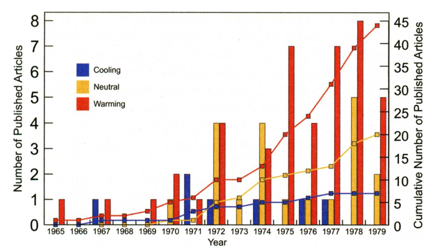
Now, you might hear some people asking: if scientists once thought we were heading into an ice age, why should we believe what they say about global warming now? Well, it's important to know that back in the '70s, the idea of an impending Ice Age wasn't a widespread belief among scientists. Think of it as more of a possibility that was being discussed, not a settled consensus. Most scientists believed that the effect of increasing greenhouse gases would likely be more significant, leading to warming, not cooling. Scientific consensus represents the prevailing view within the scientific community, based on the best available evidence at that time. Even though some scientists discussed cooling, the majority concluded that greenhouse gases would likely drive warming over the coming decade. Check out this graph from an article published in the Bulletin of the American Meteorological Society (BAMS) in 2008. The article's authors went back and counted how many scientific papers they could find that discussed global cooling, warming, or neutral projections between 1965 and 1980. They found there wasn’t a strong consensus... in fact, even during this period when some scientists thought we might be heading into a new ice age (the blue bars/line), the majority still predicted warming (the red bars/line) over the coming decades!
And as it turned out, the brief cooling trend that had affected the Northern Hemisphere stopped in the '70s, and since then, global warming has been the dominant climate influence. See the image below with the global average surface air temperature anomalies post-1970 colored in red. With the clear and obvious warming, the small group of scientists pondering an impending ice age agreed that the long-term trend was indeed not cooling.
