Prioritize...
After completing this page, you should be able to:
- Define "metric" and give at least one example of a climate metric used to evaluate climate models
Read...
When testing climate models, scientists can create petabytes of data. To put that in context, one petabyte would be 1,000 one-terabyte external hard drives... definitely not something you can keep in your dorm room! Creating petabytes of data is the byproduct of checking all the different parts of the model. Obviously, predicting temperature is important, but the model should be able to simulate winds and precipitation correctly in the atmosphere, as well as the ocean circulation and seasonal cycles of sea ice.
To quantify the accuracy of climate models, scientists use something known as “metrics.” Metrics are standard measures used to evaluate and compare the performance of different systems or models. For example, in education, standardized test scores are used as a metric to assess student performance and compare it across different schools and districts.
Key Definition:
A metric is a quantitative measure used to evaluate the performance of a climate model by comparing its outputs to observational data, reanalysis products, or other reference datasets. Metrics assess how well the model reproduces specific climate variables, patterns, or phenomena, such as temperature, precipitation, or atmospheric circulation, and are often used to diagnose errors, identify biases, and guide model improvements.
The figure below is one example of a performance metric chart used to evaluate different experimental versions of a single climate model (this one is from the Geophysical Fluid Dynamics Laboratory in Princeton, New Jersey) against various observed climate variables. Instead of creating maps, like we saw in the last section, scientists synthesize data into more bite-sized, easy to digest visuals. In the chart below, each cell represents the performance of each experimental version with respect to some observed variable; the color-coding indicates how well the model version matches the observations. It's essentially a way to squeeze thousands of maps into a single figure.
For example, the observed climate variables (listed on the y-axis) include Geopotential Height at 500 hPa, north/south Meridional Wind and east/west Zonal Wind at different atmospheric levels (200 hPa and 850 hPa which correspond to roughly 10 and 1 km above the ground, respectively), Top of Atmosphere (TOA) Outgoing Longwave (LW) “clear sky” and TOA Reflected Shortwave (SW) “clear sky” radiation, Mean Sea Level Pressure, Surface Air Temperature, and Precipitation. All of these variables have come up at various times earlier in this class. I'll be honest with you, if we've talked about them in this class, they are probably critical for assessing the climate model's accuracy in simulating different aspects of the climate system! The different experimental versions of the climate model are listed on the x-axis (i.e., each column is a different climate model).
How do you read this chart? The color scale ranges from blue to red, where blue means the model matches observations well (better performance), and red means it doesn’t match as well (worse performance). Yellow sits in the middle, showing “okay” performance. Each square in the chart is divided into four triangles, with each triangle representing a different season: DJF (December-January-February), MAM (March-April-May), JJA (June-July-August), and SON (September-October-November).
By looking at the color patterns, you can see how well a model performs across different variables and seasons. For example, if a row has mostly blue, all of the model versions are doing a great job for that variable. The goal is to find versions that consistently show better performance (more blue) across multiple variables, which helps track improvements in newer versions of the model. The chart also reveals how well models handle seasonal changes, giving scientists insights into strengths and weaknesses in simulating the climate throughout the year.
Take a moment
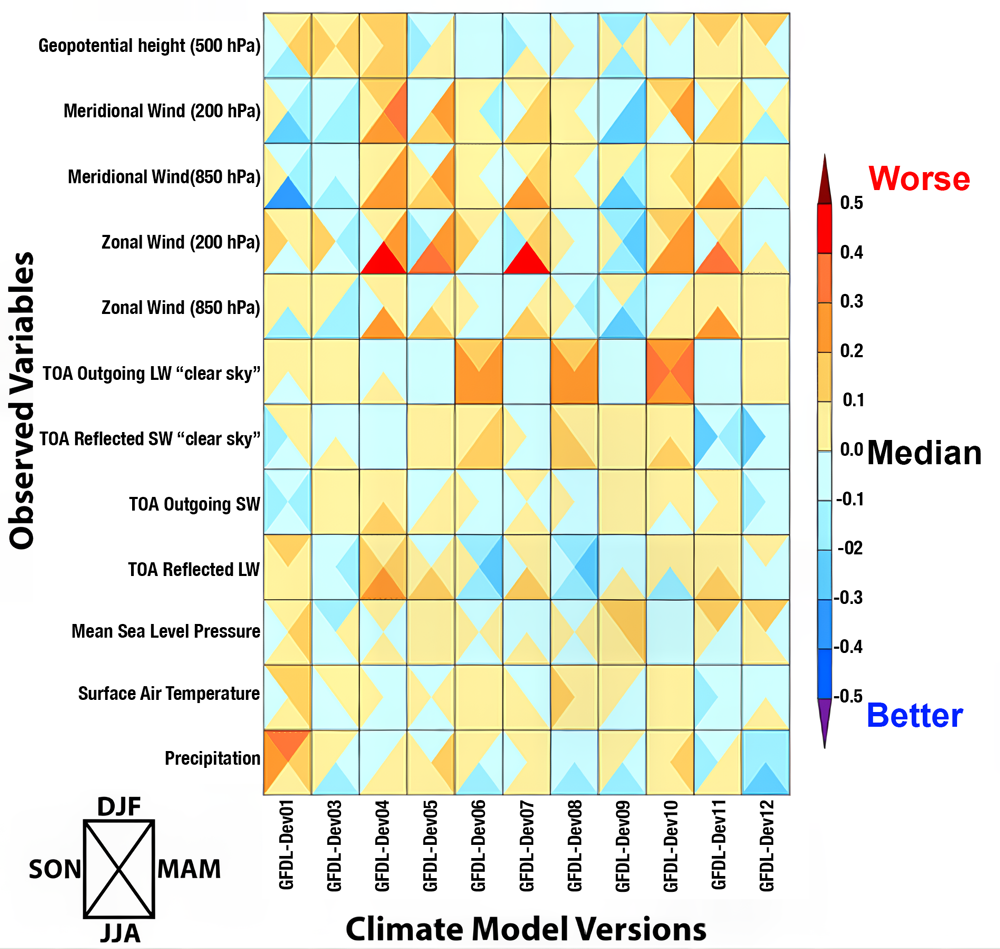
Performance characterization of different versions of a climate model from NOAA's Geophysical Fluid Dynamics Laboratory in terms of errors for various climate variables. The colors represent the error size, with blue being better and red worse, compared to the average error of all models. Each square is divided into four triangles representing the four seasons, showing how well each model performs throughout the year.
Alright, we've spent a lot of time talking about model validation, comparing model results to real-world observations, but now let's touch on verification before moving on. Verification is a quality check of the inner workings of the model itself. Think of it like double-checking your homework to ensure all the steps and calculations are accurate and logically sound. In climate modeling, this means making sure that the computer code and mathematical equations are doing exactly what they’re supposed to do. It’s about confirming that the scientific principles being modeled, like the conservation of energy or the dynamics of atmospheric circulation, are implemented correctly, without errors or bugs in the programming.
If we go back to our cake analogy, verification would be like double-checking the recipe before baking. Are we using tablespoons instead of teaspoons? Did we set the oven to the right temperature? Are we actually measuring all the ingredients correctly? It might sound tedious (and honestly, this part of climate modeling can be a bit “boring”), but it’s crucial. Without thorough verification, even the best scientific theories and principles could be misrepresented, leading to flawed simulations. Verification ensures that the foundation of the model is solid, so when scientists test new ideas or make predictions, they can trust the results are based on sound science, not a coding error. After all, you wouldn’t want your cake to flop because you accidentally doubled the salt instead of the sugar!