Prioritize...
After completing this section, you should be able to:
- Define uncertainty and describe the two different types with respect to climate model projections.
- Describe the purposes of climate model projections and give at least three examples of things that can be predicted by climate models which can be used by policymakers
Read...
OK, we've talked about what climate models are, how they are built, their strengths and weaknesses, why we can trust them, and climate scenarios. But what we haven’t covered yet is how we use all this to actually make predictions! Let’s tie everything back together and look at how these pieces fit into the bigger picture.
Below is a figure taken from the IPCC Sixth Assessment Report (AR6). The AR6 is the most recent and comprehensive summary of the state of climate science, released by the Intergovernmental Panel on Climate Change (psst: we defined this last page). It synthesizes the latest research on climate change, including projections of future warming, impacts on ecosystems and society, and potential pathways for mitigation and adaptation. Essentially, this report is the global gold standard for understanding climate change and what it means for the future.
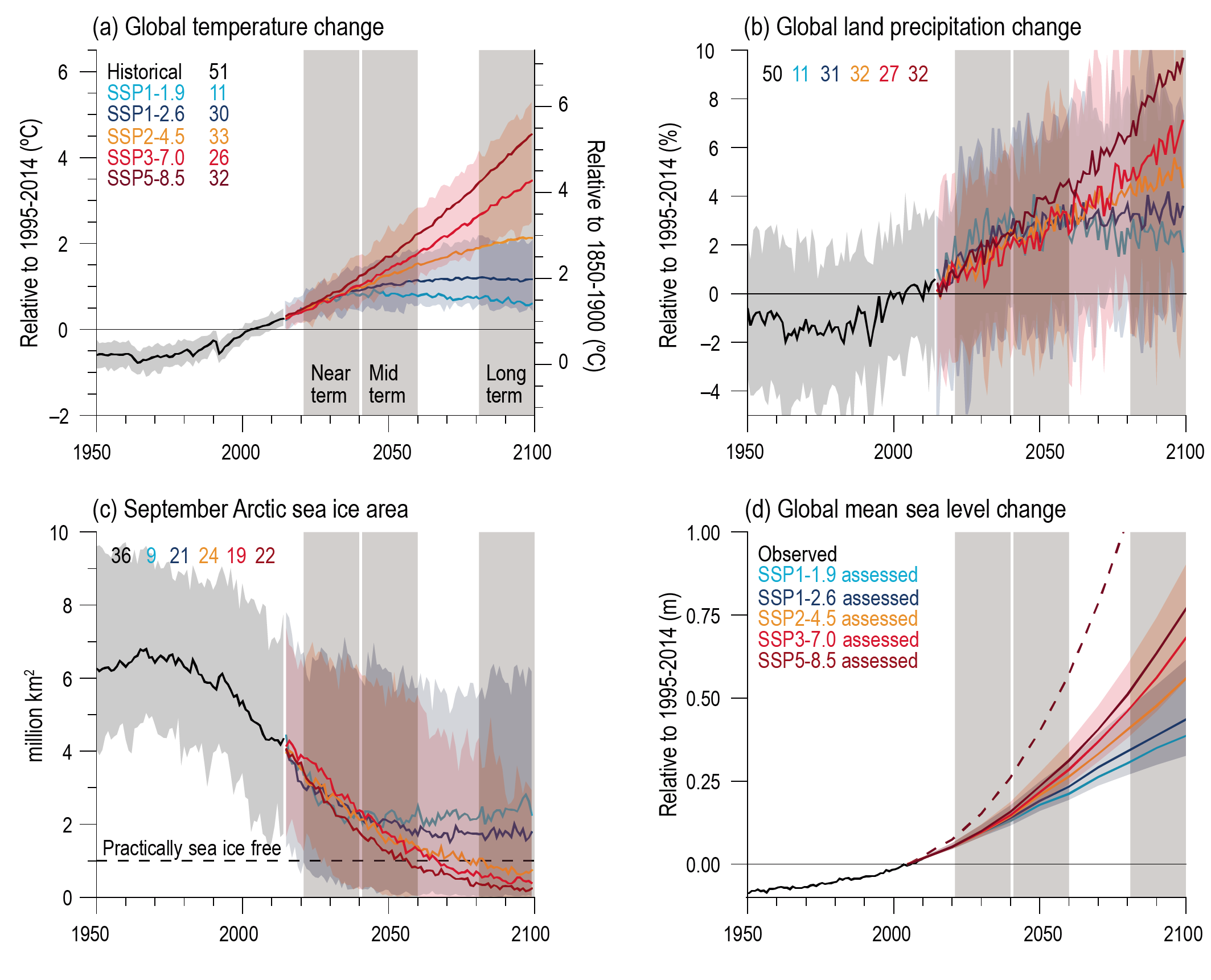
Model projections of future warming under various emissions scenarios. (See also Figure 4.2 in Chapter 4 of IPCC AR6 for similar, more up-to-date information in the context of SSPs.)
Figure 4.2 in IPCC, 2021: Chapter 4. In: Climate Change 2021: The Physical Science Basis. Contribution of Working Group I to the Sixth Assessment Report of the Intergovernmental Panel on Climate Change [Lee, J.-Y., J. Marotzke, G. Bala, L. Cao, S. Corti, J.P. Dunne, F. Engelbrecht, E. Fischer, J.C. Fyfe, C. Jones, A. Maycock, J. Mutemi, O. Ndiaye, S. Panickal, and T. Zhou, 2021: Future Global Climate: Scenario-Based Projections and Near-Term Information. In Climate Change 2021: The Physical Science Basis. Contribution of Working Group I to the Sixth Assessment Report of the Intergovernmental Panel on Climate Change [Masson-Delmotte, V., P. Zhai, A. Pirani, S.L. Connors, C. Péan, S. Berger, N. Caud, Y. Chen, L. Goldfarb, M.I. Gomis, M. Huang, K. Leitzell, E. Lonnoy, J.B.R. Matthews, T.K. Maycock, T. Waterfield, O. Yelekçi, R. Yu, and B. Zhou (eds.)]. Cambridge University Press, Cambridge, United Kingdom and New York, NY, USA, pp. 553–672, doi: 10.1017/9781009157896.006 .]
Let’s first focus on the top-left plot, which shows trajectories of projected warming from climate models. The metric plotted is our familiar "global average surface air temperature," shown as an anomaly (y-axis) relative to two baselines. The x-axis represents time, with the black line showing historical observations and the colored lines representing projections for the future based on different scenarios. But remember, we don’t have a precise crystal ball—we’re making statistical projections about what might happen going forward.
We also have to account for uncertainty in our projections. Uncertainty is the range of possible outcomes due to factors like differences in climate models, variability in the climate system itself, and unknowns about future human behavior (e.g., emissions pathways). This is why you see the shaded areas around the colored lines—they represent the “spread” or range of possible outcomes based on the same scenario. While we may not know the exact temperature in 2080, the models give us a clear picture of the general trends and the boundaries within which future warming is likely to fall.
There are actually two kinds of uncertainty shown in the top left panel of this figure! What are those two uncertainties you may ask?
Scenario Uncertainty:
This refers to the different colored lines in the figure, each corresponding to a distinct SSP. These lines represent the uncertainty in what path humanity will take in the future. For example, will we follow a low-emission pathway like SSP1-1.9 -- colored in blue, or will we continue on a high-emission trajectory like SSP5-8.5 -- colored in red? This uncertainty stems from the fact that we can’t predict human behavior—future technological advancements, policy decisions, or levels of global cooperation are all unknown. As we just learned about, these scenarios effectively bracket the range of potential futures, from aggressive mitigation efforts (SSP1-1.9) to a business-as-usual approach (SSP5-8.5). However, even these scenarios come with their own limitations. For instance, uncertainties in future aerosol emissions or how the carbon cycle might respond to increased emissions (e.g., feedback loops where warming causes more CO₂ release from soils or oceans) could influence the actual pathway. That said, the range shown in the graph gives a reasonable estimate of what is possible based on current knowledge and assumptions.
Physical Uncertainty:
This is represented by the width of the shaded areas within each scenario. Physical uncertainty reflects how different climate models simulate the same scenario! In other words, even if we knew exactly which emissions pathway we’d follow, different models would still produce slightly different warming outcomes. For example, while the solid red line corresponds to the average projection of surface air temperature associated with SSP5-8.5, the shading of the red reflects potential high and low projections for different models. Ah, now the idea of "model intercomparison projects" makes more sense!
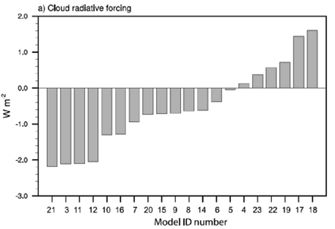
A significant portion of "physical uncertainty" stems from how physical processes —especially clouds—respond to increased greenhouse gases. As we discussed earlier, clouds have a dual nature: they can cool the Earth by reflecting sunlight or warm it by trapping heat. The balance between these effects, known as cloud feedback, varies considerably across models. Take a look at the figure below (from a slightly older IPCC report, but still illustrative). It shows the range of estimates for cloud radiative feedback across different models. Some, like model #21, exhibit strongly negative feedbacks (cooling effects that "turn down the dial" and offset some warming), while others, like model #18, show positive feedbacks (where warming triggers more warming in an amplified cycle). These variations help explain why the shaded areas in climate projections aren’t razor-thin—different models make different assumptions about the formation and dissipation of clouds, leading to a spread of possible outcomes.
Now, take another look at the first figure on this page and check out the other three panels. These show model projections for key climate impacts: how much precipitation falls over land (critical for understanding floods and droughts), the extent of Arctic sea ice, and the expected average rise in sea level due to thermal expansion and melting ice. In all these cases, the impacts are generally worse under the "higher" scenarios (warmer colors), but the degree of change isn’t uniform across all variables.
For instance, in the bottom right panel, shifting from SSP5-8.5 to SSP3-7.0 doesn’t significantly reduce sea ice loss. However, moving from SSP2-4.5 to SSP1-2.6 would preserve much more sea ice. This illustrates how complex climate decision-making can be—some actions might have a big impact on one issue but not much on another. Models are invaluable for guiding policymakers and the public by providing insight into potential outcomes, but ultimately, the decisions about how to mitigate and adapt to climate change rest with us, not the computers. And that’s exactly what we’ll dig into in the rest of this course!
Explore Further...
If you want to see more figures from the most recent IPCC report like the top one on this page, head here and click on "figures" for a treasure trove of climate model visualizations!