Student Reflection
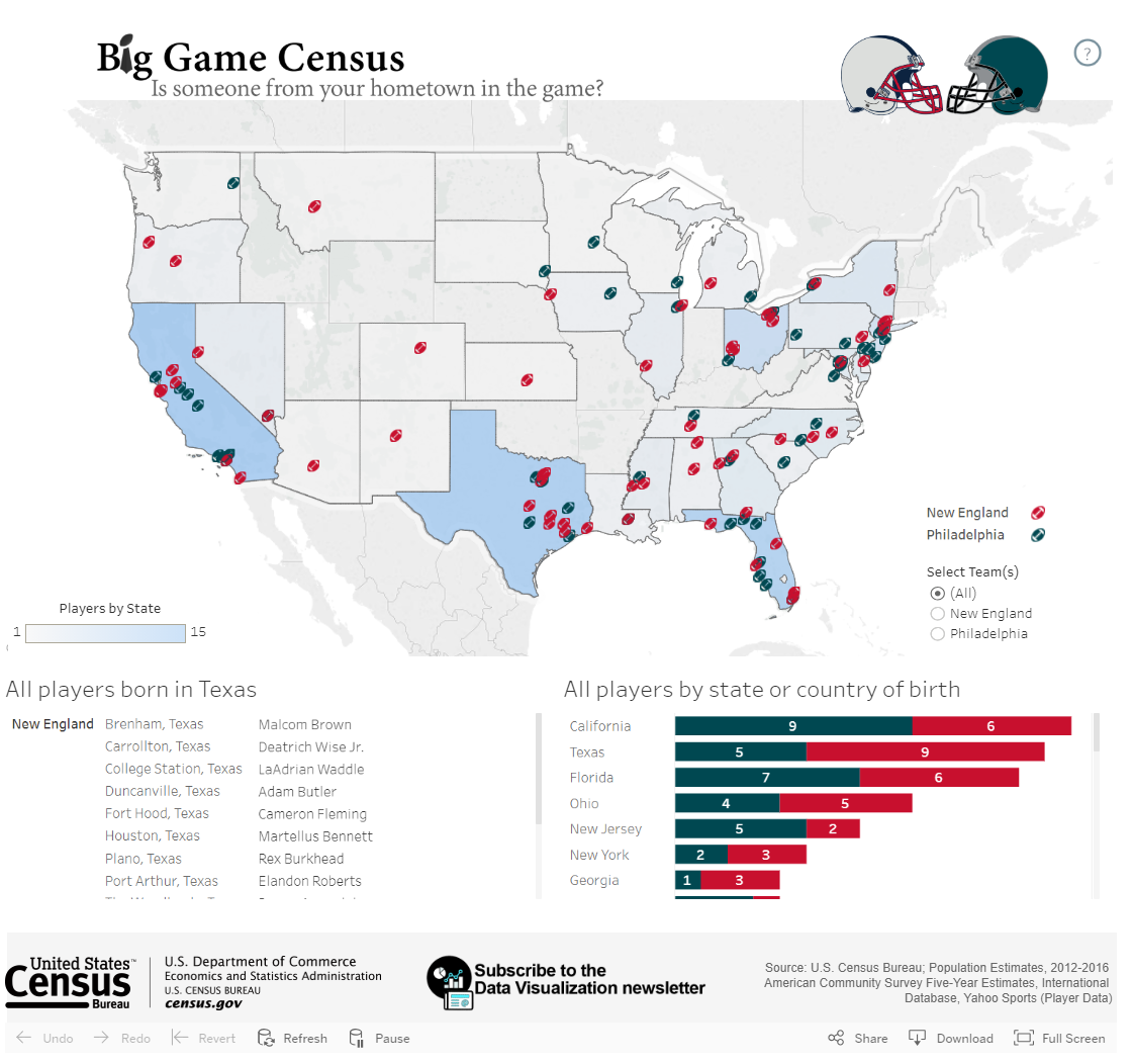
Analyze the maps shown below. For each map, name the level of measurement of the data mapped. What visual variables are used to encode this data? Is the map effective—does the map tell you what you need to know?
Analyze the maps shown below. For each map, name the level of measurement of the data mapped. What visual variables are used to encode this data? Is the map effective—does the map tell you what you need to know?