Prioritize...
By the time you are finished reading this page, you should be able to:
- Read and understand a time series
- Calculate an anomaly given an observed value and a climatological reference
Read...
Time series
We are typically interested how some component evolves over time and if it is changing, what is causing it to change. A time series is a fundamental data analysis approach used to gain insights into the behavior of climatic variables over some period of time. You have almost certainly come across these in other aspects of your day-to-day life, such as the price movement of the stock market or how Major League Baseball players are dealing with new rules.
In climate science, this typically involves taking some measurement or variable and quantifying how it changes over some time. This time period can be somewhat arbitrary – one could look at the annual climate of a particular region (the time period is one year long) or multiple millennia. This type of analysis permits a clear representation of trends, patterns, and fluctuations of the variable over time. By enabling the visualization of data points sequentially over time, time series graphics facilitate the identification of any consistent patterns, cyclic behaviors, abrupt changes, or otherwise weird behavior in the data.
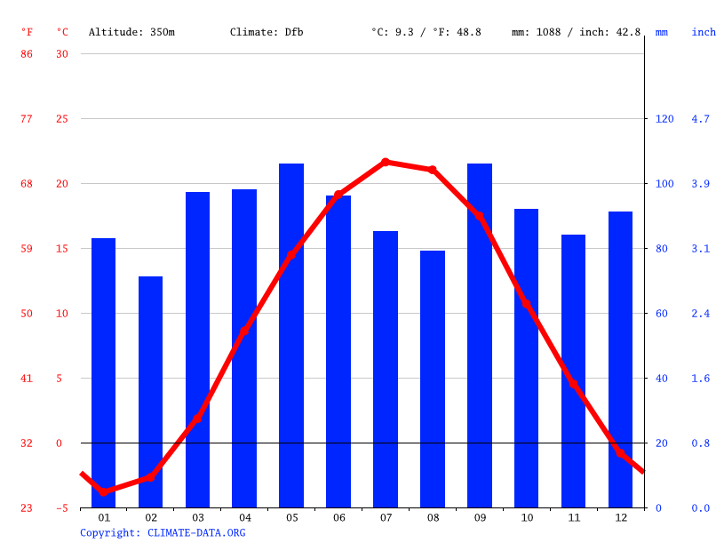
For example, a climatological time series chart below allows us to see the evolution of temperature in State College, PA. It tells us much of what we already know, that the warmest months are in July and August on average. But did you know that the month with the most precipitation is May, followed closely by September? We’ll talk more about how the circulation of the atmosphere contributes to different time series in the climate later in the semester.
Fun with units!
One thing that can be tricky for climate scientists is dealing with the correct units for variables. The most obvious one is temperature. In the United States, we commonly report temperature in units of Fahrenheit—this is probably what you are most familiar with. However, climate scientists tend to use the metric system, where temperature is measured in degrees Celsius (°C) or sometimes in Kelvin (K) for more scientific calculations. The metric system is preferred because it is used worldwide, making it easier for scientists from different countries to share and compare data with each other.
Converting between these units is quite simple - you can do it with a basic calculator. All you need to know are the relationships between them. For example, to convert a temperature from Fahrenheit to Celsius, you can use the formula:
°C = (°F - 32) * 5/9
To convert from Celsius to Fahrenheit, the formula is:
°F = (°C * 9/5) + 32
Kelvin is used mainly in scientific contexts where absolute temperature is important. To convert Celsius to Kelvin, simply add 273.15:
K = °C + 273.15
Understanding how to convert between these units is crucial in climate science because data might be collected in one unit and must be reported or analyzed in another. Misunderstanding or miscalculating units can lead to significant errors in climate models and predictions!
Quiz Yourself...
Read...
Trend
Over longer periods of time (say years to decades and beyond), we might be very interested in how a particular variable is changing over time. In combination with a time series, a trend line helps us see the overall direction in which a set of data points is moving over time. Imagine you have a graph where each dot represents a data point, like the temperature measured at different times throughout the year. These dots might seem scattered and chaotic, making it difficult to discern any pattern immediately. This is where a trend line comes into play. By drawing a straight line that best fits through these scattered dots, the trend line simplifies the complexity of the data, offering a clear, straightforward visual of whether the overall trend as a function of time is upwards, downwards, or relatively flat. It's like connecting the dots in a way that reveals the bigger picture, helping us to see beyond the short-term fluctuations and understand the broader, long-term pattern.
Temperature is actually a great example to use in a climate course. See the chart below which shows a time series of surface temperature averaged over the entire United States. Each point represents a different year. The jagged line bouncing up and down shows that there is a lot of year-to-year variability in the data. This type of jumping is usually associated with something known as “internal variability,” which we’ll talk about later in the class. The blue line represents a line (here, a linear regression) that shows the underlying trend in the data. Exactly how it’s calculated isn’t something you’ll need to do, but just notice that once you overlay this “best fit” line, you see the long-term trend from cooler temperatures to higher temperatures as you move from left to right (forward in time!). This represents a positive trend- temperatures in the United States have slowly but steadily increased over the past century.

Anomaly
It is very useful to understand the underlying distribution of variables, such as temperature or precipitation, but there are many instances where we want to know how far something deviates from its mean climatology. Having 6 inches of snow in northern Maine in December may barely induce school delays, but 6 inches of snow in Atlanta can gridlock traffic for days, even long after the snow has melted. To understand how a particular variable varies from a baseline state, climate scientists commonly calculate something known as an anomaly. An anomaly refers to the deviation of a particular variable from its long-term average over a specific time period. To calculate a climate anomaly, scientists first establish a baseline or reference period, often a time period spanning multiple decades, to represent typical or "normal" conditions for a specific location or region. This baseline is essential because it provides a standard against which current or future climate data can be compared. Once the baseline is established, the anomaly is simply the difference between the observed value and this baseline value. This difference, typically expressed as a numerical value or anomaly, indicates whether the recent climate conditions were warmer, cooler, wetter, drier, or otherwise different from the long-term average. As a simple example, if the temperature in State College on July 4th has averaged 82F over the past 30 years, then having an Independence Day holiday with a 99F temperature represents a +17F anomaly. Anomalies can be displayed in a variety of different ways. A spatial map of the air temperature anomalies during the 2021 Pacific Northwest heat wave is shown below. All of the red areas show where air temperatures climbed more than 27°F (15°C) higher than the 2014-2020 average for the same day. In other words, if Seattle normally was 80F on that day, they were actually observing temperatures of 107F!

Climate anomalies play a pivotal role in climate science for a couple of reasons. First, they allow scientists to identify and quantify variations and trends in climate data. By comparing recent climate conditions to the long-term average, researchers can detect patterns of change, such as long-term warming trends, shifts in precipitation patterns, or the occurrence of extreme weather events. These anomalies provide valuable insights into how our climate is evolving over time. Second, climate anomalies are crucial for assessing the impacts of climate change. By calculating anomalies, scientists can determine whether specific regions are experiencing changes that are outside the bounds of natural variability. This information is essential for understanding the extent to which human activities, such as greenhouse gas emissions, are influencing our climate. Identifying areas where anomalies are consistently occurring helps policymakers and communities prepare for and adapt to changing climate conditions, whether that means addressing the risks associated with sea-level rise, altered precipitation patterns, or more frequent heatwaves. Understanding how things evolve in ways that are different from the baseline we are accustomed to will be a common theme throughout the remainder of this course.
Quiz Yourself...
Below is the climatological daily mean air temperature (in degrees Celsius) over the United States on June 27th (top) and the observed daily air temperature anomaly on June 27th, 2021 (bottom).
Using this information and what you know about calculating anomalies, calculate what the observed air temperature was on June 27th, 2021 at
- Seattle, Washington
- Miami, Florida.
Report this in both Celsius and Fahrenheit!

Lesson 1 anomaly question answer
Presenter: OK, so to answer this question, we need to do a few things. First, we obviously need to know where Seattle, WA and Miami, FL are. I'm going to circle them on this top graph, but if you're not sure, you can always look up on a map on the Internet or your favorite book, something like that. So I've circled Seattle, WA and Miami, FL in black circles there.
Now we want to calculate what the actual temperature at both Seattle and Miami was on June 27th, 2021. The two graphs we have here show, on the top, the average climatological surface temperature on June 27th. Again, what we've done here is we've averaged this over a long time period and said this is the temperature that we would expect to see over many, many June 27ths. On the bottom, we have the anomaly that was actually observed on June 27th, 2021.
We know from our text that our observed air temperature is just the sum of our climatological temperature—meteorologists and climatologists sometimes refer to this as climo as shorthand—plus our anomaly, which is sometimes abbreviated anom.
So let's start with Seattle first. If we look at Seattle's climatology, we see that it lies somewhere between this contour line and this contour line, which represent 14°C and 17°C. There's actually not a 17 label here, but you could always look down here, or you could say here's 20, here's 14. We're going by threes, so the one that's in between 20 and 14 is 17. Let's estimate that the climatological temperature in Seattle is 15°C.
We then go down to our bottom plot and look at what the anomaly was that was observed on that day. Again, I'm just going to circle Seattle here, and I'm going to estimate that number to be around 12°C. Same thing: here's my 6 contour, here's my 9 contour, and Seattle looks like it's pretty much lying right along this contour right here, which if we go by threes would be 12. So now if I just add these two together, pretty straightforward, I get 27°C, and I can go ahead and convert that to Fahrenheit.
I know from our notes that converting to Fahrenheit just means I have to take what is in Celsius, multiply it by 9/5, and then add 32 to it. In this case, that will give me approximately 81°F in Seattle.
Now, I've chosen this date for a very specific reason. This was during the 2021 Pacific Northwest heat wave, where temperatures were much, much, much warmer than had previously been seen in some of these areas in the Pacific Northwest. Now, you might think 81°F is pretty roasty, but it's not overly hot. One thing I want to point out is that these temperatures I'm showing you here are the daily average. They include temperatures that you would see both during the day when the sun is up as well as at night when the sun is down. So even though the average temperature is 81°F, this is the average over that entire 24-hour period. Many of these regions in the Pacific Northwest actually experienced high temperatures greater than 100°F during this heat wave.
So let's just check out Miami. If we go down to Miami, I've circled this. Now here in the lower-right corner, it's a little tough to tell, but it is somewhere in this orange bin. This orange contour is somewhere between 26 and 29, so let's just say that it's around 28°C. That is the average temperature in Miami on June 27th.
If I go down here, I see that the anomaly is actually straddling this line that kind of goes between light blue and light red. If I look really closely, I see that that contour represents 0. So Miami on this day was actually experiencing temperatures that are pretty much right on its climatological average for this day.
If I go back to our formula up here, I see observations equal climo plus anom. Our climo is 28°C, and our anomaly is 0°C. So the observed temperature in Miami is just 28 + 0, or 28°C, and I can use my formula where I take 28, multiply it by 9/5, and then add 32 to get Fahrenheit, which equals approximately 82°F.
So on this particular day, when Seattle was experiencing some of its warmest weather in its recorded history at 81°F for a daily mean, Miami was experiencing a pretty average day, which was around the same temperature. But one thing we're going to see as we go through this class is that it's not necessarily the absolute temperature that we're concerned with, but how regions and areas are conditioned to deal with that temperature. Individuals and infrastructure in Seattle are much less equipped to handle temperatures of 81-82°F over the course of a summer day, just like Atlanta, GA, for example, would be very ill-equipped to handle a foot of snow in the middle of winter relative to a northeastern city such as Boston.