Welcome to METEO 7
Welcome to METEO 7Quick Facts about METEO 7
What will you learn in this course?
METEO 7 seeks to provide you with a deeper understanding of climate systems and processes, empowering you to better interpret the climate information you encounter. With this knowledge of how the climate operates, you'll grasp the factors that drive climate patterns and variability and appreciate why long-term climate projections can be challenging. You will also learn to recognize signs of climate shifts and understand their implications, allowing you to interpret and assess media reports and make informed decisions in your daily life. Additionally, you'll be better equipped to critically talk about the widespread concerns about climate change and its impacts on our environment and society.
- Lesson 1: What is climate?
- Lesson 2: How do we make climate observations?
- Lesson 3: Energy drives everything!
- Lesson 4: The role of water in climate
- Lesson 5: The general circulations in the climate system
- Lesson 6: Modes of natural variability in the climate system
- Lesson 7: Changes in climate over the past 4 billion years
- Lesson 8: Anthropogenic climate change
- Lesson 9: Observations of changes in climate
- Lesson 10: Climate models and projections
- Lesson 11: Climate impacts, inequities, and climate justice
- Lesson 12: How to address climate change and climate solutions
How does this course work?
METEO 7 uses an online text, which includes digital video, audio, and interactive quizzes that provide instantaneous feedback. The course consists of 12 lessons, plus a course orientation week at the beginning of the semester. Lessons consist of an online reading assignment, along with online interactive exercises, links, animations, movies, and supplementary explanations of basic scientific principles.
Registered METEO 7 students should enter the course through their course section in Canvas.
Not registered? Students who register for this Penn State course gain access to assignments and instructor feedback, as well as earn academic credit.
This course is offered as part of the Repository of Open and Affordable Materials at Penn State. You are welcome to use and reuse materials that appear on this site (other than those copyrighted by others) subject to the licensing agreement linked to the bottom of this and every page.
Want to join us? Students who register for this Penn State course gain access to assignments and instructor feedback and earn academic credit. Official course descriptions and curricular details can be reviewed in the University Bulletin.
Lesson 1: Introduction and Earth's Climate as a Dynamic System
Lesson 1: Introduction and Earth's Climate as a Dynamic SystemMotivate...

Imagine you're planning a road trip. You check the weather forecast, pack your bags, make sure there is air in the tires (and oil in your engine!), and set out on your journey. But what if you could also predict the weather for the entire trip, not just for today but for the entire season? How would that change your planning? You might pack differently, choose a different route, or even postpone the trip. You (probably) would rather hike the Appalachian Trail in New England in August rather than in January! You are making decisions based on long-term information, something that goes beyond the today and tomorrow. This broader perspective of understanding not just today's weather, but the typical patterns over time, is what we call “climate.”
We live in a world where our decisions are often influenced by the weather. But when we step back and look at the bigger picture, we realize we think in terms of climate. Climate isn't about whether it will rain tomorrow or if it's unusually hot today—it's about the average conditions we can expect over weeks, months, years, or even decades. Understanding climate gives us the power to make informed decisions that can improve our daily lives, protect our environment, and prepare us for the future.
Before we start talking about more detailed aspects of the climate system, we first need to figure out what climate really is and how it differs from weather. You'll learn that while weather is like a single roll of the dice, climate is the pattern that emerges when you roll those dice over and over again. This difference is crucial because while we can't predict each individual roll, we can understand the overall pattern—and that understanding is what helps us plan and prepare. The Earth's climate system is a complex interplay of various components that all work together to create the conditions we experience. These components each play a unique role, like five key players on a team, each with a specific job, but all working together toward a common goal.
Understanding these components and how they interact is key to understanding the climate. As you progress through this course, you'll be building upon the basis you start learning now! This knowledge is not just academic; it's practical. It will help you see the world in a new way, allowing you to make better decisions in your personal life, your community, and even in global matters.
Let's get started!
What is climate and what are the climate system components?
What is climate and what are the climate system components?Prioritize...
By the time you are finished reading this page, you should be able to:
- Define climate and differentiate how climate differs from weather
- List the five key components of the Earth’s climate system.
Read...
You are probably most used to thinking about the weather in your day-to-day lives. Should I bring an umbrella to class today? Is it warm enough for me to wear shorts? Can I gamble on that snowstorm cancelling my exam? The term “climate” may imply something completely different than what you see on the 6 p.m. news every night, but they are intricately related, differing in terms of time scale and predictability.
Climate is the “synthesis of the weather in a particular region.” Put another way, “Climate is what you expect ... weather is what you get!
Essentially, we can consider climate as the average outcome of all the weather at a particular location. Imagine you are playing a game like Monopoly that requires two dice. Any single roll of the dice could be something different – a 2, a 6, a 9. But over many, many rolls, a pattern begins to emerge. 2 and 12 happen, but are very rare. 6s, 7s, and 8s keep coming up time and time again. Any single roll of the dice can be thought of as “weather” -- unpredictability factor in the dice roll -- while the the regularity of dice rolls establishes a predictable pattern that informs how frequently those numbers can come up, just as climate does with weather data over decades.
Explore Further...
Take a minute to visit the Dice Roll simulator and try it for yourself.
The climate system (sometimes referred to as “the Earth system”) reflects an interaction between a number of critical pieces, or components. There are five generally accepted components of the climate system.
Atmosphere—This is perhaps the component that springs to mind when we think of “meteorology.” The atmosphere includes everything above the land surface, including the air we breathe and clouds in the sky. The atmosphere is incredibly thin; if we define the top of it using the Karman Line, it is only 100km thick, compared to the Earth’s radius of 6,371 km!
Hydrosphere – As its prefix “hydro” implies, the hydrosphere includes all of Earth's water bodies—oceans, seas, lakes, rivers, groundwater, and even the moisture in the air. Though it covers about 71% of Earth's surface, the average depth of the ocean is about 3,688 meters, which is extremely small relative to our planet’s radius! The hydrosphere is crucial in regulating the Earth's climate, serving as a massive heat reservoir and participating in essential processes like the water cycle and ocean circulation.
Cryosphere – The cryosphere encompasses all the frozen elements of Earth's system, from polar ice caps and glaciers to sea ice and frozen ground. Despite its apparent vastness, the cryosphere represents a relatively small portion of our planet's surface when contrasted with the vastness of the Earth itself. Yet, its presence has a significant impact on our global climate and environment.
Lithosphere - Delving into Earth's solid foundation, the lithosphere encapsulates the planet's rigid outer shell, encompassing the Earth's crust and the uppermost mantle. While it may seem substantial, it's merely a thin veneer when compared to the Earth's overall size, yet it plays a crucial role in shaping our planet's geological features.
Biosphere - The biosphere comprises all living organisms on Earth, from microorganisms to complex ecosystems. It interacts with the lithosphere, hydrosphere, and atmosphere, forming the foundation of life on our planet. In contrast to the planet's overall size, the biosphere exists as a relatively thin layer on Earth's surface.
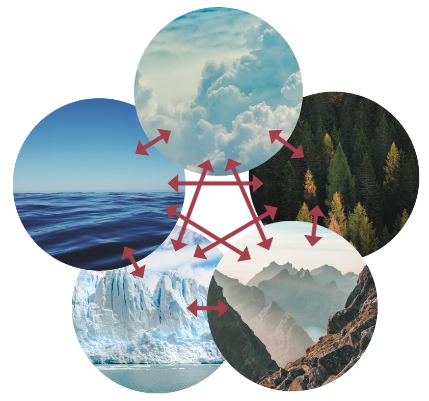
The five climate system components: Starting from the top and going counterclockwise, we have the atmosphere, the ocean, the cryosphere, the lithosphere, and the biosphere. The arrows indicate that all the components are intertwined and continuously interact with one another.
Quiz Yourself...
Why is studying climate important?
Why is studying climate important?Prioritize...
By the time you are finished reading this page, you should be able to:
- Give at least 3 real-world examples of how climate is important to various sectors in the United States.
Read...
Before we delve into some of the more scientific details about climate, it’s a good idea to understand “the big picture.” Climate impacts everything! This could be you and me, animals, plants — things that are living. But its influence doesn't stop there; it extends to non-living elements as well. Ever strolled along a beach adorned with smoothed stones? Those stones owe their formation to relentless weathering caused by tiny sand particles. And guess what? These sand particles get whipped up by waves, courtesy of atmospheric winds—proof that climate is constantly at work!

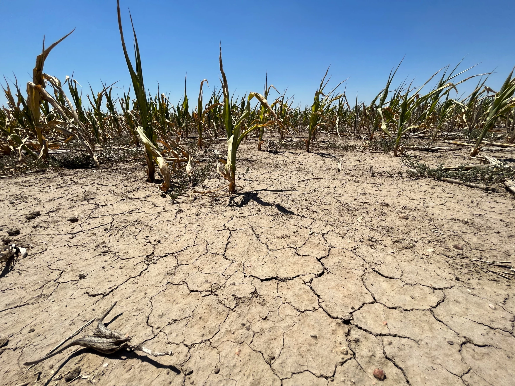
But a common question posed to climate scientists is "so what? How does climate impact our everyday lives?" You might be astonished at the multitude of sectors influenced by climate. One critical aspect of climate's significance lies in agriculture. Statistics of temperature and precipitation influence crop growth and the success of farming practices. Deviations from climate norms can lead to crop failures, affecting food security, livelihoods, and global food prices. Conversely, a stable and predictable climate is vital for sustaining agricultural systems that feed billions of people worldwide.
Water availability is another important motivation to understand climate. Climate influences the occurrence of droughts and floods, which have profound consequences for communities and ecosystems. Prolonged droughts lead to water scarcity and conflicts over resources. Conversely, intense rainfall and flooding can result in damage to infrastructure, displacement of populations, and the destruction of ecosystems. If we think about these events as “rolls of the dice,” climate plays a key role in determining the frequency and severity of these events, making it an important factor in water resource management and disaster preparedness.
Climate impacts ecosystems directly by altering temperature and precipitation patterns, which in turn affect species distribution, migration, and the health of ecosystems. Maintaining ecological balance is essential for biodiversity and human well-being. Therefore, climate stability is crucial for preserving these intricate relationships and ensuring the resilience of our natural world.
In the context of sustainability, climate considerations are central. Sustainable practices, whether in agriculture, energy usage, or urban planning, must account for climate impacts to ensure they do not harm the environment or compromise future generations' well-being.
Moreover, climate is intricately linked to energy usage and planning. The type and quantity of energy we use have direct consequences for greenhouse gas emissions, which are a primary driver of climate change. Changes in temperature lead to changes in demand for heating and cooling and changes the stress on our electric grid. Transitioning to renewable and more efficient energy sources is crucial to mitigate climate-related risks.
Climate also influences air quality, as temperature and weather patterns affect the dispersion of pollutants and the formation of smog. Poor air quality, exacerbated by climate change, can have detrimental effects on human health and the environment.
Lastly, sea level rise, driven by the warming of the planet and the melting of polar ice caps, poses a significant threat to coastal communities and infrastructure. Understanding and mitigating sea level rise is essential for the long-term resilience of coastal regions worldwide.
Quiz Yourself...
In the rest of this class, we’ll study climate primarily from a scientific perspective, but it’s worth not losing sight of the fact that understanding climate can help us improve societal health and welfare, benefit us economically, and ensure a more sustainable and resilient future.
How scientists study climate: three-legged stool
How scientists study climate: three-legged stoolPrioritize...
By the time you are finished reading this page:
- You should be able to identify the three tools scientists use to study climate and give a strength of each.
Read...
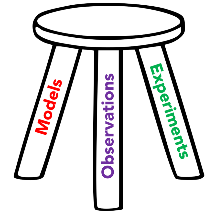
You may have heard of the three-legged stool analogy. It is often used to describe a concept or situation where three essential components or factors are critical. If one of the legs is missing, you are no longer sitting on a stool, but rather toppled over on the floor!
Three-legged Stool Example
Scientists understand climate by using three tools at their disposal. These three legs are:
Observations
“Observations” refer to the empirical data collected about the Earth's climate system through various methods. We’ll talk about these soon, but they can include satellites, weather stations, ocean buoys, and ice cores, among many others. These measurements can be straightforward, like temperature readings from a thermometer in your backyard, or incredibly complex, requiring highly specialized instruments to gauge parameters such as aerosol concentrations in the atmosphere or salinity levels in the ocean. Observations provide the essential raw data that feed into analyses, studies, and models, giving us the foundational "truth" about the evolution of the climate system. They offer a snapshot of real-world conditions, allowing scientists to validate hypotheses, calibrate models, and assess the current state of the climate system.
Models
“Models” are mathematical representations of the climate system built using the fundamental laws of physics, including conservation of mass, conservation of energy, and more. They can range from very simple “back-of-the-envelope” calculations you can do on a bar napkin to vast multi-million-line programs run on massive supercomputing systems that cost millions, if not billions, of dollars. Models serve as a virtual laboratory for experimenting on Earth, allowing scientists to simulate and analyze various scenarios to understand potential climate outcomes. These simulations are vital for predicting future climate conditions, assessing potential impacts, and developing strategies for mitigation and adaptation.
Experiments
“Experiments” in climate science involve controlled, often highly specialized, tests designed to isolate and study specific components or interactions within the Earth's climate system. These can range from lab-based studies that quantify fluxes from atmosphere-ocean interactions to field experiments that measure emissions from agricultural sources or the effect of land-use changes on emissions. Some experiments utilize advanced technologies like radiative forcing chambers to understand the response of atmospheric gases to various forms of radiation. Other experiments might employ techniques like stable isotope analysis to trace the origins and fates of specific elements within climatic cycles. The aim is to establish causality, validate or refute theories, and gather data that can be incorporated into climate models for more accurate predictions. Experiments are critical for advancing our understanding of complex climate processes, enabling scientists to tease apart the myriad factors contributing to climate change, and ultimately helping us make informed decisions for a sustainable future.
All of the legs complement one another, and focusing too much on one leads us to lack a large-scale overview of the Earth’s climate.
Basic statistics and ways to describe climate data
Basic statistics and ways to describe climate dataPrioritize...
By the time you are finished reading this page, you should be able to:
- Define the three main measures of central tendency used in climate science
- Calculate each of these three given a small set of numbers.
Read...
Since climate can be thought of as the statistical eventuality of individual weather snapshots, scientists tend to use quantitative metrics to describe aspects of the Earth system. Measures of central tendency are statistical indicators that represent the center or the average of a data set and are crucial for summarizing a dataset with a single value, facilitating easier understanding and comparison. The three main measures of central tendency are the mean, median, and mode.
This is a lot of text; maybe you could use a more visual explanation of “the three Ms.” Watch this quick YouTube video (11:04 minutes) to gain a general understanding of mean, median and mode, then read over the text below for more details.
Video: Math Antics - Mean, Median and Mode (11:03)
Transcript: Video: Math Antics - Mean, Median and Mode (11:03)
Intro
Rob: Hi, this is Rob. Welcome to Math Antics! In this lesson, we’re gonna learn about three important math concepts called the Mean, the Median, and the Mode. Math often deals with data sets, and data sets are often just collections (or groups) of numbers. These numbers may be the results of scientific measurements or surveys or other data collection methods. For example, you might record the ages of each member of your family into a data set. Or you might measure the weight of each of your pets and list them in a data set. Those data sets are fairly small and easy to understand. But you could have much bigger data sets. A really big data set might contain the cost of every item in a store, or the top speed of every land mammal, or the brightness of all the stars in our galaxy! Those data sets would contain a lot of different numbers! And if you had to look at a big data set all at one time… it would be pretty hard to make sense of it or say much about it besides, “well that’s a lot of numbers”! But that’s where Mean, Median, and Mode can really help us out. They’re three different properties of data sets that can give us useful, easy-to-understand information about a data set so that we can see the big picture and understand what the data means about the world we live in. That sounds pretty useful, huh? So let’s learn what each property really is and find out how to calculate them for any particular data set. Let’s start with the Mean.
Mean
You may not have ever heard of something called “the mean” before, but I’ll bet you’ve heard of “the average”. If so, then I’ve got good news! Mean means average! “Mean” and “average” are just two different terms for the exact same property of a data set. The mean (or average) is an extremely useful property. To understand what it is, let’s look at a simple data set that contains 5 numbers. As a visual aid, let’s also represent those numbers with stacks of blocks whose heights correspond to their values: one, eight, three, two, six. Right now, since each of the 5 numbers is different, the stacks of blocks are all different heights. But what if we rearrange the blocks with the goal of making the stacks the same height? In other words, if each stack could have the exact same amount, what would that amount be? Well, with a bit of trial and error, you’ll see that we have enough blocks for each stack to have a total of 4. That means that the Mean (or average) for our original data set would be 4. Some of the numbers are greater than 4 and some are less, but if the amounts could all be made the same, they would all become 4. So that’s the concept of Mean; it’s the value you’d get if you could smooth out or flatten all of the different data values into one consistent value.
But, is there a way we can use math to calculate the mean of a data set? After all, it would be very inconvenient if we always had to use stacks of blocks to do it! There’s got to be an easier way!! [crash] To learn the mathematical procedure for calculating the Mean, let’s start with blocks again. But this time, instead of using trial and error, let’s use a more systematic way to make the stacks all the same height. This way involves a clever combination of addition and division. We know that we want to end up with 5 stacks that all have the same number of blocks, right? So first, let’s add up all of the numbers, which is like putting all of the blocks we have into one big stack. Adding up all of the numbers (or counting all the blocks) shows us that we have a total of 20. Next, we divide that number (or stack) into 5 equal parts. Since the stack has a total of 20 blocks, dividing it into 5 equal stacks means that we’ll have 4 in each, since 20 divided by 5 equals 4. So that’s the math procedure you use to find the mean of a data set. It’s just two simple steps. First, you add up all the numbers in the set. And then you divide the total you get by how many numbers you added up. The answer you get is the Mean of the data set.
Let’s use that procedure to find the mean age of the members of this fine-looking family here. If we add them all up using a calculator (or by hand if you’d like), the total of the ages is 222 years. But then, we need to divide that total by the number of ages we added which is 6. 222 divided by 6 is 37. So that’s the mean age of all the members in this family. Alright, that’s the Mean. Now what about the Median? The Median is the middle of a data set. It’s the number that splits the data set into two equally sized groups or halves. One half contains members that are greater than or equal to the Median, and the other half contains members that are less than or equal to the Median. Sometimes finding the Median of a data set is easy, and sometimes it’s hard. That’s because finding the middle value of a data set requires that its members be in order from the least to the greatest (or vice versa). And if the data set has a lot of numbers, it might take a lot of work to put them in the right order if they aren’t already that way.
So to make things easier, let’s start with a really basic data set that isn’t in order. It’s pretty easy to see that we can put this data set in order from the least to the greatest value just by switching the 2 and the 1. There, now we have the data set {1, 2, 3}, and finding the Median (or middle) of this data set is easy! It’s just 2 because the 2 is located exactly in the middle. That almost seems too easy, doesn’t it? But don’t worry… it gets harder!
Median Example
But before we try a harder problem, I want to point out that sometimes the Mean and the Median of a data set are the same numbers, and sometimes they’re not. In the case of our simple data set {1, 2, 3}, the Median is 2 and the Mean is also 2, as you can see if we rearrange the amounts or follow the procedure we learned to calculate the Mean. But what about the first data set that we found the mean of? We determined that the Mean of this data set is 4. But what about the Median?
Well, the Median is the middle, and since this data set is already in order from least to greatest, it’s easy to see that the 3 is located in the middle since it splits the other members into two equal groups. So for this data set, the Mean is 4 but the Median is 3. So to find the Median of a set of numbers, first, you need to make sure that all the numbers are in order and then you can identify the member that’s exactly in the middle by making sure there’s an equal number of members on either side of it.
Mode
Okay, ...so far so good. But some of you may be wondering, “What if a data set doesn’t have an obvious middle member?” All of the sets we’ve found the Median of so far have an odd number of members. But, what if it has an even number of members? …like the data set {1, 2, 3, 4} There isn’t a member in the middle that splits the set into two equally sized groups. If that’s the case, we can actually use what we learned about the Mean to help us out.
If the data set has an even number of members, then to find the Median, we need to take the middle TWO numbers and calculate the Mean (or average) of those two. By doing that, we’re basically figuring out what number WOULD be exactly halfway between the two middle numbers, and that number will be our Median. For example, in the set {1, 2, 3, 4}, we need to take the middle TWO numbers (2 and 3) and find the Mean of those numbers. We can do that by adding 2 and 3 and then dividing by 2. 2 plus 3 equals 5, and 5 divided by 2 is 2.5. So the Median of the data set is 2.5. Even though the number 2.5 isn’t actually a member of the data set, it’s the Median because it represents the middle of the data set, and it splits the members into two equally sized groups.
Real World Example
Okay, so now you know the difference between Mean and Median. But what about the Mode of a data set? What in the world does that mean? Well, “Mode” is just a technical word for the value in a data set that occurs most often. In the data sets we’ve seen so far, there hasn’t even been a Mode because none of the data values were ever repeated. But what if you had this data set? This set has 6 members, but some of the values are repeated. If we rearrange them, you can see that there’s one ‘1’, two ‘2’s and three ‘3’s. The Mode of this data set is the value that occurs most often (or most frequently) so that would be 3 since there are three ‘3’s. Now don’t get confused just because the number 3 was repeated 3 times. The mode is the number that’s repeated most often, NOT how many times it was repeated.
As I mentioned, if each member in a data set occurs only once, it has no mode, but it’s also possible for a data set to have more than one mode. Here’s an example of a data set like that: In this set, the number 7 is repeated twice but so is the number 15. That means they tie for the title of Mode. This set has two modes: 7 and 15. Okay, so now that you know what the Mean, Median, and Mode of a data set are. Let’s put all that new information to use on one final real-world example. Suppose there’s this guy who makes and sells custom electric guitars. Here’s a table showing how many guitars he sold during each month of the year. Let’s find the Mean, Median, and Mode of this data set. First, to find the Mean, we need to add up the number of guitars sold in each month. You can do the addition by hand, or you can use a calculator if you want to. Either way, be careful since that’s a lot of numbers to add up, and we don’t want to make a mistake.
The answer I get is 108. o that’s the total he sold for the whole year, but to get the Mean sold each month, we need to divide that total by the number of months, which is 12. 108 divided by 12 is 9, so the Mean (or average) is 9.
Next, to find the Median of the data set, we’re going to have to rearrange the 12 data points in order from smallest to largest so we can figure out what the middle value is. There, that’s better. Since there’s an even number of members in this set, we can’t just choose the middle number, so we’re going to have to pick the middle two numbers and then find the Mean of them. 9 and 10 are in the middle since there’s an equal number of data values on either side of them. So we need to take the Mean of 9 and 10. That’s easy, 9 plus 10 equals 19, and then 19 divided by 2 is 9.5. So, the Median number of guitars sold is 9.5. That means that in half of the months, he sold more than 9.5, and in half of the months, he sold less than 9.5.
Last of all, let’s identify the Mode of this data set (if there is one). We let’s see… there’s two ‘8’s in the data set… Oh… but there’s three ’10’s. That looks like the most frequent number, so 10 is the Mode of this data set. It’s the result that occurred most often.
Summary
Alright, so that’s the basics of Mean, Median, and Mode. They are three really useful properties of data sets, and now you know how to find them. But sometimes, the hardest part about Mean, Median, and Mode is just remembering which is which. So remember that “Mean means average”, Median is in the middle, and Mode starts with ‘M’ ‘O’ which can remind you that it’s the number that occurs “Most Often”.
Remember, to get good at math, you need to do more than just watch videos about it. You need to practice! So be sure to try finding the Mean, Median, and Mode on your own. As always, thanks for watching Math Antics, and I’ll see ya next time.
Mean
The most used measure of central tendency in climate (and the one you have almost certainly used the most in your day-to-day life) is the mean, sometimes referred to as the arithmetic average or, more simply, the average. It provides a singular numerical representation of the quantitative data set’s center. The process of computing a mean is relatively straightforward, beginning with the summation of all individual elements or data points within the set. For a given set of n elements, denoted as x1, x2, …, one starts by adding all these elements together, generating a cumulative sum of all values present in the set.
After obtaining the cumulative sum of the data set, the next step in calculating the mean involves dividing this sum by the total number of elements or data points in the set, which is represented as 'n'. Mathematically, this can be expressed through the formula:
For example, let’s say we have five temperature measurements, each in Fahrenheit: 69, 74, 67, 74, 66. The sum of the elements (210) would be divided by the number of elements in the set (5), resulting in a mean value of 70 degrees.
Median
Another measure of central tendency used in climate statistics is the median, which serves to identify the middle value in a set of values. To find the median, we first organize the data points in ascending order, from the smallest to the largest. Once the data set is ordered, if there is an odd number of values, the median is the middle value. For instance, in the temperatures measured above, we first sort and get 66, 67, 69, 74, 74. Since there are five numbers, the third number (the middle one) is the median: 69.

The “middle” number is obvious when we have an odd number of data points (like 3, 5, or 173), but what do we do with an even number of data points where there are effectively “two” middle numbers? In this case, finding the median involves an additional step. It is computed by averaging the two middlemost values of the ordered sequence. Let’s say we add an additional measurement to our temperature above. Now we are at 69, 74, 67, 74, 66, 75. We sort to get 66, 67, 69, 74, 74, 75. Then, we take the two middle numbers, 69 and 74 in this case, and average them (71.5). Here, the median isn’t even a number in our dataset, but splits the difference between two of them!
The median can be more useful than the mean in the cases of distributions that have outliers. An outlier is an extreme value that extends far away from many of the other numbers in the dataset. In our first example, let’s replace the number 66 with 21 – a very cold day! Now the mean is 69+74+67+74+21=305, and 305 divided by 5 tells us our mean is 61. Just that single cold day, which represents an outlier to the rest of the dataset drags our mean down 9 degrees! However, note that our median stays the same, since the ordering becomes 21, 67, 69, 74, 74, and 69 remains the central value.
Mode
Our final measure of central tendency is the mode – defined as the value that appears most frequently in a given data set. Identifying the mode helps climate scientists recognize the most occurring or typical value in the dataset. For example, using our temperature dataset from before (66, 67, 69, 74, 74), the mode would be 74, as it appears more frequently than the other temperatures. If no number repeats, the set is said to have no mode, and in cases where two or more values occur with the same highest frequency, the dataset is considered to be multimodal, implying it has multiple modes (bimodal means two modes, trimodal means three modes, etc.).
Understanding and identifying the mode is significant as it gives insight into the most common or frequent occurrence in a dataset, offering a different perspective compared to the mean and median. Unlike the mean, the mode is not affected by extreme values or outliers, and, unlike the median, it is not necessarily positioned at the center of the ordered dataset.
Outliers
Speaking of outliers, we should talk about distributions. A distribution in climate science represents the set of all possible values or outcomes of a variable, such as temperature or precipitation, and defines how frequently each value occurs within a given dataset. Essentially, it provides a summary of the probability of occurrences of different possible outcomes in an experiment, offering a depiction of the variability or spread of a particular quantity. These are commonly shown graphically with a line or bar graph, with the horizontal x-axis containing the values of the variable and the vertical y-axis telling us something about their frequency of occurrence.
Quiz Yourself...
Understanding Distributions
Understanding DistributionsPrioritize...
By the time you are finished reading this page, you should:
- Understand the difference between a uniform, a normal, and a skewed distribution
- Be able to sketch what they look like if you were to start from a blank x-y plot
Read...
There are three types of distributions we’ll primarily use this semester.
Uniform Distribution:
In a Uniform Distribution, every value in the dataset has an equal likelihood of occurring. On a graph, this is represented graphically as a flat, horizontal line. This distribution is characterized by the minimum and maximum values of the distribution. The probability of any given value occurring within this range is constant, and values outside of this range have a probability of zero. For example, in our dice example above, when rolling a single die, the odds of rolling one single number are equally likely, between 1 and 6, demonstrating a uniform distribution.
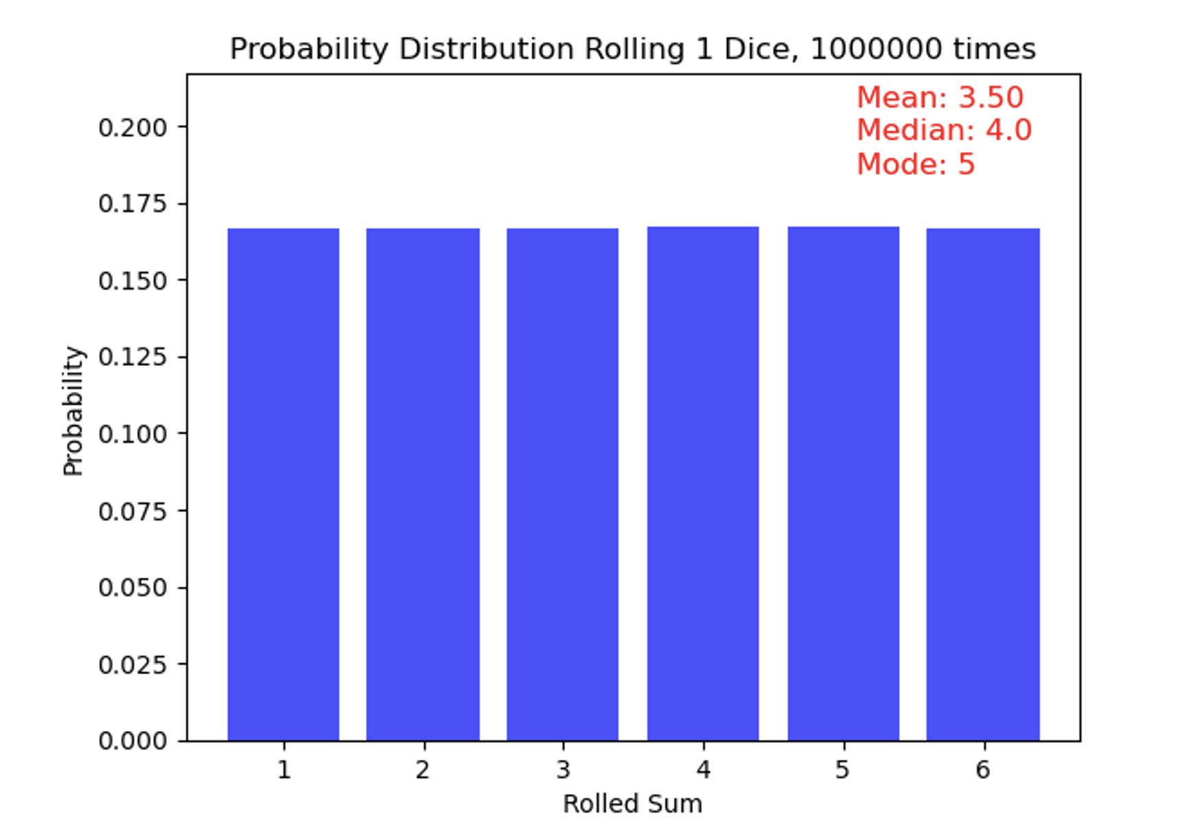
Eagle-eyed observers might take note of the statistics in the top-right corner of the figure, which show a mean of 3.5 (as expected), a median of 4, and a mode of 5. Wait—those bars look flat, so how is the mode 5!? These small deviations from perfect uniformity arise because the distribution is based on a finite (though large) sample of rolls rather than an infinite one. To make this clearer, I have added the number of rolls for each outcome above the bars, highlighting these slight differences even though the overall distribution appears very flat. With truly infinite rolls, the median would settle exactly at 3.5, and no single number would stand out as the mode.
Normal Distribution:
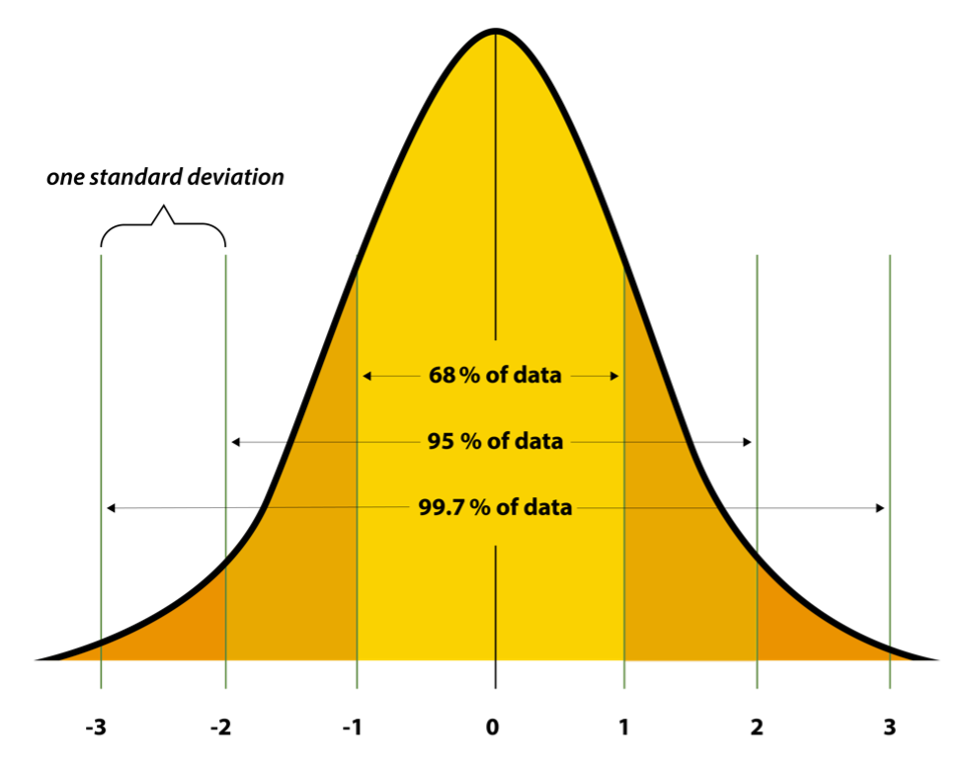
Uniform distributions are simple, but quite rare in nature. A common distribution seen in climate science – and quite prevalent across natural phenomena -- is the Normal Distribution, sometimes known as a Gaussian Distribution. This distribution follows a “bell-shaped” curve, with values closer to the central tendency (the mean and median!) being far more likely to occur than values in the “tails” of the distribution (very warm or very cold temperatures, for example). We also can briefly introduce the idea of “standard deviation” which is a measure of how much variation exists within a dataset. It is usually denoted by the Greek letter sigma. You may recognize these values, since some professors will “curve” their class grades based on this distribution (but not this one!). Small standard deviations tell us the distribution is very narrow, and all values tend to fall very close to one another. Large standard deviations tell us the opposite. If you are in a class where the mean on an exam was 81, and the standard deviation was 2, this means a *lot* of people scored very close to 81! On the other hand, if you have a mean of 81, but a standard deviation of 15, it means the distribution was far more spread out. In a symmetric normal distribution, about 68% of the data falls within one standard deviation of the mean, 95% within two standard deviations, and 99.7% within three standard deviations. Sometimes, you will hear people refer to something as a “three-sigma” outcome – this comes up in all walks of life, not just climate science. It means that it’s an event that falls at or outside the three standard deviation limit. If 99.7% of events fall within 3 standard deviations, it means a three-sigma events has less than a 0.3% chance of occurring in your distribution. Let's consider the IQ scores of a population, if IQ scores follow a normal distribution with a mean of 100 and a standard deviation of 15. An IQ score of 145 or higher is in the top 0.3% of the population, as it represents individuals with exceptionally high intelligence – this individual could be considered to score at a three sigma level (or three sigmas above the mean).
In the case of this symmetric distribution, the mean, median, and mode of a normal distribution are all equal and located smack-dab at the center. The standard deviation controls the spread or width of the distribution: a smaller standard deviation results in a narrower peak, while a larger one leads to a wider curve.
Skewed Distribution:
A Skewed Distribution can be thought of as a cousin of the normal distribution. In climate science, it typically follows something that has a lopsided bell curve. In other words, it is asymmetrical and does not exhibit mirror-image symmetry around the central value. Distributions can be either positively skewed or negatively skewed. In a positively skewed distribution, the tail on the right-hand side is longer than the left-hand side, indicating that most of the values are concentrated on the left, with a few extreme values to the right. Conversely, a negatively skewed distribution has a longer tail on the left-hand side. Unlike our normal distribution, the mean, median, and mode in a skewed distribution are not equal. Typically, in a positively skewed distribution, the mean is greater than the median, which is greater than the mode, and in a negatively skewed distribution, the mode is greater than the median, which is greater than the mean.
A variable that is positively skewed in climate science is the precipitation distribution at a particular point. Think about living in central Pennsylvania. Most of the time there is very little rain, or no rain at all. When it does rain, it’s generally more of a nuisance than anything. But occasionally, it can rain very hard or for very long periods of time. These events are rare and are outliers. Check out the graph below, the “tail” stretches much longer to the right-hand side, indicating a positively skewed distribution.

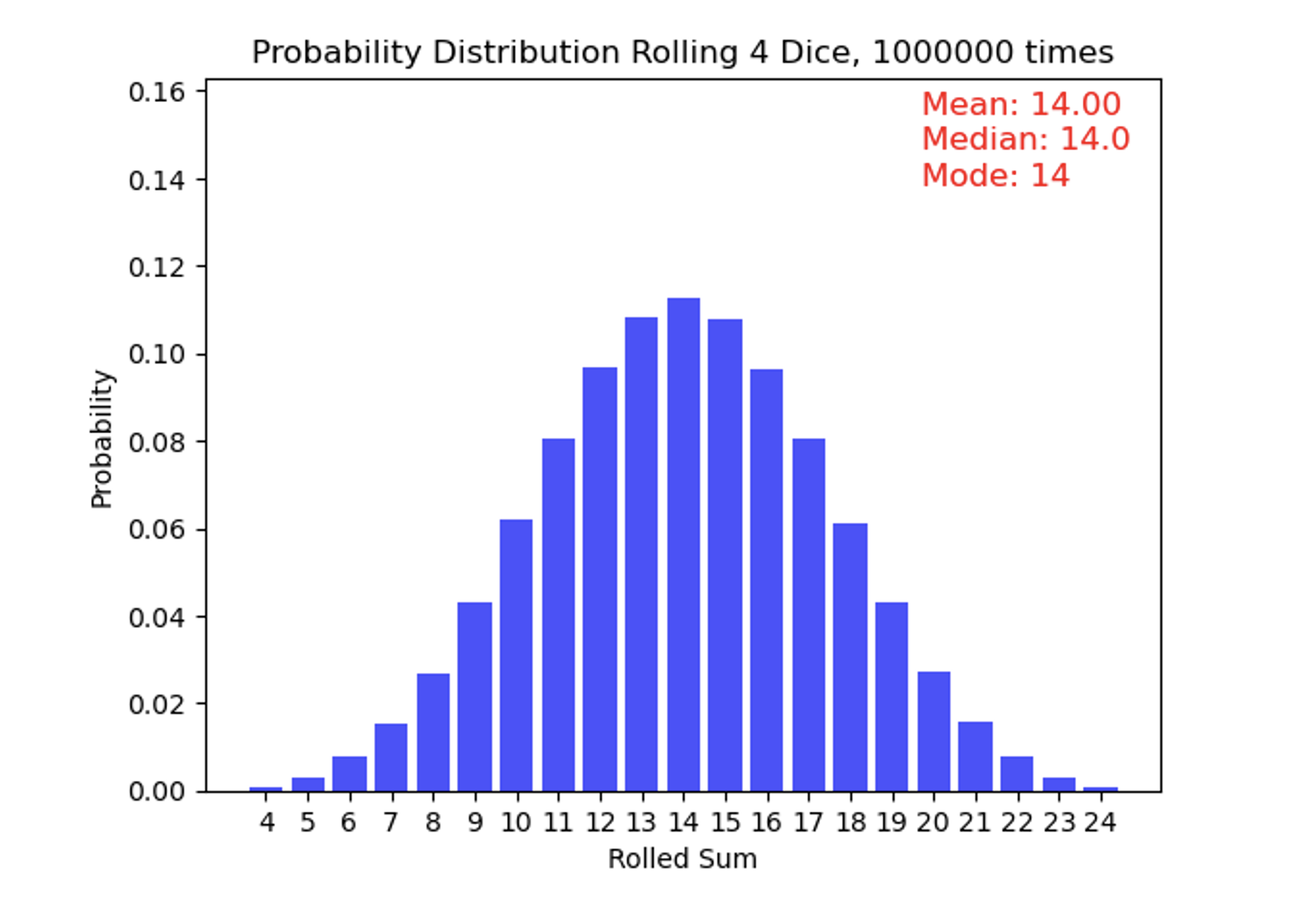
Now we roll 4 weighted dice one million times and add up what their faces show. These dice have small pieces of metal inside of them so that low numbers come up more often than high numbers. This results in a skewed distribution where combinations of lower numbers happen more frequently than higher numbers. This is an example of a positively skewed distribution, since the “tail” is longer on the right-hand side of the measures of central tendency. Also note that the mean is greater than the median, which is greater than the mode.
Quiz Yourself...
Data Analysis Techniques in Climate Science
Data Analysis Techniques in Climate SciencePrioritize...
By the time you are finished reading this page, you should be able to:
- Read and understand a time series
- Calculate an anomaly given an observed value and a climatological reference
Read...
Time series
We are typically interested how some component evolves over time and if it is changing, what is causing it to change. A time series is a fundamental data analysis approach used to gain insights into the behavior of climatic variables over some period of time. You have almost certainly come across these in other aspects of your day-to-day life, such as the price movement of the stock market or how Major League Baseball players are dealing with new rules.
In climate science, this typically involves taking some measurement or variable and quantifying how it changes over some time. This time period can be somewhat arbitrary – one could look at the annual climate of a particular region (the time period is one year long) or multiple millennia. This type of analysis permits a clear representation of trends, patterns, and fluctuations of the variable over time. By enabling the visualization of data points sequentially over time, time series graphics facilitate the identification of any consistent patterns, cyclic behaviors, abrupt changes, or otherwise weird behavior in the data.
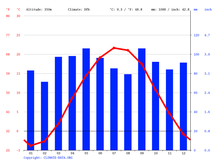
For example, a climatological time series chart below allows us to see the evolution of temperature in State College, PA. It tells us much of what we already know, that the warmest months are in July and August on average. But did you know that the month with the most precipitation is May, followed closely by September? We’ll talk more about how the circulation of the atmosphere contributes to different time series in the climate later in the semester.
Fun with units!
One thing that can be tricky for climate scientists is dealing with the correct units for variables. The most obvious one is temperature. In the United States, we commonly report temperature in units of Fahrenheit—this is probably what you are most familiar with. However, climate scientists tend to use the metric system, where temperature is measured in degrees Celsius (°C) or sometimes in Kelvin (K) for more scientific calculations. The metric system is preferred because it is used worldwide, making it easier for scientists from different countries to share and compare data with each other.
Converting between these units is quite simple - you can do it with a basic calculator. All you need to know are the relationships between them. For example, to convert a temperature from Fahrenheit to Celsius, you can use the formula:
°C = (°F - 32) * 5/9
To convert from Celsius to Fahrenheit, the formula is:
°F = (°C * 9/5) + 32
Kelvin is used mainly in scientific contexts where absolute temperature is important. To convert Celsius to Kelvin, simply add 273.15:
K = °C + 273.15
Understanding how to convert between these units is crucial in climate science because data might be collected in one unit and must be reported or analyzed in another. Misunderstanding or miscalculating units can lead to significant errors in climate models and predictions!
Quiz Yourself...
Read...
Trend
Over longer periods of time (say years to decades and beyond), we might be very interested in how a particular variable is changing over time. In combination with a time series, a trend line helps us see the overall direction in which a set of data points is moving over time. Imagine you have a graph where each dot represents a data point, like the temperature measured at different times throughout the year. These dots might seem scattered and chaotic, making it difficult to discern any pattern immediately. This is where a trend line comes into play. By drawing a straight line that best fits through these scattered dots, the trend line simplifies the complexity of the data, offering a clear, straightforward visual of whether the overall trend as a function of time is upwards, downwards, or relatively flat. It's like connecting the dots in a way that reveals the bigger picture, helping us to see beyond the short-term fluctuations and understand the broader, long-term pattern.
Temperature is actually a great example to use in a climate course. See the chart below which shows a time series of surface temperature averaged over the entire United States. Each point represents a different year. The jagged line bouncing up and down shows that there is a lot of year-to-year variability in the data. This type of jumping is usually associated with something known as “internal variability,” which we’ll talk about later in the class. The blue line represents a line (here, a linear regression) that shows the underlying trend in the data. Exactly how it’s calculated isn’t something you’ll need to do, but just notice that once you overlay this “best fit” line, you see the long-term trend from cooler temperatures to higher temperatures as you move from left to right (forward in time!). This represents a positive trend- temperatures in the United States have slowly but steadily increased over the past century.

Anomaly
It is very useful to understand the underlying distribution of variables, such as temperature or precipitation, but there are many instances where we want to know how far something deviates from its mean climatology. Having 6 inches of snow in northern Maine in December may barely induce school delays, but 6 inches of snow in Atlanta can gridlock traffic for days, even long after the snow has melted. To understand how a particular variable varies from a baseline state, climate scientists commonly calculate something known as an anomaly. An anomaly refers to the deviation of a particular variable from its long-term average over a specific time period. To calculate a climate anomaly, scientists first establish a baseline or reference period, often a time period spanning multiple decades, to represent typical or "normal" conditions for a specific location or region. This baseline is essential because it provides a standard against which current or future climate data can be compared. Once the baseline is established, the anomaly is simply the difference between the observed value and this baseline value. This difference, typically expressed as a numerical value or anomaly, indicates whether the recent climate conditions were warmer, cooler, wetter, drier, or otherwise different from the long-term average. As a simple example, if the temperature in State College on July 4th has averaged 82F over the past 30 years, then having an Independence Day holiday with a 99F temperature represents a +17F anomaly. Anomalies can be displayed in a variety of different ways. A spatial map of the air temperature anomalies during the 2021 Pacific Northwest heat wave is shown below. All of the red areas show where air temperatures climbed more than 27°F (15°C) higher than the 2014-2020 average for the same day. In other words, if Seattle normally was 80F on that day, they were actually observing temperatures of 107F!

Climate anomalies play a pivotal role in climate science for a couple of reasons. First, they allow scientists to identify and quantify variations and trends in climate data. By comparing recent climate conditions to the long-term average, researchers can detect patterns of change, such as long-term warming trends, shifts in precipitation patterns, or the occurrence of extreme weather events. These anomalies provide valuable insights into how our climate is evolving over time. Second, climate anomalies are crucial for assessing the impacts of climate change. By calculating anomalies, scientists can determine whether specific regions are experiencing changes that are outside the bounds of natural variability. This information is essential for understanding the extent to which human activities, such as greenhouse gas emissions, are influencing our climate. Identifying areas where anomalies are consistently occurring helps policymakers and communities prepare for and adapt to changing climate conditions, whether that means addressing the risks associated with sea-level rise, altered precipitation patterns, or more frequent heatwaves. Understanding how things evolve in ways that are different from the baseline we are accustomed to will be a common theme throughout the remainder of this course.
Quiz Yourself...
Below is the climatological daily mean air temperature (in degrees Celsius) over the United States on June 27th (top) and the observed daily air temperature anomaly on June 27th, 2021 (bottom).
Using this information and what you know about calculating anomalies, calculate what the observed air temperature was on June 27th, 2021 at
- Seattle, Washington
- Miami, Florida.
Report this in both Celsius and Fahrenheit!

Lesson 1 anomaly question answer
Presenter: OK, so to answer this question, we need to do a few things. First, we obviously need to know where Seattle, WA and Miami, FL are. I'm going to circle them on this top graph, but if you're not sure, you can always look up on a map on the Internet or your favorite book, something like that. So I've circled Seattle, WA and Miami, FL in black circles there.
Now we want to calculate what the actual temperature at both Seattle and Miami was on June 27th, 2021. The two graphs we have here show, on the top, the average climatological surface temperature on June 27th. Again, what we've done here is we've averaged this over a long time period and said this is the temperature that we would expect to see over many, many June 27ths. On the bottom, we have the anomaly that was actually observed on June 27th, 2021.
We know from our text that our observed air temperature is just the sum of our climatological temperature—meteorologists and climatologists sometimes refer to this as climo as shorthand—plus our anomaly, which is sometimes abbreviated anom.
So let's start with Seattle first. If we look at Seattle's climatology, we see that it lies somewhere between this contour line and this contour line, which represent 14°C and 17°C. There's actually not a 17 label here, but you could always look down here, or you could say here's 20, here's 14. We're going by threes, so the one that's in between 20 and 14 is 17. Let's estimate that the climatological temperature in Seattle is 15°C.
We then go down to our bottom plot and look at what the anomaly was that was observed on that day. Again, I'm just going to circle Seattle here, and I'm going to estimate that number to be around 12°C. Same thing: here's my 6 contour, here's my 9 contour, and Seattle looks like it's pretty much lying right along this contour right here, which if we go by threes would be 12. So now if I just add these two together, pretty straightforward, I get 27°C, and I can go ahead and convert that to Fahrenheit.
I know from our notes that converting to Fahrenheit just means I have to take what is in Celsius, multiply it by 9/5, and then add 32 to it. In this case, that will give me approximately 81°F in Seattle.
Now, I've chosen this date for a very specific reason. This was during the 2021 Pacific Northwest heat wave, where temperatures were much, much, much warmer than had previously been seen in some of these areas in the Pacific Northwest. Now, you might think 81°F is pretty roasty, but it's not overly hot. One thing I want to point out is that these temperatures I'm showing you here are the daily average. They include temperatures that you would see both during the day when the sun is up as well as at night when the sun is down. So even though the average temperature is 81°F, this is the average over that entire 24-hour period. Many of these regions in the Pacific Northwest actually experienced high temperatures greater than 100°F during this heat wave.
So let's just check out Miami. If we go down to Miami, I've circled this. Now here in the lower-right corner, it's a little tough to tell, but it is somewhere in this orange bin. This orange contour is somewhere between 26 and 29, so let's just say that it's around 28°C. That is the average temperature in Miami on June 27th.
If I go down here, I see that the anomaly is actually straddling this line that kind of goes between light blue and light red. If I look really closely, I see that that contour represents 0. So Miami on this day was actually experiencing temperatures that are pretty much right on its climatological average for this day.
If I go back to our formula up here, I see observations equal climo plus anom. Our climo is 28°C, and our anomaly is 0°C. So the observed temperature in Miami is just 28 + 0, or 28°C, and I can use my formula where I take 28, multiply it by 9/5, and then add 32 to get Fahrenheit, which equals approximately 82°F.
So on this particular day, when Seattle was experiencing some of its warmest weather in its recorded history at 81°F for a daily mean, Miami was experiencing a pretty average day, which was around the same temperature. But one thing we're going to see as we go through this class is that it's not necessarily the absolute temperature that we're concerned with, but how regions and areas are conditioned to deal with that temperature. Individuals and infrastructure in Seattle are much less equipped to handle temperatures of 81-82°F over the course of a summer day, just like Atlanta, GA, for example, would be very ill-equipped to handle a foot of snow in the middle of winter relative to a northeastern city such as Boston.
Summary
SummaryRead...
- Climate is the long-term average of weather patterns in a specific region, encompassing various components like the atmosphere, hydrosphere, cryosphere, lithosphere, and biosphere, which are all interconnected.
- Understanding climate is crucial as it affects agriculture, water availability, ecosystems, energy usage, air quality, and the resilience of coastal regions, influencing many aspects of life and society.
- Scientists study climate through observations, models, and experiments, each providing different insights that collectively enhance our understanding of the Earth's climate system.
- Analyzing climate data involves understanding distributions, trends, and anomalies to identify changes over time, which is essential for assessing the impacts of climate change and preparing for future challenges.
- A basic understanding of some statistics commonly used by scientists will come in handy for the rest of this class!
Now that we have an understanding as to what climate actually is, it begs the question, "how do we actually observe it?" Sounds like a good topic for the next lesson!
Before completing the assessments, take a few minutes to take the quiz below.
Quiz Yourself...
Lesson 2: How do we make climate observations?
Lesson 2: How do we make climate observations?Motivate...
Imagine going to the doctor for a routine checkup. What's the first thing they do? They check your vital signs—like your heart rate and blood pressure—to get a quick snapshot of your health. These simple measurements can reveal a lot about what's happening inside your body, guiding the doctor to make the right decisions for your well-being.
In the same way, observing the climate system is essential for understanding our planet's health. Just as your vital signs help a doctor understand your overall condition, key climate indicators—Essential Climate Variables, or ECVs, as you'll learn about—give us insights into how our climate behaves. By keeping a close watch on these variables, scientists can detect changes, spot trends, and even predict future climate conditions. This information is crucial, especially as we face the challenges of climate change, because it helps us understand what's happening now and what might happen next.
And just like your doctor uses a range of instruments—from thermometers to stethoscopes to x-rays—to get a complete picture of your health, we have various tools and methods to monitor the climate. These tools include satellites that orbit the Earth, weather stations on land, and buoys in the ocean. They gather a wealth of data that scientists then compile and analyze to track these vital climate signs. It's like the planet has one giant medical record! This massive collection of climate data helps us build a detailed picture of how different parts of the Earth's system interact, allowing us to better understand the past, monitor the present, and predict the future.
So let's get ready to learn about these climate "vital signs," why they're so important, and how observing and compiling these data helps us piece together the big picture of what's happening on Earth. We'll also discuss how you can help observe the climate; no special degree needed!
Essential Climate Variables
Essential Climate VariablesPrioritize...
When you've finished this page, you should be able to:
- Define what an essential climate variable is and how it is identified.
- Give 2-3 examples of essential climate variables for the atmosphere, land, and ocean.
Read...
When you visit the hospital, one of the first things that is done is checking your vital signs. These “vitals” are medical measurements that provide data about the body's basic functions and include heart rate, blood pressure, oxygen levels, etc. They are important because they give a quick picture of a patient’s overall health, aid in the detection and treatment of health problems, and guide future medical decisions.
Similarly, in our exploration of Earth's climate system, we need to select measurements that allow us to view the basic state of the climate and how it behaves, changes, and impacts our planet. This set of simple, but very important, parameters is known as Essential Climate Variables, or ECVs.
An ECV can be defined as a physical, chemical, or biological variable that holds a key importance in characterizing Earth's climate. ECVs are the variables that scientists believe are crucial to monitor because of their profound influence on the global climate system and their importance in understanding climate change. Moreover, these variables are pivotal in assisting decision-making processes related to climate change adaptation and mitigation.
There are three main criteria that make a particular measurement an ECV:
- Relevance: The variable is critical for characterizing the climate system and its changes.
- Feasibility: Observing or deriving the variable on a global scale is technically feasible using proven, scientifically understood methods.
- Cost-effectiveness: Generating and archiving data on the variable is affordable. It mainly relies on coordinated observing systems using proven technology, taking advantage of historical datasets where possible.
While relevance and feasibility seem obvious, I want to emphasize that cost-effectiveness is also extremely important. ECVs require us to get as holistic of a view of the entire Earth system as possible – if we design a drone that can measure temperatures far higher than where planes fly, but the cost is $10 billion per craft, that doesn’t do us a tremendous amount of good in terms of sampling the entirety of the planet!
While we could probably think of some ECVs right off the top of our heads (surface temperature, anyone?), we delegate the organization of them to the Global Climate Observing System (GCOS). GCOS operates under the sponsorship of the World Meteorological Organization (WMO), the Intergovernmental Oceanographic Commission (IOC) of UNESCO, the United Nations Environment Program (UNEP), and the International Science Council (ISC). Phew, don't worry; there will not be a quiz on any of *those* acronyms!
So, what are some examples of ECVs?

Text description of the Climate Variables image.
This image presents a categorized overview of Earth system components, organized into three main domains: Atmosphere, Land, and Ocean. Each domain is divided into subcategories, with lists of related environmental variables or measurements.
Atmosphere
The Atmosphere section is divided into three subcategories:
Surface:
- Precipitation
- Pressure
- Radiation budget
- Temperature
- Water vapor
- Wind speed and direction
Upper-air:
- Earth radiation budget
- Lightning
- Temperature
- Water vapor
- Wind speed and direction
- Clouds
Atmospheric Composition:
- Aerosols
- Carbon dioxide, methane, and other greenhouse gases
- Ozone
- Precursors for aerosols and ozone
Land
The Land section includes four subcategories:
Hydrosphere:
- Groundwater
- Lakes
- River discharge
- Terrestrial water storage
Cryosphere:
- Glaciers
- Ice sheets and ice shelves
- Permafrost
- Snow
Biosphere:
- Above-ground biomass
- Albedo
- Evaporation from land
- Fire
- Fraction of absorbed photosynthetically active radiation (FAPAR)
- Land cover
- Land surface temperature
- Leaf area index
- Soil carbon
- Soil moisture
Anthroposphere:
- Anthropogenic greenhouse gas fluxes
- Anthropogenic water use
Ocean
The Ocean section is divided into three subcategories:
Physical:
- Ocean surface heat flux
- Sea ice
- Sea level
- Sea state
- Sea surface currents
- Sea surface salinity
- Sea surface stress
- Sea surface temperature
- Subsurface currents
- Subsurface salinity
- Subsurface temperature
Biogeochemical:
- Inorganic carbon
- Nitrous oxide
- Nutrients
- Ocean color
- Oxygen
- Transient tracers
Biological/ecosystems:
- Marine habitats
Take a Minute
Take a few minutes to explore the list of essential variables from the GCOS website. Take a look at least two ECVs from each category - Atmosphere, Land, and Ocean. Can you guess how scientists may observe them?
We can consider that this list of ECVs provides the foundation for sharing climate data worldwide, both for current conditions and historical records. It is a Rosetta Stone that allows researchers from all around the world to speak the same climate language. However, I should emphasize that these variables – while we’ll use them a lot this semester – are not an “end-all be-all.” Scientists use a host of other data to track the climate system, too. We should just think of these 50 ECVs as a starting point for more complex climate studies. We also shouldn’t necessarily consider a single variable on this list to be more important than another; they all play a crucial role in different ways in understanding Earth's climate system as a whole.
Atmospheric
Atmospheric variables are probably the ones you are most familiar with. These even include those traditionally used to describe weather on your 6 PM news, like precipitation, wind, temperature -- even lightning. The atmospheric domain is divided into surface (near-ground) and upper air measurements (think about all the space above a tall skyscraper). Scientists are also concerned with air's chemical makeup. Pay special attention to the Earth’s “radiation budget,” which we'll discuss soon. This, in conjunction with the variables defined by atmospheric composition, is what is keenly important for understanding how our climate has changed and may change in the future.
Land
ECVs taken on land may seem diverse, but elements like river discharge and leaf area index are connected. Both contribute to energy and mass exchange on land surfaces. Other variables like soil carbon and fire disturbances relate to the global carbon cycle. Human activities can impact soil carbon levels, and fires, whether natural or human-caused, release significant carbon into the atmosphere. Of course, it goes without saying that we – as humans – live on the land’s surface, so these ECVs are of particular importance in our day-to-day lives. How much snow is on the ground can be pretty important in what we do on a dreary day in December!
Ocean
Lastly, in the ocean, things look a little different. Yes, we still look at temperature and currents (the ocean equivalent of wind), but we also look at ocean water composition, including salinity, acidity, oxygen levels, and tracers. Tiny organisms like phytoplankton help absorb carbon dioxide from the atmosphere and produce oxygen. By monitoring these ocean variables, we can learn a great deal about the evolution and vulnerabilities in specific ecosystems.
Defining ECVs is only half the story -- how do we go about measuring them? We really have two options, read on to learn about what each of these are.
Quiz Yourself...
In-situ Measurements of Land and Atmosphere
In-situ Measurements of Land and AtmospherePrioritize...
When you’ve finished this page, you should:
- Be able to explain what an in-situ observation is and give 2-3 examples.
- Understand why an ECV like global mean temperature may vary slightly from dataset to dataset, but why they ultimately paint a similar picture over long periods of time.
Read...
In-situ measurements of the land and atmosphere
In-situ measurements require that the instrumentation be located directly at the point of interest and in contact with the subject of interest. For those who took Latin in high school, you may remember that “in situ” means “in position.” Going back to our vital signs analogy from before, this would be the equivalent of a thermometer that was placed under your tongue. Measuring the air temperature with a thermometer is the easy climate analog – we are physically measuring the temperature at a specific location, but having the air make direct contact with the thermometer gives us our reading. The same thing holds for taking wind measurements (wind striking an anemometer or wind vane) or measuring precipitation (rainfall falling into a rain gauge).
A great deal of our in-situ measurement toolbox centers on the land surface, where humans live. As implied before, one of the most important ECVs for studying climate is near-surface temperature. This is the temperature outside that you and I experience at any given time, and is the temperature we are all familiar with being reported by our local weather forecasters. It is inexpensive to measure, many of you may already do this, and is almost always reported from a surface weather station, whether those be at airports or in backyards.
Thermometer records from weather stations, islands, and ships provide us with more than a century of reasonably good global estimates of surface temperature change. Measurements were historically made using mercury or alcohol thermometers, which were read manually and recorded by hand at either specified intervals or just when convenient. Over the past few decades, these observations are increasingly made using electronic sensors that transmit data without the need for human intervention. Heck, even things like your car and smartphone likely have the capability to measure temperature automatically! Some regions, like the Arctic and Antarctic, and large parts of South America, Africa, and Eurasia, have not been as well sampled over the past century or so, but records in these regions become more available as we moved into the mid and late 20th century.
These data can be reported as a time series as we discussed in the previous lesson but given that we are interested in the surface temperature and how it has evolved over the last ~200 years, we typically take these temperatures, scattered at various points and times, and merge them into a single organized dataset that can be visualized as a map. A key benefit to this approach is it reduces the potential impacts of outliers and bad data while giving us a “global” view of the planet. The figure below shows the result of this as derived by the Berkely Earth project. The scientists working on the dataset have merged all in-situ surface temperature observations from 2022 and then compared that result to the 1951-1980 global average.

Moving one step further, all of these data points and different locations and times can be merged together to form a single global mean. This is the value that is frequently seen in the media or other outlets when discussing climate change over the past hundred years. Note that there is not one specific way to calculate a single global mean – see the graph below, which shows six different time-series of the global mean temperature anomaly! It’s important to note, however, that while the lines differ slightly even though they are generally using the same observational record, the overall behavior and trends of the curves are very similar, no matter which strategy is employed.

Quiz Yourself...
In-situ Measurements of the Ocean
In-situ Measurements of the OceanPrioritize...
When you’ve finished this page, you should:
- Be able to describe how and where we currently take in-situ measurements of the ocean for climate purposes
- Be able to define what gaps exist and where our “blind spots” are with respect to ocean observations.
Read...
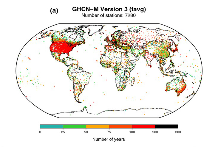
We’ll see later that the ocean is a key component of the climate system, particularly on longer timescales. But in the last section, we noted that most of our in-situ measurements of the climate system are taken on the land surface. In fact, see the below figure, which shows where each of the 7280 stations that go into the Global Historical Climatology Network dataset is located. We see a ton of red dots over the United States, Europe, Japan, and parts of Australia, indicating dense, long-term records. We see a growing network elsewhere around the world, but predominantly focused on land. Many fewer points are out over the ocean – these may be small islands, ships, oil rigs, or other buoys, but since humans don’t generally live in the water, observations there are far trickier!
So how do we measure ocean properties from an in-situ perspective? While we have some measurements of surface ocean temperature from ships (throw a bucket overboard, pull up some water, take the temperature!), a larger view of ocean variables didn’t come until the widespread use of buoys, which occurred during the middle of the 20th century. Surface weather buoys (either anchored or drifting) are primarily used to help with weather forecasting but can also aid during emergency responses to chemical spills, provide engineering baselines for wind farms, and other cool applications. But while not designed for climate modeling, we can take advantage of this network and use their observations in our dataset as well. There are a few problems with relying on this buoy network. The first, and perhaps the most obvious, is that they do not have nearly the same spatial coverage that measurements taken on land have. Below is a snapshot of buoys cataloged by NOAA’s National Data Buoy Center on a given day. Look at all those gaps!

For the record, the buoys (or oil-drilling platforms) marked with yellow dots are stations that have recorded data recently. Meanwhile, stations marked by red dots are still considered active but hadn't reported data in at least eight hours at the time this image was produced. Orange dots represent buoys that used to exist but are no longer active. For example, the rightmost buoy on the plot -- the one in the Red Sea -- was maintained by the King Abdullah University of Science and Technology, which shared its data with NOAA. However, those reports stopped in 2010. While the coastline of the United States and the central Gulf of Mexico are well sampled by buoys and observations from oil-drilling platforms, farther out over remote ocean waters, a tropical cyclone finding a buoy is akin to finding a needle in a haystack. The buoys over the Atlantic and other oceans around the world are widely spaced, leaving huge gaps between buoy observations.
The second challenge is that they tend to measure basic surface variables of the ocean, such as sea surface temperature. This only gives us a small glimpse.
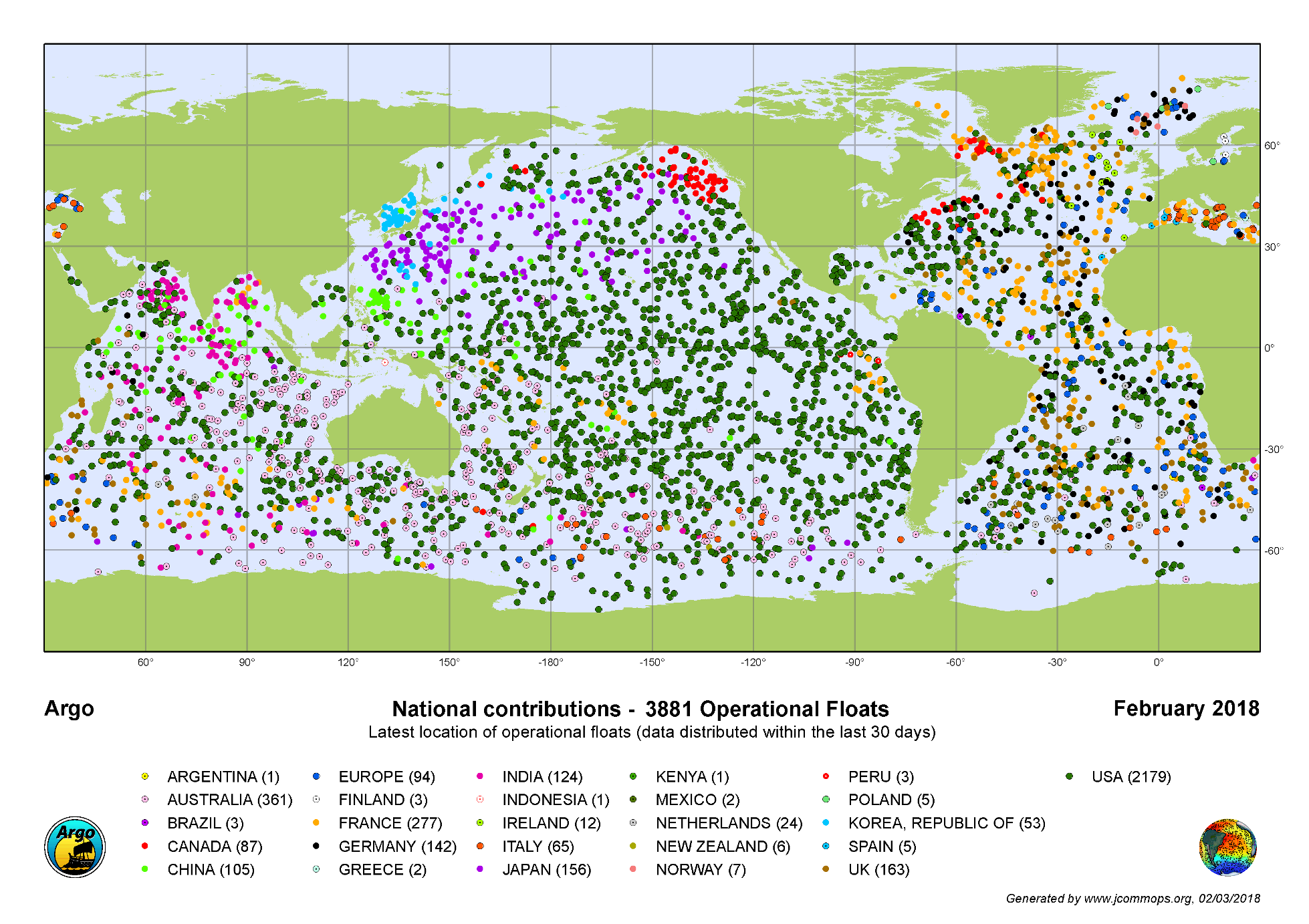
There are efforts to address these gaps. Perhaps the most notable is Argo, an international program that uses profiling floats to observe temperature, salinity, and currents. The unique feature of Argo floats is that they move up and down in the ocean according to a set schedule. To do this, the floats adjust their density by altering their volume by pushing out mineral oil and expanding a rubber bladder at its lower end. This expansion makes the float less dense than the surrounding seawater, causing it to rise. At the surface, they transmit all the measurements they have taken over the past ten or so days at depths as deep as 2,000 m. After reporting, the float contracts the bladder, reducing its volume and increasing its density, which allows it to descend back into the depths.
Currently, there are roughly 4,000 floats producing 100,000+ temperature/salinity profiles per year. This may seem like a lot but check out the picture below – there remain large gaps in ocean observations that can be as wide as the distance from Miami to New York City. Further, many portions of the ocean are far deeper than 2000m. New technology allows a small subset of these floats to go down to 6000m depth, which is still only approximately half as deep as the deepest part of the ocean (the Challenger Deep). Clearly, there is still a great deal of room for improvement in our in-situ ocean observing network!
Think about it...
Remote Sensing
Remote SensingPrioritize...
When you’ve finished this page, you should:
- Be able to describe how scientists measure ECVs remotely.
- Be able to describe the difference between polar-orbiting and geostationary satellites.
Read...
Low-Earth and High-Earth Orbits
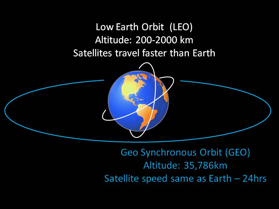
Satellites orbit Earth at various altitudes, each serving specific functions. The two most relevant for climate science are “Low-Earth orbits” and “High-Earth orbits.”
Low-earth orbits, which range from approximately 160 to 2,000 kilometers above Earth's surface, are critical for various applications, including Google Earth imagery. For climate observations, many of these satellites follow "polar" orbits, circling over both the north and south poles multiple times daily -- see the figure below for an idea. In fact, because they track over these high-latitude regions, we generally call these satellites "Polar Orbiting Satellites." These satellites complete an impressive 14 orbits daily while Earth rotates beneath them. Their orbits are consistent, forming a stable "highway" in space, allowing them to capture images of different locations on Earth as our planet continues its constant rotation beneath their path.
While polar orbiting satellites in low-Earth orbits are vital for capturing detailed global snapshots, high-Earth orbits offer a different perspective. Satellites in high-Earth orbits, often referred to as "geostationary satellites," remain fixed over a single point on the equator, providing continuous monitoring of specific regions. This contrast between low-Earth and high-Earth orbits is key to understanding their complementary roles in climate observation!
Polar Orbiting Satellites
So, polar orbiters get a worldly view, but not all at once! Like making back-and-forth passes while mowing the lawn, these low-flying satellites methodically scan the Earth in swaths about 2600 kilometers (1600 miles) wide, covering the entire globe twice every 24 hours. Each pass collects a narrow strip of data as the satellite moves along its orbit, building a complete picture of the Earth's surface over time. The appearance of a narrow swath against a data-void, dark background on a satellite image is a dead giveaway that it came from a polar orbiter. This characteristic pattern is a direct result of the satellite's polar orbit, which allows it to capture data from pole to pole as the Earth rotates beneath it. For example, see this animation below. Just like mowing a lawn, the satellite continuously orbits over the top and bottom of the planet, taking row after row of pictures with each pass! As it progresses, the satellite methodically pieces together a comprehensive view of the Earth's surface, ensuring that every part of the planet is eventually imaged, albeit not simultaneously.
Video: Polar Orbiting: NOAA-17 Satellite Coverage (0:30) (No Audio)
Video of how the NOAA-17 satellite takes images of the entire planet. The Earth is "frozen" in space here, but in reality is continually rotating, which is why the satellite takes different pictures of the Earth's surface throughout the day.
Satellites allow scientists to observe the Earth from above the atmosphere. The National Oceanic and Atmospheric Administration, NOAA, has several different types of satellites, including geostationary and polar orbiting satellites. These datasets show the path of Polar-orbiting Operational Environmental Satellites, or POES for short. NOAA has two POES in operation currently, a morning and afternoon satellite. The morning satellite crosses the equator on the sun-light side of the Earth in the morning, and the afternoon satellite crosses in the afternoon. Both satellites orbit the Earth 14.1 times per day.
There are two datasets that show the NOAA POES, which are NOAA-17 and NOAA-18. This dataset follows the path of NOAA-17, the morning satellite, and displays the IR data that the satellite collects over a 13-hour period on February 14, 2007. The IR data is overlaid on top of the NASA blue marble image. The satellite is able to provide full coverage of the Earth in less than 13 hours. POES satellites are about 510 miles above the Earth's surface and collect a swath of data that is 1740 miles wide. The other dataset, Sunsynchronous Satellite, follows NOAA-18 and shows the path of the satellite along with the day/night terminator for one day on December 22, 2007. NOAA-18 is the afternoon satellite, which crosses the equator in the afternoon. The satellite parallels the nighttime side of the terminator. Each orbit for these satellites only takes 102 minutes. They are able to orbit the Earth so quickly because they are traveling almost 17,000 mph. If Science On the Sphere were the actual size of the Earth, the height of the POES orbit would be 4.5 inches above the surface.
So these satellites sound great – global coverage through their continual orbits. The biggest downside to polar-orbiting satellites is their lack of temporal resolution and persistence. Despite their frequent passes over specific areas, polar orbiters do not capture continuous, real-time data for a given location. Similarly, since polar orbits do not maintain a fixed position relative to the Earth's surface, they cannot continuously monitor specific regions, which limits their ability to capture long-term trends in specific areas. But scientists do have a tool to address that challenge!
Geostationary Orbit Satellites
This weakness isn’t a problem for “high-Earth” orbits, however. In high-Earth orbit, at an altitude of approximately 35,786 kilometers (22,236 miles) above the Earth's surface, satellites have an orbital velocity that harmonizes precisely with Earth's rotation, creating the illusion of "hovering" over a fixed point on the planet's surface. These satellites, known as geostationary satellites, complete one orbit every 24 hours, aligning perfectly with Earth's rotational period. They remain stationary relative to a specific point on the equator, hence the term "geostationary." This unique characteristic allows them to continuously observe the same geographical area without interruption, making them invaluable for real-time monitoring of weather systems, atmospheric conditions, and other dynamic processes over extended durations. Their ability to provide continuous data streams is particularly advantageous for tracking the development of events like hurricanes or monsoons as they unfold.
However, geostationary satellites come with their own set of limitations. Their stationary position above the equator restricts their view of high-latitude regions, where coverage diminishes and detail becomes less reliable. As they are centered over the equator, observations of clouds, weather patterns, and other phenomena in high-latitude areas become increasingly distorted as the angle of observation grows steeper, rendering geostationary satellites essentially ineffective for monitoring regions poleward of approximately 70 degrees latitude. Additionally, their primary drawback is the lack of global coverage, which contrasts with the comprehensive reach of polar orbiters that scan the entire Earth. While geostationary satellites excel at providing continuous, localized data, they rely on the complementary global sweep of polar orbiters to complete the full picture of Earth's dynamic climate system.
Quiz Yourself...
Pros and Cons of Polar Orbiting and Geostationary Satellites
Pros and Cons of Polar Orbiting and Geostationary SatellitesPrioritize...
When you’ve finished this page, you should:
- Be able to list the pros and cons of each type of Polar Orbiting and Geostationary satellite.
- Understand the types of observations best taken by both Polar Orbiting and Geostationary satellites.
Read...
When considering the pursuit of a robust climate record, the strategic use of both types of satellites proves highly beneficial. Geostationary satellites excel in monitoring specific regions with exceptional temporal persistence, while polar orbiters offer the broader perspective necessary to capture global climate trends and changes. The combination of these two satellite types complements each other's strengths and is instrumental in advancing our understanding of Earth's climate system!
A major hurdle in the realm of climate observation through satellites is their finite lifespan. On average, polar-orbiting satellites typically operate for approximately 5 to 10 years, while geostationary satellites often endure for roughly twice that duration. This poses a couple of significant challenges.
First, securing continuous financial resources – either from the governmental or private sectors -- becomes a critical imperative. Given the limited operational lifespan of satellites, ensuring sustainable funding for the ongoing replacement of these crucial instruments is essential. The maintenance of a robust satellite network hinges on the consistent investment required to effectively sustain climate monitoring endeavors and launch new and improved technology as warranted.
Secondly, the meticulous comparison of observations between different satellites demands careful attention. Satellite instruments are inherently diverse, and variations in calibration errors can exist between them. These discrepancies present challenges when striving to make accurate and seamless comparisons between observations collected by distinct generations of satellites. This is particularly vital when tracking ECVs. To understand the precision required in ECV data, satellite instruments must exhibit the capability to discern subtle atmospheric temperature trends, as minuscule as 0.10 degrees Celsius per decade. Likewise, they should possess the sensitivity to track ozone changes as minute as 1% per decade and variations in the sun's output as diminutive as 0.1% per decade. These exacting requirements underscore the importance of precise instrument calibration and meticulous data analysis to ensure the accuracy of climate observations over the long term.
An example of this “dance” is two recent NASA satellites used to measure precipitation: GPM (Global Precipitation Measurement), and TRMM (Tropical Rainfall Measuring Mission). TRMM was launched in 1997 and orbited in faithful service until 2015. When TRMM grew close to the end of its useful lifetime, GPM was funded by NASA and launched in 2014 with new instruments. Behind the scenes, the transition required an entire team solely dedicated to helping calibrate its observations so that they matched up with TRMM and that the observations from the two satellites could be glued together in time to teach us how precipitation has evolved over the past 30 years.
In addition to the satellites themselves, scientists develop data processing systems to “merge” multiple dataset sources together. We briefly touched on this above with in-situ observations, but naturally, you could easily imagine merging both multiple in-situ datasets with multiple remote sensing datasets! One such example in the U.S. is CMAP, which stands for the CPC Merged Analysis of Precipitation. CPC is an acronym for the Climate Prediction Center, the arm of the U.S.’s National Weather Service tasked with real-time monitoring of global climate and predictions of climate variability. After synthesis, such products allow us to create figures like the January mean precipitation climatology shown below. We arrive at a spatiotemporally continuous map of precipitation – “spatiotemporally continuous” means we can find a data point for any geographic location (spatio-) and any time (-temporal) as long as it’s contained in the dataset. Note the higher average precipitation totals in warm tropical regions, both over the ocean and in areas such as the Amazon rainforest, but some very dry areas in the subtropics such as the Saharan desert in Northern Africa. We’ll talk about the hydrological cycle and general circulation of the atmosphere later in the course to help explain why these patterns emerge.

Quiz Yourself...
US Climate Centers
US Climate CentersPrioritize...
When you’ve finished this page, you should:
- Be able to explain the purpose of the NCEI and why the United States government decided they needed a central institute for climate science.
- Be able to define a stakeholder and give 3 examples of stakeholders outside of science.
- Understand how regional climate centers and state climatologists also play a role in communicating climate science at the regional and local levels.
Read...
You may have heard the term “big data” thrown around. You may even be currently majoring in something focused on data analytics or figuring out strategies to solve the “big data” problem. But what do we mean by “big data?” For simplicity, big data refers to extremely large and complex datasets.
Well, in many ways, climate data is just that! The National Centers for Environmental Information (NCEI) currently houses (as of 2023) more than 60 petabytes (1 petabyte = 1,000,000 gigabytes) of climate information. For context, an entry-level iPhone holds approximately 128 gigabytes of data – I would need more than half a million iPhones dedicated to storing climate data to hold it all! Another analogy is 60PB is equal to 5,268.704 years scrolling through tiktok assuming each video is around 13 MB and you watch around 100 tiktoks per hour. Remember, climate is the synthesis of weather, so to develop a solid climate record we effectively need to maintain logs of everything that has happened daily in perpetuity!
So, how do we do that here in the United States? Well, currently, if you want to use climate data in your day-to-day work, the best place to head is the National Centers for Environmental Information (NCEI), which is housed in Ashville, NC. NCEI (formally the National Climate Data Center) arose from a federal mandate way back in 1951. Before then, weather and climate archives were scattered at various offices around the United States. They were occasionally employed for regional analysis but without any national (or international) organization. It became clear to the federal government that coordination and standardization of such data was important to a variety of sectors around the country and was rapidly growing more important as interstate commerce was the norm rather than the exception.
The NCEI has evolved throughout the years. Data that were once handwritten on slips of paper were moved to punch cards, then cassette tapes and floppy disks, then optical media and hard drives. However, NCEI's primary goal has remained to safeguard these data and make it accessible to various stakeholders, including the public, businesses, government agencies, and researchers.
Definition:
Stakeholder: A stakeholder is an individual, organization, or entity with a vested interest in the issues and outcomes related to climate, including its regional impacts and changes. Stakeholders can include government entities, businesses, communities, financial institutions, industry associates, and media outlets, although this is not an exhaustive list!
The user base for NCEI data spans a wide spectrum of sectors, including agriculture, air quality, construction, education, energy, engineering, forestry, health, insurance, landscape design, livestock management, manufacturing, national security, recreation/tourism, retailing, transportation, and water resources management. Climate underlies nearly every facet of our lives.
While the NCEI serves as a central brain for the U.S.’s climate data, other climate centers across the U.S. collaborate with it to manage more regional impacts of climate. There are six major climate centers around the country. All are affiliated with major research universities and help catalog and analyze climate data specific to their respective locations. These centers often foster collaborations between service climatologists and related academic disciplines, facilitating important ongoing research. These centers also contribute to important published releases, like the National Drought Monitor which you have almost certainly seen during a particularly dry spell. Since these regional centers focus on smaller service areas compared to NCEI they can more efficiently engage in public outreach and interact with and educate local communities.

Another relevant role linked to regional climate centers is that of the state climatologist. Some state climatologists are associated with regional climate centers, while others hold dual appointments as university faculty or government officials. State climatologists serve as experts to state governments and residents. As of 2013, there were 47 official state climatologists nationwide, including one in Puerto Rico – their primary roles are to collect and interpret climate data for their home state and disseminate climate data and information through various means.
Meet your state climatologist!

Kyle Imhoff joined the Pennsylvania State Climate Office in August 2011 and became Pennsylvania State Climatologist in July 2016. Kyle is a research assistant and instructor at Penn State University. He teaches courses in weather forecasting and applied climatology, and his research interests include applied climatology, synoptic meteorology, numerical weather prediction, and weather risk. Kyle also serves as the local manager for the Penn State team in the WxChallenge national collegiate forecasting competition. Kyle is currently a member of the American Association of State Climatologists.
Prior to joining the Climate Office team, Kyle focused on weather forecasting and assisted in producing winter weather forecasts for the Pennsylvania Department of Transportation in District 2. Kyle also worked as a research assistant at the University of Alaska Fairbanks in the summer of 2010 where he studied marine boundary layer cloud evolution.
Kyle was born and raised in Pennsylvania. Currently, he resides in Bellefonte, but his hometown is in Rockwood, Pennsylvania. While at Penn State, Kyle majored and earned his B.S. and M.S. degree in Meteorology.
Quiz Yourself...
Citizen Science
Citizen SciencePrioritize...
By the time you are finished reading this page, you should be able to:
- explain what “citizen science” is with respect to climate observations
- share a way you can volunteer to take climate observations if it is something that interests you.
Read...
You might be thinking, “How can it be that we seem to have so much data, yet not enough at the same time?” The reality is, we’re still far from having a highly detailed map of surface observations to study climate in the United States. Surface observations are usually taken near airports or in major cities, which means rural areas, suburbs, and other less populated regions are often overlooked in our climate-observing network. To close those gaps, scientists have started leveraging something called “citizen science.” Citizen science is the practice of public participation and collaboration in scientific research to increase scientific knowledge. This means that anyone—even you—can become a climate observer! With some basic training and simple instruments, the general public is asked to report what’s happening in their own backyard once a day. Of course, there are exceptions for vacations or school—after all, these observers are volunteers! A great example of this is The Community Collaborative Rain, Hail, and Snow Network, or CoCoRaHS.
CoCoRaHS was created to fill the gaps left by traditional weather stations. It’s a community-based network that relies on volunteers from all walks of life to measure and report precipitation in their areas. This approach provides a more complete picture of precipitation patterns across the country, making the data more reliable and useful for everyone.
The origins of CoCoRaHS trace back to a catastrophic flash flood that hit Fort Collins, Colorado, in July 1997. A powerful, localized storm dumped over a foot of rain in just a few hours, causing $200 million in damages and claiming five lives. The existing weather stations didn’t capture the storm’s intensity because they were too far apart, highlighting the need for a more comprehensive and localized observation network. In response, CoCoRaHS was established in 1998 to improve the mapping and reporting of such extreme weather events. Since then, it has grown from a local initiative to a nationwide—and now international—network, providing critical climate data that benefits not just the United States, but other countries as well. Participation in CoCoRaHS is open to anyone, whether you live in a busy city or a quiet rural area. The process is simple: volunteers use straightforward, high-quality rain gauges to measure precipitation. With just a few minutes of effort each day, you can contribute valuable data that helps scientists and policymakers make informed decisions about water resources, agriculture, and disaster preparedness.
To ensure the data’s accuracy, CoCoRaHS offers comprehensive (and free!) training on everything from setting up your rain gauge to accurately measuring and reporting your observations. This training is crucial because consistency and precision are key to producing useful scientific data. Whether you’re reporting a quarter inch of rain or a major snowstorm, your contribution is significant.
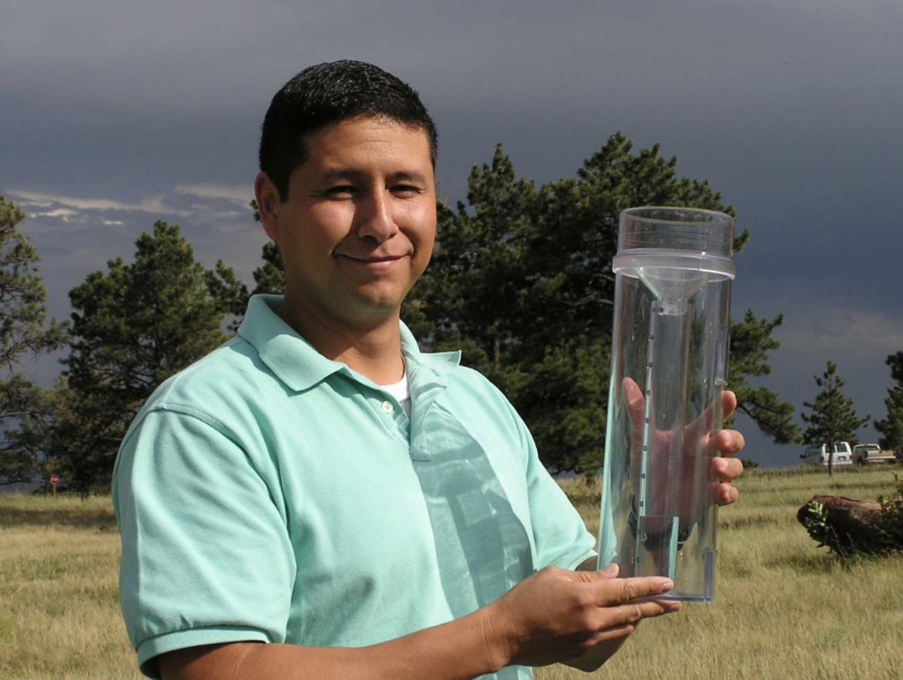
The data collected by CoCoRaHS volunteers are made available online almost instantly. You can even see your own house on the CoCoRaHS map! But more importantly, these data are used by scientists, resource managers, and decision-makers to gain a highly detailed and accurate understanding of precipitation patterns.
Being part of CoCoRaHS isn’t just about collecting data; it’s about joining a community of citizen scientists. It’s a practical, engaging way to connect with the weather and contribute meaningfully to your community. CoCoRaHS also offers webinars, training materials, and other resources to help volunteers deepen their understanding of weather and climate.
So, if you’ve ever wondered how much rain fell in your backyard—or if you just like the idea of contributing to real-world science—consider joining CoCoRaHS. It’s a small commitment that can have a big impact, and you might be surprised at how much you learn along the way.
Summary
SummaryRead...
- Essential Climate Variables (ECVs) are critical variables whose measurement helps scientists monitor and understand climate behavior, changes, and impacts, much like vital signs in human health. They are chosen based on relevance, feasibility, and cost-effectiveness, ensuring they provide key insights into the global climate system.
- Examples of ECVs include atmospheric variables (temperature, precipitation, wind), land variables (soil carbon, river discharge, leaf area index), and ocean variables (sea surface temperature, salinity, phytoplankton). The Global Climate Observing System (GCOS) organizes these to provide a standardized framework for global climate data collection and sharing.
- In-situ measurements involve collecting data directly from the point of interest, such as using thermometers for temperature or rain gauges for precipitation. They provide reliable data but can be limited by geographic coverage, especially over oceans.
- Ocean measurements often rely on buoys and ships but are supplemented by the Argo program, which uses floats to measure temperature and salinity at various depths. Despite the network of about 4,000 floats, gaps remain, especially in remote ocean areas and deep ocean zones.
- Remote sensing via satellites allows for continuous global monitoring of ECVs. Polar-orbiting satellites provide detailed snapshots of different Earth regions, while geostationary satellites monitor the same area continuously. Both types are essential for a comprehensive climate record.
- The National Centers for Environmental Information (NCEI) manages U.S. climate data and collaborates with regional centers to support research, public outreach, and informed decision-making.
- Citizen science initiatives like CoCoRaHS involve volunteers reporting local precipitation to fill gaps in traditional climate observation networks, enhancing data coverage and accuracy.
Quiz Yourself...
Lesson 3: Why Energy Drives Everything
Lesson 3: Why Energy Drives EverythingMotivate
Understanding energy is fundamental to understanding the climate system. In simple “physics” terms, energy can be described as the capacity to perform work. Practically, think about it this way. You and I need to move and eat and breathe – all of this requires us to do work and requires us to expend energy to do so. In fact, the concept of energy is so deeply intertwined with our physical universe that it becomes challenging to imagine a world without it. Everything we do, from driving a car to turning on a lightbulb, involves the conversion or transfer of energy in various forms. Therefore, energy is a concept that goes beyond this class (or any of your other science classes, for that matter!).
Overview of Energy
Overview of EnergyPrioritize...
By the end of this section, you will:
- understand the three fundamental principles of energy as they relate to the climate system
- recognize the different types of energy that play crucial roles in Earth's processes
- grasp how these energies are transferred and transformed according to the laws of thermodynamics
Read...
Overview
Energy is the ability to do work or cause change. It’s what makes things happen—whether it’s moving objects, heating up your food, lighting up a room, or even allowing you to run or think. Energy comes in many forms, like heat, light, electricity, and motion, and it can change from one form to another. For example, when you eat food, your body converts the energy stored in that food into the energy you need to move, grow, and stay warm. Without energy, nothing can move or change in the world around us.
When talking about energy to understand why the climate system behaves like it does, there are three fundamental principles we need to understand:
- Energy can be stored.
- Energy can move from one piece of matter to another.
- Energy can exist in different types and can transform between these types.
These three concepts also lay the groundwork for the First Law of Thermodynamics. According to this law, the total amount of energy within a closed system remains constant during all processes of energy movement and transformation.
Hmmm. That’s a bit of a mouthful – how can we frame this more simply? Let’s try this: Energy is never created nor destroyed, but it can move around and change forms. You may have also heard this called the “conservation of energy.” It’s worth noting the language “closed system” – this means a hypothetical box where energy cannot enter or exit. The grandest way to think about this is the universe – if we could place it in a giant box (a funny -- and very optional -- Futurama episode to watch), all energy within the box must remain constant because we assume no energy can enter or escape the universe.
Types of Energy
In the study of energy, we encounter a diverse array of “types” (sometimes referred to in textbooks as “forms”), each with unique characteristics and roles in the physical world. There are numerous forms of energy (ask a physicist for some of the more complicated ones!), but we will focus on four important ones here.
- Radiant Energy – the energy associated with electromagnetic radiation. As humans, we generally consider this manifesting as light – after all, it is the energy form that allows us to perceive the world around us (think visible light to our eyes, infrared heat from a fireplace, etc.). But as we will see very soon, it will also be critically important for getting energy into and out of (and moving it long distances around) the Earth system.
- Kinetic Energy - associated with motion, is evident in everything from the swaying of leaves in the wind to the bustling activity of a city. Any bit of matter, no matter how big or small or how light or how dense, possesses kinetic energy when it moves.
- Gravitational Potential Energy - determined by an object's height above the Earth's surface. It is called potential because it could be converted to kinetic energy if it starts falling toward the ground. Roller coaster aficionados know how potential energy and kinetic energy can be converted back and forth between one another – coasters tend to move slowly when very high and then move faster as they are closer to the ground.
- Internal energy - a composite of factors about a piece of matter itself (i.e., the atmosphere), such as its temperature, pressure, and chemical makeup.
What ties these diverse forms of energy together in the Earth system is their propensity for transfer and conversion. These transfers and conversions among various types of energy are the driving forces behind virtually every natural phenomenon. Therefore, we need to understand this to understand the climate system. While the First Law of Thermodynamics assures us that the total amount of energy in a system remains constant, it is important to recognize that not all energy is equally likely to undergo transfer or conversion. This leads us to the Second Law of Thermodynamics. According to this law, heat always flows spontaneously from hotter to colder regions of matter. A way to think about this that I think is somewhat intuitive is that heat always flows “downhill” if you think of a hill where the top represents warmth, and the valley represents cold.
What does this mean in practice? Let’s say I have a glass of ice cubes on my kitchen table. We know from personal experience that over time, those ice cubes will melt, and the resulting liquid will eventually become lukewarm. That is because the surrounding energy of the room – which is hopefully above freezing -- flows “downhill” to heat the ice cubes, melt them, and bring the water’s temperature in equilibrium with everything else around it. Left by itself, energy will always try to reduce its own order or organization itself, a concept known as “entropy.”

But wait a minute, maybe you should be skeptical of that. After all, if that’s the case, how do air conditioners and refrigerators function? After all, the whole reason they exist is to keep things cold, even when everything else around them is hot! Well, they can exist because they keep things cold (make heat flow “uphill” away from the inside of the freezer) by rearranging energy elsewhere (in their case, using electrical energy to push this heat up the hill). Similarly, we know that parts of the planet are cold and parts of the planet are warm. I know if -- for some reason -- I really, really, really want to feel an icy wind blow in my face, I can be essentially guaranteed that if I head to the South Pole. The second law of thermodynamics tells me that for this temperature imbalance between balmy Cancun, Mexico and frigid Antarctica to be maintained, energy must be being actively rearranged within the Earth system. While we will discuss all these forms of energy throughout this course, we start by focusing on radiant energy. Essentially, all the energy-sustaining life on our planet arrives in the form of radiation from our nearest star – the sun. All five components of the climate system consistently release radiation: 24 hours a day, 7 days a week. How this radiant energy is received, stored, moved, and transformed can teach us so much about the Earth’s climate! Read on.
Quiz Yourself…
Shedding Light on the Electromagnetic Spectrum
Shedding Light on the Electromagnetic SpectrumPrioritize…
At the completion of this section, you should be able to:
- define radiation, wavelength, and micron.
- discuss the organization of radiation in the electromagnetic spectrum by wavelength, including knowing which types of radiation have longer wavelengths and which have shorter wavelengths, for example).
Read…
So, we’ve now discussed that of the forms of energy, radiant energy (i.e., radiation) plays a central role. If you think of “radiation” and immediately conjure up images from science fiction movies or cautionary stories about nuclear energy, I can understand why! From a scientific perspective, radiation refers to the emission, transfer, and absorption of energy in the form of electromagnetic waves through space or a medium. It serves as a fundamental mechanism for transporting and exchanging energy within Earth's climate system. This encompasses solar radiation, which provides the energy that drives weather patterns and climate, as well as terrestrial radiation emitted by the Earth and its atmosphere.
Origins of Electromagnetic Spectrum of Radiation
During your science classes, you probably explored the electromagnetic spectrum of radiation. However, have you ever wondered about its origins? First, it's essential to recognize that all matter consists of atoms (the fundamental building blocks) and molecules (combinations of atoms). Within these already small structures exist even tinier particles with positive and negative charges, protons and electrons. Molecules tend to rotate andsibrate, and the electrons within them can move from lower energy orbitals to higher ones and vice versa. These movements of and within molecules lead to accelerations of the protons and electrons. Without delving into intricate details, physics teaches us that accelerated charges are the source of electromagnetic waves. It is amazing to think that all of the rotating water molecules around me (and most of the water molecules are indeed rotating!) are producing radiation, much of which strikes and is absorbed by my skin.
Another way to think about this is to imagine your hand as a vibrating molecule and a pond as the surrounding medium through which a wave propagates. Imagine moving your hand rapidly back and forth in the water – this generates waves that ripple out away from your hand and across the surface of the pond. Similarly, oscillating protons and electrons emit energy ripples known as electromagnetic "waves," and these waves propagate in every direction away from the accelerated charges whatever the surrounding medium might be, including the vacuum of space. These waves exhibit both electric and magnetic characteristics, hence the term “electromagnetic wave, or electromagnetic radiation, to describe them." The word “electromagnetic” is commonly abbreviated as “EM.”
Wavelengths
So, what gives rise to the different types of EM waves that form the complete spectrum? First, let's discuss the various categories of EM radiation based on wavelength. The wavelength of any wave is the distance from one identical point on the wave to the next, such as from crest to crest. Let's revisit our earlier analogy with the pond. When you move your hand through the water slowly, you generate a few waves with long wavelengths. Conversely, if you move your hand rapidly, you produce numerous waves with much shorter wavelengths. This same principle applies to an oscillating charge. When the oscillation is exceptionally fast (referred to as high frequency), the resulting EM radiation will have a short wavelength. Conversely, if the oscillation occurs at a slower rate (entailing a lower frequency), the electromagnetic waves will consist of longer wavelengths.

Now, the frequencies at which of charges in molecules can oscillate is primarily determined by the type and arrangement of atoms that compose the molecules.The temperature of the medium in which the molecules are situated subsequently determines how many molecules are oscillating at each frequency. As the temperature of the medium goes up, higher frequency oscillations within the molecules occur Why? The temperature of any piece of matter is determined by the kinetic energy of the atoms or molecules that compose the material. Remember, kinetic energy is a measure of the energy of a substance due to translation through space – we usually think about it in terms of throwing a ball or a moving train, but atoms and moleculesare tiny forms of matter and they too, can be moving through space! The higher the temperature, the faster these particles are moving. When faster moving atoms and molecules bang into each other, they are able to transfer more kinetic energy into the rotations, vibrations, and orbital excitations within the colliding particles, which correspond to higher frequency oscillations. Higher frequency oscillations, in turn, correspond to smaller wavelengths of the EM waves they generate. Conversely, as the temperature of a collection of atoms and moleculesdecreases, the frequencies induced by colliding particles decreases, and the wavelengths emanating from the collection of particles increase.
Explore Further…
Take a few minutes to explore how to measure and compare wavelengths by completing the Describing a Wave activity.
A Caveat
Extremely high-frequency EM radiation emissions (e.g., gamma rays) necessitate an additional mechanism to produce them, which goes beyond the scope of what's necessary for this course as these emissions are not important for understanding weather and climate.
Complete Spectrum of Electromagnetic Radiation
Now that we've addressed that caveat, let's examine the complete spectrum of electromagnetic radiation depicted below. Firstly, it's important to recognize the vast range of wavelengths that different types of electromagnetic radiation encompass — from hundreds of meters down to the dimensions of an atom's nucleus. Additionally, it's worth acknowledging that visible light falls within the category of electromagnetic radiation, albeit occupying just a minuscule portion of the entire spectrum. This fact underscores that our eyes are effectively blind to nearly all forms of electromagnetic radiation.
Video: What it Light? Maxwell and the Electromagnetic Spectrum (3:55)
Video: Science at NASA: An Introduction to the Electromagnetic Spectrum (5:19)
Starting from the far end of the spectrum characterized by its longest wavelengths, often referred to as the “long-wave” segment, we encounter radio waves and microwaves, boasting wavelengths ranging from hundreds of meters to just a few millimeters (one-thousandth of a meter, or 10^-3 meters). As we delve into shorter wavelengths, we find measurements often expressed in micrometers, more commonly termed microns (one-millionth of a meter, or 10^-6 meters). Within this range, when wavelengths decrease to the scale of tens of microns, comparable in size to a bacterium or a virus, we classify these emissions as infrared, visible, and ultraviolet light. In the final stretch of the spectrum, characterized by exceedingly short wavelengths comparable in size to individual molecules or atoms, we encounter X-rays and gamma rays.

A detailed visual representation of various types of electromagnetic radiation, their wavelengths, frequencies, and the temperature at which they are most intensely emitted. It includes a horizontal illustration of the electromagnetic spectrum, starting from radio waves on the left to gamma rays on the right.
Penetration of Earth's Atmosphere: A horizontal bar at the top illustrates whether each type of radiation penetrates Earth's atmosphere. It is divided into sections marked “Y” (Yes) and “N” (No), indicating if the radiation type can reach Earth.
Radiation Types and Wavelengths: A red waveform visually depicts the wavelength of each radiation type, starting with long wavelengths for radio waves and shortening progressively to gamma rays. Below, several categories of radiation types are listed with their respective wavelengths in meters: Radio (10³), Microwave (10⁻²), Infrared (10⁻⁵), Visible (0.5×10⁻⁶), Ultraviolet (10⁻⁸), X-ray (10⁻¹⁰), and Gamma ray (10⁻¹²).
Approximate Scale of Wavelengths: Various objects are depicted to represent the approximate scale of each radiation type's wavelength: buildings (radio), humans (microwave), butterflies (infrared), needle points (visible), protozoans (ultraviolet), molecules (X-ray), atoms (gamma ray), and atomic nuclei (gamma ray).
Frequency: A horizontal bar denotes the frequency range (Hz) corresponding to each type of radiation, starting from 10⁴ Hz (radio waves) to 10²⁰ Hz (gamma rays).
Temperature of Most Intense Emission: A colored horizontal scale at the bottom represents the temperature (in Kelvin and Celsius) at which each type of radiation is most intensely emitted. It ranges from 1K (-272°C) for radio waves to 10,000,000K (~10,000,000°C) for gamma rays.
In the context of this course, our primary focus will be on infrared, visible, and ultraviolet radiation, as these are relevant for climate scientists studying how energy is transferred into, within, and out of the Earth system. Additionally, we'll delve further into the infrared spectrum in this lesson, which extends “beyond red.” Notably, a significant portion of the infrared spectrum, spanning approximately 3 to 100 microns, is called “terrestrial” or “longwave” radiation — radiation originating from Earth. This is because at the temperatures commonly observed on our planet, including those within Earth's atmosphere, the molecules that compose the Earth system emit EM waves mostly with these wavelengths.
Now that you are familiar with the terminology used to describe the various segments of the electromagnetic spectrum, it's imperative to explore the characteristics governing the emission of radiation. These properties are organized into what we can think of as the “four laws of radiation.” Let's delve into these further.
Quiz Yourself…
Laws
LawsPrioritize…
By the end of this section, you will be able to
- describe the three primary laws of electromagnetic radiation—Planck's Law, Wien's Law, and the Stefan-Boltzmann Law
- understand how the laws relate to the emission, distribution, and intensity of energy from different objects, including the Earth and the Sun.
Read…
For electromagnetic radiation, there are three primary “laws” that describe the type and amount of energy being emitted by an object. In science, a law is used to describe a body of observations. At the time the law is established, no exceptions have been found that contradict it. The difference between a law and a theory is that a law simply describes something, while a theory tries to explain “why” something occurs. As you read through the laws below, think about observations you've made in everyday life that might support the existence of each law.
- Planck's Law
Planck's Law can be generalized this way: Every object emits radiation at all times and at all wavelengths. Surprising? We know that the sun emits visible light, infrared waves, and ultraviolet waves, but did you know that the sun also emits microwaves, radio waves, and X-rays? Of course, the sun is a big nuclear furnace, so it makes sense that it emits all sorts of electromagnetic radiation. Planck's Law means that you emit radiation at all wavelengths, and so does everything around you! But, depending upon the temperature of the object emitting, the object emits more radiation at some wavelengths than others.
Now before you dismiss this statement out-of-hand, let me say that you are not emitting X-rays in any measurable amount. Simply put, your temperature is way too low to excite the high frequency oscillations in the charges that compose you necessary to produce them. That said, perhaps once every millennium a tiny, unmeasurable amount of X-rays emanates from you because of some low probability fluctuation in the particles that compose you.
Another common misconception that Planck's Law dispels is that matter turns on and turns off the radiation that it emits. Consider what happens when you turn off a light bulb. Is it still emitting radiation? You might be tempted to say “No” because the light is off and you no longer see visible radiation emanating from it. However, the temperature of the light bulb is not zero, and Planck's Law tells us that while the light bulb may no longer be emitting radiation that we can see, it is still emitting at all wavelengths. It first emits mostly near infrared radiation when first turned off . As the light bulb cools down to room temperature, emission moves primarily from the near infrared to the terrestrial infrared. Another example that you hear occasionally on TV weather casts goes something like this: “When the sun sets, the ground begins to emit infrared radiation...” That's just not how it works. The ground doesn't “start” emitting when the sun sets. Planck's Law tells us that the ground is always emitting infrared radiation, the amount and distribution versus wavelength of which depends upon its temperature, a fact that we'll explore later in this lesson.
- Wien's Law
So, Planck's Law tells us that all matter emits radiation at all wavelengths all the time, but there's a catch: Matter does not emit radiation at all wavelengths equally. This is where the next radiation law comes in. Wien's Law states that the wavelength of peak emission is inversely proportional to the temperature of the emitting object. Put another way, the hotter the object, the shorter the wavelength of maximum emission. You have probably observed this law in action all the time without even realizing it. Want to know what I mean? Check out this steel bar. Which end might you pick up? Certainly, not the right end! It looks hot, doesn't it? Why does it “look hot?”
 You Can Look (But You Better Not Touch)Credit: You Can Look by Caroline is licensed by CC 2.0 BY-NC-SA
Well, for starters, the peak emission for the steel bar (even the part that looks really hot) is in the infrared part of the spectrum. But, the right side of the bar is hotter than the left, and therefore the right side has a shorter wavelength of peak emission compared to the left side. You see this shift in the peak emission wavelength as a color change from red to orange to yellow as the metal's temperature increases. In fact, the right side is hot enough that its peak emission is pretty close to the visible part of the spectrum (which has shorter wavelengths than infrared); therefore, a significant amount of visible light is also being emitted from the steel.
Judging by the look of this photograph, the steel has a temperature of roughly 1500 Kelvin, resulting in a max emission wavelength of 2 microns (visible light has wavelengths of 0.4-0.7 microns). Here is a chart showing how I estimated the steel temperature.
 Steel color temperature chart
To the left of the visibly red metal, the bar is still likely several hundred degrees Celsius. However, in this section of the bar, the peak emission wavelength is far into the infrared portion of the spectrum, and no visible light emission is discernible with the human eye.
So, how do we apply Wien's Law to the emission sources that effect the atmosphere? Consider the chart below, showing the emission curves (called Planck functions) for both the sun and the Earth.
Note the idealized spectrum for the earth's emission of electromagnetic radiation (dark red line) compared to the sun's electromagnetic spectrum (orange line). The radiating temperature of the sun is 6000 degrees Celsius compared to the earth's measly 15 degrees Celsius. This means that, given its high radiating temperature, the sun's peak emission occurs in the visible light portion of the spectrum, near 0.5 microns (toward the short-wave end of the EM spectrum). That wavelength is also the reason why we see the sun as having a yellow hue. Meanwhile, the earth's peak emission is located in the infrared portion of the electromagnetic spectrum (having longer wavelengths, by comparison).
It is important to remember this relationship going forward. In understanding climate energy balance, it is very common for scientists to refer to radiation emanating from the sun as shortwave radiation, while radiation emanating from the Earth as longwave radiation. While we’ll stick to this convention in this class, you may also hear these referred to as solar (coming from the sun) and terrestrial (coming from the Earth) radiation, respectively. As seen below, these spectra have very little overlap, which is going to allow us to treat shortwave and longwave radiation distinctly from one another, which is going to make our energy budget calculations much easier!
- Stefan-Boltzmann Law
 The emission spectrum of the sun (orange curve) compared to the earth's emission (dark red curve). The x-axis shows wavelength in factors of 10 (called a “log scale”). The y-axis is the amount of energy per unit area per unit time per unit wavelength. I have kept the units arbitrary because they are quite messy. The important message is that the sun's emission spectrum peaks in the visible spectrum while the earth's emission spectrum peaks in the infrared (in accordance with Wien’s Law).Credit: David Babb @ Penn State is licensed under CC By-NC-4.0
Look again at the graph of the sun's emission curve versus the earth's emission curve (above) and take note of the energy values on the left axis (for the sun) and right axis (for the earth). The first thing to notice is that the energy values are given in powers of 10 (that is, 10 6 is equal to 1,000,000). This means that if we compare the peak emissions from the Earth and sun, we see that the sun at its peak wavelength emits nearly 3,000,000 times more energy than the Earth at its peak. In fact, if we add up the total energy emitted by each body (by adding the energy contribution at each wavelength), the sun emits over 150,000 times more energy per unit area than the Earth!
I calculated the number above using the third radiation law that you need to know, the Stefan-Boltzmann Law. The Stefan-Boltzmann Law states that the total amount of energy per unit area emitted by an object is proportional to the 4th power of the temperature. You won't need to do any specific calculations with the Stefan-Boltzmann Law, but you should understand that as temperature increases, so does the total amount of energy per unit area emitted by an object (hotter objects emit more total energy per unit area than colder objects). This relationship is particularly useful when we want to understand how much energy the earth's surface emits in the form of infrared radiation. It will also come in handy when we study the interpretation of satellite observations of the earth, later on.
Think About It
Quiz Yourself...
What happens to that radiation, anyway?
What happens to that radiation, anyway?Prioritize...
After completing this section, you should be able to:
- describe and explain the effects of altitude on a location's average yearly temperatures.
- apply terms associated with vertical temperature variations, such as lapse rate, environmental lapse rate, and tropopause.
Read...
Now that we've covered the basic behavior of radiation and how it relates to temperature, we need to wrap-up our look at radiation by examining the possible fates of a “beam" of radiation as it passes through some sort of material.
When radiation first encounters some medium (whether it be a collection of gases, a liquid, or a solid), only three things can occur to that radiation. The electromagnetic energy can either be absorbed by the medium, scattered by the medium, or it can pass through the medium unaffected (a process called transmission). In many cases, all three processes can and do occur to some degree. Examine the figure below showing the three processes that can affect radiation passing through a medium.

Let's briefly discuss each of these potential outcomes:
- Transmission is essentially the process by which radiation passes through an object unaffected. An example of a medium with a high transmission value is window glass. Visible light passing through a thin sheet of glass does so basically undisturbed, which is why we can see objects clearly on the other side. We tend to call such mediums “transparent,” while mediums having low transmission values are called "opaque.” The transmission properties of a medium are highly dependent on wavelength, however. For example, an object that is transparent in the visible wavelengths might be opaque in some infrared wavelengths. I should also point out that 100% transmission is rare, except within the vacuum of space. Almost always, at least a little energy is lost to absorption and/or scattering as radiation moves through the medium. A glass of water from a clean lake may look clear, but it’s rare I can see more than a few feet down, no matter how pristine the water is.
- Absorption is the extinguishing of a portion of the radiation “beam.” When an object absorbs electromagnetic radiation, the radiation is taken up by the matter via increases in the rotational, vibrational, and/or electronic energies of its constituents. This increase in internal energy within the matter leads to a temperature increase of the matter. As with transmission, the amount of energy that an object absorbs depends on the wavelength of the radiation and the physical make-up of the object. For example, freshly fallen snow absorbs little direct sunlight, but snow readily absorbs infrared radiation.
- Scattering occurs when radiation interacts with matter in a way that changes its direction of “travel.” Scattering can occur in all directions, although some directions are preferred, depending on the size and composition of the particles involved in the scattering event. If the radiation encounters a scattering event and continues in a forward direction, the event is called “forward-scattering.” Likewise, objects can also back-scatter radiation, meaning that they redirect the radiation in all directions back toward the source. In some rare cases, the scattered radiation may retain the exact same direction that it initially had before the scattering event. When this occurs, the scattered light is sometimes counted in the “transmission” category (because it seemingly emerged unchanged from the medium).
Now, let's see these processes (particularly absorption and scattering) in action in the atmosphere. First, the atmosphere, like snow, is a highly discriminating absorber (it only absorbs certain wavelengths of the electromagnetic spectrum). The plot of absorption spectra by various gases (below) indicates how efficiently certain gases and the atmosphere, taken as a whole, absorb various wavelengths of electromagnetic radiation. To interpret the graph, note the “0 to 1” scale on the left of the plot, indicating zero percent absorption and 100 percent absorption, respectively. At any specific wavelength, the upward reach of the color shading indicates the percentage of absorption by a particular gas (or the atmosphere, taken as a whole).

For example, focus your attention on the row for oxygen and ozone, labeled “O2 and O3.” Note, to the left of the labels, that nearly 100 percent of the radiation incident on the O2 and O3 at wavelengths ranging from 0.1 microns to about 0.3 microns is absorbed. Recall that these wavelengths correspond to potentially dangerous ultraviolet radiation emitted by the sun. Ozone, a gas composed of three oxygen atoms (O3), absorbs much of the incoming ultraviolet radiation in the stratosphere, which is a layer that spans from 10 to 30 miles above the Earth's surface. Thank goodness for ozone in the stratosphere! Otherwise, cases of skin cancer and other afflictions associated with overexposure to the sun would likely be much more rampant in our society than they actually are.
Scattering, on the other hand, makes things look the way they do. You can't see objects if visible light isn't scattered to your eyes. But scattering doesn't have to be a one-time event. Often, radiation will enter an object and encounter many (hundreds/thousands) of scattering events before emerging. This is what happens to make clouds appear white on top and darker on the bottom (cue the obligatory storm photo). It's also what makes snow, salt, sugar, and milk white. Furthermore, multiple scattering increases the time that the radiation resides in the medium (as it bounces around, unable to escape). This longer residence time increases the chance that the radiation will also be absorbed by the medium. A great example is the blue hue that ice sometimes develops. Water (even in frozen form) tends to absorb wavelengths associated with red light at a faster rate than those associated with blue light, so over time with multiple scattering events, more blue light is scattered to our eyes (see below)!
Quiz Yourself...
Solar Radiation
Solar RadiationPrioritize...
By the end of this section, you should be able to:
- discuss how the sun’s energy is spread out over the spherical surface of the Earth,
- explain how the Earth's tilt on its axis of rotation impacts how directly this energy strikes the Earth throughout the year, and
- detail how seasons result from the changing angle at which the sun strikes the earth.
Read...
We now have a conceptual understanding of different types of radiation and what happens to radiation moving throughout a medium. But how does this pertain to the climate system?
OK, let’s start with where the energy actually comes from. By far, the most significant source of energy input into the Earth system is via solar radiation – i.e., the sun! It’s not the only energy source – others include geothermal energy, tidal energy, and energy from cosmic rays – but these are all much, much, smaller than the energy we get from our nearest star.
Recall that from above, the spherical sun emits a tremendous amount of energy into space. This energy is emitted isotropically (equally in all directions). As it travels out into space, it spreads out and the energy per unit area of space it passes through becomes less. Imagine blowing up a latex balloon – when you begin to inflate the balloon, the latex is still relatively “dense” and hard to see through. But as you keep blowing it up and spreading that material over larger and larger radii, the density becomes smaller, and the balloon thins. That “thinning” also happens with radiation density. It’s one of the reasons we are quite thankful we are not living on Mercury, where the energy density from the sun is much higher. The same goes for Pluto, too, which is very cold thanks to this process.
On Earth, at the top of the atmosphere (sometimes abbreviated TOA, you can think of this as the area in space just above all molecules in the Earth’s atmosphere), the solar flux density is – a value known as the solar constant. What does this tell us? Well, for our orbital radius, we get 1360 watts of energy input for every square meter (a two-dimensional square 1m on both sides) of that energy’s intersection with the Earth. A watt is just an energy flow per unit time – it is the same as Joules per second. So it’s kind of like measuring how much water is going through a hose and being sprayed on your lawn (well, if instead of gallons we talked about Joules!). We call this a constant because the sun is putting out almost the same amount of energy day-after-day, year-after-year. This varies a bit with sunspots every so often, but can be effectively thought of as something that will remain the same for our entire lifetime (more on its changes through the Earth’s history later!).
Because the Earth is a sphere, the actual average energy per unit area the Earth receives is a factor of four less. Why four you say? Well, imagine holding up a basketball and allowing your friend to shine a flashlight on it. For the person standing with the flashlight, the ball looks like a circle to them – the rays of light emanating from the flashlight get intercepted by the cross-sectional area of the ball. However, you (the one actually holding the ball) can see that the energy is actually not being spread across the “circle” that your friend sees, but rather the surface of the ball (for now, just the half facing the light, but if you spin the ball like the Earth rotates, eventually light is spread over the whole ball for each full rotation). Since the area of a circle is , but the surface area of a sphere is , the actual energy input the Earth receives per unit area is or . This is sometimes referred to as the solar “insolation” – think about it as Incoming SOLar radiATION.
To give you a visual, see the figure below. The yellow disk is what the sun sees Earth as -- a big circle. But we know that the Earth is a sphere, so the energy contained within this circle must be spread out over the surface area of the sphere. We just do our simple division above and get a factor of 4!

Latitudinal variations in solar insolation
We should note that this energy isn’t evenly spread over the surface, even with the planet rotating. The Earth is spherical (well, mostly spherical, although we’ll assume this is the case in this class) which means that as it orbits the sun, different latitudes (from the equator to the poles) receive sunlight at different angles. Why is this? Well, remember our basketball analogy from before – from the perspective of the sun, we see the Earth as just a circle that gets in the way of the rays we send out. Since the sun is quite far from the Earth, scientists make an assumption -- we assume the light is plane-parallel. We assume that every ray of light striking the Earth is moving parallel to all the other rays of light. This means that in areas where these solar rays are moving perpendicular to the Earth’s surface (toward the middle of our basketball or the Equator of the Earth), they are more concentrated in space. You can think of this as “more rays per square meter.” At high latitudes (towards the top and bottom of the basketball or our North and South Poles on Earth), these rays strike at an angle, which spreads them out across the surface (or disperses them). This means “fewer rays per square meter.” You can test this yourself at home right now if you want. Direct your attention to these side-by-side photos of a flashlight shining on a wall.

Please note that when the light from the flashlight strikes the surface at a rather direct angle, the light focuses on a rather small area. In other words, the light is intense. On the other hand, if the flashlight is tilted so that the light strikes the surface at a lower angle, the light spreads over a larger area, making the light less intense. Go find a dark room and a flashlight and try it out for yourself!
See the figure below for a visual interpretation.

What this means is over the course of a year, the Equator receives more radiation than higher latitudes. See the figure below, which shows the top of the atmosphere insolation. The average over this whole map is approximately (which we discussed above!), but there are higher values near the Equator where the sun’s radiation is most perpendicular and lower values towards the North and South Poles where the radiation strikes the planet at more oblique angles. Keep this geometry in mind – the fact that the Equator receives more energy from the sun than polar regions underpins why our atmosphere and ocean circulations behave the way they do.

Seasonal variations in solar insolation
What I showed you above is an annual average of radiation. Can you surmise why I did that? I deliberately left out one last important component of solar geometry –the tilt of the Earth's axis and Earth's orbit around the sun give rise to the seasons. If we didn’t have tilt, everything we talked about above would hold, but it’d be very close to the same temperature every day all year at a given spot on the planet. However, we know from personal experience in the United States that we aren’t receiving the same amount of energy all year long – we generally wear sunscreen more often in summer and usually must bundle up in winter. Why?
At the heart of Earth's seasonal variations is the tilt of its axis. The Earth’s axis can be shown by a line running from the North Pole to the South Pole, and the planet rotates around this axis like a toy top. But if an extraterrestrial alien were to stumble upon our planet in space, they’d realize that the poles are not perfectly up and down (or perpendicular) to its orbital plane, but rather the Earth is slightly tilted. In fact, it is inclined at an angle of approximately 23.5 degrees relative to its orbital plane. As Earth orbits the sun in an elliptical path, the orientation of its axis remains remarkably consistent – it’s always tilted at 23.5 degrees towards the North Star, no matter where it is in its orbit. This means that during different times of the year, specific parts of the Earth lean either toward or away from the sun.
When one hemisphere is tilted toward the sun, it receives sunlight that is more perpendicular to the surface, just like we discussed above. Like a nearly downward pointing flashlight shining directly on the surface from our dark room experiment, concentrated sunlight has heating power consistent with the elevated temperatures of summer. In the summer hemisphere, we also see that this is manifested in longer daylight hours and the sun can climb higher in the sky. You may not have considered this, but try to imagine where you see the sun in the sky during winter – it always feels like it’s not getting too far away from the horizon, even in the middle of the day! But you can certainly remember hot summer days when you craned your neck, stared straight up, and the sun was staring right back at you from directly overhead. This is the recipe for summer's warmth and extended days. In contrast, sunlight arrives at a more oblique angle when that hemisphere tilts away from the sun, leading to shorter days and colder temperatures. This means there are two days per year when the Earth is tilted either as far away or as close to the sun as possible. You may not know it, but you have heard of these days – they are the “solstices.” The periods when Earth's axis is neither tilted toward nor away from the sun are the transitional seasons of spring and autumn, when day and night lengths are relatively equal. There are two days every year when the Earth isn’t tilted away or towards the sun – these are the “equinoxes.”
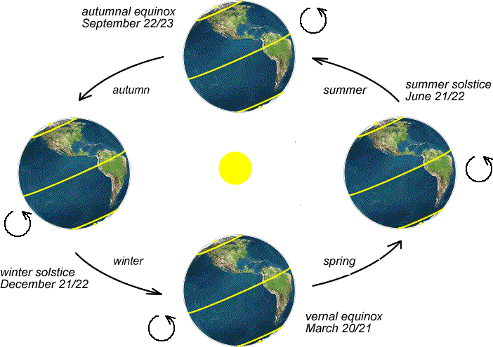
Think About It...
Do these maps make sense? Think about what the weather is like in December. Do you think your hometown gets more or less direct solar radiation during that month?
For now, we will focus on the annual averages to smooth out these seasonal variations. Still, we’ll return to the concepts of summer and winter and their importance for describing the temporal variations in climate later.
Fate of solar radiation striking the Earth
Since the sun is a constant emitter, the Earth is always receiving of energy at the top of the atmosphere. But why are we being so specific, saying the “top of the atmosphere” – that seems awfully suspicious. All that energy isn’t immediately transmitted straight to the surface – it can also be scattered or absorbed. So where does this energy go?
- About 30% is reflected back to space by air molecules, clouds, and the earth's surface. Note that I'm using the word “reflection” as a loose substitute for “back-scattering,” but there's a big difference between this loose use of “reflection” and the classic, pure interpretation of “reflection.” Pure reflection means that the angle at which radiation strikes an object must equal the angle at which the radiation is redirected from the object (think about how a billiard ball bounces off a bumper on a pool table).
- About 20% gets absorbed by clouds and atmospheric gases.
- Roughly 50% is transmitted and ultimately absorbed by the Earth's surface.

So, of the solar radiation reaching Earth's atmosphere, about 30% of it ends up back in space. It turns out we have a special name for the reflected portion -- albedo, which simply means striking some object that is ultimately not absorbed by it.
Albedo can vary between 0.0 and 1.0. An albedo close to 1.0 means almost 100% of the incoming solar energy is reflected away from the Earth system -- with respect to visible radiation, a mirror has an albedo close to 1.0. In contrast, an albedo close to 0.0 means almost all of it is being absorbed by the surface the radiation strikes. Think something matte black, like fresh asphalt.
On average, the Earth’s albedo is about 30 percent (0.3), but albedo over parts of the Earth varies greatly from location to location and time to time. Things that we consider “white” have high albedos. Two important surfaces that have high albedos are clouds and snow. Do you remember that sometimes your eyes hurt when walking outside on a sunny day after a fresh snowfall? Since snow has a high albedo, solar radiation is being reflected back towards your eyes, effectively giving you a “double whammy” of brightness – the sunlight coming down and the reflected radiation back up. Not a bad idea to keep those sunglasses handy in your glove box! On the other hand, surfaces like asphalt parking lots, forests, or ocean water tend to have low albedos because they don't reflect much of the solar radiation that strikes them. This is why it’s not pleasant to walk on asphalt on a sunny summer day.

Check out the map below, which shows the January surface albedo over the globe. For this figure, clouds have been removed – more on that in a second -- we are only considering the probability of sunlight being reflected at the surface on a sunny day. At high latitudes in the winter hemisphere (northern North America and Eurasia) albedo values are high, owing to snow and ice on the ground. The same holds for mountainous areas like parts of the Rocky Mountains, the Alps, and the Himalayas.

But wait a minute, why does Northern Africa have a similar albedo to the snowy high latitudes? Can you think of a major geographic feature in that area? Northern Africa is broadly covered by the Saharan Desert, which is generally devoid of large areas of water or vegetation. But sand is (perhaps somewhat surprisingly to you) a highly reflective surface for shortwave radiation from the sun. Next time you are at a large, sandy, beach, try and see whether you need your sunglasses more when compared to if you were walking in a grassy field or a forest nearby. You’ll find that your eyes behave very similarly to being over a snowy surface, and you’ll be squinting more when sitting in your lounge chair with your toes in the sand!
Now you may say, “Wait, if the sand in the Sahara reflects so much radiation, why is it so hot there?” That’s an excellent question, and we’ll answer that question in a few lectures – it’s the atmospheric circulation that plays a key role.

Quiz Yourself...
Clouds
CloudsPrioritize...
By the end of this page, you should be able to:
- Describe the basic process of cloud formation.
- List the three properties of a cloud important to determining its albedo.
Read...
In the last section, we said that white surfaces are key reflectors of solar radiation. In fact, we called out two particular surfaces, snow and clouds. While snow is generally seasonal and restricted to specific geographic regions, clouds are ubiquitous in our atmosphere. Check out the global satellite image below, it’s very rare to find spots on the Earth where there are no clouds nearby, and it’s even rarer for the sunny skies to remain day after day.
As you probably know from a previous science class, clouds are just condensed water. A simple explanation is that clouds are formed when warm, moist air rises and cools, causing water vapor to change from a gas to either a liquid or solid state.
As the moist, warm air containing water vapor rises, it cools down due to the decreasing air pressure at higher altitudes. As the air cools, it reaches a critical temperature called the dew point. The dew point is the temperature at which the air becomes saturated with moisture, meaning it can no longer hold all the water vapor in a gaseous state. When the air reaches its dew point, it becomes "saturated" with water vapor, and any additional moisture will condense into tiny water droplets or ice crystals, depending on the temperature. In most cases, air alone is not enough to initiate condensation. Tiny particles and aerosols in the atmosphere called condensation nuclei or cloud seeds play a crucial role. These particles can include dust, pollen, salt particles, and other atmospheric impurities. Water vapor condenses around these particles to form small water droplets. Once condensation begins around the condensation nuclei, it results in the formation of countless tiny water droplets or ice crystals (depending on the altitude where they are at and whether the temperature is broadly above or below freezing) suspended in the air. Collectively, these suspended water droplets or ice crystals form what we see as clouds.
Clouds can vary in appearance, shape, and altitude depending on factors such as temperature, humidity, and atmospheric conditions. They will be important in the context of the water cycle, which we’ll talk about soon, but it’s important to understand that this diversity in cloud properties can have a big role on their albedo and how much energy they scatter and absorb. Think about very thin wispy clouds you may see on a fair, otherwise sunny day. These are cirrus clouds which are made of ice crystals that are 100−200 µm in size and about 30,000 ice crystals per cubic meter (i.e., if you had a box that was one meter for each dimension, you’d have about 30,000 ice crystals in that box inside a cirrus cloud). This makes these types of clouds very transparent to sunlight – they don’t put up much of a fight when confronted with solar beams!

Conversely, we can have clouds that appear whiter in the sky. For example, cumulus clouds can also occur during general fair weather, but they are far more noticeable to you and me. That is because they are composed of water droplets that are roughly 10 microns in size. Wait, that is much smaller (by a factor of 10-20x!) than the cirrus clouds particles. How are cumulus clouds more “reflective” than cirrus clouds? The answer lies in the density of droplets that exist within that hypothetical one cubic meter box. The average cumulus cloud has somewhere around 65 million droplets per cubic meter! That high density of cloud particles makes it far more likely for sunlight to be reflected than if it was passing through a cirrus cloud. Now it makes sense when you climb through a cloud deck on your way out of an airport, and you suddenly can’t see anything but white outside your window.

So, the albedo of a cloud essentially depends on three things
- Mass of water in the cloud
- Droplet size
- Thickness of cloud
Numbers 1 and 2 are closely linked to the droplet density we discussed above. If we have a cloud with a lot of water and very small particles, it means a high number concentration, which reflects sunlight easily. On the other hand, a cloud with just a little bit of water tied up in big particles is relatively transparent to solar radiation. We didn’t talk about #3, but it’s pretty logical – if I take two of the same cloud and stack them right on top of one another, the thicker one will do a better job preventing radiation from being transmitted.
Now, we just talked about two types of clouds here, but there is a tremendous diversity of different cloud types we can’t cover in this class.
Quiz Yourself...
Budgets and Composition
Budgets and CompositionPrioritize...
After you've completed this section, you should be able to
- Describe how the Earth's energy budget is a balance between energy in and energy out
- List Earth's most abundant gases and be able to rank them.
Read...
Understanding the global climate system often involves thinking in terms of “budgets.” Traditionally, we've used the analogy of a checkbook to explain budgets, but in today's digital age, online bank accounts serve as a more relevant comparison. Imagine you have a certain amount of money saved up, let's say $1,000, in your bank account; this is your account balance. Now, there are two crucial aspects we need to consider: inflows and outflows. Inflows represent money being added to the bank account, while outflows represent money being withdrawn from it – a logical concept. To maintain a constant balance, your net inflow and net outflow should be equal, in other words, money in should equal money out.
The energy within the Earth’s climate system follows a similar principle. It's essential to remember that temperature is strongly connected to energy. Over the years, we've noticed that the average weather experienced in any given location on Earth remains relatively consistent in the long term – this is what we call climate. This consistency suggests that, to maintain global energy balance, the Earth must radiate longwave energy to space at the same rate that it receives shortwave energy from the sun!
Remember, the Stefan-Boltzmann Law tells us that *any* body with a temperature greater than zero must be emitting some energy. Given this, we can estimate Earth's global temperature using the information about solar radiation from the previous section and the Stefan-Boltzmann law within this straightforward in = out framework. Most of the energy entering the Earth's system comes from the sun. We've defined a solar constant () and explained that, in reality, this number gets divided by a factor of 4 when it's distributed across the entire surface of the Earth. Additionally, we've determined that Earth's albedo, representing the reflected energy, is approximately 30%. This means that only about 70% of the incoming radiation is absorbed by the planet, while the rest is reflected back into space. So, let's perform a simple calculation:
Therefore, when we average this value across the entire Earth, every square meter of the planet absorbs 239 Joules every second from the sun. That's a substantial amount of energy! A Tesla can go about 350 miles with about 8,000 W – think about this, if we managed to cover the playing field at Beaver Stadium (18,000 square meters) with perfect solar panels that took every bit of incoming solar energy and converted it to electricity, we could fully charge over 32,000 Teslas every single minute! This hopefully gives some indication why solar energy is considered such a promising renewable energy source.
This represents our energy input, but we also need to account for energy output. As mentioned earlier, the Stefan-Boltzmann Law relates the energy radiated from a black body in space to its temperature. To offset the incoming solar energy, Earth must radiate back into space. Without delving into too many details, we can use a simple equation to calculate this – don’t worry, I won’t make you solve it! The mathematical expression of Stefan-Boltzmann's law is as follows:
Here, E represents the emitted energy, T denotes the temperature, and σ is a constant (interestingly named the Stefan-Boltzmann constant). One thing it tells us is that as T goes up, E must also go up by some amount – we’ve already discussed that before. But if we rearrange the equation and solve for T, we can estimate the temperature Earth needs to have in order to radiate at and achieve our in = out balance. This is referred to as Earth's “emission temperature,” or in simpler terms, what an alien observer in outer space would measure with a thermometer pointed at Earth. If you're interested, feel free to use your calculators to verify, but the temperature comes out to be around 255 Kelvin. In more familiar units, this is equivalent to -18 °C or 0 °F. Quite chilly! We have satellites in space, and they corroborate this temperature as the overall emission temperature for Earth – fascinating, isn't it?
However, 0 °F is exceptionally cold! While certain regions on Earth can experience such cold temperatures occasionally, the average surface temperature of our planet is significantly warmer. Observations indicate that our global mean surface temperature is closer to 290 K (16.8 °C or 62 °F). This apparent disparity raises a crucial question: why is our planet's surface warmer than its emission temperature of longwave radiation to space? The answer lies in our atmosphere, which envelops our planet and makes the surface much more hospitable, given the input of solar energy. Continue reading to unravel this fascinating phenomenon.
Atmospheric composition
Before we explain why the Earth’s surface temperature is what it is, we need to briefly discuss the composition of the atmosphere. Obviously, the air we breathe is critical for our survival, but it's actually a mixture of many different types of molecules. Some of the gases are “permanent,” meaning that their concentrations are basically constant. Other gases are “variable,” meaning that their concentrations vary from time to time and place to place. I've summarized the gases that comprise our atmosphere and their concentrations in the table below:
| Permanent Gases | Variable Gases | ||
|---|---|---|---|
| Gas (Symbol) | Percent (by volume of dry air) | Gas (Symbol) | Percent (by volume) |
| Nitrogen (N2) | 78.08 | Water Vapor (H2O) | 0 to 4 |
| Oxygen (O2) | 20.95 | Carbon Dioxide (CO2) | about 0.041 |
| Argon (Ar) | 0.93 | Methane (CH4) | about 0.00018 |
| Neon (Ne) | 0.0018 | Nitrous Oxide (N2O) | about 0.00003 |
What are the big takeaways? First of all, even though we need to breathe oxygen to survive, oxygen is not the most abundant gas in the atmosphere. Nitrogen is, by far. There's nearly four times as much nitrogen as there is oxygen. However, nitrogen and oxygen, combined, account for roughly 99% of “dry air” in the atmosphere, so they're the “big two” in terms of total concentration. For every million molecules of air you breathe in, 990,000 of them are nitrogen and oxygen.
Of course, air isn't perfectly “dry.” Water vapor also exists in our atmosphere, but note that the concentration of water vapor is rather small and is variable (it varies from 0 to 4 percent). Furthermore, while you might hear a lot about carbon dioxide in the news because of its connection to climate change, it only accounts for about 0.041 percent of the atmosphere. Surprised? Give me a second, because we’ll talk about why it’s still important in a minute.
Quiz Yourself...
The "Greenhouse Effect” and our Final Energy Budget
The "Greenhouse Effect” and our Final Energy BudgetPrioritize...
Once you've completed this page, you should be able to
- discuss the so-called “greenhouse effect,” and the “greenhouse gases” that contribute to it, as well as its importance for life on Earth.
- describe the connection between the greenhouse effect and global warming, and make a distinction between the two.
Read...
So, we have this fundamental gap – out in space the Earth appears like it’s roughly 0F, but we know from living on the surface it’s generally warmer. Why? Well, recall that Planck’s Law told us that every piece of matter is emitting some form of energy. And the air molecules in our atmosphere are just that – it’s matter that can absorb and emit radiation itself. How does that help keep the surface temperature at a more comfortable level?
As you've learned, the earth's peak emission occurs at infrared wavelengths (from Wien's Law), so what happens to that radiation after it's emitted upward from the surface? Does it all go right to space? The answer is no; some is absorbed by air molecules, in particular, so-called “greenhouse gases,” such as water vapor, carbon dioxide, methane, and nitrous oxide. Note that I haven’t listed the oxygen and nitrogen discussed earlier – they are inefficient absorbers of longwave radiation and are quite happy to let that energy go back to space, not unlike how a clean window is quite happy to let shortwave radiation from the sun pass right through.
However, greenhouse gases are unique because they are a set of molecules that readily absorb longwave radiation that is emitted from the Earth. Of the greenhouse gases that exist within our atmosphere, water vapor is far and away the most abundant, followed by carbon dioxide (although recall that in the overall scheme of the atmosphere, these are trace gases – the percentages are very small). It turns out that some of the wavelengths that carbon dioxide and water vapor absorb readily (particularly those around 15 microns and a little larger) coincide with the wavelengths of Earth's peak emission.
Below is a chart of the absorption spectra of these “radiatively active gases” along with the atmosphere as a whole in the last row. Remember that shortwave radiation is anywhere between 0.1 and 1 µm. What this graph is showing us is that there is really not too much absorption in these wavelengths, so a lot of the curves are closer to zero than they are to one. The big exception is the third row, which is oxygen O2, and ozone O3. Ozone is the molecule in our atmosphere that most effectively absorbs shortwave radiation from the sun. This is actually a very important protectant for life on earth. Without ozone, a great deal of high intensity, ultraviolet (shortwave) radiation emitted by the sun would reach the surface, leading to far more frequent sunburns and skin cancer rates than seen today. We’ll talk about the ozone hole that formed a few decades ago and policies to protect our ozone layer later in the class.

Now focus on longer wavelengths, everything to the right of 1 µm. We see that all these gases (starting from the top, methane, nitrous oxide, ozone, carbon dioxide, and water vapor) all do some sort of absorbing in these wavelengths. That means, as the Earth emits these long wavelengths from the surface upwards, a select group of molecules in the atmosphere absorb some of this energy. But the molecules also must emit at these wavelengths – some of it is emitted upwards (towards space as before) but some of it is emitted downwards, back towards us at the surface. In fact, this downward emission is typically termed “down welling longwave” since it’s the terrestrial radiation that is emitted from the atmosphere back towards the surface of the Earth.
The fact that greenhouse gases absorb and emit infrared radiation so readily works out very well for humans. The very existence of these gases in our atmosphere is the key difference in why the Earth’s surface is actually that 62F number we discussed earlier versus the 0F we estimated it would be if there were no gases at all! So aside from all the oxygen we breathe, we can also thank our atmospheric blanket for making sure we don’t live in a total icebox!
The contributions of down welling IR from greenhouse gases to warming the planet is called the greenhouse effect. It is critically important to note that these gases are part of the natural Earth system – we’ll talk about human-induced global warming later, but it’s the increase in these greenhouse gases that is concerning, not their existence themselves!
Now we finally have all the pieces to explain the large-scale energy budget of the earth. When we average over the entire surface of the Earth, the sun provides approximately 340 W/m2 of incoming energy. Approximately 1/3 of that is reflected by either clouds or the surface back to space, thanks to our planetary albedo. Of the 2/3 left over (), is absorbed by the atmosphere on the way down (primarily the ozone we discussed earlier), and is absorbed by the surface. Most of the energy associated with the solar radiation absorbed in the surface is subsequently re-emitted by the surface as long wave radiation upwards into the atmosphere, although some of it also leaves the surface via other heat fluxes. Of the energy emitted by the surface, only approximately 5% of it makes it directly to space, with the other 95% being absorbed somewhere in the atmosphere, thereby changing atmospheric temperatures throughout. At the same time, all of the atmospheric volumes absorbing radiation from the surface are also emitting radiation according to their own temperatures. Eventually, the atmosphere exhausts to space via emission from gas molecules. When combined with the making it straight through, through to space from the surface, a total of 239 W / m2 is emitted to space as longwave radiation. This is quite close to the that comes into the Earth system from the sun and is absorbed by the Earth system!

Checkout this video (4:07 minutes) for a walkthrough of the energy flow diagram.
Walkthrough of the Energy Flow Diagram
Proffessor Colin Zarzycki: Let’s take a look at this energy budget in a little more detail. When we account for the curvature of the Earth, we get 340 watts per meter squared that is coming down from the sun. We know that before any of that energy is actually absorbed by material in the Earth system, a large fraction of it is reflected back to space. In fact, 100 watts per meter squared, and note that 100 watts per meter squared is approximately 29% of 340. This is our planetary albedo.
Now, of that radiation that is reflected back to space, 75 watts per meter squared are reflected by clouds, and 25 watts per meter squared are reflected by the Earth’s surface. Now, if you do 340 minus 100, that gives us 240 watts per meter squared. That’s the amount of energy from the sun that must be absorbed by components in the Earth system. 80 watts per meter squared are absorbed directly in the atmosphere, and 160 watts per meter squared are absorbed by the surface.
So now we know that we have 240 watts per meter squared of energy that is absorbed by the Earth system. Where does that energy go? Well, we can look at the surface energy budget. So remember, in accordance with Stefan-Boltzmann law, anything that has a nonzero temperature—thankfully, everything on Earth—is emitting some form of longwave radiation. So the Earth is constantly emitting radiation in the form of things like thermals. This is kind of sensible heat, heat that is directly being transmitted to the atmosphere. We also have evapotranspiration, so heat that is associated with things like the phase changes of water.
We’ll talk a little bit more about this, but the vast majority of energy that is emitted from the surface is longwave infrared energy that is emitted again in accordance with Stefan-Boltzmann law. Of that 396 watts per meter squared, 20 of it goes to space, but 376 watts per meter squared are actually absorbed in the atmosphere. And that atmosphere is allowed to then emit radiation both upward and downward. In fact, this back radiation back to the surface that the atmosphere is constantly emitting, again because it is a nonzero temperature, is what leads to the greenhouse effect that we discussed. This keeps our planet at a warmer temperature than we would expect just based on the total amount of solar energy in and the amount of energy out.
Now, the atmosphere itself at the end of the day is going to emit 219 watts per meter squared. And so when you combine 219 plus the 20 watts per meter squared that are emitted directly from the surface to space, you get a total outgoing longwave radiation at the top of the atmosphere of 239 watts per meter squared. This is almost exactly the same as the 240 watts per meter squared that we’re bringing in. So why is it off by this small amount? Well, there’s this one little arrow that we’re going to talk about later in the semester with regard to additional energy that is trapped or put into the system. But otherwise, you’ve now been able to account for where energy is moving within the Earth system and how to balance the amount of energy coming in from the sun and the amount of energy that the Earth is giving off in terms of its longwave radiation.
Quiz Yourself…
Latitudinal Distribution of Solar, IR, and Net IR
Latitudinal Distribution of Solar, IR, and Net IRPrioritize…
After reading this section, you should be able to:
- Explain how the distribution of solar (shortwave) radiation varies globally
- Understand the distribution of longwave radiation emitted by Earth's surface and atmosphere
- Describe the concept of net radiation
Read...
One last point we should make about radiation – how it is distributed globally is going to be quite important in the rest of this course. That is, we’ve been treating the Earth as a giant box for the most part – energy comes in, energy goes out. And that’s not a bad way to look at things when we talk about the Earth as a whole. But when we want to learn more about why the Sahara is so hot, the Arctic is so cold, why Cancun is such a popular spring break destination and Nome, Alaska isn’t, we need to start thinking about how radiation varies across the planet.
Shortwave Radiation Distribution:
We’ve already talked about this previously, so I won’t belabor it, but recall that we have more solar insolation at lower latitudes than higher ones. This is a fundamental result of the planetary tilt and the fact that the Earth is a sphere. Solar radiation is most intense near the equator, where sunlight strikes the Earth nearly perpendicular to the surface. As we move towards higher latitudes, the same amount of solar energy is spread over a larger area, resulting in less intense solar radiation. Consequently, regions near the poles receive considerably less solar energy than equatorial regions.
Longwave Radiation Distribution:
On the other end of the spectrum (no pun intended!), we have longwave radiation, which is emitted by the Earth's surface and its atmosphere. Recall that the Stefan-Boltzmann Law tells us that this emission is a direct consequence of Earth system temperatures – the hotter something is, the more longwave radiation it emits, the cooler something is the less longwave radiation it emits. Just as with solar radiation, the distribution of emitted longwave radiation varies with latitude. Warmer equatorial regions emit more longwave radiation, while cooler polar regions emit less.
Net Infrared Radiation Distribution:
So it seems like all the energy is going into and out of the tropics! That is true; low latitudes are critical for acting as the bank tellers for most of the Earth’s incoming and outgoing radiation. However, another way to look at this is through net radiation. Climate scientists love to create budgets, and one thing we can look at is the amount of energy in versus the energy out at each latitude. We know that the answer must be zero for the Earth system as a whole, but that doesn’t mean it has to be zero everywhere on the planet.

Quiz Yourself...
Summary
SummaryRead…
- Energy is fundamental to understanding the climate system. It governs processes like movement, heat transfer, and changes in the Earth's atmosphere.
- Key principles: energy can be stored, transferred between objects, and transformed between different types like radiant, kinetic, gravitational potential, and internal energy.
- The First Law of Thermodynamics teaches us that energy is conserved — it can move around and change forms but cannot be created or destroyed.
- The Second Law of Thermodynamics explains how energy flows from hot to cold, increasing disorder (entropy) in the process.
- Radiant energy, especially from the sun, plays a central role in driving the Earth’s climate system, impacting how energy is stored, moved, and transformed on Earth.
- The Earth receives energy from the sun and radiates it back to space. This energy balance determines the planet's overall temperature and climate patterns.
- Greenhouse gases in the atmosphere both absorb and emit longwave radiation. The downward longwave radiation emitted by them helps to maintain a surface temperature much greater than the emission temperature of Earth, a phenomenon known as the greenhouse effect.
We also discussed how water vapor is the Earth's most abundant greenhouse gas. We also know from personal experience that water is critical to the climate. So, what role does water play, and how does it move around the climate system? Why are some regions dry and others wet? Next lesson, we'll cover that!
Quiz Yourself…
Lesson 4: The Role of Water in Climate
Lesson 4: The Role of Water in ClimateMotivate…

What would our world be like without water? Have you ever thought about what water, in all of its forms -- solid (ice), liquid, and gas (water vapor), contributes to the climate as we know it? Sure, water is responsible for obvious things like clouds and precipitation, but would we still have other types of “weather” (wind, temperature changes, etc.) without water? Why is the Sahara so dry but the Amazon rain forest so humid and lush?
In the upcoming pages, we’ll dive deep into one of the most crucial elements of the Earth’s climate system—water. Water is not only essential for life, but it also plays a pivotal role in shaping weather patterns, climate dynamics, and ecosystems. From the global water cycle to how water transitions between its various states, we’ll explore the energy and processes behind the movement of water in our atmosphere and on the Earth's surface. Understanding these processes will lay the foundation for grasping larger climate interactions, especially in the context of a warming world.
We’ll also address how changing water vapor content, especially in the atmosphere, influences extreme weather events like heavy rainfall. The lesson will guide you through key concepts like evaporation, condensation, and how water vapor interacts with temperature. You’ll learn how scientists measure and analyze water in the atmosphere, such as using relative humidity and dew point, and how these tools help us understand broader climate patterns. Ready to explore the intricacies of Earth’s most vital molecule? Let’s get started!
The Hydrologic Cycle
The Hydrologic CyclePrioritize...
When you're finished with this page, you should be able to:
- discuss the main components of the hydrologic cycle, especially the main mechanisms by which water enters and exits the atmosphere.
- define evaporation, condensation, transpiration, sublimation, and deposition
- provide a real-world example of how each can be observed.
Read...
An argument can be made that water is the single most important molecule on our planet. First and foremost, it is crucial for sustaining life – you and I literally can’t live without it! It’s also a critical part of our planet’s climate system. The role of water is evident in extreme weather events like seasonal floods and droughts, and it is vital for the health of natural ecosystems and human societies. It serves as a connecting medium among the primary components of the climate system. And it’s incredibly unique in that it’s one of only a handful of substances that exist in solid, liquid, and gaseous states within the Earth’s atmosphere (and on its surface) at any one time.
While you have certainly talked about the states of water somewhere before, let’s make sure we are all on the same page. It's important to understand that water can exist in three primary phases: solid, liquid, and gas. These phases refer to the physical state that water takes under different temperature and pressure conditions. Let's explore the three phases below.
Water, with its distinctive characteristics, is abundant on Earth. It's interesting to note that over two-thirds of our planet's surface is enveloped by water, predominantly over the oceans. In fact, oceans hold approximately 97% of Earth's water, amounting to an astonishing volume – over a billion cubic kilometers. The rest, a mere three percent, is distributed among the polar ice caps, various lakes, rivers, streams, and as groundwater, which is water contained within soil, sand, or rock crevices.
You’ll notice that I only mentioned water on the surface – notoriously absent was any discussion of the atmosphere. In fact, only a very tiny amount of water (by volume) exists in the atmosphere (about 0.03 percent), and nearly all of it exists as water vapor. Still, the small fraction that exists as water vapor in the atmosphere is enough to fuel all the extreme weather we observe on Earth, including tornadoes, hurricanes, and blizzards. What little water vapor exists in the atmosphere at any given moment doesn't last for long because water is regularly changing phases, and being exchanged between the surface and the atmosphere. Remember, water vapor is a variable gas, meaning that its concentration changes in time and space, from near zero to four percent of atmospheric gases (by volume). The possible paths that water can take as it changes phases and gets transported between the surface and the atmosphere make up the hydrologic cycle (or "water cycle"), a simplified version of which is shown in the graphic below.

Think About it!
Read...
Before we analyze the hydrologic cycle's components, we need to formally define some important processes. Water exists in these three states, and an individual water molecule frequently bounces between them -- in other words, it exists in different phases during its lifetime as a water molecule. The process of moving between these phases is known as a "phase change." For example, think about what happens when you take an ice cube out of the freezer and leave it on the counter. Over time, the ice melts into liquid water—that’s a phase change from solid to liquid. These transitions are not only fundamental to understanding how water behaves in different environments but also essential for grasping its role in the climate system. They affect things from weather patterns to life on Earth, influencing a wide range of natural processes.
I will assume you are already familiar with melting (where a solid changes to a liquid) and freezing (where a liquid changes to a solid). But the other transformations of interest are:
- Evaporation: The process by which liquid water changes to water vapor, as bonds between neighboring liquid water molecules break, and molecules escape to the air as water vapor. Watch vapor rise off asphalt after a mid-summer thunderstorm, and you are witnessing evaporation.
- Condensation: The process by which water vapor changes to liquid (the reverse of evaporation). Ever grab an ice-cold beverage out of the fridge and notice that water droplets grow on the outside of the bottle? That is water vapor from the air condensing on the bottle’s cold surface!
- Sublimation: the process by which ice changes directly to water vapor without becoming liquid first. This can be observed if you leave an ice cube tray in the freezer too long—eventually, there’s nothing left!
- Deposition: the process by which water vapor is deposited directly as ice. If you’ve ever seen cool (no pun intended!) frost patterns on a window first thing in the morning, you’ve observed deposition.


Remember, these are all “phase changes” where water in one phase is transformed into another through either the release or uptake of energy (more on that later). There is one more term we need to define, which isn’t technically a phase change, but is important for understanding how water on Earth’s surface can get moved into the atmosphere.
- Transpiration: The process by which plants release water vapor into the air (plants transport water from their roots to the leaves, where they "sweat," and the water evaporates into the air).
Movement of Water Through the Earth-atmosphere Cycle
Now that we understand these concepts, we can explore the movement of water through the Earth-atmosphere system. Water in its liquid form, found in lakes, streams, rivers, and oceans, evaporates into the atmosphere. This is supplemented by transpiration from plants and the evaporation of groundwater from soil, among other sources. As air ascends, some of the water vapor forms cloud droplets. When clouds become sufficiently dense, water returns to Earth as precipitation. Some of this water replenishes groundwater, while the rest flows into lakes, streams, rivers, and eventually back to the oceans, where it can evaporate again, continuing the cycle.
Evaporation is the primary way water vapor enters the atmosphere, with transpiration and sublimation contributing to a lesser extent. In the hydrologic cycle, the largest movements of water occur through evaporation and precipitation. The water quantity near the Earth's surface remains fairly stable over short time spans (like a year), indicating that global precipitation is approximately equal to global evaporation. We'll cover this in more detail in a little while.
Interestingly, once water vapor enters the atmosphere, it doesn't linger there for long. On average, it takes about 11 days for a water molecule to evaporate (or enter via transpiration or sublimation), condense into a cloud, and return to Earth as precipitation. However, water stays much longer in its liquid or solid state on Earth. A water molecule in the ocean typically remains for about 2,800 years before evaporating, and one in a glacier might stay frozen for tens of thousands of years.
This explains why a relatively small amount of water in the Earth-atmosphere system exists as water vapor: it spends a brief period in the atmosphere before returning to the Earth. Most of the water is found in oceans or ice sheets, as water molecules reside there for extended periods before evaporating. Despite this, the small fraction of water that cycles through the atmosphere as water vapor and then as precipitation significantly influences the weather. Therefore, understanding the phase changes of water, especially evaporation and condensation, is crucial in the hydrologic cycle. Let's delve deeper into these phase changes in the following sections.
Quiz Yourself...
A Closer Look at Phase Changes
A Closer Look at Phase ChangesPrioritize…
When you've finished this page, you should be able to:
- describe the processes of evaporation and condensation, and give an example of evaporation and condensation in the real world.
- explain how phase changes require energy (evaporation absorbs heat; condensation releases heat), as well as how/why these processes impact temperature.
Read…
Since evaporation and condensation are such important phase changes for water day-to-day in the climate system, they deserve more of our attention. We defined them in the previous section, but now, let’s look closer at how these processes work.
Evaporation is when liquid water molecules break their bonds with neighboring molecules and transform into water vapor. You might recognize it as a natural cooling mechanism from sweating on a hot summer day as your body's way of regulating temperature. But what exactly causes this cooling effect?
Firstly, it's essential to understand that water molecules with the highest kinetic energy, those with the fastest vibrations, are the most likely to break their bonds with neighboring molecules and transition into vapor. Remember, the kinetic energy of a group of molecules is directly related to the material’s temperature. Kinetic energy refers to the speed at which molecules, or their constituents in a vibration, move. The faster they move, the higher the temperature. This removal of high energy water molecules during evaporation reduces the average kinetic energy of the remaining liquid water because the most energetic molecules have gone off and transformed into vapor. Since the most energetic molecules are gone, we are left with molecules not moving quite as fast. This reduction in kinetic energy leads to a decrease in the remaining water's temperature.
Secondly, the process of breaking bonds between liquid water molecules requires energy. Where does this energy come from? The surrounding air! Simply put, as water evaporates, it extracts kinetic energy from its surroundings, including the air. So it’s a bit of a double whammy -- both the fact that high-energy molecules leave less energetic (somewhat cooler) water behind and that evaporation “steals” energy from the air -- that overall gives us cooling during evaporative processes.
As water evaporates from your skin, it feels cooler, right? That's because the fastest-moving water molecules (the ones with the most energy) are 'jumping' off into the air, taking energy with them. Meanwhile, the water molecules left on your skin are slower-moving and less energetic, corresponding to a lower temperature. Or think about mist rising off a swimming pool on a warm day. That mist is water evaporating into the air and then condensing into small droplets, carrying energy away from the pool and cooling the surface in the process.
Overall, water’s phase changes involve either absorbing kinetic energy from or releasing kinetic energy to the surrounding environment, as demonstrated in the “energy staircase” diagram for ice, water, and water vapor below. While this diagram encompasses all possible phase changes of water, our primary focus will be on two of particular interest: evaporation and condensation.
Starting with liquid water, a select group of highly energetic water molecules can gradually break their bonds with neighboring molecules and transition to the vapor phase over time. To accomplish this transition, a specific amount of energy is necessary – 600 calories from every gram to move from the “liquid” stair to the “vapor” stair. This energy input is required to break all the bonds and facilitate the rapid transformation of all the water into the gaseous state of water vapor, representing the highest energy step. This process, in turn, leads to a cooling effect on the surrounding air.

So, if evaporation is a cooling process, what about its reverse -- condensation (the process by which water vapor changes to liquid)? When water vapor condenses back into water, there's a step-down in energy levels, so if you think condensation is a warming process… well, you're correct! Indeed, the energy used to evaporate water in the first place is never lost (a consequence of the conservation of energy), so as water vapor condenses into liquid water and bonds form between molecules, energy is released (600 calories per gram -- identical to the amount required for evaporation) to keep the energy books balanced. The release of this energy, called “latent heat of condensation,” warms up the surrounding air. In a way, you can think of condensation like a campfire. As the wood burns, it releases heat, warming up the surrounding air. Similarly, when water vapor condenses into a liquid, the energy that was used to evaporate it is now released back into the environment, warming it up.
So, any time a phase change (such as evaporation) causes water to go “up the energy staircase,” energy is required to break bonds between molecules (just as climbing requires effort), which cools the surrounding air. Any time a phase change (such as condensation) causes water to go “down the energy staircase,” energy is released -- after all, it is much easier to go downstairs! This warms up the surrounding air.
Quiz Yourself…
The warming that occurs with condensation is not easily noticeable to humans, but I bet you've noticed the impacts of evaporational cooling. When you step out of the shower, you sometimes feel a chill as the water evaporates off your skin, even in a warm room. Now you know that the cooling sensation directly results from evaporation pulling energy away from your body.
It's intriguing to realize that evaporation and condensation continually unfold in your surroundings, if their effects remain imperceptible at the macroscopic level. These dynamic processes operate on the molecular scale. Observable phase changes become apparent when there is a “net” condensation event, signifying that the rate of condensation surpasses that of evaporation, resulting in the formation of liquid water droplets. Conversely, when “net” evaporation occurs (assuming an initial presence of liquid water), it implies that the evaporation rate exceeds the condensation rate. A notable instance of net evaporation can be witnessed during the descent of raindrops. In this scenario, small raindrops diminish or completely vanish as the rate of evaporation outpaces that of condensation.
One last thing I want you to take home -- phase changes of water are critical for energy. Water can store energy and give off energy through these transitions. If water vapor moves around (for example, moist air from the Gulf of Mexico traversing up to New England it eventually rains out), it acts as a powerful transporter of energy! Water's ability to transport energy through phase changes is essential not only for weather but also for large-scale climate patterns. For example, as water evaporates over the warm oceans, it transforms kinetic energy into potential energy between the water vapor molecules that is carried up into the atmosphere. Winds can then move this water vapor and the potential energy associated with it across continents. When the water vapor eventually condenses to form liquid drops and precipitation, the potential energy between water molecules is transformed to kinetic energy and the environment warms up. We'll talk more about this soon!
Evaporation Rates, Condensation Rates, and Relative Humidity
Evaporation Rates, Condensation Rates, and Relative HumidityPrioritize…
After completing this page, you should be able to:
- discuss the controllers of evaporation rates and condensation rates.
- define and discuss relative humidity in terms of evaporation rates and condensation rates
- discuss the state of equilibrium.
Read…
In the preceding section, I made what perhaps can be considered a somewhat surprising assertion: evaporation and condensation are ongoing processes that happen constantly in your surroundings! However, these processes often go unnoticed because they occur at the molecular level, making their results imperceptible to the naked eye. Observable phase changes occur under specific conditions when there is either a “net” condensation or a “net” evaporation, provided there is an initial presence of liquid water.
Net Condensation and Net Evaporation
“Net” condensation refers to a situation where the rate of condensation surpasses that of evaporation, resulting in the formation of liquid water droplets. Remember our cold drink bottle from a warm day? Conversely, when starting with liquid water, “net” evaporation occurs when the evaporation rate exceeds the condensation rate – water rising off a wet roadway after our summer thunderstorm leaves and is replaced by sunny skies. This leads to the shrinking or complete disappearance of liquid water droplets and the drying up of puddles on the ground.
The concepts of “net” evaporation and “net” condensation hold significant importance for climate scientists, particularly in their implications for cloud and precipitation formation, as well as the evaporation of precipitation, which contributes to evaporational cooling and the movement of water in the climate system. To better understand these processes, let’s explore what controls the evaporation rate (how many water molecules become vapor) and the condensation rate (how many vapor molecules turn back into liquid).
To begin, it's essential to understand that the bonds holding water molecules together in the liquid phase are relatively weak in the grand scheme of things – that is why water can so easily change shape, whether in a glass or poured out onto a counter. Consequently, occasional natural vibrations of water molecules can break these bonds, resulting in evaporation. As you may already know, temperature directly influences molecular vibrations: the higher the temperature, the greater amount of energy contained within vibrating molecules. Consequently, liquid water molecules are more likely to break free from their neighboring molecules and transition into water vapor at higher temperatures. Therefore, water temperature plays a pivotal role in regulating the rate of evaporation. Lower water temperatures lead to diminished evaporation rates, whereas higher water temperatures result in increased evaporation rates. Cool water = slow evaporation, warm water = fast evaporation!
Condensation Rates
Now, let's turn our attention to the factors affecting the condensation rate. Let's conduct a simple experiment to explore what determines condensation rate. Begin with a sealed, empty container containing dry air (in other words, no water vapor molecules). Now, let's pour some liquid water into the container and observe the ensuing processes. Over time, water molecules break their molecular bonds with neighboring water molecules and evaporate into the airspace above the water, gradually increasing the concentration of water vapor molecules in that space. As time progresses and more water molecules enter the vapor phase above the water surface, some water vapor molecules will randomly come into contact with the interface between the liquid water and the air above, causing them to condense back into a liquid state.

Initially, the condensation rate is low because only a few water vapor molecules are present, and the probability that any of them will come in contact with the interface between air and water is low. In fact, the evaporation rate far exceeds the condensation rate early on (net evaporation occurs). But, as time goes on and net evaporation continues, the air above the water contains an increasing number of water vapor molecules. As the number of water vapor molecules increases, the chance of a water vapor molecule contacting the interface between air and water and condensing back into liquid also increases, which translates to an increase in the condensation rate.
So, as the number of water vapor molecules increases in the air above the water, the condensation rate increases, too. The condensation rate will continue to increase until it matches the evaporation rate. This is a state called equilibrium, meaning the condensation rate equals the evaporation rate. At equilibrium, the temperature of the remaining water is lower than that at the start of the experiment. That's because That's because kinetic energy was consumed in moving water molecules from the liquid to gas phase during evaporation, thereby lowering the average kinetic energy (in other words, the temperature) of the water left behind. Moreover, the temperature of the remaining water equals the temperature of the “air” above the water. This means that the energy exchange between the water and the air has balanced out. This state of equilibrium, where the condensation rate equals the evaporation rate, is depicted on the left below.

What happens if we take our container in equilibrium and increase the temperature (depicted on the right above)? The increase in water temperature causes the evaporation rate to increase, and, for a time, net evaporation occurs. But, with increased evaporation, more water molecules exist in the air above the water, increasing the condensation rate! The condensation rate again increases until it equals the evaporation rate, and a new equilibrium is achieved (with greater evaporation rates and condensation rates than the original equilibrium, shown above on the right).
Relative humidity (RH) is equal to the condensation rate divided by the evaporation rate, multiplied by 100 percent.
How do evaporation rates and condensation rates relate to climate?
Well, they're the basis for a variable that perhaps you are familiar with -- relative humidity. Although you may have heard the term “relative humidity” before, you may not know what it's really telling you. For starters, relative humidity is the rate of condensation divided by the rate of evaporation, multiplied by 100 percent (shown on the right). Relative humidity usually ranges from just a few percent (when the evaporation rate is much larger than the condensation rate) to 100 percent, which occurs at equilibrium. Note: 100 percent is not the absolute upper limit of relative humidity because, in reality, the condensation rate sometimes exceeds the evaporation rate slightly (that's how water droplets grow). But that's just a fun fact for you.
What does relative humidity tell us? It tells us how close the condensation rate is to the evaporation rate. As relative humidity nears 100 percent, the condensation rate nears the evaporation rate. Low relative humidity values mean that the evaporation rate greatly exceeds the condensation rate. But, because relative humidity depends on the evaporation rate, which depends on temperature, relative humidity doesn't tell us how much water vapor is present in the air. For example, the relative humidity is 100 percent in both stages of our experiment above in which the condensation rate equals the evaporation rate (equilibrium), but more water vapor molecules are present in the state of equilibrium after we've increased the temperature. By itself, relative humidity is also not a good indicator of how muggy or humid the air feels to most humans. You can have 95% relative humidity in Alaska and 95% relative humidity in Hawaii and feel much (MUCH) different!
In practice, we can't calculate relative humidity using the equation above because we can't easily determine the evaporation and condensation rates at any given time. However, we can relate evaporation and condensation rates to weather variables we can measure easily. Since we know that the condensation rate is controlled by the amount of water vapor present, and we use dew points to assess the amount of water vapor present, it stands to reason that condensation rates are connected to dew points. Indeed, higher dew points yield higher condensation rates. Meanwhile, temperature controls evaporation rates (higher temperatures yield higher evaporation rates), so relative humidity depends on dew point (which reflects the amount of water vapor present) and temperature. I should point out, however, that we can't just substitute dew point and temperature into the equation for relative humidity above and do a simple calculation. The mathematical connections between condensation rates and dew point, as well as evaporation rates and temperature, are too complex for that and are beyond the scope of this course. Still, understanding the basic connections between temperature and evaporation rates, and dew point and condensation rates leads us to the following important lesson learned:
Lesson Learned
When the evaporation rate is much larger than the condensation rate, there's a large difference between temperature and dew point, and relative humidity is low. When the evaporation rate and condensation rate are similar, there's a small difference between temperature and dew point, and relative humidity is high.
Important Applications
This lesson has many important applications in understanding broader climate processes. For example, evaporational cooling plays a crucial role in regulating surface and atmospheric temperatures, particularly in regions with high evaporation rates, such as coastal areas and deserts. When there's a large difference between temperature and dew point, the rate of evaporation greatly exceeds the rate of condensation, resulting in significant cooling. Over time, this cooling affects local climate patterns, influencing everything from vegetation types to the intensity of heat waves and drought conditions.
These concepts are also vital for understanding long-term cloud formation patterns and the role of clouds in the climate system (net condensation). Later in the course, we’ll examine how changes in global evaporation and condensation rates, driven by increasing temperatures, influence cloud coverage and precipitation patterns over decades. You may have heard the misconception that “clouds form because cold air can't hold as much water vapor as warm air,” but in reality, it all comes down to the balance between evaporation and condensation rates, which are impacted by the warming climate.
Quiz Yourself...
What To Do With Dew Points
What To Do With Dew PointsPrioritize…
After this section, you should be able to
- define and interpret dew point temperature in terms of condensation rates and measuring the amount of water vapor present,
- explain what the Clausius-Clapeyron relationship is and how water vapor in the air is tied to temperature
- sketch a distribution of precipitable water across Earth's latitudes with the knowledge that polar regions are cool and equatorial regions are warm
Read…
So far, we have primarily focused on the interplay between evaporation rates, condensation rates, and the concept of net condensation and net evaporation. However, let's shift our attention to essential moisture variables - specifically, dew point and relative humidity.
Dew Point
To begin, let’s define the “dew point temperature” – you have probably encountered this term when watching a local weather forecast on TV. It represents the approximate temperature at which the water vapor in the air must cool (at constant pressure) to condense into liquid water droplets. Remember, the phase transition between liquid water and water vapor (and vice versa) is associated with a certain amount of energy and energy is tied to temperature. So, cooling a parcel of air that contains water vapor will eventually induce a phase transition of the water to liquid. This relationship is governed by something known as the Clausius-Clapeyron relationship, which tells us that as the temperature increases, the maximum amount of water vapor the air can contain at equilibrium at a given temperature also increases. Therefore, the dew point temperature serves as an absolute measure of the amount of water vapor present. In simple terms, a higher dew point indicates a greater concentration of water vapor molecules in the air, whereas a lower dew point signifies fewer water vapor molecules.
The Clausius-Clapeyron Relationship
The Clausius-Clapeyron relationship underlines the crucial role of temperature in controlling moisture in the atmosphere. It is one of the single most important principles in climate science! As temperatures rise, the air can hold more gaseous water vapor (see my sidebar below). Consequently, when dew points are higher, the air can support a more significant quantity of water vapor. This elevates the likelihood of water vapor molecules condensing onto surfaces, resulting in higher condensation rates. Conversely, lower dew points indicate lower saturation-specific humidity levels, which translate to lower condensation rates. See the graphs below. The x-axis contains temperature, and the y-axis is a value called “equilibrium vapor pressure” – for our purposes, we can consider this the maximum amount of vapor a parcel of air can hold at that temperature before it must condense (or deposit in the case of ice). As we move from left to right on the bottom axis, we increase the temperature. We also see that as air gets warmer, the amount of water vapor it can hold prior to saturation increases.

To Put It Another Way…
The phrase “warmer air can hold more moisture” is a commonly used shorthand, but it’s not entirely accurate in the strict scientific sense. Here's the nuanced explanation:
When I said that “warmer air can hold more moisture,” I was referring to the fact that at higher temperatures, the evaporation rate increases, and the air can contain more water vapor before net condensation occurs. However, this doesn’t mean the air has a fixed capacity to “hold” water vapor like a sponge.
Instead, it’s all about the balance between evaporation and condensation rates:
At higher temperatures, water molecules move faster, which means more molecules stay in the vapor phase, increasing the amount of water vapor in the air without condensation occurring.
As the temperature increases, the rate of evaporation increases, so more water vapor can exist without forming liquid droplets. Still, the air isn't “holding” it—it's just that the higher energy of the water molecules prevents condensation from happening as quickly.
So, while warmer air does lead to more water vapor in the atmosphere, it's not because the air has some magical “holding capacity” for moisture, like a box that needs to be filled — it's because of the physics of evaporation and condensation rates that we just learned about.
In summary: Higher temperatures = higher evaporation rates, which means more water vapor can exist without condensation, but air doesn’t literally "hold” water vapor like a sponge. The phrase “warm air holds more moisture” is a convenient simplification -- and if that's the way you want to think about it, I think you'll be just fine, but now you know some more of the gory details!
Relative Humidity
While the dew point tells us something about the mass of water in the air, it doesn’t necessarily tell us how close we are to reaching the maximum amount of water vapor that air can hold. That is where relative humidity comes in. Although not an absolute measure of water vapor concentration, relative humidity is an exceptionally valuable variable when studying the atmosphere. As you have previously learned, it serves as a comparison between condensation rates and evaporation rates, expressed as a percentage. Relative humidity depends on both dew point and temperature, with the gap between these two variables influencing the outcome. A larger difference results in lower relative humidity, while a smaller difference yields higher relative humidity. When the condensation rate equals the evaporation rate at equilibrium (when the dew point equals the temperature), relative humidity reaches 100 percent.
So, the blue curve in our above graph shows “how much water vapor is held in a parcel of air when the relative humidity is 100 percent.” It also shows how much water vapor is in the atmosphere when the dew point temperature and temperature match – the further right you get on the curve, the further up the y-axis (water vapor) you go. You may have heard someone say at some point “warmer air can carry more moisture,” this is what they were referring to. Note, that’s a bit simplistic, the correct framing is “warmer air can hold more water vapor given the same relative humidity” but now you can tell them it’s thanks to this thing you learned about at Penn State called the Clausius-Clapeyron relationship!
As you see, dew points, temperature, and relative humidity are intimately connected atmospheric variables. Relative humidity depends on both the dew point and temperature. As the temperature nears the dew point, the evaporation, and condensation rates become increasingly similar, and relative humidity increases. On the other hand, if the difference between temperature and dew point grows, relative humidity decreases.
We’ll see that this relationship is very important in the climate system for determining where and how hard it rains and how our weather- particularly extreme precipitation- may change as our climate warms. We’ll talk more about this in the next chapter, but I want to leave you with one last piece of information that ties this together. All other things being equal, a warmer atmosphere can hold more water vapor. We also know that it is warmer near the equator than it is at the poles. So, if this is true, we should be able to look at a graph of water vapor as a function of latitude and see that it is highest where it is warmest. Do we see that?

Above is a zonally averaged graph (we talked about these earlier!) showing a variable called total precipitable water. Precipitable water is the amount of water vapor (remember, vapor = the gaseous form) above you if you were standing on a 1 square meter patch of Earth. We call it “precipitable water” because the idea is it’s the amount of vapor that could be converted to precipitation if we cool the atmosphere sufficiently to “wring” all the water out of it. It is indeed highest at the equator – warm areas have more water vapor in the atmosphere than cool areas. We’ll find that this will be important in the next chapter.
Quiz Yourself…
The Surface Water Budget
The Surface Water BudgetPrioritize…
When you’ve finished reading this page, you should be able to
- list the five terms in the surface water budget.
- define surface runoff.
- give at least one reason as to why the water storage term is important for local climate
Read…
Water is an important determinant of the local climate. We know Nevada can have temperatures similar to Florida's, but the characteristics of the plants that grow in both regions are wildly different! Why do we have rainforests in South America but a relatively arid climate in Australia?
Previously, we delved into the concept of budgets when examining the energy dynamics of our planet. Budgets serve as valuable tools because they help us comprehend that certain variables, like energy, cannot be created or destroyed within a closed system. Instead, they shed light on how these elements are redistributed within the system—in our case, within the intricate framework of our climate system.
Water Budget: Key Components
To gain insights into how local climates are sustained, we can employ a local surface water budget for water. Imagine delineating a square area on a patch of ground in a park. We can assess the water budget of that square using four key components. Each component of the water budget represents a different way water can enter or leave our defined patch.
- Precipitation (P) – This includes any form of water (liquid or solid) that descends from the atmosphere onto our defined patch.
- Dewfall (or frost) (D) – This encompasses water vapor that condenses or is deposited directly onto our patch.
- Evaporation + transpiration (evapotranspiration) (E) – This refers to water leaving our patch, either through evaporation into the atmosphere or through release by plants.
- Horizontal “movement,” a.k.a. runoff () – This represents the lateral flow of water across the surface, exiting our square patch. A positive value indicates water moving away from our patch.
We can construct our water budget by simply adding these terms together:
Water Budget =
Water Budget Equation: Breakdown
Let's break down this equation. To increase the amount of water within our patch, we need to introduce more water into it. The primary sources in this equation for adding water are precipitation (P) and dewfall (D), which bring water from the atmosphere. On the contrary, we must account for water leaving our patch, represented by the negative terms. This includes both water returning to the atmosphere through evaporation and transpiration (E), as well as horizontal movement (). Remember that when is positive, it indicates water is flowing away from our area, so subtracting a positive value results in less water remaining in our square.
Now that we understand the equation, let’s explore one crucial element: runoff, the horizontal movement of water across the surface. We’ve all seen runoff before—it’s the flow of water across surfaces, like rain streaming down a street during a heavy storm. Runoff occurs when the ground becomes saturated, frozen, or unable to absorb additional water (not unlike an asphalt road). Positive runoff typically signifies water flowing away from a particular location. For instance, if you stand at the top of a hill during a heavy rain, you are measuring positive runoff. Conversely, if you find yourself in a valley and water accumulates around you, you are experiencing negative runoff.
Quiz Yourself…
Water Budget's 5th Term: Storage
Now, it's important to recognize that the cumulative effect of all four of these terms doesn't instantaneously reach zero. In other words, at any given moment, the positive terms don't necessarily have to offset the negative terms precisely. For instance, we've all observed situations where there is more evaporation than precipitation during a hot, humid, sunny afternoon or significantly more runoff than dewfall during a heavy rainfall event. To account for these variations, we introduce a fifth and final term known as the “storage” term:
Think of the storage term as a mechanism for managing any surplus water from precipitation or dewfall and facilitating the release of water for processes like evaporation, transpiration, or runoff. If more precipitation occurs, it accumulates on our patch, much like your Venmo balance increases when you receive more money than you spend. The surface primarily stores water through three key mechanisms: soil moisture (reflecting the ground's level of saturation), groundwater storage (representing the water held beneath the surface we stand on), and snowpack (referring to water that remains locked into the surface as a solid and cannot flow like liquid water).

Seasonal Cycle of Water Storage: Snowpack
I want to focus a bit more on this storage term. While it may seem quasi-insignificant, it can be significant for our lives. Water storage on both seasonal and shorter time scales is a critical component of freshwater availability. It acts as a buffer for local climates, particularly in regions that receive large amounts of snow in the winter, such as the northeastern United States or the Mountain West.
During periods of heavy snowfall or rainfall, not all the water runs off immediately. Instead, it gets absorbed into the ground, snowpack, or underground aquifers. This stored water is gradually released during drier months, helping stabilize local climate conditions by ensuring a continuous water supply. This stability is essential for ecosystems, agriculture, and human consumption, especially when precipitation is irregular.
For example, snowpack is a vital water source in many areas, supplementing rivers and streams during dry seasons. It acts as a natural reservoir, accumulating water (in the gw term) during the winter months (via the P term) and gradually releasing it as snowmelt during the spring and summer (via the term).
In other words, as snow accumulates in the winter, it stores water that would otherwise be unavailable for immediate use. When temperatures rise in the spring and summer, this snowpack melts, providing a steady and reliable source of freshwater downstream. This slow release of water is invaluable for agricultural activities, ensuring a consistent water supply for crop irrigation exactly when it's needed most.
Agriculture heavily relies on this seasonal cycle of water storage provided by snowpack. In regions with pronounced snowmelt-driven water sources, such as the western United States, much of Europe, and parts of Asia, the timing and volume of snowmelt directly impact crop growth and yields. Farmers can efficiently manage their water resources, optimizing the use of available freshwater during the growing season.
This seasonally stored water also replenishes groundwater reserves, ensuring that agricultural activities have access to a sustainable and consistent supply of freshwater year after year. Thus, the seasonal storage and release of water from snowpack contribute significantly to the resilience and productivity of agricultural systems worldwide.
As we’ll discuss in this class, changes in this aspect of the water cycle can be very problematic for areas that rely on this annual water cycle!
Quiz Yourself…
Water Dynamics over Longer Timescale
Water Dynamics over Longer TimescalePrioritize…
When you’ve finished reading this page, you should be able to
- explain why groundwater storage gets smaller over time and how this fact simplifies the water budget
- define the “runoff ratio”
- explain what it means if precipitation and evaporation are not equal and how water is transported from oceans to land through the atmosphere and returned as runoff
Read…
When we consider water dynamics over longer timescales, typically spanning a year or more, a notable fact emerges: the term representing water storage (gw) tends to become relatively small. This might cause you to ask: why does this occur? As we've previously discussed, the significance of the gw term can vary considerably from season to season, playing a crucial role in short-term water balance. However, over extended periods, regions generally do not undergo drastic shifts from being extremely wet to exceedingly dry. For instance, a location like State College, PA, doesn't transform from a tropical oasis to a barren desert within a single decade.
Given the relatively minor changes in storage over such timescales, we can reasonably assume that the gw term essentially approaches zero (on long timescales). Additionally, we can assume that the dewfall (D) term is relatively small, since buckets and buckets (and buckets) of liquid water do not instantaneously leave the atmosphere on dewy mornings. Consequently, we simplify our equation to include just three terms:
While extremely simple, this has powerful implications. Firstly, if horizontal transport (ΔF) is absent (ΔF = 0), then precipitation (P) and evaporation (E) must perfectly balance at a particular location (P = E) to ensure water conservation. This concept aligns with our earlier discussions about energy budgets, as consistently higher precipitation than evaporation would imply a perpetual increase in surface moisture. This scenario is unsustainable in the long run. If we consider the planet as a whole (over which all ΔFs must cancel themselves out) P and E must be identically globally!
Moreover, the equation indicates that if we observe both precipitation and evaporation at a specific location and these two values are not equal, there must be some form of horizontal water movement into or out of that region to maintain this balance. As we discussed previously, when this water is on the surface, it's referred to as runoff. In the atmosphere, this corresponds to the movement of water northward or southward, eastward or westward due to atmospheric motion. Imagine a puffy cloud drifting overhead on a fair-weather day – this is a manifestation of ΔF in action within the atmosphere, transferring water from one place to another.
By observing P and E on the surface at different locations, we can form influential hypotheses regarding climate. First, let’s think about the global scale. The two figures below show what scientists call the “world water balance.” The first figure below illustrates what a cubic kilometer looks like in comparison to Manhattan, the Empire State Building, and the Burj Khalifa. In the second figure that follows it, the non-italic numbers represent the volume of water stored in different components of the cycle (in thousands of cubic kilometers -- a cube 1 km on each side), and the italicized ones show the volume transferred between these components annually (in a thousand cubic kilometers per year). For instance, the ocean is shown to have 1,335,040,000 cubic kilometers of water (remember we said, “more than a billion” in the first section!) Comparatively, the atmosphere contains a tiny fraction of the planet’s water at any given time (12,700 km3). For every single tiny drop of water in the atmosphere (say 0.05 mL) there is a corresponding 5 liters (more than two large soda bottles) of liquid water in the ocean!

However, let’s focus on the italicized terms representing the budget terms we’ve been discussing. Over the ocean, 413,000 km3 evaporate per year. We also observe that over the ocean, 373,000 km3 of water falls in the form of precipitation. So we have 40,000 km3 of extra water that is accounted for – that is, the amount evaporated into the atmosphere exceeds the amount that falls out of the atmosphere. We must have a non-zero transport term. In this simple framework, where the whole world is only ocean or land, this water must somehow be transported from above the oceans to above the land to balance things out, since we can’t just keep building up water in the atmosphere forever. This is known as “atmospheric transport” – and is associated with all sorts of motion, from small little clouds drifting eastward over San Francisco to giant hurricanes making landfall in Florida. This is shown as “ocean to land water vapor transport.”
Correspondingly, over land we see more precipitation 113,000 km3 versus evaporation 73,000 km3. This means that over land surfaces, we must have a surplus of water falling onto the surface. P minus E equals 40,000 km3! Therefore, we need water to be transported out of land regions (as surface runoff into oceans) to balance things out. That is the “surface and groundwater flow” arrow. All things put together, the Earth’s ocean acts as a source of water for the land surface, and this water is carried via atmospheric motions. After it precipitates on land, it is returned to the ocean via horizontal transport across (and below) the surface!

Surface Water Budget
This image is a colorful diagram of the global water cycle, showing how water moves between the ocean, atmosphere, and land. The scene is drawn as a cross-section from left to right, with the ocean on the left, land in the center, and the atmosphere above.
On the far left, a large blue ocean fills the lower portion of the image. Above it, a yellow sun shines, with arrows pointing downward to indicate incoming solar energy. From the ocean surface, multiple black arrows point upward, labeled “Ocean evaporation 413,” showing water vapor rising into the atmosphere. Nearby, a cloud releases rain over the ocean, labeled “Ocean precipitation 373.” A large label within the ocean indicates its volume.
Across the top of the image, the sky is labeled “Atmosphere 12.7.” Two large curved arrows move from left to right, labeled “Ocean to land water vapor transport 40,” showing moisture carried through the atmosphere toward land.
In the center and right, green land rises into hills and mountains. Clouds above the land produce rainfall labeled “Land precipitation 113.” Some of this water returns to the atmosphere through upward arrows labeled “Evaporation, transpiration 73,” coming from vegetation and land surfaces.
A blue river flows from the mountains toward the ocean, labeled “Rivers, lakes 178.” The river winds across the land and empties into the ocean. Along the ground surface, an arrow labeled “Surface flow 40” shows water moving back toward the ocean.
Below the land surface, several downward arrows labeled “Land percolation” show water soaking into the ground. Underground, a large brown region represents subsurface storage, including soil moisture (122) and groundwater (15,300). A horizontal arrow labeled “Ground water flow” shows water moving beneath the surface toward the ocean. On the far right underground, a small region is labeled “Permafrost 22.”
Additional elements include trees representing vegetation, a small factory emitting smoke, a road with a car, and agricultural fields, illustrating human and natural landscapes.
At the bottom, a note explains the units: storage values are in thousand cubic kilometers, and flow values are in thousand cubic kilometers per year.
Lessons Learned
By observing that the amount of evaporation from ocean surfaces is — on average — larger than precipitation over the same surfaces, and that the inverse is true over land, we conclude that the oceans must provide an extra water source for land surfaces that arrives via horizontal atmospheric transport.
We can also take a slightly more granular look at this. Now, we could go down a rabbit hole and talk about the water balance for every county in the United States, but we have other things to discuss! So, let’s look at individual continents. Below is the continent-wide annual average evaporation (E), precipitation (P), and horizontal transport (ΔF) in mm/yy for the seven continents on Earth in average mm/year. A few things first stand out. First, South America has a lot of precipitation! If you have visited a place like Brazil, you know that it’s very tropical and associated with heavy rainfall rates. About 60% of precipitation evaporates back into the atmosphere, showing how important the land surface is to the global water cycle. Therefore, approximately 40% of a continent's precipitation is channeled back to the oceans through river systems (which roughly matches up with our figure above, which showed 40,000 km3 of runoff and 113,000 km3 of precipitation!)
| Region | E | P | ||
|---|---|---|---|---|
| Europe | 375 | 657 | 282 | 0.43 |
| Asia | 420 | 696 | 276 | 0.40 |
| Africa | 582 | 696 | 114 | 0.16 |
| Australia | 534 | 803 | 269 | 0.33 |
| North America | 403 | 645 | 242 | 0.37 |
| South America | 946 | 1564 | 618 | 0.39 |
| Antarctica | 28 | 169 | 141 | 0.83 |
A key metric of continental moisture is the runoff ratio, denoted by , which quantifies the proportion of precipitation that contributes to oceanic runoff rather than being reabsorbed into the atmosphere via evaporation. A higher ratio signifies that a greater portion of rainfall contributes to runoff, which is characteristic of wetter continents. Conversely, continents such as Africa and Australia, known for their arid climates, exhibit lower runoff ratios. So, the balance between these water budget terms is important for determining regional climate – we’ve shown this at the continental scale, but this certainly happens in much smaller regions, too! We don’t have the time to cover every single aspect of regional climate in this class, but in the next chapter, we’ll discuss how atmospheric circulation plays an important role in determining where this precipitation falls and why some areas are wetter than others even if it wouldn’t exactly make sense from looking at a map!
Quiz Yourself…
Summary
SummaryRead...
- Water exists in three main phases—solid, liquid, and gas—and moves between them via phase changes like evaporation, condensation, sublimation, and deposition. These changes are crucial to the hydrologic cycle and climate system.
- Two important phase changes: evaporation cools by absorbing heat; condensation warms by releasing heat.
- Evaporation and condensation are continuous processes that shape climate by dictating water movement between the surface and the atmosphere, influencing everything from local weather to global climate patterns.
- Relative humidity, a ratio of condensation to evaporation rates, is an important indicator of atmospheric moisture content and is pivotal for understanding weather conditions, cloud formation, and overall climate dynamics.
- The Clausius-Clapeyron relationship explains how air's capacity to hold water vapor increases with temperature. As air warms, the amount of vapor contained within a parcel of air increases.
- Five terms—precipitation, evaporation, dewfall, runoff, and storage—explain the surface water budget.
- Over long periods of time, precipitation and evaporation are generally balanced at a location—if they are not, transport either of liquid water across the land surface or water vapor and water-containing particles through the atmosphere must be occurring.
- Generally, the ocean serves as a moisture source for land areas.
- The runoff ratio is a special quantity that can tell you how “wet” a continent is.
Hopefully, now you've learned that water is much more than just something you drink! It exists in three states—solid, liquid, and gas—and moves between these states through phase changes like evaporation, condensation, sublimation, and deposition. This constant “dance” not only shapes our daily weather but also deeply influences the global climate system. Whether it's the snow capping mountains, rivers flowing to the ocean, or water vapor forming clouds, each phase and transition has a significant role in the hydrologic cycle!
Quiz Yourself…
Lesson 5: The General Circulations in the Climate System
Lesson 5: The General Circulations in the Climate SystemMotivate…

Imagine you're at a hopping party. A lot is happening: music playing, people chatting, food and drinks being served. Now, think of the climate system as that party—dynamic, full of movement and energy. Just like at any good party, there’s a rhythm to everything. The atmosphere and ocean aren't just standing still; they are actually buzzing with activity, with different forces making things happen.
So far, we've hinted at things moving but have spent a lot of time understanding energy and water and heating. “Trust me, they are important!” But now it’s time to focus on the action. What makes the air move? Why does the wind blow? What keeps everything in motion?
It all starts with forces. We'll learn about the pressure gradient force -- it's sort of like the crowd gravitating toward the best snack table. And then there’s the Coriolis force, which adds a twist, like when someone starts a dance circle and suddenly the whole party is spinning in rhythm. Together, these forces, along with friction and gravity, keep the atmosphere in constant motion, creating the winds and currents that shape our weather and climate.
It’s not just a few forces that keep the party going—there’s an entire dance floor of movement out there. In particular, the atmosphere and ocean are two massive, interlinked dance floors, with currents and winds swirling in complex, but somewhat predictable, routines! The atmosphere spins up storms, whisks away moisture, and directs heat. The oceans push warm water to cold places and bring cool water back, moving things around yet keeping everything in balance.
These movements aren’t random—they shape our seasons, create rainforests and deserts, and even control the paths of hurricanes. When the atmosphere and oceans get in step, they can transform the climate in ways that affect everything from daily weather to global ecosystems.
So, as we dive into these dynamic systems, remember: understanding the forces that set the climate in motion is like learning the choreography of the planet’s most epic dance. Let’s hit the dance floor and see how the whole party comes alive!
The Pressure Gradient Force
The Pressure Gradient ForcePrioritize…
After completing this section, you should be able to:
- describe the main force that creates winds in the atmosphere (the pressure gradient force).
- qualitatively relate the strength of the pressure gradient force to the speed of the wind.
Read…
The first step in understanding atmospheric circulation is to identify the forces responsible for moving air. So, let's begin with a simple but essential question: what causes air to move horizontally? In other words, what makes the wind blow? The answer lies in atmospheric pressure, which refers to the force exerted by the weight of the air above a given area. This pressure isn’t the same everywhere; it varies from place to place. Specifically, differences in pressure across different regions of the globe create a force known as the “pressure gradient force,” which sets the air in motion. Let’s take a closer look.
You’ve probably heard the terms “low-pressure” and “high-pressure” systems mentioned during weather forecasts. These refer to differences in atmospheric pressure, which is the force exerted by the weight of air molecules above a given area, caused by gravity. Atmospheric pressure varies with height (the higher you are, the lower the pressure, which is why you may get lightheaded when you fly to a ski resort), but near sea level, it usually measures around 1013.25 millibars, or about 14.7 pounds per square inch. So, what does it mean in a climate context when we talk about “low” and “high” pressure? In simple terms, low-pressure systems occur when the air in a column above a particular region weighs less than the air in surrounding areas. High-pressure systems form when the air column is heavier.
Video: Gravity and Air Pressure (2:10)
Gravity and Air Pressure
[Music]
Narrator: The force of gravity keeps you standing on the ground by giving you weight. But it also keeps air close to the ground as well. Just in the same way our feet press down on the ground when we are standing up, air presses its weight down on the ground too. This is what we call air pressure.
We cannot feel air pressure because our bodies are naturally able to cope with the weight of the air above us. In fact, air is so light it weighs as much as just one bottle of water. We are able to measure the air pressure using a barometer, which looks like this. The barometer displays the pressure on a screen to show where the pressure is high, low, or changing.
[Music]
Sometimes there is more air pressing down on the ground. This is called high pressure. High pressure is caused by air sinking and being squashed together. When air is rising, we get low pressure, and so less air is pressing down on the ground. Air moves from being squashed under areas of high pressure to areas of low pressure where it is less squashed. This movement of air from high to low pressure creates wind.
In the UK, if there is high air pressure during the summer months, then we usually get hot and sunny days, ideal for trips to the seaside. High air pressure in the winter means cold weather and normally a frost in the mornings, so you need to wear warm clothes. If there is low pressure, then it’s normally cloudy, wet, and windy, so it’s a good time to put on a raincoat and wear your wellies.
While the pressure differences between these systems are often subtle—typically just a few percent at sea level—they have a significant influence on climate patterns. These pressure gradients drive wind and atmospheric circulation, playing a key role in redistributing moisture and energy across the globe. For example, regions of persistent low pressure can lead to more rainfall and cooler temperatures, while high-pressure areas are frequently associated with dry, stable weather. Over long periods, these pressure systems help shape broader climate zones. They are the primary influencers of everything from tropical monsoons to polar wind patterns. The movement of air due to these pressure differences is one of the fundamental processes that governs climate dynamics on Earth.

To see what I mean, let's perform a simple experiment. A Plexiglass container (pictured above) has two sections, separated by a removable barrier. The left section has more water (colored blue for easy visualization!) in it than the right, which means the water on the left is heavier – a full glass of water is heavier than an empty glass. Because of this, the water pressure at the bottom of the left section is higher than in the right section. Now, if I take away the barrier, the water will flow from the higher-pressure side (left) to the lower-pressure side (right). So, when the barrier is removed, the water, which was still before, starts moving because of the difference in pressure.
Let’s go back to a basic idea from physics: for something that is sitting still to start moving, a force must be applied to it. Since the water in our experiment was still at the beginning, there must have been a force that caused it to start moving. In this case, that force is called the pressure-gradient force. The key thing to remember about the pressure-gradient force is that it always pushes from areas of higher pressure to areas of lower pressure.
If the amount of water in each compartment is almost the same, the pressure-gradient force (PGF) will be much weaker because the water weights are nearly equal. With a smaller pressure-gradient force, the water will flow much more slowly. This brings us to the second important point: the size of the pressure-gradient force (which in this experiment is represented by the difference in water pressure between the two compartments) determines how fast the water will flow.
Explore Further…
Experiment! You can easily create your own pressure gradient right now!
Take an empty soda or water bottle and loosen the cap until it's barely hanging on by the last thread. Point away from you, your friends, pets, anything breakable… and squeeze!
When you squeeze the bottle, you increase the pressure of the air inside. This air becomes “high pressure,” while the air outside remains at “low pressure.” As the air tries to flow from high to low pressure because of this pressure gradient, the cap will pop off. The harder you squeeze, the greater the pressure difference, the faster the “wind” you create is, and the further the cap will fly!
In the atmosphere, the pressure-gradient force operates similarly to the water flow in our experiment, only on a much larger scale. Just as water moves from areas of higher pressure to lower pressure, air does the same, creating wind. This process is central to the Earth's atmospheric circulation, where pressure gradients between the equator and the poles drive large-scale wind patterns. These winds help to redistribute energy from the warm tropics to the cooler polar regions and – as we’ll see in a little while – influence Earth’s climate zones.
Quiz Yourself…
The Coriolis Force
The Coriolis ForcePrioritize...
After this section, you should be able to:
- Define the Coriolis force and why it exists
- Understand what determines the Coriolis force's magnitude, its effects, and the time/space scales on which its effects are visible (and not visible)
- Be able to debunk at least one “common myth” regarding the Coriolis force
Read...
Coriolis Effect
Recall that we demonstrated the consequences of the pressure gradient force using a two-compartment water tank. In that setup, water flowed directly from high pressure to low pressure in a short amount of time. On smaller scales, like when you let the air out of a balloon, air behaves similarly, moving directly from areas of higher to lower pressure. But on the much larger scales of high and low-pressure systems, things get more complex—air doesn’t flow directly toward the low pressure. For example, a hurricane is a low-pressure storm – air doesn’t immediately flow to the center but “spins” around the storm center.

OK, you're probably asking, “What’s happening here?” The answer lies in the Coriolis force, an “apparent” force that comes into play because of the Earth’s rotation. As our planet rotates eastward, this force influences the movement of air over large distances. Named after the French engineer and mathematician Gustave Coriolis, the Coriolis force wasn’t originally tied to Earth’s rotation. Coriolis discovered it while studying the rotation of machine parts, but it turned out to be key in explaining how air moves in our atmosphere.
So, how does the Coriolis force come into play in the atmosphere? Let's consider two points at the same longitude, one at latitude 40 degrees north (we'll call Point N) and the other at 20 degrees north (Point S). Because the latitude circle at 40 degrees north is noticeably smaller than the latitude circle at 20 degrees north, Point S must move eastward faster than Point N because it must travel a greater distance around the equatorial circle during one 24-hour revolution of the earth. Indeed, Point S moves at approximately 900 miles per hour, while, at 40 degrees North latitude, the eastward speed of Point N (and all other points at 40 degrees north) is about 800 miles per hour. For the sake of reference, the eastward speed at the North Pole is zero.
Peculiar things happen when points on the earth's surface move at different speeds as the planet rotates on its axis. Suppose a projectile is launched directly northward from the equator toward latitude 40 degrees north. The projectile retains its great eastward speed as it starts its northward journey. With each passing moment, the northward-moving projectile moves over ground that has an eastward speed less than its own. In effect, the projectile surges east ahead of the lagging ground below.
To an observer on the launching pad, the projectile appears to swerve to the right as a natural consequence of our spherical, rotating earth.
Launching the projectile from north to south results in a similar rightward deflection relative to the observer on the launching pad at 40 degrees north. The projectile, by retaining much of its original eastward speed of about 800 miles an hour, moves progressively over the ground with faster eastward speed. In effect, the projectile falls behind the ground below, lagging increasingly to the west. To the observer on the launching pad at latitude 40 degrees north, the projectile again appears to deflect to the right. The bottom line is that no matter what direction the observer launches the projectile, the deflection will always be to his or her right in the Northern Hemisphere.
Now that we've seen how the Coriolis force causes deflection in the Northern Hemisphere, let's apply the same logic to the Southern Hemisphere, where the Earth's rotation has the opposite effect. I can make similar arguments for the Southern Hemisphere by first noting that if an observer in space looks “up” at the South Pole, the sense of the Earth's rotation appears to be clockwise, which is the opposite of the counterclockwise sense an observer gets while looking “down” at the North Pole. You can contrast the two in this animation, showing each perspective. Thus, deflections due to the Coriolis force in the Southern Hemisphere are to the left of the observer.

I've used an object moving north-south to demonstrate the impacts of the Coriolis force because I think it's the easiest to visualize. But, rest assured, Coriolis deflections to the right in the Northern Hemisphere (left in the Southern Hemisphere) occur regardless of the direction of motion. Coriolis deflections even occur for objects moving due east or due west, but I'll spare you the explanation (it's more abstract and harder to visualize than the north-south case).
Coriolis Force Effects (and Myths)
I emphasize that the Coriolis force is not a true force in the tradition of gravity or the pressure gradient force. It cannot cause motion. Rather, it is an apparent effect that simply results from an object moving over our spherical, rotating planet. The Coriolis force does not discriminate, either. Indeed, no free-moving object, including wind and water, is exempt from its influence. Given enough time, the Coriolis force causes air to move 90 degrees to the right of its initial motion caused by the pressure-gradient force.
However, the magnitude of the Coriolis deflection depends on several factors. These factors depend on 1) the latitude of the moving object, 2) the object's velocity, and 3) the object's flight time. Its impact on air movement is clear because air moves over long distances for long periods of time. But, what about the impact of the Coriolis force on shorter events that happen on smaller scales? You may have heard that the Coriolis force determines the rotation of water swirling down a drain, or perhaps you've heard that the Coriolis force has a big impact on sporting events (like a baseball thrown from the pitcher's mound to home plate). Are these things true?
To begin to answer these questions, let's see how these three factors impact the magnitude of the Coriolis force:
- the magnitude of the Coriolis force increases with increasing latitude (closer to the poles) and is zero at the equator.
- the magnitude of the Coriolis force increases with increasing velocity of the object (or air parcel)
- the magnitude of the Coriolis deflection increases with increasing flight time (for the velocities typically observed in nature, a flight time of minutes to hours is typically required to observe any deflection at all)
So, what's the upshot of these factors? Well, you typically cannot observe the Coriolis deflection of water emptying from a drain (the speed is too slow, and the time is too short), for starters. This is also true of water swirling down a toilet bowl. Water circulates in a certain direction because the basin is designed to move water in that direction (as is the case for toilets), or the swirling water is simply residual motion left over from filling the basin. Sorry, Simpsons! The Coriolis force only becomes noticeable over long distances or extended periods of time—like in atmospheric circulation patterns, ocean currents, or large-scale storms.
I point to these specific examples because they are often misunderstood in popular culture. Many online videos claim to show the Coriolis Effect via water draining out of a basin, such as this video taken in Equatorial Kenya (4:09 minutes).
Video: The Equator Water Experiment (4:09)
Geographical Experiment Starting from the Southern
You know this is Southern Hemisphere, this is Northern Hemisphere. Here in the South, if you pour water here, you'll see it draining in an anti-clockwise direction. When in the North, it will change and drain clockwise. Then right on the equator line, you won't see any movement. Water will just drop straight down.
Spinning, that's what you see on this other part of the Earth. And the winds are blowing anticlockwise when you go on the Southern. In the Northern, it's clockwise. And then I'm just neutralizing.
Okay, then I brought this piece of float on top to show exactly how it works. And you know that if you are on the equator line, your body weighs less by 3%. Equator line, 3% lighter.
Let's proceed to the North and see. So on the North. Now we're heading. So you remember, been to the South, it was counter-clockwise, and here should be clock direction. That's what you're going to see. And then after pouring, have to stop the movement, also here make it stable. Put a float on top. Change.
And then when you stand on the equator line on the 21st of March and the 23rd of September, on those two days at noon, you are shadowless because that's when they said that the sun is over here, just right on 21st March, on 23rd September on the Equinox. They call them equatorial Equinox days.
Now we have to prove it. On the equator, see what happens. You ready? Yeah, right now we are exactly on the zero latitude, equator line. You won't see any movement, so I have to neutralize the water, just make it stable to see that there is no rotation or any. Fill, pouring. Right? I have to see what happens here.
[Music]
And you know this line crosses 10 countries all over the world, only 10 countries. And then in Africa there are six: Africa, Uganda, Kenya, Somalia, Gabon, and then go to Indonesia.
This “experiment” has numerous problems (like using a different bowl in each case, for example), but the water draining from these small bowls occurs over too short a time for the Coriolis force to have a noticeable effect. Furthermore, at very low latitudes (right near the equator), remember that the magnitude of the Coriolis force is practically zero! Such video demonstrations are full of nonsense and bad science.

What about objects that move faster? I'll spare you the math, but let's see what the Coriolis force does to a 100 mph fastball thrown from the pitcher's mound to home plate at Citizen's Bank Park in Philadelphia, Pennsylvania (near 40 degrees North latitude). At that speed, it takes the pitch about 0.4 seconds to reach home plate. Using these values, the Coriolis deflection is only 0.39 millimeters (0.015 inches)! That's far too small for anyone to see with the naked eye (or for any hitter to try to account for). That is why pitchers must rely on different grips and spins to fool hitters. How about a bullet fired at a long-distance target from a competition rifle? If we assume we're at 40 degrees North again, a bullet traveling 800 meters per second over a distance of 1,000 yards (0.57 miles) would have a flight time of 1.14 seconds and a Coriolis deflection of just 2.22 inches.
The “take-away” point here is that although the Coriolis force affects all free-moving objects, these effects can be really small (perhaps undetectable), unless the speeds are very great or the travel time is long. Atmospheric motions with respect to the climate have the advantage when it comes to the latter because air moves over long distances for long periods of time.
Quiz Yourself…
The Two Final Forces
The Two Final ForcesPrioritize…
After completing this section, you should be able to:
- describe how friction from the surface is influenced by the speed of the wind and how rough the surface is.
- describe what aspects of the atmosphere that gravity affects
Read…
Frictionextract
Friction, a concept widely recognized in our daily experiences, refers to the resistance encountered by an object or medium when it interacts with another object or medium during motion. While you may associate friction with solid objects, such as the challenge of trying to drag your furniture around your apartment when redecorating, it also plays a crucial role in fluid dynamics, which means it’s ever present in both atmospheric and oceanic circulations.
Within these realms, we encounter two distinct types of friction: molecular and eddy viscosity. Molecular viscosity is the result of the random movements of molecules that compose a liquid or gas, contributing to the frictional resistance experienced during fluid flow.
However, of greater significance to us in climate science is eddy viscosity, which arises from the much larger and irregular motions known as eddies within fluid substances. An example of the impact of eddy viscosity can be observed in swiftly flowing streams. In such streams, the presence of rocks in the streambed disrupts the smooth flow of water, leading to the formation of turbulent eddies immediately downstream of these obstacles. These eddies, manifest as swirling water patterns, extract kinetic energy from the stream and cause it to slow down. Similarly, on the Earth's surface, obstacles such as trees and buildings create eddies of various sizes to the lee (downwind) of each obstacle, thereby reducing the speed of near-surface winds.
Imagine trying to push a massive box with some new apartment furniture across two surfaces, one smooth (say, a surface-wetted sheet of ice) and one rough (say, a parking lot). Which is easier? Obviously, the smooth surface is because the surface provides less frictional resistance, meaning you don’t have to push as hard to get the box to move.
Instead of pushing a box, now think of wind blowing over that surface. Like with the box, the wind encounters less resistance over smooth surfaces and more resistance over rough ones. Friction is always going to slow down our air parcel, thereby always acting exactly opposite to the direction the wind is blowing. The degree of eddy viscosity in the atmosphere depends on the roughness of the surface below. On a particularly windy day, think – are you struggling to hold on to your hat if you are in a wide-open field or under a dense forest canopy? You feel the wind far more in open, flat areas because the relatively smooth surface that lacks irregularities does little to impede the flow of air. However, you are more sheltered under a canopy of trees since they present greater frictional resistance to the wind due to the increased turbulence caused by the objects in the wind’s way.

You can readily see this effect in weather maps, too. For example, above is the output from a model simulation depicting Hurricane Irma's landfall. I don't need to actually show the outlines of the state of Florida; you can figure it out just by looking at where the wind speed changes due to air moving from flowing over the nice, smooth ocean to the much higher friction land. The smooth ocean surface offers little in the way of friction, but the land (with its associated vegetation, buildings, etc.) exerts far more friction on the winds.
As we move above the Earth's surface, away from the primary sources of frictional resistance caused by obstacles on the ground (or the ground itself), this eddy viscosity diminishes rapidly, leading to an increase in horizontal wind speed with altitude. This transition becomes particularly noticeable at an average altitude of approximately 1000 meters (3300 feet) above the surface – above this, friction's influence is essentially negligible. The region in the atmosphere where frictional resistance is most pronounced is referred to as the atmospheric boundary layer.
Gravity
You probably remember countless physics assignments in high school where you had to draw forces on an object (remember a block on an incline?) and instinctually just drew a downward-facing arrow representing the gravitational force. Well, just like any other object with mass, air parcels are subject to the force of gravity, which is the attractive force between Earth and any object near it. Even though it is far less dense than the solids we interact with on a day-to-day basis, the fact that air is also subjected to gravity is a saving grace – without this effect, our atmosphere will escape to space, leaving us to struggle for survival in a vacuum.
Gravity causes objects to accelerate towards Earth's surface at an average rate of 9.8 m/s² (32.2 ft./sec.²). This is considered to be a “universal” constant, although it's important to note that this average assumes a perfectly spherical Earth with uniform mass distribution – this is actually not true. For example, the Earth slightly bulges out near the equator. It’s technically an oblate spheroid, slightly bulging at the equator due to its rotation. This bulge results in slightly lower surface gravity at the equator compared to the poles because the equator is farther from Earth's center of mass. If you stand in Costa Rica, you actually experience less gravity than if you were standing at the North Pole (although it’s imperceptibly small!)

Gravity always acts vertically downward on Earth and does not significantly impact horizontal winds, unlike the Coriolis force and friction. Gravity primarily influences vertical air motion, playing a fundamental role in creating buoyant forces. These forces drive the ascent and descent of air, seen in phenomena like updrafts and downdrafts in convection currents (e.g., thunderstorms) and the downhill drainage of cold, dense air.
In summary, four main forces are important for understanding motion in the climate system:
- The horizontal pressure gradient force, responsible for initiating air motion, continually tries to move air from high-pressure areas toward low-pressure regions.
- The Coriolis force arises from Earth's rotation, deflecting large-scale winds to the right in the Northern Hemisphere and to the left in the Southern Hemisphere. Its magnitude increases with latitude, reaching a maximum at the poles.
- Friction always opposes motion, acting in the opposite direction of the wind and increasing with surface roughness. It primarily affects winds close to the surface.
- Gravity exerts a vertical downward force on air and is critical for impacting upward or downward motions and the vertical structure of the atmosphere.
Quiz Yourself…
Atmospheric Cells and the Hadley Circulation
Atmospheric Cells and the Hadley CirculationPrioritize…
After completing this section, you will be able to:
- define general circulation and demonstrate understanding of a “cell” in the atmospheric circulation
- define a thermally-direct cell and how air rises, sinks, and moves either north or south based on where the atmosphere is warmer or cooler.
Read…
OK, let's start actually using those forces we just learned about to explain the general circulation of the climate system. The “general circulation” in a climate context refers to the large-scale movement of air that helps distribute heat and moisture across the Earth.
As previously discussed, equatorial regions receive intense solar radiation, more so than regions further north and south away from the equator. Without a mechanism to redistribute this heat, the equatorial regions would get hotter, and the higher latitudes colder than they currently are. The intense solar radiation in equatorial regions leads to a warm surface with warm moist air in the atmospheric column above it.
The extra warming at low latitudes fosters something known as convective instability, i.e., the unstable situation of having relatively light air underlying relatively heavy air. Where that instability exists, there is rising motion in the atmosphere as the relatively light (warm and moist) air rises above the heavier (colder and drier)air.
Take a look at this YouTube video detailing an experiment you can do at home on your stove top that illustrates the concept. Now imagine the stove top as the equator – instead of the burner heating up, it’s the Earth’s surface due to the copious amounts of solar radiation!
Video: Warm Air Rises - The Spinning Paper Plate (2:37)
Warm Air Rises — The Spinning Paper Plate
Presenter: Hello, I am Jared, back with some more experiments on the idea that warm air rises, heat rises. It is difficult to see that. Kids have that schema, that background knowledge that warm air rises. They have seen hot air balloons, they have gone through that fire company training, you know, of smoke detectors up high because smoke rises. The smoke rises because the warm air is heated and it rises.
And just to get them to see that is really an interesting thing, and it is easy to do. So I have a paper plate, a Sharpie, and all I am going to do is draw a swirl pattern on that plate. Nothing pretty, I am going to start in the center, and I am going to show you what that looks like, taking my time. There is no exact pattern here, I am just going into a swirl... does not take long... to the edge... and I have a swirl. When I cut that out, I am going to be left with this. And when I hold it up, it is going to dangle down. I did snip the outer edge of the plate off because it would dangle, oh, a good two or three feet. So I snipped it off, and what I want to be able to do is hold this without getting my hand burned.
So I am going to take a simple straight pin drive it through, so the head of the pin is going to keep it from falling through, and I have this. Nothing is happening. This is surrounded by air, but it is not spinning. So what I need is, I need to heat some air to get it to rise. It is going to hit the bottom part of this wind spiral and actually start it turning. So I have a burner. I am going to turn the burner on, it is going to heat up. And the kids have seen this, they have looked down the blacktop road, and they could see the heat waves rising off of the road. So it is simple, this is just the way so they do not have to sit there and squint and try and see the rising heat waves.
They are going to be able to see the heat waves rising because the wind spiral is going to start spinning. So I am going to slowly make sure this is heating up. It is not super hot yet, so I am going to make sure, I am going to slide it over, and it is starting to spin! Again, not my Jedi mind powers making this thing spin. The air is heated, it is rising up, it is hitting the bottom of the wind spiral, and it is actually pushing it and rotating it. It stops- and there it is spinning- and it stops. Warm air rises. Thanks for watching!
This rising motion at the equator leads to what scientists call a cell. An atmospheric cell is a large-scale circulation pattern in the Earth's atmosphere, driven by temperature and pressure differences across latitudes. These cells involve the upward movement of warm and moist air, the downward movement of cooler and drier air, and the associated transport of air either northward or southward at different levels of the atmosphere.
The particular cell we’re discussing is called the Hadley circulation, named after George Hadley (1685-1768), a lawyer who, while not a climate scientist, developed an interest in weather patterns as a hobby.
The Hadley circulation can be thought of as a giant conveyor belt in the sky, responsible for redistributing heat and moisture across the planet. Near the equator, air at the surface warms and moistens as intense solar radiation is absorbed by surface ocean waters and land at these latitudes. This warm, moist, energetic air rises and ascends to a region known as the tropopause, about 17 kilometers above the surface at the equator. As the air rises, it cools and loses moisture to precipitation. At this altitude, the air begins to move poleward rather than continuing into the stratosphere. Eventually, the air sinks back toward the surface at higher latitudes.
As warm air rises near the equator and sinks at higher latitudes, it creates a pressure gradient near the surface, with lower pressure near the equator and higher pressure in the subtropics. In the figure below, “H” indicates areas of high pressure and “L” represents low-pressure regions. As we discussed earlier, air flows from regions of higher pressure to lower pressure. This pressure difference drives equatorward flow in the lower parts of the atmosphere (depicted by the gray lines labeled “surface flow”). The rest of the circulation, with its rising and sinking motion, is shown by the red and blue arrows.
In simple terms, at the surface, air flows from cooler, high-pressure regions toward warmer, low-pressure regions. To balance the surface flow, higher up in the atmosphere, the air flows from regions above warm surfaces to regions above cooler surfaces.
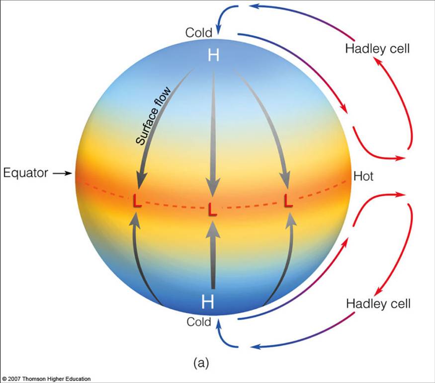
Here’s a simpler schematic that may clarify things. Notice that cells where warm air rises and cool air sinks are called thermally-direct cells, and the Hadley circulation is a prime example of this. This may seem intuitive, but since I’m pointing it out, you can probably guess that we’ll soon be discussing thermally indirect cells, where air is actually sinking in the warmer region!

I want to emphasize that this Hadley cell is always on – there is always more energy striking the Earth’s surface at the equator than the polar regions. It is like the “open 24 hours a day, 7 days a week, 365 days a year” player in the climate system. This is important for understanding the climate of tropical regions. The ascending part of the Hadley cell leads to rainy equatorial regions. The descending part of the Hadley cell, where air sinks back down to the surface, leads to clear skies and less rainfall in subtropical regions. Meanwhile, the lower branch of the Hadley cell circulation carries excess moisture from these subtropical areas back toward the equator. But more on this in a little while!
Quiz Yourself…
The Three Cells in the Atmosphere
The Three Cells in the AtmospherePrioritize...
After reading this section, you should be able to:
- describe the three main cells in the atmosphere and explain why we don’t just have one single atmospheric cell like we hypothesized.
- state where each cell is located and whether the cells are thermally-direct or thermally-indirect and how their rising and sinking motions can lead to broad latitudes of wet or dry climates.
Read...
However, what we observe in the atmosphere is a bit more complicated. There really isn’t just a single cell in the atmosphere like we hypothesized a little while ago. In fact, what we observe looks more like this below.
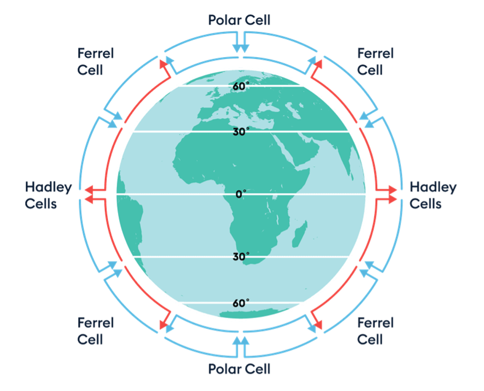
This is because the Earth is rotating. Without this rotation, things would be simple, just like we thought in the previous section! But unfortunately, Earth's rotation complicates matters…
To understand how this rotation impacts global circulation, let’s focus on the Northern Hemisphere for simplicity (the same general process happens in the Southern Hemisphere, but remember—the Coriolis force acts in the opposite direction there).
Recall that we mentioned the Coriolis force causes air to move to the right in the Northern Hemisphere. So, in our non-rotating Earth example, air rises at the equator and then moves directly toward the poles. However, since the Earth rotates, this air can’t travel in a straight line. Instead, it bends to the right as it moves from south to north. This bending starts turning the wind—first toward the northeast, and eventually toward the east. In short, this deflection prevents the Hadley cell from spanning the entire hemisphere; it only reaches about 30 degrees latitude. At this point, the air that rose in the tropics begins descending in a belt known as the "subtropics."
Within the subtropics, the descending air diverges, with some moving poleward and some equatorward. The air that flows back toward the equator near the surface also experiences the Coriolis force, bending to the right. This contributes to the formation of the surface trade winds, also called the easterlies.
Meanwhile, some of the air that descends in the subtropics moves north once it reaches the surface. From there, it forms another important circulation pattern known as the Ferrel cell, which operates between roughly 30 and 60 degrees latitude in both hemispheres. In the upper atmosphere of the Ferrel cell, air moving toward the equator is deflected westward by the Coriolis force. Air in the lower branch moving northwards is deflected to the east, producing the Westerlies. As a result, just as the easterly Trade Winds occur below the Hadley cell, the surface Westerlies are found beneath the upper branch of the Ferrel cell.
The Ferrel cell is relatively weak because it lacks both a strong heat source and a strong sink. This makes the airflow and temperatures within it more variable, which is why the latitudes it spans are sometimes referred to as the "zone of mixing.” The easterly Trade Winds in the Hadley circulation face few obstacles, as the Hadley cell is strong and undisturbed by large terrain features or high-pressure zones. In contrast, the weaker Westerlies of the Ferrel cell can be easily disrupted. For example, the passage of a cold front can change wind direction in a matter of minutes. While surface winds in the Ferrel cell are more variable, winds higher up, away from terrain disruptions, remain predominantly westerly. A low-pressure zone at 60° latitude moving toward the equator, or a high-pressure zone at 30° latitude moving poleward, can accelerate the Westerlies. A strong high moving poleward may bring westerly winds for several days.
Further poleward, closer to the poles, we find the Polar cell, which operates between approximately 60 and 90 degrees latitude in both hemispheres. In the Polar cell, cold air descends and moves toward lower latitudes. As it moves toward the equator, it’s deflected by the Coriolis force, creating polar easterlies.

The Polar cell is a simpler system driven by strong convection. Though colder and drier than equatorial air, the air masses at 60 degrees latitude are still warm and moist enough to drive convection and create a thermal loop. Here, air rises to the tropopause (about 8 km at this latitude) and moves poleward. As it does, the upper-level air is deflected eastward by the Coriolis force. When the air reaches the polar regions, it has cooled through radiation to space and becomes denser than the underlying air, causing it to descend and create a cold, dry high-pressure area. At the polar surface, the air moves away from the pole, replacing the air that rose earlier, completing the polar circulation cell. As this surface air flows toward the equator, it is deflected westward again by the Coriolis force, creating the polar easterlies. These winds flow from northeast to southwest in the Northern Hemisphere and from southeast to northwest in the Southern Hemisphere.
Quiz Yourself…
As we learned recently, Hadley and Polar cells are termed thermally direct because their circulation patterns are primarily driven by temperature differences. In the case of the Hadley cell, warm moist air rises at the equator due to intense solar heating, creating a low-pressure zone, while cooler drier air descends at higher latitudes, particularly around 30 degrees latitude, creating a high-pressure zone. This temperature contrast sets up a direct circulation pattern where air moves from regions of high pressure to low pressure (equator to subtropics). Similarly, in the Polar cell, cold, dry dense air descends at the poles due to lower temperatures, creating a high-pressure zone, while warmer, moist buoyant air rises at lower latitudes, creating a low-pressure zone. This temperature contrast also establishes a direct circulation pattern from high to low pressure (poles to mid-latitudes).
On the other hand, the Ferrell cell is termed thermally indirect because its circulation is not primarily driven by temperature differences. Instead, it exists because of the interactions between the Hadley and Polar cells. The Ferrell cell is located between these two larger cells, around 30 to 60 degrees latitude in both hemispheres. The descending air in the subtropics from the Hadley cell and the rising air in the mid-latitudes from the Polar cell set up a pattern where warmer air is sinking and cooler air is rising – the opposite of what you’d expect based on what we discussed earlier – making it thermally indirect.
The Hadley cell and the Polar cell exhibit similarities in their thermal directness, meaning they are both primarily driven by temperature differentials. Their thermal characteristics dictate the weather patterns within their respective regions. The Hadley circulation transports energy poleward from the equator out to about 30 degrees of latitude. Out to 15 degrees of latitude, it is the dominant mode of poleward energy transport, and from 15 degrees to 30 degrees other (transient) weather processes come to dominate it. Similarly, the thermally direct Polar cell also constantly works to transport energy poleward, though as a percentage of the total energy transport it is swamped by (transient) weather events.
The perpetual succession of highs and lows, a common occurrence in the daily lives of those residing in mid-latitudes under the influence of the Ferrel cell, is virtually absent beyond the 60th and below the 30th parallels. There are noteworthy exceptions to this general pattern; for instance, over Europe, unstable weather patterns extend as far north as the 70th parallel.

But it’s worth noting that these cells go far beyond just distributing heat -- they play a pivotal role in shaping the global climate by establishing semi-permanent high and low-pressure systems.
In the region of the Hadley cells where air rises, such as the equatorial rainforests, low-pressure zones are prevalent. The rising air cools and condenses, resulting in abundant rainfall characteristic of these areas.
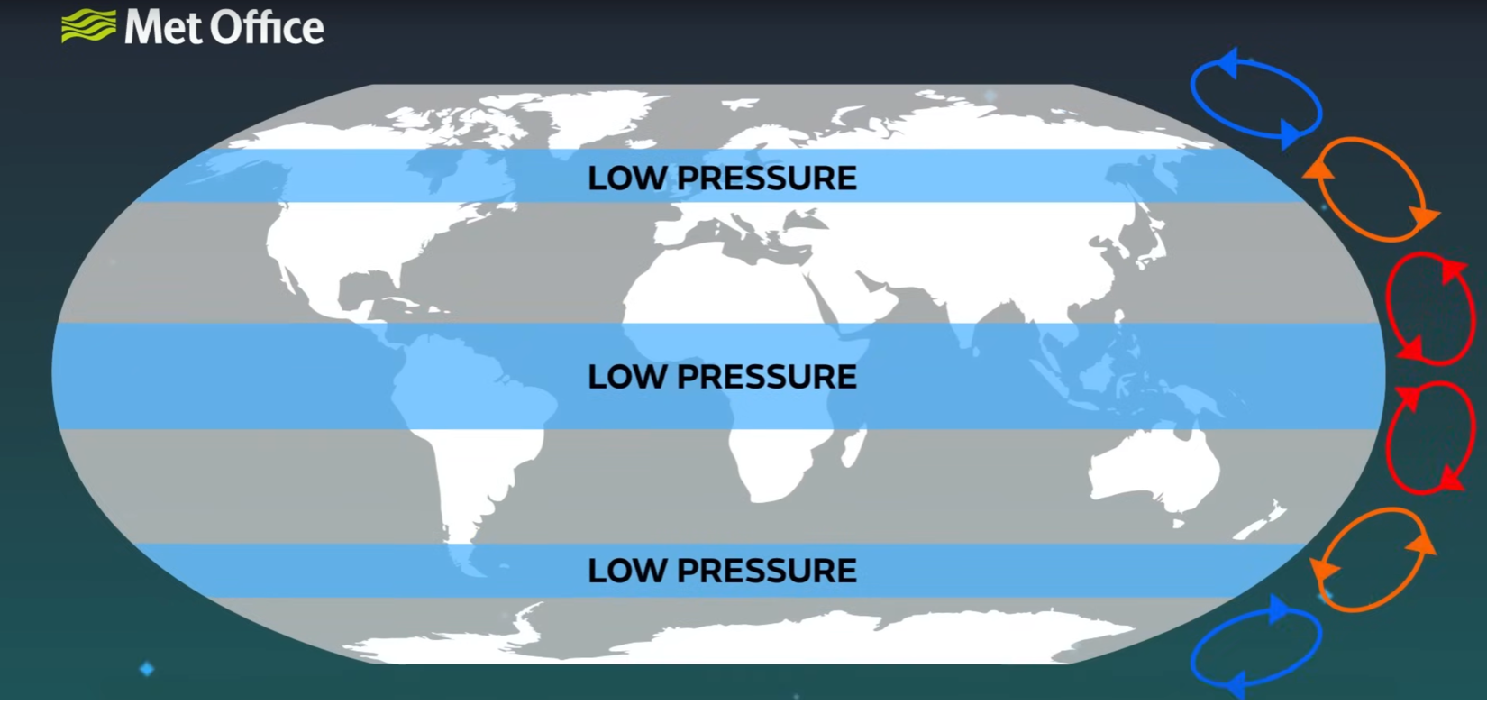
Conversely, areas at the surface under the branches of the Hadley cells where air descends experience high-pressure conditions – this leads to drier climates akin to desert regions.

Watch this video, which synthesizes everything we just talked about! (3:35 minutes)
Narrator: The last video showed that different parts of the Earth heat up differently, with the equator receiving more rates of heat from the Sun than the poles, and the purpose of global circulation is to redistribute this heat. If the Earth did not rotate and was a simple landmass with no oceans, we would have a single circulatory cell in each hemisphere, where hotter air would rise at the equator and flow toward the poles. The air would sink as it cools and then return towards the equator. But the unequal distribution of land and ocean, and the speed of the Earth's rotation, complicates this circulation system, giving us a 3-cell pattern which exists in both the northern and southern hemispheres.
The largest cells are the Hadley cells; at the equator, the warmer, less dense air rises. It rises to a height of about 18 kilometers and spreads out underneath the tropopause. The tropopause acts as a lid to the lowest part of our atmosphere, which contains all of our weather. The warm air spreads out towards the poles, gradually cooling and sinking as it moves before descending to the surface and flowing back to the equator. The smallest cells are the polar cells; cold, dense air descending in the polar regions flows at low levels to about 60 to 70 degrees north or south. As the air leaves the polar regions, it starts to warm and rise, returning to the poles at high levels.
Between the Hadley and polar cells are the Ferrel cells. Unlike the other cells, the Ferrel cells are not driven by temperature. These cells flow in the opposite direction to the Hadley and polar cells, acting like a gear. These circulating cells not only transport heat from the equator to the poles but also result in semi-permanent areas of high and low pressure due to the rising and descending parts of the circulation cells, giving us our climatic zones. Where air is rising, an area of low pressure is created, so these areas see much more rainfall. This is why the largest areas of rainforests are found near the equator, and why the United Kingdom has a relatively wet climate. Where air is descending, an area of high-pressure forms, giving largely clear skies and little rainfall, which leads to the desert regions.
But not all deserts are hot. Antarctica sits under the descending branch of the polar cell and is also classed as a desert. With more precipitation falling in the Sahara, Antarctica is the largest and driest desert. Overall, take a look at our video on atmospheric pressure for more on how pressure leads to weather. Our next video shows how the rotation of the Earth gives us jet streams and prevailing winds.
One fascinating aspect of this phenomenon is the diversity of deserts worldwide. While deserts are often associated with scorching temperatures, the designation extends beyond heat alone. Antarctica, for instance, stands as a stark testament to this notion. Despite its frigid temperatures, Antarctica qualifies as a desert due to its exceptionally low precipitation levels associated with the descending air in the polar cell. This anomaly underscores the nuanced interplay between atmospheric circulation and climatic conditions.
Quiz Yourself…
Atmospheric Climate Zones
Atmospheric Climate ZonesPrioritize…
After reading this section, you should be able to:
- Define the intertropical convergence zone and how it is related to the Hadley circulation.
- Define the major climate zones of the Earth.
- Explain how climate zones are related to the large-scale cells.
- Be given a climate zone and qualitatively explain why it arises.
Read…
Let’s explore these climatic zones in more detail. In the last section, we took a simplified view, assuming that conditions were uniform from east to west. However, in reality, the climate system is far more complex. Let's now bring together everything we've learned, using a more nuanced understanding of the Earth's diverse climates.
We know that the distribution of solar energy (or insolation) across the Earth’s surface varies with the seasons. As the Sun shifts north and south of the equator throughout the year, so do climate patterns. This seasonal migration, which occurs between approximately 23.5°S and 23.5°N, defines the tropics. Within this zone, solar heating is intense, causing air to rise. This rising motion forms the basis of the Hadley circulation, a major driver of global atmospheric motion, that we previously discussed a major.

Where this tropical air rises, we find a zone of low-pressure and frequent rainfall, known as the Intertropical Convergence Zone (ITCZ). You can think of the ITCZ as the “center” of the Hadley circulation, where that rising motion is the strongest. The ITCZ is not fixed; it moves north and south with the Sun’s seasonal journey, bringing wet and dry seasons to different regions of the tropics. This constant shifting creates dynamic weather patterns that influence life in tropical regions.
As the air rises in the ITCZ, it cools and spreads towards the poles, descending in the subtropics—the area between 23.5° and 35° latitude in both hemispheres. This descending air creates a band of high pressure, characterized by dry, stable conditions. It is no coincidence that many of the world’s deserts are located in the subtropics, such as the Sahara in the Northern Hemisphere and the Atacama in the Southern Hemisphere. These regions are marked by minimal rainfall and clear skies, driven by the sinking motion of the air, which inhibits cloud formation.
Beyond the subtropics, in the mid-latitudes (roughly 35° to 60°), the air again begins to rise, but for a different reason. Here, warm air from the subtropics collides with colder air from the polar regions. This clash, known as the polar front, is a zone of active storm formation. The meeting of these contrasting air masses leads to the development of the polar jet stream, a fast-moving current of air that circles the globe at these latitudes, directing storm systems and influencing weather patterns in the temperate regions. Storms across the latitudes of the Ferrell cell, which dominate the mid-latitudes, help transport heat between the subtropical high-pressure zones and the polar front, contributing to the distinct seasonal variations in this region.
The temperate region can be broken into a warm and a cool temperate zone. The warm temperate zone (roughly 35° to 45° latitude) experiences mild winters and hot summers, while the cool temperate zone (from about 45° to 60° latitude) sees colder winters and milder summers. As we move poleward, the influence of tropical air decreases, and polar air masses become more frequent, shaping the cooler climates.
Further poleward, the Polar Cell governs the atmospheric circulation over the polar regions. This circulation pattern reinforces the cold, dry conditions typical of these latitudes, where descending air creates high-pressure systems over the poles, completing the balance of heat transport from the equator to the poles. At the highest latitudes, beyond 60°, we reach the polar regions. Here, solar radiation is weak or absent for extended periods, particularly during the polar night, which can last for months. This results in cold temperatures and vast expanses of ice, characteristic of the Arctic and Antarctic regions. The air here is cold and dense, and surface pressure tends to be higher, although the polar regions are also subject to sporadic low-pressure systems that can bring snow and cold winds.
While the above image is static, it's important to remember that these belts of high and low atmospheric surface pressure, and the associated patterns of atmospheric circulation, also shift south and north over the course of the year in response to the heating by the Sun. You can explore the atmospheric patterns using the following animation (1:04):
Atmospheric Patterns Animation
A flat map of Earth with atmospheric circulation patterns overlaying the geographical features. The equator is centrally located, with the Tropic of Cancer and the Tropic of Capricorn marked to the north and south. Symbols for high (H) and low (L) pressure systems are scattered across the map, with “subtropical highs” prominently labeled near the Tropics. Blue circles with blue 'L's are near the poles, labeled as “Polar front.” On the sides, red and blue arrows depict the Hadley Cells with warm air rising and cool air descending, labeled as “Hadley Cells” and “Polar front”. Below the map, a timeline shows the months of the year, suggesting a seasonal progression of these patterns. Interactive buttons below the map include options to hide or show different features like the Hadley Cells, ITCZ, pressure systems, and precipitation. When selected, a wavy purple line meandering across the equator represents the Intertropical Convergence Zone (ITCZ).
We are ready to put all the pieces from the last few lessons together to describe the general circulation of the atmosphere! Let's work through what we've just learned step-by-step…
- We’ve established that there is an imbalance in the Earth's energy budget: the tropics receive more incoming shortwave solar radiation than they emit as longwave radiation, while the poles emit more longwave radiation than they absorb of the shortwave solar radiation. This results in a heat surplus in the tropics and a heat deficit near the poles. The atmosphere and ocean act together to redistribute this energy, relieving the imbalance by moving heat from where it is in excess to where it is lacking. This process, known as heat advection, is essential to maintaining the planet's energy equilibrium.
- We’ve already touched on one key player in this heat transport: the Hadley Cell. Through the rising of warm air at the equator and its descent in the subtropics, the Hadley circulation helps transfer energy poleward. But this is just one part of the story. Beyond the tropics, other wind patterns come into play, especially in the mid-latitudes, to ensure heat is distributed toward the poles.
- In addition to horizontal heat advection, there is also vertical heat transport within the atmosphere. This occurs as warm air rises in areas of low-pressure and cool air sinks in areas of high pressure. This vertical movement of air helps redistribute heat from the surface to higher altitudes, contributing to the overall balance of energy in the climate system. Rising air transports heat away from the Earth's surface, while sinking air brings cooler air down, particularly in the subtropics and polar regions.
- In the extratropics, wind patterns are driven by the interaction between the pressure gradient force (the difference in pressure between high and low-pressure systems) and the Coriolis force, a deflecting force due to the Earth's rotation. The Coriolis force deflects winds to the right in the Northern Hemisphere and to the left in the Southern Hemisphere, creating westerly winds in the mid-latitudes. They blow from west to east between the subtropical high-pressure zones and the subpolar low-pressure zones near the polar front. These westerlies strengthen with altitude, giving rise to the jet streams, fast-moving currents of air in the upper atmosphere that influence weather patterns across the globe.
- In contrast, winds in the tropics tend to blow from east to west, known as easterly trade winds. These trade winds are a product of the same forces but within the tropical pressure system.
- At the Earth’s surface, the situation becomes slightly more complex due to friction. Friction causes winds to spiral inward towards low-pressure centers (a process called convergence) and outward from high-pressure centers (divergence). Convergence in low-pressure areas is associated with rising air, while divergence in high-pressure areas is associated with sinking air. These dynamics shape the structure of mid-latitude weather systems.
- The polar front, the boundary where cold polar air meets warmer subtropical air, is a particularly dynamic region. The contrast between these air masses gives rise to extratropical cyclones—large-scale storm systems that dominate mid-latitude weather. These cyclones are powered by baroclinic instability, which occurs when the temperature difference between air masses drives instability and storm formation. As these cyclones lift warm air along frontal boundaries (such as warm fronts and cold fronts), they effectively mix air masses and transport heat toward the poles, helping to balance the energy deficit at higher latitudes.
Congrats! While the actual climate system is a little more complicated than this, you can now explain key climate regions on Earth and why they exist. You should explore the resulting large-scale pattern of circulation of the global atmosphere in the following animation (1:05) -- see how many things you can tie to what we just covered above!
Circulation of the Global Atmosphere showing the idealized Hadley cell circulation, mid-latitude and high latitude components and upper atmosphere flow.
This video shows a diagram representing the Earth with an emphasis on atmospheric circulation, specifically the idealized Hadley Cell Circulation. A cross-section of Earth shows the equator at the center, flanked by the Tropic of Cancer and the Tropic of Capricorn. The Hadley cells are depicted as large blue loops, with red arrows indicating warm air rising at the equator and blue arrows showing cool air descending at the tropics. The letters 'H' and 'L' indicate areas of high and low pressure, respectively.
As the animation progresses, additional atmospheric layers are added. The labels ‘ITCZ’ (Intertropical Convergence Zone), 'trade winds', 'westerlies', and 'polar easterlies' denote different wind patterns. The Hadley cells, now interacting with other components, create a dynamic representation of the Earth’s atmospheric circulation. Red and blue arrows again show the direction of air movement, while fluffy white shapes at the poles and a line marked 'Polar front' suggest colder climates and boundary areas in the atmosphere.
Quiz Yourself…
Ocean Circulation: Wind-Driven
Ocean Circulation: Wind-DrivenPrioritize…
After reading this section, you should be able to:
- describe how friction from winds in the atmosphere drives circulation patterns in the ocean.
- define what a gyre is and explain why the western side of the North Atlantic and North Pacific Ocean basins are warm while the eastern sides are cool.
- define the Ekman spiral and how wind blowing across the ocean surface can pump cool, nutrient-rich water upward in specific parts of the ocean.
Read…
While we have focused primarily on the atmosphere thus far, the oceans, too, play a key role in addressing the radiation imbalance by transporting heat from lower to higher latitudes. The oceans also play a key role in both climate variability and climate change, as we will see. In fact, oceans transport as much as a third of the planet's excess heat from the equator towards the poles, playing a massive role in regulating global temperatures! We will discuss ocean circulation currents, which refer to the continuous movement of seawater in the oceans, driven by various factors including wind, temperature, density differences, and the Earth's rotation. There are two primary components of the ocean circulation. Let's focus on the first one -- the wind-driven circulation.
Wind-Driven Circulation
The first component is the horizontal circulation, characterized by wind-driven ocean gyres. A gyre is a large system – typically circular or spiral-shaped -- of circulating ocean currents, typically spanning an entire ocean basin. These gyres are formed – well, exactly how they sound. Imagine these gyres like planetary-sized whirlpools, with water slowly circulating around an ocean basin like a giant, slow-moving pinwheel. Wind in the atmosphere pushes on water and moves it around. This is not unlike if you take your hand and drag it across a lake – as you do, you induce a current on the surface. This is the frictional force we talked about earlier at work.

The major surface currents you may have heard of are associated with the ocean gyres. These include the warm poleward western boundary currents such as the Gulf Stream, which is associated with the North Atlantic Gyre, and the Kuroshio Current associated with the North Pacific Gyre. These currents bring warm water from regions closer to the equator and move them poleward. It’s the main reason why it’s relatively pleasant to swim off the Outer Banks in North Carolina, even if the air temperature is relatively chilly.
Check out the map of sea surface temperatures below – that stripe of red, orange, and yellow (warmer waters) moving along the coast and out into the Atlantic Ocean is the Gulf Stream, which is the Atlantic’s western boundary current.

These gyres also contain corresponding cold equatorward (i.e., from higher latitudes to lower latitudes) eastern boundary currents such as the Canary Current in the eastern North Atlantic and the California Current in the eastern North Pacific. These are the opposite of what we just discussed, as they are currents that take cool water towards tropical regions. If you’ve visited Los Angeles, California and gone swimming in the Pacific Ocean, you may have been surprised at how cold the water felt even if it was 85 degrees outside. That is largely due to the eastern boundary current moving southward along the United States’ west coast. So warm water on the east coast, cool water on the west coast -- now you can impress your friends by telling them it's all due to ocean gyres!
Similar current systems are found in the Southern Hemisphere, where the horizontal patterns of ocean circulation mirror those in the Northern Hemisphere. This symmetry is driven by the alternating patterns of wind as a function of latitude, which are part of the broader atmospheric circulation we discussed quite recently! The trade winds blow predominantly from the east in the tropics, while the westerlies prevail in the mid-latitudes. These wind patterns exert a significant influence on ocean currents, pushing surface waters in predictable directions. Check out the below map of global surface currents – in general, water moves from east to west close the equator (pushed by the trade winds) and west to east in the mid-latitudes (pushed by the prevailing westerlies). To close the loops, water must move north or south in the regions we discussed above!
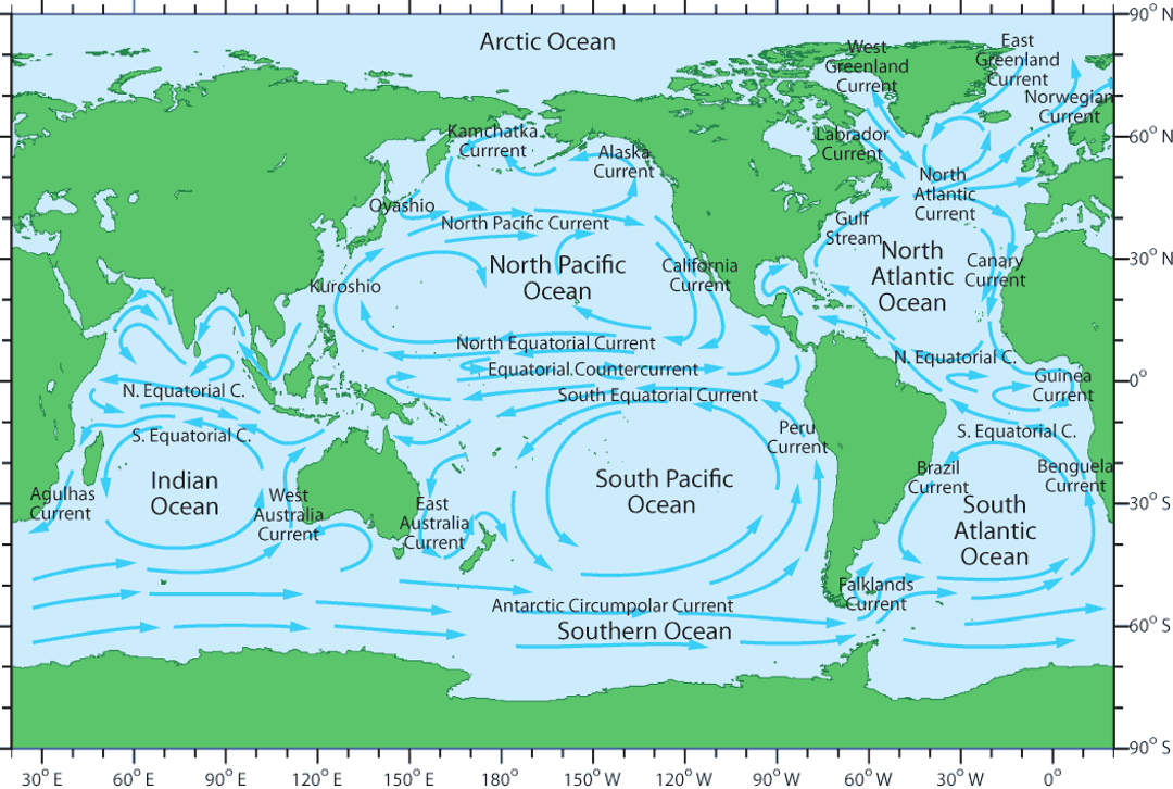
Quiz Yourself…
Ekman Pumping and Upwelling
Before moving on, let’s touch on an important phenomenon in ocean circulation closely tied to the wind-driven circulation.
We just talked about how the wind “drags” ocean water along with it. Now, you’d probably just expect that the water just starts moving along with the wind, right? But it doesn't happen exactly like that because the Earth is rotating. This rotation makes things on the Earth's surface, like ocean currents, move to the right in the Northern Hemisphere and to the left in the Southern Hemisphere. Aha, the Coriolis force is back!
Now, this is where it gets a bit twisty … literally! The wind starts pushing the water, but due to the Earth’s rotation, the water doesn't just move in the direction of the wind; it moves at an angle to it. And each layer of water below the surface moves at a slightly different angle than the one above, creating a kind of spiral staircase of water movement under the sea. This pattern is what we see in the image as the “Ekman spiral.” Take a look at the image below – the little green arrows represent the spiraling ocean direction with depth.
Because of this spiraling effect, the water on the surface doesn't just go in the direction the wind is blowing. Instead, there's what we call the “Ekman transport,” which is the average movement of all these spiraling layers of water. In the end, this means that the water at the surface tends to move at a 90-degree angle to the direction of the wind. If the wind is blowing from north to south, the water on the surface will end up moving to the west in the Northern Hemisphere and to the east in the Southern Hemisphere.
As surface water is pushed away by the wind-induced Ekman transport, a void is created. Nature abhors a vacuum, so deeper water from below rises to fill this void. This upward movement of deeper water to replace the surface water that has been transported away is known as Ekman pumping.
Ekman pumping is a bit like the ocean taking a breath, since it brings water from deeper down to the surface. It plays a role in distributing heat throughout the ocean, which helps to moderate the global climate. The upwelling water is typically cooler and can lower sea surface temperatures. Done over large enough areas and for a long enough time, it can influence atmospheric conditions and alter weather patterns over vast areas. Beyond its climatic impact, Ekman pumping serves as an underwater nutrient source. As it uplifts water from the abyss, it carries with it various nutrients that have been locked away in the dark. Upon reaching the sunlit upper layers, they fertilize the water, providing a bounty for phytoplankton, the tiny but mighty organisms that support the marine ecosystem. This process not only fuels phytoplankton, but it’s the reason coastal areas like California are teeming with marine life—from fish to dolphins to the flocks of seabirds you see diving for a meal.
Coastal Upwelling
Relatedly, coastal upwelling is a phenomenon that occurs along coastlines where winds blow parallel to the shore, driving surface water away from the coast. This offshore movement of surface water creates a void along the coastline, which is swiftly filled by deeper water welling up from below, a process known as upwelling.

The primary driving force behind coastal upwelling is wind stress exerted on the ocean surface. Along many coastlines, particularly those with strong, persistent winds such as the west coasts of continents, prevailing winds blow parallel to the shore, known as alongshore winds. These winds generate a phenomenon known as Ekman transport, where surface water is pushed offshore due to the Coriolis effect.
As surface water moves away from the coast, it is replaced by deeper, colder, and nutrient-rich water that wells up from below. This upwelled water originates from deeper layers of the ocean, where nutrient concentrations are typically higher due to biological processes and the accumulation of organic matter.
Coastal upwelling and Ekman pumping, though related, are distinct processes in ocean circulation. Ekman pumping primarily results from wind-induced Ekman transport, where friction between wind and the ocean's surface causes surface water to diverge, allowing deeper water to rise and replace it. This process occurs not only along coastlines but also in open ocean regions where wind-driven surface currents diverge. In contrast, coastal upwelling specifically occurs along coastlines where persistent winds blow parallel to the shore, driving surface water offshore and allowing deeper, nutrient-rich water to upwell. While both processes involve the upward movement of nutrient-rich water to the surface, coastal upwelling is more localized and directly linked to coastal wind patterns, whereas Ekman pumping operates on a broader scale.

In regions where coastal upwelling and Ekman pumping coincide, the combination of nutrient inputs from deep water upwelling and surface water divergence leads to exceptionally high levels of biological productivity. Phytoplankton thrive in these nutrient-rich waters, supporting abundant fisheries and diverse marine ecosystems.. Nutrient inputs from upwelling fuel the growth of phytoplankton, which form the base of the marine food web. This abundance of primary producers supports thriving populations of zooplankton, fish, seabirds, and marine mammals. In the end, these ocean currents don’t just move water!
Quiz Yourself…
Thermohaline Circulation
Thermohaline CirculationPrioritize…
After reading this section, you should be able to:
- define what the thermohaline circulation is and what “thermo-” and “haline-” mean in the context of ocean dynamics.
- qualitatively describe the motions of the thermohaline circulation and how it moves warm and cold water (and therefore energy) in the climate system.
Read…
In the last lesson, we mentioned there were two components to ocean circulation. We spoke extensively about the surface gyres, Ekman pumping, and upwelling. All of these are driven by wind “pushing” and “pulling” on the ocean surface. So what is the second component of the circulation?
An important additional mode of ocean circulation is the thermohaline circulation, which is sometimes referred to as the meridional overturning circulation or MOC for short. The term “thermohaline” combines two key components: “thermo” refers to temperature (how warm or cold the water is), and “haline” refers to salinity (how salty or fresh the water is). Therefore, “thermohaline” describes ocean currents and processes that are driven by differences in water temperature and salinity. The circulation pattern is shown below:
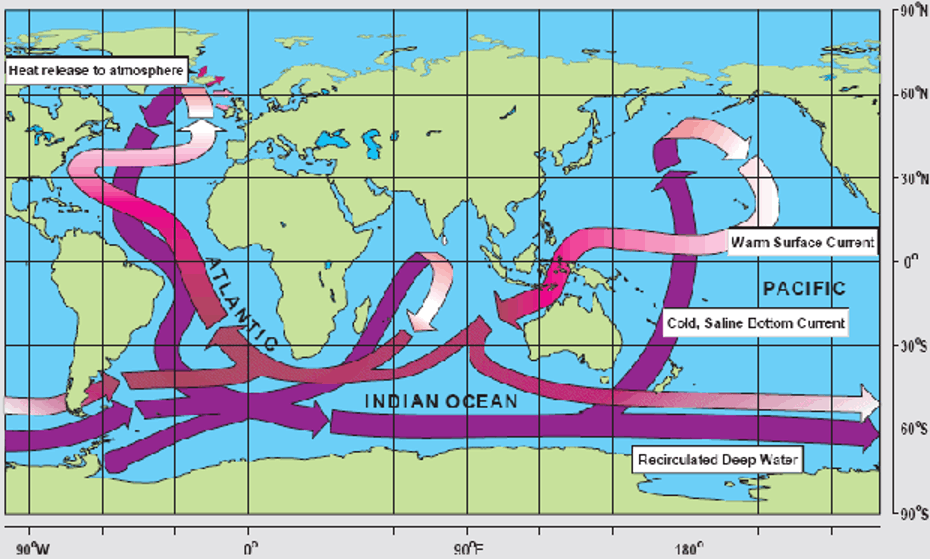
The therrmohaline circulation functions differently from the surface wind-driven currents we just learned about. Instead of horizontal movements across the ocean’s surface, thermohaline circulation involves a vertical flow pattern that spans the ocean’s depths.
Much like the Hadley circulation in the atmosphere, the thermohaline circulation can be thought of as a giant conveyor belt moving water up and down throughout the ocean. In the North Atlantic, near the pole, water becomes very cold and salty, making it denser and causing it to sink deep into the ocean. This sinking action creates a sort of vacuum, pulling water from other regions to replace it. To balance the water being pulled down, more water must flow in from elsewhere—otherwise, we’d end up with a giant divot in the center of the Atlantic!
In contrast, in warmer tropical and subtropical regions, like the Indian and Pacific Oceans, water tends to be warmer and less salty. This lighter, less dense water rises to the surface to fill the gaps left by the sinking cold water in the North Atlantic.
The main driving forces behind this circulation are differences in water density, primarily due to variations in temperature and salinity. Similar to the atmosphere, warmer water is less dense and tends to rise, while colder, saltier water is denser and sinks.
This balance of rising and sinking water plays a crucial role in regulating Earth’s climate by redistributing heat. It acts like a massive heat pump, moving warmth from the tropics toward the poles, helping to moderate temperatures in different regions.
Take a look at the schematic above. It’s worth mentioning that this is a somewhat simplified view of the actual vertical circulation patterns in the ocean—they are, in reality, much more complex. Still, you get the idea of how this circulation resembles a conveyor belt.
You might also notice, “Hey, I see the Gulf Stream in both sections!” You know, that current that is moving towards the north off of the eastern half of the United States. But hold on—that’s not quite right. The Gulf Stream is primarily driven by winds, not by the temperature or salinity of the water. When we talk about the thermohaline circulation, the northward extension in the North Atlantic is better known as the North Atlantic Drift. Like the Gulf Stream, this current also involves the net transport of warm surface waters to higher latitudes in the North Atlantic. Ultimately, the goal is to transfer that extra energy from the tropics to the poles!
Quiz Yourself…
Thermohaline shutdown?
Hopefully, I’ve convinced you by now that ocean currents, including the thermohaline circulation, play a crucial role in redistributing heat across the globe.
Within the thermohaline circulation, there are various components, much like the different currents we discussed in the context of wind-driven circulation. One of the most important of these is the Atlantic Meridional Overturning Circulation (AMOC). As we saw earlier, the North Atlantic Drift—a key part of AMOC—carries warm surface waters from the tropics to the North Atlantic, where they cool and sink, forming a deep ocean current that flows southward. This movement helps redistribute heat globally, influencing weather patterns and climate conditions, especially in regions like northern Europe.
Recent research suggests that AMOC may be approaching a “tipping point” where its behavior could change dramatically. Previous studies indicate that AMOC has two stable modes: a “strong” mode, which efficiently transports warm water into the North Atlantic, moderating the climate of northern and Western Europe, and a “weak” mode, where this transport is significantly reduced. Some scientists believe that current conditions may be pushing AMOC towards a transition from its strong state to a weaker one, leading to numerous—sometimes sensational—news articles warning of a potential climate crisis.
This possible shift to a weaker AMOC state is largely driven by the influx of cold, fresh water from the melting Greenland ice sheet (we’ll delve deeper into this topic in a few lectures). This freshwater disrupts the thermohaline circulation by reducing the salinity and density of the ocean water, which in turn weakens the sinking motion in the North Atlantic. If AMOC slows down, less heat will be transported to the North Atlantic, reducing its moderating effect on the climate of northern and Western Europe. As a result, these areas could experience colder conditions that are more typical of regions at similar latitudes, like Canada and Russia. Additionally, decreased heat transfer to the North Atlantic could lead to further warming in the southern Atlantic and surrounding areas. While the most significant impacts are expected in regions directly influenced by AMOC, broader changes in global temperature and precipitation patterns are also anticipated.
One thing worth noting is that it is best to think of these potential changes as a “tipping point” rather than a true collapse. For example, in the 2004 movie “The Day After Tomorrow,” the AMOC circulation plays a key role!
Clip from Day After Tomorrow
Newscast announcer: What you're seeing is what's left of downtown Los Angeles.
Speaker 1: Hey, man, I just got off the phone from my mom.
Speaker 2: Um, Excuse me, you guys. I'm really sorry, but we need to change the channel.
Newscast announcer: The FAA has grounded all air traffic in the United States. Unfortunately, the order came too late for two planes that were brought down by severe turbulence in the Midwest. The first flight-So much for one in a billion.
Tom: All right, all right, listen up, everybody. Listen up, please. We've got a lot of work to do, and we don't have much time, so let's get started, please. Vorsteen.
Vorsteen: All our grid models are worthless.
Booker: I don't think grid models are going to be a lot of help here. The Canadians are reporting tremendous circulation moving down from the Arctic. In Siberia, there's a low pressure system unlike anything we've seen, and Australia just saw the strongest typhoon ever recorded.
Lanson: Hang on, are you saying that these things are interconnected?
Booker: We have to consider the possibility.
Lanson: The only force strong enough to affect global weather is the sun.
Tom: What's NASA have to say?
Janet: We've already checked. Solar output is normal.
Jack Hall: What about the North Atlantic current?
Speaker: What about it?
Jack: I got a call last night from Professor Rapson at the Headland Center. He thinks the current has changed.
Booker: Come on, Jack. How could that be?
Jack: The current depends upon a delicate balance of salt and fresh water.
Tom: We all know that.
Jack: Yes, but no one has taken it into account how much fresh water has been dumped into the ocean because of melting polar ice. I think we've hit a critical desalination point.
Janet: It would explain what's driving this extreme weather.
Jack: Headland had some pretty convincing data. They've asked me to feed it into my paleo-climate model to track the next set of events.
Tom: Hold on, Jack. Are you suggesting these weather anomalies are going to continue?
Jack: Not just continue. Get worse. I think we're on the verge of a major climate shift.
Jack: Tom, what are you going to tell the administration?
Tom: What do you expect me to tell?
Jack: The government has to start making long-term preparations now.
Tom: Jack, all you have is a theory.
Jack: Well, then give me the mainframe and let me prove it.
Tom: No……You have 48 hours.
Janet: Professor Hall. Yes. I think your theory may be correct. Go off with me. Just a few weeks ago, I monitored the strongest hurricane on record. The hail, the tornado, it all fits. Can the model you're working on factor in storm scenarios?
Jason: We haven't had the time.
Janet: Maybe I can help.
Jack:
Welcome aboard.
Janet: Thanks.
Jason: Hi, I'm Jason.
Wow, the collapse of this circulation resulted in incredible and immediate shifts in day-to-day weather! Hail in Tokyo, tornados in Los Angeles, planes and helicopters “flash freezing” and falling out of the sky. Do not worry; this is highly sensationalized! Even relatively “abrupt” changes in AMOC do not happen overnight; they take years to decades to become apparent due to the ocean's size and the timescales at play. There is also no evidence that a slowdown of the AMOC (like that in the movie) would lead to global anomalous weather events that cause immediate and severe harm around the world.
However, this does not mean changes in AMOC would not result in societal impacts. In reality, the effects of such changes would be more gradual and localized, potentially altering weather patterns and marine ecosystems in specific regions rather than triggering instant, catastrophic consequences on a global scale. Despite the concerns raised by recent research, uncertainties remain regarding the specifics of AMOC transitions and the exact timing of potential collapses. There remain ongoing debates within the scientific community and the need for further research to better understand the implications of AMOC changes.
Quiz Yourself…
Summary
SummaryRead...
Let’s cover what we learned in this lesson!
- The motion of air and water in the climate system is driven by four main forces:
- The pressure gradient force initiates wind by moving air from high to low pressure areas.
- The Coriolis force deflects wind to the right in the Northern Hemisphere and to the left in the Southern Hemisphere due to Earth’s rotation.
- Friction slows down winds near the surface, especially over rough terrain, but decreases with altitude.
- Gravity drives vertical air motion, influencing updrafts and downdrafts, critical for storms and other weather phenomena.
- These forces combine to create three main atmospheric circulation cells:
- The Hadley cell circulates warm air up at the equator and down at the subtropics, leading to tropical rainforests and desert climates. It is thermally-direct.
- The Ferrel cell mixes warm and cool air in the mid-latitudes, resulting in variable weather patterns. It is thermally-indirect.
- The Polar cell circulates cold air around the poles, creating polar deserts.
- These circulation cells define Earth’s major climate zones: wet tropics, dry deserts, and polar regions.
- Wet tropics are shaped by the constant rising of warm, moist air at the equator, leading to frequent rainfall and lush vegetation.
- Deserts are formed by subtropical high-pressure zones where dry air descends and suppresses precipitation.
- Mid-latitude temperate zones experience variable weather due to the interaction between warm tropical air and cold polar air, resulting in four distinct seasons.
- Polar deserts are created by cold, descending air that limits moisture and precipitation, resulting in icy conditions.
- Oceans also play a key role in climate regulation:
- The wind-driven circulation is precisely what it sounds like – wind in the atmosphere pushes ocean water. Included in this circulation are ocean gyres moving warm water from the tropics to higher latitudes, impacting regional climates.
- The thermohaline circulation or “ocean conveyor belt” moves water based on temperature and salinity differences, redistributing heat globally.
Understanding these systems is crucial for grasping how heat and moisture move around the planet, shaping both local weather and global climate patterns. Now that we have a good grasp of why the climate system does what it does, let's move on to talking about “natural variability” within the climate system -- behaviors we observe that occur on timescales longer than sensible weather!
Quiz Yourself…
Lesson 6: Modes of Natural Variability in the Climate System
Lesson 6: Modes of Natural Variability in the Climate SystemMotivate...

Imagine you’re sitting in the front row of an orchestra. The conductor raises their baton, and slowly, each section of the orchestra comes to life. The strings start with a slow, steady rhythm—like the deep currents of the ocean, moving constantly but quietly in the background. Then, the woodwinds join in with faster, lighter melodies, like winds swirling through the atmosphere. The percussion might come in with a sudden, powerful beat—like a year where it feels as though hurricane season will never end. Each instrument has its own tempo and mood, but together, they create a grand performance.
In many ways, Earth’s climate can be thought of as this orchestra. Instead of violins and trumpets, we have natural modes of variability—different parts of the Earth's symphony. You’ve likely heard of some of these climate modes: El Niño-Southern Oscillation (ENSO), the Pacific Decadal Oscillation (PDO), and the Atlantic Multidecadal Oscillation (AMO). Each one is unique. Some move quickly, like ENSO, which shifts over just a few years and brings dramatic changes to weather patterns. Others, like the PDO or AMO, operate on much slower timescales, like the deep, resonating notes of a bass, setting a broader, longer-term rhythm.
The fascinating thing is that these “instruments” don’t play in isolation. They overlap, influence each other, and sometimes create surprising harmonies—or unexpected dissonances. Just as in an orchestra, where the combination of instruments shapes the mood of the entire piece, the interaction between these climate modes can determine whether we experience mild winters, intense hurricane seasons, or extreme droughts.
By understanding the role each of these climate “instruments” plays, we can start to hear the larger symphony of Earth’s climate. Once we’re attuned to this music, we can predict when the next major shift or “note” might be coming—giving us insight into weather patterns, ecosystems, and even human activity around the globe.
So, let’s dive into this fascinating variability. Together, these forces create the melody of our planet’s climate, a performance that has been playing for millions of years. Let’s explore how these “musicians” come together to create the rhythm of the Earth’s climate system. Ready to listen in?
Phases of the ENSO cycle
Phases of the ENSO cyclePrioritize…
At the completion of this section, you should be able to:
- Describe the ENSO cycle and its phases (El Niño, La Niña, Neutral).
- Define "climate oscillation" and explain the Southern Oscillation and its connection to ENSO phases.
Read...
The El Niño-Southern Oscillation (ENSO) cycle is a natural pattern of climate variability centered in the equatorial Pacific Ocean. It arises from the interaction between the tropical atmosphere (like pressure, wind, and cloud patterns) and the ocean (such as sea surface temperature, coastal upwelling, and ocean currents). This interaction causes periodic shifts in sea surface temperatures (SST), air pressure, and rainfall patterns, which play out over the course of a few years. ENSO is a bit like a slow-moving pendulum—sometimes swinging toward warmer, wetter conditions and other times toward cooler, drier ones, all depending on the balance between the ocean and the atmosphere. Back-and-forth, back-and-forth...

Although ENSO is primarily a tropical phenomenon, its impacts ripple across the globe, disrupting typical weather patterns and triggering extreme events. For this reason, climate forecasters closely monitor ENSO signals to predict long-term climate trends that affect everything from agriculture to energy management.
Phases of the ENSO cycle
In the 1920s, British mathematician Sir Gilbert Walker discovered a large-scale atmospheric pressure pattern in the tropical Pacific, which he named the Southern Oscillation. In climate science, an “oscillation” refers to a recurring pattern of change over time in certain aspects of the climate system, such as temperature, pressure, or precipitation. We've already used the classical pendulum analogy climate scientists love to use, but to give another analogy, think of it as a yo-yo moving up and down – just as the yo-yo moves all the way down to the floor and then all the way back up to your hand, an oscillation in the climate system involves a back-and-forth shift between two states. These shifts can happen on various timescales, from months to decades, and can influence regional or even global climate conditions. In the case of the Southern Oscillation, it represents a seesaw-like fluctuation in atmospheric pressure between the eastern and western tropical Pacific, driving changes in wind patterns, ocean currents, and weather across the globe.
Sir Walker’s research was a game-changer because it showed that atmospheric pressure changes and shifts in sea surface temperatures across the tropical Pacific were actually linked. He explained how, every few years, the usually cool waters off the coast of South America would suddenly warm up, causing all kinds of weather disruptions around the world. This warming, known as El Niño, wasn’t just a local oddity—it was part of a larger, interconnected system. By piecing together these atmospheric and oceanic changes, Walker helped us understand what we now call the ENSO cycle, which plays a huge role in global climate patterns.
ENSO doesn’t follow a strict timetable (not unlike me!), but it generally transitions through its phases every 2 to 8 years. The cycle has three phases: the positive phase (El Niño), the negative phase (La Niña), and the neutral phase when the tropical Pacific shifts back to its climatological state. You've almost certainly heard about these in the news, but what do they actually mean from the perspective of a climate scientist?
- El Niño
El Niño, which means “The Little Boy” or “Christ Child” in Spanish, was named by Peruvian fishermen in the 1600s when they noticed that every few years around Christmas the water off the coast of South America would be much warmer than usual. This warming disrupted fish populations and fishery yield, causing the fishermen to give it a name associated with the holiday season. During an El Niño event, the central and eastern Pacific Ocean becomes unusually warm. This shift in sea surface temperature influences atmospheric circulation, leading to changes in weather patterns worldwide. For instance, El Niño can bring wetter conditions to the western United States and Peru, while causing droughts in Australia and Southeast Asia.
- El Niña
La Niña, meaning “The Little Girl” in Spanish, is the opposite phase to El Niño. During the peak of La Niña, the central and eastern Pacific Ocean experiences cooler-than-average sea surface temperatures. This cooling can lead to opposite, but equally significant, weather impacts compared to El Niño. La Niña often results in wetter conditions in Australia and Southeast Asia, while causing drier weather in the southwestern United States.
- V Southern Oscillation
The Southern Oscillation is the atmospheric oscillation that accompanies the sea surface temperature anomalies associated with the El Niño and La Niña. The Southern Oscillation is characterized by the surface pressure differences between the Darwin and Tahiti, and thus reflects the strength of the Walker circulation spanning the equatorial Pacific. The Southern Oscillation index is negative during the El Niño (i.e., the Walker Circulation weakens), while positive during the La Niña (i.e., the Walker Circulation strengthens).

Quiz Yourself...
ENSO indices
ENSO indicesPrioritize...
At the completion of this section, you should be able to:
- Define a climate index
- Identify key indices used to measure ENSO, including the Niño 3.4 index, SOI, and MEI
- Explain the Southern Oscillation Index (SOI) and its role in indicating ENSO phase changes.
Read...
OK, how do we measure these oscillations or variability in the climate system? We have to develop metrics or indices to tell us "where are we?" when it comes to ENSO, for example. Let's focus on that, although other modes of variability are tracked using similar strategies. A "climate index" is a numerical value that quantifies specific aspects of climate variability or patterns, such as temperature, pressure, or precipitation, over a defined region. It's all about taking many different things going on and boiling them down into a single number. Some of you may be interested in financial markets and have heard of the "Dow Jones Industrial Average," a stock market index. In that case, you are boiling down the stock price of multiple companies and combining them into a single number you can track over time. Climate indices serve the same purpose, helping scientists monitor and describe the current state of complex climate phenomena by providing a simplified representation of how the climate system behaves relative to its typical or average conditions.
To keep track of ENSO, we need some concrete ways to measure what's happening in the ocean and atmosphere—essentially like using a scorecard. For the ocean side of things, we have something called the Niño index, which looks at sea surface temperature anomalies (SSTAs) in specific parts of the tropical Pacific. Remember, we learned that an anomaly is how the ocean temperatures differ from their "reference" or "mean" state! So, a Niño index looks at how warm or cold ocean temperatures are relative to their usual temperature. The most popular one is the Niño 3.4 index, which averages SSTAs over a region from 5°N to 5°S and 170°W to 120°W. This index helps us figure out if the central and eastern Pacific is warmer or cooler than usual.

For the atmosphere, we obviously aren't measuring water temperature -- instead, we use something called the Southern Oscillation Index (SOI), which measures the difference in standardized surface pressure between Tahiti and Darwin. Protip: if someone asks you to volunteer to make in-situ measurements of the SOI, say yes! Why? Check out the below figure which shows you exactly where those pressure observations are being taken in the tropical South Pacific Ocean! When the SOI is negative, it means the air pressure in Tahiti is lower than in Darwin. This pressure difference indicates that the normal east-to-west trade winds are weakening. As a result, warm water that is usually piled up in the western Pacific starts to flow back eastward toward South America. This shift in water movement leads to warmer-than-normal sea surface temperatures in the central and eastern Pacific, a hallmark of El Niño conditions.

But sometimes, just looking at these separate indices is like trying to understand a recipe by only reading half the ingredients. To get a fuller picture, we use the Multivariate ENSO Index (MEI). All of these acronyms feel like they are the equivalent of climate alphabet soup. It combines SST, winds, sea level pressure, and outgoing longwave radiation into one handy metric. This gives us a more complete view of what’s happening with ENSO and how it’s influencing global climate patterns. So, next time you hear a forecaster mention ENSO, you’ll know they’re talking about a lot more than just some letters in a bowl!
One last thing. You might ask yourself, "Why on Earth do climate scientists have so many indices to quantify essentially the same thing?" Not an unreasonable question... As we'll learn about in the next couple of sections, ENSO is a complex system involving different aspects of both the ocean and the atmosphere. Just like hiring someone for a job, you wouldn’t assess them based on one skill alone—you’d want to look at several qualities like teamwork, communication, punctuality, and expertise. Similarly, different ENSO indices give us a fuller picture by measuring various factors, from sea surface temperatures to air pressure. Each index captures a different angle, and together they provide a better understanding of ENSO’s behavior. Plus, some indices go farther back in time, which helps compare historical events.
See the figure below, which gives us a time series of both the Nino 3.4 and SOI indices. In many cases, the red and blue match, indicating good agreement between the two. I should also mention that the colors look 'flipped' because a positive Niño 3.4 index and a negative SOI both indicate El Niño conditions, but they represent different aspects of the climate system. The Niño 3.4 index characterizes sea surface temperature anomalies, with a positive value signaling warmer-than-normal ocean temperatures. On the other hand, the SOI is a pressure difference, where a negative value indicates weaker trade winds. So, even though the signs are opposite, they both point to the same phenomenon—El Niño. But there are other places (say, 1983-1987) where the colors aren't quite the same between the two, meaning it isn't quite obvious precisely what phase of ENSO everyone agrees on. I won't get into the exact details of what led to those differences- it's beyond the scope of this class- but just know that scientists use multiple indices because no single one can tell the whole story.

Read on.
Quiz Yourself...
A Historical Perspective on ENSO mechanisms
A Historical Perspective on ENSO mechanismsPrioritize...
After this section, you should be able to:
- Describe the Bjerknes feedback loop -- including defining "thermocline" -- and how the loop plays a role in amplifying ENSO events.
- Explain how the Walker Circulation influences El Niño and La Niña conditions.
- List a few current theories about the mechanisms that return ENSO to its neutral state.
Read...
Our understanding of ENSO (remember, ENSO = El Niño-Southern Oscillation) has come a long way from the early days when fishermen and farmers simply noticed the strange, periodic changes in weather and ocean conditions. They might not have known why these changes happened, but their observations were the first step in recognizing the patterns climate scientists from all over the world now study in depth. It wasn’t until the 20th century that scientists started connecting the dots and figuring out the complicated interactions between the ocean and atmosphere that creates ENSO.
Like any good oscillating system, ENSO involves a few key steps: a small nudge to start things off in the tropical Pacific, a mechanism that amplifies this change, and then something to bring it all back to normal. Picture it like this: a little push (maybe a slight change in wind or sea surface temperature) sets off a chain reaction, causing the system to grow stronger until it hits its peak (either El Niño or La Niña), before eventually swinging back to its regular state. This buildup is driven by what’s called the Bjerknes feedback loop—named after Dr. Jacob Bjerknes, a meteorologist who first connected the dots between El Niño and the Southern Oscillation. We are probably more familiar with a traditional audio feedback loop, where turning up the volume on a speaker near a microphone creates louder and louder noise—the initial sound gets amplified until it peaks. The Bjerknes feedback loop is not too dissimilar; essentially, it’s a positive feedback loop where warmer sea surface temperatures fuel changes in the trade winds, which in turn make the ocean even warmer! It’s like a self-reinforcing cycle that builds until something comes along to reset the whole system.

Jacob Bjerknes had quite the impressive lineage—his father, Vilhelm Bjerknes, was a founding figure in modern weather forecasting, and his grandfather was a mathematician and physicist. It’s almost as if Jacob was destined to help decode the mysteries of the climate system. His early career was marked by his involvement in developing the Norwegian Cyclone Model, which, for the first time, explained how mid-latitude weather systems -- such as nor'easters -- form and evolve. But he didn't just sit with his feet up in a comfortable office... he was hands-on, joining Roald Amundsen’s historic 1926 expedition as a meteorologist when the Norge became the first airship to cross the Arctic. Later, when World War II broke out, he moved to the U.S. and took on an entirely different challenge—helping the U.S. military with meteorological planning for the atomic bombings of Hiroshima and Nagasaki. After the war, Bjerknes turned his focus to something even more unpredictable than wartime logistics: the ocean-atmosphere dance we know as ENSO. His work at UCLA laid the groundwork for understanding how warm waters in the Pacific could disrupt weather patterns globally, a breakthrough that forever changed climate science. In the context of atmospheric science, a life well lived!
Bjerknes made a crucial observation: despite being close to the equator, the eastern Pacific (off the coast of Ecuador and Peru) has surprisingly cold sea surface temperatures (SSTs). Meanwhile, the western Pacific is much warmer. This creates a sharp temperature difference, or gradient, that runs along the equator. This setup drives a large-scale atmospheric circulation called the "Walker Circulation," named by Bjerknes himself. In this system, cool, dry air from the east flows westward along the surface, then rises over the warm waters in the west, where it picks up heat and moisture. Bjerknes suspected that changes in this circulation were the spark that triggered the Southern Oscillation, setting the stage for an ENSO event.
Here’s how it works: as the surface winds push westward along the equator, they cause cold water to upwell in the eastern Pacific, keeping it cool. This cold water is fed by a combination of westward-moving ocean currents, upwelling along the equator, and the upward movement of the thermocline (the boundary layer separating warmer surface water from cooler deep water). We discussed this last section but essentially as the winds push the water offshore, cold water from down below needs to rise to keep the ocean surface (relatively) flat.
DEFINITION: A thermocline is a layer in the ocean where the temperature drops rapidly with depth, separating the warmer surface waters from the much cooler deep waters below. Think of it as a barrier—on one side, the sun heats the top layer, and on the other, the deeper water stays cold and relatively undisturbed. This sharp temperature gradient can vary depending on the season, location, and local conditions like winds or currents. In tropical regions, the thermocline is more permanent, while in polar regions it may be weak or nonexistent, as the water stays cold from top to bottom. Why is the thermocline important for climate scientists? It influences heat storage and circulation in the ocean, affecting things like the El Niño-Southern Oscillation (ENSO). By regulating how heat is distributed between the surface and deeper waters, the thermocline plays a key role in how the ocean and atmosphere communicate (i.e., exchange energy).

Bjerknes saw this interaction between ocean and atmosphere as a “chain reaction.” The more intense the Walker Circulation, the bigger the temperature difference across the Pacific. This temperature difference then makes the Walker Circulation even stronger—a positive feedback loop (we'll talk more about feedbacks later in the semester).
But this loop can also work in reverse: if the trade winds weaken, there’s less upwelling of cold water, which reduces the temperature gradient and slows down the Walker Circulation. This is why we often see El Niño conditions (warmer waters in the east) when the Southern Oscillation Index (SOI) is low, and La Niña conditions (cooler waters in the east) when the SOI is high.
Please take a minute to watch the video below from the UK Met Office.
El Niño - What is it (4:26)
El Niño - What is it
Narrator: Every few years the El Niño phenomenon kicks into life in the Pacific Ocean around the equator. It can affect weather around the world changing the odds of floods, drought, heatwaves and cold seasons for different regions even raising global temperatures. But what is El Niño and how does it happen? Firstly we need to know what's normally happening in the tropical Pacific. This vast stretch of ocean sees consistent winds called 'trade winds' that blow from east to west. These winds push warm water near the surface in their direction of travel, so the warm water piles up on the western side of the ocean around Asia and Australasia On the other side of the ocean around South and Central America as the warmer water gets pushed away from the coast it's replaced by cold water which is pulled up from deeper down in the ocean a process called upwelling. This creates a temperature difference across the tropical Pacific with warmer water piled up in the West and cooler water in the east. Warmer water adds extra heat to the air which causes the air to rise with more vigor and its this rising air that creates an area of more unsettled weather with more cloud in rainfall That rising air in the West sets up atmospheric circulation across this part of the world with warm moist air rising on one side of the Ocean and cooler dryer air descending on the other This circulation reinforces the easterly winds so this part of the world sits in a self-perpetuating state until El Niño begins. If conditions are right tropical Pacific weather systems or slow changes in the ocean around the equator can set off a chain of events which weaken or even reverse the usual trade winds With weakened trade winds there's less push of warm surface water to the western side of the ocean and less upwelling of cold water in the eastern side. This allows the usually colder parts of the ocean to warm canceling out the normal temperature difference. Because the area of warmest water moves so does the associated wet and unsettled weather. This changes rainfall patterns over the equatorial Pacific as well as the large-scale wind patterns. It's this change in winds which has a knock-on effect changing temperature and rainfall in locations around the world.
Narrator: The main impacts are around the tropics where you see an increase in the risk of floods in Peru and droughts in Indonesia, India and parts of Brazil. But virtually wherever you are in the world El Niño has the potential to affect you directly via the weather or indirectly via socio-economic impacts. There's another impact from El Niño which happens because of all the extra heat at the surface of the tropical Pacific. This releases vast amounts of energy into the atmosphere which can temporarily push up global temperatures. This is why El Niño years often feature among the warmest on record. Each El Niño event is different so the global impacts can change. You can find out more about the different impacts of El Niño on our website. El Niño peaks around Christmas-time and last for several months. It can dive back to neutral conditions but sometimes reverses into La Niña. This is the flip side of the oscillation which sees a strengthening of the normal trade winds. This pushes the warmest water to the far western part of the tropical Pacific and increases the upwelling of cold water in the east. This cooler water extends out from the coast of the Americas towards the central part of the ocean La Niña also impacts global weather and tends to have opposite effects to El Niño. You can also see more about La Niña and its impacts on our website.
However, if this positive feedback kept going unchecked, it would push the system into extreme and unrealistic states. It would just keep going and going and going and eventually we'd just have a massive ocean current that rips across the Pacific (which we don't see). So, something has to step in to bring everything back to normal—a negative feedback mechanism. The problem? Even today, scientists don’t fully agree on what that mechanism is. Some theories suggest that oceanic waves traveling across the Pacific play a key role, spreading warm or cold signals and counteracting the initial changes. Others think it’s more about how the oceans at higher latitudes respond, damping ENSO signals through wind-driven ocean circulation and subsurface ocean processes. And we can’t forget about the atmosphere and the water cycle—they might be pitching in, too.
In short, while we’ve got a solid understanding of how the ENSO system ramps up, we’re still piecing together exactly how it cools down. New observations and models are constantly improving our grasp of this complex climate phenomenon. Remember our three-legged stool from the first lecture!
Quiz Yourself...
Climatic Impacts of ENSO Events Beyond the Tropical Pacific
Climatic Impacts of ENSO Events Beyond the Tropical PacificPrioritize...
When you're finished with this page, you should be able to:
- define the term "teleconnection" and give an example of one in the climate system
- give at least two examples of how ENSO impacts weather statistics in various places around the world
Read...
The SST and atmospheric pressure patterns associated with ENSO are primarily located over the tropical Pacific. However, the climate impacts of ENSO are communicated to the extratropics through “atmospheric bridges” (or atmospheric teleconnections). Thus, the ENSO can influence weather patterns, the hydrological cycle, ecosystems, and human activities all around the globe, as illustrated in the schematic map below.
With the resultant changes in pressure distribution of the tropical Pacific, the sinking and rising of air across the tropics and extratropics changes as well. Thus, the ENSO events can significantly modulate the distribution of precipitation at various locations, contributing to the occurrence of drought and floods across the globe. For example, El Niño is often associated with heavy rainfall and flooding in the southern United States and Peru, while La Niña can lead to severe droughts in these regions. Conversely, La Niña brings heavy rain and floods to Australia and Indonesia, while El Nino causes drought and wildfire in the region. These observed changes in precipitation and the hydrological cycle consequently impact terrestrial ecosystems, wildlife, vegetation growth, and crop yield. Countries dependent on agriculture are particularly vulnerable to these changes due to ENSO.
In addition to the impacts on the terrestrial area, the changes in SST during the ENSO can disrupt marine ecosystems. During El Niño, reduced upwelling off the coast of Peru, along with the warmer water, deprives the nutrient supplies for fish, forcing them to migrate, which substantially reduces fishery productivity and causes economic loss. Coral reefs, which are sensitive to temperature changes, can also experience bleaching events during strong El Niño periods.

Let's focus a little closer to home -- while they are born in the equatorial Pacific, El Niño and La Niña can have significant impacts on weather patterns across the United States. During El Niño years, the southern states, including Texas, Florida, and Southern California, typically experience above-average rainfall, which can increase the risk of flooding and landslides. Conversely, regions such as the Pacific Northwest often face drier conditions, potentially affecting water resources and increasing the likelihood of drought. The warmer ocean temperatures associated with El Niño can also lead to milder winter conditions across the northern United States, reducing snowpack and impacting activities like skiing as well as spring water supplies.
In contrast, La Niña events tend to bring cooler, wetter conditions to the Pacific Northwest and northern Rockies, which can result in increased snowfall and more robust winter sports seasons. However, this phase is often accompanied by drier and warmer conditions across the southern tier of the country, raising the risk of drought and wildfires, particularly in states like California and the Southwest. The Midwest and Southeast may also experience heightened severe weather activity during La Niña, including more frequent tornadoes and intense thunderstorms in the spring.

Another thing affected by ENSO is hurricane activity in the North Atlantic. During El Niño years, the increased vertical wind shear and more stable atmospheric conditions tend to suppress hurricane formation, leading to fewer and weaker storms. This can be a relief for coastal communities that are vulnerable to hurricane impacts. However, during La Niña years, the opposite is true: reduced wind shear and favorable atmospheric conditions create an environment that supports more frequent and intense hurricanes. This can elevate the risk of major storms making landfall, potentially damaging infrastructure and communities along the Gulf Coast and the Eastern Seaboard. In fact, you may have heard in the media about "seasonal hurricane outlooks" in late spring or early summer -- these outlooks almost always involve scientists combining factors like ocean temperatures and ENSO state to try and predict how much to worry about the upcoming summer and fall with respect to tropical cyclones. The variability in hurricane activity linked to ENSO highlights the broader influence these ocean-atmosphere interactions have on weather-related hazards in the United States.

ENSO events in historical records
The 1997-1998 El Niño was one of the strongest on record and had a profound impact worldwide. It caused massive flooding in Peru and Ecuador, devastating droughts and wildfires in Indonesia and Australia, and a milder winter in the northern United States. The economic toll was estimated at around $35 billion globally, highlighting the immense influence of these natural phenomena.
In contrast, the 2010-2011 La Niña event led to some of the worst flooding in Australia's history. Queensland experienced unprecedented rainfall, resulting in widespread floods that affected thousands of homes, disrupted industries, and caused billions of dollars in damage.

El Niño and La Niña are powerful reminders of the dynamic and interconnected nature of our climate system. These natural phenomena have shaped human history, influenced cultures, and continue to impact our world in profound ways! By studying and understanding ENSO, scientists can improve climate predictions and help societies better prepare for the challenges posed by these natural climate variations. As we move forward, the knowledge gained from studying El Niño and La Niña will be crucial in helping us adapt to a changing climate and mitigate the impacts of extreme weather events.
Quiz Yourself...
The Pacific Decadal Oscillation (PDO)
The Pacific Decadal Oscillation (PDO)Prioritize...
When you're finished with this page, you should be able to:
- Define the Pacific Decadal Oscillation (PDO) and describe its basic properties and characteristics
- Give at least two examples of how the Pacific Decadal Oscillation (PDO) influences weather patterns and marine ecosystems, particularly along the U.S. West Coast and in the North Pacific.
Read...
While ENSO tends to get most of the attention when it comes to ocean-atmosphere interactions, there's another important player in the Pacific Ocean: the Pacific Decadal Oscillation (PDO). Unlike ENSO, which operates on shorter timescales of 2 to 7 years, the PDO unfolds over much longer periods -- with cycles lasting 20 to 30 years. That means that in a standard lifespan, a human may only observe 2-4 phases of the PDO! What makes the PDO particularly interesting is that it’s relatively new to the world of climate science. It wasn’t officially named until 1996 when fisheries scientist Steven Hare made an intriguing observation. While studying salmon populations in the North Pacific, Dr. Hare noticed something unusual: dramatic shifts in salmon production seemed to line up with changes in sea surface temperatures, particularly during major reversals in 1947 and 1977. These shifts, which corresponded to reversals in the polarity of the Pacific Decadal Oscillation, indicated a larger climate pattern at play. As cool waters gave way to warmer ones—or vice versa—the effects rippled through the ocean ecosystem, especially along the coasts from Alaska to California. Hare's work connected these changes to a long-term, recurring oscillation in sea surface temperatures, which not only influenced marine life but also impacted coastal air temperatures across the region. This discovery of the PDO shed new light on how decadal-scale climate variability could affect everything from fisheries to weather patterns along the Pacific coast.

The PDO shares some similarities with ENSO, particularly in how sea surface temperatures shift, but it operates on a much longer timescale and impacts a different region. During its positive (or warm) phase, sea surface temperatures (SSTs) in the eastern North Pacific (north of 20°N) rise, while cooler-than-average waters form in the central and western North Pacific. Check out the below figure, which is an anomaly map (our old friend!) of global sea surface temperatures. Note the curved "horseshoe" of warmer temperatures wrapping around the cooler ones that I've annotated with a black dashed line -- in climate circles the PDO is commonly described using this horseshoe shape!
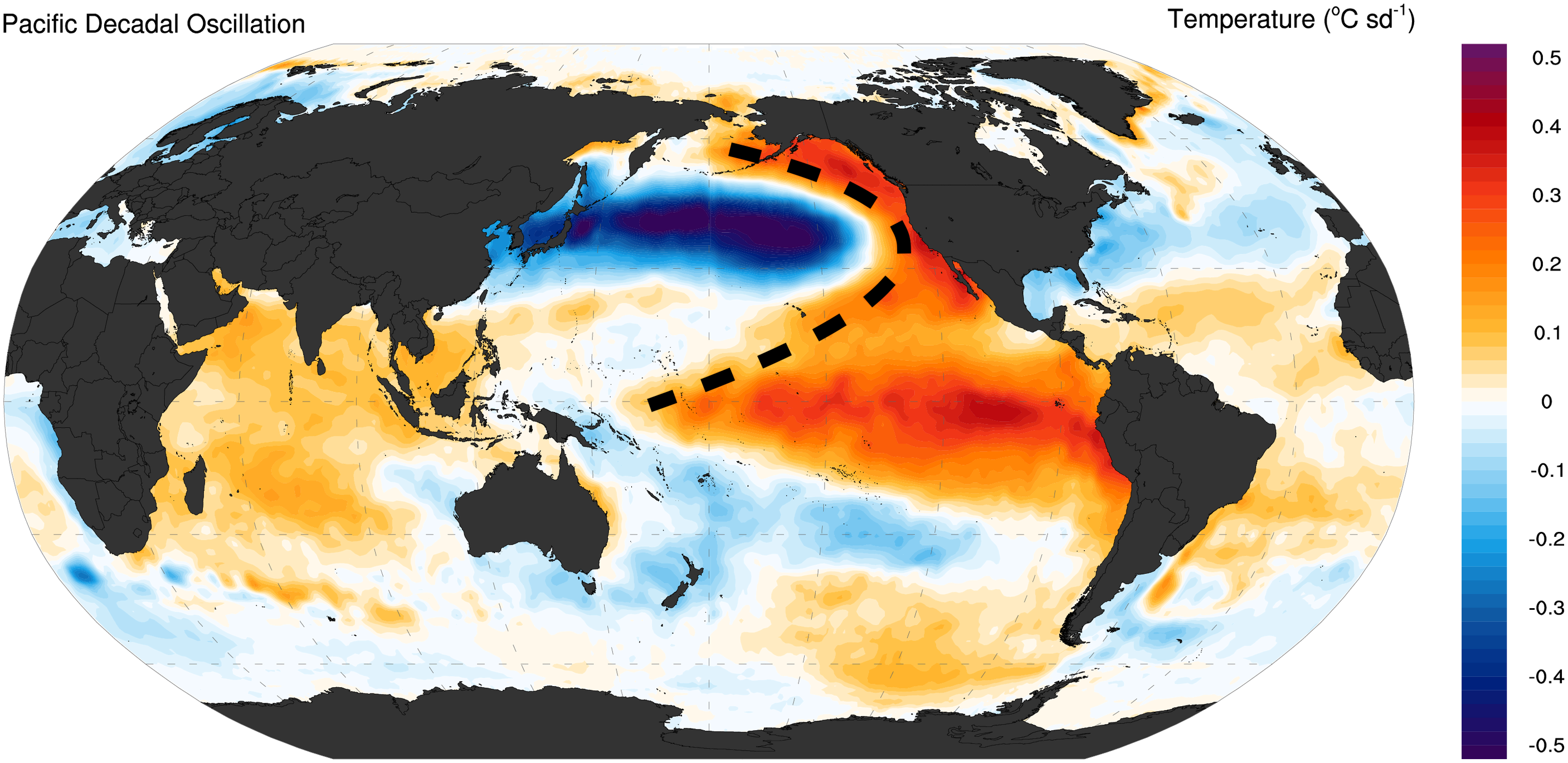
In the negative (or cold) phase, the pattern flips. Take the above figure and just mentally swap all the reds with blues and the blues with reds! Below is another graphic that shows both phases, although note the differences in the colorbar from the example above! Warm waters dominate the western Pacific, while the east (the horseshoe part) cools down. Unlike ENSO, which has its strongest influence in the tropics, the PDO mainly affects the higher latitudes in the Pacific, particularly areas north of 20°N or so. The shifts between its warm and cold phases aren’t as quick as ENSO’s, either—scientists believe that these transitions are driven by oceanic waves that take their time, roughly a decade, to propagate across the vast expanse of the North Pacific. This slower, longer-term nature of the PDO means its impacts are more drawn out, but still significant, especially for regions that rely on stable climate patterns, like the coastal ecosystems and fisheries of the Pacific Northwest.

Throughout the last century, we've seen several major PDO phase shifts. Look at the PDO time series below. For example, it moved from cold to warm around the 1920s and flipped back to cold right around the time World War II was wrapping up (mid-1940s). More recently, there was a significant shift from a cold to warm phase in 1976-77, which coincided with reductions in human-emitted pollution following the implementation of the Clean Air Act (we'll talk more about this when we talk about aerosols in a little while). Why is this noteworthy? Both the PDO phase shift and reduced aerosols contributed to warmer sea surface temperatures in the North Pacific, making it harder for scientists to separate the natural variability (what we are talking about in this lesson) of the PDO from human-induced climate changes (what we still need to discuss!) during that time.

Let's wrap up the discussion on the PDO with an important point: Can the state of the PDO actually predict anything about the atmosphere? The short answer is—it’s complicated. The PDO primarily represents an oceanic response to atmospheric changes, so we have to be cautious when attributing major shifts in atmospheric circulation directly to the PDO. That said, it can still have important local influences. Along the West Coast of the United States, for instance, a positive PDO phase, with its warmer-than-average ocean waters, often brings warmer winters and increased rainfall. On the flip side, regions like Asia and Australia might face drought conditions during these phases.
In addition to influencing weather, the PDO has notable impacts on marine ecosystems, especially fisheries. In Alaska, for example, salmon production tends to be higher during the positive (warm) phase of the PDO, which makes understanding this oscillation crucial for fishery managers and scientists alike. So, while the PDO’s direct role in atmospheric changes is limited, it plays a significant part in shaping regional climate patterns and marine life.
However, when it comes to explaining broader precipitation patterns, especially across western North America, the PDO takes a backseat to ENSO. See the maps below. They show how linked both PDO and ENSO are with precipitation anomalies in the United States. Note how the colors are "darker" for the ENSO, which shows that ENSO has a much more direct physical connection to rainfall variability. In fact, part of the reason PDO impacts can look similar to those of ENSO is because ENSO itself is a key part of the broader PDO pattern.

So, while the PDO index gives us a good sense of how various ocean and atmospheric processes are playing out in the North Pacific, it’s not necessarily the PDO itself driving weather changes. Instead, it’s the mixture of these processes that can affect weather and climate across places like the United States, with the PDO acting more as an indicator of these dynamics rather than the direct driver.
Quiz Yourself...
The Atlantic Multidecadal Oscillation (AMO)
The Atlantic Multidecadal Oscillation (AMO)Prioritize...
When you're finished with this page, you should be able to:
- define the AMO and its key characteristics and phases.
- explain the different hypotheses about what drives the AMO, including its potential links to the AMOC and external factors like aerosols and volcanic eruptions.
Read...
Let’s explore another major climate oscillation, this time in the Atlantic Ocean: the Atlantic Multidecadal Oscillation (AMO). The AMO represents a long-term pattern of sea surface temperature (SST) changes across the North Atlantic, with cycles that span 60-80 years. Like the PDO, the AMO has two phases: positive and negative. During the positive phase, SSTs across the North Atlantic—particularly in the subpolar regions near Greenland and the Labrador Sea—experience a noticeable warming. See all the red area I've circled in green in the figure below! In the negative phase, these same regions cool down -- like with the PDO, just imagine all of the colors "flipping" and you have a map of the negative phase.

Because the AMO covers such a large area and lasts for decades, it has significant impacts on both global and regional climate patterns. You can even spot the AMO’s influence in the global average temperature record. For example, during the early 1900s, a colder-than-usual period aligns with the AMO’s negative phase (below timeseries). Regionally, shifts in the AMO affect important features like the Atlantic Intertropical Convergence Zone, the North Atlantic jet stream, and the storm tracks that guide weather systems across North America and Western Europe. It also influences rainfall patterns during Africa’s monsoon season and plays a role in Atlantic hurricane activity. When the AMO is in its positive phase, the tropical Atlantic tends to be warmer, which is linked to more intense and frequent hurricanes.

The AMO index throughout the past century. The AMO index is calculated as SST anomalies averaged over the North Atlantic (northward of the equator). Red indicates the positive phase of the AMO, whereas blue represents the negative phase of the AMO.
Beyond its effects on weather and climate, the AMO also impacts marine life. Changes in ocean temperature associated with the AMO are thought to affect fish populations, such as the eel population in the Gulf of Maine, showing how far-reaching and interconnected these climate cycles can be.
Because observations of the North Atlantic Ocean have been quite limited[1], the available sea surface temperature (SST) records only capture about two full cycles of the Atlantic Multidecadal Oscillation (AMO). And even with this data, we still don’t fully understand the processes driving these temperature changes. In fact, there’s ongoing debate about the very nature of the AMO! Some scientists question whether the AMO is a true oscillation at all, or if it’s just a form of random low-frequency variability -- essentially just "static" like you'd get on an AM radio station. This uncertainty has led some to suggest using the term Atlantic Multidecadal Variability (AMV) instead, reflecting the idea that the SST changes we observe could simply be a response to factors like human-made aerosols or volcanic eruptions over the past century.
On the other hand, those who argue that the AMO is a physical oscillation often point to climate model-based results that show links between the AMO and the Atlantic Meridional Overturning Circulation (AMOC) we talked about in the last lesson. Remember, the AMOC is a vast system of ocean currents that transports heat from the equator toward the poles. When the AMOC speeds up, it carries more heat into the North Atlantic, leading to widespread warming across the basin. Since the AMOC moves slowly, its effects are felt over decadal to multidecadal timescales, aligning with the timing of the AMO phases.
However, the AMOC may not be the only factor driving the AMO. More recent research suggests that other components, like atmospheric circulation patterns (such as the North Atlantic Oscillation, which we’ll discuss next), as well as changes in the radiative properties of the atmosphere, freshwater fluxes, and even sea ice, could all play a role in shaping the AMO’s behavior.
Note [1]
It is noteworthy that the North Atlantic is already the most well sampled ocean basin. However, the observational records (back to the 1900s) of the North Atlantic, even for surface variables like SST, barely capture one or two cycles of the AMO/AMV. Without observational records, we can only infer the AMO mechanisms from numerical model simulation, which itself contains a range of sources of uncertainty. Thus, to date, the causes of AMO remain an open question without a definitive answer!
Read on.
Quiz Yourself...
Atmospheric Modes of Variability: NAO
Atmospheric Modes of Variability: NAOPrioritize...
When you're finished with this page, you should be able to:
- describe the key phases of the North Atlantic Oscillation (NAO) and their impacts on weather patterns in Europe and North America.
- explain the interactions between the NAO, ocean surface temperatures, and broader climate patterns like the AMO and AMOC.
Read...
Let's shift focus to three key atmospheric patterns that play a significant role in shaping weather and climate: the North Atlantic Oscillation (NAO), the Arctic Oscillation (AO), and the Antarctic Oscillation (also known as the Southern Annular Mode, or AAO). These oscillations represent important modes of internal variability, each with distinct impacts both locally and across the globe.
Let's start with the NAO (we'll turn to the other two soon). The NAO is particularly influential when it comes to weather patterns in Europe and North America. Meteorologists have been relying on the NAO for decades to improve the accuracy of their weather forecasts and climate predictions in these regions. These oscillations are driven by a complex interplay of atmospheric pressure systems, sea surface temperatures, and other environmental factors, illustrating the deeply interconnected nature of the Earth's climate system.
The North Atlantic Oscillation (NAO)
“Late in the 18th century, a missionary who had traveled back and forth across the Atlantic Ocean for several years noted that mild winter conditions in Greenland often coincided with severe winter conditions in Denmark, and vice versa. The severe-versus-mild phenomenon he described is now recognized as an impact of the North Atlantic Oscillation, or NAO.”
The North Atlantic Oscillation (NAO) describes the fluctuations in sea level pressure between two key pressure systems: the Icelandic Low (a low-pressure zone near Iceland) and the Azores High (a high-pressure zone near the Azores islands). When the NAO is in its positive phase, both the Icelandic Low and the Azores High intensify, which increases the pressure difference between the subtropics and mid-latitudes. Ah, but we've learned about the pressure gradient force! Recall that an increased pressure differential leads to faster winds. In contrast, during the negative phase of the NAO, this pressure contrast weakens. It's important to note that the NAO is typically more pronounced in the winter months, meaning its climatic impacts are also stronger during that season.
By influencing pressure patterns over the North Atlantic, the NAO directly affects the strength and direction of westerly winds and storm tracks, which in turn alters temperature and precipitation patterns. While its effects can be felt globally, the NAO has the most significant impact on weather and climate across the North Atlantic region and nearby continents, particularly in Europe and North America. During a positive NAO phase, stronger winds (because of the increased pressure difference and, therefore, stronger pressure gradient force!) carry warm, moist air from lower latitudes to northern Europe, resulting in warmer, wetter winters. Meanwhile, southern Europe often experiences cooler, drier conditions. On the other hand, a negative NAO phase brings colder, snowier winters to northern Europe and milder, wetter winters to the south. The eastern coast of North America is also affected, with the NAO influencing winter cold air outbreaks and snowfall. Hopefully, the schematic below will help put the pieces together. Spend a few minutes digesting it!
A striking example of the NAO's influence occurred between December 28, 2009, and January 13, 2010. An extremely negative NAO led to record-breaking cold temperatures across the Eastern US and northern Europe. Anomalous northerly winds pushed Arctic air southward into cities like Washington D.C. and even Miami. The D.C. area received a remarkable 72 inches of snow that winter, while Miami recorded a low of 36°F (2.22°C) on January 11, 2010, breaking a decades-old record. This event highlights how the NAO can drive extreme weather conditions, particularly during its negative phase!

The exact mechanisms behind the North Atlantic Oscillation (NAO) remain complex and are not yet fully understood. The most widely accepted explanation involves the interaction between the jet stream and atmospheric eddies, which drives the NAO as a largely self-sustaining mode of internal atmospheric variability. However, the NAO is far from being an isolated phenomenon. It actively interacts with the ocean, creating a dynamic relationship between the atmosphere and the sea surface.
For instance, shifts in the NAO phase leave a noticeable impact on ocean surface temperatures, which in turn can influence future NAO pressure patterns by altering the temperature gradient* of the North Atlantic Ocean. Beyond its shorter-term variability, the NAO also exhibits changes over decadal to multidecadal timescales. This longer-term variation is thought to be linked to broader climate patterns like the Atlantic Multidecadal Oscillation (AMO) and the Atlantic Meridional Overturning Circulation (AMOC), suggesting that the NAO is part of a much larger system of interconnected climate processes.
Semi fun-fact:
In the mid-latitudes, temperature differences — both horizontally and vertically — between different air masses are tied to something called baroclinicity. This term refers to how temperature changes in space, and it plays a big role in driving storms and winds. So, when we mention temperature gradients, we're also talking about the forces that help fuel much of our weather!
Quiz Yourself...
Atmospheric Modes of Variability: AO and AAO
Atmospheric Modes of Variability: AO and AAOPrioritize...
When you're finished with this page, you should be able to:
- describe the positive and negative phases of the Arctic Oscillation (AO) and their impacts on temperature, precipitation, and winter weather patterns in the Northern Hemisphere.
- explain how various factors, such as Arctic sea ice, snow cover, and volcanic eruptions, contribute to shifts in the Arctic Oscillation (AO) phases.
- describe the positive and negative phases of the Antarctic Oscillation (AAO) and their influence on temperature, westerly winds, and rainfall patterns across the Southern Hemisphere.
Read...
The Arctic Oscillation (AO)
Let’s discuss the Arctic Oscillation (AO), a key climate pattern that involves shifts in pressure between the Arctic and the mid-latitudes, particularly over the North Pacific and North Atlantic. These pressure differences influence how Arctic air moves across the Northern Hemisphere. The AO has two main phases—positive and negative—and each brings its own kind of weather.
When the AO is in its positive phase, surface pressure in the Arctic drops lower than usual, while pressure in the mid-latitudes rises. This setup strengthens the polar vortex, a large, persistent area of low-pressure and cold air that circulates around the polar regions, acting as a barrier that keeps colder air trapped near the poles. With a strengthened vortex, a positive AO effectively locks in that Arctic air. The result? The jet stream, which is like a fast-moving river of air high above us, stays further to the north, keeping colder temperatures confined to the Arctic. For those of us living in the mid-latitudes, this means milder winters, as the cold air doesn’t push as far south.
On the other hand, when the AO switches to its negative phase, things flip around. The pressure differences weaken the polar vortex, allowing it to wobble and send that cold Arctic air further south. As the jet stream dips down into the mid-latitudes, areas that might normally enjoy milder winters can suddenly get hit with frigid Arctic air, leading to much colder and stormier conditions. This phase is often associated with harsher winters in places like the eastern United States and Europe, thanks to those southward surges of cold air.
“Consequently, locations in the mid-latitudes are more likely to experience outbreaks of frigid, polar air during winters when the AO is negative.”
The Arctic Oscillation (AO) doesn't just influence temperature—it also affects where and how much it rains or snows. When the AO is in its positive phase, Northern Europe typically experiences wetter conditions, while Southern Europe and areas around the Mediterranean tend to dry out. But when the AO flips to its negative phase, these patterns can reverse, bringing more rain to Southern Europe and drier weather up north.
What drives the AO's shifts? A mix of internal and external factors plays a role. Changes in Arctic sea ice and snow cover, variations in solar radiation, and even volcanic eruptions can all influence how the AO behaves. These factors can interact with the atmosphere, nudging the AO into its positive or negative phase and shaping weather patterns across the Northern Hemisphere.

Antarctic Oscillation (AAO)
In the Southern Hemisphere, there's a similar climate pattern to the Arctic Oscillation (AO), called the Antarctic Oscillation (AAO). Scientists also refer to this as the Southern Annular Mode (SAM) -- it's fine if you want to use them interchangeably. Maybe researchers were just tired of having all the “AO”s and wanted an easier acronym to remember!
Unlike its northern counterpart, the AAO is less interrupted by landmasses, making it more zonal, or west-to-east, in nature. Because of this, the AAO has a stronger influence on the position of the westerly winds that circulate around Antarctica. These winds shift north and south depending on whether the AAO is in its positive or negative phase, representing a change in atmospheric mass between the mid-latitudes and the Antarctic region.
The AAO also impacts weather patterns across the Southern Hemisphere. In its positive phase, the westerly winds strengthen and move closer to Antarctica, keeping the mid-latitudes cooler and making conditions warmer over Antarctica. In the negative phase, the winds weaken and shift northward, leading to warmer temperatures in the mid-latitudes and cooler ones in Antarctica. These shifts in the AAO also influence rainfall patterns. A positive phase typically brings drier weather to parts of Australia, New Zealand, and South America, while the negative phase tends to increase rainfall in those regions.

The AAO is primarily driven by differences in atmospheric pressure between the mid-latitudes and Antarctica. The strength of this oscillation is closely tied to variations in the temperature gradient across the Southern Ocean, particularly changes in sea surface temperatures (SST). As sea ice around Antarctica expands or contracts, it can shift the dynamics of the AAO. Additionally, the state of the ozone hole—its formation and recovery—also plays a role in influencing the strength and behavior of this pattern, further affecting the weather and climate across the Southern Hemisphere.
Quiz Yourself...
Summary
SummaryRead...
- Climate modes of variability are recurring patterns that influence weather and climate over various timeframes, ranging from years to decades. Understanding these modes is essential to understanding how Earth’s climate fluctuates naturally.
- El Niño-Southern Oscillation (ENSO) is a key climate mode that shifts between El Niño (warmer waters in the eastern Pacific) and La Niña (cooler waters). ENSO impacts weather patterns globally, from rainfall in the United States to droughts in Australia and Indonesia.
- The Pacific Decadal Oscillation (PDO) operates on a longer timescale, typically 20-30 years. The PDO influences temperatures and weather patterns, particularly along the U.S. West Coast, and can affect marine ecosystems like salmon populations.
- The Atlantic Multidecadal Oscillation (AMO) impacts sea surface temperatures in the North Atlantic, with cycles lasting 60-80 years. It plays a significant role in Atlantic hurricane activity and weather patterns in North America and Europe.
- These climate modes don’t act in isolation; they overlap and interact, creating complex effects on global and regional weather. For example, ENSO and PDO can influence precipitation in North America, and their interaction can either amplify or dampen weather extremes.
- The North Atlantic Oscillation (NAO) and the Arctic Oscillation (AO) are atmospheric patterns that drive variations in winter weather across Europe and North America.
- The NAO’s positive phase brings mild, wetter winters to northern Europe and drier conditions to southern Europe. A negative phase has the opposite effect.
- The AO’s positive phase locks cold air in the Arctic, while its negative phase allows cold Arctic air to spill into the mid-latitudes, leading to colder winters.
- In the Southern Hemisphere, the Antarctic Oscillation (AAO) shifts westerly winds around Antarctica. The positive phase brings cooler conditions to the mid-latitudes, while the negative phase moves warmer air northward.
- By understanding these modes of variability, we gain insight into how Earth’s climate system behaves over time, helping scientists make better long-term climate predictions.
Quiz Yourself...
Lesson 7: Changes in Climate Over the Past 4 Billion Years
Lesson 7: Changes in Climate Over the Past 4 Billion YearsMotivate...

There's an enormous jigsaw puzzle with pieces scattered across eons of Earth’s history. Some pieces tell the story of tropical warmth, others of icy ages, and still others of fiery volcanic eruptions or subtle shifts in the Sun’s energy. Now, I'm going to hand it to you. Before we can talk about how climate may evolve in the future, we need to understand how it has evolved in the distant past. Your task? To dump these pieces all over the table (hopefully, you've cleaned it off!) and reveal how our planet's climate has changed over millennia.
Puzzle analogy aside, we have a big problem: we (meaning all of humanity!) weren’t around to see most of it firsthand, so how do we do it? The answer lies in the clues left behind—proxies, natural records hidden in ocean sediments, ice cores, tree rings, and even pollen. These records are like nature’s time capsules, silently preserving critical information about past climates. But proxies are just the beginning of the story. They tell us “what” happened, but we still need to understand “why.” To do that, we also need to consider larger forces at play: massive ice ages, shifts in Earth's orbit that influence solar radiation, and even volcanic eruptions that cool the planet by blocking sunlight with clouds of ash. Each of these forces adds to the complexity of Earth’s climate puzzle, and as we piece them together, we start to see patterns—patterns that not only tell us about the past but also hint at what’s to come.
In this lesson, you’ll learn how scientists reconstruct the climate’s history using proxies and what this tells us about the climate going back millions (and billions) of years. You'll also find out how Earth’s orbit, sunspots, and volcanic eruptions have shaped the climate. You’ll explore how these factors can work together to trigger events like ice ages or cause dramatic shifts in weather patterns. Understanding the interactions between these forces helps us make sense of today’s climate and gives us the tools to anticipate future changes.
So, let’s dive into Earth’s climatic past and discover the processes that have shaped our planet’s weather and climate for billions of years. Every proxy, every volcanic eruption, every solar cycle is another piece of the puzzle, and together, they reveal a picture of Earth’s ever-changing climate system. Ready to explore the forces that have shaped our world?
Reconstructing our Climate's History: Sediment and Ice Cores
Reconstructing our Climate's History: Sediment and Ice CoresPrioritize...
When you have finished this page, you should be able to:
- List at least two ways climate scientists reconstruct past climate and describe how they work.
Read...
Characterizing the climate today is (relatively) straightforward. As we’ve discussed, we have a variety of tools at our disposal, including in-situ measurements (like weather stations) and remote sensing (such as satellites) that allow us to observe the Earth system in real time. However, these methods have only been around for about a century for surface measurements and even less time for satellite observations. So, how do we know about climate conditions from hundreds, thousands, or even millions of years ago? You've likely heard of ice ages, which clearly happened long before our modern instruments existed!
The answer lies in what climate scientists call proxy records—natural recording systems that help us reconstruct past climates. These proxies come from sources like ocean and lake sediments, ice cores, and tree rings. Each of these provides clues about what the climate was like in different periods, allowing us to piece together a picture of Earth’s climate history long before we started taking direct measurements.
Ocean/Lake Sediments
Ocean and lake floors contain layers of sediment that can tell us about the climate at the time the sediment formed. Sediment is a mixture of particles, including minerals, organic material, and fragments of rocks, that settles at the bottom of a body of water over time. When you've gone swimming in a lake, you have probably felt the bottom as a bit of a "sandy muck" -- this floor gets compressed over long periods of time and pushed down and forms the sediment we are talking about.
Deep underneath the ocean/lake floor, these sediment layers can contain shells of tiny creatures. The species of creatures are present provide information about the surface water temperature. Some may like water at 50°F, others may prefer 55°F. We can also look at the ratio of different oxygen isotopes within the sediment cores. What is an isotope, you ask? Isotopes are variants of a chemical element with the same number of protons but different numbers of neutrons in their nuclei, giving them different atomic masses. An oxygen atom always has 8 protons in its nucleus, but it can have different numbers of neutrons! For example, oxygen isotope 18O has 8 protons and 10 neutrons (8 + 10 = 18), which makes it heavier than 16O, which has 8 protons and 8 neutrons (8 + 8 = 16). The bigger the number, the "heavier" the isotope.
The fraction of heavy versus light isotopes can tell us something about the temperature of the water at the time the sediment was formed. Think it's magic? Here’s how it works. First, we should remember that the chemical formula for a water molecule formula is H2O, meaning that it contains two hydrogen atoms and one oxygen atom. Water with the lighter 16O isotope, is easier for the atmosphere to evaporate. When the climate is warmer 16O evaporates into the atmosphere eventually falls back as precipitation in the ocean and lakes from which it originated. However, during colder periods, much of this lighter 16O falls as rain or snow that becomes trapped in ice sheets. This "locks" the 16O isotope out of the ocean circulation (since it's "stuck" in the ice), and we find a higher concentration of the heavier 18O isotope in the ocean. When we find higher concentrations more 18O in ocean sediments, it's a sign that -- when that sediment was formed -- the global temperatures were cooler, and ice sheets were more extensive. Pretty neat, huh?
It is quite an operation to retrieve these cores. Have a look at the following video to see scientists in action collecting these important records.
Video: Martin Jakobsson explains how to collect sediment cores from the sea floor (3:23)
Martin Jakobsson explains how to collect sediment cores from the sea floor
[music]
On screen text: How do the scientist collect sediment cores from the bottom?
Martin Jakobsson, Stockholm University: The sediment Cores we collect with different devices depending on what we're after. If we're after the surface, a very undisturbed surface sample, we take what's called a Multicore. That is a slightly different device, where you have very short tubes instead that are more controlled, pushed into the sea floor, and you get maybe 50 centimeters or something in eight different cores. They're so undisturbed that you actually preserve, in the best case scenario, you preserve the surface of the sea floor. If there's something lying on the ocean, for example, a sea star or something, sometimes that one. One can be unlucky, and then it get caught right into the sediment corner, and it actually got hoisted up.
[music]
If we would like to take long sediment records and study long climate series, we try to go for what we call a piston core, which is an old Swedish invention from Borja Kullenberg. And that is simply a pipe. And in the pipe, you have a piston. And that pipe is to the sea floor, you have a trigger arm that release, it falls freely, and then this piston stops at the sea floor. It prevents the whole compression of the sediment so the pipe can go down much easier and take very long records.
So from all that, we can take up to 12 meters. And then we have gravity course, which is very simpler. It's just a barrel or a pipe that you load to the sea floor and then just let it go and take sediments. Inside these pipes, we have what we call a liner. That's a plastic tube that capture the sediments. So, we have a container that is very controlled. So you get very nice sediment records. You see all the layers, they get fairly undisturbed. And that's what we're after for the long term of climate series.
[music]
Ice Cores
Glaciers grow as snow falls in layers that are slowly compacted into ice. Over time, this creates a deep glacier, like the Greenland Ice Sheet. These ice sheets stay frozen, preserving a long record of the composition of the snow from which scientists can get a variety of different measurements important for understanding the climate. To do so, long cylinders of ice are drilled and collected. From here, trapped air bubbles can be sampled to determine the composition of the atmosphere at the time the ice was formed. This can tell us, for example, what the concentration of carbon dioxide was. Similar to the ocean sediment cores, the air temperature can also be estimated by looking at the molecules that make up the frozen water, in particular, the ratio of oxygen isotopes. Within an ice core, more lighter isotopes indicate colder temperatures. Specific events, like volcanic eruptions can also be seen in these records, which helps determine the age of the ice at different depths in the core.
Quiz Yourself...
Reconstructing our Climate's History: Tree Rings and Pollen Grains
Reconstructing our Climate's History: Tree Rings and Pollen GrainsPrioritize...
When you have finished this page, you should be able to:
- List two other ways climate scientists reconstruct past climate and describe how they work.
Read...
Tree rings
If you've ever looked closely at a tree stump, you’ve likely noticed it grows in a pattern of concentric rings. These rings represent the tree's seasonal growth, with each one marking another year of the tree’s life. By counting these rings, scientists can determine the age of the tree—sort of like reading the chapters of a well-preserved book. But these rings tell more than just the tree’s age; they also provide insights into the climate conditions in which the tree grew. The width, color, and even the density of each ring can reveal if the tree experienced a wet or dry year, a warm growing season, or times of stress due to drought. In this way, trees act like natural climate historians, recording information about past environments.
What’s more, scientists can match tree ring data to modern climate records, allowing them to calibrate the patterns in tree rings with actual weather conditions. This process helps researchers reconstruct detailed climate histories, sometimes going back hundreds or even thousands of years. And the best part? These ancient trees don’t need to be cut down for us to access this information. Using a tool called a tree corer, scientists can carefully extract a small cylinder of wood from the tree without harming it (the tree eventually fills that wood back in). This allows the tree to continue growing while still providing scientists with a rich climate record. Win-win!

The NOAA National Centers for Environmental Information (NCEI) manages the International Tree-Ring Data Bank (ITRDB), a global repository of tree ring data. This database contains growth records from over 4,600 locations across six continents, offering insights into historical climate conditions. In addition to living forests, the data include ring patterns from ancient structures and even rare artifacts like Stradivari violins! Scientists use these records to compare tree growth with local weather data, helping to reconstruct climate patterns for hundreds or even thousands of years. These reconstructions provide critical baselines for understanding natural climate variability and assessing human-induced climate change.
Using tree ring data, researchers have pieced together important events in climate history. For example, reconstructions based on tree rings from the American Southwest reveal a prolonged drought in the late 1200s. See the figure below of rainfall anomalies over a 16-year period estimated from tree rings. In particular, note the 13-year period of continuous drought conditions (red areas denoting below-average rainfall from 1276-1289). This drought likely contributed to the abandonment of the Mesa Verde cliff dwellings by the Ancestral Pueblo people.

Pollen Grains
Pollen grains, produced by plants, are another valuable tool for reconstructing past climates. These tiny grains, which are actually the reproductive cells of plants, are often preserved in sediments found in lakes, bogs, and even ocean floors. Different plant species produce pollen with distinct shapes, a bit like each plant having a fingerprint. This allows scientists to identify which plants were present at a given time. Similar to how ice cores are used, scientists pull a core from a sediment layer and analyze the types of pollen in each part of the core. From this, scientists can infer what the local vegetation was like, which in turn reflects the climate. For example, an abundance of tree pollen might suggest a warm, temperate climate, whereas a higher concentration of grass pollen might indicate cooler, drier conditions. As for tree rings, this method is also non-destructive, meaning samples can be collected without disturbing the environment, and it provides an essential link between climate and the biosphere during periods long before humans walked the Earth.

Quiz Yourself...
Reconstructing our Climate’s History: Old Logs and Written Records
Reconstructing our Climate’s History: Old Logs and Written RecordsPrioritize...
When you have finished this page, you should be able to:
- List one more way scientists can reconstruct past climate without direct observations.
- Explain how these tools for climate reconstruction can be added together to teach us that the climate has varied significantly in the distant past.
Read...
Old Logs and Written Records
I want to touch on one more source of climate data, albeit one that isn't technically a proxy. Before the advent of modern meteorological instruments, early observers meticulously recorded weather conditions in logs, diaries, and other written records. Ship captains, for instance, often noted wind patterns, sea ice, and weather events during their voyages across the world’s oceans. Handwritten records from explorers, farmers, and even monks often contain detailed accounts of temperature, rainfall, and unusual events such as droughts, floods, or frosts. For instance, ship logs from the 18th and 19th centuries have been used to reconstruct historical sea ice extent in the Arctic and Antarctic. Likewise, personal diaries from farmers have revealed details about crop failures and harsh winters, which can indicate broader climate conditions.
While these observations are certainly not as precise as modern measurements many times they are qualitative, talking about "a great heat wave" instead of providing a numeric temperature they can help us piece together patterns of past climate and weather events, especially when combined with other sources of data, such as the ones above. They can also give us a picture albeit a fuzzy one of trends in extreme weather, like what hurricane landfalls may have looked like around the founding of the United States.

Stitching all of these together, we can get a more complete view of how the temperature of the planet has changed over geological time. The figure below shows estimates of the Earth's temperature from 500 million years ago (on the far left) to the present day (on the far right). We have a more detailed understanding of the temperature the closer we get to the present day, so the tick marks for time are change at each vertical break in the figure, starting with every 100 million years (100,000,000 years) in the first section and ending with every thousand years (1,000 years) on the right.

The color and width of tree rings can provide snapshots of past climate conditions.
From this figure, we can see that the Earth’s temperature has changed drastically over the course of geological time. Within this period, many changes occurred: the continents changed positions, volcanic activity ramped up and ramped down, and the atmosphere had different amounts of carbon dioxide. In general, periods that are very warm over the Earth’s history are ones where the carbon dioxide is higher. Over the past 11 thousand years the Earth’s temperature has been relatively constant, allowing humans to thrive. This is the case until very recently, when an increase in carbon dioxide created by people has led to a quick increase in temperature that is projected to continue, as depicted by the red dots representing projected temperatures for 2050 and 2100. Remember, the scale on the bottom is changing with each break. Although the Earth has been as warm as we are projecting it to become, it has never happened this quickly or when humans have been able to thrive.
Quiz Yourself...
Why Earth's Orbit Matters
Why Earth's Orbit MattersPrioritize...
When you have finished this page, you should be able to:
- Define the three main orbital cycles of the Earth: tilt (a.k.a. obliquity), wobble (a.k.a. precession), and ellipticity (a.k.a. eccentricity).
- For each of the three orbital parameters, describe how they impact the amount of solar radiation that hits the Earth.
Read...
Way back in Lesson 3, we talked about how solar radiation from the Sun strikes the Earth differently in different seasons. For Northern Hemisphere summer, the Earth's north pole tilted toward the Sun and vice versa for the winter. This is why we have longer days in summer than in winter. The geometry of Earth's annual orbit around the Sun changes slowly over time. These changes are subtle, but they are persistent over thousands of years and have a profound impact on climate.
Obliquity
The first of these changes involves the tilt angle (or, more technically, the obliquity) of Earth's axis relative to its orbital plane. Today, the Earth's rotational axis is inclined at an angle roughly 23.5 degrees from the vertical to the orbital plane. This is why the tropics are located between 23.5°N and 23.5°S and why the Arctic and Antarctic circles are poleward 66.5°N and 66.5°S (90°-23.5°=66.5°), respectively. This angle of inclination is not fixed over time, however, and it varies between roughly 22.1 degrees and 24.3 degrees. Seasonality only exists because of the tilt; if not for the tilt, neither hemisphere would be preferentially tilted toward the Sun at any time of the year. Therefore, periods, when the tilt angle is greatest, are periods of heightened seasonality, while periods, when the tilt angle is smallest, have reduced seasonality. It takes roughly 41 thousand years (41,000 years) for the tilt angle to go through one full cycle of alternation between minimum and maximum values of the obliquity.
Video: Changes in Obliquity (Tilt) (:01) (No Audio)
Wobble
The second of these orbital variations involves the slow wobble (or, to use the more technical term, the precession) of the Earth's rotational axis. This is analogous to the wobbling of a gyroscope. One full wobble takes roughly 19-23 thousand years (19,000-23,000 years). The precession determines when the Northern and Southern Hemispheres are each tilted toward (summer) or away (winter) from the Sun.
Video: Axial Precession (Wobble) (:04) (No Audio)
The primary importance of this factor is that it determines whether the summer solstice in each hemisphere occurs when Earth is farthest (making summer a little cooler) or closest (making summer a little warmer) to the Sun. This factor only matters, then, because Earth's annual orbit around the Sun is not circular but slightly elliptical – which brings us to our last factor.
Eccentricity
The last of Earth's changing orbital parameters involves the ellipticity (or, to use the more technical term, the eccentricity) of the orbit. Another way to think about this in non-technical terms is the "ovalness" of Earth's path around the Sun. Earth's orbit is not circular but, instead, is slightly elliptical. The degree of ellipticity is measured by the eccentricity, which ranges from roughly zero (an essentially circular orbit) to a maximum of roughly 4% (a slightly elliptical orbit). It takes roughly 100 thousand years (100,000 years) for the eccentricity to go through one full cycle of alternation between low and high eccentricity.
Video: Changes in Eccentricity (Orbit Shape) (:07) (No Audio)
These orbital cycles were first discovered by a mathematician named Milutin Milankovitch. Recreating past and future values of these orbital parameters is straightforward using celestial mechanics (a branch of astronomy that deals with motions of objects in outer space) and Milankovitch did these calculations by hand back in the early 1900’s.
The most important part of these orbital parameters is that they impact where solar radiation hits the Earth. Based on his calculations, Milankovitch theorized that the amount of solar radiation hitting the Northern Hemisphere could swing by 20% depending on the relative phases of these cycles. This has significant impacts on the climate system. In the next section, we will discuss how these can lead to large swings in the Earth’s temperature during glacial-interglacial periods.
Let's review these three important concepts. Think about what they mean -- if you can't define it in your head, click to expand and make sure "you hammer it home!"
- Obliquity (Tilt)
This refers to the angle between Earth's rotational axis and the vertical to its orbital plane around the Sun. Earth's tilt changes slightly over a cycle of about 41,000 years, varying between approximately 22.1° and 24.5°. Changes in obliquity affect the severity of the seasons: a greater tilt means more extreme seasons (hotter summers and colder winters), while a smaller tilt leads to milder seasons.
- Precession (Wobble)
Precession is the slow wobble of Earth's rotational axis, similar to the wobbling of a spinning top. This wobble occurs over a cycle of roughly 19,000 to 23,000 years. Precession alters the timing of when each hemisphere is tilted toward or away from the Sun, affecting the timing of the seasons in relation to Earth's position in its orbit.
- Eccentricity (Ellipticity)
Eccentricity describes the shape of Earth's orbit around the Sun, which changes from being more circular to more elliptical over a cycle of about 100,000 years. When the orbit is more elliptical, the distance between Earth and the Sun varies more throughout the year, influencing the amount of solar energy Earth receives and impacting long-term climate patterns.
Quiz Yourself...
Glaciers? Or No Glaciers?
Glaciers? Or No Glaciers?Prioritize...
When you have finished this page, you should also be able to
- Explain how the orbital cycles discussed in the previous section can lead to large regular swings in the Earth’s temperature between glacial and interglacial periods.
- Define the ice-albedo feedback.
Read...
Glacial-Interglacial Periods
If you had an eagle eye, you might have noticed on the first page of this lesson that the planet's temperature has experienced large regular swings over the past 500,000 years. See the zoomed-in figure below, where the blue and green lines are temperature reconstructions from ice core data in Greenland and northern Russia, respectively. These large swings are called glacial-interglacial cycles. Looking at the time between each peak in temperature, you will see that these cycles occur roughly every 100,000 years. Why do these oscillations occur? Why do they have a regular period of 100,000 years? What explains their “sawtooth-like" shape where the temperature increases rapidly and then decreases slowly? These are all good questions -- let's see if we can answer them!

The previous section of this lesson taught us about three orbital cycles that occur on long timescales (protip: you should pause here and test yourself to see if you can list the three!). The eccentricity of Earth’s orbit, in particular, operates with a period of 100,000 years. This sounds suspiciously like it could be related to the glacial-interglacial cycles! The question is how?
First, let’s think about how these three orbital parameters alter where and when solar radiation hits Earth. In short, we have stronger seasonality when Earth is more tilted, and when precession causes Earth’s Northern Hemisphere to tilt toward the Sun (summer) at a point when it is closer to the Sun. Think about it: when Earth’s axis is tilted more, the poles experience more extreme seasonal differences. If, during this time, Earth is also farther away from the Sun during Northern Hemisphere summer due to precession, summers—while still warmer than winter—become less hot. These impacts are amplified when the eccentricity of the orbit is greater—that is, their role is "turned up" the more oval-shaped Earth's orbit becomes.
When summers are cooler in the Northern Hemisphere due to a combination of these factors, snow and ice are less likely to melt fully. So, what role does ice play in all of this? Excellent question—we need to explore another (very) important feedback in the climate system.
Ice-Albedo Feedback
Let’s dive deeper into the ice-albedo feedback, a process that can amplify the impact of the orbital parameters we’ve just discussed. Remember when we talked about solar radiation earlier in this class? That’s where we first encountered the concept of albedo. To refresh your memory: albedo is a measure of how much sunlight a surface reflects. Snow and ice have a high albedo, meaning they are excellent at reflecting incoming sunlight back into space, which helps keep the surface cool. In contrast, the ocean or land beneath the snow and ice has a much lower albedo, meaning these surfaces absorb more sunlight, which warms the surface.
Now, let’s consider what happens when there’s less ice than usual. In this scenario, more of the low-albedo ocean or land would be exposed, causing more sunlight to be absorbed rather than reflected. More absorption of solar radiation means more "energy in" and a warmer surface. This additional warmth would melt even more snow and ice. As the ice melts, the exposed surface area with low albedo increases, which leads to even more absorption of solar energy. This results in further warming, which melts more ice, and the cycle continues.
Experiment:
In many northern areas of the United States, homeowners who heat their homes with wood often spread dark ash over snow and ice-covered driveways. This not only helps with traction for vehicles but also accelerates the melting process by exposing the underlying darker surface. It's the same concept at play as the ice-albedo feedback! You can try a mini version of this experiment yourself—sprinkle some dark material (like ash from a fireplace or charcoal grill) onto a small patch of snow-covered asphalt and -- once the sun comes out -- observe how much faster it melts compared to the untouched snow!
This process is an example of what we call a positive feedback. Essentially, an initial change (in this case, less ice) triggers a series of events that reinforce and amplify the original change.
The ice-albedo feedback is a powerful mechanism in the climate system. It’s one of the reasons why relatively small changes in Earth's orbital parameters can lead to such dramatic shifts in global temperatures during glacial and interglacial periods. The more ice melts, the more the Earth warms, and vice versa. This feedback loop plays a key role in amplifying the natural variability introduced by the orbital cycles.
Think About It...
Quiz Yourself...
How to Build an Ice Age
How to Build an Ice AgePrioritize...
When you have finished this page, you should also be able to
- Explain how orbital parameters and the ice-albedo feedback can "combine" to create ice ages
Read...
Ready to add another recipe to your book? Let's write "How to make an ice age."
Let's put the two concepts we just learned together. Roughly every 100,000 years, the eccentricity of Earth's orbit reaches a high value, creating the largest possible differences in Earth-Sun distance over the course of the year. During these times, there's a point in the much faster 19,000-23,000 year precession cycle when Earth is tilted toward the Sun at its closest approach. This makes summers exceptionally warm and winters unusually cold. This effect is further amplified when the obliquity (tilt of Earth's axis) is at its maximum. We focus on the Northern Hemisphere because there's more landmass, allowing snow and ice to form further south. Typically, winter temperatures are cold enough to maintain ice, but very warm summers lead to rapid melting of snow and ice.
In the figure below, we can see the three orbital parameters—precession, obliquity, and eccentricity—plotted over time. Notice how these cycles oscillate at different frequencies: precession is the fastest, followed by obliquity, with eccentricity being the slowest. Also shown in this figure is the summer Northern Hemisphere insolation (solar radiation received at 65°N). If you look very closely, you'll see how this insolation pattern is linked to the orbital cycles: broad changes every 100,000 years from eccentricity, with smaller, faster changes from precession and obliquity. Lastly, the ice core temperature record offers a glimpse into Earth's past climate, where you can clearly see the sawtooth pattern of glacial-interglacial cycles, occurring roughly every 100,000 years.
Let's focus on one glacial-interglacial cycle in particular. First, note that in this graph, time progresses to the left, opposite to what we've usually seen -- there's nothing wrong with this, but you need to flip your brain to think "hey, the present day is on the very left of this plot." Starting at point A, we see a period of very cold temperatures—an ice age—followed by a rapid increase in temperature. This warming coincides with an increase in Northern Hemisphere summer insolation at 65°N, along with a rise in eccentricity and high obliquity and precession values. As described earlier, this combination of factors—greater eccentricity amplifying the effects of precession and obliquity—leads to warmer summers that quickly melt ice, triggering a positive feedback loop that pulls Earth out of the ice age.
At point B, both precession and obliquity are in their negative phases, and eccentricity begins to decrease. This reduces solar radiation at 65°N, leading to warmer winters and cooler summers in the Northern Hemisphere. These conditions are perfect for growing ice sheets: warmer winters allow for more snowfall (since warmer air holds more moisture), and cooler summers prevent accumulated snow from melting. Ice begins to build up, reflecting more solar radiation back to space and causing cooling to spread southward. This is how a glacial period slowly takes hold, lasting tens of thousands of years. The sawtooth pattern of Earth's temperature comes from the fact that melting ice happens faster than its accumulation, leading to quicker warming followed by slower cooling.

Let’s return to the full reconstruction of Earth’s climate history that we looked at earlier (I’ve copied it below—trust me, you’ve seen it before!). You might notice something interesting: these ice ages didn’t start showing up until about 700,000 years ago (the wobbles beginning in the fourth panel). Why weren't there more ice ages in the earlier panels? The mechanism we discussed for glacial-interglacial cycles relies on the formation of large ice sheets, and scientists think that the climate just wasn’t cool enough yet to allow for that. While we can’t say for certain, the leading theory is that the planet needed to cross a cooling threshold for large ice sheets to form. This gradual cooling is thought to have been driven by a slow decline in carbon dioxide concentrations over millions of years. In other words, during the time of the dinosaurs, for example, the planet was simply too warm for the ice-albedo feedback to kick in. Eventually, as the Earth continued to cool with age, it reached that critical point, allowing the 100,000-year cycles we see in blue below (and in the figures above) to begin.
The glacial-interglacial cycles we observe, driven by Earth's orbital changes and amplified by feedback loops like ice-albedo, have only become prominent in the last 700,000 years as the planet's temperature gradually dipped, allowing large ice sheets to form and trigger these dramatic climate shifts. Pretty "cool!"
Quiz Yourself...
Solar Variability and Sunspots
Solar Variability and SunspotsPrioritize...
On this page, you will learn:
- Define sunspots and faculae, and explain how sunspots can change how much energy the sun emits in the short-term
- Explain how sunspots relate to solar radiation and their relative importance in forcing the Earth’s climate.
Read...
As we've learned, the sun is our primary source of energy. While it's incredibly consistent to the point where we actually define the amount of energy coming into the climate system as the solar constant there are tiny fluctuations in the amount of energy it releases. One of the most intriguing features related to these variations is sunspots—dark blotches or patches on the Sun’s surface that have been observed by humans for centuries. In fact, sunspots were regularly reported in Chinese literature as far back as the 4th century. In 1609, Galileo, with his newly invented telescope, was able to observe them in greater detail, documenting their presence by counting the number of visible spots. Now I should note that you should never (ever!) stare directly into the sun! However, before we talk about the science behind sunspots and their impact on the climate, here's a way you can observe the sun if you want to go sunspot hunting right now or maybe after you finish this lesson!
Explore Further...
You can easily observe the sun safely by using a simple and inexpensive device called a "pinhole camera." All you need are a few basic materials and some sunshine. Here’s what you’ll need:
- 2 sheets of stiff white paper
- (Optional) a sheet of aluminum foil
- A pin
- A sunny day
First, take one of the sheets of paper and carefully punch a small hole in the center using the pin. The example below makes this a bit easier by cutting a square out of your paper, taping some aluminum foil over that square, then pricking a hole in the foil. In both cases, this is going to be your lens. Head outside and hold the paper up, aiming the hole at the Sun—just be sure not to look directly at the Sun through the hole (or in any other way!). Next, use the second sheet of paper to act as a screen. Move it back and forth until the image of the Sun coming through the hole looks clear. What you’re seeing isn’t just a dot of light—it’s actually a tiny image of the Sun projected through that pinhole!

Now for some fun experiments: try making the hole larger or smaller and see how that changes the image. Or imagine this what if you punched a thousand tiny holes in the paper and placed little lenses in front of each one? You’d get a super-bright, sharp image as all the individual solar images would converge. In fact, optical telescopes work on a similar principle, combining light from countless tiny points into a single focused image.
If you’re feeling creative, you can even upgrade your pinhole camera. Add a stand to hold the paper, use a screen for better projection, or go all out and turn it into an actual camera by adding film. There’s plenty of inspiration out there — perform an internet search for "pinhole camera" for ideas to take it to the next level!
If you are persistent, you'll be able to see sunspots (at least large ones) with the above method! So, what exactly are sunspots?
Sunspots
Sunspots are dark patches on the Sun’s surface that appear cooler and emit less solar radiation than the surrounding areas. Though they may last anywhere from a day to several months, they are constantly changing and shifting. Their size can vary dramatically, ranging from about 100 kilometers to a staggering 10,000 kilometers—larger than the Earth! At any given moment, only about 0.0 to 0.1% of the Sun's visible surface from Earth is covered by sunspots. These spots form due to disturbances in the Sun’s magnetic field, disrupting the normal flow of energy.
In the figure below, we have images of the Sun’s surface taken on two different days—April 29, 2002, and April 29, 2009. The visible light images (which represent what we’d see with our own eyes) show a stark difference in the number of sunspots for the two days. On April 29, 2002, you can spot a large number of sunspots as dark spots scattered across the Sun, while on April 29, 2009, no fewer sunspots are apparent. If you look at the ultraviolet images, you’ll also notice something else—bright regions surrounding the sunspots. These are called faculae. The word "faculae" is borrowed from the Latin for "little torch." While sunspots emit about 15% less solar radiation, the faculae around them are actually more intense, releasing 25% more solar radiation. So, even though sunspots themselves are darker and cooler, the existence of these faculae can actually lead to an overall increase in the amount of solar energy reaching Earth when more sunspots are present!

Total Solar Irradiance (TSI)
The existence of sunspots tweak the amount of energy the Earth recieves from the sun -- what does that mean for us? Thanks to the advent of satellite measurements, we can now directly measure the Sun’s energy output—this is known as the total solar irradiance, or TSI for short. Earth-orbiting satellites are equipped with extremely precise instruments capable of detecting even small changes in TSI. However, these measurements aren’t always perfectly accurate, and the average values of TSI can vary between satellites. To address this, scientists adjust the data, stitching together measurements from multiple satellites to create a continuous and reliable record.
In the figure below, you’ll find TSI measurements from various satellites over the past few decades, alongside the number of sunspots. The two data sets correspond remarkably well—when we see an increase in sunspots, there’s a corresponding rise in solar radiation, and when sunspots are few, the TSI dips. By leveraging this relationship between sunspot numbers and TSI, scientists can actually reconstruct fluctuations in solar radiation going all the way back to the 1600s. This long-term reconstruction works similarly to how scientists reconstruct Earth’s temperature record, as we discussed earlier in this section, giving us deeper insights into how the Sun’s variability affects our climate over centuries.
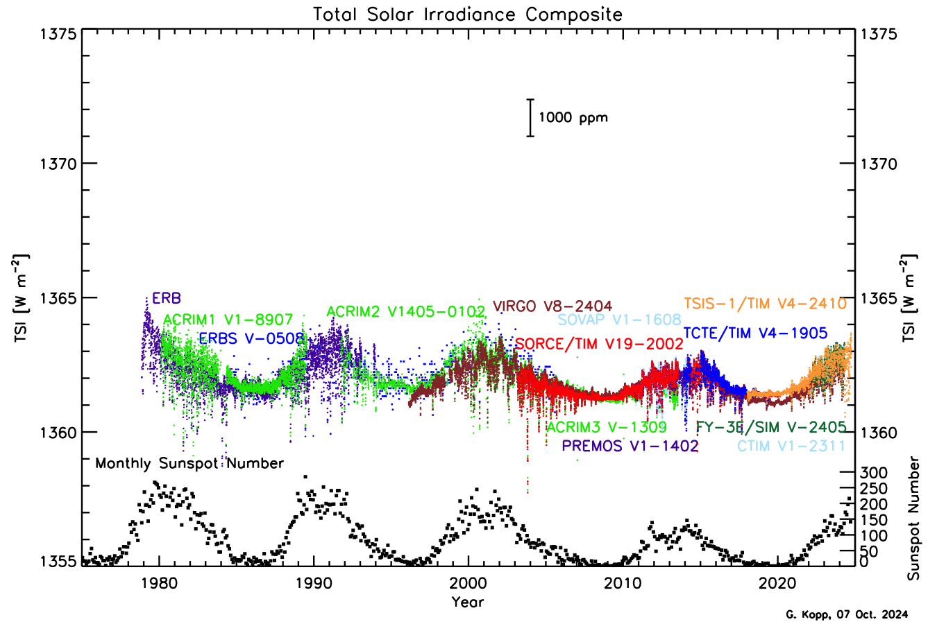
In the figure above, you’ll notice a regular cycle in both TSI and sunspots, which occurs roughly every 11 years. The total amount of radiation the Earth receives from the Sun varies by about 0.1% between the high and low points of these cycles. If we take a longer view looking at sunspot numbers as far back as the 1600s in the figure below - we can see that these cycles have been repeating for a long time. In addition to the 11-year cycles, there are longer term fluctuations that occur over 80-90 years, known as Gleissberg cycles. Sunspot activity tends to be relatively low during certain periods, such as the early 1800s, early 1900s, and early 2000s, with higher activity occurring in between.
One particularly notable feature of the sunspot record is the pronounced absence of sunspots from 1650 to 1715, a period known as the Maunder Minimum. This era, named after British astronomers Edward and Annie Maunder, represents a time when the Sun's activity was unusually low. During this period, global temperatures were also lower, especially in the Northern Hemisphere, contributing to what is often called the "Little Ice Age." This wasn't a true ice age like we previously discussed, but it was a time marked by colder winters and significant climatic shifts in Europe and North America. Although the exact cause of this diminished solar activity remains a mystery, recent research by astronomers from Penn State (led by undergraduate-at-the-time Anna Baum!) has uncovered evidence of a similar phenomenon occurring in another star, offering intriguing clues about these solar mysteries.

Now, I want to stress that while the amount of radiation the Earth receives from the sun does change, this variability plays a relatively minor role in influencing the Earth's temperature. A quick back-of-the-envelope calculation on the effect of fluctuations in TSI (which I won't make you do, but meteorology majors study!) shows that the impact on the planet’s surface temperature is less than 0.1°C. Furthermore, we’ve been in a period of declining fluctuations in solar activity since the 1950s. These variations are also accounted for in climate models, where we can confirm that they play a minor role in driving changes in the Earth's temperature compared to other factors like greenhouse gas concentrations. So, when talking heads say, "climate change is just a bunch of sunspot cycles," they aren't totally wrong, but observed changes in the sun are a drop in the bucket compared to the temperature changes we are currently observing and expect to observe in the future.
Quiz Yourself...
The Faint Young Sun Paradox
The Faint Young Sun ParadoxPrioritize...
After completing this page, you will be able to:
- Define the Faint Young Sun Paradox
- How scientists hypothesize the Earth stayed warm enough to support life despite a weaker young Sun.
Read...
Hopefully, I’ve convinced you that ongoing changes in the Sun’s output are relatively small (at least during human history). But before we move on, I want to point out something strange: scientists have discovered that when Earth first formed about 4.5 billion years ago, the Sun was much fainter than it is today. In fact, astrophysical models tell us that the Sun’s energy output was about 30% lower back then!
Check out the graph below. It shows the time-series of luminosity (i.e., emitted energy), radius, and temperature of the Sun over the past 4.6 billion years of its life—and it projects another 7 or so billion years into the future. The values on the y-axis are all normalized to present-day values, meaning a radius of 1.2 would mean the Sun is 20% larger than it is today. I want to emphasize that the x-axis is in billions of years, so all of human history is constrained to that small point where all three lines cross 1.0. (None of us will be around—barring some serious medical breakthroughs—to experience much beyond that!)

If you’ve taken an astronomy class, you might have learned that the Sun is continually growing larger (as this graph shows!). But for this class, we’re just focused on energy, so pay attention to the luminosity (the red curve). For the first two billion years of Earth’s life (note, Earth formed about 60 million years after the Sun’s birth), the energy the Sun output was less than 80% of what it is today. This means early Earth should have been much colder—so cold, in fact, that it should have been frozen solid. Yet, we know from the proxy records we’ve discussed that liquid water existed on the surface, and life was already starting to take hold. In fact, things were quite warm!
This puzzle is known as the Faint Young Sun Paradox—how did Earth stay warm enough to support life when the Sun wasn’t as bright? Astronomers Carl Sagan (you have probably heard of him, or at least heard of "The Pale Blue Dot") and George Mullen first raised this question in 1972. So, what could have kept Earth warm enough to sustain liquid water and life? Scientists aren’t 100% sure, but the most widely accepted theory involves greenhouse gases.
When Sagan and Mullen first introduced the Faint Young Sun Paradox, they suggested that high concentrations of ammonia gas (NH₃) could have been responsible for keeping Earth warm. We haven’t talked much about ammonia because—well—there isn’t much of it in the atmosphere today! But it is an effective greenhouse gas, meaning it can trap heat in the atmosphere, much like carbon dioxide (CO₂). However, there’s a catch: ammonia is easily destroyed by sunlight. Once exposed to ultraviolet radiation, it breaks down into nitrogen (N₂) and hydrogen (H₂) gases, which don’t trap heat as effectively. Although Sagan later suggested that a photochemical haze might have shielded ammonia from destruction, research eventually showed that this idea wasn’t plausible—the haze itself would have cooled Earth’s surface, counteracting any warming from ammonia. I mention this to highlight that even the most brilliant scientists aren’t always right!
Greenhouse gases to the rescue?
So, if ammonia couldn’t do the job, what could? Most scientists now agree the answer is carbon dioxide. Remember when we first introduced the greenhouse effect? We explained that carbon dioxide is a potent greenhouse gas, and we’ll dive deeper into that next lesson. For now, the key takeaway is simple: more greenhouse gases = a warmer planet! CO₂ levels in Earth’s early atmosphere were likely much higher than they are today.
Scientists have used models to estimate how much CO₂ would have been needed to keep Earth warm enough for liquid water during the Faint Young Sun period. These models suggest CO₂ concentrations could have been up to 1,000 times higher than present-day levels. Trust me, that’s a lot of carbon dioxide! This “supercharged” greenhouse effect would have compensated for the Sun’s dimmer output, allowing Earth to remain warm enough for water—and life—to exist.
The figure below shows this tradeoff over time. In the early part of Earth’s history (on the left side of the graph), solar energy (brown curve) was much lower, but CO₂ concentrations (blue curve) were sky-high. As we move forward in time (left to right), the Sun’s brightness increased while CO₂ levels dropped—without this balance, Earth would have become too hot for life as we know it.

But carbon dioxide wasn’t the only greenhouse gas at play. There’s also evidence that methane (CH₄), another potent greenhouse gas we’ll discuss soon, played a crucial role. Early Earth was home to a variety of microbes—single-celled organisms—that produced methane as a byproduct of their metabolism. These microbes were anaerobic, meaning they didn’t require oxygen to survive. In the oxygen-poor atmosphere of the time, they thrived, and their methane emissions could have significantly contributed to warming the planet.
In the early 2010s, scientists analyzing ancient marine sediments found clues suggesting methane worked alongside CO₂ to keep early Earth warm. By pulling out ocean sediment cores, they discovered certain iron-rich minerals that coexisted during the early part of Earth’s history. This hinted at a balance between CO₂ and hydrogen (H₂) in the atmosphere, with methane playing a key role. Methane is far more effective at trapping heat than CO₂, so even small amounts could have had a big impact on global temperatures.
Why is this important?
The Faint Young Sun Paradox doesn’t just teach us about Earth’s distant past—it also highlights the incredible power of greenhouse gases. Even small changes in CO₂ and methane levels can dramatically impact the planet’s temperature. In other words, the lesson of the Faint Young Sun Paradox is clear: greenhouse gases matter—a lot! In fact, our planet has fundamentally relied on the balance between energy from the Sun and the Earth’s atmosphere to sustain life. If we could snap our fingers and put as much CO₂ into the atmosphere as there was during the early Earth’s history, we’d fry like an egg (well, eggs wouldn’t exist, I suppose…)

William Shakespeare once wrote in The Tempest, “What’s past is prologue.” He used the quote in the context of fate, suggesting that everything leading up to the present shapes what happens next. But we can also apply this to climate: history sets the stage for our present and future. Understanding the role of greenhouse gases in Earth’s climate system, both past and present, is key to anticipating the future of our planet.
Quiz Yourself...
Volcanic Activity
Volcanic ActivityPrioritize...
After reading this page, you should be able to:
- Explain how volcanic eruptions can impact the Earth’s climate.
- Recognize when you see a rapid cooling and a gradual recovery in the Earth’s temperature record, you might suspect a violent volcanic eruption occurred at this time.
Read...
On June 15, 1991, Mount Pinatubo in the Philippines erupted in one of the most powerful volcanic events in recorded human history. In fact, it was the second-largest eruption of that century. Fortunately, there were warning signs before the eruption, and thanks to accurate forecasts from the Philippine Institute of Volcanology and Seismology and the U.S. Geological Survey, evacuation orders were issued in time. This likely saved more than 5,000 lives in the densely populated area around the volcano. When we think of volcanic eruptions, we often picture towering ash clouds, avalanches, and rivers of molten lava. But have you ever considered how such eruptions could affect the Earth's climate?

How Volcanos Impact the Earth's Climate
When a volcano erupts, it releases more than just dramatic ash clouds (see above) and lava flows—it also sends ash, dust, and gases high into the atmosphere. Heavier particles, like ash and fine rock, fall back to Earth relatively quickly, settling on the ground nearby. However, the smallest particles, especially those released in the most violent eruptions, can be injected high into the atmosphere and remain there for months, sometimes even longer. These fine particles, often in the form of aerosols, are carried by global winds, spreading around the Earth.
But that’s not all volcanoes release. Along with ash and dust, they emit a variety of gases, including water vapor, carbon dioxide (CO2), and sulfur dioxide (SO2). While water vapor and carbon dioxide are both well-known greenhouse gases that trap heat and contribute to warming the Earth’s surface, their effect from individual volcanic eruptions is actually quite small compared to human-driven emissions. Early in Earth’s history, when volcanic activity was much more frequent, these gases played a bigger role in shaping the planet’s climate. Today, however, the amount of carbon dioxide released during eruptions is minimal compared to the vast quantities emitted by human activities such as burning fossil fuels -- essentially just a rounding error in the carbon budget we'll talk about in the next lesson.

Sulfur Dioxide (S02)
Sulfur dioxide (SO₂), on the other hand, is particularly important. It plays a crucial role when it comes to volcanic impacts on the climate. When a volcano erupts, vast amounts of SO₂ can be ejected into the stratosphere. This is the atmospheric layer above the troposphere—well beyond where commercial airplanes fly. In the troposphere, rain can wash out particles fairly quickly, but in the stratosphere, where there is much (much) less condensed water, SO₂ can linger for months or even years. Once in the stratosphere, SO₂ reacts with the small amount of water vapor present to form sulfuric acid (H₂SO₄) aerosols. These tiny particles act like mirrors, scattering and reflecting incoming solar radiation away from the Earth’s surface, effectively increasing the planet’s albedo (I wasn't kidding when I said you'll see that word a lot in this class!). This reflection of sunlight causes a cooling effect on the Earth's surface, and after major volcanic eruptions, we can often observe noticeable dips in global temperatures. Scientists measure the amount of sunlight blocked by these aerosols using a metric called aerosol optical depth. This metric, commonly abbreviated AOD, is a gauge of how much sunlight is being scattered by particles in a given "column" of atmosphere.
The most violent eruptions can significantly impact the Earth’s climate, leading to rapid cooling followed by a slow recovery. The figure below shows notable volcanic eruptions over the past 150 years. What I've actually plotted is the stratospheric aerosol optical depth -- high values mean there are more particles in the stratosphere. Note the very strong linkage between when you see spikes in the data and volcanic eruptions, telling us that when we have lots of aerosols in the stratosphere, they were thrown up there by a big volcano.

Since these aerosols can increase planetary albedo, they can reduce sunlight reaching the surface and temporarily cool the planet. Historical temperature records reveal clear drops in global mean temperatures that align with major volcanic events. These cooling periods can last several years as the aerosols slowly dissipate from the atmosphere and the climate gradually returns to its previous state. The strongest volcanos may cool the planet up to 1°C, which is 10x more than the variability from sunspots we learned about! But I should emphasize that these effects are transient -- once all the aerosols "fall out" of the atmosphere, it's like the volcano no longer exists, so they don't do anything to stop or reverse long-term trends. While volcanic cooling is a natural process, it underscores the Earth’s sensitivity to changes in atmospheric composition, even for relatively short periods.
Quiz Yourself...
Summary
SummaryRead...
Summary
What did we learn?
- Climate proxies are natural recorders of past climate, helping scientists reconstruct conditions long before modern instruments existed. Key proxies include:
- Ocean and lake sediments: Layers of sediment provide clues about past water temperatures and ice coverage.
- Ice cores: These trap ancient air bubbles, revealing past greenhouse gas levels and precipitation patterns.
- Tree rings: The width and density of rings reflect yearly climate conditions like temperature and rainfall.
- Pollen grains: Found in sediments, they indicate the types of plants present, which helps infer past climate conditions.
- Proxies tell us that the Earth’s temperature has varied significantly over its 4.5 billion year lifespan.
- Orbital parameters are long-term cycles that influence Earth's climate by changing how much sunlight reaches different parts of the planet:
- Obliquity (tilt): The angle of Earth's axial tilt changes over a 41,000-year cycle, affecting the intensity of seasons. Greater tilt leads to more extreme seasonal differences, while a smaller tilt reduces seasonality.
- Precession (wobble): Earth’s axis wobbles like a spinning top, altering the timing of seasons relative to Earth's position in its orbit. This cycle takes about 19,000 to 23,000 years.
- Eccentricity (orbit shape): Earth’s orbit changes from more circular to slightly elliptical over a 100,000-year cycle, impacting the distance between Earth and the Sun, contributing to glacial-interglacial cycles.
- Ice-Albedo Feedback: A positive feedback loop where ice and snow reflect sunlight, cooling the Earth. As the planet cools, more ice forms, increasing reflectivity and further lowering temperatures. Conversely, when ice melts, less sunlight is reflected, warming the planet and accelerating ice loss. This feedback plays a crucial role in amplifying temperature changes during glacial and interglacial periods.
- Sunspots: Dark, cooler areas on the Sun’s surface that appear in cycles, typically every 11 years. While sunspots emit less energy, the surrounding areas (faculae) emit more, leading to slight variations in the Sun’s total energy output. These cycles can influence short-term climate patterns but have a relatively minor impact on long-term global temperatures compared to greenhouse gases.
- We learned about the Faint Young Sun Paradox. Despite the Sun being about 30% dimmer when Earth first formed, the planet remained warm enough to support liquid water and early life. This paradox is likely explained by much higher concentrations of greenhouse gases like carbon dioxide and methane, which trapped more heat and offset the Sun's weaker output.
- Volcanoes: Large volcanic eruptions release sulfur dioxide into the stratosphere, where it forms reflective aerosols that block sunlight and cool the Earth temporarily. These cooling effects can last for several years, with major eruptions like Mount Pinatubo in 1991 causing global temperatures to drop by up to 1°C. However, volcanic impacts are short-term and don't offset long-term warming trends.
Now that we’ve explored the natural processes that influence Earth's climate over time, it’s important to understand how human activities are accelerating climate change. In the next section, we’ll dive into the science behind anthropogenic climate change and examine how greenhouse gas emissions are driving rapid warming in recent decades.
Quiz Yourself...
Lesson 8: Anthropogenic Climate Change
Lesson 8: Anthropogenic Climate ChangeMotivate...

So, as we've learned, on large time and space scales, climate is not static; a variety of natural factors cause it to change. Solar variability, volcanic activity, and even how the Earth "wobbles" in its orbit around the sun have all played key roles in shaping the planet's climate over the past 4+ billion years.
There's no doubt that Earth's climate can change dramatically (though usually very slowly) due to these natural factors. But what about the rapid changes we're witnessing today? Are they purely natural? Decades of research overwhelmingly show that human activities—like burning fossil fuels and deforestation—are now driving climate change at an unprecedented rate. This acceleration has sparked widespread debate about how society should respond, with a flood of opinions in the media. With so much "noise" surrounding climate change, it can be challenging to separate fact from fiction.
That's why understanding the science behind climate change is essential, especially when we examine the carbon cycle, which is central to this issue. Parts of this cycle have worked together for millennia to maintain Earth's delicate climate balance. However, human activities since the Industrial Revolution have dramatically increased the release of carbon, particularly through fossil fuel combustion, disrupting that equilibrium.
In this lesson, we'll learn about the carbon cycle -- both its "slow" and "fast" components -- and how human actions are tipping the scales. We'll explore physically why the buildup of greenhouse gases in the atmosphere is such a concern and introduce you to key climate concepts like "forcings" and "feedbacks." By understanding the science of climate change, you'll be better equipped to interpret historical trends and consider future climate projections -- both in this class and in the real world.
The Carbon Cycle
The Carbon CyclePrioritize...
After you've finished this section, you should be able to:
- Define the carbon cycle.
- Explain the difference between the two "speeds" of the carbon cycle, and give examples of processes in both.
Read…
Carbon (you might recognize it as "C" from the periodic table!) is one of the most important elements in the universe. Perhaps most critical for us, it plays a central role in life on Earth. It’s in everything from our bodies and the food we eat to the infrastructure we build and the way our economies function. While carbon is essential for life, it’s also at the heart of one of the biggest challenges we face today - climate change.
Originally formed deep in the cores of ancient stars, carbon is actually the fourth most common element in the universe, right after hydrogen, helium, and oxygen. On Earth, though, the vast majority of carbon—around 90 million petagrams (I won't write it out, but that’s 90 followed by 15 zeros!)—is locked away in the lithosphere. If you remember from earlier in the course, the lithosphere is the rigid outer layer of the Earth that includes the crust and part of the upper mantle. This carbon exists mostly in solid minerals and carbonate rocks like limestone and dolomite right under our feet.
But not all of Earth’s carbon is socked away in rocks. Smaller, but still significant, amounts of carbon are found in other parts of the Earth system. The ocean holds around 40,000 petagrams (abbreviated Pg), while soil and plants contain about 2,300 Pg, and the atmosphere has roughly 750 Pg. As you can see, these numbers are all much smaller compared to the carbon stored in the lithosphere. However, they are key players in the carbon cycle—especially when it comes to how carbon moves between the lithosphere, oceans, living organisms atmosphere. This movement is what ties carbon directly to climate change.

What is the carbon cycle, you may ask? Well, the word cycle gives a hint: it’s a continuous process. Carbon doesn’t just stay in one place—it moves through different parts of the Earth’s system. This movement is what scientists mean when they use the term carbon cycle. How carbon circulates between the land, oceans, living organisms, and atmosphere shapes the carbon cycle, and any disruption in this movement can lead to a buildup of carbon in one of the areas.
There are two “speeds” to the carbon cycle: slow and fast. So, I guess the carbon cycle has something in common with The Tortoise and the Hare.
The “slow” (or “deep”) carbon cycle—just like its name suggests—operates over long periods of time. Think millions of years. In the slow carbon cycle, carbon is stored in rocks, soils, and the oceans, and gradually released through processes like volcanic activity, rock weathering, and sediment formation. This cycle plays a crucial role in transferring carbon from the atmosphere back into the land, helping to prevent dangerous carbon buildups in the atmosphere. It is a bit like Earth’s long-term climate thermostat, keeping the planet habitable over the ages. But because it works on such a slow timescale, its impacts on climate over a few human lifetimes are minimal; it cannot counteract large buildups of atmospheric column that are now ongoing as a result of human activities since the beginning of the industrial revolution.
What we’re more concerned with is the “fast” carbon cycle, also known as the biological carbon cycle. This is the part of the cycle that we experience on human timescales—years, decades, or centuries. It involves the rapid movement of carbon between the biosphere, atmosphere, and ocean. Each year, somewhere between 1 and 100 petagrams of carbon are shuffled naturally through processes like:
- plant growth, where plants take in carbon dioxide during photosynthesis
- wildfires, which release stored carbon from trees and vegetation into the atmosphere
- carbon dissolving in ocean waters, as the oceans absorb carbon dioxide from the air
- respiration, when plants and animals (including humans) exhale carbon dioxide into the atmosphere
- decay of organic matter, where dead plants and animals break down, releasing carbon
Now, that doesn't sound like a lot relative to the numbers we talked about earlier. But 100 petagrams isn't nothing! To put that into perspective, that’s the equivalent of 56,000 bowling balls’ worth of carbon being transformed every, single second! Next time you're at the bowling alley, picture that!
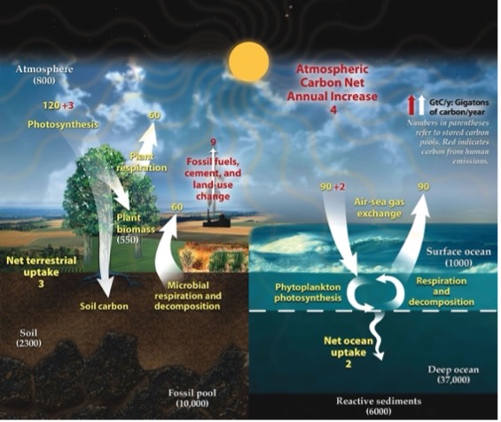
The image is a detailed illustration of the global carbon cycle. It is divided into two primary sections: the terrestrial environment on the left and the ocean environment on the right. The terrestrial side features a tree, representing plant life, and shows processes like photosynthesis, plant respiration, microbial respiration, and decomposition. Numbers next to arrows indicate carbon exchange rates, with a net terrestrial uptake of 3 gigatons of carbon per year. The soil and fossil pool are depicted beneath the surface, with the soil carbon measured at 2300 gigatons and the fossil pool at 10,000 gigatons.
On the right, the ocean environment shows processes such as air-sea gas exchange, marked by arrows indicating movement of carbon between the atmosphere and ocean with a net ocean uptake of 2 gigatons per year. Phytoplankton photosynthesis and oceanic respiration/decomposition are noted. Reactives sediments, surface and deep ocean layers are labeled with carbon measurements.
A sun shines over both sections, symbolizing energy driving these cycles. At the top, an arrow indicates an atmospheric carbon net annual increase of 4 gigatons. This is attributed to fossil fuels, cement, and land-use change.
Quiz Yourself...
Carbon Cycle: Combustion
Carbon Cycle: CombustionPrioritize...
After you've finished this section, you should be able to:
- Define fossil fuels and give three examples of them, including how they were formed.
- Define combustion and qualitatively describe why burning these fuels leads to CO₂.
- Use your knowledge of the carbon cycle and its speeds, along with fossil fuels, to explain why burning these fuels disrupts the natural timescales of carbon storage and release in the Earth.
Read…
So, why is carbon such a big deal?
Well, carbon is essential in living organisms because it forms stable bonds with other atoms, creating many complex molecules. Insert chemistry flashbacks here! These complex molecules are the building blocks of life on Earth, forming everything from proteins and fats to carbohydrates and nucleic acids. A great example is DNA, the molecule that carries genetic information, which has a backbone made of carbon atoms. When these carbon-based molecules break apart and form bonds with oxygen to create carbon dioxide, they release energy that is critical for all life forms - from the tiniest microorganisms to the largest mammals.
In the carbon cycle, plants and tiny ocean organisms called phytoplankton play a crucial role by absorbing carbon dioxide from the air. Through the process of photosynthesis, a process that requires energy from the sun, they convert carbon dioxide and water into sugars (storage containers of energy initially from the sun) and release oxygen as a byproduct. You've probably heard how trees “clean” the air by taking in carbon dioxide and releasing oxygen. This process can be summarized by the chemical equation:
Plants return carbon to the atmosphere in four main ways: through cellular respiration (which breaks down sugars using oxygen, releasing energy and CO₂), when animals consume them, when they decompose after dying, and when they burn. In each of these processes, the sugars in plants are broken down, releasing energy, water, and carbon dioxide back into the air:
This release of carbon dioxide is part of the fast carbon cycle and is closely linked to how plants grow and change with the seasons. For example, in the Northern Hemisphere, atmospheric carbon dioxide levels go up in the winter when fewer plants are growing (and taking up CO₂) and more are decaying (releasing CO₂), and then they drop in the spring when plant growth picks up again. This yearly cycle shows how the Earth itself seems to “breathe” with the seasons. See the graph below, which shows CO₂ measurements in the air at Park Falls, Wisconsin. The time series is plotted as an anomaly (think back to lesson 1) relative to the annual mean. It is highest at the very left and very right of the graph, representing the colder, darker winter months in the Northern Hemisphere (“Day of Year” equal to 1 is January 1st), when very little photosynthesis occurs. It then rapidly drops starting around day 110-120, which corresponds to mid-to-late April as trees leaf out and ground vegetation grows robustly. It bottoms out around day 225 or so, which corresponds to mid-August, the very end of the growing season, when plants in the area start to become dormant.
So, under natural conditions, the interplay between the fast and slow carbon cycles helps maintain a balanced level of carbon in the atmosphere, land, plants, and ocean. However, any disruption in one area of this balance can create ripple effects across the others!
This is where scientists grow concerned. Currently, human activities are significantly altering the carbon cycle in ways that amplify these imbalances. While we’ll dive into topics like deforestation (i.e., removing plants as natural carbon vacuums) later, let’s first focus on how fossil fuels fit into the picture.
Fossil fuels—like coal, oil, and natural gas—are energy sources that trace their origins back to ancient organic matter, formed millions of years ago. They’re called “fossil” fuels because they come from the preserved remains of long-dead plants and animals, stored deep within the Earth’s layers. It’s like nature’s slow cooker, but instead of a delicious stew, we get coal, oil, and gas when the dial is set to “geologic time.” I think I’ll stick to using my crockpot for chili, though!
Coal, for instance, formed from the dense, swampy forests that existed during the Carboniferous period, around 300 million years ago. The name Carboniferous literally means “coal-bearing,” from the Latin carbō (“coal”) and ferō (“carry”), and refers to the many coal beds formed globally during that time! As these plants died, they became buried in waterlogged environments where oxygen was scarce, slowing their decay. Over time, layers of sediment piled on top, fully cutting the dead plants off from the atmosphere. Eventually, increasing pressure and heat gradually transformed this plant material into coal.
Oil and natural gas, on the other hand, originated from tiny marine organisms—microscopic plants and animals—that drifted to the ocean floor when they died. As layers of mud and sediment buried them, similar forces of heat and pressure worked on this organic matter. However, unlike coal, the combination of factors caused the formation of liquid oil and gaseous natural gas. Over millions of years, these hydrocarbons migrated through porous rocks, eventually getting trapped in pockets deep beneath the Earth's surface.
So why does it matter when we extract these long-buried materials? Fossil fuels are packed with energy because they’re made of hydrocarbons—molecules composed of carbon and hydrogen atoms. The name says it all: hydrocarbons. When we burn these fuels in the presence of oxygen, the bonds between the carbon and hydrogen atoms break, and then the carbon forms strong bonds with oxygen, forming carbon dioxide and releasing energy that had been stored for millions of years in the weaker carbon and hydrogen bonds. The burning process, called combustion, transforms hydrocarbons into carbon dioxide (CO₂) and water vapor (H₂O), while releasing energy as heat—and sometimes light, like the flame on a gas stove or the thrust from a rocket engine.
For instance, when methane (CH₄), the main component of natural gas, combusts, it follows this chemical equation:
Combustion & Incomplete Combustion | Environmental Chemistry | FuseSchool
- Introduction
The video opens with the FuseSchool logo and the title “Combustion & Incomplete Combustion.”
An animated flame appears, symbolizing the topic of combustion. - Complete Combustion
What Combustion is:
The difference between complete and incomplete combustion.
The products of the two types of combustion.
The effects of the products of combustion.
Exothermic Reaction
Gives out heat
Fuel stores potential energy.
Examples of fuels, natural gas, methane.
Methane undergoes complete combustion
An animation shows a hydrocarbon fuel (like methane) reacting with oxygen.
Equations: CH₄ + 2O₂ → CO₂ + 2H₂O
Visuals depict the release of carbon dioxide (CO₂) and water (H₂O), with bright flames indicating the complete combustion process.
The text explains that complete combustion occurs with sufficient oxygen, producing CO₂ and H₂O. - Incomplete Combustion
Methane undergoes incomplete combustion.
The animation changes to show limited oxygen availability.
Equations: 2CH₄ + 3O₂ → 2CO + 4H₂O and CH₄ + O₂ → C + 2H₂O
Visuals depict the release of carbon monoxide (CO), water, and carbon (soot), with dull flames and smoke indicating incomplete combustion.
Water vapor is harmless.
The text explains that incomplete combustion occurs with insufficient oxygen, producing CO and soot. - Environmental and Health Impacts
Animations show the harmful effects of carbon monoxide and soot on health and the environment.
Visuals depict carbon monoxide binding to hemoglobin in the blood, reducing oxygen transport, leading to health issues.
Carbon monoxide is colorless, odorless.
Faulty gas appliances
It is important
Gas fires and boilers regularly serviced.
Unburnt carbon is a particulate.
A pollutant in the air.
Soot particles are shown to cause respiratory problems and contribute to air pollution. - Summary
A recap of the key points: Complete combustion needs enough oxygen, producing CO₂ and H₂O. Incomplete combustion lacks oxygen, producing CO and soot.
Combustion is burning, usually in air or oxygen.
Complete combustion of hydrocarbons produces carbon dioxide and water.
Incomplete combustion produces either carbon monoxide and water, or carbon and water.
The products of combustion have various effects.
Left to the Earth’s natural devices, this carbon from fossil fuels would slowly enter the atmosphere over millions of years due to volcanic activity or rock weathering (hey, it’s that slow cycle!). However, when humans extract and burn fossil fuels, things speed up dramatically—essentially moving carbon from the slow cycle into the fast cycle. This rapid release of carbon into the atmosphere is what concerns scientists most about climate change. It disrupts the natural balance of the carbon cycle, causing a spike in atmospheric carbon dioxide -- a potent greenhouse gas -- over a relatively short span of geological time (instead of talking thousands, millions, or billions of years, we're now talking tens of years!).
Quiz Yourself...
The King of All Greenhouse Gases: Carbon Dioxide
The King of All Greenhouse Gases: Carbon DioxideThe King of All Greenhouse Gases: Carbon Dioxide
Prioritize...
After reading this section, you should be able to:
- Identify the century when carbon dioxide emissions from human activities started increasing and why.
- Describe the relative contribution of different fossil fuel sources to the world’s total carbon dioxide emissions.
Read...
Remember earlier in the class when we talked about “greenhouse gases” and how they absorb and emit infrared radiation? The contributions of greenhouse gases to downwelling infrared radiation from the atmosphere to surface are what create the greenhouse effect, which plays a crucial role in warming our planet.
Take a look at the graph below. It shows measurements of downward shortwave and longwave radiation in State College, PA, taken on March 11, 2012. The red curve represents the diurnal cycle of sunlight. It's what we expect: hitting “0” at night (it's dark!) and reaching its peak around local noon. That makes sense, right? Sunlight drives the shortwave radiation, so the cycle follows the sun’s rise and set.
But now look at the blue line. This represents downwelling longwave radiation. Unlike the red curve, it’s nearly constant throughout the day, with a slight peak during the hottest part of the afternoon. Here’s the interesting part: this was a perfectly sunny day—no clouds, no rain—so this blue line isn’t doing anything sneaky. Rather, it shows the constant emission of infrared energy from greenhouse gases in the atmosphere, warming the surface below. Whether day or night, greenhouse gases are always radiating energy down to the surface, which is why this line stays steady. We've used the 24/7 analogy in this class before -- greenhouse gases are no different... always there, always on.
Now I want you to remember that without the greenhouse gases in our atmosphere the Earth system would be much (MUCH!) colder than it is today. The greenhouse effect is a completely natural process, and the warmth it generates is essential for life on our planet. In fact, the greenhouse effect is not just normal—it’s something we absolutely depend on!
So, if the greenhouse effect is both natural and essential, why are we so concerned about human-driven climate change? Great question. It all comes down to balance. As we’ve talked about, burning fossil fuels takes carbon that’s been stored deep within the Earth and releases it by combining it with oxygen in the air, creating extra carbon dioxide (CO₂) beyond the natural levels the atmosphere normally handles.
Think of it this way: imagine the atmosphere as a bathtub already filled to a certain level. Adding CO₂ from burning fossil fuels is like pouring extra water into that tub. Sure, it can handle a little more water, but if you keep pouring too fast and too much, it’s bound to overflow. Similarly, excessive CO₂ emissions from human activities are disrupting the Earth’s finely tuned climate balance, tipping the scales toward global warming.
CO₂ emissions grew slowly in the 1800s, but emissions skyrocketed as the population expanded and fossil fuels became the backbone of industrialization. In fact, carbon dioxide emissions have increased more than tenfold since 1900 (Credit: U.S. Department of Energy). While renewables like wind, solar, and nuclear power have chipped away at the dominance of fossil fuels over the past few decades, around 80 percent of the world’s energy still comes from "the big three" of coal, natural gas, and oil. The figure below for 2020 shows this split, with coal, oil, and gas each contributing a sizable portion to global energy production.
Quiz Yourself...
The Recent Rise of Carbon Dioxide
The Recent Rise of Carbon DioxidePrioritize...
After reading this section, you should be able to:
- Explain what the “Keeling” curve is and place today’s carbon dioxide concentrations in context with those from the past few hundred thousand years.
Read...
So how much has carbon dioxide grown over the past century or so? Before the Industrial Revolution, the atmospheric concentration of carbon dioxide was around 280 parts per million. "Parts per million" (commonly abbreviated ppm) asks the question... given a million molecules in a random parcel of atmosphere, how many of them are carbon dioxide? However, through the burning of fossil fuels like coal, oil, and natural gas, humans have added carbon dioxide to the atmosphere. The concentration of carbon dioxide in the atmosphere now exceeds 420 parts per million, and you can see the upward trend in atmospheric carbon dioxide concentration since the late 1950s in the data from the Mauna Loa Observatory in Hawaii below. We've already observed a 50% increase in the amount of CO2 in the atmosphere over the span of a few human generations.
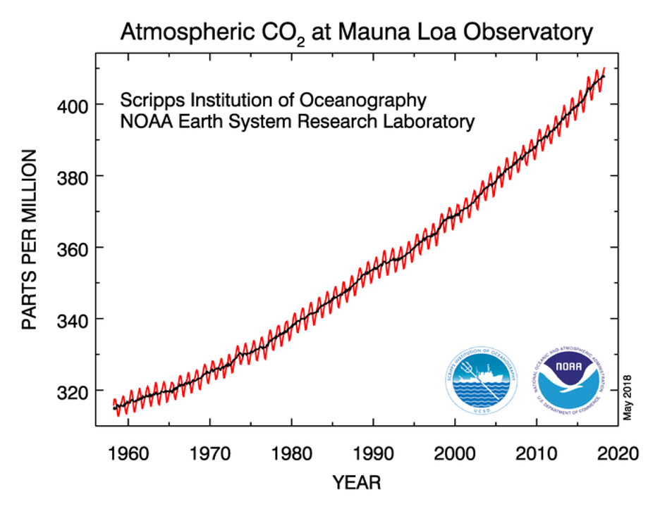
This graph of carbon dioxide (CO₂) over time is iconic. Known as the “Keeling Curve”, it was named after Charles David Keeling, who began consistently measuring atmospheric CO₂ in 1958. The red line reflects the seasonal fluctuations in CO₂ levels—CO₂ decreases during the Northern Hemisphere summer, when widespread plant photosynthesis draws carbon from the atmosphere. However, the black line, representing the long-term average, reveals a steady, unmistakable upward trend over time.
Remember, carbon dioxide is the second most important greenhouse gas after water vapor. Increasing CO₂ concentrations in the atmosphere amplify the greenhouse effect, absorbing more upward directed infrared radiation from the surface, thereby leading to an increase in atmospheric temperature, hence more downward directed infrared radiation as a result of both increasing CO2 concentrations and increased atmospheric temperature. This intensification of energy in the Earth system leads to global warming, which is at the heart of our concerns about climate change.
While the topic of global warming only began to dominate headlines in the late 1980s and 1990s, the idea has been around for much longer. As early as 1903, Swedish scientist Svante Arrhenius, a Nobel Prize-winning chemist, predicted that burning carbon-rich fossil fuels (like coal) would increase CO₂ concentrations and warm the planet. His ideas were largely ignored at the time, not because other scientists doubted the greenhouse effect. Indeed, knowledge of the greenhouse can be traced back to Eunice Foote's research in 1856 and John Tyndall's work in 1859. Rather, incomplete knowledge of Earth's carbon cycle at the time, which we'll study more in depth shortly, did not compel other scientists to fully appreciate the ramifications of such an increase.
Naturally, CO₂ levels have varied throughout Earth's history, but studies of ice cores, which trap air bubbles from the distant past, reveal that the CO₂ concentrations we see today are unprecedented in at least the past hundreds of thousands of years. As the graph below shows, CO₂ levels historically fluctuated between about 180 parts per million (ppm) and 300 ppm for millennia, until the mid-20th century. Since then, however, CO₂ concentrations have skyrocketed, now exceeding 400 ppm, largely due to the burning of fossil fuels.

Quiz Yourself...
Other Greenhouse Gases
Other Greenhouse GasesPrioritize...
After reading this section, you should be able to:
- List the other three greenhouse gas families that are most important for anthropogenic climate change.
- Describe their most common sources in terms of human activities.
Read...
While carbon dioxide tends to grab most of the headlines when we talk about human-driven climate change (and for good reason!), it’s not the only player in the atmosphere affected by our activities.
Methane (CH₄) is another potent greenhouse gas, with both natural and human-made sources, and its atmospheric concentration has more than doubled since pre-industrial times. Like carbon dioxide, methane levels began rising around 1800, as human activities became more widespread. Today, about 60% of methane emissions can be traced directly to human activities, with agriculture and waste management being the biggest contributors. For example, livestock like cows, goats, and sheep produce methane during digestion, a process that results in the gas being released into the atmosphere. You may have heard the term “cow farts” thrown around in jokes, but while oversimplified, it’s true that livestock farming contributes significantly to methane emissions.

Other major human sources of methane include landfills, where bacteria break down organic waste and generate methane, and rice paddies, where waterlogged soils become breeding grounds for methane-producing bacteria. Then there’s the oil and gas industry: during drilling and extraction, methane often leaks into the atmosphere—a phenomenon known as “fugitive emissions.” These leaks, along with other industrial activities, make up a notable portion of methane emissions.
Below is the breakdown of anthropogenic methane emissions in the United States over the 1990-2021 period. Almost 80% of methane comes from gas leaking, agriculture, and landfills.
There are two other gases that round out the "core four" greenhouse gases, and nitrous oxide (N₂O) is one of them. You might know it as "laughing gas" from dental procedures, but in the context of climate change, it’s no laughing matter. Since pre-industrial times, the concentration of N₂O in the atmosphere has risen steadily. The main culprit? Nitrogen-based fertilizers.
Nitrogen fertilizers are key to enhancing plant growth and boosting crop yields. However, not all of that nitrogen stays in the soil. Some of it escapes into the atmosphere as nitrous oxide. This makes agricultural practices the primary source of N₂O emissions, as shown in the pie chart below. Beyond agriculture, N₂O is also released from a variety of industrial processes, such as burning solid waste, fossil fuel combustion, and wastewater treatment.
Halogenated gases (HGs) are also significant contributors to anthropogenic greenhouse warming. These gases are mainly used in refrigeration, air conditioning systems, and as propellants in products like spray paint and canned cleaners. What sets them apart is the presence of at least one halogen atom—fluorine, chlorine, bromine, iodine, or astatine—in their molecular structure. HGs are primarily the result of human activities, though there are some natural sources like volcanic eruptions and certain oceanic biological processes. However, the amount emitted naturally is quite small compared to human-made sources. In fact, some halogenated gases are entirely synthetic, with no natural counterparts, created in labs for specific uses.
Once these gases are released into the atmosphere, they become well-mixed globally, meaning their concentrations spread out and stabilize around the world. They persist for a long time in the atmosphere, only being broken down in the upper layers where ultraviolet rich sunlight breaks apart their molecular bonds. Unfortunately, this breakdown process is quite slow, making halogenated gases some of the most long-lasting and stubborn greenhouse gases, contributing to warming for many years after their release.
How are all these gases changing? Well, they look a lot like what we saw earlier with CO2. Below is another timeseries, but this time, instead of just including CO2, we also include CH4 and N2O. (The halogenated gases also follow a similar trend.) They all look remarkably similar -- relatively stable for a long period of time before a sharp uptick coinciding with the industrial revolution. Given what we have learned about the sources of these emissions, this indicates that all three gases have seen recent increases that are linked to human activities – increases that go far above and beyond their environmental backgrounds that come about as a result of natural sources.

Quiz Yourself...
Putting the Pieces Together
Putting the Pieces TogetherPrioritize...
After reading this section you should be able to:
- Relate the concentrations of the "big four" greenhouse gases to one another.
- Explain in simple terms why CO₂ is the most important greenhouse gas, and why the properties of the other three gases make them important, even if their concentrations are much smaller.
Read...
We've just covered how human activities have driven up concentrations of methane, nitrous oxide, and halogenated gases (HGs). However, even with these increases, their concentrations are still much lower compared to carbon dioxide. Take a look at the table below, where the concentrations are listed in "parts per billion." It’s clear that CO₂ dominates by a wide margin. To put it in perspective, if fluorinated gases were a single person, they’d be like one person among four sold-out games at Beaver Stadium, while carbon dioxide would represent everyone else in the stands! This massive difference is a key reason why CO₂ often takes center stage in discussions about greenhouse gases and their impact on climate.
| Constituent | Concentration (ppb) |
|---|---|
| CO2 | 400,000 |
| CH4 | 1,900 |
| N2O | 320 |
| HGs | 1 |
It’s important to point out that while methane, nitrous oxide, and halogenated gases may be present in much smaller concentrations than carbon dioxide, the impact of these gases on emission and absorption of atmospheric infrared radiation for a fixed increase in concentration is far greater than for carbon dioxide. The physics behind this is a bit complex and might be better suited for a dedicated physics class, but in simple terms, it has to do with the molecular structure of these gases and the wavelengths at which they emit and absorb infrared radiation. Averaged all methane and carbon dioxide molecules in the atmosphere, it is as if one molecule of methane is 28 times more effective at absorbing and emitting infrared radiation than one molecule of carbon dioxide. So even though their concentrations are smaller—sometimes drastically so—we definitely can’t overlook their role as their concentrations change. In our atmosphere, a little bit of something can go a long way!
When you factor in both the absolute concentration of these gases and their relative ability to emit and absorb infrared radiation at different wavelengths, you get a clearer picture of their overall impact. The chart below shows how much additional radiation has been added to the climate system since 1750 due to these greenhouse gases, relative to a perfect balance of incoming and outgoing energy.
Roughly two-thirds of the warming caused by human activities can be attributed to carbon dioxide, while another 20% or so comes from methane. The rest is due to nitrous oxide and other greenhouse gases, including halogenated gases. So, while CO₂ might not be as potent on a molecule-for-molecule basis, its sheer volume in the atmosphere—thanks to fossil fuel combustion—still makes it the “top dog” among greenhouse gases.
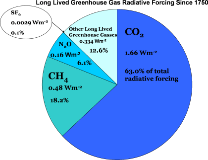
The end result of these increases in greenhouse gases is that the atmosphere is now retaining about one percent more energy compared to pre-industrial times. Now, that might not sound like much, but when you remember that the atmosphere absorbs around 240 W/m² of energy from the sun, that extra one percent adds up! It’s a key factor in explaining why the planet has warmed nearly 1 degree Celsius (1.8 degrees Fahrenheit) globally since 1970. That small shift in energy balance has big consequences!
Quiz Yourself...
Aerosols Enter the Equation
Aerosols Enter the EquationPrioritize...
After reading this, you should be able to:
- Define aerosols and explain how they can either cool or warm the atmosphere.
- Describe how aerosols falling onto a surface (particularly "white" surfaces, like snow) impact climate.
Read...
When we consider the impact of human activities on global climate, it's important to recognize that not all outcomes have to lead to warming. An obvious example is the emission of aerosols into the atmosphere. The combustion of fossil fuels, while a primary driver of climate change, is also a major source of air pollution! This pollution comprises various gases and particulates, including sulfur compounds and an assortment of small solid particles like soot and ash. On a small scale, if you’ve ever lit a wood fire like the one below, you know all about this particulate matter that is emitted during the combustion process.

While these aerosols are harmful to air quality, they also have a complex impact on the Earth's climate. Remember when we talked about volcanoes ejecting sulfur dioxide (SO₂) into the stratosphere? Once there, it combines with water vapor to form sulfate aerosols. These aerosols act like tiny mirrors, reflecting incoming solar radiation away from Earth and reducing the amount of energy that reaches the surface. This reflection leads to a cooling effect.
But volcanoes aren’t the only source of sulfate aerosols. Sulfur gases released during combustion can also undergo chemical reactions in the atmosphere, producing aerosols. These tiny liquid droplets or solid particles often serve as cloud condensation nuclei—the seeds around which cloud droplets form. More aerosols in the atmosphere can lead to more clouds, and more clouds mean more sunlight is reflected back into space, increasing Earth's albedo. This is referred to as a "secondary" effect, since the cooling impact comes not directly from the aerosols themselves, but from their role in enhancing cloud formation and cloud reflectivity.
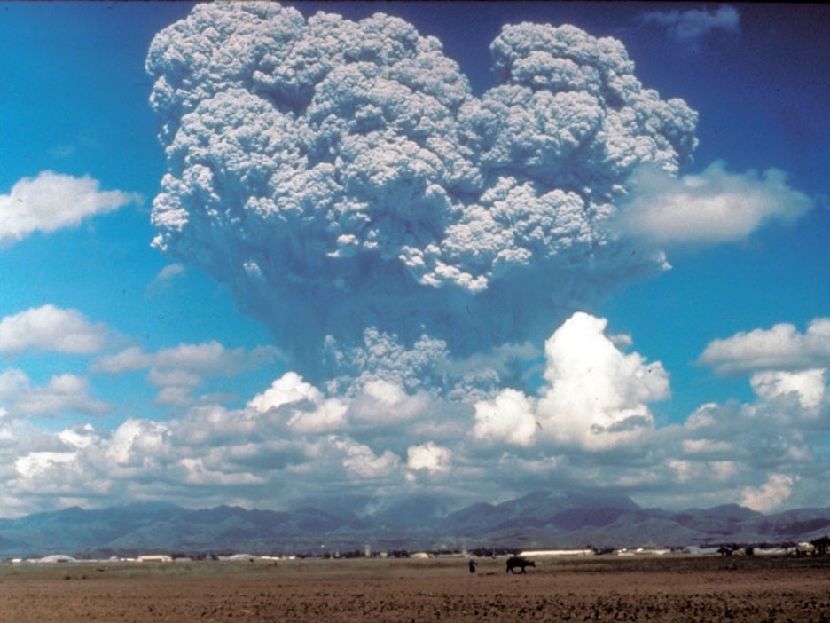
It’s also important to note that human-produced aerosols are more of a constant presence compared to those from volcanoes, which are sporadic. Scientists have observed that aerosols had a significant influence on the Earth's climate, especially during the first half of the 20th century. In fact, it’s estimated that the warming effect of greenhouse gases at the time was largely offset by the cooling effect of aerosols. Essentially, humans were pumping both warming and cooling pollutants into the atmosphere, and the overall impact was more or less a balancing act!
But by the mid-20th century, it became clear that aerosols weren’t just affecting the climate—they were also taking a toll on human health. Long-term exposure to aerosols and particulate pollutants was linked to respiratory issues and increased cancer risk. This led to the implementation of stricter air quality regulations, like the Clean Air Act of 1970 in the United States, which successfully reduced the amount of aerosols released into the atmosphere. While this has been a huge win for public health, it’s had some unintended climate consequences. As aerosol levels have dropped, so has their cooling effect.
The Clean Air Act: good for health, meh for climate
The Clean Air Act of 1970 was a landmark piece of legislation in the U.S. that set out to regulate air pollution and protect public health. At the time, cities were grappling with thick smog, acid rain, and rising rates of respiratory illnesses. The Act gave the federal government the authority to set and enforce limits on pollutants like sulfur dioxide (SO₂), nitrogen oxides (NOx), and particulate matter. This had an immediate and dramatic effect on air quality, reducing the pollutants that were causing health issues like asthma, lung disease, and even cancer.
But there’s more—by cutting down on aerosol emissions, the Clean Air Act also had a ripple effect on the climate. Cleaner air means fewer aerosols to mask the warming caused by greenhouse gases, which has led to a faster rate of warming. In short, it helped us breathe easier, but it also pulled back the curtain on the true extent of global warming. So, while we’ve made progress on air quality, the flip side is that the pace of global warming has picked up.
However, I should finish by noting that not all aerosols have a cooling effect on the climate. One key player that does the opposite is black carbon - also known as soot. This aerosol comes from incomplete combustion in sources like diesel engines, wood stoves, and the open burning of biomass. If you've ever been behind a big diesel tractor-trailer moving up a hill, you've probably seen black carbon emanating from its smokestacks. Unlike most aerosols that reflect sunlight, black carbon actually absorbs it. Think of it as the “dark side” of aerosols, absorbing incoming solar radiation and converting it into heat. In this way, black carbon warms the atmosphere, acting more like a greenhouse gas—but with a twist. While greenhouse gases absorb and emit longwave (i.e., infrared) radiation, black carbon primarily absorbs shortwave radiation from the sun while emitting and absorbing longwave radiation as well.

The impact of black carbon doesn't stop in the atmosphere. When these particles fall (or “deposit”) onto snow and ice, they create another problem. Typically, these bright surfaces reflect a lot of sunlight back into space, thanks to their high albedo (remember, white surfaces mean lots of reflection, black surfaces mean lots of absorption!). But when black carbon settles on them, it darkens the snow or ice, reducing its reflectivity. This causes more sunlight to be absorbed, leading to faster warming and accelerated melting. Imagine a thin layer of soot covering a pristine snowfield on a mountain—suddenly, that reflective surface is now a huge absorbing one of shortwave radiation.
Reducing black carbon emissions can actually help cool the climate system, which makes it an important target for climate action. In contrast to sulfate aerosols that cool the planet by reflecting sunlight, black carbon is a warming agent. So, cutting down on black carbon could be a win-win: improving air quality and slowing global warming at the same time.

Quiz Yourself...
Radiative Forcing
Radiative ForcingPrioritize...
After reading this section, you should be able to:
- Define what a "forcing" is and provide an example.
- List the major radiative forcings in the climate system and understand their relative importance compared to each other.
- Provide at least two examples of positive radiative forcings and one example of a negative radiative forcing in the Earth system.
Read...
There have been a few times we’ve used the term “forcing” when talking about greenhouse gases and climate change. And the term comes up repeatedly when you read a news article about climate change, watch a TV spot, or listen to a podcast. But what does the term actually mean?
Radiative forcing is essentially a way to measure how different factors affect the Earth's energy balance. Remember when we talked about the energy budget? The sun shines on Earth, the planet absorbs some of this shortwave energy and reflects the rest back into space. At the same time, Earth is constantly emitting energy as longwave radiation. The balance between the energy Earth absorbs and emits to space determines our climate. Any factor that disrupts this balance—either by trapping more heat or allowing more heat to escape—is what we call a "radiative forcing."
Here’s a way to think about it: picture a mug of hot cocoa sitting on a warming plate. At some point, the cocoa will reach a steady temperature because it’s being heated from below but also losing heat to the air around it. Now, if we wrap the mug in insulation, what happens? The cocoa heats up beyond that steady point because it’s no longer losing as much heat to the room. That insulation is acting like a "forcing" in our cocoa system, changing the balance of energy. This is exactly what radiative forcing does in Earth's climate system!

Two mugs of hot cocoa on warming plagues. The mug on the right is warmer even with the same energy input (same setting on the warming plate) because it is insulated (i.e., positive forcing) and retains heat more effectively. Greenhouse gases in the atmosphere act similarly.
Key Definition:
Radiative forcing refers to the change in energy balance in the Earth's atmosphere caused by factors like greenhouse gases or aerosols. It measures how much a specific factor either traps more heat or allows more heat to escape, ultimately affecting the planet's climate system. Positive radiative forcing means that factor warms the planet, negative radiative forcing means that factor cools the planet.

Take a look at this figure, which captures our current understanding of radiative forcing caused by different atmospheric components. The length of each bar represents how much each agent is affecting the climate—essentially, how much warming or cooling it’s contributing. Red bars indicate warming, while blue bars represent cooling. You’ll notice the horizontal “barbells” attached to each bar—these are error bars, showing how uncertain we are about the exact effect of each factor. Longer error bars mean greater uncertainty, so keep an eye on them as you interpret the data.
The units here are watts per square meter (W/m²), which essentially tells us how much energy each agent adds or removes from the Earth system. You can think of it as a way of quantifying “how much warming or cooling” each factor contributes to the planet’s energy budget.
The figure breaks down these factors into two major categories: those caused by human activities (anthropogenic) and those that occur naturally. The top section of the chart lists human-driven changes—things like greenhouse gas emissions. You’ll notice that the 'big four' greenhouse gases we’ve talked about (carbon dioxide, methane, halogenated gases, and nitrous oxide) all show significant warming contributions. Interestingly, halogenated gases (HGs) have a slight cooling effect in addition to warming because some of these gases destroy ozone in the stratosphere, reducing the amount of shortwave radiation the Earth absorbs. This dual role makes them a bit more complicated than other greenhouse gases.
Next, let’s touch on the "short-lived gases" rows. These are gases like carbon monoxide (CO), non-methane volatile organic compounds (NMVOCs), and nitrogen oxides (NOx). We haven’t spent much time on these yet, but they’re worth mentioning. These gases don’t last long in the atmosphere—anywhere from a few hours to a few days—but they play an important role in the climate system. Even though they aren’t major greenhouse gases themselves, they drive chemical reactions that influence the concentrations of other climate forcers like ozone and methane. For example, NOx reacts with sunlight to produce ground-level ozone (a potent greenhouse gas and pollutant), while CO and NMVOCs help prolong the lifespan of methane in the atmosphere. These gases come mostly from combustion processes, like vehicle emissions and industrial activities. While they don’t directly cause warming, their role in enhancing other pollutants makes them key players in short-term climate and air quality—think of them as carbon dioxide’s morning coffee, giving it an extra kick.
Right below, we have aerosols, split into warming (black carbon) and cooling (sulfate aerosols) effects. The red portion of the bar represents black carbon (soot), which absorbs sunlight and warms the atmosphere, while the blue portion represents sulfate aerosols, which scatter sunlight and cool the Earth’s surface. The two effects nearly cancel each other out, but as you can see from the long error bar, there’s a lot of uncertainty surrounding the net impact. Directly beneath this is "Changes in clouds due to aerosols," which refers to the secondary effects of aerosols acting as cloud condensation nuclei. More aerosols mean more cloud droplets, which makes clouds more reflective, bouncing more sunlight back into space. So, in this case, “dirtier” air can lead to a cooling effect by brightening clouds. We’ll explore this concept later when we talk about "cloud seeding" as a proposed climate solution.
The last row under human activities is about land-use change, which we’ll cover in more detail soon. Finally, we have the sole natural source of variability—changes in solar energy due to long-term trends in sunspots. As we discussed in the last lesson, this effect is relatively small compared to the human-driven factors shown above.
Understanding these factors and their impacts on radiative forcing helps us comprehend how they shift the Earth's energy budget, leading to changes in climate. As we progress through this course, we'll explore how these changes, whether warming or cooling, have shaped the Earth's climate over the past century and what that means for our future.
Quiz Yourself...
Feedbacks
FeedbacksPrioritize...
After reading this section you should be able to:
- Define what a "feedback" is.
- Differentiate between positive and negative feedback, and explain what each means for the climate system.
- List three feedback mechanisms in the climate system and briefly describe how they generally operate.
Read...
As we've seen, the concept of radiative forcing – whether natural or caused by humans -- is a crucial component in the study of Earth's climate, acting as the initial 'nudge' that can either warm or cool our planet. However, the climate system doesn't always respond in a straightforward manner to these forcings. It's here that I need to introduce the concept of 'feedbacks' — processes that can either magnify or mitigate the effects of the original forcing. These feedbacks are essential in understanding the full scope of climate change, as they often determine the magnitude and rate of a climate response.
OK, consider the climate system as a live concert sound system. The 'forcings' are like the original sound from the instruments and vocals — they start the process of producing music. Now, feedbacks are akin to the soundboard's adjustment knobs that the audio engineer uses to fine-tune the music that the audience hears.
When the engineer turns up a knob (positive feedback), it's like boosting the volume or bass to enhance the sound — this can make the existing music fuller and louder, much like positive feedback mechanisms in the climate can amplify warming. For example, a slight increase in temperature from greenhouse gases can cause more water vapor to enter the atmosphere, which in turn traps even more heat and further warms the planet.
Conversely, if the engineer dials down a knob (negative feedback), it can soften a piercing high note during the concert, maintaining a pleasant listening experience. This is similar to how negative feedback mechanisms in the climate system can counteract warming, like how increased cloud cover might reflect more sunlight away from the Earth's surface, helping to cool the planet.
In this way, just as the audio engineer uses the soundboard to balance the music, Earth's climate system is constantly adjusting through feedback mechanisms to balance the planet's energy budget.
Let’s think about this more concretely. If our planet gets a nudge (like more sunlight or more greenhouse gases), these feedback mechanisms can make the Earth's response stronger or weaker. Where this can be problematic for us is when a positive feedback actually makes things warmer than they would be just from that nudge alone. Check out this schematic below. The center box is the amount of warming, let’s say that arises due to additional CO2 emissions into the atmosphere since the industrial revolution. A positive feedback adds more warming on top of that warming, making the CO2 punch above its weight!
Key Definition:
A feedback in the context of climate refers to a process that can either amplify or reduce the impact of an initial change in the Earth's energy budget. For example, a positive feedback might enhance warming, like ice melting, which lowers albedo and leads to more heat absorption. A negative feedback would counteract the change, such as increased cloud cover reflecting more sunlight and cooling the surface.

Let's talk about a few key feedback mechanisms related to climate change:
- Water Vapor Feedback
As we discussed in earlier lessons, as the atmosphere warms, it holds more water vapor. We also know that water vapor is a greenhouse gas, leading to further warming. Luckily, while this is a positive feedback (and amplifies warming) it isn’t a runaway feedback since a warmer, moister atmosphere eventually removes water through precipitation. - Cloud Radiative Feedbacks
How clouds in the atmosphere respond to global warming is incredibly complex and influenced by changes in cloud distribution and type. For example, we know that clouds can both warm the surface by absorbing and mitting infrared radiation or cool it by reflecting sunlight. The overall effect varies with cloud characteristics like type and altitude. This feedback is very complicated, still actively researched, and one of the largest uncertainties in predicting the exact state of future climates. - Ice-Albedo Feedback
As Earth warms up, ice and snow (very bright, reflective surfaces) start to melt, revealing land or water beneath. Both the land and water have lower albedos than the ice, meaning they absorb more solar radiation. Therefore, the removal of ice in a particular region and the pooling of liquid water on top of ice in another region lead to warming in that region via this increased absorption. This warming makes even more ice in the area likely to melt, further accelerating this spiral. This feedback is a classic example of a positive feedback and is relatively easy to visualize. See the below figure!
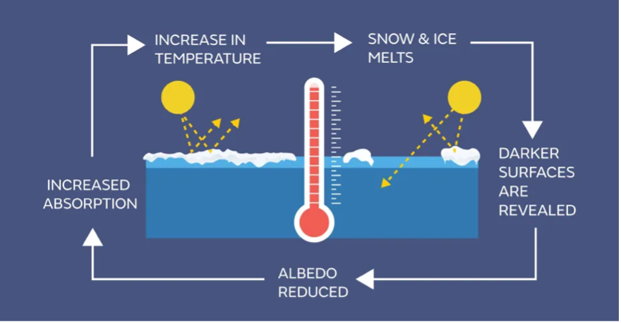
When we examine all these feedback loops together, they generally amplify the initial warming triggered by any change in our climate. For instance, let's consider a scenario where the CO2 levels in our atmosphere double compared to the pre-industrial era, due to extensive fossil fuel combustion. This would take us from about 280 parts per million CO2 to 560 parts per million (for context, we are currently around 420 ppm). This alone (in the absence of other gases and feedbacks) would lead to a temperature increase of about 1.25°C. However, when we factor in the additional warming from feedback processes, such as the extra heat trapped by increased water vapor or the reduced reflection of solar radiation due to melting ice, the temperature could actually climb by about 2.5°C to 3°C, as suggested by some climate models – which we will learn about in a few lectures.
Quiz Yourself...
Local Climate Modification: Urban Heat Islands and Deforestation
Local Climate Modification: Urban Heat Islands and DeforestationPrioritize...
When you finish this section, you should be able to:
- Define urban heat island and how it impacts local climate
- Define deforestation and describe how it may impact regional climate
Read...
While we often focus on emissions when talking about climate change, they’re not the only way humans influence the climate. Our impact can be felt on a much smaller scale, too. I want to share a couple with you...
Urban Heat Island
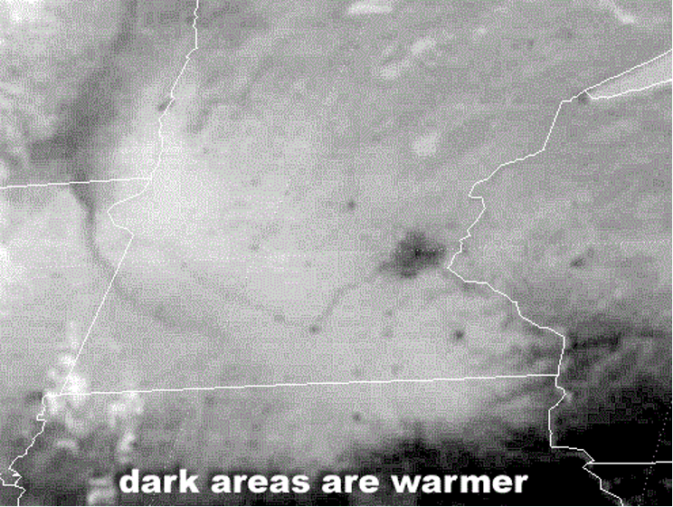
Take a look at the satellite image above from the afternoon of March 27, 2001. This is a typical infrared image, which can be used to infer temperature based on emitted infrared radiation. We know that clouds emit radiation, but it was clear over Minnesota at this time. So, what you’re seeing is a measure of the actual temperature of the Earth’s surface (with darker areas being warmer). Remember that the amount of radiation emitted is directly tied to temperature—the hotter something is, the more radiation it gives off.
Now, check out that large dark patch in eastern Minnesota, along with those smaller dark spots scattered around. Have any guesses as to what they are?
These local warm areas aren't some random shapes—those are cities! The biggest is the Minneapolis/St. Paul metro area, but you can also spot smaller cities like St. Cloud, Rochester, and Mankato. What you’re seeing here is the urban heat island effect, which refers to how cities tend to be significantly warmer than their rural surroundings. On a sunny day with light winds, cities tend to be several degrees warmer than their rural surroundings because pavement, buildings, and other urban materials absorb more solar radiation than their surroundings due to their lower albedo (reflectivity). On top of that, heat from cars, industry, and general human activity adds to the warmth. Meanwhile, the surrounding countryside, covered in vegetation with a higher albedo, stays cooler. Plants also release moisture through transpiration (we talked about this in the water lesson – transpiration is basically plant sweat), which further cools the area.
The difference in temperatures between urban and rural areas is most noticeable at night, especially on clear, calm winter nights following sunny days. As the city heats up more during the day, it stays warmer at night because concrete, asphalt, and buildings slowly release the heat they’ve absorbed. In contrast, rural areas cool down faster since they didn’t heat up as much during the day. So, urban areas tend to be warmer than surrounding rural ones, both during the day and at night.
In the infrared satellite image above, the urban heat islands are particularly striking because the surrounding countryside was snow-covered. If you look below at a visible satellite image of this region, the rural areas appear white due to the high albedo of snow, while the cities, where much of the snow had melted, appear darker because of their lower albedo.
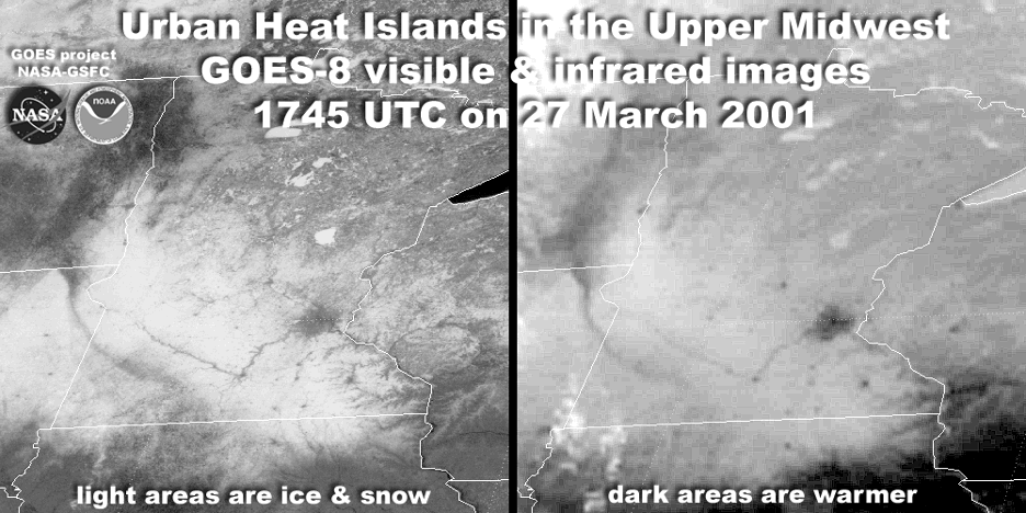
The takeaway here is that these satellite images look the way they do because humans have significantly altered the local environment. They’re a clear illustration of how human activity impacts weather and climate on a local scale. But the urban heat island effect—localized warmth and lower albedo—isn’t the only change happening in the concrete jungles of our cities. Numerous studies suggest that rainfall tends to increase downwind of large metropolitan areas, especially in the summer when winds are typically weaker. This setup allows urban heat islands to act as local "hot spots," promoting instability and encouraging rising air currents. Essentially, the warmer, buoyant air over cities rises, forming tall cumulus clouds, which can grow into showers and thunderstorms as they drift downwind.
One of the first and most comprehensive studies to measure the effect of urban areas on precipitation was METROMEX (METROpolitan Meteorological EXperiment). This multi-year research project, which started in 1971 in St. Louis, Missouri, found that average summertime rainfall, as well as the frequency of thunderstorms and hail, increased by up to 25% in a broad area around the city, extending 40 miles eastward. Similar studies in other cities like Chicago and Washington, D.C., have shown comparable results.
To visualize the urban impact on convection, take a look at the lightning flash density around Houston, Texas, from 1989 to 2001. The image below shows the number of lightning strikes per square kilometer per year. As you can see, the highest flash density is downwind (east) of the city, illustrating how the urban environment can influence storm development and increase lightning activity.
Lightning Flash Density in the Houston area from 1989 – 2001.
Notice that the highest concentration of lightning strikes occurred just downwind (east) of Houston. This study found a 45% increase in flash density downwind of the city compared to the upwind suburbs (mainly west of the city). These results align with findings from a broader study of 16 Midwestern cities which showed that lightning strike frequency downwind of cities was, on average, 40% higher than in rural areas upwind. This increased lightning activity corresponds with higher rainfall rates downwind of cities compared to rural, upwind areas.
But the effects of urbanization aren't just limited to temperature and precipitation. The changes in the landscape—removing vegetation and soil, and replacing them with impervious paved surfaces and drainage systems—alter what happens to precipitation after it falls. More water runs directly into rivers and streams, rather than being absorbed by the ground and plants. This increased runoff means that urban streams rise faster and are more prone to flooding during heavy rain compared to rural streams.
So, land use and urban development play a key role in shaping local weather and climate. And even if land isn’t urbanized, changes in land use can still have major impacts. That brings us to...
Deforestation
Deforestation is the clearing of forests to make way for agriculture, pastures, or urban development, and it has a wide range of both global and local impacts. Here, we'll focus on its effects on temperature and the hydrologic cycle. Trees and plants in forests act as water reservoirs and help keep local temperatures in check because a portion of the sun’s energy is used to evaporate water from the forested environment. In deforested areas, however, more water runs off directly into streams and rivers, leaving less moisture to evaporate. With less water available for evaporation, more of the sun’s energy goes toward warming the surface, which heats the air above.
This effect is particularly striking in tropical rainforests. NASA estimates that clearing rainforests down to bare ground can raise local temperatures by as much as 3°F, which significantly impacts the local climate. Tropical rainforests are not only humid and rainy, but they also recycle a lot of water back into the atmosphere through evaporation and transpiration. This creates a cycle where the water vapor encourages more cloud formation and rainfall. In extreme cases, like in the Amazon Basin, trees are estimated to help generate about half of the region’s rainfall! So, when rainforests are destroyed, the local rainfall significantly decreases.
Besides the moisture impacts, deforestation also increases the surface's albedo, meaning more sunlight is reflected back into space instead of being absorbed by the ground. This limits the amount of energy transferred into the lower atmosphere. You can clearly see the difference in albedo between forested and non-forested areas in satellite images taken on a clear day—forests appear darker compared to agricultural lands. The contrast is even more dramatic during the winter when snow covers the ground, as shown below in this visible satellite image from January 18, 2018. The image shows the contrast between the low albedo of forested regions compared to snow-covered, agricultural valley regions. For a closer look, here's the full-sized image.

In many regions, deforestation is thought to cause a slight cooling effect. This happens because the increased albedo (more sunlight being reflected) outweighs the drying effects—where more of the sun’s energy is directed toward warming the surface rather than evaporating water from it. Essentially, with fewer trees to absorb sunlight and less water to evaporate, more solar radiation is reflected back into space, leading to a net cooling. However, tropical rainforests are a major exception. In these regions, the massive disruption to the hydrologic cycle—primarily the sharp drop in evaporation—tips the scales toward warming, making local temperatures rise instead of cool.
Quiz Yourself...
Summary
SummaryRead...
- The carbon cycle describes how carbon moves through the Earth's system, including the atmosphere, oceans, soil, and living organisms.
- There are two speeds: the slow cycle (millions of years, involving rocks, oceans, and volcanic activity) and the fast cycle (on human timescales, involving plants, animals, and the atmosphere).
- Fossil fuels like coal, oil, and natural gas are stored carbon from ancient organisms that humans burn, releasing energy and CO₂.
- This rapid release of carbon from fossil fuels moves carbon from the slow cycle into the fast cycle, disrupting the natural balance and contributing to climate change.
- Human activities since the Industrial Revolution have caused CO₂ concentrations to rise significantly, from around 280 ppm to over 420 ppm today.
- CO₂ is the second most important greenhouse gas after water vapor, and its increased concentration enhances the natural greenhouse effect, leading to global warming.
- In addition to CO₂, methane (CH₄), nitrous oxide (N₂O), and halogenated gases (HGs) are potent greenhouse gases that contribute significantly to anthropogenic climate change. Given the current composition of the atmosphere, these gases are more effective molecule-by-molecule at trapping heat than CO₂, even though their concentrations are much smaller, making them crucial players in the climate system.
- About two-thirds of warming is attributed to CO₂, with methane and nitrous oxide contributing the remaining portion.
- Aerosols can have both warming and cooling effects on the climate. Sulfate aerosols, for example, reflect sunlight and cool the Earth, while black carbon absorbs sunlight and warms the atmosphere.
- Radiative forcing refers to the change in Earth's energy balance caused by factors like greenhouse gases and aerosols.
- Positive radiative forcing leads to warming (e.g., greenhouse gases), while negative radiative forcing leads to cooling (e.g., aerosols reflecting sunlight).
- Climate feedbacks either amplify (positive feedback) or reduce (negative feedback) the effects of initial changes in Earth's energy budget.
- Key feedbacks include water vapor feedback, cloud radiative feedbacks, and ice-albedo feedback, all of which can significantly amplify global warming.
- Urban heat islands occur when cities are warmer than their rural surroundings due to lower albedo and heat retention from buildings and pavement.
- Deforestation can raise local temperatures by reducing the amount of water available for evaporation, particularly in tropical rainforests, where trees play a key role in the hydrologic cycle.
Phew! We covered a lot of ground. Now that we've understood the science, do we actually see things like surface temperature increases and sea ice loss that we'd expect based on what we've learned? Let's find out!
Quiz Yourself...
Lesson 9: Observations of Changes in Climate
Lesson 9: Observations of Changes in ClimateMotivate...

Imagine time as a long, winding road. Standing at our place in history, we have the unique ability to look both ways—into the past and into the future. Like any careful observer crossing a busy street, climate scientists make a habit of looking both ways, too. By looking back, we understand the changes our planet has undergone and gather clues to help us predict what might come next. In this lesson, we're turning our attention to the recent past to examine how Earth’s climate has changed up until today—particularly over the last few decades.
We’ll explore the warming patterns across different layers of the atmosphere, identifying signs of human impact that cannot be explained by natural variability alone. Greenhouse gases added by human activities have influenced more than just temperature: they’re reshaping ocean temperatures, increasing acidification, accelerating ice sheet melting, and driving sea-level rise. These changes cascade through the climate system, sometimes appearing as shifts in extreme weather—such as intense heatwaves, frigid cold snaps, heavy rains, and persistent droughts.
As we navigate these changes, we'll learn that scientists approach these patterns with varying levels of certainty. Some trends, like surface warming, have been observed with high confidence, while others, like shifts in hurricane behavior or drought frequency, remain more challenging to pin down. Looking back is crucial—not only for validating climate models but for grounding our understanding of future projections. So, as we embark on this journey into the recent past, we’ll focus on what observations reveal about today’s climate—and how these lessons from history help us prepare for the road ahead.
Modern Trends in Observed Temperature
Modern Trends in Observed TemperaturePrioritize...
At the end of this section, you should be able to
- Describe why surface temperature is straightforward to measure and summarize key trends observed in global surface temperatures over the past century.
Read...
In the last section, we talked about the increase in greenhouse gases due to human activities over the last few hundred years. Combined with our knowledge of how these gases work from earlier in the class, our working hypothesis is that they lead to an increase in the temperature of the planet by increasing absorption of upwelling radiation and emission of downwelling longwave radiation to the surface. But is that really what we see when we look at observations?

Lucky for us, surface air temperature is relatively easy to measure and is a variable that is (almost) always reported anytime someone makes a weather observation. Instrumented surface air temperature measurements consisting of thermometer records from land-based stations, including islands, and ships provide us with more than a century of reasonably good global estimates of surface air temperature change. There is a particularly high-density network in places where people have lived, but even rural areas generally have samples from farmers and ranchers (and passionate amateur meteorologists!). Some regions, like the Arctic and Antarctic, and large parts of South America, Africa, and Eurasia – either due to a lack of people or means for temperature measurement – were not very well sampled in earlier decades, but records in these regions become available as people moved into them in the mid and late 20th century. Today, we now cover the planet with surface air temperature measurements using an expansive observer network.
Did You Know
Did you know that aside from penning the Declaration of Independence, Thomas Jefferson was an avid amateur meteorologist? His fascination with weather began years before the American Revolution, meticulously recording daily weather readings near his Virginia home. On his pivotal journey to Philadelphia for the Declaration's signing, Jefferson didn't forget his passion, stopping to buy a thermometer. He even devised a plan in the 1770s to establish a network of weather observations across Virginia, distributing thermometers for consistent data collection. You could argue that Jefferson was a bit before his time – his thoughts foreshadowed the National Weather Service's extensive network of over 12,000 weather stations nationwide. On the historic day of July 4, 1776, Jefferson recorded conditions in Philadelphia as mostly sunny in the morning, with increasing clouds and temperatures in the mid-70s by the afternoon—a fair-weather backdrop for America's birthday!
So, what do our observations of air temperatures tell us when it comes to looking at how they change over time? Remember way back to our early lectures — air temperature variations are typically measured in terms of anomalies relative to some base period. Using anomalies helps us see changes over time more clearly, especially in climate data. Since absolute temperatures can vary widely between locations, comparing against a standard base period (like 1951-1980) gives us a clearer view of how much each region has warmed or cooled over time.
The animation below is taken from the NASA Goddard Institute for Space Studies in New York City (which happens to sit just above “Tom's Diner” of Seinfeld fame), one of several scientific institutions that monitor global air temperature changes. It portrays how temperatures around the globe have changed in various regions since the late 19th century. The temperature data have been averaged into 5-year blocks, and reflect variations relative to a 1951-1980 base period. Red regions are warmer than the 1951-1980 average, whereas blue regions are colder than the 1951-1980 average, by the amounts shown. You may note a number that appears in the upper-right corner of the plot. That number indicates the average temperature anomaly over the entire globe at any given time, again, relative to the 1951-1980 average.
Video: Surface Temperature Patterns (1:19)
Presenter: Let's look at the pattern of surface temperature changes over the past century.
We are looking at surface temperatures relative to a base period from 1951 to 1980. So we're looking at whether the temperatures are warmer or colder than the average temperature over that late 20th-century baseline. And we're looking at five-year chunks.
We can see that in the 1930s, for example, there was some warming at high latitudes but not global in nature. We can see that in later decades, the 1960s to 1970s, there was some cooling over large parts of the Northern Hemisphere... hold that in your brain. That might have had, in part, a component due to aerosol production by human activity.
And of course, as we get into the late 20th century, we see large-scale warming that is unprecedented over at least the period covered by the instrumental record.
Explore Further...
Take some time to explore the animation on your own. You may want to go through it several times, so you can start to get a sense of just how rich and complex the patterns of surface temperature variations are. Do you see periodic intervals of warming and cooling in the eastern equatorial Pacific? What might that be?
Quiz Yourself...
Trends in Global Mean Surface Temperature
Trends in Global Mean Surface TemperaturePrioritize...
At the end of this section, you should be able to
- Define global average surface air temperature and explain the value of using a single number to represent Earth's air temperature at a given time.
- Define scientific consensus and explain why the argument "climate scientists once predicted an ice age, so they shouldn't be trusted" is flawed.
Read...
We can average surface air temperatures over the entire globe for any given year and get a single number, the global average surface air temperature. If we plot this temperature over time, we get a time series that shows how Earth's temperature has changed. This metric represents an average of temperatures from thousands of locations across the planet that helps us quickly understand overall warming or cooling trends. In the plot below, the temperature during a base period has been added to the anomalies, so each value represents the actual global average surface air temperature of the Earth for a year, rather than just the anomalies. However, whether we plot the actual temperatures or just their anomalies, the overall shape of the graph remains the same.

Since we began recording reliable, widespread temperature data in the late 1800s through land and ocean measurements, we’ve observed that Earth has warmed by about 1°C (or a little over 1.5°F). It’s important to emphasize—scientifically, this warming is undeniable. No matter how we slice the data, from different measurements or averaging methods, the long-term picture remains the same: Earth is warmer as we stand today than it was during the year of the first baseball World Series.
While the black line on the graph (showing the long-term trend) consistently rises from left to right, the grey line (representing the actual yearly observations) wiggles up and down quite a bit. You might notice that from the 1940s to the 1970s, temperatures appear relatively flat, even slightly cooler than their surrounding times. And you're not imagining things! In the mid-1970s, a few scientists thought we could be entering a long-term cooling phase. They had some reasons to believe this, such as changes in Earth's orbit that might eventually lead to an ice age, and the cooling effects of atmospheric aerosols. But at the time, it wasn’t clear how these cooling factors would compare to the warming influence of greenhouse gases.
Mythbusting
Now, you might hear some people asking: if scientists once thought we were heading into an ice age, why should we believe what they say about global warming now? Well, it's important to know that back in the '70s, the idea of an impending Ice Age wasn't a widespread belief among scientists. Think of it as more of a possibility that was being discussed, not a settled consensus. Most scientists believed that the effect of increasing greenhouse gases would likely be more significant, leading to warming, not cooling. Scientific consensus represents the prevailing view within the scientific community, based on the best available evidence at that time. Even though some scientists discussed cooling, the majority concluded that greenhouse gases would likely drive warming over the coming decade. Check out this graph from an article published in the Bulletin of the American Meteorological Society (BAMS) in 2008. The article's authors went back and counted how many scientific papers they could find that discussed global cooling, warming, or neutral projections between 1965 and 1980. They found there wasn’t a strong consensus... in fact, even during this period when some scientists thought we might be heading into a new ice age (the blue bars/line), the majority still predicted warming (the red bars/line) over the coming decades!
And as it turned out, the brief cooling trend that had affected the Northern Hemisphere stopped in the '70s, and since then, global warming has been the dominant climate influence. See the image below with the global average surface air temperature anomalies post-1970 colored in red. With the clear and obvious warming, the small group of scientists pondering an impending ice age agreed that the long-term trend was indeed not cooling.

Quiz Yourself...
Crime Scene Investigation: Global Warming
Crime Scene Investigation: Global WarmingPrioritize...
At the end of this section, you should be able to
- Define "fingerprints" as used by scientists to identify the causes of observed climate changes.
- Explain why a warming trend near Earth’s surface alongside a cooling trend way up in the stratosphere supports human-driven climate change rather than natural warming.
Read...
Now, even though we are starting to build a compelling narrative, we cannot deduce the cause of the observed warming solely from the fact that the globe is warming. Perhaps the sun is getting brighter. Maybe an army of underground gnomes have discovered space heaters! In our quest to understand why the warming is occurring, we can look for possible clues. Just like a detective, climate scientists refer to these clues as 'fingerprints.' In climate science, ‘fingerprints’ are distinct patterns or markers that reveal the causes of observed changes. These patterns help us differentiate between natural climate influences (like volcanic eruptions) and human activities (such as greenhouse gas emissions). It turns out that natural sources of warming give rise to different patterns of temperature change than human sources, such as increasing greenhouse gases. This is particularly true when we look at the vertical pattern of warming in the atmosphere.
Key Definition:
A fingerprint is a distinct pattern or marker that helps identify the causes of observed climate changes and helps scientists partition changes between natural influences (like sunspots) and human activities (like greenhouse gas emissions).
Unlike surface air temperatures, estimates of upper air temperatures (from weather balloons and satellites) have only been available for the latter part of the past century. Still, they reveal something remarkable! The lower part of the atmosphere—known as the troposphere, where we live—has been warming along with the surface. But when we look higher up in the atmosphere, particularly in the stratosphere, air temperatures have been dropping! Take a look at the figure below. The four timeseries on the left show global temperature changes from the stratosphere (top panel) down to the troposphere (middle two panels), and finally to the surface (bottom panel). The bottom three panels show consistent warming, but in the upper stratosphere, we see a clear cooling trend. In the "Lower Stratosphere Temperature" panel, you’ll notice the temperature drops from left to right, meaning it’s been getting cooler over time. So, what's going on?
Tropospheric Warming
Let’s focus on the warming trend in the lower atmosphere, known as the troposphere, which provides "part one" of our evidence for human-driven climate change. Greenhouse gases like CO₂ act like an insulating blanket around Earth, trapping warmth in the lower atmosphere, or troposphere. Here’s how: as the sun heats Earth, the surface emits some of that energy as infrared radiation. Greenhouse gases absorb this infrared energy and re-radiate it in all directions—including back toward the surface—creating a cycle of heat retention. With rising greenhouse gas levels, this trapping effect intensifies, warming the troposphere more and more. Because these gases have their highest concentrations within the lower atmosphere, the warming signal from additional greenhouse gases is expected to be concentrated near the surface, where the heat is initially captured and held.
Stratospheric Cooling
Now, for "part two," let’s take a look higher up—above where planes cruise—to the stratosphere. Unlike the warming we see in the troposphere, the stratosphere is actually cooling, and there are a couple of key reasons for this. First, because greenhouse gases trap heat in the troposphere, less heat makes it up to the stratosphere. Remember, these gases don’t create heat; they simply hold onto and re-radiate it... so the upper layers receive less energy. Second, remember when we discussed "other GHGs" and said that gases like halogenated and fluorinated compounds can break down ozone in the stratosphere? Ozone is crucial here because it A) absorbs solar radiation and B) likes to naturally hang out in the stratosphere for the most part (ozone does occur near the surface, but it's almost all due to pollution). With less ozone available, less sunlight gets absorbed in those layers, and less heat is generated in the stratosphere. Without this protective ozone layer to trap energy, more radiation simply passes through, continuing toward the surface instead of warming the upper atmosphere.
The simultaneous warming of the troposphere and cooling of the stratosphere is like a clear "tell" in climate’s version of poker—a move that unmistakably points to human-driven climate change. Natural factors, like an increase in solar energy, would either warm or cool all layers of the atmosphere at once. But when we examine temperature trends over the past 75 years or so in reanalysis data (our best historical reconstruction of the atmosphere), a distinct pattern emerges (see figure below): red, or warming, near the ground (below the dashed line marking the troposphere) and blue, or cooling, higher up in the stratosphere. Now, this isn’t a flawless fingerprint—there are still some warm areas higher up, mostly due to ozone changes in the Southern Hemisphere’s stratosphere. However, this overall pattern—warming below and cooling above—looks exactly like what we’d expect if greenhouse gases were the primary influence. This unique distribution aligns perfectly with our understanding of how greenhouse gases shift Earth’s energy balance, reinforcing the link between human activity and observed atmospheric changes.

Quiz Yourself...
Change in the Hydrosphere
Change in the HydrospherePrioritize...
At the completion of this section, you should be able to:
- Describe how ocean warming and high heat capacity impact the rate of temperature increase in oceans compared to the atmosphere.
- Explain the process of ocean acidification, its effects on marine organisms that rely on calcium carbonate, and the potential economic implications for human food security.
Read...
In the last section we found that, since the late 1800s, global average surface air temperatures have increased about 1 degree Celsius (about 2 degrees Fahrenheit). You might wonder, "Why worry about a small bit of warming?" That's a fair question! This recent rise is significant because, since the last ice age ended about 10,000 years ago, global average surface air temperatures have fluctuated by only about 1.7 degrees Celsius (close to 3 degrees Fahrenheit) in total. In contrast, today’s warming—over a degree Celsius in just about a century, most of it since 1980—marks an unusually fast change.
What makes this rapid shift even more noteworthy is our global context: when Earth was last this warm, it wasn’t home to over 7 billion people, nor had human-built infrastructure that spans almost every continent. Our ancestors shaped their communities, agricultural practices, and economies around a relatively stable climate over the past several centuries. But as our planet continues to warm, those climate norms—the foundation of modern civilization—are shifting. And while a couple of degrees may seem small, let’s consider a familiar analogy: human body temperature. Our normal body temperature is 98.6°F, but a rise of just 2 or 3 degrees signals a fever, leaving us feeling unwell. So, even small changes in temperature can have big impacts!
Ocean Warming and Acidification
For starters, the atmosphere isn't the only part of the Earth system that's warming. The hydrosphere, which includes all of Earth's water—oceans, rivers, lakes, ice, and even water vapor in the air—is also changing as the climate warms. The graph below shows global ocean "heat content" from the ocean surface down to a depth of 2000 meters since the late 1950s. “Ocean heat content” refers to the total amount of heat stored within this layer, so it not only includes the surface (or skin) temperature of the ocean, but the temperature all the way down to 2 km – or about 5 Empire State buildings!
As oceans absorb more heat due to an intensified greenhouse effect, they’re warming, but at a slower rate than the atmosphere. This difference is due to the high heat capacity of water—a property that requires more energy to raise the temperature of water than air. Think of it this way: on a hot summer day, the air in your backyard heats up fast, while your (non-heated) pool stays cool by comparison. This is because water absorbs and retains heat more efficiently than air, allowing the oceans to take in large amounts of energy without a big jump in temperature. So, while both the atmosphere and oceans are warming, the ocean’s ability to hold heat acts as a buffer, slowing the rate of temperature rise in the water.
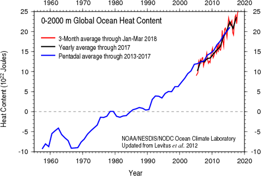
Not only are the oceans warming, they're also becoming more acidic. This increase in acidity refers to the rise in the concentration of hydrogen ions in the ocean, which lowers its pH level. Oceans play a pivotal role in Earth's carbon cycle, acting as a significant carbon sink that helps regulate the global climate. In fact, if you remember from our carbon cycle discussion, they are the largest reservoir of carbon on the planet, storing a whopping 50 times more carbon than the atmosphere! The process through which oceans absorb carbon dioxide (CO2) from the atmosphere is complex and multifaceted. When CO2 from the atmosphere dissolves in seawater, it reacts with water to form carbonic acid, which then breaks down into bicarbonate and hydrogen ions. This series of reactions helps to reduce the concentration of CO2 in the atmosphere, thereby mitigating the greenhouse effect and global warming to some extent. However, this increased uptake of CO2 by the oceans is not without consequences.
When carbon dioxide dissolves in ocean water, it forms carbonic acid, which gradually leads to ocean acidification (a decrease in pH). The graph below shows global ocean pH changes from 1982 to 2021, steadily drifting towards lower values. Now, you might think, “We only went from a pH of 8.125 to 8.055—a shift of just 0.07 units—so what’s the big deal?” But here’s the key: pH is measured on a logarithmic scale, meaning that small shifts translate to big changes in acidity. In this case, a drop of 0.07 pH units represents an 18% increase in ocean acidity!
Explore Further...
Head here to learn a bit more about pH scales to refresh your memory from high school chemistry!

So, what does this drop in ocean pH actually mean? On one hand, photosynthetic algae—key oxygen producers and essential players at the base of the marine food web—might initially benefit. These algae rely on carbon dioxide for photosynthesis (the process of converting sunlight and CO₂ into energy), so as more CO₂ dissolves in the ocean, they could gain more resources to grow.
However, the story is different for many other marine organisms. Lower pH means a change in the ocean’s chemistry, particularly making it harder for species that use calcium carbonate to build their shells and skeletons. This includes corals, mollusks like clams and oysters, and certain types of plankton, all of which are essential to the marine food chain. As the water becomes more acidic, these organisms struggle to grow and maintain their structural defenses, leaving them vulnerable to disease and other environmental pressures. The effects ripple throughout the ecosystem: weakened corals and shellfish impact larger fish and marine animals that depend on them for food. It can also have significant "downstream" impacts on fisherman livelihood and even our pocketbooks (see the diagram below).
Considering that approximately one billion people globally (about 1 in every 8 humans) depend on seafood as their primary source of protein, the health of these marine species is not just an environmental concern but also a crucial economic and food security issue.

Quiz Yourself...
Ice Changes
Ice ChangesPrioritize...
At the completion of this section, you should be able to:
- Describe the effects of warming on sea ice and ice sheets, including the factors contributing to their decline and the role of albedo in the Arctic region’s warming.
- Explain the difference in sea-level impact between melting sea ice and land ice, and discuss how melting ice sheets contribute directly to global sea-level rise.
Read...
If you’ve experienced snowy winters, you know that ice and snow are sensitive to temperature changes. As the world has warmed, ice in the polar regions, particularly in the Arctic, has been on a steady decline. Warmer temperatures now melt ice for longer periods each year, reducing its overall coverage, thickness, and volume. To understand this loss, climate scientists focus on two main types of ice: sea ice and ice sheets.
Sea ice is frozen ocean water that grows in winter as temperatures drop and shrinks in summer as temperatures rise. Satellite data, available since 1979, have given scientists a clear picture of sea ice changes across the Arctic. To track these changes, they measure the minimum extent of sea ice in September, when it reaches its lowest point each year. Since satellites began monitoring, Arctic sea ice in September has decreased by about 13 percent per decade (see the graph below).
Like the stock market’s ups and downs, sea ice coverage can vary from year to year due to natural shifts in the climate system. But the overall trend is clear: a consistent and steady decline. Even with occasional peaks that might look like a “rebound,” the long-term pattern is one of continual loss.

Long-term reconstructions of Arctic sea ice, like the one just shown of Arctic minimum sea ice extent from 1979 to 2023 (credit: Zachary Labe), provide context for the recent, rapid decline. What does this drop in Arctic sea ice mean? Let’s start with a concept from our earlier discussion on energy budgets: ice has a high albedo, meaning it reflects a lot of sunlight. With less ice, the Arctic loses some of that reflectivity, or “albedo.” This allows more sunlight to be absorbed, which leads to even more warming in the region.
But the effects don’t stop there. A warmer Arctic with less sea ice can alter temperature gradients across the Northern Hemisphere. These gradients, or temperature differences between the poles and the equator, are key players in shaping mid-latitude weather systems and circulation patterns. As the Arctic warms and the pole-to-equator gradient weakens, it can disrupt these systems, potentially leading to more erratic and unusual weather patterns.
Shrinking areas of sea ice also mean that the Northwest Passage (the shortcut route from the Atlantic Ocean to the Pacific Ocean through the Arctic) more frequently becomes ice free, and it can become a more viable route for commercial shipping during late summer. While having such an ice-free shortcut can have economic benefits, more open routes for ships also bring about security concerns. This has the attention of the United States Navy, in particular. In 2014, the Navy issued their "Arctic Roadmap" through 2030 (NOTE: not required reading), which outlines how the Navy plans to deal with the consequences of increasing open waters in the Arctic. In case you're wondering, the Antarctic region also has sea ice, but it typically grows and nearly completely disappears each year with the changing seasons.
Moving away from the sea, ice sheets are vast expanses of "glacial" ice found on land, each covering at least 50,000 square kilometers (20,000 square miles). To clarify, "glaciers" are similar but smaller formations of “old” ice on land that do not reach the size of ice sheets. Ice sheets typically grow over time as snow accumulates each year and does not fully melt during the summer. This cycle allows fresh snow to fall on top of the previous year's snow, compressing it. Over hundreds to thousands of years, this process can result in the formation of large ice masses.
Today, there are two major ice sheets on Earth: one in Greenland and another in Antarctica (credit: NSIDC). Together, these ice sheets contain about 99 percent of the world's freshwater ice. During the last ice age, these ice sheets were much more expansive. For instance, the Greenland ice sheet once covered much of North America and Northern Europe, acting as a colossal reservoir of ice and significantly altering the global climate and sea levels.
But, as the world warms, the Greenland and Antarctic ice sheets are also melting. Scientists began tracking these ice sheets via satellite in 2002, and you can see an example of the trends in land-ice mass in the side-by-side pictures below of Alaska's Muir Glacier in 1941 (left) and 2004 (right; credit: Zachary Labe). Note that the Greenland ice sheet is melting more rapidly than the Antarctic ice sheet, in large part because the high latitudes of the Northern Hemisphere (where Greenland is located) are warming faster than anywhere else on the planet. As a result, in addition to the Greenland ice sheet, high-latitude glaciers in the Northern Hemisphere are melting, too.
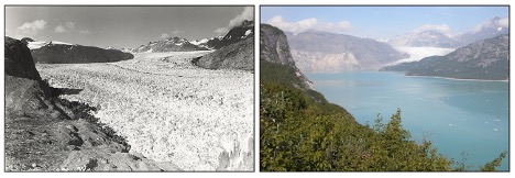
Overall, ice both on land and in the water is melting much faster in the Arctic than in the Antarctic. In the Antarctic, where warming has been less intense, some ice shelves (floating masses of ice attached to a land mass) have even grown slightly. However, when sea ice melts, the impact on sea level is relatively minor because this ice was already floating in the ocean. If I put some ice cubes in a glass and fill the water up to the brim, it won’t overflow even when it melts. This principle also applies to ice shelves.
In contrast, the melting of ice sheets and glaciers, which are situated on land, presents a different scenario. When these large ice masses melt, they contribute directly to rising sea levels because they add new water to the ocean that was previously stored as ice on land. This process is more akin to holding new ice cubes above a full glass and letting the melted water drip down. Eventually, that full glass will overflow. This distinction highlights the more significant role that land ice plays in influencing global sea levels and climate dynamics.
Quiz Yourself...
Trends in Sea Level Rise
Trends in Sea Level RisePrioritize...
At the completion of this section, you should be able to:
- Explain how melting ice sheets, glaciers, and thermal expansion contribute to global sea-level rise and describe how this rise varies regionally.
Read...
Melting ice sheets and glaciers on land are a significant concern because they hold vast amounts of fresh water. When they melt, that water ends up in the ocean. For instance, after the last ice age ended, melting ice sheets and glaciers contributed to a global sea level rise of about 400 feet (approximately 120 meters), which continued up until about 5,000 to 6,000 years ago. After that, sea levels remained relatively stable until modern melting trends were observed beginning in the late 1800s.
So, how much could sea levels rise if the existing ice sheets were to melt completely? Scientists estimate that if the entire Greenland ice sheet melted, it would release enough fresh water into the ocean to raise sea levels by about 20 feet (approximately 6 meters). If the Antarctic ice sheet were to melt entirely, the increase could be around 200 feet (about 60 meters). Such extensive melting would drastically reshape our planet!
Video: How Earth Would Look if All the Ice Melted (2:44)
We're a long way from seeing the complete melting of the ice sheets, given the immense size of these formations. The Greenland ice sheet still spans more than 600,000 square miles (more than three times the size of Texas), and the Antarctic ice sheet covers over 5 million square miles (roughly the area of the contiguous United States and Mexico combined). However, the melting that has already occurred is contributing to rising sea levels. Since 1993, when satellites began consistently tracking sea levels, there has been an increase of more than 80 millimeters (over 3 inches), as illustrated in the graph below. A longer-term record from tidal gauges shows that increasing sea levels began before 1993, culminating in a total increase of nearly 10 inches since the late 1800s.

Much of the rise can be attributed to melting ice sheets and glaciers, but thermal expansion of the warming ocean waters is contributing, too. Thermal expansion is the process by which water expands in volume as it heats up. As ocean temperatures rise, seawater takes up more space, pushing sea levels higher even without any additional water being added from melting ice. As with trends in atmospheric air temperature, complexities exist, however. For starters, there are short-term ups and downs (each year doesn't always have a higher mean sea level compared to the prior year), and sea levels aren't rising equally everywhere. Variations in ocean currents and local geography mean that sea levels in some parts of the world are rising more quickly than the global average, while in other areas sea levels have fallen or are remaining steady, even while the global average sea level increases. Furthermore, natural geologic factors affect sea level, too, such as the fact that the basins that hold Earth's oceans are constantly (albeit very slowly) changing shape. Scientists must take these long-term natural factors into account when calculating the rate of sea-level change due to global warming.
While a global average sea-level rise of 10 inches since the late 1800s may seem like no big deal, consider that 11 of the world's 15 largest cities are along coastlines. In the United States alone, about 40 percent of the population lives in densely-populated coastal areas. Even with the sea-level rise that has occurred so far, low-lying coastal areas of some large cities are flooding more frequently. Already in Miami, Florida, the highest tides of the year (called "king tides") are increasingly causing flooding in parts of the city.
Estimates show that king-tide flooding in Miami Beach has increased by four times since 2006. So, what may seem like a slow and minor sea-level rise is starting to have local and regional economic impacts. Continued warming and sea-level rise will likely cause more areas (and people) along the world's coastlines to become increasingly vulnerable to flooding.
Quiz Yourself...
Climate Change and Extreme Weather
Climate Change and Extreme WeatherPrioritize...
When you've completed this section, you should be able to:
- Explain the difference between climate change’s influence on the likelihood of extreme weather events and the misconception that climate change directly causes specific events.
- Describe how global warming shifts the probability of extreme heat and cold events, using the analogy of a “loaded die” to illustrate changes in the frequency of extreme temperatures.
- Explain why we see more record highs than record lows in a warming climate.
Read...
The way most people feel the effects of climate change isn’t through gradual shifts in average temperatures but rather in the increased frequency and intensity of extreme, often severe weather events. These are broadly termed “extreme weather.” Extreme weather can mean (but this isn't an exhaustive list by any means!) things like hurricanes, intense heatwaves, prolonged droughts, heavy rainfall and flooding, severe wildfires, and extreme winter storms.
The link between climate change and extreme weather grabs a lot of attention—and for good reason. As we've learned over the past few lessons, climate change is complex and multi-layered, with influences ranging from human activities at local scales to natural and human-induced changes on a global level. Most news stories focusing on climate change and extreme weather are actually zooming in on one key aspect: human-driven global warming. The central question is often, “How does a warming Earth impact the weather we experience on a day-to-day basis?”
However, this question often gets rephrased in a misleading way—“Did climate change *cause* this heatwave, flood, drought, or storm?” Framed this way, the answer is “no.” Climate change doesn’t directly cause specific weather events. That is, we can't unequivocally say Hurricane Katrina only happened because of climate change, and otherwise, it would be a perfectly pleasant sunny day! Blistering heatwaves, severe thunderstorms, devastating floods, and powerful hurricanes all existed long before human influence on the climate. So, while climate change doesn’t directly trigger a specific heatwave or flood, scientists' critical questions are whether and how climate change makes these extreme events more intense, frequent, impactful, or likely to happen in certain regions.
This is a complex area of study, and the science connecting climate change with extreme weather is rapidly evolving -- this lesson may not even be the same year-to-year! What is clear, though, is that the impacts of climate change on extreme weather differ from place to place. Although the globe is warming, some areas are heating up faster than others; similarly, while sea levels are rising, local factors cause them to rise unevenly across different coastlines. In short, a mix of local, regional, and global climate influences—both human-induced and natural—play into changing patterns of extreme weather. Yet, the human-driven warming of the oceans and atmosphere has certainly altered some aspects of atmospheric behavior.
Let's start with a couple of the more straightforward connections between global warming and extreme weather events. For starters, as the world has warmed, average air temperatures in many areas have increased. Not surprisingly, so have outbreaks of hot weather. On a similar note, episodes of extremely cold weather have declined, which seems intuitive.
Take a look at the graph above. It shows the probability of experiencing “cold,” “near-average,” and “hot” weather. Notice that the “previous climate” curve has a “bell” shape—this is because, in a stable climate, it’s most common for temperatures to be seasonable or close to average. However, as anyone who’s been around for a few years knows, we also get stretches of both very cold (left side of the curve) and very warm (right side of the curve) weather.
Now, look at the “new climate” curve, which shows what happens when the entire temperature distribution shifts warmer. Every temperature is nudged a bit to the right, making warmer temperatures more likely. Remember our discussion of statistical distributions? What we’re seeing here is an example of how shifting a distribution affects the likelihood of different outcomes. This shift means that, while seasonable weather is still most common, “average” itself has become a little warmer. For example, if May’s average high temperature used to be around 65°F, it might now be closer to 68°F.
So, what’s the result of this shift? With the whole distribution skewed a bit warmer, extreme cold events (on the left) become less common, and extreme heat events (on the right) become more common. It makes sense—by shifting the baseline, we’re tilting the odds toward hotter days.
This doesn’t mean cold spells will vanish altogether as the world warms. Cold snaps can still happen! Take February 2015, for instance, when the eastern United States had one of its coldest months on record (going back to 1895). So, yes, even in a warming climate, frigid weather can occasionally dominate. But when we look over a long period, we start to see a trend: fewer cold spells and more frequent heatwaves.
Do we actually see more extreme heat days compared to extreme cold days? Let’s explore that by looking at decade-by-decade data on the frequency of record-breaking warm and cold days, totaling up all U.S. locations and days of the year. This is what the trend looks like through 2015.

This graph illustrates the ratio of daily record high temperatures to record low temperatures over the decades. Each bar's color and height provide insights into temperature trends:
- Red Bars: More record highs than lows.
- Green Bars: More record lows than highs.
- Bar Height: Indicates the extent of the difference. Taller bars signify a greater disparity between record highs and lows.
In a stable climate, we’d expect the number of record highs and record lows to be pretty even. And that was indeed the case through the mid-20th century: if you look at the red bars in the graph, they’re relatively short, indicating a near 1:1 ratio. In other words, it was about a coin flip whether record highs or lows were more common.
But then came the 1960s and 1970s, when mean temperatures in the Northern Hemisphere actually cooled slightly. This cooling led to more record lows than highs, as you can see with the green bars that pop up. Since then, however, there’s been a sharp shift. As the global temperature trend turned upward, particularly in the Northern Hemisphere and North America, record highs began to outnumber record lows significantly. In the past decade, the ratio of record highs to lows has soared to over 2:1, meaning extreme heat days now occur twice as often as extreme cold days. This trend aligns with the shift in the probability of heat extremes we discussed earlier.
A helpful analogy here is to think about rolling a six-sided die. Yes, yes, we’ve played with this example earlier in the semester, but let’s roll with it again (pun intended)! Let’s set up another little experiment with die rolling to see how probabilities change.
Explore Further...
Start rolling the pair of dice. One of the dice is a fair die, and the other is "loaded", though just how, you'll need to figure out. It should become clearer and clearer as time goes on, and the number of rolls increases. Note that you can "roll" in rapid succession to get larger and larger samples (you don't need to wait for the animation to complete on each roll). Start out with 1 roll, then 5, then 10, 30, 50, 100, and so on, as many as 500 or more (if you have the patience!) rolls of the die. Pay attention to the number of numbers you've rolled for each of the two dice (the percentage of times each possible value of the die is rolled is conveniently recorded for you).
Making sense of it!
Do your rolls seem to be converging towards some well-defined fraction? Is one number showing up more often on one of the two die? When you think you're ready to guess which of the two dice is loaded, go for it. You can repeat the experiment over and over (and over!) again. Sometimes it's the red die that will be loaded, other times it will be the blue die. Can you figure out which number is favored and how skewed (loaded) the results are?
(insert Jeopardy music while you experiment with the dice!)
So, as you've figured out by now, I loaded the die so that sixes would come up twice as often as they ought to. The more rolls you take, the more obvious it becomes that the die is rigged. I'm never going to be allowed to visit Vegas again!
Now, let’s think back to that first time you rolled a six with the loaded die. Was that specific roll directly due to the loading? Not exactly. Like any long-term Monopoly player would tell you, even with a fair die, you’d expect a six about one in every six rolls. But because the die is loaded, it’s now twice as likely that any given roll, including that one, would come up six. This effect becomes clearer with more rolls.
This analogy is useful for understanding how global warming affects extreme weather, like heat waves. We showed earlier that a modest warming—similar to the average global temperature increase over the past century—almost doubles the chance of seeing temperatures exceed 100°F in mid-summer. And we've also observed that the frequency of extremely hot days in the U.S. has approximately doubled since the mid-20th century.
Using this analogy, we can think of global warming as a way of “loading the weather die” toward more heat extremes. Just as we wouldn’t say that any single scorching summer day was directly caused by global warming, we can say that the odds of such a day occurring have doubled. In other words, the "weather die" is increasingly weighted toward extreme heat events across the U.S. and around the globe.
Quiz Yourself...
Moisture and Precipitation
Moisture and PrecipitationPrioritize...
When you've completed this section, you should be able to:
- Explain how a warming atmosphere increases atmospheric moisture and precipitable water, and describe how this contributes to more intense and frequent heavy precipitation events, with regional variations in impact.
Read...
Another outcome of a warming atmosphere and ocean is increased moisture. Earlier, we discussed how rising temperatures lead to higher evaporation rates. Eventually, condensation rates catch up, reaching a new balance, but in this warmer state, the number of water vapor molecules in the air is greater. In the atmosphere, this has a major impact: if warmer air holds more water vapor, then when it rises and cools to the point where net condensation occurs, there’s more water available for cloud formation and precipitation.
To gauge the moisture available for precipitation, climate scientists use a metric called "precipitable water." This represents the amount of rain that would fall if all the water vapor in a column of air—from the Earth's surface up to the top of the troposphere—condensed and fell as rain. The image below shows the simulated percentage change in precipitable water between the 1984-2013 average and the 1871-1900 average. The widespread blue shading indicates that in most regions, precipitable water has increased by several percent, and in some areas, by as much as 15 percent as the world has warmed.

This trend has critical implications for precipitation intensity and frequency, as more moisture in the atmosphere can lead to more intense downpours, amplifying the risk of floods and extreme rainfall events in many areas. Therefore, it's not surprising to see an increase in heavy rain events. For example, the percentage of the contiguous United States receiving an unusually large portion of total annual rainfall from extreme one-day rainfall events has increased (here's the corresponding graph from NOAA; the orange curve represents a running nine-year average). But, the increase in heavy rain events hasn't occurred equally everywhere.

The figure above, from the U.S. National Climate Assessment, highlights trends in “heavy precipitation”—defined here as the top one percent of all rainfall events in each region—from 1958 through 2021. In the leftmost panel (the one labeled "a"), we can see that the Northeast has experienced the largest increase in rainfall from these intense events, while the Pacific Northwest has seen a smaller increase, and Hawaii actually shows a slight decrease in rainfall from its heaviest events during this period.
The other two panels display different measures of extreme precipitation, such as the maximum daily rainfall over one- and five-year windows. The overall story remains consistent: significant increases in the eastern United States, with smaller yet still notable, increases in the West. These trends aren't limited to the United States; as we’ll see shortly, similar patterns are evident globally, with variations across regions.
Quiz Yourself...
Historical Variation of Floods and Drought
Historical Variation of Floods and DroughtPrioritize...
After finishing this section, you should be able to:
- Explain, at the global scale, what we have seen in terms of changes in precipitation and drought.
- Give some examples of why precipitation patterns vary regionally, including those in a changing climate.
Read...
Remember when we discussed how the general circulation of the atmosphere—the global pattern of winds and weather—is shaped by the uneven heating of Earth? Because the equator receives more solar energy than the poles, this imbalance drives a vast system of atmospheric circulations that distribute heat and moisture around the planet. So, when we talk about climate change, we’re not only talking about shifts in temperature; we’re also talking about changes in this energy imbalance that can impact circulation patterns. It’s logical, then, to expect climate change to influence large-scale precipitation trends as well.
We just explored how a warmer atmosphere holds more moisture, which translates into heavier downpours when that moisture eventually condenses. In the U.S., the data confirm this trend toward more intense rainfall events. However, precipitation patterns are far from simple. It’s one thing to say heavier downpours are on the rise, but predicting how total precipitation will change in any given place—how much rain or snow falls over an entire season or year—is much more complex. Precipitation changes are “noisier,” meaning they vary a lot by location and can be harder to interpret consistently over time.
Why is precipitation so variable? The reasons range from local topography to larger-scale climate patterns. For instance, mountain ranges can trap moisture on their windward sides, creating wetter conditions there, while casting a “rain shadow” of drier conditions on their leeward sides. Oceans also play a big role: they support massive air and water currents, like the monsoons, which bring seasonal rain to regions like South Asia and East Africa. Ocean-atmosphere interactions are critical, and when they shift even slightly, they can change rainfall patterns for entire regions.
Unlike temperature, which has shown a more uniform warming trend globally, precipitation trends are a mixed bag—some regions are seeing more rain, while others face more frequent droughts. These changes don’t follow the same clear patterns as temperature, which is why scientists continue to investigate how climate change impacts precipitation in different parts of the world. This research is crucial for understanding the full picture of change impacts.
Now, let’s zoom out and take a more global look at total precipitation patterns. The figure below maps how different areas have seen precipitation either increase (in green) or decrease (in brown) over the 20th century. The small red dots mark different locations, each with its own time series showing how precipitation has trended over the years.
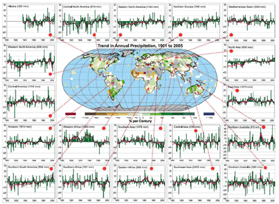
Pretty messy, right? Some areas show clear trends, but they’re all over the map. Take southern South America, for example—the time series in the bottom left corner shows a noticeable increase in rainfall across the century, indicating that this region is becoming wetter. On the other hand, regions like southern Asia and India (fourth row, third column) show a drying trend, especially over the past 30 years. These diverse precipitation signals across the world are essential to understand because climate change isn’t affecting every region equally. As global conditions shift, the “winners and losers” in terms of rainfall and drought may shift too. Places that historically supported lush forests and agriculture may face more frequent droughts, while regions previously considered too dry for intensive farming might start seeing conditions that favor crops. By the end of this course, we’ll dive into what these shifts could mean for geopolitics and resource distribution.
While these precipitation patterns are complex and heavily influenced by local factors, we do start to see some overarching trends. Remember the Clausius-Clapeyron relationship? It’s that principle telling us that a warmer atmosphere holds more water vapor before it condenses into cloud droplets and, eventually, rain. This relationship suggests that with a warming climate, regions near the equator—where the Hadley cell drives constant upward motion—might get wetter over time. Why? A warmer, moisture-laden lower atmosphere in equatorial regions means more available water vapor for rain.
So, does this theory hold up in real-world data? When we look at precipitation trends by latitude, we start to see supporting evidence. By averaging observed precipitation changes across latitude bands, a pattern emerges: certain regions, especially near the equator, are indeed becoming wetter over time.
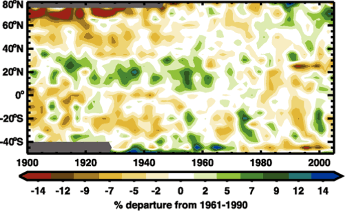
Take a look at the broad green band around 15°N latitude on the graph. This region aligns closely with the Intertropical Convergence Zone (ITCZ), where equatorial rain belts form due to warm, rising air. Seeing a green band here suggests that rainfall in the ITCZ has increased, which matches what we’d expect as the atmosphere warms and holds more moisture. Meanwhile, higher latitudes show a trend toward drying, represented by yellows and browns near the top and bottom of the graph. These drying patterns are consistent with some climate model predictions (we’ll dig into those next), but precipitation trends are notoriously variable. From year to year and even decade to decade, regional precipitation can swing widely, making it hard to confirm clear, theory-matching patterns like we saw with temperature, sea ice, or sea level.
An essential factor in this story is drought—periods of unusually low rainfall. But drought isn’t just about less rain; it also depends on temperature. Imagine this: when rainfall drops, the ground heats up faster, which speeds up evaporation and further dries out soil. This reduction in soil moisture limits the water available for plants, creating harsher conditions for growth. This process can even reinforce itself, with drier soil warming up faster, leading to even more moisture loss—a process often described as “drought begets drought.”
Drought patterns, like precipitation, are complex and vary by region. Yet, we’re seeing droughts become more common in some areas, even in regions where rainfall hasn’t decreased significantly. Warmer temperatures alone can drive moisture out of the soil, which is especially clear when we look at tools like the Palmer Drought Severity Index (PDSI). The PDSI is a numeric index for soil moisture that factors in both temperature and precipitation. The more negative the PDSI number, the stronger the drought.
Check out the time series of the PDSI over the U.S. from 1890 to 2020 below. Do any patterns stand out? Notice the deep drop in the 1930s—this was the infamous Dust Bowl, when a severe drought brought destructive dust storms, devastating agriculture across the American and Canadian prairies. There’s another notable drought in the 1950s, but since then, we haven’t seen anything as extreme. What’s important to note here is that droughts haven’t disappeared despite increases in intense rainfall events. Just because we expect heavier downpours as the atmosphere warms doesn’t mean droughts are off the table in U.S. climate trends. While researchers are still examining historical data, I’d argue it’s too early to definitively say climate change is tilting the scales toward more or fewer droughts in the long run—at least not yet.

Quiz Yourself...
Storms and Confidence
Storms and ConfidencePrioritize...
When you've completed this section, you should be able to:
- Evaluate the confidence levels linking global warming to various types of extreme weather events.
- Explain the complexities involved in attributing climate change impacts to shorter-lived phenomena, such as tornadoes and hurricanes.
Read...
While trends in extreme heat, cold episodes, and heavy rainfall have shown some global variation, scientists are confident that global warming significantly influences these patterns. However, determining how global warming impacts smaller-scale or short-lived storms—like hurricanes (tropical cyclones), mid-latitude low-pressure systems (extratropical cyclones), and severe thunderstorms (convective storms)—is more complex.
The figure below provides a sense of the certainty levels regarding links between global warming and different types of extreme weather events. Those toward the upper right of the graph represent trends with higher confidence in their connection to global warming, while those in the bottom left indicate areas with less certainty. Notably, the graph includes "extreme rainfall" but not "flooding" as a separate category. Trends in flooding are highly localized, influenced by factors such as urbanization, which affects water absorption and drainage into nearby streams and rivers. Poor urban planning, for instance, can lead to increased flooding regardless of trends in heavy rainfall. This means that while global warming may influence extreme rainfall, local land-use changes often play a major role in determining flooding outcomes, making it challenging to link flooding trends directly to climate-driven changes in rainfall.

Interest in the links between global warming and extreme storms like hurricanes, severe thunderstorms, or tornadoes is high. However, there’s less certainty in understanding these connections. Let’s focus on tornadoes and tropical cyclones (hurricanes), since they’re often in the spotlight. Part of the challenge with linking these storms to global warming is the relatively short period of quality observations we have of them.
For instance, while the number of strong tornadoes in the U.S. hasn’t shifted much since 1950, the frequency of weak tornadoes has risen significantly (see the graph below). Is this increase due to global warming? Probably not. Instead, the rise is largely due to improved storm detection with the introduction of NEXRAD Doppler radar in the early 1990s, which allows for more accurate tracking of storms that might produce tornadoes. Prior to advanced radar, only tornadoes easily observed and reported from the ground were included in the records—meaning in parts of the central U.S. where much of the landscape is dominated by acres and acres of crops instead of humans, weaker tornadoes likely went undetected and/or reported!

A similar story applies to tropical cyclones. From 1980 to 2017, hurricanes dominated the list of costliest U.S. weather disasters (credit: NCEI), underscoring their substantial societal impact. But is this impact due to human-induced warming making hurricanes more frequent or intense? It’s complicated. Reliable observations only go back to the 1970s when global satellite coverage began; prior to that, storms that didn’t make landfall or encounter ships often went unrecorded. Adjusting for this, the data suggest the overall number of tropical cyclones worldwide has changed very little with warming, although a higher percentage of hurricanes are reaching extreme strength (sustained winds over 110 mph). Still, the rise in hurricane damage appears to be driven more by increased coastal development—more people and infrastructure to be affected—than by warming itself.
Yet, some trends consistent with global warming are evident. For instance, rising sea levels amplify coastal flooding during tropical cyclones. Also, the areas where tropical cyclones develop are expanding, and these storms are reaching peak intensities farther from the equator than a few decades ago.
Quiz Yourself...
The Global Impacts of Extremes
The Global Impacts of ExtremesPrioritize...
At the end of this section, you should be able to
- Interpret global changes in heat extremes, heavy precipitation, and drought
- Describe one way that scientists visualize trends and confidence in those changes.
Read...
We’ve covered many extreme weather and climate concepts from a U.S. perspective, but how do these trends play out globally? The figure below (also, big version linked here) from the IPCC Sixth Assessment Report divides the world into regions (no, this isn’t a game of Settlers of Catan!). Each “tile” represents a region, such as ENA for Eastern North America. A team of scientists assessed changes in heat extremes, heavy precipitation, and drought since the 1950s, topics we’ve explored in this lesson. Tile colors indicate observed trends, while the number of dots represents the confidence scientists have that these trends are driven by human activity.
The top panel displays trends in hot extremes and confidence in human contributions. Red tiles show increases in hot extremes, blue shows decreases, dashed lines indicate unclear trends, and gray signifies limited data. Most regions show red tiles, supporting our earlier discussions on rising ratios of record highs to lows. High confidence (three dots) in many regions links these increases to greenhouse gas emissions and other human impacts.
The middle panel shows trends in heavy precipitation, with green for increases and brown for decreases. Most tiles are green, with trends pointing to more intense precipitation, as we discussed in North America. However, gray tiles in South America and Africa reveal gaps in data, underscoring why scientists advocate for better monitoring networks.
The bottom panel illustrates trends in agricultural and ecological drought (prolonged low precipitation). While heavy precipitation events have increased, drought trends are mixed, but most tiles are brown, indicating rising drought levels. How can heavy precipitation and drought both be on the rise? Timing is the key. In warmer climates, precipitation events cluster together, leading to long dry periods that stress water resources—a phenomenon known as the “boom-bust” cycle, where we see increasing shifts between very wet and very dry conditions.

Quiz Yourself...
Summary
SummaryRead...
- Surface temperature is easy to measure, and global observations confirm a steady warming trend over the past century.
- The global average temperature provides a single, useful metric for assessing Earth’s warming.
- Distinct "fingerprints" of human-driven climate change, such as surface warming and stratospheric cooling, support the case for anthropogenic impacts.
- Ocean warming and acidification are directly impacting marine life, with potentially far-reaching effects on global food security.
- Melting sea ice and land ice indicate regional warming differences, with distinct impacts depending on the ice source.
- Sea levels are rising globally due to ice melting and thermal expansion, though regional variations exist due to local factors.
- Global warming shifts temperature extremes, increasing the likelihood of record highs and diminishing the frequency of record lows.
- A warmer atmosphere holds more moisture, leading to intensified heavy rainfall events, with regional variations in frequency and impact.
- Shifts in global precipitation patterns (along with accompanying floods and droughts) vary widely, influenced by factors like geography, ocean currents, and climate change.
- Confidence varies in linking global warming to different extreme weather events, with particular challenges for short-lived phenomena like tornadoes and hurricanes.
- Global trends in extreme heat, heavy precipitation, and drought reveal regional differences, with data visualization strategies (like the hexagonal plots we explored) enhancing our understanding of human influence.
Quiz Yourself...
Lesson 10: Climate models and projections
Lesson 10: Climate models and projectionsMotivate...

In the last lesson, we focused on looking backward, understanding how Earth's climate has changed over time. But studying—and mitigating—climate change also requires us to look forward. What will the consequences of increased radiative forcing be? What solutions are available, and how effective might they be? How should we prioritize resources to address these challenges? To answer these questions, scientists rely on tools called climate models. While we don’t have an actual crystal ball to peer directly into the future, these models serve as our next best option—synthesizing decades of scientific knowledge to project what lies ahead.
In this lesson, we’ll uncover what a climate model is and take a peek inside the "black box." We’ll explore how models are built by coupling together different components of the Earth system—like the atmosphere, oceans, and land—and why they require massive supercomputers to handle the staggering number of calculations involved. We’ll also discuss the rigorous process of validation and verification that ensures models are reliable and up to the task.
Finally, we’ll examine how modeling centers from around the world collaborate to create climate scenarios and projections. These scenarios, developed using different codebases, assumptions, and strategies, collectively paint a picture of potential future climates. Together, they provide a powerful framework for understanding the possibilities ahead and for guiding informed decisions about the path we choose.
What is a Climate Model?
What is a Climate Model?Prioritize...
After completing this section, you should be able to:
- Define the term "model" in a scientific context.
- Describe, in basic terms, what a climate model's purpose is.
Read...
"It's tough to make predictions, especially about the future." This Danish "proverb" (often attributed to the baseball great, Yogi Berra) is especially apt now! Last lesson, we focused on how the climate has changed when we look backward. Past trends in air temperature and their consequences for ice coverage, sea level rise, atmospheric moisture, extreme weather, etc., are things that scientists have already observed. But what does the future hold? How will climate change impact us in 10 years? In 100 years? Answering those questions is challenging for scientists because of all the variables involved in predicting the future. In an ideal world, scientists could use some sort of identical planet, just like Earth, to compare observed changes to our climate to those without human influence on the identical planet. Kind of like a placebo. But no such planet exists! Therefore, scientists are forced to use the next best thing – a climate model.
First, let’s understand what a model is. In absolutely the most basic terms, a model is a simplified representation of a real-world system that helps us understand, explain, predict, or manage processes. Models can be physical objects, such as scale models of buildings or rockets, or abstract constructs, like mathematical equations and computer simulations.

Now, when it comes to science, models are often used to simulate complex systems by incorporating various different variables and how they interact with one another. By simplifying the real world, models allow scientists to experiment with different scenarios, make predictions, and explore outcomes of various changes in the system being studied. For example, in epidemiology, doctors build models to simulate the spread of infectious diseases. They may have variables like population density, temperature, whether people are locked down, etc. This helps researchers predict outbreak patterns, assess the effectiveness of interventions like vaccination, and plan public health responses.
At its core, that is also what a climate model does! It’s impossible to track every molecule in the Earth’s system at any given time. However, we can use what we have learned in this class to simplify the system and then use computers to predict what the future climate might look like. We can do things like add extra carbon dioxide to the atmosphere or remove aerosol pollution and see what happens... all without having to wait 100 years to find out!
There is a range of types of climate models, each varying in complexity and scope. When you hear the term “climate model” in some news article or even on TikTok, you should remember that it isn’t a one-size-fits-all term. For example, we can have "toy" models. These (very) simple climate models focus on basic processes and provide a broad overview of what is going on in the Earth’s climate system with minimal (or no!) need to use a computer. They often use basic concepts, such as the balance between incoming solar radiation and outgoing infrared radiation, to estimate changes in global temperature. They are simple enough that you can write them out with a pencil and paper.
Remember when we talked about the Earth’s equilibrium temperature in the context of radiation? Energy in = energy out? True story: we were actually “building a model!” Simple, yes, but useful for understanding how the climate system behaves!

Quiz Yourself...
Ingredients of a Climate Model
Ingredients of a Climate ModelPrioritize...
After completing this section, you should be able to:
- List at least three processes that are simulated in Earth system (climate) models.
- Understand that climate models are broken into different components.
Read...
All that said, when people talk about “climate models,” they aren't talking about these "toy" models. Usually, they mean something much more complex than what we can write out on a napkin at the bar! Earth System Models (ESMs) are detailed software programs (they are indeed just a bundle of computer code!) that show how the atmosphere and oceans behave on a global scale. They use complex mathematical equations to represent the movement of air and water, the exchange of heat and moisture, and other critical processes necessary to ensure we can model the climate in a way that matches what we actually observe. They can also be modified to include the carbon cycle, vegetation, and human activities—topics we’ve discussed before. ESMs aim to provide a comprehensive picture of the Earth's climate system by including natural cycles and human influences like greenhouse gas emissions and land-use changes.
While “ESM” is the technical term many scientists use (sometimes, this will also get abbreviated GCM, which stands for "general circulation model," although recently people have also been using the acronym for "global climate model"), we’ll go back to colloquially calling these tools generally “climate models” for the rest of this section.
A quick aside:
It’s worth noting that many of you are probably more familiar with weather models than climate models. At the very least, you’ve likely heard more about them on TV—your local meteorologist might say, “It’s a beautiful day right now, but the models suggest we’re in for a change by the end of the week!” A weather model is actually a specialized type of ESM (Earth System Model). Its purpose is to predict what will happen in the short term, looking just a few days to a week ahead, instead of years or decades into the future.
Climate models, on the other hand, are more complex. They need to simulate processes that are essential for estimating long-term trends in global temperature over the course of a century. For example, predicting whether the global mean temperature will rise by 4 degrees over the next 100 years is crucial, but on a weekly timescale, that’s not relevant. Entire ice shelves won’t melt in a few days—most weather models treat them as constant. But over decades, they’re a factor we can’t ignore. This difference means that weather models tend to be simpler and faster to compute, which is essential since we need updated weather forecasts multiple times each day!
How does a climate model work? While these models are incredibly complex—often the result of tens or even hundreds of scientists working on them full-time—we can break down the basics using the schematic below. This diagram focuses primarily on the atmosphere (appropriate for a METEO course!), but similar structures apply to other components of climate models, like those used to simulate the ocean and land.
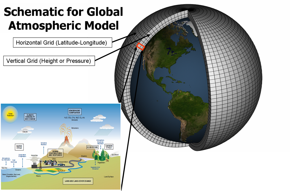
Climate models simulate the Earth’s climate by using mathematical equations to represent physical processes—many of which we’ve explored qualitatively (in other words, without too many equations!) in this course. These equations are solved on a grid covering the entire globe, where each grid cell represents a specific (two-dimensional) surface area or (three-dimensional) volume of air or water. So, State College, PA, may be surface area "grid cell number 421," while Sydney, Australia, may be "grid cell number 1078." Imagine the total collection of grid cells as the model’s “skeleton”—breaking the Earth up this way helps work through the complex, interconnected processes within each small piece, bit by bit until our model captures the whole system.
These climate models account for a range of factors, such as air and water flow, heat exchange, moisture distribution, and energy balance – all sorts of things we have learned about over the past few months! By running these climate models forward in time, they show how these elements interact, evolve, and change. This approach allows scientists not only to understand current climate patterns but also to make projections about future changes. To improve their accuracy, models are continually updated with our most recent understanding of how real-world processes work. A model in use today has been updated over a model from five years ago. And today's model will look archaic (hopefully!) in another decade!
How do these models simulate such a massive system? They’re divided into components—similar to the main parts we discussed at the beginning of this course (remember Lesson 1?). Each major component of the climate system is represented: the atmosphere, the ocean, the land, and ice-covered areas. For instance, the atmosphere component models air behavior, including wind patterns, air temperature changes, and precipitation. The ocean component handles water movement, currents, and heat exchange with the atmosphere. The land surface component tracks soil moisture, vegetation, and how the land absorbs and reflects sunlight. Finally, the cryosphere component models ice-covered areas, such as glaciers, sea ice, and snow, and their interactions with the rest of the climate system.
To illustrate this, take a look at the diagram below from the Department of Energy’s climate model. Each part of the climate system has its own dedicated “sub-model”—the atmosphere, land, ocean, etc.—and each sub-model addresses processes specific to that component. Together, these sub-models work to represent the entire climate system and its complex interactions.

Equations and data are at the heart of climate modeling. The equations rely on core physical laws like the conservation of energy, mass, and momentum, which describe how energy and matter move within the climate system through processes like radiation, convection, and the water cycle. Meanwhile, data are just as critical; they are produced by the real-world measurements necessary to set up and validate the models. These data come from sources like satellite observations, weather stations, and ocean buoys. By combining physical equations with observed data, climate models simulate past, present, and future climate conditions, enabling scientists to make informed predictions and study the possible impacts of climate change.
Quiz Yourself...
A Brief History of Climate Models
A Brief History of Climate ModelsPrioritize...
When you're finished with this section, you should be able to:
- Define what we mean by "fully coupled" climate model
- Define "supercomputer"
Read...
Climate models have grown remarkably complex over the past few decades as both computing power and our understanding of the Earth system have advanced. The graphic below shows how climate models have evolved, and as you can see, the earliest models from the 1970s were quite basic—they included only essential atmospheric processes and a few greenhouse gases. But with each passing year, we gain new insights, and our computers get more powerful. Today’s models (shown toward the bottom of the graphic) are far more sophisticated. They incorporate detailed representations of the land surface, oceans, and ice coverage, and they can simulate complex exchanges of carbon and water between the surface and atmosphere.

By the way, the acronyms, “FAR,” “SAR,” “TAR,” and “AR4” in the image above refer to the state of GCMs at the times of the first, second, third, and fourth assessment reports (AR) of the Intergovernmental Panel on Climate Change, respectively. We'll talk about the IPCC on and off through the rest of this class. For perspective, the first assessment report (FAR) was published in 1990, and the fourth (AR4) in 2007. There’s also been an AR5 and an AR6 since this figure was generated – over this time, climate models have become even more sophisticated. But even with the increasing sophistication of these models, the latest and greatest ones still can't match the true complexity of the real climate system. I’m not sure any of us will be alive to see every molecule of the atmosphere accurately predicted for the next 100 years!
The most advanced models today are “fully coupled,” meaning the atmosphere, land, ocean, and ice components all interact with each other within the model. Changes in the atmosphere impact the ocean and vice versa, creating a more realistic and interconnected simulation than simulating the two independently.
Want an analogy for "fully coupled?" Think of it like a football play -- yes, each wide receiver can run their own route and go off and do their own thing. However, the play is much more likely to succeed if all the players respond to each other. For example, we don't need three linemen blocking the same pass rusher; they need to interact and respond accordingly! While very simple, this ability to interact and respond is why it is important for the components of a climate model to be coupled, i.e., talk to each other within a model.

These incredibly sophisticated models demand enormous computing power to handle the sheer number of calculations they require. While some simpler climate models can actually run on your smartphone (yes, really!), the models used for studying global climate and informing policy decisions need vastly more power than what’s available to everyday consumers. To meet this demand, these models rely on the world’s fastest supercomputers—machines capable of performing trillions of calculations per second. Think of a supercomputer as thousands of laptops stitched together with cables, all working in perfect sync. Each grid cell in a climate model—each piece of its "skeleton"—has its own set of equations for energy, moisture, and momentum. Multiply this by thousands of cells spanning the globe, and the computational load becomes staggering. This isn’t something you can just run at home! Supercomputers break the problem into smaller chunks, assigning each piece to a different part of the system so they can all work simultaneously. To give you an idea of scale, the largest supercomputers boast more than a million times the processing power of the fastest consumer laptop.
The image above shows a worker at the NCAR-Wyoming Supercomputing Center inspecting a section of the water-cooling system for one of these supercomputers. Notice she’s working with just one "cabinet"—a tiny fraction of the full machine used for climate modeling. Each of those red and blue tubes carries water to cool a specific part of the supercomputer. To put it in perspective, each "small piece" of the supercomputer contains 128 "cores." For comparison, the laptop, tablet, or phone you’re using right now probably has between 1 and 4 cores. This immense power and scale are what make modern climate modeling possible.
Quiz Yourself...
What Climate Models Can Tell Us and What They Don't
What Climate Models Can Tell Us and What They Don'tPrioritize...
When you're finished with this section, you should be able to:
- Describe the difference between weather models and climate models and understand their purposes, limitations, and how they handle uncertainties to project short-term weather or long-term climate trends.
Read...
I've hinted we want to use these models to predict the future. And we'll get to that soon. But how do we know they are accurate? After all, if weather forecasts can’t always get it right two weeks out, how on Earth could a climate model possibly forecast characteristics of the climate 100 years from now? And I’ll say right now—that’s a fair question!
But here’s the thing: it’s not exactly a fair comparison. Comparing weather models to climate models is a bit of an “apples and oranges” situation. To produce accurate short-term weather forecasts, we need to get very specific about the details—high- and low-pressure locations, wind directions, exact temperatures, areas of precipitation, and so on, to start the forecast. These details are the initial conditions of the atmosphere, and to produce a perfect forecast, a model would need to start with a perfect set of initial conditions, i.e., a perfect picture of the atmosphere’s state (exact wind, temperature, humidity, etc.) everywhere on Earth at the same time. Because it’s impossible to measure every inch of the atmosphere at all times, achieving perfect accuracy is out of reach. So, while weather forecasts are generally good in the short term (a few days out), small errors in our “starting” conditions mean the forecast gradually diverges from reality when we try to look a week or more ahead.

On the other hand, climate models aren’t attempting to predict day-to-day weather patterns. They’re not designed to tell you if a hurricane will be in the Gulf of Mexico on August 14, 2067, or if the winter of 2078 will be snowier than usual. Instead, climate models focus on projecting large-scale climate trends (like changes in temperature, melting ice, and average rainfall) over decades. These projections are much less dependent on today’s exact weather. In other words, how warm the climate might be 100 years from now has very little to do with today’s specific wind direction or temperature at a given location. That means the small errors in initial atmospheric conditions that affect short-term forecasts don’t have the same impact on climate models.
Why? Because climate models are about predicting statistics and probabilities, not precise weather events. We’ve talked about dice-rolling a lot in this class, but imagine flipping a coin. You and I can’t predict accurately if the next flip will land heads (or tails), but we don’t need a computer model to know that over 1,000 flips, we’ll end up close to a 50/50 split between heads and tails. That’s how climate models work: they’re not trying to predict every “flip” but rather the long-term statistics, e.g., averages and trends, of important quantities.
Take some time, blow off some steam, and play with the coin flipper below.
Explore Further...
Head over to this online calculator: Coin Flipper
Those statistics are what we are interested in with climate modeling. For instance, they enable us to estimate the likelihood of certain outcomes, such as the probability of having a hotter-than-average year or the frequency of extreme weather events like hurricanes or droughts. Should people living along the Gulf of Mexico expect more or less heavy rainfall? Do we think the amount of snow falling over the ski resorts of the Rockies will increase, stay the same, or decrease moving forward?
We’ve already seen a figure like the one below, and I want to emphasize that this is exactly what a climate model is trying to predict. There are two probability curves: the gray one represents the current climate (let’s say the year 2020), while the black one represents a future climate (let’s say 2080). The horizontal axis is temperature, and the vertical axis shows how likely a particular temperature is to occur. There aren’t specific numbers on the axes, so feel free to imagine whatever region you like, anywhere from Miami to Fairbanks! While we can’t predict the exact temperature on, say, July 17th, 2080, the climate model gives us many “coin flips” or “dice rolls” for the days around that time. With enough of these simulations, we can build a distribution of likely temperatures.
In this case, the model shows us that, on average, days will be warmer. The coldest days won’t be as cold, and the hottest days will be even hotter. There’s still some overlap between the two curves, but the entire distribution shifts to higher temperatures. It’s a clear indication of how even small changes in the average climate can lead to noticeable shifts in extreme events.

Now, let's discuss limitations. Don’t let me oversell things—climate models aren't perfect, but they’re still invaluable tools. British statistician George Box said it best: "All models are wrong, but some are useful."
One significant source of uncertainty in climate models is the complexity of ocean processes. Oceans are Earth’s largest carbon reservoir, absorbing about half of the carbon dioxide emissions humans have generated so far, which has helped limit atmospheric warming. However, as the oceans take in more CO₂, their capacity to absorb it diminishes. The rate at which this happens depends on intricate interactions within the ocean that models don’t fully capture. Despite these uncertainties, ocean processes—and their immense heat capacity—are critical in shaping how quickly atmospheric temperatures rise in the future.
Another challenging area for climate models is clouds and water vapor. Clouds have a dual role: they cool the Earth by blocking incoming solar radiation during the day but also warm it by trapping infrared radiation. Which effect dominates depends on the types of clouds that form. As the planet warms and evaporation increases, the atmosphere will hold more water vapor—the most abundant greenhouse gas—likely leading to more cloud cover. But what kinds of clouds will dominate? Will the cooling or warming feedbacks of clouds prevail overall? These unanswered questions make cloud behavior one of the largest sources of variability in future climate projections.
Even with these uncertainties (and others), climate models remain essential tools for exploring potential future climates. They provide valuable insights by simulating how the climate system responds to different factors, even if some details are harder to predict. For instance, while the exact impact of increased cloud cover remains uncertain, models consistently predict continued warming if greenhouse gas emissions remain high. This agreement across multiple models and scenarios bolsters our confidence in the overall projections of climate change.
Moreover, climate models are constantly improving. Advances in satellite monitoring, ocean buoys, and other observational tools provide higher-quality data that enhance model accuracy. Researchers are also refining the mathematical representations of complex processes, such as ocean-atmosphere interactions and cloud dynamics, to reduce uncertainties. When scientists look back 20 years, they’re astounded by how much progress has been made—and we can only hope this trend continues!
Quiz Yourself...
Testing Climate Models: Validation
Testing Climate Models: ValidationPrioritize...
After completing this page, you should be able to:
- Define validation, verification, and hindcasting.
- Give at least two examples of how scientists might validate a climate model.
Read...
We finished off the last section by noting that climate models aren’t perfect, but they can be useful to scientists. Let's predict the future! But wait, I mentioned we first need to ask, how do scientists determine if they can trust models? Surprisingly, making future predictions is only a small part of a climate modeler’s job. A significant portion of their work focuses on testing the accuracy and reliability of the models themselves.
Testing climate models is essential for understanding and predicting the Earth’s climate system. Reliable models build confidence in their use for policy decisions, disaster preparedness, and long-term planning for climate change. Without rigorous testing, models could produce inaccurate predictions, leading to ineffective strategies for mitigating and adapting to climate impacts. In short, before scientists look ahead, they spend a lot of time looking back to ensure the models are up to the task.
So how do scientists do this? Validation involves comparing model outputs with independent observational data to determine how well the model represents reality. This process checks if the model can accurately simulate historical climate conditions and whether it can reproduce observed phenomena. Verification, on the other hand, focuses on ensuring that the model correctly implements the scientific theories and algorithms it is based on. This process involves code checking, debugging, and ensuring that the numerical methods used in the model are correctly executed.
Let’s talk about validation first. What is the best way to check if a climate model does a good job of simulating the Earth’s climate? Well, imagine you’re testing a new oven for making a birthday cake. You’ve made the cake before, and you know exactly how it’s supposed to taste, what kind of texture it has, how it should look... To test the new oven, you make the cake again and compare it to your previous cake. Does it look the same? Taste the same? If it does, then you can be confident that your new oven works. If, after one bite, everyone at the table spits it out, saying, "No more, I'm good," well, you have a problem with your new oven!
Climate modelers use a similar approach called hindcasting. Hindcasting is a technique where climate models are run backward in time to simulate past climate conditions. Technically, they aren't really run backwards, but climate models are *started* (the fancy word is "initialized") back in a previous year, say 1900, and they are then run to the present day. It's almost as if we took a time machine back to 1900 and tried to predict what was going to happen between then and now. Except we know what happened between then and now!
By comparing the model outputs with historical climate data, scientists can assess the model's accuracy. Hindcasting provides a robust test because the conditions are known, and the model's ability to replicate these conditions can be directly evaluated. This involves examining temperature records, precipitation patterns, and other climate variables over a significant period. If a model can accurately reproduce past climate variations, it increases confidence in its predictions for future climate scenarios. If my cake tasted good when cooked with the new oven yesterday, it's likely it'll taste good, even with some tweaks, when cooked with the new oven tomorrow.
Check out the graphic below. It compares the global average temperature over the past 50 or so years as predicted by a climate model built by NASA with what was observed. To “back test” the climate model, the model was run over the historical period from 1979 through 2023 and then the model predicted global mean temperature (black line) was compared with observations collected by surface stations and satellites (red line). The fact that the black and red lines are very close to one another provides confidence that the model is doing a reasonable job simulating the climate system, thereby providing confidence in using the model to predict future climate.

Observational datasets are a crucial part of validating climate models. And it’s not just surface temperatures that climate modelers focus on. Other observational datasets include information from satellites, weather stations, and ocean buoys. By comparing model outputs to these observations, scientists can assess how well a model captures various elements of the climate system, like temperature, humidity, and sea surface conditions. These comparisons go a bit above-and-beyond just tracking the global surface temperature For the cake analogy, in addition to tasting good, does your cake look nice? Does it have the right texture? The right amount of frosting?
Take water vapor, clouds, and precipitation, for example—quantities for which climate models are still improving. The graphic below illustrates how satellite data are used to verify the Department of Energy’s climate model. It shows satellite observations of atmospheric water vapor (gray/faint white shading) and precipitation (colors and bright white) alongside a “synthetic version” created by the model. By comparing the two, scientists can identify strengths and weaknesses in the model. For instance, in this graphic, the satellite observations are on top, and the model results are on the bottom. While the overall patterns of water vapor and precipitation are similar, the model appears “noisier” in the light gray contours. This tells scientists that tweaking certain equations or pieces of code might produce smoother results that align more closely with the satellite data. This could improve the model’s accuracy.
(top) Observed and (bottom) simulated amounts of atmospheric water vapor (faint white to gray shading), mesoscale convective system (MCS) clouds (bright white shading), and precipitation (color shading).
Quiz Yourself...
Testing Climate Models: Metrics and Verification
Testing Climate Models: Metrics and VerificationPrioritize...
After completing this page, you should be able to:
- Define "metric" and give at least one example of a climate metric used to evaluate climate models
Read...
When testing climate models, scientists can create petabytes of data. To put that in context, one petabyte would be 1,000 one-terabyte external hard drives... definitely not something you can keep in your dorm room! Creating petabytes of data is the byproduct of checking all the different parts of the model. Obviously, predicting temperature is important, but the model should be able to simulate winds and precipitation correctly in the atmosphere, as well as the ocean circulation and seasonal cycles of sea ice.
To quantify the accuracy of climate models, scientists use something known as “metrics.” Metrics are standard measures used to evaluate and compare the performance of different systems or models. For example, in education, standardized test scores are used as a metric to assess student performance and compare it across different schools and districts.
Key Definition:
A metric is a quantitative measure used to evaluate the performance of a climate model by comparing its outputs to observational data, reanalysis products, or other reference datasets. Metrics assess how well the model reproduces specific climate variables, patterns, or phenomena, such as temperature, precipitation, or atmospheric circulation, and are often used to diagnose errors, identify biases, and guide model improvements.
The figure below is one example of a performance metric chart used to evaluate different experimental versions of a single climate model (this one is from the Geophysical Fluid Dynamics Laboratory in Princeton, New Jersey) against various observed climate variables. Instead of creating maps, like we saw in the last section, scientists synthesize data into more bite-sized, easy to digest visuals. In the chart below, each cell represents the performance of each experimental version with respect to some observed variable; the color-coding indicates how well the model version matches the observations. It's essentially a way to squeeze thousands of maps into a single figure.
For example, the observed climate variables (listed on the y-axis) include Geopotential Height at 500 hPa, north/south Meridional Wind and east/west Zonal Wind at different atmospheric levels (200 hPa and 850 hPa which correspond to roughly 10 and 1 km above the ground, respectively), Top of Atmosphere (TOA) Outgoing Longwave (LW) “clear sky” and TOA Reflected Shortwave (SW) “clear sky” radiation, Mean Sea Level Pressure, Surface Air Temperature, and Precipitation. All of these variables have come up at various times earlier in this class. I'll be honest with you, if we've talked about them in this class, they are probably critical for assessing the climate model's accuracy in simulating different aspects of the climate system! The different experimental versions of the climate model are listed on the x-axis (i.e., each column is a different climate model).
How do you read this chart? The color scale ranges from blue to red, where blue means the model matches observations well (better performance), and red means it doesn’t match as well (worse performance). Yellow sits in the middle, showing “okay” performance. Each square in the chart is divided into four triangles, with each triangle representing a different season: DJF (December-January-February), MAM (March-April-May), JJA (June-July-August), and SON (September-October-November).
By looking at the color patterns, you can see how well a model performs across different variables and seasons. For example, if a row has mostly blue, all of the model versions are doing a great job for that variable. The goal is to find versions that consistently show better performance (more blue) across multiple variables, which helps track improvements in newer versions of the model. The chart also reveals how well models handle seasonal changes, giving scientists insights into strengths and weaknesses in simulating the climate throughout the year.
Take a moment
Performance characterization of different versions of a climate model from NOAA's Geophysical Fluid Dynamics Laboratory in terms of errors for various climate variables. The colors represent the error size, with blue being better and red worse, compared to the average error of all models. Each square is divided into four triangles representing the four seasons, showing how well each model performs throughout the year.
Alright, we've spent a lot of time talking about model validation, comparing model results to real-world observations, but now let's touch on verification before moving on. Verification is a quality check of the inner workings of the model itself. Think of it like double-checking your homework to ensure all the steps and calculations are accurate and logically sound. In climate modeling, this means making sure that the computer code and mathematical equations are doing exactly what they’re supposed to do. It’s about confirming that the scientific principles being modeled, like the conservation of energy or the dynamics of atmospheric circulation, are implemented correctly, without errors or bugs in the programming.
If we go back to our cake analogy, verification would be like double-checking the recipe before baking. Are we using tablespoons instead of teaspoons? Did we set the oven to the right temperature? Are we actually measuring all the ingredients correctly? It might sound tedious (and honestly, this part of climate modeling can be a bit “boring”), but it’s crucial. Without thorough verification, even the best scientific theories and principles could be misrepresented, leading to flawed simulations. Verification ensures that the foundation of the model is solid, so when scientists test new ideas or make predictions, they can trust the results are based on sound science, not a coding error. After all, you wouldn’t want your cake to flop because you accidentally doubled the salt instead of the sugar!
Quiz Yourself...
Model Intercomparison Projects (MIPs)
Model Intercomparison Projects (MIPs)Prioritize...
Upon completion of this section, you should be able to:
- Define what the acronym "MIP" means and why MIPs help compare climate models from around the world.
Read...
In the last section, we looked at results from three different climate models, one from NASA, one from the Department of Energy, and one from GFDL. And those are just three of the climate models developed in the United States! Globally, there are around thirty research groups that have their own fully developed climate models, depending on how you define "distinct" models (some can be better thought of as "families" where similar computer code gets shared between researchers).
So how do scientists compare all these models and share information to make our future predictions better? That’s where Model Intercomparison Projects (MIPs) come in—a collaborative approach to tackling these challenges.
Think of MIPs as a giant group science experiment where everyone follows the same procedure but uses slightly different tools and techniques. It’s a bit like those middle school physics contests where you build a contraption to protect an egg dropped off the roof of a building. Everyone follows the same rules—such as the height the egg is dropped from, the size limits of the contraption, or how many test drops you get—but you're free to develop your own creative strategy for keeping the egg intact. By comparing and contrasting designs, you can learn what works, what doesn’t, and how to improve your approach. In the same way, MIPs help scientists refine their models by identifying strengths and weaknesses across different methods.

These projects bring together multiple climate models and have them run under identical conditions. For example, they might tell every model exactly what the clouds should look like or specify how the ocean circulation behaves. The goal is to compare the range of outcomes these models produce and figure out where and why they might differ. By analyzing the similarities and differences, scientists can identify common errors and work collaboratively to refine their models, ultimately making climate predictions more reliable.
For example, many climate models struggle with what’s known as the "drizzle problem." This common error is called the "drizzle problem" because models tend to produce too much light precipitation, turning every day into a gray, misty one. Through MIPs, scientists realized that this issue was widespread across models from different research groups around the world. By working together, they developed strategies to address this error, improving a wide range of models. But the benefits of MIPs go beyond solving specific problems. These projects foster international collaboration and data sharing, pooling expertise and resources from scientists across countries and institutions. This collaborative spirit ensures that the global scientific community builds more comprehensive and robust climate models, essential for tackling global challenges like climate change.
MIPs also play a vital role in training the next generation of climate scientists. Participating in these large-scale projects provides early career researchers with hands-on experience using state-of-the-art climate models, while also allowing them to work alongside experienced scientists. This mentorship and collaboration are invaluable for building expertise and fostering innovation in climate science.

One of the most well-known MIPs is the Coupled Model Intercomparison Project (CMIP). Picture scientists from all over the globe, each running their climate models using the same starting conditions, like greenhouse gas concentrations, solar radiation, or volcanic activity. This standardized approach allows for a direct comparison of the outputs. I've shown one example here. Earlier in this class, we discussed the Atlantic Meridional Overturning Circulation (AMOC) and even watched a dramatic (and exaggerated!) clip from The Day After Tomorrow. The graph here shows what CMIP models, both the 5th generation (CMIP5) and 6th generation (CMIP6), predict for an AMOC "slowdown." Each line represents a different model. Despite all the models starting with the same setup, their outcomes vary, and that's actually a good thing... it ensures we're not relying on a single perspective! But when models from multiple centers consistently show a particular signal, like a future slowdown of AMOC, our confidence in that outcome grows. None of these models predict a complete shutdown of AMOC like in the movie, but the consensus points to a significant slowdown.
CMIP results are incredibly influential as a cornerstone of the Intergovernmental Panel on Climate Change (IPCC) assessment reports, which inform global climate policies and strategies. The collaborative troubleshooting process within CMIP is critical for refining models. For instance, if several models consistently overestimate the warming effect of greenhouse gases, researchers can dig into their assumptions and physics to identify the problem. These insights help make models more accurate and reliable, while also providing a range of possible future climate scenarios essential for risk assessment and planning. Speaking of scenarios, that’s exactly what we’ll dive into next!
Quiz Yourself...
Climate Models and Causality
Climate Models and CausalityPrioritize...
Upon completion of this page, you should be able to:
- Define "causality"
- Describe how climate model experiments are used by scientists to understand the impact of human activities on the climate
Read...
So, we have seen in previous sections that climate models have made some successful predictions in the past. Verification and validation give us reason to take them seriously. Can we use these models to go a step further than we already have? We have seen in previous lessons that modern-day climate change appears to be something out of the ordinary – we have lots of evidence that these changes are due to how humans are modifying the climate. Can we help use models to further build this link? This brings us to the topic of causality. Causality is just a fancy word that tells us why something happens, linking cause and effect. In the context of climate change, establishing causality means demonstrating that human activities, like burning fossil fuels and deforestation, are directly responsible for the changes we observe in the climate. It’s one thing to note that carbon dioxide levels are rising and the Earth is warming, but it’s another to show that one causes the other. The images below show the retreat of the White Chuck Glacier in Washington state between 1973 and 2006. We can see the glacier (a large, slow-moving mass of ice that forms over many years from compressed layers of snow) has retreated, and given what we know, we hypothesize that this is likely caused by climate change. But can we strengthen that link?
Climate models are powerful tools for exploring causality. How? By simulating both natural and human influences on the climate, scientists can compare the results and see which factors are driving the changes. Climate models are excellent laboratories for running "alternative" Earths. For example, we can test the impact of greenhouse gases on the planet without having a second Earth!
A climate model can be run with only the natural factors we've learned about, like volcanic eruptions and solar variations, to see what the climate would look like without human influence, making possible answers to questions like -- what would the year 2000 look like if humans weren't around? Think of that as our baseline question. Then, the model can be run again with human factors included, like greenhouse gas emissions and land-use changes. By comparing these simulations, scientists can see the impact of human activities on the climate. See the time series example below. The top panel shows what happens when we run more than 20 state-of-the-art climate models for more than 100 years using *only* natural forcings. We put in volcanos and natural emissions of things like dust and sea salt, but otherwise leave the climate alone. The blue curves are the models’ surface temperatures, and the black curve is what we’ve observed. Doesn’t really match up that well, huh?
Well, we can try something else. The bottom panel shows the same climate model recreations of the past climate, but now we add the changes in the system caused by people (remember, anthropogenic = “human-caused”). Suddenly, the red curve (the model average) does a nearly perfect job matching the black curve! This tells us something quite powerful – the only way scientists can develop a realization that matches what we’ve historically observed is by adding anthropogenic effects into the climate model. Experiments like this have been performed to show that consistent glacial retreat, like exhibited in the figure above, could have only occurred over the given 30-year period from anthropogenic induced atmospheric air warming and melting the ice.
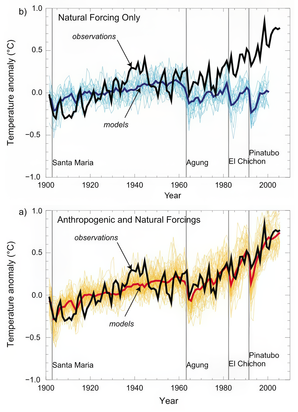
Model simulations of surface warming over the past century compared with observations for (top) natural forcing only and (bottom) natural + anthropogenic forcing.
Some might argue that this alone is not convincing evidence. Maybe, for instance, we have the trend in solar output wrong, and it just so happens to closely resemble the trend in human impacts like greenhouse gases and aerosols. If that's the case, we might be misinterpreting the good fit between our models and observations. Maybe we are just lucky!
Let's accept that criticism for a moment. Is there another way to compare observations and model predictions that might be more robust? Well, we can look at the patterns of response to different forcings. The surface expressions of warming due to solar output increases and greenhouse gas increases look quite similar. However, the vertical patterns of temperature change, as we discussed earlier, are expected to be quite different. Ah, our fingerprints have returned!
Let's go back to an example we used previously. The vertical pattern of response to increasing greenhouse gas concentrations is one where the troposphere (the lower part of the atmosphere) warms while the stratosphere (the upper part of the atmosphere) cools. Remember, this happens because greenhouse forcing is a zero-sum game: there's no increase in solar radiation at the top of the atmosphere coming in so, ultimately, the energy returning to space must equal it (energy in = energy out!); However, large changes in the distribution of energy within the atmosphere can occur. On the other hand, if the warming were due to increased solar output, we would expect the entire atmosphere to warm from top to bottom because of the increased radiation received at the top of the atmosphere (energy in going up). We have also learned that the temperature response pattern to explosive volcanic eruptions is different as well. Volcanic eruptions cause cooling at the Earth's surface and warming in the stratosphere due to the injection of aerosols, particularly sulfate aerosols that reflect sunlight and black carbon aerosols that absorb sunlight (both of these prevent solar radiation from making it to the surface). Greenhouse gas increases, increasing solar output, and volcanic eruptions each have their own unique fingerprint. So how can we use climate models to further confirm our suspicions about the planet warming? Check out the video below!
Video: Voiceover Climate Attribution (7:12)
Professor Colin Zerzycki: Okay, so what are we looking at here? What I'm showing you are actually the results of four different climate simulations. For our sake, we're going to say this is over the last 100 years. It's actually the period 1890 to 1999. What these plots are all showing is for different experiments, the warming trend over that century. So everywhere where you see yellows, oranges, and reds, that means that part of the atmosphere was warming. And everywhere where you see these blues all the way to these purples, that indicate that the atmosphere was cooling. And the other thing is, I'm going to show you the planet Earth. And then really what we're showing is a cross-section of those temperature trends. So, this area that's close to the Earth's surface. Remember, this is the troposphere. This is where weather occurs. This is where we live. And then as we get further away from the surface of the Earth, we get into these upper layers. And one of the upper layers we've talked about is the stratosphere. So, this panel over here on the right, this is essentially our best hindcast of what the climate system has looked like over the last 100 years.
So we're baking our cake, we're throwing in every ingredient that goes into the cake, and we're evaluating how the climate changes. But climate models are pretty cool in that they give us a test better, an experimental way that we could explore different kinds of Earths to really see what's going on. So, we can think about it almost like peeling back the layers of an onion. So, let's focus on these first three panels here. What I'm going to do is I'm actually going to run three different special climate experiments. In this first one, I'm only going to change how our solar input to the system has changed over the last 100 years. I'm going to essentially pretend that the only thing that could be changing temperature in the climate system is just how much sunlight is coming in at the top of the atmosphere. The second panel is going to look at only volcanic eruptions. So again, I'm going to hold everything else the same. The sun is going to stay the same. Emissions are going to stay the same. But what just happens when volcanoes emit aerosols, particularly into the stratosphere? And then this third panel is again going to hold the solar radiation fixed.
It's going to assume no volcanic eruptions, but it's going to represent the observed increase in greenhouse gasses that we've talked about throughout this semester. So, let's first come over here and focus on just increasing sunlight. So, we talked a little bit about this, especially in the last couple of lessons. But if we increase the amount of sunlight coming into the Earth system, we're increasing the amount of energy into the system. So, we should expect to see the temperature warm, and the temperature should actually warm fairly uniformly, whether we're close to the surface or whether we're up here in the stratosphere. And that is generally what we see. We see mostly a lot of yellow. We see a couple of these greeners or these less important warmings. They have to do with some changes in the circulation of the atmosphere. But for the most part, we see what we would expect. When we run the climate model with this particular configuration, we see a lot of yellow and a lot of yellow that's everywhere in the atmosphere.
So now we can over here to the effect of volcanoes. And remember, all we're doing here is we're just simulating volcanoes in the climate system. So what did we learn a few lessons ago? Volcanos emit a lot of particulate matter into the stratosphere. We're can persist for a fairly long period of time. This particular matter is mainly composed of two constituents, sulfate aerosols. Sulfate aerosols like to reflect incoming solar radiation, which prevents that sunlight from making its way to the surface. For example, the sunlight would come in, it would find a layer of sulfate aerosols, which are acting like tiny little mirrors, and it will get bounced back out to space. And what that does is it forms a broad general weak cooling in the troposphere. That's what we see. These colors aren't really high-intensity cooling. We're not seeing a lot of purples.
But close to the surface, we're seeing a decent amount of these greenish-type colors, which indicate either very little temperature change or a little bit of cooling. We also see a little bit of warming in the stratosphere. This is because of that black carbon aerosol that goes up. Remember, black carbon aerosols, they're black. Black things like to absorb solar radiation. As that sunlight comes in, Some of it gets reflected by the sulfate aerosols, but some of it gets absorbed by these black aerosols in the stratosphere, which warms the stratosphere. This is a very common fingerprint that we would expect to see with volcanic eruptions.
Then last over here in panel number 3, we see what is the warming trend just from increasing greenhouse gasses. We did talk about this in the past lesson. We said that if the amount of energy into the system is roughly the same, so if the amount of solar radiation is roughly the same, but we're emitting greenhouse gasses that are essentially acting like a blanket in the troposphere, what we're doing is we should see a warming signal that's relatively close to the surface in the troposphere, and we should see a cooling signal aloft because we have a zero sum game here. So if we have warming in the troposphere, it has to be balanced by cooling in the stratosphere. Again, not increasing the amount of sunlight that's coming in.
So, we have these three different experiments, we can call these things counter factuals. That's because they're essentially Earths that we are applying very special conditions to. So, remember, this fourth panel over here is We have our best simulation. This is our hindcast. This is where we take those curves that we were talking about, and we make sure that the verification and validation of the models looks really really good.
Of these first three panels, which one looks most closely like this fourth panel. Well, I don't really have to take a poll, but hopefully you guys are all pointing to panel number three. And what is that telling us? That is telling us that in addition to the observational fingerprints that we've talked about earlier, that climate models are providing even further evidence, even more clues, that the warming trends that we've observed over the last 100 years are due to greenhouse gas emissions. That's because our best guess certainly looks a lot like this climate simulation, where all we're doing is increasing greenhouse gas emissions. This really shows how climate models can be a very powerful tool for scientists to test hypotheses without having to create your own Earth in a different universe or wait hundreds of years to see how the climate is going to evolve.
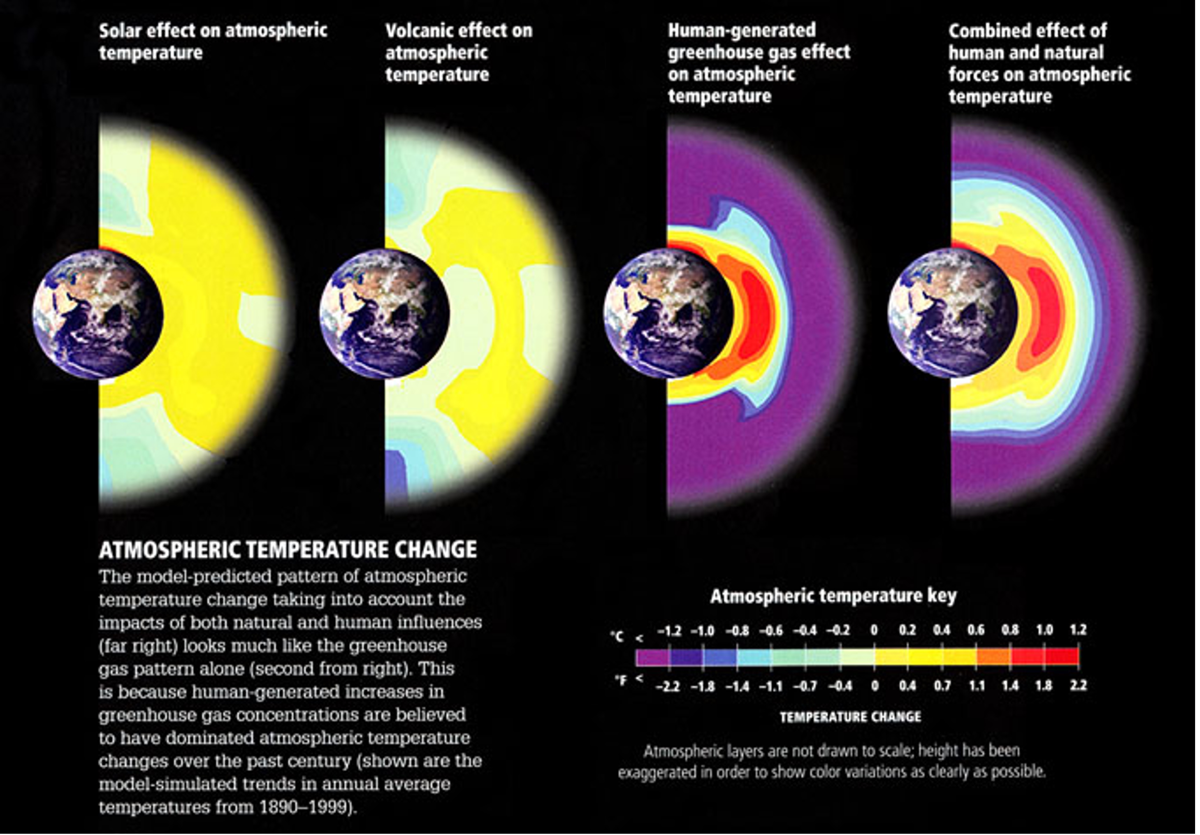
Atmospheric temperature change patterns from increasing solar output, volcanic eruptions, increasing greenhouse gas concentrations, and all three combined.
Quiz Yourself...
Scenarios
ScenariosPrioritize...
When you've completed this section, you should be able to:
- Define what a "climate scenario" is and why it is important for climate models to predict the future.
- Briefly describe how the scientific community defines scenarios has evolved over the past three decades, from Special Report on Emissions Scenarios (SRES) to Representative Concentration Pathways (RCP) to Shared Socioeconomic Pathways (SSP) and understand key improvements along the way.
Read...
OK, we've explored how climate models are excellent tools for "testing" different climate hypotheses, but I promised we'd also look ahead! Technically, projecting the future with these models isn’t all that complicated—we just start the models in the year 2025 and let them run forward. Remember, we're still focused on statistics, not predicting specific weather events or pinpointing exact outcomes.
But here’s the catch—when we “recreated” past climates with our models, we had the benefit of using observed data, like actual greenhouse gas concentrations. Looking forward raises a whole new set of questions! For instance, how will greenhouse gas concentrations change over time? Will they stabilize quickly, taper off later this century, or continue increasing at the same rate—or even faster? The answer depends on many factors, including technological advancements and decisions made by governments and policymakers about energy, the economy, and environmental priorities. If predicting future weather and climate is tough, predicting human behavior is even harder! To account for these unknowns, scientists use a range of scenarios to explore different possibilities for future emissions, air pollution, and land-use changes.
Scenarios: Mapping Out Plausible Futures
To address these uncertainties, scientists rely on something called scenarios. In climate modeling, a scenario is a “what if” story about the future. These stories give us plausible narratives for how greenhouse gas emissions, air pollution, land use, and socioeconomic conditions might evolve over time. For example, a scenario might imagine a future where humanity takes aggressive action to curb emissions by switching to renewable energy sources like wind and solar, while another might assume continued reliance on fossil fuels and little international cooperation between different countries. Importantly, these scenarios aren’t meant to predict the future—they aren’t crystal balls. Instead, they offer a way to explore different possibilities, helping scientists understand how various choices and actions could shape the climate.
Think of scenarios as roadmaps with different paths we might take, depending on technological developments, policy decisions, and societal priorities. Why are they important in this lesson? They act as inputs for climate models, setting the stage for researchers to simulate how the climate might respond under different conditions. Climate models are run multiple times under these different scenarios and by comparing the results, scientists can identify the potential consequences of specific pathways, providing valuable insights for policymakers, businesses, and communities. For example, one scenario might show limited warming if emissions peak soon and decline rapidly, while another might reveal significant warming and widespread impacts if emissions continue to rise unchecked. These insights help decision-makers weigh the risks and benefits of different strategies for addressing climate change. Over the rest of this page, we'll take a quick trek through the history of how these scenarios have evolved and changed.
The earliest storylines
Early in the history of climate modeling, scenarios were based on the Special Report on Emissions Scenarios (SRES), which came from the Intergovernmental Panel on Climate Change, or IPCC.
The Intergovernmental Panel on Climate Change (IPCC) is a United Nations body established in 1988 by the World Meteorological Organization (WMO) and the United Nations Environment Programme (UNEP) to assess the science related to climate change. It synthesizes research from scientists worldwide to provide policymakers with regular, evidence-based assessments on climate change, its impacts, and options for adaptation and mitigation. While the IPCC itself does not conduct research or develop models, it compiles and evaluates the results of climate simulations produced by General Circulation Models (GCMs) and Earth System Models (ESMs) from research institutions globally.
For climate models, the IPCC standardizes experiments and integrates model outputs into its Assessment Reports (ARs), which are published every six to seven years. These reports use scenarios like the ones we are learning about in this lesson to explore possible future climate trajectories based on different greenhouse gas emission levels and policy decisions. The IPCC’s work ensures consistency across models, enabling scientists to evaluate long-term climate risks and helping guide international climate policies like the Paris Agreement.
The SRES scenarios were quite simple. Each storyline painted a different picture of how global society, technology, and energy use might evolve... I won't make you remember the actual "letter/number" combinations, but some examples are...
- The A1 storyline imagined a highly globalized world with rapid economic and technological growth. Within this storyline, sub-scenarios ranged from fossil-fuel-intensive development (A1FI) to a balanced energy mix (A1B).
- The A2 storyline depicted a more fragmented world, focused on national identities and slower technological progress, resulting in less global cooperation.
- The B1 and B2 storylines assumed more sustainable futures, with B1 emphasizing global cooperation toward environmental stewardship, and B2 focusing on regional efforts to achieve sustainability.
These storylines gave scientists a framework for modeling a broad spectrum of futures, from optimistic to worst-case scenarios. For instance, under the B1 scenario, carbon dioxide (CO₂) concentrations were projected to double relative to pre-industrial levels by 2100. In contrast, the A1FI scenario envisioned a fossil-fuel-heavy future, leading to CO₂ concentrations that could quadruple pre-industrial levels. The figure below illustrates the carbon emissions per year and the atmospheric concentrations of CO2 associated with each scenario. The A1FI is kind of "off the charts" ballooning our CO₂ concentration, while the B1 scenario assumes countries aggressively work together to combat climate change.
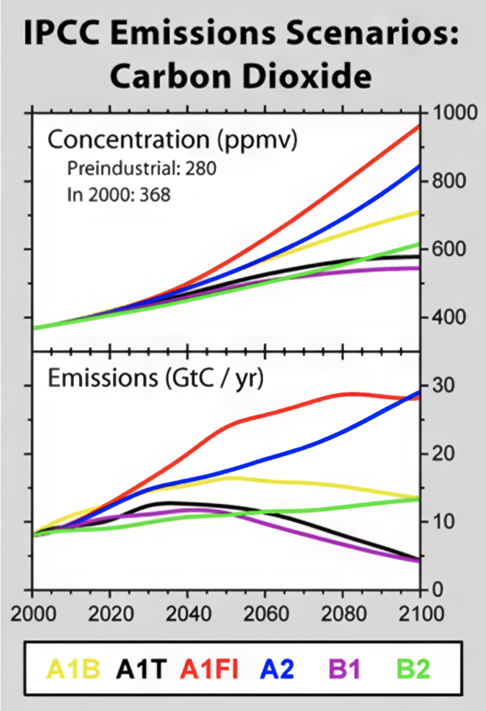
These early scenarios were groundbreaking because they represented some of the first systematic attempts to imagine and quantify possible futures for greenhouse gas emissions. They allowed scientists to model how different paths for economic growth, technological development, and societal choices could affect climate change. However, they had a notable limitation: they didn’t explicitly include the impact of policies aimed at reducing greenhouse gas emissions.
In other words, while the SRES scenarios accounted for broad societal trends—like whether the world became more globalized or whether economies relied more on renewable energy versus fossil fuels—they didn’t factor in specific actions to address climate change, such as implementing a carbon tax or international agreements. This omission meant that the scenarios couldn’t directly explore how intentional efforts to limit emissions might shape future climate outcomes. For example, they didn’t ask, “What happens if we aggressively cut emissions in the year 2030 to stabilize atmospheric carbon dioxide at a specific level?”
The Rise of RCPs: Adding Policy to the Equation
To address the gaps in earlier scenarios, the IPCC introduced Representative Concentration Pathways (RCPs) as part of its Fifth Assessment Report. These pathways offered a major improvement by explicitly including climate mitigation policies. Unlike the SRES scenarios, which focused on socio-economic storylines without specific climate action, RCPs are defined by their radiative forcing—the net change in Earth’s energy balance (in watts per square meter, W/m²)—projected for the year 2100. Remember, forcing measures how much energy the Earth retains due to factors like greenhouse gases, with higher values corresponding to greater warming. Bigger forcing numbers are like increasing the insulation on our cocoa mug, keeping more heat in!
Each RCP corresponds to a different level of radiative forcing, which in turn reflects varying levels of emissions and mitigation efforts:
- RCP2.6: This represents a very aggressive mitigation scenario where global greenhouse gas emissions peak soon and decline sharply, aiming to limit warming to around 2°C above pre-industrial levels. Achieving this pathway would require rapid reductions in fossil fuel use, widespread adoption of renewable energy, and potentially the use of negative emissions technologies like carbon capture.
- RCP4.5: This scenario assumes moderate mitigation efforts, leading to emissions peaking mid-century and then declining. It reflects a future where policies are implemented to stabilize emissions, and the radiative forcing is stabilized at 4.5 W/m² after 2100.
- RCP6.0: Similar to RCP4.5, but with less ambitious mitigation, this pathway assumes emissions stabilize later in the century, leading to a higher radiative forcing of 6.0 W/m². This scenario might represent a slower global transition to renewable energy or delayed policy implementation.
- RCP8.5: Often referred to as the “business-as-usual” scenario, this pathway assumes no significant global efforts to reduce emissions. Fossil fuel use continues to rise, and radiative forcing reaches 8.5 W/m² by 2100, leading to the highest levels of warming among the RCPs. This scenario is often used to explore the potential worst-case outcomes of climate change.
What makes the RCP scenarios stand out compared to the older SRES scenarios? Let’s look at one example (in the figure below). The RCP scenarios began incorporating projections for factors like human population (left in the chart) and gross domestic product ( GDP, center) when estimating carbon dioxide emissions (right).
Take population growth, for instance. If the Earth’s population grows, it means more demand for energy. Even if renewable energy production increases, a larger population often means we’ll still need to rely more on fossil fuels to bridge the gap. The RCP scenarios take this into account with a straightforward assumption: “more people, more energy demand, more emissions, more carbon dioxide.” While this might feel like an oversimplification, at first glance, it tracks.

© 2015 Dorling Kindersley Limited.
From RCPs to SSPs: Incorporating Human Choices
While RCPs marked an important step forward in projecting future climate scenarios, they still had limitations. One key shortcoming was their lack of direct linkage to specific socioeconomic and policy decisions. For instance, RCPs focused solely on the resulting greenhouse gas concentrations and radiative forcing levels. They did specify policies but in sort of a magic "global-dictator" like sense (i.e., the world will do X in year Y). However, they didn't incorporate how human choices—like technological innovation, economic trends, or political agreements—might lead to those outcomes.
To address this gap, the Sixth IPCC Assessment Report introduced Shared Socioeconomic Pathways (SSPs). SSPs provide an even more comprehensive framework by integrating socioeconomic factors like inequality, energy policies, and international cooperation into climate projections. This approach helps scientists and policymakers understand not just where we might end up in terms of emissions, but how human decisions influence those trajectories. In other words, what path do we take along the way? As people are walking along the path, how do they make decisions when they come to a fork?
SSPs are named based on a combination of their socioeconomic pathway and associated radiative forcing level by 2100. The first number in the name indicates the general storyline of socioeconomic development (ranging from SSP1, which emphasizes sustainability, to SSP5, which focuses on fossil-fueled development). The second number refers to the radiative forcing level (in watts per square meter) associated with that pathway. For example, SSP1-1.9 represents a highly sustainable socioeconomic scenario paired with aggressive mitigation efforts, achieving a radiative forcing level of 1.9 W/m² by 2100. Similarly, SSP5-8.5 describes a fossil-fuel-intensive development pathway leading to 8.5 W/m² of radiative forcing.
Consider SSP1-1.9, often referred to as the "Sustainability" or "Green Road" pathway. This scenario envisions a world focused on sustainable development, where governments prioritize reducing inequality, investing in renewable energy, and achieving net-zero emissions by the middle of the 21st century. In this pathway, economic growth is high, but it’s decoupled from heavy reliance on fossil fuels, and there’s strong global cooperation to tackle climate challenges. SSP1-1.9 aligns with a radiative forcing level of 1.9 W/m² by 2100. In contrast, SSP5-8.5, known as the "Fossil-Fueled Development" pathway, assumes rapid economic growth fueled by continued reliance on fossil fuels, minimal policy intervention, and a lack of global cooperation. This scenario leads to a radiative forcing level of 8.5 W/m² by 2100, driving global warming toward the upper end of projections, with catastrophic consequences for ecosystems and human societies.

The SSP framework is incredibly flexible, allowing scientists to combine different socioeconomic pathways with varying climate policy assumptions to explore a range of future possibilities. Take a look at the figure above—it organizes the SSPs based on their challenges for climate mitigation (vertical axis) and adaptation (horizontal axis). Each pathway presents a unique narrative about how socioeconomic factors, such as population growth, economic trends, and policy decisions, might shape humanity's ability to address climate change.
For instance, SSP5 assumes high challenges for mitigation (we don’t take significant steps to reduce greenhouse gas emissions, meaning they continue to rise) but low challenges for adaptation (countries actively work together to address the impacts of climate change, such as sharing financial resources or providing disaster relief). On the other hand, SSP3 is much more troubling. In this scenario, greenhouse gas emissions remain high (placing it high on the y-axis), but countries become more isolated, focusing on their own interests and refusing to cooperate globally. This creates high challenges for adaptation as well, making it a scenario where the world struggles to effectively respond to climate impacts. This framework helps us understand how different choices and policies could influence our collective ability to address climate change.
Summary of the history of climate scenarios
I've included a handy-dandy table covering what we've discussed here so you can better interpret how our climate model scenarios have evolved from SRES to RCP to SSP.
| SRES | RCP | SSP | |
|---|---|---|---|
| Full Name | Special Report on Emissions Scenarios | Representative Concentration Pathways | Shared Socioeconomic Pathways |
| Introduced | 2000 | 2014 | 2021 |
| Socioeconomic Assumptions | Fixed, defined storylines (A1, A2, B1, B2) | Flexible, with implicit socioeconomic assumptions for achieving forcing targets. | Directly linked to human choices and policy decisions |
| Climate Policies | None | Based on radiative forcing targets | Included and linked to human choices |
| Radiative Forcing | Based on emissions | Core metric for defining scenarios | Combined with socioeconomic pathways (e.g., SSP1-2.6) |
| Emissions Pathways | Defined purely based on storylines | Flexible, driven by radiative forcing targets | Based on socioeconomic and policy scenarios |
| Focus | Purely emission trajectories | Radiative forcing by 2100 | Combination of societal factors and climate forcing |
As of now, the SSPs are the standard framework used in climate models to predict the future, but that doesn’t mean they’ll stay this way forever. For example, SSPs currently focus on broad narratives of global cooperation or non-cooperation, but they don’t account for more specific geopolitical shifts, like the European Union expanding or breaking up. They also don’t factor in how humans might respond to major climate events—for instance, if a series of catastrophic global floods were to occur in 2050, it’s reasonable to expect policymakers to adapt quickly and change course. As our understanding of climate systems, geopolitics, and human behavior evolves, it’s likely that these frameworks will become more sophisticated. And, of course, we’ll need to keep updating our scenarios as real-world events and policies unfold in real time!
Quiz Yourself...
Climate Model Projections and Uncertainty
Climate Model Projections and UncertaintyPrioritize...
After completing this section, you should be able to:
- Define uncertainty and describe the two different types with respect to climate model projections.
- Describe the purposes of climate model projections and give at least three examples of things that can be predicted by climate models which can be used by policymakers
Read...
OK, we've talked about what climate models are, how they are built, their strengths and weaknesses, why we can trust them, and climate scenarios. But what we haven’t covered yet is how we use all this to actually make predictions! Let’s tie everything back together and look at how these pieces fit into the bigger picture.
Below is a figure taken from the IPCC Sixth Assessment Report (AR6). The AR6 is the most recent and comprehensive summary of the state of climate science, released by the Intergovernmental Panel on Climate Change (psst: we defined this last page). It synthesizes the latest research on climate change, including projections of future warming, impacts on ecosystems and society, and potential pathways for mitigation and adaptation. Essentially, this report is the global gold standard for understanding climate change and what it means for the future.
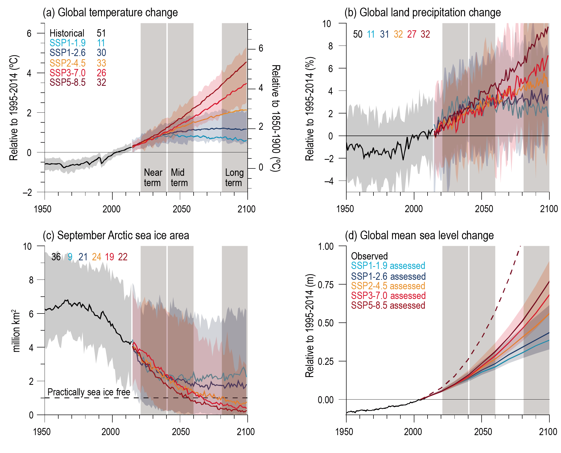
Model projections of future warming under various emissions scenarios. (See also Figure 4.2 in Chapter 4 of IPCC AR6 for similar, more up-to-date information in the context of SSPs.)
Figure 4.2 in IPCC, 2021: Chapter 4. In: Climate Change 2021: The Physical Science Basis. Contribution of Working Group I to the Sixth Assessment Report of the Intergovernmental Panel on Climate Change [Lee, J.-Y., J. Marotzke, G. Bala, L. Cao, S. Corti, J.P. Dunne, F. Engelbrecht, E. Fischer, J.C. Fyfe, C. Jones, A. Maycock, J. Mutemi, O. Ndiaye, S. Panickal, and T. Zhou, 2021: Future Global Climate: Scenario-Based Projections and Near-Term Information. In Climate Change 2021: The Physical Science Basis. Contribution of Working Group I to the Sixth Assessment Report of the Intergovernmental Panel on Climate Change [Masson-Delmotte, V., P. Zhai, A. Pirani, S.L. Connors, C. Péan, S. Berger, N. Caud, Y. Chen, L. Goldfarb, M.I. Gomis, M. Huang, K. Leitzell, E. Lonnoy, J.B.R. Matthews, T.K. Maycock, T. Waterfield, O. Yelekçi, R. Yu, and B. Zhou (eds.)]. Cambridge University Press, Cambridge, United Kingdom and New York, NY, USA, pp. 553–672, doi: 10.1017/9781009157896.006 .]
Let’s first focus on the top-left plot, which shows trajectories of projected warming from climate models. The metric plotted is our familiar "global average surface air temperature," shown as an anomaly (y-axis) relative to two baselines. The x-axis represents time, with the black line showing historical observations and the colored lines representing projections for the future based on different scenarios. But remember, we don’t have a precise crystal ball—we’re making statistical projections about what might happen going forward.
We also have to account for uncertainty in our projections. Uncertainty is the range of possible outcomes due to factors like differences in climate models, variability in the climate system itself, and unknowns about future human behavior (e.g., emissions pathways). This is why you see the shaded areas around the colored lines—they represent the “spread” or range of possible outcomes based on the same scenario. While we may not know the exact temperature in 2080, the models give us a clear picture of the general trends and the boundaries within which future warming is likely to fall.
There are actually two kinds of uncertainty shown in the top left panel of this figure! What are those two uncertainties you may ask?
Scenario Uncertainty:
This refers to the different colored lines in the figure, each corresponding to a distinct SSP. These lines represent the uncertainty in what path humanity will take in the future. For example, will we follow a low-emission pathway like SSP1-1.9 -- colored in blue, or will we continue on a high-emission trajectory like SSP5-8.5 -- colored in red? This uncertainty stems from the fact that we can’t predict human behavior—future technological advancements, policy decisions, or levels of global cooperation are all unknown. As we just learned about, these scenarios effectively bracket the range of potential futures, from aggressive mitigation efforts (SSP1-1.9) to a business-as-usual approach (SSP5-8.5). However, even these scenarios come with their own limitations. For instance, uncertainties in future aerosol emissions or how the carbon cycle might respond to increased emissions (e.g., feedback loops where warming causes more CO₂ release from soils or oceans) could influence the actual pathway. That said, the range shown in the graph gives a reasonable estimate of what is possible based on current knowledge and assumptions.
Physical Uncertainty:
This is represented by the width of the shaded areas within each scenario. Physical uncertainty reflects how different climate models simulate the same scenario! In other words, even if we knew exactly which emissions pathway we’d follow, different models would still produce slightly different warming outcomes. For example, while the solid red line corresponds to the average projection of surface air temperature associated with SSP5-8.5, the shading of the red reflects potential high and low projections for different models. Ah, now the idea of "model intercomparison projects" makes more sense!
A significant portion of "physical uncertainty" stems from how physical processes —especially clouds—respond to increased greenhouse gases. As we discussed earlier, clouds have a dual nature: they can cool the Earth by reflecting sunlight or warm it by trapping heat. The balance between these effects, known as cloud feedback, varies considerably across models. Take a look at the figure below (from a slightly older IPCC report, but still illustrative). It shows the range of estimates for cloud radiative feedback across different models. Some, like model #21, exhibit strongly negative feedbacks (cooling effects that "turn down the dial" and offset some warming), while others, like model #18, show positive feedbacks (where warming triggers more warming in an amplified cycle). These variations help explain why the shaded areas in climate projections aren’t razor-thin—different models make different assumptions about the formation and dissipation of clouds, leading to a spread of possible outcomes.
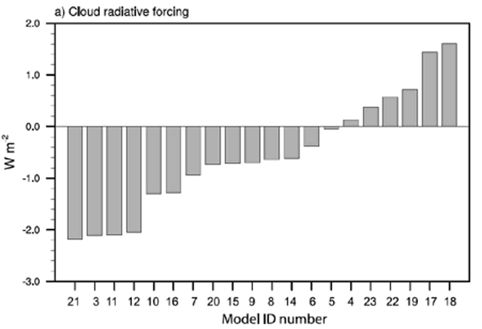
Now, take another look at the first figure on this page and check out the other three panels. These show model projections for key climate impacts: how much precipitation falls over land (critical for understanding floods and droughts), the extent of Arctic sea ice, and the expected average rise in sea level due to thermal expansion and melting ice. In all these cases, the impacts are generally worse under the "higher" scenarios (warmer colors), but the degree of change isn’t uniform across all variables.
For instance, in the bottom right panel, shifting from SSP5-8.5 to SSP3-7.0 doesn’t significantly reduce sea ice loss. However, moving from SSP2-4.5 to SSP1-2.6 would preserve much more sea ice. This illustrates how complex climate decision-making can be—some actions might have a big impact on one issue but not much on another. Models are invaluable for guiding policymakers and the public by providing insight into potential outcomes, but ultimately, the decisions about how to mitigate and adapt to climate change rest with us, not the computers. And that’s exactly what we’ll dig into in the rest of this course!
Explore Further...
If you want to see more figures from the most recent IPCC report like the top one on this page, head here and click on "figures" for a treasure trove of climate model visualizations!
Quiz Yourself...
Summary
SummaryRead...
Climate models...
- are simplified representations of the Earth's climate system, allowing scientists to simulate and predict future climate changes by experimenting with variables like carbon dioxide levels and solar radiation.
- simulate interconnected components of the Earth's system (atmosphere, ocean, land, and ice) using equations and real-world data to study processes and predict long-term trends.
- have evolved to today’s fully coupled systems, incorporating interactions among atmosphere, ocean, land, and ice, powered by supercomputers.
- predict large-scale climate trends (not day-to-day weather) by using statistics and probabilities to assess long-term changes like temperature shifts and extreme weather patterns.
- are validated by comparing simulations to historical data (hindcasting), building confidence in future climate projections.
- use metrics to quantify accuracy against observations, helping diagnose errors and guide improvements, while verification ensures scientific principles are correctly implemented in the code.
- can be compared with Model Intercomparison Projects (MIPs) under standardized conditions, fostering international collaboration to refine models and improve predictions, such as resolving the "drizzle problem."
- establish causality by simulating natural versus human influences, demonstrating that human activities drive observed climate changes, like glacial retreat and global warming.
- are guided by scenarios that explore possible futures by varying assumptions about greenhouse gas emissions, policies, and socioeconomic trends, guiding climate model projections and policy decisions.
- uncertainty arises from unknown future emissions (scenario uncertainty) and variations among models (physical uncertainty), but models still provide critical insights into potential climate outcomes.
Quiz Yourself...
Question here
Lesson 11: Climate impacts, inequities, and climate justice
Lesson 11: Climate impacts, inequities, and climate justiceMotivate...

Let's suspend reality for a second. Penn State has a crucial basketball game on tap. Unfortunately, all their players start the game with three fouls, while the other team gets to send a couple of extra players onto the court. Referees should be there to keep things in check, but they seem more preoccupied with what they are having for dinner after the game rather than keeping everyone in line. No matter how hard PSU tries, the odds are stacked against them. This scenario sounds incredulously unfair (and thankfully is just a hypothetical!), but it is an all-too-real reflection of how climate challenges play out across the world. When it comes to what society is facing today with regard to climate change, not everyone is affected equally—nor responsible equally—and addressing these injustices is what we'll explore in this lesson.
Climate change is not just a scientific and environmental issue - it's a human issue that cuts across social, economic, and political lines. Wealthier nations have historically emitted far more greenhouse gases, fueling the industrial engines of progress, while less affluent countries, often contributing the least to the problem, bear the brunt of its impacts. Rising seas, extreme weather, and droughts force families from their homes, creating climate migrants in need of support and protection. Meanwhile, within cities, long-standing inequalities leave marginalized communities disproportionately vulnerable to extreme heat, flooding, and pollution.
But this lesson isn't just about identifying problems - it's about envisioning solutions. Climate and environmental justice demand equity, fairness, and the active involvement of all voices, especially those excluded or harmed. From increasing green spaces in urban areas to strengthening legal systems that hold corporations accountable, we'll learn how solutions can prioritize those most affected. Concepts like climate reparations and corporate accountability aim to address the imbalance of climate change impacts by providing financial resources and systemic changes to support resilience, adaptation, and/or recovery.
We'll also explore how science contributes to justice. Tools like detection and attribution allow us to pinpoint the fingerprints of human influence on extreme weather events, providing the evidence needed to hold responsible parties accountable. Climate litigation and reparations aim to right historical wrongs and secure a fairer future, while corporate accountability movements challenge polluters to change their ways or face consequences.
Climate science isn't just about math and physics, observations and models - it's about people. It's about ensuring that no one is left behind and that no group of people bears an unfair burden. As we learn about these concepts, we'll discover that justice isn't just an ideal (or even an allegory) - it's a necessity for building a sustainable and equitable future for everyone.
Introduction to Environmental and Climate Justice
Introduction to Environmental and Climate JusticePrioritize...
After completing this section, you should be able to:
- Define environmental and climate justice and list the three core pillars of both.
- Give at least one example of an environmental or climate injustice.
Read...
Imagine you're in a classroom where everyone has an equal opportunity to learn. The teacher doesn’t just hand out the same textbook to every student and call it “fair.” Instead, they (hopefully) provide tailored support to those who need it—whether that means offering extra help, a quiet place to focus, or even translating the material into another language! This is what true justice looks like: going beyond equality to ensure everyone has the tools they need to succeed.
Analogy aside, let’s zoom out a bit. What if we applied this concept of justice to the environment and climate? That’s where the ideas of environmental justice and climate justice come in. They remind us that fairness isn’t just about equal distribution; it’s about meaningful inclusion and equity in environmental decision-making. It’s about ensuring that no one, regardless of race, income, or geography, is unfairly burdened by environmental harm—or left out of the conversation about how to fix it.
Key Definition
Environmental Justice
The United States Environmental Protection Agency (EPA) defines environmental justice as “the fair treatment and meaningful involvement of all people regardless of race, color, national origin, or income with respect to the development, implementation, and enforcement of environmental laws, regulations, and policies. The EPA has this goal for all communities and persons across this Nation. It will be achieved when everyone enjoys the same degree of protection from environmental and health hazards and equal access to the decision‐making process to have a healthy environment in which to live, learn, and work.”
More simply, there are three core pillars of environmental justice.
- Equity: No group should suffer more environmental burdens or enjoy fewer environmental benefits than others.
- Human Rights: Protecting and promoting human rights as a fundamental part of environmental action.
- Participation: All communities must have a say in decisions that affect their environment and health.
What’s an example of an environmental injustice? See the graph below. It illustrates disparities in exposure to particulate matter, a form of pollution harmful to health. In particular, it shows exposure to PM 2.5, fine particles with diameters generally 2.5 micrometers and smaller. These particles are easy to inhale and can get deep into the lungs where they can cause respiratory diseases. Black Americans face greater-than-average exposure from nearly every major source, including construction, power plants, and industrial facilities. In contrast, white Americans experience lower-than-average exposure across most sources. These data highlight stark inequities in environmental burden and risk. Statistically, if you are a black American, you are far more likely to get sick from air pollution. This disparity is a direct consequence of systemic issues, such as the historical placement of polluting facilities in areas of less affluence near marginalized communities.

OK, while I’ve defined “environmental justice,” you may wonder how it relates to “climate justice.” Are they two different things? Not really. In fact, climate justice is a natural extension of environmental justice. It zeros in on the ethical dimensions of climate change, emphasizing how its impacts disproportionately harm vulnerable communities. The core principles of climate justice mirror those of environmental justice but specifically frame things through the lens of climate change. Let’s revisit the three pillars from above…
- Equity: Climate justice highlights the fact that those who contribute the least to climate change—like low-income and marginalized communities—are often the hardest hit. It ensures that policies to address climate change are fair and inclusive.
- Human Rights: Protecting human rights is central to both environmental and climate justice, ensuring that every person has access to a safe, healthy, and sustainable environment.
- Participation: Climate justice calls for amplifying the voices of those most affected by climate change, ensuring they have a meaningful role in shaping solutions.
Simply put, both of these flavors of justice share a single, common goal: a fairer, more inclusive world where the burdens of environmental harm and the benefits of climate solutions are shared equitably by all.
Quiz Yourself...
The Disproportionate Emissions of Climate Change
The Disproportionate Emissions of Climate ChangePrioritize...
After completing this section, you should be able to:
- Understand which countries and regions have historically emitted most of the world's greenhouse gases.
- Define the "Global North" and "Global South" and give some examples of countries in each region.
Read...
OK, so now we’ve locked in some definitions… but what exactly is inequitable with climate change? In the last couple of lessons, we’ve discussed climate change and its possible impacts. I mean, extreme heat, rising sea levels, acidifying oceans, increased flooding… sounds pretty bad for everyone, right? But to understand climate justice, we need to understand climate injustice: who causes climate change and who's hurt by it.

Check out the graph above. This shows global carbon dioxide emissions – our "primo" greenhouse gas -- in 2021, broken down by country and region. Note how the emissions don't seem to be evenly allocated. For example, more than 1 out of every 3 molecules of carbon dioxide emitted to the atmosphere were emitted by China and India (38% between the two!). The United States emits almost 85% of all the carbon dioxide that comes from North America, more than 5 times that of Canada and Mexico combined! It is clear that different countries are emitting at different rates.
We could also get a historical perspective by evaluating how emissions have evolved over time. The graph below is an area chart – time is on the x-axis, and the area "fanning out from the plume" is the relative emission contribution. Emissions have increased globally since 1950 (plume getting wider), which is unsurprising based on what we know. While we just learned China and the United States are the big emitters currently, the United States and Europe were the key emitters until around the 1970s China’s contribution didn’t really start increasing until around 1980 and then exploded during the 2000s. Comparatively, all of Africa and South America (the purple and green curves), two entire continents, have emitted only a tiny fraction of the carbon dioxide!

So, all of the above implies that not every country should be considered “equal” in contributing to carbon dioxide emissions. Is there a way we can actually measure the imbalance? Is there a way we can actually measure this imbalance? In 2020, scientists developed a new approach to identify which countries bear the most significant responsibility for climate change damage (link to study, but not required reading!). Their method started with a simple “rule:” Every nation (and every citizen of every nation) should have an equal right to use the atmosphere. They used a benchmark of 350 parts per million (ppm) of CO2 in the atmosphere—considered a “safe” level based on research using some of those climate scenarios we talked about—and calculated each country’s fair share of the global carbon budget needed to stay under that threshold.
To do this, they compared each country’s actual CO2 emissions to its fair share, looking at two periods: territorial emissions (1850–1969) and consumption-based emissions (1970–2015). Territorial emissions refer to the CO2 released within a country’s borders, while consumption-based emissions account for emissions embedded in goods and services imported and consumed. In other words, if it took a lot of energy to build a TV in China that was shipped to the United States, that was also considered (so countries can't just "outsource" their pollution and say, "not my fault!")
This comprehensive timeline allowed them to track how countries used their emission allocation. “Excess” CO2 means countries have emitted more than equitably. Here’s what they discovered:
- By 2015, the United States alone was responsible for 40% of the excess CO2, while the European Union (EU-28) accounted for 29%.
- The G8 nations (the United States, EU-28, Russia, Japan, and Canada) contributed 85% of the excess.
- 90% was accounted for by countries categorized as Annex I under the UN Framework Convention on Climate Change (wealthier, industrialized nations).
- The Global North, a term that includes most developed nations, contributed 92% of the excess CO2.
Meanwhile, many countries in the Global South—primarily developing nations—remained within their fair share of emissions. For instance, despite their large populations, India and China had not yet exceeded their limits as of 2015, although China is projected to surpass its fair share soon (and may have by the time you are reading this).
Key Definition
Global North and Global South
The terms "Global North" and "Global South" refer to a way of categorizing countries based on socioeconomic and political factors rather than geography. The Global North includes wealthier, industrialized nations like the U.S., Canada, Europe, Japan, and Australia, while the Global South comprises developing and least-developed countries, including much of Africa, Latin America, and Asia. Countries in the Global South often face challenges such as lower incomes, limited access to education and healthcare, and infrastructure deficits, whereas the Global North is characterized by diversified economies and higher living standards.
This research highlights an important – albeit somewhat uncomfortable -- truth: wealthier countries have historically contributed far more to climate change than previously recognized. By centering the idea of equal atmospheric rights, this method provides a fairer way to assess which nations bear the greatest responsibility for addressing climate damage.

Quiz Yourself...
The Disproportionate Impacts of Climate Change
The Disproportionate Impacts of Climate ChangePrioritize...
After completing this section, you should be able to:
- Explain how climate impacts can be "decoupled" from emissions, and give at least one example of how poorer countries may bear the brunt of climate impacts at the expense of richer, highly emitting ones.
- Define Gross Domestic Product (GDP) and explain why it's helpful in understanding "uneven" climate impacts.
Read...
We’ve established that the “Global North” emits more greenhouse gases than the “Global South.” And if you are concerned with restricting global CO2, this inequity in emissions means that the “Global North” must recognize it as such. But emissions are just one side of the coin. The other side—and to be honest, the real injustice—is how climate change disproportionately impacts countries with the least responsibility for causing it.
Things wouldn’t be unfair if impacts were proportional to emissions. If climate change were like a restaurant bill split based on who ordered what—you had an extra drink and ordered the most expensive dessert, so you pay your fair share—that would make sense. But imagine sitting at the table while your friend drinks the priciest bottle of wine (all by themselves!), racks up the biggest tab, and then suggests, “To make it easy, let’s just split the check evenly!” Not ideal, right?

Climate change doesn’t hit everyone equally. Unfortunately, it overwhelmingly tends to magnify existing inequalities and hits those least equipped to handle its effects the hardest. Nations that have contributed the least to global emissions—the ones that historically used fewer resources—are, in many cases, now the most vulnerable to climate disasters. Meanwhile, wealthier, industrialized countries that released the bulk of greenhouse gases have the financial resources to buffer themselves against the worst impacts. This imbalance is one of the defining injustices of our time. Do you believe that poorer countries are getting the short end of the stick? Let’s look at why certain nations bear the brunt of the climate crisis.
Many poorer nations are located in regions particularly vulnerable to climate change—low-lying islands, arid zones, and tropical areas. These places face rising sea levels, more intense droughts, heatwaves, and storms. For example:
- Small island nations like Kiribati and the Maldives are grappling with the existential threat of rising seas. Entire communities are being displaced as their homes are swallowed by the ocean.
- Sub-Saharan Africa is enduring prolonged droughts and extreme heat, devastating agriculture and putting millions at risk of famine.
- South Asia, including heavily populated countries like Bangladesh, faces severe flooding and cyclones, displacing millions and eroding already fragile infrastructure.
Look at the image below—it's a striking example of what I mean. This graphic comes from the IPCC AR6 report we’ve referenced before. It maps the projected number of days different regions around the world will experience extreme heat and humidity by the end of this century. The top row is the “present” day (note that unfortunate IPCC typo… “pressent!”), and the three columns in the bottom two rows represent three climate scenarios we discussed in the last lesson for the middle and end of the 21st century.
As expected, we see an increase in "redder" colors across the map, signaling more days of extreme heat as the climate warms. That part isn’t surprising—as our surface air temperature distribution shifts to higher values, we know we should expect fewer extreme cold events and more extreme hot ones. But look closely at where these increases are most pronounced. It’s not the densely populated areas in the mid-latitudes—countries like the United States, Europe, or most of China. Instead, the ballooning extremes are occurring in regions like northern South America, sub-Saharan Africa, India, and parts of the Pacific. These areas are often less economically developed (and we’ll dive into why that matters in just a moment).

But geography is not the only factor. A nation’s resources make a huge difference. Wealthier nations have infrastructure and systems in place to protect their residents—seawalls, advanced weather forecasting, and disaster relief programs. In contrast, many developing nations lack these safety nets. A heatwave in Europe might mean higher electricity bills for air-conditioning, but in South Asia, it can lead to mass casualties for people without access to cooling or reliable power grids. Flooding in the Netherlands is mitigated by one of the world's most sophisticated systems of dikes and floodgates, preventing widespread devastation. Meanwhile, flooding in Bangladesh regularly displaces millions, as communities lack the infrastructure and resources to protect against rising waters. After a hurricane hits Florida, rebuilding efforts begin almost immediately, thanks to insurance and federal disaster funds. But after a cyclone devastates Mozambique, recovery can take years—or may never fully happen.
Wait, how can I say that Florida has more resources than Mozambique? Some of you may think, “That’s obvious,” but quantitative ways exist to evaluate it. One way to measure a country’s resources is through something known as Gross Domestic Product (GDP), a metric often used to quantify economic output and wealth. GDP is basically the total amount of money a country makes in a year from everything it produces and sells. You’ve probably heard the term on the news – economists and politicians love to talk about it!
Below is another map (we do love maps!) that shows the world’s nations by GDP. Darker blues to near-black represent wealthier, richer countries, while lighter shades closer to white indicate poorer ones. To put things into perspective, the GDP of the United States is generously about 1,000 times greater than that of Mozambique. It stands to reason that hurricane recovery resources would be much, much better in one country versus the other.
Now, scroll back up and take a moment to notice the inverse relationship between GDP and projected heat waves. The areas with lower GDP (the lighter areas on the map below) often align with regions facing the most dramatic increases in extreme heat (the redder areas on the map above). Sadly, this pattern isn’t unique; many global maps of economic and climate vulnerabilities tell a similar story.

The irony is hard to ignore: wealthier nations built their prosperity on a foundation of carbon emissions. Industrialization fueled the progress we often take for granted: the convenience of same-day delivery, year-round fresh produce, and the ability to fly across the country in hours. All of this was (and is) made possible by burning fossil fuels—and lots of them.
Despite their small carbon footprints, many poorer countries face the steepest costs of climate adaptation. For example, some of the things -- and far from an exhaustive list -- they must consider working on:
- Building seawalls to combat rising seas.
- Developing drought-resistant crops to cope with failing agricultural systems.
- Establishing disaster response systems to protect lives during increasingly frequent extreme weather events.
- Implementing water management systems to address shrinking freshwater supplies caused by prolonged droughts and glacial melt.
- Reforesting degraded lands to stabilize soil, reduce flooding, and sequester carbon, especially in regions like sub-Saharan Africa and Southeast Asia.
- Relocating entire communities from areas rendered uninhabitable by rising seas or desertification, a costly and logistically complex process faced by small island nations and arid regions.
- Investing in resilient healthcare infrastructure to combat the spread of diseases like malaria and dengue, which are becoming more prevalent due to shifting climate patterns.
For many nations in the Global South, these costs are insurmountable. When dealing with high poverty fractions across their populations, spending additional money on climate adaptation is a non-starter. The same countries that have been least responsible for emissions are now being asked to invest in solutions they can barely afford—solutions wealthier nations have long had the resources to develop.
Quiz Yourself...
Climate Migration and Refugees
Climate Migration and RefugeesPrioritize...
After completing this section, you should be able to:
- Define climate migration and what a climate refugee is, explain why climate migration occurs, and give an example of why someone would flee an area due to climate change.
Read...
We’ve already talked about how climate change hits certain places harder—think low latitudes or coastal areas. While geography is mostly fixed, people aren’t. When the impacts become too severe, it’s no surprise that many are forced to leave their homes to find safety and survive. This gives rise to one of today’s biggest humanitarian challenges: climate migration. In very simple terms, it’s when people are displaced because of climate change-driven disasters like rising sea levels, prolonged droughts, extreme storms, and other environmental disruptions.
Climate migration often stems from compounding vulnerabilities—multiple challenges that make it impossible to “just tough it out.” Here are some examples:
- Rising Seas: Low-lying island nations like the Maldives and Kiribati face the existential threat of being swallowed by rising sea levels. In Bangladesh, millions are being displaced as coastal land disappears under encroaching tides.
- Extreme Weather: Hurricanes and typhoons repeatedly devastate regions like the Caribbean and Southeast Asia, leaving communities with no option but to move after their homes are destroyed time and again.
- Drought and Water Scarcity: Prolonged droughts in sub-Saharan Africa and Central America are wiping out livelihoods for farmers who depend on rainfall, forcing families to leave in search of a more secure future.
The image below, originally published by the United Nations Environment Programme (UNEP) in 2005 and later modified, highlights areas where people might move away if climate impacts worsen. It’s qualitative, so don’t take it as definitive, but it aligns with some key topics we’ve covered. For instance, regions marked in purple could face growing challenges from wetter hurricanes in a warmer atmosphere (thanks to the Clausius-Clapeyron relationship: warmer air holds more moisture). Meanwhile, yellow areas might struggle with agricultural declines due to increased drought, making local crop production unsustainable. Take a moment to explore the map—while I won’t cover every detail, it’s worth seeing how these patterns connect to what we’ve discussed.

One major challenge is the lack of an international legal framework to protect "climate refugees." You might know—or maybe not—that there are international agreements for political refugees. The 1951 Refugee Convention defines who qualifies as a refugee, outlines their rights, and establishes rules for countries to protect them, including a critical principle: refugees cannot be forced to return to unsafe conditions. But no such protections exist for people displaced by climate impacts. This legal gap leaves millions in a precarious situation, unable to seek asylum or access international aid.
Take the Pacific nation of Tuvalu, for example. Its citizens face the harrowing prospect of becoming "stateless" as their homeland is swallowed by rising seas, and the nation has been vocal about the need to recognize climate-induced displacement as a refugee crisis. Similarly, communities in the Sahel region of Africa and Central America are being uprooted by a mix of climate stressors and political instability, making safe migration even more difficult.
So, you might be asking, how we do we solve this? It’s a difficult question, but some solutions to climate migration must balance humanitarian needs with proactive planning:
- International Cooperation: Developing a legal framework to recognize and protect climate refugees is essential. Organizations like the United Nations High Commissioner for Refugees (UNHCR) have called for action, but progress remains slow.
- Climate Adaptation: Investing in infrastructure, such as seawalls, resilient housing, and water management systems, can help communities adapt to climate impacts and reduce displacement.
- Economic Support: Programs that provide resources for adaptation can empower vulnerable communities to stay in place rather than being forced to migrate.
- Planned Relocation: In some cases, governments are initiating managed relocation efforts. For example, the government of Fiji has begun relocating entire villages threatened by rising seas, ensuring that communities are resettled together rather than scattered.
Quiz Yourself...
US Climate Justice and Redlining
US Climate Justice and RedliningPrioritize...
After completing this section, you should be able to:
- Define "redlining" and how redlining sets the stage for inequities within cities based on class and ethnicity.
- Explain how the urban heat island effect actually varies within a city and why this is the case.
Read...
When we talk about climate justice, it’s not just "far away global issues" -- it hits close to home, too. Even here in the U.S. – a country we’ve already noted as a high GDP one -- climate change impacts don’t play out equally across communities. Some groups, particularly low-income families, communities of color, and indigenous peoples, are hit harder. How does this happen?
First, you need to know that not all neighborhoods are created equal when it comes to dealing with climate change. Vulnerable communities are often located in areas more prone to flooding, extreme heat, and pollution. They’re also less likely to have the resources to adapt. For example, during a heatwave, wealthier neighborhoods might crank up the air conditioning or visit nearby cooling centers. However, lower-income areas may not have access to reliable AC or safe public spaces to cool off. Similarly, coastal communities composed of more marginalized populations face rising sea levels and stronger storms, but they often lack the financial means to rebuild after disasters, trapping them in a cycle of risk and recovery. This stands in stark contrast to coastal communities of more affluent denizens.
Redlining
These inequalities didn’t just happen by chance. They are deeply tied to systemic practices like redlining. Starting in the 1930s, redlining was a discriminatory policy in which banks and financial institutions refused to offer mortgages or loans to people in certain neighborhoods—usually communities of color. These areas were literally outlined in red on maps, signaling them as too risky for investment. This practice is where the term redline comes from. The result? Widespread disinvestment in these neighborhoods, leaving them with poor infrastructure, underfunded public services, and limited opportunities for growth.
Take Bedford-Stuyvesant in Brooklyn, for example. In the 1930s, a government appraiser assessed the neighborhood, noting its aging brownstones and residents who were mainly clerks, laborers, and merchants, with about 30% being foreign-born Jewiss and Irish. They also flagged "colored infiltration" as a negative factor. This led the Home Owners’ Loan Corporation to redline the area, labeling it “hazardous” for mortgages and cutting it off from critical investments. Check out the map below; these neighborhoods were literally marked in red.

Over time, redlined neighborhoods became more vulnerable to environmental hazards, offering a stark example of environmental racism. They were undesirable, not areas where new homeowners with wealth were flocking to. These are the same communities—often communities of color—that are disproportionately exposed to pollution and other environmental risks. Thanks to redlining and similar discriminatory practices, many minority neighborhoods ended up near factories, highways, and other sources of pollution. They often lack parks, green spaces, and clean air or water, and rarely receive the resources needed to deal with environmental challenges.
Unfortunately, the consequences are severe. Living close to industrial zones means increased exposure to air pollution, which leads to higher rates of asthma and other respiratory problems. When natural disasters like floods or hurricanes strike, these neighborhoods typically suffer the most because they already have underfunded infrastructure and poorly equipped emergency services.
Urban Heat Islands
But what does redlining have to do with climate change? On the surface, this feels like a social policy issue, not one that is concerned with climate science. Yet, the legacy of redlining is deeply intertwined with how communities experience the effects of climate change today. Let’s take a closer look at one example: urban heat islands.
We've already talked about these effects a bit. You may remember our earlier discussion about how cities can influence local climate, creating areas that are significantly warmer than their surroundings. What we didn't talk about was that urban heat islands are most intense in poorer neighborhoods, which often have disproportionately high Black and Hispanic populations. That is, the added "juice" to the air temperature from urbanization is highest in these redlined areas.
The figure below highlights this connection in Baltimore, Maryland. The map on the left shows surface air temperatures by zip code, while the map on the right shows income levels. Notice the pattern: the warmer areas (darker red) tend to overlap with the poorer neighborhoods (lighter green). Why is this happening? Redlined neighborhoods often lack trees and green spaces to provide shade and cooling. Instead, they’re dominated by concrete, asphalt, and other heat-trapping surfaces. These neighborhoods are also more likely to be near highways and factories, which adds to the problem.
And there’s another layer of inequity: the “double whammy” effect of heat generated elsewhere. In downtown business districts, for example, office buildings rely on air conditioning that pumps heat into the surrounding air. Really, that's all an air conditioner is doing -- moving heat from inside a building to outside. If you've ever walked by a central or window AC unit on a hot day, you've gotten a blast of hot air and you know what I am talking about! Breezes then carry this hot air into nearby residential areas—often poorer neighborhoods—making an already hot environment even hotter. It’s essentially a "heat island within a heat island," compounding the risks for the most vulnerable communities.
Take some time to go to this website to check out some other major cities and see if you see the same trends. You can even download their source code and play with it yourself if you are so inclined (not required!).

(left) Zip code level map of the magnitude of the urban heat island effect in Baltimore, Maryland and (right) the median income for those zip codes.
Quiz Yourself...
Cites and Heat
Cites and HeatPrioritize...
After completing this section, you should be able to:
- Explain why green spaces, like parks within cities, can reduce the urban heat island effect.
- Define what a "cool roof" is and how it works.
Read...
We've just established that specific neighborhoods in cities get the "raw end of the deal." It’s obvious how this effect can be tied to climate change, too. As carbon emissions increase global temperatures, the number of extremely hot days become more common and intense. As this happens, it further stresses the warmest areas of cities, the areas already registering as the hottest in our current climate.
Let’s use another specific example. Over the past 25 years or so, New York City has averaged 3 days above 95°F during the summer months. However, there are estimates that, by 2075, the number could increase to 31 days -- a factor of 10! Below is a map of New York City from the same source we discussed previously, with the “South Bronx,” an area with a historical legacy of redlining, circled. As we saw before, this area is less affluent and has one of the most intense heat island effects within New York City as a whole. The infrastructure in neighborhoods like the South Bronx, often neglected and underfunded, is ill-equipped to deal with extreme heat. Many residents live in public housing where antiquated wiring limits the use of air conditioners. This creates dangerous living conditions during heatwaves. These conditions exacerbate health issues and stress, particularly for vulnerable populations like the elderly, young children, and those with pre-existing health conditions.

Below is another look at the same city and the same data using a different map and colorbar. The South Bronx pops out with lots of bright, nearly white dots -- along with many other neighborhoods in New York City, too.

So, what can we do about all this mess caused by redlining and climate change? While it is by no means a solved problem, there are some solutions on the table. First, we could start by planting more trees in these neighborhoods. Trees provide shade, cool down the area, and clean the air – greening inner cities can have a huge “bang for your buck!”
In one study, researchers used satellite data and climate models to identify the best strategies for cooling New York City. They first looked at the figure below and noticed that areas with high amounts of vegetation (grass, trees, etc.) tended to be cooler than surrounding areas of asphalt and concrete. To see this, compare the vegetation map below with the heat island effect map above that we just looked at. Notice how all the darker areas with more grass, trees, and other plants correspond to cooler temperatures? For example, Central Park in Manhattan sticks out like a sore thumb! I've annotated a few others as well. Feel free to load up Google Maps and scan for the green spaces yourself!
The scientists involved in this research ran simulations and showed that increased urban forestry and growing plants on roofs could lower New York City's average temperature by almost 2 degrees Fahrenheit throughout the day, with some areas seeing even greater reductions. And which areas saw the greater reductions? The ones that are the hottest and with the least green space at this time; the ones that are most likely to be stressed by climate change.

Satellite map of how “green” different areas of New York City are. Greener colors mean more trees and other plants, whereas whiter areas lack vegetation throughout whereas whiter areas lack consistent vegetation throughout and consist mostly of buildings and impervious surfaces like roads and parking lots.
Cool Roofs
Another promising solution is painting the roofs of buildings white. Remember when we learned about albedo earlier in the semester? Brighter (i.e., whiter) colors have a higher albedo and are, therefore, more effective at reflecting sunlight than absorbing it. As a result, white roofs are called "cool roofs." It sounds simple, but it really helps by reflecting the sun's heat instead of absorbing it, keeping houses cooler during those scorching summer days. Proponents of this argue that it provides a low-cost solution that helps buildings reduce energy costs and cool the atmosphere, particularly in highly urbanized areas. While there are some disadvantages, such as unwanted glare (not unlike walking outside on a sunny day after a fresh snowfall) and potentially higher heating costs in winter, the benefits during summer months are likely worth it in many areas. In addition to reducing urban heat island effects and decreasing risk in inner cities, roofs can improve air quality, reduce strain on the electrical grid, enhance comfort, and decrease emissions from power plants.

Painting roofs white or using lighter colored building materials can increase the albedo of urban areas during sunny days, reducing the amount of solar radiation absorbed and, therefore, reducing surface air temperature.
If the figure doesn't do it for you, here's a neat (and short!) video on "cool roofs" from the U.S. Department of Energy.
Video: Energy 101: Cool Roofs (2:16)
Narrator: Maybe you’ve never given much thought about what color your roof is or what it’s made of, but your roof could be costing you more money than you know to cool your home or office building, especially if you live in a warmer climate. Think about it this way: In the summertime, we wear light-colored clothes because they keep us cooler. Lighter clothes reflect rather than absorb the heat of the sun. It’s the same with your roof. A cool roof is often light in color, and made of materials that have what’s called high solar reflectance. That means it’s able to reflect a lot of the sun’s light that a conventional roof would absorb, heating up the building.
Narrator: You see, when the weather is warm, a conventional roof is the hottest place in the building. It can be well over 50 degrees hotter than the temperature outside. So if you don’t have air conditioning, a lot of that discomfort you feel may be coming from the roof. If a building with a standard darker roof is air-conditioned, the cost for comfort is much higher in order to counteract all that heat pouring in from above. Insulation slows the transfer of heat inside but doesn’t eliminate it. Researchers have measured energy savings up to 10 to 15 percent for homes with cool roof coatings. And if a standard dark roof reaches 150 degrees or more, a cool roof can actually reduce the roof temperature a lot. A cool roof may only be five or 10 degrees warmer than the temperature outside on a hot, sunny day. All right. So here’s a big plus for the environment. A cool roof helps mitigate a phenomenon known as the “urban heat island.” The temperature in developed urban areas tends to be two to five degrees warmer than surrounding areas. That’s because ground covered by pavement and dark buildings absorbs more heat. So the heat stays in the atmosphere longer. A variation of the cool roof is the green roof, sometimes called a living roof. That’s because flowers and plants and even a vegetable garden grow in a special soil system right on top of the building. Cool roofs aren’t super high-tech, and that’s part of their appeal. They’re a relatively simple and effective way to improve our environment and lower energy costs.
Lastly, it is crucial to enhance community support systems, particularly for the elderly and those more vulnerable during extreme heat or other adverse conditions. This can be achieved by organizing neighborhood watch programs, establishing cooling centers, and creating networks of volunteers to check on and assist at-risk individuals. Strengthening these community connections ensures that everyone receives the necessary care and support during challenging times. These steps won't fix everything overnight, but they’re a solid start toward making things fairer and cooler, literally!
Quiz Yourself...
Detection and Attribution in Climate Justice
Detection and Attribution in Climate JusticePrioritize...
After completing this section, you should be able to:
- Define "detection" and "attribution" and explain how they are used in climate science.
- Explain what a "counterfactual" experiment means with respect to climate attribution.
Read...
When we're talking about climate justice, it's not just about recognizing the impacts of climate change; it's about understanding the science that helps us pinpoint these impacts and their causes. This is where detection and attribution come into play. Sort of like CSI: Climate Science.
Detection is noticing that something fishy is going on with the climate. It's about identifying changes in the climate system that stand out and can't be chalked up to natural variations. For example, if you see that global temperatures are rising, detection helps us figure out if this change is unusual and significant.
Attribution, on the other hand, is about figuring out what and who is to blame for these changes. It’s like finding the culprit in a mystery novel. Attribution links observed changes to specific causes, like greenhouse gas emissions from human activities. Scientists do this by comparing real-world data with climate models. They look at different scenarios, such as natural factors like volcanic eruptions and human factors like emissions from cars and factories. If the models show that the observed warming only happens when human activities are included, it’s a strong indication that we're the ones driving these changes.
So why are the ideas of detection and attribution important for climate justice? Well, remember earlier when we said we shouldn’t think about climate change as “causing” a particular extreme event (for example, a hurricane), but rather, whether climate change increased the probability of that event occurring or enhanced its impacts. Detection involves asking the question, “Is there something that climate change did here?” and attribution is asking the question, “What percentage of this event’s impact was caused by climate change?” Answering these two questions can prove important for understanding how societal choices regarding emissions, land use changes, etc., are potentially causing harm to parties less responsible for such decisions.
So, how do scientists do this? There is no one answer. They use a variety of methods and tools. These approaches often involve sophisticated climate models, historical climate data, and statistical techniques to isolate the influence of human activities from natural variability. For detection, researchers analyze long-term climate records to identify trends and anomalies that deviate from expected natural patterns. This process requires meticulous examination of temperature records, precipitation patterns, and extreme weather events, ensuring that identified changes are robust and significant.
See an example of detection below.
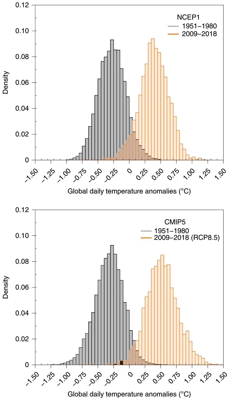
The graphs compare global daily temperature anomalies using data from (top) the NCEP dataset and (bottom) CMIP5 models.
These graphs show how daily temperatures have changed globally over time. The black bars represent temperatures from 1951–1980, while the orange bars show temperatures from 2009–2018. The top panel uses data from the National Center for Environmental Prediction (NCEP), whereas the bottom panel comes from verification of climate model simulations. Notice how the orange bars have shifted to the right compared to the black bars. We’ve seen similar graphs before in this course—these results clearly "detect" climate change, confirming that the most recent period is warmer than the past! Another cool takeaway here is that our models capture the same warming signal seen in observations—a reassuring sign that they’re trustworthy tools for understanding climate trends.
For attribution, scientists use climate models to simulate Earth’s climate under different scenarios. They run these models with and without human influences—like greenhouse gas emissions and land-use changes—to see how the climate would behave in each case. By comparing the results to observed data, researchers can figure out how much human activity has contributed to specific climate events or trends.
Let’s break this down with an example. Hurricane Florence, a major storm from the 2018 Atlantic season, caused prolonged heavy rain and catastrophic flooding in the Carolinas, leading to 54 deaths and $24.23 billion in damages. How much of this flooding was due to climate change? To answer this, scientists used atmospheric models to simulate two versions of Hurricane Florence. One version closely matched the real storm as it happened. The other, called a "counterfactual," used the same meteorological setup but removed the human-induced fingerprint of climate change from the conditions leading up to the storm. To account for variability, they ran hundreds of slightly different simulations (an ensemble) for each version. By comparing the “actual” and “counterfactual” results, they could determine how much of the storm’s impact was influenced by human-driven climate change.
Emphasize!
A counterfactual experiment in climate attribution is a method used to isolate the impact of human activities, like greenhouse gas emissions, on specific weather events or climate trends. It involves running climate model simulations under two scenarios:
- The actual scenario (in red), which includes both natural factors (like volcanic eruptions and solar variations) and human influences (such as emissions and land-use changes).
- The counterfactual scenario (in blue), which removes human influences and only includes natural factors.
By comparing the outcomes of these simulations, scientists can determine how much of an event’s severity, likelihood, or impact can be attributed to human-induced climate change. For example, in studying a heatwave, a counterfactual experiment might reveal that the event was made significantly more intense or frequent due to human activities.
The figure below shows histograms (with solid lines) of the maximum rainfall (i.e., the highest precipitation peak at any weather station over the Carolinas) and the total accumulated precipitation over the region impacted by Florence. The red (“actual”) and the blue (“counterfactual”) histograms come from the ensemble of model simulations, and the vertical black stripe is the single value that was observed by satellite data. To make it easier to see the differences, the researchers fit smooth curves (illustrated by dashed lines) to the results. For both quantities, the blue curve is to the left of the red curve, which means the blue curve is composed of less rainfall. In other words, climate scientists found that when they removed the “fingerprint” of human induced climate change from Hurricane Florence precipitation decreased. Put another way, approximately 5% of Hurricane Florence’s precipitation was due to climate change. This may not seem like a big number, but in many cities around the United States, this can be the difference between levees being breached or not or buildings being flooded and lives being lost.

Additionally, advancements in climate science have improved the precision of these studies, allowing for more accurate (and rapid) attribution of extreme weather events. For instance, after a heatwave, scientists can assess the probability of such an event occurring in a pre-industrial climate versus today’s climate in near real-time. These rapid attribution studies provide timely insights into the role of human activities in intensifying extreme weather, which is essential for public awareness and helps make sure that media outlets are communicating the best possible science to individuals interested in understanding such impacts.
Explore Further...
Curious about how scientists determine whether climate change influenced a recent heatwave, flood, or drought? Visit World Weather Attribution (WWA) to explore real-time analyses of extreme weather events. WWA uses climate models and weather observations to assess how human-driven climate change affects the intensity and likelihood of these events. From heatwaves in Europe to flooding in Africa, their studies provide insights into the role of climate change and highlight the actions needed to prepare for a world of increasing extremes.

Quiz Yourself...
Climate Litigation
Climate LitigationPrioritize...
After completing this section, you should be able to:
- Define climate litigation, explain it's intended purpose, and give an example of what climate litigation looks like.
Read...
Remember how we opened this lesson. Understanding and addressing climate change is about more than science—it’s about justice. At its core, climate justice means recognizing responsibility for climate damages and taking action to rectify these injustices. So, who’s responsible? And how can we ensure that those affected by climate change get the support they need? Let’s dive into the different perspectives on responsibility, the mechanisms for compensation, and the path forward.
We talked earlier in this lecture about how the planet is somewhat split between the “haves” and the “have-nots”—that is, from a geographic or country perspective. However, the responsibility doesn’t just rest with nations. Corporations—especially fossil fuel giants like ExxonMobil, Shell, and BP—played a massive role. These companies not only extracted and sold fossil fuels for profit, but they also knew about the risks of climate change as early as the 1970s. Internal documents reveal they understood how their activities would heat the planet, but they chose to mislead the public and delay action to protect their bottom lines.
Mechanisms for Accountability: Climate Litigation
One of the most powerful tools for holding historical emitters accountable is climate litigation. Climate litigation refers to the use of legal systems and processes to address issues related to climate change, often focusing on holding governments, corporations, and other entities accountable for their contributions to greenhouse gas emissions and climate impacts. It encompasses a broad range of legal actions, from lawsuits seeking compensation for damages caused by climate-related disasters to cases demanding stronger climate policies or the enforcement of existing environmental regulations. Plaintiffs in climate litigation might include affected individuals, communities, advocacy groups, or even governments, while defendants often include major polluters like fossil fuel companies or policymakers accused of inaction. By leveraging the law, climate litigation aims to achieve justice for those disproportionately affected by climate change, enforce accountability, and catalyze systemic changes in how societies address the climate crisis.

Over the past decade, we’ve seen a surge in lawsuits targeting governments, corporations, and even financial institutions for their roles in contributing to or enabling climate change. Check out the explosion in the graph above! These legal actions aim to achieve several key goals:
- Establishing Responsibility: Proving that specific entities bear significant responsibility for climate impacts.
- Securing Compensation: Providing financial resources to communities hit hardest by climate disasters.
- Driving Policy Change: Pressuring governments and corporations to adopt more sustainable practices.
The infographic below is useful to digest. I'll let you sit with it for a little while since I can't cover everything on it. There are several takeaways from it:
- The number of cases has gone up over time (as we saw above)
- The U.S. is the "leader" in filed cases, with Europe coming in second and Australia leading the pack of non-US, non-EU countries.
- The number of jurisdictions is increasing, indicating that not only is the number of cases going up but the number of locations pursuing climate litigation is as well.

Case Study
Massachusetts v. EPA (2007): A Milestone in Climate Litigation
In Massachusetts v. Environmental Protection Agency, the U.S. Supreme Court issued a landmark ruling that established the federal government’s responsibility to address greenhouse gas emissions. The case came about when Massachusetts, joined by other states and cities, sued the EPA for failing to regulate carbon dioxide emissions from vehicles under the Clean Air Act (CAA). Massachusetts argued that the EPA was legally obligated to regulate "any air pollutant" that endangers public health or welfare. The EPA countered by claiming it lacked authority to regulate greenhouse gases and cited scientific uncertainty as a reason for inaction. So, who is right?
At the time -- in a 5–4 decision -- the Court ruled in favor of Massachusetts, holding that the EPA had both the authority and the obligation under the CAA to regulate greenhouse gases if they posed a risk to public health. The decision marked the first time the Supreme Court recognized greenhouse gases as pollutants, setting a crucial precedent for climate-related litigation.
The outcome reinforced the idea that laws like the Clean Air Act could be used to address environmental challenges. The ruling also highlighted the importance of "standing" in climate lawsuits, with the Court acknowledging Massachusetts' claim that rising sea levels directly threatened its coastal land. “Standing” is a key part of climate litigation!
However, things are far from settled. A later Supreme Court case in 2022, West Virginia v. EPA, actually found that the EPA had overstepped its authority under the "major questions doctrine" by attempting to regulate emissions and promote alternate energy sources in the Clean Power Plan. The Inflation Reduction Act of 2022 codified the findings in Massachusetts v. EPA, reaffirming that carbon dioxide and other greenhouse gases fall under the EPA’s authority to regulate as pollutants under the Clean Air Act.
Quiz Yourself...
Climate Reparations
Climate ReparationsPrioritize...
After completing this section, you should be able to:
- Define climate reparations, explain their intended purpose, and describe the concept behind a "climate fund."
Read...
Mechanisms for Justice: Climate Reparations
Climate reparations are a framework for addressing the injustices of climate change by compensating those who have been disproportionately harmed by its impacts. Reparations are a way to make up for harm caused in the past by giving money, resources, or help to those who were unfairly hurt. In climate change, it means helping people or countries that didn’t cause much of the problem but are suffering the most from its effects.
The concept centers on the principle that those most responsible for greenhouse gas emissions—historically wealthier nations and major polluters—should provide financial and material support to vulnerable communities and nations that have contributed the least to climate change but suffer the most from its effects. Reparations go beyond traditional aid or charity, emphasizing accountability and justice, acknowledging historical inequities, and fostering global solidarity.
A key mechanism for delivering climate reparations is the establishment of climate funds. These funds, often facilitated through international agreements like the United Nations Framework Convention on Climate Change (UNFCCC), are designed to channel financial resources from wealthier nations to those most affected by climate change. For example, the Loss and Damage Fund was recently created by countries working together at a global meeting to address climate change (at the 2022 United Nations Climate Change Conference or Conference of the Parties, if you aren’t into the whole brevity thing). This fund is designed to help communities and countries that are facing damage from climate change that cannot be reversed, like when rising seas destroy homes, floods wipe out farmland, or powerful storms force people to leave their communities. The idea is to provide money and resources to help these people recover and rebuild their lives.
The push for climate reparations has focused on achieving three main objectives:
- Acknowledging Historical Responsibility: Recognizing that industrialized nations and corporations have historically driven climate change through unchecked emissions and benefiting from fossil fuel consumption. For example, say a factory has been dumping toxic waste into a river for decades and making huge profits, while communities downstream suffer from polluted water. Holding the factory accountable is like acknowledging historical responsibility for the harm caused.
- Providing Fair Compensation: Leveraging climate funds to ensure vulnerable nations and communities receive resources to rebuild, recover, and adapt to climate-related impacts. If a hurricane with an attributable climate change signal destroyed a small island nation’s homes and infrastructure, fair compensation would mean wealthier nations, who contributed most to climate change, help pay for the island's recovery and adaptation to future storms.
- Promoting Global Equity: Bridging the gap between the Global North and Global South by redistributing resources through mechanisms like the Green Climate Fund and the Adaptation Fund to address systemic inequities exacerbated by climate change. Wealthier countries might contribute to these funds with an eye towards achieving goals like the Global South countries building more flood-resistant infrastructure and develop early-warning systems.

Case Study...
The Green Climate Fund: Addressing Global Climate Challenges
The Green Climate Fund (GCF) is the world’s largest fund dedicated to helping developing nations tackle climate change. Created under the United Nations Framework Convention on Climate Change (UNFCCC), it’s designed to support countries that often contribute the least to climate change but face its harshest impacts. With a portfolio of $13.5 billion (and over $51 billion when including co-financing) as of 2023, the GCF funds projects like building climate-resilient infrastructure, scaling up renewable energy, and preparing communities for disasters like floods and heatwaves. Governed by a 24-member board and based in South Korea, the GCF is a key player in global efforts to channel resources from wealthier countries to those that need them most. The above figure highlights the “buy-in” the fund has been getting from major nations. While the overall commitment pales in comparison to what is needed to address climate issues, the financial outlay indicates a real commitment!
But like any massive program, the GCF isn’t without its challenges. Critics argue that some funded projects don’t go far enough, sticking to “business-as-usual” solutions instead of fostering real innovation. There’s also ongoing debate about whether the money is being distributed fairly or efficiently, with some pointing out that it’s tough for smaller countries to access funds for adaptation projects. Cynics are concerned about the possibility of corruption and cronyism, meaning stringent oversight of the funds is a key request from contributors.
Despite these hurdles, the GCF remains a vital piece of the puzzle in addressing climate injustices, especially as wealthier nations work to fulfill their promises of supporting vulnerable communities around the globe.
Quiz Yourself...
Corporate Responsibility and Accountability
Corporate Responsibility and AccountabilityPrioritize...
After completing this section, you should be able to:
- Explain the role of fossil fuel giants in climate change and how legal avenues can be used to hold them accountable
- Define Environmental, Social, and Governance (ESG) business criteria and divestment, give an example of how they work, and offer at least one strength and weakness for each.
Read...
When it comes to responsibility for climate change, corporations—especially fossil fuel giants like ExxonMobil, BP, and Shell — play a massive role. These companies have been major contributors to greenhouse gas emissions, not just from extracting fuels but also from the emissions generated when those fuels are burned. The figure below highlights some of the biggest corporate sources of greenhouse gases, underscoring their significant impact on the planet's energy budget.

Even more troubling, internal documents dating back to the 1970s reveal that many of these corporations were fully aware of the devastating consequences of burning fossil fuels. They had access to research predicting rising global temperatures, melting ice caps, and more extreme weather events. Instead of acting responsibly, these companies made a calculated choice: they funneled money into misinformation campaigns aimed at casting doubt on climate science and delaying meaningful action. For example, check out the graph below. Each gray line predicts climate change from internal ExxonMobil models that were available to company leadership but not the general public. You could actually make an argument that their models of climate change in the 1970s and 1980s were as good, if not better, than some of the leading research models at the time!

Through funding think tanks, lobbying against regulations, and crafting misleading ads, these corporations actively sowed doubt, framing the science as "unsettled." This calculated approach didn’t just delay action—it amplified the climate crisis. The result? Vulnerable communities are now bearing the brunt of intensifying disasters, collapsing ecosystems, and rising seas, all while the clock keeps ticking.
Case Studies in Corporate Accountability
In recent years, efforts to hold these corporations accountable have gained momentum. Climate litigation has become a powerful tool for seeking justice. For example:
- New York City v. ExxonMobil (2021): New York City sued ExxonMobil, Chevron, and other fossil fuel giants, alleging they misled investors and the public about the risks of climate change. While the case faced legal challenges, it brought critical attention to corporate deception.
- Royal Dutch Shell in the Netherlands (2021): In a landmark ruling, a Dutch court ordered Shell to cut its carbon emissions by 45% by 2030, emphasizing its responsibility to align with the Paris Agreement. This case marked the first time a court held a corporation legally accountable for reducing its emissions.
- Climate Liability Cases in the Philippines (2022): The Philippine Commission on Human Rights found fossil fuel companies legally and morally responsible for climate harms, setting a global precedent for corporate accountability in human rights contexts.
How much all of these lawsuits will actually have teeth remains up for debate. For example, Shell appealed the ruling in the Netherlands, arguing that it was not the court's role to enforce emissions targets. But beyond legal means, other strategies have become a powerful tool for holding corporations accountable.
Environmental, Social, and Governance (ESG)
A newer development in corporate accountability is the integration of Environmental, Social, and Governance (ESG) criteria into business practices. ESG criteria measure how well companies address environmental sustainability, social responsibility, and ethical governance. Investors increasingly prioritize ESG-compliant companies, recognizing that long-term profitability is tied to sustainable practices. For instance, companies like Unilever and Microsoft have committed to achieving carbon neutrality in their operations, while the Task Force on Climate-Related Financial Disclosures (TCFD) has encouraged businesses to disclose climate risks and outline strategies for mitigation. Even major financial companies like BlackRock have pledged to align their portfolios with net-zero emissions by 2050, signaling a shift in the financial sector’s approach to sustainability.
Meanwhile, divestment campaigns have become another powerful tool for holding corporations accountable. Divestment is the process of withdrawing investments from companies or industries, often as a form of protest or ethical stand, to pressure them to change practices deemed harmful or unethical. In other words, rather than apply legal pressure like we talked about above, apply financial pressure instead! Universities, pension funds, and cities are divesting billions from fossil fuel investments, signaling societal disapproval of the industry’s environmental impact. For example, New York City and London have committed to moving their funds out of fossil fuel companies, and prestigious institutions like Harvard and Oxford have followed suit, citing both moral and financial risks. These efforts not only create financial pressure but also reshape public perceptions, positioning fossil fuel investments as increasingly unacceptable. The graph below demonstrates the rapid increase in divestment from fossil fuel companies -- the black line is the dollar amount, and the red bars are counts of "institutions," which are composed of all sorts of entities from colleges to non-profits to other companies to even religion organizations/churches!

Shareholder activism is amplifying these trends. Investors are demanding greater transparency and genuine commitments to sustainability, using their influence to push for internal change. In 2021, activist investors secured board seats at ExxonMobil to advocate for stronger climate action—a move that underscored the growing dissent even within major corporations.
Note that both ESG practices and divestment campaigns do face criticism. In particular, one can make an argument that ESG business criteria can be used as a "marketing tool" to make companies look good (and investors feel better) without any meaningful action -- a form of virtue signaling. Likewise, some argue that divestment has a limited financial impact, even though the graph above above indicates $40 trillion US dollars in divestments. It's a bit misleading because the divestment total reflects the total value of the institutions' assets, not the specific value of fossil fuel investments. For example, a university endowment committing to divest might be worth $5 billion, but only $50 million of that could be tied to fossil fuels.
However, ESG business criteria and divestment do represent significant shifts in how society and financial markets hold corporations accountable. Together, these strategies highlight an evolving expectation: that businesses must align with global climate goals and take responsibility for their role in the climate crisis.
Quiz Yourself...
Summary
SummaryRead...
- Environmental and climate justice focus on equity, human rights, and meaningful participation to ensure no group bears disproportionate environmental burdens or is excluded from solutions, emphasizing fairness and inclusivity in addressing environmental harm and climate change impacts.
- Inequity can include both emissions and impacts
- Wealthier nations in the Global North have historically contributed disproportionately to climate change, while many countries in the Global South have remained within their fair share of emissions, highlighting the need for equitable responsibility in addressing climate damage.
- Climate change disproportionately impacts nations in the Global South, which have contributed the least to emissions but face the steepest adaptation costs due to vulnerabilities like geography, limited resources, and economic constraints, amplifying global inequalities.
- Climate migration arises when people are displaced by climate change-driven disasters like rising seas, extreme weather, and drought, highlighting the need for international legal protections, proactive adaptation measures, and equitable economic support to address this growing humanitarian challenge.
- Redlining has led to systemic disinvestment in minority neighborhoods, resulting in poor infrastructure and limited green spaces, which amplify the urban heat island effect and leave these communities disproportionately vulnerable to climate change impacts like extreme heat and pollution.
- Increasing urban green spaces and implementing cool roofs can significantly reduce the urban heat island effect, particularly in historically neglected neighborhoods, while strengthening community support systems helps protect vulnerable populations during extreme heat events.
- Detection identifies significant climate changes beyond natural variability, while attribution determines the role of human activities, often using counterfactual experiments to isolate climate change’s contribution to extreme events, providing essential insights for understanding and addressing climate justice.
- Climate litigation uses legal systems to hold governments, corporations, and other entities accountable for their contributions to climate change, aiming to establish responsibility, secure compensation for affected communities, and drive systemic policy changes.
- Climate reparations aim to address historical inequities by holding wealthier nations and major polluters accountable for their disproportionate contributions to climate change, providing financial and material support through mechanisms like climate funds to help vulnerable nations recover, rebuild, and adapt.
- Corporate accountability for climate change focuses on holding major emitters like fossil fuel companies responsible through legal actions, Environmental, Social, and Governance (ESG) practices, and divestment campaigns, aiming to drive systemic change despite challenges like greenwashing and limited financial impacts.
Quiz Yourself...
Lesson 12: How to deal with climate change
Lesson 12: How to deal with climate changeMotivate...

Imagine preparing for a big storm that's been all of the news. You’d likely do two things. First, secure what you already have—board up windows, reinforce your home, and stock supplies. Second, you’d think about how to avoid storms in the future—maybe relocating, building stronger shelters, or advocating for better warning systems. When it comes to climate change, we face a similar challenge. We need to brace for impacts already happening while also working to prevent the worst outcomes in the years ahead. This dual approach, balancing adaptation and mitigation, is what we need to address if we are going to combat climate impacts.
Adaptation is about resilience—limiting our vulnerability to climate impacts through practical solutions like protecting coastlines, managing water supplies, and diversifying crops. It's an acknowledgment that some degree of climate change is inevitable and we must be prepared. But adaptation alone won’t be enough. That’s where mitigation comes in, aiming to reduce the extent of climate change itself by cutting greenhouse gas emissions or, in some cases, considering bold geoengineering techniques.
We’ll explore both strategies. On one hand, we’ll discuss the global policy frameworks that guide our efforts and outline how nations work together to reduce emissions and adapt to changing conditions. On the other, we’ll examine the innovations that make these goals achievable: improving energy efficiency, electrifying systems with renewable power, and embracing sustainable development practices that balance economic needs with environmental protection.
But the road forward isn’t straight and obvious. Geoengineering—using large-scale interventions like carbon capture, solar radiation management, or oceanic iron fertilization—offers tantalizing possibilities to help "fix" what is broken. However, it comes with risks that could reshape the planet in unpredictable ways. Can we trust these methods, or are they too dangerous to pursue? We need to weigh the trade-offs and consider their ethical implications. We'll also look at what it means to design a climate-resilient future. From building infrastructure that can withstand extreme weather to adopting smarter agricultural and water management practices, these strategies aim to protect vulnerable communities while ensuring that societies can thrive even in a changing climate.
Together, adaptation and mitigation form the foundation of how we respond to climate change. They remind us that while we can’t undo the past, we may have the tools—and the responsibility—to shape a more sustainable future.
Climate Solutions: Adaptation vs. Mitigation
Climate Solutions: Adaptation vs. MitigationPrioritize...
After completing this section, you should be able to:
- Define adaptation and mitigation in the context of climate change.
- Explain why serious climate solutions should include some combination of both adaptation and mitigation strategies.
Read...
We've spent all semester talking about the science of climate, the history of climate, and why we have observed (and expect) the climate to change. So, what do we do now? Throw up our hands and say "good game!"?
When it comes to addressing the challenges of climate change, the conversation often revolves around two main strategies: adaptation and mitigation. These represent the broad paths humanity can take to confront the impacts of a warming planet.

Mitigation focuses on reducing the extent of climate change itself. An analogy would be trying to avoid injuring yourself while playing in a basketball game—perhaps you wear a knee brace proactively. This can be achieved through two main approaches:
- Emissions reductions, which address the problem at its source by curbing greenhouse gas emissions.
- Geoengineering, which involves large-scale technological interventions designed to offset the effects of those emissions (a controversial topic we’ll explore in a future lesson).
Adaptation, on the other hand, emphasizes efforts to limit our vulnerability to the impacts of climate change. This typically involves measures to protect human communities—like building seawalls, managing water resources, or altering agricultural practices—without necessarily addressing the root cause of the problem. Essentially, we are trying to harden ourselves against expected future challenges. Using our example above, if you hurt your knee, you now try to do things that allow you to function as well as possible given a hurt knee—perhaps you use crutches or do activities that don't require standing or walking.
It’s worth noting that adaptation often focuses on safeguarding human systems, not natural ecosystems. For instance, coral reefs are unlikely to adapt to the combined pressures of warming oceans and acidification. Unfortunately, humans do not control that. As ecosystems collapse, the essential services they provide—like coastal protection or fisheries—could be lost, with severe consequences for human civilization.
See the flowchart below. Start in the top left box—humans are changing the climate. This leads to all the impacts and vulnerabilities in the purple box. We now have two strategies (mainly driven by policy, which we'll talk about soon): mitigation and adaptation.
Sometimes, you might hear people say, "Why worry about trying to stop climate change? We should just focus on adapting to it." Others might argue, "Planning for adaptation means you’ve already given up on stopping it!" So, what do we do?
The reality is that framing this as an either-or question is misleading—we’re going to need both adaptation and mitigation to tackle climate change effectively. The greenhouse gases we’ve already put into the atmosphere have committed us to at least 1°C of additional warming, a concept known as committed climate change. This warming is already "baked in," and no amount of mitigation can undo it. That’s where adaptation comes in—we have to prepare for the changes we can’t avoid. At the same time, adaptation alone isn’t enough. Without mitigating future emissions, the problems will only escalate. For instance, you can build a seawall today, but if emissions continue unchecked, rising seas could overtop it in just a few decades, forcing ever-larger fixes. That would be a vicious cycle, for sure.
To understand the interplay between these two strategies, consider a few scenarios:
- No response measures (so we do nothing, no adaptation nor mitigation): This leads to widespread and severe vulnerabilities across the globe. Obviously, very bad.
- Adaptation alone: Without mitigation, adaptive measures may slow local impacts but cannot prevent the worsening of global climate conditions. Our "spiral" we talked about above.
- Mitigation alone: While limiting our emissions and resulting greenhouse gas concentrations might reduce the magnitude of climate change, vulnerable regions, especially in the tropics, would still face severe impacts. We've already seen there is far more CO2 in the atmosphere now than in recorded human history: "the cake is (somewhat) baked."
- Adaptation and mitigation combined: Together, these approaches can significantly reduce vulnerability, offering a more sustainable path forward for most regions. This seems like our best option!
Hopefully, your convinced that only a combination of adaptation and mitigation can minimize risks to both human and natural systems.
One helpful way to think about climate vulnerability is by comparing different scenarios: no response at all (no adaptation or mitigation), adaptation on its own, mitigation on its own, and a combination of both strategies. Play with the slider in the interactive tool below to explore these scenarios. As you move the slider to the right—representing an increase in both adaptation and mitigation efforts—you’ll notice the map’s colors shift from dark red, nearly black (indicating high vulnerability), to much lighter shades across the globe. This visual demonstrates the powerful impact of combining adaptation and mitigation to reduce climate risks worldwide.

As is apparent from the above comparisons, much of the world would likely suffer extreme vulnerability to climate change in the absence of any mitigation efforts at all, regardless of what adaptive measures are taken. Yet, mitigation alone, for example limiting CO2 concentrations to 550 ppm, would, in the absence of any adaptive measures, still result in great vulnerability, particularly in tropical and subtropical regions. However, a combination of adaptation and mitigation could reduce vulnerability to modest levels for most of the world.
While mitigation strategies will be covered in-depth in later sections, early in this lesson the spotlight is turned on adaptation. We’ll explore specific examples of adaptive measures in areas such as:
- Coastal protection (e.g., barriers against rising sea levels),
- Water resource management (e.g., systems for drought resilience), and
- Agriculture and food security (e.g., crop diversification and irrigation technologies).
However, adaptation comes with limits. It is inherently reactive and localized, often unable to address the cascading effects of environmental degradation. For instance, when ecosystems like coral reefs collapse, the ripple effects extend beyond biodiversity loss to include economic and social challenges for human communities.
Ultimately, adaptation and mitigation are complementary, not competing, strategies. Each plays a critical role in addressing climate change, but neither can succeed in isolation. As we delve into adaptation strategies, let us remain mindful of the larger context in which they operate—and the urgent need for a balanced, dual-pronged approach to climate solutions.
Quiz Yourself...
Public Policy: Carbon Emissions, Kyoto and Paris
Public Policy: Carbon Emissions, Kyoto and ParisPrioritize...
After completing this section, you should be able to:
- Define climate policy and describe what an international agreement is.
- Understand that the Kyoto Protocol came first, was followed by the Paris Agreement, and describe the basic outcomes of each.
Read...
On the last page, we mentioned the word "policy." But what does that actually mean? While individual choices can contribute to reducing carbon emissions—through decisions you and I can make at home, like conserving energy, driving less, or consuming more sustainably—they alone are insufficient to drive the large-scale changes required to address climate change. Don't get me wrong, there is a benefit to collective action, but without getting everyone in the world to snap their fingers and buy in, it will not be enough.
Key Definition:
Climate policy refers to the rules, strategies, and actions implemented by governments and organizations to reduce greenhouse gas emissions, adapt to climate change impacts, and promote sustainable practices.
In market-based economies, such as those in North America, Europe, and increasingly in the developing world, change depends on aligning incentives with sustainable practices. What on Earth does that mean? Currently, the economic system provides minimal support for renewable energy development while heavily subsidizing fossil fuels. Financially, it makes sense to continue emitting. If one person or one country cuts emissions, they might be at a heavy disadvantage to another. That is where climate policy comes in.
We're going to talk mainly about large-scale global policies here, but this can happen at all levels of society: from the entire globe down to an individual home owners' association!
The Kyoto Protocol: A First Step in Global Collaboration
Understanding the global nature of greenhouse gas emissions, nations have long recognized the need for international cooperation to tackle climate change. The first significant step came in 1992 with the United Nations Framework Convention on Climate Change (UNFCCC), established at the Earth Summit in Rio de Janeiro. This agreement laid the groundwork for the 1997 Kyoto Protocol, where participating countries outlined targets to stabilize greenhouse gas concentrations. Officially coming into force in 2005, the Kyoto Protocol focused on emissions reductions but left many details—like defining how much warming is dangerous or whether to use carbon taxes or trading—up to individual nations to decide.

By 2007, the European Union had stepped into a leadership role, framing the idea of "dangerous anthropogenic interference" (DAI) as a global temperature rise of 2°C above pre-industrial levels. DAI is essentially the tipping point where climate impacts shift from manageable challenges to widespread crises. Think of it like a boiling pot of water: at first, it heats up slowly, and you can manage it by turning down the heat, but if you wait too long, the water will boil over and create a mess—much harder to clean up.
While 192 nations eventually ratified the Kyoto Protocol, key players like the United States and China held out. Both economies are deeply tied to fossil fuels, and in the U.S., lobbying by the fossil fuel industry has long influenced climate policy. Without the participation of these two major emitters, meaningful global progress in reducing emissions faced significant hurdles.
Kyoto marked an important milestone because it demonstrated that the global community recognized a problem and agreed (roughly) on a path forward to address it. However, it wasn’t without flaws. Low-lying island nations and tropical countries, already grappling with climate impacts, argued the agreement didn’t go far enough. For them, DAI isn’t a future problem—it’s an imminent crisis, and their limited resources make large-scale adaptation nearly impossible without international support. On the other hand, while many viewed Kyoto as a stepping stone toward stronger climate action, critics—especially in the U.S.—claimed it would harm economic growth. I'll note that most cost-benefit analyses (this isn't an economic class, so I'll spare you the details!) indicate the long-term costs of inaction far outweigh the price of addressing climate change now.
So, how did countries perform? The chart below compares emission targets under the Kyoto Protocol with actual outcomes between 1990 and 2010. Positive numbers (blue) show countries that exceeded their targets, while negative numbers (red) indicate countries that fell short. For instance, a nation pledging a 10% reduction but increasing emissions by 10% would score -20, while a nation pledging a 5% cut but achieving a 15% reduction would score +10. Eastern European countries generally outperformed their targets, while nations like Canada and Australia significantly missed theirs.

Overall, it’s a mixed bag. Some nations exceeded their goals, while others fell far behind. This uneven performance isn’t surprising, given that the Kyoto Protocol lacked strong enforcement mechanisms (in other words, it lacked "teeth"), relying largely on peer pressure between countries. Still, Kyoto’s legacy lies in demonstrating that global cooperation is essential for tackling climate change. Its successes and shortcomings set the stage for future agreements, highlighting the ongoing challenge of balancing fairness, economic interests, and the need for urgent action. As we’ll see in upcoming sections, solving this problem requires not only innovative policies but also a commitment from major emitters to prioritize the planet’s future over short-term gains.
The Paris Agreement and Prospects for Future Policy
In the years after the Kyoto Protocol, efforts to secure binding international climate agreements faced numerous hurdles. High-profile summits, including Bali in 2007 and Copenhagen in 2009, ended without significant breakthroughs. The core challenges remained: conflicting priorities between major players like the U.S. and China and broader divides between wealthier, industrialized nations and those still developing or struggling to develop. In the United States, political gridlock and intense lobbying from the fossil fuel industry further stalled progress, as well-funded campaigns sowed doubt about climate science and targeted lawmakers pushing for action.
These setbacks left many feeling disheartened about the prospect of global climate cooperation. Yet, there were glimmers of hope. China, the world’s largest emitter of carbon dioxide, began making notable strides in renewable energy investments, surpassing even the United States in its commitment to solar and wind power. In 2014, a historic moment occurred when Chinese leader Xi Jinping and U.S. President Barack Obama reached a bilateral agreement to limit greenhouse gas emissions. This pact between the two largest emitters showed the world that collaboration—even between economic competitors—was possible and necessary.
Domestically, while the U.S. Congress failed to pass sweeping climate legislation, incremental progress emerged through state and local efforts and executive actions. The Obama administration introduced ambitious measures, including the Clean Power Plan, which set a goal of cutting emissions from power plants by 32% by 2030, and stronger fuel-efficiency standards for vehicles. These policies highlighted how leadership at multiple levels could complement stalled federal action and reinforce international commitments.
The Paris Agreement, adopted in 2015, built on the foundations laid by the Kyoto Protocol but offered a more inclusive and flexible framework. Unlike Kyoto, which set binding emissions targets primarily for developed nations, Paris sought commitments from nearly every country, recognizing the shared but differentiated responsibilities of nations at various stages of development. The agreement aimed to limit global warming to “well below 2°C” above pre-industrial levels, with aspirations to cap it at 1.5°C—a recognition of the heightened risks faced by vulnerable nations like small island states.

What made Paris unique was its reliance on voluntary emissions targets, allowing countries to set their own goals based on their capabilities and circumstances. While critics argued that these voluntary targets lacked enforcement mechanisms, the agreement fostered a spirit of collective responsibility and accountability. Regular reviews and updates to these targets encouraged nations to increase their ambition over time, creating a dynamic framework rather than a static treaty.
The Paris Agreement also emphasized the importance of financial and technical support for developing nations, ensuring they could adapt to climate impacts and transition to cleaner energy systems. This focus on equity recognized the historical emissions of industrialized countries while addressing the urgent needs of those already facing the brunt of climate change.
Though the Paris Agreement has not solved the climate crisis, it represents a significant step forward in global cooperation. It acknowledges the scale of the challenge, the necessity of collective action, and the need for both mitigation and adaptation. As we explore climate solutions, Paris serves as a reminder that while progress may be slow and imperfect, it is possible when nations work together with a shared vision for the future.
Quiz Yourself...
Reducing Energy Intensity: Efficiency
Reducing Energy Intensity: EfficiencyPrioritize...
After completing this section, you should be able to:
- Define energy intensity and energy efficiency and list three areas where active efforts seek to improve efficiency.
- Understand why electric vehicles have a smaller carbon footprint, even if the electricity used to charge their batteries arises from fossil fuel combustion at a power plant.
Read...
Reducing energy intensity—how much energy we use relative to economic output—is an important cornerstone of addressing climate change. There can be a misconception that emission reductions mean that we have to sacrifice things—get rid of road trips, cut down on transcontinental trips, etc. However, that’s not (necessarily) true. It’s about doing more with less: less energy waste, less reliance on fossil fuels, and fewer emissions. By improving energy efficiency and transitioning to electrification, we can make significant strides toward a cleaner, more sustainable energy future. If a gallon of oil can take us five times as far, we’ve started winning the battle!
Energy efficiency
Improving energy efficiency means reducing the amount of energy needed to power our homes, businesses, and industries. It’s often the easiest, most cost-effective way to cut emissions while saving money. Consider these key areas:
Buildings:
- Heating, cooling, and lighting account for a large portion of energy use in buildings. Insulating homes, installing energy-efficient windows, and using LED lighting can drastically reduce energy consumption.
- Smart technologies like programmable thermostats and motion-sensor lighting further reduce waste.
Transportation:
- Traditional internal combustion engines are notoriously inefficient, converting only about 20-30% of fuel into motion. By contrast, electric vehicles (EVs) are far more efficient, with 60-80% of the energy stored in their batteries powering the wheels.
- Public transit systems, carpooling, and hybrid vehicles also help lower energy use in the transportation sector. Even if a "dirty" bus emits three times as much as a car, having 50 people on that bus dramatically reduces carbon emissions!
Mythbusting
A common misconception is that electric cars are no better for global CO2 emissions than internal combustion engines that run on gasoline. After all, burning fossil fuel sources like coal and natural gas emits CO2 just like cars do. So, if we are emitting carbon to make electricity to charge our batteries, what good are we doing? Well, while it’s true that generating electricity from fossil fuels DOES produce CO₂, the overall emissions from an electric car are significantly lower than those of a gasoline car—even when powered by a grid that relies heavily on fossil fuels! This is because electric motors are far more efficient than internal combustion engines, converting a much higher percentage of their energy input into motion.
Check out the image below. Out of the 8.9 million barrels of gasoline for motor vehicles consumed daily in the U.S. on average, only 1.8 million gallons, or approximately 20 percent, actually propel an internal combustion vehicle forward. The other 80% is "lost" (wasted) on heat and friction, and other inefficiencies. How much energy could we save if we still got the same "1.8 million gallons" of motion with electric cars? That's what the other three panels show. Even by replacing gas engines with a "dirty" electricity source (coal), we reduce energy use by 31% since the "lost" energy between combustion and wheels moving is reduced. Running electric vehicles powered by renewable energy sources like wind and solar? That reduces energy needs by a whopping 75%!

Industry:
- Industries can reduce energy use through better equipment design, optimized processes, and waste heat recovery systems. For example, advanced manufacturing techniques like 3D printing can minimize material waste and energy.
Energy efficiency reduces greenhouse gas emissions while saving money. It’s like fixing leaks in a bucket before refilling it—saving every bit of energy means fewer emissions overall!
Quiz Yourself...
Reducing Energy Intensity: Electrification
Reducing Energy Intensity: ElectrificationPrioritize...
After completing this section, you should be able to:
- Explain how changing sources of electricity generation can reduce carbon emissions without reducing the energy we consume.
- Understand that renewable energy sources still have a carbon footprint due to the manufacture, transport, and maintenance of their systems, but that they drastically reduce carbon emissions needed to generate energy.
Read...
Electrification is a game-changer for reducing greenhouse gas emissions because it shifts energy consumption away from fossil fuels like coal, oil, and natural gas toward cleaner, renewable sources like wind, solar, and hydropower. These renewable energy sources produce little to no direct emissions during operation, which means that as the electricity grid becomes greener, the emissions associated with electric systems—like vehicles, heating, and industrial processes—drop substantially. For example, as we saw above, charging an electric vehicle (EV) using electricity from solar panels or wind turbines is virtually emissions-free, compared to the substantial CO₂ released by burning gasoline in a traditional car. This transition can also reduce the dependency on volatile fossil fuel markets, stabilizing energy costs while cutting pollution that contributes to climate change and poor air quality.
How much carbon emissions can we save by transitioning energy sources? It's not an exact science, but the graph below shows numbers provided by the IPCC. The units are grams of carbon dioxide emitted to generate one kilowatt-hour of energy. To put this in context, 1 kilowatt hour is about 50 full smartphone charges. It’s enough to power a microwave for an hour, perfect for cooking dinner (and the leftovers a few times). If you’re more into streaming, 1 kWh can fuel about ten hours of your favorite Netflix show on a modern TV. It can keep a 10-watt LED bulb on and glowing for 100 hours. It’s also enough to boil water for around 40 cups of tea with an electric kettle or run a space heater for 45 minutes on a chilly State College day in December.
To do each of those things, coal combustion emits 820 grams of carbon dioxide equivalent, or about four medium-sized apples. That doesn't sound like a lot, but just think of how often people around the world are doing activities that require energy—it's easy to see how global carbon dioxide levels increase in the ways we have observed. Now, let's say we replace some of those coal power plants with solar energy. Instead of 820 grams, we are now emitting a little less than 50 grams. Instead of an apple, it's merely a tablespoon of sugar! This is another powerful reminder of energy efficiency – we can lower our emissions without sacrificing charging our smartphone if we can leverage greener energy sources.

Now, you might look at the above graph and ask "wait, why do energy sources like solar and wind emit carbon, I thought they were renewable?!" Well, while the energy they produce is clean and doesn’t emit carbon during operation, the process of manufacturing, transporting, installing, and maintaining the infrastructure for these energy sources does have a carbon footprint. For example, building solar panels involves mining raw materials like silicon, aluminum, and glass, which require energy-intensive processes. Similarly, wind turbines require steel and concrete, both of which are associated with significant emissions during production. Transporting these components to installation sites via trains and trucks, as well as maintaining them over their lifespan, also contributes to emissions. That said, the carbon emissions from newer, green sources are minimal compared to fossil fuels, and over their lifetime, they more than make up for the initial carbon cost by providing clean, renewable energy—that's what the above graph is telling us.
Moreover, electrification enables sectors that were traditionally dependent on fossil fuels to leverage the efficiency and scalability of electricity. For instance, electric heat pumps can provide space heating and cooling far more efficiently than oil or gas furnaces, while electric industrial processes can eliminate emissions from burning fuels directly at factories. By using electricity derived from renewable sources, these systems not only reduce carbon emissions but also eliminate other harmful pollutants, like sulfur dioxide and nitrogen oxides, which are common byproducts of fossil fuel combustion. In short, electrification offers a pathway to cleaner energy use across all sectors of society, accelerating progress toward a low-carbon future and helping mitigate the impacts of climate change.
Quiz Yourself...
Sustainable Development
Sustainable DevelopmentPrioritize...
After completing this section, you should be able to:
- Define sustainable development and explain its linkage to climate change
- List at least three examples of sustainable development practices, why they can help mitigate climate impacts, and their potential implementation drawbacks
Read...
Sustainable development refers to creating solutions that allow people to meet their basic needs—like food, clean water, housing, and energy—without depleting natural resources, polluting the environment, or harming ecosystems. It focuses on balancing economic growth with protecting the planet so future generations can enjoy the same resources and quality of life we do today. In the context of climate change, sustainable development means ensuring society operates in a way that mitigates climate change.
Economic growth and environmental sustainability might seem to be at odds. After all, industrial development has often come at the expense of ecosystems, clean air, and water. For example, deforestation to make way for urban expansion has destroyed habitats, reduced biodiversity, and contributed to soil and water degradation. But when we look at the bigger picture, it becomes clear that growth without consideration of its climate impacts undermines the very foundation of long-term prosperity. Without a stable climate, healthy ecosystems, and reliable natural resources, economies cannot thrive, and societies cannot endure. For a planet projected to host nearly 10 billion people by 2050, sustainability isn't something that's just "nice to have." It's a "must-have."

So, what does sustainable development mean in practice? It means creating policies that allow for economic growth while protecting and even restoring the environment. This includes helping developing nations grow in ways that avoid the mistakes of the past—like unchecked deforestation, over-reliance on fossil fuels, and pollution. Developed nations, whose current consumption patterns are among the least sustainable, must take the lead in charting a new course, sharing technology and resources to help developing nations leapfrog to cleaner, more efficient ways of living and working.
Climate Solutions as a Path to Sustainability
The good news is that many strategies to address climate change align directly with the principles of sustainable development. Take recycling: it reduces waste, conserves raw materials, and lowers carbon emissions by decreasing the energy needed to produce new goods. You've probably been taught that since elementary school! Similarly, transitioning to renewable energy doesn’t just cut emissions—it creates new industries, jobs, and opportunities for innovation. Solar panels, wind turbines, and electric vehicles are not only climate solutions but also drivers of economic progress in their own right. In the early 2020s, Tesla became one of the world's largest companies, built on the back of improving energy efficiency and electrifying vehicular transportation!

Agriculture offers another example. By adopting climate-smart practices like precision farming, using drought-resistant crops, and minimizing food waste, we can reduce emissions while securing food supplies for a growing population. Similarly, investing in resilient infrastructure that can withstand climate impacts—like flooding or sea-level rise—not only protects communities but also strengthens economies by reducing disaster recovery costs.
For sustainable development to succeed, it requires collaboration on a global scale. Developed nations must take responsibility for their historical emissions and current consumption patterns by leading the charge in reducing emissions and funding clean energy innovation. At the same time, they must support developing nations in adopting sustainable practices through financial aid, technology transfer, and capacity-building. The goal is not simply to mitigate climate change but to create a world where economic progress and environmental health go hand in hand. We don't have enough time in this class to get further "in the weeds" here—we could have a separate lecture on each of these topics! But spend time reading and understanding the table below. From left to right, a mitigation option is listed followed by some reasons why it's "good" in terms of sustainable development and what the potential drawbacks are (in life, it is rare that something is a "silver bullet").
| Mitigation Options | Compatibility with sustainable development | Trade-offs |
|---|---|---|
| Improving Energy Efficiency | Cost-effective; creates jobs; benefits human health and comfort; provides energy security | Requires retraining workers, may harm local economies centered around traditional fossil fuel energy sources |
| Reforestation | Slows soil erosion and water runoff | Reduces land for agriculture |
| Deforestation avoidance | Sustains biodiversity and ecosystem function; creates potential for ecotourism | May result in loss of forest exploitation income and shift to wood substitutes that produce more emissions |
| Incineration of waste | Energy is obtained from waste | Air pollution prevention may be costly |
| Recycling | Reduces need for raw materials; creates local jobs | May result in health concerns for those employed in waste recycling |
| Switching from domestic fossil fuel to imported alternative energy | Reduces local pollution; provides economic benefits for energy-exporters | Reduces energy security; worsens balance of trade for importers |
| Switching from imported fossil fuel to domestic alternative energy | Creates new local industries and employment; reduces emissions of pollutants; provides energy security | Alternative energy sources can cause environmental damage and social disruption, e.g., hydroelectric dam construction |
© 2015 Pearson Education, Inc.
Quiz Yourself...
Geoengineering: What's the Big Deal?
Geoengineering: What's the Big Deal?Prioritize...
After completing this section, you should be able to:
- Define "geoengineering."
Read...
Geoengineering refers to the intentional manipulation of the environment on a global scale, aiming to counteract the effects of climate change. The term "geoengineering" combines "geo," meaning Earth, and "engineering," reflecting the deliberate design and manipulation of systems! While humans have already had significant unintended impacts on the climate—through burning fossil fuels, producing sulfate aerosols, and altering land surfaces—these changes don’t qualify as geoengineering because they weren’t deliberate attempts to modify the climate.
At this stage, geoengineering remains a theoretical concept, but it’s increasingly part of discussions around potential climate solutions. The basic idea is straightforward: to actively intervene in the Earth’s systems in ways that offset the warming effects of greenhouse gas emissions. However, the strategies proposed vary widely in scope, feasibility, and risk.
Some geoengineering approaches focus on carbon removal. For instance, carbon capture and sequestration (CCS) involves capturing CO₂ emissions from sources like power plants before they enter the atmosphere, while air capture seeks to remove CO₂ already in the atmosphere—akin to trying to "put the genie back in the bottle." This might include strategies like reforestation or even creating artificial "super trees" designed to extract carbon more efficiently than their natural counterparts. In these cases, the captured carbon would need to be stored securely underground or in the deep ocean, isolated from the atmosphere for long periods. Another proposal involves fertilizing the ocean with iron to stimulate the growth of phytoplankton, which could, in theory, absorb more CO₂ through photosynthesis and sink it into the deep ocean.
Other strategies, known as solar radiation management, aim to cool the planet by reflecting sunlight away from the Earth's surface. One idea is to mimic the cooling effects of large volcanic eruptions by injecting sulfate aerosols into the stratosphere. Another envisions placing massive arrays of reflective mirrors in space to reduce the sunlight reaching Earth. Related proposals focus on increasing the Earth's surface reflectivity, such as by painting rooftops white or modifying land surfaces to reflect more solar radiation.
Each scheme has its own set of potential benefits, risks, and trade-offs. We'll talk about them over the next few pages!
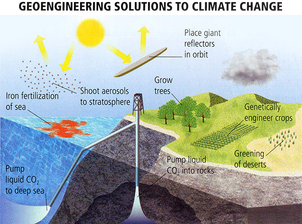
Quiz Yourself...
Interception! Carbon Capture and Sequestration
Interception! Carbon Capture and SequestrationPrioritize...
After completing this section, you should be able to:
- Define what "carbon capture and sequestration is" and how it can reduce carbon emissions at energy sources (like a power plant).
- Describe the rocky history of carbon capture and storage (CCS) and explain why it's unlikely to be the only solution to climate change.
Read...
Among the various geoengineering proposals, carbon capture and sequestration (CCS) is often considered the least invasive to the Earth's systems. The idea behind CCS is simple yet ambitious: prevent carbon dioxide (CO₂) produced during fossil fuel combustion from ever reaching the atmosphere. In theory, this could allow energy generation from fossil fuels with near-zero carbon emissions. However, CCS is only economical for large point sources, such as coal-fired power plants or industrial facilities like steel mills, cement factories, and oil refineries.
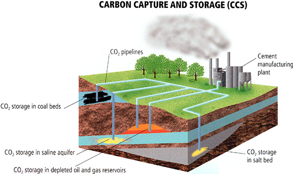
One notable attempt to demonstrate the feasibility of CCS was the FutureGen project, a full-scale "proof of concept" for CCS at a coal-fired power plant in Illinois. Funded by the U.S. Department of Energy in partnership with coal producers, users, and distributors, FutureGen aimed to capture CO₂ from coal combustion, compress and liquefy it, and inject it deep underground for long-term storage. The site chosen, Mount Simon in Illinois, offered an ideal geological setting, with porous rock formations to absorb CO₂ and impermeable caprock to seal it in, all situated well below freshwater aquifers.

The process involved a technique called oxy-combustion, where coal is burned in a mixture of oxygen (O₂) and recycled CO₂ instead of regular air. This results in a relatively pure stream of CO₂ after combustion, which is then scrubbed of residual pollutants, compressed, liquefied, and injected into deep geological formations. Over time, the CO₂ reacts with porous igneous rocks to form stable limestone, mimicking natural geological processes. FutureGen estimated it could bury 1.3 million tons of CO₂ annually—equivalent to 90% of the plant's emissions.
FutureGen was intended not only to reduce emissions but also to generate critical data on the efficiency and long-term viability of CCS. Researchers planned to monitor the injection sites, ensuring that CO₂ remained securely stored. Lessons learned from this experiment could, in theory, guide the deployment of CCS at other locations worldwide.

Why was FutureGen considered a good choice for testing the efficacy of CCS? The geology of the Mount Simon site in Illinois is well suited for CCS, and it is also reasonably representative of geological formations found in many other regions of the world. Whatever was learned from FutureGen could, in principle, be applied to many other potential CCS sites around the U.S. and the world.
Like Mount Simon, geological formations that contain salt water are ideal because of their porosity -- a fancy way of saying there are lots of pockets in which to store things. Moreover, there is impermeable caprock to seal in CO2. The formation is deep, placing it well below the depth of aquifers that are tapped for freshwater supply.
More than anything else, FutureGen was proposed as an experiment. The FutureGen operation would have evaluated potential storage sites before deciding precisely where the liquefied CO2 would have been injected for long-term storage, based on both theoretical modeling and data collection to evaluate detailed geological information about potential storage sites. The effectiveness of the injection system would be evaluated, and there would be continual monitoring of the burial process to ensure that CO2 was indeed being sequestered and remained sequestered. Whatever was learned could, in principle, be applied to any full-scale future deployment of CCS in the U.S. and abroad.
Despite its promise, FutureGen faced significant hurdles. The project was restructured as FutureGen 2.0, but it was eventually suspended in 2015 due to funding issues. Similarly, other CCS projects, like the Kemper County plant in Mississippi, struggled with cost overruns and ultimately abandoned CCS in favor of natural gas combustion. While some CCS efforts continue, such as Texas's Petra Nova project and Iceland's CarbFix program, they remain limited in scope and application.
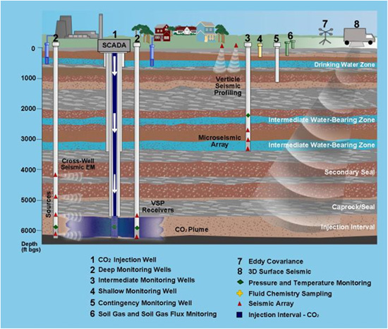
Although CCS appears to offer a pathway to reducing greenhouse gas emissions, its potential is constrained by several factors:
- Residual Emissions: Even with a 90% sequestration rate, CCS-equipped plants still emit some CO₂, meaning they cannot achieve zero emissions.
- Geological Risks: Seismic activity, groundwater flow changes, or other unforeseen events could compromise storage integrity, leading to CO₂ leaks and undermining the economic investment in the CCS infrastructure.
- Economic Viability: Establishing and maintaining CCS sites requires significant upfront costs, which may not compare favorably to other low-carbon energy solutions.
Moreover, the promise of "clean coal" technology remains largely theoretical. Without extensive data from projects like FutureGen, the long-term efficacy of CCS in sequestering carbon remains uncertain. Evaluating whether stored CO₂ remains secure could take decades—time we may not have, given the urgency of reducing emissions to avoid severe climate impacts.
While CCS shows promise, it is unlikely to serve as a magical solution for climate mitigation. The technology could play a role in reducing emissions from hard-to-decarbonize sectors like heavy industry, but relying on it as a primary strategy risks delaying critical transitions to renewable energy and other low-carbon solutions. As we continue to explore potential pathways for addressing climate change, CCS may complement, but cannot replace, more comprehensive efforts to reduce emissions at their source.
Quiz Yourself...
Air Capture: Putting the Genie Back in the Bottle
Air Capture: Putting the Genie Back in the BottlePrioritize...
After completing this section, you should be able to:
- Define what we mean by "air capture" and understand how capturing carbon dioxide already in the atmosphere differs from carbon capture during emission.
- Understand what scientists mean by natural and artificial trees, and how both could be possible solutions to help remove excess CO2 from the atmosphere.
Read...
Air capture offers a bold approach to addressing carbon dioxide (CO₂) emissions: removing CO₂ directly from the atmosphere after it has already been released. Unlike carbon capture and sequestration (CCS), which targets CO₂ at the source, air capture aims to scrub CO₂ from the ambient atmosphere. While this idea might sound futuristic, its potential is both intriguing and complex.
Nature’s Approach: Reforestation
One natural method for air capture is reforestation—planting more trees to absorb CO₂ through photosynthesis. While this may seem like a straightforward solution, it has limitations.
Wait, why's that? Trees act as temporary carbon sinks, storing CO₂ as they grow, but this storage is not permanent. All that carbon gets (primarily) locked up in the solid parts of the tree: the trunk, branches, and roots. When trees die, their organic matter decomposes, releasing much of the stored carbon back into the atmosphere in the form of CO₂ or methane, depending on decomposition conditions. This means that the carbon captured during the tree's lifespan isn't permanently removed from the carbon cycle, making reforestation an inefficient method for achieving long-term carbon sequestration. Don't get me wrong, planting trees is good from a climate perspective. If we increase the number of trees growing on the Earth's surface, we increase the total carbon pool in trees, but we can't do that infinitely, unfortunately.While reforestation remains a valuable tool for improving biodiversity and providing ecosystem services, it should be seen as one piece of a larger climate solution, not a standalone fix for stabilizing atmospheric CO₂ levels. See the schematic below to get an idea of what I'm talking about.
Furthermore, factors such as deforestation, forest fires, or land-use changes can abruptly release this stored carbon, negating the benefits of the initial planting. Additionally, reforestation in snow-covered extratropical regions could inadvertently contribute to global warming by reducing Earth's reflectivity (albedo) during winter and early spring, as highlighted by climate scientist Ken Caldeira of Stanford University.

A Technological Alternative: Artificial Trees
What if we could "make" trees that vacuum up carbon like real trees but then hold it instead of eventually dying and releasing it back into the atmosphere? Enter the concept of artificial trees. No, not the ones you shove up in your attic after Christmas, but rather a more engineered approach to air capture. These synthetic "super trees" are designed to absorb CO₂ more efficiently than natural trees while avoiding the drawbacks of decomposition and albedo reduction. In fact, they can be constructed with reflective surfaces to enhance Earth's albedo, potentially offsetting warming effects.
Artificial trees use chemical filters to capture CO₂, which is then extracted, compressed, and buried for long-term storage. How does that work? One common method involves calcium oxide (quick lime), which absorbs CO₂ at high temperatures (~400°C) and releases it at even higher temperatures (~1000°C) for sequestration. Concentrated solar heating could power this process, eliminating the need for fossil fuels.
An engineer named Klaus Lackner has proposed an even more efficient system for artificial trees. His design relies on ion exchange resins, which capture and release CO₂ by changing humidity rather than temperature. This approach significantly reduces energy demands compared to traditional methods, making it a promising candidate for large-scale deployment. See below for an example of what one of these artificial trees looks like!
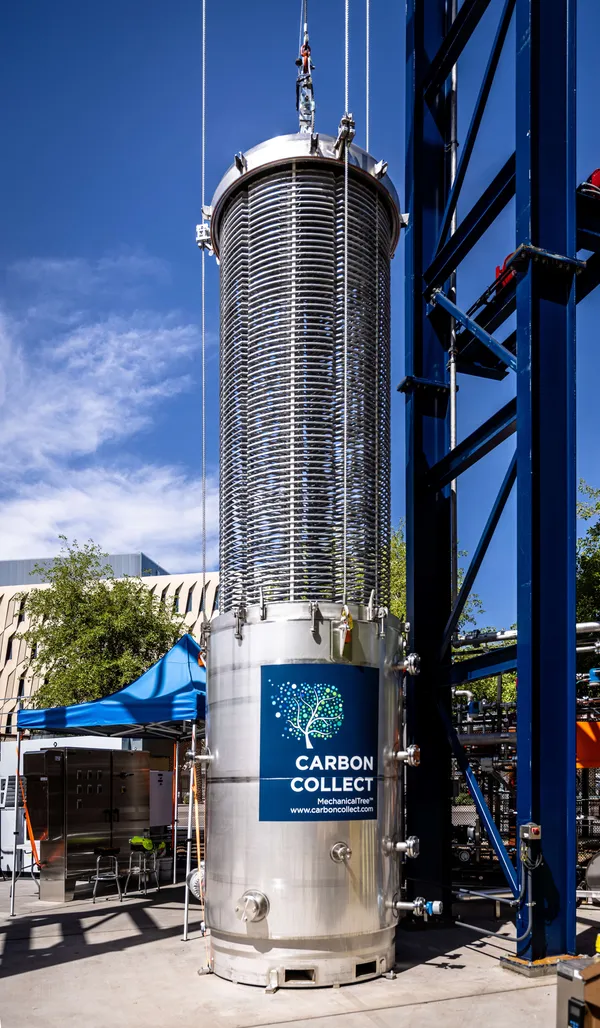
.jpg)
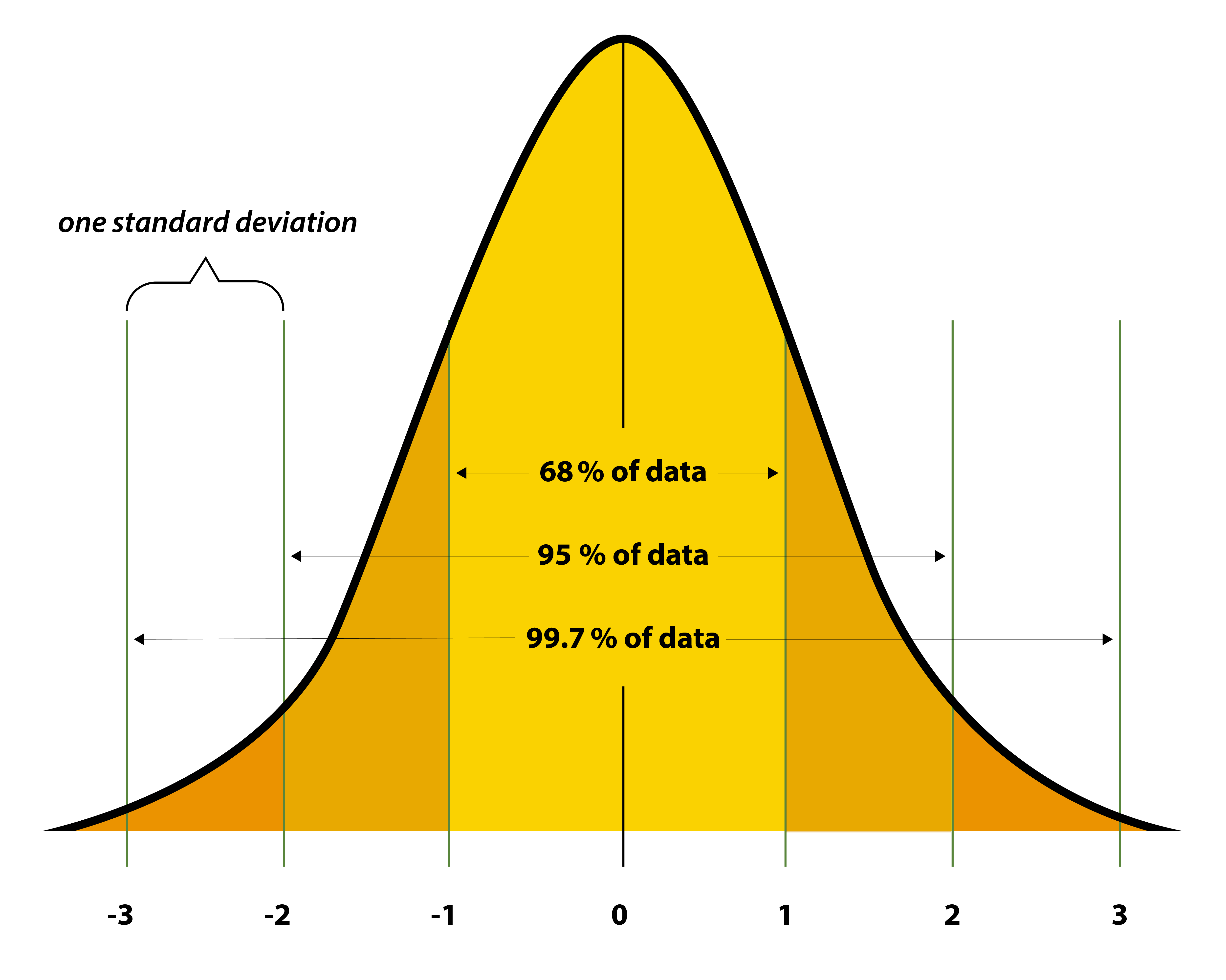
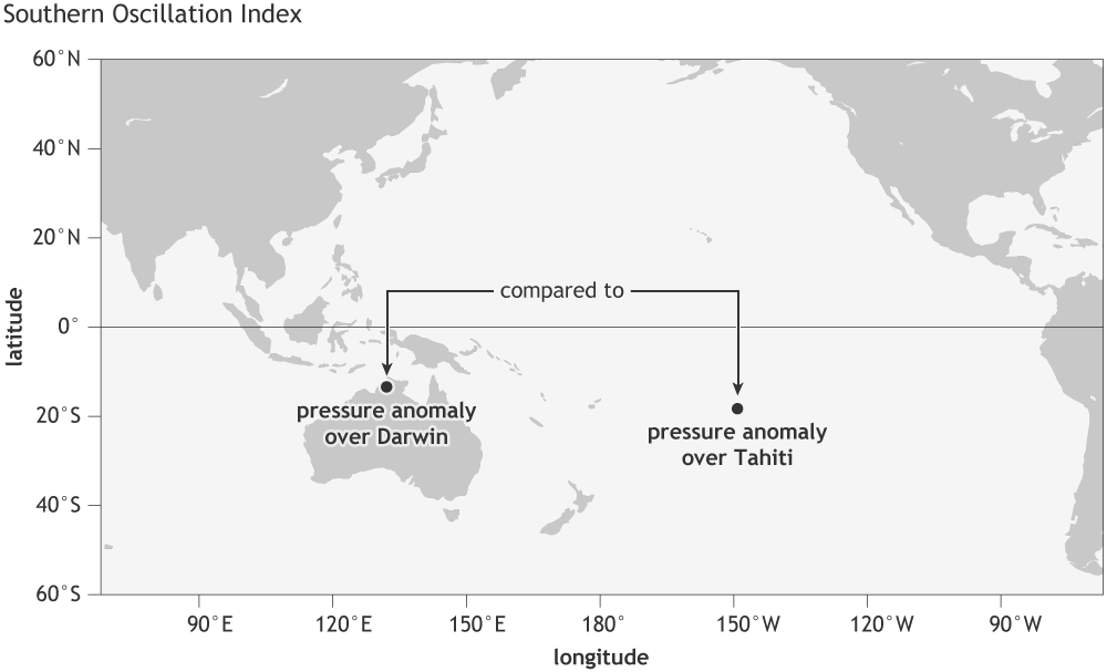
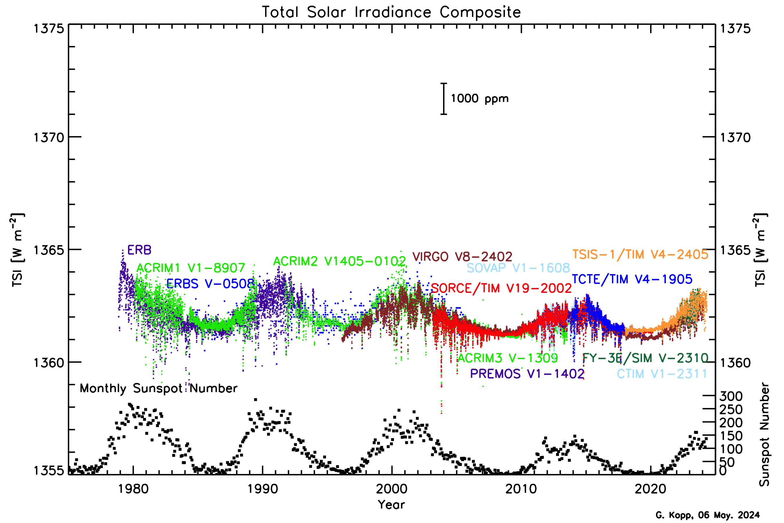
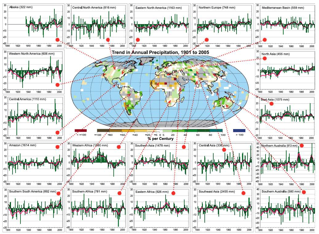
These schemes might seem rather fanciful and far-fetched, but, in fact, they are quite implementable. Air capture has already proven feasible. In 2008, scientists, in a review study, estimated that a basic carbon capture tower could remove up to half of the CO₂ from incoming air. That sounds great, what's the catch?!
The challenge lies in the technology's cost-effectiveness—how expensive it is to remove one "unit" (whatever that may be) of carbon dioxide. Capturing CO₂ from diffuse levels in the atmosphere is far less efficient than capturing it from concentrated sources, as in traditional CCS systems. Consequently, air capture is currently less viable than cheaper alternatives.
That said, air capture may become an essential tool as the cost of emitting carbon rises through carbon pricing or as climate risks escalate. If global CO₂ levels reach dangerous thresholds, air capture could be the only way to stabilize or reduce atmospheric CO₂ concentrations rapidly. Air capture holds unique promise for actively lowering atmospheric CO₂ levels.
Unlike other geoengineering solutions that we'll talk about next, air capture addresses the root problem: rising CO₂ levels. While air capture faces significant technological and economic hurdles, its potential to reverse atmospheric CO₂ accumulation makes it an essential option in our climate mitigation toolbox. As the urgency to stabilize global temperatures grows, air capture could play a pivotal role in achieving a sustainable climate future.
Quiz Yourself...
Solar Radiation Management: Casting a Shade on Warming
Solar Radiation Management: Casting a Shade on WarmingPrioritize...
After completing this section, you should be able to:
- Define "solar radiation management" and describe two ways it can theoretically be done.
- Explain the potential drawbacks of emitting sulfate aerosols either near the surface or high up into the atmosphere.
Read...
Solar radiation management (SRM) is one of the most widely discussed and controversial geoengineering approaches. Unlike methods such as carbon capture and storage (CCS) or direct air capture, which focus on reducing greenhouse gas concentrations (in other words, lowering the amount of carbon dioxide in the atmosphere), SRM aims to counteract the warming effects of these gases by reducing the amount of solar radiation that reaches the Earth's surface. Remember our energy budget model from earlier in this class: we can "turn down" the sun's energy input and offset warming that way, too. This can be achieved in two primary ways: decreasing the total solar energy received (effectively reducing the solar constant) or increasing the Earth's ability to reflect radiation back into space (increasing the planet's albedo).

So, how might we do this? One potential method involves introducing sulfate aerosols into the lower troposphere (the region of the atmosphere closest to the surface), which has already happened unintentionally as a byproduct of industrial activity. These aerosols act like tiny mirrors, reflecting sunlight, and have offset some greenhouse warming over the past few decades. In some ways, this gives us a glimpse into how intentional manipulation of the Earth's shortwave (i.e., solar) radiative balance might work. For example, removing sulfur scrubbers from smokestacks or intentionally not installing them in emerging economies like China could sustain or increase the current sulfate aerosol burden. This cooling effect could, in theory, act as a "free pass" for some portion of the CO₂ emissions we’ve already added to the atmosphere.
Hopefully, your immediate reaction is: "Adding more particulate matter and aerosols to the atmosphere seems like a bad idea." You’d be right—there are some serious drawbacks to this approach. Sulfate aerosols contribute to problems such as acid rain and air pollution. This approach might be the definition of "robbing Peter to pay Paul."
Another, more ambitious strategy involves injecting sulfate aerosols into the stratosphere rather than the troposphere, mimicking the natural cooling effect of large volcanic eruptions, such as Mount Pinatubo in 1991. The idea is to periodically load the stratosphere with enough aerosols to reflect sunlight and offset the warming caused by greenhouse gases—essentially, artificially creating the cooling effects of a volcanic eruption on a regular schedule. For example, if CO₂ levels are limited to double pre-industrial concentrations, a Pinatubo-scale injection would be required approximately every six years to keep the planet's temperature stable. For higher CO₂ levels, more frequent injections would be necessary.
Technological proposals for stratospheric aerosol injection include launching containers that release sulfate aerosols at high altitudes via balloons or dispersing them directly from aircraft flying in the lower stratosphere.

But how sensible and safe is the idea of solar radiation management? Just because an approach mimics a natural process doesn’t guarantee it’s harmless—sometimes, it can be "too much of a good thing." Some scientists support this approach, arguing that the urgency of the climate crisis might make it necessary. If we cannot implement emissions reductions, carbon capture, or air capture quickly enough to avoid crossing the threshold of dangerous anthropogenic interference (DAI) with the climate system, geoengineering methods like stratospheric sulfate aerosol injection might be needed as a last resort.
However, there are significant challenges and risks. For one, the cooling effect of SRM is not uniform across the globe, much like the uneven impacts of a large volcanic eruption. Changes in atmospheric circulation could lead to uneven temperature effects, cooling some regions significantly while others, such as parts of the Arctic, might continue warming. This uneven warming could accelerate Arctic sea ice loss or Greenland ice sheet melting, compounding the very problems SRM seeks to mitigate. Precipitation patterns could also shift dramatically, with many continental areas drying out, threatening water supplies and agriculture. Additionally, sulfate aerosols worsen stratospheric ozone depletion, presenting a clear environmental tradeoff.
While other SRM approaches could avoid some of these issues—such as placing reflective mirrors in space or increasing the Earth's albedo by painting roofs and roads white—these alternatives face their own challenges. Many are prohibitively expensive or logistically unfeasible on the massive scale required. For instance, launching enough mirrors into space to counteract existing warming would cost more than one trillion U.S. dollars, not including the cost of positioning and maintaining those mirrors. Furthermore, none of these strategies address rising CO₂ levels, leaving ocean acidification—a critical problem—entirely unmitigated.

One notable advantage of SRM is its rapid deployability, offering a faster response compared to the slow pace of greenhouse gas mitigation. However, this quick implementation comes with its own dangers. If the world becomes reliant on SRM to offset warming, any disruption—whether due to war, economic collapse, or sabotage—could abruptly halt its deployment. Imagine developing a strategy to release sulfate aerosols into the stratosphere for decades, only to suddenly stop. This immediate cessation would almost certainly unmask decades of accumulated greenhouse warming in a matter of months, resulting in climate changes far more rapid and severe than what would have occurred otherwise. Reliance on SRM, therefore, introduces a precarious dependency.
Quiz Yourself...
Oceanic Iron Fertilization: Feeding the Ocean to Cool the Planet
Oceanic Iron Fertilization: Feeding the Ocean to Cool the PlanetPrioritize...
After completing this section, you should be able to:
- Define iron fertilization of the ocean, explain how it works, and give at least one example of a potential drawback.
Read...
Finally, let’s dive into another possible but controversial geoengineering idea: iron fertilization of the oceans. Unlike CCS or air capture, which focus on directly capturing and storing carbon, this approach seeks to amplify the natural carbon cycle. Think of it like having a morning cup of coffee or an energy drink—it’s not essential, but it gives your body a boost to perform better. Similarly, iron fertilization aims to "turbocharge" the ocean's natural processes to draw down more CO₂ from the atmosphere.
Phytoplankton, the tiny plants in the upper ocean, play a crucial role in the marine carbon cycle by taking up CO₂ from the atmosphere through photosynthesis. This is the first step in something known as the marine biological pump, where carbon absorbed by phytoplankton moves up the food chain. This pump not only helps regulate atmospheric CO₂ but also drives the transfer of carbon from the surface to the deep ocean, creating a natural mechanism for long-term carbon storage. Some organisms that consume phytoplankton produce calcium carbonate skeletons, and when these organisms die or create waste, their carbon sinks into the deep ocean, potentially locking it away for centuries. In theory, increasing phytoplankton productivity could amplify this process, leading to greater long-term carbon burial in the ocean!

The productivity of phytoplankton often depends on the availability of nutrients, particularly iron. Natural events like upwelling—when nutrient-rich deep water rises to the surface—can trigger phytoplankton blooms, dramatically increasing their activity fueled by newly available iron, nitrogen, and phosphorus. Because iron is a key limiting nutrient in many ocean regions, such as the North Pacific and North Atlantic, adding iron to these waters could, in principle, stimulate phytoplankton growth and enhance carbon sequestration. It's like fertilizing a garden—just as adding nutrients to soil can make plants grow faster and more abundantly, adding iron to nutrient-poor ocean regions could "fertilize" phytoplankton, sparking blooms that suck up CO₂ from the atmosphere.

As far-fetched as this may sound, it has already been attempted. About a decade ago, a company called Planktos launched efforts to fertilize the ocean with iron, though the project was ultimately abandoned due to a lack of funding and public support.
So... obvious question time. Does the concept hold promise? Limited research shows that iron fertilization can boost phytoplankton activity. However, studies measuring carbon fluxes suggest the main effect is simply a faster cycling of carbon through the upper ocean’s food web. This means the extra carbon absorbed by phytoplankton is quickly re-released into the atmosphere rather than being transported to the deep ocean for long-term storage. As a result, the effectiveness of iron fertilization in increasing true carbon burial remains highly uncertain.
Even more concerning is potential unintended consequences. Some studies indicate that iron fertilization could favor the growth of harmful or toxic plankton species, such as those responsible for red tides, which can devastate marine ecosystems and harm human health. Not good. These risks underscore the unpredictable nature of tampering with the complex and interconnected oceanic environment, making iron fertilization a controversial and uncertain path forward.

Quiz Yourself...
Geoengineering: What Could Possibly Go Wrong?
Geoengineering: What Could Possibly Go Wrong?Prioritize...
After completing this section, you should be able to:
- List eight potential unintended consequences of geoengineering and briefly explain the potential negative ramifications.
Read...
We’ve touched on some of geoengineering's potential downsides, but let’s examine these risks in more detail.
Alan Robock, a prominent climate scientist at Rutgers University, has conducted groundbreaking research on the effectiveness and potential dangers of geoengineering. In fact, he authored a piece, "20 Reasons Why Geoengineering May Be a Bad Idea", published in the Bulletin of the Atomic Scientists. Fear not; it isn't required reading, but if you are interested in this topic, I encourage you to read it! His work offers a thoughtful and critical examination of geoengineering’s promise and its significant risks.

Robock primarily focuses on the effects of the stratospheric sulfate aerosol solar modification scheme. Remember, this is the idea that we put billions of tiny little aerosol mirrors in the atmosphere, increasing the Earth's albedo and reflecting some sunlight back to space to help cool us down. But this scheme is certainly not without pitfalls! Robuck outlines some of them as follows.
Effects on Regional Climate
Stratospheric sulfate aerosols wouldn’t offset global warming evenly. Some regions would cool, while others could experience warming. Shifts in atmospheric circulation would result, likely leading to drying across many continental areas, with significant implications for water resources and agriculture.
Ozone Depletion
Injecting sulfate aerosols into the stratosphere could accelerate ozone-depleting chemical reactions, worsening the damage to the ozone layer and exposing the Earth to more harmful ultraviolet radiation.
Unintentional Warming
Sulfate aerosols in the lower stratosphere might sink into the upper troposphere and seed cirrus clouds, which could have a net warming effect. Cirrus clouds trap more heat than they reflect, potentially counteracting the cooling effects of the aerosols.
Reduced Solar Power Availability
Any strategy that reduces the amount of solar radiation reaching the Earth’s surface, whether through aerosols, mirrors, or cloud seeding, would diminish the efficiency of solar energy—a vital renewable resource.
Risk of Sudden Climate Change
If geoengineering efforts are abruptly halted—due to war, economic crises, or sabotage—the greenhouse warming masked by the geoengineering would resurface quickly. This sudden warming and the associated shifts in wind and precipitation patterns could be catastrophic for ecosystems and human societies.
Dependence on Geoengineering
Geoengineering could act as a “crutch,” enabling continued carbon emissions while avoiding immediate warming. However, this dependence would lock us into perpetual geoengineering. As CO2 levels rise, the interventions would need to grow increasingly extreme, leaving us with no option to reverse course without facing dire consequences.
Ocean Acidification
Geoengineering schemes like sulfate aerosols do nothing to address ocean acidification, often called the “other CO2 problem.” Without mitigating atmospheric CO2 levels directly, the increasing acidity of oceans will continue to pose grave threats to marine ecosystems and biodiversity.
Unintended Consequences
The Earth system is extraordinarily complex, and our understanding remains incomplete. Tampering with it could lead to unexpected outcomes, many of which are unlikely to work in our favor. These unintended consequences pose a major ethical and practical challenge to any geoengineering approach.
Quiz Yourself...
Adaptation Strategies
Adaptation StrategiesPrioritize...
After completing this section, you should be able to:
- List three areas that can benefit from climate-resilient strategies and give an example of a strategy in each area.
Read...
We've talked a lot about mitigation but not so much about adaptation since we defined it earlier in the lesson. Before we wrap this up, let's touch on some strategies here. Remember, adaptation is adjusting our systems and behaviors to cope with the impacts of climate change we can’t avoid.
As the impacts of climate change become increasingly apparent, communities must adapt to ensure their systems and resources remain functional and resilient. This is especially important for our infrastructure, agriculture, and water management. You may not think of them on a regular basis, but they are critical to sustaining daily life and economic stability. Imagine how the world would grind to a halt if roads were to disappear, if food were to quintuple in price, and if fresh, clean water couldn't come out of your tap. Let’s examine what climate-resilient strategies look like in each of these areas.
Building Climate-Resilient Infrastructure
Infrastructure is the backbone of modern civilization, encompassing everything from roads and bridges to power grids and urban water systems. However, much of our existing infrastructure was designed for a climate that no longer exists. For example, stormwater systems in many cities were built to handle rainfall patterns of the past 100 years, but we've already seen that we expect extreme rainfall rates to increase in a warmer world. Rising sea levels, stronger storms, and more frequent flooding are already straining these systems. Without proactive adaptation, failures in critical infrastructure could disrupt transportation, energy access, and public safety.
To address these risks, engineers and urban planners are turning to climate-resilient design. This means constructing buildings and infrastructure capable of withstanding the stresses of a changing climate. For example, cities in flood-prone areas are raising roads, building seawalls, and installing permeable pavement that allows water to drain naturally. Coastal regions are also rethinking development patterns, moving critical facilities like hospitals and power plants to higher ground. Additionally, designs that include redundancies—such as backup power systems and alternative transportation routes—can help communities recover more quickly from extreme weather events. Click on the graphic below to see a list of potential climate-resilient design strategies from the Boston Society for Architecture.

The emphasis on resilience isn’t just about protecting what we already have. It’s also an opportunity to modernize. By incorporating renewable energy systems and sustainable building practices, new infrastructure can reduce emissions while preparing for future climate conditions. Think of it as building not just for survival, but for long-term sustainability.
Adapting Agriculture to a Changing Climate
Agriculture is another cornerstone of human society that faces significant challenges from climate change. Shifting weather patterns, prolonged droughts, and more intense heat waves are already affecting crop yields and food security worldwide. For farmers, this means rethinking traditional practices and adopting new strategies to ensure the resilience of their operations.
One of the most promising approaches is the development and use of drought-resistant and heat-tolerant crops. These varieties are specifically bred to thrive in harsher conditions, helping to maintain productivity even when rainfall is scarce or temperatures spike. For example, scientists have developed strains of wheat and maize that can survive with less water and withstand prolonged heat—a critical advancement for regions increasingly affected by desertification.
Another important strategy is diversifying crops. Instead of relying on a single crop, farmers have begun planting a mix of varieties to spread risk. If one crop fails due to drought or pests, others may still thrive. In some areas, farmers are also shifting planting schedules to better align with changing growing seasons, ensuring that crops mature under optimal conditions. Advances in agricultural technology, such as precision irrigation and soil moisture sensors, also play a role by reducing water waste and maximizing efficiency.
Ultimately, agricultural adaptation is not just about maintaining food supplies—it’s also about preserving livelihoods. By equipping farmers with the tools and knowledge to adapt, we can help rural communities remain stable in the face of an uncertain future.
Rethinking Water Management for a Warming World
Water is a resource we often take for granted, but climate change is making it far less predictable. Some regions are facing more frequent droughts, while others are grappling with increased flooding. These changes disrupt water availability, complicating everything from agriculture to daily household use. To manage these challenges, new approaches to water conservation and efficiency are essential.
One key strategy is improving water storage and distribution systems. In areas prone to drought, this might involve building reservoirs to capture and store water during rainy periods. Similarly, updating leaky or inefficient infrastructure can help ensure that more water reaches its intended destination rather than being lost along the way. Urban areas are adopting "green infrastructure" like rain gardens and wetlands to absorb stormwater naturally, reducing the risk of floods while replenishing groundwater supplies.

Water conservation efforts are equally important. Simple changes, like installing low-flow fixtures and promoting water-efficient irrigation practices, can significantly reduce consumption. Public education campaigns are also critical, encouraging individuals and industries to use water wisely. For example, some cities now incentivize the use of recycled or "greywater" for non-potable purposes like landscaping and industrial cooling. Greywater refers to gently used water from sinks, showers, and laundry that can be treated and reused for purposes like irrigation or flushing toilets, reducing the demand for freshwater resources.
Finally, adapting water management means planning for extremes. This includes designing flood control systems that can handle the deluge of a 100-year storm and developing policies to allocate scarce water resources during prolonged droughts. By prioritizing both conservation and preparedness, communities can better navigate the challenges of an increasingly unpredictable water cycle.
Quiz Yourself...
Summary
SummaryRead...
We've covered quite a bit of ground -- what did we learn?
- Adaptation focuses on limiting vulnerability to climate impacts through measures like coastal protection, water management, and agricultural resilience, while mitigation reduces the extent of climate change by curbing greenhouse gas emissions or using geoengineering.
- A combination of adaptation and mitigation is necessary to reduce climate vulnerabilities effectively, as neither strategy alone can fully address the challenges of climate change.
- International climate policy agreements, such as the Kyoto Protocol and Paris Climate Agreement, establish frameworks for global cooperation on reducing emissions and adapting to climate impacts, with Kyoto focusing on binding targets for developed nations and Paris emphasizing voluntary commitments and shared responsibilities for all countries.
- Reducing energy intensity through improved efficiency in buildings, transportation, and industry minimizes energy waste, lowers greenhouse gas emissions, and supports a sustainable future while maintaining economic productivity.
- Electrification reduces carbon emissions by transitioning energy use from fossil fuels to cleaner renewable sources, which produce minimal emissions during operation, and enables efficient, low-pollution energy use across sectors despite the initial carbon footprint of infrastructure production.
- Sustainable development balances meeting societal needs with environmental protection by promoting practices like energy efficiency, renewable energy, and climate-smart agriculture, which mitigate climate impacts but may involve trade-offs such as economic shifts or infrastructure costs.
- Geoengineering involves deliberate large-scale interventions in Earth’s systems, such as carbon removal or solar radiation management, to counteract climate change, though these strategies remain theoretical and come with significant risks and trade-offs.
- Carbon capture and sequestration (CCS) aims to reduce emissions from large point sources by storing CO₂ underground, but challenges such as residual emissions, high costs, and geological risks limit its feasibility as a standalone climate solution.
- Air capture removes CO₂ directly from the atmosphere using natural methods like reforestation or technological solutions like artificial trees, but its effectiveness is limited by cost, efficiency, and the temporary nature of carbon storage in natural systems.
- Solar radiation management (SRM) aims to reduce warming by reflecting sunlight, using methods like sulfate aerosol injection or reflective surfaces, but it poses risks such as uneven cooling, precipitation shifts, ozone depletion, and reliance on potentially fragile systems.
- Oceanic iron fertilization aims to stimulate phytoplankton growth to enhance carbon sequestration, but its effectiveness in long-term carbon storage is uncertain, and it risks unintended consequences like harmful algal blooms.
- Geoengineering poses risks such as uneven climate effects, ozone depletion, unintentional warming, reduced solar energy efficiency, sudden climate change if halted, dependence on interventions, continued ocean acidification, and unpredictable unintended consequences, highlighting the complexity and ethical challenges of these approaches.
- Climate-resilient strategies include designing infrastructure to withstand extreme weather, adapting agriculture with drought-resistant crops and diversified practices, and improving water management through conservation, efficient distribution, and flood control systems.