Climate Models and Causality
Climate Models and CausalityPrioritize...
Upon completion of this page, you should be able to:
- Define "causality"
- Describe how climate model experiments are used by scientists to understand the impact of human activities on the climate
Read...
So, we have seen in previous sections that climate models have made some successful predictions in the past. Verification and validation give us reason to take them seriously. Can we use these models to go a step further than we already have? We have seen in previous lessons that modern-day climate change appears to be something out of the ordinary – we have lots of evidence that these changes are due to how humans are modifying the climate. Can we help use models to further build this link? This brings us to the topic of causality. Causality is just a fancy word that tells us why something happens, linking cause and effect. In the context of climate change, establishing causality means demonstrating that human activities, like burning fossil fuels and deforestation, are directly responsible for the changes we observe in the climate. It’s one thing to note that carbon dioxide levels are rising and the Earth is warming, but it’s another to show that one causes the other. The images below show the retreat of the White Chuck Glacier in Washington state between 1973 and 2006. We can see the glacier (a large, slow-moving mass of ice that forms over many years from compressed layers of snow) has retreated, and given what we know, we hypothesize that this is likely caused by climate change. But can we strengthen that link?
Climate models are powerful tools for exploring causality. How? By simulating both natural and human influences on the climate, scientists can compare the results and see which factors are driving the changes. Climate models are excellent laboratories for running "alternative" Earths. For example, we can test the impact of greenhouse gases on the planet without having a second Earth!
A climate model can be run with only the natural factors we've learned about, like volcanic eruptions and solar variations, to see what the climate would look like without human influence, making possible answers to questions like -- what would the year 2000 look like if humans weren't around? Think of that as our baseline question. Then, the model can be run again with human factors included, like greenhouse gas emissions and land-use changes. By comparing these simulations, scientists can see the impact of human activities on the climate. See the time series example below. The top panel shows what happens when we run more than 20 state-of-the-art climate models for more than 100 years using *only* natural forcings. We put in volcanos and natural emissions of things like dust and sea salt, but otherwise leave the climate alone. The blue curves are the models’ surface temperatures, and the black curve is what we’ve observed. Doesn’t really match up that well, huh?
Well, we can try something else. The bottom panel shows the same climate model recreations of the past climate, but now we add the changes in the system caused by people (remember, anthropogenic = “human-caused”). Suddenly, the red curve (the model average) does a nearly perfect job matching the black curve! This tells us something quite powerful – the only way scientists can develop a realization that matches what we’ve historically observed is by adding anthropogenic effects into the climate model. Experiments like this have been performed to show that consistent glacial retreat, like exhibited in the figure above, could have only occurred over the given 30-year period from anthropogenic induced atmospheric air warming and melting the ice.
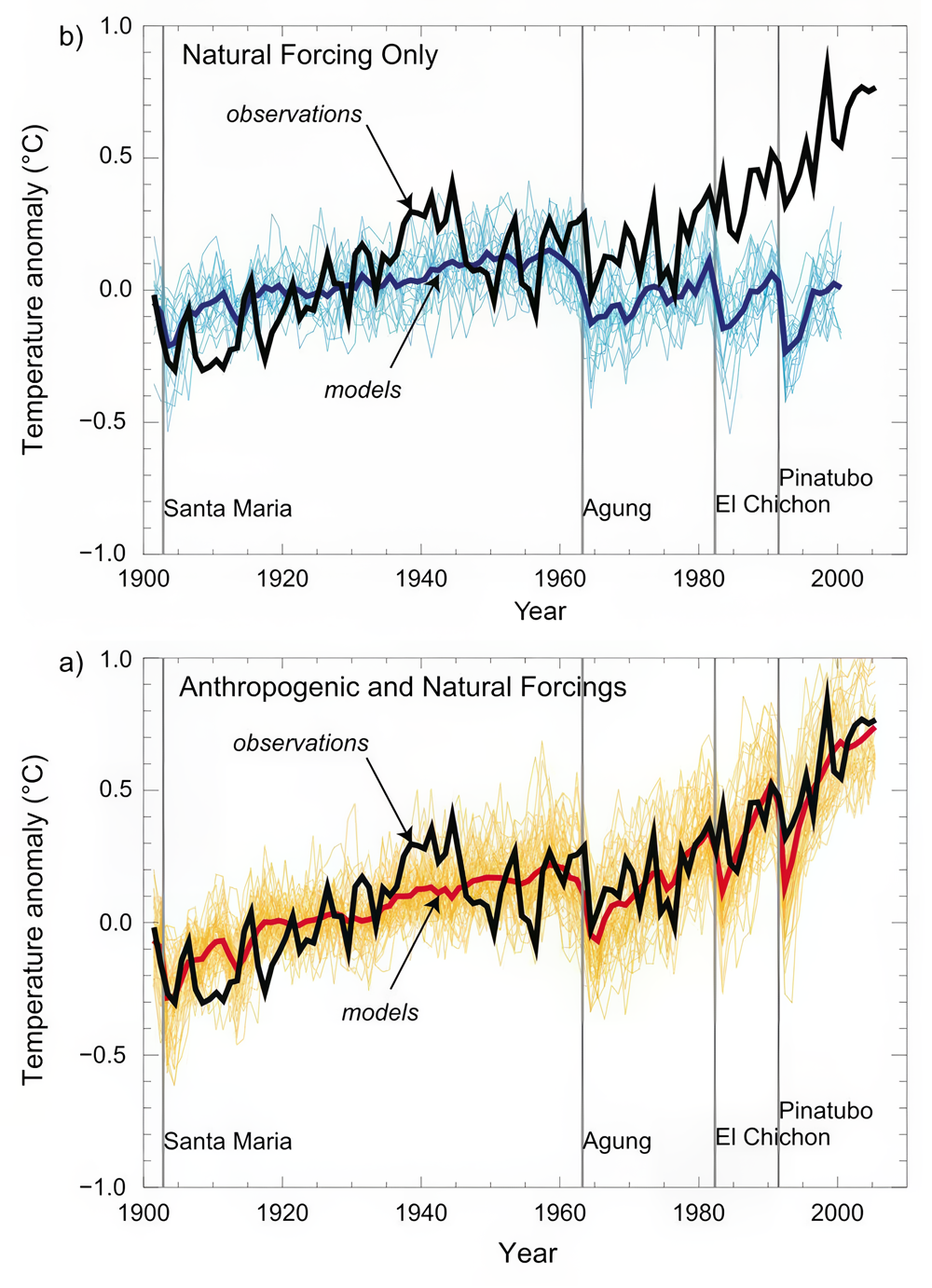
Model simulations of surface warming over the past century compared with observations for (top) natural forcing only and (bottom) natural + anthropogenic forcing.
Some might argue that this alone is not convincing evidence. Maybe, for instance, we have the trend in solar output wrong, and it just so happens to closely resemble the trend in human impacts like greenhouse gases and aerosols. If that's the case, we might be misinterpreting the good fit between our models and observations. Maybe we are just lucky!
Let's accept that criticism for a moment. Is there another way to compare observations and model predictions that might be more robust? Well, we can look at the patterns of response to different forcings. The surface expressions of warming due to solar output increases and greenhouse gas increases look quite similar. However, the vertical patterns of temperature change, as we discussed earlier, are expected to be quite different. Ah, our fingerprints have returned!
Let's go back to an example we used previously. The vertical pattern of response to increasing greenhouse gas concentrations is one where the troposphere (the lower part of the atmosphere) warms while the stratosphere (the upper part of the atmosphere) cools. Remember, this happens because greenhouse forcing is a zero-sum game: there's no increase in solar radiation at the top of the atmosphere coming in so, ultimately, the energy returning to space must equal it (energy in = energy out!); However, large changes in the distribution of energy within the atmosphere can occur. On the other hand, if the warming were due to increased solar output, we would expect the entire atmosphere to warm from top to bottom because of the increased radiation received at the top of the atmosphere (energy in going up). We have also learned that the temperature response pattern to explosive volcanic eruptions is different as well. Volcanic eruptions cause cooling at the Earth's surface and warming in the stratosphere due to the injection of aerosols, particularly sulfate aerosols that reflect sunlight and black carbon aerosols that absorb sunlight (both of these prevent solar radiation from making it to the surface). Greenhouse gas increases, increasing solar output, and volcanic eruptions each have their own unique fingerprint. So how can we use climate models to further confirm our suspicions about the planet warming? Check out the video below!
Video: Voiceover Climate Attribution (7:12)
Professor Colin Zerzycki: Okay, so what are we looking at here? What I'm showing you are actually the results of four different climate simulations. For our sake, we're going to say this is over the last 100 years. It's actually the period 1890 to 1999. What these plots are all showing is for different experiments, the warming trend over that century. So everywhere where you see yellows, oranges, and reds, that means that part of the atmosphere was warming. And everywhere where you see these blues all the way to these purples, that indicate that the atmosphere was cooling. And the other thing is, I'm going to show you the planet Earth. And then really what we're showing is a cross-section of those temperature trends. So, this area that's close to the Earth's surface. Remember, this is the troposphere. This is where weather occurs. This is where we live. And then as we get further away from the surface of the Earth, we get into these upper layers. And one of the upper layers we've talked about is the stratosphere. So, this panel over here on the right, this is essentially our best hindcast of what the climate system has looked like over the last 100 years.
So we're baking our cake, we're throwing in every ingredient that goes into the cake, and we're evaluating how the climate changes. But climate models are pretty cool in that they give us a test better, an experimental way that we could explore different kinds of Earths to really see what's going on. So, we can think about it almost like peeling back the layers of an onion. So, let's focus on these first three panels here. What I'm going to do is I'm actually going to run three different special climate experiments. In this first one, I'm only going to change how our solar input to the system has changed over the last 100 years. I'm going to essentially pretend that the only thing that could be changing temperature in the climate system is just how much sunlight is coming in at the top of the atmosphere. The second panel is going to look at only volcanic eruptions. So again, I'm going to hold everything else the same. The sun is going to stay the same. Emissions are going to stay the same. But what just happens when volcanoes emit aerosols, particularly into the stratosphere? And then this third panel is again going to hold the solar radiation fixed.
It's going to assume no volcanic eruptions, but it's going to represent the observed increase in greenhouse gasses that we've talked about throughout this semester. So, let's first come over here and focus on just increasing sunlight. So, we talked a little bit about this, especially in the last couple of lessons. But if we increase the amount of sunlight coming into the Earth system, we're increasing the amount of energy into the system. So, we should expect to see the temperature warm, and the temperature should actually warm fairly uniformly, whether we're close to the surface or whether we're up here in the stratosphere. And that is generally what we see. We see mostly a lot of yellow. We see a couple of these greeners or these less important warmings. They have to do with some changes in the circulation of the atmosphere. But for the most part, we see what we would expect. When we run the climate model with this particular configuration, we see a lot of yellow and a lot of yellow that's everywhere in the atmosphere.
So now we can over here to the effect of volcanoes. And remember, all we're doing here is we're just simulating volcanoes in the climate system. So what did we learn a few lessons ago? Volcanos emit a lot of particulate matter into the stratosphere. We're can persist for a fairly long period of time. This particular matter is mainly composed of two constituents, sulfate aerosols. Sulfate aerosols like to reflect incoming solar radiation, which prevents that sunlight from making its way to the surface. For example, the sunlight would come in, it would find a layer of sulfate aerosols, which are acting like tiny little mirrors, and it will get bounced back out to space. And what that does is it forms a broad general weak cooling in the troposphere. That's what we see. These colors aren't really high-intensity cooling. We're not seeing a lot of purples.
But close to the surface, we're seeing a decent amount of these greenish-type colors, which indicate either very little temperature change or a little bit of cooling. We also see a little bit of warming in the stratosphere. This is because of that black carbon aerosol that goes up. Remember, black carbon aerosols, they're black. Black things like to absorb solar radiation. As that sunlight comes in, Some of it gets reflected by the sulfate aerosols, but some of it gets absorbed by these black aerosols in the stratosphere, which warms the stratosphere. This is a very common fingerprint that we would expect to see with volcanic eruptions.
Then last over here in panel number 3, we see what is the warming trend just from increasing greenhouse gasses. We did talk about this in the past lesson. We said that if the amount of energy into the system is roughly the same, so if the amount of solar radiation is roughly the same, but we're emitting greenhouse gasses that are essentially acting like a blanket in the troposphere, what we're doing is we should see a warming signal that's relatively close to the surface in the troposphere, and we should see a cooling signal aloft because we have a zero sum game here. So if we have warming in the troposphere, it has to be balanced by cooling in the stratosphere. Again, not increasing the amount of sunlight that's coming in.
So, we have these three different experiments, we can call these things counter factuals. That's because they're essentially Earths that we are applying very special conditions to. So, remember, this fourth panel over here is We have our best simulation. This is our hindcast. This is where we take those curves that we were talking about, and we make sure that the verification and validation of the models looks really really good.
Of these first three panels, which one looks most closely like this fourth panel. Well, I don't really have to take a poll, but hopefully you guys are all pointing to panel number three. And what is that telling us? That is telling us that in addition to the observational fingerprints that we've talked about earlier, that climate models are providing even further evidence, even more clues, that the warming trends that we've observed over the last 100 years are due to greenhouse gas emissions. That's because our best guess certainly looks a lot like this climate simulation, where all we're doing is increasing greenhouse gas emissions. This really shows how climate models can be a very powerful tool for scientists to test hypotheses without having to create your own Earth in a different universe or wait hundreds of years to see how the climate is going to evolve.
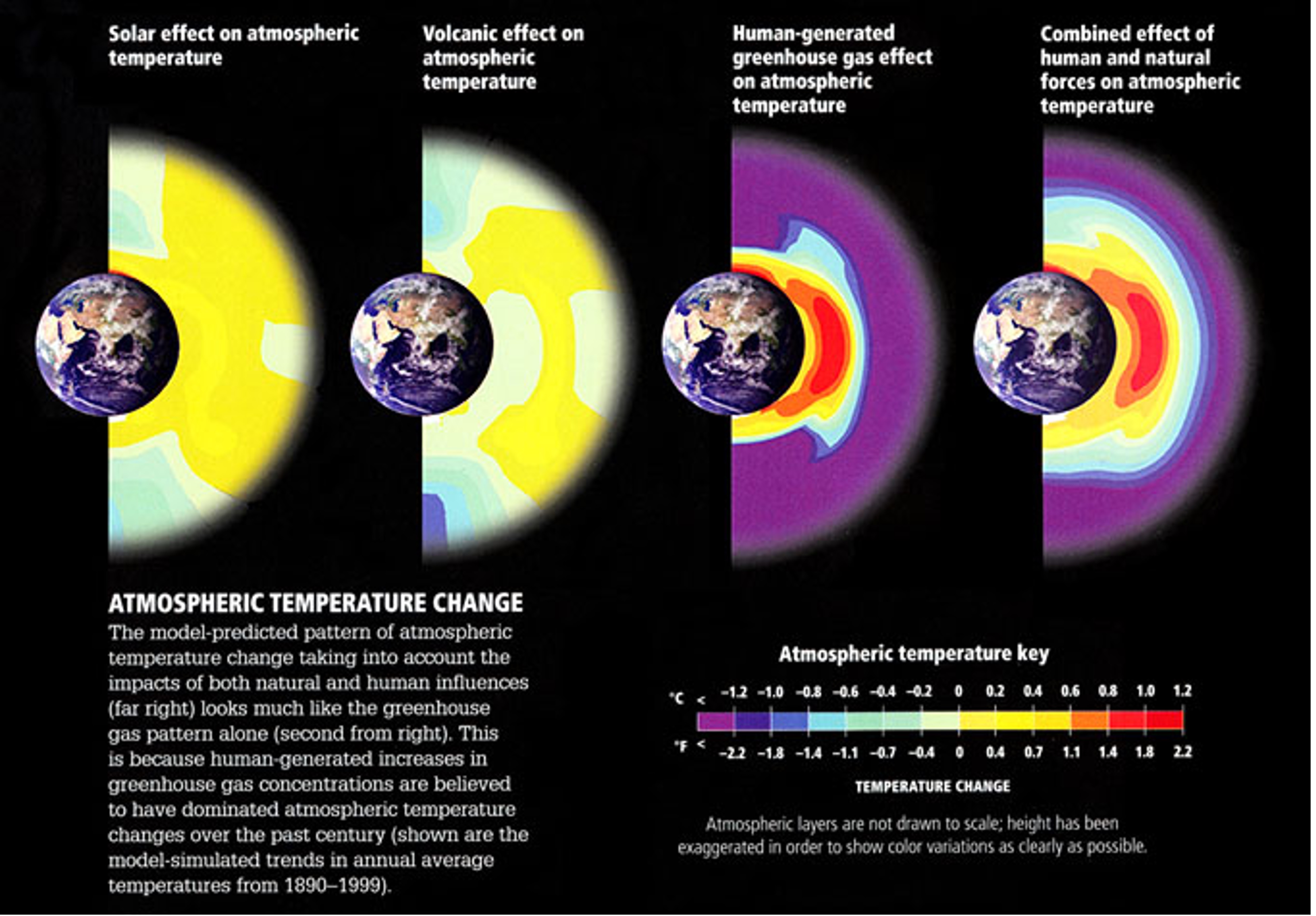
Atmospheric temperature change patterns from increasing solar output, volcanic eruptions, increasing greenhouse gas concentrations, and all three combined.