Lesson 10: Climate models and projections
Lesson 10: Climate models and projectionsMotivate...

In the last lesson, we focused on looking backward, understanding how Earth's climate has changed over time. But studying—and mitigating—climate change also requires us to look forward. What will the consequences of increased radiative forcing be? What solutions are available, and how effective might they be? How should we prioritize resources to address these challenges? To answer these questions, scientists rely on tools called climate models. While we don’t have an actual crystal ball to peer directly into the future, these models serve as our next best option—synthesizing decades of scientific knowledge to project what lies ahead.
In this lesson, we’ll uncover what a climate model is and take a peek inside the "black box." We’ll explore how models are built by coupling together different components of the Earth system—like the atmosphere, oceans, and land—and why they require massive supercomputers to handle the staggering number of calculations involved. We’ll also discuss the rigorous process of validation and verification that ensures models are reliable and up to the task.
Finally, we’ll examine how modeling centers from around the world collaborate to create climate scenarios and projections. These scenarios, developed using different codebases, assumptions, and strategies, collectively paint a picture of potential future climates. Together, they provide a powerful framework for understanding the possibilities ahead and for guiding informed decisions about the path we choose.
What is a Climate Model?
What is a Climate Model?Prioritize...
After completing this section, you should be able to:
- Define the term "model" in a scientific context.
- Describe, in basic terms, what a climate model's purpose is.
Read...
"It's tough to make predictions, especially about the future." This Danish "proverb" (often attributed to the baseball great, Yogi Berra) is especially apt now! Last lesson, we focused on how the climate has changed when we look backward. Past trends in air temperature and their consequences for ice coverage, sea level rise, atmospheric moisture, extreme weather, etc., are things that scientists have already observed. But what does the future hold? How will climate change impact us in 10 years? In 100 years? Answering those questions is challenging for scientists because of all the variables involved in predicting the future. In an ideal world, scientists could use some sort of identical planet, just like Earth, to compare observed changes to our climate to those without human influence on the identical planet. Kind of like a placebo. But no such planet exists! Therefore, scientists are forced to use the next best thing – a climate model.
First, let’s understand what a model is. In absolutely the most basic terms, a model is a simplified representation of a real-world system that helps us understand, explain, predict, or manage processes. Models can be physical objects, such as scale models of buildings or rockets, or abstract constructs, like mathematical equations and computer simulations.

Now, when it comes to science, models are often used to simulate complex systems by incorporating various different variables and how they interact with one another. By simplifying the real world, models allow scientists to experiment with different scenarios, make predictions, and explore outcomes of various changes in the system being studied. For example, in epidemiology, doctors build models to simulate the spread of infectious diseases. They may have variables like population density, temperature, whether people are locked down, etc. This helps researchers predict outbreak patterns, assess the effectiveness of interventions like vaccination, and plan public health responses.
At its core, that is also what a climate model does! It’s impossible to track every molecule in the Earth’s system at any given time. However, we can use what we have learned in this class to simplify the system and then use computers to predict what the future climate might look like. We can do things like add extra carbon dioxide to the atmosphere or remove aerosol pollution and see what happens... all without having to wait 100 years to find out!
There is a range of types of climate models, each varying in complexity and scope. When you hear the term “climate model” in some news article or even on TikTok, you should remember that it isn’t a one-size-fits-all term. For example, we can have "toy" models. These (very) simple climate models focus on basic processes and provide a broad overview of what is going on in the Earth’s climate system with minimal (or no!) need to use a computer. They often use basic concepts, such as the balance between incoming solar radiation and outgoing infrared radiation, to estimate changes in global temperature. They are simple enough that you can write them out with a pencil and paper.
Remember when we talked about the Earth’s equilibrium temperature in the context of radiation? Energy in = energy out? True story: we were actually “building a model!” Simple, yes, but useful for understanding how the climate system behaves!

Quiz Yourself...
Ingredients of a Climate Model
Ingredients of a Climate ModelPrioritize...
After completing this section, you should be able to:
- List at least three processes that are simulated in Earth system (climate) models.
- Understand that climate models are broken into different components.
Read...
All that said, when people talk about “climate models,” they aren't talking about these "toy" models. Usually, they mean something much more complex than what we can write out on a napkin at the bar! Earth System Models (ESMs) are detailed software programs (they are indeed just a bundle of computer code!) that show how the atmosphere and oceans behave on a global scale. They use complex mathematical equations to represent the movement of air and water, the exchange of heat and moisture, and other critical processes necessary to ensure we can model the climate in a way that matches what we actually observe. They can also be modified to include the carbon cycle, vegetation, and human activities—topics we’ve discussed before. ESMs aim to provide a comprehensive picture of the Earth's climate system by including natural cycles and human influences like greenhouse gas emissions and land-use changes.
While “ESM” is the technical term many scientists use (sometimes, this will also get abbreviated GCM, which stands for "general circulation model," although recently people have also been using the acronym for "global climate model"), we’ll go back to colloquially calling these tools generally “climate models” for the rest of this section.
A quick aside:
It’s worth noting that many of you are probably more familiar with weather models than climate models. At the very least, you’ve likely heard more about them on TV—your local meteorologist might say, “It’s a beautiful day right now, but the models suggest we’re in for a change by the end of the week!” A weather model is actually a specialized type of ESM (Earth System Model). Its purpose is to predict what will happen in the short term, looking just a few days to a week ahead, instead of years or decades into the future.
Climate models, on the other hand, are more complex. They need to simulate processes that are essential for estimating long-term trends in global temperature over the course of a century. For example, predicting whether the global mean temperature will rise by 4 degrees over the next 100 years is crucial, but on a weekly timescale, that’s not relevant. Entire ice shelves won’t melt in a few days—most weather models treat them as constant. But over decades, they’re a factor we can’t ignore. This difference means that weather models tend to be simpler and faster to compute, which is essential since we need updated weather forecasts multiple times each day!
How does a climate model work? While these models are incredibly complex—often the result of tens or even hundreds of scientists working on them full-time—we can break down the basics using the schematic below. This diagram focuses primarily on the atmosphere (appropriate for a METEO course!), but similar structures apply to other components of climate models, like those used to simulate the ocean and land.
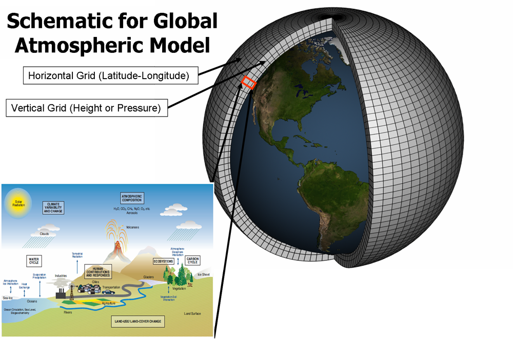
Climate models simulate the Earth’s climate by using mathematical equations to represent physical processes—many of which we’ve explored qualitatively (in other words, without too many equations!) in this course. These equations are solved on a grid covering the entire globe, where each grid cell represents a specific (two-dimensional) surface area or (three-dimensional) volume of air or water. So, State College, PA, may be surface area "grid cell number 421," while Sydney, Australia, may be "grid cell number 1078." Imagine the total collection of grid cells as the model’s “skeleton”—breaking the Earth up this way helps work through the complex, interconnected processes within each small piece, bit by bit until our model captures the whole system.
These climate models account for a range of factors, such as air and water flow, heat exchange, moisture distribution, and energy balance – all sorts of things we have learned about over the past few months! By running these climate models forward in time, they show how these elements interact, evolve, and change. This approach allows scientists not only to understand current climate patterns but also to make projections about future changes. To improve their accuracy, models are continually updated with our most recent understanding of how real-world processes work. A model in use today has been updated over a model from five years ago. And today's model will look archaic (hopefully!) in another decade!
How do these models simulate such a massive system? They’re divided into components—similar to the main parts we discussed at the beginning of this course (remember Lesson 1?). Each major component of the climate system is represented: the atmosphere, the ocean, the land, and ice-covered areas. For instance, the atmosphere component models air behavior, including wind patterns, air temperature changes, and precipitation. The ocean component handles water movement, currents, and heat exchange with the atmosphere. The land surface component tracks soil moisture, vegetation, and how the land absorbs and reflects sunlight. Finally, the cryosphere component models ice-covered areas, such as glaciers, sea ice, and snow, and their interactions with the rest of the climate system.
To illustrate this, take a look at the diagram below from the Department of Energy’s climate model. Each part of the climate system has its own dedicated “sub-model”—the atmosphere, land, ocean, etc.—and each sub-model addresses processes specific to that component. Together, these sub-models work to represent the entire climate system and its complex interactions.

Equations and data are at the heart of climate modeling. The equations rely on core physical laws like the conservation of energy, mass, and momentum, which describe how energy and matter move within the climate system through processes like radiation, convection, and the water cycle. Meanwhile, data are just as critical; they are produced by the real-world measurements necessary to set up and validate the models. These data come from sources like satellite observations, weather stations, and ocean buoys. By combining physical equations with observed data, climate models simulate past, present, and future climate conditions, enabling scientists to make informed predictions and study the possible impacts of climate change.
Quiz Yourself...
A Brief History of Climate Models
A Brief History of Climate ModelsPrioritize...
When you're finished with this section, you should be able to:
- Define what we mean by "fully coupled" climate model
- Define "supercomputer"
Read...
Climate models have grown remarkably complex over the past few decades as both computing power and our understanding of the Earth system have advanced. The graphic below shows how climate models have evolved, and as you can see, the earliest models from the 1970s were quite basic—they included only essential atmospheric processes and a few greenhouse gases. But with each passing year, we gain new insights, and our computers get more powerful. Today’s models (shown toward the bottom of the graphic) are far more sophisticated. They incorporate detailed representations of the land surface, oceans, and ice coverage, and they can simulate complex exchanges of carbon and water between the surface and atmosphere.

By the way, the acronyms, “FAR,” “SAR,” “TAR,” and “AR4” in the image above refer to the state of GCMs at the times of the first, second, third, and fourth assessment reports (AR) of the Intergovernmental Panel on Climate Change, respectively. We'll talk about the IPCC on and off through the rest of this class. For perspective, the first assessment report (FAR) was published in 1990, and the fourth (AR4) in 2007. There’s also been an AR5 and an AR6 since this figure was generated – over this time, climate models have become even more sophisticated. But even with the increasing sophistication of these models, the latest and greatest ones still can't match the true complexity of the real climate system. I’m not sure any of us will be alive to see every molecule of the atmosphere accurately predicted for the next 100 years!
The most advanced models today are “fully coupled,” meaning the atmosphere, land, ocean, and ice components all interact with each other within the model. Changes in the atmosphere impact the ocean and vice versa, creating a more realistic and interconnected simulation than simulating the two independently.
Want an analogy for "fully coupled?" Think of it like a football play -- yes, each wide receiver can run their own route and go off and do their own thing. However, the play is much more likely to succeed if all the players respond to each other. For example, we don't need three linemen blocking the same pass rusher; they need to interact and respond accordingly! While very simple, this ability to interact and respond is why it is important for the components of a climate model to be coupled, i.e., talk to each other within a model.

These incredibly sophisticated models demand enormous computing power to handle the sheer number of calculations they require. While some simpler climate models can actually run on your smartphone (yes, really!), the models used for studying global climate and informing policy decisions need vastly more power than what’s available to everyday consumers. To meet this demand, these models rely on the world’s fastest supercomputers—machines capable of performing trillions of calculations per second. Think of a supercomputer as thousands of laptops stitched together with cables, all working in perfect sync. Each grid cell in a climate model—each piece of its "skeleton"—has its own set of equations for energy, moisture, and momentum. Multiply this by thousands of cells spanning the globe, and the computational load becomes staggering. This isn’t something you can just run at home! Supercomputers break the problem into smaller chunks, assigning each piece to a different part of the system so they can all work simultaneously. To give you an idea of scale, the largest supercomputers boast more than a million times the processing power of the fastest consumer laptop.
The image above shows a worker at the NCAR-Wyoming Supercomputing Center inspecting a section of the water-cooling system for one of these supercomputers. Notice she’s working with just one "cabinet"—a tiny fraction of the full machine used for climate modeling. Each of those red and blue tubes carries water to cool a specific part of the supercomputer. To put it in perspective, each "small piece" of the supercomputer contains 128 "cores." For comparison, the laptop, tablet, or phone you’re using right now probably has between 1 and 4 cores. This immense power and scale are what make modern climate modeling possible.
Quiz Yourself...
What Climate Models Can Tell Us and What They Don't
What Climate Models Can Tell Us and What They Don'tPrioritize...
When you're finished with this section, you should be able to:
- Describe the difference between weather models and climate models and understand their purposes, limitations, and how they handle uncertainties to project short-term weather or long-term climate trends.
Read...
I've hinted we want to use these models to predict the future. And we'll get to that soon. But how do we know they are accurate? After all, if weather forecasts can’t always get it right two weeks out, how on Earth could a climate model possibly forecast characteristics of the climate 100 years from now? And I’ll say right now—that’s a fair question!
But here’s the thing: it’s not exactly a fair comparison. Comparing weather models to climate models is a bit of an “apples and oranges” situation. To produce accurate short-term weather forecasts, we need to get very specific about the details—high- and low-pressure locations, wind directions, exact temperatures, areas of precipitation, and so on, to start the forecast. These details are the initial conditions of the atmosphere, and to produce a perfect forecast, a model would need to start with a perfect set of initial conditions, i.e., a perfect picture of the atmosphere’s state (exact wind, temperature, humidity, etc.) everywhere on Earth at the same time. Because it’s impossible to measure every inch of the atmosphere at all times, achieving perfect accuracy is out of reach. So, while weather forecasts are generally good in the short term (a few days out), small errors in our “starting” conditions mean the forecast gradually diverges from reality when we try to look a week or more ahead.

On the other hand, climate models aren’t attempting to predict day-to-day weather patterns. They’re not designed to tell you if a hurricane will be in the Gulf of Mexico on August 14, 2067, or if the winter of 2078 will be snowier than usual. Instead, climate models focus on projecting large-scale climate trends (like changes in temperature, melting ice, and average rainfall) over decades. These projections are much less dependent on today’s exact weather. In other words, how warm the climate might be 100 years from now has very little to do with today’s specific wind direction or temperature at a given location. That means the small errors in initial atmospheric conditions that affect short-term forecasts don’t have the same impact on climate models.
Why? Because climate models are about predicting statistics and probabilities, not precise weather events. We’ve talked about dice-rolling a lot in this class, but imagine flipping a coin. You and I can’t predict accurately if the next flip will land heads (or tails), but we don’t need a computer model to know that over 1,000 flips, we’ll end up close to a 50/50 split between heads and tails. That’s how climate models work: they’re not trying to predict every “flip” but rather the long-term statistics, e.g., averages and trends, of important quantities.
Take some time, blow off some steam, and play with the coin flipper below.
Explore Further...
Head over to this online calculator: Coin Flipper
Those statistics are what we are interested in with climate modeling. For instance, they enable us to estimate the likelihood of certain outcomes, such as the probability of having a hotter-than-average year or the frequency of extreme weather events like hurricanes or droughts. Should people living along the Gulf of Mexico expect more or less heavy rainfall? Do we think the amount of snow falling over the ski resorts of the Rockies will increase, stay the same, or decrease moving forward?
We’ve already seen a figure like the one below, and I want to emphasize that this is exactly what a climate model is trying to predict. There are two probability curves: the gray one represents the current climate (let’s say the year 2020), while the black one represents a future climate (let’s say 2080). The horizontal axis is temperature, and the vertical axis shows how likely a particular temperature is to occur. There aren’t specific numbers on the axes, so feel free to imagine whatever region you like, anywhere from Miami to Fairbanks! While we can’t predict the exact temperature on, say, July 17th, 2080, the climate model gives us many “coin flips” or “dice rolls” for the days around that time. With enough of these simulations, we can build a distribution of likely temperatures.
In this case, the model shows us that, on average, days will be warmer. The coldest days won’t be as cold, and the hottest days will be even hotter. There’s still some overlap between the two curves, but the entire distribution shifts to higher temperatures. It’s a clear indication of how even small changes in the average climate can lead to noticeable shifts in extreme events.

Now, let's discuss limitations. Don’t let me oversell things—climate models aren't perfect, but they’re still invaluable tools. British statistician George Box said it best: "All models are wrong, but some are useful."
One significant source of uncertainty in climate models is the complexity of ocean processes. Oceans are Earth’s largest carbon reservoir, absorbing about half of the carbon dioxide emissions humans have generated so far, which has helped limit atmospheric warming. However, as the oceans take in more CO₂, their capacity to absorb it diminishes. The rate at which this happens depends on intricate interactions within the ocean that models don’t fully capture. Despite these uncertainties, ocean processes—and their immense heat capacity—are critical in shaping how quickly atmospheric temperatures rise in the future.
Another challenging area for climate models is clouds and water vapor. Clouds have a dual role: they cool the Earth by blocking incoming solar radiation during the day but also warm it by trapping infrared radiation. Which effect dominates depends on the types of clouds that form. As the planet warms and evaporation increases, the atmosphere will hold more water vapor—the most abundant greenhouse gas—likely leading to more cloud cover. But what kinds of clouds will dominate? Will the cooling or warming feedbacks of clouds prevail overall? These unanswered questions make cloud behavior one of the largest sources of variability in future climate projections.
Even with these uncertainties (and others), climate models remain essential tools for exploring potential future climates. They provide valuable insights by simulating how the climate system responds to different factors, even if some details are harder to predict. For instance, while the exact impact of increased cloud cover remains uncertain, models consistently predict continued warming if greenhouse gas emissions remain high. This agreement across multiple models and scenarios bolsters our confidence in the overall projections of climate change.
Moreover, climate models are constantly improving. Advances in satellite monitoring, ocean buoys, and other observational tools provide higher-quality data that enhance model accuracy. Researchers are also refining the mathematical representations of complex processes, such as ocean-atmosphere interactions and cloud dynamics, to reduce uncertainties. When scientists look back 20 years, they’re astounded by how much progress has been made—and we can only hope this trend continues!
Quiz Yourself...
Testing Climate Models: Validation
Testing Climate Models: ValidationPrioritize...
After completing this page, you should be able to:
- Define validation, verification, and hindcasting.
- Give at least two examples of how scientists might validate a climate model.
Read...
We finished off the last section by noting that climate models aren’t perfect, but they can be useful to scientists. Let's predict the future! But wait, I mentioned we first need to ask, how do scientists determine if they can trust models? Surprisingly, making future predictions is only a small part of a climate modeler’s job. A significant portion of their work focuses on testing the accuracy and reliability of the models themselves.
Testing climate models is essential for understanding and predicting the Earth’s climate system. Reliable models build confidence in their use for policy decisions, disaster preparedness, and long-term planning for climate change. Without rigorous testing, models could produce inaccurate predictions, leading to ineffective strategies for mitigating and adapting to climate impacts. In short, before scientists look ahead, they spend a lot of time looking back to ensure the models are up to the task.
So how do scientists do this? Validation involves comparing model outputs with independent observational data to determine how well the model represents reality. This process checks if the model can accurately simulate historical climate conditions and whether it can reproduce observed phenomena. Verification, on the other hand, focuses on ensuring that the model correctly implements the scientific theories and algorithms it is based on. This process involves code checking, debugging, and ensuring that the numerical methods used in the model are correctly executed.
Let’s talk about validation first. What is the best way to check if a climate model does a good job of simulating the Earth’s climate? Well, imagine you’re testing a new oven for making a birthday cake. You’ve made the cake before, and you know exactly how it’s supposed to taste, what kind of texture it has, how it should look... To test the new oven, you make the cake again and compare it to your previous cake. Does it look the same? Taste the same? If it does, then you can be confident that your new oven works. If, after one bite, everyone at the table spits it out, saying, "No more, I'm good," well, you have a problem with your new oven!
Climate modelers use a similar approach called hindcasting. Hindcasting is a technique where climate models are run backward in time to simulate past climate conditions. Technically, they aren't really run backwards, but climate models are *started* (the fancy word is "initialized") back in a previous year, say 1900, and they are then run to the present day. It's almost as if we took a time machine back to 1900 and tried to predict what was going to happen between then and now. Except we know what happened between then and now!
By comparing the model outputs with historical climate data, scientists can assess the model's accuracy. Hindcasting provides a robust test because the conditions are known, and the model's ability to replicate these conditions can be directly evaluated. This involves examining temperature records, precipitation patterns, and other climate variables over a significant period. If a model can accurately reproduce past climate variations, it increases confidence in its predictions for future climate scenarios. If my cake tasted good when cooked with the new oven yesterday, it's likely it'll taste good, even with some tweaks, when cooked with the new oven tomorrow.
Check out the graphic below. It compares the global average temperature over the past 50 or so years as predicted by a climate model built by NASA with what was observed. To “back test” the climate model, the model was run over the historical period from 1979 through 2023 and then the model predicted global mean temperature (black line) was compared with observations collected by surface stations and satellites (red line). The fact that the black and red lines are very close to one another provides confidence that the model is doing a reasonable job simulating the climate system, thereby providing confidence in using the model to predict future climate.

Observational datasets are a crucial part of validating climate models. And it’s not just surface temperatures that climate modelers focus on. Other observational datasets include information from satellites, weather stations, and ocean buoys. By comparing model outputs to these observations, scientists can assess how well a model captures various elements of the climate system, like temperature, humidity, and sea surface conditions. These comparisons go a bit above-and-beyond just tracking the global surface temperature For the cake analogy, in addition to tasting good, does your cake look nice? Does it have the right texture? The right amount of frosting?
Take water vapor, clouds, and precipitation, for example—quantities for which climate models are still improving. The graphic below illustrates how satellite data are used to verify the Department of Energy’s climate model. It shows satellite observations of atmospheric water vapor (gray/faint white shading) and precipitation (colors and bright white) alongside a “synthetic version” created by the model. By comparing the two, scientists can identify strengths and weaknesses in the model. For instance, in this graphic, the satellite observations are on top, and the model results are on the bottom. While the overall patterns of water vapor and precipitation are similar, the model appears “noisier” in the light gray contours. This tells scientists that tweaking certain equations or pieces of code might produce smoother results that align more closely with the satellite data. This could improve the model’s accuracy.
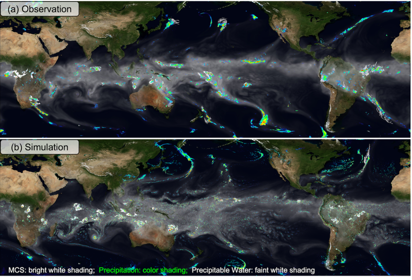
(top) Observed and (bottom) simulated amounts of atmospheric water vapor (faint white to gray shading), mesoscale convective system (MCS) clouds (bright white shading), and precipitation (color shading).
Quiz Yourself...
Testing Climate Models: Metrics and Verification
Testing Climate Models: Metrics and VerificationPrioritize...
After completing this page, you should be able to:
- Define "metric" and give at least one example of a climate metric used to evaluate climate models
Read...
When testing climate models, scientists can create petabytes of data. To put that in context, one petabyte would be 1,000 one-terabyte external hard drives... definitely not something you can keep in your dorm room! Creating petabytes of data is the byproduct of checking all the different parts of the model. Obviously, predicting temperature is important, but the model should be able to simulate winds and precipitation correctly in the atmosphere, as well as the ocean circulation and seasonal cycles of sea ice.
To quantify the accuracy of climate models, scientists use something known as “metrics.” Metrics are standard measures used to evaluate and compare the performance of different systems or models. For example, in education, standardized test scores are used as a metric to assess student performance and compare it across different schools and districts.
Key Definition:
A metric is a quantitative measure used to evaluate the performance of a climate model by comparing its outputs to observational data, reanalysis products, or other reference datasets. Metrics assess how well the model reproduces specific climate variables, patterns, or phenomena, such as temperature, precipitation, or atmospheric circulation, and are often used to diagnose errors, identify biases, and guide model improvements.
The figure below is one example of a performance metric chart used to evaluate different experimental versions of a single climate model (this one is from the Geophysical Fluid Dynamics Laboratory in Princeton, New Jersey) against various observed climate variables. Instead of creating maps, like we saw in the last section, scientists synthesize data into more bite-sized, easy to digest visuals. In the chart below, each cell represents the performance of each experimental version with respect to some observed variable; the color-coding indicates how well the model version matches the observations. It's essentially a way to squeeze thousands of maps into a single figure.
For example, the observed climate variables (listed on the y-axis) include Geopotential Height at 500 hPa, north/south Meridional Wind and east/west Zonal Wind at different atmospheric levels (200 hPa and 850 hPa which correspond to roughly 10 and 1 km above the ground, respectively), Top of Atmosphere (TOA) Outgoing Longwave (LW) “clear sky” and TOA Reflected Shortwave (SW) “clear sky” radiation, Mean Sea Level Pressure, Surface Air Temperature, and Precipitation. All of these variables have come up at various times earlier in this class. I'll be honest with you, if we've talked about them in this class, they are probably critical for assessing the climate model's accuracy in simulating different aspects of the climate system! The different experimental versions of the climate model are listed on the x-axis (i.e., each column is a different climate model).
How do you read this chart? The color scale ranges from blue to red, where blue means the model matches observations well (better performance), and red means it doesn’t match as well (worse performance). Yellow sits in the middle, showing “okay” performance. Each square in the chart is divided into four triangles, with each triangle representing a different season: DJF (December-January-February), MAM (March-April-May), JJA (June-July-August), and SON (September-October-November).
By looking at the color patterns, you can see how well a model performs across different variables and seasons. For example, if a row has mostly blue, all of the model versions are doing a great job for that variable. The goal is to find versions that consistently show better performance (more blue) across multiple variables, which helps track improvements in newer versions of the model. The chart also reveals how well models handle seasonal changes, giving scientists insights into strengths and weaknesses in simulating the climate throughout the year.
Take a moment
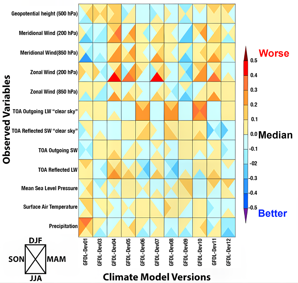
Performance characterization of different versions of a climate model from NOAA's Geophysical Fluid Dynamics Laboratory in terms of errors for various climate variables. The colors represent the error size, with blue being better and red worse, compared to the average error of all models. Each square is divided into four triangles representing the four seasons, showing how well each model performs throughout the year.
Alright, we've spent a lot of time talking about model validation, comparing model results to real-world observations, but now let's touch on verification before moving on. Verification is a quality check of the inner workings of the model itself. Think of it like double-checking your homework to ensure all the steps and calculations are accurate and logically sound. In climate modeling, this means making sure that the computer code and mathematical equations are doing exactly what they’re supposed to do. It’s about confirming that the scientific principles being modeled, like the conservation of energy or the dynamics of atmospheric circulation, are implemented correctly, without errors or bugs in the programming.
If we go back to our cake analogy, verification would be like double-checking the recipe before baking. Are we using tablespoons instead of teaspoons? Did we set the oven to the right temperature? Are we actually measuring all the ingredients correctly? It might sound tedious (and honestly, this part of climate modeling can be a bit “boring”), but it’s crucial. Without thorough verification, even the best scientific theories and principles could be misrepresented, leading to flawed simulations. Verification ensures that the foundation of the model is solid, so when scientists test new ideas or make predictions, they can trust the results are based on sound science, not a coding error. After all, you wouldn’t want your cake to flop because you accidentally doubled the salt instead of the sugar!
Quiz Yourself...
Model Intercomparison Projects (MIPs)
Model Intercomparison Projects (MIPs)Prioritize...
Upon completion of this section, you should be able to:
- Define what the acronym "MIP" means and why MIPs help compare climate models from around the world.
Read...
In the last section, we looked at results from three different climate models, one from NASA, one from the Department of Energy, and one from GFDL. And those are just three of the climate models developed in the United States! Globally, there are around thirty research groups that have their own fully developed climate models, depending on how you define "distinct" models (some can be better thought of as "families" where similar computer code gets shared between researchers).
So how do scientists compare all these models and share information to make our future predictions better? That’s where Model Intercomparison Projects (MIPs) come in—a collaborative approach to tackling these challenges.
Think of MIPs as a giant group science experiment where everyone follows the same procedure but uses slightly different tools and techniques. It’s a bit like those middle school physics contests where you build a contraption to protect an egg dropped off the roof of a building. Everyone follows the same rules—such as the height the egg is dropped from, the size limits of the contraption, or how many test drops you get—but you're free to develop your own creative strategy for keeping the egg intact. By comparing and contrasting designs, you can learn what works, what doesn’t, and how to improve your approach. In the same way, MIPs help scientists refine their models by identifying strengths and weaknesses across different methods.

These projects bring together multiple climate models and have them run under identical conditions. For example, they might tell every model exactly what the clouds should look like or specify how the ocean circulation behaves. The goal is to compare the range of outcomes these models produce and figure out where and why they might differ. By analyzing the similarities and differences, scientists can identify common errors and work collaboratively to refine their models, ultimately making climate predictions more reliable.
For example, many climate models struggle with what’s known as the "drizzle problem." This common error is called the "drizzle problem" because models tend to produce too much light precipitation, turning every day into a gray, misty one. Through MIPs, scientists realized that this issue was widespread across models from different research groups around the world. By working together, they developed strategies to address this error, improving a wide range of models. But the benefits of MIPs go beyond solving specific problems. These projects foster international collaboration and data sharing, pooling expertise and resources from scientists across countries and institutions. This collaborative spirit ensures that the global scientific community builds more comprehensive and robust climate models, essential for tackling global challenges like climate change.
MIPs also play a vital role in training the next generation of climate scientists. Participating in these large-scale projects provides early career researchers with hands-on experience using state-of-the-art climate models, while also allowing them to work alongside experienced scientists. This mentorship and collaboration are invaluable for building expertise and fostering innovation in climate science.

One of the most well-known MIPs is the Coupled Model Intercomparison Project (CMIP). Picture scientists from all over the globe, each running their climate models using the same starting conditions, like greenhouse gas concentrations, solar radiation, or volcanic activity. This standardized approach allows for a direct comparison of the outputs. I've shown one example here. Earlier in this class, we discussed the Atlantic Meridional Overturning Circulation (AMOC) and even watched a dramatic (and exaggerated!) clip from The Day After Tomorrow. The graph here shows what CMIP models, both the 5th generation (CMIP5) and 6th generation (CMIP6), predict for an AMOC "slowdown." Each line represents a different model. Despite all the models starting with the same setup, their outcomes vary, and that's actually a good thing... it ensures we're not relying on a single perspective! But when models from multiple centers consistently show a particular signal, like a future slowdown of AMOC, our confidence in that outcome grows. None of these models predict a complete shutdown of AMOC like in the movie, but the consensus points to a significant slowdown.
CMIP results are incredibly influential as a cornerstone of the Intergovernmental Panel on Climate Change (IPCC) assessment reports, which inform global climate policies and strategies. The collaborative troubleshooting process within CMIP is critical for refining models. For instance, if several models consistently overestimate the warming effect of greenhouse gases, researchers can dig into their assumptions and physics to identify the problem. These insights help make models more accurate and reliable, while also providing a range of possible future climate scenarios essential for risk assessment and planning. Speaking of scenarios, that’s exactly what we’ll dive into next!
Quiz Yourself...
Climate Models and Causality
Climate Models and CausalityPrioritize...
Upon completion of this page, you should be able to:
- Define "causality"
- Describe how climate model experiments are used by scientists to understand the impact of human activities on the climate
Read...
So, we have seen in previous sections that climate models have made some successful predictions in the past. Verification and validation give us reason to take them seriously. Can we use these models to go a step further than we already have? We have seen in previous lessons that modern-day climate change appears to be something out of the ordinary – we have lots of evidence that these changes are due to how humans are modifying the climate. Can we help use models to further build this link? This brings us to the topic of causality. Causality is just a fancy word that tells us why something happens, linking cause and effect. In the context of climate change, establishing causality means demonstrating that human activities, like burning fossil fuels and deforestation, are directly responsible for the changes we observe in the climate. It’s one thing to note that carbon dioxide levels are rising and the Earth is warming, but it’s another to show that one causes the other. The images below show the retreat of the White Chuck Glacier in Washington state between 1973 and 2006. We can see the glacier (a large, slow-moving mass of ice that forms over many years from compressed layers of snow) has retreated, and given what we know, we hypothesize that this is likely caused by climate change. But can we strengthen that link?
Climate models are powerful tools for exploring causality. How? By simulating both natural and human influences on the climate, scientists can compare the results and see which factors are driving the changes. Climate models are excellent laboratories for running "alternative" Earths. For example, we can test the impact of greenhouse gases on the planet without having a second Earth!
A climate model can be run with only the natural factors we've learned about, like volcanic eruptions and solar variations, to see what the climate would look like without human influence, making possible answers to questions like -- what would the year 2000 look like if humans weren't around? Think of that as our baseline question. Then, the model can be run again with human factors included, like greenhouse gas emissions and land-use changes. By comparing these simulations, scientists can see the impact of human activities on the climate. See the time series example below. The top panel shows what happens when we run more than 20 state-of-the-art climate models for more than 100 years using *only* natural forcings. We put in volcanos and natural emissions of things like dust and sea salt, but otherwise leave the climate alone. The blue curves are the models’ surface temperatures, and the black curve is what we’ve observed. Doesn’t really match up that well, huh?
Well, we can try something else. The bottom panel shows the same climate model recreations of the past climate, but now we add the changes in the system caused by people (remember, anthropogenic = “human-caused”). Suddenly, the red curve (the model average) does a nearly perfect job matching the black curve! This tells us something quite powerful – the only way scientists can develop a realization that matches what we’ve historically observed is by adding anthropogenic effects into the climate model. Experiments like this have been performed to show that consistent glacial retreat, like exhibited in the figure above, could have only occurred over the given 30-year period from anthropogenic induced atmospheric air warming and melting the ice.
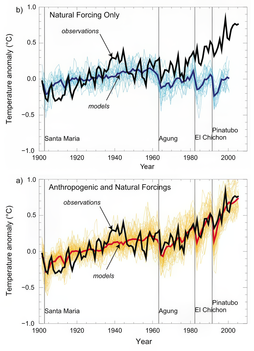
Model simulations of surface warming over the past century compared with observations for (top) natural forcing only and (bottom) natural + anthropogenic forcing.
Some might argue that this alone is not convincing evidence. Maybe, for instance, we have the trend in solar output wrong, and it just so happens to closely resemble the trend in human impacts like greenhouse gases and aerosols. If that's the case, we might be misinterpreting the good fit between our models and observations. Maybe we are just lucky!
Let's accept that criticism for a moment. Is there another way to compare observations and model predictions that might be more robust? Well, we can look at the patterns of response to different forcings. The surface expressions of warming due to solar output increases and greenhouse gas increases look quite similar. However, the vertical patterns of temperature change, as we discussed earlier, are expected to be quite different. Ah, our fingerprints have returned!
Let's go back to an example we used previously. The vertical pattern of response to increasing greenhouse gas concentrations is one where the troposphere (the lower part of the atmosphere) warms while the stratosphere (the upper part of the atmosphere) cools. Remember, this happens because greenhouse forcing is a zero-sum game: there's no increase in solar radiation at the top of the atmosphere coming in so, ultimately, the energy returning to space must equal it (energy in = energy out!); However, large changes in the distribution of energy within the atmosphere can occur. On the other hand, if the warming were due to increased solar output, we would expect the entire atmosphere to warm from top to bottom because of the increased radiation received at the top of the atmosphere (energy in going up). We have also learned that the temperature response pattern to explosive volcanic eruptions is different as well. Volcanic eruptions cause cooling at the Earth's surface and warming in the stratosphere due to the injection of aerosols, particularly sulfate aerosols that reflect sunlight and black carbon aerosols that absorb sunlight (both of these prevent solar radiation from making it to the surface). Greenhouse gas increases, increasing solar output, and volcanic eruptions each have their own unique fingerprint. So how can we use climate models to further confirm our suspicions about the planet warming? Check out the video below!
Video: Voiceover Climate Attribution (7:12)
Professor Colin Zerzycki: Okay, so what are we looking at here? What I'm showing you are actually the results of four different climate simulations. For our sake, we're going to say this is over the last 100 years. It's actually the period 1890 to 1999. What these plots are all showing is for different experiments, the warming trend over that century. So everywhere where you see yellows, oranges, and reds, that means that part of the atmosphere was warming. And everywhere where you see these blues all the way to these purples, that indicate that the atmosphere was cooling. And the other thing is, I'm going to show you the planet Earth. And then really what we're showing is a cross-section of those temperature trends. So, this area that's close to the Earth's surface. Remember, this is the troposphere. This is where weather occurs. This is where we live. And then as we get further away from the surface of the Earth, we get into these upper layers. And one of the upper layers we've talked about is the stratosphere. So, this panel over here on the right, this is essentially our best hindcast of what the climate system has looked like over the last 100 years.
So we're baking our cake, we're throwing in every ingredient that goes into the cake, and we're evaluating how the climate changes. But climate models are pretty cool in that they give us a test better, an experimental way that we could explore different kinds of Earths to really see what's going on. So, we can think about it almost like peeling back the layers of an onion. So, let's focus on these first three panels here. What I'm going to do is I'm actually going to run three different special climate experiments. In this first one, I'm only going to change how our solar input to the system has changed over the last 100 years. I'm going to essentially pretend that the only thing that could be changing temperature in the climate system is just how much sunlight is coming in at the top of the atmosphere. The second panel is going to look at only volcanic eruptions. So again, I'm going to hold everything else the same. The sun is going to stay the same. Emissions are going to stay the same. But what just happens when volcanoes emit aerosols, particularly into the stratosphere? And then this third panel is again going to hold the solar radiation fixed.
It's going to assume no volcanic eruptions, but it's going to represent the observed increase in greenhouse gasses that we've talked about throughout this semester. So, let's first come over here and focus on just increasing sunlight. So, we talked a little bit about this, especially in the last couple of lessons. But if we increase the amount of sunlight coming into the Earth system, we're increasing the amount of energy into the system. So, we should expect to see the temperature warm, and the temperature should actually warm fairly uniformly, whether we're close to the surface or whether we're up here in the stratosphere. And that is generally what we see. We see mostly a lot of yellow. We see a couple of these greeners or these less important warmings. They have to do with some changes in the circulation of the atmosphere. But for the most part, we see what we would expect. When we run the climate model with this particular configuration, we see a lot of yellow and a lot of yellow that's everywhere in the atmosphere.
So now we can over here to the effect of volcanoes. And remember, all we're doing here is we're just simulating volcanoes in the climate system. So what did we learn a few lessons ago? Volcanos emit a lot of particulate matter into the stratosphere. We're can persist for a fairly long period of time. This particular matter is mainly composed of two constituents, sulfate aerosols. Sulfate aerosols like to reflect incoming solar radiation, which prevents that sunlight from making its way to the surface. For example, the sunlight would come in, it would find a layer of sulfate aerosols, which are acting like tiny little mirrors, and it will get bounced back out to space. And what that does is it forms a broad general weak cooling in the troposphere. That's what we see. These colors aren't really high-intensity cooling. We're not seeing a lot of purples.
But close to the surface, we're seeing a decent amount of these greenish-type colors, which indicate either very little temperature change or a little bit of cooling. We also see a little bit of warming in the stratosphere. This is because of that black carbon aerosol that goes up. Remember, black carbon aerosols, they're black. Black things like to absorb solar radiation. As that sunlight comes in, Some of it gets reflected by the sulfate aerosols, but some of it gets absorbed by these black aerosols in the stratosphere, which warms the stratosphere. This is a very common fingerprint that we would expect to see with volcanic eruptions.
Then last over here in panel number 3, we see what is the warming trend just from increasing greenhouse gasses. We did talk about this in the past lesson. We said that if the amount of energy into the system is roughly the same, so if the amount of solar radiation is roughly the same, but we're emitting greenhouse gasses that are essentially acting like a blanket in the troposphere, what we're doing is we should see a warming signal that's relatively close to the surface in the troposphere, and we should see a cooling signal aloft because we have a zero sum game here. So if we have warming in the troposphere, it has to be balanced by cooling in the stratosphere. Again, not increasing the amount of sunlight that's coming in.
So, we have these three different experiments, we can call these things counter factuals. That's because they're essentially Earths that we are applying very special conditions to. So, remember, this fourth panel over here is We have our best simulation. This is our hindcast. This is where we take those curves that we were talking about, and we make sure that the verification and validation of the models looks really really good.
Of these first three panels, which one looks most closely like this fourth panel. Well, I don't really have to take a poll, but hopefully you guys are all pointing to panel number three. And what is that telling us? That is telling us that in addition to the observational fingerprints that we've talked about earlier, that climate models are providing even further evidence, even more clues, that the warming trends that we've observed over the last 100 years are due to greenhouse gas emissions. That's because our best guess certainly looks a lot like this climate simulation, where all we're doing is increasing greenhouse gas emissions. This really shows how climate models can be a very powerful tool for scientists to test hypotheses without having to create your own Earth in a different universe or wait hundreds of years to see how the climate is going to evolve.
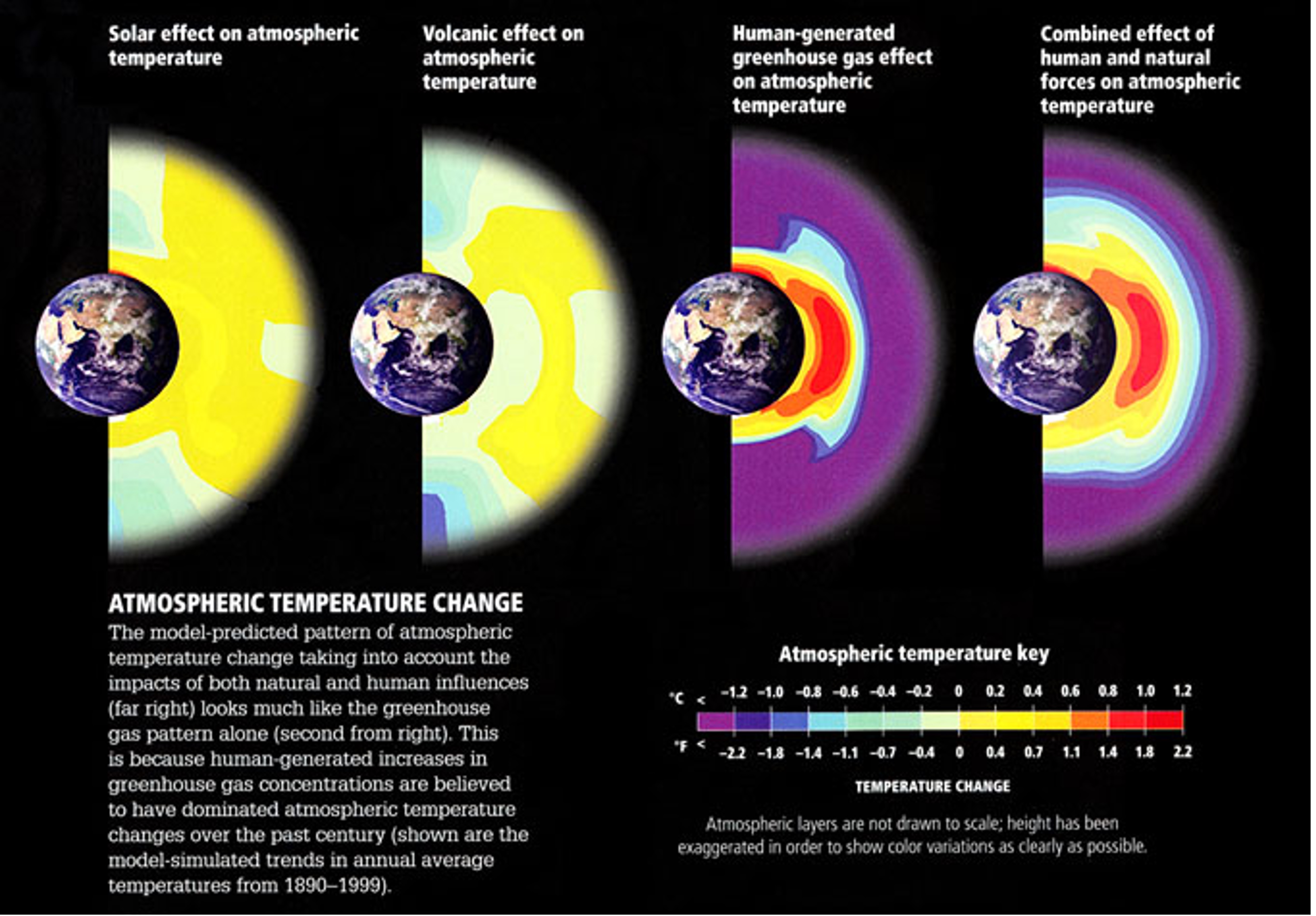
Atmospheric temperature change patterns from increasing solar output, volcanic eruptions, increasing greenhouse gas concentrations, and all three combined.
Quiz Yourself...
Scenarios
ScenariosPrioritize...
When you've completed this section, you should be able to:
- Define what a "climate scenario" is and why it is important for climate models to predict the future.
- Briefly describe how the scientific community defines scenarios has evolved over the past three decades, from Special Report on Emissions Scenarios (SRES) to Representative Concentration Pathways (RCP) to Shared Socioeconomic Pathways (SSP) and understand key improvements along the way.
Read...
OK, we've explored how climate models are excellent tools for "testing" different climate hypotheses, but I promised we'd also look ahead! Technically, projecting the future with these models isn’t all that complicated—we just start the models in the year 2025 and let them run forward. Remember, we're still focused on statistics, not predicting specific weather events or pinpointing exact outcomes.
But here’s the catch—when we “recreated” past climates with our models, we had the benefit of using observed data, like actual greenhouse gas concentrations. Looking forward raises a whole new set of questions! For instance, how will greenhouse gas concentrations change over time? Will they stabilize quickly, taper off later this century, or continue increasing at the same rate—or even faster? The answer depends on many factors, including technological advancements and decisions made by governments and policymakers about energy, the economy, and environmental priorities. If predicting future weather and climate is tough, predicting human behavior is even harder! To account for these unknowns, scientists use a range of scenarios to explore different possibilities for future emissions, air pollution, and land-use changes.
Scenarios: Mapping Out Plausible Futures
To address these uncertainties, scientists rely on something called scenarios. In climate modeling, a scenario is a “what if” story about the future. These stories give us plausible narratives for how greenhouse gas emissions, air pollution, land use, and socioeconomic conditions might evolve over time. For example, a scenario might imagine a future where humanity takes aggressive action to curb emissions by switching to renewable energy sources like wind and solar, while another might assume continued reliance on fossil fuels and little international cooperation between different countries. Importantly, these scenarios aren’t meant to predict the future—they aren’t crystal balls. Instead, they offer a way to explore different possibilities, helping scientists understand how various choices and actions could shape the climate.
Think of scenarios as roadmaps with different paths we might take, depending on technological developments, policy decisions, and societal priorities. Why are they important in this lesson? They act as inputs for climate models, setting the stage for researchers to simulate how the climate might respond under different conditions. Climate models are run multiple times under these different scenarios and by comparing the results, scientists can identify the potential consequences of specific pathways, providing valuable insights for policymakers, businesses, and communities. For example, one scenario might show limited warming if emissions peak soon and decline rapidly, while another might reveal significant warming and widespread impacts if emissions continue to rise unchecked. These insights help decision-makers weigh the risks and benefits of different strategies for addressing climate change. Over the rest of this page, we'll take a quick trek through the history of how these scenarios have evolved and changed.
The earliest storylines
Early in the history of climate modeling, scenarios were based on the Special Report on Emissions Scenarios (SRES), which came from the Intergovernmental Panel on Climate Change, or IPCC.
The Intergovernmental Panel on Climate Change (IPCC) is a United Nations body established in 1988 by the World Meteorological Organization (WMO) and the United Nations Environment Programme (UNEP) to assess the science related to climate change. It synthesizes research from scientists worldwide to provide policymakers with regular, evidence-based assessments on climate change, its impacts, and options for adaptation and mitigation. While the IPCC itself does not conduct research or develop models, it compiles and evaluates the results of climate simulations produced by General Circulation Models (GCMs) and Earth System Models (ESMs) from research institutions globally.
For climate models, the IPCC standardizes experiments and integrates model outputs into its Assessment Reports (ARs), which are published every six to seven years. These reports use scenarios like the ones we are learning about in this lesson to explore possible future climate trajectories based on different greenhouse gas emission levels and policy decisions. The IPCC’s work ensures consistency across models, enabling scientists to evaluate long-term climate risks and helping guide international climate policies like the Paris Agreement.
The SRES scenarios were quite simple. Each storyline painted a different picture of how global society, technology, and energy use might evolve... I won't make you remember the actual "letter/number" combinations, but some examples are...
- The A1 storyline imagined a highly globalized world with rapid economic and technological growth. Within this storyline, sub-scenarios ranged from fossil-fuel-intensive development (A1FI) to a balanced energy mix (A1B).
- The A2 storyline depicted a more fragmented world, focused on national identities and slower technological progress, resulting in less global cooperation.
- The B1 and B2 storylines assumed more sustainable futures, with B1 emphasizing global cooperation toward environmental stewardship, and B2 focusing on regional efforts to achieve sustainability.
These storylines gave scientists a framework for modeling a broad spectrum of futures, from optimistic to worst-case scenarios. For instance, under the B1 scenario, carbon dioxide (CO₂) concentrations were projected to double relative to pre-industrial levels by 2100. In contrast, the A1FI scenario envisioned a fossil-fuel-heavy future, leading to CO₂ concentrations that could quadruple pre-industrial levels. The figure below illustrates the carbon emissions per year and the atmospheric concentrations of CO2 associated with each scenario. The A1FI is kind of "off the charts" ballooning our CO₂ concentration, while the B1 scenario assumes countries aggressively work together to combat climate change.
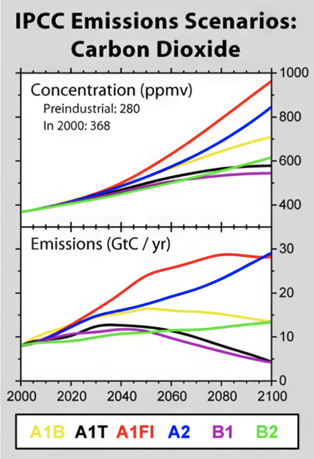
These early scenarios were groundbreaking because they represented some of the first systematic attempts to imagine and quantify possible futures for greenhouse gas emissions. They allowed scientists to model how different paths for economic growth, technological development, and societal choices could affect climate change. However, they had a notable limitation: they didn’t explicitly include the impact of policies aimed at reducing greenhouse gas emissions.
In other words, while the SRES scenarios accounted for broad societal trends—like whether the world became more globalized or whether economies relied more on renewable energy versus fossil fuels—they didn’t factor in specific actions to address climate change, such as implementing a carbon tax or international agreements. This omission meant that the scenarios couldn’t directly explore how intentional efforts to limit emissions might shape future climate outcomes. For example, they didn’t ask, “What happens if we aggressively cut emissions in the year 2030 to stabilize atmospheric carbon dioxide at a specific level?”
The Rise of RCPs: Adding Policy to the Equation
To address the gaps in earlier scenarios, the IPCC introduced Representative Concentration Pathways (RCPs) as part of its Fifth Assessment Report. These pathways offered a major improvement by explicitly including climate mitigation policies. Unlike the SRES scenarios, which focused on socio-economic storylines without specific climate action, RCPs are defined by their radiative forcing—the net change in Earth’s energy balance (in watts per square meter, W/m²)—projected for the year 2100. Remember, forcing measures how much energy the Earth retains due to factors like greenhouse gases, with higher values corresponding to greater warming. Bigger forcing numbers are like increasing the insulation on our cocoa mug, keeping more heat in!
Each RCP corresponds to a different level of radiative forcing, which in turn reflects varying levels of emissions and mitigation efforts:
- RCP2.6: This represents a very aggressive mitigation scenario where global greenhouse gas emissions peak soon and decline sharply, aiming to limit warming to around 2°C above pre-industrial levels. Achieving this pathway would require rapid reductions in fossil fuel use, widespread adoption of renewable energy, and potentially the use of negative emissions technologies like carbon capture.
- RCP4.5: This scenario assumes moderate mitigation efforts, leading to emissions peaking mid-century and then declining. It reflects a future where policies are implemented to stabilize emissions, and the radiative forcing is stabilized at 4.5 W/m² after 2100.
- RCP6.0: Similar to RCP4.5, but with less ambitious mitigation, this pathway assumes emissions stabilize later in the century, leading to a higher radiative forcing of 6.0 W/m². This scenario might represent a slower global transition to renewable energy or delayed policy implementation.
- RCP8.5: Often referred to as the “business-as-usual” scenario, this pathway assumes no significant global efforts to reduce emissions. Fossil fuel use continues to rise, and radiative forcing reaches 8.5 W/m² by 2100, leading to the highest levels of warming among the RCPs. This scenario is often used to explore the potential worst-case outcomes of climate change.
What makes the RCP scenarios stand out compared to the older SRES scenarios? Let’s look at one example (in the figure below). The RCP scenarios began incorporating projections for factors like human population (left in the chart) and gross domestic product ( GDP, center) when estimating carbon dioxide emissions (right).
Take population growth, for instance. If the Earth’s population grows, it means more demand for energy. Even if renewable energy production increases, a larger population often means we’ll still need to rely more on fossil fuels to bridge the gap. The RCP scenarios take this into account with a straightforward assumption: “more people, more energy demand, more emissions, more carbon dioxide.” While this might feel like an oversimplification, at first glance, it tracks.

© 2015 Dorling Kindersley Limited.
From RCPs to SSPs: Incorporating Human Choices
While RCPs marked an important step forward in projecting future climate scenarios, they still had limitations. One key shortcoming was their lack of direct linkage to specific socioeconomic and policy decisions. For instance, RCPs focused solely on the resulting greenhouse gas concentrations and radiative forcing levels. They did specify policies but in sort of a magic "global-dictator" like sense (i.e., the world will do X in year Y). However, they didn't incorporate how human choices—like technological innovation, economic trends, or political agreements—might lead to those outcomes.
To address this gap, the Sixth IPCC Assessment Report introduced Shared Socioeconomic Pathways (SSPs). SSPs provide an even more comprehensive framework by integrating socioeconomic factors like inequality, energy policies, and international cooperation into climate projections. This approach helps scientists and policymakers understand not just where we might end up in terms of emissions, but how human decisions influence those trajectories. In other words, what path do we take along the way? As people are walking along the path, how do they make decisions when they come to a fork?
SSPs are named based on a combination of their socioeconomic pathway and associated radiative forcing level by 2100. The first number in the name indicates the general storyline of socioeconomic development (ranging from SSP1, which emphasizes sustainability, to SSP5, which focuses on fossil-fueled development). The second number refers to the radiative forcing level (in watts per square meter) associated with that pathway. For example, SSP1-1.9 represents a highly sustainable socioeconomic scenario paired with aggressive mitigation efforts, achieving a radiative forcing level of 1.9 W/m² by 2100. Similarly, SSP5-8.5 describes a fossil-fuel-intensive development pathway leading to 8.5 W/m² of radiative forcing.
Consider SSP1-1.9, often referred to as the "Sustainability" or "Green Road" pathway. This scenario envisions a world focused on sustainable development, where governments prioritize reducing inequality, investing in renewable energy, and achieving net-zero emissions by the middle of the 21st century. In this pathway, economic growth is high, but it’s decoupled from heavy reliance on fossil fuels, and there’s strong global cooperation to tackle climate challenges. SSP1-1.9 aligns with a radiative forcing level of 1.9 W/m² by 2100. In contrast, SSP5-8.5, known as the "Fossil-Fueled Development" pathway, assumes rapid economic growth fueled by continued reliance on fossil fuels, minimal policy intervention, and a lack of global cooperation. This scenario leads to a radiative forcing level of 8.5 W/m² by 2100, driving global warming toward the upper end of projections, with catastrophic consequences for ecosystems and human societies.

The SSP framework is incredibly flexible, allowing scientists to combine different socioeconomic pathways with varying climate policy assumptions to explore a range of future possibilities. Take a look at the figure above—it organizes the SSPs based on their challenges for climate mitigation (vertical axis) and adaptation (horizontal axis). Each pathway presents a unique narrative about how socioeconomic factors, such as population growth, economic trends, and policy decisions, might shape humanity's ability to address climate change.
For instance, SSP5 assumes high challenges for mitigation (we don’t take significant steps to reduce greenhouse gas emissions, meaning they continue to rise) but low challenges for adaptation (countries actively work together to address the impacts of climate change, such as sharing financial resources or providing disaster relief). On the other hand, SSP3 is much more troubling. In this scenario, greenhouse gas emissions remain high (placing it high on the y-axis), but countries become more isolated, focusing on their own interests and refusing to cooperate globally. This creates high challenges for adaptation as well, making it a scenario where the world struggles to effectively respond to climate impacts. This framework helps us understand how different choices and policies could influence our collective ability to address climate change.
Summary of the history of climate scenarios
I've included a handy-dandy table covering what we've discussed here so you can better interpret how our climate model scenarios have evolved from SRES to RCP to SSP.
| SRES | RCP | SSP | |
|---|---|---|---|
| Full Name | Special Report on Emissions Scenarios | Representative Concentration Pathways | Shared Socioeconomic Pathways |
| Introduced | 2000 | 2014 | 2021 |
| Socioeconomic Assumptions | Fixed, defined storylines (A1, A2, B1, B2) | Flexible, with implicit socioeconomic assumptions for achieving forcing targets. | Directly linked to human choices and policy decisions |
| Climate Policies | None | Based on radiative forcing targets | Included and linked to human choices |
| Radiative Forcing | Based on emissions | Core metric for defining scenarios | Combined with socioeconomic pathways (e.g., SSP1-2.6) |
| Emissions Pathways | Defined purely based on storylines | Flexible, driven by radiative forcing targets | Based on socioeconomic and policy scenarios |
| Focus | Purely emission trajectories | Radiative forcing by 2100 | Combination of societal factors and climate forcing |
As of now, the SSPs are the standard framework used in climate models to predict the future, but that doesn’t mean they’ll stay this way forever. For example, SSPs currently focus on broad narratives of global cooperation or non-cooperation, but they don’t account for more specific geopolitical shifts, like the European Union expanding or breaking up. They also don’t factor in how humans might respond to major climate events—for instance, if a series of catastrophic global floods were to occur in 2050, it’s reasonable to expect policymakers to adapt quickly and change course. As our understanding of climate systems, geopolitics, and human behavior evolves, it’s likely that these frameworks will become more sophisticated. And, of course, we’ll need to keep updating our scenarios as real-world events and policies unfold in real time!
Quiz Yourself...
Climate Model Projections and Uncertainty
Climate Model Projections and UncertaintyPrioritize...
After completing this section, you should be able to:
- Define uncertainty and describe the two different types with respect to climate model projections.
- Describe the purposes of climate model projections and give at least three examples of things that can be predicted by climate models which can be used by policymakers
Read...
OK, we've talked about what climate models are, how they are built, their strengths and weaknesses, why we can trust them, and climate scenarios. But what we haven’t covered yet is how we use all this to actually make predictions! Let’s tie everything back together and look at how these pieces fit into the bigger picture.
Below is a figure taken from the IPCC Sixth Assessment Report (AR6). The AR6 is the most recent and comprehensive summary of the state of climate science, released by the Intergovernmental Panel on Climate Change (psst: we defined this last page). It synthesizes the latest research on climate change, including projections of future warming, impacts on ecosystems and society, and potential pathways for mitigation and adaptation. Essentially, this report is the global gold standard for understanding climate change and what it means for the future.
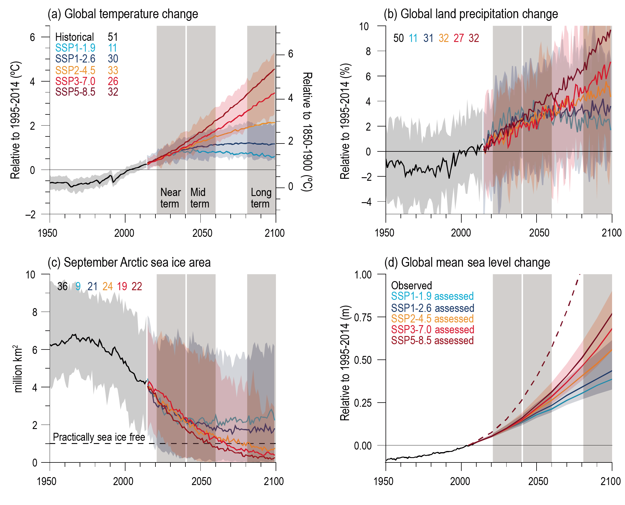
Model projections of future warming under various emissions scenarios. (See also Figure 4.2 in Chapter 4 of IPCC AR6 for similar, more up-to-date information in the context of SSPs.)
Figure 4.2 in IPCC, 2021: Chapter 4. In: Climate Change 2021: The Physical Science Basis. Contribution of Working Group I to the Sixth Assessment Report of the Intergovernmental Panel on Climate Change [Lee, J.-Y., J. Marotzke, G. Bala, L. Cao, S. Corti, J.P. Dunne, F. Engelbrecht, E. Fischer, J.C. Fyfe, C. Jones, A. Maycock, J. Mutemi, O. Ndiaye, S. Panickal, and T. Zhou, 2021: Future Global Climate: Scenario-Based Projections and Near-Term Information. In Climate Change 2021: The Physical Science Basis. Contribution of Working Group I to the Sixth Assessment Report of the Intergovernmental Panel on Climate Change [Masson-Delmotte, V., P. Zhai, A. Pirani, S.L. Connors, C. Péan, S. Berger, N. Caud, Y. Chen, L. Goldfarb, M.I. Gomis, M. Huang, K. Leitzell, E. Lonnoy, J.B.R. Matthews, T.K. Maycock, T. Waterfield, O. Yelekçi, R. Yu, and B. Zhou (eds.)]. Cambridge University Press, Cambridge, United Kingdom and New York, NY, USA, pp. 553–672, doi: 10.1017/9781009157896.006 .]
Let’s first focus on the top-left plot, which shows trajectories of projected warming from climate models. The metric plotted is our familiar "global average surface air temperature," shown as an anomaly (y-axis) relative to two baselines. The x-axis represents time, with the black line showing historical observations and the colored lines representing projections for the future based on different scenarios. But remember, we don’t have a precise crystal ball—we’re making statistical projections about what might happen going forward.
We also have to account for uncertainty in our projections. Uncertainty is the range of possible outcomes due to factors like differences in climate models, variability in the climate system itself, and unknowns about future human behavior (e.g., emissions pathways). This is why you see the shaded areas around the colored lines—they represent the “spread” or range of possible outcomes based on the same scenario. While we may not know the exact temperature in 2080, the models give us a clear picture of the general trends and the boundaries within which future warming is likely to fall.
There are actually two kinds of uncertainty shown in the top left panel of this figure! What are those two uncertainties you may ask?
Scenario Uncertainty:
This refers to the different colored lines in the figure, each corresponding to a distinct SSP. These lines represent the uncertainty in what path humanity will take in the future. For example, will we follow a low-emission pathway like SSP1-1.9 -- colored in blue, or will we continue on a high-emission trajectory like SSP5-8.5 -- colored in red? This uncertainty stems from the fact that we can’t predict human behavior—future technological advancements, policy decisions, or levels of global cooperation are all unknown. As we just learned about, these scenarios effectively bracket the range of potential futures, from aggressive mitigation efforts (SSP1-1.9) to a business-as-usual approach (SSP5-8.5). However, even these scenarios come with their own limitations. For instance, uncertainties in future aerosol emissions or how the carbon cycle might respond to increased emissions (e.g., feedback loops where warming causes more CO₂ release from soils or oceans) could influence the actual pathway. That said, the range shown in the graph gives a reasonable estimate of what is possible based on current knowledge and assumptions.
Physical Uncertainty:
This is represented by the width of the shaded areas within each scenario. Physical uncertainty reflects how different climate models simulate the same scenario! In other words, even if we knew exactly which emissions pathway we’d follow, different models would still produce slightly different warming outcomes. For example, while the solid red line corresponds to the average projection of surface air temperature associated with SSP5-8.5, the shading of the red reflects potential high and low projections for different models. Ah, now the idea of "model intercomparison projects" makes more sense!
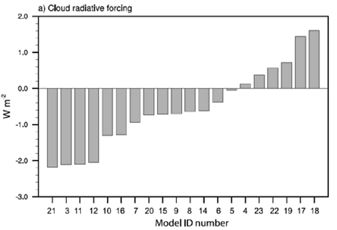
A significant portion of "physical uncertainty" stems from how physical processes —especially clouds—respond to increased greenhouse gases. As we discussed earlier, clouds have a dual nature: they can cool the Earth by reflecting sunlight or warm it by trapping heat. The balance between these effects, known as cloud feedback, varies considerably across models. Take a look at the figure below (from a slightly older IPCC report, but still illustrative). It shows the range of estimates for cloud radiative feedback across different models. Some, like model #21, exhibit strongly negative feedbacks (cooling effects that "turn down the dial" and offset some warming), while others, like model #18, show positive feedbacks (where warming triggers more warming in an amplified cycle). These variations help explain why the shaded areas in climate projections aren’t razor-thin—different models make different assumptions about the formation and dissipation of clouds, leading to a spread of possible outcomes.
Now, take another look at the first figure on this page and check out the other three panels. These show model projections for key climate impacts: how much precipitation falls over land (critical for understanding floods and droughts), the extent of Arctic sea ice, and the expected average rise in sea level due to thermal expansion and melting ice. In all these cases, the impacts are generally worse under the "higher" scenarios (warmer colors), but the degree of change isn’t uniform across all variables.
For instance, in the bottom right panel, shifting from SSP5-8.5 to SSP3-7.0 doesn’t significantly reduce sea ice loss. However, moving from SSP2-4.5 to SSP1-2.6 would preserve much more sea ice. This illustrates how complex climate decision-making can be—some actions might have a big impact on one issue but not much on another. Models are invaluable for guiding policymakers and the public by providing insight into potential outcomes, but ultimately, the decisions about how to mitigate and adapt to climate change rest with us, not the computers. And that’s exactly what we’ll dig into in the rest of this course!
Explore Further...
If you want to see more figures from the most recent IPCC report like the top one on this page, head here and click on "figures" for a treasure trove of climate model visualizations!
Quiz Yourself...
Summary
SummaryRead...
Climate models...
- are simplified representations of the Earth's climate system, allowing scientists to simulate and predict future climate changes by experimenting with variables like carbon dioxide levels and solar radiation.
- simulate interconnected components of the Earth's system (atmosphere, ocean, land, and ice) using equations and real-world data to study processes and predict long-term trends.
- have evolved to today’s fully coupled systems, incorporating interactions among atmosphere, ocean, land, and ice, powered by supercomputers.
- predict large-scale climate trends (not day-to-day weather) by using statistics and probabilities to assess long-term changes like temperature shifts and extreme weather patterns.
- are validated by comparing simulations to historical data (hindcasting), building confidence in future climate projections.
- use metrics to quantify accuracy against observations, helping diagnose errors and guide improvements, while verification ensures scientific principles are correctly implemented in the code.
- can be compared with Model Intercomparison Projects (MIPs) under standardized conditions, fostering international collaboration to refine models and improve predictions, such as resolving the "drizzle problem."
- establish causality by simulating natural versus human influences, demonstrating that human activities drive observed climate changes, like glacial retreat and global warming.
- are guided by scenarios that explore possible futures by varying assumptions about greenhouse gas emissions, policies, and socioeconomic trends, guiding climate model projections and policy decisions.
- uncertainty arises from unknown future emissions (scenario uncertainty) and variations among models (physical uncertainty), but models still provide critical insights into potential climate outcomes.