Lesson 9: Observations of Changes in Climate
Lesson 9: Observations of Changes in ClimateMotivate...

Imagine time as a long, winding road. Standing at our place in history, we have the unique ability to look both ways—into the past and into the future. Like any careful observer crossing a busy street, climate scientists make a habit of looking both ways, too. By looking back, we understand the changes our planet has undergone and gather clues to help us predict what might come next. In this lesson, we're turning our attention to the recent past to examine how Earth’s climate has changed up until today—particularly over the last few decades.
We’ll explore the warming patterns across different layers of the atmosphere, identifying signs of human impact that cannot be explained by natural variability alone. Greenhouse gases added by human activities have influenced more than just temperature: they’re reshaping ocean temperatures, increasing acidification, accelerating ice sheet melting, and driving sea-level rise. These changes cascade through the climate system, sometimes appearing as shifts in extreme weather—such as intense heatwaves, frigid cold snaps, heavy rains, and persistent droughts.
As we navigate these changes, we'll learn that scientists approach these patterns with varying levels of certainty. Some trends, like surface warming, have been observed with high confidence, while others, like shifts in hurricane behavior or drought frequency, remain more challenging to pin down. Looking back is crucial—not only for validating climate models but for grounding our understanding of future projections. So, as we embark on this journey into the recent past, we’ll focus on what observations reveal about today’s climate—and how these lessons from history help us prepare for the road ahead.
Modern Trends in Observed Temperature
Modern Trends in Observed TemperaturePrioritize...
At the end of this section, you should be able to
- Describe why surface temperature is straightforward to measure and summarize key trends observed in global surface temperatures over the past century.
Read...
In the last section, we talked about the increase in greenhouse gases due to human activities over the last few hundred years. Combined with our knowledge of how these gases work from earlier in the class, our working hypothesis is that they lead to an increase in the temperature of the planet by increasing absorption of upwelling radiation and emission of downwelling longwave radiation to the surface. But is that really what we see when we look at observations?

Lucky for us, surface air temperature is relatively easy to measure and is a variable that is (almost) always reported anytime someone makes a weather observation. Instrumented surface air temperature measurements consisting of thermometer records from land-based stations, including islands, and ships provide us with more than a century of reasonably good global estimates of surface air temperature change. There is a particularly high-density network in places where people have lived, but even rural areas generally have samples from farmers and ranchers (and passionate amateur meteorologists!). Some regions, like the Arctic and Antarctic, and large parts of South America, Africa, and Eurasia – either due to a lack of people or means for temperature measurement – were not very well sampled in earlier decades, but records in these regions become available as people moved into them in the mid and late 20th century. Today, we now cover the planet with surface air temperature measurements using an expansive observer network.
Did You Know
Did you know that aside from penning the Declaration of Independence, Thomas Jefferson was an avid amateur meteorologist? His fascination with weather began years before the American Revolution, meticulously recording daily weather readings near his Virginia home. On his pivotal journey to Philadelphia for the Declaration's signing, Jefferson didn't forget his passion, stopping to buy a thermometer. He even devised a plan in the 1770s to establish a network of weather observations across Virginia, distributing thermometers for consistent data collection. You could argue that Jefferson was a bit before his time – his thoughts foreshadowed the National Weather Service's extensive network of over 12,000 weather stations nationwide. On the historic day of July 4, 1776, Jefferson recorded conditions in Philadelphia as mostly sunny in the morning, with increasing clouds and temperatures in the mid-70s by the afternoon—a fair-weather backdrop for America's birthday!
So, what do our observations of air temperatures tell us when it comes to looking at how they change over time? Remember way back to our early lectures — air temperature variations are typically measured in terms of anomalies relative to some base period. Using anomalies helps us see changes over time more clearly, especially in climate data. Since absolute temperatures can vary widely between locations, comparing against a standard base period (like 1951-1980) gives us a clearer view of how much each region has warmed or cooled over time.
The animation below is taken from the NASA Goddard Institute for Space Studies in New York City (which happens to sit just above “Tom's Diner” of Seinfeld fame), one of several scientific institutions that monitor global air temperature changes. It portrays how temperatures around the globe have changed in various regions since the late 19th century. The temperature data have been averaged into 5-year blocks, and reflect variations relative to a 1951-1980 base period. Red regions are warmer than the 1951-1980 average, whereas blue regions are colder than the 1951-1980 average, by the amounts shown. You may note a number that appears in the upper-right corner of the plot. That number indicates the average temperature anomaly over the entire globe at any given time, again, relative to the 1951-1980 average.
Video: Surface Temperature Patterns (1:19)
Presenter: Let's look at the pattern of surface temperature changes over the past century.
We are looking at surface temperatures relative to a base period from 1951 to 1980. So we're looking at whether the temperatures are warmer or colder than the average temperature over that late 20th-century baseline. And we're looking at five-year chunks.
We can see that in the 1930s, for example, there was some warming at high latitudes but not global in nature. We can see that in later decades, the 1960s to 1970s, there was some cooling over large parts of the Northern Hemisphere... hold that in your brain. That might have had, in part, a component due to aerosol production by human activity.
And of course, as we get into the late 20th century, we see large-scale warming that is unprecedented over at least the period covered by the instrumental record.
Explore Further...
Take some time to explore the animation on your own. You may want to go through it several times, so you can start to get a sense of just how rich and complex the patterns of surface temperature variations are. Do you see periodic intervals of warming and cooling in the eastern equatorial Pacific? What might that be?
Quiz Yourself...
Trends in Global Mean Surface Temperature
Trends in Global Mean Surface TemperaturePrioritize...
At the end of this section, you should be able to
- Define global average surface air temperature and explain the value of using a single number to represent Earth's air temperature at a given time.
- Define scientific consensus and explain why the argument "climate scientists once predicted an ice age, so they shouldn't be trusted" is flawed.
Read...
We can average surface air temperatures over the entire globe for any given year and get a single number, the global average surface air temperature. If we plot this temperature over time, we get a time series that shows how Earth's temperature has changed. This metric represents an average of temperatures from thousands of locations across the planet that helps us quickly understand overall warming or cooling trends. In the plot below, the temperature during a base period has been added to the anomalies, so each value represents the actual global average surface air temperature of the Earth for a year, rather than just the anomalies. However, whether we plot the actual temperatures or just their anomalies, the overall shape of the graph remains the same.

Since we began recording reliable, widespread temperature data in the late 1800s through land and ocean measurements, we’ve observed that Earth has warmed by about 1°C (or a little over 1.5°F). It’s important to emphasize—scientifically, this warming is undeniable. No matter how we slice the data, from different measurements or averaging methods, the long-term picture remains the same: Earth is warmer as we stand today than it was during the year of the first baseball World Series.
While the black line on the graph (showing the long-term trend) consistently rises from left to right, the grey line (representing the actual yearly observations) wiggles up and down quite a bit. You might notice that from the 1940s to the 1970s, temperatures appear relatively flat, even slightly cooler than their surrounding times. And you're not imagining things! In the mid-1970s, a few scientists thought we could be entering a long-term cooling phase. They had some reasons to believe this, such as changes in Earth's orbit that might eventually lead to an ice age, and the cooling effects of atmospheric aerosols. But at the time, it wasn’t clear how these cooling factors would compare to the warming influence of greenhouse gases.
Mythbusting
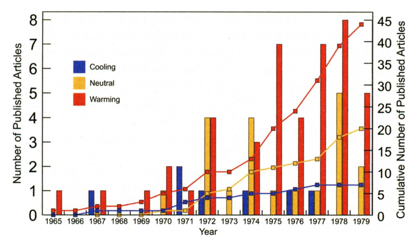
Now, you might hear some people asking: if scientists once thought we were heading into an ice age, why should we believe what they say about global warming now? Well, it's important to know that back in the '70s, the idea of an impending Ice Age wasn't a widespread belief among scientists. Think of it as more of a possibility that was being discussed, not a settled consensus. Most scientists believed that the effect of increasing greenhouse gases would likely be more significant, leading to warming, not cooling. Scientific consensus represents the prevailing view within the scientific community, based on the best available evidence at that time. Even though some scientists discussed cooling, the majority concluded that greenhouse gases would likely drive warming over the coming decade. Check out this graph from an article published in the Bulletin of the American Meteorological Society (BAMS) in 2008. The article's authors went back and counted how many scientific papers they could find that discussed global cooling, warming, or neutral projections between 1965 and 1980. They found there wasn’t a strong consensus... in fact, even during this period when some scientists thought we might be heading into a new ice age (the blue bars/line), the majority still predicted warming (the red bars/line) over the coming decades!
And as it turned out, the brief cooling trend that had affected the Northern Hemisphere stopped in the '70s, and since then, global warming has been the dominant climate influence. See the image below with the global average surface air temperature anomalies post-1970 colored in red. With the clear and obvious warming, the small group of scientists pondering an impending ice age agreed that the long-term trend was indeed not cooling.

Quiz Yourself...
Crime Scene Investigation: Global Warming
Crime Scene Investigation: Global WarmingPrioritize...
At the end of this section, you should be able to
- Define "fingerprints" as used by scientists to identify the causes of observed climate changes.
- Explain why a warming trend near Earth’s surface alongside a cooling trend way up in the stratosphere supports human-driven climate change rather than natural warming.
Read...
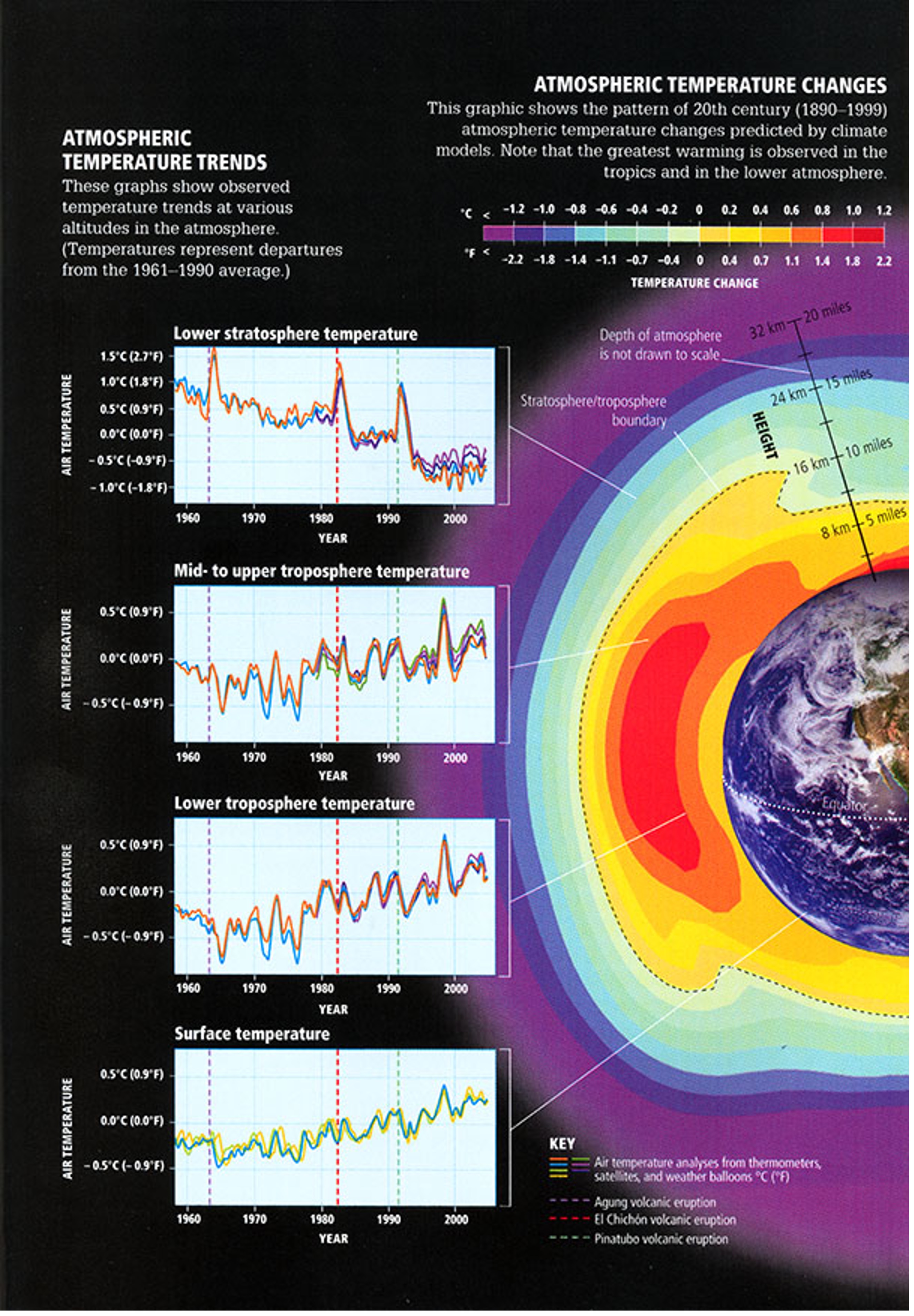
Now, even though we are starting to build a compelling narrative, we cannot deduce the cause of the observed warming solely from the fact that the globe is warming. Perhaps the sun is getting brighter. Maybe an army of underground gnomes have discovered space heaters! In our quest to understand why the warming is occurring, we can look for possible clues. Just like a detective, climate scientists refer to these clues as 'fingerprints.' In climate science, ‘fingerprints’ are distinct patterns or markers that reveal the causes of observed changes. These patterns help us differentiate between natural climate influences (like volcanic eruptions) and human activities (such as greenhouse gas emissions). It turns out that natural sources of warming give rise to different patterns of temperature change than human sources, such as increasing greenhouse gases. This is particularly true when we look at the vertical pattern of warming in the atmosphere.
Key Definition:
A fingerprint is a distinct pattern or marker that helps identify the causes of observed climate changes and helps scientists partition changes between natural influences (like sunspots) and human activities (like greenhouse gas emissions).
Unlike surface air temperatures, estimates of upper air temperatures (from weather balloons and satellites) have only been available for the latter part of the past century. Still, they reveal something remarkable! The lower part of the atmosphere—known as the troposphere, where we live—has been warming along with the surface. But when we look higher up in the atmosphere, particularly in the stratosphere, air temperatures have been dropping! Take a look at the figure below. The four timeseries on the left show global temperature changes from the stratosphere (top panel) down to the troposphere (middle two panels), and finally to the surface (bottom panel). The bottom three panels show consistent warming, but in the upper stratosphere, we see a clear cooling trend. In the "Lower Stratosphere Temperature" panel, you’ll notice the temperature drops from left to right, meaning it’s been getting cooler over time. So, what's going on?
Tropospheric Warming
Let’s focus on the warming trend in the lower atmosphere, known as the troposphere, which provides "part one" of our evidence for human-driven climate change. Greenhouse gases like CO₂ act like an insulating blanket around Earth, trapping warmth in the lower atmosphere, or troposphere. Here’s how: as the sun heats Earth, the surface emits some of that energy as infrared radiation. Greenhouse gases absorb this infrared energy and re-radiate it in all directions—including back toward the surface—creating a cycle of heat retention. With rising greenhouse gas levels, this trapping effect intensifies, warming the troposphere more and more. Because these gases have their highest concentrations within the lower atmosphere, the warming signal from additional greenhouse gases is expected to be concentrated near the surface, where the heat is initially captured and held.
Stratospheric Cooling
Now, for "part two," let’s take a look higher up—above where planes cruise—to the stratosphere. Unlike the warming we see in the troposphere, the stratosphere is actually cooling, and there are a couple of key reasons for this. First, because greenhouse gases trap heat in the troposphere, less heat makes it up to the stratosphere. Remember, these gases don’t create heat; they simply hold onto and re-radiate it... so the upper layers receive less energy. Second, remember when we discussed "other GHGs" and said that gases like halogenated and fluorinated compounds can break down ozone in the stratosphere? Ozone is crucial here because it A) absorbs solar radiation and B) likes to naturally hang out in the stratosphere for the most part (ozone does occur near the surface, but it's almost all due to pollution). With less ozone available, less sunlight gets absorbed in those layers, and less heat is generated in the stratosphere. Without this protective ozone layer to trap energy, more radiation simply passes through, continuing toward the surface instead of warming the upper atmosphere.
The simultaneous warming of the troposphere and cooling of the stratosphere is like a clear "tell" in climate’s version of poker—a move that unmistakably points to human-driven climate change. Natural factors, like an increase in solar energy, would either warm or cool all layers of the atmosphere at once. But when we examine temperature trends over the past 75 years or so in reanalysis data (our best historical reconstruction of the atmosphere), a distinct pattern emerges (see figure below): red, or warming, near the ground (below the dashed line marking the troposphere) and blue, or cooling, higher up in the stratosphere. Now, this isn’t a flawless fingerprint—there are still some warm areas higher up, mostly due to ozone changes in the Southern Hemisphere’s stratosphere. However, this overall pattern—warming below and cooling above—looks exactly like what we’d expect if greenhouse gases were the primary influence. This unique distribution aligns perfectly with our understanding of how greenhouse gases shift Earth’s energy balance, reinforcing the link between human activity and observed atmospheric changes.

Quiz Yourself...
Change in the Hydrosphere
Change in the HydrospherePrioritize...
At the completion of this section, you should be able to:
- Describe how ocean warming and high heat capacity impact the rate of temperature increase in oceans compared to the atmosphere.
- Explain the process of ocean acidification, its effects on marine organisms that rely on calcium carbonate, and the potential economic implications for human food security.
Read...
In the last section we found that, since the late 1800s, global average surface air temperatures have increased about 1 degree Celsius (about 2 degrees Fahrenheit). You might wonder, "Why worry about a small bit of warming?" That's a fair question! This recent rise is significant because, since the last ice age ended about 10,000 years ago, global average surface air temperatures have fluctuated by only about 1.7 degrees Celsius (close to 3 degrees Fahrenheit) in total. In contrast, today’s warming—over a degree Celsius in just about a century, most of it since 1980—marks an unusually fast change.
What makes this rapid shift even more noteworthy is our global context: when Earth was last this warm, it wasn’t home to over 7 billion people, nor had human-built infrastructure that spans almost every continent. Our ancestors shaped their communities, agricultural practices, and economies around a relatively stable climate over the past several centuries. But as our planet continues to warm, those climate norms—the foundation of modern civilization—are shifting. And while a couple of degrees may seem small, let’s consider a familiar analogy: human body temperature. Our normal body temperature is 98.6°F, but a rise of just 2 or 3 degrees signals a fever, leaving us feeling unwell. So, even small changes in temperature can have big impacts!
Ocean Warming and Acidification
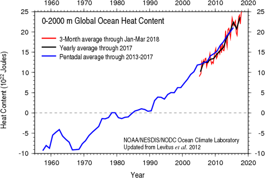
For starters, the atmosphere isn't the only part of the Earth system that's warming. The hydrosphere, which includes all of Earth's water—oceans, rivers, lakes, ice, and even water vapor in the air—is also changing as the climate warms. The graph below shows global ocean "heat content" from the ocean surface down to a depth of 2000 meters since the late 1950s. “Ocean heat content” refers to the total amount of heat stored within this layer, so it not only includes the surface (or skin) temperature of the ocean, but the temperature all the way down to 2 km – or about 5 Empire State buildings!
As oceans absorb more heat due to an intensified greenhouse effect, they’re warming, but at a slower rate than the atmosphere. This difference is due to the high heat capacity of water—a property that requires more energy to raise the temperature of water than air. Think of it this way: on a hot summer day, the air in your backyard heats up fast, while your (non-heated) pool stays cool by comparison. This is because water absorbs and retains heat more efficiently than air, allowing the oceans to take in large amounts of energy without a big jump in temperature. So, while both the atmosphere and oceans are warming, the ocean’s ability to hold heat acts as a buffer, slowing the rate of temperature rise in the water.
Not only are the oceans warming, they're also becoming more acidic. This increase in acidity refers to the rise in the concentration of hydrogen ions in the ocean, which lowers its pH level. Oceans play a pivotal role in Earth's carbon cycle, acting as a significant carbon sink that helps regulate the global climate. In fact, if you remember from our carbon cycle discussion, they are the largest reservoir of carbon on the planet, storing a whopping 50 times more carbon than the atmosphere! The process through which oceans absorb carbon dioxide (CO2) from the atmosphere is complex and multifaceted. When CO2 from the atmosphere dissolves in seawater, it reacts with water to form carbonic acid, which then breaks down into bicarbonate and hydrogen ions. This series of reactions helps to reduce the concentration of CO2 in the atmosphere, thereby mitigating the greenhouse effect and global warming to some extent. However, this increased uptake of CO2 by the oceans is not without consequences.
When carbon dioxide dissolves in ocean water, it forms carbonic acid, which gradually leads to ocean acidification (a decrease in pH). The graph below shows global ocean pH changes from 1982 to 2021, steadily drifting towards lower values. Now, you might think, “We only went from a pH of 8.125 to 8.055—a shift of just 0.07 units—so what’s the big deal?” But here’s the key: pH is measured on a logarithmic scale, meaning that small shifts translate to big changes in acidity. In this case, a drop of 0.07 pH units represents an 18% increase in ocean acidity!
Explore Further...
Head here to learn a bit more about pH scales to refresh your memory from high school chemistry!

So, what does this drop in ocean pH actually mean? On one hand, photosynthetic algae—key oxygen producers and essential players at the base of the marine food web—might initially benefit. These algae rely on carbon dioxide for photosynthesis (the process of converting sunlight and CO₂ into energy), so as more CO₂ dissolves in the ocean, they could gain more resources to grow.
However, the story is different for many other marine organisms. Lower pH means a change in the ocean’s chemistry, particularly making it harder for species that use calcium carbonate to build their shells and skeletons. This includes corals, mollusks like clams and oysters, and certain types of plankton, all of which are essential to the marine food chain. As the water becomes more acidic, these organisms struggle to grow and maintain their structural defenses, leaving them vulnerable to disease and other environmental pressures. The effects ripple throughout the ecosystem: weakened corals and shellfish impact larger fish and marine animals that depend on them for food. It can also have significant "downstream" impacts on fisherman livelihood and even our pocketbooks (see the diagram below).
Considering that approximately one billion people globally (about 1 in every 8 humans) depend on seafood as their primary source of protein, the health of these marine species is not just an environmental concern but also a crucial economic and food security issue.

Quiz Yourself...
Ice Changes
Ice ChangesPrioritize...
At the completion of this section, you should be able to:
- Describe the effects of warming on sea ice and ice sheets, including the factors contributing to their decline and the role of albedo in the Arctic region’s warming.
- Explain the difference in sea-level impact between melting sea ice and land ice, and discuss how melting ice sheets contribute directly to global sea-level rise.
Read...
If you’ve experienced snowy winters, you know that ice and snow are sensitive to temperature changes. As the world has warmed, ice in the polar regions, particularly in the Arctic, has been on a steady decline. Warmer temperatures now melt ice for longer periods each year, reducing its overall coverage, thickness, and volume. To understand this loss, climate scientists focus on two main types of ice: sea ice and ice sheets.
Sea ice is frozen ocean water that grows in winter as temperatures drop and shrinks in summer as temperatures rise. Satellite data, available since 1979, have given scientists a clear picture of sea ice changes across the Arctic. To track these changes, they measure the minimum extent of sea ice in September, when it reaches its lowest point each year. Since satellites began monitoring, Arctic sea ice in September has decreased by about 13 percent per decade (see the graph below).
Like the stock market’s ups and downs, sea ice coverage can vary from year to year due to natural shifts in the climate system. But the overall trend is clear: a consistent and steady decline. Even with occasional peaks that might look like a “rebound,” the long-term pattern is one of continual loss.

Long-term reconstructions of Arctic sea ice, like the one just shown of Arctic minimum sea ice extent from 1979 to 2023 (credit: Zachary Labe), provide context for the recent, rapid decline. What does this drop in Arctic sea ice mean? Let’s start with a concept from our earlier discussion on energy budgets: ice has a high albedo, meaning it reflects a lot of sunlight. With less ice, the Arctic loses some of that reflectivity, or “albedo.” This allows more sunlight to be absorbed, which leads to even more warming in the region.
But the effects don’t stop there. A warmer Arctic with less sea ice can alter temperature gradients across the Northern Hemisphere. These gradients, or temperature differences between the poles and the equator, are key players in shaping mid-latitude weather systems and circulation patterns. As the Arctic warms and the pole-to-equator gradient weakens, it can disrupt these systems, potentially leading to more erratic and unusual weather patterns.
Shrinking areas of sea ice also mean that the Northwest Passage (the shortcut route from the Atlantic Ocean to the Pacific Ocean through the Arctic) more frequently becomes ice free, and it can become a more viable route for commercial shipping during late summer. While having such an ice-free shortcut can have economic benefits, more open routes for ships also bring about security concerns. This has the attention of the United States Navy, in particular. In 2014, the Navy issued their "Arctic Roadmap" through 2030 (NOTE: not required reading), which outlines how the Navy plans to deal with the consequences of increasing open waters in the Arctic. In case you're wondering, the Antarctic region also has sea ice, but it typically grows and nearly completely disappears each year with the changing seasons.
Moving away from the sea, ice sheets are vast expanses of "glacial" ice found on land, each covering at least 50,000 square kilometers (20,000 square miles). To clarify, "glaciers" are similar but smaller formations of “old” ice on land that do not reach the size of ice sheets. Ice sheets typically grow over time as snow accumulates each year and does not fully melt during the summer. This cycle allows fresh snow to fall on top of the previous year's snow, compressing it. Over hundreds to thousands of years, this process can result in the formation of large ice masses.
Today, there are two major ice sheets on Earth: one in Greenland and another in Antarctica (credit: NSIDC). Together, these ice sheets contain about 99 percent of the world's freshwater ice. During the last ice age, these ice sheets were much more expansive. For instance, the Greenland ice sheet once covered much of North America and Northern Europe, acting as a colossal reservoir of ice and significantly altering the global climate and sea levels.
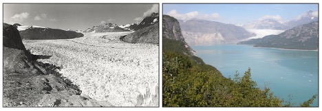
But, as the world warms, the Greenland and Antarctic ice sheets are also melting. Scientists began tracking these ice sheets via satellite in 2002, and you can see an example of the trends in land-ice mass in the side-by-side pictures below of Alaska's Muir Glacier in 1941 (left) and 2004 (right; credit: Zachary Labe). Note that the Greenland ice sheet is melting more rapidly than the Antarctic ice sheet, in large part because the high latitudes of the Northern Hemisphere (where Greenland is located) are warming faster than anywhere else on the planet. As a result, in addition to the Greenland ice sheet, high-latitude glaciers in the Northern Hemisphere are melting, too.
Overall, ice both on land and in the water is melting much faster in the Arctic than in the Antarctic. In the Antarctic, where warming has been less intense, some ice shelves (floating masses of ice attached to a land mass) have even grown slightly. However, when sea ice melts, the impact on sea level is relatively minor because this ice was already floating in the ocean. If I put some ice cubes in a glass and fill the water up to the brim, it won’t overflow even when it melts. This principle also applies to ice shelves.
In contrast, the melting of ice sheets and glaciers, which are situated on land, presents a different scenario. When these large ice masses melt, they contribute directly to rising sea levels because they add new water to the ocean that was previously stored as ice on land. This process is more akin to holding new ice cubes above a full glass and letting the melted water drip down. Eventually, that full glass will overflow. This distinction highlights the more significant role that land ice plays in influencing global sea levels and climate dynamics.
Quiz Yourself...
Trends in Sea Level Rise
Trends in Sea Level RisePrioritize...
At the completion of this section, you should be able to:
- Explain how melting ice sheets, glaciers, and thermal expansion contribute to global sea-level rise and describe how this rise varies regionally.
Read...
Melting ice sheets and glaciers on land are a significant concern because they hold vast amounts of fresh water. When they melt, that water ends up in the ocean. For instance, after the last ice age ended, melting ice sheets and glaciers contributed to a global sea level rise of about 400 feet (approximately 120 meters), which continued up until about 5,000 to 6,000 years ago. After that, sea levels remained relatively stable until modern melting trends were observed beginning in the late 1800s.
So, how much could sea levels rise if the existing ice sheets were to melt completely? Scientists estimate that if the entire Greenland ice sheet melted, it would release enough fresh water into the ocean to raise sea levels by about 20 feet (approximately 6 meters). If the Antarctic ice sheet were to melt entirely, the increase could be around 200 feet (about 60 meters). Such extensive melting would drastically reshape our planet!
Video: How Earth Would Look if All the Ice Melted (2:44)
We're a long way from seeing the complete melting of the ice sheets, given the immense size of these formations. The Greenland ice sheet still spans more than 600,000 square miles (more than three times the size of Texas), and the Antarctic ice sheet covers over 5 million square miles (roughly the area of the contiguous United States and Mexico combined). However, the melting that has already occurred is contributing to rising sea levels. Since 1993, when satellites began consistently tracking sea levels, there has been an increase of more than 80 millimeters (over 3 inches), as illustrated in the graph below. A longer-term record from tidal gauges shows that increasing sea levels began before 1993, culminating in a total increase of nearly 10 inches since the late 1800s.

Much of the rise can be attributed to melting ice sheets and glaciers, but thermal expansion of the warming ocean waters is contributing, too. Thermal expansion is the process by which water expands in volume as it heats up. As ocean temperatures rise, seawater takes up more space, pushing sea levels higher even without any additional water being added from melting ice. As with trends in atmospheric air temperature, complexities exist, however. For starters, there are short-term ups and downs (each year doesn't always have a higher mean sea level compared to the prior year), and sea levels aren't rising equally everywhere. Variations in ocean currents and local geography mean that sea levels in some parts of the world are rising more quickly than the global average, while in other areas sea levels have fallen or are remaining steady, even while the global average sea level increases. Furthermore, natural geologic factors affect sea level, too, such as the fact that the basins that hold Earth's oceans are constantly (albeit very slowly) changing shape. Scientists must take these long-term natural factors into account when calculating the rate of sea-level change due to global warming.
While a global average sea-level rise of 10 inches since the late 1800s may seem like no big deal, consider that 11 of the world's 15 largest cities are along coastlines. In the United States alone, about 40 percent of the population lives in densely-populated coastal areas. Even with the sea-level rise that has occurred so far, low-lying coastal areas of some large cities are flooding more frequently. Already in Miami, Florida, the highest tides of the year (called "king tides") are increasingly causing flooding in parts of the city.
Estimates show that king-tide flooding in Miami Beach has increased by four times since 2006. So, what may seem like a slow and minor sea-level rise is starting to have local and regional economic impacts. Continued warming and sea-level rise will likely cause more areas (and people) along the world's coastlines to become increasingly vulnerable to flooding.
Quiz Yourself...
Climate Change and Extreme Weather
Climate Change and Extreme WeatherPrioritize...
When you've completed this section, you should be able to:
- Explain the difference between climate change’s influence on the likelihood of extreme weather events and the misconception that climate change directly causes specific events.
- Describe how global warming shifts the probability of extreme heat and cold events, using the analogy of a “loaded die” to illustrate changes in the frequency of extreme temperatures.
- Explain why we see more record highs than record lows in a warming climate.
Read...
The way most people feel the effects of climate change isn’t through gradual shifts in average temperatures but rather in the increased frequency and intensity of extreme, often severe weather events. These are broadly termed “extreme weather.” Extreme weather can mean (but this isn't an exhaustive list by any means!) things like hurricanes, intense heatwaves, prolonged droughts, heavy rainfall and flooding, severe wildfires, and extreme winter storms.
The link between climate change and extreme weather grabs a lot of attention—and for good reason. As we've learned over the past few lessons, climate change is complex and multi-layered, with influences ranging from human activities at local scales to natural and human-induced changes on a global level. Most news stories focusing on climate change and extreme weather are actually zooming in on one key aspect: human-driven global warming. The central question is often, “How does a warming Earth impact the weather we experience on a day-to-day basis?”
However, this question often gets rephrased in a misleading way—“Did climate change *cause* this heatwave, flood, drought, or storm?” Framed this way, the answer is “no.” Climate change doesn’t directly cause specific weather events. That is, we can't unequivocally say Hurricane Katrina only happened because of climate change, and otherwise, it would be a perfectly pleasant sunny day! Blistering heatwaves, severe thunderstorms, devastating floods, and powerful hurricanes all existed long before human influence on the climate. So, while climate change doesn’t directly trigger a specific heatwave or flood, scientists' critical questions are whether and how climate change makes these extreme events more intense, frequent, impactful, or likely to happen in certain regions.
This is a complex area of study, and the science connecting climate change with extreme weather is rapidly evolving -- this lesson may not even be the same year-to-year! What is clear, though, is that the impacts of climate change on extreme weather differ from place to place. Although the globe is warming, some areas are heating up faster than others; similarly, while sea levels are rising, local factors cause them to rise unevenly across different coastlines. In short, a mix of local, regional, and global climate influences—both human-induced and natural—play into changing patterns of extreme weather. Yet, the human-driven warming of the oceans and atmosphere has certainly altered some aspects of atmospheric behavior.
Let's start with a couple of the more straightforward connections between global warming and extreme weather events. For starters, as the world has warmed, average air temperatures in many areas have increased. Not surprisingly, so have outbreaks of hot weather. On a similar note, episodes of extremely cold weather have declined, which seems intuitive.
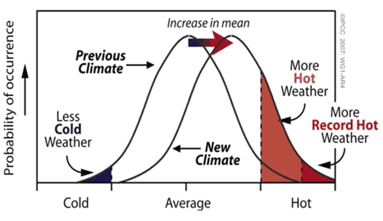
Take a look at the graph above. It shows the probability of experiencing “cold,” “near-average,” and “hot” weather. Notice that the “previous climate” curve has a “bell” shape—this is because, in a stable climate, it’s most common for temperatures to be seasonable or close to average. However, as anyone who’s been around for a few years knows, we also get stretches of both very cold (left side of the curve) and very warm (right side of the curve) weather.
Now, look at the “new climate” curve, which shows what happens when the entire temperature distribution shifts warmer. Every temperature is nudged a bit to the right, making warmer temperatures more likely. Remember our discussion of statistical distributions? What we’re seeing here is an example of how shifting a distribution affects the likelihood of different outcomes. This shift means that, while seasonable weather is still most common, “average” itself has become a little warmer. For example, if May’s average high temperature used to be around 65°F, it might now be closer to 68°F.
So, what’s the result of this shift? With the whole distribution skewed a bit warmer, extreme cold events (on the left) become less common, and extreme heat events (on the right) become more common. It makes sense—by shifting the baseline, we’re tilting the odds toward hotter days.
This doesn’t mean cold spells will vanish altogether as the world warms. Cold snaps can still happen! Take February 2015, for instance, when the eastern United States had one of its coldest months on record (going back to 1895). So, yes, even in a warming climate, frigid weather can occasionally dominate. But when we look over a long period, we start to see a trend: fewer cold spells and more frequent heatwaves.
Do we actually see more extreme heat days compared to extreme cold days? Let’s explore that by looking at decade-by-decade data on the frequency of record-breaking warm and cold days, totaling up all U.S. locations and days of the year. This is what the trend looks like through 2015.

This graph illustrates the ratio of daily record high temperatures to record low temperatures over the decades. Each bar's color and height provide insights into temperature trends:
- Red Bars: More record highs than lows.
- Green Bars: More record lows than highs.
- Bar Height: Indicates the extent of the difference. Taller bars signify a greater disparity between record highs and lows.
In a stable climate, we’d expect the number of record highs and record lows to be pretty even. And that was indeed the case through the mid-20th century: if you look at the red bars in the graph, they’re relatively short, indicating a near 1:1 ratio. In other words, it was about a coin flip whether record highs or lows were more common.
But then came the 1960s and 1970s, when mean temperatures in the Northern Hemisphere actually cooled slightly. This cooling led to more record lows than highs, as you can see with the green bars that pop up. Since then, however, there’s been a sharp shift. As the global temperature trend turned upward, particularly in the Northern Hemisphere and North America, record highs began to outnumber record lows significantly. In the past decade, the ratio of record highs to lows has soared to over 2:1, meaning extreme heat days now occur twice as often as extreme cold days. This trend aligns with the shift in the probability of heat extremes we discussed earlier.
A helpful analogy here is to think about rolling a six-sided die. Yes, yes, we’ve played with this example earlier in the semester, but let’s roll with it again (pun intended)! Let’s set up another little experiment with die rolling to see how probabilities change.
Explore Further...
Start rolling the pair of dice. One of the dice is a fair die, and the other is "loaded", though just how, you'll need to figure out. It should become clearer and clearer as time goes on, and the number of rolls increases. Note that you can "roll" in rapid succession to get larger and larger samples (you don't need to wait for the animation to complete on each roll). Start out with 1 roll, then 5, then 10, 30, 50, 100, and so on, as many as 500 or more (if you have the patience!) rolls of the die. Pay attention to the number of numbers you've rolled for each of the two dice (the percentage of times each possible value of the die is rolled is conveniently recorded for you).
Making sense of it!
Do your rolls seem to be converging towards some well-defined fraction? Is one number showing up more often on one of the two die? When you think you're ready to guess which of the two dice is loaded, go for it. You can repeat the experiment over and over (and over!) again. Sometimes it's the red die that will be loaded, other times it will be the blue die. Can you figure out which number is favored and how skewed (loaded) the results are?
(insert Jeopardy music while you experiment with the dice!)
So, as you've figured out by now, I loaded the die so that sixes would come up twice as often as they ought to. The more rolls you take, the more obvious it becomes that the die is rigged. I'm never going to be allowed to visit Vegas again!
Now, let’s think back to that first time you rolled a six with the loaded die. Was that specific roll directly due to the loading? Not exactly. Like any long-term Monopoly player would tell you, even with a fair die, you’d expect a six about one in every six rolls. But because the die is loaded, it’s now twice as likely that any given roll, including that one, would come up six. This effect becomes clearer with more rolls.
This analogy is useful for understanding how global warming affects extreme weather, like heat waves. We showed earlier that a modest warming—similar to the average global temperature increase over the past century—almost doubles the chance of seeing temperatures exceed 100°F in mid-summer. And we've also observed that the frequency of extremely hot days in the U.S. has approximately doubled since the mid-20th century.
Using this analogy, we can think of global warming as a way of “loading the weather die” toward more heat extremes. Just as we wouldn’t say that any single scorching summer day was directly caused by global warming, we can say that the odds of such a day occurring have doubled. In other words, the "weather die" is increasingly weighted toward extreme heat events across the U.S. and around the globe.
Quiz Yourself...
Moisture and Precipitation
Moisture and PrecipitationPrioritize...
When you've completed this section, you should be able to:
- Explain how a warming atmosphere increases atmospheric moisture and precipitable water, and describe how this contributes to more intense and frequent heavy precipitation events, with regional variations in impact.
Read...
Another outcome of a warming atmosphere and ocean is increased moisture. Earlier, we discussed how rising temperatures lead to higher evaporation rates. Eventually, condensation rates catch up, reaching a new balance, but in this warmer state, the number of water vapor molecules in the air is greater. In the atmosphere, this has a major impact: if warmer air holds more water vapor, then when it rises and cools to the point where net condensation occurs, there’s more water available for cloud formation and precipitation.
To gauge the moisture available for precipitation, climate scientists use a metric called "precipitable water." This represents the amount of rain that would fall if all the water vapor in a column of air—from the Earth's surface up to the top of the troposphere—condensed and fell as rain. The image below shows the simulated percentage change in precipitable water between the 1984-2013 average and the 1871-1900 average. The widespread blue shading indicates that in most regions, precipitable water has increased by several percent, and in some areas, by as much as 15 percent as the world has warmed.

This trend has critical implications for precipitation intensity and frequency, as more moisture in the atmosphere can lead to more intense downpours, amplifying the risk of floods and extreme rainfall events in many areas. Therefore, it's not surprising to see an increase in heavy rain events. For example, the percentage of the contiguous United States receiving an unusually large portion of total annual rainfall from extreme one-day rainfall events has increased (here's the corresponding graph from NOAA; the orange curve represents a running nine-year average). But, the increase in heavy rain events hasn't occurred equally everywhere.

The figure above, from the U.S. National Climate Assessment, highlights trends in “heavy precipitation”—defined here as the top one percent of all rainfall events in each region—from 1958 through 2021. In the leftmost panel (the one labeled "a"), we can see that the Northeast has experienced the largest increase in rainfall from these intense events, while the Pacific Northwest has seen a smaller increase, and Hawaii actually shows a slight decrease in rainfall from its heaviest events during this period.
The other two panels display different measures of extreme precipitation, such as the maximum daily rainfall over one- and five-year windows. The overall story remains consistent: significant increases in the eastern United States, with smaller yet still notable, increases in the West. These trends aren't limited to the United States; as we’ll see shortly, similar patterns are evident globally, with variations across regions.
Quiz Yourself...
Historical Variation of Floods and Drought
Historical Variation of Floods and DroughtPrioritize...
After finishing this section, you should be able to:
- Explain, at the global scale, what we have seen in terms of changes in precipitation and drought.
- Give some examples of why precipitation patterns vary regionally, including those in a changing climate.
Read...
Remember when we discussed how the general circulation of the atmosphere—the global pattern of winds and weather—is shaped by the uneven heating of Earth? Because the equator receives more solar energy than the poles, this imbalance drives a vast system of atmospheric circulations that distribute heat and moisture around the planet. So, when we talk about climate change, we’re not only talking about shifts in temperature; we’re also talking about changes in this energy imbalance that can impact circulation patterns. It’s logical, then, to expect climate change to influence large-scale precipitation trends as well.
We just explored how a warmer atmosphere holds more moisture, which translates into heavier downpours when that moisture eventually condenses. In the U.S., the data confirm this trend toward more intense rainfall events. However, precipitation patterns are far from simple. It’s one thing to say heavier downpours are on the rise, but predicting how total precipitation will change in any given place—how much rain or snow falls over an entire season or year—is much more complex. Precipitation changes are “noisier,” meaning they vary a lot by location and can be harder to interpret consistently over time.
Why is precipitation so variable? The reasons range from local topography to larger-scale climate patterns. For instance, mountain ranges can trap moisture on their windward sides, creating wetter conditions there, while casting a “rain shadow” of drier conditions on their leeward sides. Oceans also play a big role: they support massive air and water currents, like the monsoons, which bring seasonal rain to regions like South Asia and East Africa. Ocean-atmosphere interactions are critical, and when they shift even slightly, they can change rainfall patterns for entire regions.
Unlike temperature, which has shown a more uniform warming trend globally, precipitation trends are a mixed bag—some regions are seeing more rain, while others face more frequent droughts. These changes don’t follow the same clear patterns as temperature, which is why scientists continue to investigate how climate change impacts precipitation in different parts of the world. This research is crucial for understanding the full picture of change impacts.
Now, let’s zoom out and take a more global look at total precipitation patterns. The figure below maps how different areas have seen precipitation either increase (in green) or decrease (in brown) over the 20th century. The small red dots mark different locations, each with its own time series showing how precipitation has trended over the years.
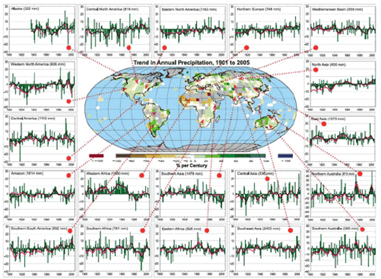
Pretty messy, right? Some areas show clear trends, but they’re all over the map. Take southern South America, for example—the time series in the bottom left corner shows a noticeable increase in rainfall across the century, indicating that this region is becoming wetter. On the other hand, regions like southern Asia and India (fourth row, third column) show a drying trend, especially over the past 30 years. These diverse precipitation signals across the world are essential to understand because climate change isn’t affecting every region equally. As global conditions shift, the “winners and losers” in terms of rainfall and drought may shift too. Places that historically supported lush forests and agriculture may face more frequent droughts, while regions previously considered too dry for intensive farming might start seeing conditions that favor crops. By the end of this course, we’ll dive into what these shifts could mean for geopolitics and resource distribution.
While these precipitation patterns are complex and heavily influenced by local factors, we do start to see some overarching trends. Remember the Clausius-Clapeyron relationship? It’s that principle telling us that a warmer atmosphere holds more water vapor before it condenses into cloud droplets and, eventually, rain. This relationship suggests that with a warming climate, regions near the equator—where the Hadley cell drives constant upward motion—might get wetter over time. Why? A warmer, moisture-laden lower atmosphere in equatorial regions means more available water vapor for rain.
So, does this theory hold up in real-world data? When we look at precipitation trends by latitude, we start to see supporting evidence. By averaging observed precipitation changes across latitude bands, a pattern emerges: certain regions, especially near the equator, are indeed becoming wetter over time.
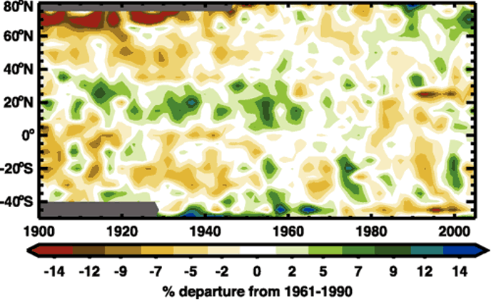
Take a look at the broad green band around 15°N latitude on the graph. This region aligns closely with the Intertropical Convergence Zone (ITCZ), where equatorial rain belts form due to warm, rising air. Seeing a green band here suggests that rainfall in the ITCZ has increased, which matches what we’d expect as the atmosphere warms and holds more moisture. Meanwhile, higher latitudes show a trend toward drying, represented by yellows and browns near the top and bottom of the graph. These drying patterns are consistent with some climate model predictions (we’ll dig into those next), but precipitation trends are notoriously variable. From year to year and even decade to decade, regional precipitation can swing widely, making it hard to confirm clear, theory-matching patterns like we saw with temperature, sea ice, or sea level.
An essential factor in this story is drought—periods of unusually low rainfall. But drought isn’t just about less rain; it also depends on temperature. Imagine this: when rainfall drops, the ground heats up faster, which speeds up evaporation and further dries out soil. This reduction in soil moisture limits the water available for plants, creating harsher conditions for growth. This process can even reinforce itself, with drier soil warming up faster, leading to even more moisture loss—a process often described as “drought begets drought.”
Drought patterns, like precipitation, are complex and vary by region. Yet, we’re seeing droughts become more common in some areas, even in regions where rainfall hasn’t decreased significantly. Warmer temperatures alone can drive moisture out of the soil, which is especially clear when we look at tools like the Palmer Drought Severity Index (PDSI). The PDSI is a numeric index for soil moisture that factors in both temperature and precipitation. The more negative the PDSI number, the stronger the drought.
Check out the time series of the PDSI over the U.S. from 1890 to 2020 below. Do any patterns stand out? Notice the deep drop in the 1930s—this was the infamous Dust Bowl, when a severe drought brought destructive dust storms, devastating agriculture across the American and Canadian prairies. There’s another notable drought in the 1950s, but since then, we haven’t seen anything as extreme. What’s important to note here is that droughts haven’t disappeared despite increases in intense rainfall events. Just because we expect heavier downpours as the atmosphere warms doesn’t mean droughts are off the table in U.S. climate trends. While researchers are still examining historical data, I’d argue it’s too early to definitively say climate change is tilting the scales toward more or fewer droughts in the long run—at least not yet.

Quiz Yourself...
Storms and Confidence
Storms and ConfidencePrioritize...
When you've completed this section, you should be able to:
- Evaluate the confidence levels linking global warming to various types of extreme weather events.
- Explain the complexities involved in attributing climate change impacts to shorter-lived phenomena, such as tornadoes and hurricanes.
Read...
While trends in extreme heat, cold episodes, and heavy rainfall have shown some global variation, scientists are confident that global warming significantly influences these patterns. However, determining how global warming impacts smaller-scale or short-lived storms—like hurricanes (tropical cyclones), mid-latitude low-pressure systems (extratropical cyclones), and severe thunderstorms (convective storms)—is more complex.
The figure below provides a sense of the certainty levels regarding links between global warming and different types of extreme weather events. Those toward the upper right of the graph represent trends with higher confidence in their connection to global warming, while those in the bottom left indicate areas with less certainty. Notably, the graph includes "extreme rainfall" but not "flooding" as a separate category. Trends in flooding are highly localized, influenced by factors such as urbanization, which affects water absorption and drainage into nearby streams and rivers. Poor urban planning, for instance, can lead to increased flooding regardless of trends in heavy rainfall. This means that while global warming may influence extreme rainfall, local land-use changes often play a major role in determining flooding outcomes, making it challenging to link flooding trends directly to climate-driven changes in rainfall.

Interest in the links between global warming and extreme storms like hurricanes, severe thunderstorms, or tornadoes is high. However, there’s less certainty in understanding these connections. Let’s focus on tornadoes and tropical cyclones (hurricanes), since they’re often in the spotlight. Part of the challenge with linking these storms to global warming is the relatively short period of quality observations we have of them.
For instance, while the number of strong tornadoes in the U.S. hasn’t shifted much since 1950, the frequency of weak tornadoes has risen significantly (see the graph below). Is this increase due to global warming? Probably not. Instead, the rise is largely due to improved storm detection with the introduction of NEXRAD Doppler radar in the early 1990s, which allows for more accurate tracking of storms that might produce tornadoes. Prior to advanced radar, only tornadoes easily observed and reported from the ground were included in the records—meaning in parts of the central U.S. where much of the landscape is dominated by acres and acres of crops instead of humans, weaker tornadoes likely went undetected and/or reported!

A similar story applies to tropical cyclones. From 1980 to 2017, hurricanes dominated the list of costliest U.S. weather disasters (credit: NCEI), underscoring their substantial societal impact. But is this impact due to human-induced warming making hurricanes more frequent or intense? It’s complicated. Reliable observations only go back to the 1970s when global satellite coverage began; prior to that, storms that didn’t make landfall or encounter ships often went unrecorded. Adjusting for this, the data suggest the overall number of tropical cyclones worldwide has changed very little with warming, although a higher percentage of hurricanes are reaching extreme strength (sustained winds over 110 mph). Still, the rise in hurricane damage appears to be driven more by increased coastal development—more people and infrastructure to be affected—than by warming itself.
Yet, some trends consistent with global warming are evident. For instance, rising sea levels amplify coastal flooding during tropical cyclones. Also, the areas where tropical cyclones develop are expanding, and these storms are reaching peak intensities farther from the equator than a few decades ago.
Quiz Yourself...
The Global Impacts of Extremes
The Global Impacts of ExtremesPrioritize...
At the end of this section, you should be able to
- Interpret global changes in heat extremes, heavy precipitation, and drought
- Describe one way that scientists visualize trends and confidence in those changes.
Read...
We’ve covered many extreme weather and climate concepts from a U.S. perspective, but how do these trends play out globally? The figure below (also, big version linked here) from the IPCC Sixth Assessment Report divides the world into regions (no, this isn’t a game of Settlers of Catan!). Each “tile” represents a region, such as ENA for Eastern North America. A team of scientists assessed changes in heat extremes, heavy precipitation, and drought since the 1950s, topics we’ve explored in this lesson. Tile colors indicate observed trends, while the number of dots represents the confidence scientists have that these trends are driven by human activity.
The top panel displays trends in hot extremes and confidence in human contributions. Red tiles show increases in hot extremes, blue shows decreases, dashed lines indicate unclear trends, and gray signifies limited data. Most regions show red tiles, supporting our earlier discussions on rising ratios of record highs to lows. High confidence (three dots) in many regions links these increases to greenhouse gas emissions and other human impacts.
The middle panel shows trends in heavy precipitation, with green for increases and brown for decreases. Most tiles are green, with trends pointing to more intense precipitation, as we discussed in North America. However, gray tiles in South America and Africa reveal gaps in data, underscoring why scientists advocate for better monitoring networks.
The bottom panel illustrates trends in agricultural and ecological drought (prolonged low precipitation). While heavy precipitation events have increased, drought trends are mixed, but most tiles are brown, indicating rising drought levels. How can heavy precipitation and drought both be on the rise? Timing is the key. In warmer climates, precipitation events cluster together, leading to long dry periods that stress water resources—a phenomenon known as the “boom-bust” cycle, where we see increasing shifts between very wet and very dry conditions.

Quiz Yourself...
Summary
SummaryRead...
- Surface temperature is easy to measure, and global observations confirm a steady warming trend over the past century.
- The global average temperature provides a single, useful metric for assessing Earth’s warming.
- Distinct "fingerprints" of human-driven climate change, such as surface warming and stratospheric cooling, support the case for anthropogenic impacts.
- Ocean warming and acidification are directly impacting marine life, with potentially far-reaching effects on global food security.
- Melting sea ice and land ice indicate regional warming differences, with distinct impacts depending on the ice source.
- Sea levels are rising globally due to ice melting and thermal expansion, though regional variations exist due to local factors.
- Global warming shifts temperature extremes, increasing the likelihood of record highs and diminishing the frequency of record lows.
- A warmer atmosphere holds more moisture, leading to intensified heavy rainfall events, with regional variations in frequency and impact.
- Shifts in global precipitation patterns (along with accompanying floods and droughts) vary widely, influenced by factors like geography, ocean currents, and climate change.
- Confidence varies in linking global warming to different extreme weather events, with particular challenges for short-lived phenomena like tornadoes and hurricanes.
- Global trends in extreme heat, heavy precipitation, and drought reveal regional differences, with data visualization strategies (like the hexagonal plots we explored) enhancing our understanding of human influence.