ENSO indices
ENSO indicesPrioritize...
At the completion of this section, you should be able to:
- Define a climate index
- Identify key indices used to measure ENSO, including the Niño 3.4 index, SOI, and MEI
- Explain the Southern Oscillation Index (SOI) and its role in indicating ENSO phase changes.
Read...
OK, how do we measure these oscillations or variability in the climate system? We have to develop metrics or indices to tell us "where are we?" when it comes to ENSO, for example. Let's focus on that, although other modes of variability are tracked using similar strategies. A "climate index" is a numerical value that quantifies specific aspects of climate variability or patterns, such as temperature, pressure, or precipitation, over a defined region. It's all about taking many different things going on and boiling them down into a single number. Some of you may be interested in financial markets and have heard of the "Dow Jones Industrial Average," a stock market index. In that case, you are boiling down the stock price of multiple companies and combining them into a single number you can track over time. Climate indices serve the same purpose, helping scientists monitor and describe the current state of complex climate phenomena by providing a simplified representation of how the climate system behaves relative to its typical or average conditions.
To keep track of ENSO, we need some concrete ways to measure what's happening in the ocean and atmosphere—essentially like using a scorecard. For the ocean side of things, we have something called the Niño index, which looks at sea surface temperature anomalies (SSTAs) in specific parts of the tropical Pacific. Remember, we learned that an anomaly is how the ocean temperatures differ from their "reference" or "mean" state! So, a Niño index looks at how warm or cold ocean temperatures are relative to their usual temperature. The most popular one is the Niño 3.4 index, which averages SSTAs over a region from 5°N to 5°S and 170°W to 120°W. This index helps us figure out if the central and eastern Pacific is warmer or cooler than usual.

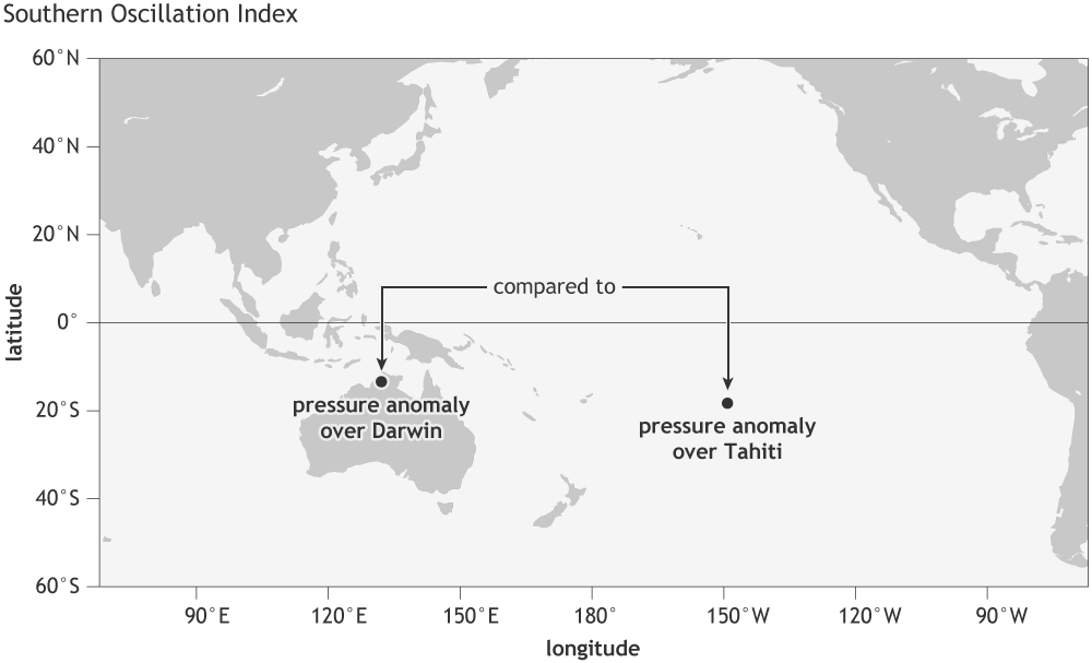
For the atmosphere, we obviously aren't measuring water temperature -- instead, we use something called the Southern Oscillation Index (SOI), which measures the difference in standardized surface pressure between Tahiti and Darwin. Protip: if someone asks you to volunteer to make in-situ measurements of the SOI, say yes! Why? Check out the below figure which shows you exactly where those pressure observations are being taken in the tropical South Pacific Ocean! When the SOI is negative, it means the air pressure in Tahiti is lower than in Darwin. This pressure difference indicates that the normal east-to-west trade winds are weakening. As a result, warm water that is usually piled up in the western Pacific starts to flow back eastward toward South America. This shift in water movement leads to warmer-than-normal sea surface temperatures in the central and eastern Pacific, a hallmark of El Niño conditions.

But sometimes, just looking at these separate indices is like trying to understand a recipe by only reading half the ingredients. To get a fuller picture, we use the Multivariate ENSO Index (MEI). All of these acronyms feel like they are the equivalent of climate alphabet soup. It combines SST, winds, sea level pressure, and outgoing longwave radiation into one handy metric. This gives us a more complete view of what’s happening with ENSO and how it’s influencing global climate patterns. So, next time you hear a forecaster mention ENSO, you’ll know they’re talking about a lot more than just some letters in a bowl!
One last thing. You might ask yourself, "Why on Earth do climate scientists have so many indices to quantify essentially the same thing?" Not an unreasonable question... As we'll learn about in the next couple of sections, ENSO is a complex system involving different aspects of both the ocean and the atmosphere. Just like hiring someone for a job, you wouldn’t assess them based on one skill alone—you’d want to look at several qualities like teamwork, communication, punctuality, and expertise. Similarly, different ENSO indices give us a fuller picture by measuring various factors, from sea surface temperatures to air pressure. Each index captures a different angle, and together they provide a better understanding of ENSO’s behavior. Plus, some indices go farther back in time, which helps compare historical events.
See the figure below, which gives us a time series of both the Nino 3.4 and SOI indices. In many cases, the red and blue match, indicating good agreement between the two. I should also mention that the colors look 'flipped' because a positive Niño 3.4 index and a negative SOI both indicate El Niño conditions, but they represent different aspects of the climate system. The Niño 3.4 index characterizes sea surface temperature anomalies, with a positive value signaling warmer-than-normal ocean temperatures. On the other hand, the SOI is a pressure difference, where a negative value indicates weaker trade winds. So, even though the signs are opposite, they both point to the same phenomenon—El Niño. But there are other places (say, 1983-1987) where the colors aren't quite the same between the two, meaning it isn't quite obvious precisely what phase of ENSO everyone agrees on. I won't get into the exact details of what led to those differences- it's beyond the scope of this class- but just know that scientists use multiple indices because no single one can tell the whole story.

Read on.