Lesson 1: Introduction and Earth's Climate as a Dynamic System
Lesson 1: Introduction and Earth's Climate as a Dynamic SystemMotivate...

Imagine you're planning a road trip. You check the weather forecast, pack your bags, make sure there is air in the tires (and oil in your engine!), and set out on your journey. But what if you could also predict the weather for the entire trip, not just for today but for the entire season? How would that change your planning? You might pack differently, choose a different route, or even postpone the trip. You (probably) would rather hike the Appalachian Trail in New England in August rather than in January! You are making decisions based on long-term information, something that goes beyond the today and tomorrow. This broader perspective of understanding not just today's weather, but the typical patterns over time, is what we call “climate.”
We live in a world where our decisions are often influenced by the weather. But when we step back and look at the bigger picture, we realize we think in terms of climate. Climate isn't about whether it will rain tomorrow or if it's unusually hot today—it's about the average conditions we can expect over weeks, months, years, or even decades. Understanding climate gives us the power to make informed decisions that can improve our daily lives, protect our environment, and prepare us for the future.
Before we start talking about more detailed aspects of the climate system, we first need to figure out what climate really is and how it differs from weather. You'll learn that while weather is like a single roll of the dice, climate is the pattern that emerges when you roll those dice over and over again. This difference is crucial because while we can't predict each individual roll, we can understand the overall pattern—and that understanding is what helps us plan and prepare. The Earth's climate system is a complex interplay of various components that all work together to create the conditions we experience. These components each play a unique role, like five key players on a team, each with a specific job, but all working together toward a common goal.
Understanding these components and how they interact is key to understanding the climate. As you progress through this course, you'll be building upon the basis you start learning now! This knowledge is not just academic; it's practical. It will help you see the world in a new way, allowing you to make better decisions in your personal life, your community, and even in global matters.
Let's get started!
What is climate and what are the climate system components?
What is climate and what are the climate system components?Prioritize...
By the time you are finished reading this page, you should be able to:
- Define climate and differentiate how climate differs from weather
- List the five key components of the Earth’s climate system.
Read...
You are probably most used to thinking about the weather in your day-to-day lives. Should I bring an umbrella to class today? Is it warm enough for me to wear shorts? Can I gamble on that snowstorm cancelling my exam? The term “climate” may imply something completely different than what you see on the 6 p.m. news every night, but they are intricately related, differing in terms of time scale and predictability.
Climate is the “synthesis of the weather in a particular region.” Put another way, “Climate is what you expect ... weather is what you get!
Essentially, we can consider climate as the average outcome of all the weather at a particular location. Imagine you are playing a game like Monopoly that requires two dice. Any single roll of the dice could be something different – a 2, a 6, a 9. But over many, many rolls, a pattern begins to emerge. 2 and 12 happen, but are very rare. 6s, 7s, and 8s keep coming up time and time again. Any single roll of the dice can be thought of as “weather” -- unpredictability factor in the dice roll -- while the the regularity of dice rolls establishes a predictable pattern that informs how frequently those numbers can come up, just as climate does with weather data over decades.
Explore Further...
Take a minute to visit the Dice Roll simulator and try it for yourself.
The climate system (sometimes referred to as “the Earth system”) reflects an interaction between a number of critical pieces, or components. There are five generally accepted components of the climate system.
Atmosphere—This is perhaps the component that springs to mind when we think of “meteorology.” The atmosphere includes everything above the land surface, including the air we breathe and clouds in the sky. The atmosphere is incredibly thin; if we define the top of it using the Karman Line, it is only 100km thick, compared to the Earth’s radius of 6,371 km!
Hydrosphere – As its prefix “hydro” implies, the hydrosphere includes all of Earth's water bodies—oceans, seas, lakes, rivers, groundwater, and even the moisture in the air. Though it covers about 71% of Earth's surface, the average depth of the ocean is about 3,688 meters, which is extremely small relative to our planet’s radius! The hydrosphere is crucial in regulating the Earth's climate, serving as a massive heat reservoir and participating in essential processes like the water cycle and ocean circulation.
Cryosphere – The cryosphere encompasses all the frozen elements of Earth's system, from polar ice caps and glaciers to sea ice and frozen ground. Despite its apparent vastness, the cryosphere represents a relatively small portion of our planet's surface when contrasted with the vastness of the Earth itself. Yet, its presence has a significant impact on our global climate and environment.
Lithosphere - Delving into Earth's solid foundation, the lithosphere encapsulates the planet's rigid outer shell, encompassing the Earth's crust and the uppermost mantle. While it may seem substantial, it's merely a thin veneer when compared to the Earth's overall size, yet it plays a crucial role in shaping our planet's geological features.
Biosphere - The biosphere comprises all living organisms on Earth, from microorganisms to complex ecosystems. It interacts with the lithosphere, hydrosphere, and atmosphere, forming the foundation of life on our planet. In contrast to the planet's overall size, the biosphere exists as a relatively thin layer on Earth's surface.

The five climate system components: Starting from the top and going counterclockwise, we have the atmosphere, the ocean, the cryosphere, the lithosphere, and the biosphere. The arrows indicate that all the components are intertwined and continuously interact with one another.
Quiz Yourself...
Why is studying climate important?
Why is studying climate important?Prioritize...
By the time you are finished reading this page, you should be able to:
- Give at least 3 real-world examples of how climate is important to various sectors in the United States.
Read...
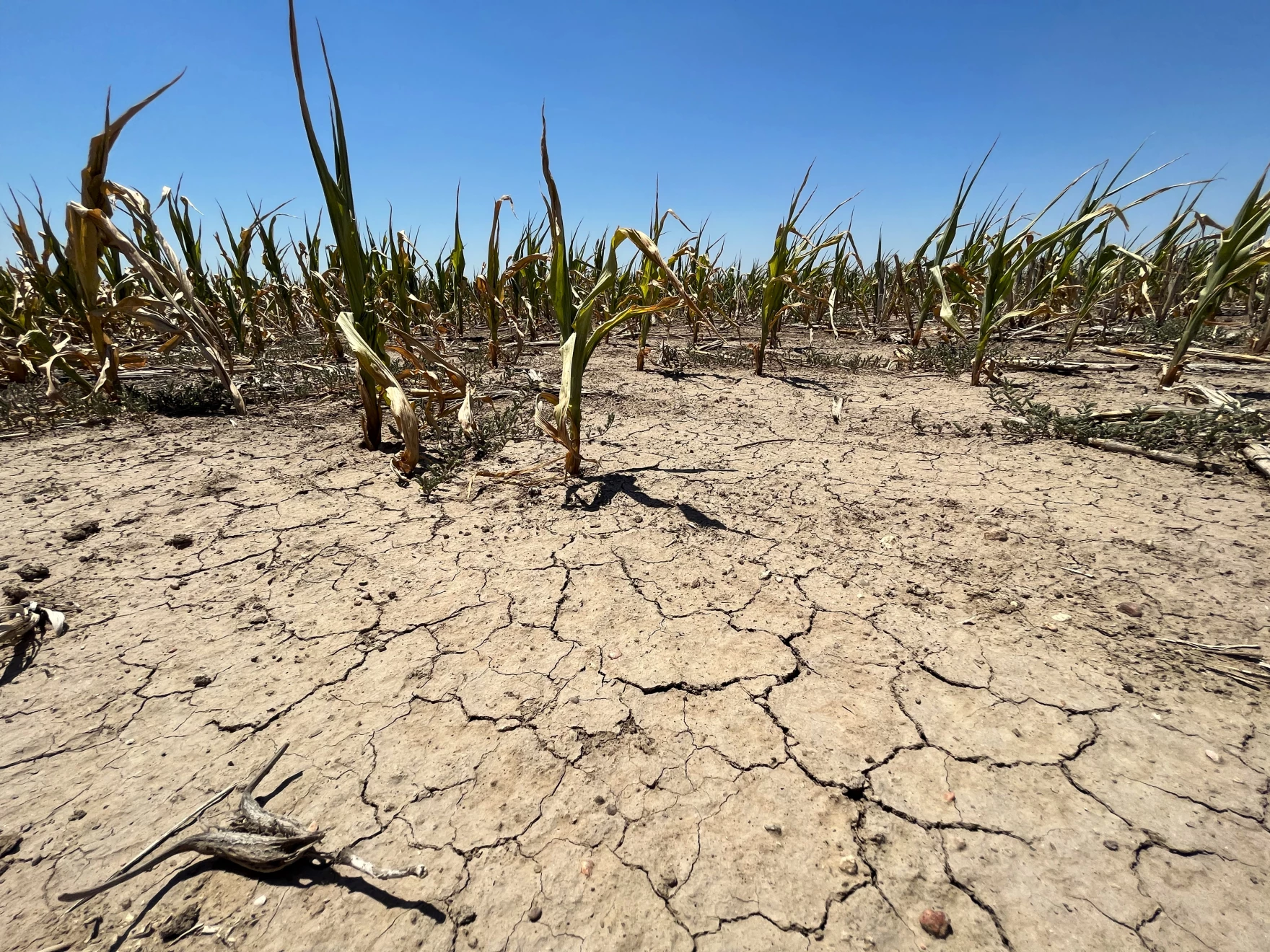
Before we delve into some of the more scientific details about climate, it’s a good idea to understand “the big picture.” Climate impacts everything! This could be you and me, animals, plants — things that are living. But its influence doesn't stop there; it extends to non-living elements as well. Ever strolled along a beach adorned with smoothed stones? Those stones owe their formation to relentless weathering caused by tiny sand particles. And guess what? These sand particles get whipped up by waves, courtesy of atmospheric winds—proof that climate is constantly at work!

.jpg)
But a common question posed to climate scientists is "so what? How does climate impact our everyday lives?" You might be astonished at the multitude of sectors influenced by climate. One critical aspect of climate's significance lies in agriculture. Statistics of temperature and precipitation influence crop growth and the success of farming practices. Deviations from climate norms can lead to crop failures, affecting food security, livelihoods, and global food prices. Conversely, a stable and predictable climate is vital for sustaining agricultural systems that feed billions of people worldwide.
Water availability is another important motivation to understand climate. Climate influences the occurrence of droughts and floods, which have profound consequences for communities and ecosystems. Prolonged droughts lead to water scarcity and conflicts over resources. Conversely, intense rainfall and flooding can result in damage to infrastructure, displacement of populations, and the destruction of ecosystems. If we think about these events as “rolls of the dice,” climate plays a key role in determining the frequency and severity of these events, making it an important factor in water resource management and disaster preparedness.
Climate impacts ecosystems directly by altering temperature and precipitation patterns, which in turn affect species distribution, migration, and the health of ecosystems. Maintaining ecological balance is essential for biodiversity and human well-being. Therefore, climate stability is crucial for preserving these intricate relationships and ensuring the resilience of our natural world.
In the context of sustainability, climate considerations are central. Sustainable practices, whether in agriculture, energy usage, or urban planning, must account for climate impacts to ensure they do not harm the environment or compromise future generations' well-being.
Moreover, climate is intricately linked to energy usage and planning. The type and quantity of energy we use have direct consequences for greenhouse gas emissions, which are a primary driver of climate change. Changes in temperature lead to changes in demand for heating and cooling and changes the stress on our electric grid. Transitioning to renewable and more efficient energy sources is crucial to mitigate climate-related risks.
Climate also influences air quality, as temperature and weather patterns affect the dispersion of pollutants and the formation of smog. Poor air quality, exacerbated by climate change, can have detrimental effects on human health and the environment.
Lastly, sea level rise, driven by the warming of the planet and the melting of polar ice caps, poses a significant threat to coastal communities and infrastructure. Understanding and mitigating sea level rise is essential for the long-term resilience of coastal regions worldwide.
Quiz Yourself...
In the rest of this class, we’ll study climate primarily from a scientific perspective, but it’s worth not losing sight of the fact that understanding climate can help us improve societal health and welfare, benefit us economically, and ensure a more sustainable and resilient future.
How scientists study climate: three-legged stool
How scientists study climate: three-legged stoolPrioritize...
By the time you are finished reading this page:
- You should be able to identify the three tools scientists use to study climate and give a strength of each.
Read...
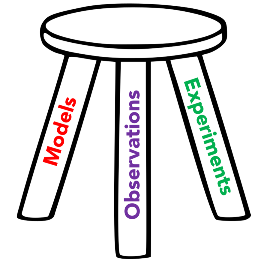
You may have heard of the three-legged stool analogy. It is often used to describe a concept or situation where three essential components or factors are critical. If one of the legs is missing, you are no longer sitting on a stool, but rather toppled over on the floor!
Three-legged Stool Example
Scientists understand climate by using three tools at their disposal. These three legs are:
Observations
“Observations” refer to the empirical data collected about the Earth's climate system through various methods. We’ll talk about these soon, but they can include satellites, weather stations, ocean buoys, and ice cores, among many others. These measurements can be straightforward, like temperature readings from a thermometer in your backyard, or incredibly complex, requiring highly specialized instruments to gauge parameters such as aerosol concentrations in the atmosphere or salinity levels in the ocean. Observations provide the essential raw data that feed into analyses, studies, and models, giving us the foundational "truth" about the evolution of the climate system. They offer a snapshot of real-world conditions, allowing scientists to validate hypotheses, calibrate models, and assess the current state of the climate system.
Models
“Models” are mathematical representations of the climate system built using the fundamental laws of physics, including conservation of mass, conservation of energy, and more. They can range from very simple “back-of-the-envelope” calculations you can do on a bar napkin to vast multi-million-line programs run on massive supercomputing systems that cost millions, if not billions, of dollars. Models serve as a virtual laboratory for experimenting on Earth, allowing scientists to simulate and analyze various scenarios to understand potential climate outcomes. These simulations are vital for predicting future climate conditions, assessing potential impacts, and developing strategies for mitigation and adaptation.
Experiments
“Experiments” in climate science involve controlled, often highly specialized, tests designed to isolate and study specific components or interactions within the Earth's climate system. These can range from lab-based studies that quantify fluxes from atmosphere-ocean interactions to field experiments that measure emissions from agricultural sources or the effect of land-use changes on emissions. Some experiments utilize advanced technologies like radiative forcing chambers to understand the response of atmospheric gases to various forms of radiation. Other experiments might employ techniques like stable isotope analysis to trace the origins and fates of specific elements within climatic cycles. The aim is to establish causality, validate or refute theories, and gather data that can be incorporated into climate models for more accurate predictions. Experiments are critical for advancing our understanding of complex climate processes, enabling scientists to tease apart the myriad factors contributing to climate change, and ultimately helping us make informed decisions for a sustainable future.
All of the legs complement one another, and focusing too much on one leads us to lack a large-scale overview of the Earth’s climate.
Basic statistics and ways to describe climate data
Basic statistics and ways to describe climate dataPrioritize...
By the time you are finished reading this page, you should be able to:
- Define the three main measures of central tendency used in climate science
- Calculate each of these three given a small set of numbers.
Read...
Since climate can be thought of as the statistical eventuality of individual weather snapshots, scientists tend to use quantitative metrics to describe aspects of the Earth system. Measures of central tendency are statistical indicators that represent the center or the average of a data set and are crucial for summarizing a dataset with a single value, facilitating easier understanding and comparison. The three main measures of central tendency are the mean, median, and mode.
This is a lot of text; maybe you could use a more visual explanation of “the three Ms.” Watch this quick YouTube video (11:04 minutes) to gain a general understanding of mean, median and mode, then read over the text below for more details.
Video: Math Antics - Mean, Median and Mode (11:03)
Transcript: Video: Math Antics - Mean, Median and Mode (11:03)
Intro
Rob: Hi, this is Rob. Welcome to Math Antics! In this lesson, we’re gonna learn about three important math concepts called the Mean, the Median, and the Mode. Math often deals with data sets, and data sets are often just collections (or groups) of numbers. These numbers may be the results of scientific measurements or surveys or other data collection methods. For example, you might record the ages of each member of your family into a data set. Or you might measure the weight of each of your pets and list them in a data set. Those data sets are fairly small and easy to understand. But you could have much bigger data sets. A really big data set might contain the cost of every item in a store, or the top speed of every land mammal, or the brightness of all the stars in our galaxy! Those data sets would contain a lot of different numbers! And if you had to look at a big data set all at one time… it would be pretty hard to make sense of it or say much about it besides, “well that’s a lot of numbers”! But that’s where Mean, Median, and Mode can really help us out. They’re three different properties of data sets that can give us useful, easy-to-understand information about a data set so that we can see the big picture and understand what the data means about the world we live in. That sounds pretty useful, huh? So let’s learn what each property really is and find out how to calculate them for any particular data set. Let’s start with the Mean.
Mean
You may not have ever heard of something called “the mean” before, but I’ll bet you’ve heard of “the average”. If so, then I’ve got good news! Mean means average! “Mean” and “average” are just two different terms for the exact same property of a data set. The mean (or average) is an extremely useful property. To understand what it is, let’s look at a simple data set that contains 5 numbers. As a visual aid, let’s also represent those numbers with stacks of blocks whose heights correspond to their values: one, eight, three, two, six. Right now, since each of the 5 numbers is different, the stacks of blocks are all different heights. But what if we rearrange the blocks with the goal of making the stacks the same height? In other words, if each stack could have the exact same amount, what would that amount be? Well, with a bit of trial and error, you’ll see that we have enough blocks for each stack to have a total of 4. That means that the Mean (or average) for our original data set would be 4. Some of the numbers are greater than 4 and some are less, but if the amounts could all be made the same, they would all become 4. So that’s the concept of Mean; it’s the value you’d get if you could smooth out or flatten all of the different data values into one consistent value.
But, is there a way we can use math to calculate the mean of a data set? After all, it would be very inconvenient if we always had to use stacks of blocks to do it! There’s got to be an easier way!! [crash] To learn the mathematical procedure for calculating the Mean, let’s start with blocks again. But this time, instead of using trial and error, let’s use a more systematic way to make the stacks all the same height. This way involves a clever combination of addition and division. We know that we want to end up with 5 stacks that all have the same number of blocks, right? So first, let’s add up all of the numbers, which is like putting all of the blocks we have into one big stack. Adding up all of the numbers (or counting all the blocks) shows us that we have a total of 20. Next, we divide that number (or stack) into 5 equal parts. Since the stack has a total of 20 blocks, dividing it into 5 equal stacks means that we’ll have 4 in each, since 20 divided by 5 equals 4. So that’s the math procedure you use to find the mean of a data set. It’s just two simple steps. First, you add up all the numbers in the set. And then you divide the total you get by how many numbers you added up. The answer you get is the Mean of the data set.
Let’s use that procedure to find the mean age of the members of this fine-looking family here. If we add them all up using a calculator (or by hand if you’d like), the total of the ages is 222 years. But then, we need to divide that total by the number of ages we added which is 6. 222 divided by 6 is 37. So that’s the mean age of all the members in this family. Alright, that’s the Mean. Now what about the Median? The Median is the middle of a data set. It’s the number that splits the data set into two equally sized groups or halves. One half contains members that are greater than or equal to the Median, and the other half contains members that are less than or equal to the Median. Sometimes finding the Median of a data set is easy, and sometimes it’s hard. That’s because finding the middle value of a data set requires that its members be in order from the least to the greatest (or vice versa). And if the data set has a lot of numbers, it might take a lot of work to put them in the right order if they aren’t already that way.
So to make things easier, let’s start with a really basic data set that isn’t in order. It’s pretty easy to see that we can put this data set in order from the least to the greatest value just by switching the 2 and the 1. There, now we have the data set {1, 2, 3}, and finding the Median (or middle) of this data set is easy! It’s just 2 because the 2 is located exactly in the middle. That almost seems too easy, doesn’t it? But don’t worry… it gets harder!
Median Example
But before we try a harder problem, I want to point out that sometimes the Mean and the Median of a data set are the same numbers, and sometimes they’re not. In the case of our simple data set {1, 2, 3}, the Median is 2 and the Mean is also 2, as you can see if we rearrange the amounts or follow the procedure we learned to calculate the Mean. But what about the first data set that we found the mean of? We determined that the Mean of this data set is 4. But what about the Median?
Well, the Median is the middle, and since this data set is already in order from least to greatest, it’s easy to see that the 3 is located in the middle since it splits the other members into two equal groups. So for this data set, the Mean is 4 but the Median is 3. So to find the Median of a set of numbers, first, you need to make sure that all the numbers are in order and then you can identify the member that’s exactly in the middle by making sure there’s an equal number of members on either side of it.
Mode
Okay, ...so far so good. But some of you may be wondering, “What if a data set doesn’t have an obvious middle member?” All of the sets we’ve found the Median of so far have an odd number of members. But, what if it has an even number of members? …like the data set {1, 2, 3, 4} There isn’t a member in the middle that splits the set into two equally sized groups. If that’s the case, we can actually use what we learned about the Mean to help us out.
If the data set has an even number of members, then to find the Median, we need to take the middle TWO numbers and calculate the Mean (or average) of those two. By doing that, we’re basically figuring out what number WOULD be exactly halfway between the two middle numbers, and that number will be our Median. For example, in the set {1, 2, 3, 4}, we need to take the middle TWO numbers (2 and 3) and find the Mean of those numbers. We can do that by adding 2 and 3 and then dividing by 2. 2 plus 3 equals 5, and 5 divided by 2 is 2.5. So the Median of the data set is 2.5. Even though the number 2.5 isn’t actually a member of the data set, it’s the Median because it represents the middle of the data set, and it splits the members into two equally sized groups.
Real World Example
Okay, so now you know the difference between Mean and Median. But what about the Mode of a data set? What in the world does that mean? Well, “Mode” is just a technical word for the value in a data set that occurs most often. In the data sets we’ve seen so far, there hasn’t even been a Mode because none of the data values were ever repeated. But what if you had this data set? This set has 6 members, but some of the values are repeated. If we rearrange them, you can see that there’s one ‘1’, two ‘2’s and three ‘3’s. The Mode of this data set is the value that occurs most often (or most frequently) so that would be 3 since there are three ‘3’s. Now don’t get confused just because the number 3 was repeated 3 times. The mode is the number that’s repeated most often, NOT how many times it was repeated.
As I mentioned, if each member in a data set occurs only once, it has no mode, but it’s also possible for a data set to have more than one mode. Here’s an example of a data set like that: In this set, the number 7 is repeated twice but so is the number 15. That means they tie for the title of Mode. This set has two modes: 7 and 15. Okay, so now that you know what the Mean, Median, and Mode of a data set are. Let’s put all that new information to use on one final real-world example. Suppose there’s this guy who makes and sells custom electric guitars. Here’s a table showing how many guitars he sold during each month of the year. Let’s find the Mean, Median, and Mode of this data set. First, to find the Mean, we need to add up the number of guitars sold in each month. You can do the addition by hand, or you can use a calculator if you want to. Either way, be careful since that’s a lot of numbers to add up, and we don’t want to make a mistake.
The answer I get is 108. o that’s the total he sold for the whole year, but to get the Mean sold each month, we need to divide that total by the number of months, which is 12. 108 divided by 12 is 9, so the Mean (or average) is 9.
Next, to find the Median of the data set, we’re going to have to rearrange the 12 data points in order from smallest to largest so we can figure out what the middle value is. There, that’s better. Since there’s an even number of members in this set, we can’t just choose the middle number, so we’re going to have to pick the middle two numbers and then find the Mean of them. 9 and 10 are in the middle since there’s an equal number of data values on either side of them. So we need to take the Mean of 9 and 10. That’s easy, 9 plus 10 equals 19, and then 19 divided by 2 is 9.5. So, the Median number of guitars sold is 9.5. That means that in half of the months, he sold more than 9.5, and in half of the months, he sold less than 9.5.
Last of all, let’s identify the Mode of this data set (if there is one). We let’s see… there’s two ‘8’s in the data set… Oh… but there’s three ’10’s. That looks like the most frequent number, so 10 is the Mode of this data set. It’s the result that occurred most often.
Summary
Alright, so that’s the basics of Mean, Median, and Mode. They are three really useful properties of data sets, and now you know how to find them. But sometimes, the hardest part about Mean, Median, and Mode is just remembering which is which. So remember that “Mean means average”, Median is in the middle, and Mode starts with ‘M’ ‘O’ which can remind you that it’s the number that occurs “Most Often”.
Remember, to get good at math, you need to do more than just watch videos about it. You need to practice! So be sure to try finding the Mean, Median, and Mode on your own. As always, thanks for watching Math Antics, and I’ll see ya next time.
Mean
The most used measure of central tendency in climate (and the one you have almost certainly used the most in your day-to-day life) is the mean, sometimes referred to as the arithmetic average or, more simply, the average. It provides a singular numerical representation of the quantitative data set’s center. The process of computing a mean is relatively straightforward, beginning with the summation of all individual elements or data points within the set. For a given set of n elements, denoted as x1, x2, …, one starts by adding all these elements together, generating a cumulative sum of all values present in the set.
After obtaining the cumulative sum of the data set, the next step in calculating the mean involves dividing this sum by the total number of elements or data points in the set, which is represented as 'n'. Mathematically, this can be expressed through the formula:
For example, let’s say we have five temperature measurements, each in Fahrenheit: 69, 74, 67, 74, 66. The sum of the elements (210) would be divided by the number of elements in the set (5), resulting in a mean value of 70 degrees.
Median
Another measure of central tendency used in climate statistics is the median, which serves to identify the middle value in a set of values. To find the median, we first organize the data points in ascending order, from the smallest to the largest. Once the data set is ordered, if there is an odd number of values, the median is the middle value. For instance, in the temperatures measured above, we first sort and get 66, 67, 69, 74, 74. Since there are five numbers, the third number (the middle one) is the median: 69.

The “middle” number is obvious when we have an odd number of data points (like 3, 5, or 173), but what do we do with an even number of data points where there are effectively “two” middle numbers? In this case, finding the median involves an additional step. It is computed by averaging the two middlemost values of the ordered sequence. Let’s say we add an additional measurement to our temperature above. Now we are at 69, 74, 67, 74, 66, 75. We sort to get 66, 67, 69, 74, 74, 75. Then, we take the two middle numbers, 69 and 74 in this case, and average them (71.5). Here, the median isn’t even a number in our dataset, but splits the difference between two of them!
The median can be more useful than the mean in the cases of distributions that have outliers. An outlier is an extreme value that extends far away from many of the other numbers in the dataset. In our first example, let’s replace the number 66 with 21 – a very cold day! Now the mean is 69+74+67+74+21=305, and 305 divided by 5 tells us our mean is 61. Just that single cold day, which represents an outlier to the rest of the dataset drags our mean down 9 degrees! However, note that our median stays the same, since the ordering becomes 21, 67, 69, 74, 74, and 69 remains the central value.
Mode
Our final measure of central tendency is the mode – defined as the value that appears most frequently in a given data set. Identifying the mode helps climate scientists recognize the most occurring or typical value in the dataset. For example, using our temperature dataset from before (66, 67, 69, 74, 74), the mode would be 74, as it appears more frequently than the other temperatures. If no number repeats, the set is said to have no mode, and in cases where two or more values occur with the same highest frequency, the dataset is considered to be multimodal, implying it has multiple modes (bimodal means two modes, trimodal means three modes, etc.).
Understanding and identifying the mode is significant as it gives insight into the most common or frequent occurrence in a dataset, offering a different perspective compared to the mean and median. Unlike the mean, the mode is not affected by extreme values or outliers, and, unlike the median, it is not necessarily positioned at the center of the ordered dataset.
Outliers
Speaking of outliers, we should talk about distributions. A distribution in climate science represents the set of all possible values or outcomes of a variable, such as temperature or precipitation, and defines how frequently each value occurs within a given dataset. Essentially, it provides a summary of the probability of occurrences of different possible outcomes in an experiment, offering a depiction of the variability or spread of a particular quantity. These are commonly shown graphically with a line or bar graph, with the horizontal x-axis containing the values of the variable and the vertical y-axis telling us something about their frequency of occurrence.
Quiz Yourself...
Understanding Distributions
Understanding DistributionsPrioritize...
By the time you are finished reading this page, you should:
- Understand the difference between a uniform, a normal, and a skewed distribution
- Be able to sketch what they look like if you were to start from a blank x-y plot
Read...
There are three types of distributions we’ll primarily use this semester.
Uniform Distribution:
In a Uniform Distribution, every value in the dataset has an equal likelihood of occurring. On a graph, this is represented graphically as a flat, horizontal line. This distribution is characterized by the minimum and maximum values of the distribution. The probability of any given value occurring within this range is constant, and values outside of this range have a probability of zero. For example, in our dice example above, when rolling a single die, the odds of rolling one single number are equally likely, between 1 and 6, demonstrating a uniform distribution.
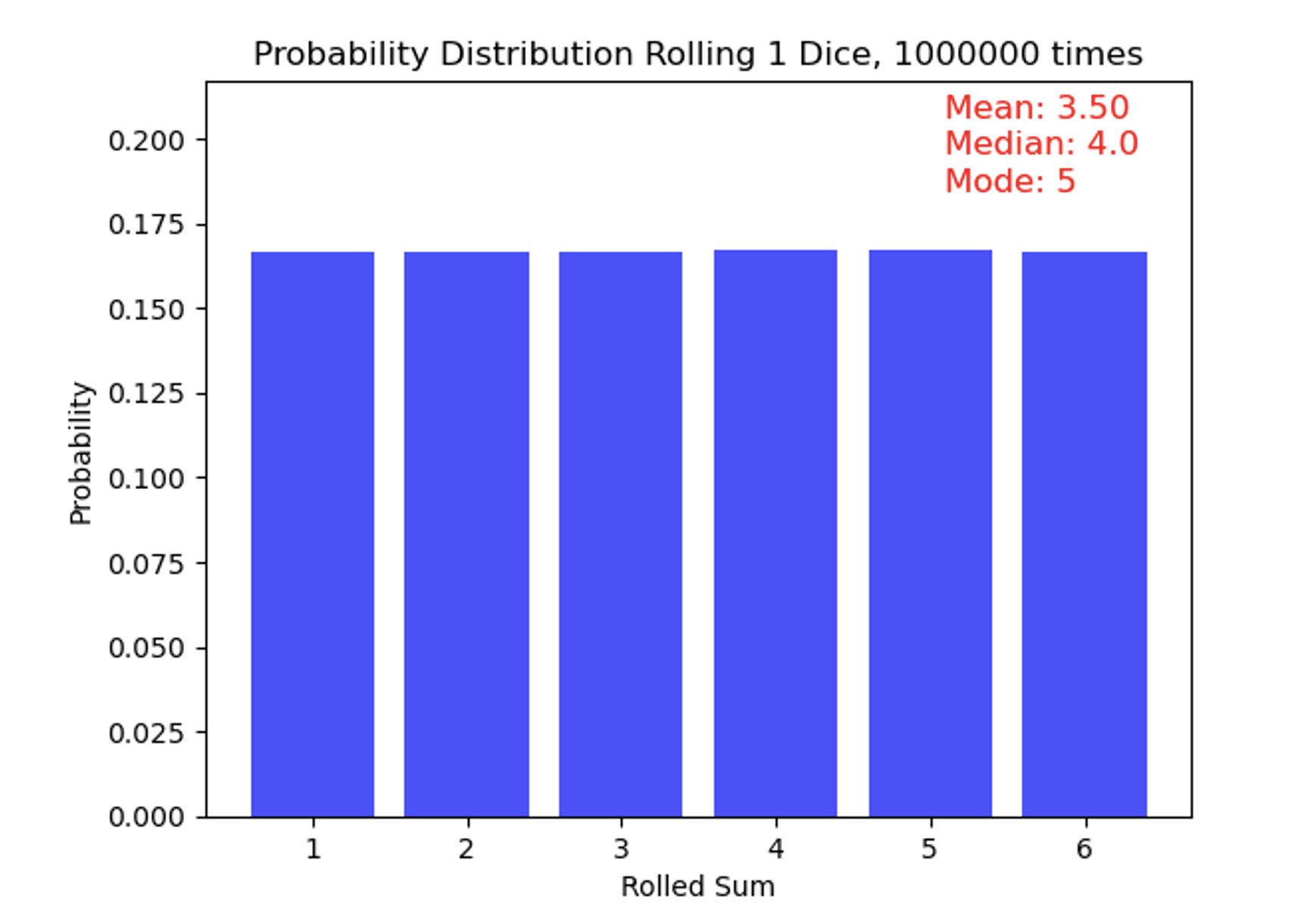
Eagle-eyed observers might take note of the statistics in the top-right corner of the figure, which show a mean of 3.5 (as expected), a median of 4, and a mode of 5. Wait—those bars look flat, so how is the mode 5!? These small deviations from perfect uniformity arise because the distribution is based on a finite (though large) sample of rolls rather than an infinite one. To make this clearer, I have added the number of rolls for each outcome above the bars, highlighting these slight differences even though the overall distribution appears very flat. With truly infinite rolls, the median would settle exactly at 3.5, and no single number would stand out as the mode.
Normal Distribution:
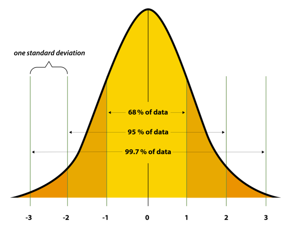
Uniform distributions are simple, but quite rare in nature. A common distribution seen in climate science – and quite prevalent across natural phenomena -- is the Normal Distribution, sometimes known as a Gaussian Distribution. This distribution follows a “bell-shaped” curve, with values closer to the central tendency (the mean and median!) being far more likely to occur than values in the “tails” of the distribution (very warm or very cold temperatures, for example). We also can briefly introduce the idea of “standard deviation” which is a measure of how much variation exists within a dataset. It is usually denoted by the Greek letter sigma. You may recognize these values, since some professors will “curve” their class grades based on this distribution (but not this one!). Small standard deviations tell us the distribution is very narrow, and all values tend to fall very close to one another. Large standard deviations tell us the opposite. If you are in a class where the mean on an exam was 81, and the standard deviation was 2, this means a *lot* of people scored very close to 81! On the other hand, if you have a mean of 81, but a standard deviation of 15, it means the distribution was far more spread out. In a symmetric normal distribution, about 68% of the data falls within one standard deviation of the mean, 95% within two standard deviations, and 99.7% within three standard deviations. Sometimes, you will hear people refer to something as a “three-sigma” outcome – this comes up in all walks of life, not just climate science. It means that it’s an event that falls at or outside the three standard deviation limit. If 99.7% of events fall within 3 standard deviations, it means a three-sigma events has less than a 0.3% chance of occurring in your distribution. Let's consider the IQ scores of a population, if IQ scores follow a normal distribution with a mean of 100 and a standard deviation of 15. An IQ score of 145 or higher is in the top 0.3% of the population, as it represents individuals with exceptionally high intelligence – this individual could be considered to score at a three sigma level (or three sigmas above the mean).
In the case of this symmetric distribution, the mean, median, and mode of a normal distribution are all equal and located smack-dab at the center. The standard deviation controls the spread or width of the distribution: a smaller standard deviation results in a narrower peak, while a larger one leads to a wider curve.
Skewed Distribution:
A Skewed Distribution can be thought of as a cousin of the normal distribution. In climate science, it typically follows something that has a lopsided bell curve. In other words, it is asymmetrical and does not exhibit mirror-image symmetry around the central value. Distributions can be either positively skewed or negatively skewed. In a positively skewed distribution, the tail on the right-hand side is longer than the left-hand side, indicating that most of the values are concentrated on the left, with a few extreme values to the right. Conversely, a negatively skewed distribution has a longer tail on the left-hand side. Unlike our normal distribution, the mean, median, and mode in a skewed distribution are not equal. Typically, in a positively skewed distribution, the mean is greater than the median, which is greater than the mode, and in a negatively skewed distribution, the mode is greater than the median, which is greater than the mean.
A variable that is positively skewed in climate science is the precipitation distribution at a particular point. Think about living in central Pennsylvania. Most of the time there is very little rain, or no rain at all. When it does rain, it’s generally more of a nuisance than anything. But occasionally, it can rain very hard or for very long periods of time. These events are rare and are outliers. Check out the graph below, the “tail” stretches much longer to the right-hand side, indicating a positively skewed distribution.

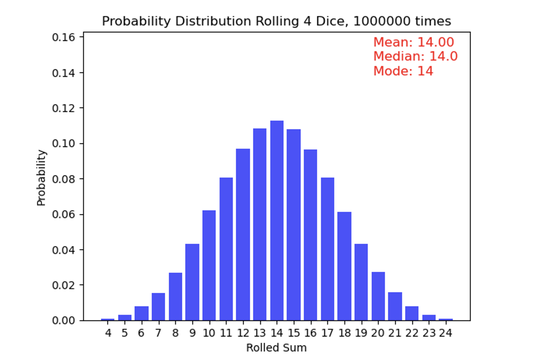
Now we roll 4 weighted dice one million times and add up what their faces show. These dice have small pieces of metal inside of them so that low numbers come up more often than high numbers. This results in a skewed distribution where combinations of lower numbers happen more frequently than higher numbers. This is an example of a positively skewed distribution, since the “tail” is longer on the right-hand side of the measures of central tendency. Also note that the mean is greater than the median, which is greater than the mode.
Quiz Yourself...
Data Analysis Techniques in Climate Science
Data Analysis Techniques in Climate SciencePrioritize...
By the time you are finished reading this page, you should be able to:
- Read and understand a time series
- Calculate an anomaly given an observed value and a climatological reference
Read...
Time series
We are typically interested how some component evolves over time and if it is changing, what is causing it to change. A time series is a fundamental data analysis approach used to gain insights into the behavior of climatic variables over some period of time. You have almost certainly come across these in other aspects of your day-to-day life, such as the price movement of the stock market or how Major League Baseball players are dealing with new rules.
In climate science, this typically involves taking some measurement or variable and quantifying how it changes over some time. This time period can be somewhat arbitrary – one could look at the annual climate of a particular region (the time period is one year long) or multiple millennia. This type of analysis permits a clear representation of trends, patterns, and fluctuations of the variable over time. By enabling the visualization of data points sequentially over time, time series graphics facilitate the identification of any consistent patterns, cyclic behaviors, abrupt changes, or otherwise weird behavior in the data.
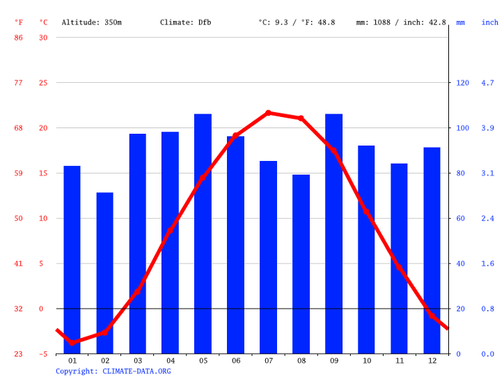
For example, a climatological time series chart below allows us to see the evolution of temperature in State College, PA. It tells us much of what we already know, that the warmest months are in July and August on average. But did you know that the month with the most precipitation is May, followed closely by September? We’ll talk more about how the circulation of the atmosphere contributes to different time series in the climate later in the semester.
Fun with units!
One thing that can be tricky for climate scientists is dealing with the correct units for variables. The most obvious one is temperature. In the United States, we commonly report temperature in units of Fahrenheit—this is probably what you are most familiar with. However, climate scientists tend to use the metric system, where temperature is measured in degrees Celsius (°C) or sometimes in Kelvin (K) for more scientific calculations. The metric system is preferred because it is used worldwide, making it easier for scientists from different countries to share and compare data with each other.
Converting between these units is quite simple - you can do it with a basic calculator. All you need to know are the relationships between them. For example, to convert a temperature from Fahrenheit to Celsius, you can use the formula:
°C = (°F - 32) * 5/9
To convert from Celsius to Fahrenheit, the formula is:
°F = (°C * 9/5) + 32
Kelvin is used mainly in scientific contexts where absolute temperature is important. To convert Celsius to Kelvin, simply add 273.15:
K = °C + 273.15
Understanding how to convert between these units is crucial in climate science because data might be collected in one unit and must be reported or analyzed in another. Misunderstanding or miscalculating units can lead to significant errors in climate models and predictions!
Quiz Yourself...
Read...
Trend
Over longer periods of time (say years to decades and beyond), we might be very interested in how a particular variable is changing over time. In combination with a time series, a trend line helps us see the overall direction in which a set of data points is moving over time. Imagine you have a graph where each dot represents a data point, like the temperature measured at different times throughout the year. These dots might seem scattered and chaotic, making it difficult to discern any pattern immediately. This is where a trend line comes into play. By drawing a straight line that best fits through these scattered dots, the trend line simplifies the complexity of the data, offering a clear, straightforward visual of whether the overall trend as a function of time is upwards, downwards, or relatively flat. It's like connecting the dots in a way that reveals the bigger picture, helping us to see beyond the short-term fluctuations and understand the broader, long-term pattern.
Temperature is actually a great example to use in a climate course. See the chart below which shows a time series of surface temperature averaged over the entire United States. Each point represents a different year. The jagged line bouncing up and down shows that there is a lot of year-to-year variability in the data. This type of jumping is usually associated with something known as “internal variability,” which we’ll talk about later in the class. The blue line represents a line (here, a linear regression) that shows the underlying trend in the data. Exactly how it’s calculated isn’t something you’ll need to do, but just notice that once you overlay this “best fit” line, you see the long-term trend from cooler temperatures to higher temperatures as you move from left to right (forward in time!). This represents a positive trend- temperatures in the United States have slowly but steadily increased over the past century.

Anomaly
It is very useful to understand the underlying distribution of variables, such as temperature or precipitation, but there are many instances where we want to know how far something deviates from its mean climatology. Having 6 inches of snow in northern Maine in December may barely induce school delays, but 6 inches of snow in Atlanta can gridlock traffic for days, even long after the snow has melted. To understand how a particular variable varies from a baseline state, climate scientists commonly calculate something known as an anomaly. An anomaly refers to the deviation of a particular variable from its long-term average over a specific time period. To calculate a climate anomaly, scientists first establish a baseline or reference period, often a time period spanning multiple decades, to represent typical or "normal" conditions for a specific location or region. This baseline is essential because it provides a standard against which current or future climate data can be compared. Once the baseline is established, the anomaly is simply the difference between the observed value and this baseline value. This difference, typically expressed as a numerical value or anomaly, indicates whether the recent climate conditions were warmer, cooler, wetter, drier, or otherwise different from the long-term average. As a simple example, if the temperature in State College on July 4th has averaged 82F over the past 30 years, then having an Independence Day holiday with a 99F temperature represents a +17F anomaly. Anomalies can be displayed in a variety of different ways. A spatial map of the air temperature anomalies during the 2021 Pacific Northwest heat wave is shown below. All of the red areas show where air temperatures climbed more than 27°F (15°C) higher than the 2014-2020 average for the same day. In other words, if Seattle normally was 80F on that day, they were actually observing temperatures of 107F!

Climate anomalies play a pivotal role in climate science for a couple of reasons. First, they allow scientists to identify and quantify variations and trends in climate data. By comparing recent climate conditions to the long-term average, researchers can detect patterns of change, such as long-term warming trends, shifts in precipitation patterns, or the occurrence of extreme weather events. These anomalies provide valuable insights into how our climate is evolving over time. Second, climate anomalies are crucial for assessing the impacts of climate change. By calculating anomalies, scientists can determine whether specific regions are experiencing changes that are outside the bounds of natural variability. This information is essential for understanding the extent to which human activities, such as greenhouse gas emissions, are influencing our climate. Identifying areas where anomalies are consistently occurring helps policymakers and communities prepare for and adapt to changing climate conditions, whether that means addressing the risks associated with sea-level rise, altered precipitation patterns, or more frequent heatwaves. Understanding how things evolve in ways that are different from the baseline we are accustomed to will be a common theme throughout the remainder of this course.
Quiz Yourself...
Below is the climatological daily mean air temperature (in degrees Celsius) over the United States on June 27th (top) and the observed daily air temperature anomaly on June 27th, 2021 (bottom).
Using this information and what you know about calculating anomalies, calculate what the observed air temperature was on June 27th, 2021 at
- Seattle, Washington
- Miami, Florida.
Report this in both Celsius and Fahrenheit!

Lesson 1 anomaly question answer
Presenter: OK, so to answer this question, we need to do a few things. First, we obviously need to know where Seattle, WA and Miami, FL are. I'm going to circle them on this top graph, but if you're not sure, you can always look up on a map on the Internet or your favorite book, something like that. So I've circled Seattle, WA and Miami, FL in black circles there.
Now we want to calculate what the actual temperature at both Seattle and Miami was on June 27th, 2021. The two graphs we have here show, on the top, the average climatological surface temperature on June 27th. Again, what we've done here is we've averaged this over a long time period and said this is the temperature that we would expect to see over many, many June 27ths. On the bottom, we have the anomaly that was actually observed on June 27th, 2021.
We know from our text that our observed air temperature is just the sum of our climatological temperature—meteorologists and climatologists sometimes refer to this as climo as shorthand—plus our anomaly, which is sometimes abbreviated anom.
So let's start with Seattle first. If we look at Seattle's climatology, we see that it lies somewhere between this contour line and this contour line, which represent 14°C and 17°C. There's actually not a 17 label here, but you could always look down here, or you could say here's 20, here's 14. We're going by threes, so the one that's in between 20 and 14 is 17. Let's estimate that the climatological temperature in Seattle is 15°C.
We then go down to our bottom plot and look at what the anomaly was that was observed on that day. Again, I'm just going to circle Seattle here, and I'm going to estimate that number to be around 12°C. Same thing: here's my 6 contour, here's my 9 contour, and Seattle looks like it's pretty much lying right along this contour right here, which if we go by threes would be 12. So now if I just add these two together, pretty straightforward, I get 27°C, and I can go ahead and convert that to Fahrenheit.
I know from our notes that converting to Fahrenheit just means I have to take what is in Celsius, multiply it by 9/5, and then add 32 to it. In this case, that will give me approximately 81°F in Seattle.
Now, I've chosen this date for a very specific reason. This was during the 2021 Pacific Northwest heat wave, where temperatures were much, much, much warmer than had previously been seen in some of these areas in the Pacific Northwest. Now, you might think 81°F is pretty roasty, but it's not overly hot. One thing I want to point out is that these temperatures I'm showing you here are the daily average. They include temperatures that you would see both during the day when the sun is up as well as at night when the sun is down. So even though the average temperature is 81°F, this is the average over that entire 24-hour period. Many of these regions in the Pacific Northwest actually experienced high temperatures greater than 100°F during this heat wave.
So let's just check out Miami. If we go down to Miami, I've circled this. Now here in the lower-right corner, it's a little tough to tell, but it is somewhere in this orange bin. This orange contour is somewhere between 26 and 29, so let's just say that it's around 28°C. That is the average temperature in Miami on June 27th.
If I go down here, I see that the anomaly is actually straddling this line that kind of goes between light blue and light red. If I look really closely, I see that that contour represents 0. So Miami on this day was actually experiencing temperatures that are pretty much right on its climatological average for this day.
If I go back to our formula up here, I see observations equal climo plus anom. Our climo is 28°C, and our anomaly is 0°C. So the observed temperature in Miami is just 28 + 0, or 28°C, and I can use my formula where I take 28, multiply it by 9/5, and then add 32 to get Fahrenheit, which equals approximately 82°F.
So on this particular day, when Seattle was experiencing some of its warmest weather in its recorded history at 81°F for a daily mean, Miami was experiencing a pretty average day, which was around the same temperature. But one thing we're going to see as we go through this class is that it's not necessarily the absolute temperature that we're concerned with, but how regions and areas are conditioned to deal with that temperature. Individuals and infrastructure in Seattle are much less equipped to handle temperatures of 81-82°F over the course of a summer day, just like Atlanta, GA, for example, would be very ill-equipped to handle a foot of snow in the middle of winter relative to a northeastern city such as Boston.
Summary
SummaryRead...
- Climate is the long-term average of weather patterns in a specific region, encompassing various components like the atmosphere, hydrosphere, cryosphere, lithosphere, and biosphere, which are all interconnected.
- Understanding climate is crucial as it affects agriculture, water availability, ecosystems, energy usage, air quality, and the resilience of coastal regions, influencing many aspects of life and society.
- Scientists study climate through observations, models, and experiments, each providing different insights that collectively enhance our understanding of the Earth's climate system.
- Analyzing climate data involves understanding distributions, trends, and anomalies to identify changes over time, which is essential for assessing the impacts of climate change and preparing for future challenges.
- A basic understanding of some statistics commonly used by scientists will come in handy for the rest of this class!
Now that we have an understanding as to what climate actually is, it begs the question, "how do we actually observe it?" Sounds like a good topic for the next lesson!
Before completing the assessments, take a few minutes to take the quiz below.