METEO 361 Lesson 3 Images
Lesson 3. Sizing up the Synoptic Scale
Front Page
large hail

Text description of the large hail image.
The image is a map of the United States with outlined state borders and shaded regions representing hail probability. The map highlights the main risk region covering parts of Louisiana, Mississippi, Alabama, Tennessee, and Arkansas. The central yellow region indicates a 15% probability of hail, surrounded by a wider brown area indicating a 5% probability. The map includes geographical details such as state outlines, and there is a legend at the bottom right of the map showing color coding for hail probability percentages. In the lower left corner, there is a NOAA/NWS logo and some textual information about the forecast.
damaging winds

Text description of the damaging winds image.
The image is a map of the central and eastern United States, depicting wind probability outlooks issued by the SPC (Storm Prediction Center). It uses a color-coded system to show different probabilities of wind events on December 23, 2015. The map highlights much of the midwest and deep south at risk for damaging winds. Brown, yellow, and red colors indicate varying levels of wind probability risks, with brown being the lowest and red the highest. The brown area surrounds the yellow and red regions, covering a broader area. The yellow area is between the brown and red, while the red, indicating a 30% probability, is concentrated in central areas of the map. A legend in the bottom right corner explains the color coding: 5% (brown), 15% (yellow), and 30% (red).
tornadoes

Text description of the tornadoes image.
The image shows a weather map of the central and southeastern United States, indicating the probability of tornado occurrence. Various regions are shaded in different colors representing the likelihood, including green (2%), brown (5%), yellow (10%), and red (15%), with escalating risk near the center. An additional region of hashmarks is drawn indicating the possibility for strong (EF2+) tornadoes. Portions of Arkansas, Mississippi, and Tennessee are in the highest tornado risk area. The map includes state boundaries drawn in black. At the bottom left corner is the NOAA logo and text detailing the Storm Prediction Center's outlook issuance information.
overlay of severe weather reports on the 13Z Day 1 Convective Outlook

Text description of the overlay of severe weather reports on the 13Z Day 1 Convective Outlook image.
The image is a weather map of the United States, showing severe weather outlook and preliminary storm reports for December 23-24, 2015. Different shaded regions illustrate areas of varying risk for severe weather. A dark green area labeled "TSTM" indicates the potential for thunderstorms. The marginal risk area, labeled "MRGL," is in light green, and covers parts of the southeastern United States. The slight risk area labeled "SLGT" is in yellow and extends over the entire Mississippi valley. An enhanced risk area in orange, labeled "ENH," and a moderate risk area in red, labeled "MDT," are also shown. Numerous colored symbols on the map represent reports of hail (green), wind (blue), and tornadoes (red). A legend on the bottom right provides a color key and explains the symbols.
Day 4 Convective outlook from December 20

Text description of the Day 4 Convective outlook from December 20 image.
The image is a map of the United States with state boundaries outlined. A yellow polygon is drawn and focused over portions of Louisiana, Arkansas, and Mississippi. This polygon represents a 15% risk of severe weather on day 4. A legend on the right indicates the shading corresponds to a 15% risk category for severe weather. There is also a small red box labeled "30%" in the legend but not appearing on the map itself. A logo in the bottom left corner reads "NOAA/NWS Storm Prediction Center, Norman, Oklahoma."
Assessing Strong Updrafts
sounding from Pittsburgh, Pennsylvania at 12Z on January 6, 2016

Text description of the sounding from Pittsburgh, Pennsylvania at 12Z on January 6, 2016 image.
The image is a Skew-T Log-P diagram from the University of Wyoming, depicting atmospheric conditions for Pittsburgh. The graph comprises a series of colored lines, with temperature and pressure axes plotted along a logarithmic grid. The right black line represents the temperature profile, while the left black line depicts the dew point profile. Isobars, isotherms, and mixing ratio lines are present in the background for reference. Wind barbs are displayed along the right, illustrating wind speed and direction at various altitudes. The vertical axis indicates pressure in hPa and altitude in meters, while the horizontal axis shows temperature in degrees Celsius.
annotated sounding showing the path a parcel would take

Text description of the annotated sounding showing the path a parcel would take image.
The image is a skew-T log-P diagram, specifically illustrating atmospheric sounding data from Pittsburgh. The graph displays isobars, isotherms, and wind barbs. Horizontal black lines represent pressure levels ranging from 1000 to 100 millibars, decreasing logarithmically. Curved green lines indicate isotherms, slanted toward the right, with temperatures scaling from -40°C to 40°C. Thin purple lines depict dry adiabats, while dashed blue lines represent moist adiabats. Thick black lines show the temperature and dew point profiles. Red lines highlight the mixing ratio lines, slanting from bottom left to top right.
A red arrow is drawn showing the path a parcel would take if lifted. Initially, the red lines extend from the surface at both the observed temperature and dew point. The red line rises dry adiabatically from the temperature observation, and along the mixing ratio line from the surface dew point. When these two lines meet, a single red arrow extends nearly moist adiabatically from this intersection to the 300mb level.
idealized skew-T near the top of this page

Text description of the idealized skew-T near the top of this page image.
The image displays a simplified skew-T showing temperature and dew point plotted along constant temperature and pressure surfaces. The chart features a large, green, shaded area labeled as the "Positive area (CAPE)" between a blue and a black temperature line, representing the Convective Available Potential Energy. The blue line represents the path of a parcel being lifted through the atmosphere. The right black line indicates the temperature profile and the left black line is the observed dew point through the column. The chart is overlaid with diagonal grey grid lines and is marked with horizontal pressure levels ranging from 1000 to 200 hPa, denoted on the left. Three key points are marked in purple: EL (Equilibrium Level), LFC (Level of Free Convection), and LCL (Lifted Condensation Level).
tables describing CAPE values on the Internet

Text description of the tables describing CAPE values on the Internet image.
The image is a color-coded table displaying the relationship between CAPE (Convective Available Potential Energy) values and convective potential. The table has two columns: "CAPE value" and "Convective Potential." The rows are filled with different background colors corresponding to varying levels of instability. The first row is light blue, indicating a CAPE value of "0" and labeling it as "Stable." The second row is light green for values "0-1000," marked as "Marginally Unstable." The third row is pale yellow for "1000-2500," tagged as "Moderately Unstable." The fourth row is light orange for "2500-3500," described as "Very Unstable." The fifth row is light red for "3500+," noted as "Extremely Unstable." Beneath the table is a footnote in blue text starting with a double asterisk, giving a caveat regarding CAPE values.
Transcribed Text:
CAPE value | Convective Potential 0 | Stable 0-1000 | Marginally Unstable 1000-2500 | Moderately Unstable 2500-3500 | Very Unstable 3500+ | Extremely Unstable
** Caveat: Note that there are no threshold values of CAPE above which severe thunderstorms become imminent.
Lapse Rates
less than the dry adiabatic lapse rate but greater than the moist adiabatic lapse rate

Text description of the less than the dry adiabatic lapse rate but greater than the moist adiabatic lapse rate image.
The image is a graph illustrating concepts related to atmospheric stability, specifically conditional instability. The vertical axis represents altitude in kilometers, ranging from 1 to 10 km. The graph features three main lines: a dashed line labeled "Dry Adiabat", a solid red line labeled "Sounding" following a similar, but less steep slope, and a dotted line labeled "Moist Adiabat" curving slowly to the left at a minimal slope. Several arrows are drawn around these lines, indicating movements or processes. Red circles are placed along the two black lines at various points showing parcel location. Text labels describe different elements of the graph. The background is white, and the lines and text are predominantly black, with the exception of the red elements.
20Z low-level lapse rates

Text description of the 20Z low-level lapse rates image.
The image is a weather map depicting mesoscale analysis data over the central United States. It displays contour lines indicating different values of the 0-3km lapse rate. The contours are color-coded: red, orange, green, and blue, showing various levels of atmospheric instability. The map outlines parts of the Midwest and Great Plains regions, labeled with state boundaries. Lapse rates that exceed 8 C/km are shaded in red, prominently visible in the southwestern area, specifically over the southern parts of Colorado and Kansas. The northwest part of the map has blue contours indicating lower values. The rest of the region features orange and green contours, showing moderate levels.
20Z analysis of CAPE and CIN

Text description of the 20Z analysis of CAPE and CIN image.
The image is a meteorological map with contours showing CAPE values and shaded regions showing CIN. The red contours are labeled with specific CAPE values ranging from 500-2500 J/kg. Blue shading with hatch patterns covers certain areas highlighting regions of CIN and range from -25 to -200. The background is a light tan with faint wind barbs, representing wind speed and direction.
20Z analysis of surface temperatures

Text description of the 20Z analysis of surface temperatures image.
The image is a weather map of the contiguous United States depicting surface temperatures in Fahrenheit on 20Z on Saturday, July 3, 2010. The map uses a color gradient ranging from green to red, with contour lines to indicate temperature ranges. The northern regions, such as parts of the Pacific Northwest and northern Great Plains, show cooler temperatures in shades of green, indicating 60°F to 75°F. Moving south, the map transitions through yellow and orange, with temperatures increasing to 85°F across much of the Midwest and Northeast. The central and southern regions, especially the Southwest and Texas, are shown in red, representing higher temperatures, ranging from 90°F to 95°F. The Gulf Coast and southeastern states also report temperatures around 85°F.
21Z surface analysis

Text description of the 21Z surface analysis image.
The image is a surface analysis map of the contiguous United States. It features isobars, fronts, and pressure systems. Isobars are maroon lines that curve across the map, labeled with pressure values in millibars, showcasing different pressure levels. Blue "H" symbols denote areas of high-pressure, while red "L" symbols indicate low-pressure systems. Blue lines with triangles represent cold fronts, while red lines with semicircles indicate warm fronts. Some lines are a mix of both symbols, denoting stationary fronts.
rather weak upslope flow

Text description of the rather weak upslope flow image.
The image is a surface map from the NOAA/NWS Storm Prediction Center, showing the Midwest and Great Lakes regions of the United States. It features isobars, which are curved black lines indicating areas of equal atmospheric pressure. The isobars are labeled with pressure values, such as 1004, 1006, 1008, etc. The map also includes orange wind barbs representing wind directions and strengths.
topographic map

Text description of the topographic map image.
The image is a topographical map of the contiguous United States. It uses a color gradient to indicate elevation changes across various regions. The western part of the map, including the Rocky Mountains, is depicted with shades of purple and dark red, indicating higher elevations. The central plains are shown in green, representing lower elevations. In the eastern region, the Appalachian Mountains appear in shades of red and pink. Large bodies of water, such as the Great Lakes and Gulf of Mexico, are depicted in bright blue. The Pacific Ocean along the western coastline is also shown in blue. The map is detailed, capturing the varied terrain of the country.
23Z radar reflectivity

Text description of the 23Z radar reflectivity image.
The image shows a weather radar map with various patches of precipitation in different colors, indicating varying intensities. The background is black, allowing the colors to stand out clearly. Predominantly, areas of blue and green represent lighter precipitation, while yellow and red areas indicate heavier rainfall and storm activity. The map includes a color scale on the left, labelled "DBZ," ranging from dark blue for light precipitation to white for the most intense storms. There are several distinct patches of activity scattered across the map, with notable clusters in eastern Wyoming and western Nebraska.
revisit the Miami skew-T from earlier on the page

Text description of the revisit the Miami skew-T from earlier on the page image.
The image is a Skew-T Log-P diagram showing pressure levels on the vertical axis (in millibars) and temperature on the horizontal axis (in degrees Celsius). The background is filled with skewed green lines representing temperature, mixing ratio, and moist and dry adiabats, creating a grid pattern. Two primary plotted lines prominently feature in the foreground: a red line representing temperature and a green line for dew point temperature. A blue line is drawn highlighting the path a parcel would take if lifted from the surface. Height in meters is labeled along the vertical axis. Various technical details and indices are displayed on the right side of the diagram, CAPE is specifically highlighted and has a value of 1649 J/kg. Wind barbs on the side provide wind speed and direction information.
Vertical Wind Shear
vertical profile of winds, showing an environment with relatively strong vertical wind shear

Text description of the vertical profile of winds, showing an environment with relatively strong vertical wind shear image.
The image shows a diagram representing atmospheric pressure in millibars along a vertical axis. The axis is marked with pressure levels: 1000, 925, 850, 700, 500, and 400 millibars, from bottom to top. Each pressure level has its own wind barb drawn showing wind speed and direction with height. The top of the diagram indicates an approximate altitude of 6 kilometers. To the right of the axis, "PRESSURE (mb)" is written vertically.
vertical profile of winds

Text description of the vertical profile of winds image.
The image shows a diagram representing atmospheric pressure in millibars along a vertical axis. The axis is marked with pressure levels: 1000, 925, 850, 700, 500, and 400 millibars, from bottom to top. Each pressure level has its own wind barb drawn showing wind speed and direction with height. The top of the diagram indicates an approximate altitude of 6 kilometers. To the right of the axis, "PRESSURE (mb)" is written vertically.
wind compass

Text description of the wind compass image.
The image is a circular compass rose featuring sixteen directional points. The center contains a star-like design with alternating black and white triangular points extending outward, symbolizing the primary and intermediate directions. Surrounding the star is a green circle, labeled with intermediate compass directions such as NNE (North-Northeast) and SSW (South-Southwest) in black text. Outside this circle is another ring in brown, marked with degree measurements at intervals: 0° at North, 45° at Northeast, 90° at East, 135° at Southeast, 180° at South, 225° at Southwest, 270° at West, and 315° at Northwest. The directions and degrees create a complete 360° circle. The name "The COMET Program" appears in black text at the bottom right corner.
The Big Picture at 500 mb
animation tracking a parcel through a shortwave trough

Text description of the animation tracking a parcel through a shortwave trough image.
The image features a diagram depicting atmospheric dynamics with two sets of curved lines. The black lines are wavy and span from left to right, illustrating airflow or pressure contours. Red dashed lines form elliptical shapes, indicating changes in vorticity. An "X" marks the central ellipse. On the left side, text in a green-bordered box explains the concept of increasing vorticity and convergence, with green arrows visualizing airflow convergence. On the right, text in a blue-bordered box discusses decreasing vorticity and divergence, with blue arrows demonstrating airflow divergence. A small black and white checkerboard pattern is shown in the top left corner.
Transcribed Text:
As parcels move towards the trough axis, they move into an environment of increasing vorticity. In order to maintain equilibrium with their surroundings, parcels must also increase vorticity. The only way that they can do this is to undergo convergence.
As parcels move away from the trough axis, they move into an environment of decreasing vorticity. In order to maintain equilibrium with their surroundings, parcels must also lose vorticity. The only way that they can do this is to undergo divergence.
500-mb pattern shown by the 12Z run of the NAM on February 2, 2016, valid at 18Z

Text description of the 500-mb pattern shown by the 12Z run of the NAM on February 2, 2016, valid at 18Z image.
The image is a forecast map depicting 500mb height and absolute vorticity forecast over North America. Curved lines, indicating height contours, span the map, forming wave-like patterns. Yellow and brown shading signifies different vorticity levels, with deeper shades representing higher values. Isoheights are labeled with values ranging between 536-576 indicating the heightof the 500mb level in decameters. Wind barbs represent wind direction and flow, and the map is topped by labeled geographic markers such as countries and states. The date and time of the forecast ("02/02/16 12UTC") are displayed at the top, along with the issuing organizations, NCEP and NOAA. A color key on the left indicates vorticity values in red, orange, and yellow.
marks a subtle vort max and shortwave trough

Text description of the marks a subtle vort max and shortwave trough image.
The image is a forecast map depicting 500mb height and absolute vorticity forecast over North America. Curved lines, indicating height contours, span the map, forming wave-like patterns. Yellow and brown shading signifies different vorticity levels, with deeper shades representing higher values. Isoheights are labeled with values ranging between 536-576 indicating the height of the 500mb level in decameters. A circle is drawn and labeled "subtle vort max" over an area of locally enhanced vorticity over New Mexico. Arrows represent wind direction and flow, and the map is topped by labeled geographic markers such as countries and states. The date and time of the forecast ("02/02/16 12UTC") are displayed at the top, along with the issuing organizations, NCEP and NOAA. A color key on the left indicates vorticity values in red, orange, and yellow.
17Z Rapid Refresh analysis of 500-mb heights

Text description of the 17Z Rapid Refresh analysis of 500-mb heights image.
The image is a meteorological map illustrating 500 millibar height and vorticity over the continental United States. The map features several colors to indicate different data points, with shades of green, yellow, and red representing varying vorticity levels. Blue contour lines highlight specific values, creating a swirling pattern that shows atmospheric circulation. Black lines, representing isoheights, cross the map from west to east, curving around low and high-pressure systems. The green areas primarily cover the western and central regions, with the yellow and red zones indicating higher vorticity in the central states. Various numbers and symbols are inscribed throughout the map to denote specific weather data.
Day 1 Convective outlook

Text description of the Day 1 Convective outlook image.
The image is a Storm Prediction Center severe weather outlook showing the categorical likelihood for severe weather across the United States. The map highlights several states in varying shades of color to indicate the risk levels of thunderstorms. A large area covering parts of the Midwest to the Southeast is shaded green, indicating a marginal risk (MRGL). Within this, there's a yellow area representing a slight risk (SLGT), and an orange area highlighting an enhanced risk (ENH). The map contains geographic boundaries such as state lines and major water bodies. In the bottom right corner, there's a legend with color codes indicating risk levels from thunderstorms to high risks. The NOAA (National Oceanic and Atmospheric Administration) and NWS (National Weather Service) logos are displayed in the bottom left corner.
12Z 500-mb RUC analysis from July 14, 2010

Text description of the 12Z 500-mb RUC analysis from July 14, 2010 image.
The image is a meteorological map showing the 500mb height, temperature, and wind patterns over the central and eastern United States. The map features contour lines in black, representing geopotential heights. A blue shaded region near the base of the trough in the northern great plains indicates the position of the jet stream. Thin, brown contour lines outline the topography, showing elevation variations. Red numbers and lines appear on the map, indicating temperature data. There is also a series of short, wind-barbed lines illustrating wind direction and speed. The general layout of the map covers several states, with clear geographical details like coastlines and state boundaries.
Lee Troughs
animation of a parcel with a changing rate of spin

Text description of the animation of a parcel with a changing rate of spin image.
The animation features a 3D cylindrical object in the center, divided into four shaded sections, two darker and two lighter. Behind the cylinder, there is a grid on the floor, extending into the distance, and a gradient background transitioning from purple at the top to white near the middle. Two large red arrows point outward from the center, positioned on either side of the cylinder on the grid, and the cylinder expands and slows down. Alternatively, when the arrows point inward, the cylinder gets thinner, taller, and spins faster. The arrows are elongated and three-dimensional, creating a sense of motion or direction.
increase in absolute vorticity

Text description of the increase in absolute vorticity image.
The image illustrates the conservation of potential vorticity using two diagrams of a parcel of air. On the left, a short red cylindrical shape represents the initial parcel. It has an orange arrow wrapped around it, indicating cyclonic spin (ζ), situated between two dashed lines labeled Θ₂ and Θ₁, and marked with "H" to denote the height. To the right, a taller red cylindrical shape indicates the final state. It also has an orange arrow indicating an increased cyclonic spin. Between the two cylinders is a large gray arrow pointing from left to right. Below the diagrams, two sections compare initial and final values with formulas showing how values change, emphasizing the increase in relative vorticity. Text at the top describes the conservation of potential vorticity concept.
Transcribed Text:
Conservation of potential vorticity means that as a parcel stretches (H increases) the parcel’s cyclonic spin (ζ) must increase. This is because (ζ+f)/H must always be constant. Consider the example below...
Initial...
f=10 x 10⁻⁵ s⁻¹ ζ=1 x 10⁻⁵ s⁻¹ H=1000 m
ζ+f/H = 11 x 10⁻⁸ s⁻¹m⁻¹
Final...
f=10 x 10⁻⁵ s⁻¹ ζ= ? s⁻¹ H=1500 m
ζ=(H)(11 x 10⁻⁸ s⁻¹m⁻¹) - f ζ=6.5 x 10⁻⁵ s⁻¹
Relative Vorticity Increases
surface trough at 12Z on January 1, 2004

Text description of the surface trough at 12Z on January 1, 2004 image.
The image is a weather map of the United States showing sea level pressure patterns. It is color-coded to indicate different pressure levels. In the Pacific Northwest, a low-pressure area is highlighted in shades of purple and blue with pressure values of 1000 mb and 1008 mb. Moving eastward, the central U.S. features a light blue region indicating another low-pressure area marked with an "L". The Midwest and Northeast are covered in orange and red hues, representing higher pressure levels, with values ranging from 1024 to 1028 mb. Contour lines are used to connect areas of equal pressure across the map.
700-mb analysis from 12Z on June 10, 2004

Text description of the 700-mb analysis from 12Z on June 10, 2004 image.
The image is a 700mb analysis map of the United States. The map is filled with multicolored lines and symbols. Black contour lines represent height contours. Red dashed lines correspond to temperature, while green lines denote dew point. Blue symbols represent wind barbs indicating wind speed and direction. The density of lines and symbols varies across the map, providing a complex visualization of weather conditions at the 700 MB pressure level.
12Z surface weather map

Text description of the 12Z surface weather map image.
The image is a surface weather map displaying meteorological data and conditions as of 7:00 A.M. EST on June 10, 2004. The map covers the central and eastern United States. It includes various weather fronts, represented with distinct symbols and colors: a red low-pressure symbol labeled “LOW” near Texas, a blue cold front marked with triangular pips running north through Kansas to the Great Lakes, and a red warm front with semicircles shown across the upper Midwest. Green shaded areas depict precipitation zones scattered throughout, primarily concentrated over the Midwest and Eastern regions. The isobars, or lines of equal pressure, are drawn in brown, weaving across the map to indicate areas of equal atmospheric pressure. Station data with numerical values indicate temperature, pressure, and other meteorological information at different locations.
Surface Boundaries and the Big Picture
ahead of the low's cold front and on the warm side of the warm front
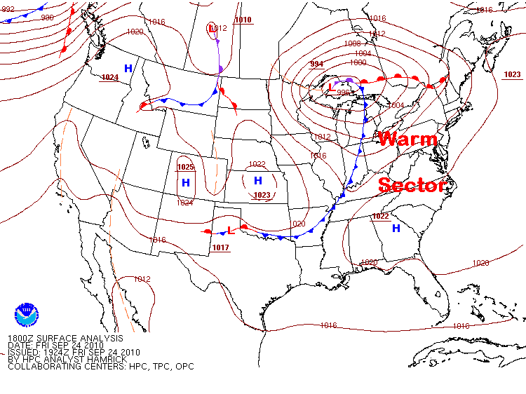
Text description of the ahead of the low's cold front and on the warm side of the warm front image.
The image is a weather map of the United States, displaying various meteorological symbols and lines. It features red and blue lines with triangles and semicircles indicating cold fronts, warm fronts, and stationary fronts across the map. The red lines with circles represent warm fronts, while blue lines with triangles designate cold fronts. Several high-pressure areas are shown with the letter "H" in blue, and low-pressure areas are marked with "L" in red. Isobars, depicted as brown lines, contour the map, illustrating areas of equal atmospheric pressure. The words "Warm Sector" are prominently marked in bold red letters in the region between the cold and warm front. The rest of the map shows pressure values annotated at various points.
1945Z visible satellite image

Text description of the 1945Z visible satellite image image.
The image is a satellite view of a section of the United States, displayed in grayscale, capturing clouds across the midwest and great plains. The map shows the outlines of several states, with a mix of clear skies and cloud formations. Notably, there is a distinct boundary where clear sky meets a cumulus cloud field, labeled with yellow lines and labeled in bold yellow text. The top portion of the image features high-altitude clouds in the northeastern region, while the lower portion has larger cloud formations to the south. State borders are visible, and there is a gradient from light to dark areas indicating cloud density and sky clarity.
21Z visible image

Text description of the 21Z visible image image.
The image is a black and white satellite weather map highlighting several U.S. states, including Minnesota, Iowa, Missouri, and parts of surrounding states. A large mass of clouds is visible in the lower left quadrant over Kansas and Missouri, indicating significant weather activity. Lighter cloud cover is scattered throughout the image, particularly over Iowa and Wisconsin, indicating varying weather patterns.
close-up 21Z surface analysis

Text description of the close-up 21Z surface analysis image.
The image is a detailed weather map showing meteorological data over part of the United States. Red and blue lines indicate warm and cold fronts, marked by semi-circles or triangles respectively. The map is overlaid with station plots providing temperature, pressure, dew point, and wind information. Isobars, curved lines indicating equal atmospheric pressure are drawn in maroon across the map. The background is light gray, enhancing the visibility of the features.
2245Z visible image

Text description of the 2245Z visible image image.
The image is a satellite weather map showing cloud formations over the central United States. An area of deep convection is present over Oklahoma and Kansas with a second line of storms apparent across Minnesota. In the upper section, scattered cloud formations cover portions of states like Iowa and Wisconsin, while clearer skies are visible over other areas. The map features state boundaries, helping to locate the weather activity geographically.
21Z composite of base reflectivity

Text description of the 21Z composite of base reflectivity image.
The image is a weather radar map showing portions of the central United States. The map includes state boundaries and is overlaid with radar data in various colors, indicating different levels of reflectivity in decibels (dBZ). Green, yellow, and blue spots represent areas of weather activity. Two black lines are drawn across the map, labeled "Surface boundary" and "Perhaps a second line of convergence," indicating meteorological features. The top right corner shows part of a large blue body of water, likely one of the Great Lakes.
23Z composite of base reflectivity

Text description of the 23Z composite of base reflectivity image.
The image displays a weather radar map showing the central region of the United States. The map highlights parts of several states including Minnesota, Wisconsin, Iowa, Missouri, Nebraska, and the Dakotas. Areas of varying weather activity are depicted using colors ranging from light greens and blues to reds and purples. The colored areas represent different levels of reflectivity, indicating precipitation intensity and type. The background is a neutral beige color, and state boundaries are marked in black. Storms have begun to initiate across portions of Minnesota and Iowa.
21Z surface analysis

Text description of the 21Z surface analysis image.
The image is a weather surface analysis map of the contiguous United States, featuring isobars, pressure systems, and frontal boundaries. Red lines with numbers indicate isobars, which show lines of equal atmospheric pressure across the region. High-pressure systems are denoted by blue "H" symbols, while low-pressure systems are marked with red "L" symbols. Various frontal boundaries are depicted: blue lines with triangles indicate cold fronts, red lines with semicircles indicate warm fronts, and purple lines indicate occluded fronts. The map identifies several pressure centers with specific isobar values. Additionally, the border of the continental U.S., as well as parts of Canada and Mexico, are clearly outlined.
21Z mosaic of composite reflectivity

Text description of the 21Z mosaic of composite reflectivity image.
The image is a weather radar map showing precipitation activity across parts of the central United States. The map is color-coded with a gradient scale on the left indicating precipitation intensity, ranging from light green (lowest) to purple (highest). Multiple lines of strong storms can be seen moving across Wisconsin , with another line developing across central Minnesota. Two white diagonal lines point to these storms in Minnesota and is captioned "Thunderstorms erupting near the occluded and cold fronts. The background is black, and boundaries of states are outlined in thin lines. The time and date at the bottom indicate the data is from July 14, 2010.
analysis of 1000 mb streamlines (a proxy for the surface) superimposed on mixing ratio

Text description of the analysis of 1000 mb streamlines (a proxy for the surface) superimposed on mixing ratio image.
The image depicts a meteorological map depicting 1000mb streamlines and mixing ratio. The map features a green and brown color scheme, where green regions are higher mixing ratios and brown areas are lower. Yellow lines and arrows indicate streamlines, showing wind near surface wind patterns across the domain. The map includes a grid overlay of latitude and longitude lines. At the bottom of the image, text is printed in white against a black background.
secondary low and along the occluded and cold fronts
Text description of the secondary low and along the occluded and cold fronts image.
The image is a surface analysis weather map of the United States. Maroon lines representing isobars indicate areas of equal atmospheric pressure, with numerical values labeled along these lines. Blue lines with triangles mark cold fronts, while red lines with semicircles signify warm fronts. Regions labeled with "H" represent areas of high pressure, and "L" indicates low pressure systems. A notable area of low pressure in the northern Plains and a high pressure over the southeastern US.
Prefrontal Troughs and Confluence
model includes showers and thunderstorms developing along or just ahead of the low's cold front

Text description of the model includes showers and thunderstorms developing along or just ahead of the low's cold front image.
The image is a weather map illustrating an idealized low pressure over eastern United States. It features key meteorological elements such as a 500-millibar flow pattern, a trough, and a ridge. A wide, light purple arrow curves from the northwest to the southeast, labeled "500-mb Flow." A dashed brown line indicates a "500-mb trough" running from the northern plains toward the south-central region. To the east, a zigzag brown line represents a "500-mb ridge." In the central section, a thick blue line marked with blue triangles represents a cold front and the red dots drawn ahead of the front are labeled "Squall Line" and stretches from Texas to Illinois. Adjacent to this is a green shaded area, labeled "Tongue of warm, moist air," also featuring a green arrow pointing northward. A red line with semicircles on the eastern side of the low, denoting a warm front. The map includes outlines of U.S. states for geographical reference.
06Z composite of radar reflectivity

Text description of the 06Z composite of radar reflectivity image.
The image is a radar image showing a large storm system Texas, Oklahoma, and Arkansas. The map features state boundaries in thin orange lines against a black background. The radar imagery shows a vibrant display of colors indicating precipitation levels, ranging from blue to green, yellow, and intense red, indicating higher levels of precipitation. The main line of strong storms stretches north to south across eastern Texas. Further north, there is a broad precipitation field with moderate rainfall. The map includes a color scale on the left labeled "DBZ" from 5 to 75, indicating different radar reflectivity levels, with colors ranging from blue to red and pink.
06Z analysis of surface streamlines

Text description of the 06Z analysis of surface streamlines image.
The image displays a weather map featuring wind patterns overlaid with green flow lines and arrows against a black background. These lines demonstrate the direction of wind flow across various states in the Southern and Central United States, including Texas, Oklahoma, Louisiana, Arkansas, and Mississippi. The lines indicate the direction of wind speed and highlight areas of convergence. The state borders are highlighted in light orange, providing geographical context.
06Z field of surface moisture convergence

Text description of the 06Z field of surface moisture convergence image.
The image is a map of the United States showing surface moisture convergence and mixing ratios. The map is outlined with state boundaries and includes contour lines and shaded areas in varying shades of green. The darker green areas indicate higher mixing ratio values, primarily concentrated in the southeastern region of the country. Red contour lines are overlaid, indicating specific values of moisture convergence. The background is filled with brown wind vectors across the entire map. There is a gradient bar at the bottom indicating values ranging from 8 to 16.
closed 500-mb low

Text description of the closed 500-mb low image.
The image displays a map of the central and eastern United States showing 500mb heights. The map is overlaid with green contour lines representing geopotential heights at the 500 mb pressure level. The lines form various curved patterns across the map, with numbers indicating height values at specific locations, such as 5400, 5460, 5520, and so on. The contour lines form a deep trough and upper level low across Texas. The background is black, and the state boundaries are outlined in a thin orange-brown line.
lobe of very high absolute vorticity

Text description of the lobe of very high absolute vorticity image.
The image is a weather map displaying absolute vorticity data over a region in the United States. The map uses contour lines in bright cyan to denote areas of equal vorticity values, and color shading to indicate intensity levels. The vorticity levels range from lower blue shades to higher red shades, with the most intense vorticity depicted in a deep red hue located centrally, primarily over Texas. A color scale on the right indicates the range from deep blue, representing lower values, to red, representing higher values. The diagram also includes text in white pointing to a specific area labeled "Lobe of relatively high absolute vorticity." Grid lines outline state borders with additional latitude and longitude lines.
06Z synoptic-scale analysis of mean sea-level pressure

Text description of the 06Z synoptic-scale analysis of mean sea-level pressure image.
The image is a surface map showing fronts, station plots, and isobars across Texas and Louisiana. Blue triangles along a curved line represent a cold front moving eastward. The image also highlights a "Prefrontal trough" line annotated with black text pointing two a series of red lines and dots analyzed through a trough. Station plots, scattered across the map, show temperature, dew point, pressure, and wind information. Maroon contour lines across the surface map indicate isobars and show local troughs and ridges.
corresponding 21Z surface analysis

Text description of the corresponding 21Z surface analysis image.
The image shows a surface weather analysis map of the United States. Areas of high and low pressure are labeled by a red "L" for low pressure and blue "H" for high pressure. Cold fronts are drawn in blue with triangles, warm fronts in red with semi circles, and occluded fronts in purple, all are connected to an area of low pressure. Isobars, thin red lines, indicate pressure contours across the map. The central U.S. displays tightly packed isobars around a low-pressure system, indicating a storm. The northwest has high pressure with widely spaced isobars. The map includes the entire contiguous United States, parts of Canada, and northern Mexico.
2330Z reflectivity

Text description of the 2330Z reflectivity image.
This image shows composite reflectivity information over the southeastern United States. It features several states outlined in light orange lines including Mississippi, Alabama, Georgia, South Carolina, and parts of neighboring states. The map is overlaid with a spectrum of colors representing different intensity levels of precipitation. Blue and green indicate lighter precipitation, while yellow, orange, and red areas represent more intense precipitation. Numerous strong suppercellular thunderstorms are located across Mississippi, Alabama, and Georgia with lighter rain further south over Florida.. The left side of the map displays a color scale labeled "DBZ" ranging from light blue at 5 to purple at 75, denoting the intensity of the precipitation. The map's bottom edge features text in red.
surface-based CAPE

Text description of the surface-based CAPE image.
The image is a weather map of the contiguous United States, displaying convective available potential energy (CAPE) and convective inhibition (CIN) data. It features a grid surface wind barbs showing wind speed and direction. Areas of different blue shades represent regions with varying levels of negative buoyancy (CIN). Several red contour lines, labeled with numbers such as 1000, 2000, and 3000, detail CAPE values concentrated mostly in the Southern and Southeastern United States. Text annotations indicate specific values, enhancing the map's scientific data portrayal.
vertical wind shear

Text description of the vertical wind shear image.
The image is a weather map of the United States displaying surface to 6 km wind shear vectors in knots. The map is overlaid with numerous contour lines and numeric values, depicted in blue, representing the wind shear intensity. The background consists of a simplified outline of the United States, with state boundaries faintly marked in brown. A strong wind shear gradient appears across the central US, with weaker wind shear in the north and stronger to the south. The map is labeled with numerical values at various points to denote the shear intensity, ranging from 10 to 110 knots.
deep moist convergence over the eastern Gulf and Southeast Coasts 12 hours later

Text description of the deep moist convergence over the eastern Gulf and Southeast Coasts 12 hours later image.
The image is a weather map of the United States showing flux convergence and the 100mb mean mixing ratio. The map shows solid contour lines in red and green with dashed blue lines showing flux convergence. The contour lines are concentrated in the southeastern part of the U.S., stretching from Texas through the southeastern states and up the East Coast, extending into the Atlantic Ocean. Red contour lines are more concentrated on the East Coast, while green lines spread from southern Texas to the eastern coast. Blue lines are sparse and appear in the southeastern regions. The map includes numerical values along the contour lines, indicating mixing ratio values.
strong cold front

Text description of the strong cold front image.
A black-and-white surface weather analysis map of the United States, southern Canada, Mexico, and surrounding waters. State and national boundaries are outlined in black, while curved red isobars are labeled with pressure values such as 1000, 1004, 1008, 1012, 1016, 1024, and 1026. Blue “H” symbols mark high-pressure centers, including a 1026 center over the central Plains and a 1032 center in the western United States. Red-and-blue “L” symbols mark low-pressure centers, including a 998 center near the Great Lakes and a 994 center over eastern Canada.
Blue lines with triangular barbs indicate cold fronts extending from the central United States toward the Gulf of Mexico and along the eastern United States. Red lines with semicircles indicate warm fronts, and alternating red-and-blue lines appear around the northeastern low-pressure system. Purple frontal segments are also shown near the Great Lakes and Northeast. A small NOAA-style logo appears in the lower-left corner, above a block of analysis information.
2330Z radar review

Text description of the 2330Z radar review image.
This image shows composite reflectivity information over the southeastern United States. It features several states outlined in light orange lines including Mississippi, Alabama, Georgia, South Carolina, and parts of neighboring states. The map is overlaid with a spectrum of colors representing different intensity levels of precipitation. Blue and green indicate lighter precipitation, while yellow, orange, and red areas represent more intense precipitation. Numerous strong suppercellular thunderstorms are located across Mississippi, Alabama, and Georgia with lighter rain further south over Florida.. The left side of the map displays a color scale labeled "DBZ" ranging from light blue at 5 to purple at 75, denoting the intensity of the precipitation. The map's bottom edge features text in red.
0925Z radar

Text description of the 0925Z radar image.
The image is a weather radar map showing a band of precipitation extending across the southeastern United States, including parts of Louisiana, Mississippi, Alabama, Georgia, and South Carolina. The map is framed by state boundaries outlined in light brown. The radar display features a spectrum of colors indicating different levels of precipitation intensity, ranging from green and yellow to orange and red. The most intense precipitation appears as red, with lighter rain depicted in green and blue. There is a color-coded scale to the left, labeled "DBZ," representing the intensity of precipitation in decibels. The background is black, making the precipitation vividly stand out.
The Big Picture at 850 mb
12Z surface analysis

Text description of the 12Z surface analysis image.
The image is a detailed surface analysis weather map of the contiguous United States, dated Wednesday, July 14, 2010. Areas of high and low pressure are marked with a blue "H" or red "L", respectively. Red lines with half circles indicate warm fronts, while blue lines with triangles denote cold fronts. Isobars, which are solid red lines, depict lines of constant pressure across the map, labeled with numbers like 1004, 1012, etc. A large area of high pressure is marked in the southeastern United States and a significant low pressure system is seen over the upper great plains.
14Z regional radar mosaic

Text description of the 14Z regional radar mosaic image.
The image shows composite reflectivity across Minnesota and surrounding states. The radar imagery consists of various colors indicating different intensities of precipitation. The colors range from light blue for lower intensity to red for higher intensity. A strong line of storms is seen moving eastward through central Minnesota into Wisconsin, areas of lighter precipitation can be seen across the Dakotas. The top left features a color scale indicating decibels (dBZ) ranging from 5 to 75, which represents the intensity levels. The background is black, emphasizing the color contrast in the radar data.
upper-level divergence above the sloping warm front

Text description of the upper-level divergence above the sloping warm front image.
The image depicts a diagram illustrating the concept of strong divergence in the atmosphere. In the center, a large cumulonimbus cloud rises vertically with a strong upward red arrow indicating the direction of the air movement. Surrounding the cloud are horizontal layers of clouds with blue streaks representing rain beneath them. Above the cloud, there is a shaded elliptical area labeled "Strong Divergence" with red arrows pointing outward on both sides, signifying the diverging winds. The background features a gradient sky from pink at the top to blue closer to the horizon. The ground is depicted as a solid dark green strip.
12Z NAM model 500-mb analysis of heights and vorticity.

Text description of the 12Z NAM model 500-mb analysis of heights and vorticity. image.
The image is a meteorological map showing vorticity at the 500 mb level over North America. The map is filled with contour lines, wind barbs, and color-shaded areas, primarily in shades of yellow, orange, and red, indicating different levels of vorticity. Several areas of high vorticity are evident, marked by red and dark red patches, suggesting significant atmospheric rotation. The contours are densely packed in some regions, particularly over the central United States, illustrating varying pressure heights. Wind barbs suggest wind direction and speed across the continent. Overall, the image provides a detailed representation of weather patterns and atmospheric instability on a specific date.
conceptual model
Text description of the conceptual model image.
The image illustrates a meteorological concept with a focus on airflow and cloud formations. At the bottom, there is a green landscape with a gradient giving way to a blue to pink sky. In the center, a cumulonimbus cloud rises from the horizon, depicted in white with a billowing structure. Arrows in red indicate airflow, with a vertical arrow going through the cloud and two horizontal arrows diverging at the top. The area above the cloud is marked with an oval containing diagonal lines and the words "Strong Divergence." Below the clouds, narrow blue diagonal lines represent rain or downdrafts. Yellow lightning bolts emanate from the cloud base.
12Z NAM model analysis of 850-mb heights, temperatures, and winds

Text description of the 12Z NAM model analysis of 850-mb heights, temperatures, and winds image.
The image is a weather map focusing on the 850 millibar pressure level, showing height contours and temperature data over the continental United States. Black lines represent height contours. Red numbers indicate temperature data across the map. Wind barbs in blue are scattered throughout, pointing various directions, indicating wind direction and speed. In the center, a blue circle highlights a region of tightly packed height contours, with an annotation in blue text that reads “Tight height gradient at 850 mb.” The map is dated for July 14, 2010, and includes information from the NCEP/NWS/NOAA at the bottom.
roots over the Gulf of Mexico

Text description of the roots over the Gulf of Mexico image.
The image is a weather chart depicting wind patterns and pressure systems overlaid on a map of a region. The background is predominantly black with various colored overlays and lines indicating different meteorological data. Blue, red, and purple shaded areas represent different weather conditions. Blue lines and arrows indicate the direction and strength of wind currents, sweeping across the image in various directions. Red and purple contours highlight regions of higher intensity, probably representing different atmospheric pressures or precipitation levels. The chart is filled with numerical values scattered throughout, marking specific meteorological data points. Thin orange lines trace geographical boundaries, while the entire map is densely populated with lines and patterns illustrating complex weather data.
along a sloping frontal surface
Text description of the along a sloping frontal surface image.
The image illustrates a meteorological concept with a focus on airflow and cloud formations. At the bottom, there is a green landscape with a gradient giving way to a blue to pink sky. In the center, a cumulonimbus cloud rises from the horizon, depicted in white with a billowing structure. Arrows in red indicate airflow, with a vertical arrow going through the cloud and two horizontal arrows diverging at the top. The area above the cloud is marked with an oval containing diagonal lines and the words "Strong Divergence." Below the clouds, narrow blue diagonal lines represent rain or downdrafts. Yellow lightning bolts emanate from the cloud base.
21Z surface analysis

Text description of the 21Z surface analysis image.
The image is a weather map of the United States depicting surface analysis for February 24, 2016. Areas of high and low pressure are marked with a blue "H" or red "L", respectively. Red lines with half circles indicate warm fronts, while blue lines with triangles denote cold fronts. Isobars, which are solid red lines, depict lines of constant pressure across the map, labeled with numbers like 1004, 1012, etc. A large area of high pressure is marked in the southeastern United States and a significant low pressure system is seen over the upper great plains.
20Z analysis of vertical shear between the surface and an altitude of one kilometer

Text description of the 20Z analysis of vertical shear between the surface and an altitude of one kilometer image.
The image is a weather map of the contiguous United States showing surface wind shear vectors at the 1-kilometer level. The map outlines state boundaries and displays various weather data. Blue contour lines indicate different levels of wind speed, with values labeled in increments of 10, ranging from 10 to 80. Orange wind barbs show wind direction and speed patterns across the country. The Midwest and Eastern U.S. display denser wind patterns and higher speed values compared to the Western regions.
issued tornado watches from the Carolinas to Pennsylvania and New Jersey

Text description of the issued tornado watches from the Carolinas to Pennsylvania and New Jersey image.
This animation is of composite reflectivity across the CONUS with the SPC outlook and current watches/warnings overlaid. The map highlights regions with severe weather alerts and forecasts, with most alerts in the central and eastern parts of the country. Various colored shapes and lines overlaid on the map indicate different weather activities and alerts. Reflectivity is shaded in hues ranging from green (light rain) to red (heavy rain). Red polygons, particularly concentrated over the central eastern states, denote current tornado watches. The map's background displays state boundaries, with major weather data visibly concentrated from the Midwest to the Atlantic coast.
storm reports for February 24 included 27 tornado reports

Text description of the storm reports for February 24 included 27 tornado reports image.
The image is a map of the United States showing filtered storm reports for February 24, 2016. Various symbols indicate different types of storm reports across the eastern part of the country. Red triangles represent tornado reports, blue triangles are for high wind reports, and green triangles denote hail reports. The map highlights a concentration of these reports along the East Coast, stretching from Florida to New England. The background is a simple outline of the United States with state borders marked. In the bottom left, there is a NOAA logo and the address for the Storm Prediction Center.
Elevated Convection
idealized skew-T diagrams

Text description of the idealized skew-T diagrams image.
The image contains two skew-T diagrams under different atmospheric conditions. The left graph is titled "Elevated Convection" and the right one is titled "Surface-Based Convection." Both graphs have a common layout with "Pressure (mb)" on the vertical axis and "Temperature (°C)" on the horizontal axis. Pressure decreases from 1000 mb at the bottom to 100 mb at the top, while temperature ranges from -20°C to 30°C. Each graph features a red line showing the temperature profile, with an orange shaded area next to an orange dashed line indicating the atmospheric instability region. The skew-T on the right has a significantly larger region of CAPE than the left graphic. The grid is made of diagonal and horizontal lines, aiding in identifying temperature-pressure relationships.
feed into the "bottom" of updrafts along the sloping frontal boundary
Text description of the feed into the "bottom" of updrafts along the sloping frontal boundary image.
The image illustrates a meteorological concept, showing an atmospheric phenomenon. It features a stylized depiction of cumulonimbus clouds rising from a green landscape. Above the clouds, arrows indicate airflow, with large red arrows pointing outward and labeled "Strong Divergence." The clouds are shown with vertical development, suggesting strong updrafts, depicted with a bold red arrow ascending through the cloud. Below the cloud, jagged yellow lines represent lightning. The background is a gradient of pink to blue, indicating different atmospheric layers.
14Z radar reflectivity
Text description of the 14Z radar reflectivity image.
The image shows composite reflectivity across Minnesota and surrounding states. The radar imagery consists of various colors indicating different intensities of precipitation. The colors range from light blue for lower intensity to red for higher intensity. A strong line of storms is seen moving eastward through central Minnesota into Wisconsin, areas of lighter precipitation can be seen across the Dakotas. The top left features a color scale indicating decibels (dBZ) ranging from 5 to 75, which represents the intensity levels. The background is black, emphasizing the color contrast in the radar data.
12Z surface analysis
Text description of the 12Z surface analysis image.
The image is a weather map of the United States showing surface analysis for July 14, 2010. It includes isobars, pressure systems, and frontal boundaries. High-pressure areas are marked with blue "H" symbols, and low-pressure areas are marked with red "L" symbols. Red lines represent warm fronts with semicircles, while blue lines with triangles indicate cold fronts. Purple lines depict occluded fronts. Numerical values indicate pressure readings in millibars. The map is demarcated by states, with weather systems and patterns affecting various regions across the country.
warm-air advection

Text description of the warm-air advection image.
The image is a meteorological map depicting 850 mb temperature advection with height, temperature, and wind data over the United States. The map features various contour lines in black and red, overlaying a geographic map showing state boundaries. Shaded areas in blue indicate cold temperature advection and red indicate regions of warm temperature advection. The blue shaded areas predominantly appear on the western side of the trough, while red areas are more concentrated on the eastern side of the trough. Wind barbs are distributed across the map, illustrating wind speed and direction.
vorticity maxima ahead of a closed 500-mb low
Text description of the vorticity maxima ahead of a closed 500-mb low image.
The image is a weather map displaying 500 millibar (mb) geopotential heights and vorticity over North America. Predominantly yellow and red regions indicate areas of higher vorticity, with contour lines representing geopotential height. Black lines with numbers denote isopleths indicating height contours (e.g., 558, 582). Several "X" and "N" symbols mark regions of positive and negative vorticity advection. The background is filled with directional arrows in blue to indicate wind patterns and intensity. Warmer colors, such as yellow and red, highlight areas of significant atmospheric activity, whereas cooler blue tones depict wind currents.
KINL's meteogram

Text description of the KINL's meteogram image.
The image is a weather analysis chart titled "INTERNATIONAL, MN (INL)" provided by the University of Wyoming. It shows a series of graphs and plots over a time period from 2155Z on July 13, 2010, to 2255Z on July 14, 2010. The top graph displays temperature (TMPF) and dew point (DWPF) in magenta and green lines respectively, against a range of 60 to 80 degrees Fahrenheit on the left axis. A blue line indicates relative humidity (RELH) in percentage on the right axis, ranging from 0 to 100. Below this, a series of symbols represent weather conditions, including cloud cover (SKYC) using red dots and circles, as well as wind speed (WSYM) depicted with green arrows. Gusts (GUST) are shown with numbers in blue. The next section has a pressure chart plots height in the troposphere at levels CHC3, CHC2, and CHC1 in white and green lines over a vertical range from 1000 to 10000. Additional weather parameters are listed with specific values: maximum temperature (T6XF), minimum temperature (T6NF), and precipitation (P06I). At the bottom, there is a purple line graph showing atmospheric pressure (PMSL) variations labeled from 1008 to 1016 hPa.
no match for the depth and strength of the stable layer next to the ground

Text description of the no match for the depth and strength of the stable layer next to the ground image.
The image depicts a weather phenomenon involving convection. A large, towering cumulonimbus cloud rises from the horizon, extending upwards into the sky with its characteristic anvil top. The cloud is white with a fluffy texture, standing against a blue sky that fades into purple near the top. Below the cloud, a strip of blue represents water or land, transitioning to green and brown at the bottom, suggesting a surface. A series of blue arrows indicate the direction of downdrafts within the cloud, pointing downward through the cloud's base but appearing to stop at the surface. The visual suggests an explanation of a convection process occurring in the atmosphere.
A text box in the top left corner reads: "In elevated convection, if the temperature of the air parcels in the downdraft are warmer than the air near the surface, the downdraft will not penetrate the surface inversion".
stationary front was draped across Kansas
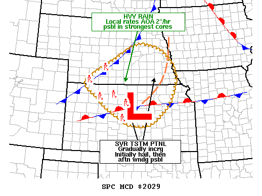
Text description of the stationary front was draped across Kansas image.
The image is a weather map focusing on a central area highlighted with markers and text. There is a large red "L" in the center, indicating low pressure. Surrounding this, a dashed brown oval encloses portions of several states within its boundary. A series of red and blue symbols indicate the presence of a stationary front passing through the low, with a cold front analyzed to the north. Annotations in the image describe heavy rain possibilities and severe thunderstorm potential. Grid lines divide the map, and borders of states are faintly visible.
meteogram for Tulsa, OK, on December 10

Text description of the meteogram for Tulsa, OK, on December 10 image.
The image is a composite weather chart for Tulsa, OK (TUL) presented in a series of horizontal graphs showing various atmospheric parameters over time from 00:53Z to 22:53Z on December 10, 2007. The top panel shows temperature (TMPF) and dew point (DWPF) in purple and green lines, respectively, with values marked between 28 and 32 degrees Fahrenheit. Relative humidity (RELH) is indicated on the right in percentages scaling from 40 to 100%. Below that, a panel displays wind speed and direction, represented by green wavy lines and red dots with extending lines. The middle section presents cloud cover (CHC3, CHC2, CHC1) visualized through small colored squares, visibility (VSBY) using a red line and dots, and recorded in miles ranging from 0 to 10. The fourth section shows temperature-related parameters, including T6XF, T6NF, and precipitation (P06I) indicated by numbers below. The bottom graph shows pressure (PMSL) illustrated by a pink line oscillating between 1023 and 1028 millibars.
08Z field of lapse rates between 700 mb and 500 mb

Text description of the 08Z field of lapse rates between 700 mb and 500 mb image.
The image is a weather map depicting the United States, illustrating contour lines of lapse rates between 700 and 500mb. The map is divided into states outlined in brown, with a variety of lines and numbers indicating different lapse rates. Lapse rates below 6 C/km are in dashed blue lines, lapse rates between 6-7 are in green, and above 7 in orange.
00Z surface analysis on December 10, 2007

Text description of the 00Z surface analysis on December 10, 2007 image.
The image is a surface analysis map of the United States, depicting various meteorological elements. The map includes isobars, identified by red lines, indicating areas of equal atmospheric pressure. High (H) and low (L) pressure systems are marked with blue and red letters respectively. Station plots spread out across the map show temperature, dew point, pressure, and wind information. Fronts are indicated with lines, a blue line with triangles representing a cold front, and a red line with semicircles denoting a warm front. The map covers the contiguous United States, parts of Canada, and northern Mexico, with a focus on current weather conditions as of December 10, 2007.
00Z analysis of 850-mb temperature advection

Text description of the 00Z analysis of 850-mb temperature advection image.
The image is a weather map showing 850mb temperature advection. It includes multiple contour lines and colored areas, indicating different heights of the 850mb level and temperature advection. Thick black lines contour across the map, labeled with numbers like 1500, representing height in geopotential meters. Red lines, denoting temperature, weave across the map with both filled and non-filled areas. Blue shaded regions signify cold air advection and red shaded areas highlight warm air advection. The map features several geographical outlines, resembling a section of the United States, with state boundaries faintly visible.
04Z analysis on December 10

Text description of the 04Z analysis on December 10 image.
The image is a weather map of the contiguous United States, delineated with state boundaries. It features areas outlined with red and blue contours, depicting weather data overlaying the map. The red contours are positive values and indicate varying levels of moisture flux convergence. Similarly, blue dashed contours represent negative values, or moisture flux divergence.The overall background of the map is white, providing contrast to the red and blue overlay. At the bottom of the map, text provides specifics about the data and time: “071210/0400 Deep layer mstr flux cvgnc.”
Mesoscale Discussion #2203

Text description of the Mesoscale Discussion #2203 image.
The image is a weather forecast text document from the NWS Storm Prediction Center in Norman, OK, dated December 10, 2007. It communicates a freezing rain advisory for much of the northern, central, and western regions of Oklahoma and Texas Panhandles. The forecast is valid for specific times and details expected freezing rain conditions, their progression, and associated weather patterns. The document describes temperature observations, expected precipitation rates, and the potential for thunderstorms. A specific portion of the document is underlined in red and talks about a strengthening low level jet and warm air advection that will promote lift. Text lines are densely packed, using uppercase letters, with sections separated by ellipses for emphasis.
00Z model analysis of 500-mb winds

Text description of the 00Z model analysis of 500-mb winds image.
The image is a meteorological map displaying jet stream data over the United States. The map features contour lines and color-coded wind patterns. The background is black, with green outlines indicating state boundaries. The wind patterns are illustrated in shades of blue, purple, and red, with lighter blue representing lower wind speeds and dark red indicating higher wind speeds. A prominent feature is a dark red band labeled "500-mb jet streak," stretching across the midwest. 500mb wind barbs are also plotted sowing more specific wind speed and direction values. A color gradient on the right indicates wind speed in knots, ranging from 20 (light blue) to 100 (dark red). The text and data are superimposed on the image, providing further meteorological details.
Upper-Level Jet Streaks
four-quadrant model

Text description of the four-quadrant model image.
The animation depicts an idealized jet streak model. The map outlines parts of the central United States, displaying an arrangement of colored, overlapping ovals and lines. Two red ovals labeled "Surface Pressure Rises" are in the top left and bottom right corners of the jet streak. Two green ovals labeled "Surface pressure falls" are located in the bottom left and top right corners of the jet streak. As grey boxes, representing air parcels, move across the jet streak, they accelerate through the jet streak before diverging as they exit. The animation changes to show 4 dotted ovals. The red ones, in the top left and bottom right corner, say "Upper Level Convergence". The two green ones, in the opposite corners, read "Upper level divergence".
most upper-level jet streaks are curved

Text description of the most upper-level jet streaks are curved image.
The image is a meteorological map depicting jet streams over a geographic region. It features multicolored bands ranging from light blue to dark blue, representing different speeds of jet streams. The dark blue areas indicate the fastest wind speeds, while the lighter shades show slower speeds. Two distinct jet streaks are highlighted: one in the northwestern part of the map labeled "Anticyclonically Curved Jet Streak," and another in the central eastern region labeled "Cyclonically Curved Jet Streak." These labels are enclosed in boxes with arrows pointing to the respective streaks. The background shows lightly drawn contours and thin lines representing various meteorological data such as geopotential height and wind direction.
21Z reanalysis of 500-mb heights

Text description of the 21Z reanalysis of 500-mb heights image.
The image is a colorful weather map depicting the geopotential height composite mean over North America. The map highlights various regions using a spectrum of colors, ranging from dark blue, indicating lower heights, to deep red, representing higher heights. Contour lines denote different geopotential heights in meters, which are labeled in 120m incriments. The color gradient changes smoothly across the map, transitioning from blues in the north to oranges and reds in the south. The map is framed by a color bar on the right, showing the corresponding height values from 5160 to 5880 meters. A date at the bottom indicates the data reference, "1991/04/26 21z."
21Z reanalysis of mean sea-level isobars

Text description of the 21Z reanalysis of mean sea-level isobars image.
The image is a black and white map of North America, overlaid with contour lines representing pressure at mean sea level. The map includes the United States, Canada, and parts of Mexico. Contour lines of varying curves indicate different pressure levels across the continent. Red labels and lines highlight specific pressure values and features: "992" located over the Midwest, marked with an "L" to denote a low-pressure system, and additional points labeled "996" and "1000" arranged southwestward. Three red lines, labeled "Lee trough", connects these points. The background includes minimal geographic details, with coastlines and borders faintly visible.
21Z reanalysis of two-meter dew points

Text description of the 21Z reanalysis of two-meter dew points image.
The image is a map showing the dew point temperature across North America, presented in vibrant colors indicating various temperature ranges. The map uses a color gradient from purple for the lowest temperatures to red for the highest. In the northwest, dark purple signifies the lowest dew points, while the southeast has intense red representing the highest dew points. A sharp gradient runs through the central part of the continent, transitioning from blue and green colors to warmer tones of yellow and red. A legend on the right marks dew point ranges in Kelvin, from 260K to 295K. Text on the map highlights regions with significant dew point temperatures: an arrow pointing to Colorado shows "Dew points less than 8 degrees F," and an arrow pointing to Arkansas says "Dew points greater than 71 degrees F".
close-up 21Z map of surface station models

Text description of the close-up 21Z map of surface station models image.
The image is a weather map showing a dryline indicated by a dashed yellow line running diagonally from top left to bottom right, dividing Kansas (KS) and Oklahoma (OK). Station plots are scattered throughout the map and show temperature (in red), dew point (green), pressure (white), cloud coverage, and wind information. The dryline separates warmer, drier air to the west from cooler, more humid air to the east. The background is black, and white text labels “KS” and “OK” indicate the states. In the bottom left corner, "4:00 p.m." is displayed. Additional meteorological notation is seen at the bottom.
wind maximum exceeding 35 meters per second (roughly 70 knots) at 500 mb

Text description of the wind maximum exceeding 35 meters per second (roughly 70 knots) at 500 mb image.
The image is a map showing the 500mb wind pattern over North America, represented through colorful gradients and directional arrows. The map spans from the Pacific Ocean on the left to the Atlantic Ocean on the right, with the United States prominently centered. Large swathes of green, yellow, and red areas illustrate varying wind speeds, with red indicating higher speeds. The map showcases two large jet stream patterns: one curving from the northwest down through the central U.S. and another across the northeastern U.S. Blue and purple hues indicate lower wind speeds surrounding the main jet streams. A color scale on the right translates colors to specific wind speeds, ranging from 10 (blue) to over 40 (red). Delicate black lines with arrowheads depict wind direction across the continent, providing detailed flow patterns.
low-level jet stream evident at 850 mb

Text description of the low-level jet stream evident at 850 mb image.
The image is a map depicting 850mb wind patterns across North America. It shows a color gradient to represent wind speed, with colors ranging from blue (indicating lower speeds) to red (indicating higher speeds). Arrows scattered across the map indicate wind direction. A significant concentration of yellow and red is seen in the central region, indicating higher wind speeds. Blue colors dominate the western and eastern parts, with some areas of green. There is a scale on the right side of the map, labeled to denote wind speed values from 4 to 22 meters per second. The map includes outlines of geographical features such as coastlines and borders.
vorticity maximum (vort max) north of the jet streak's core, and a vorticity minimum (vort min) to its south

Text description of the vorticity maximum (vort max) north of the jet streak's core, and a vorticity minimum (vort min) to its south image.
The image is a diagram illustrating vorticity patterns over an idealized jet streak. It contains overlapping ellipses in varying shades of blue, with the darkest shade at the center and lighter shades extending outward, representing wind speed contours. Three black arrows point right, through the center of the ellipses, indicating the direction of airflow. The image also includes two sets of red dashed circles labeled with bold red letters. The top set of circles is marked with an "X" and labeled "Vort Max," indicating the maximum vorticity area, while the bottom set is marked with an "N" and labeled "Vort Min," indicating the minimum vorticity area. The numbers "110," "90," and "70 kts" in blue indicate wind speeds at different points of the ellipses.
PVA typically occurs just east of the 300-mb vort max

Text description of the PVA typically occurs just east of the 300-mb vort max image.
The image is a diagram illustrating an idealized jet streak with associated features. A horizontal black arrow is drawn and labeled "Axis of Jet Streak," extending from left to right. The background displays a gradient of blue ovals, with the darkest near the center and gradually lighter towards the edges, indicating varying wind speeds. The blue ovals are labeled "110," "90," and "70 kts," denoting wind speed. The diagram has two prominent red dashed circles labeled "X" near the top and "N" near the bottom, marking specific locations termed "Left Entrance," "Right Entrance," "Left Exit," and "Right Exit." An arrow labeled "PVA" in green points towards the "X." Additionally, "Point P" is marked next to "PVA" on the right side.
NVA and upper-level convergence in the right-exit region of a straight 300-mb jet streak

Text description of the NVA and upper-level convergence in the right-exit region of a straight 300-mb jet streak image.
The image is a diagram illustrating an idealized jet streak with associated features. A horizontal black arrow is drawn and labeled "Axis of Jet Streak," extending from left to right. The background displays a gradient of blue ovals, with the darkest near the center and gradually lighter towards the edges, indicating varying wind speeds. The blue ovals are labeled "110," "90," and "70 kts," denoting wind speed. The diagram has two prominent red dashed circles labeled "X" near the top and "N" near the bottom, marking specific locations termed "Left Entrance," "Right Entrance," "Left Exit," and "Right Exit." An arrow labeled "NVA" in green points towards the "X." Additionally, "Point Q" is marked next to "NVA" on the right side.
two-quadrant model of a cyclonically curved jet streak

Text description of the two-quadrant model of a cyclonically curved jet streak image.
The image is a diagram depicting the dynamics of a cyclonically curved jet streak. The central focus is a large black curved arrow arcing from left to right, symbolizing airflow direction across the jet streak. Below it, a light blue shaded area labeled "Isotachs" follows the arrow's path. Two distinct regions are shown: on the left, a red-striped area labeled "Downward Motion," and on the right, a green-striped area labeled "Upward Motion." Both areas are vertically elongated and have diagonal stripes. Labels indicate different sections of the flow path: "Left Entrance," "Right Entrance," "Left Exit," and "Right Exit."
Coupled Jet Streams
California's Central Valley

Text description of the California's Central Valley image.
The image is a colorful topographic map of California and parts of neighboring states. It shows the geography and elevation differences across the region, with variations in color representing different elevations. The west coast is bordered by the Pacific Ocean, depicted in solid blue. Inland, a range of colors from greens to purples and browns indicates mountains and valleys, with green suggesting lower elevations, and purple and brown indicating higher areas. Red lines are drawn on the map outlining particular sections. Labels for latitude and longitude are marked along the borders, and a grid overlays the map, providing precise location markers.
08Z model analysis of 500-mb heights

Text description of the 08Z model analysis of 500-mb heights image.
The image displays a map of geopotential heights at the 500mb level over a region in the western United States, including California and neighboring states. Black contour lines, marked with values such as 5400, 5460, and 5520, curve across the map, indicating lines of equal geopotential height. The contours create a pattern that outlines weather systems. The map has an orange outline illustrating state boundaries and coastlines, providing geographical context. The data is dated Tuesday, December 28, 2004, based on the analysis at 0800Z.
300-mb jet streak arriving overhead

Text description of the 300-mb jet streak arriving overhead image.
The image is a weather map showing geopotential height contours in black solid lines and Isotachs in dashed blue lines at the 300mb level. Each black line is marked with values ranging approximately from 8880 to 9480, depicting different geopotential heights. The map spans the western United States, including states such as California, Nevada, and Arizona. The dashed blue contours indicate tropopause isotachs, while solid black lines represent isoheights. The background is a light gray, which helps the contours stand out. Orange lines delineate state boundaries, providing context to the geographical area shown.
08Z radar reflectivity

Text description of the 08Z radar reflectivity image.
The image is a composite reflectivity map showing precipitation patterns over parts of California, Nevada, and Arizona. The radar data is depicted in varying intensities, with colors ranging from dark blue to bright red. The heaviest precipitation is represented by red and orange areas, centralized over the coastline of California, likely indicating significant rainfall. This area transitions into yellow, green, and blue as the precipitation intensity decreases and disperses inland toward the Sierra Nevada mountain range. The left side of the map feature a color scale indicating precipitation intensity in Decibels Z (dBZ), ranging from 5 (light blue) to 75 (dark purple). State boundaries are marked by thin orange lines.
couple of small tornadoes

Text description of the couple of small tornadoes image.
The image is a map of the United States displaying storm reports from December 28, 2004. The map highlights different weather events using colored symbols, notably concentrated in California. Red triangles indicate tornado reports, blue triangles represent high wind reports, and green triangles denote hail reports. In the lower left corner is the NOAA logo and a legend explaining the symbols. Text captions provide additional information about the reports and indicate that the data is preliminary.