Lesson 2: Remote and In-Situ Observations in the Tropics
Lesson 2: Remote and In-Situ Observations in the TropicsMotivate...
You already have some experience with both in-situ and remote sensing from your previous course work. In this lesson, we're going to broaden that experience so that you can better understand how meteorologists observe tropical cyclones. As a reminder, "in-situ" observations are taken by instruments that are in direct contact with the medium that they are "sensing." Everything from tossing blades of grass in the air to get a sense for the wind direction (blades of grass are in direct contact with the moving air) to conventional thermometers, barometers, rain gauges, and standard anemometers are considered in-situ observations. Indeed, many of the observations taken by the instruments that make up Automated Surface Observing System (opens in a new window) (ASOS) stations commonly located at airports, for example, are in-situ measurements.
But, meteorologists can't rely on in-situ observations alone, especially in the tropics. Given that oceans constitute a large part of the tropics, the number of traditional surface and upper-air observations to represent the current state of the tropical atmosphere is insufficient. Fortunately, forecasters have access to some other sources of in-situ observations in the tropics, such as those from ocean buoys, ships, and aircraft (including aircraft flying into hurricanes to measure air pressure, temperature, wind speed, and wind direction among other variables). We'll delve deeper into these alternative in-situ measurements in this lesson, but ultimately, there just aren't enough of them to provide a complete picture of tropical weather. There's undoubtedly a relative dearth of traditional in-situ observations in the tropics.
In order to fill in the gaps left by the available in-situ observations in the tropics, meteorologists turn to remote sensors, which make observations of a medium that they are not in direct contact with. For instance, the conventional satellite and radar images you've learned about in previous courses are an example of remote sensing. But, not all remote sensors are alike. We can further break down remote sensors into two basic types -- active and passive remote sensors. To really understand the capabilities of remote sensing instruments, it's important that you understand the difference between the two:
- Active remote sensors emit electromagnetic waves that scatter back to the sensor when they strike "targets". Conventional radar (opens in a new window) is an example of an active remote sensor.
- Passive remote sensors detect natural electromagnetic waves emitted or scattered by objects. Conventional visible, infrared, and water vapor satellite imagery are all examples of products from passive remote sensors.

In this lesson, we'll cover the in-situ sensors that we have at our disposal, as well as a wide array of active and passive remote sensors used to monitor conditions in the tropics (and elsewhere). We'll start with the in-situ observations we can get from tropical ocean buoys, and we'll delve into the variety of data collected by remote and in-situ sensors aboard United States Air Force and NOAA aircraft that fly into hurricanes. Finally, you'll learn that satellites can collect much more data than the conventional images you're already familiar with. Read on.
Tropical Ocean Buoys
Tropical Ocean BuoysPrioritize...
Upon finishing this page, you should be familiar with major buoy deployment programs (such as the Global Drifter Program and TAO Buoys), and recognize why close encounters between stationary ocean buoys and tropical cyclones are "lucky" encounters, especially over open ocean waters (away from coastal areas). You should also be able to interpret data summary plots from the TAO / TRITON Buoy Array.
Read...
You're already familiar with the in-situ weather observations on land that forecasters have available to them. While land-based surface observational networks have gaps, those gaps are nothing like the gaps that exist in observational networks over the oceans, and the oceans constitute a large part of the tropics! For forecasters tracking tropical cyclones, that means that considerable time may pass between any in-situ observations in or around a particular storm, and some storms may never be sampled directly by an in-situ observation. Sometimes tropical cyclones "find" tiny islands scattered about the oceans, providing in-situ observations like the pressure trace below, from when the eye of Category 5 Hurricane Irma passed directly over a National Ocean Service observation platform on the coast of Barbuda in 2017.

The pressure trace is striking, with pressure plummeting down to 27.2 inches of Mercury (921 millibars) as the eye passed, before rapidly recovering. But, a direct encounter of a hurricane's eye with a stationary, in-situ observation site are rather infrequent in the tropics. Out over the oceans, if a tropical cyclone doesn't pass over an island with an observation site, forecasters are limited to the available buoy and ship observations. Many storms miss these observations, however. To see what I mean, check out the image below from the website for the National Data Buoy Center, which shows the locations of buoys (and oil-drilling platforms that collect observations) across much of the North Atlantic. While the East Coast and Gulf Coast of the U.S. seem fairly well sampled by observation sites (though if we zoomed in more, we would see some gaps), farther out over remote ocean waters, a tropical cyclone finding a buoy is akin to finding a needle in a haystack. The buoys over the Atlantic and other oceans around the world are widely spaced, leaving huge gaps of hundreds or thousands of miles between buoy observations.

Every now and then, a tropical cyclone will have a "lucky" direct encounter with a buoy, much like Hurricane Irma's encounter with the observation site on the Island of Barbuda, but it's somewhat rare, especially away from the coasts. The relative wealth of buoy observations along the coasts of the United States is augmented by the Coastal-Marine Automated Network (C-MAN), which was developed by the National Data Buoy Center in the early 1980s to better maintain weather observations near the coasts. C-MAN buoys provide crucial observations in coastal areas, particularly when tropical storms and hurricanes approach the East Coast and Gulf Coast states.
Another special buoy program that you should be aware of is the Tropical Atmosphere Ocean (TAO) project, which covers the equatorial Pacific (see image below). TAO buoys have since been combined with buoys from the Japanese TRITON (Triangle Trans Ocean Buoy Network) project to create the TAO / TRITON array, which contains several dozen buoys. As an aside, the TAO / TRITON array has a pretty interesting history, which you can read about in the Explore Further section below, if you would like. Data from the TAO / TRITON array are instrumental in detecting El Niño (opens in a new window) and La Niña (opens in a new window) conditions, which as you'll learn later, can have major impacts on global weather patterns. You can see the locations of the TAO buoys in the image below.

On the TAO / TRITON Web site (opens in a new window), you can access summary plots from individual buoys like this sample summary plot (opens in a new window) from the TAO buoy located at 5 degrees North latitude and 170 degrees West longitude. This summary, which spans from January through May 2026, represents a running five-day mean of wind vectors, elevation of sea level (not counting ocean waves) and temperatures from the sea surface to a depth of 300 meters. When you looked at the plot, you may have noticed that sea level in the vicinity of this buoy is not flat (it varied by almost 25 centimeters, or 10 inches, during this time), nor does it correspond to an elevation of zero. We'll talk more about variations in sea-surface height in a later lesson.
Keep in mind that the data in the top part of the graph shows wind vectors (even though there are no arrowheads like we would usually see on a vector). While standard meteorological convention is to plot and express wind direction as the direction from which the wind blows, since the red slashes are vectors, they extend outward and point in the direction that the wind is blowing toward (exactly the opposite of the standard convention). So, for example, during April and May on this graph, winds predominantly blew from the northeast (toward the southwest) at this buoy. By the way, the length of the red slash indicates the wind speed (in meters per second).
We'll return to data from the TAO / TRITON array later on when we cover El Niño and La Niña, but I wanted you to be aware of the TAO / TRITON project since it's an important component of the system of buoys that monitors tropical weather. Even with special buoy programs, however, the overall picture should be crystal clear to you by now -- stationary ocean buoys simply can't cover the entirety of tropics, and they leave lots of gaping holes in our observing system. Fortunately, data from other buoy programs that aren't stationary can act as a supplement.

One such program is the Global Drifter Program (opens in a new window) (GDP), under the auspice of the Atlantic Oceanographic and Meteorological Laboratory (AOML), which sometimes deploys drifting buoys in the paths of hurricanes, giving forecasters access to crucial surface weather data. NOAA is also increasingly partnering with private companies to deploy buoys ahead of tropical cyclones. In the image on the right, you can see locations of buoys that were deployed ahead of Hurricane Helene in 2024 from a combination of public and private sources.
Another useful program for monitoring tropical ocean conditions is the Argo Program (opens in a new window). Argo deployments began in 2000 and at any given time, the fleet consists of roughly 4,000 robotic "floats" which drift around with the ocean currents, monitoring upper ocean conditions (temperature and salinity) from the surface down to a depth of 2,000 meters. Argo floats can dive and rise to different depths to gather a complete vertical profile, but keep in mind that they do not collect any atmospheric observations (they only measure water conditions). Still, the data they collect, which get assimilated into computer models, can help monitor changes to temperatures in the top layer of the ocean, helping to improve tropical cyclone forecasts. Because they drift around with the ocean currents, their sampling of the ocean can be somewhat "uneven," meaning that some areas may end up with a lot of floats at any given time, while other areas end up with too few.
NOAA also maintains a number of hurricane gliders (opens in a new window), which are remote-controlled underwater vehicles which measure temperature, salinity, and pressure (among other variables) from the surface all the way down to a depth of 1,000 meters. These gliders move slowly (horizontally), so they can't really follow hurricanes around, but they can sample well-known ocean features (like warm currents) that are known to impact hurricane intensity. Data from these gliders gets incorporated into model forecasts, so they provide critical data about the changing thermal profiles in the ocean.
Finally, NOAA also partners with private companies to deploy "uncrewed surface vehicles (opens in a new window)" (USVs) into tropical cyclones the Atlantic. USVs aren't actually buoys, but instead are essentially remote-controlled sailboats capable of measuring winds, air and water temperatures, pressure, and wave heights, among other variables. Since 2021, these USVs, which have been constructed to withstand the fierce conditions inside a hurricane, have sailed missions into select hurricanes, collecting critical data that is transmitted to the National Hurricane Center in real-time, as well as assimilated into computer model forecasts. Unfortunately, public availability of real-time data from private buoy or USV deployment can be somewhat limited, but I have some links below in the Explore Further section below that you can use to track the available data from various public programs.
Even with special buoy and USV programs to observe tropical cyclones, however, our in-situ observing networks for surface observations over the oceans just aren't enough to get a full picture of what's going on in the tropics (or within tropical cyclones) at all times. Therefore, forecasters must rely on other data sources to get a more complete picture of the state of the tropics. We'll start our investigation of those other sources by looking into the role that aircraft observations play in observing weather in the tropics (particularly when tropical cyclones are present). Read on.
Explore Further...
Data Resources on the Web
Looking for real-time data from buoys and ships? You may be interested in the following resources:
- Decoded Offshore Weather Data (opens in a new window) is perhaps the most straightforward for accessing observations from ships and moored buoys in the vicinity of tropical cyclones. If you check-out "Tropical Cyclone/Hurricane Maps," you'll see the worldwide list of current or recent tropical cyclones. Simply click on the name of the tropical cyclone to access buoy and ship observations in the vicinity of the cyclone (though you'll often find that these observations are sparse). The labels (two digits and a letter) used for unnamed storms follow the standards you learned about previously.
- National Data Buoy Center (opens in a new window) has an interface with a wealth of stationary buoy observations, as well as ship observations (opens in a new window). The page often highlights the nearest available observations when tropical cyclones are present.
- The CIMSS tropical cyclones (opens in a new window) site also allows you to view buoy and ship observations in the vicinity of tropical cyclones. Just click on any particular active storm, and in the interface that pops up, select "buoy" and / or "ship" to view any nearby observations (though these will often be sparse). We'll learn about many of the other available fields later in the course.
- Current positions of drifting buoys in the Global Drifter Program (opens in a new window) along with recent data they've collected. They also have an archive of deployments by year (opens in a new window).
- Argo Float data and recent trajectories (opens in a new window)
- AOML Ocean Observations Viewer (opens in a new window)has a wide variety of data from gliders, floats, buoys, and USVs in a single interface.
- Information on USV missions into hurricanes (opens in a new window), including blogs from missions in recent years and links to publicly available data (usually after the event).
For History Buffs
As you just learned, the TAO / TRITON array provides critical monitoring that helps forecasters measure El Niño and La Niña, and predict their onset. The development of the program was motivated by the historic 1982-83 El Niño, which was the strongest on record at the time. And, at the time, forecasters didn't even know about the El Niño until it was near its peak! The impacts of El Niño that rippled through the atmosphere were far-reaching -- droughts and fires in Australia, Southern Africa, Central America, Indonesia, the Philippines, South America and India, as well as serious floods in the United States, Peru, Ecuador, Bolivia and Cuba. Globally, roughly 2,000 deaths were credited to weather events that were influenced by El Niño. We'll explore the connections between El Niño, La Niña, and global weather patterns in a later lesson.
The great devastation caused by the weather during the 1982-83 El Niño underscored the need for a real-time monitoring system for the tropical Pacific, to better detect and eventually predict the onset of El Niño and La Niña events. Thus, the foundation of what would become the TAO / TRITON array was laid in 1984 when a series of buoys was field tested along 110 degrees West longitude in the equatorial Pacific, and the rest is history. In the 2010s, the project fell on hard times due to a lack of funding, but it was reinvigorated with an upgrade in the mid-2020s (opens in a new window).
Air Force Hurricane Hunters
Air Force Hurricane HuntersPrioritize...
Upon finishing this page, you should be familiar with the operations of the U.S. Air Force and NOAA Hurricane Hunters. Specifically, you should be able to identify their general flight area and flight range.
Read...
While we're about to focus on the activities of special "Hurricane Hunters" programs that fly into tropical cyclones to collect data, did you know that "Hurricane Hunters" are not the only aviators that contribute to weather analysis and forecasting? As you've learned, the data collected by radiosondes aboard weather balloons contribute to the constant pressure analyses that you're accustomed to (at 500 mb or 300 mb, for example). But, the data captured by instruments on weather balloons is also supplemented by in-situ observations taken by commercial jets. Recall that the standard height of the 300-mb surface is 9,000 meters -- roughly 30,000 feet, which is a representative altitude where commercial aircraft often cruise, for example.
Indeed, the Aircraft Meteorological Data Relay (opens in a new window) (AMDAR), and the Aircraft Communication Addressing and Reporting System (opens in a new window) (ACARS) in the U.S. continuously collect digital communications from commercial aircraft, including weather observations. While these observations aren't freely available to the public in real time, they are incorporated into the initialization of some numerical weather prediction models. But, observations from commercial aircraft are not enough to fully cover the tropics, obviously. To compensate, meteorologists incorporate satellite-derived winds (wind speeds and directions estimated by satellite at specified altitudes), which we'll cover later in this lesson.
To get back to the topic at hand (aircraft observations over the tropics), I point out that commercial and private aircraft prudently fly around big storms. However, groups of intrepid aviators in the U.S. Air Force Reserve and NOAA, popularly known as "Hurricane Hunters," are available to fly reconnaissance missions into tropical cyclones whenever they develop. During the off-season, they also fly into fierce winter storms that rage along the Atlantic and Pacific Coasts.
U.S. Air Force Hurricane Hunters
Stationed at Keesler Air Force Base in Biloxi, Mississippi, the U.S. Air Force Hurricane Hunters formally belong to the 53rd Weather Reconnaissance Squadron. During hurricane season, the squadron is ready to spring into action at any sign of a tropical cyclone developing in the region spanning approximately from the mid-Atlantic Ocean (longitude 55 degrees West) to the Caribbean Sea and the Gulf of Mexico. Hurricane Hunters also fly reconnaissance into tropical cyclones over the central and eastern Pacific Ocean, particularly those that might pose a threat to Hawaii or mainland North America. U.S. Air Force Hurricane Hunters rely on the durable WC-130-J aircraft (see below) equipped with an arsenal of weather instruments to monitor tropical cyclones.

NOAA Hurricane Hunters
The Air Force Hurricane Hunters don't have the "market cornered" on hurricane hunting. Indeed, NOAA also flies specially equipped aircraft into hurricanes to collect observations. But, the mission of the NOAA Hurricane Hunters goes beyond just routine reconnaissance. The Hurricane Research Division (opens in a new window) (HRD), under the auspice of the Atlantic Oceanographic and Meteorological Laboratory (AOML) within NOAA, flies specially equipped aircraft into hurricanes and other tropical weather systems to conduct research to advance the scientific understanding of the tropics and, in the process, improve weather forecasts. For this reason, NOAA Hurricane-Hunter flights often serve as testing grounds for new and experimental instruments and strategies for making various atmospheric measurements (which may or may not eventually become operational on all Hurricane Hunter flights and in other contexts). HRD has a long and storied history in the pursuit of excellence in hurricane research, which you can read about (opens in a new window), if you're interested. The NOAA Hurricane-Hunter research fleet (see below), which consists of two WP-3D turboprops (sometimes referred to as "NOAA P-3s") and a Gulfstream jet, operate from NOAA's Aircraft Operations Center (opens in a new window) in Lakeland, Florida.

Flying into the storm
For most of the missions flown into hurricanes, the standard flight level is 700 mb (recall that the standard 700-mb height is 3,000 meters, or around 10,000 feet). When forecasters at the National Hurricane Center spot a suspicious cluster of tropical showers and thunderstorms on satellite imagery, Hurricane Hunters may fly a Low-level Investigative Mission at 500 or 1500 feet above the sea surface. At such altitudes, wind data can reveal a closed, low-level circulation that allows forecasters to upgrade the system to a tropical depression. As the depression develops into a tropical storm, Hurricane Hunters typically increase the flight level to 850 mb (recall that the standard 850-mb height is 1,500 meters, or about 5,000 feet). As the tropical cyclone further intensifies, Hurricane Hunters increase their flight level to 10,000 feet (the conventional maximum flight level inside hurricanes), unless they need to deviate due to special circumstances (such as multiple planes flying the storm at once: They must stay at least 2,000 feet in altitude apart). I should note here that Hurricane Hunters fly at higher altitudes on other missions (such as reconnaissance in winter storms).
When Hurricane Hunters enter a tropical cyclone, they often fly an alpha pattern (the animation below will give you a general idea of what one looks like), or a series of alpha patterns. After flying the first diagonal across the storm (usually at least 105 nautical miles (120 statute miles) on either side of the center), executing a successful alpha pattern amounts to simply making a series of left-hand turns. In this way, the plane never flies directly into the teeth of the wind (remember that northern hemispheric low-pressure systems have a counterclockwise circulation). Avoiding the strong direct headwinds allows the aircraft to save fuel and fly longer missions. Moreover, the aircraft collects data in all four quadrants of the storm after making only two passes through the center. The aircraft passes through the center about every two hours and continues the pattern until the next plane is ready to take its place if NHC wants fixes on the storm every six hours and "round-the-clock" surveillance. If NHC wants fixes on the storm less frequently (every 12 or 24 hours, for example), then there's no immediate replacement aircraft when the mission is complete (each mission lasts roughly eight hours, on average).
Alpha Pattern (0:09)
Text Description: Alpha Pattern (0:09)
The animation is a satellite view of a large hurricane. The cyclone shows a well-defined, circular eye in the center, surrounded by swirling clouds. The clouds form a tight spiral, with bands extending outward in a counterclockwise direction. The shades of the clouds range from bright white at the core to darker grays as they extend outward. A small aircraft is visible, flying over the cloud tops in the shape of a backward Greek letter alpha. The background is a dark expanse, contrasting with the bright, turbulent clouds of the hurricane.
Hurricane Hunters may execute other flight patterns or fly at other altitudes, depending on the goals of the mission. NOAA's Gulfstream jet, for example, often flies missions to collect observations in the environment around and ahead of hurricanes. Often flying at altitudes as high as 45,000 feet, the Gulfstream jet can assess the winds that steer these storms. For instance, as Hurricane Dorian moved perilously close to the Southeast coast on September 4, 2019, the Gulfstream jet flew around the periphery of the storm and emphasized sampling the environment to its east an northeast (to ensure the best understanding of the environment the storm was going to move into), so its flight-track map (opens in a new window) bears no resemblance to an alpha pattern.
I should note here that the range of reconnaissance aircraft varies from 2,200 to 3,600 miles (the range depends, in part, on flight altitude). Thus, newly forming tropical cyclones over the eastern and central Atlantic Ocean are, for all practical purposes, out of range for reconnaissance aircraft. In its place, tropical forecasters rely on remote sensing from satellites to assess the intensity and structure of storms (more to come later in this lesson).
To see what the Hurricane Hunters are up to on any given day, check out the Tropical Cyclone Plan of the Day (opens in a new window). If you're interested in learning more about the operations of the Hurricane Hunters, you may enjoy the resources in the Explore Further section below. Otherwise, up next, we'll turn our attention to the instruments and sensors that Hurricane Hunters have in their arsenal to collect crucial data.
Explore Further...
More on Hurricane Hunter Operations
If you want to know more about the operations of U.S. Air Force and NOAA Hurricane Hunters, you may enjoy these links:
- WC-130 aircraft (opens in a new window) (learn about the planes U.S. Air Force Hurricane Hunters fly)
- Lockheed WP-3Ds (opens in a new window) and Gulfstream IV-SP (opens in a new window) (learn about the planes NOAA Hurricane Hunters fly)
- NOAA's transition from a Gulfstream IV-SP to Gulfstream 550s (opens in a new window)
- The official Facebook page of the U.S. Air Force Hurricane Hunters (opens in a new window) (they often post pictures and videos from their missions)
- Overview of NOAA Hurricane Hunter Operations (opens in a new window) including a collection of amazing videos (opens in a new window) and links to their social media accounts.
Decoding a Vortex Data Message
Decoding a Vortex Data MessagePrioritize...
Upon finishing this page, you should be able to discuss the use of dropwindsondes and uncrewed aerial vehicles (UAVs) for data collection, identify their observations as in-situ or remote sensing, as well as identify Doppler radar and the Stepped Frequency Microwave Radiometer as active or passive remote sensors, and describe their capabilities.
Read...
Now that you know about how U.S. Air Force and NOAA Hurricane Hunters operate, let's look at the major tools they have in their arsenal for collecting data. As an overall package, their instrumentation is called the Improved Weather Reconnaissance System (IWRS). Instruments mounted on the planes frequently collect flight-level data, which include air temperature, dew point, wind velocity, air pressure, and altitude of the aircraft (altitude is measured by radar (opens in a new window)). Onboard computers process flight-level data every second, but "complete" weather observations take 30 seconds. Moreover, the computers are tied to the aircraft's navigational system, allowing the flight meteorologist to determine the position (or location) of each observation. These data are also sent off the plane in real time in various coded formats. But, of course, meteorologists aren't just interested in observations at flight level. So, what tools do Hurricane Hunters have to detect weather conditions all the way down to the surface?
Dropwindsondes
Dropwindsondes (sometimes called "dropsondes" or just "sondes" for short) are instrument packages designed to be dropped from aircraft in order to take observations along their path to the surface. Dropsondes are very similar to the rawinsondes you learned about in your previous studies, but instead of ascending aboard a weather balloon, the descend toward the earth's surface. They have a long history of use in aircraft reconnaissance of tropical cyclones dating back to the 1950s. In the "old days," however, they couldn't be used to gather wind data in areas of clouds or rain. Therefore, forecasters at the National Hurricane Center "extrapolated" flight-level winds (700 mb) to the ocean surface. By "extrapolate" I mean that forecasters multiplied the maximum winds at flight level by a fraction between 0.80 and 0.90 to estimate the maximum surface winds (you will learn later in the course that the fastest winds in a hurricane typically blow at altitudes of several hundred meters above the sea surface).
This method ultimately proved to be fairly reliable, except for a few "misbehaved" storms. While scientific principles laid the groundwork for the extrapolation technique used by the National Hurricane Center, data collected by Global Positioning System (opens in a new window) (GPS)-based dropwindsondes beginning in 1997 proved that the scheme works pretty well most of the time. But without reservation, GPS-based dropwindsondes have improved the accuracy of estimating maximum surface winds in a hurricane (and model accuracy for predicting the path of tropical cyclones). If you're interested in learning more about the benefits of using GPS dropwindsondes, check out this research paper (opens in a new window).

Hurricane Hunters routinely release dropwindsondes during their missions to penetrate the center of the a tropical cyclone, but the NOAA Gulfstream jet also releases them in the environment around the tropical cyclone to collect data about the surrounding environment. Immediately after a dropsonde gets released, a drogue parachute deploys, which stabilizes the sonde's descent by stopping it from tumbling, which is especially critical in the turbulent air motions within the eyewall. During descent, the in-situ sensors on the dropsonde (see image above) relay observations of pressure, temperature and relative humidity back to the aircraft via radio until the sonde splashes down into the ocean. These observations are processed by computers on board the aircraft as well as on the ground (computers can process real-time observations from multiple dropsondes simultaneously). For the record, on a typical mission, Hurricane Hunters may release 20-40 dropsondes, and in an average hurricane season, they can release well over 1,000 dropsondes on training and storm-reconnaissance missions. The data from dropsondes gets assimilated into some numerical weather prediction models, which improves forecast accuracy.
While most dropsonde observations are in situ, technically the method for measuring wind speed using dropsondes qualifies as remote sensing. That might sound strange, but each sonde contains a full GPS, which allows satellites to remotely track its exact location. By tracking the changes in the sonde's location in time, computers calculate the wind speed by subtracting out the terminal fall speed and friction. Ultimately, dropsondes are often the best observation source for minimum surface pressure as well as for directly sampling low-level winds in the eyewall of a tropical cyclone. These data are immensely valuable for determining the intensity of a particular storm. Ongoing research continues to make dropsondes smaller (so-called "minisondes" are now available) and less expensive.
Uncrewed Aerial Vehicles (UAV)

In recent years, NOAA has collaborated with private companies to develop "uncrewed aircraft systems" (UAS) or "uncrewed aerial vehicles" (UAVs), which they can deploy in addition to dropsondes during their flights. These flying drones (like the one pictured on the right) are capable of flying for more than one hour, can ascend and descend very rapidly, and have been designed to withstand the harsh conditions within a hurricane. They can fly as low as 50 feet above the ocean surface, and up to 15,000 feet above sea level, measuring pressure, temperature, humidity, and winds (among other variables) with their onboard instruments. These data are transmitted to the National Hurricane Center in real-time and get assimilated into some computer models, much like data from dropsondes. Since UAVs can stay in the air longer than a dropsonde, they're capable of covering more area within a tropical cyclone than a single dropsonde can.
Doppler Radar
While all Hurricane Hunter aircraft have radar onboard for helping the pilots navigate, the planes used by the NOAA Hunters also have radars aboard for data collection. Recall that Doppler Radar is an active remote sensor: It sends out a pulse of energy and measures what gets scattered back to it. The Gulfstream jet has two radars (one on the nose for help with navigation, and a Doppler radar on the tail), but the weather instrumentation aboard each NOAA WP-3D actually includes three radars (opens in a new window) (one on the nose for navigation, one on the lower fuselage, and a Doppler radar on the tail). In addition to giving insight into the precipitation occurring in the storm, recall from previous courses that Doppler radars have the capability of detecting wind velocities, which helps meteorologists observe the storm's wind field. For example, check out the side-by-side images below, collected from Tail Doppler Radar, showing reflectivity (left) and winds (right) at 2 kilometers in Hurricane Laura (2020).

Keep in mind that the range of the ground-based system of radars along the East Coast of the United States (and the Caribbean Islands) is limited and only captures hurricanes that are relatively close to land (opens in a new window), making radar data from the NOAA Hurricane Hunters indispensable as an operational forecasting and research tool. Furthermore, data from these airborne Doppler radars are assimilated into some operational forecasting models. In case you want to look at data from current or past hurricanes and tropical storms, the Hurricane Research Division provides an archive of their radar data (opens in a new window), but note that radar data is not available for every storm.
As useful as Tail Doppler Radar data is for analyzing the wind field within a tropical cyclone, it doesn't actually detect the surface wind field (neither does land-based Doppler radar when a storm is close to land, for that matter), which is obviously of great interest to forecasters. In the "good old days", to get a feel for the surface winds, the flight meteorologist applied what could be considered an aviator's version of the Beaufort Wind Scale (opens in a new window). Instead of observing canvas sails in the wind (as Sir Francis Beaufort did), the flight meteorologist estimated wind speeds by the "look" of the sea. Indeed, the appearance of white caps, foam, sea spray, patches of green foam, or streaks in ocean foam offers clues that allow an experienced flight meteorologist to gauge the speed (and direction) of surface winds. A major shortcoming of this approach was that sometimes the weather officer just couldn't see the sea surface (obscured by heavy rain, clouds, darkness, etc.). Furthermore, this approach is somewhat subjective; even when the weather officer could see the ocean surface, its appearance could vary based on the altitude of the flight.
Other Tools for Measuring Surface Winds
Estimating surface winds within a tropical cyclone is a challenging problem, but we aren't just limited to what the flight meteorologist can see on the ocean surface. The development of remote sensing instruments aboard Hurricane Hunter flights has helped forecasters more objectively estimate surface winds. One such instrument is a passive remote sensor called the Stepped Frequency Microwave Radiometer (opens in a new window) (SFMR), which has been in operation since 2008. The underlying principle that the SFMR employs is that the bulk radiative properties of a substance depend on the "nature" of the substance (size, shape, exposed surface area, etc.). By changing the nature of a substance, its radiative behavior changes, too. If that seems odd to you, think about the difference between fog and a glass of water. Both consist of liquid water, yet you can see right through a glass of water, while fog obscures your vision because of the different ways that light scatters off the fog droplets.
Likewise, the nature of a substance can impact the emission of radiation, which serves as the basis for the SFMR's ability to detect surface wind speeds. You may not realize it, but the sea emits some natural microwave radiation (everything does, actually), but these emissions from the sea are not very large. In microwave-cooking terms, for example, you couldn't cook anything using the microwave radiation emitted by the ocean, but I assure you that natural microwave emissions from the sea are detectable by airborne radiometers like the SFMR.

A relatively smooth ocean (winds are relatively light) emits a certain amount of microwave radiation. But, winds blowing over the ocean change the nature of the surface (and thus, its radiative properties). As wind speed increases, patches and streaks of sea foam (essentially, bubbles) start to cover the ocean surface, and it turns out that these patches and streaks of sea foam emit more microwave energy than a smooth, "foamless" sea. The bottom line here is that the SFMR can infer surface wind speeds by detecting increases in microwave emissions from a foamy sea. And, the coverage of sea foam is a function of wind speed (the faster the wind speed, the foamier the sea).
Of course, it's raining to beat the band outside of the eye of a hurricane (particularly in the eyewall), and raindrops certainly would attenuate microwave emissions from the sea (by "attenuate," I mean that raindrops absorb microwave energy from the sea and thus limit the intensity of the energy reaching the SMFR). But the SFMR measures microwave emissions at six different frequencies between 4.6 and 7.2 Gigahertz (hence, the term "stepped frequency"). At any rate, scientists account for the absorption and scattering properties by raindrops at each frequency. By "stepping" through each frequency, scientists can correct for the attenuation of microwave emissions by rain. In the process of correcting for this attenuation, the rainfall-rate can be recovered, yielding bonus data from the SFMR.
I should point out, however, that research has indicated some inconsistencies with surface wind measurements from the SFMR. Wind estimates in very intense hurricanes seem to have a high bias (estimates are too fast). Furthermore, the depth of the ocean in shallow areas near land as well as sea-surface temperatures can impact the behavior of the sea surface and microwave emissions. So, while the SFMR continues to operate on Hurricane-Hunter flights, research to calibrate these measurements is ongoing, and forecasters at the National Hurricane Center question their reliability (and sometimes the data are not even made public). NOAA's Hurricane Hunters are currently experimenting with next generation instruments, such as the Rain, Ocean, Atmosphere Radar System (opens in a new window) (ROARS), which may be able to replace the SFMR for surface wind retrieval from Hurricane Hunter flights, but unlike the SFMR, ROARS is an active remote sensor (it's another specialized radar mounted on the plane).
What ultimately happens to all the data that Hurricane Hunters collect on their flights? It gets transmitted (in various coded formats) to the National Hurricane Center. Perhaps the most commonly used coded message is the Vortex Data Message (VDM), which focuses on conditions near the core of the storm. These messages contain a wealth of data about the current strength and demeanor of the storm, so we're going to look at them in-depth in the next section. In the meantime, the Explore Further section below contains some links for tracking data from Hurricane Hunters in real time. Check it out, if you're interested.
Explore Further...
Resources on the Web
If you're looking to track data from Hurricane Hunters in real time, you may be interested in these links:
- Aircraft Recon at Tropical Tidbits (opens in a new window) (view plots of data, including flight-level winds, soundings from dropsondes, flight paths, etc., which will help you visualize data collected on current and recent recon missions)
- Recon Data at CyclonicWx (opens in a new window) (another source with similar data plots that will help you visualize data collected on current and recent recon missions)
- High-Density Observation (HDOB) Tracker (opens in a new window) (tracks data from hurricane reconnaissance missions, including data from UAVs that Hurricane Hunters deploy during their missions)
- Latest Vortex Data Messages (opens in a new window) from the Atlantic and Pacific (we'll cover how to translate these in the next section)
- Realtime Dropsonde Viewer (opens in a new window) (plot soundings derived from dropsonde data)
NOAA Hurricane Hunters
NOAA Hurricane HuntersPrioritize...
You will be required to interpret Vortex Data Messages (VDMs) in this course, so upon completion of this page, you should be able to completely decode and translate a VDM. Please note that you're welcome to use this page as a guide when you're interpreting VDMs, either in this course or on your own.
Read...
Vortex Data Messages (VDMs) are perhaps the most commonly cited coded message from the Hurricane Hunters, so we're going to walk through decoding one in detail (what information each item contains, along with various codes and units). Make sure to use the links available to navigate easily between each item and its translation.
Before we begin, however, I should point out that the format of VDMs was significantly changed in 2018. The guide for decoding VDMs below is based on the current format, but if you happen to research VDMs for storms that occurred prior to 2018, the format will be different. To help you with any old VDMs you may encounter if you're researching past tropical cyclones, check out the materials I have for you in the Explore Further section below.
The sample VDM that I will decode below was actually the prototype that NHC mocked up when they announced the format change, so it's based on data collected in a real hurricane prior to 2018 (Otto in 2016, to be exact). VDMs are transmitted in an alphabetical manner, and in each report, a letter of the alphabet is followed by information about the center of the tropical circulation. This information includes such items as lat/long of the center, temperatures inside and outside of the eye of the storm, wind information, minimum pressures, etc.
Sample Report: (clicking on each element will take you to the explanation)
URNT12 KNHC 241133
VORTEX DATA MESSAGE   AL162016
A. 24/11:12:50Z
B. 10.97 deg N 082.77 deg W
C. 700 mb 2927 m
D. 977 mb
E. 210 deg 11 kt
F. CLOSED
G. C20
H. 90 kt
I. 144 deg 5 nm 11:07:00Z
J. 253 deg 78 kt
K. 158 deg 8 nm 11:07:30Z
L. 95 kt
M. 314 deg 5 nm 11:17:00Z
N. 033 deg 108 kt
O. 349 deg 14 nm 11:17:30Z
P. 10 C / 3042 m
Q. 18 C / 3045 m
R. NA / NA
S. 12345 / 7
T. 0.02 / 1 nm
U. AF301 0616A OTTO OB 13
MAX FL WIND 108 KT 349 / 14 NM 11:17:00Z
Breakdown of the message:
MESSAGE HEADER
The first line of the message is the code used to identify a vortex message in various meteorological databases, followed by the date and time (Zulu) the message was transmitted. Back to Message
A. DATE AND TIME OF FIX
The time when the center of the storm was located or "fixed". 24/11:12:50Z means the report is from the 24th day of the month, at 11:12:50Z (hours:minutes:seconds of Zulu time). Back to Message
B. LOCATION OF THE VORTEX CENTER ("FIX")
Latitude and Longitude of the vortex fix in decimal degrees. 10.97 deg N 082.77 deg W means 10.97 degrees North latitude, 82.77 degrees West longitude. This information can be used to plot the latest location of the storm center; comparing the current position to previous positions gives the recent movement of the storm. Back to Message
C. MINIMUM HEIGHT AT STANDARD LEVEL
Standard level refers to certain "slices" of the atmosphere used by meteorologists around the world. The exact altitude of each of these slices relates to the pressure. The lower this height is below the "standard" height indicates how low the pressure is inside the hurricane; stronger storms tend to have lower pressures. The number reported is in meters. Hurricane Hunters fly storms at the "surface" (500 to 1500 feet above the water), 925 millibars (2500 feet or 762 meters), 850 mb (4780 ft or 1457 m), or 700 mb (9880 ft or 3011 m).
The aircraft will fly using an autopilot set to follow a constant pressure altitude. For example, when flying a mission at 700 mb, the aircraft's pressure altimeter will read 9,880 feet all day. But as the plane flies into lower pressure, the plane will actually be flying closer to the ground. A radar altimeter bounces radar pulses off the ground and tells the crew how high they actually are, and the meteorologist uses this number to calculate the height of standard surface. In the example above, the 700 millibar height was 2927 meters, which is 84 meters lower than the standard height of 3011 meters. When flying low-level missions (below 1500 feet) this block is reported as NA (Not Applicable). Back to Message
D. MINIMUM SEA-LEVEL PRESSURE
This value, computed from dropsonde or extrapolation, is one of the key pieces of information which indicates the intensity of the storm. "Standard" sea-level pressure is 1013 millibars. Since hurricanes, tropical storms, and tropical depressions are all low-pressure systems, the pressure reported here is almost always lower than standard. The lower the pressure, the more intense the storm. The word "EXTRAP" precedes any pressures extrapolated from aircraft sensor information; if the word "EXTRAP" is not there, it means the pressure was measured directly by a dropsonde released from the aircraft, and is usually more accurate. In this case it was 977 mb. There may be small fluctuations in pressure due to normal, daily pressure rises and falls. Of course, a dropsonde rarely lands precisely in the exact center of the storm where winds are calm (where the true lowest pressure would be found), so forecasters often adjust the lowest readings from the dropsondes using a rule of thumb that the "real" minimum pressure is the lowest value measured by dropsonde minus 1 mb for every 10 knots of surface wind speed. Back to Message
E. DROPSONDE CENTER WIND SPEED AND DIRECTION
The wind direction (in degrees) and speed (in knots) at the center of the storm as measured by dropsonde. In this case, winds were from 210 degrees (south-southwest) at 11 knots. In well-developed tropical cyclones, winds at the center will typically be fairly weak compared to the much faster winds found in the eyewall. Back to Message
F. EYE CHARACTER
This is a brief description of what the eye looks like on radar. "CLOSED" means that the eye is completely surrounded by a ring of thunderstorms. "OPEN NE" means there is a break in the eyewall to the northeast, etc. If the eye is not at least 50% surrounded by eyewall clouds, this item and Item G will be reported as "NA" (Not Applicable). Back to Message
G. EYE SHAPE ORIENTATION AND DIAMETER
Eye shapes are coded as follows: C-circular; CO-concentric; E-elliptical and all diameters are transmitted in nautical miles. In this case, "C20" translates to a circular eye with a diameter of 20 nautical miles. Orientation of major axis of an ellipse is transmitted in tens of degrees. Example: E09/15/5 means elliptical eye oriented with major axis through 90 degrees (and also 270 degrees), with length of major axis 15 nautical miles, and length of minor axis 5 nautical miles. CO8-14 means concentric eye with inner eye diameter 8 nautical miles, and outer diameter 14 nautical miles. The "healthiest" hurricanes usually have a small, circular eye. A concentric eye (a ring inside a ring) is a phenomenon that may signal a temporary weakening while the storm reorganizes (which we'll explore later in the course). An eye diameter that shrinks (compared to the previous vortex message) may signal intensification: Just as a twirling ice skater spins faster as she pulls in her arms, a hurricane may "spin" faster as its eye gets smaller. Eye diameters are usually 10-20 nautical miles, while we sometimes see them smaller than 5 nautical miles or larger than 60 nautical miles in rare instances. Back to Message
H. ESTIMATE OF MAXIMUM SURFACE WIND SPEED OBSERVED ON INBOUND LEG (IN KNOTS)
90 kt means the highest maximum sustained surface wind speed is 90 knots on this particular inbound leg. The Stepped Frequency Microwave Radiometer (SFMR) typically takes this measurement, so it is not considered to be highly reliable (and some VDMs may just have "NA" in this line). Back to Message
I. BEARING, RANGE, AND TIME OF THE WIND SPEED OBSERVED IN ITEM H
The "bearing" is the direction (given in degrees) from the center in which the maximum surface wind speed was recorded (similar to compass headings, except these bearings are in reference to "true" instead of "magnetic" north). Due north is 0 degrees, east is 90 degrees, south is 180 degrees, and west is 270 degrees. The bearing in the example is 144 degrees, which means the surface wind speed was recorded southeast of the center. To pinpoint where this was, you also need to know how far away it was: the "range". In this case, the 90 knot wind reported in part H was found 5 nautical miles (about 6 statute miles) southeast of the center at 11:07:00Z (11:07Z exactly). Back to Message
J. MAXIMUM INBOUND FLIGHT-LEVEL WIND SPEED AND DIRECTION
The highest wind speed in knots (and its direction) observed on the last leg inbound to the storm center. These winds are at flight level, and were measured directly by the aircraft's instruments. In the example, the peak wind was 253 degrees, 78 knots, which means the wind was blowing from a direction of 253 deg (west-southwest) at a speed of 78 kts (about 90 miles per hour). Back to Message
K. BEARING, RANGE, AND TIME OF THE WIND OBSERVED IN ITEM J
Same method as reporting bearing, range, and time for the surface winds (see Item I, above). In this example, the 78 knot flight-level wind speed reported in Item J was found 158 degrees (south-southeast) of the center, and 8 nautical miles from the center at 11:07:30Z (in this case, that's 30 seconds after the maximum surface wind speed was observed). Usually the strongest winds are found in the "eyewall" surrounding the eye (if there is an eye), and this gives an idea of how large the center (or eye) of the storm is. Back to Message
L. ESTIMATE OF MAXIMUM SURFACE WIND SPEED OBSERVED WHILE FLYING OUTBOUND (IN KNOTS)
95 kt means the highest maximum sustained surface wind speed estimated while flying outbound from the storm center is 95 knots. Estimates are made in the same fashion as those in Item H, and the same caveats apply. Back to Message
M. BEARING, RANGE, AND TIME OF THE WIND SPEED OBSERVED IN ITEM L
Same method as reporting bearing, range, and time for previous wind observations. In this example, the 95 knot estimated surface wind occurred 314 degrees (northwest) of the center, and 5 nautical miles from the center at 11:17:00Z (exactly 1117Z). Back to Message
N. MAXIMUM OUTBOUND FLIGHT-LEVEL WIND SPEED AND DIRECTION
The highest wind speed in knots (and its direction) observed while flying outbound from the storm's center. These winds are at flight level, and were measured directly by the aircraft's instruments. In the example, the peak wind was 33 degrees at 108 knots, which means the wind was blowing from a direction of 33 degrees (northeast) at a speed of 108 kts (about 124 miles per hour). Back to Message
O. BEARING, RANGE, AND TIME OF THE WIND OBSERVED IN ITEM N
Same method as reporting bearing, range, and time for previous wind observations. In this example, the 108-knot flight-level wind occurred 349 degrees (north-northwest) of the center, and 14 nautical miles from the center at 11:17:30Z (that's 30 seconds after the maximum surface wind speed was observed while flying outbound). Back to Message
P. MAXIMUM FLIGHT-LEVEL TEMPERATURE / PRESSURE ALTITUDE OUTSIDE THE EYE
This gives an idea of the general temperature surrounding the eye. "Standard" temperature at 700 mb (where we fly most hurricanes) is about -5 degrees Celsius, but in the tropics, it's usually 10 to 15 degrees warmer than "standard". What you especially want to look for is how it compares to the temperature inside the eye, in Item Q. The example shows a temperature of 10 degrees Celsius (50 degrees Fahrenheit) at an altitude of 3042 meters (9,980 feet). The altitude is included because the airplane bumps up and down due to turbulence and other factors, and minor changes in the temperature may be due to changes in altitude. Back to Message
Q. MAXIMUM FLIGHT-LEVEL TEMPERATURE / PRESSURE ALTITUDE INSIDE THE EYE
This is yet another indicator of how "healthy" the storm is. One of the unusual features of a hurricane is that it is warmer inside the eye than outside. What you want to look for here is how much warmer it is than the temperature reported outside the eye in Item "P." A developing storm may be only slightly warmer inside the center, while a strong hurricane may be 10 degrees warmer (or more). In this example, the eye temperature of 18 degrees Celsius (64 degrees Fahrenheit) is eight degrees Celsius higher than the temperatures immediately outside the eye. Be sure to look at the remarks in Item "U" to see if there was an even warmer temperature found inside the eye (but more than 5 miles from the fix position). The aircraft was at a pressure altitude of 3045 meters (9,990 feet). Back to Message
R. DEW POINT TEMPERATURE / SEA SURFACE TEMPERATURE INSIDE THE EYE
If available, the dew point measured at the center of the storm (in degrees Celsius) will be reported here; however, a dew point observation was unavailable in this case, so it was reported as "NA" (not applicable). The second part of Item R is no longer used, as the aircraft do not carry the infrared sensors needed to measure sea surface temperature. Back to Message
S. FIX DETERMINED BY / FIX LEVEL
The first string of numbers indicates what the meteorologist used to find the center of the storm, using numbers 1 through 5, as follows: 1-Penetration, 2-Radar, 3-Wind, 4-Pressure, 5-Temperature. After the solidus ("/"), you'll find one or two numbers which show at what level(s) the center was found, as follows: 0-surface, 1-1500 ft, 8-850 mb, 7-700 mb, 5-500 mb, 4-400 mb, 3-300 mb, 2-200 mb, 9-925 mb.
Example: 12345/7 means the fix was determined by all five means: penetration, radar, winds, pressure, and temperature. The fix was made at 700 mb (approx 10,000 feet). If a calm spot was seen on the surface of the water, the fix level could have been "07" to indicate the surface and the 700 mb center were found within 5 nautical miles of each other. Back to Message
T. NAVIGATION FIX ACCURACY / METEOROLOGICAL ACCURACY
These numbers give an estimate of how accurate the position is, in nautical miles. "Navigation accuracy" is a gauge of how well the navigation equipment is operating (within 0.02 nautical miles, in this case). The "Meteorological Accuracy" depends on how well the storm center can be defined by the meteorological data: if there is a sudden, sharp wind shift, and the temperature peak and pressure drop all coincide, the meteorological accuracy will be a small number. A weaker storm will probably have a larger meteorological accuracy. In this case, the meteorological accuracy was one nautical mile. Back to Message
U. REMARKS SECTION
Always starts with the Mission ID (a unique identifier for each mission): AFXXX AABBC NAME OB DD
Agency: Either AF (Air Force Reserve Hurricane Hunters)
 or NOAA (National Oceanic and Atmospheric Agency)
XXX: Tail number of the aircraft
AA: Number of missions flown on this storm system
BB: Depression number (or "XX" if it's not a depression or greater)
C: Ocean basin. "A"=Atlantic, "C"=Central Pacific, "E"=Eastern Pacific
NAME: Storm name, or words CYCLONE (for depression) or INVEST.
OB: "Observation."
DD: Observation number.
Example: AF301 0616A OTTO OB 13 means Air Force Reserve aircraft number 301 is flying the 6th mission on Hurricane Otto, which is the 16th tropical cyclone of the season in the Atlantic/Gulf/Caribbean, and is making the 13th observation of the storm.
The flight meteorologist may add details of anything he or she feels are interesting to note. There are some standard remarks: "MAX FL WIND 108 KT 349 / 14 NM 11:17:00Z" reminds the public about the location and time of the maximum flight-level wind found in the storm overall (in this case, it's the outbound wind described in Items N and O). Another standard remark is given anytime a temperature peak is seen more than 5 nautical miles from the center location. The flight meteorologist may also further describe characteristics of the eye (such as "STADIUM EFFECT" if the clouds form a solid wall all around the eye, and stretch up and outward to reveal a circle of clear sky above, similar to a football stadium that's 50,000 feet tall), among other things. Back to Message
I hope you'll use this section as a guide when you have to interpret VDMs, but VDMs aren't the only coded messages that Hurricane Hunters transmit. If you're interested in learning more about other types of coded messages, check out the Explore Further section below. Otherwise, it's time to move on to the use of satellites in observing tropical cyclones.
Explore Further...
For History Buffs
As I mentioned above, the format of the VDM underwent significant changes in 2018 to include more information about the maximum outbound flight-level winds, as well as to better organize the data. So, if you happen to be researching VDMs from a storm that occurred prior to 2018, you'll encounter a different format than the one described above. For reference, here's a guide for decoding the pre-2018 format of VDMs, which you may find useful in the event that you want to research historic storms.
Other Coded Messages
Vortex Data Messages are not the only coded messages transmitted by Hurricane Hunters. Dropwindonde observations are transmitted in code, for example, and Hurricane Hunters also transmit "spot" reports in code called RECCO observations (which convey meteorological conditions at a single position inside the storm or in the vicinity of the storm), as well as High Density Observations (HDOB) messages, which include SFMR observations. HDOB messages represent observations averaged over 30-second intervals along the flight path, and are sent every 30 seconds to two minutes, at the operator's discretion. They also include information about quality-control flags that may indicate suspect observations.
I won't get into the nitty-gritty details of these other messages, but if you're really interested in getting your hands dirty with the raw data, here are some links for accessing and decoding these other messages:
- NHC's Reconnaissance Page (opens in a new window) has the latest raw VDMs, RECCO observations, HDOBs, and dropsonde observations, as well as an archive.
- Guide for decoding dropsonde observations (opens in a new window)
- Guide for decoding RECCO observations (opens in a new window)
- Guide for decoding HDOB messages (opens in a new window)
The Dvorak Technique
The Dvorak TechniquePrioritize...
Upon finishing this page, you should be able to discuss the Dvorak Technique, classify a tropical cyclone's cloud pattern as one of the four basic categories (curved band, shear, central dense overcast, or eye), and identify the range of Current Intensity (CI) numbers that correspond to these basic categories.
Read...
One of the primary goals of this course is for you to develop the ability to comprehend the discussions, advisories, and forecasts issued by the National Hurricane Center. In this section we're going to look at another commonly referenced term found in many NHC discussions -- the Dvorak Technique. For starters, check out the excerpt from the NHC forecast discussion from 5 PM EDT on October 25, 2025, for Hurricane Melissa, which forecasters suspected was about to undergo a round of rapid intensification.
ZCZC MIATCDAT3 ALL
TTAA00 KNHC DDHHMM

Hurricane Melissa Discussion Number  18
NWS National Hurricane Center Miami FL       AL132025
500 PM EDT Sat Oct 25 2025

Melissa is likely beginning a period of rapid intensification (RI).
Since both the NOAA-P3 and Air Force Reserve C-130 aircraft sampled
the system this morning, the satellite presentation has continued to
improve, with cold -75 to -80 C cloud tops wrapping around the
center with hints of an eye starting to appear on visible images.
The eye is also becoming better defined on radar images out of
Jamaica with an overall diameter of around 20 n mi. In addition, an
earlier GMI microwave pass received after the prior advisory showed
a well-defined cyan ring on the 37-GHz, which is often a harbinger
of RI. Subjective Dvorak intensity estimates were T5.0/90 kt from
SAB, and T4.5/77 kt from TAFB. The objective estimates from UW-CIMSS
were a little lower, but are also quickly rising, and the initial
intensity will be set at 80 kt this advisory, blending these
intensity estimates.
If you read the above excerpt, you should note a few things. First, forecasters were able to benefit from data collected by the Hurricane Hunters that we just learned about. They also based their analysis on several satellite-based remote sensing tools that we're about to learn about, including the Dvorak Technique. In a nutshell, the Dvorak Technique is an analysis procedure for estimating the intensity of tropical cyclones based on cloud patterns on satellite imagery. The technique is named after Vernon Dvorak, who pioneered the technique with his research in the 1970s and early 1980s.
How does the Dvorak Technique work? In a nutshell, it's really just a statistical system that combines observed cloud patterns on satellite imagery with a set of established guidelines (based on years of observations) to estimate the intensity of a tropical cyclone. These estimates are called T Numbers, which range from 1.0 to 8.0. So, the reference to "T5.0" and "T4.5" in the discussion above correlated to intensity estimates of 90 knots and 77 knots, respectively. If you look at the formal Dvorak scale (opens in a new window), you'll notice that the scale refers to a "CI Number" (Current Intensity Number) and not, specifically, a "T Number". However, the two are usually highly similar. Forecasters arrive at a T Number (which estimates a tropical cyclone's intensity) by comparing cloud patterns on a single satellite image (sometimes referred to as the "satellite presentation") to a set of statistical guidelines. Once forecasters determine a T Number, they can then modify it in an attempt to preserve the continuity of past (recent) estimates and account for recent trends in the satellite presentation (indicative of intensification or weakening). The final value, after any modifications, represents the Current Intensity (CI) Number.
Manually conducting a complete Dvorak analysis to arrive at a specific T Number (and adjust to a CI Number) is a fairly complex process, which requires a great deal of experience to perform well. Don't worry, you won't be asked to perform such detailed analyses in this course, but if you're interested in seeing some more details, you may be interested in some of the links in the Explore Further section below. Still, it probably won't come as a surprise to you that some subjectivity exists when forecasters attempt to classify cloud patterns, which is one drawback to the technique. Indeed, in the Hurricane Melissa forecast discussion above, note that two different groups of forecasters arrived at slightly different T Numbers. However, the discussion also references "objective estimates" which refers to objective computer analyses that have been developed to take the subjective element out of Dvorak estimations. If you're interested in learning more about this evolution and the details of these objective schemes, check out the Explore Further section below. One standard objective technique is the Advanced Dvorak Technique (ADT), which attempts to achieve the accuracy of the original Dvorak Technique without the subjective limitations. Like the manual Dvorak Technique, the ADT can be applied to any tropical cyclone across the globe, in any phase of its life-cycle.
Forecasters have also developed a version of the ADT enhanced by artificial intelligence, known as the Advanced (AI-Enhanced) Dvorak Technique, or AiDT. In short, the machine learning models that underlie the technique are based on 12 years of ADT estimates for tropical cyclones compared to their official best track estimates of intensity. By learning from the errors in the training dataset, the AiDT is able to improve upon the ADT estimates, resulting in roughly a 20% improvement, on average. The graph below plots both the ADT and AiDT CIs for Hurricane Melissa throughout its life. Note that much of the time, the differences between the ADT and AiDT estimates are quite small, but when there is a more noticeable difference, the AiDT number is usually closer to the official best track intensity (the black line).
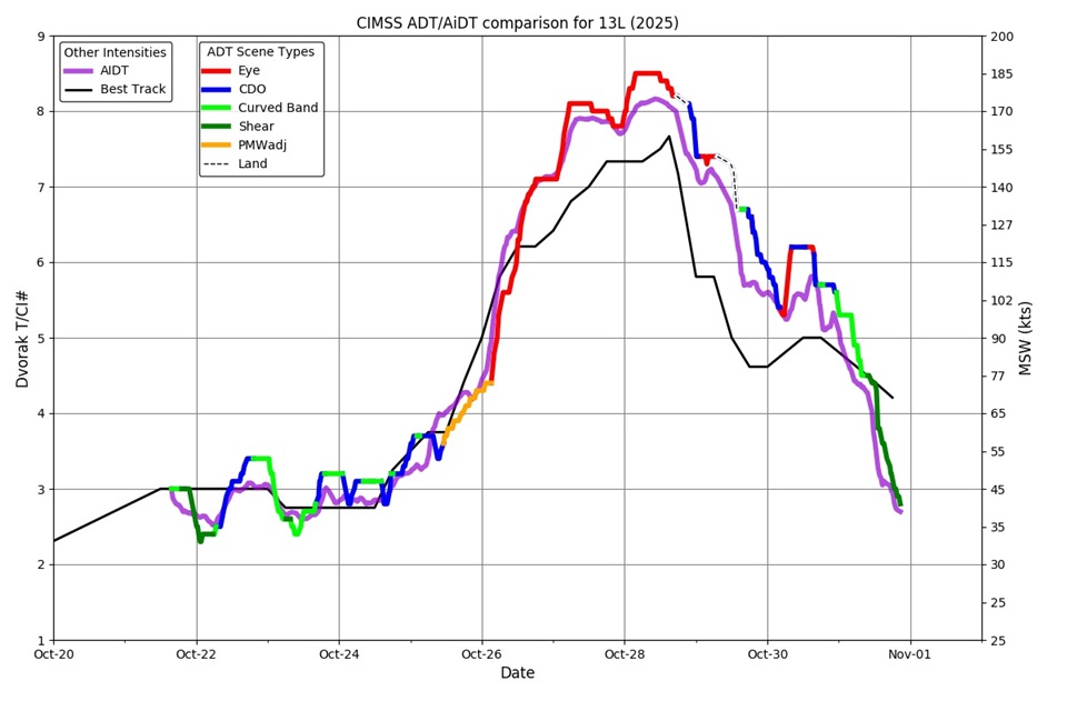
You may also notice that around the time of its peak intensity, Melissa's ADT and AiDT numbers were actually above 8.0! How is that possible, if the scale stops at 8? Well, for starters, let's look at Melissa on enhanced infrared imagery Melissa on enhanced infrared imagery (opens in a new window) early on October 28 (near the time when the intensity peaked). The storm had a perfectly circular eye surrounded by a highly symmetric ring of very cold cloud tops, approaching 180 Kelvin (about -93 degrees Celsius)! Melissa was about as close to "satellite perfection" as it gets, and the original Dvorak technique didn't account for a warm eye embedded so deeply in cloud tops that cold. In such cases, the objective computer-based Dvorak approaches may produce T/CI numbers slightly greater than 8, though this doesn't happen very often (it's a sign of an incredibly impressive satellite presentation).
While using objective approaches like the ADT and AiDT has many advantages, performing subjective analyses manually still has value. Referring back to the Hurricane Melissa discussion near the top of the page, you'll notice that forecasters referenced both subjective and objective approaches in their analysis. Indeed, analysts and researchers still regularly conduct manual Dvorak analyses. While you won't have to do complete Dvorak analyses in this course, conducting some basic Dvorak classifications can still help you become "one with the atmosphere" so that you can really be in tune with how a particular storm is evolving. As your experience grows in tropical weather forecasting, you will discover that tropical cyclones appear in a variety of sizes and shapes on satellite imagery. A major component of the Dvorak Technique hinges on forecasters classifying the shape and pattern of clouds they observe on visible and infrared satellite imagery into four basic categories, which you should be sure to know (click on each one to see a brief description and an example):
- Curved-band pattern
Often observed in the early stages of tropical cyclone development, this pattern is characterized by a band of dense cloudiness that begins to curve around the center of the storm. In weak hurricanes, the band coils entirely around the center of the storm. For example, Check out this infrared image that shows the curved-band pattern (opens in a new window) associated with a tropical storm with maximum sustained wind speeds of 60 miles per hour. At the time, the curved band wrapped around most of the center of the storm.
- Shear pattern
Typically observed in the formative stages of a tropical cyclone or during weakening, the shear pattern is characterized by deep convective clouds moving to one side of the storm's center. For example, check out this satellite image of a sheared tropical storm (opens in a new window) with maximum sustained wind speeds of 45 miles per hour. Note that the center of low-level circulation lies to the north of the deep convection, indicative of relatively strong northerly shear between 850 mb and 200 mb. Recall that a tropical cyclone is in a weakened state when upper-level winds push deep convection away from the storm's low-level circulation.
- Central Dense Overcast (CDO) Pattern
The CDO pattern describes the region of dense cirrus clouds that shrouds the core of a tropical cyclone, which is sometimes observed in stronger tropical depressions, tropical storms, and weak hurricanes. The presence of a CDO pattern sometimes indicates that intensification has stalled or is being delayed. For example, this satellite image showing a CDO pattern (opens in a new window) reveals a canopy of very cold cloud tops consolidated around the center of the storm. At this time, the storm was on the verge of being upgraded to a hurricane. For tropical depressions, tropical storms, and some weak hurricanes, the CDO appears fairly homogeneous (uniformly cold cloud-tops on infrared imagery) with no eye readily apparent.
I say "readily" because an embryonic eye may have already "secretly" formed. As a tropical cyclone intensifies, an eye typically starts to develop near the center of the tightening spiral associated with the cyclone's primary curved band. But, the CDO typically masks most of this emerging pattern from the view of conventional satellite imagery (high cloud tops shield lower-level features from detection by visible and infrared imagery). Forecasters do have tools for detecting these "secret" eyes, which we'll explore later in the lesson, but forecasters continue to use the Dvorak CDO pattern until an eye appears on conventional satellite imagery.- Eye Pattern
Once an eye is evident on conventional satellite imagery, an "eye pattern" exists. After the eye emerges, a large surrounding ring of cold convective cloud remains (which were formerly part of the CDO). For example, about 15 hours after the infrared image capturing the CDO pattern above, an eye emerged on infrared imagery (opens in a new window). The newly apparent eye appears as an oasis of warmth within the surrounding cold convective clouds as this storm was intensifying quickly into a major hurricane, with maximum sustained wind speeds of 120 miles per hour a few hours after the time of this image.
Eye patterns can characterize tropical cyclones of widely varying intensities. For example, a storm that has an eye could be a Category 1 or a Category 5 hurricane. That's a huge difference, but both would fall under the eye pattern! To further help forecasters refine their assessments based on eye patterns, they look at specific characteristics of the eye. For example, recognizing the eye of a hurricane is banded (check out this example of a banded eye (opens in a new window)) helps meteorologists recognize that a hurricane is weak (essentially a curve band had finished coiling entirely around the center of the storm to form the "banded eye"). On the other hand, highly circular eyes with few clouds surrounded by a thick symmetric ring of cold CDO cloud typically indicate a storm with major hurricane intensity (as in this enhanced infrared image of a super typhoon (opens in a new window)). Tropical forecasters look at a specially enhanced infrared satellite image called a Dvorak image to help them distinguish between various eye patterns. By using this imagery to determine the radiating temperature of the eye and compare it to the radiating temperatures of the surrounding cloud tops, they can more specifically assess the intensity of a particular hurricane. As a general rule, the larger the difference in temperatures between the eye and the surrounding cloud tops, the stronger the hurricane.
However, I should point out that hurricanes with very small eyes can present challenges to objective Dvorak analyses. When an eye is very small, the gradients in radiating temperatures within the eye and eye wall may not be depicted accurately on Dvorak imagery, lending the impression that the difference between temperatures in the eye and the surrounding cloud tops is less than it actually is. For example, check out the image slider below, showing Super Typhoon Chanthu's tiny pinhole eye on higher-resolution visible imagery compared to Dvorak imagery (advance the slider to see the Dvorak image). The Dvorak image doesn't really do justice to the characteristics of the tiny eye, which can lead to intensity estimates that are too low.
After classifying the cloud pattern and looking at satellite-derived temperatures, forecasters completing the Dvorak Technique manually would take into account other factors such as trends in the cloud pattern that indicate a weakening or intensification and assign a T Number and CI Number, which range from 0 to 8 in increments of 0.5. Officially, T Numbers and CI Numbers appear in a coded format (opens in a new window), which you may be interested in if you're into tracking tropical cyclones in real-time. But, how do these numbers translate to storm intensity? Below is a chart that links the estimated CI number with the basic patterns of clouds that I described above. Current Intensity Numbers have also been calibrated against aircraft reconnaissance of tropical cyclones in the Northwest Pacific and Atlantic Oceans. On average, the CI Numbers correspond to the specific wind speeds and central barometric pressures also shown in the graphic below.

In case you're wondering, the reason for the basin differences in central pressures at a fixed CI Number is that the overall mean sea-level pressures are lower in the Northwest Pacific (more details later in the course). So, given a central pressure and maximum sustained wind speed associated with an Atlantic tropical cyclone, the central pressure of storm in the Northwest Pacific must essentially be lower for it to generate the same wind speed. Remember, it's the pressure gradient that largely determines wind speed, which is why small tropical cyclones can generate stronger winds than a larger cyclone with the same minimum central pressure. It's important to keep in mind that the Dvorak intensity estimates in the graphic above are merely averages.
As you track tropical cyclones in real-time, you'll regularly see references to T Numbers and CI Numbers in discussions from NHC and JTWC, and a number of sites online provide Dvorak analysis data (links are in the Explore Further section below, if you're interested). With what you now know about the Dvorak Technique, you should be able to interpret those references and understand what they suggest about a tropical cyclone's current status. The Dvorak Technique, however, is far from the only way that satellites are used in tropical cyclone forecasting. We'll explore another intriguing use of satellite data on the next page with a discussion of "Cloud-Drift Winds."
Explore Further...
Dvorak Technique Data on the Web
If you're looking for Dvorak technique data to assess current storms, check out these resources:
- Cooperative Institute for Meteorological Satellite Studies (CIMSS) ADT page (opens in a new window) (includes current Dvorak ratings and time series for individual storms)
- CIMSS AiDT page (opens in a new window) (similar to the ADT page, but for the AiDT)
- NOAA ADT/AiDT page (opens in a new window) (includes AiDT time series, as well as satellite imagery
- RAMMB-CIRA Real-Time Tropical Cyclones page (opens in a new window) (click on your storm of interest, then "Satellite", and look for the IR image with "BD Curve Enhancement" to get Dvorak Imagery)
More on the Dvorak Technique
While I gave a basic picture of the Dvorak Technique in this section, I didn't really get into the nitty-gritty details of how to perform the technique manually, which takes a great amount of skill and experience! The execution of the Dvorak Technique has evolved over the years from completely manual analyses to the objective automated analyses of the ADT and AiDT. If you're a real tropical weather aficionado, you may be interested in learning more about the details of this evolution, from the details of Dvorak's original technique through the development and evolution of objective computerized versions. The academic papers below will enrich your understanding (although they contain material well beyond the scope of the course):
- Dvorak's seminal paper (opens in a new window) from 1984
- Paper on the development of the Objective Dvorak Technique (ODT) (opens in a new window) from 1998
- Paper on the development of the Advanced Dvorak Technique (ADT) (opens in a new window) from 2007
- Paper on the development of the Advanced (AI-Enhanced) Dvorak Technique (AiDT) (opens in a new window) from 2021
- A very readable paper describing the Dvorak Technique and its history (opens in a new window) from the Bulletin of the American Meteorological Society in 2006.
Cloud-Drift Winds
Cloud-Drift WindsPrioritize...
You should be able to discuss the main applications of cloud-drift winds to tropical weather forecasting and interpret cloud-drift wind imagery once you've finished this page.
Read...
As you've already seen, remote sensing from satellites can be used to estimate the intensity of a tropical cyclone via the Dvorak Technique. Indeed, several other satellite-based remote sensors help forecasters observe various aspects of a tropical cyclone's structure and intensity as well. We'll cover several more of these sensors as we continue through the lesson. In this section, I'm going to focus on a remote-sensing technique that has broader applications than just tropical cyclone analysis.
The same geostationary satellites used to execute the Dvorak Technique can also be used to remotely retrieve tropospheric wind information by calculating what are formally called atmospheric motion vectors (AMVs). You'll also sometimes hear AMVs referred to as cloud-drift winds (CDWs) or cloud-tracked winds. On the Web, you may encounter any of these phrases, so just realize that they refer to the same thing. For simplicity, however, I'm going to stick with the term "cloud-drift winds" (CDWs) because it intuitively describes how this product is created. In a nutshell, this technique retrieves estimates of wind speeds and directions at various altitudes by tracking the movement of clouds on satellite loops. The process sounds pretty simple, but it can actually be quite challenging.
Before we really explore cloud-drift winds, I should point out that they rarely get a mention in any NHC discussions. So, what's the role of CDWs in tropical weather forecasting? Well, as you know, there's a serious dearth of routine radiosonde observations over the oceans, where the lack of data introduces errors into numerical simulations of the atmosphere. Thus, the capability of getting a proxy for winds by measuring how fast clouds drift over open seas is invaluable. With numerical weather prediction in mind, it should come as no surprise to you that CDWs are assimilated into computer models.
While cloud-drift winds often play somewhat of a "behind-the-scenes" role in weather forecasting, we can still use available CDW data to infer important things about tropical weather. For example, check out the CDW data in the image below, which shows wind barbs annotated on infrared satellite imagery over the Southeast Indian Ocean. The various colors are described by the key in the upper-right corner of the image (green wind barbs are in the layer between 800 mb and 950mb; yellow = 600 - 799 mb; blue = 400 - 599 mb). For example, look off the west coast of Australia and note the closed, cyclonic circulation. Remember that this image is from the Southern Hemisphere, so "cyclonic" refers to a clockwise circulation. Using infrared imagery alone, the system would only appear as an innocuous blob of relatively low clouds that are hard to pick out, but the yellow barbs derived from cloud-drift winds showed that a closed circulation existed between 799 mb and 600 mb. These CDW observations helped forecasters not be fooled by the unremarkable blob of low clouds and realize that there was actually a tropical depression present.

Now that you have a little background on CDWs and their applications, let's look at the technique of retrieving winds from various types of satellite imagery (they're not all based on IR imagery). As its name suggests, cloud-drift winds are derived from a sequence of satellite images. In the simplest sense, you could spot a cloud and watch it move with time; but, as you can imagine, in reality, it's not that straightforward. As an example, I'll describe the technique for retrieving winds in the lower to middle troposphere from infrared satellite data. First, the technique requires three successive images. Next, "target clouds" are selected according to brightness gradients (large gradients in brightness, for example, typically mark cloud edges). The pressure altitudes of the cloud targets are then estimated from the intensity of infrared radiation detected by the satellite.

An important caveat here is that the brightness gradients associated with candidate targets must remain relatively consistent in time, which means that not all clouds provide viable targets. To get a feel for what a sample of suitable cloud targets might look like, check out the dots on the infrared satellite image on the right. Indeed, multilayered clouds (decks of low, middle, and/or high clouds lying over the same geographical area) are eliminated as potential targets because trying to assign altitudes to multilayered clouds poses nightmarish challenges. So, ultimately, we can't accurately determine CDWs everywhere using infrared imagery because of these challenges, and the fact that some areas have no cloud cover at all.
Fortunately, we're not limited to infrared imagery for CDW observations. As you already know, loops of water-vapor images can be used to assess winds in the upper troposphere (forecasters infer these winds even without a formal CDW technique). Indeed, in areas without high clouds to track the upper-level winds, water-vapor imagery becomes indispensable because it allows us to follow "vapor targets (opens in a new window)" (like cloud targets on infrared imagery) in time. Following "vapor targets" allows us to deduce the speed and direction of upper-level winds over tropical seas quantitatively (as opposed to the qualitative approach that forecasters often use when looking at water vapor loops).
The schemes used to generate middle- and upper-tropospheric winds from water-vapor loops are similar to the technique used to generate lower-altitude winds from infrared-satellite loops. For starters, three successive water-vapor images are required, and horizontal gradients in water-vapor (or high cloud tops) that remain coherent in time serve as potential vapor targets. Even though water vapor imagery provides more target options, many of the vapor targets end up being removed because of various quality control issues. After applying the same principles involved in retrieving CDWs from infrared imagery, out pops water-vapor images with middle- to upper-tropospheric winds -- just like the one below showing CDWs over parts of North America, Central America, and South America (and surrounding oceans).

The different colors of the wind barbs correspond to their layers as described by the key at the top right of the image. Note however, that color schemes for plotting various layers of cloud-drift winds can vary from Web site to Web site, so it's wise to not get locked in on one particular color scheme. At the time of this image, a tropical depression had just formed off the coast of Central America, but a corridor of relatively fast north-northeasterly flow in the upper troposphere over the storm (note the wind barbs in the 250-100 mb layer indicating winds as fast as 40-50 knots or more near the storm), with a few in the 350-251 mb layer, too) was helping to create strong vertical wind shear over the storm. Persistent vertical shear over the storm helped prevent it from becoming anything more than a minimal tropical storm during its lifetime.
Cloud-drift winds aren't limited to just traditional infrared and water-vapor imagery, though. CDW data can also be produced from visible imagery, though it has an inherent limitation of only being available during local daytime when there's enough reflected visible sunlight to produce a visible image. Shortwave infrared imagery is often used to supplement visible imagery so that there's no data void at night. If you're interested in learning more about CDWs from visible imagery, check out the Explore Further section below.
Finally, I should point out that CDWs have long been used to assess large-scale wind patterns, but they often aren't the best tool for detecting the details of wind patterns around tropical cyclones. Remember that tropical cyclones are rather small features in the scheme of things, and available CDW targets are often too few in number or too far apart to capture the finer details. However, improvements in satellite technology, including the introduction of very high-resolution sector scans focused on important weather features, allows for better tracking of wind fields around tropical cyclones. These high-resolution satellite scans with their more frequent updates make it possible to track a higher number of cloud targets (potentially thousands within the region of a tropical cyclone), allowing for a higher-level of detail in CDWs.
To see what I mean, check out the image of these "High-Resolution CDWs" below, showing CDWs in the vicinity of Hurricane Melissa (2025) as it was beginning a period of rapid intensification. The blue and cyan wind barbs represent winds above 250 mb, and they show a clear pattern of upper-level divergence over the storm (note how the wind barbs blow outward from the center of the storm). This upper-level divergence, of course, would help air columns near the center of the storm lose weight and lower surface pressures.

You might have noticed in the image above that most of the wind barbs were located in the upper troposphere, which isn't surprising, given the plethora of high-topped clouds in and around a hurricane. However, in some storms that don't have well-developed central dense overcast regions or expansive high-level cirrus flowing outward at the top of the storm, high-resolution CDWs can track lower level winds around the storm. But, in Melissa's case above, CDWs below 500 mb were limited to the bottom left corner of the image (purple and red wind barbs blowing from the west-southwest -- in toward the storm).
If you want to learn a bit more about how cloud-drift winds are produced, or want to view real-time CDW data, you may be interested in the resources in the Explore Further section below. In the final analysis, assessing CDWs at a variety of wavelengths (corresponding to those that create water-vapor and infrared imagery, as well as shortwave infrared and visible imagery if available) gives forecasters a more complete picture of winds throughout the depth of the troposphere. Such a "multi-channel" approach was essential for assigning heights to potential cloud targets. But, the utility of the multi-channel approach in satellite remote sensing has broader applications, which we're about to investigate.
Explore Further...
Cloud-Drift Winds on the Web
If you're interested in accessing satellite images that include cloud-drift wind data, you may be interested in these resources:
- The Cooperative Institute for Meteorological Satellite Studies (CIMSS) (opens in a new window) site (look for "Winds & Analyses" for any of the tropical basins under "Regional Real-Time Products"). Upper-level winds based on water vapor imagery are the default, but if you click on "Lower-level winds" you'll get CDWs based on infrared imagery. "Visible winds" are often unavailable since they're posted only when tropical cyclones are active in a particular basin
- The CIMSS "Meso-AMV" page (opens in a new window) (CIMSS refers to high-resolution CDWs as "Meso-AMVs" (mesoscale atmospheric motion vectors) so you can use this page to see the more detailed CDWs around tropical cyclones.
- GOES Winds (opens in a new window) from NOAA (CDW images and loops from GOES-East and West, using infrared, water vapor, shortwave infrared, and visible imagery).
More on Cloud-Drift Winds
Above, I briefly mentioned that cloud-drift winds based on visible imagery are available, but didn't go into much detail. It turns out that CDWs from visible imagery have some advantages when they're available, like the fact that low-level wind fields derived from visible CDWs can be empirically adjusted to the surface to estimate the surface wind field of a tropical cyclone. You can read more about CDW products involving shortwave infrared and visible radiation (opens in a new window), if you're interested.
Cloud-drift winds also have applications to aviation and mesoscale meteorology that may interest you. This article from the Bulletin of the American Meteorological Society (BAMS) (opens in a new window) has more on the utility of CDWs.
Multispectral Imagery
Multispectral ImageryPrioritize...
In this section, you should focus on the interpretation of multispectral imagery, and be able to identify clouds as low, middle, or high based on common color schemes used in the three-channel color composites shown in this section. Furthermore, you should be able to use multispectral imagery to identify the low-level circulation of a tropical cyclone when it's exposed.
Read...
Throughout your studies, we've looked at several different types of satellite imagery, each using a different wavelength of electromagnetic radiation to produce an image. Notably, each type of "conventional" satellite imagery (visible versus infrared, for example) uses a single wavelength (or "channel") to produce the image. But, as we already know, using different types of imagery (different "channels" from the satellite's imager) helps forecasters gain different information (about upper-level winds versus lower-level winds in the case of cloud-drift winds, for example). It turns out that combining multiple channels on the same image can sometimes help forecasters better identify certain features and cloud characteristics. Let's explore these "multi-channel," or more formally, multispectral images, which use multiple wavelengths of the electromagnetic spectrum.
Polar-orbiting satellites have long played a pivotal role in remote sensing of tropical weather systems using a multispectral approach. You may recall that polar orbiters fly at much lower altitudes (opens in a new window) than geostationary satellites and are "sun synchronous" (meaning that they ascend or descend over a given point on the Earth's surface at approximately the same time each day). Multiple fleets of polar orbiting satellites currently circle the Earth (more in the Explore Further section below). Instruments aboard these satellites collect data at multiple wavelengths ("channels") across the visibile and infrared portions of the electromagnetic spectrum, which allows us to collect information about day and nighttime cloud cover, snow and ice coverage, sea-surface temperatures, and land-water boundaries. However, with improvements in geostationary satellites, including better resolution, they're also a common source of multispectral satellite composites. By the way, if you're interested in exploring the topic of satellite resolution in more detail, check out the Explore Further section below.
One product that has long been common in tropical forecasting is a three-channel color composite like the one below captured by a polar orbiting satellite, showing Category 5 Hurricane Katrina at 2011Z on August 28, 2005. The yellow shading in Katrina's eye really stands out, doesn't it?

That yellowish shading corresponds to low-topped, relatively warm clouds within Katrina's eye (remember that the eye of a hurricane often contains low clouds). Meanwhile the thick, tall convective clouds with cold tops surrounding the eye appear bright-white on this three-channel color composite, and high, thin cirrus clouds appear blue/white.
How does it work?
How are useful color composites like this one created? The process can vary depending on the type of multispectral image, but most commonly, three individual channels are combined, with a filter being applied to each. To illustrate, let's walk through the scheme used to make the image above. It's not really all that complex. First, we start with a standard grayscale visible image, near (or "shortwave") infrared, and infrared images (check out the top row of satellite images in the graphic below). Next, we apply a red filter to the visible image, a green filter to the near-infrared image, and a blue filter to the infrared image, and we get strange looking satellite images like the ones in the second row of the graphic below. But, if we combine those "false-color" images together, we get a three-channel color composite!

Breaking down this three-channel color composite helps us to understand why high, thin clouds appear in blue on the final product like the image of Hurricane Katrina -- they're brightest on the infrared channel (which had blue hues added to it). Meanwhile, tall, thick convective clouds that show up bright white on the final product are bright on the individual images from all three channels, and low clouds appear yellow because they're brightest on the visible (red) and near-infrared (green) images. The combination of green and red provides the yellow shading (if you're curious about why yellow results, you may want to read about additive color models (opens in a new window)).
This final color scheme (yellow for low clouds, white for tall, thick convective clouds, and blue for thinner cirrus) isn't universal, however. For another example of a three-channel color composite from a geostationary satellite, check out the image below. This particular image shows Tropical Storm Arthur near the Texas Coast on June 17, 2026. This composite was created using two different visible channels and one infrared channel. Using these channels, this type of composite (formally called a "Day Cloud Phase RGB") helps to discern between low clouds composed of liquid water (in blue), clouds where ice crystals are starting to form (in green), tall, convective clouds (yellow), and thinner cirrus clouds (reddish-orange). Given the presence of thick convective clouds and cirrus in the large convective cluster over the Gulf, the clouds take on a a reddish-yellowish appearance.

At this time, Arthur was a highly sheared system, with all of the deep convection displaced well to the east of the low-level center (the surface center of low pressure is marked with an "L."). The fact that lower clouds comprised of liquid drops appear in blue on this type of image helps forecasters quickly recognize the displacement between the low-level center and the deep convective clouds (appearing reddish yellow) over the Gulf. At the time, Arthur was obviously not a "healthy" storm.
The multispectral approach ultimately made it much easier to diagnose cloud types and discern the low-level circulation from the rest of the storm than any single visible image or infrared image. The image slider below helps to illustrate this. The first image is a conventional visible image of Arthur at the same time as the multispectral image above. If you advance the slider to the second image, you'll see the corresponding enhanced infrared image, on which it's very difficult to pick out circulation in the low clouds. Finally, advancing the slider to the final image shows the multispectral image above for comparison. The striking color contrasts help forecasters get a quick read on the sheared structure of the storm.
I should point out that many types of multispectral images exist, beyond three-channel color composites like the ones I've already described. Indeed, another example is so-called "sandwich" imagery, which combines one visible channel and one infrared channel to provide the high-resolution details of visible imagery, along with color enhancements to accentuate cold cloud tops (from infrared imagery). The result can be a visually spectacular image where you can see the bubbly texture of cumulonimbus clouds along with infrared color enhancement (see Arthur's corresponding sandwich image (opens in a new window), for example). So, I've just scratched the surface here (we haven't covered all types of multispectral images), but hopefully you can see how the multispectral approach can make it easier to pick out specific details of tropical cyclone structure and discern details about cloud type and altitude, even though color conventions may vary.
Specifically, when a tropical cyclone is highly sheared like Arthur was, the color scheme of three-channel color composites can really expose the structure of the storm. For another striking example, check out this loop of three-channel color composite images of a weak tropical depression (opens in a new window) in the Atlantic. Not long after the storm was classified as a depression, the deep convective clouds (bright white) got displaced to the northwest thanks to strong southeasterly wind shear. The yellow swirl of clouds left behind clearly marks the storm's low-level circulation. The completely exposed low-level circulation signaled that intensification wasn't in the cards for this storm (in fact, it never did become a tropical storm and dissipated entirely a couple of days later).
There's no doubt that this multispectral approach to satellite imagery can produce some striking and very insightful images, and in case you're wondering, the false-color approach of multispectral images has a number of other applications. The Hubble and James Webb Space Telescopes (opens in a new window) employ a similar approach, as do polar-orbiting satellites that study features on the Earth's surface. But, for analyzing tropical cyclones, the uses of multiple wavelengths of electromagnetic radiation don't stop with what we've covered here. It turns out that other remote sensing equipment aboard polar-orbiting satellites can detect things like rainfall rates, temperatures, and wind speeds by employing different wavelengths of radiation. We'll begin our investigation of those topics in the next section.
Explore Further...
Multispectral Satellite Images Online
Where can you find multispectral images online? Many interfaces that offer conventional visible, infrared, and water vapor images also offer multispectral images. You may find these resources to be of interest:
- College of DuPage Satellite Page (opens in a new window) (scroll down on the left to RGB Color Products to access images like the ones in this section, along with others that we did not cover)
- NHC Satellite Page (opens in a new window) (in addition to lots of conventional images, some basins also have the "IR RGB" images we covered on this page available)
- GOES Floater Imagery (opens in a new window) (when tropical cyclones are active, you can access zoomed-in imagery, including some multispectral options
- NASA SPORT (opens in a new window) (scroll down to see a variety of multispectral images and descriptions of their applications)
- If you're interested in looking at images of past hurricanes, Johns Hopkins University has a spectacular archive of three-channel color composites (opens in a new window) of older storms (pre-2010).
Polar-Orbiting Satellite Programs
If you're interested in learning about some major satellite programs (you'll encounter some of the instruments aboard satellites in these programs in the remaining sections of this lesson), you may like exploring the following links:
- The Joint Polar Satellite System (JPSS) (opens in a new window) operations page
- The Defense Meteorological Satellite Program (DMSP) (opens in a new window)
- NASA's Landsat (opens in a new window)
- NASA'S Earth Observing System (EOS) (opens in a new window) Satellites
- Metop Series Satellites (opens in a new window)
Among the instruments aboard these polar orbiters that contribute to the creation of multispecral imagery are the Visibile Infrared Imaging Radiometer Suite (VIIRS) and the METImage instrument. If you're interested in learning more about the details of these instruments or its applications, you can read more about VIIRS (opens in a new window) and METImage (opens in a new window).
More on satellite resolution...
The word "resolution" came up a few times in this section (and has other times in your previous studies). It's very common for camera or smartphone manufacturers to boast about resolution in terms of a number of "pixels" (even though that's not a true measure of resolution). So, what is "resolution" anyway? The short video below demonstrates in the context of satellite imagery.
Satellite Resolution (4:34)
Transcript: Satellite Resolution (4:34)
Satellite resolution refers to the minimum spacing between two objects, such as clouds, that allows the objects to appear as two distinct objects on the image. The smallest individual elements of an image are pixels, so your ability to see the separation between two objects on a satellite image ultimately depends on at least one pixel lying between the objects. If you zoomed in close enough on a satellite image, the details would look all boxy like they do in the bottom right inset image here. Zooming in enough makes the clouds look highly pixelated, but whether the clouds can be resolved just depends on whether there's a separation of at least one-pixel between two clouds. If not, the objects would simply blend together, and can't be resolved.
To get a visual idea of how satellite resolution works, check out this simulated visible satellite image. Our simulated image is very zoomed in, so the clouds look very pixelated. On this image, the two clouds can be resolved – the image shows two distinct clouds, A and B, because the distance between them exceeds one pixel.
If we pretend that each pixel’s width is 1 kilometer, then these two clouds are a little more than 3 kilometers apart.
Now what happens if the clouds are closer together? Now our two clouds, A and B, are still separate clouds, but now the distance between them is less than one pixel. Parts of each cloud lie in adjacent pixels.
If we still assume that our pixels are 1 kilometer wide, the two clouds might be a little less than a half kilometer apart. On our simulated visible image now the clouds blend together as one cloud because they can no longer be resolved. So, even though the breadth of each cloud on the simulator is greater than one pixel – each one happens to be close to 3 pixels wide, we can’t resolve them as distinct objects at this resolution because the distance between them is less than one pixel. So, if our pixels are 1 kilometer wide, can we broadbrush things and just say that as long as clouds are more than 1 kilometer apart, they can be resolved?
Not really. Imagine if clouds A and B drifted a bit apart, such that the edge of cloud A was on the left side of one pixel and the edge of cloud B was on the right side of the adjacent pixel. First, you might notice that, even though the size of the clouds didn’t change here, each one is now spread across parts of four pixels instead of 3, because their position changed within the pixels.
But, even though the clouds are now closer to 2 kilometers apart, because parts of them still occupy adjacent pixels, they still couldn’t be resolved and would blend together as one cloud on a satellite image. After doing some math, if our pixels are 1 kilometer by 1 kilometer, we can’t guarantee that two different clouds can be completely resolved unless they are almost 3 kilometers apart, in a scenario where, say the edge of one cloud is in the southwest corner of one pixel and the edge of another cloud is in the northeast corner of a pixel just to the northeast of the first pixel. So, with pixels that are 1 kilometer by 1 kilometer, a minimum of 1 kilometer between clouds is required to resolve them distinctly, but close to 3 kilometers might be needed, depending on the spatial orientation of the objects and where they’re located within pixels. So, basically, satellite resolution is related to the size of the pixels -- smaller pixels allow objects to be closer together and still be resolved distinctly.
Resolving objects distinctly depends on the distance between objects, not the size of the objects themselves. For example, in the simulated visible satellite image, the clouds don't look very much like clouds. They look more like white blocks even though they can be resolved distinctly when there's at least one pixel between them. The clouds would need to be larger for them to be clearly identified as clouds on the satellite image. The bottom line is that by and large, satellite resolution and the minimum size of an object that allows it to be identified are not the same, although they are related.
To see what I mean, check out this tool that allows us to view the same image at different resolutions. At a resolution of 250-meters, which would be a very high resolution, small objects like individual cumulus clouds can be seen. Each pixel spans just 250 by 250 meters, so clouds that are at least 250 meters apart have a chance to be resolved.
But, as resolution decreases, each pixel is an average of a larger area, so small features which occupy less than a pixel in areal coverage get averaged with their surroundings, and the features start to look more blocky. At very low resolutions, small objects like individual cumulus clouds can no longer be seen, and a field of broken clouds can fade into the background.
Peering at Precipitation
Peering at PrecipitationPrioritize...
Upon completing this section, you should be able to interpret 85-91-GHz imagery and 36-37-GHz imagery, as well as discuss their primary uses and how these types of images are derived. Furthermore, you should be able to discuss the primary uses of the precipitation radar and microwave imager instruments aboard the GPM satellite. Finally, you should be able to discern whether a particular product discussed on the page comes from an active or passive remote sensor.
Read...
Our studies of remote sensing from satellites so far have mostly focused on techniques and products that are based on conventional satellite imagery. Even multi-spectral images are merely created from various wavelengths used to create visible and infrared images. Now, however, we're going to transition into some more sophisticated applications of remote sensing from satellites. In this section, I'm going to focus on satellite-based detection of precipitation structures and rates. Satellites play a crucial role in this area because tropical cyclones spend so much time outside of the range of land-based radar networks. First, we'll investigate imagery created from satellite detection of microwave radiation between 85 GHz and 91 GHz.
85-91-GHz Imagery
One of the characteristics that you've learned about a tropical cyclone's eye is that it is generally rain free, but it is not often completely cloud free. Either some low clouds exist in the eye and/or high clouds obscure the presence of the eye altogether on conventional satellite imagery. For example, check out the enhanced infrared satellite image at 2250Z on July 2, 2026 (below), which shows Typhoon Bavi. At the time, Bavi was in the midst of rapid intensification and had maximum sustained wind speeds of 105 miles per hour (a Category 2 storm on the Saffir-Simpson Wind Scale). Given that data, you might suspect that Bavi would display a well-defined eye on conventional satellite imagery. But, alas, high clouds obscured Bavi's eye, and it would be tough to get a fix on the storm's center under these circumstances.

Even though enhanced IR imagery didn't provide a good look at Bavi's core structure, thanks to passive microwave imagery, forecasters could still see that Bavi had an eye. How? Microwave imagers aboard polar-orbiting satellites detect emitted microwave radiation at frequencies from 85-91 GHz, and at the wavelengths used to create these images, we can "see" right through high-altitude cirrus clouds into the eye. Therefore, detecting the high-level structure of the core of tropical cyclones is a primary use of 85-91-GHz imagery. The image below happened to utilize 89-GHz microwave radiation and is superimposed on conventional infrared imagery in the areas outside the viewing swath of the polar-orbiting satellite (the pass didn't capture the entire storm). The 89-GHz image, which was from less than 30 minutes after the enhanced infrared image shown above, clearly revealed that Bavi did have a well-defined eye.

So, how should we interpret this image? Why is Bavi's eye evident on this image, but not the enhanced infrared image? After all, both images are plotting the same variable, called "brightness temperature," which is the temperature of a hypothetical object that absorbs all radiation that strikes it (brightness temperature is also sometimes referred to as "equivalent blackbody temperature"). But, because the two images are utilizing different wavelengths (frequencies) of radiation, they're showing us different things. The 89-GHz image doesn't really show us high, cold cloud tops like conventional infrared imagery does. Focusing on the spiraling pattern of low brightness temperatures around Bavi's center (red, green, and yellow), it stands to reason that not much 89-GHz radiation was reaching the satellite at this time. The short video below will help you understand why.
85-91-GHz Imagery (2:51)
Transcript: 85-91-GHz Imagery (2:51)
To understand the utility of 85-91 GHz imagery, we need to study the sources and behavior of microwave radiation at these frequencies. So, we’ll start at the bottom and work our way up through a thunderstorm. For starters, the surface of the ocean is a source of 85-91 GHz radiation. However, this radiation upwelling from the ocean gets strongly attenuated – that is, absorbed and scattered -- by cloud droplets and raindrops at below the melting layer within a tall thunderstorm, like those within the eye wall or a spiral band of a hurricane. However, these raindrops and cloud droplets also emit some radiation at these frequencies upward. This upwelling radiation from the top of the rain layer is primarily what reaches the satellite, but not before it gets scattered and absorbed above the freezing level by precipitation-sized ice particles like hail and graupel. Graupel pellets are softer ice pellets that form when supercooled water droplets freeze onto a snow crystal. Higher up in the storm, tiny ice crystals in cirrus clouds are virtually transparent to 85-91-GHz radiation. It gets transmitted right through the tiny ice crystals, which is why we can’t see cirrus clouds on 85-91 GHz images. But, in a tall thunderstorm where there’s lots of attenuation from the large ice particles, there’s not much of a signal left to reach the satellite. The weak signal that reaches the satellite correlates to very low brightness temperatures.
So, let’s apply this to an actual 85-91 GHz image. This one happened to utilize 89 GHz radiation. In this case, the polar-orbiting satellite wasn’t able to scan the entire storm, but it did capture the core of the storm. The yellows and reds surrounding the center of the storm represent brightness temperatures less than 228 Kelvin, and in some areas even less than 200 Kelvin – that’s less than -73 degrees Celsius! The brightness temperatures are so low because these are areas of deep convection in the eyewall – the upwelling 89-GHz radiation from beneath the melting level was largely attenuated by the large precipitation-sized ice particles high in the deep convective clouds. Not much radiation ultimately reached the satellite in those areas, yielding low brightness temperatures. Contrast that with the brightness temperatures in the eye, which were much higher – up near 280 Kelvin. The brightness temperatures in the eye were higher because the path of the 89-GHz radiation was much less impeded on its way to the satellite, allowing more radiation to reach the satellite. Upwelling radiation from the ocean or from the tops of low clouds had a pretty clear shot to the satellite from there, since there were no deep convective clouds with large ice particles in them over the eye, so there was minimal attenuation at higher altitudes, and 89 GHz radiation gets transmitted right through cirrus clouds, rendering them basically invisible.
The bottom line from the video is that when we see very low brightness temperatures on 85-91-GHz imagery, we're really seeing the signature of deep convection (characterized by the areas where emissions of 85-91-GHz radiation have been weakened the most by large ice particles like hail and graupel high up in convective clouds). For practical purposes, this trait of 85-91-GHz imagery:
- allows forecasters to see the eye of a hurricane that's shrouded by high clouds
- allows forecasters to assess the structure of hurricanes over remote seas by revealing the patterns of deep, moist convection in the storm's eye wall and outer rain bands
For the record, a few "twists" on 85-91-GHz images actually exist. Scientists have made some tweaks to the basic product in order to make it more useful. If you're interested in reading about these "twists," check out the upcoming Explore Further page.
One of the major limitations of 85-91-GHz imagery is that the satellites housing the sensors that create the imagery do not provide constant, universal coverage (as hinted at by the fact that the 89-GHz image above only includes a partial scan of Bavi). In fact, one of the several satellites equipped with a microwave sensor passes over a tropical cyclone, on average, every 2-3 hours (though time lags can be shorter or longer). So, there can be long gaps between data for any tropical cyclone. Researchers at the University of Wisconsin devised a creative technique, called MIMIC (Morphed Integrated Microwave Imagery at CIMSS), to fill in the time gaps with morphed 85-91-GHz images, and it can be very helpful for assessing changes to the structure of a tropical cyclone's core structure (and thus, its intensity). For example, check out this MIMIC loop of Hurricane Helene (opens in a new window) as it made landfall in Florida in September, 2024. The loop really shows the breakdown of Helene's eye wall (the partial ring of yellows and oranges) after landfall. If you really enjoy following tropical cyclones in real-time, I highly recommend keeping an eye on the recent MIMIC loops posted on the CIMSS site (opens in a new window).
36-37-GHz Imagery
While 85-91-GHz imagery is useful for identifying areas of deep convection within a tropical cyclone, it's not particularly useful at looking at the low-altitude structure of a storm because of the impacts that the large ice particles above the freezing level have on upwelling 85-91-GHz radiation. To get a better view of the low-level structure of a tropical cyclone, forecasters turn to imagery based on 36-37-GHz radiation, which works much like 85-91-GHz imagery, with one key difference. The 36-37-GHz radiation that upwells from the top of the "rain layer" is not scattered and absorbed by large ice particles or tiny ice crystals above the freezing level (here's a visual schematic outlining the process (opens in a new window)).
As a result, brightness temperatures are higher because the passive microwave sensor aboard the satellite detects a relatively large portion of the upwelling 36-37-GHz radiation from its source -- raindrops below the freezing level. And, because the majority of the radiation from lower altitudes reaches the satellite, 36-37-GHz imagery gives forecasters a better sense of the overall low-level structure of tropical cyclones. For example, we can see the low-level structure of Bavi from this corresponding 37-GHz image (opens in a new window). You might have noticed that the signature of Bavi's eye was smaller on the 37-GHz image than it was on the 89-GHz image shown earlier. The ability of 36-37-GHz imagery to detect low-level structure also makes it a better choice than 85-91-GHz imagery for pinpointing a tropical cyclone's center. For a more in-depth explanation of this advantage of 36-37-GHz imagery, check out upcoming Explore Further page.
Before moving on, however, I want to point out that forecasters can use 36-37-GHz imagery in tandem with 85-91-GHz imagery to assess the vertical structure of tropical cyclones. Since 36-37-GHz imagery gives a better look at the low-level structure, and 85-91-GHz imagery gives a better look at the high-level structure, forecasters can compare the locations of the low-altitude center and high-altitude center to see if the center of the storm tilts with increasing height. If the center notably tilts with height, that's often a sign that the storm isn't healthy and may be hindered by strong vertical wind shear.
Quantitative Precipitation Estimates
While 85-91-GHz and 36-37-GHz imagery do a good job of showing us the overall precipitation structure of a tropical cyclone (by highlighting deep convection and the details of the low-level rain layer, respectively), they don't quantitatively indicate rainfall rates or totals. Remote sensing from satellites can help with that, too, as suggested by the rainfall estimates (below) from Hurricane Harvey as it approached and made landfall in Texas in late August, 2017.

How can microwave sensors be used to attain quantitative precipitation rates and totals? The key lies in a multispectral approach. Imagery generated using a single frequency between 85-91-GHz or 36-37-GHz can't display precipitation rates, but imagery developed from multiple frequencies can. The data in the image come from NASA's Integrated Multi-Satellite Retrievals for GPM (IMERG) product. The "GPM" in the name stands for the Global Precipitation Measurement mission, which consists of several satellites with microwave sensors. The workhorse for providing quantitative precipitation data, however, is the core GPM satellite itself, which provides nearly global coverage (though not simultaneously since it's a polar-orbiting satellite) and houses two key instruments--the GPM Microwave Imager (GMI) and a Dual-frequency Precipitation Radar (DPR). If you're interested in learning more details about these key instruments aboard the GPM satellite, feel free to read more (DPR overview (opens in a new window); GMI overview (opens in a new window)), but I'll summarize the main points.
GMI is a passive microwave sensor, carefully measuring weak microwave energy naturally emitted by the Earth and the atmosphere and using it to infer rainfall rates. What makes the GMI different from 85-91-GHz imagery and 36-37-GHz imagery (which do not quantitatively estimate precipitation) is its use of multiple frequencies. Meanwhile, DPR is an active microwave sensor, which transmits pulses of microwave radiation and waits for return signals, much like a ground-based radar. DPR also uses multiple frequencies (within the "Ka-Band" at 35.5 GHz and the "Ku-Band" at 13.6 GHz), and is capable of depicting the surface rain rate as well as the three-dimensional precipitation structure of storms. DPR also provides higher-resolution data than GMI; however, the tradeoff is that its scanning swaths are narrower, so DPR is more likely to only partially scan any individual storm on a single pass, as illustrated by the schematic below.

So, GMI offers coarser information about surface precipitation over a larger area, while DPR offers more detailed, three-dimensional information over a smaller area. DPR is also more sensitive to areas of light rain and snow, and its sensitivity allows it to help calibrate the passive microwave data that go into IMERG precipitation analyses (which include passive microwave data and even rain gauge data, if available). Ultimately, the passive microwave imagery that go into IMERG precipitation estimates provide perhaps the best look at where it's precipitating (and how hard) across much of the globe where ground-based radar imagery is lacking. The 7-day loop of IMERG estimates below gives a spectacular example. Can you pick out the signatures of precipitation from mid-latitude cyclones tracking across the Southern Hemisphere and the typhoon approaching China?
Global 7-Day Precipitation Rate (0:13)
Transcript: Global 7-Day Precipitation Rate (0:13)
Video has no audio. It shows a loop of IMERG 7-day precipitation rate data across most of the globe. Some key features are mid-latitude cyclones swirling from west-to-east through the southern hemisphere and a typhoon approaching China in the western Pacific. All are marked by areas of locally high precipitation rates, in yellows, oranges, and reds.
Now that you're familiar with satellite-based qualitative and quantitative looks at precipitation within tropical cyclones, I recommend checking your knowledge in the Quiz Yourself section below. You also might be wondering where you can access all of this data. For more on data resources and some of the products available, check out the Explore Further page that follows. Otherwise, we'll stick with the theme of remote sensing using microwaves and explore microwave sounders (a sounder provides a vertical profile of a meteorological variable) used in tropical forecasting.
Read on.
Quiz Yourself...
Check your basic knowledge of the microwave remote sensors and products covered in this section:
The Advanced Microwave Sounding Unit
The Advanced Microwave Sounding UnitPrioritize...
When you've finished this section, you should be able to interpret the positive and negative temperature anomalies on cross-sections created by microwave sounders, as well as images created by a single channel. You should also be able to identify specific channels that correspond to monitoring the middle and upper troposphere on the microwave sounders described on this page.
Read...
While we've already seen how satellite data can help forecasters estimate the intensity of tropical cyclones (via the Dvorak Technique, for example), we're about to see that other remote sensing tools called "microwave sounders" can also provide intensity estimates. But, the functionality of microwave sounders extends far beyond just observing tropical cyclones. These are passive microwave sensors that retrieve atmospheric vertical temperature and moisture profiles throughout the atmosphere, and when it comes to the initialization data that feeds global weather models, the largest fraction actually comes from microwave sounders. So, microwave sounders are an indispensable tool for weather analysis and forecasting.
Besides temperature and moisture profiles, many other applications of data from microwave sounders exist, such as deriving rain rate, sea ice concentration, and snow cover, but our focus here will be on temperature profiles because of their connection to tropical cyclone intensity. Here again, the ability to collect multispectral data is key to making the most out of these instruments, which use multiple channels that are "tuned" to specific atmospheric layers. Having the capability to estimate temperatures in specific layers of the atmosphere is pivotal for getting a handle on the high-altitude warming above the core of a developing tropical cyclone.
For example, check out the cross-section of temperature anomalies in a slice through the center of Hurricane Helene on September 25, 2024, below. The warming in the eye can be correlated to a reasonable estimate for minimum surface pressure (warming decreases mean column density, which results in a decrease in column weight, which, in turn, is closely related to surface pressure). It sounds simple, but deriving these temperatures is actually fairly complicated (more details coming shortly).

The deepest orange and red shadings represent the largest positive temperature anomalies (the warmest air compared to the storm environment), which appear to be in the middle and upper troposphere thanks to compressional warming occurring with sinking air in the eye. This particular cross section captured the maximum warm anomalies aloft in the storm because this slice included Helene's eye. In other parts of the storm, the pattern of temperature anomalies can look quite different. To get an idea of how they can change in different parts of a hurricane, check out the interactive tool below.
In the image on the left, click and drag the white bar to view various cross sections throughout the storm (on the right). Keep in mind that all of these cross sections were created at the same time in an actual hurricane; they simply represent different slices through the storm. As you drag the white bar closer to the eye, the broad warm anomalies (from the release of latent heat in convective clouds) transition to dramatic, focused, warming over the core (in deep red). The magnitude of the compressional warming high above the core and the low central pressure at the ocean surface (and, thus, the powerful surface winds around the periphery of the eye) are connected, and researchers have developed various statistical techniques for estimating minimum central pressure and maximum sustained wind speeds from this connection.
You might have also noticed that in slices closer to the center of the storm, a notable cool anomaly appeared in the lower troposphere on the cross section. This signal actually becomes most prominent as two symmetric cool anomalies on either side of the eye, corresponding to the stormy eye wall. If you look back at the cross-section of Hurricane Helene, you'll notice similar low-level cool anomalies, though they're more subtle. Without mincing words, you should disregard these large cool anomalies because they are phony. Indeed, heavy rain in the eye wall and spiral-band thunderstorms grossly attenuates microwaves from microwave sounders (raindrops scatter and absorb microwaves), causing unrealistically weak upwelling that is accidentally interpreted as a large cool anomaly. So don't believe it! The attenuation of microwaves by heavy rain is one of the limitations of these kinds of remote sensors. I should add that another limitation of microwave sounders is that they're housed aboard polar-orbiting satellites, much like the other passive microwave sensors we've covered. Therefore, they don't offer continuous, universal coverage (i.e. they may miss storms sometimes and hours may go by before a storm is successfully sampled by a satellite pass).
Now that you know about how microwave sounders can give forecasters a look at warm core of a tropical cyclone, let's dig a little deeper.
How does it work?
As I mentioned before, each channel on a microwave sounder is "tuned" to measure brightness temperatures in specific atmospheric layers. Recall that brightness temperature (also known as "equivalent black-body temperature") is the temperature of a hypothetical object that absorbs all radiation that strikes it. Having the capability to estimate brightness temperatures in specific layers of the atmosphere is the key for assessing the high-altitude warming above the core of a tropical cyclone. But, how do these instruments assign brightness temperatures to specific atmospheric layers? We've encountered a similar problem before, when we discussed the complicated methods of assigning altitudes to water vapor targets in order to derive cloud-drift winds. That problem was particularly complex because vertical profiles of water vapor vary in time and space across the globe.
Microwave sounders, however, remotely sense microwave radiation emitted by molecular oxygen. That's a big deal because unlike water vapor, the decrease in the concentrations of molecular oxygen with increasing altitude is roughly the same at any place and at any time. Moreover, the presence of clouds does not meaningfully interfere with microwave emissions from molecular oxygen reaching the satellite. The bottom line here is that we know how oxygen is distributed in the atmosphere. And, this knowledge is the basis for how we can assign specific altitudes to brightness temperatures measured at microwave frequencies with these instruments.
Between roughly 50 GHz and 60 GHz (the microwave band for the channels that create temperature profiles), molecular oxygen absorbs strongly at some frequencies, but not as strongly at other frequencies. For example, let's look at the channels corresponding to 50.3 GHz and 54.9 GHz. Molecular oxygen weakly absorbs microwave radiation at a frequency of 50.3 GHz, so it virtually passes through the atmosphere without much absorption at this frequency (see graph on the left below). As a result, the greatest contribution to upwelling microwave radiation at 50.3 GHz that reaches the satellite comes from the earth's surface (see graph on the right below).

Meanwhile, at a frequency of 54.9 GHz, molecular oxygen much more strongly absorbs microwave radiation. This means that microwave emissions from the ground at 54.9 GHz do not reach the satellite because this radiation is absorbed by molecular oxygen higher up. Nor do microwave emissions (at 54.9 GHz) from oxygen in the low-to-middle troposphere ever reach the satellite. In the final analysis, microwave emissions from molecular oxygen at approximately 200 mb (about 12 kilometers) provide the greatest contribution to upwelling radiation that reaches the satellite at this frequency.
The primary microwave sounders used for tropical cyclone monitoring are the Advanced Microwave Sounding Unit (AMSU) and the Advanced Technology Microwave Sounder (ATMS), which both have a dozen or more channels dedicated to temperature profiling (and other channels dedicated to water and ice detection), so it's not difficult to imagine that they can generate a temperature profile through virtually the entire atmosphere. If you're interested in knowing the specific level of maximum contribution to upwelling microwave radiation for each ATMS channel (including other channels not used for temperature profiles), check out this graph of weighting functions (opens in a new window). In simplest terms, you can think of a weighting function as the level of maximum contribution to upwelling microwave radiation that reaches the satellite at the given channel's frequency.
In addition to viewing cross sections of tropical cyclones, we can also view data from individual channels to identify temperature anomalies near single pressure altitudes. Historically, the maximum warming over the eye of a hurricane was thought to occur near 200 mb, and it does appear there often on microwave sounder images; however, research suggests that the maximum warm anomaly can meander between the middle and upper troposphere at various times during the storm's life cycle. Therefore, forecasters commonly monitor four channels that allow them to evaluate temperature in the upper half of the troposphere and lower stratosphere, though the specific channel numbers are slightly different on each instrument, as outlined in the table below.
So, these four channels (AMSU channels 5-8 and ATMS channels 6-9), give forecasters a "top down" or plan view of the temperature anomalies at various levels within a tropical cyclone. For example, the image below shows the warm anomalies in a hurricane from AMSU Channels 5 - 8. The warm core really stands out, especially on channels 6 and 7 (350 mb and 200 mb, respectively), marked by yellows, oranges, and reds.

Ultimately, data from these microwave sounders gets incorporated (along with other satellite data) into statistical models for estimating tropical cyclone intensity. These approaches are imperfect, but on average, they have smaller errors than automated Dvorak-based methods alone. If you're looking for where you can access these satellite-based intensity estimates, as well as AMSU/ATMS data, check out the Explore Further section below after you've tested your basic knowledge from this section in the Quiz Yourself below. Up next, we have one more stop on our tour of remote sensing from satellites -- remote sensing of surface winds from space with satellite-based radars.
Quiz Yourself...
Check your basic knowledge of microwave sounders covered in this section:
Explore Further...
Microwave Sounder Data Online
Where can you find data from microwave sounders like the AMSU and ATMS online? The resources below may be of interest. I've included a link to an operational satellite-based intensity tool because data from microwave sounders is often a critical component of these estimates:
- CIMSS AMSU page (opens in a new window) (AMSU temperature anomaly cross sections and individual channel images for current and past tropical cyclones)
- CIMSS Home Page (opens in a new window) (If you click on a current tropical cyclone or invest, you can select individual channel views of the storm's environment from AMSU channels 5-8 and ATMS channels 6-9, if available)
- CIMSS SATCON (opens in a new window) (Consensus satellite estimates of intensity for current and past storms. If you click on a particular storm and view the available graphs, you may notice contributions from AMSU, ATMS, and other tools covered in this lesson. The consensus also includes artificial-intelligence based estimates from conventional infrared imagery and microwave imagery, called "D-PRINT" and "D-MINT").
Scatterometry
ScatterometryPrioritize...
Your focus on this page should be on interpreting scatterometry and synthetic-aperture radar (SAR) data, which requires an understanding of the abilities and limitations of the instruments that create them. Specifically, you should be able to discuss the primary use of scatterometry data and SAR data and interpret a variety of scatterometry and SAR data.
Read...
One of the reasons that remote sensing from satellites is so important to tropical cyclone observation and forecasting is that tropical cyclones spend so much time away from land-based observational networks (such as radar networks, among others). But, did you know that some polar-orbiting satellites also have radars mounted on them, which provide critical data to tropical forecasters? The primary use of these radars is actually in detecting the wind field in tropical cyclones, but like all tools, they have some limitations. So, let's get right into the first of these tools -- scatterometers.
Scatterometry
Scatterometers are unique because they have the ability to remotely measure surface wind speed and direction over water. For the record, a scatterometer is a high-frequency radar ("high" compared to the standard network of ground-based Doppler radars, which are "S-Band radars (opens in a new window)"). So, a scatterometer is an active remote sensor--it emits pulses of microwave radiation and measures the radiation that backscatters to the unit, similar to standard weather radar.
In a nutshell, scatterometers transmit pulses of microwaves with relatively short wavelengths (relatively high frequencies) and measure the backscatter from the wind-roughened ocean. The faster the winds are, the rougher the ocean surface, and the more radiation that backscatters to the scatterometer. In turn, meteorologists correlate backscattered microwave energy to wind speed and direction. As you'd expect, actually determining wind speeds and directions is a complex, imperfect process, but we'll explore those issues in a bit.
A number of scatterometers have been mounted on polar-orbiting satellites and have made key contributions to tropical forecasting since the 1990s. From a forecasting perspective, scatterometry gives forecasters the ability to detect tropical cyclones in their earliest stages of development. Early detection is important, of course, because it affords the general public and maritime interests greater lead time to prepare for any eventual threat. Scatterometry can detect centers of wind circulations that have the potential to develop into tropical cyclones many hours in advance of their attaining formal status as a tropical depression. In fact, when scatterometers were a relatively new tool around the turn of the century, researchers determined that they helped forecasters identify potential tropical cyclones an average of 43 hours before the National Hurricane Center formally classified the systems as tropical depressions. Identifying potential tropical cyclones from scatterometer data involves the detection of a developing cyclonic circulation of surface winds. So, how do forecasters interpret scatterometry data for this purpose?
Interpreting Scatterometry Data
Let's start with examining what scatterometry data actually looks like in practice. Once the data have been processed by computers, the output looks something like the image below. Notice a few important things. First, there's no scatterometry data over land (remember scatterometers measure backscattered radiation from ocean waves, so that makes sense). Secondly, notable swaths of missing data exist across the western Gulf and across much of the Caribbean into the Atlantic Ocean off the East Coast. Like the other sensors mounted aboard polar orbiting satellites, coverage gaps exist in the data (the satellite's "view" on any one pass is only so wide, so some areas naturally get missed). Finally, the surface wind barbs on this particular image show a clear cyclonic swirl, which corresponded with Hurricane Milton (opens in a new window) in 2024.

Note that most of the wind barbs near Milton's center are black and show very high speeds, which doesn't make sense with the color code used on the graphic (black represents speeds five knots or less). Furthermore, the circulation is hardly neat and tidy. It turns out that these black wind barbs have a special meaning -- they indicate that the data are unreliable. This "black flag" convention isn't universal, however. Some Web sites use other symbols (such as dots at the end of a wind barb) to indicate unreliable data. Scatterometers have trouble collecting good data in areas of heavy rain because raindrops severely attenuate microwave radiation, which weakens the signal received by the satellite. In addition, heavy rain splashing down on the ocean surface alters the small-scale structure of the surface ocean waves, which changes the nature of the backscattering to the satellite. Ignoring the unreliable "rain-contaminated" data on this particular image, the reliable observations suggest that Milton's maximum surface wind speed was only a little more than 50 knots, which was an underestimate since Milton was actually a Category 4 hurricane at the time.
This image provides a good example of why scatterometry data is primarily used to identify cyclonic circulations in embryonic tropical cyclones. Because heavy rain can prevent scatterometers from accurately discerning wind direction and speed, they typically don't provide useful data near the center of stronger tropical cyclones (because that's where lots of heavy rain falls in eye wall thunderstorms). So, scatterometry is generally not a good way to assess the intensity of a strong tropical cyclone. In weaker tropical systems, fewer organized areas of heavy rain exist, which yields a more useful data set.
You should also note that scatterometry has applications beyond the tropics, such as identifying sea ice in polar regions. Glacial snow and ice very effectively backscatter microwaves to the scatterometer (more effectively than even wind-roughened oceans), which allows scientists to identify boundaries of sea ice from their strong return echoes.
Characteristics and Limitations
Rain contamination isn't the only limitation of scatterometry data, however. Scatterometers can differ in their frequency of radiation emitted, resolution, sensitivity to rain contamination, scanning width, etc. While each scatterometer has its own unique set of characteristics and limitations, I'm going to highlight the most significant ones. First, while scatterometers use higher frequencies of microwaves than land-based Doppler radars, they don't all use the same frequencies. Typically, they are either Ku-Band (opens in a new window) radars (frequencies between 12 and 18 GHz) or C-Band (opens in a new window) radars (frequencies between 4 and 8 GHz). Employing these different frequencies has some tradeoffs, which I've summarized in the table below.
Note that each type has its advantages and disadvantages. I should also note that while C-Band scatterometers are a bit less sensitive to attenuation in areas of heavy rain than Ku-Band scatterometers, rain contamination isn't eliminated entirely. Furthermore, the ASCAT scatterometer series (maintained by the European Space Agency) also has a documented low bias at moderate to high wind speeds (greater than about 20 meters per second, or 39 knots).
Each scatterometer passes over a region twice per day (one "ascending" pass and one "descending" pass), but scatterometers can differ greatly in how much they "see" in a single pass. To gain a better understanding of these differences in coverage for a single pass, check out the image below, which shows a coverage comparison between ascending passes from an ASCAT series scatterometer (left) and an OSCAT series scatterometer (right). The superior spatial coverage of OSCAT is obvious, and note that the coverage gaps of both scatterometers are maximized at the equator, get smaller in the middle latitudes, and are eliminated entirely near the poles (which doesn't really help tropical forecasters).

ASCAT passes have larger coverage gaps since they view the earth differently than OSCAT. ASCAT views the earth in two parallel swaths 550 kilometers wide (opens in a new window), with a nadir (the point on the earth directly beneath the satellite) gap of about 700 kilometers between them. The bottom line is that each ASCAT pass sees much less, but having more than one ASCAT unit orbiting the earth helps to compensate.
You may encounter data from any of these scatterometers or others (scatterometers have even been launched by private sector companies) when looking at past or current tropical cyclones online, so it's important that you understand their basic characteristics and limitations (particularly with respect to problems in areas of heavy rain and any established biases in wind data). If you're interested in viewing scatterometry data for current or past storms, check out the links in the Explore Further section below.
Synthetic-Aperture Radar (SAR)
Much like scatterometry, Synthetic-Aperture Radar (SAR) data comes from active remote sensors (they emit pulses of energy and measure what gets back-scattered), so in that sense SAR and scatterometry have some basic similarities for tropical cyclone detection (faster winds produce a rougher ocean surface, which causes more back-scatter to the satellite). However, SAR can produce imagery of much higher resolution than scatterometry. In addition to tropical cyclone detection, SAR data is also useful for glacier and sea ice monitoring, surveilling coastal erosion, mapping forest cover, and monitoring disasters like floods, volcanic eruptions, and oil spills.
So, how does SAR produce such high-resolution imagery from a satellite? It turns out that the spatial resolution of radar data depends on the wavelength of radiation emitted and the length of the radar antenna. Generally, for any given wavelength, a longer antenna will produce higher spatial resolution. Producing imagery with a resolution of hundreds of meters (compared to 12-25 kilometers for scatterometry) would require a huge antenna, which isn't really practical. But, by combining a rapid sequence of emissions targeted at the same spot from a shorter antenna on a moving satellite, the effect can simulate a much longer antenna and produce a higher-resolution image. It's this "simulation" of a much larger antenna that puts the "synthetic" in synthetic aperture radar. Determining wind direction is a bit tricky, and SAR relies on supplemental wind data (like that from scatterometers) or applying established models of wind flow in tropical cyclones to determine direction.
The end result is that SAR imagery can provide forecasters with a highly-detailed look at a tropical cyclone's wind field (far more detailed than scatterometry), including fierce winds in the eye wall and within individual spiral bands. For example, check out the SAR image of surface winds in Hurricane Melissa on October 27, 2025 (below). Note that while SAR imagery does have moderate issues with rain contamination, it's still able to depict areas near the center of the storm with winds greater than 100 knots.

Furthermore, because SAR can give forecasters a detailed look at the entire wind field of a tropical cyclone, it can help forecasters analyze the winds in each quadrant of the storm, identifying the radius of maximum wind speed, and the maximum extent of hurricane-force winds, 50-knot winds, and 34-knot winds in each quadrant. The corresponding horizontal wind speed profile for Hurricane Melissa is below. The vertical axis represents wind speed, and the bottom axis represents distance from the center. It's easy to pick out the peak winds in the eye wall, with wind speeds steadily decreasing at greater distances from the center. Each quadrant has a line representing the average winds in that quadrant with distance from the center, but you might also note that each quadrant has a dotted line that represents something called "2 sigma" (which represents "2 standard deviations"). These dashed lines give forecasters an idea of the "high-end" wind speeds at that distance from the center (wind speeds within any quadrant obviously have some variation along a ring at a given radius).

The graphic showing Melissa's horizontal wind speed profile also provides some text information, which gives us more information about the storm's wind field if we decipher the abbreviations:
- QUA = Quadrant (Northeast, Southeast, Southwest, and Northwest)
- R34, R50, and R64 = The maximum radius of 34-, 50-, and 64-knot winds in each quadrant in nautical miles
- VMAX = The maximum wind speed in the analysis in knots ("mean" = 1-minute average; "peak" = roughly instantaneous)
- RMW = The distance of the location of the maximum wind speed from the center in nautical miles
You might have noticed that some of the maximum radii of the various wind thresholds are listed as zero, which means the maximum radius can't be determined because winds of those speeds extend outside the swath covered by the SAR or they may extend onto land (where there is no data). The estimated "VMAX mean" in this case was 123 knots (142 miles per hour), which is on the low side, considering that the National Hurricane Center listed Melissa as a Category 5 storm with 155-knot maximum sustained wind speed at this time. Why the large discrepancy? Well, In addition to some vulnerability to rain contamination, what the SAR actually detects are essentially instantaneous wind speeds based on the roughness of the ocean surface. But, forecasters classify tropical cyclones using a 1-minute average (some forecasting centers use a 10-minute average) of wind speeds at an altitude of 10 meters. Therefore, SAR winds get converted to 1-minute averages so forecasters can make "apples to apples" comparisons with other types of wind observations. This conversion (which involves statistical correlations with other types of wind observations) results in some spatial averaging of the very high-resolution SAR data (note that the pixel size was listed as 3.0 km in the graph above, even though this SAR data was collected with a resolution of 500 meters). The end result is a more "spatially smoothed" product which can underestimate maximum wind speeds a bit.
Still, the maximum sustained wind speeds retrieved from SAR imagery tend to be closer to reality than what scatterometry can detect. But, SAR data isn't without other limitations. Unlike scatterometers, which collect continuous swaths of data as they orbit Earth, SARs aboard polar-orbiting satellites must be given specific targets to analyze, which means coverage is more limited. For example, check out this map showing SAR acquisitions (opens in a new window) across the Atlantic and Pacific Oceans on a single day from two polar-orbiter missions.
We've covered a lot of information in this section (satellite-based radars are complex topics), but there's also plenty of details that we didn't cover. For folks who are interested, I've packed the Explore Further section below with some additional goodies -- data sources for scatterometry and SAR imagery, a resource for satellite-based surface wind analyses that incorporate several of the remote sensing types that we covered in this lesson, as well as a more in-depth explanation of how scatterometry works. This wraps up our extensive treatment of remote and in-situ sensing in the tropics. I hope that you can now appreciate the importance that remote sensing plays in analyzing tropical cyclones, but even with the application of new technologies and techniques, meteorologists face numerous challenges and can only make best estimates about the current state of tropical cyclones around the world!
Explore Further...
Key Data Resources
If you want to access scatterometry or SAR data for analyzing current or past tropical cyclones, you should bookmark these links:
- NESDIS Center for Satellite Applications and Research (opens in a new window): Includes data from the major scatterometers, including an archive. This page also includes data from some passive microwave sensors, which we did not cover, that determine surface wind vectors. Feel free to explore those sensors on your own, if you wish.
- CIMSS Tropical Cyclones (opens in a new window): Selecting an active tropical cyclone brings up an interface that allows you to overlay data from active scatterometers, if available.
- Naval Research Lab--Tropical Cyclones (opens in a new window): After selecting a storm, by clicking on "windspeed" you can access a variety of scatterometry data (if available) along with other surface wind products from other microwave sensors.
- SAR Winds for Tropical Cyclones (opens in a new window): The NESDIS Center for Satellite Applications and Research home for SAR imagery for current and past tropical cyclones.
We covered a lot of remote sensing products in this lesson. None of them are perfect, nor do they provide a complete look at everything a forecaster would want to know about a tropical cyclone. But, by combining data sources we can sometimes get a more complete picture. One product that takes this approach is the "Multiplatform Satellite Surface Wind Analysis" developed at Colorado State University. The basic idea behind the product is to synthesize wind observations from remote sensors aboard satellites to construct a wind field for a tropical cyclone. The analyses include data from microwave sounders (winds can be calculated from the height fields derived from the sounding data), cloud-drift winds, winds derived from infrared satellite data, and scatterometry. Of these sources, only scatterometry provides actual surface wind observations, so data from the other sources has to be adjusted to the surface using statistical models. You can read more about how the product was developed (opens in a new window), if you're interested, and you can find these analyses for current and past storms at the RAMMB-CIRA at Colorado State (opens in a new window) site. Just select your storm of interest, and you should see a link for the "Multiplatform Satellite Surface Wind Analysis." The interface even allows you to see the data from each source that contributed to each analysis. While these wind fields are obviously imperfect, they are more regularly available than a product that depends on individual polar-orbiting satellites (since some sources come from geostationary satellites, the analyses can be produced for any storm even if all data sources aren't available).
How does scatterometry really work?
Although you have a basic idea of how scatterometry works, the process of determining surface wind speed and direction is actually quite complex. The short video below should give you more of an appreciation of how it really works.
How Scatterometry Really Works (4:24)
Transcript: How Scatterometry Really Works (4:25)
Let’s take a closer look at how scatterometry really works. To start, let’s imagine you're canoeing on a pond or lake. The wind is light, but occasionally a slight breeze kicks up and blows across the relatively smooth water. If you look down at the water, you might notice tiny ripples on the surface of the water, like the ones labeled in this image. Those tiny ripples are likely capillary or gravity waves, with wavelengths on the order of centimeters. We’ll call these “short water waves.” For all practical purposes, these waves are a measure of the "roughness" of the sea surface, which, in turn, depends on wind speed. As wind speed increases, the air exerts a greater drag on the water, making the sea surface rougher.
When transmitted pulses of microwave energy strike the ocean, microwaves are scattered in all directions, but depending on the angle that microwave energy strikes the ocean, there is a "select" size of short water waves with wavelengths comparable to that of the transmitted microwaves, which promote sufficient backscatter to the satellite. This unique kind of scattering is called Bragg scattering, and the "select" short water waves are Bragg waves. Of course, short water waves often ride on larger waves, which has an effect on how the satellite perceives their size. Here we can see the perceived size of the waves in the inset in the upper-left, and the effective distance between wave crests is rather large due to the viewing angle.
But, as those short-water waves ride along the larger waves, their perceived size changes. Note the effective distance in between waves is now smaller in the inset. At this point, these "tilted" waves no longer have a strong Bragg-scatter signal, but other tilted waves now have the optimal perceived size to contribute to the overall signal. With all of these effects, extracting the wind speed is actually a pretty messy process; however, the basic idea that faster wind speeds lead to rougher seas holds true. As a result, as the surface becomes rougher, the intensity of backscattering microwaves that reach the satellite increases, and the intensity of backscattering microwaves is then correlated to surface wind speed.
Wind direction gets even trickier. Although most wind-generated waves move with the wind, the small waves that backscatter microwaves to the radar travel every which way, and the scatterometer "sees" them all! So, there's definitely some "ambiguity" associated with determining wind direction from scatterometry. For each swath, a scatterometer actually gets three looks at the ocean surface, which helps to reduce the ambiguity associated with wind direction. This image actually shows us the scatteometer ambiguities from a pass over parts of the Gulf, Caribbean, and western Atlantic Ocean. Each line originating from a point represents a possible wind direction for that location, and you might notice that most observation points have two or three possibilities.
From these possibilities, computers are able to determine the most likely wind direction based on the multiple looks that the scatterometer had, and here we have the final product from this pass, showing winds across this area. There was actually a tropical storm in the northern Gulf on this day, and we can pick out the circulation toward the top left of the image, even with quite a few rain contaminated observations in the area. I should note that ambiguity selection is not a perfect process, and if the final scatterometer analyses look a bit odd to experienced forecasters, they will sometimes take a plot of the scatterometer ambiguities and conduct their own hand analysis to better determine wind direction based on their experience.
Understanding scatterometry's reliance on short water waves helps us also understand its problems in areas of heavy precipitation. In addition to rain's significant attenuation of microwaves, raindrops splashing down on the ocean surface can also dampen out Bragg waves. This image provides a good example. It shows the ocean footprints from strong surface winds generated by a cluster of evening thunderstorms over water. The horseshoe-like footprints correspond to the winds caused by downdrafts of rain-cooled air impacting the water and then spreading radially outward from the cores of the storms. The dark areas inside the footprints represent areas where heavy rain splashing down on the sea surface erased the Bragg waves that backscatter the radar signal to the satellite. The weakened return signal to the scatterometer leads to erroneous results in wind speeds and directions over regions where rain rates are high, and the rain-contaminated data get marked as unreliable.