L5: Regression Analysis
L5: Regression AnalysisThe links below provide an outline of the material for this lesson. Be sure to carefully read through the entire lesson before returning to Canvas to submit your assignments.
Lesson 5 Overview
Lesson 5 OverviewRegression analysis is a statistical method used to estimate or predict the relationship between one or more predictor variables (also called independent variables). The independent variables are selected with the assumption that they will contribute to explaining the response variable (also called the dependent variable). In regression, there is only one dependent variable that is assumed to “depend” on one or more independent variables. Regression analysis allows the researcher to statistically test to see how well the independent variables statistically predict the dependent variable. In this week’s lesson, we will provide a broad overview of regression, its utility to predict something, and a statistical assessment of that prediction.

Learning Outcomes
At the successful completion of Lesson 5, you should be able to:
- perform descriptive statistics on data to determine if your variables meet the assumptions of regression;
- test these factors for normality;
- understand how correlation analysis can help you to understand relationships between variables;
- create scatterplots to view relationships between variables;
- run a regression analysis to generate an overall model of prediction;
- interpret the output from a regression analysis; and
- test the regression model for assumptions.
Checklist
Lesson 5 is one week in length. (See the Calendar in Canvas for specific due dates.) The following items must be completed by the end of the week. You may find it useful to print this page out first so that you can follow along with the directions.
| Step | Activity | Access/Directions |
|---|---|---|
| 1 | Work through Lesson 5 | You are in Lesson 5 online content now. |
| 2 | Reading Assignment | Read the following section of the course text:
Also read the following articles, which registered students can access via the Canvas module:
|
| 3 | Weekly Assignment | This week’s project explores conducting correlation and regression analysis in RStudio. Note that there is no formal submission for this week’s assignment. |
| 4 | Term Project | Interactive peer review: Meet with your group to receive and provide feedback on project proposals. |
| 5 | Lesson 5 Deliverables | Lesson 5 is one week in length. (See the Calendar in Canvas for specific due dates.) The following items must be completed by the end of the week.
|
Questions?
Please use the 'Discussion - Lesson 5' discussion forum to ask for clarification on any of these concepts and ideas. Hopefully, some of your classmates will be able to help with answering your questions, and I will also provide further commentary where appropriate.
Introduction
IntroductionUnderstanding why something is occurring in a particular location (high levels of a pollutant) or in a population (a measles outbreak) is important to determine which variables may be responsible for that occurrence. Last week, we used cluster analysis to identify positive or negative spatial autocorrelation. This week, we will examine the variables that contribute to why those clusters are there and understand how these variables may play a role in contributing to those clusters. To do so, we will use methods that allow researchers to ask questions about the variables that are found in that location or population and that statistically correlate with the occurrence of an event. One way that we can do this is through the application of correlation and regression analysis. Correlation analysis enables a researcher to examine the relationship between variables while describing the strength of that relationship. On the other hand, regression analysis provides us with a mathematical and statistical way to model that relationship. Before getting too far into the details of both analyses, here are some examples of these methods as they have been used in spatial studies:
Below is a listing of five research studies that use regression/correlation analysis as part of their study. You can scan through one or more of these to see how multiple regression has been incorporated into the research. One take-away from these studies is to recognize that multiple regression is rarely used in isolation. In fact, multiple regression is used as a compliment to many other methods.
Magnusson, Maria K., Anne Arvola, Ulla-Kaisa Koivisto Hursti, Lars Åberg, and Per-Olow Sjödén. "Choice of Organic Foods is Related to Perceived Consequences for Human Health and to Environmentally Friendly Behaviour." Appetite 40, no. 2 (2003): 109-117. doi:10.1016/S0195-6663(03)00002-3
Oliveira, Sandra, Friderike Oehler, Jesús San-Miguel-Ayanz, Andrea Camia, and José M. C. Pereira. "Modeling Spatial Patterns of Fire Occurrence in Mediterranean Europe using Multiple Regression and Random Forest." Forest Ecology and Management 275, (2012): 117-129. doi:10.1016/j.foreco.2012.03.003
Park, Yujin and Gulsah Akar. "Why do Bicyclists Take Detours? A Multilevel Regression Model using Smartphone GPS Data." Journal of Transport Geography 74, (2019): 191-200. doi:10.1016/j.jtrangeo.2018.11.013
Song, Chao, Mei-Po Kwan, and Jiping Zhu. "Modeling Fire Occurrence at the City Scale: A Comparison between Geographically Weighted Regression and Global Linear Regression." International Journal of Environmental Research and Public Health 14, no. 4 (2017): 396. Doi: 10.3390/ijerph14040396
Wray Ricardo J., Keri Jupka, and Cathy Ludwig-Bell. “A community-wide media campaign to promote walking in a Missouri town.” Prevention of Chronic Disease 2, (2005): 1-17.
Correlation Analysis
Correlation AnalysisCorrelation analysis quantifies the degree to which two variables vary together. If two variables are independent, then the value of one variable has no relationship to the value of the other variable. If they are correlated, then the value of one is related to the value of the other. Figure 5.1 illustrates this relationship. For example, when an increase in one variable corresponds to an increase in the other, a positive correlation results. However, when an increase in one variable leads to a decrease in the other, a negative correlation results.

A commonly used correlation measure is Pearson’s r. Pearson’s r has the following characteristics:
- Non-unit tied: allows for comparisons between variables measured using different units
- Strength of the relationship: assesses the strength of the relationship between the variables
- Direction of the relationship: provides an indication of the direction of that relationship
- Statistical measure: provides a statistical measure of that relationship
Pearson’s correlation coefficient measures the linear association between two variables and ranges between -1.0 ≤ r ≤ 1.0.
When r is near -1.0 then there is a strong linear negative association, that is, a low value for x tends to imply a high value for y.
When r = 0, there is no linear association, There may be an association, just not a linear one.
When r is near +1.0 then there is a strong positive linear association, that is, a low value of x tends to imply a low value for y.
Remember that just because you can compute a correlation between two variables, it does NOT necessarily imply that one causes the other. Social/demographic data (e.g., census data) are usually correlated with each other at some level.
Try This!
For fun: try and guess the correlation value using this correlation applet.
Interactively build a scatterplot and control the number of points and the correlation coefficient value.
Regression Analysis: Understanding the Why?
Regression Analysis: Understanding the Why?Regression analysis is used to evaluate relationships between two or more variables. Identifying and measuring relationships lets you better understand what's going on in a place, predict where something is likely to occur, or begin to examine causes of why things occur where they do. For example, you might use regression analysis to explain elevated levels of lead in children using a set of related variables such as income, access to safe drinking water, and presence of lead-based paint in the household (corresponding to the age of the house). Typically, regression analysis helps you answer these why questions so that you can do something about them. If, for example, you discover that childhood lead levels are lower in neighborhoods where housing is newer (built since the 1980s) and has a water delivery system that uses non-lead based pipes, you can use that information to guide policy and make decisions about reducing lead exposure among children.
Regression analysis is a type of statistical evaluation that employs a model that describes the relationships between the dependent variable and the independent variables using a simplified mathematical form and provides three things (Schneider, Hommel and Blettner 2010):
- Description: Relationships among the dependent variable and the independent variables can be statistically described by means of regression analysis.
- Estimation: The values of the dependent variables can be estimated from the observed values of the independent variables.
- Prognostication: Risk factors that influence the outcome can be identified, and individual prognoses can be determined.
In summary, regression models are a SIMPLIFICATION of reality and provide us with:
- a simplified view of the relationship between 2 or more variables;
- a way of fitting a model to our data;
- a means for evaluating the importance of the variables and the fit (correctness) of the model;
- a way of trying to “explain” the variation in y across observations using another variable x;
- the ability to “predict” one variable (y - the dependent variable) using another variable (x - the independent variable)
Understanding why something is occurring in a particular location is important for determining how to respond and what is needed. During the last two weeks, we examined clustering in points and polygons to identify clusters of crime and population groups. This week, you will be introduced to regression analysis, which might be useful for understanding why those clusters might be there (or at least variables that are contributing to crime occurrence). To do so, we will be using methods that allow researchers to ask questions about the factors present in an area, whether as causes or as statistical correlates. One way that we can do this is through the application of correlation analysis and regression analysis. Correlation analysis enables us to examine the relationship between variables and examine how strong those relationships are, while regression analysis allows us to describe the relationship using mathematical and statistical means.
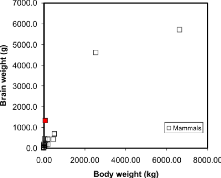
Simple linear regression is a method that models the variation in a dependent variable (y) by estimating a best-fit linear equation with an independent variable (x). The idea is that we have two sets of measurements on some collection of entities. Say, for example, we have data on the mean body and brain weights for a variety of animals (Figure 5.2). We would expect that heavier animals will have heavier brains, and this is confirmed by a scatterplot. Note these data are available in the R package MASS, in a dataset called 'mammals', which can be loaded by typing data (mammals) at the prompt.
A regression model makes this visual relationship more precise, by expressing it mathematically, and allows us to estimate the brain weight of animals not included in the sample data set. Once we have a model, we can insert any other animal weight into the equation and predict an animal brain weight. Visually, the regression equation is a trendline in the data. In fact, in many spreadsheet programs, you can determine the regression equation by adding a trendline to an X-Y plot, as shown in Figure 5.3.

... and that's all there is to it! It is occasionally useful to know more of the underlying mathematics of regression, but the important thing is to appreciate that it allows the trend in a data set to be described by a simple equation.
One point worth making here is that this is a case where regression on these data may not be the best approach - looking at the graph, can you suggest a reason why? At the very least, the data shown in Figure 5.2 suggests there are problems with the data, and without cleaning the data, the regression results may not be meaningful.
Regression is the basis of another method of spatial interpolation called trend surface analysis, which will be discussed during next week’s lesson.
For this lesson, you will be analyzing health data from Ohio for 2017 and use correlation and regression analysis to predict percent of families below the poverty line on a county-level basis using various factors such as percent without health insurance, median household income, and percent unemployed.
Project Resources
You will be using RStudio to undertake your analysis this week. The packages that you will use include:
- ggplot2
- The ggplot2 package includes numerous tools to create graphics in R.
- corrplot
- The corrpplot package include useful tools for computing and graphical correlation analysis.
- car
- The car package stands for “companion to applied regression” and offers many specific tools when carrying out a regression analysis.
- pastecs
- The pastecs package stands for “package for analysis of space-time ecological series.”
- psych
- The psych package includes procedures for psychological, psychometric, and personality research. It includes functions primariy designed for multivariate analysis and scale construction using factor analysis, principal component analysis, cluster analysis, reliability analysis and basic descriptive statistics.
- QuantPsyc
- The QuantPsyc package stands for “quantitative psychology tools.“ It contains functions that are useful for data screening, testing moderation, mediation and estimating power. Note the capitalization of Q and P.
Data
The data you need to complete the Lesson 5 project are available in Canvas. If you have difficulty accessing the data, please contact me.
Poverty data (download the CSV file called Ohio Community Survey): The poverty dataset that you need to complete this assignment was compiled from the Census Bureau's Online Data Portal and is from the 2017 data release. The data were collected at the county level.
The variables in this dataset include:
- percent of families with related children who are < 5 years old, and are below the poverty line (this is the dependent variable);
- percent of individuals > 18 years of age with no health insurance coverage (independent variable);
- median household income (independent variable);
- percent >18 years old who are unemployed (independent variable).
During this week’s lesson, you will use correlation and regression analysis to examine percent of families in poverty in Ohio’s 88 counties. To help you understand how to run a correlation and regression analysis on the data, this lesson has been broken down into the following steps:
Getting Started with RStudio/RMarkdown
- Setting up your workspace
- Installing the packages
Preparing the data for analysis
- Checking the working directory
- Listing available files
- Reading in the data
Explore the data
- Descriptive statistics and histograms
- Normality tests
- Testing for outliers
Examining Relationships in Data
- Scatterplots and correlation analysis
- Performing and assessing regression analysis
- Regression diagnostic utilities: checking assumptions
Project 5: Getting Started in RStudio/RMarkdown
Project 5: Getting Started in RStudio/RMarkdownYou should already have installed R and RStudio from earlier lessons. As we discussed in Lab 2, there are two ways to enter code in R. Most of you have likely been working in R-scripts where the code and results run in the console. R-Markdown is another way to run code, where you essentially make an interactive report which includes "mini consoles" called code chunks. When you run each of these, then the code runs below each chunk, so you can intersperse your analysis within your report itself. For more details on R Markdown:
- To get started, see Lesson 2 - markdown
- For a general tutorial by the R-studio team, see here: https://rmarkdown.rstudio.com/lesson-1.html
For this lab, you can choose to use either an R-script or an R-Markdown document to complete this exercise, in whichever environment you are more comfortable.
The symbols to denote a code chunk are ```{r} and ``` :
```{r setup, include=FALSE}
#code goes here
y <- 1+1
```
So if you are running this in a traditional R script, in these instructions, completely ignore any variant of lines containing ```{r} and ``` .
Let's get started!
- Start RStudio.
- Start a new RMarkdown file.
You learned in Lesson 2 that you should set your working directory and install the needed packages in the first chunk of the RMarkdown file. Although you can do this in the Files and Packages tab in the lower right-hand corner of the Studio environment, you can hard-code these items in a chunk as follows:
### Set the Working Directory and Install Needed Packages

```{r setup, include=FALSE}

# Sets the local working directory location where you downloaded and saved the Ohio poverty dataset.
setwd("C:/PSU/Course_Materials/GEOG_586/Revisions/ACS_17_5YR_DP03")

# Install the needed packages
install.packages("car", repos = "http://cran.us.r-project.org")
library(car)

install.packages("corrplot", repos = "http://cran.us.r-project.org")
library(corrplot)

install.packages("ggplot2", repos = "http://cran.us.r-project.org")
library(ggplot2)

install.packages("pastecs", repos = "http://cran.us.r-project.org")
library(pastecs)

install.packages("psych", repos = "http://cran.us.r-project.org")
library(psych)

install.packages("QuantPsyc", repos = "http://cran.us.r-project.org")
library(QuantPsyc)

```
Project 5: Preparing the Data for Analysis
Project 5: Preparing the Data for AnalysisIn the second chunk of RMarkdown, you will confirm that the working directory path is correct, list the available files, and read in the Ohio poverty data from the *.csv file.
### Chunk 2: Check the working directory path, list available files, and read in the Ohio poverty data.

```{r}

# Checking to see if the working directory is properly set
getwd()

# listing the files in the directory
list.files()

# Optionally, if you want to just list files of a specific type, you can use this syntax.
list.files(pattern="csv")

# Read in the Ohio poverty data from the *.csv file. The .csv file has header information and the data columns use a comma delimiter.
# The header and sep parameters indicate that the *.csv file has header information and the data are separated by commas.
Poverty_Data <- read.csv("Ohio_Community_Survey.csv", header=T, sep=",")

```Project 5: Explore the Data: Descriptive Statistics and Histograms
Project 5: Explore the Data: Descriptive Statistics and HistogramsExploring your data through descriptive statistics and graphical summaries assists understanding if your data meets the assumptions of regression. Many statistical tests require that specific assumptions be met in order for the results of the test to be meaningful. The basic regression assumptions are as follows:
- The relationship between the y and x variables is linear and that relationship can be expressed as a linear equation.
- The errors (or residuals) have a mean of 0 and a constant variance. In other words, the errors about the regression line do not vary with the value of x.
- The residuals are independent and the value of one error is not affected by the value of another error.
- For each value of x, the errors are normally distributed around the regression line.
Before you start working with any dataset, it is important to explore the data using descriptive statistics and view the data’s distribution using histograms (or another graphical summary method). Descriptive statistics enable you to compare various measures across the different variables. These include mean, mode, standard deviation, etc. There are many kinds of graphical summary methods, such as histograms and boxplots. For this part of the assignment, we will use histograms to examine the distribution of the variables.
### Chunk 3: Descriptive statistics and plot histograms
```{r}

# Summarize the Poverty Dataset
# describe() returns the following descriptive statistics
# Number of variables, nvalid, mean, standard deviation (sd), median, trimmed median, mad (median absolute deviation from the median), minimum value, maximum value, skewness, kurtosis, and standard error of the mean.

attach(Poverty_Data)
descriptives <- cbind(Poverty_Data$PctFamsPov, Poverty_Data$PctNoHealth, Poverty_Data$MedHHIncom, Poverty_Data$PCTUnemp)
describe(descriptives)

# skew (skewness) = provides a measure by which the distribution departs from normal.
# values that are + suggest a positive skew
# values that are - skewness suggest a negative skew
# values 1.0 suggests the data are non-normal data

# Create Histograms of the Dependent and Independent Variables

# Percent families below poverty level histogram (dependent variable)
# Note that the c(0,70) sets the y-axis to have the same range so each histogram can be directly compared to one another
hist(Poverty_Data$PctFamsPov, col = "Lightblue", main = "Histogram of Percent of Families in Poverty", ylim = c(0,70))

# Percent families without health insurance histogram
hist(Poverty_Data$PctNoHealth, col = "Lightblue", main = "Histogram of Percent of People over 18 with No Health Insurance", ylim = c(0,70))

# Median household income histogram
hist(Poverty_Data$MedHHIncom, col = "Lightblue", main = "Histogram of Median Household Income", ylim = c(0,70))

# Percent unemployed histogram
hist(Poverty_Data$PCTUnemp, col = "Lightblue", main = "Histogram of Percent Unemployed", ylim = c(0,70))

```
Figure 5.4 shows a summary of the various descriptive statistics that are provided by the describe() function. In Figure 5.4, X1, X2, X3, and X4 represent the percent of families below the poverty level, the percent of individuals without health insurance, the median household income, and the percent of unemployed individuals, respectively.
| - | X1 | X2 | X3 | X4 |
|---|---|---|---|---|
| vars <dbl> | 1 | 2 | 3 | 4 |
| n <dbl> | 88 | 88 | 88 | 88 |
| mean <dbl> | 24.55 | 7.87 | 51742.20 | 6.08 |
| sd <dbl> | 8.95 | 3.99 | 10134.75 | 1.75 |
| median <dbl> | 24.20 | 7.30 | 49931.50 | 5.85 |
| trimmed <dbl> | 24.49 | 7.48 | 50463.38 | 6.02 |
| mad <dbl> | 9.86 | 2.08 | 8158.75 | 1.70 |
| min <dbl> | 5.8 | 3.3 | 36320.0 | 2.6 |
| max <dbl> | 43.1 | 40.2 | 100229.0 | 10.8 |
| range <dbl> | 37.3 | 36.9 | 63909.0 | 8.2 |
| skew <dbl> | 0.00 | 6.04 | 1.82 | 0.41 |
| kurtosis <dbl> | -0.86 | 46.36 | 5.22 | 0.08 |
| se <dbl> | 0.95 | 0.42 | 1080.37 | 0.19 |
We begin our examination of the descriptive statistics by comparing the mean and median values of the variables. In cases where the mean and median values are similar, the data’s distribution can be considered approximately normal. Note that a similarity in mean and median values can be seen in rows X1 and X4. For X1, the difference between the mean and median is 0.35 percent and for X4 the difference is 0.23 percent. There is a larger difference between the mean and median for the variables in rows X2 and X3. The difference between the mean and median for X2 and X3 is 0.57 and $48,189, respectively. Based on this comparison, variables X1 and X4 would seem to be more normally distributed than X2 and X3.
We can also examine the skewness values to see what they report about a given variable’s departure from normality. Skewness values that are “+” suggest a positive skew (outliers are on located on the higher range of the data values and are pulling the mean in the positive direction). Skewness values that are “–“ suggest a negative skew (outliers are located on the lower end of the range of data values and are pulling the mean in the negative direction). A skewness value close to 0.0 suggests a distribution that is approximately normal. As skewness values increase, the severity of the skew also increases. Skewness values close to ±0.5 are considered to possess a moderate skew while values above ±1.0 suggests the data are severely skewed. From Figure 5.4, X2 and X3 have skewness values of 6.04 and 1.82, respectively. Both variables are severely positively skewed. Variables X1 and X4 (reporting skewness of 0.00 and 0.41, respectively) appear to be more normal; although X4 appears to have a moderate level of positive skewness. We will examine each distribution more closely in a graphical and statistical sense to determine whether an attribute is considered normal.
The histograms in Figures 5.5 and 5.6 both reflect what was observed from the mean and median comparison and the skewness values. Figure 5.5 shows a distribution that appears rather symmetrical while Figure 5.6 shows a distribution that is distinctively positively skewed (note the data value located on the far right-hand side of the distribution).


Project 5: Explore the Data: Normality Tests and Outlier Tests
Project 5: Explore the Data: Normality Tests and Outlier TestsNow that you have examined the distribution of the variables and noted some concerns about skewness for one or more of the datasets, you will test each for normality in the fourth chunk of RMarkdown.
There are two common normality tests: the Kolmogorov-Smirnov (KS) and Shapiro-Wilk test. The Shapiro-Wilk test is preferred for small samples (n is less than or equal to 50). For larger samples, the Kolomogrov-Smirnov test is recommended. However, there is some debate in the literature whether the “50” that is often stated is a firm number.
The basic hypotheses for testing for normality are as follows: H0: The data are ≈ normally distributed. HA: The data are not ≈ normally distributed.
Note that the use of the ≈ symbol is deliberate, as the symbol means “approximately.”
We reject the null hypothesis when the p-value is ≤ a specified α-level. Common α-levels include 0.10, 0.05, and 0.01.
## Chunk 4: Carry out normality tests on the variables

```{r}

# Carry out a normality test on the variables
shapiro.test(Poverty_Data$PctFamsPov)
shapiro.test(Poverty_Data$PctNoHealth)
shapiro.test(Poverty_Data$MedHHIncom)
shapiro.test(Poverty_Data$PCTUnemp)

# Examine the data using QQ-plots
qqnorm(Poverty_Data$PctFamsPov);qqline(Poverty_Data$PctFamsPov, col = 2)
qqnorm(Poverty_Data$PctNoHealth);qqline(Poverty_Data$PctNoHealth, col = 2)
qqnorm(Poverty_Data$MedHHIncom);qqline(Poverty_Data$MedHHIncom, col = 2)
qqnorm(Poverty_Data$PCTUnemp);qqline(Poverty_Data$PCTUnemp, col = 2)

```
Using the shapiro.test() function two statistics are returned: W (the test statistic) and the p-value.
| Variables | W | p-value |
|---|---|---|
| Percent Families Below Poverty | 0.981 | 0.2242 |
| Percent Without Health Insurance | 0.50438 | 9.947e-16 |
| Median Household Income | 0.85968 | 1.219e-07 |
| Poverty_Data$PCTUnemp | 0.97994 | 0.1901 |
In Table 5.1, the reported p-values suggest that the percent families below the poverty level and percent unemployed are both normal at any reasonable alpha level. However, the p-values for percent without health insurance and median household income are both less than any reasonable alpha level and therefore are not normally distributed.
The normality of the data can also be viewed through Q-Q plots. Q-Q plots represent the pairing of two probability distributions by plotting their quantiles against each other. If the two distributions being compared are similar, the points in the Q-Q plot will approximately lie on the line y = x. If the distributions are linearly related, the points in the Q-Q plot will approximately lie on a line, but not necessarily on the line y = x, If the distributions are not similar (demonstrating non-normality), then the points in the tails of the plot will deviate from the overall trend of the points. For example, the median household income shown in Figure 5.7 does not completely align with the trend line. Most of the middle portion of the data do align with the trend line but the data “tails” deviate. The data “tails” signal that the data may not be normal.
A good overview of how to interpret Q-Q plots can be seen here.

What should I do if data are not normally distributed?
We see that two variables are not normal: percent families with no health insurance and median household income. Based on the evidence supplied by the descriptive statistics, histograms, and Q-Q plot, we suspect that outliers are the reason why these two datasets are not normal. Generally speaking, an outlier is an atypical data value.
There are several approaches that are used to identify and remove outliers. To add a bit of confusion to the mix, there isn’t a single quantitative definition that describes what is atypical. Moreover, there isn’t a single method to detect outliers – the chosen method depends on your preferences and needs. For an overview of how outliers are defined and some of the methods used to identify those outliers, check out the following two websites:
### Chunk 5: Conduct outlier test and clean the data
```{r}

# Check for Outliers and Clean those Variables of Outliers
outlier <- boxplot.stats(Poverty_Data$PctFamsPov)$out

outlier # Report any outliers

# Check for Outliers and Clean those Variables of Outliers
outlier <- boxplot.stats(Poverty_Data$PctNoHealth)$out

outlier # Report any outliers
# An outlier was detected.
# Find the row number.
row_to_be_deleted <- which(Poverty_Data$PctNoHealth == outlier)

# Delete the entire row of data
Poverty_Data_Cleaned <- Poverty_Data[-c(row_to_be_deleted),]

# Redraw the histogram to check the distribution
hist(Poverty_Data_Cleaned$PctNoHealth, col = "Lightblue", main = "Histogram of Percent of People over 18 with No Health Insurance", ylim = c(0,70))

# Check for Outliers and Clean those Variables of Outliers
outlier <- boxplot.stats(Poverty_Data_Cleaned$MedHHIncom)$out

outlier # Report any outliers
# An outlier was detected.
# Use another method to remove rows of data. Find the minimum outlier value
outlier <- min(outlier)
# Subset the data values that are less than the minimum outlier value.
Poverty_Data_Cleaned <- subset(Poverty_Data_Cleaned, Poverty_Data_Cleaned$MedHHIncom < outlier)

# Median household income histogram
hist(Poverty_Data_Cleaned$MedHHIncom, col = "Lightblue", main = "Histogram of Median Household Income", ylim = c(0,70))

# Carry out a Normality Test on the Variables
shapiro.test(Poverty_Data_Cleaned$MedHHIncom)
outlier <- boxplot.stats(Poverty_Data_Cleaned$PCTUnemp)$out

# Report any outliers
outlier

# Find the row number.
row_to_be_deleted <- which(Poverty_Data_Cleaned$PCTUnemp == outlier)

# Delete the entire row of data
Poverty_Data_Cleaned <- Poverty_Data_Cleaned[-c(row_to_be_deleted),]

# Redraw the histogram to check
hist(Poverty_Data_Cleaned$PCTUnemp, col = "Lightblue", main = "Histogram of Percent of People over 18 with No Health Insurance", ylim = c(0,70))

# Carry out a Normality Test on the Variables
shapiro.test(Poverty_Data_Cleaned$PCTUnemp)

```
You should realize that removing outliers does not ensure that your data will be normal. Even after removing outliers, your data may still not be normal. If removing outliers does not remediate the normality issue, then you can attempt to transform the data. A data transformation applies a specific mathematical function to the data, attempting to normalize the data. For example, data that exhibit extremely strong positive skewness can be transformed by applying the log10 transformation to the data. Applying a transformation has the effect of changing the scale of the data and therefore the distribution’s “shape” and hopefully skewness. There are several data transformations available, but the more common include log10(x), x2, sqrt(x), and ln(x).
Here is a brief but useful site that covers most of the major data transformations.
It is important to note that in most cases, your data are not going to be normally distributed. The degree of departure from normality can be extremely challenging to deal with especially as some statistical tests require that the data be normal before running the test (like regression). This assumption has a lot to do with making the regression model residuals more symmetric since one assumption in linear regression is that the errors are Gaussian (normally distributed). Not meeting the normality assumption has serious consequences in the ability of the correlation and regression analysis to produce meaningful results.
Project 5: Examine Relationships in Data: Scatterplots and Correlation Analysis
Project 5: Examine Relationships in Data: Scatterplots and Correlation AnalysisAn underlying idea of regression analysis is that the variables are linearly related. To begin to visualize that linear relationship, we will start with an examination of a scatterplot matrix showing the variables in the sixth chunk of RMarkdown. In its simplest form, a scatterplot graphically shows how changes in one variable relate to the changes in another variable.
### Chunk 6: Scatterplot Matrix
```{r}

# Create a Scatterplot Matrix
pairs(~Poverty_Data_Cleaned$PctFamsPov+Poverty_Data_Cleaned$PctNoHealth+Poverty_Data_Cleaned$MedHHIncom+Poverty_Data_Cleaned$PCTUnemp, main = "Scatterplot of Ohio Poverty Data", lwd=2, labels = c("% Poverty", "% No Health Insurance", "Median Household Income", "% Unemployed"), pch=19, cex = 0.75, col = "blue")

```
Figure 5.8 shows a scatterplot matrix of the variables selected for this regression analysis. The labels in the main diagonal report the variables. In the upper left box, the percent of families below the poverty line appears. Reading to the right, we see a scatter of points that relates to the correlation of percent of families below the poverty line with the percent of families without health insurance. In this case, the percent of families below the poverty line is the dependent variable (y) and the percent without health insurance is the independent variable (x). The scatter of points suggests that as the percent of people without health insurance increases, the percent of families below the poverty line also increases. This relationship suggests a positive correlation (the variables both change in the same direction). Continuing reading to the right, we see that as the median household income increases, then the percent of families below the poverty line decreases. This relationship illustrates a negative correlation (e.g., as one variable increases, the other variable decreases). By examining the scatterplot matrix, it is possible to see the relationships between the different variables.

After examining the scatterplot matrix and getting a visual sense of the variables and their relationships, we can derive a quantitative measure of the strength and direction of the correlation. There are several measures of correlation that are available. One of the more common is the Pearson product moment (or Pearson’s r), which is used in Chunk 7 of RMarkdown. From Figure 5.8, we can see that the main diagonal of the matrix is 1.00. This means that each variable is perfectly correlated with itself. Elsewhere in the matrix, note that the “-“ sign indicates a negative correlation, while the absence of a “-“ sign indicates a positive correlation.
Values of Pearson’s r range from -1.0 (perfectly negatively correlated) to +1.0 (perfectly positively correlated). Values of r closer to -1.0 or +1.0 indicate a stronger linear relationship (correlation). From Table 5.2 we see that the percent of families below the poverty line and median household income have a Pearson’s r value of -0.76, which suggests a rather strong negative linear correlation. On the other hand, the percent of individuals with no health insurance has a rather low Pearson’s r value of 0.29 indicating a rather weak positive correlation.
| - | PctFamsPov | PctNoHealth | MedHHIncom | PCTUnemp |
|---|---|---|---|---|
| PctFamsPov | 1.00 | 0.52 | -0.76 | 0.71 |
| PctNoHealth | 0.52 | 1.00 | -0.52 | 0.29 |
| MedHHIncom | -0.76 | -0.52 | 1.00 | -0.62 |
| PCTUnemp | 0.71 | 0.29 | -0.62 | 1.00 |
### Chunk 7: Correlation Analysis
```{r}

# Remove the non-numeric columns from the poverty data file
Poverty_corr_matrix <- as.matrix(Poverty_Data_Cleaned[-c(1,2,3)])
# Truncate values to two digits
round (Poverty_corr_matrix, 2)

# Acquire specific r code for the rquery.cormat() function
source("http://www.sthda.com/upload/rquery_cormat.r")
col <- colorRampPalette(c("black", "white", "red"))(20)
cormat <- rquery.cormat(Poverty_corr_matrix, type = "full", col=col)

# Carry out a Correlation Test using the Pearson Method and reported p-values
corr.test(Poverty_corr_matrix, method = "pearson")

```
Table 5.3 shows the p-values for each correlation measure reported in Table 5.2. The p-values report the statistical significance of the test or measure. Here, all of the reported Pearson’s r values are statistically significant – meaning that the correlation values statistically differ from an r value of 0.0 (which is a desirable outcome if you are expecting your variables to be linearly related).
| - | PctFamsPov | PctNoHealth | MedHHIncom | PCTUnemp |
|---|---|---|---|---|
| PctFamsPov | 0 | 0.00 | 0 | 0.00 |
| PctNoHealth | 0 | 0.00 | 0 | 0.01 |
| MedHHIncom | 0 | 0.00 | 0 | 0.00 |
| PCTUnemp | 0 | 0.01 | 0 | 0.00 |
Figure 5.9 shows a graphical method of illustrating Pearson’s r values. Values of grey represent a negative correlation while values of red indicate a positive correlation. The size of the circle represents the correlation strength – the larger the circle the greater the correlation strength. Large dark grey circles (e.g., between percent families below the poverty line and median household income) represent a strong negative correlation (-0.76) while large dark red circles (between percent unemployed and percent families below the poverty line) represent a strong positive correlation (0.71).

Project 5: Examine Relationships in Data: Performing and Assessing Regression Analysis
Project 5: Examine Relationships in Data: Performing and Assessing Regression AnalysisTo perform a regression analysis, there are several functions available in RStudio that we will use. To begin, we will create a multivariate regression model using the independent variables for this assignment. Chunk 8 shows the different functions that will be used to run and summarize the regression output, conduct a VIF test, and examine the results of the ANOVA test.
### Chunk 8: Mulitvariate Regression, VIF, and ANOVA
```{r}

# Run a Regression Analysis on the Poverty Data
Poverty_Regress <- lm(Poverty_Data_Cleaned$PctFamsPov~Poverty_Data_Cleaned$PctNoHealth+Poverty_Data_Cleaned$MedHHIncom+Poverty_Data_Cleaned$PCTUnemp)

# Report the Regression Output
summary(Poverty_Regress)

# Carry ouf a VIF Test on the Independent Variables
vif(Poverty_Regress)

# Carry out an ANOVA test
anova(Poverty_Regress)

```
Perform a Regression Analysis
In RStudio, a regression is carried out using the lm function (linear method). Using our poverty data, the dependent variable is the percent of families below the poverty line while the independent variables include the percent of individuals without health insurance, median household income, and percent of unemployed individuals. The tilde character ~ means that the percent of families below the poverty line is being predicted from the independent variables. The additional independent variables are appended to the list through the use of the “+” sign. Note that we are creating a new object called Poverty_Regress that will hold all of the regression output.
Annotated Regression Analysis in RStudio
To summarize the results of this regression, use the summary() function:
> summary(Poverty_Regress)which returns the following output…
Residuals:
	Min	1Q	Median	3Q	Max
	-11.8404	-2.9583	0.6864	2.7394	9.2912

Coefficients:
                                   	  Estimate  	Std. Error	t value	Pr(>|t|)
(Intercept)                        	 30.9649344 	8.4170726	3.679	0.000429 ***
Poverty_Data_Cleaned$PctNoHealth	  0.8289709 	0.3323119	2.495	0.014725 *
Poverty_Data_Cleaned$MedHHIncom 	 -0.0005061 	0.0001061	-4.770	8.43e-06 ***
Poverty_Data_Cleaned$PCTUnemp   	  2.1820454 	0.4326694	5.043	2.91e-06 ***
---
Signif. codes:  0 *** 0.001 ** 0.01 * 0.05 . 0.1   1

Residual standard error: 4.797 on 78 degrees of freedom
Multiple R-squared:  0.6984,	Adjusted R-squared:  0.6868
F-statistic: 60.21 on 3 and 78 DF, p-value: < 2.2e-16
Writing the Regression Equation
Recall that the general regression equation takes the form of
where
According to the values shown in the RStudio output under the Coefficients heading, the regression equation for percent below poverty predicted from the independent variables is shown in Equation 5.1. The value 30.9649344 is the y-intercept and 0.8289709 represents the slope of the regression line. Thus, we have the following (rounding to two significant digits):
Equation 5.1 suggests that by inserting any value of x for each independent variable into the equation, a value of y (percent below poverty) will be predicted based on the regression coefficients. Remember that the original variables were cast in percentages and dollars.
Interpreting Equation 5.1, we see that when all of the independent variables’ values are 0 (the value of x = 0), then the baseline percentage of families below the poverty line is 30.96%. In other words, if no one had health insurance, no one made any income, and no one was employed, then there would be a moderate level of poverty. This is a rather unrealistic scenario, but it helps to understand a baseline of what the regression equation is reporting.
Continuing on, if we have one percent of individuals who are unemployed (keeping all other variables constant), then that one percent unemployed will contribute an additional 2.18% to the increase in families below the poverty line. Evidence of this result can also be seen in the reported correlation value of 0.71 between these two variables shown in Table 5.2. Adding an extra dollar of median household income decreases the percent of families below the poverty line by a paltry 0.0005 percent. In other words, small changes in the percent unemployed appear to be more impactful on determining the percent of individuals in poverty compared to increasing or decreasing the median household income.
Assessing the Regression Output
Just how significant is the regression model? The software RStudio provides several metrics by which we can assess the model’s performance.
The t- and p-values
The t-value is given for both the intercept and all independent variables. We are most interested in whether or not an independent variable is statistically significant in predicting the percent below poverty. The t- and p-values can assist us in this determination. Notice that the t-values listed range from -4.770 to 5.043. For example, we can examine the significance of this t-value (5.043). Using an alpha of 0.05 and 80 degrees of freedom (n – 1) and α = 0.01 we find that the table t-value is 2.374. This means that the likelihood of a t-value of 2.374 or greater occurring by chance is less than 1%. So, a t-value of 5.043 is a very rare event. Thus, this variable is statistically significant in the model.
To confirm each independent variable's statistical significance, we can examine their p-values, which are listed under the Pr(>|t|) heading. For example, the p-value for the percent with no health insurance is 0.014, which is statistically significant at the 0.1 and 0.05 levels, but not at the 0.01 level. Depending on our p-value threshold, we can conclude that this variable is statistically significant in the regression model. Both median household income and percent unemployed have very small p-values, indicating that both are highly statistically significant at predicting the percent below the poverty line. This high level of statistical significance is also provided by the “***” code printed to the right of the Pr(>|t|) value, indicating that the significance is very high.
Coefficient of Determination
The r2 assesses the degree to which the overall model is able to predict a value of y accurately. The multiple r2 value as reported here is 0.6984. If there had been only one independent variable, then the multiple r2 value would have been the same as was computed through Pearson’s r. Interpreting the value of 0.6984 can be tricky. Generally speaking, a high value of r2 suggests that the independent variables are doing a good job at explaining the variation in the dependent variable while a low r2 value suggests that the independent variables are not doing a good job of explaining the variation in the dependent variable. Here, the three independent variables appear to explain almost 70% of the variation in percent below the poverty line. There are likely other variables that can increase the predictive ability of the model.
It is important to note that in general terms, r2 is a conservative estimate of the true population coefficient of determination, which is reported by the adjusted r2. Note that the value of the adjusted r2 will always be less than the value of the multiple r2. In this case, the adjusted r2 value is 0.6868.
Examining the Independent Variables in the Regression Model
Although seemingly useful, one should not rely solely on the value of r2 as a measure of the overall model’s success at making predictions. Instead, we need to confirm the statistical value of the model in predicting y. We can do this through the results of the anova() function using Poverty_Regress, which calculates the F-statistic and its p-value for each independent variable in the equation.
Analysis of Variance Table
Response: Poverty_Data_Cleaned$PctFamsPov
		                            Df	Sum Sq	  Mean Sq	 F value	Pr(>F)
Poverty_Data_Cleaned$PctNoHealth	1	1588.09	   1588.09	 69.001	    2.393e-12 ***
Poverty_Data_Cleaned$MedHHIncom	    1	1983.49	   1983.49	 86.181	    3.046e-14 ***
Poverty_Data_Cleaned$PCTUnemp	    1	 585.37 	585.37	 25.434 	0.908e-06 ***
Residuals                        	78	1795.20 	 23.02
---
Signif. codes:  0 *** 0.001 ** 0.01 * 0.05 . 0.1   1
Looking at the RStudio output from the anova() function, we see several data values for each variable. The ANOVA table can help us refine our understanding of the contribution that each independent variable makes to the overall regression model. To learn about each independent variable and its contribution to the overall model’s ability to explain the variation in the dependent variable, we need to examine the data values in the sum of squares (Sum Sq) column. The total sum of squares value for the model is 5952.15 (add up the individual sum of squares for each row in the Sum Sq column). Dividing each sum of squares value by this sum of squares total will indicate the percent contribution each independent variable has in explaining the dependent variable. For example, percent with no health insurance has a sum of squares value of 1588.09. Dividing 1588.09 / 5952.15 = 27%. This 27% implies that percent with no health insurance explains 27% of the variation in percent below the poverty line. Median household income and percent unemployed explain 33% and 9% of percent below the poverty line, respectively. Adding 27%, 33%, and 9% produces the same 69% that was reported by in the multiple r2 statistic shown in the summary() function output.
Multicollinearity of the Independent Variables
Ideally, we would like to have the independent variable (or in the case of multiple regression, several independent variables) highly correlated with the dependent variable. In such cases, this high correlation would imply that the independent variable or variables would potentially contribute to explaining the dependent variable. However, it is also desirable to limit the degree to which independent variables correlate with each other. For example, assume a researcher is examining a person’s weight as a function of their height. The researcher collects, each person's height and records that height in centimeters and inches. Obviously, the height variables in centimeters and inches would be perfectly correlated with each other. Each measurement would give the same predictive ability for weight and thus are redundant. Here, one of these height variables should be eliminated to avoid what is referred to as multicollinearity.
The important question here is, when should the researcher consider removing one or more independent variables? The VIF (variance inflation factor) test helps answer this question in cases where there are several independent variables. The vif() function examines the independent variables that are used to build the multiple regression model. Specifically, the VIF test measures whether one or more independent variables are highly correlated with one each other. You must have more than one independent variable to use the vif() function. The smallest possible value of VIF is one (absence of multicollinearity). As a rule of thumb, a VIF value that exceeds 5 or 10 (depending on the reference selected) indicates a problem with multicollinearity (James et al., 2014). Based on the VIF values reported from the vif() function results, none of our independent variables exhibit multicollinearity as all of the values are smaller than 5.
Poverty_Data_Cleaned$PctNoHealth	Poverty_Data_Cleaned$MedHHIncom
	1.368166	2.018607

   Poverty_Data_Cleaned$PCTUnemp
   	1.616680
James, Gareth, Daniela Witten, Trevor Hastie, and Robert Tibshirani. 2014. An Introduction to Statistical Learning: With Applications in R. Springer Publishing Company, Incorporated.
Project 5: Examine Relationships in Data: Regression Diagnostic Utilities: Checking Assumptions
Project 5: Examine Relationships in Data: Regression Diagnostic Utilities: Checking AssumptionsAs was discussed earlier, regression analysis requires that your data meet specific assumptions. Otherwise, the regression output may not be meaningful. You should test those assumptions through statistical means. These assumptions can be assessed through RStudio.
Plot the Standardized Predicted Residuals against the Standardized Residuals
First, compute the predicted values of y using the regression equation and store them as a new variable in Poverty_Regress called Predicted.
>Poverty_Regress$Predicted <- predict(Poverty_Regress)Second, compute the standardized predicted residuals (here we compute z-scores of the predicted values – hence the acronym ZPR).
>Poverty_Regress$ZPR <- scale(Poverty_Regress$Predicted, center = TRUE, scale = TRUE)Third, compute the standardized residuals.
>Poverty_Regress$Std.Resids <- rstandard(Poverty_Regress)
Fourth, create a scatterplot of the standardized residuals (y-axis) plotted against the standardized predicted value (x-axis).
>plot(Poverty_Regress$ZPR, Poverty_Regress$Std.Resids, pch = 19, col = "Blue", xlab = "Standardized Predicted Values", ylab = "Standardized Residuals", xlim = c(-4,4), ylim = c(-3,3))Explaining some of the parameters in the plot command
- col is the color definition.
- xlim and ylim parameters control the numerical range shown on the x and y axes, respectively.
- bg is the background color. The scatterplot will have a grey background.
- pch is the plotting character used. In this case, the plotting character “19” is a solid fill circle whose fill is blue. For those of you with a more artistic background, here is a pdf of the color names used in r.
Figure 5.10 shows a scatterplot of the standardized predicted values (x-axis) plotted against the standardized residuals (y-axis). Note that there are two dashed lines drawn on the plot. Each dashed line is centered on 0. The dashed lines correspond to the mean of each standardized dataset. The other values represent standard deviations about the mean. Ideally, you would like to see a scatter of points that shows no trend. In other words, the scatter of points should not show an increase or decrease in data values going from + to - or - to + standard deviation. In Figure 5.10, we see a concentration that is more or less centered about the 0, 0 intersection, with the points forming a circular pattern.

Fifth, create a histogram of the standardized residuals.
>hist(Poverty_Regress$Std.Resids, col = "Lightblue", main = "Histogram of Standardized Residuals")In addition to examining the scatterplot, we can also view a histogram of the standardized residuals. By examining the distribution of the standardized residuals, we can see if the residuals appear to be normally distributed. This idea gets back to one of the assumptions of regression, which is that the errors of prediction are normally distributed (homoscedasticity). Looking at Figure 5.11, we see a distribution that appears to be fairly normally distributed.

Assessing residuals for normality and homoscedasticity
It is important to test the standardized residuals for normality. For our test, we will use the Shapiro-Wilk normality test, which is available in the psych package.
>shapiro.test(Poverty_Regress$Std.Resids)This command produced the following output.
Shapiro-Wilk normality test data:
Poverty_Regress$Std.Resids
W = 0.98025, p-value = 0.2381
Recall the hypothesis statement:
H0: data are ≈ normal
HA: data are ≈ not normal
The returned p-value is 0.2381. Using α = 0.05, the p-value is greater than 0.05, and thus we accept the null hypothesis that the standardized residuals are normal. This result helps to confirm that we have met the homoscedasticity assumption of regression.
Assessing the assumption of Independence: The Durbin-Watson Statistic
> durbinWatsonTest(Poverty_Regress$Std.Resids)

[1] 1.8058
In order to meet this assumption, we expect to see values close to 2. Values less than 1.0 or greater than 3.0 should be a warning that this assumption has not been met (Field, 2009). In this case, the Durbin-Watson statistic is 1.80, which suggests that we have met the condition of independence and no multicollinearity exists and the residuals are not autocorrelated.
Field, A.P. (2009). Discovering Statistics using SPSS: and Sex and Drugs and Rock ‘n’ Roll (3rd edition). London: Sage.
### Post-Regression Diagnostics
```{r}

# Compute the Predicted Values from the Regression
Poverty_Regress$Predicted <- predict(Poverty_Regress)

# Compute the Standardized Predicted Values from the Regression
Poverty_Regress$ZPR <- scale(Poverty_Regress$Predicted, center = TRUE, scale = TRUE)

# Compute the Standardized Residuals from the Regression
Poverty_Regress$Std.Resids <- rstandard(Poverty_Regress)

# Plot the Standardized Predicted Values and the Standardized Residuals
plot(Poverty_Regress$ZPR, Poverty_Regress$Std.Resids, pch = 19, col = "Blue", xlab = "Standardized Predicted Values", ylab = "Standardized Residuals", xlim = c(-4,4), ylim = c(-3,3))

# Divide the plot area into quadrate about the mean of x and y
abline(h=mean(Poverty_Regress$ZPR), lt=2)
abline(v=mean(Poverty_Regress$Std.Resids), lt=2)

# Plot a Histogram of Standardized Residuals
hist(Poverty_Regress$Std.Resids, col = "Lightblue", main = "Histogram of Standardized Residuals")

# Conduct a Normality Test on the Standardized Residuals
shapiro.test(Poverty_Regress$Std.Resids)

# Conduct a Durbin Watson Test on the Standardized Residuals
durbinWatsonTest(Poverty_Regress$Std.Resids)

```
Now you've walked through a regression analysis and learned to interpret its outputs. You'll be pleased to know that there is no formal project write-up required this week.
Project 5: Finishing Up
Project 5: Finishing UpNow you've walked through a regression analysis and learned to interpret its outputs. You'll be pleased to know that there is no formal project write-up required this week.
You're now done with Project 5!
Term Project (Week 5): Peer-Review of Projects
Term Project (Week 5): Peer-Review of ProjectsThis week, you will be meeting with your group to conduct an interactive peer review.
Additional details can be found on the Term Project Overview Page.
Deliverable
Post your comments on each group member's feedback to the 'Term Project: Peer-Review' discussion forum as comments on your posted project proposal. Your peer reviews are due by the end of this week.
Questions?
Please use the Discussion - General Questions and Technical Help discussion forum to ask any questions now or at any point during this project.
Final Tasks
Final TasksLesson 5 Deliverables
- Complete the Lesson 5 quiz.
- Read an article that used regression and post your reflections on the authors' use of regression in the 'Reflections on the Regression Reading' discussion forum on Canvas. The article is available in the discussion forum.
- Participate in the interactive peer review and post your response to the peer feedback to the 'Term Project: Peer-Review' discussion forum on Canvas.
Reminder - Complete all of the Lesson 5 tasks!
You have reached the end of Lesson 5! Double-check the to-do list on the Lesson 5 Overview page to make sure you have completed all of the activities listed there before you begin Lesson 6.