L2: Spatial Data Analysis: Dealing with data
L2: Spatial Data Analysis: Dealing with dataThe links below provide an outline of the material for this lesson. Be sure to carefully read through the entire lesson before returning to Canvas to submit your assignments.
Lesson 2 Overview
Lesson 2 OverviewGeographic Information Analysis (GIA) is an iterative process that involves integrating data and applying a variety of spatial, statistical, and visualization methods to better understand patterns and processes governing a system.

Figure 2.0: Spatial Data analysis: an iterative process.
Learning Outcomes
At the successful completion of Lesson 2, you should be able to:
- deal with various types of data;
- develop a data frame and structure necessary to perform analyses;
- apply various statistical methods;
- identify various spatial methods;
- develop a research framework and integrate both statistical and spatial methods; and
- document and communicate your analysis and findings in an efficient manner.
Checklist
Lesson 2 is one week in length. (See the Calendar in Canvas for specific due dates.) The following items must be completed by the end of the week. You may find it useful to print this page out first so that you can follow along with the directions.
| Step | Activity | Access/Directions |
|---|---|---|
| 1 | Work through Lesson 2 | You are in Lesson 2 online content now. Be sure to read through the online lesson material carefully. |
| 2 | Reading Assignment | Before we go any further, you need to complete all of the readings for this lesson.
After you've completed the readings, get back into the lesson, work through the interactive assignment and test your knowledge with the quiz. |
| 3 | Weekly Assignment | Project 2: Exploratory Data Analysis and Descriptive Statistics in R |
| 4 | Term Project | Submit a more detailed project proposal (1 page) to the 'Term Project: Preliminary Proposal' discussion forum. |
| 5 | Lesson 2 Deliverables |
|
Questions?
Please use the 'Discussion - Lesson 2' forum to ask for clarification on any of these concepts and ideas. Hopefully, some of your classmates will be able to help with answering your questions, and I will also provide further commentary where appropriate.
Spatial Data Analysis
Spatial Data AnalysisRequired Reading:
Read Chapter 1: "Introduction to Statistical Analysis in Geography," from Rogerson, P.A. (2001). Statistical Methods for Geography. London: SAGE Publications. This text is available as an eBook from the PSU library (make sure you are logged in to your PSU account) and you can download and save a pdf of this chapter (or others) to your computer. You can skip over the section about analysis in SPSS.
Spatial analysis:
Refers to the "general ability to manipulate spatial data into different forms and extract additional meaning as a result" (Bailey 1994, p. 15) using a body of techniques "requiring access to both the locations and the attributes of objects" (Goodchild 1992, p. 409). This means spatial analysis must draw on a range of quantitative methods and requires the integration and use of many types of data and methods (Cromley and McLafferty 2012).
Where and how to start?
In Figure 2.0, we provided an overview of the process involved, now we will provide some of the details to get you familiar with the research process and the types of methods you may be using to perform your analysis.
Research framework
Where and how do we start to analyze our data? Analyzing data whether it is spatial or not is an iterative process that involves many different components (Figure 2.1). Depending on what questions we have in mind, we will need some data. Next, we will need to get to know our data so that we can understand its limitations, identify transformations required to produce a valid analysis, and better grasp the types of methods we will be able to use. Next, we will want to refine our hypothesis and then perform our analysis, interpret our results, and share our findings.

Text description of the Classical research framework image.
Diagram of defining a research question: objectives and hypotheses. Diagram includes the following: Collect, create, organize, and process data and ask what data is needed. Summarize the data by being descriptive and including summary statistics and visualizations–get to know the data. Analyze the data by using a statistical or spatial analysis and ask what statistical tests you will be using. Knowledge involves the findings and conclusions, capturing new findings, maps, graphs, tables, etc, and sharing and communicating that knowledge.
Statistical and Spatial Analysis
Now that you have an understanding of the research process, let’s start to familiarize ourselves with the different types of statistical and spatial analysis methods that we may need to use at each stage of the process (Figure 2.2). As you can see from Figure 2.2, statistical and spatial analysis methods are intertwined and often integrated. I know this looks complex, and for many of you the methods are new, but by the end of this course, you will have a better understanding of many of these methods and how to integrate them as you require spatial and/or statistical methods.
- Data: Determine what data is needed. This may require collecting data or obtaining third-party data. Once you have the data, it may need to be cleaned, processed (transformed, aggregated, converted, etc.), organized, and stored so that it is easy to manage, update, and retrieve for later analyses.
- Data: Get to know the data. This is an important step that many people ignore. All data has issues of one form or another. These issues are based on how the dataset was collected, formatted, and stored. Before you moving forward with your analysis, it is vital to understand
- What are a dataset's limitations? For example, you may be interested in learning about the severity of a disease across a region. The dataset you obtained contains count data (total number of cases). This count data will not give you an overall picture of the disease's impact and severity since one should adjust the case count according to the underlying population distribution (create a percent of total or incidence rate).
- Determine the usefulness of a dataset. Look at the data and determine if that data will fit your needs. For example, you may have obtained point data, but your analysis needs to operate on area-based data. Is the conversion between point to area-based data an appropriate way to answer your research question?
- Learn how the data are structured. Spreadsheets are convenient ways to store and share data. But how is that data arranged inside the spreadsheet? The data that you need may be there but the formatting is not advantageous (e.g., rows and columns need to be switched, dates need to be sequentially ordered, attributes need to be combined, etc.).
- identify any outliers. To better understand and explore the data, you can use descriptive spatial and non-spatial statistical methods as well as visualize the data either in graphs or plots as well as in the form of a map. Outliers may be signs of data entry errors or data that are atypical and depending on the intended statistical test may need to be removed from the data listing.
- Spatial Analysis and Statistical Methods. As you work through the analysis, you will use a variety of methods that are statistical, spatial, or both, as you can see from Figure 2.2. In the upcoming weeks, we will be using many of these methods starting with Point Pattern Analysis (PPA) in Lesson 3, spatial autocorrelation analysis (Lesson 4), regression analysis (Lesson 5), and the use of different spatial functions for performing spatial analysis (Lessons 6-Lesson 8). Remember, this is an iterative process that will likely require the use of one or more of the methods summarized in the diagram that are either traditional statistical methods (on the left) or a variety of spatial methods (on the right). In many cases, we will likely move back and forth between the different components (up and down) as well as between the left and right sides.
- Communication. Lastly, an important part of any research process is communicating your findings effectively. There are a variety of ways that we can do this, using web-based tools and integration of different visualizations.

Text description of the spatial data analysis process image.
Diagram of workflows of statistical and spatial methods that may be used to perform an analysis. Statistical methods are shown on the left, spatial methods are shown on the right. The diagram shows how research questions, data, methods, and conclusions are all linked together and used iteratively to arrive at the end result of an analysis. The information contained in the diagram is described more fully in the text above.
Now that you have been introduced to the research framework and have an idea of some of the methods you will be learning about, let’s cover the basics so that we are all on the same page. We will start with data, then spatial analysis, and end with a refresher on statistics.
Data
DataRequired Reading:
Read Chapter 2.2, pages 32-34 from the course text.
Data comes in many forms, structured and unstructured, and is obtained through a variety of sources. No matter its source or form, before the data can be used for any type of analysis, it must be assessed and transformed into a framework that can then be analyzed efficiently.
Some Special Considerations with Spatial Data [Rogerson Text, 1.6]
There shouldn't be anything new to anyone in this class in these pages. Since analysis is almost always based on data that suffer from some or all of these limitations, these issues have a big effect on how much we can learn from spatial data, no matter how clever the analysis methods we adopt become.
The separation of entities from their representation as objects is important, and the scale-dependence issue that we read about in Lesson 1 is particularly important to keep in mind. The scale dependence of all geographic analysis is an issue that we return to frequently.
GIS Analysis, Spatial Data Manipulation, and Spatial Analysis
From Figure 2.2, it is clear that spatial analysis requires a wide variety of analytical methods (statistical and spatial).
Spatial analysis functions fall into five classes that include: measurement, topological analysis, network analysis, surface analysis and statistical analysis (Cromley and McLafferty 2012, p. 29-32) (Table 2.0).
| Function Class | Function | Description |
|---|---|---|
| Measurement | Distance, length, perimeter, area, centroid, buffering, volume, shape, measurement scale conversion | Allows users to calculate straight-line distances between points, distances along paths, arcs, or areas. Distance as a measure of separation in space is a key variable used in many kinds of spatial analysis and is often an important factor in interactions between people and places. |
| Topological analysis | Adjacency, polygon overlay, point-in-polygon, line-in-polygon, dissolve, merge, clip, erase, intersect, union, identity, spatial join, and selection | Used to describe and analyze the spatial relationships among units of observation. Includes spatial database overlay and assessment of spatial relationships across databases, including map comparison analysis. Topological analysis functions can identify features in the landscape that are adjacent or next to each other (contiguous). Topology is important in modeling connectivity in networks and interactions. |
| Network and location analysis | Connectivity, shortest path analysis, routing, service areas, location-allocation modeling, accessibility modeling | Investigates flows through a network. Network is modeled as a set of nodes and the links that connect the nodes. |
| Surface analysis | Slope, aspect, filtering, line-of-sight, viewsheds, contours, watersheds; surface overlays or multi-criteria decision analysis (MCDA) | Often used to analyze terrain and other data that represent a continuous surface. Filtering techniques include smoothing (remove noise from data to reveal broader trends) and edge enhancement (accentuate contrast and aids in the identification of features). Or to perform raster-based modeling where it is necessary to perform complex mathematical operations that combine and integrate data layers (e.g., fuzzy logic, overlay, and weighted overlay methods; dasymetric mapping). |
| Statistical analysis | Spatial sampling, spatial weights, exploratory data analysis, nearest neighbor analysis, global and local spatial autocorrelation, spatial interpolation, geostatistics, trend surface analysis. | Spatial data analysis is closely tied to spatial statistics and is influenced by spatial statistics and exploratory data analysis methods. These methods analyze information about the relationships being modeled based on attributes as well as their spatial relationships. |
Although maps are used to present research results (when they present known results and are represented using public, low-interaction devices), many more maps are impermanent, exploratory devices, and with the increased use of interactive web-based data graphs and maps, often driven by dynamically changing data, this is even more so the case.
With this, there is an ever-increasing need for spatial analysis, particularly since much of the data collected today contains some form of geographic attribute and every map tells a story… or does it? It is easy to feel that a pattern is present in a map. Spatial analysis allows us to explore the data, develop a hypothesis, and test that visual insight in a systematic, more reliable way.
The important point at this stage is to get used to thinking of space and spatial relations in the terms presented here — distance, adjacency, interaction, and neighborhood. The interaction weight idea is particularly commonly used. You can think of interaction as an inverse distance measure: near things interact more than distant things. Thus, it effectively captures the basic idea of spatial autocorrelation.
Summarizing Relationships in Matrices [Lloyd text, section 2.2]
This week's readings discuss some of the ways matrices are used in spatial analysis. You'll notice that distances and adjacencies appear in Table 2.0. At this stage, you only need to get the basic idea that distances, adjacencies (or contiguities), or interactions can all be recorded in a matrix form. This makes for very convenient mathematical manipulation of a large number of relationships among geographic objects. We will see later how this concept is useful in point pattern analysis (Lesson 3), clustering and spatial autocorrelation (Lesson 4), and interpolation (Lesson 6).
Statistics, a refresher
Statistics, a refresherStatistical methods, as will become apparent during this course, play an important role in spatial analysis and are behind many of the methods that we regularly use. So to get everyone up to speed, particularly if you haven’t used stats recently, we will review some basic ideas that will be important through the rest of the course. I know the mention of statistics makes you want to close your eyes and run the other direction .... but some basic statistical ideas are necessary for understanding many methods in spatial analysis. An in-depth understanding is not necessary, however, so don't get worried if your abiding memory of statistics in school is utter confusion. Hopefully, this week, we can clear up some of that confusion and establish a firm foundation for the much more interesting spatial methods we will learn about in the weeks ahead. We will also get you to do some stats this week!
You have already been introduced to some stats earlier on in this lesson (see Figures 2.0-2.3). Now, we will focus your attention on the elements that are particularly important for the remainder of the course. "Appendix A: The elements of Statistics," linked in the additional readings list for this lesson in Canvas, will serve as a good overview (refresher) for the basic elements of statistics. The section headings below correspond to the section headings in the reading.
Required Reading:
Read the Appendix A reading provided in Canvas (see Geographic Information Analysis/Elements of Statistics), especially if this is your first course in statistics or it has been a long time since you took a statistics class. This reading will provide a refresher on some basic statistical concepts.
A.1. Statistical Notation
One of the scariest things about statistics, particularly for the 'math-phobic,' is the often intimidating appearance of the notation used to write down equations. Because some of the calculations in spatial analysis and statistics are quite complex, it is worth persevering with the notation so that complex concepts can be presented in an unambiguous way. Really, understanding the notation is not indispensable, but I do hope that this is a skill you will pick up along the way as you pursue this course. The two most important concepts are the summation symbol capital sigma (Σ), and the use of subscripts (the i in xi).
I suggest that you re-read this section as often as you feel the need, if, later in the course, 'how an equation works' is not clear to you. For the time being, there is a question in the quiz to check how well you're getting it.
A.2. Describing Data
The most fundamental application of statistics is simply describing large and complex sets of data. From a statistician's perspective, the key questions are:
- What is a typical value in this dataset?
- How widely do values in the dataset vary?
... and following directly from these two questions:
- What qualifies as an unusually high or low value in this dataset?
Together, these three questions provide a rough description of any numeric dataset, no matter how complex it is in detail. Let's consider each in turn.
Measures of central tendency such as the mean and the median provide an answer to the 'typical value' question. Together, these two measures provide more information than just one value, because the relationship between the two is revealing. The important difference between them is that, the mean is strongly affected by extreme values while the median is not.
Measures of spread are the statistician's answer to the question of how widely the values in a dataset vary. Any of the range, the standard deviation, or the interquartile range of a dataset allows you to say something about how much the values in a dataset vary. Comparisons between the different approaches are again helpful. For example, the standard deviation says nothing about any asymmetry in a data distribution, whereas the interquartile range—more specifically the values of Q25 and Q75—allows you to say something about whether values are more extreme above or below the median.
Combining measures of central tendency and of spread enables us to identify which are the unusually high or low values in a dataset. Z scores standardize values in a dataset to a range such that the mean of the dataset corresponds to z = 0; higher values have positive z scores, and lower values have negative z scores. Furthermore, values whose z scores lie outside the range ±2 are relatively unusual, while those outside the range ±3 can be considered outliers. Box plots provide a mechanism for detecting outliers, as discussed in relation to Figure A.2.
A.3. Probability Theory
Probability is an important topic in modern statistics.
The reason for this is simple. A statistician's reaction to any observation is often along the lines of, "Well, your results are very interesting, BUT, if you had used a different sample, how different would the answer be?" The answer to such questions lies in understanding the relationship between estimates derived from a sample and the corresponding population parameter, and that understanding, in turn, depends on probability theory.
The material in this section focuses on the details of how probabilities are calculated. Most important for this course are two points:
- the definition of probability in terms of the relative frequency of events (eqns A.18 and A.19), and
- that probabilities of simple events can be combined using a few relatively simple mathematical rules (eqns A.20 to A.26) to enable calculation of the probability of more complex events.
A.4. Processes and Random Variables
We have already seen in the first lesson that the concept of a process is central to geographic information analysis (look back at the definition on page 3).
Here, a process is defined in terms of the distribution of expected outcomes, which may be summarized as a random variable. This is very similar to the idea of a spatial process, which we will examine in more detail in the next lesson, and which is central to spatial analysis.
A.5. Sampling Distributions and Hypothesis Testing
The most important result in all of statistics is the central limit theorem. How this is arrived at is unimportant, but the basic message is simple. When we use a sample to estimate the mean of a population:
- The sample mean is the best estimate for the population mean, and
- If we were to take many different samples, each would produce a different estimate of the population mean, and these estimates would be normally distributed, and
- The larger the sample size, the less variation there is likely to be between different samples.
Item 1 is readily apparent: What else would you use to estimate the population mean than the sample mean?!
Item 2 is less obvious, but comes down to the fact that sample means that differ substantially from the population mean are less likely to occur than sample means that are close to the population mean. This follows more or less directly from Item 1; otherwise, there would be no reason to choose the sample mean in making our estimate in the first place.
Finally, Item 3 is a direct outcome of the way that probability works. If we take a small sample, then it is prone to wide variation due to the presence of some very low or very high values (like the people in the bar example). On the other hand, a very large sample will also vary with the inclusion of extreme values, but overall is much more likely to include both high and low values.
Try This! (Optional)
Take a look at this animated illustration of the workings of the central limit theorem from Rice University.
The central limit theorem provides the basis for calculation of confidence intervals, also known as margins of error, and also for hypothesis testing.
Hypothesis testing may just be the most confusing thing in all of statistics... but, it really is very simple. The idea is that no statistical result can be taken at face value. Instead, the likelihood of that result given some prior expectation should be reported, as a way of inferring how much faith we can place in that expectation. Thus, we formulate a null hypothesis, collect data, and calculate a test statistic. Based on knowledge of the distributional properties of the statistic (often from the central limit theorem), we can then say how likely the observed result is if the null hypothesis were true. This likelihood is reported as a p-value or probability. A low probability indicates that the null hypothesis is unlikely to be correct and should be rejected, while a high value (usually taken to mean greater than 0.05) means we cannot reject the null hypothesis.
Confusingly, the null hypothesis is set up to be the opposite of the theory that we are really interested in. This means that a low p-value is a desirable result, since it leads to rejection of the null, and therefore provides supporting evidence for our own alternative hypothesis.
Visualizing the Data
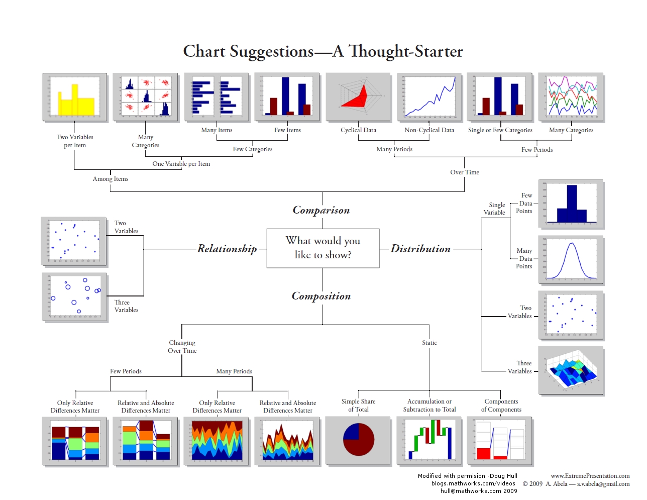
Not only is it important to perform the statistics, but in many cases it is important to visualize the data. Depending on what you are trying to analyze or do, there are a variety of visualizations that can be used to show:
- Composition: where and when something is occurring at a single point in time (e.g., dot map; choropleth map; pie chart, bar chart) or changing over time (e.g., time-series graphs), which can be further enhanced by including intensity (e.g., density maps, heat maps),
- the relationship between two things (e.g., scatterplot (2 variables), bubbleplots (e.g., 3 variables)),
- distribution of the data (e.g., frequency, histogram, scatterplot),
- comparison between variables (e.g., single or multiple).
For a visual overview of some different types of charts, see the graphic produced by Dr Abela (2009).
For example, earlier we highlighted the importance of understanding our data using descriptive statistics (mean and variation of the data). By using frequency distributions and histograms, we can further understand these aspects since these visualizations reveal three aspects of the data:
- where the distribution has its peak (central location) - the clustering at a particular value is known as the central location or central tendency of a frequency distribution. Measures of central location can be in the middle or off to one side or the other.
- how widely dispersed the distribution is on either side of its peak (spread, also known as variation or dispersion) - this refers to the distribution out from a central value.
- whether the data is more or less symmetrically distributed on the two sides of the peak (shape) - shape can be symmetrical or skewed.
Telling a story with data
An important part of doing research and analysis is communicating the knowledge you have discovered to others and also documenting what you did so that you or others can repeat your analysis. To do so, you may want to publish your findings in a journal or create a report that describes the methods you used, presents the results you obtained, and discusses your findings. Often, we have to toggle between the software and a word document or text file to capture our workflow and integrate our results. One way to do this is to use a digital notebook that enables you to document and execute your analysis and write up your results. If you'd like to try this, in this week's project, have a crack at the "Try This" box in the project instructions, which will walk you through how to set up an R Markdown notebook. There are other popular notebooks, such as Jupyter; however, since we are interested in R, those who wish to attempt this can try with the R version.
An important part of telling a story is to present the data efficiently and effectively. The project this week will give you an opportunity to apply some stats to data and get you familiar with running different statistical analyses and applying different visualization methods.
Project 2: Exploratory Data Analysis and Descriptive Statistics in R
Project 2: Exploratory Data Analysis and Descriptive Statistics in RBackground
This week, we covered some key concepts important for conducting research and analysis. Now, it is time for you to put this information to use through some analysis. In this week's project, you will be analyzing some point data describing crimes in St. Louis, Missouri and creating a descriptive analysis of the data. Next week, you will build on this analysis by using some spatial point pattern statistics with the same dataset to look at the spatial patterns of crime in more detail.
To carry out this week's analysis, you will use RStudio and several packages in R. The assignment has been broken down into several components.
You will analyze the data and familiarize yourself with R by copying and pasting the provided R code from Lesson 2 into RStudio. In some cases, you will want to modify this code to analyze additional variables or produce different graphs and charts that you think will help with your analysis. As you work through the analysis, make some informal notes about what you are finding.
The outputs generated by running these analyses provides evidence to answer the questions listed at the bottom of this page. Once you have completed your analysis and obtained the different statistical and graphical outputs, use this evidence to create a more formal written report of the analysis.
Project Resources
You need an installation of R and RStudio, to which you will need to add the packages listed on a subsequent page of these instructions.
You will also need some data. You will find a data archive to download (Geog586_Les2_Project.zip) in the Lesson 2 materials in Canvas. If you have any difficulty in downloading the data, please contact me.
This archive includes the following files:
- Crime data files for St Louis: crimeStLouis20132014b.csv, crimeStLouis20132014b_agg.csv
- Boundary of St Louis data file (shapefile): stl_boundary_ll.shp
How to Move Forward with the Analysis
As you work your way through the R code on the following pages of the project instructions, keep the following questions in mind. Jotting down some notes related to each of them will help you to synthesize your findings into your project report.
Discuss Overall Findings
- What types of crime were recorded in the city?
- Was there a temporal element associated with each of the crimes?
- How did the occurrence of crimes changes between the years?
- Where did crimes take place? Was there a particular spatial distribution associated with each of the crimes? Did they take place in a particular part of the city?
- What additional types of analysis would be useful?
Descriptive Statistics
- What type of distribution does your data have?
- What is a typical value in this dataset?
- How widely do values in the dataset vary?
- Are there any unusually high or low value in this dataset? (e.g., outliers)
Visualizing the Data
- Map the data: What is spatial distribution of crimes?
- Create graphs:
- Of the crimes in the dataset, is there a crime that occurs more than others?
- Is there a month when crimes occur more than others?
- Have crimes increased or decreased over time?
Summary of the Minimum Project 2 Deliverables
To give you an idea of the work that will be required for this project, here is a summary of the minimum items you will create for Project 2.
- Create necessary maps, graphics, or tables of the data. Include in your written report any and all maps, graphics, and tables that are needed to support your analysis.
- The analysis should help you present the spatial patterns of crime types across the city as well as what evidence exists showing any temporal trend in crime overall and for individual crime types.
Questions?
Please use the 'Week 2 lesson discussion' forum to ask for clarification on any of these concepts and ideas. Hopefully, some of your classmates will be able to help with answering your questions, and I will also provide further commentary there where appropriate.
Project 2: Getting Started in R and RStudio
Project 2: Getting Started in R and RStudioRStudio/R is a standard statistical analysis package that is free, is extensible, and contains many new methods and analysis that are contributed by researchers across the globe.
Install R First
Navigate to the R website and choose the CRAN link under Download in the menu at the left.
Select a CRAN location. R is hosted at multiple locations around the world to enable quicker downloads. Choose a location (any site will do) from which, among other things, you will obtain various packages used during your coding.
On the next page, under Download and Install R, choose the appropriate OS for your computer.
Windows installs
On the next page, for most of you, you will want to choose the Install R for the first time link (on Windows). Note that the link you select is unique to the CRAN site you selected.
On the next page, choose the Download R 4.1.2 for Windows link (or whatever version is current).
The file that is downloaded is titled R-4.1.2-win.exe (note that the 4.1.2 specifies the version while win indicates the OS).
Once the file is downloaded, initiate the executable and follow the prompts to download and install R.
Mac OS X installs
From the Download and Install page, simply choose the link for the latest release package (for Mac OSX) and then double-click the downloaded installer and follow the installation prompts.
Install RStudio
Once R is successfully installed, you can download and install RStudio.
You'll install RStudio at this link. Versions are available for all the major platforms. RStudio offers several price points. Choose the price point you are interested in and download and install RStudio. (I assume you are interested in the FREE version).
Once both R and RStudio are installed, start RStudio.
The console window appears as shown in Figure 2.4. The console window includes many components. The Console tab is where you will do your coding. You can also go to File - New File - R Script to open the Source window and enter your code there. The Environment tab in the upper-right corner shows information about variables and their contents. The History tab allows you to see the history of your coding and changes. The lower-right corner has several tabs. The Plots tab shows you any graphical output (such as histograms, boxplots, maps, etc.) that your code outputs. The Packages tab allows you to, among other things, check to see which packages are currently installed with your program. The Help tab allows you to search for R functions and learn more about their utility in your code.
As you work through your code, you should get in the habit of saving your work often. Compared to other programs, R is very stable, but you never know. You can save your R code by looking under File and choosing the Save As option. Name your code file something logical like Lesson_2.

Project 2: Obtaining and installing R packages
Project 2: Obtaining and installing R packagesR contains many packages that researchers around the world have created. To learn more about what is available, look through the following links.
Packages in R
R itself has a relatively modest number of capabilities grouped in the base package. Its real power comes from its extensive set of libraries, which are bundled up groups of functions called packages. However, this power comes at the cost of the fact that knowing which statistical tool is in which particular package can be confusing to new users.
During this course, you will be using many different packages. To use a package, you will first need to obtain it, install it, and then use the library() command to load it. There are two ways in which you can select and install a package.
Installing packages by command line
> install.packages("ggplot2")
> library(ggplot2)
Installing packages with RStudio
Click the Packages tab and click Install (Figure 2.5). A window will pop up. Select repository to install from, and then type in the package(s) you want. To install the package(s), click Install. Once the package has been installed, you will see it listed in the packages library. To turn a package on or off, click on the box next to the package listed in the User Library on the packages tab. Some packages 'depend' on other packages, so sometimes to use one package you have to also download and install a second one. Packages are updated at different intervals, so check for updates regularly.
Troubleshooting
In some cases, a package will fail to load. You may not realize this has happened until you try to use one of the functions and an error will return saying something to the effect that function() was not found. This happens, but you should not take this as a serious error. If you run into a situation where a package fails to install, try installing it again.
If you get an error message saying something like: Error if readOGR(gisfile, layer = "stl_boundary_11", GDAL1_integert64_policy = FALSE) : could not find function "readOGR"
Then, issue the ??readOGR command in the RStudio console window and figure out which package you are missing and install (or reinstall) it.

What to install
By whatever method you choose, install the following packages. Links are provided for a few packages, providing a bit more information about the package.
Installing these packages will take a little time. Pay attention to the messages being printed in the RStudio console to make sure that things are installing correctly and that you're not getting error messages. If you get asked whether you want to install a version that needs compiling, you can say no and use the older version.
Various packages used for mapping, spatial analysis, statistics and visualizations:
- doBy
- dplyr
- ggmap (although the tmap package is relatively newer and works with the newer sf format)
- ggplot2
- gridExtra
- gstat
- leaflet: mapping elements
- spatstat
- sf (a relatively new format for R objects)
- sp
- spdep
- raster
- RColorBrewer
Additional help is available through video tutorials at LinkedInLearning.com. As a PSU student, you can access these videos. Sign in with your Penn State account, browse software, and select R.
Project 2: Introduction to R: the essentials
Project 2: Introduction to R: the essentialsIn Canvas, you will find Statistics_RtheEssentials_2019.pdf in the Additional Reading Materials link in Lesson 2. It contains some essential commands to get you going.
This is not a definitive resource – since it would end up as a book in its own right. Instead, it provides a variety of commands that will allow you to load your data, explore, and visualize your data.
Three Considerations As You Write and Debug Code
Coding takes patience but can be very rewarding. To help you work through code, here are three suggestions.
- If there is something that you would like your code to do but is not covered explicitly in the lesson instructions, or you are not able to figure out an error, then post a question to the discussion forum and either another student or I may know the answer. If you are asking about a solution to an error in your code, please provide a screenshot of the error message and lines around the place in the code where the error is reported to occur. Simply posting that "my program doesn't work" or "I am getting an error message" will not help others help you.
- If you discover or know some code that is useful or goes beyond that which is covered in the lesson and would be beneficial to others in the class, then please share it. We are all here to learn in a collective environment.
- Use scripts! (go to file/new script). These allow you to save your code, so you don't have to retype it later. If you enter your code into the console then the computer will "talk to you" and run the commands, but it will not remember anything - AKA you are having a phone call with the computer but speaking the language R. But with a script, you can enter and save your commands and return back to them (or re-run them later) - so to build on the metaphor, this is like sending an e-mail, you have a written record of what you said.
Project 2: Setting Up Your Analysis Environment in R
Project 2: Setting Up Your Analysis Environment in RAdding the R packages that will be needed for the analysis
Many of the analyses you will be using require commands contained in different packages. You should have already loaded many of these packages, but just to ensure we document what packages we are using, let's add in the relevant information so that if the packages have not been switched on, they will be when we run our analysis.
Note that the lines that start with #install.packages will be ignored in this instance because of the # in front of the command. Lines of code with a # symbol are treated as comments by the compiler. If you do need to install a package (e.g., if you hadn't already installed all of the relevant packages), then remove the # when you run your code so the line will execute.
Note that for every package you install, you must also issue the library() function to tell R that you wish to access that package. Installing a package does not ensure that you have access to the functions that are a part of that package.
#install and load packages here

install.packages("ggplot2")
library(ggplot2)
install.packages("spatstat")
library (spatstat)
install.packages("leaflet")
library(leaflet)
install.packages("dplyr")
library (dplyr)
install.packages("doBy")
library(doBy)
install.packages("sf")
library(sf)
install.packages("ggmap")
library (ggmap)
install.packages("gridExtra")
library(gridExtra)
install.packages("sp")
library(sp)
install.packages("RColorBrewer")
library (RColorBrewer)
Set the working directory
Before we start writing R code, you should make sure that R knows where to look for the shapefiles and text files. First, you need to set the working directory. In your case, the working directory is the folder location where you placed the contents of the .zip file when you unzipped it. To follow up, make sure that the correct file location is specified. There are several ways you can do this. As shown below, you can set the directory path to a variable and then reference that variable whereever and whenever you need to. Notice that there is a slash at the end of the directory name. If you don't include this, it can lead to the final folder name getting merged with a filename, meaning R cannot find your file.
file_dir_crime <-"C:/Geog586_Les2_Project/crime/"
Note that R is very sensitive to the use of "/" as a directory level indicator. R does not recognize "\" as a directory level indicator and an error will return. DO NOT COPY THE DIRECTORY PATH FROM FILE EXPLORER AS THE FILE PATH USES "\" but R only recognizes "/" for this purpose.
You can also issue the setwd() function that "sets" the working directory for your program.
setwd("C:/Geog586_Les2_Project/crime/")
Finally and most easily, you can also set the working directory through RStudio's interface: Session - Set Working Directory - Choose Directory.
Issue the getwd() function to confirm that R knows what the correct path is.
#check and set the working directory
#if you do not set the working directory ensure that you use the full directory pathname to where you saved the file.
#R is very sensitive to the use of "/" as a directory level indicator. R does not recognize "\" as a directory level indicator and an error will return.
#DO NOT COPY THE DIRECTORY PATH FROM YOUR FILE EXPLORER AS THE FILE PATH USES "\"
#e.g. "C:/Geog586_Les2_Project/crime/">
#check the directory path that R thinks is correct with the getwd() function.
getwd()

#set directory to where the data is so that you can reference these varibles later rather than typing the directory path out again.
#you will need to adjust this for your own filepath.
file_dir_crime <-"C:/Geog586_Les2_Project/crime/"

#make sure that the path is correct and that the csv files are in the expected directory
list.files(file_dir_crime)
#this is an alternative way of checking that R can see your csv files. In this version of the command, you are asking R to list only the .csv files
#that are in the folder located at the filepath filedircrime.
list.files(path = file_dir_crime, pattern = "csv")

#to view the files in the other directory
file_dir_gis <-"C:/Geog586_Les2_Project/gis/"

#make sure that the path is correct and that the shp file is in the expected directory
list.files(file_dir_gis)
# and again, the version of the command that limits the list to shapefiles only
list.files(path = file_dir_gis, pattern="shp")

#You are not creating any outputs here, but you may want to think about setting up a working directory
#where you can write outputs when and if needed. First create a new directory, in this case called outputs
#and then set the working directory to point to that directory.
wk_dir_output<-setwd("C:/Geog586_Les2_Project/outputs/")
When you've finished replacing the filepaths above to the relevant ones on your own computer, check the results in the RStudio console with the list.files() command to make sure that R is seeing the files in the directories. You should see outputs that print that list the files in each of the directories. 90% of problems with R code come from either a library not being loaded correctly or a filepath problem, so it is worth taking some care here.
Loading and viewing the data file (Two Code Options)
Add the crime data file that you need and view the contents of the file. Inspect the results to make sure that you are able to read the crime data.
#Option #1: Read in crime file by pasting the path into a variable name
#concatenate the filedircrime (set earlier to your directory) with the filename using paste()
crime_file <-paste(file_dir_crime,"crimeStLouis20132014b.csv", sep = "")
#check that you've accessed the file correctly - next line of code should return TRUE
file.exists(crime_file)

crimesstl <- read.csv(crime_file, header=TRUE,sep=",")

#Option #2: Set the file path and read in the file into a variable name
crimesstl2 <- read.csv("C:/Geog586_Les2_Project/crime/crimeStLouis20132014b.csv", header=TRUE, sep=",")

#returns the first ten rows of the crime data
head(crimesstl, n=10)

#view the variable names
names(crimesstl)

# view data as attribute tables (spreadsheet-style data viewer) opened in a new tab.
# Your opportunity to explorethe data a bit more!
View(crimesstl) #feel free to use the 'View' function whenever you need to explore data as an attribute table
View(crimesstl2)

#create a list of the unique crime types in the data set and view what these are so that you can select using these so that you can explore their distributions.
listcrimetype <-unique(crimesstl$crimetype)
listcrimetype
Project 2: Running the Analysis in R
Project 2: Running the Analysis in RNow that the packages and the data have been loaded, you can start to analyze the crime data.
Before Beginning: An Important Consideration
The example descriptive statistics that are reported below are just that, examples of what is possible - not necessarily a template that you should follow exactly. In a similiar light, the visuals shown below are only examples of the evidence that you could create for your analysis. In other words, avoid the tendancy to simply reproduce the descriptive statistics and visuals that are shown in the sections that follow. The analysis you create should be based on your investigation of the data and the kinds of research questions that you want to answer. Think about the questions about the data that you want answered and the descriptive statistics and visuals that are needed to help you answer those questions.
Descriptive Statistics
Use various descriptive statistics that have been discussed or others that you are aware of to analyze the types of crime that have been recorded, when these crimes were most abundant (e.g., during what year, month, and time of the day), and where crimes were most abundant. Refer to the RtheEssentials.pdf for additional commands and visualizations you can use.
#Summarise data
summary(crimesstl)

#Make a data frame (a data structure) with crimes by crime type
dt <- data.frame(cnt=crimesstl$count, group=crimesstl$crimetype)
#save these grouped data to a variable so you can use it other commands
grp <- group_by(dt, group)

#Summarise data from library (dplyr)
#Summarise the number of counts for each group
summarise(grp, sum=sum(cnt))
#transpose the table
tapply(crimesstl$count, crimesstl$crimetype,sum)
Visualizations of the data
#Descriptive analysis
#Barchart of crimes by month
countsmonth <- table(crimesstl$month)
barplot(countsmonth, col="grey", main="Number of Crimes by Month",xlab="Month",ylab="Number of Crimes")

#Barchart of crimes by year
countsyr <- table(crimesstl$year)
barplot(countsyr, col="darkcyan", main="Number of Crimes by Year",xlab="Year",ylab="Number of Crimes")

#Barchart of crimes by crimetype
counts <- table(crimesstl$crimetype)
barplot(counts, col = "cornflowerblue", main = "Number of Crimes by Crime Type", xlab="Crime Type", ylab="Number of Crimes")

#BoxPlots are useful for comparing data.
#Use the dataset crimeStLouis20132014b_agg.csv.
#These data are aggregated by neighbourhood.
agg_crime_file <-paste(file_dir_crime,"crimeStLouis20132014b_agg.csv", sep = "")
#check everything worked ok with accessing the file
file.exists(agg_crime_file)
crimesstlagg <- read.csv(agg_crime_file, header=TRUE,sep=",")

#Compare crimetypes
boxplot(count~crimetype, data=crimesstlagg,main="Boxplots According to Crime Type",
            xlab="Crime Type", ylab="Number of Crimes",
            col="cornsilk", border="brown", pch=19)

Mapping the data
Now let’s see where the crimes are taking place. Create an interactive map so that you can view where the crimes have taken place.
#Create an interactive map that plots the crime points on a background map.

# This will create a map with all of the points
gis_file <- file.path(file_dir_gis, "stl_boundary_ll.shp")
stopifnot(file.exists(gis_file))

# Read the St Louis Boundary Shapefile
StLouisBND <- st_read(gis_file, quiet = TRUE)

leaflet(crimesstl) %>%
 addTiles() %>%
 addPolygons(data=StLouisBND, color = "#444444", weight = 3, smoothFactor = 0.5,
         opacity = 1.0, fillOpacity = 0.5, fill= FALSE,
         highlightOptions = highlightOptions(color = "white", weight = 2,
                           bringToFront = TRUE)) %>%
 addCircles(lng = ~xL, lat = ~yL, weight = 7, radius = 5,
  popup = paste0("Crime type: ", as.character(crimesstl$crimetype),
               "; Month: ", as.character(crimesstl$month)))

Viewing different crimes
To view different crimes you will need to refer back to the section where you viewed the different crime types in the datasets so that you can specify what crimes to select. View either the boxplot you created or the summaries you created. You will map the distribution of arson, dui, and homicide in the St. Louis area.
To create a map of a specific type of crime you will first need to create a subset of the data.
#Now view each of the crimes
#create a subset of the data
crimess22 <- subset(crimesstl, crimetype == "arson")
crimess33 <- subset(crimesstl, crimetype == "dui")
crimess44 <- subset(crimesstl, crimetype == "homicide")

#Check to see that the selection worked and view the records in the subset.
crimess22
crimess33
crimess44

# Create an individual plot of each crime to show the variation in crime distribution
# using ggplot

#create the individual maps using ggplot
g1 <- ggplot() +
  geom_sf(data = StLouisBND, color = "red", fill = "white") +
  geom_point(data = crimesstl, aes(x = xL, y = yL), color = "black", size = 1) +
  ggtitle("All Crimes") +
  coord_sf()
g1

g2 <- ggplot() +
  geom_sf(data = StLouisBND, color = "red", size = 0.2, fill = "white") +
  geom_point(data = crimess22, aes(x = xL, y = yL), color = "black", size = 1) +
  ggtitle("Arson") +
  coord_sf()
g2

g3 <- ggplot() +
  geom_sf(data = StLouisBND, color = "red", size = 0.2, fill = "white") +
  geom_point(data = crimess33, aes(x = xL, y = yL), color = "black", size = 1) +
  ggtitle("DUI") +
  coord_sf()
g3

g4 <- ggplot() +
  geom_sf(data = StLouisBND, color = "red", size = 0.2, fill = "white") +
  geom_point(data = crimess44, aes(x = xL, y = yL), color = "black", size = 1) +
  ggtitle("Homicide") +
  coord_sf()
g4

# Now, arrange the individual plots in a 2x2 column

grid.arrange(g1,g2,g3,g4, nrow=2,ncol=2)

#Create an interactive map for each crimetype
#To view a particular crime you will want to create a map using a subset of the data.
#Or use leaflet and include a background map to put the crime in context.

leaflet(crimesstl) %>%
  addTiles() %>%
  addPolygons(data=StLouisBND, color = "#444444", weight = 3, smoothFactor = 0.5,
                  opacity = 1.0, fillOpacity = 0.5, fill= FALSE,
                  highlightOptions = highlightOptions(color = "white", weight = 2,
                                                      bringToFront = TRUE)) %>%

  addCircles(data = crimess22, lng = crimess22$xL, lat = crimess22$yL, weight = 5, radius = 10,
  popup = paste0("Crime type: ", as.character(crimess22$crimetype),
               "; Month: ", as.character(crimess22$month)))


#Turn these on when you are ready to view them. To do so remove the # and switch off the addCircles above by adding a #
#addCircles(data = crimess33, lng = crimess33$xL, lat = crimess33$yL, weight = 5, radius = 10,
  #popup = paste0("Crime type: ", as.character(crimess33$crimetype),
               #"; Month: ", as.character(crimess33$month)))

#addCircles(data = crimess44, lng = crimess44$xL, lat = crimess44$yL, weight = 5, radius = 10,
  #popup = paste0("Crime type: ", as.character(crimess44$crimetype),
               #"; Month: ", as.character(crimess44$month)))

Project 2: Finishing Up
Project 2: Finishing UpSummary of Project 2 Deliverables
To give you an idea of the work that will be required for this project, here is a summary of the minimum items you will create for Project 2.
- Create necessary maps, graphics, or tables of the data. Include in your written report any and all maps, graphics, and tables that are needed to support your analysis.
- The analysis should help you present the spatial patterns of crime types across the city as well as what evidence exists showing any temporal trend in crime overall and for individual crime types.
Note that this summary does not supersede elements requested in the main text of this project (refer back to those for full details). Also, you should include discussions of issues important to the lesson material in your write-up, even if they are not explicitly mentioned here.
Use the questions below to organize the narrative that you craft about your analysis.
- Discuss Overall Findings
- What types of crime were recorded in the city?
- Was there a temporal element associated with each of the crimes? If so, then were there any considerations about the temporal element in your analysis.
- How did crimes changes between the years?
- Where did crimes take place? Was there a particular spatial distribution associated with each of the crimes? Did they take place in a particular part of the city?
- What additional types of analysis would be useful?
- Visualizing the Data
- Map the data: Explain the spatial distribution of crimes?
- Create some graphs:
- Of the crimes in the dataset, is there a crime that occurs more than others?
- Is there a month when crimes occur more than others?
- Have crimes increased or decreased over time?
- Descriptive Statistics
- What type of statistical distribution does your data have?
- What is the typical value in this dataset?
- How widely do values in the dataset vary?
- Are there any unusually high or low value in this dataset?
Please upload your write-up (in Word or PDF format) in the Project 2 Drop Box.
That's it for Project 2!
Project 2: (Optional) Try This - R Markdown
Project 2: (Optional) Try This - R MarkdownYou've managed to complete your first analysis in RStudio, congratulations! As was mentioned earlier in the lesson, R also offers a notebook-like environment in which to do statistical analysis. If you'd like to try this out, follow the instructions on this page to reproduce your Lesson 2 analysis in an R Markdown file.
R Markdown: a quick overview
Since typing commands into the console can get tedious after a while, you might like to experiment with R Markdown.
R Markdown acts as a notebook where you can integrate your notes or the text of a report with your analysis. When you are finished, save the file; if you need to return to your analysis, you can load the file into R and run your analysis again. Once you have completed the analysis and write-up, you can create a final document.
Here are some resources to help you better understand RMarkdown and other tools.
- Learning tools in R
- markdown: RMarkdown cheat sheet
- markdown: RMarkdown Reference guide
- markdown: RMarkdown Tutorial
- swirl: Learn R, in R
- rcmdr: GUI for different statistical methods
Before doing anything, make sure you have installed and loaded the rmarkdown package.
 install.packages("rmarkdown")
library(rmarkdown)
To create a new RMarkdown file, go to File – New File – R Markdown. Select the Output Format and Document. Select HTML (Figure 2.16).

Opening the RMD File and Coding
In the Lesson 2 data folder, you will find a .rmd file.
In RStudio, load the .rmd file, File – Open File. Select the Les2_crimeAnalysis.Rmd file from the Lesson 2 folder.
The file will open in a window in the top left quadrant of RStudio. This is essentially a text file where you can add your R code, run your analysis, and write up your notes and results.
The header is where you should add a title, date, and your name as the author. Try customizing the information there.
R code should be written in the grey areas between the ``` and ``` comments. These grey areas are called "chunks".
Note that the command {r, echo=TRUE), written at the top of each R code chunk, will include the R code in the output (see line 20 in Figure 2.17). If you do not want to include the R code, then set echo=FALSE. There are several chunk options that you can explore on your own.
include = FALSEprevents code and results from appearing in the finished file. R Markdown still runs the code in the chunk, and the results can be used by other chunks.echo = FALSEprevents code, but not the results from appearing in the finished file. This is a useful way to embed figures.message = FALSEprevents messages that are generated by code from appearing in the finished file.warning = FALSEprevents warnings that are generated by code from appearing in the finished.fig.cap = "..."adds a caption to graphical results.
Of course, setting any of these options to TRUE creates the opposite effect. Chunk options must be written in one line; no line breaks are allowed inside chunk options.
Once you have added what you need to the R Markdown file, you can use it to create a formatted text document, as shown below.

Text description of the example RMD file image.
Annotated screenshot of an R Markdown file and an example of the output produced by running the R Markdown file. Annotations show where header information, R code, and report text can be found within an R Markdown file.
For additional information on formatting, see the RStudio cheat sheet.
To execute the R code and create a formatted document, use Knit. Knit integrates the pieces in the file to create the output document, in this case an html_document. The Run button will execute the R code and integrate the results into the notebook. There are different options available for running your code. You can run all of your code or just a chunk of code. To run just one chunk, click the green arrow near the top of the chunk.
If you are having trouble with running just one chunk, it might be because the chunk depends on something that was done in a prior chunk. If you haven't run that prior chunk, then those results may not be available, causing either an error or an erroneous result. We recommend generally using the Knit approach or the Run Analysis button at the top (as shown in Figure 2.18).
Try the Run and Knit buttons

Note for Figure 2.18:
You probably set the output of the "knit" to HTML. Oher output options are available and can be set at the top of the markdown file.
title: "Lesson1_RMarkdownProject1doc"
author: "JustineB"
date: "January 24, 2019"
output:
word_document: default
html_document: default
editor_options:
chunk_output_type: inline
always_allow_html: yes
Add the "always_allow_html: yes" to the bottom
Your Turn!
Now you've seen how the analysis works in an R Markdown file. Try adding another chunk (Insert-R) to the R Markdown document and then copy the next blocks of your analysis code into the new chunk in the R Markdown file and then try to Knit the file. It's best to add one chunk at a time and then test the file/code by knitting it. That will make it easier to find any problems.
If you're successful, continue on until you've built out your whole R Markdown file. If you get stuck, post a description of your problem to the Lesson 2 discussion forum and ask for some help!
Term Project (Week 2) - Writing a Preliminary Project Proposal
Term Project (Week 2) - Writing a Preliminary Project ProposalSubmit a brief project proposal (1 page) to the 'Term Project: Preliminary Proposal' discussion forum. This week, you should start to obtain the data you will need for your project. The proposal must identify at least two (preferably more) likely data sources for the project work, since this will be critical to success in the final project. Over the next few weeks, you will be refining your proposal. Next week you will submit a first revision of your project proposal based on feedback from me and your continued work in developing your project. During week 5, you will receive feedback from other students. This will help you revise a more complete (final) proposal which will be due in Week 6. For a quick reminder, view Overview of term project and weekly deliverables
This week, you must organize your thinking about the term project by developing your topic/scope from last week into a short proposal.
Your proposal should include:
Background:
- some background on the topic, particularly why it is interesting;
- research question(s). What specifically do you hope to find out?
Methodology:
- data: data required to answer the question(s) – list the data sets you think are needed and what role each will play.
- where you will obtain the data required. This may be public websites or perhaps data that you have access to through work or personal contacts.
- Obtain and explore the data: attributes, resolutions, scale.
- Is the data useful or are there limitations?
- Will you need to clean and organize the data in order to use it?
- Obtain and explore the data: attributes, resolutions, scale.
- analysis: what you will do with the data, in general terms
- What sort statistical analysis and spatial analysis, do you intend to carry out? Review Figure 1.2 and skim through the lessons to identify the methods you will be using. If you don't know the technical names for the types of analysis you would like to do, then at least try to describe the types of things you would like to be able to say after finishing the analysis (e.g., one distribution is more clustered than another). This will give me and other students a firmer basis for making constructive suggestions about the options available to you. Also, look through the course topics for ideas.
Expected Results:
- what sort of maps or outputs you will create.
References:
- include references to papers you may have cited in the background or methods section.
I realize, at this point, that you may feel that your knowledge is too limited for the last point in particular (Analysis). Skim through the lessons from the course website, where you are now and visit the course syllabus, where there is an overview of each lesson and the methods you will be learning.
The proposal does not have to be detailed at this stage. Your proposal should be no longer than about 1 page (max.). Make sure that your proposal covers all the above points, so that I (Lesson 3 & 4) and others (Lesson 5 – peer review) evaluating the proposal can make constructive suggestions about additions, changes, other sources of data, and so on.
Deliverable
Post your preliminary proposal to the "Term Project: Preliminary Proposal" discussion forum.
Questions?
Please use the Discussion - General Questions and Technical Help discussion forum to ask any questions now or at any point during this project.
Final Tasks
Final TasksLesson 2 Deliverables
- Complete the Lesson 2 quiz.
- Complete the Project 2 activities. This deliverable includes inserting maps, graphs, and/or tables into your write-up along with accompanying commentary. Submit your assignment to the 'Assignment: Week 2 Project' dropbox provided in Lesson 2 in Canvas.
- Term Project: Submit a more detailed project proposal (1 page) to the 'Term Project Discussion: Preliminary Proposal' discussion forum.
Reminder - Complete all of the Lesson 2 tasks!
You have reached the end of Lesson 2! Double-check the to-do list on the Lesson 2 Overview page to make sure you have completed all of the activities listed there before you begin Lesson 2.
References and Resources
Here are some additional resources that might be of use.