Lesson 6 Lab Visual Guide
Lesson 6 Lab Visual GuideLesson 6 Lab Visual Guide Index
- Introduction
- Downloading Census Data
- Some File Cleaning Operation Considerations
- Downloading TIGER Data
- The GIS Join Process
- Convert County Polygons to Points
- Tableau Operations
- Make a Connection in Tableau
- Preliminaries to Creating a Map
- Save Your Tableau Project
- Part I: Creating a Proportional Symbol Map
- Part II: Creating a Range Graded (Graduated) Symbol Map
- Part III: Chorochromatic Symbolization
- Sharing and Publishing Your Tableau Projects
1. Introduction
In this lab you will create three maps: a proportional symbol map, a range graded map (also called graduated symbol by Esri), and a qualitative choropleth (or chorochromatic) map. The first two maps in this lab will use the same dataset (a county-level census dataset of your own choosing which should include counts/totals) and the third map will use a qualitative dataset related to the first two quantitative datasets.
You will download data from the US Census Bureau, format it in Excel (or Google Sheets), and join the census data to a TIGER line file using GIS software. Once through these steps, you will make the aforementioned three maps in a new mapping software platform – Tableau. Tableau is data visualization software often used in the Business Analytics community. It is powerful in that it allows for easy data visualization in multiple forms, including charts and graphs in addition to maps. You can also create interactive dashboards which display multiple charts. However, it also has some drawbacks; the GIS features are less robust than traditional GIS software, which is why we are doing some data processing in Excel and GIS software. You will explore some of the more complex features of GIS software in Lab 7; Lab 6 is an introduction to the basics of Tableau.
2. Downloading Census Data
For this lab, you will be downloading your census data using the US Census Bureau Data Explorer Tool. While a sample dataset will be downloaded and then used to demonstrate the workflow and symbolization options in Tableau, you are free to choose your own dataset for this lab.. Remember that the data you choose for this lab must be at the county level and come from a single state that has at least 30 counties.
Visiting the Census Data Explorer website, an introduction screen appears (Figure 6.1).

Once you have identified and downloaded the census data of your choosing, you will then need to source the corresponding state TIGER line file that contains that state’s county polygons.
There are several ways to search for census data. I recommend using the Advanced Search option from the home page of the data explorer website. Using the Advanced Search option, you may find it easier to search for census data according to specific topics, geography, years, surveys, or table code IDs. For example, assume I am interested in choosing ACS 2023 five-year survey for all counties in New Mexico for the purpose of examining characteristics of grandparents who live with their grandchildren. Here is one way that I could use these criteria to search using the Advanced Search option:
- Geographies: County - New Mexico - All Counties in New Mexico
- Topics: Families and Living Arrangements - Families and Household Characteristics
- Years: 2023
After you have specified these three criteria, select the Search button to see the resulting tables. Using only these three criteria, more than 1,000 options are returned. You can scroll through the listing of Tables. To narrow down the number of tables that are returned, you can enter “grandparents” in the search box “Search for a filter or table.” Figure 6.2. shows the three filters that were specified from the above criteria and the “grandparents” text in the search box. Figure 6.2 also shows a few of the many tables that meet the listed criteria.

The next question is which individual census table is appropriate. The answer to this question can be found by individually examining the contents of each table to see what data is contained inside. For instance, I examined the table titled “Grandparents” (table S1002). Upon inspection, the included data contains the number of grandparents who have grandchildren living with them at the county level for New Mexico. Notice that this table has two options (1-year and 5-year estimates). Choose the 5-year estimates which will provide you with complete records for all counties.
Once the correct table has been identified, you will need to format the data and specify the file type before you download it.
- On the screen that appears showing the data contents,
- Transpose the rows and columns so that the geography becomes the individual rows, and the data become the individual columns.
- Include the Margin of Error data (you will use this data in a later lab).
- Choose to download the data as a Zip (zipped) option which will ensure that all the required geography IDs are included.
3. Some File Cleaning Operation Considerations
Once you have downloaded the tract data into your Lab 6 folder, extract the contents from the *.zip file. There will be three files. Open the Excel file with the “-Data.csv” filename and inspect the rows and columns. Perform three cleaning operations.
- By default, there are two header rows. One header row makes use of the census codes while the other header file uses descriptive text. Make sure that you only have one (1) header row. In my case, I deleted the first row since interpreting the codes would require additional effort to link the data content to the individual code.
- As you scan through your file, you will see that there are likely a lot of data columns. You should save data that relates to two basic ideas for this lab (data for the proportional symbol maps and data for the chorochromatic map). Data for the proportional symbol lab can be sourced using a single column of quantitative data. In my case, I selected the column that reports the total number of grandparents who live with their grandchildren. Data for the chorochromatic requires a bit more thought. All of the data in the spreadsheet is quantitative. Yet, the chorochromatic map requires qualitative data. In my case, I am choosing to map the race of the grandparents that is the majority for each county. To create this data, I will need to use the columns of data that list the total number of grandparents who live with their grandchildren according to each race. Most of these columns (variables) you will not use for this lesson and thus they can be deleted from your spreadsheet. Removing unnecessary data will make the join process less time intensive and faster to import into Tableau.
- You may need to do some additional data cleaning. For example, I know that I am going to make a spatial join based on county names as the relate item. The county names listed under the NAME column includes “[name] County, New Mexico.” I know that the county name entry in the TIGER file only lists the county name (without the “County, New Mexico” suffix). I want to remove everything after the comma (the state name), including the comma. I completed this task in Excel using the “find and replace” tool.
- Once you have selected and organized the data, save the file as a *.csv comma-delimited formatted file with a sensible name (so you can easily find it later when needed). I named the file Grandparents.csv.
4. Downloading TIGER Data
Visit US Census Bureau: TIGER/Line Shapefiles. Figure 6.3 shows the download window options. Select the appropriate year and data using the drop-down menus. In this case, choose 2023 and Counties (and equivalent) as the two options. Download the zipped folder into your Lab 6 folder.

5. The GIS Join Process
Before working with Tableau, we need to preprocess data in GIS software. Three essential steps will be taken in this part of the exercise.
- The TIGER line file that you downloaded contains counties for the entire United States. We only need counties for New Mexico. Thus, you will need to remove all non-New Mexico counties. Remove all non-New Mexico counties (we only want to focus on New Mexico counties). Open the attribute table and sort by STATEFP. I know that the New Mexico code is 35, but you may need to look it up for your state. Select all features that are not equal to this code (35). Delete the rows (states) that are not New Mexico.
- Once the non-New Mexico counties have been removed, join the Census data to the TIGER line file. To facilitate the join process, I added both files to a geodatabase. Carry out the join process. After the join process is completed, open the TIGER line file Attribute Table to make sure that the join was successful.
- If the join was successful, export this file as a new shapefile to preserve the join. I named this file NM_Counties.shp.
6. Convert County Polygons to Points
To make a proportional symbol map in Tableau, the joined file (NM_Counties.shp) needs to be point-based rather than polygon-based. Therefore, you will also need to export the centroids of each county to a new shapefile. In ArcGIS Pro, this process can be accomplished using the Feature to Point and Feature Class to Shapefile tools.
At this point, you should have the following necessary files to make your maps in Tableau.
- Grandparents.csv
- NM_Counties.shp
- NM_County_Centroids.shp
7. Tableau Operations
Open Tableau Desktop Public. Figure 6.4 shows the menu options that are found along the left-hand side of the Tableau file management environment. Start by adding a Spatial File to the Tableau file management environment. This Spatial File should contain the county centroids (point-based).

8. Make a Connection in Tableau
Once the county centroids spatial file has been added to the Tableau environment, you will see that file name appearing inside a blue rectangle in the top portion of the file management environment. To add the county polygon file, use the Add link. The Add link is to the right of the Connections heading (top left portion of the Tableau file management environment). If successful, you will see the two files listed under the Connections header. At the same time, you should also see the two files listed under the Files header which is below the Connections header (Figure 6.5).

Right now, the two files are separate with one file containing the centroid points and the other file containing the county outlines. In Tableau, you will need to make a connection between the two files. If you look at the main window of the Tableau file management environment, you will see a single rectangle containing the centroids file.
To make a connection between the centroid file and the polygon file, click on the county file name listed under the Files header. Drag the polygon file from the Files location to the main window area. As you drag the file onto the main window area a red connection line will appear. Place the polygon file to the right of the centroids file and unclick. The polygon file will snap into place as a new rectangle. Figure 6.6 shows how the file placement and connection line should appear.

Upon inspection, notice that there is a triangle with an exclamation point inside appearing between the two rectangles. Although the two files are connected, a type of "join" relationship needs to be expressed to connect the two files together on a common attribute. This relationship can be defined in the area below left. Make a relationship based on the county name fields that exist in both files. In my case, the NAME is the field in the attribute tables that set the relationship (Figure 6.7). Depending on the files that you use for your map, this "join" item name may be different.

9. Preliminaries to Creating a Map
Now that a connection has been expressed, open Sheet 1 (Figure 6.8). The Sheet 1 tab is located at the bottom left-hand corner.

Figure 6.9 shows the Tableau worksheet environment where you will create different maps for this lesson. To begin, I renamed this worksheet to Proportional Circles by double clicking on the Sheet 1 tab. Next, you can change the map title. Figure 6.9 shows an appropriate title for the map that I intend to make. You can edit the title at any point.

10. Save Your Tableau Project
Before continuing, you should also save your workbook. To save your workbook to Tableau Public, you will first need to sign into (or create) your Tableau Public account. Once signed in, look under File along the main menu listing and choose the “Save to Tableau Public As” option. A window will appear (Figure 6.10) asking you to give your project a name. Use a logical file name such as “Lab 6_Part_1” then click Save.
Once the project is saved, your map will appear as a published Tableau dashboard. Figure 6.11 shows the published dashboard environment. This environment is where you will set up and share your work with your instructor and others. More on the sharing process later.
There are various pathways to saving your Tableau workbook. See this page for a full discussion on options.


11. Part I: Creating a Proportional Symbol Map
Now let’s work on making a proportional symbol map! Scroll to the bottom of Tables listing and double click on “Latitude” and “Longitude” options (see Figure 6.12). The click order does not matter. After you add both, a grey world basemap will appear.

Next, look under the Tables for the New Mexico County shapefile header and search for the “Geometry” option from the polygon file. Drag this file from the Tables section to the Detail square on the Marks box (which is below the Pages and Filters headings). The map will zoom to your state (see Figure 6.13).

Drag another instance of “Longitude” to the top of the screen placing it to the right of the current Longitude, essentially duplicating your map. In Figure 6.14, make sure to note the order of the two instances of “Longitude” are side-by-side but only one “Latitude” is shown.

Look under the Marks heading. There are two instances of “Longitude” under Marks. They are both duplicates of one another (both show the county polygons - they have polygon geometry). We will change this so that one map shows the centroids or point geometry. The centroids file will be used to create proportional circle map while the polygon (county outlines) file will serve as the basemap. Click on the “Geometry” from the centroids file listed under Tables. Drag an instance of this “Geometry” to one of the two “Longitude” listings under Marks. Which “Longitude” file you move the “Geometry” to does not matter. Once the centroid “Geometry” has been added, click on the down arrow on one of the COLLECT(Geo...) entries and the remove the polygon “Geometry.” The polygon map should be removed leaving the centroid points behind. Figure 6.15 shows the county centroids appearing to the right of the county polygons. If your map order does not match what is shown in Figure 6.15, it is not a concern as the order does not matter,

A few other tasks for the Centroids Longitude:
- Change the color of the dots by clicking on “Color”. At the same time, consider changing the circle outline color.
- Drag the centroid County Names data (NAMES) to the “Detail” square.
- Drag the Census data field (in my case, S1002 CO1) to the “Size” square.
- In the Automatic dropdown menu (Figure 6.16), change from “Automatic” to “Circle.” You may want to adjust the circle size by clicking “Size.” Drag the slider bar so that the circles have a definitive size as suggested by their data differences.
The map shows circles that are drawn in proportion to their associated data values (Figure 6.17).


11.a. Combine the Maps
Click on the right-most bubble labeled “Longitude” at the top of the maps. From the pull-down options, select the “Dual Axis” option (Figure 6.18) and the two maps will combine into one. After the combination, you may see that the county map is overprinting or hiding the proportional circle map. If this happens, then simply drag the right-most “Longitude” bubble to the left of the other “Longitude” bubble.

A few more design items.
- Ensure the legend is visible and edit its title. To adjust the legend title text, use the pull-down menu on the legend to “Edit Title…”
- Use the “Size” and “Colors” options under the Marks header to adjust the size of the proportional symbols and the fill and outline colors, respectively as you see fit.
Figure 6.19 shows the results of the two maps combined into a single map using the “Dual Axis” option, adding an overall map title, and adjusting the legend title.

11.b. Tooltip Labels
In the design environment, you can hover over any of the circles and see the data (Figure 6.20) as reported in the attribute table. Note, however, that the "Tooltip" wording is ambiguous and confusing. For instance, what does "Name" and "S1002 C01" mean exactly? The wording shown in the Tooltip bubble can be edited. To do so, under the Marks panel, click on the Tooltip icon. The Edit Tooltip window appears. Inside this window, you can change the labels that appear inside the bubble when someone hovers over a map symbol. In my case, I changed "Name" and "S1002 C01" to "County Name" and # of Grandparents," respectively.

11.c. Setting the Data Formatting and Controlling Legend Items
As shown in Figure 6.21 (highlighted by the red rectangle), the listing of variables associated with the census data shows "Abc" which suggests that these variables are formatted as "string" or text. When you create a proportional circle map of these "string" values, you are forcing Tableau to recognize each individual value in your data, similar to a categorical color legend. In other words, this means that Tableau "sees" your data values as sequential, but not in a proportional sense of the word. For example, the last (highest) value could be 60,000,000,000 and it would still be the same size it presently is displayed for 13,180 (which is the largest value in my dataset), because it's being treated as a category, not a quantity. Thus, the circles are technically not being drawn as proportional to the data values but are being drawn sequentially. Hence, the reason for the large number of items in the legend. We will correct this.
Tableau recognizes discrete and continuous data. You can immediately tell which format a given variable is by looking at the "pill" color of a given variable shown in the Marks panel (see the blue rectangle in Figure 6.21). A blue or green pill coloring suggests a discrete or continuous variable, respectively. For proportional circles to be drawn correctly (in proportion to their data values), we need our data to be continuous. If you look in Figure 6.20, the S1002 Co1 pill color is blue suggesting that even though the data are numeric (at least we think they are), Tableau see these data as discrete. This should make sense as all of the census data shown in the far left-hand side of the figure are "Abc" or string format. To change the data formatting in Tableau, follow these two steps.
First, along the left-hand listing of variables, search for the variable you want to map with proportional circles. In Figure 6.20, that variable is S1002 CO1 which is shown to be "Abc" or string format. Right click on the "Abc" immediately to the left of the S1002 CO1 variable name. From the list of options that appear, choose the Number (decimal) option. If successful, the "Abc" should turn into the "#" icon.
Second, look under the Marks panel and right-click on the pill name that is now formatted at a decimal number. Choose Continuous option. The circle sizes should update on the map and be sized proportional to their data values. Also, the legend will now only report five sample symbols. Compare the number of legend items in Figures 6.20 and 6.21.

Congratulations! You have just made a proportional symbol map, where each circle is a separate size and reports the total number of grandparents who live with their grandchildren in New Mexico. Now we will make a range graded (graduated) symbol map, which classes the data.
11.d. Save Your Tableau Project
Save your workbook.
12. Part II: Creating a Range Graded (Graduated) Symbol Map
While it is possible to embed a script into your Tableau project to create a range graded symbol map, we are going to use a simpler method. I will demonstrate how to create range graded proportional symbol map using quartiles. Given what you have learned in previous lessons, other classification options such as equal intervals, standard deviation, or natural breaks are certainly possible and encouraged.
To start, you should create a copy of your first workbook. The copied version is the version you will work with and will become your range graded (graduated) symbol map.
With your copied version displayed, look at the top of the Tableau environment. Click Analysis, then Create Calculated Field option. Name the calculation something logical.
12.a. Calculate Quartiles
We’ll want to calculate quartiles (four classes). To determine the class breaks, we will use Excel. These class breaks will then serve as the class breaks in our Tableau project. Open your CSV file with the census demographic data (Grandparents) that you are using. Click on an empty cell and then type the following formula in the formula text box “=QUARTILE(D2:D34,1)”, replacing D2:D34 with the appropriate data range for your data. The “1” parameter gives you information for the first quartile. This value becomes the upper limit for the first class. Record this number, then repeat for quartiles 2 and 3. Each time, recording the value returned.
In my case, the following four class limits were calculated for the grandparents who are living with their grandchildren:
0 – 180
181 – 442.5
443 – 1,579.5
1,580 – 4,166
Using these values, the following expression shown in Figure 6.22 will divide the data into four quartiles or classes. In my case, I used the Census Bureau’s code for my variable of interest. Depending on your file and naming convention, you should replace [S1002 C01] with the name of your data. Once your expression is completed, press “OK.” You will see the calculation added to Tables.

The above discussion explains how to calculate quantiles. Quantiles is not required for this lab. You should also feel free to calculate other data classifications such as equal interval, natural breaks, and mean-standard deviation. To help you decide which data classification method is appropriate, refer back to Lab 5 regarding the instructions on how to create a dot plot. Use the dot plot to examine the data distribution of your census data. Use this dot plot as evidence for your decision as to the appropriate data classification method.
To apply the calculation, drag this calculation the Longitude “Size” square of the Longitude (centroids map). This action should replace the previous symbol field. A range graded map is produced (Figure 6.23). As with your proportional circle map, the circle sizes may be too large or small and you may wish to adjust the circle fill color and circle outline color. Again, since this is a range graded proportional circle map, there will only be four total circle sizes rather than an individual circle size for each of the data values.

12.b. Save Your Tableau Project
Before continuing, you should also save the book as “Lab 6”. For example, you could consider saving this part of the exercise as Lab_6_Part_2.
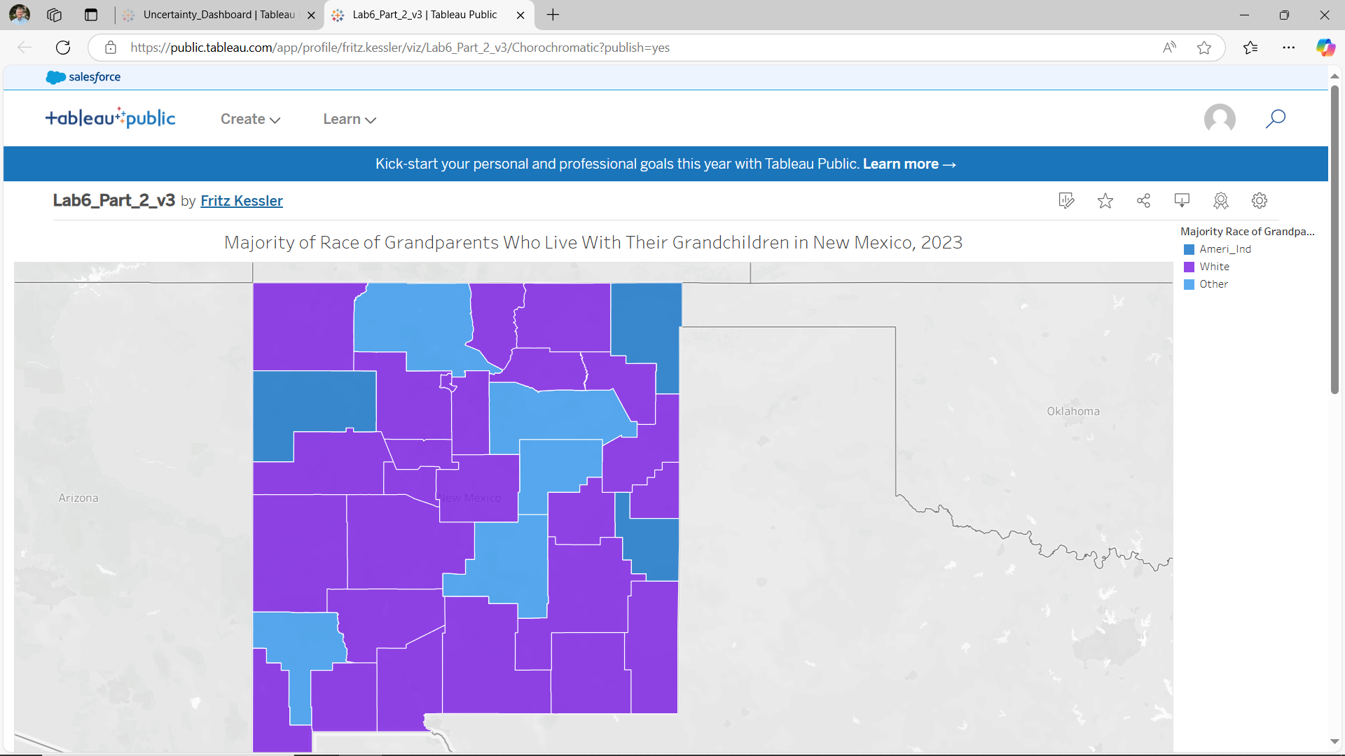
13. Part III: Chorochromatic Symbolization
As a final map for this lab, you will create a qualitative choropleth map that relates to the subject of the first two maps. Discussion was presented earlier on the use of race as a qualitative aspect to the grandparents living with their grandchildren dataset.
13.a. Data Formatting
To revisit the qualitative nature of the needed data for this portion of the lab, look at the data and consider what qualitative data you would like to map. Note that there might not be a single column with the appropriate data, and that you may have to create one yourself based on the data. For example, assume that I want to map which racial group has the highest percent of grandparents living with their grandchildren per county. Included in the original census data, columns are supplied that contain totals for different racial groups. Using these columns of data, I can then determine which racial group has the higher percentage of grandparents living with grandchildren per county. For ease of data, I will only be looking at individuals reporting one racial group and I will not use Hispanic/Latinx identity as a category.
After cleaning the data, I manually determined which racial group has the majority number of grandparents living with grandchildren. In Figure 6.24, a few counties have “Other” as the highest category, which leads to some questions.
- Are there issues with the data?
- Were some counties miscalculated?
- Were individual people’s identities not accurately represented in the options provided by the census?
These issues can sometimes be better understood through “margin of error”, which is another column that exists alongside this main census data. We will deal more with the margin of error data in Lab 7.

Save the *.csv file as something useful and open it in GIS software, just as you did before. Join the *.csv file to the TIGER county file that you created during the initial data cleaning stage. Unlike the previous effort, you only need to make a new polygon file and not a centroid file. Only a polygon file is needed since you will be making a choropleth map.
13.b. Tableau Operations
You can start a new Tableau session. To begin, add Spatial Data. You should repeat the above steps (from Parts I and II) to add the new data file to your Tableau session. Since you are only dealing with one data file (the TIGER polygon file), there are no connections to be made.
Double click on the Latitude and Longitude. Add the “Geometry” for the new shapefile. Drag the data (In my case, I called the new data “Majority”) to the “Colors” square in the Marks area. Make sure that “Automatic” is selected in the dropdown Marks menu. You should have the start of a qualitative choropleth map (Figure 6.25).

13.c. Color in Tableau
We will adjust the assigned colors and modify the legend. Right click anywhere on the legend and choose the “Edit Colors…” option. Or click on the “Color” square in the Marks area. Figure 6.26 shows the Edit Colors window. Using this window, you can choose different color palettes for your data (notice the “Lightning Color Safe” palette in the pull-down menu. Recall from a previous lesson that Colorbrewer offers good suggestions on distinguishable and color-blind friendly color palettes to use for qualitative data. Tableau also offers some interesting and useful color palettes from which to choose. Experiment a bit with the color palette choices. Selecting an existing Tableau color palette will apply that palette to the entire dataset. You can add your own custom color palette to the existing palettes. This process is discussed on the Tableau Create Custom Color Palettes page.

You can also download free software like Color Oracle or Vizcheck to test for colorblind-friendly colors. Figure 6.27 shows how the color palette shown in Figure 6.26 would appear by someone with deuteranopia. Deuteranopia is a form of red-green color confusion. Note that in Figure 6.26 the pink and green hues are washed out into shades of grey, the yellow and orange hues appear as desaturated yellows, and the blues take on a purplish hue. In short, when selecting color palettes for maps, one should be aware of how those colors will be seen by those with color vision limitations.
About 8% of people with XY chromosomes have some limited color vision deficiency, while very few people with XX chromosomes are. To have some level of color vision impairment, all of the X chromosomes must have the colorblind trait. If you have two X chromosomes, colorblindness is less likely, because they would both have to have that trait, which is very unlikely.

13.d. Tableau Legends
Next, edit the legend itself. You may wish to order the arrangement of items. To do this, right click on the legend and click “Sort” and select “Manual” in the dropdown. For qualitative legends, the order of legend items could be grouped according to similarities of one or more traits. In this case, it often makes sense to put an “Other” category at the bottom following the other categories.

Rename the legend and map title as you did in the other maps.
Figure 6.29 shows the final design of the chorochromatic map. Do not simply copy this design as this design could be greatly improved upon!
13.e. Save Your Tableau Project
Before continuing, you should also save the book as “Lab 6”. For example, you could consider saving this part of the exercise as Lab_6_Part_3.
You should now have three separate Tableau workbooks that correspond to the individual parts of this lab.
14. Sharing and Publishing Your Tableau Projects
Once you're happy with your map design, you're ready to individually publish your maps to Tableau Public. Make sure you've saved your work first! Again, to save your maps to Tableau Public, you will need to sign into (or create) your Tableau Public account.
When you save your map, Tableau publishes the map (Figure 6.30) in an interactive environment.
Adding metadata to the map can be accomplished by scrolling down to the Details option (Figure 6.31). Click on the small pencil icon next to the Details header. The Details section opens. Under the Viz description textbox, enter the following information:
- data source (provide URL if possible)
- data year
- cartographer’s name
- date when the map was created

Once you have saved each of your workbooks and added appropriate metadata, you should copy each link which will allow me and others to view your maps. This link is available through the share Tableau workbook button. Look along the top right list of icons for the share icon (Figure 6.32). Selecting the share link opens the Tableau Share window (Figure 6.33). On the share link window, copy the URL address inside the Link textbox. You will need to copy the link from each map separately and include all three links in your submission.
If you make changes to your workbook, you will need to save each and then "re-publish" it at any time to update the online version.
