Lesson 3 Lab
Lesson 3 LabFlow Mapping with Customized Projections
In Lesson 3, we discussed map projections and projection characteristics. We also discussed how to choose a map projection based on your map's intended location, scale, and purpose. It can be challenging, however, to really understand how the choice of a projection alters your map without trying it out for yourself. In Lab 3, we will be creating three map layouts that visualize flight data as flowlines. This ties together both of the topics in Lesson 3 (map projections and flow mapping), and provides a practical demonstration of the influence of map projections in small-scale thematic mapping.
For good measure, we will design each of these map layouts as advertisements: encouraging creative design and adding emphasis to the importance of map purpose and audience in choosing projections for maps. Recall from this week's required reading, Mark Monmonier's discussion of Maps that Advertise. Your challenge this week is to create map layouts that are both scientifically-appropriate and engaging to your intended customers - the readers of your maps.
Lab Objectives
- Create three advertisements for London Heathrow Airport (LHR) using flight origin-destination data.
- Select and customize map projections based on each map’s purpose and overall design.
- Use appropriate visual variables to symbolize background data and flowlines.
- Create well-designed layouts with appropriate legends and text elements.
Overall Lab Requirements
For Lab 3, you will use the provided data to create three (3) different map layouts, each of which is an advertisement for LHR airport.
- For each map, you should choose and customize an appropriate map projection.
- Each layout must use a different projection. For layout #2, which contains four maps, you may use the same projection for all maps.
- Include a written reflection (250+ words); use the following questions to guide your writing:
- For each map layout, which projection did you choose, how did you customize it, and why?
- Include a screenshot of the projection customization window (Visual Guide Figure 3.18) for each map layout (3 screenshots in total).
Map Requirements
Layout One: Highlight the distance a flight from Heathrow can take you
- Create a map that highlights distance – how far a customer can go via Heathrow’s non-stop flights.
- Classify and visualize flight paths based on their length (e.g., short haul vs. long haul). Use sensible units and at least three classes.
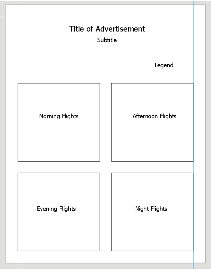
Layout Two: Highlight that Heathrow can fit anyone’s schedule
- Use the flight path data that has been pre-segmented into time blocks: Morning (7am-noon), Afternoon (noon-5pm), Evening (5pm-10pm), and Night (10pm-7am).
- Design with category and hierarchy; visualize daily counts of flights during each time block.
- Combine these four maps (one per time block) into one balanced layout with an appropriate legend.
Layout Three: Highlight that Heathrow flies to desirable locations
- Create a world map that shows all flight paths to and from London Heathrow (LHR). Symbolize as appropriate.
- Add and symbolize tourism data (included as its own layer) to demonstrate that flights from LHR take customers to popular tourist destinations.
- Instead of using the tourism data, you may symbolize a relevant field from the Natural Earth (boundary file) data on your map.
Lab Instructions
- Registered students can download the Lab 3 zipped file (475 KB). It contains:
- A project (.aprx) file to be opened in ArcGIS Pro.
- This file contains boundary, flight, and tourist data – the focus here is on design; you will not need to upload any new data of your own.
- Flight data coordinates use the datum WGS 1984.
- Data Sources:
- Arrival/Departure flight data source: Flightradar24
- Boundary data source: Natural Earth
- Tourism Data: UNWTO (World Tourism Organization)
- A project (.aprx) file to be opened in ArcGIS Pro.
- Extract the zipped folder, and double-click the blue (.aprx) file to open ArcGIS Pro.
- You should see the starting file, with all data included. See the Lab 4 Visual Guide for additional guidance.
Grading Criteria
Registered students can view a rubric for this assignment in Canvas.
Submission Instructions
- You will have three map layout PDFs to submit. Please use the naming conventions outlined below— each should be in 8.5 x 11-inch (Portrait or Landscape) design.
- LastName_Lab3_Layout1.pdf
- LastName_Lab3_Layout2.pdf
- LastName_Lab3_Layout3.pdf
- Include your write-up/reflection as a separate PDF.
- Lab Write-up: LastName_Lab3_WriteUp.pdf
- Remember that this document should include screenshots of the projection customization window for each projection used.
- Submit the three map layout PDFs and one write-up (also PDF) to Lesson 3 Lab.
- Lab Write-up: LastName_Lab3_WriteUp.pdf
Ready to Begin?
Further instructions are available in the Lesson 3 Lab Visual Guide.
Lesson 3 Lab Visual Guide
Lesson 3 Lab Visual GuideLesson 3 Lab Visual Guide Index
- Starting File
- Explore the Flight Data
- Create Flight Paths Using the X-Y to Line Tool
- Choose and Customize a Map Projection
- Symbolize Flight Paths by Their Length
- Repeat to Create the 2nd Layout
- Repeat to Create the 3rd Layout
- Additional Tips
Throughout this lab, keep the following statement in mind:
"The projection you choose will depend on the characteristics most important to be preserved, given the purpose of your map."
1. Starting File
This is your starting file in ArcGIS Pro: It contains boundary, flight, and tourism data. The flight data is in table form - we will be using these data tables to create flight paths and visualize them on the map.

2. Explore the Flight Data
The primary flight data table is the one shown below - it contains a full day of flight data (Oct 22nd, 2018). Listed in the table are all locations which had a flight arrive from, or depart to, London Heathrow Airport (LHR). We will not differentiate between arrival and departure flights in this lab.
The count of flights to or from this location is listed in the Count_Num field. For the purposes of this lab, we will assume that October 22nd is representative of an average day at LHR, and thus use this dataset as a proxy for LHR’s “daily” flight data. You do not need to mention October 22nd anywhere on your maps.

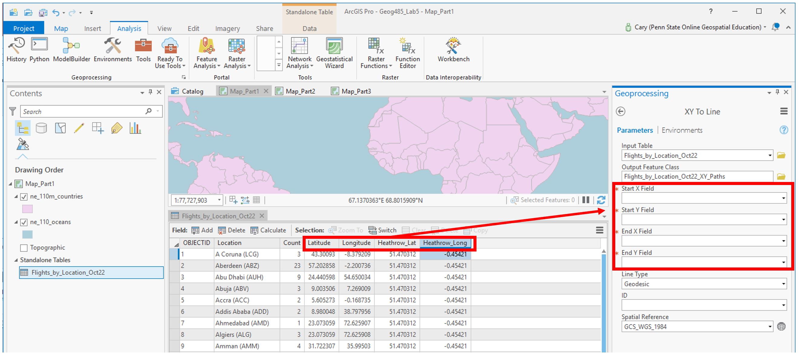
3. Create Flight Paths Using the XY to Line Tool
In our flight data, we have lots of origin-destination data. We want to visualize these data as flows on our map. For this, we use the XY to line tool. Think carefully about the fields you choose for each parameter when running this tool. If you do it incorrectly the first time, don't worry - rethink and re-do.
4. Choose and Customize a Map Projection
For each map layout in this lab, you will be creating a customized map projection (use the Project tool). Reference the projection lesson and consider each advertisement's goal/purpose to help you decide which projection to choose/customize for each map. You may want to try adding the map to a layout at this stage of the lab to decide if you like it. Remember that you will be asked to defend this choice in the reflection you submit with this lab.

You may need to try a few different projections or customization parameters to find a map projection you are happy with. When you have settled on a projection, use the project tool to project your flowlines to match the map's projection. As shown below, ArcGIS makes this pretty easy.

Recall that we will be visualizing flight paths based on their length. We can use the Shape_Length field which ArcGIS automatically calculated for us from our origin-destination data to do this. Note that before projecting these lines, the Shape_Length field will not contain meaningful values.

Once your flight paths are projected, the Shape_Length field will be calculated in meters.

As you may have noticed, the flight path data doesn't contain any location names or flight count numbers. We'll need to join the original flight data table to the flight path data to get all our data in one place.

5. Symbolize Flight Paths by Their Length
Use external research or the data distribution to decide on classifications for short vs. long flights, etc. (3+ classes). Recall considerations for data classification from Lesson/Lab 4.

You may use any or multiple visual variables of your choice to symbolize your flowline data - size, value, etc... as long as it is appropriate given the perceptual structure of your data, you can be creative with it.

Add your map to a layout: create a catchy title/subtitle and customize your legend. Add a graticule (ArcGIS Pro calls this a “grid”) if you wish.

Make sure all layout elements are neat and orderly – “convert to graphics” will likely be helpful. Keep in mind lessons from previous labs: legends and any explanatory text should be clear, etc.
6. Repeat These Same General Steps to Create the 2nd Layout
You’ll want to create three new maps (four total) to separate the flight types (morning, afternoon, evening, night). If you prefer, you can do a Save-As and keep work done on this project separate form the previous one. In any case, save frequently!

You can drag the tables onto their appropriate map from the Contents Pane.

Use creativity, appropriate visual variables, and good design in this ad as well! Remember the goal of this layout - highlighting that Heathrow can fit anyone’s schedule.
7. Repeat to Create the 3rd Layout
For the third advertisement, we will add additional data to our map to demonstrate to the reader that flights from LHR go to desirable locations. Choose a field such as “International Tourist Arrivals 2017” that makes sense to use in an ad about air travel. Visualize this data on your map how you choose - remember that you will still be visualizing the flight paths. You may use the same flight path layer from Map #1, but you will need to re-project it to match your projection for Map #3.

Choose and customize a projection you haven’t used yet – be prepared to write about the reason for this selection. Think about your map type and purpose.

Ensure that both your flight path and other thematic data is included in your layout - below is just an example of how you might symbolize this data, but there are many other possible ways. If you do not want to use tourism data, you can use a field that was automatically imported with the Natural Earth boundary data such as GDP. Consider how you will visualize null values.

8. Additional Tips
- Remember these are advertisements! Use good design but have fun with titles, colors, etc.
- You may want to use an interesting projection - such as one that visualizes the world as a sphere - for one or more of your maps. Be sure it is appropriate for your map's purpose.
- Adding a grid often aids in reader interpretation of small-scale maps.
- You do not need a scale bar or north arrow for any of these map layouts - they are generally considered unnecessary (and often inappropriate) for global-scale maps.
- When you write your reflection, include a screenshot of the map's projection details (such as in Figure 3.18 below) for each map layout. You will likely use the same projection for all four maps in layout #2, so you only need to include one screenshot for layout #2 and note that it was used four times.
