Lesson 7: Multivariate Symbology
Lesson 7: Multivariate SymbologyThe links below provide an outline of the material for this lesson. Be sure to carefully read through the entire lesson before returning to Canvas to submit your assignments.
Note: You can print the entire lesson by clicking on the "Print" link above.
Overview
OverviewWelcome to Lesson 7! During the course so far, we have discussed many ways in which cartographers symbolize data on maps. We used visual variables to create category and order for basemap and label design. We have also examined the usefulness of choropleth, flowlines and isarithmic symbolization methods to represent data. In most cases, our maps have focused on one data variable (e.g., % of people with health insurance), or layered different kinds of data (e.g., race routes layered over terrain). This week, we introduce multivariate mapping—maps that visualize more than one data attribute at once. We also continue with our exploration of Tableau and the interactivity that this application provides.
Following our discussion of multivariate maps in this lesson, we will introduce a special type of data—uncertainty. When mapping predicted flood zones, for example, we might want the reader to understand not only the predicted flood values across the map, but their associated uncertainty—how certain those values are to reflect reality across different locations. As uncertainty plays a pivotal role in decision-making (e.g., cones of uncertainty in predicting the path of a tornado or hurricane), we close out our discussion of uncertainty visualization with a short summary of its influence on decision-making with maps. In Lab 7, we explore both multivariate data and uncertainty visualization techniques while creating maps based on data from the US Census.
Learning Outcomes
By the end of this lesson, you should be able to:
- anticipate the influence of uncertainty visualization on decision-making with map-based displays based on knowledge of related research.
- interpret advanced multivariate maps that use visuals such as Chernoff faces and glyphs.
- use appropriate combinations of visual variables to design multivariate maps.
- describe cluster analysis and its function in multivariate thematic mapping.
- understand geographic uncertainty and the role of its visualization in map design.
- evaluate the benefits and downsides of multivariate mapping compared to designing multiple maps (i.e., compare vs. combine) for a specific mapping purpose.
Lesson Roadmap
| Action | Assignment | Directions |
|---|---|---|
| To Read | In addition to reading all of the required materials here on the course website, before you begin working through this lesson, please read the following required readings:
Additional (recommended) readings are clearly noted throughout the lesson and can be pursued as your time and interest allow. | The required reading material is available in the Lesson 7 module. |
| To Do |
|
|
Questions?
If you have questions, please feel free to post them to the Lesson 7 Discussion forum. While you are there, feel free to post your own responses if you, too, are able to help a classmate.
Multivariate Maps
Multivariate MapsSo far in this course, we have discussed many different ways of symbolizing data using visual variables. Our focus has been primarily on univariate maps—maps that show only one thematic data variable.
There are many cases where mapping a single variable is needed. More complex data and purposes often require mapping a number of different variables at once. This is called multivariate mapping. The term multivariate map is typically defined as a map that displays two or more variables at once (Field 2018). Note however, that bivariate mapping (mapping only two variables is distinct). When creating multivariate maps, you will think about the best way to symbolize each variable, as well as how they can be combined to suit your map's audience, medium, and purpose.

Figure 7.1.1 shows a multivariate map. The map visualizes two variables at each location: rent prices and the number of Section 8 vouchers. These variables are individually symbolized appropriately. First, rental prices are visually encoded with a sequential color scheme—a good symbolization choice for normalized data such as rates. Second, the number of Section 8 vouchers at each location is visualized by adjusting symbol size—an appropriate visual variable for mapping count data. Together, these symbols work to visualize this housing data from Portland.
Note that the legend in Figure 7.1.1 is more complicated than many of the legends that we’ve seen so far. The format shown—one variable along the x-axis, and one along the y-axis, is common in bivariate maps, or maps that display two variables. Doing so not only explains how to data is visually encoded, but helps the map reader understand how the data are related to each other. The more visually complicated a map becomes, the more challenging it will be to design a useful legend. However, your legend is central to the reader accurately interpretating your map, so don’t treat legend design as an afterthought. The map in Figure 7.1.2 below uses short text blurbs to assist the reader in this interpretation.

As we continue through this lesson, keep an eye on the legend designs. Some maps, such as bivariate choropleth maps, have a more standardized legend designs. Others, such as what appears in Figure 7.1.2, are somewhat less conventional; they are designed and customized by the cartographer to suit the map’s data and purpose. Legend design is an important component of cartographic design in general, but is particularly important for multivariate maps.
Student Reflection
Consider the legends you have made for your maps in labs thus far. For which map did you find designing the legend most challenging? Why?
Multivariate Choropleths
Multivariate ChoroplethsAs choropleth maps are the most popular type of univariate thematic map, it is not surprising that they are also commonly used in multivariate mapping. Bivariate choropleth maps visualize two variables. Note that while cartographers have historically described maps of two data variables as bivariate, these maps can also be described as multivariate (more than one variable). In the context of this lesson and course, we will generally use the more comprehensive description multivariate maps.
The map in Figure 7.2.1 is an example of a bivariate (or multivariate) choropleth map from a research article on COVID-19 and population movement. Examine the legend. Note that a hue progression (purple to yellow – vertically on the legend) has been applied to visually encode population vulnerability. Color lightness (horizontally on the legend) to visually encode population movement, or “stay-at-home behavior.” The legend text explains the logic behind the ordering of the color chips in the 3x3 diamond legend in the lower right of the map.

Using color hue to encode population vulnerability is a sequential quantitative variable—a design choice we have discouraged in previous lessons. In general, color lightness is a much better choice for encoding quantitative data. In this map, however, color lightness is already being used to map the other variable—population movement (stay-at-home behavior). Creating multivariate maps sometimes requires bending the rules of cartographic conventions a bit so as to best represent all of your data.
Recommended Reading
Brewer, Cynthia A. 1994. “Color Use Guidelines for Mapping and Visualization.” In Visualization in Modern Cartography, edited by Alan M. MacEachren and D.R. F. Taylor, 123–147. Pergamon.
Axis Maps. 2018. “Bivariate Choropleth.” Cartography Guide. Accessed November 14.
Stevens, Joshua. 2018. “Bivariate Choropleth Maps: A How-to Guide.” Accessed November 14.
Multivariate Dot and Proportional Symbol Maps
Multivariate Dot and Proportional Symbol MapsAnother commonly-used thematic map type for multivariate mapping is the proportional symbol map. As you can infer from the description, this symbolization method sizes symbols (often circles) according to individual data values. Making these types of maps can be easier than making bivariate choropleth maps. As the main visual variable used in proportional symbol mapping is size, another variable can be added quite easily (e.g., color hue, filling the interior of the symbols with unique colors representing a qualitative variable). The challenge to the map reader lies in the interpretation: as the visual variables of size and color hue are quite different, this can make it challenging for the multiple variables on the map to be directly compared by readers.

Figure 7.3.1 above is a bivariate proportional symbol map that visualizes two variables: population by county (a quantitative variable, with the visual variable size) and coastline vs. interior (a qualitative variable, with the visual variable color hue).
Student Reflection
Imagine you were tasked to create the map above, but instead of symbolizing points as coastline vs. interior, you were asked to symbolize all points by income per capita (in addition to population). What would you change about this map design to fit that new data?
Another method of multivariate map design is to stack multiple layers so they can be viewed simultaneously. Often, this is done by displaying proportional or graduated symbols on top of a choropleth or isoline map. An example is shown in Figure 7.3.2.

In the map above, visual emphasis is placed on the proportional symbols: they use size to symbolize a primary variable of interest—the estimated count of people in each city who arrived there after visiting a country on the CDC’s Zika travel advisory list. Another variable, Ae. aegypti (a mosquito capable of transporting the Zika virus) abundance, is visualized with color hue. A third variable—the approximate observed maximum extent of this mosquito, is visualized using a color fill for additional context. Note the careful descriptive legend design.
The outline of the maximum extent of the mosquito's range does not have a solid line. The light color fill contrasts against the remaining white fill to create a natural boundary interface. Not only is this design approach visually appealing, the lack of a solid outline to the mosquito's extent also implies a level of uncertainty in the exactness of that extent. We will discuss this idea later in this lesson.
Making a map such as this one is a challenge but is an example of how related variables can be mapped together to create an engaging and useful map.
Recommended Reading
Nelson, Elisabeth S. 1999. “Using Selective Attention Theory to Design Bivariate Point Symbols.” Cartographic Perspectives Winter (32): 6–28.
Cartograms
CartogramsThus far, we have discussed several methods for visually encoding maps with multiple variables via the addition of map symbols. There is another option: encoding data by altering the map’s shape or size itself. Area cartograms are maps in which the areal relationships of enumeration units are distorted based on a data attribute (e.g., the relative sizes of states on a map might grow or shrink proportional to their respective populations) (Slocum et al. 2009). So the larger the attribute value, the larger the feature on the map, and vice-versa.
Figure 7.4.1 shows a choropleth map of Social Capital Index ratings (Lee 2018) at the top, and two cartograms beneath it. Each of these maps encode every state's Social Capital Index ranking using a multi-hue sequential color scheme. The bottom two cartograms also distort the area of each state by sizing them based on their population—but they use different techniques for doing so.

In Figure 7.4.1, the map on the bottom left is a density-equalizing, or contiguous cartogram. Though areas are distorted, connections between the areal units (here, states) are maintained (e.g., the border between Alabama and Georgia is maintained). The map on the right, conversely, is a noncontiguous cartogram. States are still sized according to their population, but this method used does not require the maintenance of connections at areal boundaries. The relaxation of this requirement allows areas to be re-sized without their shapes being particularly distorted. The inclusion of state political boundaries on this map also allows the reader to make an interesting comparison: which states are sparsely populated relative to their original areal size, and which are less so?
Student Reflection
Think back to earlier lessons—how might you apply color differently to improve the maps in Figure 7.4.1?
An alternative technique to constructing cartograms, called “Value-by-Alpha” mapping, was recently defined by Roth, Woodruff, and Johnson (2010). Rather than re-sizing areas based on their population, value-by-alpha maps use transparency to fade less-populated areas into the background, giving areas of higher population greater visual prominence. Thus, they serve a similar purpose to cartograms, but do not distort the map’s geography. This is not to say that they should always be used instead of cartograms—but they are perhaps an appropriate alternative when the shock value of a cartogram is undesirable, and maintenance of both area borders and shapes is desired (Roth, Woodruff, and Johnson 2010), which is not possible with traditional cartogram maps. Pay particular attention to the fact that in order to effectively show the subtle differences in the transparencies, a dark background is selected.

Recommended Reading
Roth, Robert E, Andrew W Woodruff, and Zachary F Johnson. 2010. “Value-by-Alpha Maps: An Alternative Technique to the Cartogram.” The Cartographic Journal 47 (2): 130–140. doi:10.1179/000870409X12488753453372.
Sun, Hui, and Zhilin Li. 2010. “Effectiveness of Cartogram for the Representation of Spatial Data.” The Cartographic Journal 47 (1): 12–21. doi:10.1179/000870409X12525737905169.
Multivariate Graphics
Multivariate GraphicsThe examples we have explored so far have visualized two or three variables at once. Occasionally, you may want to visualize even more. One possible solution is to design data graphics that can then be incorporated into your map. A classic example of this is the use of pie charts as proportional symbols: an example is shown in Figure 7.5.1.

Interpreting the information in Figure 7.5.1 is rather straight-forward. The circle diameters represent the weight of butchered meat in kilograms supplied by departments to Paris. The individual colors assigned to the "pies" include black = ox or cow, red = veal, and green = sheep.
A more recent (and more complicated) example is shown in Figure 7.5.2.

Though the introduction of data graphics does permit the addition of many variables onto the map, this does not mean it is always the best solution. As shown in Figure 7.5.2, including a large amount of data in a map using multiple symbolization methods can make it challenging to interpret. Additionally, multivariate graphics in general—and pie charts in particular—have well-documented disadvantages in terms of reader comprehension (Tufte 2001). Adding graphics that are already challenging for people to understand to maps tends to exacerbate such issues. Furthermore, the size of the graphics may lead them to obscure data in underlying layers. This is not to say that they should never be used, however—just with caution. And fortunately, there are ways in which such maps can be made easier to interpret.
Glyphs
One way that multivariate maps can be made more comprehensible is through the addition of user interaction. Figure 7.5.3, for example, is challenging to interpret as a static image, particularly as the glyphs (i.e., a pictograph) used are quite small and some of the color choices are not easily distinguishable. However, this is an interactive map. Clicking on a state creates an informative pop-up, shown in Figure 7.5.4.

While you will explore interactivity in this assignment, we will discuss the merits and challenges of map interactivity further in Lesson 8.

Student Reflection
Explore the use of multivariate glyphs to explore data about well-being. Can you think of ways in which this data might be symbolized instead as a static map or maps?
Chernoff Faces
Despite the difficulty of creating maps with multivariate glyphs, cartographers have long attempted to tackle this challenge through interesting experimentation. One particularly whimsical example of this is Chernoff faces. Chernoff faces are glyphs created by mapping variables onto facial attributes. When mapping the variable average household income, for example, a bigger smile might indicate a higher income level.

The Chernoff face technique was first proposed by Herman Chernoff in 1973. Chernoff's intention was to capitalize on the ability of humans to intuitively interpret differences in facial characteristics. One the one hand, humans can subconsciously note important differences in expressions that are almost unmeasurable. In addition, humans can ignore large differences that are common between faces (Chernoff 1973). Chernoff also noted that his method was desirable as it permitted the designer to map many variables (as many as 18!) onto just one graphic.
Chernoff’s original application of his technique used fossil and geological data, but Chernoff mapping is more commonly used to depict social thematic data such as well-being, or other topics related to human emotion. Chernoff mapping has been a contentious method since its introduction— some Chernoff maps such as this one: Life in Los Angeles by Eugene Turner, 1977 [14], have been heavily criticized for their use of stereotypical facial attributes and a cartoonish over-simplification of complex issues.
In response to these critiques, some cartographers have developed techniques for utilizing the advantages of Chernoff faces without some of the contentiousness. Heather Rosenfeld and her colleagues, for example, proposed using “Zombieface” glyphs rather than human faces—maintaining the emotive content and still capitalizing on people's ability to intuitively interpret facial features, but removing the human context and thus lowering the likelihood of reinforcing harmful stereotypes (Figure 7.5.6).

Take a closer look at the legend of this map—which demonstrates how the hazardous waste data was mapped to Zombie facial attributes—in the image below. As you can see, the map focuses on visualizing the presence of unknowns and uncertainty in the mapped dataset (we'll discuss further techniques for visualizing uncertainty later in this lesson).

Chernoff Zombies are among several creative solutions recently proposed: a fun example is shown in the following quasi-Chernoff map: Mapping Happiness. It maps happiness, or well-being, across the United States using emoticons. Though these icons do not encode as many variables as Chernoff faces, they share the benefit of visualizing data at-a-glance using facial expressions.
Of course, the novelty of this "zombie-chernoff" symbolization method is interesting. As shown in the legend, there are many subtle differences in symbols that may be difficult for readers to distinguish. Thus, despite the inventiveness of such symbolization experimentations, the cartographer should always question how easily it is for the map reader to encode the information and make sense of what they see.
Recommended Reading
Esri Blog: Chernoff Faces by John Nelson.
Comparing vs. Combining
Comparing vs. CombiningAs demonstrated by previous examples, multivariate maps are often challenging—both for cartographers to create and for readers to interpret. However, if you need to map multiple variables simultaneously, but want to avoid a complex multivariate map (for example, when creating a map for a presentation slide) there is another option: simply creating multiple, adjacent maps. This is called small multiple mapping.

Small multiple maps are particularly useful for depicting data over time, as they can be arranged in a linear sequence, the way that time is typically depicted. With the increasing popularity of web maps, small multiple maps can be more easily replaced with a animated maps, where each map appears as an individual frame. Despite the advantages of animated maps (e.g., creating visual interest, efficient use of layout space), there are still benefits to traditional small multiple mapping. One primary advantage is the ability to simultaneously compare the various maps.
We can imagine combing the set of maps in Figure 7.6.1 with some sort of transparent layering, or perhaps turning it into an animated map. However, a single map with multiple transparent layers would be visually complex, and viewers of an animation would have to wait for the animation to loop—or scrub through the frames—in order to compare two specific maps. Here, simple works well. If your presentation is still too complex, you may consider reducing the amount of information being presented. Figure 7.6.2 is an example of small multiple mapping that only uses two multiples.

Cluster Analysis
Cluster AnalysisSo far, we have discussed two ways of mapping multiple variables—combining visual variables to encode multiple variables into one map, and visually comparing sets of maps of different data. There is a third, considerably different method that is often used for mapping multivariate data sets: cluster analysis. Cluster analysis is a form of data reduction and refers to mathematical methods used to combine multiple quantitative variables into one map (Slocum et al. 2009).
There are multiple methods for clustering (e.g., hierarchical and non-hierarchical). One of the more simple to understand is the K-Means algorithm. With K-means, the goal is to identify groups (k) of similar observations based on several attributes. The groups are assigned in a way that minimizes intra-group differences, while maximizing inter-group differences. Consider, for example, that you are interested in visualizing education, income, and access to green space in the US by county. You could map these three variables individually creating a small multiple, or you could use cluster analysis to identify groups of counties that are similar along all three dimensions on a single map using a qualitative color scheme (or a chorochromatic map).

Cluster analysis is a complicated topic, and we will not go into the mathematical details in this course. What is important to understand is that it provides a mathematical alternative to the other more design-based multivariate mapping techniques we have explored so far. You are encouraged to explore the recommended readings if you are interested in learning more about cluster analysis and about implementing it in GIS.
Recommended Reading
ArcGIS Pro Tool Reference: How Multivariate Clustering Works. Esri 2018.
Jain, A. K. 2009. "Data Clustering: 50 years beyond K-Means." Pattern Recognition Letters.
The Visualization of Uncertainty
The Visualization of UncertaintyOf the many variables you may wish to include in your maps, there is one that has received particular focus from cartographers due to its unique characteristics—uncertainty. Uncertainty is a complex concept that has been defined differently by various authors. For example, Longley et al. (2005) define uncertainty as "the difference between a real geographic phenomenon and the user’s understanding of the geographic phenomenon." We use this definition as it encompasses the many variations of uncertainty that in emerge during multiple stages of map-making—during data collection, data classification, visualization, map-reader interpretation, and more (Kinkeldey and Senaratne, 2018).
It can be assumed that all geographic data contain some level of uncertainty. A map of average income by county, for example, might classify a county as having an average household income of $58,234. Despite this, it is possible, even likely, that the actual value is different—this is due to survey response errors, non-response to survey (e.g., Census) requests by some residents, or changes in the data over time (e.g., some survey respondents have moved in or out of the county since the data was collected). A map of precipitation levels, similarly, will also contain uncertainty, due to factors including the lack of ubiquitous measurement instruments, their imprecision or inaccuracy, and possibly human error or related factors. Soil mapping is another example of uncertainty. On soil maps, definitive boundaries are shown through outlines of soil types. Yet, we know that soil does not have definitive edges as soil types gradually change over space often mixing together at their boundaries.
Recommended Resource:
A helpful list of terms and definitions related to uncertainty can be found here:
Kinkeldey, C., & Senaratne, H. (2018). Representing Uncertainty.
The Geographic Information Science & Technology Body of Knowledge (2nd Quarter 2018 Edition), John P. Wilson (ed.). DOI: 10.22224/gistbok/2018.2.3
Traditionally, researchers have grouped geodata uncertainty into three categories – the what (attribute/ thematic uncertainty), the where (positional or locational uncertainty), and the when (temporal uncertainty) (MacEachren et al. 2005). The success of visual variables for depicting uncertainty depends on the type of uncertainty to be mapped. For example, containing a point within a colored circle showing your location on a map, such as Google’s “blue dot,” might be most effective for depicting positional uncertainty (Google Maps; McKenzie et al. 2016). Use of another variable such as transparency might be more effective for depicting attribute uncertainty, such as uncertainty of unemployment rates in a county-level map.
Like other multivariate data, uncertainty can be combined with the other visualized data in a map, or compared by visualizing it in a separate map view. Figure 7.8.1 shows two maps that use different techniques to visualize the uncertainty in the data. Figure 7.8.1 (top) uses a combining technique, in which a visual overlay (diagonal lines on top of a univariate choropleth symbolization) is used to show attributional uncertainty. Figure 7.8.1 (bottom) uses a reliability diagram—an inset map that the reader can reference to understand which locations on the map contain the most certain data values. In general, the combining method is a more popular technique, though a compare technique might be more appropriate if the primary map is sufficiently complex, and thus adding overlay would make the map difficult to comprehend.

Data Source: The World Happiness Report (Helliwell et al. 2018), Natural Earth.
Among combined uncertainty visualization techniques, methods for visualizing uncertainty are typically classified as either intrinsic or extrinsic. Intrinsic uncertainty visualization techniques cannot be visually separated from the visualization of one or more other variables, while extrinsic visualization techniques are easier to interpret separately. An example of the difference between these two techniques is shown in Figure 7.8.2.

Data Source: The World Happiness Report (Helliwell et al. 2018), Natural Earth.
In Figure 7.8.2, both extrinsic (top) and intrinsic (bottom) uncertainty visualization techniques are shown. The extrinsic visualization uses a hatched fill overlay to denote uncertain values—thus, the visualization of uncertainty is visually separable from the visualization of the data underneath. Figure 7.8.2 (bottom) by contrast, uses an intrinsic visual variable—transparency—to visualize data uncertainty. The two variables are combined together to create the legend as well. Examine the top and bottom maps in Figure 7.8.2. Ask yourself how easily it is to visually separate the variables in each map. Can you think of a different approach to map the two variables that would be easier for the map reader to visually separate and at the same time combine the two variables?
Any visual variable can be adapted to demonstrate uncertainty. However, some are more intuitively associated with uncertainty than others. MacEachren (1995) proposed the idea of clarity as a visual variable for static maps, an overarching concept that can be further divided into three visual variables: transparency, crispness, and resolution (MacEachren 1995). Transparency is a familiar visual variable, as it has been adapted for purposes other than displaying uncertainty, such as in the value-by-alpha maps described earlier in this lesson.
Crispness is a particularly intuitive way of visualizing uncertainty. Features are depicted on a continuum from crisp to blurry, with less certain values appearing appropriately blurry or out-of-focus (Figure 7.8.3).

Resolution creates a similar effect—features with less certain boundaries or attributes are depicted in courser resolution, suggesting a lack of certainty in the map.

These visual variables have long been associated with uncertainty due to use or presence in other visual media—e.g., a photograph “coming into focus”—and so provide a design option with substantial precedent. Just as higher data values are visually encoded with larger symbols, less certain boundaries, for example, may be visually encoded with fuzzy boundaries. Look at maps of the Middle East published by the CIA or US State Department. In many instances, these maps will use dashed or other non-solid lines styles to indicate disputed country boundaries.
Though uncertainty is often discussed in terms of imprecise instruments, imperfect collection methods, etc., an important additional context where uncertainty plays a role is in the mapping of future scenarios. Climate models, for example, use past and present data to predict future conditions, but these predictions are inherently uncertain. Figure 7.8.5 below contains maps of temperature and precipitation change predictions. The first map (top left) maps the average result of 37 predictive models intended to estimate temperature change by 2050 (Kennedy 2014). The middle map shows the warmest 20% of models—the 20% coldest models are summarized at the right. The bottom three maps show a similar comparison of maps created from precipitation models. In all three maps, the "boundaries" of each projected temperature area are visually set by the interface of the two dis-similar color fills. No solid line is present.

Unlike previous examples, these maps do not use intuitive visual depictions of uncertainty. However, the map-maker's inclusion of all three maps for each data variable shows the range of possibilities that might lie ahead: the future is always an uncertain entity. It is implied that these maps depict not all possible scenarios but a range of likely ones; they intend not to precisely predict the future but to help users understand what future conditions they might expect to come about.
Recommended Reading
MacEachren, Alan, Anthony Robinson, Susan Hopper, Steven Gardner, Robert Murray, Mark Gahegan, and Elisabeth Hetzler. 2005. “Visualizing Geospatial Information Uncertainty: What We Know and What We Need to Know” 32 (3): 139–160.
Slingsby, Aidan, Jason Dykes, and Jo Wood. 2011. “Exploring Uncertainty in Geodemographics with Interactive Graphics.” IEEE Transactions on Visualization and Computer Graphics. doi:10.1109/TVCG.2011.197.
Uncertainty and Decision-Making
Uncertainty and Decision-MakingIn the last section, we discussed how to conceptualize uncertainty, and ways in which it can be visualized. One important question remains: why should we do so? Creating well-designed maps is already challenging, and adding a depiction of uncertainty makes this process even more so.
Uncertainty is typically depicted in maps for two primary reasons: (1) its inclusion may be regarded as an ethical necessity—many maps are created with significantly uncertain data, and a cartographer might feel that withholding this information from the map reader would be misleading, and (2) consideration of uncertainty plays an important role in decision-making, and thus its visualization might be necessary in some contexts—for example, maps of predictive hurricane paths tend to include a “cone of uncertainty” (Figure 7.9.1)—and such maps often play an important role in decisions made by residents of storm-affected areas.

So how does the visualization of uncertainty affect decision-making with maps? Kinkeldey et al. (2015) conducted a review of studies that attempted to answer this question. Most of the studies they analyzed suggested that the visualization of uncertainty does have an effect on task performance with maps and similar spatial displays (Kinkeldey et al. 2015). Simpson et al. (2006), for example, studied the use of uncertainty visualization in surgical tasks with graphic displays, and noted that the inclusion of uncertainty visualization improved performance accuracy. The positive influence of uncertainty visualization on task-completion accuracy with maps is a somewhat common finding. Though findings are less consistent with regards to task completion times (i.e., speed), uncertainty visualization seems at least not to significantly increase task-completion times (Kinkeldey et al. 2015).
Despite this, there is still not a consensus concerning whether uncertainty visualization is always helpful for decision-makers—some studies note that participants perceive uncertain data as risky, which can induce irrational decision-making via loss-aversion (Hope and Hunter 2007). Whether uncertainty visualization is useful—and whether it is useful enough to warrant the design efforts it requires—is context dependent and still thoroughly up for debate.
Recommended Reading
Kinkeldey, Christoph, Alan M. MacEachren, Maria Riveiro, and Jochen Schiewe. 2015. “Evaluating the Effect of Visually Represented Geodata Uncertainty on Decision-Making: Systematic Review, Lessons Learned, and Recommendations.” Cartography and Geographic Information Science 0406 (August 2016). Taylor & Francis: 1–21. doi:10.1080/15230406.2015.1089792.
Deitrick, Stephanie, and Elizabeth A. Wentz. 2015. “Developing Implicit Uncertainty Visualization Methods Motivated by Theories in Decision Science” 105 (May 2013): 531–551.
Critique #4
Critique #4For Critique #4, you will put your Artificial Intelligence literacy skills to the test by critiquing a map generated by ChatGPT or another AI tool.
You may find this article helpful as you reflect on your AI-generated map and its merits and pitfalls:
- Kang, Y., Zhang, Q., Roth, R., (2023). The Ethics of AI-Generated Maps: A Study of Dall-E 2 and Implications for Cartography. arXiv preprint arXiv:2304.10743
Grading Criteria
Registered students can view a rubric for this assignment in Canvas.
Instructions
- Go to an AI platform of your choice, such as chatgpt.com. If you don’t have an account, or don’t wish to create an account, you may use the AI-generated map linked below.
- Enter a prompt on a topic of your choosing to generate a thematic map, in print format.
- Example: The map below (Figure 7.10.1) was generated with the prompt, “Make a print map showing the population density of Pennsylvania at the county level.”
- Write a critique (300+ words) of the generated map. Include:
- The AI-generated map image with a citation (hint: see Figure 7.10.1 caption)
- Your ChatGPT prompt, and any additional input that was needed
- Three things about the map that you think works well, and why.
- Three suggestions for improvement of the map, and why these improvements matter.
- Return to the Lesson 7 Module in Canvas to submit your critique to the Critique #4 assignment as a PDF file in the format: LastName_Critique4.

Lesson 7 Lab
Lesson 7 LabMultivariate Symbolization
In Lab 6, we explored representing discrete and abrupt data using proportional symbols. Specifically, you worked with proportional and graduated symbols. You also explored mapping qualitative data using the chorochromatic symbolization. In Lab 7, you will continue to apply design and symbolization ideas. In most cases, your maps have focused on one representing a single data variable (e.g., % of people with health insurance), or layered different kinds of data (e.g., race routes layered over terrain). Univariate data is one of the more common data that is mapped. However, symbolization methods exist that allow more than one variable to be mapped. This Lab, we introduce multivariate mapping—maps that visualize more than one data attribute at once.
Following our general discussion of multivariate maps, we introduce a special type of data—uncertainty. When mapping predicted flood zones, for example, we might want the reader to understand not only the predicted flood values across the map, but their associated uncertainty—how certain those values are to reflect reality across different locations. As uncertainty plays a pivotal role in decision-making, we close out our discussion of uncertainty visualization with a short summary of its influence on decision-making with maps. In Lab 7, we explore both multivariate data and uncertainty visualization techniques while creating maps using the reported margin of error reported in census data.
As with Lab 6, Lab 7 will continue using Tableau to create the maps. However, the emphasis on using Tableau for Lab 7 will extend beyond multivariate symbolization to creating an interactive dashboard where maps and graphics will be linked together, allowing relations in the data to be seen.
Lab Objectives
- Create a single dashboard in Tableau that includes the following main elements:
- a multivariate map using proportional symbols (separate legends for each variable)
- a chart showing the variable of interest
- a chart showing the margin of error values
- Create a single multivariate map using census data (either the same data from Lab 6 or new data).
- Visualize the census data and uncertainty data on a single map using an appropriate combination of visual variables and colors to create a multivariate map.
- Create two charts (e.g., scatterplots) that illustrate the census data values and the uncertainty (e.g., margin of error)
- Integrate the multivariate map and two charts together on a single dashboard through linking so that relations highlighted on one object (e.g., the map) are also highlighted on another (e.g., both charts), creating a dynamic environment.
- Implement an effective unified design practice (color choices, balancing negative space, etc.)
Overall Lab Requirements
For Lab 7, you will create a single dashboard of a unified design in Tableau. The specific requirements for each dashboard element are listed below.
Lab Requirements
Multivariate Map: Variable of Interest and Uncertainty Data
- Choose a variable of interest to map from the provided American Community Survey (ACS) data to create a single multivariate map.
- You can use the same data from Lab 6 (or choose a different dataset), but the data must also include a measure of uncertainty (for census data, this uncertainty can be considered the margin of error values included as a separate column with the census data).
- The chosen data will be mapped using a bivariate symbolization (e.g., symbols and color values).
- Use appropriate visual variables to encode your data using a bivariate symbolization.
Chart One: Census Data (choose your own variable)
- Select an appropriate chart representation method (e.g., scatterplot, barchart, etc.) to represent the pattern between the census data value and each county.
- This chart must be linked to the bivariate map and another chart so that data relations highlighted on one element are also highlighted on another, creating a linked environment.
- The chart title must correspond to the data appearing on the chart.
- Consideration must also be given to the chart's design (e.g., unique color choice for the symbols, axes titles, data order along both axes, etc.).
Chart Two: Census Data (use the variable's margin of error)
- Select an appropriate chart representation method (e.g., scatterplot, barchart, etc.) to represent the pattern between the census data and the margin of error by county (note, you can use the same chart type as with Chart One or choose a different one).
- This chart must be linked to the bivariate map and another chart so that data relations highlighted on one element are also highlighted on another, creating a linked environment.
- The chart title must correspond to the data appearing on the chart.
- Consideration must also be given to the chart's design (e.g., unique color choice for the symbols, axes titles, data order along both axes, etc.).
Tableau Dashboard
- Appropriately arrange and size each object in the available dashboard space (e.g., consider the distribution of negative space).
- Ensure that each object is linked to the other objects on the dashboard.
- All objects must be clearly visible and readable (e.g., be mindful of text size).
- Create an overall descriptive explanation of the dashboard and its contents.
- Create an overall descriptive title for the dashboard and individual object titles.
- Use a consistent design appearance and feel throughout the story.
Lab Instructions
The data for this lab will be self-selected from the US Census Bureau’s data explorer website. The Lesson 6 Lab Visual Guide provided details on how to access this site, search for data, and format the data for download.
Grading Criteria
Registered students can view a rubric for this assignment in Canvas.
Submission Instructions
- You will have one (1) Tableau dashboard to submit. This submission will include the link to your Published Tableau Story using the file name format below.
- LastName_Lab7.pdf
- Include the URL link to your published Tableau Dashboard in your PDF.
- Include a screen capture of your Tableau dashboard in your document.
- Briefly explain one (1) positive aspect of working with Tableau for this week's assignment.
- Briefly explain one (1) challenge that you encountered while working with Tableau for this week's assignment and what steps you took to address that challenge.
Ready to Begin?
Detailed instructions on creating these objects are available in the Lesson 7 Lab Visual Guide.
Lesson 7 Lab Visual Guide Index
Lesson 7 Lab Visual Guide IndexLesson 7 Lab Visual Guide Index
- Introduction
- Required Data
- Data Cleaning and Formatting
- GIS Operations
- Tableau: Initial Steps in Displaying the Maps
- Tableau: Setting Up the Bivariate Map
- Tableau: Color Selection
- Save Your Tableau Project
- Tableau: Creating Charts
- Save Your Tableau Project
- Tableau: Dashboard
- Tableau: Linked Map and Charts
- Tableau: Dashboard Design Considerations
- Save Your Tableau Project
- Sharing and Publishing Your Tableau Projects
Lesson 7 Lab Visual Guide
1. Introduction
In this lab you will work with multivariate symbolization. Specifically, you will create a bivariate map, which allows you to show two variables at once. You will use one variable to display the data itself, and another to display margin of error related to the data. The margin of error fits within the idea of data uncertainty. As with Lab 6, you will continue using Tableau. For this lab, you will begin to explore the interactivity afforded by Tableau through ideas known as linking and brushing (connecting data relations on multiple interactive graphics). You will end the lab by creating a dashboard with a map and two charts with linked data, allowing you and other map viewers to hover over the mapped data and see related patterns simultaneously appearing on the maps and charts.
2. Required Data
For this lab, you can continue with the data you used in Lab 6. However, you can decide on a new dataset of your own choice. Regardless of the chosen dataset, it is important that you find data where an “uncertainty” category, like margin of error, is present (such as is available from the US Census Bureau). For this lab, you will map the data along with the uncertainty measure that is associated with that data.
As with the Lab 6 visual guide, a sample dataset will be used to explain the map creation process in Tableau. You can certainly follow along with these instructions using this dataset or one of your choosing.
Whichever data you use, place it in a Lab 7 folder.
In Lab 6, I suggested that there may have been potential errors per county for my dataset about grandparents who live with their grandchildren in New Mexico. Using this dataset, I mapped the majority race per county with the highest percentage of grandparents living with grandchildren. Some of the numbers appeared a little confusing, so I am interested in visualizing the uncertainty of that grandparent data for Lab 7. I will pick one race for this lab, white, since that was the group with the highest percentage in most counties.
For Lab 7, you will be creating one map and two (2) charts. The data for the two charts can come from the same census data; you do not need a separate csv!
3. Data Cleaning and Formatting
As with working in Lab 6, before working in Tableau, I cleaned my dataset in Excel. I removed unnecessary data leaving only three columns: county names, percentages of white grandparents living with children, and the margin of errors related to this percentage (Figure 7.1). Similarly, clean your data and leave only three columns (or more if you want to visualize additional data!), making sure to keep both the data itself and the error related to that data. If you are using your own data, it may be any numeric form (e.g., percents, rates, or totals).
Try to clean your data with minimal instructions; it is important to internalize and learn these principles without following instructions every time. However, if you get stuck, then you can certainly review the instructions specified in Lab 6.

4. GIS Operations
Using your cleaned *.csv file and relevant TIGER line shapefile in ArcPro GIS, make a join between the TIGER line file and the *.csv file. Join your *.csv data to the shapefile and export both a polygon and a centroid shapefile of your data for use in Tableau. Use logical file names. Again, if you need more detailed instructions on the join or export process, return to Lab 6.
Below I list the files that I created. You should have a similar number of files for work in Tableau.
- Grandparents_MoE.csv (the cleaned and formatted data in .csv format)
- NM_Cnty.shp (the polygon shapefile that includes the joined data from the .csv file)
- NM_Cnty_Points.shp (the centroid point shapefile that includes the joined data from the .csv file)
5. Tableau: Initial Steps in Displaying the Maps
Open a new book in Tableau and add two Spatial Files: your polygon file and your centroid (point) file. As with the work in Lab 6, you will need to establish the relationship between the two files. Figure 7.2 illustrates this process. You carried out this same process in Lab 6.

Open your first sheet (Sheet 1 tab) and separately double click on “Latitude” and “Longitude” to display the grey scale world map. Drag the polygon “Geometry” to the Detail square on the Marks panel to begin your map. Second, drag the column containing the county names to the same square and panel.
Drag a second “Longitude” to the Columns header at the top of the Tableau environment to duplicate your map. Once there, click on “Longitude,” and under the dropdown choose the Dual Axis option to again combine the two maps into one. Notice that there are two (2) Longitude listings appearing under the Marks panel (Figure 7.3).
One of the two Longitude listings in the Marks panel will remain as-is to represent the polygon basemap (change the polygon fill color as you see fit). The other Longitude listing will be used to display your .csv data.

Choose the Symbol to Display
Now, you will add the data of interest that you wish to map. On the non-basemap tab (the centroids point file), drag the “Percent” (not the margin of error) data to the Size square on the Marks panel. Change the Automatic option to Circle option in the dropdown menu. Proportional circles will display (Figure 7.4). At this stage, you can experiment with the circle size and the county color fill options, if you like.
Change the Symbol Drawing Order
You should also be mindful that Tableau does not default to a specific visual order of displaying proportional circles. In Figure 7.4, note that the larger circles are displayed on top of smaller circles, which limits the map reader's ability to effectively interpret the overall pattern. To adjust the visual order of the way in which the proportional circles draw, sort the Dimension field on the Marks panel by the variable that determines the circles' sizes, choosing Descending order which will draw smaller circles on top of larger ones for better visibility.

6. Tableau: Setting Up the Bivariate Map
We want to make a bivariate map that shows the percentage and error data. For the symbols to represent two variables we will use the visual variables size and color. Drag the margin of error data from the centroid table onto the “Color” square on the same panel. You should see the interior fills of the circles change from a solid fill to a color gradient from light to dark. As with cartographic convention, light colors are associated with a low margin of error and dark colors representing a high margin of error.
7. Tableau: Color Selection
Click on the arrow next to the color ramp on the right-hand side and click “Edit Colors” to determine if you would like to display your data using a different color scale (Figure 7.5). In my case, I chose a white to purple color scheme, changed the polygon county fill color to a light green, and reversed the margin of error colors. The decision to reverse the margin of error color assignment is derived from what the margin of error values report. With the margin of error values, lower values indicate higher confidence or lower uncertainty while higher values indicate lower confidence or greater uncertainty in the data. Traditionally, brighter hues represent “higher” values. However, I wanted to use brighter colors to highlight the counties with the greatest margin of error (suggesting more uncertainty) to draw attention to that error. Figure 7.5 shows the map with the assigned colors. Notice in Figure 7.5 that the color scheme order has been reversed and the circle sizes have been increased to help visualize the color lightness difference within the data.

At this point the map for this lab is almost done. You will eventually be displaying it alongside two bar charts, so take some time to take a critical look at the map design. Note that the design shown in Figure 7.5 is not well done. Take a critical look at your map design at this stage. Consider resizing the symbols, modifying all colors, and editing all titles and labels. Do not simply copy the design shown in Figure 7.5!
8. Save Your Tableau Project
Before continuing, you should also save the book as “Lab 7”. For example, you could consider saving this part of the exercise as Lab_7_Dashboard.
9. Tableau: Creating Charts
For my particular dataset, there are two counties (Colfax and De Baca) where there are no grandparents of white majority reported that live with their grandchildren. However, I still want to be able to see the margin of error data for all counties, so I am going to create two charts to display with my map.
To begin, create a new sheet in the same Tableau Book. To create a new Sheet, click on the small plus icon to the right of Sheet 1 tab at the bottom left-hand corner. Title the new sheet something logical like “Chart 1”.
The same .csv data from the map is also accessible from the new sheet. Drag the percent grandparent data to Columns on the top and the County Name data to “Rows” (Figure 7.6).
For this data, let’s visualize it as squares (you can use circles or other shapes) on a scatter plot. Under the Marks panel, change the “Automatic” to “Squares.” Doing so will automatically create square marks on a scatterplot (Figure 7.6).
Depending on your data, you could visualize it using a different chart type instead (e.g., vertically aligned bar chart). Think about what makes sense with your data. In my case, for example, a line chart probably does not make sense here since neither change over time nor different categories are being represented (doing so would create connections between the data that don’t exist).
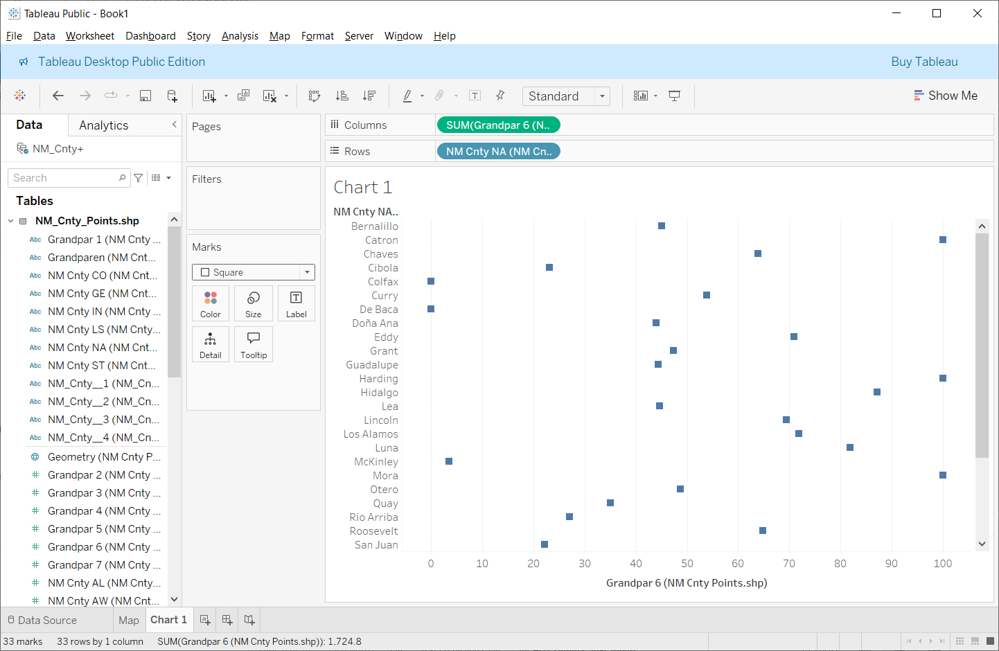
Notice along the x-axis, the grandparent data is presented numerically according to the alphabetical order of the county names along the y-axis. While this order may make sense, the numeric relationships in the grandparent data are not well visualized. A more meaningful depiction of the grandparent data would be to arrange that data numerically, irrespective of the order of county names along the y-axis. To reorder the grandparent data numerically, look along the top of the chart’s y-axis (below the chart title, Chart 1), click the down arrow, then Field, and source the data numerically (Figure 7.7). This action will re-arrange the order of the dots from low to high (or visa-versa). Figure 7.8 shows the re-arranged dots in numerical order.


Follow the same steps from the first chart to make a second chart, this time using the margin of error data. Try something different here and use a bar chart instead of a scatterplot to represent the margin of error data. Stylize and label the resulting chart appropriately (e.g., add a descriptive title, change legend titles, etc.). The two charts should not use the same colors. Consider assigning colors based on the color choices you assigned to the variables in the map. The charts do not represent the same data, so their appearance should be unique. Regardless, ensure consistency between the various elements of both charts and the map (edit the titles, colors, and legends).
10. Save Your Tableau Project
Before continuing, you should also save the book as “Lab 7”. For example, you could consider saving this part of the exercise as Lab_7_Dashboard.
11. Tableau: Dashboard
Now, we will place all three visuals together on a single dashboard. On the bottom of the screen, next to where you usually create a new sheet, select New Dashboard instead (Figure 7.9).

On the left table of contents, under the Size heading, select a screen size for your design. Select an option where you can see everything at once without scrolling. This may take some experimentation, and you can revisit this option later once you place all of the elements on the dashboard.
Below Size, look under Sheets. Separately drag each of your three sheets into the layout. Drag the “Map” first and then bring the other two sheets onto the layout. Note that as you drag an individual sheet around the dashboard environment, containers will appear, letting you know where these sheets will appear and their size. You can always resize each sheet. The legends will automatically be added (Figure 7.10).

This appearance isn’t terrible, but it’s hard to see all the data on the tables (the map is too large, and the charts are compressed). Maybe a better appearance would result if we flipped the columns and rows on the tables. Luckily, Tableau has an easy way to do this. Individually return to each of your chart’s sheet and click “Swap Columns and Rows” button at the top of the screen (Figure 7.11).
You can individually change any element, design, or data on the map or charts at any time in the appropriate sheet and those changes will be updated on the dashboard!

The dashboard is looking better (Figure 7.12) and most of the counties are now visible on the tables. However, the map legends are taking up a lot of space in the middle of the display. Click on it so the editing features appear and grab the blue rectangle with two white lines to drag it somewhere else. In Figure 7.13, the two map legends have been moved to a position below the map. Note that, when moving these elements, the other elements’ sizes automatically adjust.
You can drag each of the sheets by their sides to change their sizes, or you can click the arrow on the top right side of each for “More Options” and the “Edit Width” by typing a number.
The chart titles and label appearances (e.g., text sizes) can also be edited. You may feel that the type sizes for both axes should be made smaller. Specifying smaller text can help conserve a bit more on space allocation of the map and charts on the dashboard.
Y-Axis Label
In Figure 7.12, notice that the y-axis is labeled. However, that label is a bit cryptic (e.g., "Grandpar 7 (NMCnt..)"). You can edit the label to make it more understandable. To edit the label, make sure that you are in the chart's worksheet and not the dashboard. It is easier to perform the edits in the worksheet rather than the dashboard. To edit the label, right-click on the label text and choose the Edit Axis option. The Edit Axis window appears. Look over the contents of the window. Under the Axis Title heading, double-click the label text which will highlight. Change the label to something more sensible. The y-axis label will update.
X-Axis Label
The x-axis label is a bit more involved. Instead of referring to the x-axis label as a label, Tableau calls it a "Caption." Regardless of the terminology, the caption can be edited. By default, the x-axis caption is disabled. To enable the caption, move your cursor to the lower-left portion of the chart (below the y-axis text) and right-click. On the menu that appears, enable the Caption option. The caption appears. Inside the caption area, right click and choose the Edit Caption option. The Edit Caption window appears. Change the caption's wording to something more readable. Make sure to center align the caption. Style the text to have the same appearance as the y-axis. When you are finished, select Apply and Ok. The caption will appear below the chart and serve as the x-axis label.
Repeat the editing process on the other chart's y- and x-axes labels.


12. Tableau: Linked Map and Charts
Now that the map and charts have been created, we need to establish the “link” between the three sheets. To begin, look at the top of the screen, click on the “Dashboard” menu item along the top of the Tableau environment and select “Actions…” The Actions window appears (Figure 7.14). On this window, look under “Add Actions” and click the “Highlight” option. The Add Highlight Action window appears.

On the Highlight window, name the action “Hover.” Under “Run action on” change the type to “Hover” as this specifies the kind of action that Tableau will look for with your cursor. Under “Targeted Highlighting” click “Selected Fields” and select the field that contains the name of your counties (Figure 7.15).

Click OK on the Add Highlight Action and Action windows. Now, when you hover over a data point on one of the three sheets, it will be highlighted on the other two sheets (Figure 7.16).
Note that I have the data sorted where the counties with the least errors appear first. Instead, I would rather see the data with the greatest amount of uncertainty first. I need to reverse the charts back in the Sheets section. Remember, you can always edit your charts more to fit the scope of your dashboard story.

13. Tableau: Dashboard Design Considerations
Notice that not all the counties are visible in the scatterplots’ x-axis. You can individually change the dimension of each object in several ways. First, you can manually adjust the width and height of each object by moving your cursor to the edge of each object. Your cursor will change to a double-sided (left-to-right) arrow. Click and drag your cursor adjusting the dimension of the object. You can also right-click on an object which brings up a menu. On this menu, choose the Fit option. You can choose to Fit the width, height, etc. (Figure 7.17).
Consider changing the type size, type face, and type style on each object to make the type more readable, present a different appearance, or ensure consistency between all objects in the dashboard. You can change the type specs under the main menu Format and then the Font option. Figure 7.18 shows a better dimension for each element that improved readability of the different elements.


Find empty space in the dashboard and add metadata and a short textual description of the data and any patterns you see.
Figure 7.19 gives you a general idea of what your final dashboard should look like. Your design should be different! This is a published version of the dashboard. Note that while the dashboard in Figure 7.19 includes all of the requested elements. However, the overall design leaves much to be desired!

14. Save Your Tableau Project
Before continuing, you should also save your Tableau project as “Lab 7” or "Lab_7_Dashboard."
You should now have three separate Tableau sheets and one dashboard inside your project that correspond to the individual parts of this lab.
15. Sharing and Publishing Your Tableau Dashboard
Once you're happy with the design of your map and charts, you can ready publish the dashboard to Tableau Public which will allow anyone to view it. Make sure you have saved your work! Again, to save your maps to Tableau Public, you will need to sign into (or create) your Tableau Public account.
By now, you should have saved each of your sheets. It is the dashboard link that you will share with me and others in the class.
The Share link is available through the share button found in your published dashboard inside Tableau Public.
To share your dashboard, look along the top right list of icons for the share icon (Figure 7.20). Selecting the Share link button opens the Tableau Share window (Figure 7.21).
On the share link window, copy the URL address inside the Link textbox. Paste this link in your Word or .pdf submission.
The link is the only item that you need to include in your Word or .pdf submission.
If you make changes to your any parts of your charts or map, you will need to save each and then "re-publish" it at any time. Once re-published, the changes will automatically be applied to the online version. You will not need to re-share the dashboard URL.


Summary and Final Tasks
Summary and Final TasksYou've reached the end of Lesson 7! In this lab, we designed an interactive map-based story using the visual analytics platform Tableau. Though this lab focused heavily on concepts from Lessons 6 and 7, we also drew from concepts throughout this lesson including multivariate symbolization and mapping uncertainty. However, you also appreciated and relied upon ideas from earlier lessons such as designing layouts, symbolizing data, choosing colors, and thinking critically about map audience and purpose. You should consider publishing your Tableau cartographic creations on your website for you to share with others as demonstration of your skills in map design and data visualization. You're now ready and able to create, analyze, critique, and share high-quality interactive maps! In Lab 8, we will continue exploring web-based mapping with a new application.
Reminder - Complete all of the Lesson 7 tasks!
You have reached the end of Lesson 7! Double-check the to-do list on the Lesson 7 Overview page to make sure you have completed all of the activities listed there before you begin Lesson 8.