Lesson 6: Proportional Symbolization
Lesson 6: Proportional SymbolizationThe links below provide an outline of the material for this lesson. Be sure to carefully read through the entire lesson before returning to Canvas to submit your assignments.
Note: You can print the entire lesson by clicking on the "Print" link above.
Overview
OverviewWelcome to Lesson 6! In previous lessons, we discussed broad concepts related to map and map symbol design, including designing for a map’s audience, medium, and purpose. We learned about visual variables and how to designate order and category with map symbols. In the context of text on maps, we discussed these ideas in greater detail; we created symbols with labels and learned how to place them appropriately on maps. We then put everything together in a map layout.
So far, we have only designed maps that use more or less concrete data, such as road networks, lakes, or travel routes. You began to work with more abstract statistical data from the US Census Bureau in Lesson 5. In this lesson, we discuss another type of thematic map symbolization, the proportional symbol and the ways in which we can use maps to effectively visualize spatial statistical data. When deciding how to map, we’ll continue to consider the spatial dimensions and models of geographic phenomena, levels of data measurement, and appropriate methods of visual encoding.
Learning Outcomes
By the end of this lesson, you should be able to:
- identify the visual variables used to display both quantitative and qualitative data in a given map.
- identify the spatial dimension, model, and level of measurement of geographic phenomena.
- select appropriate visual variables for data encoding based on the characteristics of the phenomenon to be mapped.
- use knowledge of data measurement levels and visual variables to thoughtfully critique thematic maps.
Lesson Roadmap
| Action | Assignment | Directions |
|---|---|---|
| To Read | In addition to reading all of the required materials here on the course website, before you begin working through this lesson, please read the following required readings:
Additional (recommended) readings are clearly noted throughout the lesson and can be pursued as your time and interest allow. | The required reading material is available in the Lesson 6 module. |
| To Do |
|
|
Questions?
If you have questions, please feel free to post them to the Lesson 6 Discussion Forum. While you are there, feel free to post your own responses if you, too, are able to help a classmate.
Thematic Maps: Visualizing Data
Thematic Maps: Visualizing DataWe first introduced thematic maps in Lesson 1, and described them as maps intended to highlight features, data, or concepts (either quantitative or qualitative). In assignments 1 and 2, we used visual variables to show order and category of typical map features. In assignments 3 and 4, we introduced the use of projections and symbolized methods for terrain visualization.
The maps we’ve created so far have visualized fairly tangible information—we have indeed been creating abstract representations of the real world, with roads, rivers, lakes, county lines, etc., with hues and shapes different from what would be captured by a photograph. We have also visualized the concept of travel routes, be they on foot or by plane. But on balance, our designs have more or less matched a physical phenomenon or object. So, in this lesson, we turn to more abstract depictions of the world, designed using thematic, statistical data. View for example, the map in Figure 6.1.1.

Data Sources: Esri, US Census Bureau
This map uses color value—not to show category or hierarchy of map features—but to visually encode county- level quantitative unemployment data. Figure 6.1.1 also simplifies the map of the US (not showing even major highways or mountain ranges, but only state and county boundaries) to emphasize the map’s theme.
Due to thoughtful use of color and a simple layout design, this map successfully communicates geographic trends of unemployment across the United States. Was this the best design and symbolization choice to show this geographic distribution? Is there a better way?
View the map in Figure 6.1.2.

Data Source: Esri, The National Map
This map uses a similar color scheme and layout, but encodes its data (this time population rather than unemployment) primarily using proportionally-sized symbols. Color value is used for additional effect, a technique called dual encoding.
Both of these maps (6.1.1; 6.1.2) employ appropriate cartographic conventions (e.g., assigning lighter color values to lower data values and darker color values to higher data values). But there are other conventions that this cartographer could have used with each dataset that would have been equally appropriate (e.g., using a diverging color scheme for Figure 6.1.1 and a single hue fill for Figure 6.1.2). There are also other symbolization methods that they could have used that would have been—arguably—not meeting the map purpose. How do you decide?
Student Reflection
Do you think the data mapped in Figure 6.1.1 would be appropriate for making a proportional symbol map (e.g., Figure 6.1.2)? Why or why not?
Before beginning the how of making a map, we need to take a step back and consider the what—the geographic phenomena we want our map to be about.
Geographic phenomena are elements that exist over geographic space. When we say geographic, we typically mean anything tangible that is associated with Earth. On the other hand, spatial refers to connections that exist in space (broadly defined). So, while still spatial and can be mapped, the connections between the neurons in your brain or the arrangement of atoms in a ceramic material are generally not referred to as “geographic" phenomena. In this lesson, you will learn tools for conceptualizing, visualizing, and communicating the many geographic phenomena that do.
Recommended Reading
US Census Bureau. 2021. “Interactive Maps.” Accessed May 31.
Geographic Phenomena: Spatial Dimensions
Geographic Phenomena: Spatial DimensionsGeographic phenomena are often classified according to the spatial dimension best used to describe their nature. These include points, lines, polygons, and volumes (3D). As you likely remember, we used the spatial dimension of map elements (e.g., line vs. point) in a previous lab to decide how to symbolize and apply feature labels to our maps.
Points exist in a singular location. Points are usually specified using a coordinate pair (x, y or latitude and longitude), though they occasionally include a z-value (height). Points are most appropriate in situations where the specific geometry of a feature is unimportant, or if the scale of the map is too small to usefully or accurately render the geometry of a feature. Points are also useful in cases where you are trying to minimize the amount of visual information being presented in a map. Points are used to map point locations such as weather recording stations, control points, or stream gages.

Lines are one-dimensional spatial features defined by a sequence of at least two pairs (x, y) of coordinates. A third dimension, z (height), can also be assigned to lines, but this is uncommon. Lines are used to map geographic phenomena that are best conceived of as linear features, including features that have greater dimensionality in reality (e.g., streams are defined by surface area and volume). There are also linear features that do not visibly exist in the real world (e.g., property lines). Often, someone else has decided for you whether or not a given feature should be encoded as a line rather than a polygon, but if you’re trying to make this determination, you could think in terms of how many dimensions are needed to sufficiently present the geographic phenomenon. For example, Figure 6.2.2 is drawn at a scale such that the width of the Blue Ridge Parkway would be difficult to represent, and road width would be an immaterial variable anyway– the goal of this map isn’t furthered by that data (the map reader doesn't need to be able to accurately measure the road's width). We only need to know the path of the road (where it exists), so a line is the appropriate choice for representation here (the thickness of which is irrelevant).

Polygon features, also called area features, are represented by a sequence of (x, y) points that form a boundary that encloses a space. Areal phenomena can include natural features like lakes and islands, as well as human-defined locations like cities or census blocks.

2-½ and 3-D features are sometimes grouped together, but the distinction between them is important. 2-½D features define a continuous surface—they have an x, y, and a z at every location. A good example is elevation, which varies continuously across the landscape. Therefore, a topographic map is a common depiction of 2-½D phenomena.

True 3D maps have an x, y, and z, plus an additional data value, at every location and height. Imagine, as an example, a map of elevation like the one above; but at every point along the terrain surface, there are additional measurements being taken at various depths of that surface. Thus, rather than depicting a continuous 2D surface, true 3D maps depict a continuous volume.

As mentioned earlier, the scale of your map has significant influence on what spatial dimension will best represent the phenomenon you intend to map. Cities, for example, are often drawn as polygons on large-scale maps, but may appear as points on smaller-scale maps. Rivers are usually drawn as lines on small-scale maps but are better represented as areas on large-scale maps. We will discuss this more during discussions of cartographic generalization later in the course.
Recommended Reading
Peuquet, D J. 1984. “A Conceptual Framework and Comparison of Spatial Data Models.” Cartographica 21 (4): 66–113. doi:10.3138/D794-N214-221R-23R5.
Couclelis, Helen. 1992. “People Manipulate Objects (but Cultivate Fields): Beyond the Raster-Vector Debate in GIS.” GIScience Conference Pa. doi:10.1007/3-540-55966-3.
Geographic Phenomena: Models
Geographic Phenomena: ModelsWhen conceptualizing the geographic phenomena we want to map, it is important to consider the best way that these phenomena can be modeled. In general, we can categorize the best model for a given phenomenon as existing somewhere along two continuums: (1) from discrete to continuous, and (2) from smooth to abrupt.
You likely learned the difference between discrete (e.g., as shown by a histogram) and continuous (e.g., as shown by the bell curve) variables in an introductory statistics course. The distinction in cartography is similar.
Discrete phenomena have well-defined boundaries: they occur at specific locations, with space in between. Examples include trees, houses, cities, and roads.
Continuous phenomena, conversely, have ill-defined or irrelevant boundaries but exist everywhere. Examples include temperature, air quality, and elevation.
Phenomena can also—independent of their classification as discrete or continuous—be considered either smooth or abrupt.
Smooth phenomena are those that change gradually over geographic space. Examples include precipitation levels and barometric pressure: they vary by location but do not typically change abruptly at geographic bounds.
Abrupt phenomena do change suddenly at geographic boundaries, whether physical or cultural. Examples include state sales tax or municipal water cost.
Often, phenomena are not clearly smooth or abrupt, but fall somewhere in between. The amount of pesticide residue in soil, for example, might vary somewhat continuously over the area of a farm, but change rather abruptly at the boundary of the farm’s fields.

Figure 6.3.1 illustrates various surfaces used to represent geographic phenomena throughout the discrete to continuous and abrupt to smooth continuums. Keep this idea of a continuum in mind—geographic phenomena often cannot be classified into neat categories, and it is typically more fruitful to think of them as “more continuous” or “more discrete” than to try and fit them into a box.
Student Reflection
Identify the proper (approximate) location in Figure 6.3.1 or the following phenomena: Health insurance (% of people covered); water quality; political affiliation; surface porosity. Why did you place them where you did?

Figure 6.3.2: above shows different map representations that are suited to mapping the geographic phenomena located at these relative positions along the continuous-discrete and abrupt-smooth continua. We will discuss the appropriateness of various thematic mapping methods further later in this lesson.
Recommended Reading
MacEachren, Alan M. 1992. “Visualizing Uncertain Information.” Cartographic Perspectives 13 (13): 10–19. doi:10.1.1.62.285.
Practical Mapping: What about the Data?
Practical Mapping: What about the Data?Considering the characteristics of the geographic phenomena you wish to map will inevitably improve the quality of your maps. However, before you design your map, you must understand the distinction between the characteristics of the phenomena and those of your data.
Consider again the map from Figure 6.1.1.
Data Sources: Esri, US Census Bureau.
This map illustrates unemployment rates in the United States at the county level. Though it is a well-designed and attractive map, consider the characteristics of unemployment as a geographic phenomenon. The abrupt change in unemployment rates at county boundaries in this map obscures the underlying heterogeneity in unemployment within county bounds. The phenomenon of unemployment varies by person, while the mapped unemployment data varies by county. This doesn’t mean the map is wrong, but it is a reality important to be cognizant of, both while creating your own maps and while critiquing those designed by others. What do you want your map to present to the reader? Different map purposes will help dictate how to present that information.
Relatedly, when creating maps, you will often rely on data that has already been collected by others. Often, this data is collected (as in the example in Figure 6.1.1 above) by enumeration units, such as counties, census tracts, or states. Obviously, containerizing data can create the illusion of a discrete and abrupt phenomenon. Unemployment does vary by person, but it is unlikely that this fine-grained data will be available to you. If you have a coarser level (e.g., state level) data, you cannot create a map that shows variation by person, by county, etc., even if this would be a more accurate depiction of the phenomena's distribution across space. The only way to create a more detailed map is to collect more granular data. Your map design can always be altered to present a simplified depiction of your data—but not the other way around.
Recommended Reading
Slingsby, Aidan, Jason Dykes, and Jo Wood. 2011. “Exploring Uncertainty in Geodemographics with Interactive Graphics.” IEEE Transactions on Visualization and Computer Graphics. doi:10.1109/TVCG.2011.197.
Geographic Data: Levels of Measurement
Geographic Data: Levels of MeasurementData is typically classified as either qualitative (e.g., land use; political affiliation) or quantitative (e.g., per capita income; temperature)—you likely recall learning about this distinction in earlier courses. The classification of your data as qualitative or quantitative will have significant influence on which visual variables you select to map your data. Color hue, for example, is excellent for qualitative data, while color value suggests order or a sequence and thus is probably a better choice for designing quantitative maps.
Nominal is a common term used to describe qualitative, or categorical data. Land use and land cover maps are popular examples of nominal data. They might show, for example, residential blocks as distinct from parks and green space, but this does not suggest that one is lesser or greater than the other.

Quantitative data can be further classified as ordinal, interval, or ratio data.
Ordinal data has an order, but cannot be presumed to show differences in magnitude. Sports team rankings, for example, describe which teams are better, but not by how much.
Interval data describes orders of magnitude but has an arbitrary zero point. Credit scores, exam grades, and the hours on a clock are all examples of interval data: the intervals between points in all three of these ranges is equal, and none of them have an absolute zero point. Additionally, you can add or subtract interval values, but you can’t multiply them— 2 o’clock plus 3 hours = 5 o’clock, but you can’t multiply 2 o’clock by 3 hours. The classic example is temperature: 0º Fahrenheit and 0º degrees Celsius both serve as the zero point on their respective scales, but refer to different temperatures and therefore arbitrary.
Ratio data, conversely, has a non-arbitrary zero point. Examples of ratio data include counts of forest fire incidence, and yearly household income (e.g., $50,000 is twice as much as $25,000). Interval and ratio data are often grouped together and classified as numerical data.

Student Reflection
View the map in Figure 6.4.2 above—is the data shown qualitative, ordinal, interval, or ratio? How does this compare to the likely level of measurement of this data when it was first collected?
Student Reflection
Consider time—would you usually consider this to be nominal, ordinal, interval, or ratio data? Why?
Consider mean sea level—would you usually consider this to be nominal, ordinal, interval, or ratio data? Why?
Recommended Reading
Chang, Kang-tsung. 1978. “Measurement Scales in Cartography.” The American Cartographer 5 (1): 57–64. doi:10.1559/152304078784023006.
Choosing Symbols for Maps
Choosing Symbols for MapsUnderstanding your data’s spatial dimensions, geographic model, and levels of measurement will help you select which visual variables to use in your map. Recall the table of visual variables we first encountered in Lesson 1 (Figure 6.5.1). This is a good time to check your knowledge and consider which of the following seven visual variables are best for visualizing data category, and which are best for visualizing order.

Some visual variables are also better than others for encoding data with different levels of measurement. Bertin (1967) only considered size (other than position on the map) to be a truly quantitative variable, its visual representation able to be matched precisely to a numerical value (although this is arguably true for orientation and position as well). This makes it a good choice for mapping ratio-level data, as making mathematical calculations with such data can be useful. Visual variables that can typically encode only category, not order (e.g., color hue; shape) are best for qualitative data.
Note that the visual variables presented in Figure 6.5.1 are those originally proposed by Bertin, and though they are likely the most common in use, this is not a comprehensive list. The graphic also does not demonstrate the many ways in which these variables might be altered and/or combined to create new designs. At the end of this lesson, we will assess a variety of maps, many of which use multiple visual variables. We will also discuss multivariate mapping further in Lesson 7 (Multivariate and Uncertainty Visualization).
The figures above focus on geometric visual variables (e.g., color; pattern; size), though another common mapping technique is to use pictographic or iconic symbols (Figure 6.5.2).

Iconic symbols are those that provide a closer visual match to their referent, or the real-world element meant to be depicted by the map symbol (Maceachren et al. 2012). The map in Figure 6.5.3 below uses flower symbols that are drawn similarly to how they appear in reality to create an engaging and useful map. It is important to balance usability and realism when using iconic symbols on maps - ensure that they do not become overcrowded, or distract from the map's purpose.

Another important consideration that should be weighed when considering the use of iconic symbols is the cultural context of those symbols. Some iconic symbols may be meaningful only to a specific group of people. For example, in the United Kingdom, the symbol used for speed cameras is a 19th century-style bellows camera (Figure 6.5.4). Especially for young people who may have never seen this type of camera, its symbolic rendering may be completely meaningless. Iconic symbols, therefore, are very culturally contextualized and that context should be weighed before icon symbols are chosen to be used on a map. This article [11] further explores the idea of symbols and icons and their meaning in cartography.

Like other continuums we have discussed (e.g., discrete to continuous; abrupt to smooth), map symbols cannot always be classified as simply abstract or iconic, and instead, exist somewhere in the middle. National Geographic's Atlas of Happiness for example, uses smiling face graphics to encode data about happiness. Thus, it is less abstract than if this data had been encoded only with color value or size, but less iconic than if more realistic graphic images of people were used.
Visual variables are used in many mapping techniques: in addition to selecting which visual variables you use for your maps, you will also need to choose what type of thematic map you will create. While the four most popular thematic map types are choropleth, isarithmic, proportional symbol, and dot maps, other more sophisticated symbolization methods have been developed.
Student Reflection
This would be a good point to complete the required reading for this week, particularly pages 81-91 in Thematic Cartography and Geovisualization. The reading gives an excellent overview of visual variables and thematic mapping techniques.
The required reading gives more detailed descriptions, but below we give a general overview of the four most popular types of thematic maps.

Choropleth Maps are maps in which color or shading is applied to distinct enumeration units, usually statistical or administrative areas. Color hue, saturation, and value are the most frequently used visual variables in choropleth mapping, though pattern is sometimes used as well. As discussed in Lesson 5, choropleth mapping should almost never be used to encode exact counts (e.g., number of people living in each state), as the visual encoding of color by enumeration units makes this confusing (i.e., due to the varying sizes of the enumeration units). For example, consider that more people live in California than in any other state. You could create a state-by-state choropleth map showing counts of, say, universities or gas stations, and California would likely lead in both simply due to its geographic expanse. But a map showing this would not provide much useful information—California has more people and things because it is a bigger enumeration unit. The map would tell us nothing interesting about California's system of education, or its residents' consumption of gas However, if you were to map universities per capita, then we would be able to meaningfully compare rates between states, and a choropleth map would be an appropriate method.

Isarithmic Maps are like choropleth maps in that they typically use color value to encode data values, but unlike choropleth maps, they do not visualize the enumeration units from which they are built. Isarithmic maps are preferred for mapping phenomena that vary continuously over space (like temperatures), as they better represent the distributions of these phenomena than choropleth maps. The primary disadvantage of isarithmic maps is that they require quite a bit of data to design them accurately. They should also not be used to map data that change abruptly at administrative boundaries (e.g., percent sales tax). Choropleth mapping is a simpler and more appropriate method for mapping such data.

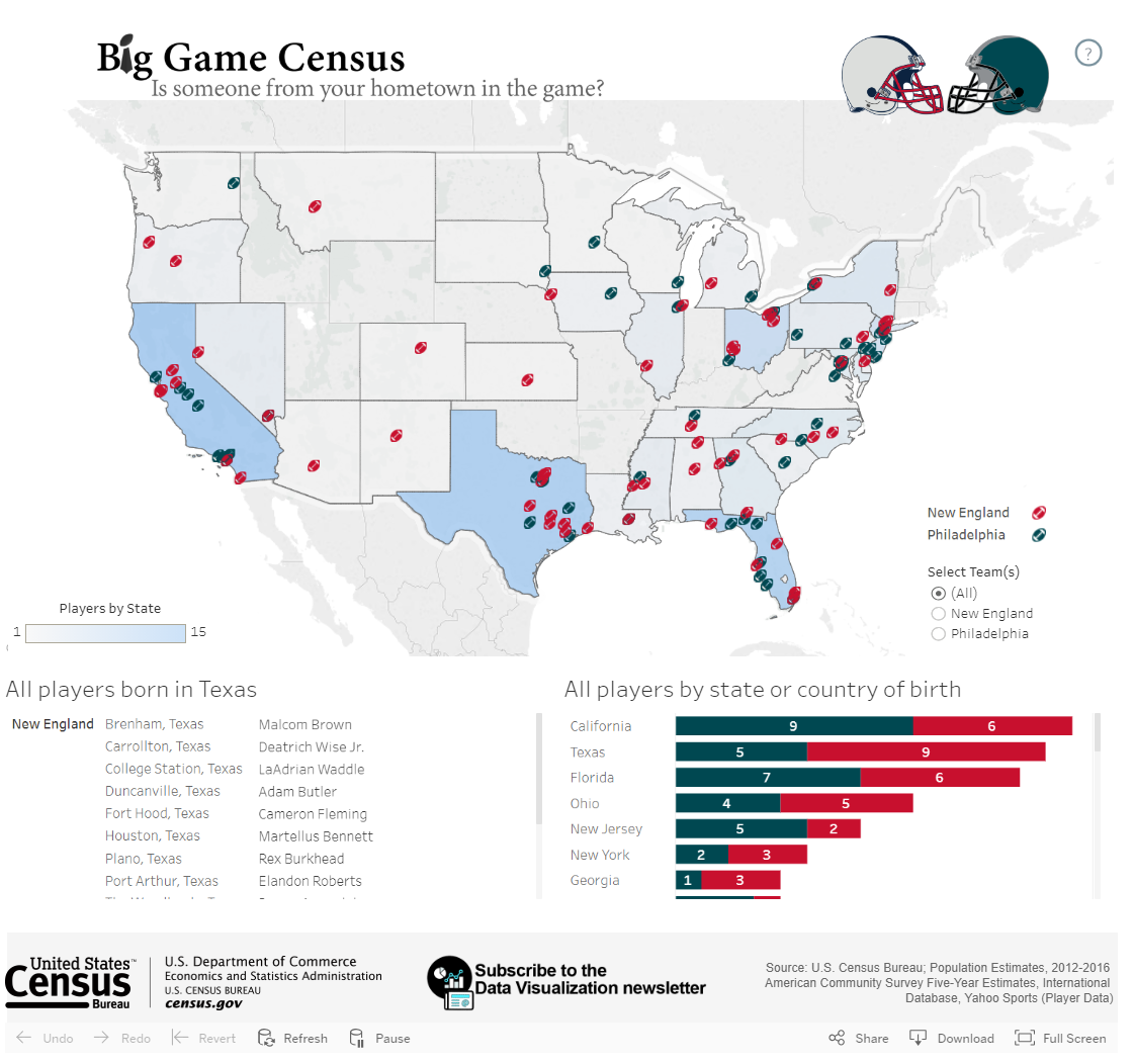
Proportional Symbol Maps are best suited for mapping abrupt, discrete data; they visualize data using the size of a symbol (most often a circle) placed inside an enumeration unit. Size is the visual variable used in proportional symbol mapping - as the symbols are scaled in proportion to the data values that the symbol represents. As the symbols are scaled only based on the data value—irrespective of the size of the enumeration unit—this permits the reader to not only view the variation between symbols, but also perform a visual comparison of the size of the symbol and the size of the enumeration unit over which it is placed. Note that the map in 6.5.6, unlike the previous two maps (6.5.4 and 6.5.5) displays count data (population) rather than a rate (percent in poverty; people per sq. mile). This is an appropriate choice for a proportional symbol map.
When mapping count data such as population counts, you should use a proportional symbol map, or you should standardize your data before using it to make a choropleth or isarithmic map. You explored standardizing data in Lesson 4. However, proportional symbols can also be used to map standardized data such as rates (e.g., cancer rate per 100,000) or densities (e.g., people per sq. mile).

Dot Maps are like proportional symbol maps in that they are most appropriate for visualizing discrete data. Rather than displaying a different-sized symbol per enumeration unit, however, dot maps are constructed by filling enumeration units with a count of symbols (usually dots) based on the count of the variable of interest within the unit. Thus, this technique is preferred over proportional symbols for mapping data which vary more continuously over geographic space. It also ensures that your symbols will not overlap one another, which is sometimes the case with proportional/graduated symbols.
It's important to think carefully when creating and reading dot maps. Often, dot maps made with a computer mapping application are made by scattering the appropriate number of dots randomly throughout each enumeration unit. To a novice viewer, they give the illusion of high precision— you might assume that if every dot represents one thing, that the dots are placed on the map exactly where those things exist! However, this is very rarely the case.
Ultimately, which symbolization method you choose for your mapping purpose depends not only on what phenomenon you are mapping, but also on the scale at which you map it and the intended information you wish to present to the map reader.
Recommended Reading
Chapter 5: Principles of Symbolization. Slocum, Terry A., Robert B. McMaster, Fritz C. Kessler, and Hugh H. Howard. 2009. Thematic Cartography and Geovisualization. Edited by Keith C. Clarke. 3rd ed. Upper Saddle River, NJ: Pearson Prentice Hall.
Note: This chapter includes the 10 pages of required reading for this week, but if you have access to the text, you may find the additional pages in the chapter useful as well.
Visual Encoding: Examples for reflection
Visual Encoding: Examples for reflectionStudent Reflection
Analyze the maps shown below. For each map, name the level of measurement of the data mapped. What visual variables are used to encode this data? Is the map effective—does the map tell you what you need to know?


Lesson 6 Lab
Lesson 6 LabProportional Symbolization
In Lab 6, we will explore two symbolization methods for data that are considered discrete and abrupt. Proportional and range-graded symbols are two approaches to represent discrete and abrupt data using symbols that are scaled according to the individual data values. Proportional symbolization scales each symbol size in direct relation to each data value. For example, if you had unique data related to all 88 Ohio counties, there would be 88 symbols of different sizes on your map. A commonly used symbol is the circle. With range-graded symbolization, the data are classed into finite classes. This approach mirrors what you experienced in Lab 5 with the data classification for data for choropleth mapping. This method is also known as graduated symbol (which is Esri-speak). Both range-graded and graduated are a bit ambiguous. A better term would simply be classed proportional circles, but that is probably too long.
In addition to the proportional and range-graded symbolization methods, we will also examine a symbolization method mapping qualitative data via the choropleth method. This method, known as chorochromatic symbolization, is useful when you wish to map qualitative data using the choropleth method.
As a cartographer, you will often have to choose between which approach is better for your data. Essentially, consider the use of proportional symbols when the recovery of the original data values is important. Proportional symbolization method is appropriate for a dataset whose range is not excessive. In such cases where the range is great, extremely large or small symbols could result. Range graded symbolization addresses datasets with large ranges by setting a fixed number of symbol sizes according to a classification method applied to the data. As with other options in the map-making process, the choice between using proportional symbols and range-graded symbols depends on the map's purpose and data characteristics.
In Lab 5, we used data from the American Community Survey, provided by the US Census - a commonly used source of geospatial data for statistical maps. In this lab, we use the same data source, but you also will have the opportunity to choose your own data for this assignment.
The first part of Lab 6 will focus on searching for and downloading data from the US Census Bureau’s data explorer website. This website offers access to all census data collected since 1990 – both at the decennial census and the one- and five-year estimates from the American Community Survey. The second part of the lab allows you to explore using proportional symbols to map your chosen census data. The third part of the lab allows you to explore using range-graded symbols to map your chosen census data. The second and third parts will take place in a new mapping application – Tableau.
This lab, which you will submit at the end of Lesson 6, will be reviewed/critiqued by one of your classmates in Lesson 7 (critique #4).
Lab Objectives
- Create three (3) maps of county-level data from a state of your choosing, sourced from the US Census Bureau. The state must have at least 30 counties.
- One map must use proportional symbolization.
- One map must use range-graded symbolization.
- One map must use chorochromatic symbolization (using a qualitative variable extracted from the census data).
- Learn how Tableau can be used to create interactive maps.
- Calculate class breaks for the range graded symbolization using either quantiles, equal intervals, natural breaks, or mean-standard deviation.
- Understand the impact of different symbolization approaches on the information illustrated on each map and be able to reflect upon and write about these decisions.
Overall Lab Requirements
For Lab 6, you will create three (3) maps, each of which should be created as its own sheet in Tableau. In total, you will have three separate Tableau sheets. You will also write a short reflection statement about the map creation process in Tableau.
- Prepare visually balanced layouts for each map with all required elements suitably sized and balanced negative space.
- Create an effective design for the visual hierarchy: overall title, subtitle(s), legend title(s), legend class labels, metadata (data source/year, your name, and date of completion). Use thoughtful and efficient wording when labeling map elements.
Map Requirements
Map One: Proportional Symbols
- Choose a census variable of interest to map from the provided American Community Survey (ACS) data. As a hint, choose a variable from the 5-year estimate to download.
- Use Tableau to complete all cartographic work.
- Using Tableau,
- choose an appropriate symbol (e.g., circles, squares, etc.) for this map
- attend to the design aesthetic of the basemap, county outline fill, symbol fill, and symbol outline colors
- create a descriptive map title, subtitle, and legend title
- add metadata to the map that reports on the data source and year, your name and date of map completion
- include a legend and legend title (note that Tableau is not very flexible in altering a legend for proportional symbols with a large number of mapped features)
Map Two: Range Graded Symbols
- Using the same census data that you did for map one, use range graded symbolization.
- Choose a classification method to determine the class breaks. The available methods include equal interval, quantile, natural breaks, and mean-standard deviation. The choice of the method is up to you but make sure the method is appropriate for the data distribution that you are mapping.
- Use Excel to assist in the following:
- create a dot plot as you did in Lab 5 to see the distribution of the data for this map
- include a screenshot of your dot plot with lines manually drawn to demonstrate the breaks you identified
- identify the data classification you selected and why you thought it appropriate.
- Using Tableau,
- choose an appropriate symbol (e.g., circles, squares, etc.) for this map
- apply the data classification limits to the data
- attend to the design aesthetic of the basemap, county outline fill, symbol fill, and symbol outline colors
- create a descriptive map title, subtitle, and legend title
- add metadata to the map that reports on the data source and year, your name and date of map completion
- include a legend and legend title (the legend for this map will be better designed since you are mapping classes rather than the number of mapped features)
Map Three: Chorochromatic Map
- Using the same census data that you did for map one, derive a single qualitative variable of interest related to the data chosen for maps one and two.
- Using Tableau,
- choose an appropriate qualitative color scheme for this map
- attend to the design aesthetic of the basemap, symbol fill, and symbol outline colors
- create a descriptive map title, subtitle, and legend title.
- add metadata to the map that reports on the data source and year, your name and date of map completion,
- include a legend and legend title (note that the legend for this map will be better designed since you are mapping qualitative data with a limited number of categories)
For additional assistance, explore the Lab 6 Visual Guide and utilize online tutorials and training materials such as those listed below:
- Tableau 10 Essential Training. Your access to LinkedIn Learning (aka Lynda.com) is provided through your Penn State login
- These two links are tutorials provided by Tableau
Reflection Statement
Include a short write-up (< 250 words) that includes the following commentary:
- State the variables you used to create the proportional/range-graded symbol map and the chorochromatic map
- For the range graded map, comment on the overall distribution of the data as shown on the dot plot (normal, positively skewed, negatively skewed)
- State the classification method you selected and why (relate this discussion back to the data distribution and what information you intend for the map to portray – remember the concepts from Lesson 5)
- Explain why you chose and how you derived the qualitative variable of interest for your chorochromatic map
- Comment on two (2) positive aspects of working with Tableau
- Comment on two (2) aspects of working with Tableau that were challenging
Lab Instructions
The data for this lab will be self-selected from the US Census Bureau’s data explorer website. Details on how to access this site, how to search for data, and format the data for download will be presented in the Lesson 6 Lab Visual Guide.
Grading Criteria
Registered students can view a rubric for this assignment in Canvas.
Submission Instructions
- You will have to upload one (1) PDF document using the file name format below.
- LastName_Lab6.pdf
- Include the following in your PDF:
- screen captures of all three maps that you created in Tableau (the screen captures can be taken from either the dashboard or the published version of the dashboard)
- a screen capture of your dot plot with manually drawn annotated breaks
- the <250-word reflection statement addressing the prompts listed above
- links to the published version of each map that you created in Tableau (do not include the URL links as an assignment comment as doing so renders these links invisible for the peer-review process)
- Note: The critique/peer review of the Lab 6 assignment will occur in Lesson 7 (critique #4).
Ready to Begin?
More instructions are available in the Lesson 6 Lab Visual Guide.
Lesson 6 Lab Visual Guide
Lesson 6 Lab Visual GuideLesson 6 Lab Visual Guide Index
- Introduction
- Downloading Census Data
- Some File Cleaning Operation Considerations
- Downloading TIGER Data
- The GIS Join Process
- Convert County Polygons to Points
- Tableau Operations
- Make a Connection in Tableau
- Preliminaries to Creating a Map
- Save Your Tableau Project
- Part I: Creating a Proportional Symbol Map
- Part II: Creating a Range Graded (Graduated) Symbol Map
- Part III: Chorochromatic Symbolization
- Sharing and Publishing Your Tableau Projects
1. Introduction
In this lab you will create three maps: a proportional symbol map, a range graded map (also called graduated symbol by Esri), and a qualitative choropleth (or chorochromatic) map. The first two maps in this lab will use the same dataset (a county-level census dataset of your own choosing which should include counts/totals) and the third map will use a qualitative dataset related to the first two quantitative datasets.
You will download data from the US Census Bureau, format it in Excel (or Google Sheets), and join the census data to a TIGER line file using GIS software. Once through these steps, you will make the aforementioned three maps in a new mapping software platform – Tableau. Tableau is data visualization software often used in the Business Analytics community. It is powerful in that it allows for easy data visualization in multiple forms, including charts and graphs in addition to maps. You can also create interactive dashboards which display multiple charts. However, it also has some drawbacks; the GIS features are less robust than traditional GIS software, which is why we are doing some data processing in Excel and GIS software. You will explore some of the more complex features of GIS software in Lab 7; Lab 6 is an introduction to the basics of Tableau.
2. Downloading Census Data
For this lab, you will be downloading your census data using the US Census Bureau Data Explorer Tool. While a sample dataset will be downloaded and then used to demonstrate the workflow and symbolization options in Tableau, you are free to choose your own dataset for this lab.. Remember that the data you choose for this lab must be at the county level and come from a single state that has at least 30 counties.
Visiting the Census Data Explorer website, an introduction screen appears (Figure 6.1).

Once you have identified and downloaded the census data of your choosing, you will then need to source the corresponding state TIGER line file that contains that state’s county polygons.
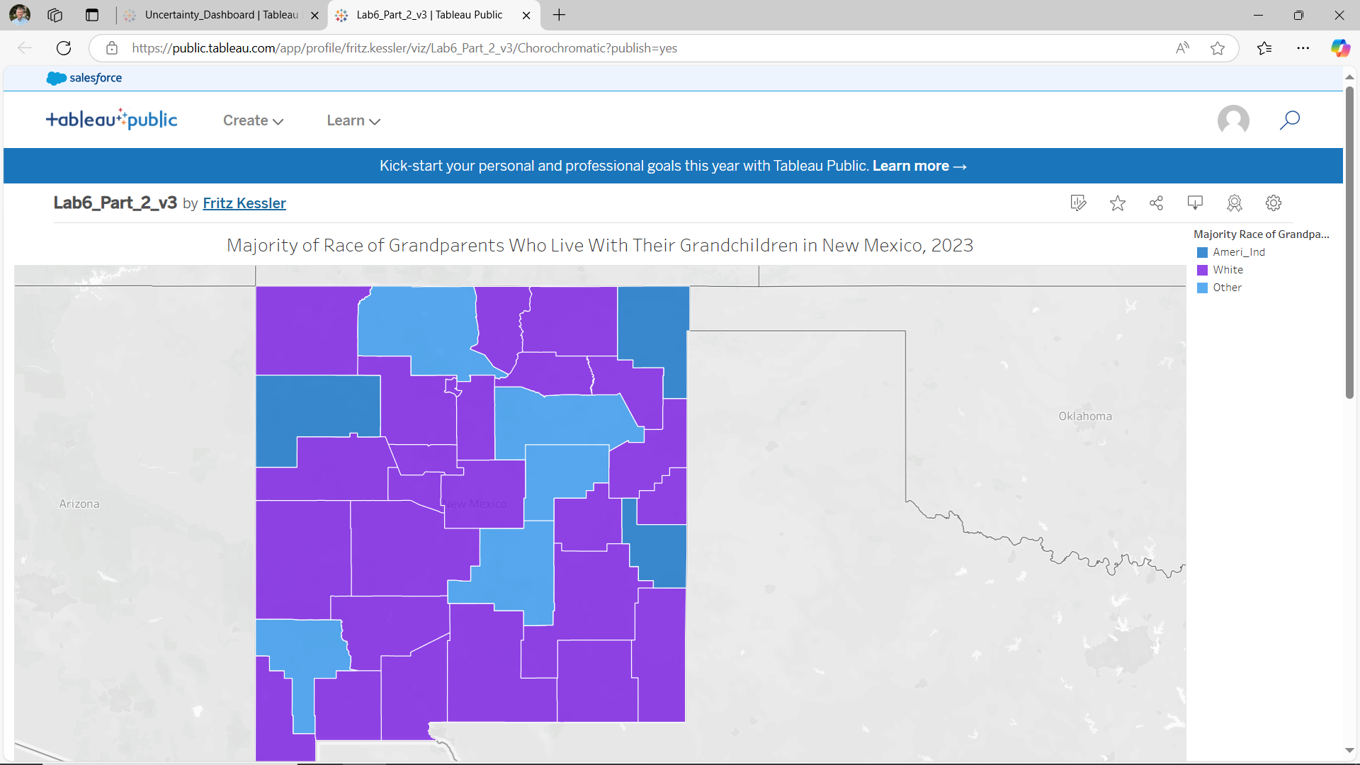
There are several ways to search for census data. I recommend using the Advanced Search option from the home page of the data explorer website. Using the Advanced Search option, you may find it easier to search for census data according to specific topics, geography, years, surveys, or table code IDs. For example, assume I am interested in choosing ACS 2023 five-year survey for all counties in New Mexico for the purpose of examining characteristics of grandparents who live with their grandchildren. Here is one way that I could use these criteria to search using the Advanced Search option:
- Geographies: County - New Mexico - All Counties in New Mexico
- Topics: Families and Living Arrangements - Families and Household Characteristics
- Years: 2023
After you have specified these three criteria, select the Search button to see the resulting tables. Using only these three criteria, more than 1,000 options are returned. You can scroll through the listing of Tables. To narrow down the number of tables that are returned, you can enter “grandparents” in the search box “Search for a filter or table.” Figure 6.2. shows the three filters that were specified from the above criteria and the “grandparents” text in the search box. Figure 6.2 also shows a few of the many tables that meet the listed criteria.

The next question is which individual census table is appropriate. The answer to this question can be found by individually examining the contents of each table to see what data is contained inside. For instance, I examined the table titled “Grandparents” (table S1002). Upon inspection, the included data contains the number of grandparents who have grandchildren living with them at the county level for New Mexico. Notice that this table has two options (1-year and 5-year estimates). Choose the 5-year estimates which will provide you with complete records for all counties.
Once the correct table has been identified, you will need to format the data and specify the file type before you download it.
- On the screen that appears showing the data contents,
- Transpose the rows and columns so that the geography becomes the individual rows, and the data become the individual columns.
- Include the Margin of Error data (you will use this data in a later lab).
- Choose to download the data as a Zip (zipped) option which will ensure that all the required geography IDs are included.
3. Some File Cleaning Operation Considerations
Once you have downloaded the tract data into your Lab 6 folder, extract the contents from the *.zip file. There will be three files. Open the Excel file with the “-Data.csv” filename and inspect the rows and columns. Perform three cleaning operations.
- By default, there are two header rows. One header row makes use of the census codes while the other header file uses descriptive text. Make sure that you only have one (1) header row. In my case, I deleted the first row since interpreting the codes would require additional effort to link the data content to the individual code.
- As you scan through your file, you will see that there are likely a lot of data columns. You should save data that relates to two basic ideas for this lab (data for the proportional symbol maps and data for the chorochromatic map). Data for the proportional symbol lab can be sourced using a single column of quantitative data. In my case, I selected the column that reports the total number of grandparents who live with their grandchildren. Data for the chorochromatic requires a bit more thought. All of the data in the spreadsheet is quantitative. Yet, the chorochromatic map requires qualitative data. In my case, I am choosing to map the race of the grandparents that is the majority for each county. To create this data, I will need to use the columns of data that list the total number of grandparents who live with their grandchildren according to each race. Most of these columns (variables) you will not use for this lesson and thus they can be deleted from your spreadsheet. Removing unnecessary data will make the join process less time intensive and faster to import into Tableau.
- You may need to do some additional data cleaning. For example, I know that I am going to make a spatial join based on county names as the relate item. The county names listed under the NAME column includes “[name] County, New Mexico.” I know that the county name entry in the TIGER file only lists the county name (without the “County, New Mexico” suffix). I want to remove everything after the comma (the state name), including the comma. I completed this task in Excel using the “find and replace” tool.
- Once you have selected and organized the data, save the file as a *.csv comma-delimited formatted file with a sensible name (so you can easily find it later when needed). I named the file Grandparents.csv.
4. Downloading TIGER Data
Visit US Census Bureau: TIGER/Line Shapefiles. Figure 6.3 shows the download window options. Select the appropriate year and data using the drop-down menus. In this case, choose 2023 and Counties (and equivalent) as the two options. Download the zipped folder into your Lab 6 folder.

5. The GIS Join Process
Before working with Tableau, we need to preprocess data in GIS software. Three essential steps will be taken in this part of the exercise.
- The TIGER line file that you downloaded contains counties for the entire United States. We only need counties for New Mexico. Thus, you will need to remove all non-New Mexico counties. Remove all non-New Mexico counties (we only want to focus on New Mexico counties). Open the attribute table and sort by STATEFP. I know that the New Mexico code is 35, but you may need to look it up for your state. Select all features that are not equal to this code (35). Delete the rows (states) that are not New Mexico.
- Once the non-New Mexico counties have been removed, join the Census data to the TIGER line file. To facilitate the join process, I added both files to a geodatabase. Carry out the join process. After the join process is completed, open the TIGER line file Attribute Table to make sure that the join was successful.
- If the join was successful, export this file as a new shapefile to preserve the join. I named this file NM_Counties.shp.
6. Convert County Polygons to Points
To make a proportional symbol map in Tableau, the joined file (NM_Counties.shp) needs to be point-based rather than polygon-based. Therefore, you will also need to export the centroids of each county to a new shapefile. In ArcGIS Pro, this process can be accomplished using the Feature to Point and Feature Class to Shapefile tools.
At this point, you should have the following necessary files to make your maps in Tableau.
- Grandparents.csv
- NM_Counties.shp
- NM_County_Centroids.shp
7. Tableau Operations
Open Tableau Desktop Public. Figure 6.4 shows the menu options that are found along the left-hand side of the Tableau file management environment. Start by adding a Spatial File to the Tableau file management environment. This Spatial File should contain the county centroids (point-based).

8. Make a Connection in Tableau
Once the county centroids spatial file has been added to the Tableau environment, you will see that file name appearing inside a blue rectangle in the top portion of the file management environment. To add the county polygon file, use the Add link. The Add link is to the right of the Connections heading (top left portion of the Tableau file management environment). If successful, you will see the two files listed under the Connections header. At the same time, you should also see the two files listed under the Files header which is below the Connections header (Figure 6.5).

Right now, the two files are separate with one file containing the centroid points and the other file containing the county outlines. In Tableau, you will need to make a connection between the two files. If you look at the main window of the Tableau file management environment, you will see a single rectangle containing the centroids file.
To make a connection between the centroid file and the polygon file, click on the county file name listed under the Files header. Drag the polygon file from the Files location to the main window area. As you drag the file onto the main window area a red connection line will appear. Place the polygon file to the right of the centroids file and unclick. The polygon file will snap into place as a new rectangle. Figure 6.6 shows how the file placement and connection line should appear.

Upon inspection, notice that there is a triangle with an exclamation point inside appearing between the two rectangles. Although the two files are connected, a type of "join" relationship needs to be expressed to connect the two files together on a common attribute. This relationship can be defined in the area below left. Make a relationship based on the county name fields that exist in both files. In my case, the NAME is the field in the attribute tables that set the relationship (Figure 6.7). Depending on the files that you use for your map, this "join" item name may be different.

9. Preliminaries to Creating a Map
Now that a connection has been expressed, open Sheet 1 (Figure 6.8). The Sheet 1 tab is located at the bottom left-hand corner.

Figure 6.9 shows the Tableau worksheet environment where you will create different maps for this lesson. To begin, I renamed this worksheet to Proportional Circles by double clicking on the Sheet 1 tab. Next, you can change the map title. Figure 6.9 shows an appropriate title for the map that I intend to make. You can edit the title at any point.

10. Save Your Tableau Project
Before continuing, you should also save your workbook. To save your workbook to Tableau Public, you will first need to sign into (or create) your Tableau Public account. Once signed in, look under File along the main menu listing and choose the “Save to Tableau Public As” option. A window will appear (Figure 6.10) asking you to give your project a name. Use a logical file name such as “Lab 6_Part_1” then click Save.
Once the project is saved, your map will appear as a published Tableau dashboard. Figure 6.11 shows the published dashboard environment. This environment is where you will set up and share your work with your instructor and others. More on the sharing process later.
There are various pathways to saving your Tableau workbook. See this page for a full discussion on options.


11. Part I: Creating a Proportional Symbol Map
Now let’s work on making a proportional symbol map! Scroll to the bottom of Tables listing and double click on “Latitude” and “Longitude” options (see Figure 6.12). The click order does not matter. After you add both, a grey world basemap will appear.

Next, look under the Tables for the New Mexico County shapefile header and search for the “Geometry” option from the polygon file. Drag this file from the Tables section to the Detail square on the Marks box (which is below the Pages and Filters headings). The map will zoom to your state (see Figure 6.13).

Drag another instance of “Longitude” to the top of the screen placing it to the right of the current Longitude, essentially duplicating your map. In Figure 6.14, make sure to note the order of the two instances of “Longitude” are side-by-side but only one “Latitude” is shown.

Look under the Marks heading. There are two instances of “Longitude” under Marks. They are both duplicates of one another (both show the county polygons - they have polygon geometry). We will change this so that one map shows the centroids or point geometry. The centroids file will be used to create proportional circle map while the polygon (county outlines) file will serve as the basemap. Click on the “Geometry” from the centroids file listed under Tables. Drag an instance of this “Geometry” to one of the two “Longitude” listings under Marks. Which “Longitude” file you move the “Geometry” to does not matter. Once the centroid “Geometry” has been added, click on the down arrow on one of the COLLECT(Geo...) entries and the remove the polygon “Geometry.” The polygon map should be removed leaving the centroid points behind. Figure 6.15 shows the county centroids appearing to the right of the county polygons. If your map order does not match what is shown in Figure 6.15, it is not a concern as the order does not matter,

A few other tasks for the Centroids Longitude:
- Change the color of the dots by clicking on “Color”. At the same time, consider changing the circle outline color.
- Drag the centroid County Names data (NAMES) to the “Detail” square.
- Drag the Census data field (in my case, S1002 CO1) to the “Size” square.
- In the Automatic dropdown menu (Figure 6.16), change from “Automatic” to “Circle.” You may want to adjust the circle size by clicking “Size.” Drag the slider bar so that the circles have a definitive size as suggested by their data differences.
The map shows circles that are drawn in proportion to their associated data values (Figure 6.17).


11.a. Combine the Maps
Click on the right-most bubble labeled “Longitude” at the top of the maps. From the pull-down options, select the “Dual Axis” option (Figure 6.18) and the two maps will combine into one. After the combination, you may see that the county map is overprinting or hiding the proportional circle map. If this happens, then simply drag the right-most “Longitude” bubble to the left of the other “Longitude” bubble.

A few more design items.
- Ensure the legend is visible and edit its title. To adjust the legend title text, use the pull-down menu on the legend to “Edit Title…”
- Use the “Size” and “Colors” options under the Marks header to adjust the size of the proportional symbols and the fill and outline colors, respectively as you see fit.
Figure 6.19 shows the results of the two maps combined into a single map using the “Dual Axis” option, adding an overall map title, and adjusting the legend title.

11.b. Tooltip Labels
In the design environment, you can hover over any of the circles and see the data (Figure 6.20) as reported in the attribute table. Note, however, that the "Tooltip" wording is ambiguous and confusing. For instance, what does "Name" and "S1002 C01" mean exactly? The wording shown in the Tooltip bubble can be edited. To do so, under the Marks panel, click on the Tooltip icon. The Edit Tooltip window appears. Inside this window, you can change the labels that appear inside the bubble when someone hovers over a map symbol. In my case, I changed "Name" and "S1002 C01" to "County Name" and # of Grandparents," respectively.

11.c. Setting the Data Formatting and Controlling Legend Items
As shown in Figure 6.21 (highlighted by the red rectangle), the listing of variables associated with the census data shows "Abc" which suggests that these variables are formatted as "string" or text. When you create a proportional circle map of these "string" values, you are forcing Tableau to recognize each individual value in your data, similar to a categorical color legend. In other words, this means that Tableau "sees" your data values as sequential, but not in a proportional sense of the word. For example, the last (highest) value could be 60,000,000,000 and it would still be the same size it presently is displayed for 13,180 (which is the largest value in my dataset), because it's being treated as a category, not a quantity. Thus, the circles are technically not being drawn as proportional to the data values but are being drawn sequentially. Hence, the reason for the large number of items in the legend. We will correct this.
Tableau recognizes discrete and continuous data. You can immediately tell which format a given variable is by looking at the "pill" color of a given variable shown in the Marks panel (see the blue rectangle in Figure 6.21). A blue or green pill coloring suggests a discrete or continuous variable, respectively. For proportional circles to be drawn correctly (in proportion to their data values), we need our data to be continuous. If you look in Figure 6.20, the S1002 Co1 pill color is blue suggesting that even though the data are numeric (at least we think they are), Tableau see these data as discrete. This should make sense as all of the census data shown in the far left-hand side of the figure are "Abc" or string format. To change the data formatting in Tableau, follow these two steps.
First, along the left-hand listing of variables, search for the variable you want to map with proportional circles. In Figure 6.20, that variable is S1002 CO1 which is shown to be "Abc" or string format. Right click on the "Abc" immediately to the left of the S1002 CO1 variable name. From the list of options that appear, choose the Number (decimal) option. If successful, the "Abc" should turn into the "#" icon.
Second, look under the Marks panel and right-click on the pill name that is now formatted at a decimal number. Choose Continuous option. The circle sizes should update on the map and be sized proportional to their data values. Also, the legend will now only report five sample symbols. Compare the number of legend items in Figures 6.20 and 6.21.

Congratulations! You have just made a proportional symbol map, where each circle is a separate size and reports the total number of grandparents who live with their grandchildren in New Mexico. Now we will make a range graded (graduated) symbol map, which classes the data.
11.d. Save Your Tableau Project
Save your workbook.
12. Part II: Creating a Range Graded (Graduated) Symbol Map
While it is possible to embed a script into your Tableau project to create a range graded symbol map, we are going to use a simpler method. I will demonstrate how to create range graded proportional symbol map using quartiles. Given what you have learned in previous lessons, other classification options such as equal intervals, standard deviation, or natural breaks are certainly possible and encouraged.
To start, you should create a copy of your first workbook. The copied version is the version you will work with and will become your range graded (graduated) symbol map.
With your copied version displayed, look at the top of the Tableau environment. Click Analysis, then Create Calculated Field option. Name the calculation something logical.
12.a. Calculate Quartiles
We’ll want to calculate quartiles (four classes). To determine the class breaks, we will use Excel. These class breaks will then serve as the class breaks in our Tableau project. Open your CSV file with the census demographic data (Grandparents) that you are using. Click on an empty cell and then type the following formula in the formula text box “=QUARTILE(D2:D34,1)”, replacing D2:D34 with the appropriate data range for your data. The “1” parameter gives you information for the first quartile. This value becomes the upper limit for the first class. Record this number, then repeat for quartiles 2 and 3. Each time, recording the value returned.
In my case, the following four class limits were calculated for the grandparents who are living with their grandchildren:
0 – 180
181 – 442.5
443 – 1,579.5
1,580 – 4,166
Using these values, the following expression shown in Figure 6.22 will divide the data into four quartiles or classes. In my case, I used the Census Bureau’s code for my variable of interest. Depending on your file and naming convention, you should replace [S1002 C01] with the name of your data. Once your expression is completed, press “OK.” You will see the calculation added to Tables.

The above discussion explains how to calculate quantiles. Quantiles is not required for this lab. You should also feel free to calculate other data classifications such as equal interval, natural breaks, and mean-standard deviation. To help you decide which data classification method is appropriate, refer back to Lab 5 regarding the instructions on how to create a dot plot. Use the dot plot to examine the data distribution of your census data. Use this dot plot as evidence for your decision as to the appropriate data classification method.
To apply the calculation, drag this calculation the Longitude “Size” square of the Longitude (centroids map). This action should replace the previous symbol field. A range graded map is produced (Figure 6.23). As with your proportional circle map, the circle sizes may be too large or small and you may wish to adjust the circle fill color and circle outline color. Again, since this is a range graded proportional circle map, there will only be four total circle sizes rather than an individual circle size for each of the data values.

12.b. Save Your Tableau Project
Before continuing, you should also save the book as “Lab 6”. For example, you could consider saving this part of the exercise as Lab_6_Part_2.
13. Part III: Chorochromatic Symbolization
As a final map for this lab, you will create a qualitative choropleth map that relates to the subject of the first two maps. Discussion was presented earlier on the use of race as a qualitative aspect to the grandparents living with their grandchildren dataset.
13.a. Data Formatting
To revisit the qualitative nature of the needed data for this portion of the lab, look at the data and consider what qualitative data you would like to map. Note that there might not be a single column with the appropriate data, and that you may have to create one yourself based on the data. For example, assume that I want to map which racial group has the highest percent of grandparents living with their grandchildren per county. Included in the original census data, columns are supplied that contain totals for different racial groups. Using these columns of data, I can then determine which racial group has the higher percentage of grandparents living with grandchildren per county. For ease of data, I will only be looking at individuals reporting one racial group and I will not use Hispanic/Latinx identity as a category.
After cleaning the data, I manually determined which racial group has the majority number of grandparents living with grandchildren. In Figure 6.24, a few counties have “Other” as the highest category, which leads to some questions.
- Are there issues with the data?
- Were some counties miscalculated?
- Were individual people’s identities not accurately represented in the options provided by the census?
These issues can sometimes be better understood through “margin of error”, which is another column that exists alongside this main census data. We will deal more with the margin of error data in Lab 7.

Save the *.csv file as something useful and open it in GIS software, just as you did before. Join the *.csv file to the TIGER county file that you created during the initial data cleaning stage. Unlike the previous effort, you only need to make a new polygon file and not a centroid file. Only a polygon file is needed since you will be making a choropleth map.
13.b. Tableau Operations
You can start a new Tableau session. To begin, add Spatial Data. You should repeat the above steps (from Parts I and II) to add the new data file to your Tableau session. Since you are only dealing with one data file (the TIGER polygon file), there are no connections to be made.
Double click on the Latitude and Longitude. Add the “Geometry” for the new shapefile. Drag the data (In my case, I called the new data “Majority”) to the “Colors” square in the Marks area. Make sure that “Automatic” is selected in the dropdown Marks menu. You should have the start of a qualitative choropleth map (Figure 6.25).

13.c. Color in Tableau
We will adjust the assigned colors and modify the legend. Right click anywhere on the legend and choose the “Edit Colors…” option. Or click on the “Color” square in the Marks area. Figure 6.26 shows the Edit Colors window. Using this window, you can choose different color palettes for your data (notice the “Lightning Color Safe” palette in the pull-down menu. Recall from a previous lesson that Colorbrewer offers good suggestions on distinguishable and color-blind friendly color palettes to use for qualitative data. Tableau also offers some interesting and useful color palettes from which to choose. Experiment a bit with the color palette choices. Selecting an existing Tableau color palette will apply that palette to the entire dataset. You can add your own custom color palette to the existing palettes. This process is discussed on the Tableau Create Custom Color Palettes page.

You can also download free software like Color Oracle or Vizcheck to test for colorblind-friendly colors. Figure 6.27 shows how the color palette shown in Figure 6.26 would appear by someone with deuteranopia. Deuteranopia is a form of red-green color confusion. Note that in Figure 6.26 the pink and green hues are washed out into shades of grey, the yellow and orange hues appear as desaturated yellows, and the blues take on a purplish hue. In short, when selecting color palettes for maps, one should be aware of how those colors will be seen by those with color vision limitations.
About 8% of people with XY chromosomes have some limited color vision deficiency, while very few people with XX chromosomes are. To have some level of color vision impairment, all of the X chromosomes must have the colorblind trait. If you have two X chromosomes, colorblindness is less likely, because they would both have to have that trait, which is very unlikely.

13.d. Tableau Legends
Next, edit the legend itself. You may wish to order the arrangement of items. To do this, right click on the legend and click “Sort” and select “Manual” in the dropdown. For qualitative legends, the order of legend items could be grouped according to similarities of one or more traits. In this case, it often makes sense to put an “Other” category at the bottom following the other categories.

Rename the legend and map title as you did in the other maps.
Figure 6.29 shows the final design of the chorochromatic map. Do not simply copy this design as this design could be greatly improved upon!
13.e. Save Your Tableau Project
Before continuing, you should also save the book as “Lab 6”. For example, you could consider saving this part of the exercise as Lab_6_Part_3.
You should now have three separate Tableau workbooks that correspond to the individual parts of this lab.
14. Sharing and Publishing Your Tableau Projects
Once you're happy with your map design, you're ready to individually publish your maps to Tableau Public. Make sure you've saved your work first! Again, to save your maps to Tableau Public, you will need to sign into (or create) your Tableau Public account.
When you save your map, Tableau publishes the map (Figure 6.30) in an interactive environment.
Adding metadata to the map can be accomplished by scrolling down to the Details option (Figure 6.31). Click on the small pencil icon next to the Details header. The Details section opens. Under the Viz description textbox, enter the following information:
- data source (provide URL if possible)
- data year
- cartographer’s name
- date when the map was created

Once you have saved each of your workbooks and added appropriate metadata, you should copy each link which will allow me and others to view your maps. This link is available through the share Tableau workbook button. Look along the top right list of icons for the share icon (Figure 6.32). Selecting the share link opens the Tableau Share window (Figure 6.33). On the share link window, copy the URL address inside the Link textbox. You will need to copy the link from each map separately and include all three links in your submission.
If you make changes to your workbook, you will need to save each and then "re-publish" it at any time to update the online version.

Summary and Final Tasks
Summary and Final TasksYou've reached the end of Lesson 6!
In this lesson, we learned a lot about thematic maps - what they are, why we design them, and how to choose the best thematic mapping technique based on characteristics of your data and of the geographic phenomena you wish to map. We discussed challenges you might encounter when making thematic maps, such as when the level of measurement of the data available to you doesn't match the level of measurement of the phenomena.
In Lab 6, we created proportional and range-graded (graduated) symbol maps - exploring the differences between map types and their appropriateness. Though our focus this lesson was on using these two symbolization methods, you'll notice that concepts we learned earlier - such as visual variables, map labels, and layout design - have remained of high importance. The tasks in this course are intended to build upon each other. I look forward to watching you thoughtfully integrate concepts from throughout the course into your maps each week. In addition, in this lab, you explored a new mapping application, Tableau. It is important to explore other mapping applications outside of ArcGIS Pro as each application offers something unique. Using Tableau, you witnessed the ability to quickly create and implement a common design across different maps. Exploring Tableau functionality continues into Lab 7 where you will work on multivariate symbolization and experience the powerful linking and brushing interactivity that this application brings to the map making process.
Reminder - Complete all of the Lesson 6 tasks!
You have reached the end of Lesson 6! Double-check the to-do list on the Lesson 6 Overview page to make sure you have completed all of the activities listed there before you begin Lesson 7.