Lesson 1: Basemaps and Big Picture Design
Lesson 1: Basemaps and Big Picture DesignThe links below provide an outline of the material for this lesson. Be sure to carefully read through the entire lesson before returning to Canvas to submit your assignments.
Note: You can print the entire lesson by clicking on the "Print" link above.
Overview
OverviewWelcome to Geog 486! In this lesson, we will talk about the basics of map design, including how to customize your map to fit a specific audience, medium, and purpose. We will also introduce some topics that we will cover more in-depth later in the course, including visual variables, scale, and online map distribution. For this week’s lab activity, we will be making general-purpose basemaps in ArcGIS Pro. For those of you that haven’t used ArcGIS Pro before, this will be a good introduction to the software, and for all it will provide an opportunity to start thinking more deeply about the principles of cartographic design.
Throughout the lesson content, you will notice Student Reflection prompts. These prompts are opportunities for you to pause and reflect on what you have learned and how it relates to previous course content or your own personal or professional experience. Though not required, you are welcome to post responses to these prompts in the lesson discussion forum. You should post something to the lesson discussion each week, but you may choose to post a question/answer or comment about the lab instead.
Now, let's begin Lesson 1.
Learning Outcomes
By the end of this lesson, you should be able to:
- recognize suitable pre-designed basemaps for mapping tasks;
- utilize publicly-available data to create and customize general-purpose maps;
- design GIS overlay data to adequately display over pre-existing basemap content;
- incorporate knowledge of a map’s intended audience, medium, and purpose into design decisions;
- create an online portfolio for compiling and sharing map designs.
Lesson Roadmap
| Action | Assignment | Directions |
|---|---|---|
| To Read | In addition to reading all of the required materials here on the course website, before you begin working through this lesson, please read the following required readings in the Canvas lesson module:
Additional (recommended) readings are clearly noted throughout the lesson and can be pursued as your time and interest allows. | The required reading material is available in the Lesson 1 module. |
| To Do |
|
|
Questions?
If you have questions, please feel free to post them to the Lesson 1 Discussion forum. While you are there, feel free to post your own responses if you, too, are able to help a classmate.
Design Matters
Design MattersWhen making a map, it is impossible to map everything. In fact, to be a useful model of our world and of any phenomena in it, maps must always obscure, simplify, and/or embellish reality. These actions—which make maps useful—also make their construction subjective. Cartographic design, even when informed by well-established conventions, is an art as much as a science. Every design choice a cartographer makes ultimately influences the map readers’ comprehension, appreciation—and even trust—of the map that he or she creates.
Though maps may include or be supplemented by text or other media (even by sound, smell, or touch), map creation at its core is about visual design. As such, cartographers often talk of graphicacy and its importance in facilitating visual communication with maps (e.g., Field 2018, pg. 194). Graphicacy was first defined by Balchin and Coleman (1966) as “the intellectual skill necessary for the communication of relationships which cannot be successfully communicated by words or mathematical notation alone.” Graphicacy—like literacy—has its own grammar and syntax, and learning the rules of graphic language is essential for designing effective maps (Field 2018, pg. 194).
Student Reflection
Which map of the two below best communicates the trend of the data? Why?

In the map on the left (Figure 1.1.1), the rainbow color scheme makes it easy to view the states as grouped into categories by hue, but the lack of an obvious order between the selected colors makes the overall trend unclear. A sequential color scheme (right), however, makes it easy to view the trend of the data, as low-to-high values as are encoded intuitively from light to dark.
The design decisions that go into making a map often go far beyond choosing a color scheme for a simple state-by-state choropleth map. The map below is a Russian Civil War map – flames and smoke are used as symbols of the Bolshevik uprising. This map not only communicates information; it conveys emotion.

As demonstrated by the examples above, the way in which you design a map can deeply influence how your readers interpret it. A well-designed map can intrigue and even surprise its readers, leaving a meaningful and memorable impression. Shown below is a map of projected future storm surge in New York City, designed by Penn State alum and cartographer Carolyn Fish. The map doesn't ask the reader to imagine what NYC might look like under future climate scenarios - it shows them.

Following cartographic conventions—such as applying sequential color schemes for sequential data—typically results in more effective maps. However, some maps diverge from these guidelines. Learning cartographic best practices will help you to both apply them—and thoughtfully disobey them—when prudent.
Student Reflection
View the maps in Figures 1.1.4 through 1.1.7 below: Do you think they are effective? Is there anything you think should have been done differently?


Recommended Reading
Chapter 1: Slocum, Terry A., Robert B. McMaster, Fritz C. Kessler, and Hugh H. Howard. 2009. Thematic Cartography and Geovisualization. Edited by Keith C. Clarke. 3rd ed. Upper Saddle River, NJ: Pearson Prentice Hall.
Maps that Kill (pgs. 300-301): Field, Kenneth. 2018. Cartography. Esri Press.
Types of Maps
Types of MapsMaps are generally classified into one of three categories: (1) general purpose, (2) thematic, and (3) cartometric maps.
General Purpose Maps
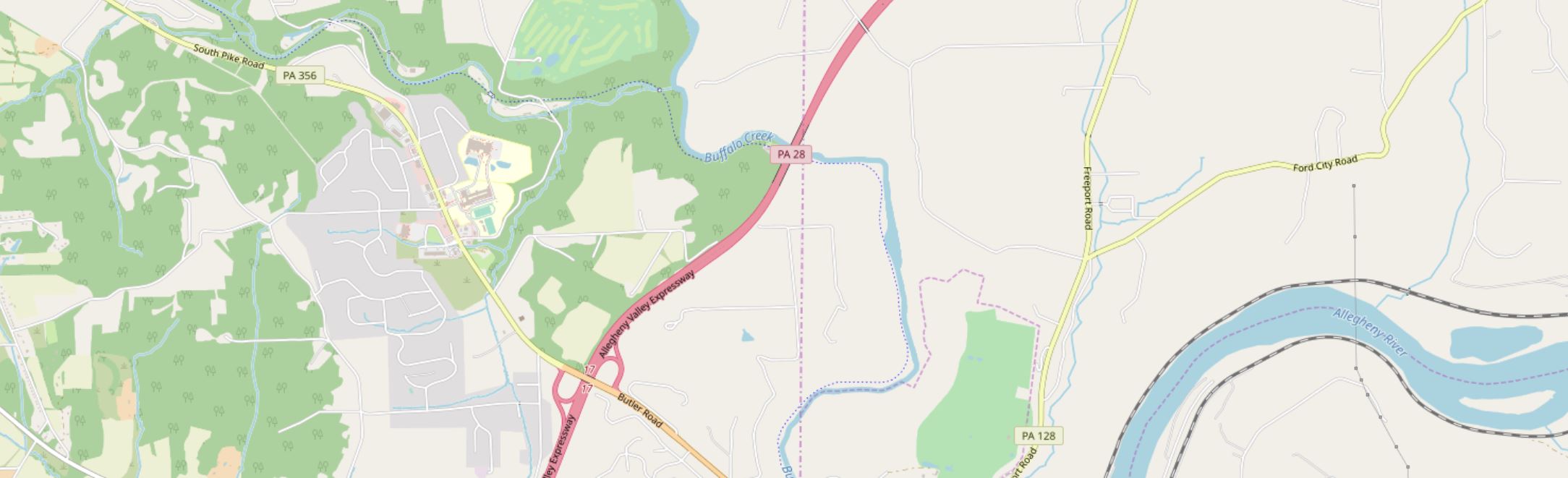
General Purpose Maps are often also called basemaps or reference maps. They display natural and man-made features of general interest, and are intended for widespread public use (Dent, Torguson, and Hodler 2009).

The data is available under the Open Database License (CC BY-SA).
Thematic Maps
Thematic Maps are sometimes also called special purpose, single topic, or statistical maps. They highlight features, data, or concepts, and these data may be qualitative, quantitative, or both. Thematic maps can be further divided into two main categories: qualitative and quantitative. Qualitative thematic maps show the spatial extent of categorical, or nominal, data (e.g., soil type, land cover, political districts). Quantitative thematic maps, conversely, demonstrate the spatial patterns of numerical data (e.g., income, age, population).

Cartometric Maps
Cartometric Maps are a more specialized type of map and are designed for making accurate measurements. Cartometrics, or cartometric analysis, refers to mathematical operations such as counting, measuring, and estimating—thus, cartometric maps are maps which are optimized for these purposes (Muehrcke, Muehrcke, and Kimerling 2001). Examples include aeronautical and nautical navigational charts—used for routing over land or sea—and USGS topographic maps, which are often used for tasks requiring accurate distance calculations, such as surveying, hiking, and resource management.

In theory, these map categories are distinct, and it can be helpful to understand them as such. However, few maps fit cleanly into one of these categories—most maps in the real world are really hybrid general purpose/thematic maps.

Advancements in technology and in the availability of data have resulted in the proliferation of many diverse types of maps. Some, as shown in Figure 1.2.5, are embedded into exploratory tools intended to inform researchers and policy-makers.

Reproduced with permission from Dr. Anthony Robinson, Penn State University.
Other maps are intended for a wider audience but share the goal of uncovering and visualizing interesting relationships in spatial data (Figure 1.2.6).

Maps also are not limited to depicting outdoor landscapes. Some maps, such as the one in Figure 1.2.7, are designed to help people navigate complicated indoor spaces, such as malls, airports, hotels, and hospitals.

For a map to be useful, it is not always necessary that they realistically portray the geography they represent. This map of the public transit system in Boston, MA (Figure 1.2.8) drastically simplifies the geography of the area to create a map that is more useful for travelers than it would be if it were entirely spatially accurate.

Maps that show general spatial relationships but not geography are often called diagrammatic maps, or spatializations. Spatializations are often significantly more abstract than public transit maps; the term refers to any visualization in which abstract information is converted into a visual-spatial framework (Slocum et al 2009).

Though there are many different types of maps, they share the goal of demonstrating complex spatial information in a clear and useful way. Rather than attempt to place maps into discrete categories, it is generally more productive to see them as individual entities designed to suit a particular audience, medium, and purpose. We will discuss this more in the next section.
Recommended Reading
Chapter 1: Introduction to Thematic Mapping. Dent, Borden D., Jeffrey S. Torguson, and Thomas W. Hodler. 2009. Cartography: Thematic Map Design. 6th ed. New York: McGraw-Hill.
Wood, D., and Fels, J. (1992) The Power of Maps. New York: Guilford.
Communicating with Maps
Communicating with MapsThough you won’t need to understand the biology of the human brain and visual system, making great maps requires understanding how people perceive visual information. When discussing how people interpret maps, we can frame this discussion in terms of perception, cognition, and behavior.
Perception in map design refers to the reader’s immediate response to map symbology (e.g., instant recognition that symbols are different hues) (Slocum et al. 2009).
Cognition occurs when map readers incorporate that perception into conscious thought, and thus combine it with their own knowledge (Slocum et al. 2009). For example, readers might be able to interpret a weather radar map without its legend due to their previous experience with a similar map, or might incorporate knowledge of a map’s topic into their interpretation of a visual data distribution (e.g., the higher concentration of people aged 65+ shown in some Florida cities makes sense given what I know about retirement communities).
Behavior refers to actions that go beyond just thinking about maps. Considering how design may influence behavior is essential in anticipating the real-world effects your maps may have. The way a map is designed can influence its readers’ actions and decision-making, and these decisions may range from small (e.g., for how many seconds will the reader look at this map?) to great (e.g., will this flood-risk map convince the reader to purchase insurance?).

Another useful way to think about map communication is with the cartography-cubed model (MacEachren 1994). The model MacEachren (1994) proposed focuses on how different maps and visualizations are used. Within this framework, any map can be located within the cube by determining its location along three dimensions: (1) from public to private (with regards to the map audience), (2) from presenting knowns to revealing unknowns (e.g., is the map for displaying known information or for exploration?), and (3) from low to high interaction (e.g., a static map vs. an exploratory interactive mapping tool).

These dimensions are often correlated, hence the shown corner-to-corner continuum from visualization to communication. A printed map in a magazine article, for example, we could classify as a tool for communication, while an exploratory mapping tool designed for epidemiologists would be better described as (geo)visualization.
Student Reflection
Return to the previous section (Types of Maps). Where would you place each of the maps shown within the cartography cube?
Before you Map: Audience, Medium, and Purpose
Before you Map: Audience, Medium, and PurposeBefore you Map: Audience, Medium, and Purpose
There is no inherently good map—only a map that is well-designed and properly suited to its audience, medium, and purpose. Before creating a map, you should ask yourself (and if possible, your clients) several questions (Brewer 2015).
Audience—who is going to use this map?
- Will your map readers be novices or experts? Do they have advanced knowledge related to the data you intend to map? You would create, for example, a different map of crime hotspots for criminologists than for the public.
- Are your intended map readers knowledgeable about the area to be mapped? Those unfamiliar with a location might need more detail to understand its geographic context.
- How much time will a typical reader spend with your map? Some audiences will be happy to explore and analyze your map, while others may hope to understand the message of your map at a glance.
- Is your map accessible? Consider how colorblindness or other visual impairments might affect your readers’ interpretation of your map.

Medium—how will this map be displayed?
- Maps are viewed in a vast number of formats—in desktop browsers, on mobile phone screens, in brightly-lit rooms on large-screen projectors, as well as printed in magazines, brochures, newspapers, posters, etc.
- In addition to the broad media category (e.g., mobile phone browser vs. poster), predict the specifics of your map's final viewing format as much as possible—details such as the map’s size on a webpage or a reader’s viewing distance from a poster can make a big difference in both a map's utility and aesthetics.
- If your map will be viewed in multiple media formats, you will likely have to create multiple versions of your map, each optimized for its respective display medium.

Purpose—what is the intended function of your map?
- Maps are used for many purposes (e.g., for navigation, for understanding spatial trends in data, for site selection, for communicating the results of a research project, etc.) Different purposes necessitate different maps.
- When making design decisions, consider how they will influence the success of your users in completing their expected map-use tasks. Maps for driving navigation, for example, are generally more useful when detailed terrain data is excluded, creating a simpler interface. In a hiking map, however, such information is essential.
- Considering in what scenarios a map will be used is also important—users of maps for emergency response, for example, will likely be stressed and working under inflexible time constraints.

In this course and beyond, you will make many different kinds of maps. Some will be advertisements, some will be scientific documents - some may be just for fun. No matter the mapping project or process you use, pausing to reflect upon the who, what, and why of your map will always lead to better results.

Student Reflection
Consider a mobile or desktop mapping application that you use frequently, such as Google Maps. What changes might you make to this mapping tool if a client asked you to alter it for a different, singular purpose—for example, as a wayfinding tool for young children, or for assisting police during emergency response?
Recommended Reading
Chapter 1: Planning Maps. Brewer, Cynthia. 2015. Designing Better Maps: A Guide for GIS Users. 2nd ed. Esri Press. (note: pages. 1-3 are required reading for this lesson, but you may find the rest of the chapter helpful as well.)
Basemaps: Leveraging Location
Basemaps: Leveraging LocationBasemaps are essential – they provide the context for your map data. Selecting a basemap should never be just an afterthought, and though the final choice is always subjective, you can make a better decision by considering your map purpose, audience, and the nature of your overlay data.
Street Maps
Often the default basemap used in business web-mapping applications. Helpful when highly-detailed locational context is necessary (particularly for navigation). Though pre-designed street basemaps may not have the ideal aesthetic for overlaying complex data, they are particularly useful at large scales (at which they appear less visually cluttered) or when overlaying relatively simple social data (e.g., for a map showing all locations of a restaurant chain).
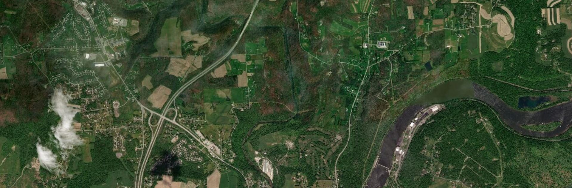
Satellite Imagery
Often useful for environmental or engineering applications. May be useful in rural areas that cannot be well-understood using street maps (as few streets exist). The colors and detail make overlay data much more challenging to design than over subtle basemaps – satellite basemaps work best when GIS data is structured and simple and understanding the physical structure of the landscape is essential to the mapping function (e.g., for a map of local water pipelines).
Greyscale Basemaps
Usually reserved for thematic mapping, greyscale basemaps are helpful when the intended audience already knows the location context, or when significant detail is not important to fulfill the map’s purpose. The simple backdrop adds visual emphasis to your overlay data – especially important for maps produced for entertainment or maps whose primary focus is statistical data (e.g., statistical mortality maps). Choose a light or dark background based on the content and mood of your map, and design overlay data accordingly.

Terrain Basemaps
Terrain basemaps are particularly useful when the terrain of the landscape has an important relationship with the data being mapped (e.g., mapping wildfires; hiking maps). Shaded relief also adds visual interest and, when done well, creates a beautiful map. Just be sure to not let the basemap content overwhelm your own data.

A comparison of several example basemaps at the same location in Chicago are shown below in Figure 1.5.5. As shown, different basemaps can have vastly different overall looks, as well as differing levels of detail (LOD).

When making a map, your basemap sets the tone - everything else builds from this important beginning.
Student Reflection
There are many more options for basemaps than the defaults available in ArcGIS Pro, though they are a great place to start. Have you used any mapping applications that you felt had an exceptionally-designed basemap?
Check out some more creative, exciting basemaps in the Mapbox Gallery!
There are many creative possibilities - visit Mapbox's selection of Designer Maps.
Recommended Reading
Chapter 2: Basemap Basics. Brewer, Cynthia A. 2015. Designing Better Maps: A Guide for GIS Users. Second Edition. Redlands: Esri Press.
ArcGIS Content Team. 2014. “Choosing the Best ArcGIS Online Basemap for Your Maps and Apps.” ArcGIS Blog.
Base Data: Building a Map
Base Data: Building a MapThough many pre-designed options exist, and can be selected as described above, the best reference map for a specific task is often the one you make yourself. When downloading base data for a map, you should consider the following data layers, of which you might need a few or many. This is not an exhaustive list of available base data content, but will help you start thinking about the kinds of data you may need.
Terrain data
A good basemap will often include data that shows the shape of the physical landscape. All terrain layers are typically derived from a digital elevation model (DEM), which is a grid-based (raster) data layer that contains elevation layers.
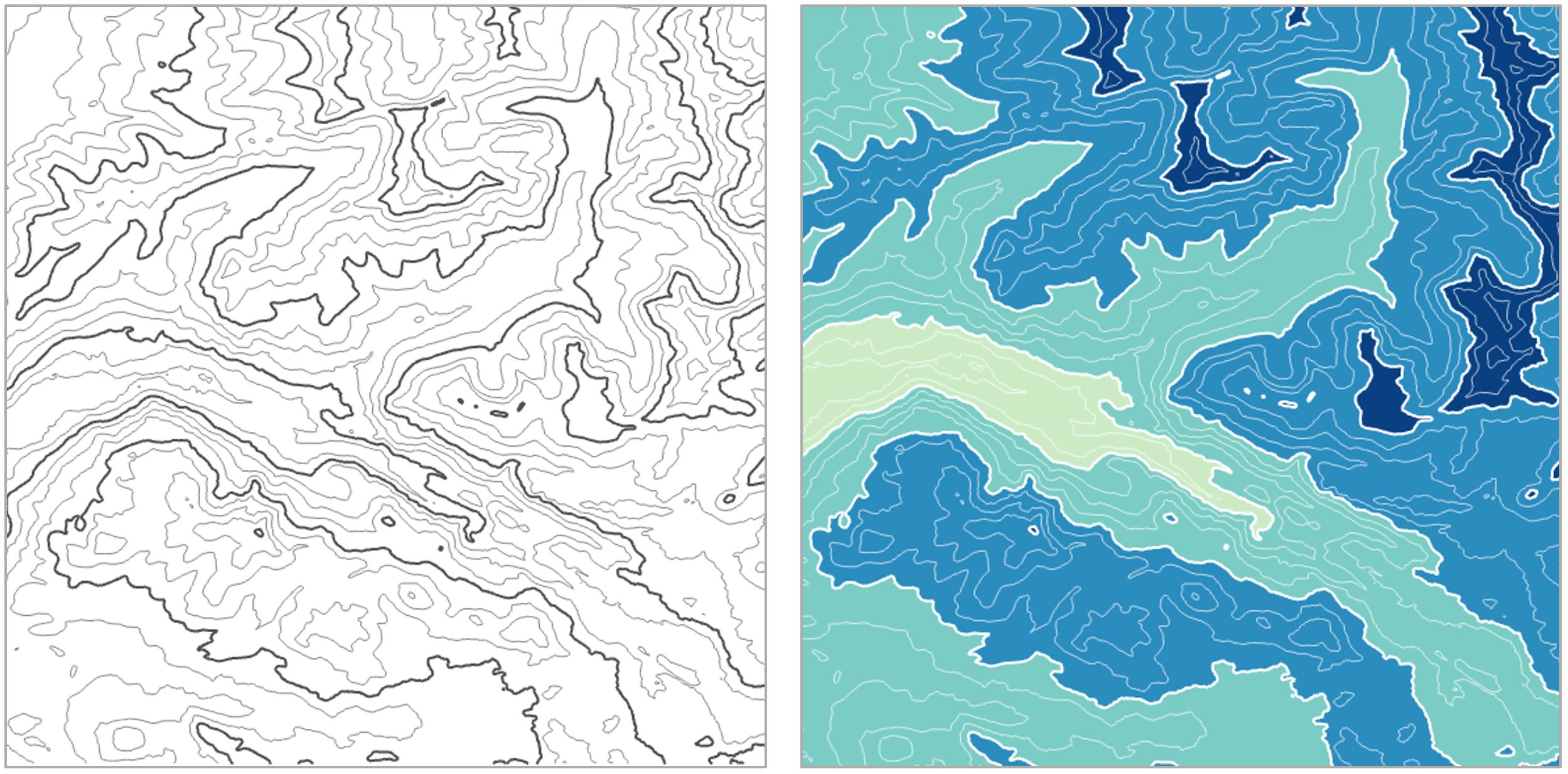
Elevation can be mapped in several different ways; a common method is hypsometric tinting (hypso) or coloring based on elevation values, shown in Figure 1.6.1.

Contour lines are often used to show more detail about the shape of the landscape, either alone or combined with hypsometric tinting, as shown below.
Other layers such as hillshade and curvature are often added for additional visual detail.

Orthoimages, or images of the earth’s surface that have been properly transformed for mapping purposes, can also be used alone or combined with terrain layers. We'll talk more about terrain visualization later in the course.

Cultural Data
Political boundaries are often important components of basemap design. Commonly-mapped boundaries include international borders, state or province boundaries, incorporated places, smaller census units such as tracts and blocks, and boundaries of Native American reservations, among others. Place names are used to add additional locational context.

Additional Data
Other layers that can be useful as base data include zoning and land use data. These data are often available in vector form from local GIS organizations. Land cover and impervious surface data, among other layers, are available in raster form from the National Land Cover Database (NLCD).


Hydrography can also play an important role in a basemap. Data used may include streams, rivers, lakes, swamps, marshes, and wetlands, among other water features.

Given the vast amount of data available, it is important to think carefully about the base data necessary for map’s audience, medium, and purpose—and design accordingly.
Recommended Reading
Chapter 2: Basemap Basics. Brewer, Cynthia A. 2015. Designing Better Maps: A Guide for GIS Users. Second Edition. Redlands: Esri Press.
Symbol Design: Visual Order and Categories
Symbol Design: Visual Order and CategoriesWhen designing your maps, two ideas should be at the forefront of your symbol design process: (1) order, and (2) category. Map symbol design relies heavily on the proper use of visual variables—graphic marks that are used to symbolize data (White, 2017).
Cartographer Jacques Bertin (1967) was the first to present this system of encoding data via graphic elements. Suggestions of supplemental visual variables (e.g., transparency), as well as analyses of their utility in different cartographic contexts, have been brought forth by multiple well-known cartographers (e.g., MacEachren 1994).

Some visual variables (e.g., size, color saturation, and color lightness) clearly indicate quantitative changes in magnitude. These are best for encoding data that has an order (e.g., a county-level map of population density; a road map with both highways and local roads). Other visual variables (e.g., color hue, pattern, and shape) signify qualitative—but not quantitative—differences. These are best applied when data categories have no inherent ordering (also often called nominal, or qualitative data), such as in a choropleth map showing political boundaries.
Figures 1.7.2, 1.7.3, and 1.7.4 demonstrate how visual variables can be used to symbolize common features in general purpose maps. These variables can be used either independently or in combination, to create the best visual representation of the underlying data.


Edward Tufte, a statistician and data visualization expert, said “the commonality between science and art is in trying to see profoundly—to develop strategies of seeing and showing” (Zachry and Thralls 2004, pg. 450). The goal of cartography, both an art and a science, is to optimally visualize—and help others see—the world, and various phenomena within it. To do so takes patience, practice, and skill—all of which you will continually develop throughout this course.
Student Reflection
Do a simple web search for maps of a topic that interests you. What visual variables are used in these maps? Are they effective?
Recommended Reading
White, T. (2017). Symbolization and the Visual Variables. The Geographic Information Science & Technology Body of Knowledge (2nd Quarter 2017 Edition), John P. Wilson (ed.). DOI: 10.22224/gistbok/2017.2.3
Tufte, Edward R. 2001. The Visual Display of Quantitative Information. Second. Graphics Press.
Bertin, Jacques. 1967. Sémiologie Graphique. Vol. 30. doi:10.1037/023518.
Designing for Multiple Scales
Designing for Multiple ScalesAnother important decision you will have to make when mapping is at what scale your map should be designed. When designing your symbols, you should always take scale into consideration. Generally, large-scale (zoomed-in) maps should include more features, such as local roads and points of interest, while small-scale maps should be simpler, to avoid visual clutter.

Student Reflection
What do you see at the four different scales shown in Figure 1.8.1? What features are prominent at the smallest scale (top left)? What features do not appear until the largest scale (bottom right?)
Web-based basemaps, such as the one shown in Figure 1.8.1, are often designed to adjust the level of detail automatically, as the user adjusts the map’s scale. If you are mapping your own data over a web map, however, you will still need to make decisions about the level of detail you include at each scale, as well as the sizes and styles of your symbol designs.
Recommended Reading
Cynthia A. Brewer & Barbara P. Buttenfield (2007) Framing Guidelines for Multi-Scale Map Design Using Databases at Multiple Resolutions, Cartography and Geographic Information Science, 34:1, 3-15, DOI: 10.1559/152304007780279078
Sharing Maps
Sharing MapsParticularly given the rise of web-based mapping, maps are readily shared across the web – occasionally even going viral. Many blogs and websites are host to many maps, though the most efficient way to share maps with many users is through social media. Social media platforms like Twitter are an easy way to share both interactive and static maps, as well as links to external sites that permit more than a 140-character explanation of your work.

Not following anyone on twitter yet? @psugeography and @PennStateGIS are good places to start!
Maps can serve many purposes – from communicating ideas to exploring data to generate new insights. For any purpose, however, maps must be read and used. Social media has its faults, but it is an excellent way to get design inspiration and to share your own work.
Student Reflection
Have you ever used Twitter or other social media sites to share or learn about maps? It can be a fun way to stay up-to-date on current mapping trends, and to gain and share new ideas. Cartographer Kenneth Field shared this list of cartographers and (geo)visualization experts on Twitter in his recent book, Cartography. (Field 2018). If you’re interested in learning more about (the most) current trends in cartography, you may find it a helpful place to start. ESRI.com Cartography Sources and Resources
Recommended Reading
Caquard, Sébastien. 2014. “Cartography II: Collective Cartographies in the Social Media Era.” Progress in Human Geography 38 (1): 141–150. doi:10.1177/0309132513514005.
Robinson, Anthony C. 2018. “Elements of Viral Cartography.” Cartography and Geographic Information Science. Taylor & Francis: 1–18. doi:10.1080/15230406.2018.1484304.
Critique #1
Critique #1During this course, we will be completing some peer critiques. However, for your first map critique, you will be critiquing a map made not by one of your peers, but by an external source. As noted by cartographer Kenneth Field (2018), the ability to thoughtfully reflect on the design of a map is an important skill. It will improve both your own map-making abilities, and your ability to comprehend the maps of others.
To complete this assignment, you should write-up a 500 word (max) critique of one of the following maps:
Map #1: Where to Live to Avoid a Natural Disaster - NY Times
Map #2: Monsters of the Mekong - National Geographic
Map #3: Grand Canyon Panorama - National Parks Service
In your written critique please describe:
- three things about the map design that you think the map does very well;
- three suggestions you have for improvement to the map design.
As suggested by the prompts above, map critique is not just about finding problems, but about reflecting on a map overall. Your critique should focus on things the map does well as much as it does on suggestions for improvement. In your discussion, you should connect your ideas back to what we have learned in Lesson One. You are also welcome - but not required - to relate the map to a personal or professional project or experience.
Please list the title of the map you have chosen at the top of the page.
Grading Criteria
Registered students can view a rubric for this assignment in Canvas.
Submission Instructions
Return to the Lesson 1 module in Canvas to submit your critique (300+ words) to the Critique #1 assignment as a PDF file in the format: LastName_Critique1
Lesson 1 Lab
Lesson 1 LabIntroduction to Map Design
This week, we'll be making two (2) general-purpose 8.5" x 11" maps. In addition to being an introduction to map-making in ArcGIS Pro, this lab brings together a variety of concepts discussed in this lesson. When making these maps, you'll need to consider
- scale
- visual variables
- map symbols
- audience, medium, and purpose.
All the requirements for this lab are listed below: you should reference this page as you work, and before you submit your final maps.
Lab Objectives
- Create two (2) general-purpose maps by designing line and area features in ArcGIS Pro.
- Explore multi-scale map design by designing symbols for maps at two different scales.
- Minimize reliance on the use of color as a visual variable by designing at least one (1) map using only a greyscale.
Overall Lab Requirements
For Lab 1, you will create two (2) general-purpose maps in ArcGIS Pro.
- Choose an area (likely a city) in Louisiana with a wide variety of map features—you must include the required number of map features for each map, so avoid selecting a remote rural location. The two maps you create should show the same approximate location but at different scales.
- Demonstrate map feature category and order by symbolizing the data provided:
- Design to emphasize a visual difference in category (e.g., roads, counties, cities, flowlines, waterbodies). Symbol design should denote the categorical difference between features when appropriate.
- Design to emphasize visual importance (i.e., order) of features (e.g., local road, secondary road, interstate). Within a category, symbols should be similar but show order.
- Use multi-layer line and area symbols, and design features appropriately for each map scale.
- IMPORTANT: Do not include any labels of any kind (not even your name), and no map elements (north arrow, scale bar, etc.) on your map—we will work on map labeling and layout design with the map elements in later labs. Make sure to turn off the Esri basemap before submission.
Individual Map Requirements
Map One
- Scale: 1:24,000
- Must not include any color—design in greyscale only.
- Must include the following features:
- at least three types of transportation features (e.g., interstate, local roads, rails, trails, etc.)
- at least three types of waterbodies (e.g., lake or pond, reservoir, etc.)
- at least one type of flowline (e.g., streams, artificial paths, etc.)
- at least one political boundary feature
- For the purpose of this lab, features are considered different if defined differently in the data (e.g., local and collector roads have different TNMFRC codes; lakes and reservoirs have different FTypes).
- Produce the map at 8.5" x 11"
- Include a short statement (no more than 100 words) that explains the imagined purpose and audience for a map (yes, be imaginative here). Also, be sure to explain the intended visual order of importance to the map features that you included and symbolized on the map and how that order was achieved.
Map Two
- Scale: 1:100,000
- Must include some or all color.
- Must include the following features:
- at least four types of transportation features (e.g., interstate, local roads, rails, trails, etc.)
- at least two types of waterbodies (e.g., lake or pond, reservoir, etc.)
- at least two types of flowlines (e.g., streams, artificial paths, etc.)
- at least two political boundary features (e.g., parish and city limits)
- Produce the map at 8.5" x 11"
- For the purpose of this lab, features are considered different if defined differently in the data (e.g., local and collector roads have different TNMFRC codes; lakes and reservoirs have different FTypes).
- Include a short statement (no more than 100 words) that explains the imagined purpose and audience for a map (yes, be imaginative here). Also, be sure to explain the intended visual order of importance to the map features that you included and symbolized on the map and how that order was achieved.
Lab Instructions
- Download the Lab 1 zipped file (575 MB). This is a very large file. It contains:
- a project (.aprx) file to be opened in ArcGIS Pro
- database with all required data. The data source for this lesson is The National Map. Note: The .aprx file will contain all required data loaded and organized. The goal of this lab is to focus on symbol design without worrying about any data downloading, data cleaning, or database organizing tasks.
- Extract the zipped folder, and double-click the blue (.aprx) file to open ArcGIS Pro.
- Once the file is open, you're ready to go! There are few ordered steps to complete this lab - map design is not a linear process - but following along with the visual guide will put you on the right path.
- Note: this is a big file and can take a long time to render. As a suggestion, once you have decided on an area of interest for your map, you can (and probably should) delete the rest of the map features.
Grading Criteria
Registered students can view a rubric for this assignment in Canvas.
Submission Instructions
- Submit two (2) PDFs—one for each map, using the naming conventions outlined below. You may attach your statement about each map in an additional .pdf document, or add the text as a comment with your assignment.
- Map 1: LastName_Lab1_Map1.pdf
- Map 2: LastName_Lab1_Map2.pdf
- Submit the PDFs and statements to the Lesson 1 Lab.
Ready to Begin?
More instructions are provided in Lesson 1 Lab Visual Guide.
Lesson 1 Lab Visual Guide
Lesson 1 Lab Visual GuideNote:
Before you look through the Visual Guide, please watch the following video (6:28) entitled "Lesson 1 Lab ArcGIS Pro Tips & Tricks." Doing so will give you a few hints on how to start with this lesson. You should not expect to follow the video exactly as the map design process and the decisions made on how to design the map is up to you.
GEOG 486 Lab 1 (6:29)
Transcript: GEOG 486 Lab 1 (6:29)
(0:01)
This is the ArcGIS Pro starting screen which you'll see when you open the map file for Lab 1.
Here are some of the base maps we read about in Lesson 1. I've pre-selected to include the gray canvas basemap which we'll be working with for this lab. The basemap also comes with a reference layer (that you can use to help locate an area of interest to map) that you can toggle on and off, but we won't be including any labels on our map in Lab 1. I encourage you to toggle off the basemap before you submit the map as the basemap includes labels that disturb your design. Besides, we will work with labeling in the next lesson.
For Lab 1 and 2, we'll be working in Louisiana. The data we'll be using was all downloaded from The National Map, and I've pre-loaded all the features you will need. You can expand groups of layers as well as toggle layers on and off in the contents pane, which is on the lefthand side of the ArcPro environment. All the data you'll need for this lab is in the database. You won't really need to worry about this for Lab 1 unless you accidentally delete a layer from your map. In that case, you can drag it back onto the map from the database. For example, if we accidentally remove the roads layer we could drag it back.
(1:10)
When designing symbols, it's often helpful to focus on one layer at a time, so I'm going to toggle all but this rails layer off. We can right-click on the layer and then select the symbology option to open the symbology pane. For this layer, we have just a single symbol, which we can edit in the symbol properties pane. Within this pane, the first tab is most helpful for making simple adjustments such as changing symbol color or width. For example, we can change these lines to red and we can increase their width - and you'll see that preview appear at the bottom of the pane.
(2:00)
More detailed edits can be made in the layers and structures pane. For example, we can add an additional layer to create a multi-layer line, and we could also rearrange these layers if we wanted to. Back in the layers tab, we can change the line's colors and make additional edits. It's a good idea to explore all the design options available in the layers tab.
You may notice that our lines have a strange "caterpillar" look. This can be corrected by enabling symbol layer drawing which will fix the ordering of your layers and clean these lines right up. Some layers, such as roads, contain multiple feature types. The roads in this map are classified by their TNMFRC value. Different values signify different types of roads. You can explore this more by opening the attribute table for this layer.
(3:17)
There's some interesting design you can do with area features as well. We'll work from the symbology pane to edit our water bodies; just as we did with lines, we can change the fill color - so let's go into the color picker and do yellow (you wouldn't do yellow, but let's try yellow) and then we can add another fill layer on top. Go back to the layers pane, and we can change this to a hatched fill. I really don't like the yellow let's change to green - so there you have a pretty easy example of creating a pattern effect.
(3:58)
Another helpful feature is the show count option which displays the count of each feature type in your dataset. You can see there's only one feature in this underground conduit classification - and we're just going to remove that. Unlike the codes, which are linked back to the database, you're free to change the labels as much as you want. We'll talk about this more in Lab 2. You can also change the ordering of features by clicking one and using the arrows to move it up or down.
(4:28)
To make the second map for this lab, we'll start by saving our first map as a map file. You should name it something that makes sense and something that you'll remember. Essentially what we're doing is making a copy of our map that we can then re-import into the same project. So let's do that now by choosing the import map file option. Our map isn't done, but imagine it is - so let's try a new layout using the import layout option. Name your layout something that makes sense, and then you're ready to add your map! I'm going to put in some half-inch margins here and then go to the map frame drop down and click on the appropriate map. You can resize and rescale your map once you add it to the page. To change the location and view on your map though, you'll have to activate it. Once activated you can move your map around as much as you'd like. The final step is to add your name and export your map. One last step is to use a text box to add my name. Now, Go to the Share tab and export your map as a PDF: we'll increase to 300 dpi.
Lesson 1 Lab Visual Guide Index
- Starting File
- Explore the pre-loaded data via the Contents pane
- Design symbols using the Symbology pane
- Make your second (smaller-scale) map
- Add each map to a layout
- Finalize and save your layouts
- Additional tips and tricks
1. Starting File
To start this lab, you'll want to download the zipped folder and copy it to a safe space on your computer that has plenty of file space. I recommend dedicating a folder on your computer or a large external drive just to Geog 486 lab projects to keep yourself organized. There will be several large files used in this class.
To open the starting map file, you'll need to extract the folder and open the blue ArcGIS Pro file called "Lab1_START." It should look similar to the file in Figure 1.1 below.
All the features/data you will need have been downloaded by your instructor and pre-loaded into this project file.

2. Explore the pre-loaded data via the Contents pane
You can toggle on and off layers using the associated checkboxes in the Contents pane. The light-gray canvas basemap has been included as part of these files. The basemap also comes with a reference layer (that you can use to help locate an area of interest to map) that you can toggle on and off, but we won't be including any labels on our map in Lab 1. We will work with labeling in Lab 2. While you can use the World Light Gray Reference and World Light Gray Canvas Base layers as guides during the map design process, make sure that you toggle off both the World Light Gray Reference and World Light Gray Canvas Base layers before you submit your final maps for this lesson.
There are Layers Groups (e.g., “Transportation”) as well as individual layers (e.g., “Roads”). Eventually, you will need to look at multiple layers at once, so that you can see how all your symbols look together. It will likely be easiest at first, however, to turn off (un-check) most of the layers so you can focus on one layer at a time.

The data you see in the contents pane are stored in the project's geodatabase. You can see this data by expanding the database in the Catalog pane. For this lab, you don't have to worry much about managing the data in the geodatabase - the data you need has already been added to your map. If you accidentally delete a layer from your map, however, you can drag it back onto the map from here.

3. Design symbols using the Symbology Pane
As a suggestion, it may make sense if you started from the "bottom" layer and worked your way "up." In other words, think about "visually" what is the lowest layer in the list of data. For example, let's assume the area of interest you selected is near a large water body. What color would you assign to that water body? Figure 1.4 shows how to select a layer (here, railroads) and open the Symbology pane. Clicking on the symbol will let you edit its properties. The next layer to work with may be "land." Again, what color do you imagine appropriate for land given you color choice for the water body. How does the land color you selected contrast/compliment with the water color you chose? Upon inspection, you will likely have to change the colors associated with one or more of the layers until you have achieved a visual agreement with all of the layers, their colors, line thickness, and line styles. Continue adding additional layers according to your visual hierarchy.

Looking in the Gallery of the Symbology pane will give you some ideas, but you should alter these symbols - do not accept the defaults.

Design changes (e.g., color; thickness, style) are made in the symbol properties tab (Figure 1.6; left tab of the Symbology pane). Note that for Map 1 in this lesson you must work only in greyscale. Think about symbol ordering/importance as you design - more important features should have greater visual emphasis. Most detailed work is done in the symbol layers tab (Figure 1.6; middle tab). Experiment with the many options available (e.g., offsets and dashes). You can also preview your symbol at the bottom of the pane. The Symbol Structure tab (Figure 1.6; right tab) allows you to make multilayer lines. You can also drag to re-order these lines.

You may notice a strange “caterpillar” effect when you create multi-layer lines. This is due to the default layering of line segments in ArcGIS Pro, but it's easy to fix.

You can fix this layering issue by enabling Symbol layer drawing within that layer from the Symbology Pane.

Some layers, such as roads, have multiple feature types within them - these feature types are specified within that feature's attribute table. For this lab, these have already been classified for you in the Symbology Pane – TNMFRC values are used to specify road types, and FTypes are used for specifying types of waterbodies. Classifying these layers lets us symbolize features based on a crucial attribute, such as road type (e.g., we can make more important road types such as highways more visually prominent).

Similar symbol options are available for area features – for these you will be choosing fills and outline colors/patterns. Experiment with different patterns but be careful with their implementation as patterns can look harsh and visually disruptive: remember that your main map must be designed in greyscale. Exploring the Gallery tab may help you develop ideas.

You are free to alter the labels for each feature type, or change their order using the arrows in the Symbology pane. Note that it doesn't really matter what your labels are for this lab, as long as you understand them. We will not be creating a legend in Lab 1, so these labels will only be visible to you.

You can also drag to re-arrange entire layers within the Contents pane. Think carefully about the ordering of the features on your map. Should railroads be drawn above or below lakes and rivers? What about political boundaries? Why? You may want to reference popular general purpose maps such as Google maps to compare your choices, but there is not always a right answer. Think of your audience and map purpose!

4. Make your second (smaller-scale) map
Once you’re happy with your large-scale (1:24,000) map, save it as a map file by right-clicking on the map name in the Contents pane - you should save it in the same folder as this ArcGIS project folder to keep everything organized and connected.

You can then import that saved map into this map project. Note that a map project can contain several different maps and map layouts. Once you re-import your map, this will create a duplicate map within the project file. You can then use this as a starting map for making your smaller scale map. Your main tasks then will be to add color and adjust your symbols for this smaller scale.
Creating a duplicate map this way is not required. Another option is to start your second map from scratch. I recommend creating and editing a copy of your first map instead, as this map will likely have a similar design to your first map, and creating a copy will prevent you from having to re-do a significant amount of design work (unless your second map has a different scope and purpose than the first map).

Staying organized will help you tremendously in the long run. A big part of this is saving your map files with useful file names. Use the Properties dialog box to change your map names to something memorable and descriptive - you don't want to mix them up.

Some ideas for descriptive map names are shown below:

5. Add each map to a layout
Use the Insert tab to create an 8.5" by 11" layout. Either Portrait or Landscape layouts are fine—but either way, use guides to create a ½ inch margin all around. Once you've created a layout, you can import your map as shown below. Use the labeled map rather than the "default" map to insert your map at the appropriate scale.

6. Finalize and save your layouts
Once you've added your map to a layout, you'll want to make some final adjustments.
- You'll need to activate your map as shown below to pan around the area.
- Make sure you've chosen an area of interest that suits the map requirements. It's ok to adjust your map's location at the end - when you designed your map symbols, they were automatically applied to the entire dataset.
- Whether or not your map is activated, you can adjust its scale at the bottom of the page.
- Make sure that you toggle off both the World Light Gray Reference and World Light Gray Canvas Base layers before you submit your final maps. Except for your name, there shouldn't be any labels or text on the map.
- Note that the map in Visual Guide Figure 1.18 is not well-designed at all - it's intended only as an example of how to insert and activate a map in a layout.

The final step is to export your maps as PDFs. Remember you will have two layouts, one for each map. Use the Share tab to export your layouts.
Considerations when exporting. For most maps, a 300dpi is fine. However, if you use:
- gradient area fills
- complex area patterns
- coastline effects
then, change the resolution to 150dpi. Otherwise, the file sizes will become extremely large and Canvas can't display these large file sizes. Once your PDF is exported, check the file size. You should keep your exported PDF's file size to less than 10MB. When I go to look at your maps, Canvas has a difficult time displaying files larger than 10MB.

7. Additional tips and tricks
Use “Show count” to view how many of each feature type are included in the map data.

Remember to experiment with multiple layers, verify your map design meets all requirements, and design your 1:24,000 map in only greyscale and your 1:100,000 using color. Designing a map in greyscale may require you to be a bit creative with multilayer symbols and patterns - but that's a good thing! As shown in the example below, you can use different shades of grey and patterns or other fill ideas to create interesting map symbols.

That's it! If you have any questions, please post them to the Lab 1 discussion board. You are also encouraged to browse the discussion board if you do not have a question - you may be able to help out a classmate, and you may learn something from a question that someone else has asked.
Credit for all screenshots is to Cary Anderson, Penn State University; Data Source: The National Map.
Summary and Final Tasks
Summary and Final TasksSummary
Now that you’ve finished this lesson, you should have a solid understanding of the importance of visual design, and the many factors that must be considered when making a map. During this lesson, we discussed the importance of considering a map’s audience, medium, and purpose – three vital factors to consider when planning a map.
We also introduced the idea of symbol design, and how to leverage order and category of visual variables to create a more informative map. At the end of the lesson, we touched on issues of scale and map-sharing, which we explore in more depth later this semester. In this lesson’s lab, we began applying this knowledge by building general-purpose maps using ArcGIS Pro and a popular source of open-source geospatial data: The National Map.
Reminder - Complete all of the Lesson 1 tasks!
You have reached the end of Lesson 1! Double-check the to-do list on the Lesson 1 Overview page to make sure you have completed all of the activities listed there before you begin Lesson 2.