Welcome to GEOG 486 - Cartography and Visualization
Welcome to GEOG 486 - Cartography and VisualizationQuick Facts about GEOG 486
- Instructor(s): This course is taught by a variety of instructors, including Fritz Kessler, Alicia Iverson, and Lydia Yoder.
- Course Structure: Online, 10-15 hours a week for 10 weeks
- Prerequisites: GEOG 484 - GIS Database Development
Overview
Cartographic design projects emphasize effective visual thinking and visual communication with geographic information systems. This course covers cartographic design principles and thematic mapmaking techniques. Students will create static and dynamic maps using contemporary tools, including ArcGIS Pro, Mapbox Studio, and Tableau. Students will engage in the cartographic design process by selecting visual variables, classifying and generalizing data, applying principles of color and contrast, and choosing map projections based on map audience and purpose. Students will also be introduced to niche topics such as augmented and virtual reality, interactive geovisualization and geovisual analytics, and decision-making with maps and mapping products. GEOG 486 is one of several courses students may choose as their final course in the Certificate Program in Geographic Information Systems.
Learn more about GEOG 486, Cartography and Visualization (1:12)
Transcript: Learn more about GEOG 486, Cartography and Visualization (1:12)
Hi, I'm Marcela Suárez. I'm one of the instructors of the Cartography and Visualization course. In this course you will learn how to create professional and aesthetically pleasing maps. Maps tell stories, whether they are related to an analysis or planning work, or to a personal project. These stories can be communicated in multiple ways. So how do you decide what map to make so that your stories are communicated in the most clear and effective way? You will learn that in this course. This is a lab-based course that covers design principles and techniques for creating maps. This includes selecting visual variables, classifying and generalizing data, and choosing map projections among other topics. But the bulk of this course will be spent getting hands-on experience creating different types of maps and critiquing maps as well. Many students comment that they were able to put what they learned to use right away at work and, or, in their research. They not only appreciate the variety of the assignments but also the opportunity to use different GIS software and tools. I invite you to take this course and take your cartographic skills to the next level.
Want to join us? Students who register for this Penn State course gain access to assignments and instructor feedback and earn academic credit. For more information, visit Penn State's Online Geospatial Education Program website. Official course descriptions and curricular details can be reviewed in the University Bulletin.
This course is offered as part of the Repository of Open and Affordable Materials at Penn State. You are welcome to use and reuse materials that appear on this site (other than those copyrighted by others) subject to the licensing agreement linked to the bottom of this and every page.
Lesson 1: Basemaps and Big Picture Design
Lesson 1: Basemaps and Big Picture DesignThe links below provide an outline of the material for this lesson. Be sure to carefully read through the entire lesson before returning to Canvas to submit your assignments.
Note: You can print the entire lesson by clicking on the "Print" link above.
Overview
OverviewWelcome to Geog 486! In this lesson, we will talk about the basics of map design, including how to customize your map to fit a specific audience, medium, and purpose. We will also introduce some topics that we will cover more in-depth later in the course, including visual variables, scale, and online map distribution. For this week’s lab activity, we will be making general-purpose basemaps in ArcGIS Pro. For those of you that haven’t used ArcGIS Pro before, this will be a good introduction to the software, and for all it will provide an opportunity to start thinking more deeply about the principles of cartographic design.
Throughout the lesson content, you will notice Student Reflection prompts. These prompts are opportunities for you to pause and reflect on what you have learned and how it relates to previous course content or your own personal or professional experience. Though not required, you are welcome to post responses to these prompts in the lesson discussion forum. You should post something to the lesson discussion each week, but you may choose to post a question/answer or comment about the lab instead.
Now, let's begin Lesson 1.
Learning Outcomes
By the end of this lesson, you should be able to:
- recognize suitable pre-designed basemaps for mapping tasks;
- utilize publicly-available data to create and customize general-purpose maps;
- design GIS overlay data to adequately display over pre-existing basemap content;
- incorporate knowledge of a map’s intended audience, medium, and purpose into design decisions;
- create an online portfolio for compiling and sharing map designs.
Lesson Roadmap
| Action | Assignment | Directions |
|---|---|---|
| To Read | In addition to reading all of the required materials here on the course website, before you begin working through this lesson, please read the following required readings in the Canvas lesson module:
Additional (recommended) readings are clearly noted throughout the lesson and can be pursued as your time and interest allows. | The required reading material is available in the Lesson 1 module. |
| To Do |
|
|
Questions?
If you have questions, please feel free to post them to the Lesson 1 Discussion forum. While you are there, feel free to post your own responses if you, too, are able to help a classmate.
Design Matters
Design MattersWhen making a map, it is impossible to map everything. In fact, to be a useful model of our world and of any phenomena in it, maps must always obscure, simplify, and/or embellish reality. These actions—which make maps useful—also make their construction subjective. Cartographic design, even when informed by well-established conventions, is an art as much as a science. Every design choice a cartographer makes ultimately influences the map readers’ comprehension, appreciation—and even trust—of the map that he or she creates.
Though maps may include or be supplemented by text or other media (even by sound, smell, or touch), map creation at its core is about visual design. As such, cartographers often talk of graphicacy and its importance in facilitating visual communication with maps (e.g., Field 2018, pg. 194). Graphicacy was first defined by Balchin and Coleman (1966) as “the intellectual skill necessary for the communication of relationships which cannot be successfully communicated by words or mathematical notation alone.” Graphicacy—like literacy—has its own grammar and syntax, and learning the rules of graphic language is essential for designing effective maps (Field 2018, pg. 194).
Student Reflection
Which map of the two below best communicates the trend of the data? Why?

In the map on the left (Figure 1.1.1), the rainbow color scheme makes it easy to view the states as grouped into categories by hue, but the lack of an obvious order between the selected colors makes the overall trend unclear. A sequential color scheme (right), however, makes it easy to view the trend of the data, as low-to-high values as are encoded intuitively from light to dark.
The design decisions that go into making a map often go far beyond choosing a color scheme for a simple state-by-state choropleth map. The map below is a Russian Civil War map – flames and smoke are used as symbols of the Bolshevik uprising. This map not only communicates information; it conveys emotion.

As demonstrated by the examples above, the way in which you design a map can deeply influence how your readers interpret it. A well-designed map can intrigue and even surprise its readers, leaving a meaningful and memorable impression. Shown below is a map of projected future storm surge in New York City, designed by Penn State alum and cartographer Carolyn Fish. The map doesn't ask the reader to imagine what NYC might look like under future climate scenarios - it shows them.

Following cartographic conventions—such as applying sequential color schemes for sequential data—typically results in more effective maps. However, some maps diverge from these guidelines. Learning cartographic best practices will help you to both apply them—and thoughtfully disobey them—when prudent.
Student Reflection
View the maps in Figures 1.1.4 through 1.1.7 below: Do you think they are effective? Is there anything you think should have been done differently?


Recommended Reading
Chapter 1: Slocum, Terry A., Robert B. McMaster, Fritz C. Kessler, and Hugh H. Howard. 2009. Thematic Cartography and Geovisualization. Edited by Keith C. Clarke. 3rd ed. Upper Saddle River, NJ: Pearson Prentice Hall.
Maps that Kill (pgs. 300-301): Field, Kenneth. 2018. Cartography. Esri Press.
Types of Maps
Types of MapsMaps are generally classified into one of three categories: (1) general purpose, (2) thematic, and (3) cartometric maps.
General Purpose Maps
General Purpose Maps are often also called basemaps or reference maps. They display natural and man-made features of general interest, and are intended for widespread public use (Dent, Torguson, and Hodler 2009).

The data is available under the Open Database License (CC BY-SA).
Thematic Maps
Thematic Maps are sometimes also called special purpose, single topic, or statistical maps. They highlight features, data, or concepts, and these data may be qualitative, quantitative, or both. Thematic maps can be further divided into two main categories: qualitative and quantitative. Qualitative thematic maps show the spatial extent of categorical, or nominal, data (e.g., soil type, land cover, political districts). Quantitative thematic maps, conversely, demonstrate the spatial patterns of numerical data (e.g., income, age, population).
Cartometric Maps
Cartometric Maps are a more specialized type of map and are designed for making accurate measurements. Cartometrics, or cartometric analysis, refers to mathematical operations such as counting, measuring, and estimating—thus, cartometric maps are maps which are optimized for these purposes (Muehrcke, Muehrcke, and Kimerling 2001). Examples include aeronautical and nautical navigational charts—used for routing over land or sea—and USGS topographic maps, which are often used for tasks requiring accurate distance calculations, such as surveying, hiking, and resource management.

In theory, these map categories are distinct, and it can be helpful to understand them as such. However, few maps fit cleanly into one of these categories—most maps in the real world are really hybrid general purpose/thematic maps.

Advancements in technology and in the availability of data have resulted in the proliferation of many diverse types of maps. Some, as shown in Figure 1.2.5, are embedded into exploratory tools intended to inform researchers and policy-makers.

Reproduced with permission from Dr. Anthony Robinson, Penn State University.
Other maps are intended for a wider audience but share the goal of uncovering and visualizing interesting relationships in spatial data (Figure 1.2.6).

Maps also are not limited to depicting outdoor landscapes. Some maps, such as the one in Figure 1.2.7, are designed to help people navigate complicated indoor spaces, such as malls, airports, hotels, and hospitals.

For a map to be useful, it is not always necessary that they realistically portray the geography they represent. This map of the public transit system in Boston, MA (Figure 1.2.8) drastically simplifies the geography of the area to create a map that is more useful for travelers than it would be if it were entirely spatially accurate.

Maps that show general spatial relationships but not geography are often called diagrammatic maps, or spatializations. Spatializations are often significantly more abstract than public transit maps; the term refers to any visualization in which abstract information is converted into a visual-spatial framework (Slocum et al 2009).

Though there are many different types of maps, they share the goal of demonstrating complex spatial information in a clear and useful way. Rather than attempt to place maps into discrete categories, it is generally more productive to see them as individual entities designed to suit a particular audience, medium, and purpose. We will discuss this more in the next section.
Recommended Reading
Chapter 1: Introduction to Thematic Mapping. Dent, Borden D., Jeffrey S. Torguson, and Thomas W. Hodler. 2009. Cartography: Thematic Map Design. 6th ed. New York: McGraw-Hill.
Wood, D., and Fels, J. (1992) The Power of Maps. New York: Guilford.
Communicating with Maps
Communicating with MapsThough you won’t need to understand the biology of the human brain and visual system, making great maps requires understanding how people perceive visual information. When discussing how people interpret maps, we can frame this discussion in terms of perception, cognition, and behavior.
Perception in map design refers to the reader’s immediate response to map symbology (e.g., instant recognition that symbols are different hues) (Slocum et al. 2009).
Cognition occurs when map readers incorporate that perception into conscious thought, and thus combine it with their own knowledge (Slocum et al. 2009). For example, readers might be able to interpret a weather radar map without its legend due to their previous experience with a similar map, or might incorporate knowledge of a map’s topic into their interpretation of a visual data distribution (e.g., the higher concentration of people aged 65+ shown in some Florida cities makes sense given what I know about retirement communities).
Behavior refers to actions that go beyond just thinking about maps. Considering how design may influence behavior is essential in anticipating the real-world effects your maps may have. The way a map is designed can influence its readers’ actions and decision-making, and these decisions may range from small (e.g., for how many seconds will the reader look at this map?) to great (e.g., will this flood-risk map convince the reader to purchase insurance?).

Another useful way to think about map communication is with the cartography-cubed model (MacEachren 1994). The model MacEachren (1994) proposed focuses on how different maps and visualizations are used. Within this framework, any map can be located within the cube by determining its location along three dimensions: (1) from public to private (with regards to the map audience), (2) from presenting knowns to revealing unknowns (e.g., is the map for displaying known information or for exploration?), and (3) from low to high interaction (e.g., a static map vs. an exploratory interactive mapping tool).

These dimensions are often correlated, hence the shown corner-to-corner continuum from visualization to communication. A printed map in a magazine article, for example, we could classify as a tool for communication, while an exploratory mapping tool designed for epidemiologists would be better described as (geo)visualization.
Student Reflection
Return to the previous section (Types of Maps). Where would you place each of the maps shown within the cartography cube?
Before you Map: Audience, Medium, and Purpose
Before you Map: Audience, Medium, and PurposeBefore you Map: Audience, Medium, and Purpose
There is no inherently good map—only a map that is well-designed and properly suited to its audience, medium, and purpose. Before creating a map, you should ask yourself (and if possible, your clients) several questions (Brewer 2015).
Audience—who is going to use this map?
- Will your map readers be novices or experts? Do they have advanced knowledge related to the data you intend to map? You would create, for example, a different map of crime hotspots for criminologists than for the public.
- Are your intended map readers knowledgeable about the area to be mapped? Those unfamiliar with a location might need more detail to understand its geographic context.
- How much time will a typical reader spend with your map? Some audiences will be happy to explore and analyze your map, while others may hope to understand the message of your map at a glance.
- Is your map accessible? Consider how colorblindness or other visual impairments might affect your readers’ interpretation of your map.

Medium—how will this map be displayed?
- Maps are viewed in a vast number of formats—in desktop browsers, on mobile phone screens, in brightly-lit rooms on large-screen projectors, as well as printed in magazines, brochures, newspapers, posters, etc.
- In addition to the broad media category (e.g., mobile phone browser vs. poster), predict the specifics of your map's final viewing format as much as possible—details such as the map’s size on a webpage or a reader’s viewing distance from a poster can make a big difference in both a map's utility and aesthetics.
- If your map will be viewed in multiple media formats, you will likely have to create multiple versions of your map, each optimized for its respective display medium.

Purpose—what is the intended function of your map?
- Maps are used for many purposes (e.g., for navigation, for understanding spatial trends in data, for site selection, for communicating the results of a research project, etc.) Different purposes necessitate different maps.
- When making design decisions, consider how they will influence the success of your users in completing their expected map-use tasks. Maps for driving navigation, for example, are generally more useful when detailed terrain data is excluded, creating a simpler interface. In a hiking map, however, such information is essential.
- Considering in what scenarios a map will be used is also important—users of maps for emergency response, for example, will likely be stressed and working under inflexible time constraints.

In this course and beyond, you will make many different kinds of maps. Some will be advertisements, some will be scientific documents - some may be just for fun. No matter the mapping project or process you use, pausing to reflect upon the who, what, and why of your map will always lead to better results.

Student Reflection
Consider a mobile or desktop mapping application that you use frequently, such as Google Maps. What changes might you make to this mapping tool if a client asked you to alter it for a different, singular purpose—for example, as a wayfinding tool for young children, or for assisting police during emergency response?
Recommended Reading
Chapter 1: Planning Maps. Brewer, Cynthia. 2015. Designing Better Maps: A Guide for GIS Users. 2nd ed. Esri Press. (note: pages. 1-3 are required reading for this lesson, but you may find the rest of the chapter helpful as well.)
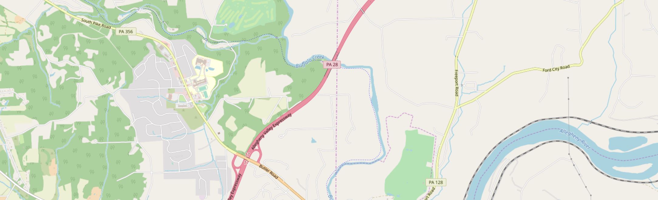
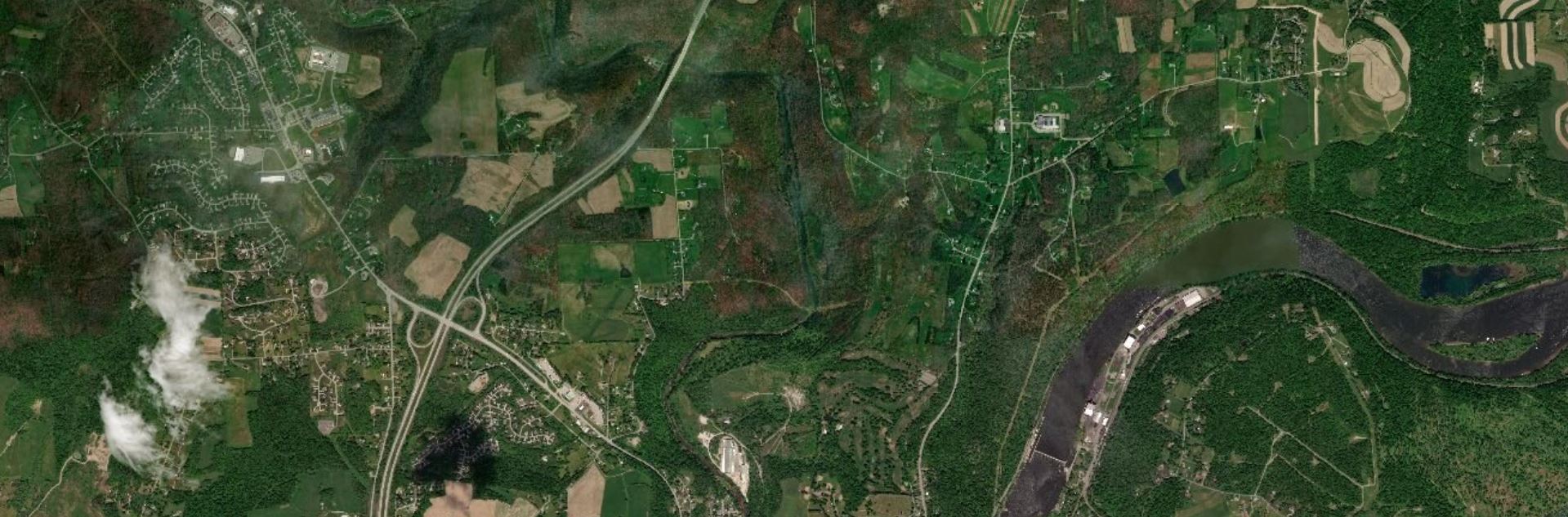
Basemaps: Leveraging Location
Basemaps: Leveraging LocationBasemaps are essential – they provide the context for your map data. Selecting a basemap should never be just an afterthought, and though the final choice is always subjective, you can make a better decision by considering your map purpose, audience, and the nature of your overlay data.
Street Maps
Often the default basemap used in business web-mapping applications. Helpful when highly-detailed locational context is necessary (particularly for navigation). Though pre-designed street basemaps may not have the ideal aesthetic for overlaying complex data, they are particularly useful at large scales (at which they appear less visually cluttered) or when overlaying relatively simple social data (e.g., for a map showing all locations of a restaurant chain).
Satellite Imagery
Often useful for environmental or engineering applications. May be useful in rural areas that cannot be well-understood using street maps (as few streets exist). The colors and detail make overlay data much more challenging to design than over subtle basemaps – satellite basemaps work best when GIS data is structured and simple and understanding the physical structure of the landscape is essential to the mapping function (e.g., for a map of local water pipelines).
Greyscale Basemaps
Usually reserved for thematic mapping, greyscale basemaps are helpful when the intended audience already knows the location context, or when significant detail is not important to fulfill the map’s purpose. The simple backdrop adds visual emphasis to your overlay data – especially important for maps produced for entertainment or maps whose primary focus is statistical data (e.g., statistical mortality maps). Choose a light or dark background based on the content and mood of your map, and design overlay data accordingly.

Terrain Basemaps
Terrain basemaps are particularly useful when the terrain of the landscape has an important relationship with the data being mapped (e.g., mapping wildfires; hiking maps). Shaded relief also adds visual interest and, when done well, creates a beautiful map. Just be sure to not let the basemap content overwhelm your own data.

A comparison of several example basemaps at the same location in Chicago are shown below in Figure 1.5.5. As shown, different basemaps can have vastly different overall looks, as well as differing levels of detail (LOD).

When making a map, your basemap sets the tone - everything else builds from this important beginning.
Student Reflection
There are many more options for basemaps than the defaults available in ArcGIS Pro, though they are a great place to start. Have you used any mapping applications that you felt had an exceptionally-designed basemap?
Check out some more creative, exciting basemaps in the Mapbox Gallery!
There are many creative possibilities - visit Mapbox's selection of Designer Maps.
Recommended Reading
Chapter 2: Basemap Basics. Brewer, Cynthia A. 2015. Designing Better Maps: A Guide for GIS Users. Second Edition. Redlands: Esri Press.
ArcGIS Content Team. 2014. “Choosing the Best ArcGIS Online Basemap for Your Maps and Apps.” ArcGIS Blog.
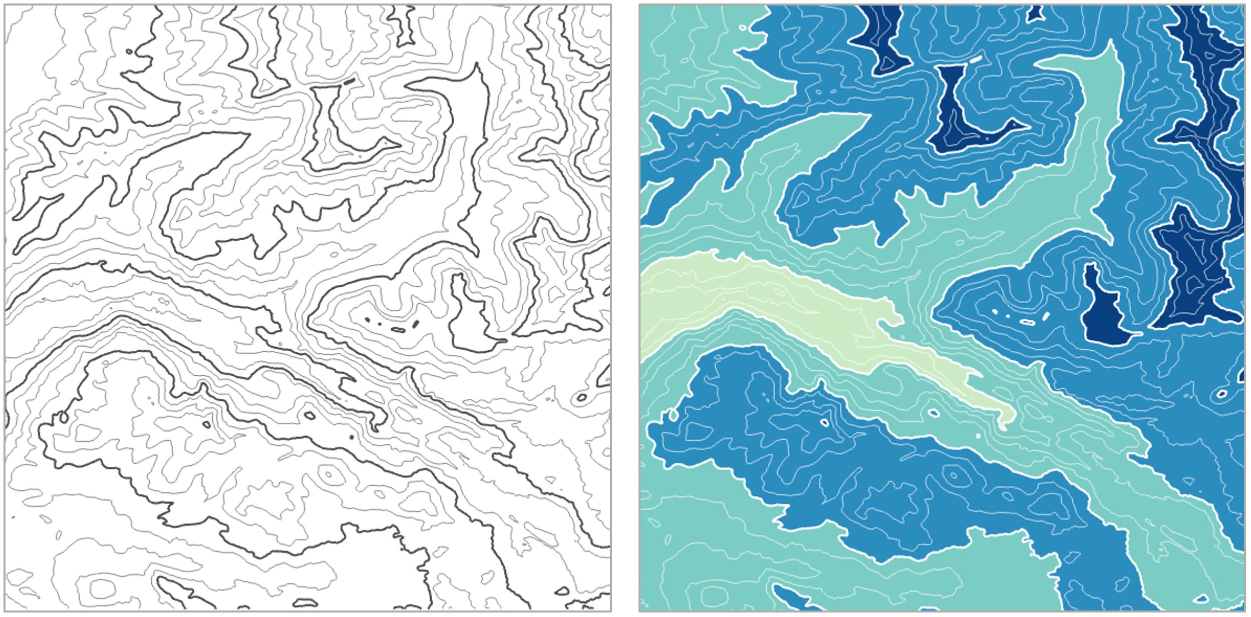
Base Data: Building a Map
Base Data: Building a MapThough many pre-designed options exist, and can be selected as described above, the best reference map for a specific task is often the one you make yourself. When downloading base data for a map, you should consider the following data layers, of which you might need a few or many. This is not an exhaustive list of available base data content, but will help you start thinking about the kinds of data you may need.
Terrain data
A good basemap will often include data that shows the shape of the physical landscape. All terrain layers are typically derived from a digital elevation model (DEM), which is a grid-based (raster) data layer that contains elevation layers.
Elevation can be mapped in several different ways; a common method is hypsometric tinting (hypso) or coloring based on elevation values, shown in Figure 1.6.1.

Contour lines are often used to show more detail about the shape of the landscape, either alone or combined with hypsometric tinting, as shown below.
Other layers such as hillshade and curvature are often added for additional visual detail.

Orthoimages, or images of the earth’s surface that have been properly transformed for mapping purposes, can also be used alone or combined with terrain layers. We'll talk more about terrain visualization later in the course.

Cultural Data
Political boundaries are often important components of basemap design. Commonly-mapped boundaries include international borders, state or province boundaries, incorporated places, smaller census units such as tracts and blocks, and boundaries of Native American reservations, among others. Place names are used to add additional locational context.

Additional Data
Other layers that can be useful as base data include zoning and land use data. These data are often available in vector form from local GIS organizations. Land cover and impervious surface data, among other layers, are available in raster form from the National Land Cover Database (NLCD).


Hydrography can also play an important role in a basemap. Data used may include streams, rivers, lakes, swamps, marshes, and wetlands, among other water features.

Given the vast amount of data available, it is important to think carefully about the base data necessary for map’s audience, medium, and purpose—and design accordingly.
Recommended Reading
Chapter 2: Basemap Basics. Brewer, Cynthia A. 2015. Designing Better Maps: A Guide for GIS Users. Second Edition. Redlands: Esri Press.
Symbol Design: Visual Order and Categories
Symbol Design: Visual Order and CategoriesWhen designing your maps, two ideas should be at the forefront of your symbol design process: (1) order, and (2) category. Map symbol design relies heavily on the proper use of visual variables—graphic marks that are used to symbolize data (White, 2017).
Cartographer Jacques Bertin (1967) was the first to present this system of encoding data via graphic elements. Suggestions of supplemental visual variables (e.g., transparency), as well as analyses of their utility in different cartographic contexts, have been brought forth by multiple well-known cartographers (e.g., MacEachren 1994).

Some visual variables (e.g., size, color saturation, and color lightness) clearly indicate quantitative changes in magnitude. These are best for encoding data that has an order (e.g., a county-level map of population density; a road map with both highways and local roads). Other visual variables (e.g., color hue, pattern, and shape) signify qualitative—but not quantitative—differences. These are best applied when data categories have no inherent ordering (also often called nominal, or qualitative data), such as in a choropleth map showing political boundaries.
Figures 1.7.2, 1.7.3, and 1.7.4 demonstrate how visual variables can be used to symbolize common features in general purpose maps. These variables can be used either independently or in combination, to create the best visual representation of the underlying data.


Edward Tufte, a statistician and data visualization expert, said “the commonality between science and art is in trying to see profoundly—to develop strategies of seeing and showing” (Zachry and Thralls 2004, pg. 450). The goal of cartography, both an art and a science, is to optimally visualize—and help others see—the world, and various phenomena within it. To do so takes patience, practice, and skill—all of which you will continually develop throughout this course.
Student Reflection
Do a simple web search for maps of a topic that interests you. What visual variables are used in these maps? Are they effective?
Recommended Reading
White, T. (2017). Symbolization and the Visual Variables. The Geographic Information Science & Technology Body of Knowledge (2nd Quarter 2017 Edition), John P. Wilson (ed.). DOI: 10.22224/gistbok/2017.2.3
Tufte, Edward R. 2001. The Visual Display of Quantitative Information. Second. Graphics Press.
Bertin, Jacques. 1967. Sémiologie Graphique. Vol. 30. doi:10.1037/023518.
Designing for Multiple Scales
Designing for Multiple ScalesAnother important decision you will have to make when mapping is at what scale your map should be designed. When designing your symbols, you should always take scale into consideration. Generally, large-scale (zoomed-in) maps should include more features, such as local roads and points of interest, while small-scale maps should be simpler, to avoid visual clutter.

Student Reflection
What do you see at the four different scales shown in Figure 1.8.1? What features are prominent at the smallest scale (top left)? What features do not appear until the largest scale (bottom right?)
Web-based basemaps, such as the one shown in Figure 1.8.1, are often designed to adjust the level of detail automatically, as the user adjusts the map’s scale. If you are mapping your own data over a web map, however, you will still need to make decisions about the level of detail you include at each scale, as well as the sizes and styles of your symbol designs.
Recommended Reading
Cynthia A. Brewer & Barbara P. Buttenfield (2007) Framing Guidelines for Multi-Scale Map Design Using Databases at Multiple Resolutions, Cartography and Geographic Information Science, 34:1, 3-15, DOI: 10.1559/152304007780279078
Sharing Maps
Sharing MapsParticularly given the rise of web-based mapping, maps are readily shared across the web – occasionally even going viral. Many blogs and websites are host to many maps, though the most efficient way to share maps with many users is through social media. Social media platforms like Twitter are an easy way to share both interactive and static maps, as well as links to external sites that permit more than a 140-character explanation of your work.

Not following anyone on twitter yet? @psugeography and @PennStateGIS are good places to start!
Maps can serve many purposes – from communicating ideas to exploring data to generate new insights. For any purpose, however, maps must be read and used. Social media has its faults, but it is an excellent way to get design inspiration and to share your own work.
Student Reflection
Have you ever used Twitter or other social media sites to share or learn about maps? It can be a fun way to stay up-to-date on current mapping trends, and to gain and share new ideas. Cartographer Kenneth Field shared this list of cartographers and (geo)visualization experts on Twitter in his recent book, Cartography. (Field 2018). If you’re interested in learning more about (the most) current trends in cartography, you may find it a helpful place to start. ESRI.com Cartography Sources and Resources
Recommended Reading
Caquard, Sébastien. 2014. “Cartography II: Collective Cartographies in the Social Media Era.” Progress in Human Geography 38 (1): 141–150. doi:10.1177/0309132513514005.
Robinson, Anthony C. 2018. “Elements of Viral Cartography.” Cartography and Geographic Information Science. Taylor & Francis: 1–18. doi:10.1080/15230406.2018.1484304.
Critique #1
Critique #1During this course, we will be completing some peer critiques. However, for your first map critique, you will be critiquing a map made not by one of your peers, but by an external source. As noted by cartographer Kenneth Field (2018), the ability to thoughtfully reflect on the design of a map is an important skill. It will improve both your own map-making abilities, and your ability to comprehend the maps of others.
To complete this assignment, you should write-up a 500 word (max) critique of one of the following maps:
Map #1: Where to Live to Avoid a Natural Disaster - NY Times
Map #2: Monsters of the Mekong - National Geographic
Map #3: Grand Canyon Panorama - National Parks Service
In your written critique please describe:
- three things about the map design that you think the map does very well;
- three suggestions you have for improvement to the map design.
As suggested by the prompts above, map critique is not just about finding problems, but about reflecting on a map overall. Your critique should focus on things the map does well as much as it does on suggestions for improvement. In your discussion, you should connect your ideas back to what we have learned in Lesson One. You are also welcome - but not required - to relate the map to a personal or professional project or experience.
Please list the title of the map you have chosen at the top of the page.
Grading Criteria
Registered students can view a rubric for this assignment in Canvas.
Submission Instructions
Return to the Lesson 1 module in Canvas to submit your critique (300+ words) to the Critique #1 assignment as a PDF file in the format: LastName_Critique1
Lesson 1 Lab
Lesson 1 LabIntroduction to Map Design
This week, we'll be making two (2) general-purpose 8.5" x 11" maps. In addition to being an introduction to map-making in ArcGIS Pro, this lab brings together a variety of concepts discussed in this lesson. When making these maps, you'll need to consider
- scale
- visual variables
- map symbols
- audience, medium, and purpose.
All the requirements for this lab are listed below: you should reference this page as you work, and before you submit your final maps.
Lab Objectives
- Create two (2) general-purpose maps by designing line and area features in ArcGIS Pro.
- Explore multi-scale map design by designing symbols for maps at two different scales.
- Minimize reliance on the use of color as a visual variable by designing at least one (1) map using only a greyscale.
Overall Lab Requirements
For Lab 1, you will create two (2) general-purpose maps in ArcGIS Pro.
- Choose an area (likely a city) in Louisiana with a wide variety of map features—you must include the required number of map features for each map, so avoid selecting a remote rural location. The two maps you create should show the same approximate location but at different scales.
- Demonstrate map feature category and order by symbolizing the data provided:
- Design to emphasize a visual difference in category (e.g., roads, counties, cities, flowlines, waterbodies). Symbol design should denote the categorical difference between features when appropriate.
- Design to emphasize visual importance (i.e., order) of features (e.g., local road, secondary road, interstate). Within a category, symbols should be similar but show order.
- Use multi-layer line and area symbols, and design features appropriately for each map scale.
- IMPORTANT: Do not include any labels of any kind (not even your name), and no map elements (north arrow, scale bar, etc.) on your map—we will work on map labeling and layout design with the map elements in later labs. Make sure to turn off the Esri basemap before submission.
Individual Map Requirements
Map One
- Scale: 1:24,000
- Must not include any color—design in greyscale only.
- Must include the following features:
- at least three types of transportation features (e.g., interstate, local roads, rails, trails, etc.)
- at least three types of waterbodies (e.g., lake or pond, reservoir, etc.)
- at least one type of flowline (e.g., streams, artificial paths, etc.)
- at least one political boundary feature
- For the purpose of this lab, features are considered different if defined differently in the data (e.g., local and collector roads have different TNMFRC codes; lakes and reservoirs have different FTypes).
- Produce the map at 8.5" x 11"
- Include a short statement (no more than 100 words) that explains the imagined purpose and audience for a map (yes, be imaginative here). Also, be sure to explain the intended visual order of importance to the map features that you included and symbolized on the map and how that order was achieved.
Map Two
- Scale: 1:100,000
- Must include some or all color.
- Must include the following features:
- at least four types of transportation features (e.g., interstate, local roads, rails, trails, etc.)
- at least two types of waterbodies (e.g., lake or pond, reservoir, etc.)
- at least two types of flowlines (e.g., streams, artificial paths, etc.)
- at least two political boundary features (e.g., parish and city limits)
- Produce the map at 8.5" x 11"
- For the purpose of this lab, features are considered different if defined differently in the data (e.g., local and collector roads have different TNMFRC codes; lakes and reservoirs have different FTypes).
- Include a short statement (no more than 100 words) that explains the imagined purpose and audience for a map (yes, be imaginative here). Also, be sure to explain the intended visual order of importance to the map features that you included and symbolized on the map and how that order was achieved.
Lab Instructions
- Download the Lab 1 zipped file (575 MB). This is a very large file. It contains:
- a project (.aprx) file to be opened in ArcGIS Pro
- database with all required data. The data source for this lesson is The National Map. Note: The .aprx file will contain all required data loaded and organized. The goal of this lab is to focus on symbol design without worrying about any data downloading, data cleaning, or database organizing tasks.
- Extract the zipped folder, and double-click the blue (.aprx) file to open ArcGIS Pro.
- Once the file is open, you're ready to go! There are few ordered steps to complete this lab - map design is not a linear process - but following along with the visual guide will put you on the right path.
- Note: this is a big file and can take a long time to render. As a suggestion, once you have decided on an area of interest for your map, you can (and probably should) delete the rest of the map features.
Grading Criteria
Registered students can view a rubric for this assignment in Canvas.
Submission Instructions
- Submit two (2) PDFs—one for each map, using the naming conventions outlined below. You may attach your statement about each map in an additional .pdf document, or add the text as a comment with your assignment.
- Map 1: LastName_Lab1_Map1.pdf
- Map 2: LastName_Lab1_Map2.pdf
- Submit the PDFs and statements to the Lesson 1 Lab.
Ready to Begin?
More instructions are provided in Lesson 1 Lab Visual Guide.
Lesson 1 Lab Visual Guide
Lesson 1 Lab Visual GuideNote:
Before you look through the Visual Guide, please watch the following video (6:28) entitled "Lesson 1 Lab ArcGIS Pro Tips & Tricks." Doing so will give you a few hints on how to start with this lesson. You should not expect to follow the video exactly as the map design process and the decisions made on how to design the map is up to you.
GEOG 486 Lab 1 (6:29)
Transcript: GEOG 486 Lab 1 (6:29)
(0:01)
This is the ArcGIS Pro starting screen which you'll see when you open the map file for Lab 1.
Here are some of the base maps we read about in Lesson 1. I've pre-selected to include the gray canvas basemap which we'll be working with for this lab. The basemap also comes with a reference layer (that you can use to help locate an area of interest to map) that you can toggle on and off, but we won't be including any labels on our map in Lab 1. I encourage you to toggle off the basemap before you submit the map as the basemap includes labels that disturb your design. Besides, we will work with labeling in the next lesson.
For Lab 1 and 2, we'll be working in Louisiana. The data we'll be using was all downloaded from The National Map, and I've pre-loaded all the features you will need. You can expand groups of layers as well as toggle layers on and off in the contents pane, which is on the lefthand side of the ArcPro environment. All the data you'll need for this lab is in the database. You won't really need to worry about this for Lab 1 unless you accidentally delete a layer from your map. In that case, you can drag it back onto the map from the database. For example, if we accidentally remove the roads layer we could drag it back.
(1:10)
When designing symbols, it's often helpful to focus on one layer at a time, so I'm going to toggle all but this rails layer off. We can right-click on the layer and then select the symbology option to open the symbology pane. For this layer, we have just a single symbol, which we can edit in the symbol properties pane. Within this pane, the first tab is most helpful for making simple adjustments such as changing symbol color or width. For example, we can change these lines to red and we can increase their width - and you'll see that preview appear at the bottom of the pane.
(2:00)
More detailed edits can be made in the layers and structures pane. For example, we can add an additional layer to create a multi-layer line, and we could also rearrange these layers if we wanted to. Back in the layers tab, we can change the line's colors and make additional edits. It's a good idea to explore all the design options available in the layers tab.
You may notice that our lines have a strange "caterpillar" look. This can be corrected by enabling symbol layer drawing which will fix the ordering of your layers and clean these lines right up. Some layers, such as roads, contain multiple feature types. The roads in this map are classified by their TNMFRC value. Different values signify different types of roads. You can explore this more by opening the attribute table for this layer.
(3:17)
There's some interesting design you can do with area features as well. We'll work from the symbology pane to edit our water bodies; just as we did with lines, we can change the fill color - so let's go into the color picker and do yellow (you wouldn't do yellow, but let's try yellow) and then we can add another fill layer on top. Go back to the layers pane, and we can change this to a hatched fill. I really don't like the yellow let's change to green - so there you have a pretty easy example of creating a pattern effect.
(3:58)
Another helpful feature is the show count option which displays the count of each feature type in your dataset. You can see there's only one feature in this underground conduit classification - and we're just going to remove that. Unlike the codes, which are linked back to the database, you're free to change the labels as much as you want. We'll talk about this more in Lab 2. You can also change the ordering of features by clicking one and using the arrows to move it up or down.
(4:28)
To make the second map for this lab, we'll start by saving our first map as a map file. You should name it something that makes sense and something that you'll remember. Essentially what we're doing is making a copy of our map that we can then re-import into the same project. So let's do that now by choosing the import map file option. Our map isn't done, but imagine it is - so let's try a new layout using the import layout option. Name your layout something that makes sense, and then you're ready to add your map! I'm going to put in some half-inch margins here and then go to the map frame drop down and click on the appropriate map. You can resize and rescale your map once you add it to the page. To change the location and view on your map though, you'll have to activate it. Once activated you can move your map around as much as you'd like. The final step is to add your name and export your map. One last step is to use a text box to add my name. Now, Go to the Share tab and export your map as a PDF: we'll increase to 300 dpi.
Lesson 1 Lab Visual Guide Index
- Starting File
- Explore the pre-loaded data via the Contents pane
- Design symbols using the Symbology pane
- Make your second (smaller-scale) map
- Add each map to a layout
- Finalize and save your layouts
- Additional tips and tricks
1. Starting File
To start this lab, you'll want to download the zipped folder and copy it to a safe space on your computer that has plenty of file space. I recommend dedicating a folder on your computer or a large external drive just to Geog 486 lab projects to keep yourself organized. There will be several large files used in this class.
To open the starting map file, you'll need to extract the folder and open the blue ArcGIS Pro file called "Lab1_START." It should look similar to the file in Figure 1.1 below.
All the features/data you will need have been downloaded by your instructor and pre-loaded into this project file.

2. Explore the pre-loaded data via the Contents pane
You can toggle on and off layers using the associated checkboxes in the Contents pane. The light-gray canvas basemap has been included as part of these files. The basemap also comes with a reference layer (that you can use to help locate an area of interest to map) that you can toggle on and off, but we won't be including any labels on our map in Lab 1. We will work with labeling in Lab 2. While you can use the World Light Gray Reference and World Light Gray Canvas Base layers as guides during the map design process, make sure that you toggle off both the World Light Gray Reference and World Light Gray Canvas Base layers before you submit your final maps for this lesson.
There are Layers Groups (e.g., “Transportation”) as well as individual layers (e.g., “Roads”). Eventually, you will need to look at multiple layers at once, so that you can see how all your symbols look together. It will likely be easiest at first, however, to turn off (un-check) most of the layers so you can focus on one layer at a time.

The data you see in the contents pane are stored in the project's geodatabase. You can see this data by expanding the database in the Catalog pane. For this lab, you don't have to worry much about managing the data in the geodatabase - the data you need has already been added to your map. If you accidentally delete a layer from your map, however, you can drag it back onto the map from here.

3. Design symbols using the Symbology Pane
As a suggestion, it may make sense if you started from the "bottom" layer and worked your way "up." In other words, think about "visually" what is the lowest layer in the list of data. For example, let's assume the area of interest you selected is near a large water body. What color would you assign to that water body? Figure 1.4 shows how to select a layer (here, railroads) and open the Symbology pane. Clicking on the symbol will let you edit its properties. The next layer to work with may be "land." Again, what color do you imagine appropriate for land given you color choice for the water body. How does the land color you selected contrast/compliment with the water color you chose? Upon inspection, you will likely have to change the colors associated with one or more of the layers until you have achieved a visual agreement with all of the layers, their colors, line thickness, and line styles. Continue adding additional layers according to your visual hierarchy.

Looking in the Gallery of the Symbology pane will give you some ideas, but you should alter these symbols - do not accept the defaults.

Design changes (e.g., color; thickness, style) are made in the symbol properties tab (Figure 1.6; left tab of the Symbology pane). Note that for Map 1 in this lesson you must work only in greyscale. Think about symbol ordering/importance as you design - more important features should have greater visual emphasis. Most detailed work is done in the symbol layers tab (Figure 1.6; middle tab). Experiment with the many options available (e.g., offsets and dashes). You can also preview your symbol at the bottom of the pane. The Symbol Structure tab (Figure 1.6; right tab) allows you to make multilayer lines. You can also drag to re-order these lines.

You may notice a strange “caterpillar” effect when you create multi-layer lines. This is due to the default layering of line segments in ArcGIS Pro, but it's easy to fix.

You can fix this layering issue by enabling Symbol layer drawing within that layer from the Symbology Pane.

Some layers, such as roads, have multiple feature types within them - these feature types are specified within that feature's attribute table. For this lab, these have already been classified for you in the Symbology Pane – TNMFRC values are used to specify road types, and FTypes are used for specifying types of waterbodies. Classifying these layers lets us symbolize features based on a crucial attribute, such as road type (e.g., we can make more important road types such as highways more visually prominent).

Similar symbol options are available for area features – for these you will be choosing fills and outline colors/patterns. Experiment with different patterns but be careful with their implementation as patterns can look harsh and visually disruptive: remember that your main map must be designed in greyscale. Exploring the Gallery tab may help you develop ideas.

You are free to alter the labels for each feature type, or change their order using the arrows in the Symbology pane. Note that it doesn't really matter what your labels are for this lab, as long as you understand them. We will not be creating a legend in Lab 1, so these labels will only be visible to you.

You can also drag to re-arrange entire layers within the Contents pane. Think carefully about the ordering of the features on your map. Should railroads be drawn above or below lakes and rivers? What about political boundaries? Why? You may want to reference popular general purpose maps such as Google maps to compare your choices, but there is not always a right answer. Think of your audience and map purpose!

4. Make your second (smaller-scale) map
Once you’re happy with your large-scale (1:24,000) map, save it as a map file by right-clicking on the map name in the Contents pane - you should save it in the same folder as this ArcGIS project folder to keep everything organized and connected.

You can then import that saved map into this map project. Note that a map project can contain several different maps and map layouts. Once you re-import your map, this will create a duplicate map within the project file. You can then use this as a starting map for making your smaller scale map. Your main tasks then will be to add color and adjust your symbols for this smaller scale.
Creating a duplicate map this way is not required. Another option is to start your second map from scratch. I recommend creating and editing a copy of your first map instead, as this map will likely have a similar design to your first map, and creating a copy will prevent you from having to re-do a significant amount of design work (unless your second map has a different scope and purpose than the first map).

Staying organized will help you tremendously in the long run. A big part of this is saving your map files with useful file names. Use the Properties dialog box to change your map names to something memorable and descriptive - you don't want to mix them up.

Some ideas for descriptive map names are shown below:

5. Add each map to a layout
Use the Insert tab to create an 8.5" by 11" layout. Either Portrait or Landscape layouts are fine—but either way, use guides to create a ½ inch margin all around. Once you've created a layout, you can import your map as shown below. Use the labeled map rather than the "default" map to insert your map at the appropriate scale.

6. Finalize and save your layouts
Once you've added your map to a layout, you'll want to make some final adjustments.
- You'll need to activate your map as shown below to pan around the area.
- Make sure you've chosen an area of interest that suits the map requirements. It's ok to adjust your map's location at the end - when you designed your map symbols, they were automatically applied to the entire dataset.
- Whether or not your map is activated, you can adjust its scale at the bottom of the page.
- Make sure that you toggle off both the World Light Gray Reference and World Light Gray Canvas Base layers before you submit your final maps. Except for your name, there shouldn't be any labels or text on the map.
- Note that the map in Visual Guide Figure 1.18 is not well-designed at all - it's intended only as an example of how to insert and activate a map in a layout.

The final step is to export your maps as PDFs. Remember you will have two layouts, one for each map. Use the Share tab to export your layouts.
Considerations when exporting. For most maps, a 300dpi is fine. However, if you use:
- gradient area fills
- complex area patterns
- coastline effects
then, change the resolution to 150dpi. Otherwise, the file sizes will become extremely large and Canvas can't display these large file sizes. Once your PDF is exported, check the file size. You should keep your exported PDF's file size to less than 10MB. When I go to look at your maps, Canvas has a difficult time displaying files larger than 10MB.

7. Additional tips and tricks
Use “Show count” to view how many of each feature type are included in the map data.

Remember to experiment with multiple layers, verify your map design meets all requirements, and design your 1:24,000 map in only greyscale and your 1:100,000 using color. Designing a map in greyscale may require you to be a bit creative with multilayer symbols and patterns - but that's a good thing! As shown in the example below, you can use different shades of grey and patterns or other fill ideas to create interesting map symbols.

That's it! If you have any questions, please post them to the Lab 1 discussion board. You are also encouraged to browse the discussion board if you do not have a question - you may be able to help out a classmate, and you may learn something from a question that someone else has asked.
Credit for all screenshots is to Cary Anderson, Penn State University; Data Source: The National Map.
Summary and Final Tasks
Summary and Final TasksSummary
Now that you’ve finished this lesson, you should have a solid understanding of the importance of visual design, and the many factors that must be considered when making a map. During this lesson, we discussed the importance of considering a map’s audience, medium, and purpose – three vital factors to consider when planning a map.
We also introduced the idea of symbol design, and how to leverage order and category of visual variables to create a more informative map. At the end of the lesson, we touched on issues of scale and map-sharing, which we explore in more depth later this semester. In this lesson’s lab, we began applying this knowledge by building general-purpose maps using ArcGIS Pro and a popular source of open-source geospatial data: The National Map.
Reminder - Complete all of the Lesson 1 tasks!
You have reached the end of Lesson 1! Double-check the to-do list on the Lesson 1 Overview page to make sure you have completed all of the activities listed there before you begin Lesson 2.
Lesson 2: Lettering and Layouts
Lesson 2: Lettering and LayoutsThe links below provide an outline of the material for this lesson. Be sure to carefully read through the entire lesson before returning to Canvas to submit your assignments.
Note: You can print the entire lesson by clicking on the "Print" link above.
Overview
OverviewWelcome to Lesson 2! In the previous lesson, we learned the basics of map and map symbol design, and created some general purpose maps in ArcGIS Pro. This week, we're going to focus on what we left out of those maps - most notably, place labels and marginal map elements (e.g., scale bars, north arrows, etc.). We'll discuss typography and the art of text-based elements: you'll learn how to classify and select appropriate fonts, and how to apply this knowledge when creating place labels for maps. Then, we'll focus on another important topic in cartography: the design of a map layout. You'll build and customize a map legend, and practice designing with appropriate visual hierarchy and balanced negative space.
In this week's lab, we'll be working from the maps we designed last lesson. That way, you'll be able to focus on applying the new topics we have learned, rather than starting from the beginning. By the end of this lesson, you will have learned how to create a complete, well-designed general purpose map from open source data. In addition to that being an achievement in itself, these general skills will prepare you for creating more specific, topic-driven thematic maps in labs to come.
Learning Outcomes
By the end of this lesson, you should be able to:
- use symbol design knowledge to create clear categorical groups and orders of map labels;
- design and position labels appropriately based on the category (e.g., point; line; area) and content (e.g., river vs. road network) of map features;
- solve dense label placement problems using automatic tools in ArcGIS Pro;
- create a clean and useful map layout with appropriate visual hierarchy;
- customize marginal elements (e.g., legends, scale bars, titles) suitably for a map’s intended purpose.
Lesson Roadmap
| Action | Assignment | Directions |
|---|---|---|
| To Read | In addition to reading all of the required materials here on the course website, before you begin working through this lesson, please read the following required readings in Canvas lesson module:
Additional (recommended) readings are clearly noted throughout the lesson and can be pursued as your time and interest allows. | The required reading material is available in the Lesson 2 module. |
| To Do |
|
|
Questions?
If you have questions, please feel free to post them to Lesson 2 Discussion Forum. While you are there, feel free to post your own responses if you, too, are able to help a classmate.
Text on Maps
Text on MapsWhen you think of maps, you likely don’t think much about text. In Lesson One, we defined graphicacy—the skill needed to interpret that which cannot be communicated by text or numbers alone—as distinct from literacy (Balchin and Coleman 1966). Despite this, map graphics are often augmented with text, either on the map itself (as in map labels), or in the margins (titles, legends, etc.) Thus, text plays an important role in map design.
View the map in Figure 2.1.1 below—can you immediately tell what is missing? Can you still recognize the location?


As shown above, good label design often employs different colors, font styles, sizing, and more. Map labels play an important role in mapping—not only by labeling symbols, but also by serving as symbols themselves. In this lesson, we’ll learn about the many design effects that can be used to make appropriate text symbols and aesthetically pleasing designs.
Text on maps, as seen in Figure 2.1.1 above, often refers to place names. The study of geographic names is its own subject of study. A commission within the International Cartographic Association (ICA) is dedicated to toponomy, or the study of the use, history, and meaning of place names. If this interests you, you can learn more about toponomy and the ICA on the ICA website.
Particularly in thematic mapping, text is employed not just to identify places, but to explain data. In Figure 2.1.3 below, text is used in the making of map legends, scale bars, and so on. Despite this map’s careful color and layout design, without text—it would be unusable.

Student Reflection
Place naming is often a contentious and complicated task. Can you think of a place that is referred to differently by those who live there than by those who do not? How do these different names influence the identity of this place?
Recommended Reading
Rose-Redwood, Reuben S. 2008. “From Number to Name: Symbolic Capital, Places of Memory and the Politics of Street Renaming in New York City.” Social and Cultural Geography 9 (4): 431–452. doi:10.1080/14649360802032702.
Typographic Design
Typographic Design“The choices of fonts for uses can be seen as related to the personality of the fonts. The Script/Funny fonts scored high on Youthful, Casual, Attractive, and Elegant traits which are all related to Children’s Documents and artistic elements. The Serif and Sans Serif fonts were seen as more stable, practical, mature, and formal; the uses they are appropriate for fit these characteristics.”
“Make it easy to read.”
There are many elements to consider when designing text for maps. As a cartographer, you want your text to be clearly legible against the map background, be appropriate for the features you are labeling, and match the overall aesthetics of your map.
As you start designing labels, it is best to learn a bit about typographic design.
A typeface is a design applied to text that gives letters a certain style. An example of a typeface is Arial. Many typefaces contain multiple fonts, so typefaces are sometimes called font families. For example, the Arial font family contains several fonts, including Arial Black and Arial Narrow (Silverant 2016). Though it is technically incorrect to do so, the words typeface and font are often used interchangeably. It is less important to understand this nuance than to understand how to apply fonts in practice.
Classifying Fonts
Fonts can be classified in several ways. For example, as text fonts vs. display fonts (Figure 2.2.1).
Text fonts are designed to be simple and legible: examples include Arial, Calibri, Cambria, and Tahoma. Display fonts are decorative fonts like Stencil, Curlz MT, Bauhaus 93, and Castellar. These fonts are often used in branding and for advertisements. Use these fonts with caution, and sparingly on maps. They are perhaps appropriate for a map title, but for little else (Brewer 2015).

Possibly the most common way to classify fonts is as serif or sans-serif (Figure 2.2.2). Serifs are small strokes added to the end of some letters in a font, such as in the widely-recognized font Times New Roman. Sans-serif fonts do not contain these small strokes. Sans-serif fonts as sometimes viewed as informal, modern, and best suited to digital formats; serifs are often described as best for formal print production. These general guidelines, however, are less important than the specific context in which you use a font. In map design, pairing a serif and a sans-serif together in a map often works best.

Though the presence or absence of serifs may be one of the most obvious characteristics of a font, there are many design factors that influence a font's style. Figure 2.2.3 below illustrates many of the different components of type design. Changes to these elements create the difference between different font styles.

Student Reflection
Browse the web—or your closet—looking for logos and similar advertisements that employ text as part of their branding design. How does the style of a font change your perception of that brand or item? Do you notice any that work particularly well? Why is this?
There are a wide number of web resources available for learning more about typography—some are linked in the recommended reading section of this lesson topic. Much of this advice, developed for graphic designers, journalists, and others, will also apply to text design for maps. In Designing Better Maps, Cynthia Brewer (2015) outlines several features of fonts that make them particularly useful for cartographers. You should keep these in mind when selecting fonts for your maps.
1. A large font family (i.e., the availability of many fonts within a single typeface):

As shown in Figure 2.2.4, some typefaces contain many font variations. This can be very useful for map labeling, as it permits the cartographer to create distinct labels for different types of features while maintaining a consistent look and feel throughout the map.
2. Italic as a separately installed font:

You are likely quite familiar with the use of bolding and/or italics to create distinct font styles. A distinction of note, however, is shown in Figure 2.2.5—the difference between an italic and bold font, and bold and italics as applied afterword by a word processing program such as Microsoft Word. Though applied italics and bolding (Figure 2.2.5; right) will work in a pinch, bold and italic fonts designed as a separate font style (Figure 2.2.5; left) take specific characteristics of the typeface into careful account when applying these styles, typically resulting in improved aesthetics and legibility.
3. Text that is readable at small point sizes and at angles:
Unlike when writing a paper, where most of your text is horizontal and of similar size, the variability of text sizes and angles on a map presents and additional challenge to cartographers. As you will likely use a font in many different instances on your map, a good font choice is one that remains legible when angled and printed small or viewed from a large distance.

4. A large x-height:
X-height has a simple definition – the height of a lowercase x.

A small x-height results in greater distinction between different letters, which is helpful when reading a block of text. When creating labels for maps, however, a large x-height is typically preferred, it results in fonts that are easier to read when printed small on a page.
5. Distinction between a capital I, lowercase l, and number 1:
This one is self-explanatory, though it may not always be possible (e.g., when using most sans serif fonts). Legibility is improved when the reader can tell immediately whether a letter is an uppercase i, lowercase L, or a number 1. The same goes for distinguishing between a zero and an uppercase O. Though typically a zero is shown as a thinner ellipsoid, in some fonts this difference is more distinct than in others.
In addition to selecting proper fonts, there are many design details that can be applied to improve your map labels. These include text color, halos, and shadows, as well as changes to character spacing and sizing.
A halo is often helpful, particularly against busy backgrounds, for helping text display over the background of a map. Halos are distinct from outlines, as they are placed behind text—and they are typically a better choice for legibility, as they do not interfere at all with the text itself (Figure 2.2.8).

Halos are not always as pronounced as the one shown in Figure 2.2.8. Choosing a halo that blends in with the background color of the map creates a subtle look that doesn’t call attention to the halo, but still sets the text legibly apart from any lines that may cross beneath it. See Figure 2.2.9 below – a subdued yellow-green halo blends into most of the background but prevents contour lines from obscuring the legibility of the interval numbers.

Many text effects are available in ArcGIS, and in graphic design software such as Adobe Illustrator. Experiment with text effects when designing your maps, and don’t be afraid to move beyond default settings to create more engaging, legible, and attractive maps.
Recommended Reading
Lupton, Ellen. 2009. “Thinking with Type.” Their 2024 edition of this book is available through Penn State's library as an ebook.
Cousins, Carrie. 2018. “Serif vs. Sans Serif Fonts: Is One Really Better Than the Other?” Design Shack.
Magalhães, Ricardo. 2017. “To Choose the Right Typeface, Look at Its x-Height.” Prototypr.Io.
Chapter 5: Type Basics. Brewer, Cynthia A. 2015. Designing Better Maps: A Guide for GIS Users. Second. Redlands: Esri Press.
Creating Symbols with Labels
Creating Symbols with LabelsWe learned about visual variables in Lesson One and applied those ideas to create general purpose maps. For example, you might have used different line weights to create hierarchies of road features, or different hues and/or patterns to differentiate between types of waterbodies. In this lesson, we apply these same ideas to text.
Student Reflection
Look at the labels on the map in Figure 2.3.1. Which show categorical differences from others? Which show order differences? Which show both?

When designing labels to show order (e.g., population size, (road) speed limit), choose text characteristics that demonstrate differing levels of importance, such as those shown in Figure 2.3.2.

When designing labels to demonstrate category, choose text characteristics that demonstrate difference, but not importance or order (Figure 2.3.3).

As with symbol design, it may often be prudent to use both types of characteristics together—creating labels that show both order and category. When designing labels, be cautious to attend to the aesthetics of your map, and avoid over cluttered or overcomplicated design. It often looks messy to use more than two fonts on a map, so try to stick to two: as noted previously, pairing a serif and a sans-serif font that look good together often does the trick.
Recommended Reading
Chapter 6: Labels as Symbols. Brewer, Cynthia A. 2015. Designing Better Maps: A Guide for GIS Users. Second. Redlands: Esri Press.
Label Placement
Label PlacementIdeal label placements are always context dependent—many factors, such as the density of map features or character length of place names, will determine the best way to place your labels. Even so, it is helpful to understand best-practice guidelines for placing labels on maps. In this section, we will learn how best to place map labels for point, line, and area (polygon) features. As a cartographer, you will apply these guidelines using both automatic labeling procedures in GIS software and though the manual editing of graphic text.
Point labels
When placing point labels, two factors are of primary importance: (1) legibility, and (2) association. You don’t want your reader to struggle to read your map labels, and it should always be clear to which point each label refers.
The first guideline to remember is that adding point labels is not like making a bulleted list—your labels should be shifted up or down from their associated point feature. An example ordered ranking of label placements for point feature labels is shown in Figure 2.4.1.

Though the placement ranking guidelines in Figure 2.4.1 provide a good starting point, it is notable that cartographers do not always agree on this specific order. If you are a very astute reader, you may notice that these recommendations vary slightly from the point label placement guidelines given by Field (2018) in this week's required reading. Cartography is not only a science but an art, and sometimes there is more than one right answer. Additionally, while such guidelines are helpful, label placement is a continuous balancing act. Figure 2.4.2 (left) shows two labeled points, both placed at the ideal label position shown in Figure 2.4.1. This arrangement of point labels, however, makes it seem ambiguous to which point “East Gate Shopping Center” refers. In Figure 2.4.2 (right), this label is moved to the second position. The ambiguity disappears.

In addition to the orientation of point labels, you will also need to decide how closely to place them to your point features. In the left image, labels are placed very close to points, while on the right, labels are placed at a greater distance from their associated point symbols. Though map elements that appear too tightly packed are generally undesirable, how closely your labels and points are placed will depend on the size, shape, and density of your labels, points, and map. Most important is maintaining consistency throughout your map design.
Another important consideration is when and where you will apply line breaks to the text on your map. When it fits on the map, showing the entire label on one line (Figure 2.4.3; left) is appropriate. However, due to the density of map features and length of feature names, this is often not possible.

When line breaks are used, place them at natural breaks in the feature name. For example, Mission Hills Country Club looks strange as Mission/Hills Country/Club (Figure 2.4.3; middle) but natural as Mission Hills/Country Club (Figure 2.4.3; right). You should also use spacing between lines that is smaller than the spacing between other labels on the map, clearly demonstrating that these lines of text belong together.
Point labeling is further complicated when labeling multiple types of point features. Your goal should be again to avoid ambiguity—labels should help demonstrate feature categories. As shown in Figure 2.4.4, it is best to label land features on land, and coastal features in water.

Label design is about the details, and often very small changes to label placements can really improve the readability of your map. Figure 2.4.5 below shows how a couple of small edits were used to improve a set map labels. From left to right, line spacing within the “Shawnee Nieman Center” label was decreased to -2 pts., and then the "Nieman Plaza label" was shifted to the left.

Note that though counterintuitive, the use of -2 line spacing, or leading, does not create overlapping lines. Negative leading is generally recommended for multi-line labels—too much space between lines makes them look disjointed, which may cause map readers to incorrectly perceive them as separate labels (referring to separate features).
Line Labels
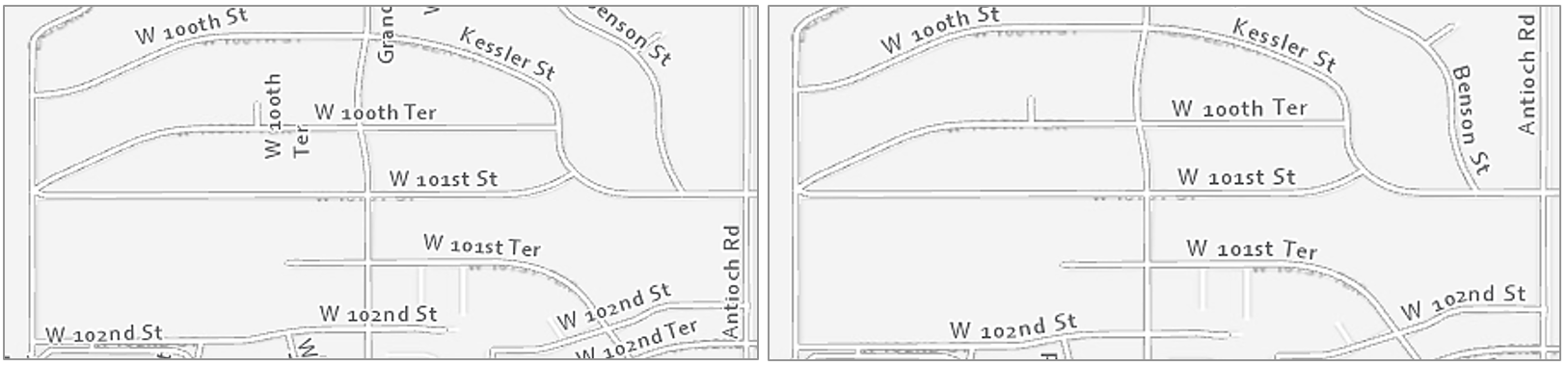
When labeling line features, similar guidelines as for point labeling exist—design for association, but not at the expense of legibility. Labels should generally follow line features—but not cross over perpendicular lines—as this makes the text harder to read. In some instances, this advice will not be practical, but it is best to first learn the rules so you can more thoughtfully break them.
Figure 2.4.6 shows two maps with labeled streets; the right-sided image is a definite improvement. Unlike in the left map, labels in the right map are aligned with streets and do not cross other lines. Labels in the right map are also better aligned for the eye to understand the naming conventions of the neighborhood: see W 100th Ter, W 101st St, and W 101st Ter, from North to South (maps are North-up). It is much easier to understand this progression in the right map. This sort of line placement is also useful when labeling contour lines, which have an even more important orderly progression.
In lieu of map labels, shields are often used to label highways and other important roads. Though interstate shields in the US are consistent, many states have unique highway shield designs. Using these custom shields in your maps is not always practical, but it can give them local character, and create a better match between the map and the real world.

Similar but additional guidelines exist for labeling non-road line features, such as flowlines. Streams, rivers, and other waterlines should be labeled with text that shows their categorical difference from road features. This is often done with italics (text posture), and/or by using a hue that matches the feature symbol. Figure 2.4.7 shows several examples of labels applied to the stream “Little Cedar Creek”. The label in the map at the left is legible but does not follow the flow of the creek—it looks rigid, as if it is a road label. In the middle map, the label does follow the creek, but this time too much so—it is difficult to read. The label placement in the far-right map is best—a gentle curve makes it clear that this label refers to a water feature, but not at the expense of legibility.

Figure 2.4.9 contains additional examples of line label improvements. Three general guidelines are demonstrated by this figure: (1) follow the feature, but not at the expense of legibility, (2) place labels above lines rather than below, (3) don’t write upside down.
If a line feature is quite long, the label will need to be repeated periodically. The interval at which your line labels repeat is up to you as the map designer and will depend on the map’s feature density, audience, presentation medium, and purpose.

Area labels
Just as rivers are labeled with curves to follow the flow of water, area features should be labeled in a way that highlights their most characteristic feature: extent. Labels for natural features such as water bodies and mountain ranges should demonstrate their physical extent across the landscape. Use UPPERCASE letters and stretch the label across the area of the feature.

When covering areal extent with labels, focus on finding a balance between character spacing and size. Increasing spacing is generally best—recall that increased font size suggests increased importance. To cover the extent of a feature, however, you may want to increase font sizing somewhat—too distant spacing with a small font size is likely to be challenging to read.
A common mistake to avoid is aligning area labels horizontally across the map frame. Though horizontal alignment is helpful when reading large blocks of text, this design is off-putting when viewed on a map (Figure 2.4.11; top). Stagger area labels for increased legibility (Figure 2.4.11; bottom).

Like regular line feature (e.g., roads, rivers) labeling, avoid labeling across boundary lines when prudent. When labels must cross over map lines, ensure that this does not compromise their legibility, nor overly obscure the feature underneath.

In some instances, particularly for political boundaries, it makes more sense to label the boundary of a feature, rather than its extent. You have likely seen this implemented in maps for navigation, or other interactive basemaps (Figure 2.4.12).
When labeling maps, you will often encounter locations with a lot of features in need of labels; this can pose a significant challenge. Leader lines can be used to connect features with labels that do not fit on or directly adjacent to their respective feature on the map. However, you should not overuse text halos, as these can obscure the map features underneath (Figure 2.4.13; top left). Nor should you overuse leader lines (as shown in Figure 2.4.13; top right)—this leads to a visually confusing map. Instead, find a balance between these techniques; experiment with label hue contrast and use leader lines sparingly. With practice, you will be able to create a well-balanced set of labels, such as shown in Figure 2.4.13 (bottom).

Further improved cartographic design is shown in Figure 2.4.14. This map shows how text color contrast, sizing, and occasional use of leader lines can create a balanced, legible, and aesthetically pleasing map design—even in a complicated map with many labels.
In summary: when creating a map feature label, balance different techniques, and continually ask yourself two over-arching questions: (1) Is the label clearly associated—both in style and positioning—with the feature being labeled? (2) Can I read it?
Recommended Reading
Imhof, Eduard. 1975. “Positioning Names on Maps.” The American Cartographer 2: 128–144.
Chapter 6: Labeling Maps. Brewer, Cynthia A. 2015. Designing Better Maps: A Guide for GIS Users. Second. Redlands: Esri Press.
Placing type (pgs. 346-350): Field, Kenneth. 2018. Cartography. Esri Press.
Axis Maps. 2017. “Labeling and Text Hierarchy in Cartography.” Cartography Guide.
Layout Essentials
Layout EssentialsOrganizing Space
It is typically efficient to place the most important features first, as they will take up the most space on the page. Be cautious, however, not to just start adding items wherever there are holes in the layout—good design is about balancing white space, which does not mean just filling it in. Often, the best way to find a good layout arrangement is to try many different arrangements and note what works. There will never be just one correct way to arrange all map elements.
Important Reading!
The graphics and explanations in Thematic Cartography and Geovisualization and Designing Better Maps are exceedingly helpful for developing an understanding of layout balance and design. This would be a good time to complete the required reading for this week.
When placing elements on the page, be cautious to leave enough space between them. For example, Figure 2.5.2 below shows how adding just a bit of negative space can result in a cleaner, clearer map design.

Another important component of layout design is the intentional reduction of ambiguity. For example, if your layout includes multiple maps (e.g., a primary and a locator map), and multiple scale bars, it should be clear which scale bar is associated with which map.
Using boxes (e.g., boxed legends) will often seem like an easy solution, but you should use these sparingly, as they tend to create crowding and making aligning map elements more challenging. As you finish designing your layout, ensure that all elements are visually aligned. See the recommended reading below, as well as the required reading for this week, for additional detail and images of proper layout alignment and design.
Building a Legend
Building a LegendThe part of your map layout that will likely require the most thought—except of course, for your map itself—is your map's legend. A map legend is a key composed of graphics and text that explains the meaning of any non-obvious map symbols. This non-obvious component is important to remember. Consider the general purpose map in Figure 2.6.1 below:

The legend isn’t incorrect, but it doesn’t help explain the map’s already clear design. Did you need a legend to understand that the blue features were water? Every element in your layout takes up precious space—there is no need to waste it explaining symbols that your readers will understand without it.
The same principle applies when adding text to your legend, such as a legend title. Legend titles should be used to add context and explain your map. Don’t title your legend “legend”—your reader will know it is a legend. If there’s no better title then "legend", it doesn’t need a title at all.
If your map does require a legend, use the same care to design it as you do with map symbols and labels. Be cautious of the way you create column breaks or other visual groups in your legend design. People tend to perceive groups of things as related - use this to your advantage in your legend design.
Figures 2.6.2 below shows a choropleth map with an accompanying legend. Though the legend accurately prints the map colors and their matching data values, the splitting of legend items across three columns breaks up the list in a way that may be confusing to the reader.

Below in Figure 2.6.3, the legend design has been much improved. A single column creates an easy visual representation of the color scheme for the reader.

For some legends, you will want not to eliminate column groupings, but to re-position or even create them. In Figure 2.6.4 below, inappropriate column groupings lead to ambiguity regarding the classification of some symbols. Are trails part of transportation, or are they their own category? What about streams? This legend leaves too much up to the reader to interpret.
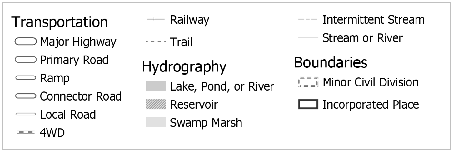
Figure 2.6.5 shows an improved version of this legend. Note that the different shape of the legend container means that it will need to be placed differently on the page—this highlights the importance of experimenting with layout arrangements throughout the design process.

Note that the examples in 2.6.4 and 2.6.5 contradict the previous statement that obvious symbols like "lake" can be left off the legend. We will slightly relax this "only non-obvious features" guideline in order to practice creating well-designed legends, and due to the presumption that some of our symbol designs may stray far enough from cartographic convention to be nonintuitive to map readers.
Recommended Reading
Chapter 3: Explaining Maps. Brewer, Cynthia A. 2015. Designing Better Maps: A Guide for GIS Users. Second. Redlands: Esri Press.
Marginalia Design
Marginalia DesignIn addition to a legend, your maps will often contain other supporting graphic elements such as a scale bar and north arrow. Similar principles apply—you should make your design as simple as possible while still supporting the reader’s understanding of the map. Commercial GIS software such as ArcGIS permits you to easily add accurate scale bars to your map. These will automatically match your map’s scale, and dynamically update if you re-scale your map within your layout. When it comes to visual design, however—be wary of GIS defaults. You will typically have to make manual simplifications to these elements, scale bars in particular.
Figure 2.7.1 shows examples of default scale bar designs inserted into a map layout in ArcGIS, alongside illustrations of their appearance after manual adjustment.

Like making a legend, the first question you should ask yourself before designing a north arrow for your map is: do you need it? Depending on the map projection you use, the direction which points north may not be consistent across your map—in this case, a background grid may be more appropriate. Most maps do use a north arrow, however, and if you do use one, similar conventions to scale bar design exist. Aim to make your design as simple as possible without sacrificing comprehensibility.
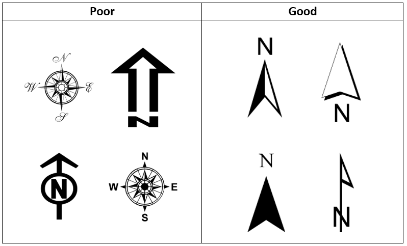
Student Reflection
View the two scale bars in Figure 2.7.3. In general, as described in Figure 2.7.1, the top scale bar is considered better design. Can you think of a map for which the scale bar at the bottom would be more suitable? Why would it be?

Lesson 2 Lab
Lesson 2 LabLettering and Layouts
This week, we'll revise and combine our two maps from Lab 1 into one neat, well-designed layout with labels, a legend, and marginal map elements (e.g., scale bars, north arrow). You'll get to build off your hard work from last week and apply new knowledge from this week: typographic design, label symbology, and layout design.
This lab, which you will submit at the end of Lesson 2, will be reviewed/critiqued by one of your classmates as part of Lesson 3 (critique #2). Receiving critique of your work and using this to inform future cartographic design decisions is an important skill to develop. Giving feedback to others also often teaches you new ways of looking at your own and others’ map designs.
Lab Objectives
- Create appropriate labels for map features using Maplex automated labeling tools in ArcGIS Pro.
- Apply labels to your maps from Lab 1, designing to show both category and hierarchy.
- Apply what you learned about multi-scale map design in Lab 1 by creating both a main map frame and an accompanying locator map.
- Use visual hierarchy when designing symbols, labels, a legend, and a layout.
Overall Lab Requirements
For Lab 2, you will create one complete map layout, with a main and a locator map.
- Modify your maps from Lab 1 to create new maps—you will need to make significant changes for them to work at the new scales; you may start over from the beginning if you wish.
- The best approach is likely to design your main map first, then create a copy of this map which you will modify/generalize/redesign as appropriate for the smaller (1: 1,000,000) inset map scale.
- Use these approximate scales: 1:40,000 for the main map, 1: 1,000,000 for the locator map.
- Design over ArcGIS Pro’s light gray canvas basemap—the same basemap we used in Lab 1 but please turn off the Esri basemap before submitting your lesson.
- Use color hue as you wish—be cautious not to overuse it. There is no restriction on color use for this lab.
Map Requirements
Labeling Requirements
- Coordinate label appearance with feature symbol design.
- Create label types with style settings; use SQL queries create specific feature label classes.
- Remove all nonsensical labels, using SQL queries and other methods of feature removal.
- Use expressions to augment at least one category of labels with additional text and/or combine data attributes.
- Use label placement conventions for line and area features.
Map One: Primary Map (1:40,000)
- Examine your map and develop at least four or more label categories based on the map feature classes (e.g., Highways, Lakes, Streams, Boundaries, etc.). You can use other names for your label categories.
- Within each label category, create one or more label classes. The label classes should demonstrate a hierarchy to a label category (e.g., interstate, collector road, local road, etc.).
- Create at least eight different label classes in total. You will likely have more label classes in some label categories than others.
- For this lab, a map feature class is considered different if defined differently in the data (e.g., local and collector roads have different TNMFRC codes; lakes and reservoirs have different FTypes). Note that while some map feature classes have a different FType, for instance, this difference doesn't necessarily mean that those features need to have unique label designs (e.g., what is the practical difference between a lake and reservoir on your map?). You do not need to create a unique label class for every map feature class, just the eight in total as described above. Some of the geographic areas in LA, for example, don't have a tunnel.
Map Two: Locator Map (1: 1,000,000)
- The locator map should be placed on the same layout as the main map.
- Label prominent map features as needed at this scale.
- Remember that this inset map is needed to provide locational context for people unfamiliar with the location you are mapping—design features and labels accordingly. Also, be judicious in how much information you show on your locator map.
Layout requirements
- Create two frames at different scales (main map and locator map). The main map should be larger in size than the inset map.
- Create appropriate marginal elements:
- a north arrow for the locator map (confirm north is up in both map frames);
- two scale bars; use clean design and label with sensible numbers;
- a legend; design its style, placement, and descriptive text;
- a hierarchy of marginal text (e.g., title, subtitle, data source, your name, legend text, legend title) – not necessarily in this order.
- Create a balanced page layout (either portrait or landscape). Attend to negative space.
Lab Instructions
- Open your project from Lab 1 and re-save with a new name (e.g., "Geog486_Lab2").
- If desired, you may re-download the zipped folder from Lesson 1 Lab and start the new map design from scratch.
- Start designing!
- As in Lab 1, there are few steps that must be completed in order - map design is not a linear process. You are encouraged to reference the visual guide for additional instructions and guidance. If you have a question, comment, or suggestion, please post it to the Lesson 2 Discussion forum.
Grading Criteria
Registered students can view a rubric for this assignment in Canvas.
Submission Instructions
- Submit one PDF—all elements must be included on one 8.5 x 11 page. Use the naming convention outlined below. You do not need to include a written statement or explanation with this lab assignment.
- Map Layout: LastName_Lab2.pdf
- Submit the PDF to Lesson 2 Lab for instructor and peer review.
- Note:The critique/peer review of the Lesson 2 assignment will occur in Lesson 3 (critique #2).
Ready to Begin?
More instructions are provided in Lesson 2 Lab Visual Guide.
Lesson 2 Lab Visual Guide
Lesson 2 Lab Visual GuideLesson 2 Lab Visual Guide Index
Part I: Labeling
- Starting file
- Finding names in your data
- Adding labels to your map
- Editing label classes
- Designing label symbols
- Positioning label symbols
- Creating label expressions
Part II: Layouts
Part I: Labeling
I.1 Starting file
Start this lab by opening your project file from Lab 1. Use “Save As” to create a new project for Lab 2. After this, you'll be ready to add labels!

I.2 Finding names in your data
We do not have to write our own labels for map features - they're already in our data - we just need to make them visible. Map features often contain multiple fields (data columns) with possible names, so we need to identify the best ones to use. To do this, open the attribute table for the layer you want to label. We can see the Full_Street_Name field seems like a good option to start with for this layer.

I.3 Adding labels to your map
To turn on labels for a layer, right-click the layer and toggle labeling on. To edit the labels, open Labeling Properties as shown below. This will open the Label Class pane. In this pane, the expression box shows how your labels are being drawn from a field in the attribute table. In some cases, ArcGIS will correctly identify the best field to use for labels. In other cases, it will not, and you will have to alter the expression manually. We will use Full_Street_Name, the field we identified earlier.

I.4 Editing label classes
Begin editing the style of your labels with the Labeling menu in the ribbon shown below. The default label symbols available are good starting points - they will help give you an idea of how to best design your own labels.


You should also create label classes using this top menu bar. Similar to when we classified roads by their TNMFRC code in Lab 1, we create label classes so that we can create different types of labels within a feature category, and use these classes to design our labels with visual order and/or category.

When you create a label class, all you are creating is a class with a name - ArcGIS will not automatically recognize, for example, that a label class named "Interstates" should only be applied to roads which are interstates. We will tell ArcGIS this using SQL (structured query language).
In our data, all interstates have a TNMRC code of 1 (this code signifies the interstate road-type; see Figure 2.8). We can define this label class using the SQL view in the label class pane. See below:

Note: The Label Class Pane can also be used to create label classes, instead of the top menu bar. You may find it more helpful to use the Label Class Pane for most labeling tasks.
If you forget which TNMFRC code refers to which road type, you should refer to the image below. You can also open this view in your project - your road features should still be classified by TNMFRC code, so viewing it in the symbology pane should create a view similar to the one below.

You should create a different label class for each road type for which you wish to have a different type of label. This includes small differences, such as font size. You do not necessarily have to create a different label class for every road type, but you will likely have several (e.g., local road, collector road, highway, etc.). You should reference the lab requirements page to ensure that you have created enough different label classes throughout your map.
Once you create your label classes, you can switch back and forth between them while editing using the Class dropdown menu. Note that if you create multiple label classes, you will need to define all of them, including the default label class. If you do not, you will have duplicate labels. For example, you may have Interstates labeled in one class, and all roads labeled in the default class - causing interstates to be labeled in both classes.
Another option is to delete the default label class - but be careful when doing so that you are maintaining all the labels you need.

I.5 Designing label symbols
Once you've created a label class, you can use the Symbol tab in the Label Class pane to edit its style. Shown here is the label symbol editing menu (left), and the formatting menu (right). These are used to change many aspects of a label's symbology - including fonts, sizes, spacing, color, etc. Highlighted in green are options I’ve found especially helpful – but don’t limit yourself to these. You should experiment with all options for symbol design—font, weight, spacing, etc. Recall from the lesson content that line spacing (leading) can be a negative value.

I.6 Positioning label symbols
In addition to changing the style of your labels, it is important to also assign how they should be positioned. Recall the lesson content on text placement - our goal for this lab is to place labels only with automatic rules. We will not be placing or adjusting labels by hand.
There are many positioning parameters you can adjust in the label position tab—try them out and watch how your labels change. There are a lot of useful options (e.g., Feature Weight) whose function may not be immediately clear to you - I recommend using the link at the end of this sentence to learn more about labeling with the ArcGIS Pro Maplex Label Engine.
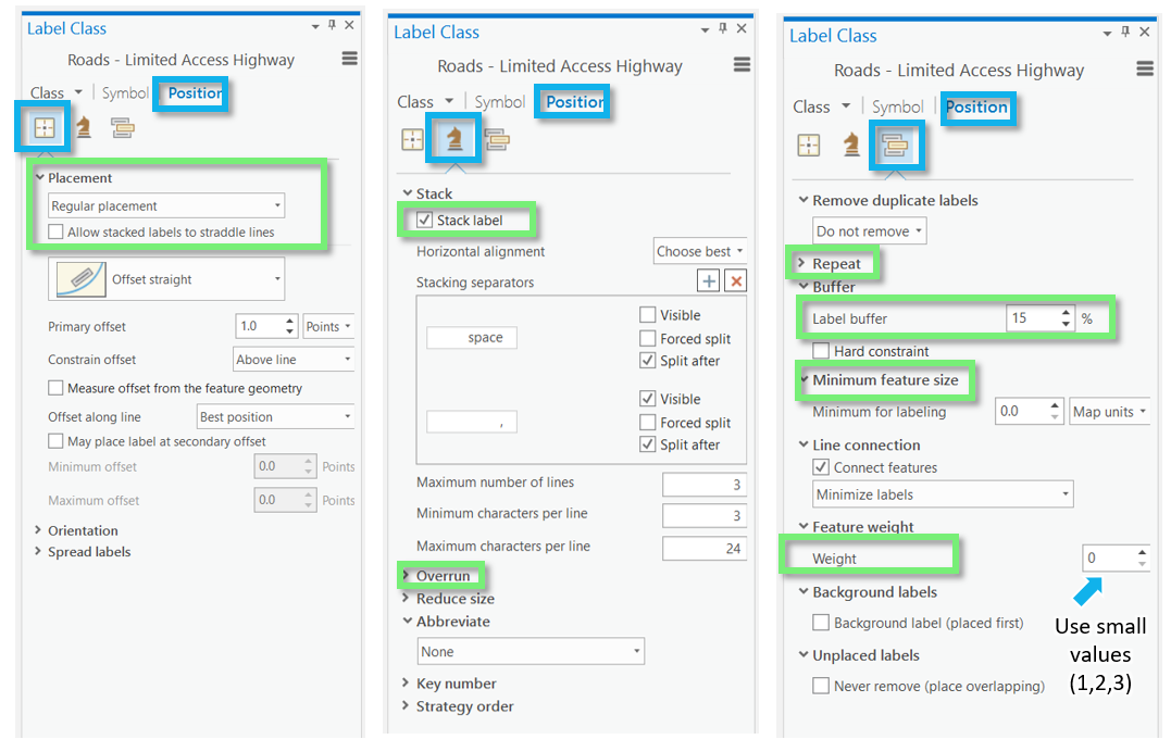
I.7 Creating label expressions
In addition to simply drawing a label from a feature's attribute table, you can edit label expressions using SQL to append words or other text for more descriptive labels. Don't worry if you haven't done any programming - you only need to make minor edits to create label expressions.

You can also use SQL to append additional text to a label from the attribute table. An example is shown below - though, in this example, you are creating quite a wordy label, which is generally not recommended.

Part II: Layouts
II.1 Putting it all together
Remember that you will be adding labels both to your large-scale (primary) map, and your small-scale (locator) map. Once you've finished adding labels to your primary map, you can add similar labels to your locator map. You can also save and then import a copy of your large scale map into your project, and then adjust it for the new smaller scale. This is the same process we used to create our second map in Lab 1.
To duplicate/re-import (a refresher):
- Save the most current version of your map as a map file (right-click on the Map in the Table of Contents (TOC)).
- Import that saved the map as a copy back into your project (Insert Tab --> Import Map).
- Change the scale of your new map, and design for this new smaller scale as a locator map.
Your final task is to create a Portrait or Landscape layout with your two maps, a legend, and text elements. An example layout design is shown below.
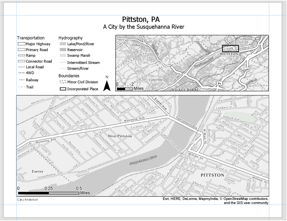
An example of a portrait layer is shown below: not that your map will also include a title, legend, etc. Additionally, these map examples are not shown in their final form - you are encouraged to use them for layout ideas, but you should not copy their designs.
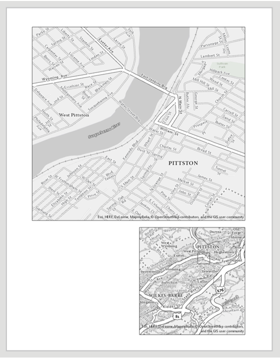
II.2 Build your layout
Before importing your maps, add guides for ½ inch margins – you should not include anything on the page outside of these margins. Note again that the examples below contain unfinished design—they should not be interpreted as examples of finished feature or label symbology.

For the locator map to be useful, you will need to insert an extent indicator. You should do so with the small scale map selected. This will draw a rectangle showing the extent of your large-scale map within the (larger) region covered by your small-scale, inset/locator map.

II.3 Add marginal elements
Marginal elements such as north arrows and scale bars should be added at this point. Keep your North arrow and scale bars simple and easy to read. Use “adjust width” to create clean scale bar values. You can also edit the color, font, label locations, etc., of all marginal elements. Reference lesson content for design ideas.

II.4 Create a legend
Another important component of your map layout for this lab will be its legend. Insert a legend with your large-scale map selected so it reflects your large-scale symbol design. Your locator map should use similar symbols, and therefore should not need a legend.

Right-click your new legend element in the contents pane, and choose “Properties” to edit.


You do not have to include every item in your legend, and you may want to change the names of some items significantly. Your goal is to create a comprehensible map. To change the design of different legend elements, select them from the drop-down menu in the Format Legend pane.

You can also make changes from the ribbon.

An efficient way to clean legend titles is to edit the layer titles themselves in the TOC—for example, by opening the properties dialog box for the county boundary layer and changing “GU_CountyOrEquivalent” to “County.”
Once you have made sufficient edits, you may want to disconnect your legend from the data by converting to graphics. This will give you more freedom over the design, but as your legend will no longer update dynamically if you update any map symbols, you should save this step until the end. You will have to “ungroup” the elements to edit them. Once you convert to graphics, you will need to right-click and “ungroup” multiple times to edit the elements for detailed design work. (Note that this is not a well-edited legend, just an example of one in process).

Once your legend is complete, there are only a few final touches to be made. Use the “Dynamic Text” dropdown to move the service layer (basemap) credits out of the map frame and place them elsewhere in your layout, for a cleaner look.

Don't be afraid to re-arrange your layout elements as you go! It may take quite a few tries before you find an optimal design.
Remember to create visual hierarchy for marginalia elements:
- Title
- Subtitle
- Legend Titles
- Legend Text
- Data Source
- Name
Below is an example of a landscape layout made from similar data - you will need to adjust your map to work with the assigned data and location. Note also that the map below may not include all required elements for this lab, but is an example of how your layout might look if you are on the right track.

II.5 Final tips and tricks
- You may use color, but do not over-rely on it. It is often advised to use all greyscale at first, and then add color later on for emphasis. Too much color on a map that is not well balanced will result in a poorly designed map.
- Don’t be afraid to change course while you work—try out different labeling and layout options before committing to a final design.
- Lesson 2 Visual Guide contains many design ideas and suggestions. Do not rely on the Guide to tell you how to design your map. Instead, use the instructions to learn how tools in ArcGIS Pro are used and then let your creativity guide your design.
- See the Lab 1 instructions if you need a refresher on how to design symbols or how to export your map. Remember, if your map uses a gradient fill, complex area fill patterns, or coastline effects, export the map setting the resolution to be no more than 150dpi.
- Check that your map meets all listed requirements by referring to the lab instruction document and rubric before you submit.
Credit for all screenshots is to Cary Anderson, Penn State University; Data Source: The National Map.
Summary and Final Tasks
Summary and Final TasksSummary
Here we are - at the end of Lesson 2! In this lesson, we learned about two vitally important but occasionally overlooked aspects of map design: the design of labels and other text elements, and the building of a neat, balanced map layout. In Lesson 1, we discussed visual variables and how they can be used to visually encode order and category in map symbols. In Lesson 2, we extended this idea to include map label design. We also discussed order in another context - the creation of a visual hierarchy in a map layout.
As you likely noticed while working on Lab 2, neither adding labels nor designing a map layout are trivial tasks. Something as simple as creating a legend or scale bar requires significant thought and attention. Little details such as the alignment of layout elements may feel like the "last mile" in the making of a map, but they are key for getting your readers' minds to where they ought to go.
Reminder - Complete all of the Lesson 2 tasks!
You have reached the end of Lesson 2! Double-check the to-do list on the Lesson 2 Overview page to make sure you have completed all of the activities listed there before you begin Lesson 3.
Lesson 3: Flow Mapping and Projections
Lesson 3: Flow Mapping and ProjectionsThe links below provide an outline of the material for this lesson. Be sure to carefully read through the entire lesson before returning to Canvas to submit your assignments.
Note: You can print the entire lesson by clicking on the "Print" link above.
Overview
OverviewWelcome to Lesson 3! In previous lessons, we discussed and designed several types of thematic maps, including proportional symbol, dot, and choropleth maps. Here, we discuss a more specialized type of thematic map - flow maps. In this lesson, we'll integrate our knowledge of visual variables, map symbolization, and levels of measurement into our discussion of these flow maps: maps that show movement between locations.
Before diving into our flow map discussion, however, we introduce another topic integral to cartography: map projection. We explore the different ways in which we define locations on Earth's surface, the process of creating a map projection, and how our choice of projection alters readers' interpretations of our maps. By the end of this lesson, you should understand the different classes and cases of projections, as well as popular map projections and their characteristics. In Lab 3, we use this knowledge to create custom projections for flow map-based advertisements - a twist intended to emphasize the vast variety of clients and audiences for whom cartographers design thematic maps.
Learning Outcomes
By the end of this lesson, you should be able to:
- explain the relationship between the geoid, a reference ellipsoid, and a datum, as well as the importance of these elements in cartography;
- classify projections based on their class, case, and aspect;
- describe projection properties and their respective utility for different mapping tasks;
- integrate knowledge of a map’s purpose, scale, and location into the projection selection process;
- describe the use of visual variables and levels of measurement in flow maps.
Lesson Roadmap
Here's the corrected table: html
| Action | Assignment | Directions |
|---|---|---|
| To Read | In addition to reading all of the required materials here on the course website, before you begin working through this lesson, please read the following required readings:
If you want to dive into the material a bit further, a good place to start with map projections and learning about their influence on map design, check out this article:
Additional (recommended) readings are clearly noted throughout the lesson and can be pursued as your time and interest allow. | The required reading is available in the Lesson 5 module. |
| To Do |
|
|
Questions?
If you have questions, please feel free to post them to the Have a question about Lesson 3? Ask here! forum. While you are there, feel free to post your own responses if you, too, are able to help a classmate.
Modeling Earth
Modeling EarthFrom a young age, we are generally taught that Earth is a sphere. Images such as those taken from space (e.g., Figure 3.1.1) reinforce this idea. Yet, this is an oversimplification—Earth's actual shape is far more complicated as it appears to be. This poses an issue for cartographers, because our job often requires us to use measurements of the Earth to represent it accurately. So, short of going out and measuring every nook and cranny of the Earth’s surface, what tools can we use to create a faithful model of our very non-spherical planet?

Due to the centrifugal force created by Earth’s rotation, Earth bulges outwards slightly at the middle—it is wider around the equator than from pole to pole. Because of this, a better way to describe Earth’s shape is as an ellipsoid. Ellipsoids which closely resemble spheres (also referred to as spheroids)—and as Earth is wider in the East-West direction, the most precise word to describe the approximation of Earth's shape is oblate ellipsoid (or oblate spheroid). In the literature about this topic, the terms ellipsoid and spheroid are often used interchangeably. Which term you use is less important than your understanding of the general concepts involved.

Many scientific fields are concerned with determining heights across Earth’s surface. In order to establish an accurate height, a zero-surface needs to be established. While the equator and prime meridian offer convenient zero-references for horizontal positions (a horizontal datum), heights (or the vertical component) is more challenging. To determine accurate heights (or elevation), a vertical datum is needed.
Elevation can be described as the distance of a point above a specified zero-surface of constant potential (usually gravity or gravitation). This distance is measured along the direction of gravity between the point in question on Earth’s surface and the specified zero-surface. To start this measurement, a suitable surface must be selected. Many surfaces exist such as an equipotential surface (i.e., a level surface of constant potential energy). Meyer (2010) explains that, in theory, on a level surface, there is no change in gravity potential and water does not flow across said surface. Water only flows between different equipotential surfaces due to forces that arise from the differences in potential energy.
Earth possesses an infinite number of equipotential surfaces. Deakin (1996) described that a cross-section of Earth’s equipotential surfaces would appear as an infinite number of thin onion skins that are not parallel to one another, are continuous, have smoothly varying radii of curvature, and are spaced closer together at the poles than at the equator with verticals as curved lines intersecting each surface at right angles. This convergence is a consequence of Earth’s physical oblate shape, to a first order and that gravity is stronger at the poles.
One particularly important zero-surface of the Earth is mean sea level (MSL), or the average height of the ocean’s surface. Historically, MSL was calculated simply by measuring the height of the ocean over time at fixed points. Mean sea level is affected by Earth’s gravity as gravity across Earth’s surface is not constant. Earth’s gravity is different in Lincoln, NE than it is in Los Angeles, CA, and if the ocean existed in both locations, its surface would be at different heights due, in part, to the influence of gravity. In places where the ocean is not found (like Lincoln, NE) it is difficult to measure MSL. Historically, estimates of MSL for interior locations were created by extending MSL based, in part, on long-term computations from tidal gauge stations located along the coasts. This process created a vertical datum called the Sea Level Datum of 1929 (which was later renamed to the National Geodetic Vertical Datum of 1929 in 1973). Unfortunately, the surveys used to create this datum introduced error into this geodetic height network.
Despite best intentions, MSL does not accurately represent Earth’s true shape. Estimates of MSL are fraught with accounting for forces such as winds, tides, currents that complicate the estimation process. A different zero-surface, known as the geoid, helps address these complications. In conceptual terms, the geoid is a level surface that the world’s ocean would assume if Earth’s rotation, winds, tides, and currents stopped, and its waters freely flowed over land conforming to Earth’s gravity field. In a general sense, MSL approximates the geoid, after a least squares adjustment is made. Van Sickle (2017) offers that these environmental forces cause MSL to deviate from the geoid up to 2 meters implying that MSL does not exactly follow the geoid. It is important to remember that the geoid does not represent the terrain of the Earth. However, the surfaces are related, for example, as rock masses have an effect on local gravitational forces and can help shape the geoid.
Figure 3.1.3 illustrates a geoid model. Overall, this geoid model is bumpy but these undulations are not visible to our eyes. In the figure, magenta hues indicate places of greater mass and stronger gravity (MSL is higher) while cyan hues represent lower mass and weaker gravity (MSL is lower). Some of Earth’s surface topography, reflected by the geoid undulations, can be visualized in this figure such as the Pyrenees Mountains and the Himalayans. Other undulations cannot and are attributed to, for example, different rock densities (such as observed in the basin in the Indian Ocean).


The geoid is constantly changing—due both the ever-changing nature of Earth’s surface (e.g., from continental shifts, melting glaciers, etc.), and because technological advancements have allowed for more and more precise gravitational calculations over the years. The dynamics of Earth and the imprecision of measurement techniques mean that any model of the geoid is only an approximation (just as MSL is an approximation for Earth’s gravitational (and height) surface), in reality.
Recommended Reading
Deakin, R. E. (1996). The Geoid, what's it got to do with me? Australian Surveyor, 41(4), 294–305. DOI: 10.1080/00050339.1996.10558646.
Meyer. T. (2021). Earth's Shape, Sea Level, and the Geoid. The Geographic Information Science & Technology Body of Knowledge (2nd Quarter 2021 Edition), John P. Wilson (ed.). DOI: 10.22224/gistbok/2021.2.8.
Meyer, T. (2010). Introduction to Geometrical and Physical Geodesy: Foundations of Geomatics. Redlands, CA: Esri Press.
Van Sickle, J. (2010). Basic GIS Coordinates. 3rd edition. CRC Press, Boca Raton, Florida.
Vertical (Geopotential) Datums. Fritz C. Kessler. 2022. The Geographic Information Science & Technology Body of Knowledge (2nd Quarter 2022 Edition). John P. Wilson (Ed.). DOI: 10.22224/gistbok/2022.2.4.
Geographic Coordinate Systems
Geographic Coordinate SystemsEllipsoids and geoids are both ways to model the Earth, and thus there are multiple ways to “fit” these models to our physical planet. We do this by choosing a set of reference points, and using these reference points create a geodetic network called a datum. There are many different datums from which to choose. Each datum can be composed of unique ellipsoid and geoid models.
Horizontal datums denote locations using a system of longitude and latitude. The network of latitude and longitude lines that appears on a map is called the graticule. Horizontal datums are based primarily on a specified reference ellipsoid. We have already addressed the idea of a vertical datum, which is used to specify heights from a zero-surface (i.e. the geoid). Both horizontal and vertical datums are important for designing cartometric maps, as was mentioned in Types of Maps. But in order to get the most accurate horizontal measurements of a particular area of concern, one must select a horizontal datum that accurately models the geographic location in question.
The two illustrations in Figure 3.2.1 below demonstrate how datums differ in their design based on their intended purpose. On the left, the reference ellipsoid is aligned to closely fit the geoid in one part of the world (Australia). This is a local datum developed for use in Australia, and though the ellipsoid fits other parts of the world poorly, this is acceptable given the datum's intended use. On the right, the reference ellipsoid more closely fits the geoid overall. This is a geocentric datum, which is ideal for global mapping projects. The reference ellipsoid on the right is also centered at the center of Earth’s mass, which is important for GPS positioning.

The three most popular horizontal datums used in North America are the North American Datum of 1927 (NAD27), the North American Datum of 1983 (NAD83), and the World Geodetic System (WGS84), which is actually considered to be a terrestrial reference frame (which expresses both horizontal and vertical datums all rolled into one standard. NAD27 was the first standardized connected system of location points in North America. It was based on the Clarke Ellipsoid of 1866—measurements were made and recorded based on the relative positioning of all locations from Meade’s Ranch in Kansas. NAD83 is the modernized replacement of NAD27 and sought to improve positional accuracy as a result of adding thousands of new benchmarks. NAD83 replaced NAD27 in 1983; its increase in accuracy came from the addition of more benchmarks compared to NAD27. Still, NAD83, relied on human measurement of triangulation from control points. The National Geodetic Survey (NGS) has been working to replace NAD83 with a terrestrial reference frame that will encompass the entirety of the United States and its territories. Known as the North American Terrestrial Reference Frame of 2022 (NATRF22), this will combine the geometric and geopotential aspects into a single product that will rely primarily on Global Navigation Satellite Systems (GNSS), such as the Global Positioning System (GPS), as well as on a gravimetric geoid model resulting from NGS’ Gravity for the Redefinition of the American Vertical Datum (GRAV-D) Project. The intended accuracy of heights relative to MSL in the geopotential component of NATRF2022 will be 2 centimeters over any distance, where possible. The magnitude of change with NATRF2022 will vary depending on your geographic location. NATRF2022 will change latitude and longitude positioning and ellipsoid height between 1 and 4 meters. In the conterminous United States (CONUS), NATRF2022 will change heights on average 50 centimeters, with approximately a 1-meter tilt towards the Pacific Northwest.
Student Reflection
In a time before computers and satellite measurements, why do you think Kansas was chosen to start measurements for the North American Datum of 1927? What role does this location play in GIS today?
The World Geodetic System (WGS84), designed by the National Geospatial-Intelligence Agency, developed alongside GPS technology, was the first datum suitable for general worldwide use. WGS84 is the standard datum used by GPS technologies today, though NAD83 remains popular for non-GPS-based mapping activities in North America. As mentioned, a new geometric and geopotential datum for North America, NATRF2022, will soon be realized and available for use. More information on this and other new datums is available from the National Geodetic Survey.
Historical maps and data often reference the now-outdated NAD27 datum; it is important to be aware of the datum which was used to designate the locations of your spatial data. Datum transformation is the process of re-calculating coordinate locations or heights based on a different datum and may be necessary if you are combining datasets that were specified using different datums (e.g., NAD27 vs. NAD83), or if you are hoping to map historical data using a more up-to-date system.
As noted previously, modeling the earth as an ellipsoid or geoid is necessary for Cartometric mapping—mapping that involves the taking of precise measurements from maps. Current GIS software tools (and the computers they run on) are now powerful enough to create projections based on an ellipsoidal Earth without much difficulty. For most thematic mapping purposes, however, conceptualizing Earth as a sphere is close enough.
For the rest of this lesson, we will discuss Earth’s shape as if it were spherical, despite this being an oversimplification. The reason for this is that to create a map—that is, a two-dimensional (flat) rendering of Earth’s surface—we need to represent a three-dimensional object on a two-dimensional plane. And even with a simple sphere, this is no simple task. In addition, the thematic maps that are created in this class do not have a high accuracy measurement requirement; thus, a spherical Earth assumption is sufficient for thematic map purposes.
Recommended Reading
The following list provides supplemental readings on related topics that can provide you with more detail about datums.
Kessler, F. (2022). Horizontal (Geometric) Datums. The Geographic Information Science & Technology Body of Knowledge (2nd Quarter 2022 Edition). John P. Wilson (Ed.). DOI: 10.22224/gistbok/2022.2.6.
Kelly, K.M. (2020). Geographic Coordinate System. The Geographic Information Science & Technology Body of Knowledge (4th Quarter 2023 Edition), John P. Wilson (ed.), DOI: 10.22224/gistbok/2023.4.1.
National Geodetic Survey (NGS). (2021). Blueprint for 2022, Part 1: Geometric Coordinates. NOAA Technical Report NOS NGS 64. National Oceanic and Atmospheric Administration (NOAA).
National Geodetic Survey (NGS). (2021). Blueprint for 2022, Part 2: Geopotential Coordinates. NOAA Technical Report NOS NGS 64. National Oceanic and Atmospheric Administration (NOAA)
Projecting the Earth
Projecting the EarthUnlike Earth, maps are flat. Though Earth can also be represented as a globe, globes are inconvenient, expensive, and challenging to design. Maps are much more convenient: they are easier both to produce and to reproduce, and when you are mapping detailed data at a relatively large scale, the Earth appears to be more or less flat anyway. So when you want to transform latitude and longitude values from the three-dimensional Earth onto a two-dimensional surface (a map), you will use a process called map projection.

In the past, cartographers were tasked with projecting maps by hand, necessitating relatively complex mathematical calculations. Fortunately, GIS software such as ArcGIS is now able to perform this task of projection for us automatically. Though deriving a map projection through manual methods is uncommon today, map projections are still being refined and invented– as one example, Bojan Šavrič (Esri), Tom Patterson (US National Park Service), and Bernhard Jenny (Monash University) released the Equal Earth Projection in 2017.
To create a map, cartographers transfer a model of the earth as it appears on a reference globe to a developable surface.
A reference globe is a model of Earth, including landmasses, oceans and the graticule (lines of latitude and longitude), at some chosen scale, which is the final scale of the map to be created (Slocum et. al 2023). This projected map is thus modeled from an imaginary scaled-down version of Earth.
A developable surface is a mathematically-definable surface onto which landmasses and the graticule are projected (Slocum et. al 2023). In simpler terms, a developable surface is any surface that can be “unrolled” flat and thus, create a two-dimensional map. Typically, this surface is described as a cone, a plane (flat surface), or a cylinder. In this next section, we discuss how the choice of a developable surface—among other factors—influences a map projection's characteristics.
Student Reflection
Imagine the cone developable surface as a party hat placed on top of Earth. After projection, which locations do you imagine would appear the least distorted on the resulting map? Which would appear the most distorted?
Recommended Reading
Chapter 8: Elements of Map Projections. Slocum, Terry A., Robert B. McMaster, Fritz C. Kessler, and Hugh H. Howard. 2023. Thematic Cartography and Geovisualization. 4th ed. Boca Raton, FL: CRC Press.
Characteristics of Projections
Characteristics of ProjectionsLike ellipsoids, geoids, and datums, there are many projections to choose from, as well as many options for customizing the projection you choose. Before you decide, it will help to understand the characteristics of different projections. Projections are generally defined by their class, case, and aspect. All three of these characteristics refer to the way in which the developable surface relates to the reference globe.
A projection’s class refers to which developable surface was used to create the projection. Was the developable surface a cone (conic class), plane (planar class/azimuthal), or cylinder (cylindric class)?

The projection class you use will depend, among other factors, on the location of the region you intend to map. Planar projections, for example, are often used for polar regions.
As shown by the figure below (Figure 3.4.2), a map will contain no distortion at the location where the reference globe touches the developable surface, and distortion increases with distance from this location.

Even among projections of the same class, there is more than one way to create a projection with the selected developable surface. A projection’s case refers to how this surface was positioned on the reference globe. If the developable surface touches the globe at only one point or line, this is called a tangent projection. If it touches at two, this is called a secant projection.

Aspect refers to where the developable surface is placed on the globe. If it is placed over one of the Poles (North or South), this is called a polar aspect projection. If the center is along the equator, this creates an equatorial projection. If the developable surface is placed anywhere else, we call this an oblique projection.

No matter what its class, case, and aspect, the projection process always creates distortion. Different projections, however, have different types of distortion. In the next section, we discuss these differences.
Projection Properties
Projection PropertiesAll map projections distort landmasses (and waterbodies) on Earth’s surface in some way. Even so, projections can be designed to preserve certain types of relationships between features on maps. These include equivalent projections (which preserve areal relationships), conformal
All map projections distort landmasses (and waterbodies) on Earth’s surface in some way. Even so, projections can be designed to preserve certain types of relationships between features on maps. These include equivalent projections (which preserve areal relationships), conformal projections (angular relationships), azimuthal projections (directional relationships), and equidistant projections (distance relationships). The projection you choose will depend on the characteristics most important to be preserved, given the purpose of your map.
Equivalent
Equivalent projections preserve areal relationships. This means that comparisons between sizes of land-masses (e.g., North America vs. Australia) can be properly made on equal area maps. Unfortunately, when areal relationships are maintained, shapes of landmasses will inevitably be distorted—it is impossible to maintain both.
In Figure 3.5.1 below, shape distortion is most pronounced near the top and bottom of the map. This is because the poles of Earth (North and South) are represented as lines of the same length as the equator. Recall that lines of longitude on the globe converge at the poles. When these convergence points are instead mapped as lines, landmasses are stretched East-West, which means that to maintain the same area, landmasses must be compressed in the opposite direction. In the map below, Russia (and other landmasses) are represented at the proper size (compared to other landmasses on the map) but their shapes are significantly distorted.

The property of equivalence is perhaps best understood by contrasting the appearance of landmasses on an equivalent projection with a popular projection that greatly distorts area—the Mercator projection (Figure 3.5.2).

The Mercator projection results in a significant distortion of areas far from the equator. In order to maintain local angles, parallels (lines of latitude) are placed further and further apart as you depart from the equator. The website thetruesize.com demonstrates this effect.
Despite this, the Mercator is useful for some purposes. It has historically been used for navigation—it is efficient for routing as any straight line drawn on the map represents a route with a constant compass bearing (e.g., due West). This line of constant compass bearing is commonly referred to as a rhumb line or loxodrome. The Mercator is a conformal projection.
Conformal
Conformal projections preserve local angles. Though the scale factor (map scale) changes across the map, from any point on the map, the scale factor changes at the same rate in all directions, therefore maintaining angular relationships. If a surveyor were to determine an angle between two locations on Earth’s surface, it would match the angle shown between those same two locations on a conformal projection.

Although the Mercator projection simplifies navigation, rhumb lines do not show the shortest distance between two points. The shortest point between two points on Earth is called a great circle route. Unlike rhumb lines, such lines appear curved on a conformal projection (Figure 3.5.4). Of course, the literal shortest path from Providence to Rome is actually a straight line: but you'd have to travel beneath Earth's surface to travel it. When we talk about the shortest distance between two points on Earth, we are talking in a practical sense of traveling across or above Earth's surface.

Azimuthal
The gnomonic map projection has the interesting property that any straight line drawn on the projection is a great circle route. The gnomonic projection is an example of an azimuthal projection.

Azimuthal projections are planar projections on which correct directions from the center of the map to any other point location are maintained. The stereographic projection is another example of an azimuthal projection. Though only on the gnomonic projection is every straight line a great circle route, a straight line drawn directly from the map’s center is a great circle on any azimuthal projection.

The most common types of azimuthal projections are the gnomonic, stereographic, Lambert azimuthal equal area, and orthographic projections. The primary difference between azimuthal projection types is the location of the point of projection. In Figure 3.5.7 below, a gnomonic projection occurs when the point of projection is Earth’s center. Stereographic maps have a point of projection on the side of Earth opposite the plane’s point of tangency; the point of projection for an orthographic map is at infinity.

Equidistant
Equidistant projections are often useful as they maintain distance relationships. However, they do not maintain distance at all points across the map. Instead, an equidistant projection displays the true distance from one or two points on the map (dependent on the projection) to any other point on the map or along specific lines.

In the azimuthal equidistant projection (Figure 3.5.8, left) distance can be correctly measured from the center of the map (shown by the black dot) to any other point. In two-point Equidistant projection (Figure 3.5.8, right), correct distance can be measured from any two points to any other point on the map (and, thus, to each other). In the example above, those two points are (30⁰S, 30⁰W) and (30⁰N, 30⁰E). These values were supplied as parameters to GIS software while projecting the map. However, you can customize the parameters that better suit the map's purpose, the geographic area to be mapped, and the map’s purpose.

Not all equidistant maps are circular in shape. The cylindrical equidistant projection, for example, is equidistant in that correct distances can be measured along any meridian. When the cylindrical equidistant projection uses the Equator as its standard parallel, the graticule appears to be composed of grid squares, and it is called the Plate Carrée, a popular map projection due to its simplicity and utility.
Student Reflection
Imagine you are planning a flight path and tasked with finding the shortest route from Alaska to New York. Which map would you use? Why? Would the map you use first to draw the route be different from the map you would use while traveling?
So far, we have discussed maps that preserve areal (equivalent), angular (conformal), distance (equidistant), and directional (azimuthal) relationships. As demonstrated by the previous examples, maps that preserve certain properties do so at the expense of others. It is impossible to preserve angular relationships, for example, without significantly distorting feature areas. For this reason, another class of projections exists—compromise projections.
Compromise
Compromise projections do not entirely preserve any property but instead provide a balance of distortion between the various properties. A frequently-used example is the Robinson Projection, shown in Figure 3.5.10 below. Note on this projection how the landmasses appear more similar in shape and size to what is seen on a globe compared to their appearance on a projection that preserves a specific property entirely (e.g., The Mercator).

Interruption is not a projection property, but a characteristic of a projection. Specifically, interrupted projections can be useful in some mapping contexts. Interrupted maps, such as the Goode homolosine interrupted projection (Figure 3.5.11), are reminiscent of an “orange-peel” pressed against a flat surface, a common metaphor for map projections. In the same way that peeling an orange allows you to make the rind flatter, interruption allows cartographers to represent landmasses with generally less distortion.

The interrupted nature of this projection severely distorts (by dividing) water bodies, and so would not be useful for maps related to oceanic data, or those intending to visualize routes across Earth’s (connected) surface. These distortions, however, allow the map to display a more accurate representation of landmasses’ sizes and shapes at the expense of accurate proximity. Note that while the divisions on the projection shown in Figure 3.5.11 are over water, divisions over land are also possible, though not as popular.
Many projections are available in ArcGIS and other software, some of which are imaginative and fun (e.g., the Berghaus star; Figure 3.5.12) and all of which can be customized to suit a map’s location and purpose. We will talk more about how to select an appropriate map projection in the next section.

projections (angular relationships), azimuthal projections (directional relationships), and equidistant projections (distance relationships). The projection you choose will depend on the characteristics most important to be preserved, given the purpose of your map.
Choosing a Projection
Choosing a ProjectionThere are many factors to keep in mind when choosing a projection for your map. The number of projections available can sometimes seem overwhelming, and as there is no distortion-free map, the selection of any projection involves a trade-off between different properties.
When selecting a projection for your map, your map’s purpose, geographic scale, and location should be at the forefront of your decision-making process. Many cartographers have proposed guidelines or tools to assist map-makers in choosing an appropriate projection.
Slocum et al. (2023) provide five suggestions for choosing a projection for a thematic map:
- The cartographer should aim to select the projection with the least distortion.
- Distortion can be kept to a minimum by aligning the location of the map with the location of the standard line(s) or point(s)—where the reference globe meets the developable surface.
- As the amount of geographic area covered by the map increases, distortion becomes more of an issue—projection selection is much less consequential with large-scale “zoomed-in” detailed maps.
- Some projections are popular and in widespread use—this does not necessarily mean they are the best choice for your map.
- Projection influences the overall look of your map design—this has been less studied and is generally less quantifiable than other factors, but it’s still important to consider.
Frederick Pearson (1984), also proposed a simple set of guidelines for map projection selection based on the latitude of the area to be mapped. If the map was of an equatorial region, he suggested a cylindric projection. If it was mid-latitude, a conic projection, if it was polar, a planar projection (Pearson 1984). While this is a good starting point, one must consider these guidelines in the context of a map’s purpose. One must also then choose between the many projections that exist of each type (e.g., there are many different conic projections).
Some online tools have been developed to help in the projection selection process. One such tool is Projection Wizard, developed by Bojan Šavrič (Šavrič, Jenny, and Jenny 2016). It is a web-based tool that suggests projections based on user input of only the intended distortion property (e.g., equal-area), and the location of the map (input via an adjustable map frame).

Projection Wizard is based largely on projection selection guidelines developed by John Snyder (1987), guidelines which are also discussed in detail by Slocum et al. (2023). These sources are listed in the recommended readings for this section—highly suggested if you would like to learn more about this topic.
As noted by Slocum et al. (2023), selecting an appropriate projection requires thinking not only about its objective utility, but about its overall design and what your map’s readers will think of it. Recent research has investigated user responses to map projections. Battersby and Kessler (2012) investigated novice and experienced map-readers’ strategies for comprehending distortion on maps, and found that both groups struggled to correctly specify distortion on maps. Šavrič et al. (2015) focused on user preference and found that many readers tend to favor the Robinson (and similar) projections, and that general map-readers have somewhat different preferences for map projections overall than experienced cartographers.
In addition to attending to projection guidelines and anticipating reader responses, it is often helpful simply to experiment with different projections. The following tools are good resources to explore projection properties and distortion:
- Map Projection Transitions - a cool interactive visualization of spinning map projections
- Projection Compare - visually compare two map projections overlaid on top of each other
- Map Projection Playground - explore map projection parameters
- Mercator Puzzle - a fun game with map projections
Student Reflection
Another helpful way to learn is to create a simple map in ArcGIS and practice changing its projection—load simple boundary files (such as those provided for Lab 3) and notice how altering the projection and projection parameters changes the final design.
Recommended Reading
Chapter 9: Selecting an Appropriate Map Projection. Slocum, Terry A., Robert B. McMaster, Fritz C. Kessler, and Hugh H. Howard. 2023. Thematic Cartography and Geovisualization. 4th ed. Boca Raton, FL: CRC Press.
Battersby, S. (2017). Map Projections. The Geographic Information Science & Technology Body of Knowledge (2nd Quarter 2017 Edition), John P. Wilson (ed.). DOI: 10.22224/gistbok/2017.2.7.
Kessler, F., &; Battersby, S. E. (2019). Working With Map Projections: A Guide to Their Selection 1st ed. Boca Raton, FL: CRC Press/Taylor & Francis Group.
Jenny B., Šavrič B., Arnold N.D., Marston B.E., Preppernau C.A. (2017) A Guide to Selecting Map Projections for World and Hemisphere Maps. In: Lapaine M., Usery E. (eds) Choosing a Map Projection. Lecture Notes in Geoinformation and Cartography. Springer, Cham.
Robinson A.H., The Committee on Map Projections (2017) Matching the Map Projection to the Need. In: Lapaine M., Usery E. (eds) Choosing a Map Projection. Lecture Notes in Geoinformation and Cartography. Springer, Cham.
Popular Projections and Coordinate Systems
Popular Projections and Coordinate SystemsTwo map projections that you will notice are frequently used in the United States are the Lambert conformal conic and transverse Mercator. The Lambert conformal conic, as its name suggests, is a conformal (preserves local angles) projection that uses a cone as its developable surface. The name “Lambert” is from its inventor—Swiss scientist Johann Heinrich Lambert. Conic projections are particularly useful for mid-latitude regions with primarily East-West extent, such as the United States.

The transverse Mercator projection is a slight alteration of the Mercator projection. Where the Mercator uses the equator as its line of tangency, the transverse Mercator uses a meridian. Figure 3.7.2 below uses the prime meridian as its standard line.

These two projections are used in the State Plane Coordinate System (SPCS), a coordinate system designed for use in the United States. The SPCS is useful for some mapping tasks such as local government planning, as these coordinate systems have been designed to be highly accurate within each zone. Problems can occur, however, when areas of interest cross a zone boundary: this requires that at least one set of data be transformed so that proper GIS analysis can be conducted.

As shown, the transverse Mercator is used in states with a primarily North-South extent (e.g., Vermont, New Jersey) or in locations where the state is usefully divided into multiple North-South extent (e.g., New York). The Lambert conformal conic projection is similarly used for East-West extents. Some states, such as Florida, use both (Lambert conformal conic is used for the Florida panhandle). The oblique Mercator is used only in one case—the Alaska panhandle—as this region has an extent that is neither North-South nor East-West.
Another coordinate system that you will see frequently (once you start paying attention to these things) is the Universal Transverse Mercator (UTM). The system divides the world into 60 zones, each of which covers six degrees of longitude. The set of zones that covers the US is shown in Figure 3.7.4.

Each UTM zone uses a secant transverse Mercator projection with unique parameters based on the longitudes of its bounds. As the Mercator is a conformal projection, local angles are maintained. Areas and distances are distorted, but the use of secant projections and the somewhat small size of the zones keeps this distortion low – at about 1 part in 1,000. The larger size of these zones means that they are more likely than SPCS zones to cover the entirety of a local area of interest, though recommendations exist for adjusting maps in cases where a mapped area overlaps multiple zones. UTM's worldwide coverage also makes it useful for creating maps that are shared around the world, and it is widely used in military applications.
Recommended Reading
Chapter 3: Geodesy and Map Projections. Bolstad, Paul. 2012. GIS Fundamentals: A First Text on Geographic Information Systems. 4th ed. XanEdu Publishing Inc. Stockton, Nick. 2013.
“Get to Know a Projection: Lambert Conformal Conic." [24] WIRED.
Flow Mapping
Flow MappingChoosing an appropriate projection is important for all mapping tasks. Consider, for example, a proportional symbol map. You would not want to use a projection that significantly distorts area—as the intention of such a map is to compare the size of the symbol to the size of its underlying area, this would be misleading.
A map type that we haven’t yet discussed, and to which projection choice can be integral, is a flow map. A flow map is a map that visualizes movement between places—often across large regions, even the entire globe.

Flow maps can be classified into two main types: those that represent origins and destinations, and those that map routes. Origin-destination flow maps (sometimes called OD maps) show the general or exact start and end points (and often the direction) of flows, but do not map out a precise route. An example is shown in Figure 3.8.1. Flow arrows show the direction and magnitude of migration flows, but the route paths are not meaningful, or even necessarily accurate. Note, for example, the placement of a large red arrow showing migration from many locations to California. This indicates that many people migrated from these places to California during that time period, but we can imagine that their actual movement covered various routes. Their journeys also surely ended in more places than just north-central California, but the purpose of the map is to show flows between states, so exact origins and destinations are not important.
Other flow maps show meaningful routes, such as the flow of traffic, or stream flows. Figure 3.8.2 is an example—instead of focusing on the starts and ends of flows, it maps out a route network (notice, also, that the network itself provides sufficient visual information for readers to orient themselves spatially without the need for a basemap–a very cool design idea) . Size is used to visually encode the amount of truck traffic, and color represents the percent change of traffic compared to the previous year.

Possibly the most famous flow map ever designed was drawn by Charles Minard; it represents the French army’s travel and suffering during the Russian campaign of 1812 (Figure 3.8.3). Edward Tufte, in his influential book The Visual Display of Quantitative Information, described this work as perhaps the best statistical graphic that had ever been created (Tufte 2001).


Another map by Minard (Figure 3.8.5) is more reminiscent of modern flow maps. It illustrates migration flows across the world using multiple visual variables. The achromatic continent fills and boundaries place emphasis on the flowlines as the more important component of the map.

Figure 3.8.5, as well as Figure 3.8.3 (and 5.8.4) above, are examples of aggregating flows to create a more comprehensible map. Figure 3.8.5 shows the magnitude of migration flow between Europe and America, for example, but it does not show the many routes these people likely traveled. Figure 3.8.6 below is an example of the opposite design choice—all origins and destinations are mapped. This is appropriate for some mapping purposes, but if there are many routes, this makes the map more challenging to read.

Figure 3.8.6 also differs from the other flow maps shown above in that it does not visualize any data except the flight origins and destinations. When creating flow maps, whether you map precise routes or just origins and destinations, and whether you chose to visually encode additional data, such as with size or color hue, will depend on the intended purpose of your map.
Flow maps can also be combined with other types of thematic maps, such as proportional symbol or choropleth maps, to show multiple sets of data. Figure 3.8.7, for example, combines a qualitative choropleth map with directional flows.

Student Reflection
In Figure 3.8.7 above, what visual variables are used? What levels of measurement are used to map the flows?
Recommended Reading
Chapter 21: Flow Mapping. Slocum, Terry A., Robert B. McMaster, Fritz C. Kessler, and Hugh H. Howard. 2023. Thematic Cartography and Geovisualization. 4th ed. Boca Raton, FL: CRC Press.
Doantam Phan, Ling Xiao, R. Yeh, P. Hanrahan, and T. Winograd. 2018. “Flow Map Layout.” In IEEE Symposium on Information Visualization, 2005. INFOVIS 2005., 219–224. IEEE. Accessed October 30, 2018.
Chapter 6: Maps that Advertise. Monmonier, Mark. 2018. How to Lie with Maps. 3rd ed. The University of Chicago Press. (part of this week's required readings).
Critique #2
Critique #2During this course, we will be completing five map-based critiques of your colleagues' maps. In Week One, you completed the first of five critiques of a map produced by a professional organization. For Critique #2, you will complete a peer-to-peer review (or peer review) of one of your colleague's maps. In this activity, you will be assigned to critique a colleague's map from Lesson 2 Lab: Lettering and Layouts. During that lab, you put significant thought and effort into symbolizing the linework, selecting colors for the basemap information and selecting labels - now you will appraise another's work instead of your own. This new perspective is likely to be beneficial to you both while you are writing the critique, and later, when you review the feedback provided to you by one of your peers. Participating in these peer-review critiques will improve both how you think about cartographic design skills and your ability to critically evaluate the map design of others.
Your peer review assignment includes writing up a 300+ word critique of one of your colleague’s Lesson 2 Lab.
In your written critique please describe:
- three (3) things about the map design that you think works well and why.
- three (3) suggestions you have for improvement of the map design and why these improvements would be helpful.
According to the two prompts above, a map critique is not just about finding problems, but about reflecting on a map in an overall context. Your critique should focus on the map design that works well as much as it does on suggestions for design improvements. In your discussion, you should connect your ideas back to what we learned in the previous lessons.
Remember, your critique should be as much about reflecting upon design ideas well-done as it is about suggesting improvements to the design. In your discussion, connect your ideas to concepts from previous lessons where relevant.
You may find these two resources helpful as you write your critiques:
- Daniel Huffman’s 2020 blog post on how to “Critique with Empathy"
- Ordnance Survey’s (Wesson, Glynn and Naylor, 2013) list of effective cartographic design principles
Grading Criteria
Registered students can view a rubric for this assignment in Canvas.
Submission Instructions
You will work on Critique #2 during Lesson 3 and submit it at the end of Lesson 3.
Step 1: When a peer review has been assigned, you will see a notification appear in your Canvas Dashboard To Do sidebar or Activity Stream. Upon notification of the Peer Review (Critique), go to Lesson 2: Lab 2 assignment. You will see your assignment to peer review one other colleague. (Note: You will be notified that you have a peer review in the Recent Activity Stream and the To-Do list. Once peer reviews are assigned, you will also be notified via email.)
Step 2: Download/view your colleagues' completed map.
Step 3:
- Write up your critique using the prompts above in a Word document.
- Please write the student name of the map that you have been assigned to critique at the top of the page.
- Be sure to review the critique rubric in which you will be graded for more guidance on the expected content and format of your review.
- Save your Word document as a PDF.
- Use the naming convention outlined here:
YourLastName_LastNameOfColleagueCritiqued_C2.pdf
Step 4: In order to complete the Peer Review/Critique, you must
- Add the PDF as an attachment in the comment sidebar in the assignment.
- Include a comment such as "here is my critique" in the comment area.
- PLEASE DO NOT complete the lesson rubric as your review, award points, or grade the map you are critiquing. Even though Canvas asks you to complete the rubric, PLEASE DO NOT COMPLETE THE RUBRIC OR ASSIGN POINTS/GRADE.
Step 5: When you're finished, click the Save Comment button. Canvas may not instantly show that your PDF was uploaded. You may need to exit from the course, leave the page, refresh your browser, or some combination thereof to see that you've completed the required steps for the peer review. If in doubt, you can send a message to the instructor for them to check an confirm that your PDF was successfully uploaded.
Note: Again, you will not submit anything for a letter grade or provide comments in the lesson rubric.
Lesson 3 Lab
Lesson 3 LabFlow Mapping with Customized Projections
In Lesson 3, we discussed map projections and projection characteristics. We also discussed how to choose a map projection based on your map's intended location, scale, and purpose. It can be challenging, however, to really understand how the choice of a projection alters your map without trying it out for yourself. In Lab 3, we will be creating three map layouts that visualize flight data as flowlines. This ties together both of the topics in Lesson 3 (map projections and flow mapping), and provides a practical demonstration of the influence of map projections in small-scale thematic mapping.
For good measure, we will design each of these map layouts as advertisements: encouraging creative design and adding emphasis to the importance of map purpose and audience in choosing projections for maps. Recall from this week's required reading, Mark Monmonier's discussion of Maps that Advertise. Your challenge this week is to create map layouts that are both scientifically-appropriate and engaging to your intended customers - the readers of your maps.
Lab Objectives
- Create three advertisements for London Heathrow Airport (LHR) using flight origin-destination data.
- Select and customize map projections based on each map’s purpose and overall design.
- Use appropriate visual variables to symbolize background data and flowlines.
- Create well-designed layouts with appropriate legends and text elements.
Overall Lab Requirements
For Lab 3, you will use the provided data to create three (3) different map layouts, each of which is an advertisement for LHR airport.
- For each map, you should choose and customize an appropriate map projection.
- Each layout must use a different projection. For layout #2, which contains four maps, you may use the same projection for all maps.
- Include a written reflection (250+ words); use the following questions to guide your writing:
- For each map layout, which projection did you choose, how did you customize it, and why?
- Include a screenshot of the projection customization window (Visual Guide Figure 3.18) for each map layout (3 screenshots in total).
Map Requirements
Layout One: Highlight the distance a flight from Heathrow can take you
- Create a map that highlights distance – how far a customer can go via Heathrow’s non-stop flights.
- Classify and visualize flight paths based on their length (e.g., short haul vs. long haul). Use sensible units and at least three classes.
Layout Two: Highlight that Heathrow can fit anyone’s schedule
- Use the flight path data that has been pre-segmented into time blocks: Morning (7am-noon), Afternoon (noon-5pm), Evening (5pm-10pm), and Night (10pm-7am).
- Design with category and hierarchy; visualize daily counts of flights during each time block.
- Combine these four maps (one per time block) into one balanced layout with an appropriate legend.
Layout Three: Highlight that Heathrow flies to desirable locations
- Create a world map that shows all flight paths to and from London Heathrow (LHR). Symbolize as appropriate.
- Add and symbolize tourism data (included as its own layer) to demonstrate that flights from LHR take customers to popular tourist destinations.
- Instead of using the tourism data, you may symbolize a relevant field from the Natural Earth (boundary file) data on your map.
Lab Instructions
- Registered students can download the Lab 3 zipped file (475 KB). It contains:
- A project (.aprx) file to be opened in ArcGIS Pro.
- This file contains boundary, flight, and tourist data – the focus here is on design; you will not need to upload any new data of your own.
- Flight data coordinates use the datum WGS 1984.
- Data Sources:
- Arrival/Departure flight data source: Flightradar24
- Boundary data source: Natural Earth
- Tourism Data: UNWTO (World Tourism Organization)
- A project (.aprx) file to be opened in ArcGIS Pro.
- Extract the zipped folder, and double-click the blue (.aprx) file to open ArcGIS Pro.
- You should see the starting file, with all data included. See the Lab 4 Visual Guide for additional guidance.
Grading Criteria
Registered students can view a rubric for this assignment in Canvas.
Submission Instructions
- You will have three map layout PDFs to submit. Please use the naming conventions outlined below— each should be in 8.5 x 11-inch (Portrait or Landscape) design.
- LastName_Lab3_Layout1.pdf
- LastName_Lab3_Layout2.pdf
- LastName_Lab3_Layout3.pdf
- Include your write-up/reflection as a separate PDF.
- Lab Write-up: LastName_Lab3_WriteUp.pdf
- Remember that this document should include screenshots of the projection customization window for each projection used.
- Submit the three map layout PDFs and one write-up (also PDF) to Lesson 3 Lab.
- Lab Write-up: LastName_Lab3_WriteUp.pdf
Ready to Begin?
Further instructions are available in the Lesson 3 Lab Visual Guide.
Lesson 3 Lab Visual Guide
Lesson 3 Lab Visual GuideLesson 3 Lab Visual Guide Index
- Starting File
- Explore the Flight Data
- Create Flight Paths Using the X-Y to Line Tool
- Choose and Customize a Map Projection
- Symbolize Flight Paths by Their Length
- Repeat to Create the 2nd Layout
- Repeat to Create the 3rd Layout
- Additional Tips
Throughout this lab, keep the following statement in mind:
"The projection you choose will depend on the characteristics most important to be preserved, given the purpose of your map."
1. Starting File
This is your starting file in ArcGIS Pro: It contains boundary, flight, and tourism data. The flight data is in table form - we will be using these data tables to create flight paths and visualize them on the map.

2. Explore the Flight Data
The primary flight data table is the one shown below - it contains a full day of flight data (Oct 22nd, 2018). Listed in the table are all locations which had a flight arrive from, or depart to, London Heathrow Airport (LHR). We will not differentiate between arrival and departure flights in this lab.
The count of flights to or from this location is listed in the Count_Num field. For the purposes of this lab, we will assume that October 22nd is representative of an average day at LHR, and thus use this dataset as a proxy for LHR’s “daily” flight data. You do not need to mention October 22nd anywhere on your maps.

3. Create Flight Paths Using the XY to Line Tool
In our flight data, we have lots of origin-destination data. We want to visualize these data as flows on our map. For this, we use the XY to line tool. Think carefully about the fields you choose for each parameter when running this tool. If you do it incorrectly the first time, don't worry - rethink and re-do.
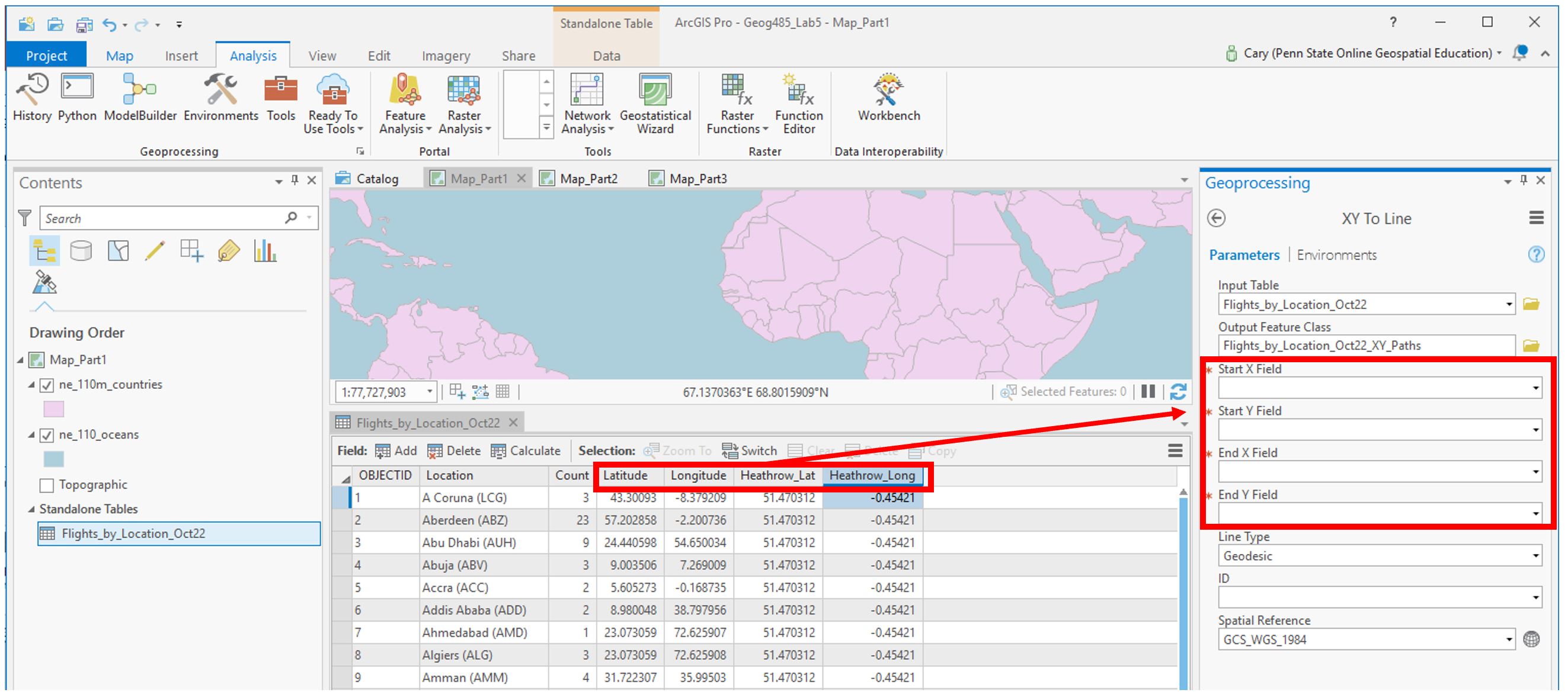
4. Choose and Customize a Map Projection
For each map layout in this lab, you will be creating a customized map projection (use the Project tool). Reference the projection lesson and consider each advertisement's goal/purpose to help you decide which projection to choose/customize for each map. You may want to try adding the map to a layout at this stage of the lab to decide if you like it. Remember that you will be asked to defend this choice in the reflection you submit with this lab.

You may need to try a few different projections or customization parameters to find a map projection you are happy with. When you have settled on a projection, use the project tool to project your flowlines to match the map's projection. As shown below, ArcGIS makes this pretty easy.

Recall that we will be visualizing flight paths based on their length. We can use the Shape_Length field which ArcGIS automatically calculated for us from our origin-destination data to do this. Note that before projecting these lines, the Shape_Length field will not contain meaningful values.

Once your flight paths are projected, the Shape_Length field will be calculated in meters.

As you may have noticed, the flight path data doesn't contain any location names or flight count numbers. We'll need to join the original flight data table to the flight path data to get all our data in one place.

5. Symbolize Flight Paths by Their Length
Use external research or the data distribution to decide on classifications for short vs. long flights, etc. (3+ classes). Recall considerations for data classification from Lesson/Lab 4.

You may use any or multiple visual variables of your choice to symbolize your flowline data - size, value, etc... as long as it is appropriate given the perceptual structure of your data, you can be creative with it.

Add your map to a layout: create a catchy title/subtitle and customize your legend. Add a graticule (ArcGIS Pro calls this a “grid”) if you wish.

Make sure all layout elements are neat and orderly – “convert to graphics” will likely be helpful. Keep in mind lessons from previous labs: legends and any explanatory text should be clear, etc.
6. Repeat These Same General Steps to Create the 2nd Layout
You’ll want to create three new maps (four total) to separate the flight types (morning, afternoon, evening, night). If you prefer, you can do a Save-As and keep work done on this project separate form the previous one. In any case, save frequently!

You can drag the tables onto their appropriate map from the Contents Pane.

Use creativity, appropriate visual variables, and good design in this ad as well! Remember the goal of this layout - highlighting that Heathrow can fit anyone’s schedule.
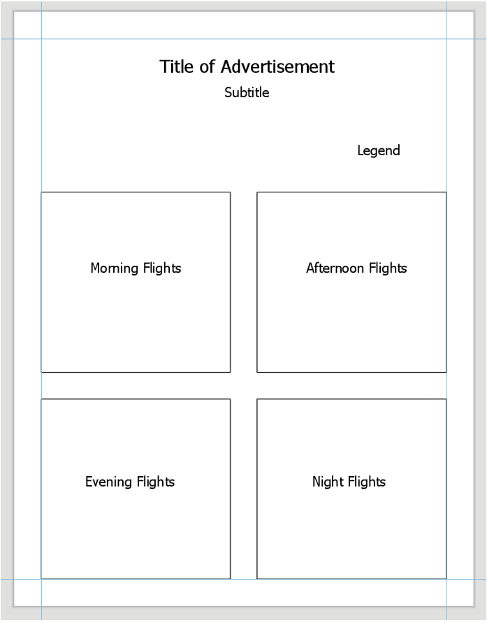
7. Repeat to Create the 3rd Layout
For the third advertisement, we will add additional data to our map to demonstrate to the reader that flights from LHR go to desirable locations. Choose a field such as “International Tourist Arrivals 2017” that makes sense to use in an ad about air travel. Visualize this data on your map how you choose - remember that you will still be visualizing the flight paths. You may use the same flight path layer from Map #1, but you will need to re-project it to match your projection for Map #3.

Choose and customize a projection you haven’t used yet – be prepared to write about the reason for this selection. Think about your map type and purpose.

Ensure that both your flight path and other thematic data is included in your layout - below is just an example of how you might symbolize this data, but there are many other possible ways. If you do not want to use tourism data, you can use a field that was automatically imported with the Natural Earth boundary data such as GDP. Consider how you will visualize null values.

8. Additional Tips
- Remember these are advertisements! Use good design but have fun with titles, colors, etc.
- You may want to use an interesting projection - such as one that visualizes the world as a sphere - for one or more of your maps. Be sure it is appropriate for your map's purpose.
- Adding a grid often aids in reader interpretation of small-scale maps.
- You do not need a scale bar or north arrow for any of these map layouts - they are generally considered unnecessary (and often inappropriate) for global-scale maps.
- When you write your reflection, include a screenshot of the map's projection details (such as in Figure 3.18 below) for each map layout. You will likely use the same projection for all four maps in layout #2, so you only need to include one screenshot for layout #2 and note that it was used four times.

Summary and Final Tasks
Summary and Final TasksSummary
Welcome to the end of Lesson 3! In this lesson, we discussed the complex process of modeling Earth's surface, and how concepts such as reference ellipsoids and datums relate to the map projections used by cartographers every day. During our discussion of characteristics of map projections, we focused on the appropriateness of various map projections for different mapping tasks: based on a map's location, scale, and purpose. Finally, we connected these ideas to a new thematic mapping technique - flow mapping. Though projection choice is often particularly consequential in flow map design—due to the nature of the data visualized, and to the large regions such maps often depict—it is an important consideration in many mapping projects. You will often have to select an appropriate map projection when making other kinds of thematic maps, including proportional symbol, dot density, and choropleth maps.
In Lab 3, we explored the effect of projection selection on small-scale thematic map design while creating map-based advertisements for London Heathrow Airport (LHR). We designed these maps using prior knowledge of visual variables and symbols on maps, and put together neat, useful layouts intended to appeal to our map readers. Prepare for another creative real-world mapping experience in Lab 4!
Reminder - Complete all of the Lesson 3 tasks!
You have reached the end of Lesson 3! Double-check the to-do list on the Lesson 3 Overview page to make sure you have completed all of the activities listed there before you begin Lesson 4.
Lesson 4: Terrain Mapping
Lesson 4: Terrain MappingThe links below provide an outline of the material for this lesson. Be sure to carefully read through the entire lesson before returning to Canvas to submit your assignments.
Note: You can print the entire lesson by clicking on the "Print" link above.
Overview
OverviewWelcome to Lesson 4! Last lesson, we talked in-depth about map projection: the process of transforming Earth's three-dimensional surface into a form that can be depicted on a flat map. Earth's terrain poses a similar challenge - how can we represent the intricacies of Earth's surface on a two-dimensional piece of paper or computer screen? Fortunately, just as with the challenge of map projections, cartographers have been designing creative solutions to this problem for many years. In this lesson, we'll learn about many techniques that exist for modeling Earth's terrain. These include oblique and vertical map views, contour maps, and physical models. We'll also talk a bit about how different terrain layers are components of GIS software, and the importance of balancing the visualization of terrain with other map data, such as political boundaries, roads, water features, and trails.
In Lab 4, we'll put all this together to create a trail run map for an imagined event, The Paradise Valley Trail Run. You'll generate and design terrain layers, overlay additional base and thematic data, and use your knowledge of symbol and layout design to create a map that would be helpful to runners and their supporters. Let's get started!
Learning Outcomes
By the end of this lesson, you should be able to:
- understand various terrain representations’ relationship with each other and with the earth's physical environment;
- select a scale-appropriate Digital Elevation Model (DEM) for terrain visualization;
- generate additional terrain layers from a Digital Elevation Model (DEM);
- visualize terrain layers through careful application of hue, saturation, and inter-layer transparency;
- balance the design of thematic overlay data with terrain to create a usable map.
Lesson Roadmap
| Action | Assignment | Directions |
|---|---|---|
| To Read | In addition to reading all of the required materials here on the course website, before you begin working through this lesson, please read the following required readings:
Additional (recommended) readings are clearly noted throughout the lesson and can be pursued as your time and interest allow. | This week's reading is provided in ebook form through the Penn State library system. |
| To Do |
|
|
Questions?
If you have questions, please feel free to post them to the Lesson 4 Discussion forum. While you are there, feel free to post your own responses if you, too, are able to help a classmate.
Visualizing a Landscape
Visualizing a LandscapeIn Lesson 3, we discussed map projections—the act of transferring the three-dimensional Earth onto a two-dimensional map. We also presented the flow map symbolization to represent movement. In this lesson, we discuss similar problems—representing Earth’s three-dimensional terrain surface on a two-dimensional map and how to symbolize movement.
When artists depict three-dimensional landscapes, they commonly use an oblique view. See the example painting in figure 4.1.1—the perspective of the drawing makes the landscape appear three-dimensional, though it is only a two-dimensional piece of art.

Whether in an artists’ rendering (figure 4.1.1), photograph (figure 4.1.2), or digital model, the oblique perspective is effective in its realism: it depicts what might be seen by a person on or near the ground.

Though the oblique view can create a compelling visual experience, it has its disadvantages. First, this perspective inherently obscures some of the landscape—tall features like mountains or skyscrapers can hide the features behind them. Secondly, oblique views are often constructed by exaggerating the height of landforms so as to emphasize variation in topography. This can make between-map comparisons challenging, and cause issues for cartographers hoping to take accurate measurements with such maps.


To account for these shortcomings, several vertical view techniques for depicting terrain were developed. figure 4.1.5 shows a topographic map from the United States Geological Survey (USGS), which depicts a section of Acadia National Park. Topographic maps are maps that quantitatively depict terrain, typically with contour lines. Contour lines on a map connect points of equal elevation, and when drawn, they visualize hills, valleys, and other landforms. In the next sections, we discuss in further detail techniques for using both oblique and vertical map views to represent Earth's terrain.

Student Reflection
Visualizing three-dimensional terrain without obstructing parts of the landscape has been a challenge in cartography for centuries. Can you think of a modern mapping technique that presents similar problems and challenges for map-makers and readers?
Recommended Reading
Chapter 5: Statement of the Problem. Imhof, Eduard. 2007. Cartographic Relief Presentation. Redlands: Esri Press.
Chapter 23: Visualizing Terrain. Slocum, Terry A., Robert B. McMaster, Fritz C. Kessler, and Hugh H. Howard. 2009. Thematic Cartography and Geovisualization. 4th ed. Boca Raton, FL: CRC Press.
Oblique Views
Oblique ViewsDespite the challenges involved with accurately depicting and visualizing all of the landscape with an oblique view, it is still useful in some contexts. For example, a detailed view of a small part of the terrain may be more useful than a view from above of a wider area. As with all maps, attention to audience, purpose, and medium is important, and cartographers take these factors into account when deciding how to best represent terrain on a map.
One technique—used commonly in Geology to show underground rock or soil properties—is the block diagram.

Block diagrams show the surface of the landscape as well as underground structures and materials. This gives them a natural advantage over vertical-view maps if the goal of the map is to visualize both the Earth’s surface and its interior. The disadvantage of block diagrams is that they cannot depict all sides of the terrain. In figure 4.2.1, for example, it is unclear whether the composition of underground materials in the far side of the diagram matches that shown in the front. These diagrams are also more challenging to create than traditional maps, though new software developments continue to make this process easier.
Student Reflection
Imagine viewing a block diagram such as the one in figure 4.2.1 in an interactive web environment, rather than on paper. How might this alleviate some of the problems caused by the oblique view? Could it present new issues?
Panoramas are wide-angle views of an area and another popular technique for visualizing terrain. Several maps we saw in the first section, such as figure 4.1.3, are panoramic maps. The map in figure 4.2.2 is available from the Library of Congress—if you are interested in these types of historical maps, the LoC is an excellent source to explore (https://www.loc.gov/maps/).

The birds-eye perspective often given by panoramic maps provides an easily-comprehensible view of the landscape to the map user. Hills and valleys, for example, appear as they would to an observer in the real world, and thus their recognition requires no prior knowledge of cartography, or the area being depicted. Despite this, these maps are uncommonly used for scientific purposes as they do not show a geometrically-accurate view of the landscape, and do not lend themselves to clearly visualizing the results of geospatial analysis.

The map in figure 4.2.3, for example, is a beautiful depiction of the mountains in Wrangell-St. Elias National Park. But if a map reader were to take measurements from this map, the resulting figures would not be correct. Not only does the oblique view complicate measurement tasks with such maps, but mountain heights are typically exaggerated—not drawn to scale.
Draped images are a form of oblique view maps that have recently become more popular due to the increased availability of satellite imagery and advances in 3D visualization software. They are created by—in essence—draping a remotely-sensed image over a 3D digital terrain model. An example is shown in figure 4.2.4.

The combination of remotely-sensed data and terrain visualization in draped images can be particularly useful for communicating a combination of terrain and surface characteristics (e.g., for research on forest fires or ecological suitability).
Recommended Reading
Chapter 20: Visualizing Terrain. Slocum, Terry A., Robert B. McMaster, Fritz C. Kessler, and Hugh H. Howard. 2023. Thematic Cartography and Geovisualization. 4th ed. Boca Raton, FL: CRC Press.
“Shaded Relief.” Accessed November 9, 2018.
“Relief Shading.” Accessed November 9, 2018.
Physical Models
Physical ModelsThe oblique view, when compared to the vertical view, provides a more intuitive view of Earth’s landscapes. However, there is an even more intuitive way to model landscapes—with physical 3D models.

Physical models have been around since the time of the Ancient Greeks, but the time and expense required to create such models has sharply decreased in recent years due to the advent of new computer modeling techniques and 3D printing capabilities (Slocum et al. 2009). This has led, as you might imagine, to a recent increase in the popularity of such maps.
Physical representation can be combined with other terrain visualization techniques. The USGS, for example, produces topographic raised relief maps, such as the one in figure 4.3.2. These maps combine the contour mapping technique with a haptic representation of terrain—creating maps that are engaging as well as useful.

Another new technology, augmented reality (AR), has become popular for creating realistic and dynamic physical models of landscapes. Shown in figure 4.3.3 below is an augmented reality sandbox, which draws contour lines and hypsometric tints by detecting the shape of the landscape as molded by sandbox-users.

Video Demo!
A similar sandbox is available at UCLA. Watch this video, UCLA's Augmented Reality Sandbox, for an exciting demonstration of this technology. We will talk more about applications of augmented reality and similar technologies (e.g., virtual reality, mixed reality) later in the course.
Recommended Reading
Chapter 20: Visualizing Terrain. Slocum, Terry A., Robert B. McMaster, Fritz C. Kessler, and Hugh H. Howard. 2009. Thematic Cartography and Geovisualization. Edited by Keith C. Clarke. 3rd ed. Upper Saddle River, NJ: Pearson Prentice Hall.
Vertical Views
Vertical ViewsMaps that use a vertical perspective—wherein the viewer is perpendicular to the surface of the Earth—are now ubiquitous, but this was not always the case. Browse through old maps, especially those made before the 1800s, and you’ll notice that they frequently use a mix of vertical and oblique perspectives to visualize information. Techniques for depicting terrain from directly above were developed for two primary reasons. First, the oblique view inherently hides some map features; a vertical view, by contrast, offers a view of all landscape features within the map frame. The vertical view also allows the map maker to position features appropriately in geographic space relative to each other—thus providing concrete spatial information, rather than a more artistic visual representation (Slocum et al. 2009).
In the vertical view, terrain is often represented with contour lines. Contour lines drawn on a map connect points of equivalent elevation. figure 4.4.1 demonstrates how contour lines relate to the landscape from which they are derived—note that the bottom image is a 2D rendering of what is presumed to be a mountain feature.

As demonstrated by figure 4.4.1, gentle slopes are represented on contour maps by lines spaced farther apart than those that represent steep slopes. This is because elevation values change more quickly across steeper slopes, meaning that contour lines will need to be drawn more frequently (across the same map distance) to accurately represent the terrain. figure 4.4.2 below shows a topographic map with markings to denote gentle and steep slopes, as well as valleys, hills, and ridges.

A map’s contour interval is the change in elevation (typically in meters) between drawn contour lines. This is a form of sampling (e.g., every 20m), meaning that topographic maps do not display every possible contour line, but rather display (as all maps do) a simplified view of the landscape.

In addition to mapping elevated features such as hills and mountains, contour maps are also useful for depicting underwater terrain. While topographic maps visualize elevations above sea level, bathymetric maps depict elevations below sea level.

On topographic maps, increasing values indicate higher elevations. Bathymetric values—as they also represent a distance from sea level—increase in the opposite direction. So just as the highest values on topographic maps represent the highest mountains, the highest bathymetric measurements represent the deepest depths of the Earth’s oceans.
Despite their usefulness in accurately depicting terrain, contour lines do require some prior knowledge for their proper interpretation, as they do not present an immediately intuitive view of the landscape. To mediate this, cartographers have developed innovative methods for artistically depicting terrain on vertical-view maps using additional elements of design.
One popular method is Tanaka’s method (Tanaka 1950), often called Tanaka contours. Tanaka contours assume that the map is being illuminated by a light source from some direction. With this method, contour lines are drawn lighter (i.e., illuminated) and thinner when facing towards the light source, and darker (i.e., in shadow) and thicker when facing away from the light source. The result is a contour map wherein the form of the landscape is more intuitively depicted (figure 4.4.5). Ridges and valleys are far less likely here to be confused.

A similar but simplified method called illuminated contours was developed by J. Ronald Eyton (1984).

This method, shown in figure 4.4.6, varies lightness as in Tanaka’s technique but does not vary line thickness. Contrary to Tanaka’s approach, which was applied manually, Eyton (1984) developed his method in the early days of computerized mapping—he used consistent line thickness to reduce computation time.
Other techniques for designing contour maps have been developed by other cartographers. You are encouraged to explore the recommended readings or search the web on your own to learn more about these techniques.
A mostly-outdated but charming alternative to contour lines called hachures also exists. Hachures are created by drawing a series of lines drawn perpendicular to contours. The spacing between hachures are drawn proportional to the slope—steeper areas are highlighted by increased density of these lines (Slocum et al. 2009). A hachure-like technique can also be used to manually create shaded relief (a visually-appealing and artistic depiction of landforms), but its traditional purpose was to show a geometrically-correct depiction of slope.

Shaded relief is commonly added to maps to give the reader a more intuitive impression of landform shapes. It simulates the presence of a light source and displays highlights or shadows over landforms accordingly, giving the illusion of depth. An example is shown in figure 4.4.8.

The artificial light source in shaded relief mapping comes traditionally from the upper-left of the map (Northwest, assuming a North-up map view, or 315º). At first, this might seem inappropriate—the sun rarely shines onto the Earth from a Northwestern direction, at least in the locations where most people live. This convention does not come from the earth sciences, however, but instead from guidelines in art developed in response to the realities of everyday life at the human scale.
Humans are used to illumination from the sun—as well as other light sources (e.g., lamps, overhead lighting)— coming from above our heads. As most people are right-handed, an upper-left light source is ideal for writing. Even left-handed people typically write from left-to-right and top-to-bottom, due to the left-right convention of most languages. figure 4.4.9 demonstrates the appropriateness of this upper-left light source.

We have become so accustomed to this location of light that light projected from other directions (e.g. from underneath) results in features looking incorrect to the human eye. Imagine someone holding a flashlight underneath their chin in the dark—the reason their facial features appear so strange is that we are accustomed to seeing them lit from above.
figure 4.4.10 below shows how changing the azimuth (direction) of a simulated light source can create confusion in the interpretation of landscape features. Both below maps depict the same location, and a valley exists within the yellow box on each. Left, the valley is shown via traditional Northwest illumination. When the map is illuminated from the Southeast (right) the valley now appears inverted—it looks like a ridge.

In major GIS applications, you are not only able to adjust the azimuth of an artificial light source, but the altitude as well. The default value is usually 45º, as if the sun were in the sky at an angle of 45º. This condition is going to look great in the vast majority of cases, but there might be times where you want to emphasize the shadows or highlights, and adjust the altitude accordingly.
Much of cartography is about understanding not only the analytical elements of landscapes and map design variables, but human perception. The Northwest oblique light source convention is an excellent example of how cartographers have developed their techniques with this understanding in mind.
Recommended Reading
Chapter 5: Landform Portrayal. Muehrcke, Phillip C., Juliana O. Muehrcke, and A. Jon Kimerling. 2001. Map Use: Reading, Analysis, Interpretation. 4th ed. Madison, Wisconsin: JP Publications. Intergovernmental Committee on Surveying and Mapping. 2018.
“Topographic Maps.” Accessed November 9, 2018.
Building Terrain Layers
Building Terrain LayersBefore the widespread use of computers and GIS for map-making, terrain visualization techniques such as hachures were drawn by hand, and elevation values were gathered from field surveys. In modern cartography, almost all terrain layers begin with one map layer—a digital elevation model (DEM). Though you likely often see DEMs with additional design elements such as color tints and shaded relief, DEM data is actually as simple as shown in the image in figure 4.5.1 below.

DEMs are raster—or grid-based—data. You use rasters on your computer every day in the form of image files: JPEG, TIFF, and PNG files among others. In fact, DEMs are often stored using one of those file formats. Each grid cell in a DEM image (also called a pixel) has a single value, which corresponds to its elevation. In figure 4.5.1 for example, the values closest to white are the locations of highest elevation at this location. Using GIS software, DEM data can be used to easily create additional terrain layers—the most common being hillshade, curvature, and contours.
Hillshade is a term often used interchangeably with the term shaded relief discussed earlier. Hillshade is a grayscale raster data layer in which lightness values of certain pixels have been adjusted to imitate the highlights and shadows that would be cast by a hypothetical oblique light source. The highest values in a hillshade layer, then, are often those which would be met with the highest levels of illumination from the light source, although this may change depending on the light source’s altitude, as discussed earlier.

Contour lines, as discussed in the vertical views section lesson, connect points of equal elevation across a terrain surface. The density of lines across the map depends on the slope of the terrain—steeper slopes result in lines being drawn closer together. When creating a contour map, you choose what contour interval to use on your map. Theoretically, an infinite number of contour lines can be drawn on any map. Cartographers typically consider multiple factors when choosing a contour interval, including the scale of their map and the steepness of the terrain. Intervals that are multiples of 5 or 10 are usually a good idea when possible.

A common technique when symbolizing contour lines on maps is to draw index contours—contour lines that are more visually prominent—at less frequent intervals. Often, to avoid map clutter, only these contour lines are labeled. Map readers can then use the lines between them, called intermediate contours, to interpolate elevation values between them.

Digital Elevation Models can also be used to generate curvature layers, such as the one shown in figure 4.5.5. Curvature is often referred to as “the slope of the slope.” In mathematical terms, it represents the second derivative of a terrain surface (Muehrcke, Muehrcke, and Kimerling 2001). Curvature is excellent for showing inflection points in a surface—sharp ridges and deep valleys. In this way, adding a curvature layer can add additional visual interest to your terrain map.

Viewed individually, none of these layers are very convincing at simulating realistic-looking terrain. However, with just a digital elevation model from a source such as The National Map, you can generate several different terrain layers and adjust layer transparency, color, and other design elements to create imaginative depictions of Earth's terrain. Though terrain visualizations are typically used as a base layer for thematic or general-purpose map data, making maps just of Earth's terrain and experimenting with new, creative designs can be quite fun.

Recommended Reading
Kennelly, Patrick. 2009. “Hill-Shading Techniques to Enhance Terrain Maps.” In International Cartographic Conference.
Nelson, John. 2018. “Hacking a DEM Sunrise.” ArcGIS Blog. Accessed November 9, 2018.
Terrain as a Basemap
Terrain as a BasemapThough terrain layers can be used to make fun and interesting map designs, terrain is rarely the sole element on a map. USGS topographic maps, for example, depict much more than just contour lines across the landscape—they also include political boundaries, streets, water features, and more. This is particularly challenging in urban areas, as demonstrated by the map in figure 4.6.1, located in Manhattan, NY.

Even when terrain is the main feature of interest, such as in the thematic map in figure 4.6 2 below, the design must ensure the appropriate visualization of terrain given the map projection, level of detail, other visual variables (here, color), and background.

Some types of maps more frequently contain depictions of terrain than others. As designing a good terrain base layer typically involves significant effort—and makes map symbol design more complicated—terrain is typically left off of maps when it is considered irrelevant, such as in thematic maps of political or social data. In some maps however, (e.g., maps of ski trails), terrain visualization is essential. Most maps fall somewhere in between.
Whether or not you decide to depict your location’s terrain—and how detailed that design will be—will depend, as with most design decisions, on your map’s intended audience, medium, and purpose. You will likely also need to take other constraints into consideration (e.g., availability of data and time).

Student Reflection
Google maps (maps.google.com) offers users the option of replacing the default Google basemap with a map that visualizes terrain. What use cases can you imagine for routing over such a basemap, rather than the simpler standard map?
Recommended Reading
Chapter 2: Basemap Basics. Brewer, Cynthia A. 2015. Designing Better Maps: A Guide for GIS Users. Second. Redlands: Esri Press.
Chapter 14: Interplay of Elements. Imhof, Eduard. 2007. Cartographic Relief Presentation. Redlands: Esri Press.
Terrain Through Scale
Terrain Through ScaleSo far in this course, we have been working primarily with vector data. Though scale is an important consideration in all mapping tasks, working with raster data such as Digital Elevation Models presents a totally different set of challenges for data management and design.
When mapping terrain, it is important to use elevation data that is appropriate for the scale of your map. The image in figure 4.7.1, for example, appears pixelated and blurry. The resolution of the data used (1-arc-second) is too coarse for creating a clear image at this scale.

The solution to this is, as you might have guessed, to use higher-resolution data. See, for example, the map in figure 4.7.2. The scale of this map is the same as in figure 4.7.1, but the finer-grained data results in a much clearer image.

It is important to note that the answer is not to always use the highest-resolution data you can find. The map in figure 4.7.3, for example, shows a 1-arc-second DEM: the same as used in the blurry image in figure 4.7.1. At this new scale (1:120,000) this coarser data is quite appropriate. To understand the difference in scale between these maps, note that the extent of the maps above (6.7.1 and 6.7.2) is shown by the blue extent indicator in Figures 4.7.3 and 4.7.4 below.

Raster data is much more space-intensive than vector data, and high-resolution raster data means particularly large file sizes. Using coarse data when appropriate will keep you from filling up all the space on your computer. This is not the only reason for not always using high-resolution DEM data, however. Using data that is too fine for a particular scale can result in undesirable visual effects, similarly to how using data that is too coarse can lead to a very pixelated image. figure 4.7.4 is an example of a map created with terrain data that is a bit too unnecessarily detailed for its scale.

The good news in this second example is that DEMs can be simplified: GIS software can be used to re-sample and generalize terrain data. As with all data processing tasks, however, it is not possible to go in the opposite direction. The only way to create a more detailed terrain map is to collect more detailed data.
Recommended Reading
Chapter 2: Basemap Basics. Brewer, Cynthia A. 2015. Designing Better Maps: A Guide for GIS Users. Second. Redlands: Esri Press.
Lesson 4 Lab
Lesson 4 LabTerrain and Trails Visualization
In this lab, you will be creating a map of the (imaginary) Paradise Valley Trail Run in southern San Francisco, California. Imagine the final map will be handed out in race packets - what do trail runners and their supporters want to see? As the race takes place over hilly terrain, you will first design the terrain backdrop of the map, and then add overlay data such as route paths, water stops, and general base data. Finally, you'll put it all together in a layout with an elevation profile for the 10K route and map marginalia.
This lab, which you will submit at the end of Lesson 4, will be reviewed/critiqued by one of your classmates in Lesson 5 (critique #3).
Lab Objectives
- Create a trail map for the Paradise Valley Trail Run in southern San Francisco, California.
- Symbolize routes and route points of interest (e.g., water stations) using category and hierarchy.
- Use the supplied DEM to generate additional terrain layers; design and layer them into an aesthetically- pleasing base layer using transparency and symbology options in ArcGIS.
- Create an inset map that works with the primary map to provide locational context to the map reader. Build the map into a layout with an elevation profile for the 10k route, an inset map, and appropriate marginal elements (scale bar; titles; legend).
Overall Lab Requirements
For Lab 4, you will be creating only one map layout, though it will contain several different elements: the primary map, an inset map, an elevation profile, and marginal elements (scale bars, north arrows, text, and legend).
Map Requirements
Map One: Primary Map
- Use the provided DEM to generate contours, hillshade, and curvature terrain layers: design and layer terrain data into an aesthetically-pleasing base layer using transparency and symbology options in ArcGIS.
- Symbolize and label all routes and points of interest (water stations; endpoints; distance markers) related to the trail run using category and hierarchy.
- Symbolize and label additional base layer data from The National Map (transportation; hydrography; boundaries) as appropriate for additional map base context.
- Orient the map in a way that works for displaying routes – do not orient this map directly North-up. Use the feature editor to edit layers if desired; create arrows to show the direction of both routes.
Map Two: Inset Map
- Label prominent map features as appropriate at this scale.
- The intent of this map is to provide locational context for people unfamiliar with the location—design features and labels accordingly.
- Include an extent indicator to show the location of the primary map.
Layout requirements
- Add an elevation profile chart showing the terrain of the 10K route.
- Include your two map frames at appropriate scales (main map and locator/inset map).
- Create and include appropriate marginal elements:
- two north arrows (one for each map);
- as many scale bars as you deem necessary; use clean design and sensible labels;
- a legend: design its style, placement, and descriptive text;
- a hierarchy of marginal text (e.g., title, subtitle, data source, your name, legend text, legend title) – not necessarily in this order.
- Create a balanced page layout (either portrait or landscape). Attend to negative space.
Lab Instructions
- Download the Lab 4 zipped file (approx. 67 MB). It contains:
- a project (.aprx) file to be opened in ArcGIS Pro;
- a database that includes the spatial data needed to start this lab.
- Data source: Base data and DEM from The National Map.
- Additional data was created by the course developer. Lengths of routes and locations of distance markers are approximate.
- Extract the zipped folder, and double-click the (.aprx) file to open ArcGIS Pro.
- All data you will need to complete this lab has already been downloaded to the included geodatabase.
Grading Criteria
Registered students can view a rubric for this assignment in Canvas.
Submission Instructions
- You will have one map layout (PDF format) to submit. All elements must be included on one 8.5 x 11 page. Please use the naming convention outlined below.
- LastName_Lab4.pdf
- Submit your PDF to Lesson 4 Lab for instructor and peer review.
- Note: The critique/peer review of the Lesson 4 assignment will occur in Lesson 5 (critique #3).
Note: While Paradise Valley is a real place in California, data related to the Paradise Valley Trail Run in this lab was invented and built by the course author. Any existence of a real event with this name or in this location is coincidental. The Resources menu links to important supporting materials, while the Lessons menu links to the course lessons that provide the primary instructional materials for the course.
Need Guidance?
Please refer to Lesson 4 Lab Visual Guide.
Lesson 4 Lab Visual Guide
Lesson 4 Lab Visual GuideLesson 4 Lab Visual Guide Index
- Step 0: Starting File
- Step 1: Create your Terrain Basemap
- Step 2: Symbolize Base Data
- Step 3: Symbolize Thematic Data
- Step 4: Create your Inset Map
- Step 5: Create your 10K Elevation Profile
- Step 6: Add Route Direction Arrows
- Lab 4 Final Tips & Tricks
Step 0: Starting File
This is your starting file in ArcGIS Pro. It contains data for the Paradise Valley Trail Run, as well as base data (e.g., boundaries, transportation) and a Digital Elevation model (DEM). Your goal is to turn this data into a map for trail race participants and their supporters.

Step 1: Create your Terrain Basemap
Your first goal in this lab is to use the included DEM to generate additional terrain layers. Create three terrain layers: Hillshade, Contours, and Curvature.

The default settings/parameters provided by ArcGIS are ok for generating the Hillshade and Curvature layers. Make sure your output is saved to the geodatabase for the current project (Lab6_data.gdb).

You will need to choose an appropriate interval for your contours - if you don't like the result, you can always choose a new interval and run the tool again.

Keep your terrain layers organized in the "terrain" layer group in the contents pane - think about your layer ordering, and don't be afraid to re-order layers as you go! Use the transparency slider so you can see multiple layers at once - all of your terrain layers should contribute to your design.
Try out different symbology methods and color schemes. A simple stretch sequential color scheme (often greyscale) tends to work best for hillshade and curvature, but you can be a bit more creative with the DEM. Right click on a color scheme to reverse it if needed. Remember that higher hillshade values represent greater illumination - so unlike with most map data, higher values should be paired with lighter color. Keep your design subtle enough for your thematic (race info) data to show up on top. This map design is all about balance.

Step 2: Symbolize Base Data
Symbolize the transport, hydro, and boundary layers as appropriate for this map’s purpose. Reference previous labs (particularly 1 and 2) for basemap design ideas. Remember you can create new label classes using SQL! This base data should be visible over the terrain data, but not be so overwhelming so as to detract from the data about the Paradise Valley Trail Run.

Step 3: Symbolize Thematic Data
Choose line width, color, etc. to symbolize the two race routes. Think about how you can you display these two (overlapping!) routes at once. Design labels for water stations, route markers, and Start/End points. The Gallery may have helpful ideas for your point symbol designs, and there are many ways you can customize them yourself. Explore the available options. You may also want to look at running or trail maps on the web for ideas - but note that some that you find may not be well designed!

Step 4: Create your Inset Map
Once you are happy with your primary race map, you're ready to start experimenting with layout designs and adjusting your map scales. To design your inset/locator map, it is recommended that you follow the familiar "Save-As map file" and re-import procedure illustrated below. Save a copy of your map, then import it into your map project. You can then alter the design so it works as an inset map.

The Navigator can be used to change a map’s orientation when the map is activated. Remember that your primary map cannot be directly North-Up for this project!

Step 5: Create your 10K Elevation Profile
We want to create an elevation profile to help trail runners anticipate the difficulty of the race. To do this, we will be using ArcGIS Pro’s Interpolate Shape tool. This tool turns a 2D line feature into a 3D line feature based an input DEM or other surfaces. We will use this 3D line feature to create an elevation profile. You do not need to create an elevation profile for the 5K route, but you may do so if you choose.

Once you have created a 3D line, you can use this line to create a profile graph. As noted below, the design of your profile graph can be edited. You can also wait and edit the design as you work on your map layout.
Your profile graph will cover a slightly different horizontal distance than in the screenshot below - this is ok!

Step 6: Add Route Direction Arrows
An important part of route maps like this is to inform the reader of their direction of travel! There are many options for adding directional arrows to your map - two are listed below. You may design your arrows any way you want as long as you do not use any software other than ArcGIS Pro.
Option #1: Use the Edit tab to create arrow features by drawing new lines. An empty “Arrows” feature class has been added to the map for you to facilitate this method. Use the editing toolbar to finish or discard map feature changes in this layer. And always save your edits!

Option #2: Manually add arrows to your map via the map’s layout shape/line tools.
ArcGIS has tools for adding arrows and editing graphics, but is not fully-fledged graphic software (e.g., Adobe Illustrator). Keep this in mind as you decide which of options #1 and #2 for adding arrows works best for you. You might also try them both out and see which works best for your map.

Lab 4 Final Tips & Tricks
Insert your 10K elevation profile into your layout. (But note that you can keep the old 2D route for your map design).

Map routes, stops, and marker locations are approximate. You may alter them slightly if you would like. Reference the lesson and previous labs for ideas. Check the lab assignment for a list of specific requirements and ask questions in the discussion forum. Don't forget to add an extent indicator and marginal elements (e.g., scale bars, north arrows). Feel free to customize your layout and map elements creatively!

Summary and Final Tasks
Summary and Final TasksSummary
You've reached the end of Lesson 4! This lesson, we discussed the many techniques available for visualizing Earth's terrain, including vertical views (e.g., contour lines, hachures), oblique views (e.g., panoramas, draped images), and 3D physical models. We also explored the terrain layers available to be generated and designed in ArcGIS and similar software, and talked about the importance of DEM resolution (scale) for terrain-mapping projects.
In Lab 4, we put all this together with concepts from earlier lessons. We built a map for an imagined trail run in San Francisco, which involved the design of base, thematic, and underlying terrain data, as well as the composition of a neat, useful, and visually-appealing layout. This kind of mapping task is quite common— cartographers must often combine techniques from many different aspects of map design in their work.
Another important aspect of this lab was our focus on the intended map-reader: someone running a trail race, or cheering on a participating friend or family member. We'll talk more in-depth about map readers (and map users, in the case of interactive maps) in upcoming lessons. How can we design maps so that they best communicate our data, or assist their readers in making better decisions? Continue to Lesson 5 to find out.
Reminder - Complete all of the Lesson 4 tasks!
You have reached the end of Lesson 4! Double-check the to-do list on the Lesson 4 Overview page to make sure you have completed all of the activities listed there before you begin Lesson 5.
Lesson 5: Color, Classification, and Choropleth Symbolization
Lesson 5: Color, Classification, and Choropleth SymbolizationThe links below provide an outline of the material for this lesson. Be sure to carefully read through the entire lesson before returning to Canvas to submit your assignments.
Note: You can print the entire lesson by clicking on the "Print" link above.
Overview
OverviewWelcome to Lesson 5! Last lesson, we learned about techniques that cartographers employ to visualize Earth’s terrain. This week, we begin to focus on a more statistically driven type of thematic map: choropleth maps. Choropleth maps are a very common thematic map type. To design them properly, an adequate understanding of other important topics in cartography, such as data standardization and classification methods are needed. Choropleth maps also typically employ color in their design: in this lesson, we discuss color in-depth. You will learn about the different ways in which we can model color space, and how visual perception constraints - both in the general population, and in those with color-vision impairments - influence map perception.
In Lab 5, we'll explore how choosing a different color scheme and data classification method can alter the way the information is presented and how readers interpret that information. We’ll also learn how to make maps that work well in pairs—a common task that is often significantly more challenging than making one map that stands alone.
Learning Outcomes
By the end of this lesson, you should be able to:
- match the most fitting type of color scheme (e.g., sequential; diverging; qualitative) to specific data sets;
- demonstrate how to identify and specify colors using the three perceptual dimensions of hue, saturation, and lightness;
- integrate knowledge of color perception and human visual limitations (including color-vision impairment) into map color decision-making;
- standardize and classify data appropriately for use on choropleth maps;
- select an appropriate color scheme for a map based on probable perceived connotations of those colors as they relate to the map's data.
Lesson Roadmap
| Action | Assignment | Directions |
|---|---|---|
| To Read | In addition to reading all of the required materials here on the course website, before you begin working through this lesson, please read the following required reading:
Additional (recommended) readings are clearly noted throughout the lesson and can be pursued as your time and interest allow. | The required reading material is available in the Lesson 4 module. |
| To Do |
|
|
Questions?
If you have questions, please feel free to post them to the Lesson 5 Discussion Forum. While you are there, feel free to post your own responses if you, too, are able to help a colleague.
Color Overview
Color OverviewColor is frequently used to symbolize information on maps. In recent years, cartographers have begun to employ color more frequently. in a study of map-color use in scientific journals, White et al., (2017) found that the use of color in published map figures increased from 18.4% in 2004 to 69.9% in 2013. This trend can primarily be attributed to the expansion of practical map production technologies. The cost of color printing, for example, is no longer prohibitory. Additionally, the increasing popularity of web-based dissemination of maps and other visual graphics makes such color production costs irrelevant. Tools such as ColorBrewer Colorbox, and Colorgorical have also made color selection easier; the first of these is now integrated into the color selection tools in ArcGIS Pro and a separate package in R (RColorBrewer).

In this lesson, we will explore the basics of specifying, mixing, and selecting colors for choropleth maps. You should aim to understand and properly apply the color schemes available in GIS software, and alter them as appropriate based on your maps’ audience, medium, and purpose. Eventually, you might even design your own color schemes from scratch.
You may remember the map in Figure 5.1.2 from Lesson 1. This map is a thematic map, and more specifically, a choropleth map. Discussions of color in mapping often focus on choropleth maps. This is for good reason—choropleth mapping is the most common thematic mapping technique, and its employment typically requires thoughtful analytical use of color. We will discuss the details of choropleth mapping later in this lesson. However, note that color is also frequently used on other types of maps. General purpose maps often employ color to delineate between different kinds of features, and maps that focus on other symbolization types (e.g., proportional symbol maps) often also use color to encode an additional variable, or to add visual interest.
Recommended Reading
Harrower, Mark, and Cynthia A. Brewer. 2003. “ColorBrewer.Org: An Online Tool for Selecting Colour Schemes for Maps.” The Cartographic Journal 40 (1): 27–37. doi:10.1002/9780470979587.ch34.
Gramazio, Connor C., David H. Laidlaw, and Karen B. Schloss. 2017. “Colorgorical: Creating Discriminable and Preferable Color Palettes for Information Visualization.” IEEE Transactions on Visualization and Computer Graphics 23 (1): 521–530. doi:10.1109/TVCG.2016.2598918.
White, Travis M., Terry A. Slocum, and Dave McDermott. 2017. “Trends and Issues in the Use of Quantitative Color Schemes in Refereed Journals.” Annals of the American Association of Geographers 4452 (April): 1–20. doi:10.1080/24694452.2017.1293503.
Specifying Colors
Specifying ColorsWhen you hear the word "color," words such as blue, red, and green likely spring to mind. Though these are colors in the colloquial sense, these are better described as color hues. Color has more dimensionality than just the color name. In fact, when thinking about color as a visual variable, each color is specified not just by hue but by three dimensions: hue, lightness (also “brightness” or “value”), and saturation (also “chroma” or “intensity”) (Figure 5.2.1). Some people regard these “alternative terms” as completely synonymous with each other, while others argue that they each refer to something specific. For now, just know that the synonymous terms refer to roughly the same properties.

Color is produced when light is either reflected off of (e.g., a car; a printed map) or emitted by (e.g., a computer screen) an object. Hue refers to the portion of the electromagnetic spectrum where human vision is sensitive. We can discuss color falling along that spectrum in terms of its wavelength of light, from longest (oranges and reds), to shortest (blues and violets). Figure 5.2.2 shows nine swatches of color with different hues, in the order of the rainbow spectrum. It is important to understand that the electromagnetic spectrum offers a vast range of wavelengths, and the human visual system can only perceive a relative tiny portion of that range. For an overview of the electromagnetic spectrum, NASA has a useful website (https://science.nasa.gov/ems/01_intro/).

In mapping contexts, hue is typically used to differentiate between features. In general purpose maps, for example, the use of different hues creates different categories, and helps the reader identify different features as belonging to a particular group. In Figure 5.2.3, for example, the color choices are visually distinguishable, and improves the legibility and aesthetics of the map. Though multiple types of roads are shown, all roads are shown in red. Similarly, all hydrologic features and labels are shown in blue - a familiar color easily recognizable by map readers as associated with water. Furthermore, features and their labels that are shown in green, map readers conceptually associate with vegetation.

Lightness is another dimension of color; it describes how perceptually close a color appears to a pure white object. Lightness is also commonly called value, though cartographers sometimes avoid that term, as value is also used to describe data values—using the same word for both items can cause confusion. Another alternative word, brightness, might sound like you’re referring to the brightness of a screen on which a map is being displayed, so use of that word is not recommended either. Lightness works well for visually encoding the order and/or magnitude of thematic data values—typically, lighter colors signify lower data values (i.e., less implies less), and darker, more visually-prominent features implies higher data values.
The third dimension of color is saturation. Saturation is also sometimes called chroma or intensity. Highly saturated colors are particularly useful for calling attention to small but important map elements that would otherwise be lost (Figure 5.2.4). Caution should be used when using saturation in this way, however—the use of too many highly saturated colors, particularly over large areas, may be distracting or accidentally overemphasize unintended features. An effective alternative approach is to desaturate your basemap/background so that your most important features can remain at a reasonable saturation level, but still stand out. If you look at maps in popular media outlets, such as the New York Times or National Geographic, you’ll notice that this approach is extremely common.

The three color dimensions (hue; lightness; saturation) were originally identified by Dr. Albert H. Munsell in the early 20th century. Munsell’s first color model, a color sphere, was an attempt to fit these three dimensions of color into a regular shape. Though this model was still a breakthrough, Munsell realized that it was quite insufficient, as human color perception is not linear and cannot be accurately modeled by a regular shape. The final shape he landed on looks more like a lopsided ellipsoid. The Podcast 99% Invisible has written an excellent short piece on the origins and specifics of the Munsell's color system, with helpful explanatory graphics. Read it here: The Color Sphere: A Professor's Pivotal "Color Space" Numbering System.
Figure 5.2.5 below takes a top-down approach to visualizing this color space: each of the four graphics demonstrates what is, in essence, a slice of the Munsell model, with increasing lightness from left to right. As shown, the colors that the human eye can perceive do not change linearly through color space—note that there is a greater range of red hues than blue hues. This non-linearity makes color specification and design a challenging task.

Student Reflection
Imagine you want to create a categorical map with a large variety of colors. What does Munsell’s model suggest about the kind of colors that would be best used for this purpose?
Though Munsell’s model is helpful for understanding color perception, and perhaps for sharing color specifications with others, a working knowledge of other models is required for building color schemes in GIS and graphic design software. When specifying colors, it is important to consider the display medium that you are using to create them. When mixing paint, cyan, magenta, yellow, and black are used (CMYK [“K” stands for black because it used to refer to the “key plate” in printing and that mixing CMY does not produce a true black, which had the most detail and was usually black]). As mixing paint (or laser printing toner) results in less light being reflected from the color surface, this is called subtractive mixing. The opposite occurs on digital display screens, which create colors by mixing red, blue, and green (RGB) light. Mixing these primaries is called additive mixing.


ArcGIS offers a wide selection of color model choices for specifying colors, including RGB, HSV, and CMYK. RGB and CMYK color models refer to the aforementioned models for mixing additive and subtractive primaries, respectively. RGB is useful for digital media, and CMYK is the color language typically used by graphic artists, largely for print media. Another popular model is hue, saturation, and value (HSV). HSV is reminiscent of the Munsell model (see Figure 5.2.8), but with much greater symmetry—recall the oddly-shaped structure of Munsell’s model.

The symmetry of HSV makes it fit much better into the language of computers, but as human color perception is not linear (recall Figure 5.2.5), using HSV can cause problems unless you remain cognizant of this shortcoming.
Additional color models, including hue, saturation, and lightness (HSL) and Commission internationale de l'éclairage that expresses color as three values: L* (perceptual lightness) and a* and b* (red, green, blue and yellow) (CIEL*a*b* or CIELAB), offer other ways of specifying colors. We will not go further into the details of color specification here, but you are encouraged to explore the recommended readings for more information.
Recommended Reading
Chapter 7: Color Basics. Brewer, Cynthia A. 2015. Designing Better Maps: A Guide for GIS Users. Second. Redlands: Esri Press.
Types of Color Schemes
Types of Color SchemesTypes of color schemes
When applying color schemes to maps, there are many factors to consider. First and foremost, keep this rule in mind: the perceptual structure of the color scheme should match the perceptual structure of the data. For example, if your data go from high to low (sequential data), you should use a color scheme that demonstrates this quantitative order, as shown in the map in Figure 5.3.1. Note also that the primary color hue, green, was selected due to its cultural association with the mapped theme.

There are three main types of color schemes: sequential, diverging, and qualitative. We will discuss what these mean below, but you may find it helpful to augment our discussion by visiting ColorBrewer, a popular tool for choosing color schemes on maps. This tool was designed by Dr. Cynthia A. Brewer at Penn State. ColorBrewer’s interface is shown in Figure 5.3.2. Feel free to explore the many color schemes available on the site as you read more about types of color schemes in this lesson and consider how you might apply them to your maps.

Sequential color schemes are one of the most popular color schemes used in thematic mapping, as they intuitively communicate the quantitative order of data values. If you are attempting to visually contrast the numerical arrangement of values of a particular dataset, then a sequential color scheme is probably an appropriate choice. Several examples of sequential color schemes are shown in Figure 5.3.3.

Though color lightness is effective on its own, sequential color schemes are also often designed with multiple harmonious hues, such as in the color schemes shown in Figure 5.3.4. The multi-hued nature of these color schemes can make it easier for viewers to discriminate between all data classes on the map. They also often create more aesthetically-pleasing visualizations. As long as it doesn't take away from readers' comprehension of your data, why not make a better-looking map?

As shown in Figure 5.3.5, when hue is paired with lightness it can create dramatic contrast in a sequential color scheme. When adding sequential color schemes to such maps, ensure that the chosen scheme accurately reflects the progression of your data—it is challenging to create an effective sequential color scheme that relies heavily on hue.

Diverging color schemes are similar to sequential color schemes, as they also demonstrate order. However, instead of showing a single progression, they visualize the distance of all values from a meaningful midpoint, usually an average or median using two contrasting color hues. For example, a map that shows percent change with red hues showing increases and blue hues showing decreases. This middle value or class is often represented using white or a light grey representing a neutral position in the data. Diverging schemes are typically limited to two color hues. Using a third color hue may cause readers to assume that the color scheme is qualitative (more on that later).

If your data has a natural midpoint—such as a 0% change in some phenomenon— a diverging color scheme works well, as it permits the reader to easily identify values on the map as either above or below that value. An example of this is shown in Figure 5.3.7 below.

Other values can also serve as helpful midpoints in mapped data. For example, a map might use a diverging color scheme to demonstrate values that fall above or below the data’s mean, or perhaps some external value (e.g., a choropleth map of median income where a diverging color scheme is centered around a calculated national level value of a living wage).
An important consideration when applying a diverging color scheme is whether your data has a critical class or a critical break (Figure 5.3.8). Using a diverging scheme with a critical class will highlight a critical group of areas on your map, as well as those above and below. A critical break will show all areas as either above or below a critical value—there is no “neutral” color class in this scheme. Diverging schemes also do not always have to be symmetrical. Your critical class/break will often be near the center of your data range, but it in no way needs to be.
Keep the divergent schemes shown in Figure 5.3.8 below in mind as we discuss data classification for choropleth mapping later in the lesson.

Student Reflection
View the map in Figure 5.3.9 below. Why is a diverging color scheme used here? What does the map tell you? What doesn’t it tell you? Would you design it differently?

The third type of color scheme is the qualitative color scheme. These schemes are used to demonstrate differences—but not numerical order—between map features. Several examples are shown in Figure 5.3.10 below.

Qualitative color schemes are often used when creating maps of political boundaries, or to create categorical choropleth maps, such as the one in Figure 5.3.11. As the term choropleth is composed of the Greek words for “area/region” (khṓra) and “multitude” (plēthos), it is technically incorrect to refer to a map of nominal values as a choropleth map, despite the characteristic enumeration-unit shading such maps employ. These maps should instead be called chorochromatic maps. That being said, it’s unlikely that you’ll hear even GIS or most cartographer professionals use that term. But hey, be the change you wish to see in the world, right?

Perhaps the most common use of qualitative color schemes in mapping is in land use/land cover (LULC) maps. These maps seek to demonstrate category (e.g., residential vs. commercial) but not to demonstrate order. An example of a land cover map is shown in Figure 5.3.12.

The (color vision unimpaired) human eye can discriminate between about twelve different hues in the same image, and, dependent on the reader and the design of the map, often even less. Many maps, and LULC maps in particular, contain more than this number of categories. A frequent strategy is to group categories into hue classes (e.g., green for vegetation) and then to use lightness and saturation to create intra-class differences. In Figure 5.3.12, for example, green hue is used for forest, and lightness variations are used to differentiate between forest types. When designing a color scheme for land classification-land cover maps, one must be careful to choose color variations that are visually perceptible from others (i.e., too many similar green hues may not be visually perceptual).
Student Reflection
View the categories of land cover in Figure 5.3.12. Does the perceptual structure of the data match the perceptual structure of the colors assigned? Does it do so in more ways than one?
Recommended Reading
Chapter 8: Color on Maps. Brewer, Cynthia A. 2015. Designing Better Maps: A Guide for GIS Users. Second. Redlands: Esri Press.
Chapter 14: Choropleth Maps. Slocum, Terry A., Robert B. McMaster, Fritz C. Kessler, and Hugh H. Howard. 2009. Thematic Cartography and Geovisualization. Edited by Keith C. Clarke. 3rd ed. Upper Saddle River, NJ: Pearson Prentice Hall.
Visual Perception Constraints
Visual Perception ConstraintsSo far in this lesson, we have talked about multiple ways to specify colors, and how we might apply them to maps. As we discuss color, however, we also need to discuss color vision deficiency—the inability to discriminate between certain (or occasionally, all) colors. Though color blindness varies by gender and ethnicity, you can generally expect that between five and ten percent of your map readers will have some form of color deficiency. You may even have some form of color vision deficiency yourself.
The good news is that several web tools exist to help you design more accessible maps. Viz Palette, developed by Elijah Meeks and Susie Lu, is one useful example. It permits you to import your own color schemes from popular color-picking tools such as ColorBrewer and view their appearance through the eyes of those with different types of color vision deficiencies. Vizcheck is an application that allows an image or map to be uploaded and view how the colors on that image or map appear according to different color vision impairments.

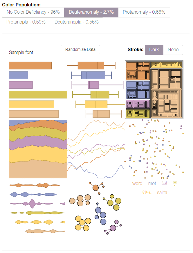
Tools such as Viz Palette are useful for understanding how different people might view your data visualizations and maps. You can then decide for yourself whether your chosen palette is acceptable. ColorBrewer also lets you select from among only color schemes that have been empirically-verified as colorblind friendly its interface includes an option to show only “colorblind safe” color schemes. Unsurprisingly, the scheme in Figure 5.4.1(2) does not appear.
How much you factor color accessibility into your map design will depend greatly on its audience, medium, and purpose. Color discriminability is affected by many factors outside of genetics, including reader age, lighting conditions, and map resolution. It is also more crucial in some mapping contexts than in others. A map for entertainment, for example, may sacrifice accessibility for increased aesthetics and visual interest among the not color-vision impaired. When a map’s purpose is emergency management or vehicle routing, however, the cartographer may place a greater value on ensuring readability for all map users.
Even among those without color vision impairments, human color perception does not come without flaws. View the squares labeled A and B in Figure 5.4.3—do they look the same to you?

You likely perceive squares A and B as different shades of grey, but, as you may have guessed, your eyes are deceiving you—these two squares are exactly the same shade of grey. (If you don't believe it, check out the interactive version of this graphic at illusionsindex.org). This is the result of a principle of color interpretation called simultaneous contrast, or induction—colors appear differently, dependent on the backdrop against which they appear.
Student Reflection
View the maps in Figure 5.4.4: which colors in the second map (1, 2, 3, 4) do you think match the colors in areas A and B?

Student Reflection Answer
The color in A matches the color in 4; the color in area B matches area 2. Is this what you were expecting?
To date, little empirical research in cartography has evaluated the influence of induction on map interpretation, and, thus, few suggestions exist for minimizing its effects in practice. You should, however, anticipate the effects that varied backgrounds will have on the interpretation of your map symbol colors, particularly for maps in which such comparisons are common and/or critical.
So far in this lesson, many of our examples have been choropleth maps—the most common thematic mapping technique, and one which typically makes extensive use of color as a visual variable. In the next section, we will focus on other aspects of choropleth mapping, including data standardization and classification, as a deeper understanding of how these maps are built using data is required for selecting an effective color scheme.
Recommended Reading
Chapter 8: Color on Maps. Brewer, Cynthia A. 2015. Designing Better Maps: A Guide for GIS Users. Second. Redlands: Esri Press. Bach, M. (n.d.).
Data Standardization
Data StandardizationThe choropleth mapping technique should be used on standardized data such as rates and percentages—rather than on totals or counts—which are better represented by point symbol maps.
There is almost never a good reason to make a choropleth map without standardizing your data. Why? Because if you don’t standardize your data, then you are inadvertently creating a map of the underlying population. For example, you could create a choropleth map of the United States showing counts of, say, gas stations in each state. Texas and California have the largest populations of any state in the US, so they would likely have more gas stations and show primacy in this count. The result is a map without much useful information—California and Texas have more people and things because simply because they have more people and things. The map would tell us nothing interesting about each state’s respective consumption of gas or transportation infrastructure in relation to the underlying population. However, if you were to map gas stations per capita (i.e., if you standardized your data), then we would be able to meaningfully compare rates, and a choropleth map would be an appropriate method.
If you’re lucky (really, really lucky), your data will be delivered in the proper standardized format. For example, for each enumeration unit in your data, you might have a rate, density, or index value. All of these are appropriate standardized data for choropleth mapping. Oftentimes, however, you will need to calculate these values yourself. Data from the US Census, for example, is often delivered as count data by enumeration unit but includes a population field which can be used for standardization.

Using the example data in Figure 5.5.1 above, imagine we wanted to map the number of people in each county who are under 18 years old AND have one type of health insurance coverage (Column F). And imagine we created a county-level choropleth map using those Column F values. What would this map tell us? It might tell us a little something about geographic health insurance trends in North Carolina, but mostly it would just show us in which counties more people live.
Remember the importance of map purpose: rather than just making a population map, we want to understand the geography of health insurance coverage for young people. For this, we need to map standardized values. To do so, we can divide the number of under 18-year-olds with one type of health insurance (Column F) by the appropriate universe: the count of items (here, people) that could possibly fall into this category. Since our data value of interest only applies to a specific age group, our universe, in this case, is not all people (Column D), but all people under 18 (Column E).
Some texts and software programs, including ArcGIS, call this process normalization rather than standardization. As suggested by (Slocum et al. 2009) we use the term standardization, as normalization has a more specific meaning in statistics with which we do not want this process to be confused.
Making Choropleth Maps
Making Choropleth Maps
Let’s return again to a map that should be becoming familiar, posted now as Figure 5.6.1. Median income is visually encoded in each state as belonging to one of four classes: (1) less than $45,000; (2) $45,000 to $49,999; (3) $50,000 to $59,999, and (4) $60,0000 and more. How were these classes chosen?
Student Reflection
One side-step before we discuss data classification: think back to our discussion of types of color schemes— can you think of another type of color scheme that would be effective in Figure 5.6.1? Do you think it would be better?
When the map in Figure 5.6.1 was being designed, the aforementioned classes had to be decided upon – and there are many different ways in which class breaks in median income could have been drawn. So, how do you choose? Rather than simply choosing the default classification scheme that your GIS software suggests, you should think critically about how your data classes are defined. Before you decide how to class your data, the first decision you should make, however, is not how, but whether to class your data.
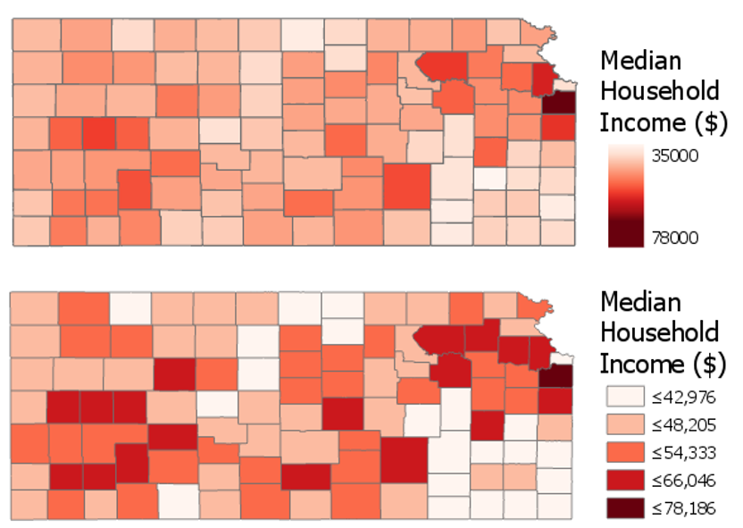
Figure 5.6.2 shows an example of two maps—one unclassed and one classed. Unclassed maps (sometimes called N-classed, where the N represents the number of enumeration units, or "class-less" map) encode color (usually with lightness) based on the specific value within each enumeration unit, rather than based on a pre-defined class within which the data value falls. These maps are useful as—if designed properly—they may more accurately reflect the ordinal nuances in the distribution of the data as map readers can see the differences between the color lightness (a given color lightness is more or less light than its neighbors). However, unclassed maps should not be considered an easy solution to the problem of data classification. They have their own disadvantages, for example, they make it challenging for the reader to match the value encoded in an enumeration unit to its location on the legend.
Before modern GIS software, unclassed maps were quite difficult to create, but new technology has made their design quite simple. Unclassed maps show a visualization of the data that respects the inherent numeric distribution of data values, while classifying maps gives you more control over the final map. It will be up to you as the map designer to decide whether to class your map; however, many map readers—and cartographers—still prefer classed maps.
As you will likely be classifying your maps, it is important to understand how this process can influence your final map design. Most of the commonly-used classification methods are available in ArcGIS, and the software interface gives a simple explanation of each of these methods (Figure 5.6.3). We will not discuss the mathematical details of each of these classification methods here—it is recommended that you explore the recommended readings or do your own research on the web to learn more.

Natural Breaks (Jenks): Numerical values of ranked data are examined to account for non-uniform distributions, giving an unequal class width with varying frequency of observations per class.
Quantile: Distributes the observations equally across the class interval, giving unequal class width but the same frequency of observations per class.
Equal Interval: The data range of each class is held constant, giving an equal class width with varying frequency of observations per class.
Defined Interval: Specify an interval size to define equal class widths with varying frequency of observations per class.
Manual Interval: Create class breaks manually or modify one of the present classification methods appropriate for your data.
Geometric Interval: Mathematically defined class widths based on a geometric series, giving an approximately equal class width and consistent frequency of observations per class.
Standard Deviation: For normally distributed data, class widths are defined using standard deviations from the mean of the data array, giving an equal class width and varying frequency of observations per class.
Though Figure 5.6.3 gives brief descriptions of each classification method, it offers little advice as to when to use them. A good way to approach this question is to view your data along the number line. You can use histograms (for large data sets) or dot plots (for small data sets) to visualize how your data is distributed, and to select class breaks accordingly. The following suggestions are given by Penn State cartographer Dr. Cynthia Brewer.
- For data with near-normal distributions, consider classifying your data based on the mean and standard deviation.
- For skewed distributions, consider systematically increasing classes, such as arithmetic and geometric classing methods.
- If your data are evenly distributed, equal interval and quantile classing methods work well. These methods are also best for ranked data.
- Natural breaks, created using Jenks classing method or in selecting breaks by eye, work best for data that shows obvious groupings through the range. The natural breaks method highlights the numeric relationships in the data values.
We will look at data using dot plots during this lab associated with this lesson. When you make maps, unless you are working with a very large data set, this will often be the most effective way to visually investigate the distribution of your dataset in order to choose a classification method or visually/manually place your own breaks. ArcGIS, however, creates histograms of your data that you can also use to understand how the breaks you have chosen to relate to the spread of your data.
Student Reflection
Compare the breaks, histograms, and maps in Figure 5.6.4 below. Which classification method would you have chosen? Why?
![comparison of two maps (top map created using quantiles classification method, bottom map using natural breaks [Jenks]), see surrounding text](/geog486/sites/geog486/files/Lesson_04/Images/4.5.10.PNG)
Note that the spread of your data is only one of multiple elements you should consider when choosing how to classify your data. As with other map design choices, your map's intended audience, medium, and purpose are also of vital importance here.
In addition to choosing a classification method for your maps, you also must decide how many classes to create. It may be tempting to create a large number of classes, as more classes means less simplification of your data, and thus more information conveyed to the map viewer. Unfortunately, the human eye can only differentiate between so many colors. There are recommendations for the maximum number of color classes on a map, generally ranging from about 5 to 12. But a good rule of thumb is that the fewer classes your reader has to remember, the better.
Student Reflection
View the maps in Figure 5.6.5 below. Looking at the map on the left, can you identify within which class county x belongs? How confident are you that this is the correct answer? What about in the map on the right?

Finally, when classifying your map data, you will have to contend with outliers in your dataset. Consider a county-level map, where one county has double the rate (for example, of people with graduate-level degrees) of any other county in your data. Some classification methods, such as natural breaks or equal intervals, will most likely group this outlier into a class of its own. Other methods, such as quartiles, will simply place it into a group with all the next-highest counties.
There is no rule for which method is best, except that context matters. Is the rate high because that county contains the most prestigious university in the state? In that case, you probably want it to be highlighted on your map. If, instead, it is the highest because only five people live there—and two are college professors—you probably don’t. In general, the more data you have, the less likely an outlier is to be noise: this is called the law of large numbers. Whenever possible, however, you should investigate the possible causes of an outlier; there is no substitute for contextual clues.
There are additional ways to classify your data, including by combining methods; for example, using equal intervals for most of the range, and then switching to natural breaks. Methods also exist that consider not just the distribution of data along the number line, but its distribution through geographic space as well. These are beyond the scope and intent of this lesson, but be aware that you may encounter them in the future.
Recommended Reading
Chapter 4: Data Classification. Slocum, Terry A., Robert B. McMaster, Fritz C. Kessler, and Hugh H. Howard. 2009. Thematic Cartography and Geovisualization. Edited by Keith C. Clarke. 3rd ed. Upper Saddle River, NJ: Pearson Prentice Hall.
Chapter 11: Data Maps: A Thicket of Thorny Choices. Monmonier, Mark. 2018. How to Lie with Maps. 3rd ed. The University of Chicago Press. (this week's required reading - it relates especially well to this topic).
Tversky, Amos, and Daniel Kahneman. 1971. “Belief in the Law of Small Numbers.” Psychological Bulletin 76 (2): 105–110.
Making Sense of Maps
Making Sense of MapsBy now, you should feel pretty good about creating a single choropleth map. But while we frequently encounter choropleth maps in the singular, the power of maps often comes from our ability to compare them. Static maps—all of the maps we’ve discussed thus far—typically only represent one snapshot in time. What if we are interested in how a phenomenon has changed over time, or how it varies between two disparate locations?
View the two maps below in Figure 5.7.1. They are both maps of population density from New Jersey and Vermont and are shown using the same scale. A casual inspection of the maps (to non-US residents, perhaps), the vibrant colors appearing on the Vermont map suggest that this state may have a higher level of population density. But take a closer look at the legends.

The legends in the maps in Figure 5.7.1 don’t match. The darkest color, for example, represents a vastly higher level of population between the two maps. How much does population density differ between New Jersey and Vermont? Due to the unmatched legends, it’s almost impossible to tell.
Using the same data classification scheme for a set of maps whose purpose is to compare a dataset is necessary. For example, the maps in Figure 5.7.2 use the same data, but this time, both legends are equivalent.

This gives us an entirely different view of the data: New Jersey is now represented as obviously more densely populated. Note, however, that this map just took New Jersey’s classification scheme and applied it to Vermont, which is still not a good solution. Though it is now easy to compare these states, we are unable to discern which areas of Vermont are more populated than others: they are all simply classified as "less than 562 residents per square mile." Making maps that work well both independently and when compared is a challenging task, and one which we will contend with in Lab 5.
Another important aspect of choropleth—and any—map design is making sure that marginal elements such as legends and labels are well-crafted to support reader comprehension of your map. For example, see Figure 5.7.3. It may seem at first that this legend is too text-heavy at the expense of the geography mapped: you don’t generally create visual graphics with the intention of asking people to read. However, without necessary information being conveyed through the text, the content of the map would be confusing, and many readers would likely misinterpret it.

This map also purposefully places breaks in the data; for example, one break is placed at 24 percent, which is the percentage of all people in the US who are under 18 years old. The break is annotated to inform the reader of this fact; without this annotation, the use of this specific break would not be useful. Additional legend annotations (e.g., “High proportion of AIAN are young”) serve to clarify the map.
Figure 5.7.4 below similarly uses a text explanation to clarify the data mapped. Due to the classification scheme used, the location indicated by the leader line and Prisons* note does not immediately stand out as an outlier. However, given the topic of the map, this explanation is important. We discussed dealing with outliers earlier in the lesson—one option for dealing with a relevant outlier is simply to point it out to your readers via explanatory text. Mapping is all about graphic presentation, but sometimes the best solution is a simple, concise, text explanation.

Recommended Reading
Chapter 3: Explaining Maps. Brewer, Cynthia A. 2015. Designing Better Maps: A Guide for GIS Users. Second. Redlands: Esri Press.
Chapter 5: Color: Attraction and Distraction. Monmonier, Mark. 2018. How to Lie with Maps. The University of Chicago Press.
Color and Data
Color and DataWhen using color as a symbol on your maps, your first priority should be to apply it analytically. As stated before: the perceptual structure of your color scheme should match the perceptual structure of your data. You should apply color based on the guidelines previously discussed in this lesson before worrying about choosing aesthetically-pleasing colors, or your audiences’ likely favorite colors, or colors that correspond to the context of the data (e.g., using a green color scheme to create a map about sustainability).
However—when appropriate—adding context to colors in your maps can benefit your readers. See the map in Figure 5.8.1 below. Rather than choosing a traditional sequential color scheme, this cartographer chose to match the map’s colors to colors of tree leaves as they turn in autumn.

This approach may not always work to best represent the mathematical order of your data classes. But your maps aren’t always about dots along a number line—they represent real-world phenomena. Using color assignments that make sense (e.g., red for negative values), or are customary (e.g., yellow for residential in zoning maps) can improve the clarity and comprehensibility of your maps.
Recommended Reading
Lin, Sharon, and Jeffrey Heer. 2014. “The Right Colors Make Data Easier to Read.” Harvard Business Publishing.
Bartram, Lyn, Abhisekh Patra, and Maureen Stone. 2017. “Affective Color in Visualization.” CHI Proceeding: 1364–1374. doi:10.1145/3025453.3026041.
Critique #3
Critique #3Critique #3 will be your second critique involving a peer review of a map created by someone in this class. In this activity, you will be assigned a colleague's map from this class to critique from Lab 4: Terrain Mapping.
Your peer review assignment includes writing up a 300+ word critique of one of your colleague's Lesson 4 Lab.
In your written critique please describe:
- three (3) things about the map design that you think works well and why.
- three (3) suggestions you have for improvement of the map design and why these improvements would be helpful.
According to the two prompts above, a map critique is not just about finding problems, but about reflecting on a map in an overall context. Your critique should focus on the map design that works well as much as it does on suggestions for design improvements. In your discussion, you should connect your ideas back to what we learned in the previous lessons.
Remember, your critique should be as much about reflecting upon design ideas well-done as it is about suggesting improvements to the design. In your discussion, connect your ideas to concepts from previous lessons where relevant.
Grading Criteria
Registered students can view a rubric for this assignment in Canvas.
Submission Instructions
You will work on Critique #3 during Lesson 5 and submit it at the end of Lesson 5.
Step 1: When a peer review has been assigned, you will see a notification appear in your Canvas Dashboard To Do sidebar or Activity Stream. Upon notification of the Peer Review (Critique), go to Lesson 4: Lab 4 Assignment. You will see your assignment to peer review. (Note: You will be notified that you have a peer review in the Recent Activity Stream and the To-Do list. Once peer reviews are assigned, you will also be notified via email.)
Step 2: Download/view your colleague's completed map.
Step 3:
- Write up your critique using the prompts above in a Word document.
- Please write the student name of the map that you have been assigned to critique at the top of the page.
- Be sure to review the critique rubric in which you will be graded for more guidance on the expected content and format of your review.
- Save your Word document as a PDF.
- When submitting your PDF, use the naming convention outlined here:
YourLastName_LastNameOfColleagueCritiqued_C3.pdf
Step 4: In order to complete the Peer Review/Critique, you must
- Add the PDF as an attachment in the comment sidebar in the assignment.
- Include a comment such as "here is my critique" in the comment area.
- PLEASE DO NOT complete the lesson rubric as your review, award points, or grade the map you are critiquing. Even though Canvas asks you to complete the rubric, PLEASE DO NOT COMPLETE THE RUBRIC OR ASSIGN POINTS/GRADE.
Step 5: When you're finished, click the Save Comment button. Canvas may not instantly show that your PDF was uploaded. You may need to exit from the course, leave the page, refresh your browser, or some combination thereof to see that you've completed the required steps for the peer review. If in doubt, you can send a message to the instructor for them to check an confirm that your PDF was successfully uploaded.
Note: Again, you will not submit anything for a letter grade or provide comments in the lesson rubric..
Lesson 5 Lab
Lesson 5 LabColor and Choropleth Mapping in Series
In Lab 5, we will explore different ways of choosing data classification and color schemes for choropleth maps. As a cartographer, you will often have to choose between several of these options, many of which may seem at first glance to be equally appropriate. In this lab, we will utilize data from the American Community Survey, provided by the U.S. Census—a commonly used source of data for statistical maps. From this data source, we will focus on a specific variable frequently in focus during public policy debates: health insurance.
The first part of Lab 5 will focus on data classification. There are many ways to classify statistical data on maps, and it is important that you understand them, and be able to defend your choice of classification scheme to others. As we will be not only be classifying data but also adding that data to maps, this lab will also focus on the use of color on maps. Finally, as suggested in the lesson content, we will explore ways of making comparable maps - in this lab, we will be making three pairs of maps.
Lab Objectives
- Create three pairs of county-level choropleth maps describing health insurance in New England.
- Utilize shared or similar legends to help readers understand the relationships between pairs of maps.
- Use information about data distributions and health insurance rates in New England and the US overall to plan shared data classification breaks.
- Understand the impact of different color schemes and classification methods; be able to reflect upon and write about these decisions.
Overall Lab Requirements
For Lab 5, you will create three pairs of maps, each pair as its own full-page map layout. In total, you will have three separate pages. Two maps will appear on each page. You will also write a short reflection statement about each pair of maps.
- For each pair, use the same map positioning and scale within each frame; one scale bar for both maps.
- Prepare balanced page layouts with all elements suitably sized and balanced negative space—no pinched elements or visual collisions.
- Attend to text hierarchy: overall title, subtitles, legend title(s), legend class labels, scale, data source, and name. Use thoughtful and efficient wording when labeling map elements.
Map Requirements
Map Pair One: Use a Sequential Color Scheme
- Choose two related variables to map from the provided American Community Survey (ACS) data.
- Do not just choose two age groups (e.g., 18-under; 19-25 years).
- The mapped data must be two related variables.
- Select class breaks manually
- Create dot plots in Microsoft Excel
- Draw appropriate breaks using your eye to judge the data
- Enter these values as manual breaks in ArcGIS Pro.
- Use a sequential color scheme and a single shared legend for both maps.
- Include a short write-up (100+ words)
- Include a screenshot of your dot plot with lines drawn to demonstrate the breaks you chose, as well as a short description of how you selected these breaks.
- Include a screenshot of the symbology pane for both maps.
- Discuss why you selected this particular color scheme.
Map Pair Two: Use a Diverging Color Scheme
- Re-create your maps from map pair #1; using a diverging color scheme.
- Choose a critical break or class using external information using either of the approaches listed
- Use a value that is directly derived from your chosen data set (e.g., the mean of the data)
- Any logical dividing point that is calculated from an external source (e.g., the U.S. national average)
- Adjust other class breaks accordingly.
- Use a single well-designed shared legend for both maps.
- Include a short write-up (100+ words) describing the critical break or class you chose and why.
- Discuss why you selected this particular color scheme.
- Include a screenshot of the symbology pane for both maps.
Map Pair Three: Unclassed vs. Classed Maps (Choose your own appropriate color scheme)
- Choose one of the maps from map pairs #1 and #2 and create two more maps of this data—unlike in the previous layouts you made, these two maps will show the same data/topic.
- One of the maps should be an unclassed map; one should be classed.
- For the classed map, choose a classification method available in ArcGIS Pro—do not manually adjust the class breaks created, but ensure that this method is appropriate for the data you are mapping.
- Include a well-designed legend for each map.
- Include a short write-up (100+ words) that describes why you chose the classification method you did, and how you think its effectiveness compares to that of the unclassed map.
Lab Instructions
- Download the Lab 5 zipped file (43.2 MB). It contains:
- a project (.aprx) file to be opened in ArcGIS Pro;
- a database that includes the spatial boundary and health insurance data needed to start this lab;
- a spreadsheet containing New England health insurance data.
- Data source: US Census Bureau - TIGER boundary files and American Community Survey (ACS) S2701 (Health Insurance Coverage Status) 5-year estimates for 2016.
- For the purposes of this lab, New England is defined as the following states: Massachusetts, Connecticut, Rhode Island, Vermont, New Hampshire, and Maine.
- Extract the zipped folder, and double-click the blue (.aprx) file to open ArcGIS Pro.
- In addition to the ArcGIS Pro file, you will also be using the ACS_2016_NewEngland_HealthInsurance.xlsx file to explore New England health insurance data.
- Note that you will not need to import any data into ArcGIS Pro - all data is included and ready to map. The Excel file is only for visually exploring the data in order to select class breaks for your maps.
Grading Criteria
Registered students can view a rubric for this assignment in Canvas.
Submission Instructions
- You will have three map layout PDFs to submit. Each will contain one map pair using the naming conventions outlined below.
- Map Layout/Pair 1: LastName_Lab5_Layout1.pdf
- Map Layout/Pair 2: LastName_Lab5_Layout2.pdf
- Map Layout/Pair 3: LastName_Lab5_Layout3.pdf
- Include your write-ups (all three in one document) as a separate PDF.
- Lab Write-up: LastName_Lab5_WriteUp.pdf
- Remember that your write-up should include three 100+ word sections (300+ words in total) - these write-ups should defend your data classification and color scheme selection choices. The write-up for your first pair of maps must also include an image of your dot plot with annotated breaks, and screenshots of the Symbology Pane in ArcGIS Pro for both maps.
- Lab Write-up: LastName_Lab5_WriteUp.pdf
- Submit the three map layout PDFs and one write-up (also PDF) to Lesson 5 Lab for instructor review.
Ready to Begin?
More instructions are available in the Lesson 5 Lab Visual Guide.
Lesson 5 Lab Visual Guide
Lesson 5 Lab Visual GuideLesson 5 Lab Visual Guide Index
- Starting File
- Explore the Health Insurance Data in Excel
- Standardize Chosen Data for Visualization
- Create Dot Plots Using your Standardized Data
- Use this Plot to Visually Select Breaks
- Create Maps (1 & 2) Using These Breaks
- Create Maps (3 & 4) Using Diverging Colors
- Create Maps (5 & 6) Unclassed vs. Classed
- Final Deliverables
- Additional Tips
1. Starting File
This is your starting file in ArcGIS Pro. It includes county-level boundary data for the United States. This county-level file has been joined with health insurance data for New England from the American Community Survey (ACS). A state boundaries file is also included – this file is not needed to map the health insurance data, but you may choose to symbolize it to create visible state boundaries on your map.

2. Explore the Health Insurance Data in Excel
Within the health insurance data provided in the Lab 5 zipped folder, find two variables you are interested in and their associated universes. For example, if you were interested in uninsured people under 18, your value and universe would be those shown in Figure 5.2 below. (note: this is one variable, you need to choose two).

3. Standardize Chosen Data for Visualization
Paste the four columns you will need "as values" (see Figure 5.3) into the Chosen Data sheet. (Reminder: use something other than just age for your maps). This will eliminate the clutter of the full dataset, giving you space to calculate standardized values from your data. We will use these standardized values to determine class breaks for our first set of maps.

Once you have your two variables of interest (and their universes) in the Chosen Data sheet, use Excel to calculate a standardized column of data for each of your variables. You want to divide each variable of interest by its universe (recall the Data Standardization section in Lesson 5).

4. Create Dot Plots Using your Standardized Data
Insert a column of 1s and 2s as shown - we will use this to create a dot plot. When you select columns A and B below and insert a scatter plot, this will create a dot plot showing the distribution of your two standardized variables along the number line.


5. Use this Plot to Visually Select Breaks
Draw lines with the "insert shape" tool to illustrate where you will be placing breaks in your data. Annotate your lines if you choose the breaks for a reason other than just eyeing the dot distribution. For example, if you place a break at the national average for a variable, annotated this break with a text box explanation such as "US national average." Ex: “national average."
Note that Figure 5.7 is an example of how to draw lines above your dot plot, but these are not good breaks.

6. Create Maps (1 & 2) Using These Breaks
We will not be importing our excel data into ArcGIS, as I have already loaded the health insurance data into ArcGIS for you. We only needed the Excel file to decide on what breaks to use for our data classification. Instead of importing standardized values, use ArcGIS to standardize your data for you: make sure the variables you choose match the ones you chose earlier!
You will then manually edit your class breaks to match the ones you drew on your dot plot (use your eye to estimate the values). The screenshot in Figure 5.8 (below) is an example of a screenshot from the Symbology Pane. You will submit a screenshot of the Symbology Pane for both maps in layout one, in addition to an image of your dot plot with annotated breaks.

7. Create Maps (3 & 4) Using Diverging Colors
For these maps, you will be setting a critical class break (e.g., based on the mean of the data) and a diverging color scheme. To create your second pair of maps, choose a diverging color scheme. Then, set a deliberate and useful critical class or break. Once the break is set, you should manipulate the other class breaks manually. As a suggestion, for the other class breaks you could start with the manual breaks you chose for your first two maps, but may need to adjust them to work with this new color scheme. Reference the Lesson 5 reading for ideas and advice on how to choose a critical class or break.
8. Create Maps (5 & 6) Unclassed vs. Classed
For the third set of maps, abandon your previously-selected class breaks. In this set of maps, you will compare the visual difference between a classed map and an unclassed map. Use the same sequential color scheme for both maps so they can be adequately compared. You should also use consistent line design, etc., so as to not distract from the primary difference of interest - the classification method used. Unlike with the first two sets of maps, you will not be mapping two different variables for comparison here. You will choose just one of the variables from your previous maps, and visualize this variable on both of maps 5 & 6.

For your classed map, choose any of the methods available in ArcGIS Pro – but have a reason why! You will discuss your reasoning for choosing one of these methods in your write-up for this map pair.

9. Final Deliverables
For this lab you will submit three layouts, each containing a pair of maps. You will also submit a write-up document, with a 100+ word explanation of your design (data classification and color) choices for each map pair. Make sure to also design a neat and useful layout - see Lesson/Lab 2 for layout design advice.

9.1 Example Map Pair #1
Don’t copy this (poor) layout design – use your own knowledge and judgment. Clean up titles, marginal elements, alignments, etc. – use either portrait or landscape, whichever you prefer. Note that elements which refer to both maps (legend; north arrow; scale bar) need only be included once.
 Visual Guide Figure 5.13. Example Map Layout #1
9.2 Example Map Pair #2
Don’t copy this (poor) layout design – use your own knowledge and judgment.
 Visual Guide Figure 5.14. Example Map Layout #2
Use convert to graphics to manually improve your legend. Use a text box to annotate your critical class/break!
 Visual Guide Figure 5.15. Using the Convert to Graphics function.
9.3 Example Map Pair #3
Don’t copy this (poor) layout design – use your own knowledge and judgment. Remember this map pair uses the same data for each map – it is demonstrating the effects of classification. Your goal should be to make a clean, useful legend for each map - make it look better than the legend design below.
 Visual Guide Figure 5.16. Example Map Layout #3.
10. Additional Tips
Think about color and what you are mapping. Are you mapping insured or uninsured? Choose colors wisely – what do they represent?
Remember that you can employ text to explain your map! Use text sparingly but effectively – don’t be afraid to use convert to graphics and/or manually edit text and layout elements. When choosing a color scheme as well as when doing your write-up, keep in mind: the perceptual progression of your data should match the perceptual progression of your color scheme.


Credit for all screenshots is to Cary Anderson, Penn State University; Data Source, US Census Bureau.
Summary and Final Tasks
Summary and Final TasksSummary
Congrats on making it to the end of Lesson 5! In this lesson, we learned about color, data classification, and choropleth maps - three topics that are quite inter-related. During our discussion on color models and human color vision, we talked about how to select appropriate color schemes to choropleth maps that represent quantitative data. We learned how to choose a color scheme for a map based on the perceptual progression of our data, as well as how to consider other factors such as map purpose, color accessibility, and data context. We also explored ideas related to data classification. We specifically focused our attention on how to choose a classification method and how that choice can affect the information presented on the map. Choropleth symbolization, while commonly used to map quantitative data, does present limitations in that data are aggregated to an enumeration unit and are assumed to be continuous across that unit which may not be how the data truly are distributed.
In Lab 5, we made pairs of choropleth maps. In doing so, we took on the challenge of making maps that work well both independently and when viewed together. We also compared the visual effect of classed vs. unclassed maps, and considered the impact of each method on reader perception of our maps. In building our final map layouts, we utilized knowledge from earlier lessons, such as legend and layout design. As we move forward with the course, the skills we learn will continue to build upon each other. We will design some more interesting map layouts in Lab 6!
Reminder - Complete all of the Lesson 5 tasks!
You have reached the end of Lesson 5! Double-check the to-do list on the Lesson 5 Overview page to make sure you have completed all of the activities listed there before you begin Lesson 5.
Lesson 6: Proportional Symbolization
Lesson 6: Proportional SymbolizationThe links below provide an outline of the material for this lesson. Be sure to carefully read through the entire lesson before returning to Canvas to submit your assignments.
Note: You can print the entire lesson by clicking on the "Print" link above.
Overview
OverviewWelcome to Lesson 6! In previous lessons, we discussed broad concepts related to map and map symbol design, including designing for a map’s audience, medium, and purpose. We learned about visual variables and how to designate order and category with map symbols. In the context of text on maps, we discussed these ideas in greater detail; we created symbols with labels and learned how to place them appropriately on maps. We then put everything together in a map layout.
So far, we have only designed maps that use more or less concrete data, such as road networks, lakes, or travel routes. You began to work with more abstract statistical data from the US Census Bureau in Lesson 5. In this lesson, we discuss another type of thematic map symbolization, the proportional symbol and the ways in which we can use maps to effectively visualize spatial statistical data. When deciding how to map, we’ll continue to consider the spatial dimensions and models of geographic phenomena, levels of data measurement, and appropriate methods of visual encoding.
Learning Outcomes
By the end of this lesson, you should be able to:
- identify the visual variables used to display both quantitative and qualitative data in a given map.
- identify the spatial dimension, model, and level of measurement of geographic phenomena.
- select appropriate visual variables for data encoding based on the characteristics of the phenomenon to be mapped.
- use knowledge of data measurement levels and visual variables to thoughtfully critique thematic maps.
Lesson Roadmap
| Action | Assignment | Directions |
|---|---|---|
| To Read | In addition to reading all of the required materials here on the course website, before you begin working through this lesson, please read the following required readings:
Additional (recommended) readings are clearly noted throughout the lesson and can be pursued as your time and interest allow. | The required reading material is available in the Lesson 6 module. |
| To Do |
|
|
Questions?
If you have questions, please feel free to post them to the Lesson 6 Discussion Forum. While you are there, feel free to post your own responses if you, too, are able to help a classmate.
Thematic Maps: Visualizing Data
Thematic Maps: Visualizing DataWe first introduced thematic maps in Lesson 1, and described them as maps intended to highlight features, data, or concepts (either quantitative or qualitative). In assignments 1 and 2, we used visual variables to show order and category of typical map features. In assignments 3 and 4, we introduced the use of projections and symbolized methods for terrain visualization.
The maps we’ve created so far have visualized fairly tangible information—we have indeed been creating abstract representations of the real world, with roads, rivers, lakes, county lines, etc., with hues and shapes different from what would be captured by a photograph. We have also visualized the concept of travel routes, be they on foot or by plane. But on balance, our designs have more or less matched a physical phenomenon or object. So, in this lesson, we turn to more abstract depictions of the world, designed using thematic, statistical data. View for example, the map in Figure 6.1.1.

Data Sources: Esri, US Census Bureau
This map uses color value—not to show category or hierarchy of map features—but to visually encode county- level quantitative unemployment data. Figure 6.1.1 also simplifies the map of the US (not showing even major highways or mountain ranges, but only state and county boundaries) to emphasize the map’s theme.
Due to thoughtful use of color and a simple layout design, this map successfully communicates geographic trends of unemployment across the United States. Was this the best design and symbolization choice to show this geographic distribution? Is there a better way?
View the map in Figure 6.1.2.

Data Source: Esri, The National Map
This map uses a similar color scheme and layout, but encodes its data (this time population rather than unemployment) primarily using proportionally-sized symbols. Color value is used for additional effect, a technique called dual encoding.
Both of these maps (6.1.1; 6.1.2) employ appropriate cartographic conventions (e.g., assigning lighter color values to lower data values and darker color values to higher data values). But there are other conventions that this cartographer could have used with each dataset that would have been equally appropriate (e.g., using a diverging color scheme for Figure 6.1.1 and a single hue fill for Figure 6.1.2). There are also other symbolization methods that they could have used that would have been—arguably—not meeting the map purpose. How do you decide?
Student Reflection
Do you think the data mapped in Figure 6.1.1 would be appropriate for making a proportional symbol map (e.g., Figure 6.1.2)? Why or why not?
Before beginning the how of making a map, we need to take a step back and consider the what—the geographic phenomena we want our map to be about.
Geographic phenomena are elements that exist over geographic space. When we say geographic, we typically mean anything tangible that is associated with Earth. On the other hand, spatial refers to connections that exist in space (broadly defined). So, while still spatial and can be mapped, the connections between the neurons in your brain or the arrangement of atoms in a ceramic material are generally not referred to as “geographic" phenomena. In this lesson, you will learn tools for conceptualizing, visualizing, and communicating the many geographic phenomena that do.
Recommended Reading
US Census Bureau. 2021. “Interactive Maps.” Accessed May 31.
Geographic Phenomena: Spatial Dimensions
Geographic Phenomena: Spatial DimensionsGeographic phenomena are often classified according to the spatial dimension best used to describe their nature. These include points, lines, polygons, and volumes (3D). As you likely remember, we used the spatial dimension of map elements (e.g., line vs. point) in a previous lab to decide how to symbolize and apply feature labels to our maps.
Points exist in a singular location. Points are usually specified using a coordinate pair (x, y or latitude and longitude), though they occasionally include a z-value (height). Points are most appropriate in situations where the specific geometry of a feature is unimportant, or if the scale of the map is too small to usefully or accurately render the geometry of a feature. Points are also useful in cases where you are trying to minimize the amount of visual information being presented in a map. Points are used to map point locations such as weather recording stations, control points, or stream gages.

Lines are one-dimensional spatial features defined by a sequence of at least two pairs (x, y) of coordinates. A third dimension, z (height), can also be assigned to lines, but this is uncommon. Lines are used to map geographic phenomena that are best conceived of as linear features, including features that have greater dimensionality in reality (e.g., streams are defined by surface area and volume). There are also linear features that do not visibly exist in the real world (e.g., property lines). Often, someone else has decided for you whether or not a given feature should be encoded as a line rather than a polygon, but if you’re trying to make this determination, you could think in terms of how many dimensions are needed to sufficiently present the geographic phenomenon. For example, Figure 6.2.2 is drawn at a scale such that the width of the Blue Ridge Parkway would be difficult to represent, and road width would be an immaterial variable anyway– the goal of this map isn’t furthered by that data (the map reader doesn't need to be able to accurately measure the road's width). We only need to know the path of the road (where it exists), so a line is the appropriate choice for representation here (the thickness of which is irrelevant).

Polygon features, also called area features, are represented by a sequence of (x, y) points that form a boundary that encloses a space. Areal phenomena can include natural features like lakes and islands, as well as human-defined locations like cities or census blocks.

2-½ and 3-D features are sometimes grouped together, but the distinction between them is important. 2-½D features define a continuous surface—they have an x, y, and a z at every location. A good example is elevation, which varies continuously across the landscape. Therefore, a topographic map is a common depiction of 2-½D phenomena.

True 3D maps have an x, y, and z, plus an additional data value, at every location and height. Imagine, as an example, a map of elevation like the one above; but at every point along the terrain surface, there are additional measurements being taken at various depths of that surface. Thus, rather than depicting a continuous 2D surface, true 3D maps depict a continuous volume.

As mentioned earlier, the scale of your map has significant influence on what spatial dimension will best represent the phenomenon you intend to map. Cities, for example, are often drawn as polygons on large-scale maps, but may appear as points on smaller-scale maps. Rivers are usually drawn as lines on small-scale maps but are better represented as areas on large-scale maps. We will discuss this more during discussions of cartographic generalization later in the course.
Recommended Reading
Peuquet, D J. 1984. “A Conceptual Framework and Comparison of Spatial Data Models.” Cartographica 21 (4): 66–113. doi:10.3138/D794-N214-221R-23R5.
Couclelis, Helen. 1992. “People Manipulate Objects (but Cultivate Fields): Beyond the Raster-Vector Debate in GIS.” GIScience Conference Pa. doi:10.1007/3-540-55966-3.
Geographic Phenomena: Models
Geographic Phenomena: ModelsWhen conceptualizing the geographic phenomena we want to map, it is important to consider the best way that these phenomena can be modeled. In general, we can categorize the best model for a given phenomenon as existing somewhere along two continuums: (1) from discrete to continuous, and (2) from smooth to abrupt.
You likely learned the difference between discrete (e.g., as shown by a histogram) and continuous (e.g., as shown by the bell curve) variables in an introductory statistics course. The distinction in cartography is similar.
Discrete phenomena have well-defined boundaries: they occur at specific locations, with space in between. Examples include trees, houses, cities, and roads.
Continuous phenomena, conversely, have ill-defined or irrelevant boundaries but exist everywhere. Examples include temperature, air quality, and elevation.
Phenomena can also—independent of their classification as discrete or continuous—be considered either smooth or abrupt.
Smooth phenomena are those that change gradually over geographic space. Examples include precipitation levels and barometric pressure: they vary by location but do not typically change abruptly at geographic bounds.
Abrupt phenomena do change suddenly at geographic boundaries, whether physical or cultural. Examples include state sales tax or municipal water cost.
Often, phenomena are not clearly smooth or abrupt, but fall somewhere in between. The amount of pesticide residue in soil, for example, might vary somewhat continuously over the area of a farm, but change rather abruptly at the boundary of the farm’s fields.

Figure 6.3.1 illustrates various surfaces used to represent geographic phenomena throughout the discrete to continuous and abrupt to smooth continuums. Keep this idea of a continuum in mind—geographic phenomena often cannot be classified into neat categories, and it is typically more fruitful to think of them as “more continuous” or “more discrete” than to try and fit them into a box.
Student Reflection
Identify the proper (approximate) location in Figure 6.3.1 or the following phenomena: Health insurance (% of people covered); water quality; political affiliation; surface porosity. Why did you place them where you did?

Figure 6.3.2: above shows different map representations that are suited to mapping the geographic phenomena located at these relative positions along the continuous-discrete and abrupt-smooth continua. We will discuss the appropriateness of various thematic mapping methods further later in this lesson.
Recommended Reading
MacEachren, Alan M. 1992. “Visualizing Uncertain Information.” Cartographic Perspectives 13 (13): 10–19. doi:10.1.1.62.285.
Practical Mapping: What about the Data?
Practical Mapping: What about the Data?Considering the characteristics of the geographic phenomena you wish to map will inevitably improve the quality of your maps. However, before you design your map, you must understand the distinction between the characteristics of the phenomena and those of your data.
Consider again the map from Figure 6.1.1.
Data Sources: Esri, US Census Bureau.
This map illustrates unemployment rates in the United States at the county level. Though it is a well-designed and attractive map, consider the characteristics of unemployment as a geographic phenomenon. The abrupt change in unemployment rates at county boundaries in this map obscures the underlying heterogeneity in unemployment within county bounds. The phenomenon of unemployment varies by person, while the mapped unemployment data varies by county. This doesn’t mean the map is wrong, but it is a reality important to be cognizant of, both while creating your own maps and while critiquing those designed by others. What do you want your map to present to the reader? Different map purposes will help dictate how to present that information.
Relatedly, when creating maps, you will often rely on data that has already been collected by others. Often, this data is collected (as in the example in Figure 6.1.1 above) by enumeration units, such as counties, census tracts, or states. Obviously, containerizing data can create the illusion of a discrete and abrupt phenomenon. Unemployment does vary by person, but it is unlikely that this fine-grained data will be available to you. If you have a coarser level (e.g., state level) data, you cannot create a map that shows variation by person, by county, etc., even if this would be a more accurate depiction of the phenomena's distribution across space. The only way to create a more detailed map is to collect more granular data. Your map design can always be altered to present a simplified depiction of your data—but not the other way around.
Recommended Reading
Slingsby, Aidan, Jason Dykes, and Jo Wood. 2011. “Exploring Uncertainty in Geodemographics with Interactive Graphics.” IEEE Transactions on Visualization and Computer Graphics. doi:10.1109/TVCG.2011.197.
Geographic Data: Levels of Measurement
Geographic Data: Levels of MeasurementData is typically classified as either qualitative (e.g., land use; political affiliation) or quantitative (e.g., per capita income; temperature)—you likely recall learning about this distinction in earlier courses. The classification of your data as qualitative or quantitative will have significant influence on which visual variables you select to map your data. Color hue, for example, is excellent for qualitative data, while color value suggests order or a sequence and thus is probably a better choice for designing quantitative maps.
Nominal is a common term used to describe qualitative, or categorical data. Land use and land cover maps are popular examples of nominal data. They might show, for example, residential blocks as distinct from parks and green space, but this does not suggest that one is lesser or greater than the other.

Quantitative data can be further classified as ordinal, interval, or ratio data.
Ordinal data has an order, but cannot be presumed to show differences in magnitude. Sports team rankings, for example, describe which teams are better, but not by how much.
Interval data describes orders of magnitude but has an arbitrary zero point. Credit scores, exam grades, and the hours on a clock are all examples of interval data: the intervals between points in all three of these ranges is equal, and none of them have an absolute zero point. Additionally, you can add or subtract interval values, but you can’t multiply them— 2 o’clock plus 3 hours = 5 o’clock, but you can’t multiply 2 o’clock by 3 hours. The classic example is temperature: 0º Fahrenheit and 0º degrees Celsius both serve as the zero point on their respective scales, but refer to different temperatures and therefore arbitrary.
Ratio data, conversely, has a non-arbitrary zero point. Examples of ratio data include counts of forest fire incidence, and yearly household income (e.g., $50,000 is twice as much as $25,000). Interval and ratio data are often grouped together and classified as numerical data.

Student Reflection
View the map in Figure 6.4.2 above—is the data shown qualitative, ordinal, interval, or ratio? How does this compare to the likely level of measurement of this data when it was first collected?
Student Reflection
Consider time—would you usually consider this to be nominal, ordinal, interval, or ratio data? Why?
Consider mean sea level—would you usually consider this to be nominal, ordinal, interval, or ratio data? Why?
Recommended Reading
Chang, Kang-tsung. 1978. “Measurement Scales in Cartography.” The American Cartographer 5 (1): 57–64. doi:10.1559/152304078784023006.
Choosing Symbols for Maps
Choosing Symbols for MapsUnderstanding your data’s spatial dimensions, geographic model, and levels of measurement will help you select which visual variables to use in your map. Recall the table of visual variables we first encountered in Lesson 1 (Figure 6.5.1). This is a good time to check your knowledge and consider which of the following seven visual variables are best for visualizing data category, and which are best for visualizing order.

Some visual variables are also better than others for encoding data with different levels of measurement. Bertin (1967) only considered size (other than position on the map) to be a truly quantitative variable, its visual representation able to be matched precisely to a numerical value (although this is arguably true for orientation and position as well). This makes it a good choice for mapping ratio-level data, as making mathematical calculations with such data can be useful. Visual variables that can typically encode only category, not order (e.g., color hue; shape) are best for qualitative data.
Note that the visual variables presented in Figure 6.5.1 are those originally proposed by Bertin, and though they are likely the most common in use, this is not a comprehensive list. The graphic also does not demonstrate the many ways in which these variables might be altered and/or combined to create new designs. At the end of this lesson, we will assess a variety of maps, many of which use multiple visual variables. We will also discuss multivariate mapping further in Lesson 7 (Multivariate and Uncertainty Visualization).
The figures above focus on geometric visual variables (e.g., color; pattern; size), though another common mapping technique is to use pictographic or iconic symbols (Figure 6.5.2).

Iconic symbols are those that provide a closer visual match to their referent, or the real-world element meant to be depicted by the map symbol (Maceachren et al. 2012). The map in Figure 6.5.3 below uses flower symbols that are drawn similarly to how they appear in reality to create an engaging and useful map. It is important to balance usability and realism when using iconic symbols on maps - ensure that they do not become overcrowded, or distract from the map's purpose.

Another important consideration that should be weighed when considering the use of iconic symbols is the cultural context of those symbols. Some iconic symbols may be meaningful only to a specific group of people. For example, in the United Kingdom, the symbol used for speed cameras is a 19th century-style bellows camera (Figure 6.5.4). Especially for young people who may have never seen this type of camera, its symbolic rendering may be completely meaningless. Iconic symbols, therefore, are very culturally contextualized and that context should be weighed before icon symbols are chosen to be used on a map. This article [11] further explores the idea of symbols and icons and their meaning in cartography.

Like other continuums we have discussed (e.g., discrete to continuous; abrupt to smooth), map symbols cannot always be classified as simply abstract or iconic, and instead, exist somewhere in the middle. National Geographic's Atlas of Happiness for example, uses smiling face graphics to encode data about happiness. Thus, it is less abstract than if this data had been encoded only with color value or size, but less iconic than if more realistic graphic images of people were used.
Visual variables are used in many mapping techniques: in addition to selecting which visual variables you use for your maps, you will also need to choose what type of thematic map you will create. While the four most popular thematic map types are choropleth, isarithmic, proportional symbol, and dot maps, other more sophisticated symbolization methods have been developed.
Student Reflection
This would be a good point to complete the required reading for this week, particularly pages 81-91 in Thematic Cartography and Geovisualization. The reading gives an excellent overview of visual variables and thematic mapping techniques.
The required reading gives more detailed descriptions, but below we give a general overview of the four most popular types of thematic maps.

Choropleth Maps are maps in which color or shading is applied to distinct enumeration units, usually statistical or administrative areas. Color hue, saturation, and value are the most frequently used visual variables in choropleth mapping, though pattern is sometimes used as well. As discussed in Lesson 5, choropleth mapping should almost never be used to encode exact counts (e.g., number of people living in each state), as the visual encoding of color by enumeration units makes this confusing (i.e., due to the varying sizes of the enumeration units). For example, consider that more people live in California than in any other state. You could create a state-by-state choropleth map showing counts of, say, universities or gas stations, and California would likely lead in both simply due to its geographic expanse. But a map showing this would not provide much useful information—California has more people and things because it is a bigger enumeration unit. The map would tell us nothing interesting about California's system of education, or its residents' consumption of gas However, if you were to map universities per capita, then we would be able to meaningfully compare rates between states, and a choropleth map would be an appropriate method.

Isarithmic Maps are like choropleth maps in that they typically use color value to encode data values, but unlike choropleth maps, they do not visualize the enumeration units from which they are built. Isarithmic maps are preferred for mapping phenomena that vary continuously over space (like temperatures), as they better represent the distributions of these phenomena than choropleth maps. The primary disadvantage of isarithmic maps is that they require quite a bit of data to design them accurately. They should also not be used to map data that change abruptly at administrative boundaries (e.g., percent sales tax). Choropleth mapping is a simpler and more appropriate method for mapping such data.

Proportional Symbol Maps are best suited for mapping abrupt, discrete data; they visualize data using the size of a symbol (most often a circle) placed inside an enumeration unit. Size is the visual variable used in proportional symbol mapping - as the symbols are scaled in proportion to the data values that the symbol represents. As the symbols are scaled only based on the data value—irrespective of the size of the enumeration unit—this permits the reader to not only view the variation between symbols, but also perform a visual comparison of the size of the symbol and the size of the enumeration unit over which it is placed. Note that the map in 6.5.6, unlike the previous two maps (6.5.4 and 6.5.5) displays count data (population) rather than a rate (percent in poverty; people per sq. mile). This is an appropriate choice for a proportional symbol map.
When mapping count data such as population counts, you should use a proportional symbol map, or you should standardize your data before using it to make a choropleth or isarithmic map. You explored standardizing data in Lesson 4. However, proportional symbols can also be used to map standardized data such as rates (e.g., cancer rate per 100,000) or densities (e.g., people per sq. mile).

Dot Maps are like proportional symbol maps in that they are most appropriate for visualizing discrete data. Rather than displaying a different-sized symbol per enumeration unit, however, dot maps are constructed by filling enumeration units with a count of symbols (usually dots) based on the count of the variable of interest within the unit. Thus, this technique is preferred over proportional symbols for mapping data which vary more continuously over geographic space. It also ensures that your symbols will not overlap one another, which is sometimes the case with proportional/graduated symbols.
It's important to think carefully when creating and reading dot maps. Often, dot maps made with a computer mapping application are made by scattering the appropriate number of dots randomly throughout each enumeration unit. To a novice viewer, they give the illusion of high precision— you might assume that if every dot represents one thing, that the dots are placed on the map exactly where those things exist! However, this is very rarely the case.
Ultimately, which symbolization method you choose for your mapping purpose depends not only on what phenomenon you are mapping, but also on the scale at which you map it and the intended information you wish to present to the map reader.
Recommended Reading
Chapter 5: Principles of Symbolization. Slocum, Terry A., Robert B. McMaster, Fritz C. Kessler, and Hugh H. Howard. 2009. Thematic Cartography and Geovisualization. Edited by Keith C. Clarke. 3rd ed. Upper Saddle River, NJ: Pearson Prentice Hall.
Note: This chapter includes the 10 pages of required reading for this week, but if you have access to the text, you may find the additional pages in the chapter useful as well.
Visual Encoding: Examples for reflection
Visual Encoding: Examples for reflectionStudent Reflection
Analyze the maps shown below. For each map, name the level of measurement of the data mapped. What visual variables are used to encode this data? Is the map effective—does the map tell you what you need to know?


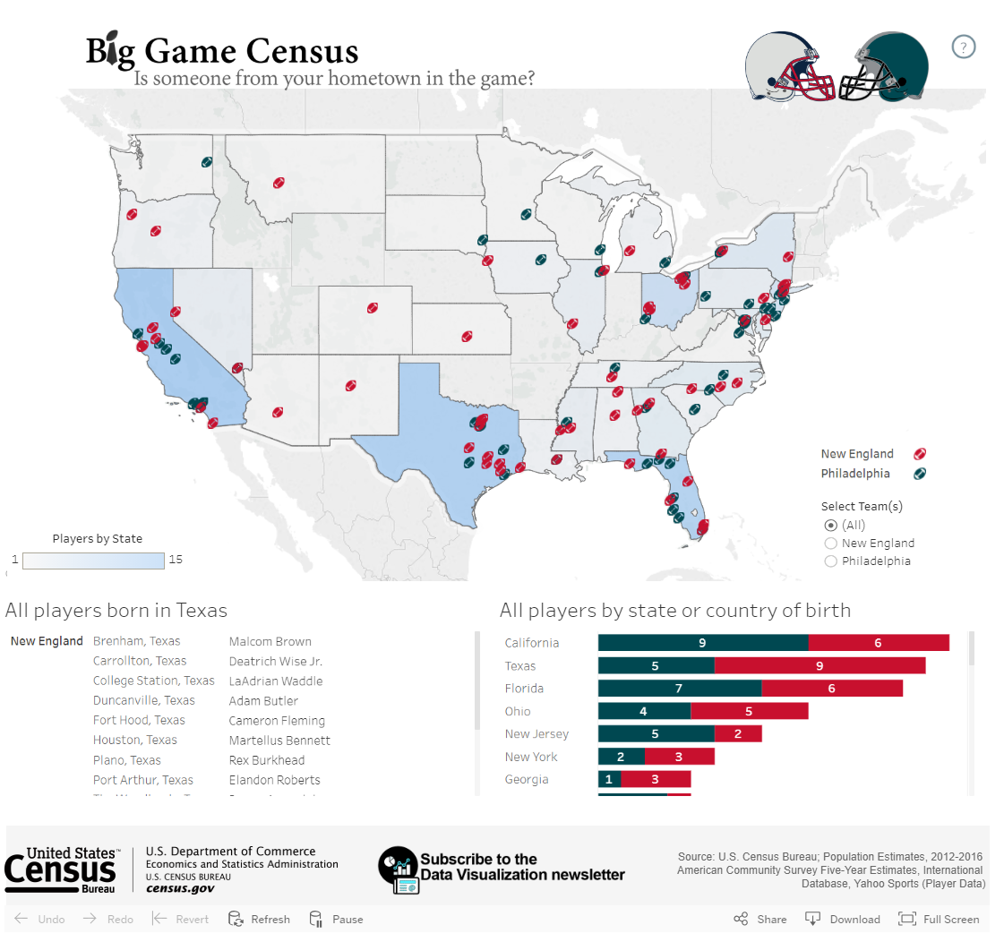
Lesson 6 Lab
Lesson 6 LabProportional Symbolization
In Lab 6, we will explore two symbolization methods for data that are considered discrete and abrupt. Proportional and range-graded symbols are two approaches to represent discrete and abrupt data using symbols that are scaled according to the individual data values. Proportional symbolization scales each symbol size in direct relation to each data value. For example, if you had unique data related to all 88 Ohio counties, there would be 88 symbols of different sizes on your map. A commonly used symbol is the circle. With range-graded symbolization, the data are classed into finite classes. This approach mirrors what you experienced in Lab 5 with the data classification for data for choropleth mapping. This method is also known as graduated symbol (which is Esri-speak). Both range-graded and graduated are a bit ambiguous. A better term would simply be classed proportional circles, but that is probably too long.
In addition to the proportional and range-graded symbolization methods, we will also examine a symbolization method mapping qualitative data via the choropleth method. This method, known as chorochromatic symbolization, is useful when you wish to map qualitative data using the choropleth method.
As a cartographer, you will often have to choose between which approach is better for your data. Essentially, consider the use of proportional symbols when the recovery of the original data values is important. Proportional symbolization method is appropriate for a dataset whose range is not excessive. In such cases where the range is great, extremely large or small symbols could result. Range graded symbolization addresses datasets with large ranges by setting a fixed number of symbol sizes according to a classification method applied to the data. As with other options in the map-making process, the choice between using proportional symbols and range-graded symbols depends on the map's purpose and data characteristics.
In Lab 5, we used data from the American Community Survey, provided by the US Census - a commonly used source of geospatial data for statistical maps. In this lab, we use the same data source, but you also will have the opportunity to choose your own data for this assignment.
The first part of Lab 6 will focus on searching for and downloading data from the US Census Bureau’s data explorer website. This website offers access to all census data collected since 1990 – both at the decennial census and the one- and five-year estimates from the American Community Survey. The second part of the lab allows you to explore using proportional symbols to map your chosen census data. The third part of the lab allows you to explore using range-graded symbols to map your chosen census data. The second and third parts will take place in a new mapping application – Tableau.
This lab, which you will submit at the end of Lesson 6, will be reviewed/critiqued by one of your classmates in Lesson 7 (critique #4).
Lab Objectives
- Create three (3) maps of county-level data from a state of your choosing, sourced from the US Census Bureau. The state must have at least 30 counties.
- One map must use proportional symbolization.
- One map must use range-graded symbolization.
- One map must use chorochromatic symbolization (using a qualitative variable extracted from the census data).
- Learn how Tableau can be used to create interactive maps.
- Calculate class breaks for the range graded symbolization using either quantiles, equal intervals, natural breaks, or mean-standard deviation.
- Understand the impact of different symbolization approaches on the information illustrated on each map and be able to reflect upon and write about these decisions.
Overall Lab Requirements
For Lab 6, you will create three (3) maps, each of which should be created as its own sheet in Tableau. In total, you will have three separate Tableau sheets. You will also write a short reflection statement about the map creation process in Tableau.
- Prepare visually balanced layouts for each map with all required elements suitably sized and balanced negative space.
- Create an effective design for the visual hierarchy: overall title, subtitle(s), legend title(s), legend class labels, metadata (data source/year, your name, and date of completion). Use thoughtful and efficient wording when labeling map elements.
Map Requirements
Map One: Proportional Symbols
- Choose a census variable of interest to map from the provided American Community Survey (ACS) data. As a hint, choose a variable from the 5-year estimate to download.
- Use Tableau to complete all cartographic work.
- Using Tableau,
- choose an appropriate symbol (e.g., circles, squares, etc.) for this map
- attend to the design aesthetic of the basemap, county outline fill, symbol fill, and symbol outline colors
- create a descriptive map title, subtitle, and legend title
- add metadata to the map that reports on the data source and year, your name and date of map completion
- include a legend and legend title (note that Tableau is not very flexible in altering a legend for proportional symbols with a large number of mapped features)
Map Two: Range Graded Symbols
- Using the same census data that you did for map one, use range graded symbolization.
- Choose a classification method to determine the class breaks. The available methods include equal interval, quantile, natural breaks, and mean-standard deviation. The choice of the method is up to you but make sure the method is appropriate for the data distribution that you are mapping.
- Use Excel to assist in the following:
- create a dot plot as you did in Lab 5 to see the distribution of the data for this map
- include a screenshot of your dot plot with lines manually drawn to demonstrate the breaks you identified
- identify the data classification you selected and why you thought it appropriate.
- Using Tableau,
- choose an appropriate symbol (e.g., circles, squares, etc.) for this map
- apply the data classification limits to the data
- attend to the design aesthetic of the basemap, county outline fill, symbol fill, and symbol outline colors
- create a descriptive map title, subtitle, and legend title
- add metadata to the map that reports on the data source and year, your name and date of map completion
- include a legend and legend title (the legend for this map will be better designed since you are mapping classes rather than the number of mapped features)
Map Three: Chorochromatic Map
- Using the same census data that you did for map one, derive a single qualitative variable of interest related to the data chosen for maps one and two.
- Using Tableau,
- choose an appropriate qualitative color scheme for this map
- attend to the design aesthetic of the basemap, symbol fill, and symbol outline colors
- create a descriptive map title, subtitle, and legend title.
- add metadata to the map that reports on the data source and year, your name and date of map completion,
- include a legend and legend title (note that the legend for this map will be better designed since you are mapping qualitative data with a limited number of categories)
For additional assistance, explore the Lab 6 Visual Guide and utilize online tutorials and training materials such as those listed below:
- Tableau 10 Essential Training. Your access to LinkedIn Learning (aka Lynda.com) is provided through your Penn State login
- These two links are tutorials provided by Tableau
Reflection Statement
Include a short write-up (< 250 words) that includes the following commentary:
- State the variables you used to create the proportional/range-graded symbol map and the chorochromatic map
- For the range graded map, comment on the overall distribution of the data as shown on the dot plot (normal, positively skewed, negatively skewed)
- State the classification method you selected and why (relate this discussion back to the data distribution and what information you intend for the map to portray – remember the concepts from Lesson 5)
- Explain why you chose and how you derived the qualitative variable of interest for your chorochromatic map
- Comment on two (2) positive aspects of working with Tableau
- Comment on two (2) aspects of working with Tableau that were challenging
Lab Instructions
The data for this lab will be self-selected from the US Census Bureau’s data explorer website. Details on how to access this site, how to search for data, and format the data for download will be presented in the Lesson 6 Lab Visual Guide.
Grading Criteria
Registered students can view a rubric for this assignment in Canvas.
Submission Instructions
- You will have to upload one (1) PDF document using the file name format below.
- LastName_Lab6.pdf
- Include the following in your PDF:
- screen captures of all three maps that you created in Tableau (the screen captures can be taken from either the dashboard or the published version of the dashboard)
- a screen capture of your dot plot with manually drawn annotated breaks
- the <250-word reflection statement addressing the prompts listed above
- links to the published version of each map that you created in Tableau (do not include the URL links as an assignment comment as doing so renders these links invisible for the peer-review process)
- Note: The critique/peer review of the Lab 6 assignment will occur in Lesson 7 (critique #4).
Ready to Begin?
More instructions are available in the Lesson 6 Lab Visual Guide.
Lesson 6 Lab Visual Guide
Lesson 6 Lab Visual GuideLesson 6 Lab Visual Guide Index
- Introduction
- Downloading Census Data
- Some File Cleaning Operation Considerations
- Downloading TIGER Data
- The GIS Join Process
- Convert County Polygons to Points
- Tableau Operations
- Make a Connection in Tableau
- Preliminaries to Creating a Map
- Save Your Tableau Project
- Part I: Creating a Proportional Symbol Map
- Part II: Creating a Range Graded (Graduated) Symbol Map
- Part III: Chorochromatic Symbolization
- Sharing and Publishing Your Tableau Projects
1. Introduction
In this lab you will create three maps: a proportional symbol map, a range graded map (also called graduated symbol by Esri), and a qualitative choropleth (or chorochromatic) map. The first two maps in this lab will use the same dataset (a county-level census dataset of your own choosing which should include counts/totals) and the third map will use a qualitative dataset related to the first two quantitative datasets.
You will download data from the US Census Bureau, format it in Excel (or Google Sheets), and join the census data to a TIGER line file using GIS software. Once through these steps, you will make the aforementioned three maps in a new mapping software platform – Tableau. Tableau is data visualization software often used in the Business Analytics community. It is powerful in that it allows for easy data visualization in multiple forms, including charts and graphs in addition to maps. You can also create interactive dashboards which display multiple charts. However, it also has some drawbacks; the GIS features are less robust than traditional GIS software, which is why we are doing some data processing in Excel and GIS software. You will explore some of the more complex features of GIS software in Lab 7; Lab 6 is an introduction to the basics of Tableau.
2. Downloading Census Data
For this lab, you will be downloading your census data using the US Census Bureau Data Explorer Tool. While a sample dataset will be downloaded and then used to demonstrate the workflow and symbolization options in Tableau, you are free to choose your own dataset for this lab.. Remember that the data you choose for this lab must be at the county level and come from a single state that has at least 30 counties.
Visiting the Census Data Explorer website, an introduction screen appears (Figure 6.1).

Once you have identified and downloaded the census data of your choosing, you will then need to source the corresponding state TIGER line file that contains that state’s county polygons.
There are several ways to search for census data. I recommend using the Advanced Search option from the home page of the data explorer website. Using the Advanced Search option, you may find it easier to search for census data according to specific topics, geography, years, surveys, or table code IDs. For example, assume I am interested in choosing ACS 2023 five-year survey for all counties in New Mexico for the purpose of examining characteristics of grandparents who live with their grandchildren. Here is one way that I could use these criteria to search using the Advanced Search option:
- Geographies: County - New Mexico - All Counties in New Mexico
- Topics: Families and Living Arrangements - Families and Household Characteristics
- Years: 2023
After you have specified these three criteria, select the Search button to see the resulting tables. Using only these three criteria, more than 1,000 options are returned. You can scroll through the listing of Tables. To narrow down the number of tables that are returned, you can enter “grandparents” in the search box “Search for a filter or table.” Figure 6.2. shows the three filters that were specified from the above criteria and the “grandparents” text in the search box. Figure 6.2 also shows a few of the many tables that meet the listed criteria.

The next question is which individual census table is appropriate. The answer to this question can be found by individually examining the contents of each table to see what data is contained inside. For instance, I examined the table titled “Grandparents” (table S1002). Upon inspection, the included data contains the number of grandparents who have grandchildren living with them at the county level for New Mexico. Notice that this table has two options (1-year and 5-year estimates). Choose the 5-year estimates which will provide you with complete records for all counties.
Once the correct table has been identified, you will need to format the data and specify the file type before you download it.
- On the screen that appears showing the data contents,
- Transpose the rows and columns so that the geography becomes the individual rows, and the data become the individual columns.
- Include the Margin of Error data (you will use this data in a later lab).
- Choose to download the data as a Zip (zipped) option which will ensure that all the required geography IDs are included.
3. Some File Cleaning Operation Considerations
Once you have downloaded the tract data into your Lab 6 folder, extract the contents from the *.zip file. There will be three files. Open the Excel file with the “-Data.csv” filename and inspect the rows and columns. Perform three cleaning operations.
- By default, there are two header rows. One header row makes use of the census codes while the other header file uses descriptive text. Make sure that you only have one (1) header row. In my case, I deleted the first row since interpreting the codes would require additional effort to link the data content to the individual code.
- As you scan through your file, you will see that there are likely a lot of data columns. You should save data that relates to two basic ideas for this lab (data for the proportional symbol maps and data for the chorochromatic map). Data for the proportional symbol lab can be sourced using a single column of quantitative data. In my case, I selected the column that reports the total number of grandparents who live with their grandchildren. Data for the chorochromatic requires a bit more thought. All of the data in the spreadsheet is quantitative. Yet, the chorochromatic map requires qualitative data. In my case, I am choosing to map the race of the grandparents that is the majority for each county. To create this data, I will need to use the columns of data that list the total number of grandparents who live with their grandchildren according to each race. Most of these columns (variables) you will not use for this lesson and thus they can be deleted from your spreadsheet. Removing unnecessary data will make the join process less time intensive and faster to import into Tableau.
- You may need to do some additional data cleaning. For example, I know that I am going to make a spatial join based on county names as the relate item. The county names listed under the NAME column includes “[name] County, New Mexico.” I know that the county name entry in the TIGER file only lists the county name (without the “County, New Mexico” suffix). I want to remove everything after the comma (the state name), including the comma. I completed this task in Excel using the “find and replace” tool.
- Once you have selected and organized the data, save the file as a *.csv comma-delimited formatted file with a sensible name (so you can easily find it later when needed). I named the file Grandparents.csv.
4. Downloading TIGER Data
Visit US Census Bureau: TIGER/Line Shapefiles. Figure 6.3 shows the download window options. Select the appropriate year and data using the drop-down menus. In this case, choose 2023 and Counties (and equivalent) as the two options. Download the zipped folder into your Lab 6 folder.

5. The GIS Join Process
Before working with Tableau, we need to preprocess data in GIS software. Three essential steps will be taken in this part of the exercise.
- The TIGER line file that you downloaded contains counties for the entire United States. We only need counties for New Mexico. Thus, you will need to remove all non-New Mexico counties. Remove all non-New Mexico counties (we only want to focus on New Mexico counties). Open the attribute table and sort by STATEFP. I know that the New Mexico code is 35, but you may need to look it up for your state. Select all features that are not equal to this code (35). Delete the rows (states) that are not New Mexico.
- Once the non-New Mexico counties have been removed, join the Census data to the TIGER line file. To facilitate the join process, I added both files to a geodatabase. Carry out the join process. After the join process is completed, open the TIGER line file Attribute Table to make sure that the join was successful.
- If the join was successful, export this file as a new shapefile to preserve the join. I named this file NM_Counties.shp.
6. Convert County Polygons to Points
To make a proportional symbol map in Tableau, the joined file (NM_Counties.shp) needs to be point-based rather than polygon-based. Therefore, you will also need to export the centroids of each county to a new shapefile. In ArcGIS Pro, this process can be accomplished using the Feature to Point and Feature Class to Shapefile tools.
At this point, you should have the following necessary files to make your maps in Tableau.
- Grandparents.csv
- NM_Counties.shp
- NM_County_Centroids.shp
7. Tableau Operations
Open Tableau Desktop Public. Figure 6.4 shows the menu options that are found along the left-hand side of the Tableau file management environment. Start by adding a Spatial File to the Tableau file management environment. This Spatial File should contain the county centroids (point-based).

8. Make a Connection in Tableau
Once the county centroids spatial file has been added to the Tableau environment, you will see that file name appearing inside a blue rectangle in the top portion of the file management environment. To add the county polygon file, use the Add link. The Add link is to the right of the Connections heading (top left portion of the Tableau file management environment). If successful, you will see the two files listed under the Connections header. At the same time, you should also see the two files listed under the Files header which is below the Connections header (Figure 6.5).

Right now, the two files are separate with one file containing the centroid points and the other file containing the county outlines. In Tableau, you will need to make a connection between the two files. If you look at the main window of the Tableau file management environment, you will see a single rectangle containing the centroids file.
To make a connection between the centroid file and the polygon file, click on the county file name listed under the Files header. Drag the polygon file from the Files location to the main window area. As you drag the file onto the main window area a red connection line will appear. Place the polygon file to the right of the centroids file and unclick. The polygon file will snap into place as a new rectangle. Figure 6.6 shows how the file placement and connection line should appear.

Upon inspection, notice that there is a triangle with an exclamation point inside appearing between the two rectangles. Although the two files are connected, a type of "join" relationship needs to be expressed to connect the two files together on a common attribute. This relationship can be defined in the area below left. Make a relationship based on the county name fields that exist in both files. In my case, the NAME is the field in the attribute tables that set the relationship (Figure 6.7). Depending on the files that you use for your map, this "join" item name may be different.

9. Preliminaries to Creating a Map
Now that a connection has been expressed, open Sheet 1 (Figure 6.8). The Sheet 1 tab is located at the bottom left-hand corner.

Figure 6.9 shows the Tableau worksheet environment where you will create different maps for this lesson. To begin, I renamed this worksheet to Proportional Circles by double clicking on the Sheet 1 tab. Next, you can change the map title. Figure 6.9 shows an appropriate title for the map that I intend to make. You can edit the title at any point.

10. Save Your Tableau Project
Before continuing, you should also save your workbook. To save your workbook to Tableau Public, you will first need to sign into (or create) your Tableau Public account. Once signed in, look under File along the main menu listing and choose the “Save to Tableau Public As” option. A window will appear (Figure 6.10) asking you to give your project a name. Use a logical file name such as “Lab 6_Part_1” then click Save.
Once the project is saved, your map will appear as a published Tableau dashboard. Figure 6.11 shows the published dashboard environment. This environment is where you will set up and share your work with your instructor and others. More on the sharing process later.
There are various pathways to saving your Tableau workbook. See this page for a full discussion on options.


11. Part I: Creating a Proportional Symbol Map
Now let’s work on making a proportional symbol map! Scroll to the bottom of Tables listing and double click on “Latitude” and “Longitude” options (see Figure 6.12). The click order does not matter. After you add both, a grey world basemap will appear.

Next, look under the Tables for the New Mexico County shapefile header and search for the “Geometry” option from the polygon file. Drag this file from the Tables section to the Detail square on the Marks box (which is below the Pages and Filters headings). The map will zoom to your state (see Figure 6.13).

Drag another instance of “Longitude” to the top of the screen placing it to the right of the current Longitude, essentially duplicating your map. In Figure 6.14, make sure to note the order of the two instances of “Longitude” are side-by-side but only one “Latitude” is shown.

Look under the Marks heading. There are two instances of “Longitude” under Marks. They are both duplicates of one another (both show the county polygons - they have polygon geometry). We will change this so that one map shows the centroids or point geometry. The centroids file will be used to create proportional circle map while the polygon (county outlines) file will serve as the basemap. Click on the “Geometry” from the centroids file listed under Tables. Drag an instance of this “Geometry” to one of the two “Longitude” listings under Marks. Which “Longitude” file you move the “Geometry” to does not matter. Once the centroid “Geometry” has been added, click on the down arrow on one of the COLLECT(Geo...) entries and the remove the polygon “Geometry.” The polygon map should be removed leaving the centroid points behind. Figure 6.15 shows the county centroids appearing to the right of the county polygons. If your map order does not match what is shown in Figure 6.15, it is not a concern as the order does not matter,

A few other tasks for the Centroids Longitude:
- Change the color of the dots by clicking on “Color”. At the same time, consider changing the circle outline color.
- Drag the centroid County Names data (NAMES) to the “Detail” square.
- Drag the Census data field (in my case, S1002 CO1) to the “Size” square.
- In the Automatic dropdown menu (Figure 6.16), change from “Automatic” to “Circle.” You may want to adjust the circle size by clicking “Size.” Drag the slider bar so that the circles have a definitive size as suggested by their data differences.
The map shows circles that are drawn in proportion to their associated data values (Figure 6.17).


11.a. Combine the Maps
Click on the right-most bubble labeled “Longitude” at the top of the maps. From the pull-down options, select the “Dual Axis” option (Figure 6.18) and the two maps will combine into one. After the combination, you may see that the county map is overprinting or hiding the proportional circle map. If this happens, then simply drag the right-most “Longitude” bubble to the left of the other “Longitude” bubble.

A few more design items.
- Ensure the legend is visible and edit its title. To adjust the legend title text, use the pull-down menu on the legend to “Edit Title…”
- Use the “Size” and “Colors” options under the Marks header to adjust the size of the proportional symbols and the fill and outline colors, respectively as you see fit.
Figure 6.19 shows the results of the two maps combined into a single map using the “Dual Axis” option, adding an overall map title, and adjusting the legend title.

11.b. Tooltip Labels
In the design environment, you can hover over any of the circles and see the data (Figure 6.20) as reported in the attribute table. Note, however, that the "Tooltip" wording is ambiguous and confusing. For instance, what does "Name" and "S1002 C01" mean exactly? The wording shown in the Tooltip bubble can be edited. To do so, under the Marks panel, click on the Tooltip icon. The Edit Tooltip window appears. Inside this window, you can change the labels that appear inside the bubble when someone hovers over a map symbol. In my case, I changed "Name" and "S1002 C01" to "County Name" and # of Grandparents," respectively.

11.c. Setting the Data Formatting and Controlling Legend Items
As shown in Figure 6.21 (highlighted by the red rectangle), the listing of variables associated with the census data shows "Abc" which suggests that these variables are formatted as "string" or text. When you create a proportional circle map of these "string" values, you are forcing Tableau to recognize each individual value in your data, similar to a categorical color legend. In other words, this means that Tableau "sees" your data values as sequential, but not in a proportional sense of the word. For example, the last (highest) value could be 60,000,000,000 and it would still be the same size it presently is displayed for 13,180 (which is the largest value in my dataset), because it's being treated as a category, not a quantity. Thus, the circles are technically not being drawn as proportional to the data values but are being drawn sequentially. Hence, the reason for the large number of items in the legend. We will correct this.
Tableau recognizes discrete and continuous data. You can immediately tell which format a given variable is by looking at the "pill" color of a given variable shown in the Marks panel (see the blue rectangle in Figure 6.21). A blue or green pill coloring suggests a discrete or continuous variable, respectively. For proportional circles to be drawn correctly (in proportion to their data values), we need our data to be continuous. If you look in Figure 6.20, the S1002 Co1 pill color is blue suggesting that even though the data are numeric (at least we think they are), Tableau see these data as discrete. This should make sense as all of the census data shown in the far left-hand side of the figure are "Abc" or string format. To change the data formatting in Tableau, follow these two steps.
First, along the left-hand listing of variables, search for the variable you want to map with proportional circles. In Figure 6.20, that variable is S1002 CO1 which is shown to be "Abc" or string format. Right click on the "Abc" immediately to the left of the S1002 CO1 variable name. From the list of options that appear, choose the Number (decimal) option. If successful, the "Abc" should turn into the "#" icon.
Second, look under the Marks panel and right-click on the pill name that is now formatted at a decimal number. Choose Continuous option. The circle sizes should update on the map and be sized proportional to their data values. Also, the legend will now only report five sample symbols. Compare the number of legend items in Figures 6.20 and 6.21.

Congratulations! You have just made a proportional symbol map, where each circle is a separate size and reports the total number of grandparents who live with their grandchildren in New Mexico. Now we will make a range graded (graduated) symbol map, which classes the data.
11.d. Save Your Tableau Project
Save your workbook.
12. Part II: Creating a Range Graded (Graduated) Symbol Map
While it is possible to embed a script into your Tableau project to create a range graded symbol map, we are going to use a simpler method. I will demonstrate how to create range graded proportional symbol map using quartiles. Given what you have learned in previous lessons, other classification options such as equal intervals, standard deviation, or natural breaks are certainly possible and encouraged.
To start, you should create a copy of your first workbook. The copied version is the version you will work with and will become your range graded (graduated) symbol map.
With your copied version displayed, look at the top of the Tableau environment. Click Analysis, then Create Calculated Field option. Name the calculation something logical.
12.a. Calculate Quartiles
We’ll want to calculate quartiles (four classes). To determine the class breaks, we will use Excel. These class breaks will then serve as the class breaks in our Tableau project. Open your CSV file with the census demographic data (Grandparents) that you are using. Click on an empty cell and then type the following formula in the formula text box “=QUARTILE(D2:D34,1)”, replacing D2:D34 with the appropriate data range for your data. The “1” parameter gives you information for the first quartile. This value becomes the upper limit for the first class. Record this number, then repeat for quartiles 2 and 3. Each time, recording the value returned.
In my case, the following four class limits were calculated for the grandparents who are living with their grandchildren:
0 – 180
181 – 442.5
443 – 1,579.5
1,580 – 4,166
Using these values, the following expression shown in Figure 6.22 will divide the data into four quartiles or classes. In my case, I used the Census Bureau’s code for my variable of interest. Depending on your file and naming convention, you should replace [S1002 C01] with the name of your data. Once your expression is completed, press “OK.” You will see the calculation added to Tables.

The above discussion explains how to calculate quantiles. Quantiles is not required for this lab. You should also feel free to calculate other data classifications such as equal interval, natural breaks, and mean-standard deviation. To help you decide which data classification method is appropriate, refer back to Lab 5 regarding the instructions on how to create a dot plot. Use the dot plot to examine the data distribution of your census data. Use this dot plot as evidence for your decision as to the appropriate data classification method.
To apply the calculation, drag this calculation the Longitude “Size” square of the Longitude (centroids map). This action should replace the previous symbol field. A range graded map is produced (Figure 6.23). As with your proportional circle map, the circle sizes may be too large or small and you may wish to adjust the circle fill color and circle outline color. Again, since this is a range graded proportional circle map, there will only be four total circle sizes rather than an individual circle size for each of the data values.

12.b. Save Your Tableau Project
Before continuing, you should also save the book as “Lab 6”. For example, you could consider saving this part of the exercise as Lab_6_Part_2.
13. Part III: Chorochromatic Symbolization
As a final map for this lab, you will create a qualitative choropleth map that relates to the subject of the first two maps. Discussion was presented earlier on the use of race as a qualitative aspect to the grandparents living with their grandchildren dataset.
13.a. Data Formatting
To revisit the qualitative nature of the needed data for this portion of the lab, look at the data and consider what qualitative data you would like to map. Note that there might not be a single column with the appropriate data, and that you may have to create one yourself based on the data. For example, assume that I want to map which racial group has the highest percent of grandparents living with their grandchildren per county. Included in the original census data, columns are supplied that contain totals for different racial groups. Using these columns of data, I can then determine which racial group has the higher percentage of grandparents living with grandchildren per county. For ease of data, I will only be looking at individuals reporting one racial group and I will not use Hispanic/Latinx identity as a category.
After cleaning the data, I manually determined which racial group has the majority number of grandparents living with grandchildren. In Figure 6.24, a few counties have “Other” as the highest category, which leads to some questions.
- Are there issues with the data?
- Were some counties miscalculated?
- Were individual people’s identities not accurately represented in the options provided by the census?
These issues can sometimes be better understood through “margin of error”, which is another column that exists alongside this main census data. We will deal more with the margin of error data in Lab 7.

Save the *.csv file as something useful and open it in GIS software, just as you did before. Join the *.csv file to the TIGER county file that you created during the initial data cleaning stage. Unlike the previous effort, you only need to make a new polygon file and not a centroid file. Only a polygon file is needed since you will be making a choropleth map.
13.b. Tableau Operations
You can start a new Tableau session. To begin, add Spatial Data. You should repeat the above steps (from Parts I and II) to add the new data file to your Tableau session. Since you are only dealing with one data file (the TIGER polygon file), there are no connections to be made.
Double click on the Latitude and Longitude. Add the “Geometry” for the new shapefile. Drag the data (In my case, I called the new data “Majority”) to the “Colors” square in the Marks area. Make sure that “Automatic” is selected in the dropdown Marks menu. You should have the start of a qualitative choropleth map (Figure 6.25).

13.c. Color in Tableau
We will adjust the assigned colors and modify the legend. Right click anywhere on the legend and choose the “Edit Colors…” option. Or click on the “Color” square in the Marks area. Figure 6.26 shows the Edit Colors window. Using this window, you can choose different color palettes for your data (notice the “Lightning Color Safe” palette in the pull-down menu. Recall from a previous lesson that Colorbrewer offers good suggestions on distinguishable and color-blind friendly color palettes to use for qualitative data. Tableau also offers some interesting and useful color palettes from which to choose. Experiment a bit with the color palette choices. Selecting an existing Tableau color palette will apply that palette to the entire dataset. You can add your own custom color palette to the existing palettes. This process is discussed on the Tableau Create Custom Color Palettes page.

You can also download free software like Color Oracle or Vizcheck to test for colorblind-friendly colors. Figure 6.27 shows how the color palette shown in Figure 6.26 would appear by someone with deuteranopia. Deuteranopia is a form of red-green color confusion. Note that in Figure 6.26 the pink and green hues are washed out into shades of grey, the yellow and orange hues appear as desaturated yellows, and the blues take on a purplish hue. In short, when selecting color palettes for maps, one should be aware of how those colors will be seen by those with color vision limitations.
About 8% of people with XY chromosomes have some limited color vision deficiency, while very few people with XX chromosomes are. To have some level of color vision impairment, all of the X chromosomes must have the colorblind trait. If you have two X chromosomes, colorblindness is less likely, because they would both have to have that trait, which is very unlikely.

13.d. Tableau Legends
Next, edit the legend itself. You may wish to order the arrangement of items. To do this, right click on the legend and click “Sort” and select “Manual” in the dropdown. For qualitative legends, the order of legend items could be grouped according to similarities of one or more traits. In this case, it often makes sense to put an “Other” category at the bottom following the other categories.

Rename the legend and map title as you did in the other maps.
Figure 6.29 shows the final design of the chorochromatic map. Do not simply copy this design as this design could be greatly improved upon!
13.e. Save Your Tableau Project
Before continuing, you should also save the book as “Lab 6”. For example, you could consider saving this part of the exercise as Lab_6_Part_3.
You should now have three separate Tableau workbooks that correspond to the individual parts of this lab.
14. Sharing and Publishing Your Tableau Projects
Once you're happy with your map design, you're ready to individually publish your maps to Tableau Public. Make sure you've saved your work first! Again, to save your maps to Tableau Public, you will need to sign into (or create) your Tableau Public account.
When you save your map, Tableau publishes the map (Figure 6.30) in an interactive environment.
Adding metadata to the map can be accomplished by scrolling down to the Details option (Figure 6.31). Click on the small pencil icon next to the Details header. The Details section opens. Under the Viz description textbox, enter the following information:
- data source (provide URL if possible)
- data year
- cartographer’s name
- date when the map was created

Once you have saved each of your workbooks and added appropriate metadata, you should copy each link which will allow me and others to view your maps. This link is available through the share Tableau workbook button. Look along the top right list of icons for the share icon (Figure 6.32). Selecting the share link opens the Tableau Share window (Figure 6.33). On the share link window, copy the URL address inside the Link textbox. You will need to copy the link from each map separately and include all three links in your submission.
If you make changes to your workbook, you will need to save each and then "re-publish" it at any time to update the online version.

Summary and Final Tasks
Summary and Final TasksYou've reached the end of Lesson 6!
In this lesson, we learned a lot about thematic maps - what they are, why we design them, and how to choose the best thematic mapping technique based on characteristics of your data and of the geographic phenomena you wish to map. We discussed challenges you might encounter when making thematic maps, such as when the level of measurement of the data available to you doesn't match the level of measurement of the phenomena.
In Lab 6, we created proportional and range-graded (graduated) symbol maps - exploring the differences between map types and their appropriateness. Though our focus this lesson was on using these two symbolization methods, you'll notice that concepts we learned earlier - such as visual variables, map labels, and layout design - have remained of high importance. The tasks in this course are intended to build upon each other. I look forward to watching you thoughtfully integrate concepts from throughout the course into your maps each week. In addition, in this lab, you explored a new mapping application, Tableau. It is important to explore other mapping applications outside of ArcGIS Pro as each application offers something unique. Using Tableau, you witnessed the ability to quickly create and implement a common design across different maps. Exploring Tableau functionality continues into Lab 7 where you will work on multivariate symbolization and experience the powerful linking and brushing interactivity that this application brings to the map making process.
Reminder - Complete all of the Lesson 6 tasks!
You have reached the end of Lesson 6! Double-check the to-do list on the Lesson 6 Overview page to make sure you have completed all of the activities listed there before you begin Lesson 7.
Lesson 7: Multivariate Symbology
Lesson 7: Multivariate SymbologyThe links below provide an outline of the material for this lesson. Be sure to carefully read through the entire lesson before returning to Canvas to submit your assignments.
Note: You can print the entire lesson by clicking on the "Print" link above.
Overview
OverviewWelcome to Lesson 7! During the course so far, we have discussed many ways in which cartographers symbolize data on maps. We used visual variables to create category and order for basemap and label design. We have also examined the usefulness of choropleth, flowlines and isarithmic symbolization methods to represent data. In most cases, our maps have focused on one data variable (e.g., % of people with health insurance), or layered different kinds of data (e.g., race routes layered over terrain). This week, we introduce multivariate mapping—maps that visualize more than one data attribute at once. We also continue with our exploration of Tableau and the interactivity that this application provides.
Following our discussion of multivariate maps in this lesson, we will introduce a special type of data—uncertainty. When mapping predicted flood zones, for example, we might want the reader to understand not only the predicted flood values across the map, but their associated uncertainty—how certain those values are to reflect reality across different locations. As uncertainty plays a pivotal role in decision-making (e.g., cones of uncertainty in predicting the path of a tornado or hurricane), we close out our discussion of uncertainty visualization with a short summary of its influence on decision-making with maps. In Lab 7, we explore both multivariate data and uncertainty visualization techniques while creating maps based on data from the US Census.
Learning Outcomes
By the end of this lesson, you should be able to:
- anticipate the influence of uncertainty visualization on decision-making with map-based displays based on knowledge of related research.
- interpret advanced multivariate maps that use visuals such as Chernoff faces and glyphs.
- use appropriate combinations of visual variables to design multivariate maps.
- describe cluster analysis and its function in multivariate thematic mapping.
- understand geographic uncertainty and the role of its visualization in map design.
- evaluate the benefits and downsides of multivariate mapping compared to designing multiple maps (i.e., compare vs. combine) for a specific mapping purpose.
Lesson Roadmap
| Action | Assignment | Directions |
|---|---|---|
| To Read | In addition to reading all of the required materials here on the course website, before you begin working through this lesson, please read the following required readings:
Additional (recommended) readings are clearly noted throughout the lesson and can be pursued as your time and interest allow. | The required reading material is available in the Lesson 7 module. |
| To Do |
|
|
Questions?
If you have questions, please feel free to post them to the Lesson 7 Discussion forum. While you are there, feel free to post your own responses if you, too, are able to help a classmate.
Multivariate Maps
Multivariate MapsSo far in this course, we have discussed many different ways of symbolizing data using visual variables. Our focus has been primarily on univariate maps—maps that show only one thematic data variable.
There are many cases where mapping a single variable is needed. More complex data and purposes often require mapping a number of different variables at once. This is called multivariate mapping. The term multivariate map is typically defined as a map that displays two or more variables at once (Field 2018). Note however, that bivariate mapping (mapping only two variables is distinct). When creating multivariate maps, you will think about the best way to symbolize each variable, as well as how they can be combined to suit your map's audience, medium, and purpose.

Figure 7.1.1 shows a multivariate map. The map visualizes two variables at each location: rent prices and the number of Section 8 vouchers. These variables are individually symbolized appropriately. First, rental prices are visually encoded with a sequential color scheme—a good symbolization choice for normalized data such as rates. Second, the number of Section 8 vouchers at each location is visualized by adjusting symbol size—an appropriate visual variable for mapping count data. Together, these symbols work to visualize this housing data from Portland.
Note that the legend in Figure 7.1.1 is more complicated than many of the legends that we’ve seen so far. The format shown—one variable along the x-axis, and one along the y-axis, is common in bivariate maps, or maps that display two variables. Doing so not only explains how to data is visually encoded, but helps the map reader understand how the data are related to each other. The more visually complicated a map becomes, the more challenging it will be to design a useful legend. However, your legend is central to the reader accurately interpretating your map, so don’t treat legend design as an afterthought. The map in Figure 7.1.2 below uses short text blurbs to assist the reader in this interpretation.

As we continue through this lesson, keep an eye on the legend designs. Some maps, such as bivariate choropleth maps, have a more standardized legend designs. Others, such as what appears in Figure 7.1.2, are somewhat less conventional; they are designed and customized by the cartographer to suit the map’s data and purpose. Legend design is an important component of cartographic design in general, but is particularly important for multivariate maps.
Student Reflection
Consider the legends you have made for your maps in labs thus far. For which map did you find designing the legend most challenging? Why?
Multivariate Choropleths
Multivariate ChoroplethsAs choropleth maps are the most popular type of univariate thematic map, it is not surprising that they are also commonly used in multivariate mapping. Bivariate choropleth maps visualize two variables. Note that while cartographers have historically described maps of two data variables as bivariate, these maps can also be described as multivariate (more than one variable). In the context of this lesson and course, we will generally use the more comprehensive description multivariate maps.
The map in Figure 7.2.1 is an example of a bivariate (or multivariate) choropleth map from a research article on COVID-19 and population movement. Examine the legend. Note that a hue progression (purple to yellow – vertically on the legend) has been applied to visually encode population vulnerability. Color lightness (horizontally on the legend) to visually encode population movement, or “stay-at-home behavior.” The legend text explains the logic behind the ordering of the color chips in the 3x3 diamond legend in the lower right of the map.

Using color hue to encode population vulnerability is a sequential quantitative variable—a design choice we have discouraged in previous lessons. In general, color lightness is a much better choice for encoding quantitative data. In this map, however, color lightness is already being used to map the other variable—population movement (stay-at-home behavior). Creating multivariate maps sometimes requires bending the rules of cartographic conventions a bit so as to best represent all of your data.
Recommended Reading
Brewer, Cynthia A. 1994. “Color Use Guidelines for Mapping and Visualization.” In Visualization in Modern Cartography, edited by Alan M. MacEachren and D.R. F. Taylor, 123–147. Pergamon.
Axis Maps. 2018. “Bivariate Choropleth.” Cartography Guide. Accessed November 14.
Stevens, Joshua. 2018. “Bivariate Choropleth Maps: A How-to Guide.” Accessed November 14.
Multivariate Dot and Proportional Symbol Maps
Multivariate Dot and Proportional Symbol MapsAnother commonly-used thematic map type for multivariate mapping is the proportional symbol map. As you can infer from the description, this symbolization method sizes symbols (often circles) according to individual data values. Making these types of maps can be easier than making bivariate choropleth maps. As the main visual variable used in proportional symbol mapping is size, another variable can be added quite easily (e.g., color hue, filling the interior of the symbols with unique colors representing a qualitative variable). The challenge to the map reader lies in the interpretation: as the visual variables of size and color hue are quite different, this can make it challenging for the multiple variables on the map to be directly compared by readers.

Figure 7.3.1 above is a bivariate proportional symbol map that visualizes two variables: population by county (a quantitative variable, with the visual variable size) and coastline vs. interior (a qualitative variable, with the visual variable color hue).
Student Reflection
Imagine you were tasked to create the map above, but instead of symbolizing points as coastline vs. interior, you were asked to symbolize all points by income per capita (in addition to population). What would you change about this map design to fit that new data?
Another method of multivariate map design is to stack multiple layers so they can be viewed simultaneously. Often, this is done by displaying proportional or graduated symbols on top of a choropleth or isoline map. An example is shown in Figure 7.3.2.

In the map above, visual emphasis is placed on the proportional symbols: they use size to symbolize a primary variable of interest—the estimated count of people in each city who arrived there after visiting a country on the CDC’s Zika travel advisory list. Another variable, Ae. aegypti (a mosquito capable of transporting the Zika virus) abundance, is visualized with color hue. A third variable—the approximate observed maximum extent of this mosquito, is visualized using a color fill for additional context. Note the careful descriptive legend design.
The outline of the maximum extent of the mosquito's range does not have a solid line. The light color fill contrasts against the remaining white fill to create a natural boundary interface. Not only is this design approach visually appealing, the lack of a solid outline to the mosquito's extent also implies a level of uncertainty in the exactness of that extent. We will discuss this idea later in this lesson.
Making a map such as this one is a challenge but is an example of how related variables can be mapped together to create an engaging and useful map.
Recommended Reading
Nelson, Elisabeth S. 1999. “Using Selective Attention Theory to Design Bivariate Point Symbols.” Cartographic Perspectives Winter (32): 6–28.
Cartograms
CartogramsThus far, we have discussed several methods for visually encoding maps with multiple variables via the addition of map symbols. There is another option: encoding data by altering the map’s shape or size itself. Area cartograms are maps in which the areal relationships of enumeration units are distorted based on a data attribute (e.g., the relative sizes of states on a map might grow or shrink proportional to their respective populations) (Slocum et al. 2009). So the larger the attribute value, the larger the feature on the map, and vice-versa.
Figure 7.4.1 shows a choropleth map of Social Capital Index ratings (Lee 2018) at the top, and two cartograms beneath it. Each of these maps encode every state's Social Capital Index ranking using a multi-hue sequential color scheme. The bottom two cartograms also distort the area of each state by sizing them based on their population—but they use different techniques for doing so.

In Figure 7.4.1, the map on the bottom left is a density-equalizing, or contiguous cartogram. Though areas are distorted, connections between the areal units (here, states) are maintained (e.g., the border between Alabama and Georgia is maintained). The map on the right, conversely, is a noncontiguous cartogram. States are still sized according to their population, but this method used does not require the maintenance of connections at areal boundaries. The relaxation of this requirement allows areas to be re-sized without their shapes being particularly distorted. The inclusion of state political boundaries on this map also allows the reader to make an interesting comparison: which states are sparsely populated relative to their original areal size, and which are less so?
Student Reflection
Think back to earlier lessons—how might you apply color differently to improve the maps in Figure 7.4.1?
An alternative technique to constructing cartograms, called “Value-by-Alpha” mapping, was recently defined by Roth, Woodruff, and Johnson (2010). Rather than re-sizing areas based on their population, value-by-alpha maps use transparency to fade less-populated areas into the background, giving areas of higher population greater visual prominence. Thus, they serve a similar purpose to cartograms, but do not distort the map’s geography. This is not to say that they should always be used instead of cartograms—but they are perhaps an appropriate alternative when the shock value of a cartogram is undesirable, and maintenance of both area borders and shapes is desired (Roth, Woodruff, and Johnson 2010), which is not possible with traditional cartogram maps. Pay particular attention to the fact that in order to effectively show the subtle differences in the transparencies, a dark background is selected.

Recommended Reading
Roth, Robert E, Andrew W Woodruff, and Zachary F Johnson. 2010. “Value-by-Alpha Maps: An Alternative Technique to the Cartogram.” The Cartographic Journal 47 (2): 130–140. doi:10.1179/000870409X12488753453372.
Sun, Hui, and Zhilin Li. 2010. “Effectiveness of Cartogram for the Representation of Spatial Data.” The Cartographic Journal 47 (1): 12–21. doi:10.1179/000870409X12525737905169.
Multivariate Graphics
Multivariate GraphicsThe examples we have explored so far have visualized two or three variables at once. Occasionally, you may want to visualize even more. One possible solution is to design data graphics that can then be incorporated into your map. A classic example of this is the use of pie charts as proportional symbols: an example is shown in Figure 7.5.1.

Interpreting the information in Figure 7.5.1 is rather straight-forward. The circle diameters represent the weight of butchered meat in kilograms supplied by departments to Paris. The individual colors assigned to the "pies" include black = ox or cow, red = veal, and green = sheep.
A more recent (and more complicated) example is shown in Figure 7.5.2.

Though the introduction of data graphics does permit the addition of many variables onto the map, this does not mean it is always the best solution. As shown in Figure 7.5.2, including a large amount of data in a map using multiple symbolization methods can make it challenging to interpret. Additionally, multivariate graphics in general—and pie charts in particular—have well-documented disadvantages in terms of reader comprehension (Tufte 2001). Adding graphics that are already challenging for people to understand to maps tends to exacerbate such issues. Furthermore, the size of the graphics may lead them to obscure data in underlying layers. This is not to say that they should never be used, however—just with caution. And fortunately, there are ways in which such maps can be made easier to interpret.
Glyphs
One way that multivariate maps can be made more comprehensible is through the addition of user interaction. Figure 7.5.3, for example, is challenging to interpret as a static image, particularly as the glyphs (i.e., a pictograph) used are quite small and some of the color choices are not easily distinguishable. However, this is an interactive map. Clicking on a state creates an informative pop-up, shown in Figure 7.5.4.

While you will explore interactivity in this assignment, we will discuss the merits and challenges of map interactivity further in Lesson 8.

Student Reflection
Explore the use of multivariate glyphs to explore data about well-being. Can you think of ways in which this data might be symbolized instead as a static map or maps?
Chernoff Faces
Despite the difficulty of creating maps with multivariate glyphs, cartographers have long attempted to tackle this challenge through interesting experimentation. One particularly whimsical example of this is Chernoff faces. Chernoff faces are glyphs created by mapping variables onto facial attributes. When mapping the variable average household income, for example, a bigger smile might indicate a higher income level.

The Chernoff face technique was first proposed by Herman Chernoff in 1973. Chernoff's intention was to capitalize on the ability of humans to intuitively interpret differences in facial characteristics. One the one hand, humans can subconsciously note important differences in expressions that are almost unmeasurable. In addition, humans can ignore large differences that are common between faces (Chernoff 1973). Chernoff also noted that his method was desirable as it permitted the designer to map many variables (as many as 18!) onto just one graphic.
Chernoff’s original application of his technique used fossil and geological data, but Chernoff mapping is more commonly used to depict social thematic data such as well-being, or other topics related to human emotion. Chernoff mapping has been a contentious method since its introduction— some Chernoff maps such as this one: Life in Los Angeles by Eugene Turner, 1977 [14], have been heavily criticized for their use of stereotypical facial attributes and a cartoonish over-simplification of complex issues.
In response to these critiques, some cartographers have developed techniques for utilizing the advantages of Chernoff faces without some of the contentiousness. Heather Rosenfeld and her colleagues, for example, proposed using “Zombieface” glyphs rather than human faces—maintaining the emotive content and still capitalizing on people's ability to intuitively interpret facial features, but removing the human context and thus lowering the likelihood of reinforcing harmful stereotypes (Figure 7.5.6).

Take a closer look at the legend of this map—which demonstrates how the hazardous waste data was mapped to Zombie facial attributes—in the image below. As you can see, the map focuses on visualizing the presence of unknowns and uncertainty in the mapped dataset (we'll discuss further techniques for visualizing uncertainty later in this lesson).

Chernoff Zombies are among several creative solutions recently proposed: a fun example is shown in the following quasi-Chernoff map: Mapping Happiness. It maps happiness, or well-being, across the United States using emoticons. Though these icons do not encode as many variables as Chernoff faces, they share the benefit of visualizing data at-a-glance using facial expressions.
Of course, the novelty of this "zombie-chernoff" symbolization method is interesting. As shown in the legend, there are many subtle differences in symbols that may be difficult for readers to distinguish. Thus, despite the inventiveness of such symbolization experimentations, the cartographer should always question how easily it is for the map reader to encode the information and make sense of what they see.
Recommended Reading
Esri Blog: Chernoff Faces by John Nelson.
Comparing vs. Combining
Comparing vs. CombiningAs demonstrated by previous examples, multivariate maps are often challenging—both for cartographers to create and for readers to interpret. However, if you need to map multiple variables simultaneously, but want to avoid a complex multivariate map (for example, when creating a map for a presentation slide) there is another option: simply creating multiple, adjacent maps. This is called small multiple mapping.

Small multiple maps are particularly useful for depicting data over time, as they can be arranged in a linear sequence, the way that time is typically depicted. With the increasing popularity of web maps, small multiple maps can be more easily replaced with a animated maps, where each map appears as an individual frame. Despite the advantages of animated maps (e.g., creating visual interest, efficient use of layout space), there are still benefits to traditional small multiple mapping. One primary advantage is the ability to simultaneously compare the various maps.
We can imagine combing the set of maps in Figure 7.6.1 with some sort of transparent layering, or perhaps turning it into an animated map. However, a single map with multiple transparent layers would be visually complex, and viewers of an animation would have to wait for the animation to loop—or scrub through the frames—in order to compare two specific maps. Here, simple works well. If your presentation is still too complex, you may consider reducing the amount of information being presented. Figure 7.6.2 is an example of small multiple mapping that only uses two multiples.

Cluster Analysis
Cluster AnalysisSo far, we have discussed two ways of mapping multiple variables—combining visual variables to encode multiple variables into one map, and visually comparing sets of maps of different data. There is a third, considerably different method that is often used for mapping multivariate data sets: cluster analysis. Cluster analysis is a form of data reduction and refers to mathematical methods used to combine multiple quantitative variables into one map (Slocum et al. 2009).
There are multiple methods for clustering (e.g., hierarchical and non-hierarchical). One of the more simple to understand is the K-Means algorithm. With K-means, the goal is to identify groups (k) of similar observations based on several attributes. The groups are assigned in a way that minimizes intra-group differences, while maximizing inter-group differences. Consider, for example, that you are interested in visualizing education, income, and access to green space in the US by county. You could map these three variables individually creating a small multiple, or you could use cluster analysis to identify groups of counties that are similar along all three dimensions on a single map using a qualitative color scheme (or a chorochromatic map).

Cluster analysis is a complicated topic, and we will not go into the mathematical details in this course. What is important to understand is that it provides a mathematical alternative to the other more design-based multivariate mapping techniques we have explored so far. You are encouraged to explore the recommended readings if you are interested in learning more about cluster analysis and about implementing it in GIS.
Recommended Reading
ArcGIS Pro Tool Reference: How Multivariate Clustering Works. Esri 2018.
Jain, A. K. 2009. "Data Clustering: 50 years beyond K-Means." Pattern Recognition Letters.
The Visualization of Uncertainty
The Visualization of UncertaintyOf the many variables you may wish to include in your maps, there is one that has received particular focus from cartographers due to its unique characteristics—uncertainty. Uncertainty is a complex concept that has been defined differently by various authors. For example, Longley et al. (2005) define uncertainty as "the difference between a real geographic phenomenon and the user’s understanding of the geographic phenomenon." We use this definition as it encompasses the many variations of uncertainty that in emerge during multiple stages of map-making—during data collection, data classification, visualization, map-reader interpretation, and more (Kinkeldey and Senaratne, 2018).
It can be assumed that all geographic data contain some level of uncertainty. A map of average income by county, for example, might classify a county as having an average household income of $58,234. Despite this, it is possible, even likely, that the actual value is different—this is due to survey response errors, non-response to survey (e.g., Census) requests by some residents, or changes in the data over time (e.g., some survey respondents have moved in or out of the county since the data was collected). A map of precipitation levels, similarly, will also contain uncertainty, due to factors including the lack of ubiquitous measurement instruments, their imprecision or inaccuracy, and possibly human error or related factors. Soil mapping is another example of uncertainty. On soil maps, definitive boundaries are shown through outlines of soil types. Yet, we know that soil does not have definitive edges as soil types gradually change over space often mixing together at their boundaries.
Recommended Resource:
A helpful list of terms and definitions related to uncertainty can be found here:
Kinkeldey, C., & Senaratne, H. (2018). Representing Uncertainty.
The Geographic Information Science & Technology Body of Knowledge (2nd Quarter 2018 Edition), John P. Wilson (ed.). DOI: 10.22224/gistbok/2018.2.3
Traditionally, researchers have grouped geodata uncertainty into three categories – the what (attribute/ thematic uncertainty), the where (positional or locational uncertainty), and the when (temporal uncertainty) (MacEachren et al. 2005). The success of visual variables for depicting uncertainty depends on the type of uncertainty to be mapped. For example, containing a point within a colored circle showing your location on a map, such as Google’s “blue dot,” might be most effective for depicting positional uncertainty (Google Maps; McKenzie et al. 2016). Use of another variable such as transparency might be more effective for depicting attribute uncertainty, such as uncertainty of unemployment rates in a county-level map.
Like other multivariate data, uncertainty can be combined with the other visualized data in a map, or compared by visualizing it in a separate map view. Figure 7.8.1 shows two maps that use different techniques to visualize the uncertainty in the data. Figure 7.8.1 (top) uses a combining technique, in which a visual overlay (diagonal lines on top of a univariate choropleth symbolization) is used to show attributional uncertainty. Figure 7.8.1 (bottom) uses a reliability diagram—an inset map that the reader can reference to understand which locations on the map contain the most certain data values. In general, the combining method is a more popular technique, though a compare technique might be more appropriate if the primary map is sufficiently complex, and thus adding overlay would make the map difficult to comprehend.

Data Source: The World Happiness Report (Helliwell et al. 2018), Natural Earth.
Among combined uncertainty visualization techniques, methods for visualizing uncertainty are typically classified as either intrinsic or extrinsic. Intrinsic uncertainty visualization techniques cannot be visually separated from the visualization of one or more other variables, while extrinsic visualization techniques are easier to interpret separately. An example of the difference between these two techniques is shown in Figure 7.8.2.

Data Source: The World Happiness Report (Helliwell et al. 2018), Natural Earth.
In Figure 7.8.2, both extrinsic (top) and intrinsic (bottom) uncertainty visualization techniques are shown. The extrinsic visualization uses a hatched fill overlay to denote uncertain values—thus, the visualization of uncertainty is visually separable from the visualization of the data underneath. Figure 7.8.2 (bottom) by contrast, uses an intrinsic visual variable—transparency—to visualize data uncertainty. The two variables are combined together to create the legend as well. Examine the top and bottom maps in Figure 7.8.2. Ask yourself how easily it is to visually separate the variables in each map. Can you think of a different approach to map the two variables that would be easier for the map reader to visually separate and at the same time combine the two variables?
Any visual variable can be adapted to demonstrate uncertainty. However, some are more intuitively associated with uncertainty than others. MacEachren (1995) proposed the idea of clarity as a visual variable for static maps, an overarching concept that can be further divided into three visual variables: transparency, crispness, and resolution (MacEachren 1995). Transparency is a familiar visual variable, as it has been adapted for purposes other than displaying uncertainty, such as in the value-by-alpha maps described earlier in this lesson.
Crispness is a particularly intuitive way of visualizing uncertainty. Features are depicted on a continuum from crisp to blurry, with less certain values appearing appropriately blurry or out-of-focus (Figure 7.8.3).

Resolution creates a similar effect—features with less certain boundaries or attributes are depicted in courser resolution, suggesting a lack of certainty in the map.

These visual variables have long been associated with uncertainty due to use or presence in other visual media—e.g., a photograph “coming into focus”—and so provide a design option with substantial precedent. Just as higher data values are visually encoded with larger symbols, less certain boundaries, for example, may be visually encoded with fuzzy boundaries. Look at maps of the Middle East published by the CIA or US State Department. In many instances, these maps will use dashed or other non-solid lines styles to indicate disputed country boundaries.
Though uncertainty is often discussed in terms of imprecise instruments, imperfect collection methods, etc., an important additional context where uncertainty plays a role is in the mapping of future scenarios. Climate models, for example, use past and present data to predict future conditions, but these predictions are inherently uncertain. Figure 7.8.5 below contains maps of temperature and precipitation change predictions. The first map (top left) maps the average result of 37 predictive models intended to estimate temperature change by 2050 (Kennedy 2014). The middle map shows the warmest 20% of models—the 20% coldest models are summarized at the right. The bottom three maps show a similar comparison of maps created from precipitation models. In all three maps, the "boundaries" of each projected temperature area are visually set by the interface of the two dis-similar color fills. No solid line is present.

Unlike previous examples, these maps do not use intuitive visual depictions of uncertainty. However, the map-maker's inclusion of all three maps for each data variable shows the range of possibilities that might lie ahead: the future is always an uncertain entity. It is implied that these maps depict not all possible scenarios but a range of likely ones; they intend not to precisely predict the future but to help users understand what future conditions they might expect to come about.
Recommended Reading
MacEachren, Alan, Anthony Robinson, Susan Hopper, Steven Gardner, Robert Murray, Mark Gahegan, and Elisabeth Hetzler. 2005. “Visualizing Geospatial Information Uncertainty: What We Know and What We Need to Know” 32 (3): 139–160.
Slingsby, Aidan, Jason Dykes, and Jo Wood. 2011. “Exploring Uncertainty in Geodemographics with Interactive Graphics.” IEEE Transactions on Visualization and Computer Graphics. doi:10.1109/TVCG.2011.197.
Uncertainty and Decision-Making
Uncertainty and Decision-MakingIn the last section, we discussed how to conceptualize uncertainty, and ways in which it can be visualized. One important question remains: why should we do so? Creating well-designed maps is already challenging, and adding a depiction of uncertainty makes this process even more so.
Uncertainty is typically depicted in maps for two primary reasons: (1) its inclusion may be regarded as an ethical necessity—many maps are created with significantly uncertain data, and a cartographer might feel that withholding this information from the map reader would be misleading, and (2) consideration of uncertainty plays an important role in decision-making, and thus its visualization might be necessary in some contexts—for example, maps of predictive hurricane paths tend to include a “cone of uncertainty” (Figure 7.9.1)—and such maps often play an important role in decisions made by residents of storm-affected areas.

So how does the visualization of uncertainty affect decision-making with maps? Kinkeldey et al. (2015) conducted a review of studies that attempted to answer this question. Most of the studies they analyzed suggested that the visualization of uncertainty does have an effect on task performance with maps and similar spatial displays (Kinkeldey et al. 2015). Simpson et al. (2006), for example, studied the use of uncertainty visualization in surgical tasks with graphic displays, and noted that the inclusion of uncertainty visualization improved performance accuracy. The positive influence of uncertainty visualization on task-completion accuracy with maps is a somewhat common finding. Though findings are less consistent with regards to task completion times (i.e., speed), uncertainty visualization seems at least not to significantly increase task-completion times (Kinkeldey et al. 2015).
Despite this, there is still not a consensus concerning whether uncertainty visualization is always helpful for decision-makers—some studies note that participants perceive uncertain data as risky, which can induce irrational decision-making via loss-aversion (Hope and Hunter 2007). Whether uncertainty visualization is useful—and whether it is useful enough to warrant the design efforts it requires—is context dependent and still thoroughly up for debate.
Recommended Reading
Kinkeldey, Christoph, Alan M. MacEachren, Maria Riveiro, and Jochen Schiewe. 2015. “Evaluating the Effect of Visually Represented Geodata Uncertainty on Decision-Making: Systematic Review, Lessons Learned, and Recommendations.” Cartography and Geographic Information Science 0406 (August 2016). Taylor & Francis: 1–21. doi:10.1080/15230406.2015.1089792.
Deitrick, Stephanie, and Elizabeth A. Wentz. 2015. “Developing Implicit Uncertainty Visualization Methods Motivated by Theories in Decision Science” 105 (May 2013): 531–551.
Critique #4
Critique #4For Critique #4, you will put your Artificial Intelligence literacy skills to the test by critiquing a map generated by ChatGPT or another AI tool.
You may find this article helpful as you reflect on your AI-generated map and its merits and pitfalls:
- Kang, Y., Zhang, Q., Roth, R., (2023). The Ethics of AI-Generated Maps: A Study of Dall-E 2 and Implications for Cartography. arXiv preprint arXiv:2304.10743
Grading Criteria
Registered students can view a rubric for this assignment in Canvas.
Instructions
- Go to an AI platform of your choice, such as chatgpt.com. If you don’t have an account, or don’t wish to create an account, you may use the AI-generated map linked below.
- Enter a prompt on a topic of your choosing to generate a thematic map, in print format.
- Example: The map below (Figure 7.10.1) was generated with the prompt, “Make a print map showing the population density of Pennsylvania at the county level.”
- Write a critique (300+ words) of the generated map. Include:
- The AI-generated map image with a citation (hint: see Figure 7.10.1 caption)
- Your ChatGPT prompt, and any additional input that was needed
- Three things about the map that you think works well, and why.
- Three suggestions for improvement of the map, and why these improvements matter.
- Return to the Lesson 7 Module in Canvas to submit your critique to the Critique #4 assignment as a PDF file in the format: LastName_Critique4.

Lesson 7 Lab
Lesson 7 LabMultivariate Symbolization
In Lab 6, we explored representing discrete and abrupt data using proportional symbols. Specifically, you worked with proportional and graduated symbols. You also explored mapping qualitative data using the chorochromatic symbolization. In Lab 7, you will continue to apply design and symbolization ideas. In most cases, your maps have focused on one representing a single data variable (e.g., % of people with health insurance), or layered different kinds of data (e.g., race routes layered over terrain). Univariate data is one of the more common data that is mapped. However, symbolization methods exist that allow more than one variable to be mapped. This Lab, we introduce multivariate mapping—maps that visualize more than one data attribute at once.
Following our general discussion of multivariate maps, we introduce a special type of data—uncertainty. When mapping predicted flood zones, for example, we might want the reader to understand not only the predicted flood values across the map, but their associated uncertainty—how certain those values are to reflect reality across different locations. As uncertainty plays a pivotal role in decision-making, we close out our discussion of uncertainty visualization with a short summary of its influence on decision-making with maps. In Lab 7, we explore both multivariate data and uncertainty visualization techniques while creating maps using the reported margin of error reported in census data.
As with Lab 6, Lab 7 will continue using Tableau to create the maps. However, the emphasis on using Tableau for Lab 7 will extend beyond multivariate symbolization to creating an interactive dashboard where maps and graphics will be linked together, allowing relations in the data to be seen.
Lab Objectives
- Create a single dashboard in Tableau that includes the following main elements:
- a multivariate map using proportional symbols (separate legends for each variable)
- a chart showing the variable of interest
- a chart showing the margin of error values
- Create a single multivariate map using census data (either the same data from Lab 6 or new data).
- Visualize the census data and uncertainty data on a single map using an appropriate combination of visual variables and colors to create a multivariate map.
- Create two charts (e.g., scatterplots) that illustrate the census data values and the uncertainty (e.g., margin of error)
- Integrate the multivariate map and two charts together on a single dashboard through linking so that relations highlighted on one object (e.g., the map) are also highlighted on another (e.g., both charts), creating a dynamic environment.
- Implement an effective unified design practice (color choices, balancing negative space, etc.)
Overall Lab Requirements
For Lab 7, you will create a single dashboard of a unified design in Tableau. The specific requirements for each dashboard element are listed below.
Lab Requirements
Multivariate Map: Variable of Interest and Uncertainty Data
- Choose a variable of interest to map from the provided American Community Survey (ACS) data to create a single multivariate map.
- You can use the same data from Lab 6 (or choose a different dataset), but the data must also include a measure of uncertainty (for census data, this uncertainty can be considered the margin of error values included as a separate column with the census data).
- The chosen data will be mapped using a bivariate symbolization (e.g., symbols and color values).
- Use appropriate visual variables to encode your data using a bivariate symbolization.
Chart One: Census Data (choose your own variable)
- Select an appropriate chart representation method (e.g., scatterplot, barchart, etc.) to represent the pattern between the census data value and each county.
- This chart must be linked to the bivariate map and another chart so that data relations highlighted on one element are also highlighted on another, creating a linked environment.
- The chart title must correspond to the data appearing on the chart.
- Consideration must also be given to the chart's design (e.g., unique color choice for the symbols, axes titles, data order along both axes, etc.).
Chart Two: Census Data (use the variable's margin of error)
- Select an appropriate chart representation method (e.g., scatterplot, barchart, etc.) to represent the pattern between the census data and the margin of error by county (note, you can use the same chart type as with Chart One or choose a different one).
- This chart must be linked to the bivariate map and another chart so that data relations highlighted on one element are also highlighted on another, creating a linked environment.
- The chart title must correspond to the data appearing on the chart.
- Consideration must also be given to the chart's design (e.g., unique color choice for the symbols, axes titles, data order along both axes, etc.).
Tableau Dashboard
- Appropriately arrange and size each object in the available dashboard space (e.g., consider the distribution of negative space).
- Ensure that each object is linked to the other objects on the dashboard.
- All objects must be clearly visible and readable (e.g., be mindful of text size).
- Create an overall descriptive explanation of the dashboard and its contents.
- Create an overall descriptive title for the dashboard and individual object titles.
- Use a consistent design appearance and feel throughout the story.
Lab Instructions
The data for this lab will be self-selected from the US Census Bureau’s data explorer website. The Lesson 6 Lab Visual Guide provided details on how to access this site, search for data, and format the data for download.
Grading Criteria
Registered students can view a rubric for this assignment in Canvas.
Submission Instructions
- You will have one (1) Tableau dashboard to submit. This submission will include the link to your Published Tableau Story using the file name format below.
- LastName_Lab7.pdf
- Include the URL link to your published Tableau Dashboard in your PDF.
- Include a screen capture of your Tableau dashboard in your document.
- Briefly explain one (1) positive aspect of working with Tableau for this week's assignment.
- Briefly explain one (1) challenge that you encountered while working with Tableau for this week's assignment and what steps you took to address that challenge.
Ready to Begin?
Detailed instructions on creating these objects are available in the Lesson 7 Lab Visual Guide.
Lesson 7 Lab Visual Guide Index
Lesson 7 Lab Visual Guide IndexLesson 7 Lab Visual Guide Index
- Introduction
- Required Data
- Data Cleaning and Formatting
- GIS Operations
- Tableau: Initial Steps in Displaying the Maps
- Tableau: Setting Up the Bivariate Map
- Tableau: Color Selection
- Save Your Tableau Project
- Tableau: Creating Charts
- Save Your Tableau Project
- Tableau: Dashboard
- Tableau: Linked Map and Charts
- Tableau: Dashboard Design Considerations
- Save Your Tableau Project
- Sharing and Publishing Your Tableau Projects
Lesson 7 Lab Visual Guide
1. Introduction
In this lab you will work with multivariate symbolization. Specifically, you will create a bivariate map, which allows you to show two variables at once. You will use one variable to display the data itself, and another to display margin of error related to the data. The margin of error fits within the idea of data uncertainty. As with Lab 6, you will continue using Tableau. For this lab, you will begin to explore the interactivity afforded by Tableau through ideas known as linking and brushing (connecting data relations on multiple interactive graphics). You will end the lab by creating a dashboard with a map and two charts with linked data, allowing you and other map viewers to hover over the mapped data and see related patterns simultaneously appearing on the maps and charts.
2. Required Data
For this lab, you can continue with the data you used in Lab 6. However, you can decide on a new dataset of your own choice. Regardless of the chosen dataset, it is important that you find data where an “uncertainty” category, like margin of error, is present (such as is available from the US Census Bureau). For this lab, you will map the data along with the uncertainty measure that is associated with that data.
As with the Lab 6 visual guide, a sample dataset will be used to explain the map creation process in Tableau. You can certainly follow along with these instructions using this dataset or one of your choosing.
Whichever data you use, place it in a Lab 7 folder.
In Lab 6, I suggested that there may have been potential errors per county for my dataset about grandparents who live with their grandchildren in New Mexico. Using this dataset, I mapped the majority race per county with the highest percentage of grandparents living with grandchildren. Some of the numbers appeared a little confusing, so I am interested in visualizing the uncertainty of that grandparent data for Lab 7. I will pick one race for this lab, white, since that was the group with the highest percentage in most counties.
For Lab 7, you will be creating one map and two (2) charts. The data for the two charts can come from the same census data; you do not need a separate csv!
3. Data Cleaning and Formatting
As with working in Lab 6, before working in Tableau, I cleaned my dataset in Excel. I removed unnecessary data leaving only three columns: county names, percentages of white grandparents living with children, and the margin of errors related to this percentage (Figure 7.1). Similarly, clean your data and leave only three columns (or more if you want to visualize additional data!), making sure to keep both the data itself and the error related to that data. If you are using your own data, it may be any numeric form (e.g., percents, rates, or totals).
Try to clean your data with minimal instructions; it is important to internalize and learn these principles without following instructions every time. However, if you get stuck, then you can certainly review the instructions specified in Lab 6.

4. GIS Operations
Using your cleaned *.csv file and relevant TIGER line shapefile in ArcPro GIS, make a join between the TIGER line file and the *.csv file. Join your *.csv data to the shapefile and export both a polygon and a centroid shapefile of your data for use in Tableau. Use logical file names. Again, if you need more detailed instructions on the join or export process, return to Lab 6.
Below I list the files that I created. You should have a similar number of files for work in Tableau.
- Grandparents_MoE.csv (the cleaned and formatted data in .csv format)
- NM_Cnty.shp (the polygon shapefile that includes the joined data from the .csv file)
- NM_Cnty_Points.shp (the centroid point shapefile that includes the joined data from the .csv file)
5. Tableau: Initial Steps in Displaying the Maps
Open a new book in Tableau and add two Spatial Files: your polygon file and your centroid (point) file. As with the work in Lab 6, you will need to establish the relationship between the two files. Figure 7.2 illustrates this process. You carried out this same process in Lab 6.

Open your first sheet (Sheet 1 tab) and separately double click on “Latitude” and “Longitude” to display the grey scale world map. Drag the polygon “Geometry” to the Detail square on the Marks panel to begin your map. Second, drag the column containing the county names to the same square and panel.
Drag a second “Longitude” to the Columns header at the top of the Tableau environment to duplicate your map. Once there, click on “Longitude,” and under the dropdown choose the Dual Axis option to again combine the two maps into one. Notice that there are two (2) Longitude listings appearing under the Marks panel (Figure 7.3).
One of the two Longitude listings in the Marks panel will remain as-is to represent the polygon basemap (change the polygon fill color as you see fit). The other Longitude listing will be used to display your .csv data.

Choose the Symbol to Display
Now, you will add the data of interest that you wish to map. On the non-basemap tab (the centroids point file), drag the “Percent” (not the margin of error) data to the Size square on the Marks panel. Change the Automatic option to Circle option in the dropdown menu. Proportional circles will display (Figure 7.4). At this stage, you can experiment with the circle size and the county color fill options, if you like.
Change the Symbol Drawing Order
You should also be mindful that Tableau does not default to a specific visual order of displaying proportional circles. In Figure 7.4, note that the larger circles are displayed on top of smaller circles, which limits the map reader's ability to effectively interpret the overall pattern. To adjust the visual order of the way in which the proportional circles draw, sort the Dimension field on the Marks panel by the variable that determines the circles' sizes, choosing Descending order which will draw smaller circles on top of larger ones for better visibility.

6. Tableau: Setting Up the Bivariate Map
We want to make a bivariate map that shows the percentage and error data. For the symbols to represent two variables we will use the visual variables size and color. Drag the margin of error data from the centroid table onto the “Color” square on the same panel. You should see the interior fills of the circles change from a solid fill to a color gradient from light to dark. As with cartographic convention, light colors are associated with a low margin of error and dark colors representing a high margin of error.
7. Tableau: Color Selection
Click on the arrow next to the color ramp on the right-hand side and click “Edit Colors” to determine if you would like to display your data using a different color scale (Figure 7.5). In my case, I chose a white to purple color scheme, changed the polygon county fill color to a light green, and reversed the margin of error colors. The decision to reverse the margin of error color assignment is derived from what the margin of error values report. With the margin of error values, lower values indicate higher confidence or lower uncertainty while higher values indicate lower confidence or greater uncertainty in the data. Traditionally, brighter hues represent “higher” values. However, I wanted to use brighter colors to highlight the counties with the greatest margin of error (suggesting more uncertainty) to draw attention to that error. Figure 7.5 shows the map with the assigned colors. Notice in Figure 7.5 that the color scheme order has been reversed and the circle sizes have been increased to help visualize the color lightness difference within the data.

At this point the map for this lab is almost done. You will eventually be displaying it alongside two bar charts, so take some time to take a critical look at the map design. Note that the design shown in Figure 7.5 is not well done. Take a critical look at your map design at this stage. Consider resizing the symbols, modifying all colors, and editing all titles and labels. Do not simply copy the design shown in Figure 7.5!
8. Save Your Tableau Project
Before continuing, you should also save the book as “Lab 7”. For example, you could consider saving this part of the exercise as Lab_7_Dashboard.
9. Tableau: Creating Charts
For my particular dataset, there are two counties (Colfax and De Baca) where there are no grandparents of white majority reported that live with their grandchildren. However, I still want to be able to see the margin of error data for all counties, so I am going to create two charts to display with my map.
To begin, create a new sheet in the same Tableau Book. To create a new Sheet, click on the small plus icon to the right of Sheet 1 tab at the bottom left-hand corner. Title the new sheet something logical like “Chart 1”.
The same .csv data from the map is also accessible from the new sheet. Drag the percent grandparent data to Columns on the top and the County Name data to “Rows” (Figure 7.6).
For this data, let’s visualize it as squares (you can use circles or other shapes) on a scatter plot. Under the Marks panel, change the “Automatic” to “Squares.” Doing so will automatically create square marks on a scatterplot (Figure 7.6).
Depending on your data, you could visualize it using a different chart type instead (e.g., vertically aligned bar chart). Think about what makes sense with your data. In my case, for example, a line chart probably does not make sense here since neither change over time nor different categories are being represented (doing so would create connections between the data that don’t exist).
Notice along the x-axis, the grandparent data is presented numerically according to the alphabetical order of the county names along the y-axis. While this order may make sense, the numeric relationships in the grandparent data are not well visualized. A more meaningful depiction of the grandparent data would be to arrange that data numerically, irrespective of the order of county names along the y-axis. To reorder the grandparent data numerically, look along the top of the chart’s y-axis (below the chart title, Chart 1), click the down arrow, then Field, and source the data numerically (Figure 7.7). This action will re-arrange the order of the dots from low to high (or visa-versa). Figure 7.8 shows the re-arranged dots in numerical order.


Follow the same steps from the first chart to make a second chart, this time using the margin of error data. Try something different here and use a bar chart instead of a scatterplot to represent the margin of error data. Stylize and label the resulting chart appropriately (e.g., add a descriptive title, change legend titles, etc.). The two charts should not use the same colors. Consider assigning colors based on the color choices you assigned to the variables in the map. The charts do not represent the same data, so their appearance should be unique. Regardless, ensure consistency between the various elements of both charts and the map (edit the titles, colors, and legends).
10. Save Your Tableau Project
Before continuing, you should also save the book as “Lab 7”. For example, you could consider saving this part of the exercise as Lab_7_Dashboard.
11. Tableau: Dashboard
Now, we will place all three visuals together on a single dashboard. On the bottom of the screen, next to where you usually create a new sheet, select New Dashboard instead (Figure 7.9).

On the left table of contents, under the Size heading, select a screen size for your design. Select an option where you can see everything at once without scrolling. This may take some experimentation, and you can revisit this option later once you place all of the elements on the dashboard.
Below Size, look under Sheets. Separately drag each of your three sheets into the layout. Drag the “Map” first and then bring the other two sheets onto the layout. Note that as you drag an individual sheet around the dashboard environment, containers will appear, letting you know where these sheets will appear and their size. You can always resize each sheet. The legends will automatically be added (Figure 7.10).

This appearance isn’t terrible, but it’s hard to see all the data on the tables (the map is too large, and the charts are compressed). Maybe a better appearance would result if we flipped the columns and rows on the tables. Luckily, Tableau has an easy way to do this. Individually return to each of your chart’s sheet and click “Swap Columns and Rows” button at the top of the screen (Figure 7.11).
You can individually change any element, design, or data on the map or charts at any time in the appropriate sheet and those changes will be updated on the dashboard!

The dashboard is looking better (Figure 7.12) and most of the counties are now visible on the tables. However, the map legends are taking up a lot of space in the middle of the display. Click on it so the editing features appear and grab the blue rectangle with two white lines to drag it somewhere else. In Figure 7.13, the two map legends have been moved to a position below the map. Note that, when moving these elements, the other elements’ sizes automatically adjust.
You can drag each of the sheets by their sides to change their sizes, or you can click the arrow on the top right side of each for “More Options” and the “Edit Width” by typing a number.
The chart titles and label appearances (e.g., text sizes) can also be edited. You may feel that the type sizes for both axes should be made smaller. Specifying smaller text can help conserve a bit more on space allocation of the map and charts on the dashboard.
Y-Axis Label
In Figure 7.12, notice that the y-axis is labeled. However, that label is a bit cryptic (e.g., "Grandpar 7 (NMCnt..)"). You can edit the label to make it more understandable. To edit the label, make sure that you are in the chart's worksheet and not the dashboard. It is easier to perform the edits in the worksheet rather than the dashboard. To edit the label, right-click on the label text and choose the Edit Axis option. The Edit Axis window appears. Look over the contents of the window. Under the Axis Title heading, double-click the label text which will highlight. Change the label to something more sensible. The y-axis label will update.
X-Axis Label
The x-axis label is a bit more involved. Instead of referring to the x-axis label as a label, Tableau calls it a "Caption." Regardless of the terminology, the caption can be edited. By default, the x-axis caption is disabled. To enable the caption, move your cursor to the lower-left portion of the chart (below the y-axis text) and right-click. On the menu that appears, enable the Caption option. The caption appears. Inside the caption area, right click and choose the Edit Caption option. The Edit Caption window appears. Change the caption's wording to something more readable. Make sure to center align the caption. Style the text to have the same appearance as the y-axis. When you are finished, select Apply and Ok. The caption will appear below the chart and serve as the x-axis label.
Repeat the editing process on the other chart's y- and x-axes labels.


12. Tableau: Linked Map and Charts
Now that the map and charts have been created, we need to establish the “link” between the three sheets. To begin, look at the top of the screen, click on the “Dashboard” menu item along the top of the Tableau environment and select “Actions…” The Actions window appears (Figure 7.14). On this window, look under “Add Actions” and click the “Highlight” option. The Add Highlight Action window appears.

On the Highlight window, name the action “Hover.” Under “Run action on” change the type to “Hover” as this specifies the kind of action that Tableau will look for with your cursor. Under “Targeted Highlighting” click “Selected Fields” and select the field that contains the name of your counties (Figure 7.15).

Click OK on the Add Highlight Action and Action windows. Now, when you hover over a data point on one of the three sheets, it will be highlighted on the other two sheets (Figure 7.16).
Note that I have the data sorted where the counties with the least errors appear first. Instead, I would rather see the data with the greatest amount of uncertainty first. I need to reverse the charts back in the Sheets section. Remember, you can always edit your charts more to fit the scope of your dashboard story.

13. Tableau: Dashboard Design Considerations
Notice that not all the counties are visible in the scatterplots’ x-axis. You can individually change the dimension of each object in several ways. First, you can manually adjust the width and height of each object by moving your cursor to the edge of each object. Your cursor will change to a double-sided (left-to-right) arrow. Click and drag your cursor adjusting the dimension of the object. You can also right-click on an object which brings up a menu. On this menu, choose the Fit option. You can choose to Fit the width, height, etc. (Figure 7.17).
Consider changing the type size, type face, and type style on each object to make the type more readable, present a different appearance, or ensure consistency between all objects in the dashboard. You can change the type specs under the main menu Format and then the Font option. Figure 7.18 shows a better dimension for each element that improved readability of the different elements.


Find empty space in the dashboard and add metadata and a short textual description of the data and any patterns you see.
Figure 7.19 gives you a general idea of what your final dashboard should look like. Your design should be different! This is a published version of the dashboard. Note that while the dashboard in Figure 7.19 includes all of the requested elements. However, the overall design leaves much to be desired!

14. Save Your Tableau Project
Before continuing, you should also save your Tableau project as “Lab 7” or "Lab_7_Dashboard."
You should now have three separate Tableau sheets and one dashboard inside your project that correspond to the individual parts of this lab.
15. Sharing and Publishing Your Tableau Dashboard
Once you're happy with the design of your map and charts, you can ready publish the dashboard to Tableau Public which will allow anyone to view it. Make sure you have saved your work! Again, to save your maps to Tableau Public, you will need to sign into (or create) your Tableau Public account.
By now, you should have saved each of your sheets. It is the dashboard link that you will share with me and others in the class.
The Share link is available through the share button found in your published dashboard inside Tableau Public.
To share your dashboard, look along the top right list of icons for the share icon (Figure 7.20). Selecting the Share link button opens the Tableau Share window (Figure 7.21).
On the share link window, copy the URL address inside the Link textbox. Paste this link in your Word or .pdf submission.
The link is the only item that you need to include in your Word or .pdf submission.
If you make changes to your any parts of your charts or map, you will need to save each and then "re-publish" it at any time. Once re-published, the changes will automatically be applied to the online version. You will not need to re-share the dashboard URL.


Summary and Final Tasks
Summary and Final TasksYou've reached the end of Lesson 7! In this lab, we designed an interactive map-based story using the visual analytics platform Tableau. Though this lab focused heavily on concepts from Lessons 6 and 7, we also drew from concepts throughout this lesson including multivariate symbolization and mapping uncertainty. However, you also appreciated and relied upon ideas from earlier lessons such as designing layouts, symbolizing data, choosing colors, and thinking critically about map audience and purpose. You should consider publishing your Tableau cartographic creations on your website for you to share with others as demonstration of your skills in map design and data visualization. You're now ready and able to create, analyze, critique, and share high-quality interactive maps! In Lab 8, we will continue exploring web-based mapping with a new application.
Reminder - Complete all of the Lesson 7 tasks!
You have reached the end of Lesson 7! Double-check the to-do list on the Lesson 7 Overview page to make sure you have completed all of the activities listed there before you begin Lesson 8.
Lesson 8: Interactive Mapping
Lesson 8: Interactive MappingThe links below provide an outline of the material for this lesson. Be sure to carefully read through the entire lesson before returning to Canvas to submit your assignments.
Note: You can print the entire lesson by clicking on the "Print" link above.
Overview
OverviewWelcome to Lesson 8! In this lesson, we discuss another key topic in cartography: map generalization. Generalization, or transforming a map’s features (traditionally from large-scale to small-scale) to fit a map’s given scale and purpose, has been increasingly salient given the proliferation of interactive multi-scale web maps. Such maps are among a new generation of ”fast maps”, which include interactive, animated, and viral maps and mapping products. These maps, as well as other products of technological advancements in mapping, including 3D maps and extended reality applications, present new challenges and opportunities for geographers across many fields of interest.
In Lab 8, we break from our focus on mapping in ArcGIS and Tableau to design an interactive multiscale basemap using Esri's Vector Tile Style Editor online map design platform. To highlight the creative designs possible with such tools, we design this map by taking inspiration from a favorite piece of media/art/computer game/etc. Lab 8 thus ties together our discussion of generalization and interactivity with previous discussions of maps for advertising, map symbology, and basemap design.
Learning Outcomes
By the end of this lesson, you should be able to:
- describe the differences between content, geometry, and symbology generalization operators and their roles in multi-scale map design;
- evaluate a map designer’s use of selection and generalization on a map and the logical and ethical implications of these decisions;
- articulate the merits and challenges associated with designing and using animated and/or interactive maps (vs. static maps);
- discuss applications of cartography within the domain of Extended Reality (XR) – such as Virtual Reality (VR) and Augmented Reality (AR), while recognizing their respective disadvantages;
- design a custom multi-scale Mapbox basemap in the style of a movie, TV show, or other favorite piece of media and/or art.
Lesson Roadmap
| Action | Assignment | Directions |
|---|---|---|
| To Read | In addition to reading all of the required materials here on the course website, before you begin working through this lesson, please read the following required readings:
| The required reading material is available in the Lesson 8 module. |
| To Do |
|
|
Questions?
If you have questions, please feel free to post them to Lesson 8 Discussion Forum. While you are there, feel free to post your own responses if you are able to help a classmate.
Map Generalization
Map GeneralizationIn Lesson 7, we discussed a common theme in cartography: uncertainty visualization. In Lesson 8, we focus on how the complexities of our world are reduced into a visualization via a map. Specifically, when we reduce the complexities of Earth’s geography into a form more appropriate for a map’s given scale and purpose, this is called cartographic generalization. Thorough understanding of generalization and the related concept of scale is—and has always been—essential for creating high quality maps. The increased prevalence of web-maps—featuring seamless, simultaneous zooming and panning across multiple extents and scales—has encouraged increased research in the process of generalization. In Lesson 8, we discuss generalization, both in general, and in the context of multi-scale and interactive web maps.
Maps of Earth or other terrestrial bodies are set to some scale which reduces the complexities of Earth's features and their true size. As a result, all maps contain some level of generalization—maps would be unusable otherwise. A map at a scale of 1:1 is rather pointless. Representing every element of the real world on a map is not feasible, nor would such a map be interpretable by readers. Generalization permits cartographers to construct maps with an appropriate level of detail while preserving spatial relationships, feature density, and complexity. In Lesson 4, we discussed the necessity of using the correct resolution of (raster) digital elevation data to create terrain visualizations of a large scale map. In Lesson 8, we focus primarily on the generalization of vector data, such as road networks, hydrologic features, and political boundaries.
When considering what level of detail is appropriate, it is important to consider your map's location, scale, and geographic extent. A map of seaside hotel locations in Massachusetts would, for example, show a much more detailed coastline of Cape Cod than would a map of the entire United States.
It is also worth quickly reviewing the difference between small-scale and large-scale maps: small-scale maps represent a considerable extent of Earth's surface, while large-scale maps represent a reduced extent of Earth's surface. In terms of representative fractions, a 1:2,000,000 map scale shows a greater extent of Earth's surface than a 1:24,000 map scale. Whereas the former scale would be appropriate to map a state, the latter scale would be more appropriate to map a limited portion of a city. Even professional cartographers mix these two up on occasion, so just do your best to commit this to memory.
It should also be noted that there is no hard-and-fast definition of what constitutes “small” and “large” scale, i.e., there is no quantitative agreement on the scale at which, for example, a map goes from small- to large-scale. Added to this confusion is the use of "medium" to indicate a scale. Generally, maps referred to as “small-scale” tend to depict large areas, such as regions, states, or continents. Large-scale maps tend to depict cities, neighborhoods, streets, and so on. But again, these are not immutable declarations. Instead, when we compare small- and large-scale maps, we are doing so in relative terms. However, small-scale maps nearly always benefit from increased generalization, and large-scale maps benefit from greater resolution or detail. Here is a brief overview of map scale by the USGS.
Natural Earth is a source of boundary data that we have used extensively in this course. Figure 8.1.1 below demonstrates the differences in level of detail between different boundary datasets that Natural Earth offers. Natural Earth offers various categories of data and for each category at different scales. For example, the purple boundaries (left) show the most detail. Such data are appropriate for large-scale maps (scale = 1:10,000,000). Here, the level of detail shown in this large-scale vector linework is high. At this map scale, the intent is to present a dataset with a greater amount of detail compared to the other smaller scales. The pink (center) boundaries would be better suited for smaller-scale maps of countries or continents (scale = 1:50,000,000). The blue (right) boundaries are highly generalized and would be best suited for very small-scale maps such as the globe or advertising maps that use heavily stylized data (scale = 1:110,000,000).

Data Source: Natural Earth, Esri (basemap from ArcGIS).
Figure 8.1.2 shows each of the above boundary files at an appropriate scale given their level of detail. The extent of the largest-scale map (black rectangle of the frameline - left) is shown by the black rectangle extent indicator in the center and right maps. Note that as the scale becomes smaller (moving from the maps left to right in Figure 8.1.2, we see a diminished level of complexity with the administrative boundaries. Try to think of mapping purposes for which each level of boundary detail would be appropriate.

Data Source: Natural Earth, Esri (basemap from ArcGIS).
Student Reflection
For an interactive experience with generalization, try uploading a shapefile from NaturalEarth to the interactive tool MapShaper.
So far, we have talked about the overall idea of generalization – using data that is the correct level of detail for your map’s scale. A general-purpose map of a small town, for example, would likely show lakes, ponds, and reservoirs, while a small-scale map of a large region would show only the largest waterbodies (e.g., rivers, large lakes, and oceans). Often, rules decided upon by the cartographer are used to determine what elements are displayed on a map (e.g., “only show lakes that cover more than five square miles”). However, due to the uneven distribution of features across the landscape, cartographers also have to make some generalization decisions that are complex, subjective, and specific.
An example of this is demonstrated by Figure 8.1.3. Some cities are labeled, and some are not. At first, it may appear that the largest cities are labeled, and to some extent, this is true. New York, NY, is labeled, as well as Washington, DC. However, you may notice some cities that are absent—most notably Philadelphia, PA. A city with 1.5 million people is left off the map, while Reading, PA—a city of about 94,000—is included. Why?

Philadelphia is located in a densely populated region, with many nearby cities, such as Trenton, Baltimore, and Washington, D.C. By contrast, Reading, PA, is surrounded only by smaller towns. Web-maps are designed to display—or not display—city labels based on a number of factors. These include population and general importance, but also design-relevant factors, such as the density of labels on the map. In the case of tools like Google Maps and Apple Maps, the features included on the map are also influenced by the user’s search history and/or other digital activity. Look at several web maps of the same location at the same scale (or zoom level) to see what similarities and differences in labels, road network, and hydrology features are apparent.
Recommended Reading
Chapter 3: Map Generalization: Little White Lies and Lots of Them. Monmonier, Mark. 2018. How to Lie with Maps. 3rd ed. The University of Chicago Press.
Generalization Operators
Generalization OperatorsGeneralization Operators
As suggested by the previous OpenStreetMap example, generalization is also a process for dealing with conflict and congestion among map symbols. Generalization can also be used as a strategy for creating a more readable and useful map by selectively including a limited set of labels, for example. Though this is a complex and context-dependent problem, some resources are available to help you determine the appropriate level of detail for your maps. The now-defunct website ScaleMaster (Brewer et al. 2007), for example, offered advice to mapmakers on which features ought to be included at different scales, and for different mapping purposes.

We will not go into the details of ScaleMaster in this lesson, but you are encouraged to read more about ScaleMaster through the linked Cartographic Perspectives article if you are interested. The most important takeaway is that different scales require differing levels of detail, and that the appropriate level of detail is mediated by the map’s context (e.g., topographic vs. zoning maps).
Generalization can be broadly categorized as either selection or symbolization. In the context of scale, selection is simple—it refers to the decision of whether to include (or not) a feature at a certain scale, while symbolization refers to alteration of the way a feature is designed in order to make its design more appropriate for the scale at hand. For example, when designing a small-scale map, you might choose not to include cities unless they are of high population (selection), and to symbolize these cities as labeled points rather than as areas (symbolization). Generalization traditionally refers to reducing detail in a map as much as is necessary to maintain legibility and usefulness at a specified scale. Generalizing multi-scale web maps (which exist at many rather than one scale) is more challenging, but not fundamentally different—we can think of every possible scale step (or zoom level) of a multi-scale web map as its own map for which an appropriate level of detail must be determined.
As generalization is a fundamental topic in cartography, many cartographers have proposed theoretical frameworks for discussing generalization. For simplicity, in this lesson, we will focus on the set of generalization operators proposed by Roth et al. (2011), as they were developed based on a comprehensive review of previous literature. As we discuss generalization operators, an important distinction should be made between generalization operators and generalization algorithms. Operator refers to a cartographer’s conceptualization of an intended change (e.g., I want to remove some roads to reduce the visual clutter of this road network), while an algorithm is a system followed for implementing this idea (e.g., I will remove all roads with speed limits below 25mph) (Roth et al. 2011). Like Roth et al., we focus on operators rather than algorithms in this lesson as they are more widely applicable to map-making tasks, and not dependent on the use of specific datasets or GIS software tools.
Roth et al. (2011) classify feature generalization operators into three groups: content, geometry, and symbol. Content operators directly alter the content of the map, typically by adding or removing features at particular scales. An example would be deciding not to include local roads or trails in a small-scale map as these features would not be visible at small scales. These operators include: add, eliminate, reorder, and reclassify.


Geometry operators describe the ways in which different features' geometry can be altered to create a map that is more legible and aesthetically pleasing. Examples include smoothing a line feature and representing a city as a point rather than an area. Geometry operators include: simplify, aggregate, collapse, merge, displace, exaggerate, and smooth.


Symbol operators alter feature symbology to improve legibility, but do not change the features’ underlying geometry. An example would be simplifying the pattern in an area fill so it still looks good at a smaller scale. Symbol operators include adjust color, enhance, adjust iconicity, adjust pattern, rotate, adjust shape, adjust size, adjust transparency, and typify.


It is not necessary to memorize the above operators, but you should aim to understand the difference between the three groups of operators (i.e., content, geometry, symbol) and think critically about situations in which each might be useful.
Recommended Reading
Brewer, Cynthia A., and Barbara P. Buttenfield. 2007. “Framing Guidelines for Multi-Scale Map Design Using Databases at Multiple Resolutions.” Cartography and Geographic Information Science 34 (1): 3–15. doi: 10.1559/152304007780279078.
Roth, Robert E., Cynthia A. Brewer, and Michael S. Stryker. 2011. “A Typology of Operators for Maintaining Legible Map Designs at Multiple Scales.” Cartographic Perspectives 68 (68): 29–64. doi:10.14714/CP68.7.
Brewer, Cynthia A., and Barbara P. Buttenfield. 2010. “Mastering Map Scale: Balancing Workloads Using Display and Geometry Change in Multi-Scale Mapping.” GeoInformatica 14 (2): 221–239. doi:10.1007/ s10707-009-0083-6.
Dynamic Maps
Dynamic MapsThe advent of the world wide web initiated many changes in the world of map-making. Though centuries-old cartographic principles are still relevant in a web-mapping world, digital map-making has presented new unique opportunities and challenges for cartographers.
The increasing ubiquity of the Internet has influenced cartography in many ways, from changing the nature of maps themselves (e.g., with new interactive and animated maps), to facilitating a system wherein map-making tools are widely accessible—a world in which almost anyone can make and share it widely.
Figure 8.3.1 demonstrates the evolution of the popular GIS software ArcGIS, from ArcMap/ArcView to ArcGIS Pro, designed with modern processing capabilities, searchable toolboxes, and a ribbon-based interface. Perhaps even more indicative of the times is the widespread availability of web-based mapping tools and libraries, including Felt, Leaflet, Mapbox, Social Explorer, and many more.

Geographer Mark Monmonier (2018) uses the term “fast maps” as an umbrella term to describe many new forms of maps and mapping products that have come about in the internet age. These include interactive maps, animated maps, and viral maps—maps that may be static or otherwise but are nevertheless a product of new technologies and widely spread due to the Internet and social media. New interests in virtual and augmented reality have also added to the variety of maps available in this widely connected world.
Student Reflection
If you have several years of experience using GIS Software, consider how software that you have experience with has changed over the course of your career. What software did you use when you were first learning GIS or started your professional work? How is it different today?
Recommended Reading
Chapter 14: Fast Maps: Animated, Interactive, or Mobile. Monmonier, Mark. 2018. How to Lie with Maps. 3rd ed. The University of Chicago Press.
Interactive Maps
Interactive MapsWe briefly discussed interactive maps in the previous lesson on multivariate mapping—interactivity is often used to solve problems related to multivariate mapping, such as the challenge of fitting all the necessary data into one map frame. New technologies (most notably, mobile smartphones) have both increased the challenge of designing maps and contributed their own solutions. Creating a map that can be viewed on a 4.7-inch screen, for example, can be quite a difficult design problem. Yet, accessibility to mobile cell data and location-aware devices have enabled the creation of zoomable, pan-able, user-specific maps—thus reducing the amount of map content required in-view at any one time.

The data is available under the Open Database License (CC BY-SA).
Web maps such as the one in Figure 8.4.1, which allow the user to zoom and pan around the extent of the map, are commonly called slippy maps. Such maps let you zoom and pan around (think of the map "slipping" around as you drag the mouse). While these slippy maps often serve as general purpose maps, they are most often used as basemaps that provide location context for a variety of thematic or functional overlays, such as the traffic volume data or navigational functionality of Google Maps.
We can categorize interactive maps by the level of user interaction (low to high) they permit. Some maps allow only simple interactions such as panning or zooming, or perhaps show additional information about features on mouse hover or click. Others may be developed for expert users and include the ability to search, filter, and analyze data, as well as the option to upload the user’s own data for exploration and analysis. Many interactive maps, such as the one in Figure 8.4.2, fall somewhere in the middle of this continuum, allowing a multitude of user interactions/experiences.

While the term interactive map is most often used to describe maps such as the one in Figure 8.4.2, other maps are better characterized as containing passive interactivity. These are maps that respond to actions of the user, though not in the traditional sense of a user interacting with tools via a map interface (Monmonier 2018). An example of this is the navigation function in Google Maps, usable in so many car information/navigation screens, or an automotive personal navigation device (PND), such as those made by Garmin or TomTom.

Though these devices also contain traditionally interactive components, they are primarily designed to respond to one particular user behavior—movement through space and time. Such mapping tools provide navigation, real-time traffic, and safety-zone warnings; some even provide advanced notifications such as lane departure warnings via unit-mounted cameras and other sensors.
Interactive maps have the potential to be useful in any geographic decision-making context wherein the computer or other device can provide an appropriate interface between the human and the map (Monmonier 2018). Due to the complexity of many of these products, however, the effectiveness of an interactive map is often dependent not only on the design of the map itself, but on its interface and related functions. This has made interactive map-making a particularly interdisciplinary subset of cartography, as successful approaches borrow increasingly from research in data visualization, human-computer interaction (HCI), and computer science. We will discuss the interface between maps and their users in more detail in Lesson 9.
Recommended Reading
Roth, Robert E. 2013. “Interactive Maps: What We Know and What We Need to Know.” Journal of Spatial Information Science 6: 59–115. doi:10.5311/JOSIS.2013.6.105.
Animated Maps
Animated MapsThough animated maps may also have interactive components, they are uniquely defined by their use of animation to display spatial data. A type of animated map you have likely seen and used is a weather radar map, such as the one shown in Figure 8.5.1. These ubiquitous maps typically contain little user-interaction capabilities—they are watched by the user as if watching a movie—though they may contain zooming or panning functionality, or the option to pause the animation at a point in time.

Animated maps are used to visualize a wide range of data topics, from weather to health data, demographic statistics to travel routes. Most common among these maps is the inclusion of time as the variable that is changed as the animation is performed. Though, theoretically, any quantitative variable could be depicted via animation, the use of animation to depict data through time is supported by the congruence principle which states that the external graphic representation of data should match its intrinsic characters (e.g., in the case of animation, the animation plays across time, and represents temporal data) (Tversky, Morrison, and Betrancourt 2002). Figure 8.5.2 shows a map animation where dots move across the map representing the day in the life of Chicago's extensive taxi network.
Despite the popularity of animated maps for data visualization, little research has yet been conducted that supports its use as a complete replacement for static graphics such as small multiple maps (Tversky, Morrison, and Betrancourt 2002; Griffin et al. 2006). Animated maps present unique challenges for users, who are often hindered by perceptive constraints, such as change blindness – the inability to detect changes in maps across animated frames, often combined with user overconfidence in map comprehension (Fish, Goldsberry, and Battersby 2011).
But there are some advantages: Griffin et al. (2006) conducted a map-cluster detection study with animated maps and small multiples and found that users did tend to be more successful with animated rather than static maps for this task. However, they note an important challenge in animated map design: the pace or speed of the animation is influential on user success, and different paces are more useful for different maps. There is no ideal animation pace for maps, though cartographers ought to consider what pace might be most useful for their map’s intended audience and purpose. One way to address this issue is to add simple interaction features to animated maps, such as the ability to pause or step through time, so the user has control over the animation speed that works best for them (Tversky, Morrison, and Betrancourt 2002). Though many visual variables are used in animated mapping, pace is among the visual variables used specifically for encoding data via animation. Other animation-relevant variables include rate of change – how much the map changes between each animated frame, and order (DiBiase et al. 1992), which is the order in which individual frames are presented (often chronologically, but not always).
Student Reflection
Consider a mapping purpose for which you might want to create an animated map with frames in non-chronological order. Why would this design choice benefit the map user?
Alan MacEachren (1995) extended the above-mentioned visual animation variables to include display date – the starting time of a temporal sequence, frequency – the number of unique animation frames within each unit of time (e.g., animated frames per year vs. animated frames per month), and synchronization – the coincidence (or otherwise) of time series when two or more are displayed at once (e.g., snowfall and school attendance might be displayed out of sync).

Recommended Reading
Tversky, Barbara, Julie Bauer Morrison, and Mireille Betrancourt. 2002. “Animation: Can It Facilitate?” Int. J. Human-Computer Studies Schnotz & Kulhavy 57: 247–262. doi:10.1006/ijhc.1017.
Griffin, Amy L, Alan M MacEachren, Frank Hardisty, Erik Steiner, and Bonan Li. 2006. “A Comparison of Animated Maps with Static Visually Maps for Identifying Clusters Space-Time.” Annals of the Association of American Geographers 96 (4): 740–753.
Dibiase, David, Alan M. MacEachren, John B. Krygier, and Catherine Reeves. 1992. “Animation and the Role of Map Design in Scientific Visualization.” Cartography and Geographic Information Systems 19 (4): 265–266. doi:10.1080/152304092783721295.
Viral Cartography
Viral CartographyThough the term “dynamic maps” implies movement within maps (i.e., animation and interaction), we discuss here a similar category of maps, as suggested by Monmonier (2018) in his categorization of “fast maps” – viral maps. Though there is no widely accepted definition of a viral map, the term applies broadly to a map that is shared widely, and through non-traditional processes (i.e., through users sharing content with each other via social networks, rather than from a singular, popular provider) (Robinson 2018).
Maps that spread in this way tend to inspire emotion and be persuasive in nature (Monmonier 2018; Muehlenhaus 2014; Robinson 2018). Despite the heightened study of such emotive and persuasive maps due to their dispersion on social media, persuasive maps themselves are not new. Figure 8.6.1 shows a map from the Civil War, which illustrates General Winfield Scott’s plan to conquer the South. The snake illustrates a dark, emotional message.

Social networking sites such as Facebook or WhatsApp have facilitated the spread of maps to a global audience with incredible speed—it is difficult to overstate the contrast between this new environment of online map distribution and cartography’s history of maps being made primarily by professional cartographers or those in other positions of power. In many ways, we find ourselves in an exciting, dynamic, more democratic era of map-making. It is important to note, however, the challenges that have arisen in this new era. The increasing ubiquity of maps and map-making has blurred the lines between mapmakers who make mistakes and those who deliberately mislead; between personal perspectives and dangerous propaganda.
Related to the increased availability of map-making tools and online map distribution channels, web technologies have facilitated increased access to a wide amount of data within the public domain. Where debate tends to ensue, however, is when such data are made more visible and accessible to everyone, such as with the creation of an engaging map. Maps printed along with an article in a local newspaper titled “The Gun Owner Next Door: What You Don’t Know About the Weapons in Your Neighborhood” (linked below) provide a useful case study of such a debate. The article and accompanying maps identified gun owners in the local area by their names and addresses. The map itself ‘went viral’ both due to people's interest in the data mapped and the outrage that the discussions surrounding it incurred.
Student Reflection
Read the article mentioned above, available here: “The Gun Owner Next Door: What You Don’t Know About the Weapons in Your Neighborhood.” Would you consider it ethical to map any data, as long as it is available in the public domain? If not, where do you stand on this issue? How might we decide where to draw the line? As a Penn State Student, you have free access to The New York Times, The Wall Street Journal, and others through the Student News Readership Program. The following link provides instructions on how to get access.
Maps are omnipresent in political media—consider the interactive maps used extensively on news channels while reporting election results. About a month before the 2016 US Presidential election, Nate Silver (Silver 2016) posted a map with the heading “Here’s what the election map would look like if only women voted:”
In addition to reaching viral status itself, the map inspired many others to create similar maps, such as what the election map would look like if only millennials/white women/people of color voted. Robinson (2018) uses Silver’s map as an instrumental example of a viral map in his recent paper, Viral Elements of Cartography. He notes that it is characteristic of viral maps to inspire the creation of others.
Though viral and persuasive maps are often discussed in tandem (e.g., Muehlenhaus 2014), viral maps need not always be persuasive or political. The map in Figure 8.6.2 below was designed by Joshua Stevens, a cartographer at NASA who, despite being well-known in the data visualization community, has only a fraction of the online following of journalist Nate Silver (Silver 2018). It was the creativity and entertainment value generated by Stevens’s map that was responsible for generating its viral status.
Like Silver’s map of women voters, Stevens’s Sunsquatch map inspired the design of many others, some of which went viral themselves, such as Jerry Shannon’s Smothered and Covered map (Figure 8.6.3) which illustrated where one could watch the eclipse while eating at Waffle House.

Watch his (entertaining) discussion of this map here: Viral Cartography: Or, how to make an affective map.
These maps by Silver, Stevens, and Shannon highlight the usefulness of Monmonier’s classification of new-era maps facilitated by web technologies as fast rather than dynamic or interactive maps (Monmonier 2018). The speed at which these maps were shared to thousands of users certainly qualifies them as fast, though they are simple, static maps. And though these static maps do not include animation or permit user interaction, they did instigate discussion and inspire further map-making, making them interactive in their own right. Certainly, interactive and/or animated maps can also ‘go viral.’ The above examples illustrate, however, the power in pairing a simple illustrative graphic with a creative idea.
Recommended Reading
Muehlenhaus, Ian. 2014. “Going Viral: The Look of Online Persuasive Maps.” Cartographica: The International Journal for Geographic Information and Geovisualization 49 (1): 18–34. doi:10.3138/carto.49.1.1830.
Robinson, Anthony C. 2018. “Elements of Viral Cartography.” Cartography and Geographic Information Science 00 (00). Taylor & Francis: 1–18. doi:10.1080/15230406.2018.1484304.
3D Maps
3D MapsSimilar to how new web-based technologies have made it easier to design interactive and animated maps, technological advancements have altered mapmaking in another, related way: enabling more realistic depictions of the real world through more accessible 3D-mapping tools and virtual/augmented reality.
Physical, three-dimensional models have long been used to visualize geospatial information, such as cities (e.g., Figure 8.7.1), the Earth’s terrain, buildings, and so on. These models are useful in that they provide a realistic view of the environment, but their realism and complexity often come at a cost. For example, the oblique view inherently obstructs some of the scene (e.g., locations behind tall buildings), and physical models are typically not built to scale.

In the past, creating complex 3D digital visualizations and physical models came at a near-prohibitive cost. Yet recent increases in the computational power of mainstream computers and new software tools have reduced the time, capital, and expertise required to create three-dimensional maps. Naturally, this has encouraged cartographers to make more of them. The inclusion of 3D visuals in mapping tools has become increasingly widespread; realistic modeling of buildings can now be seen, for example, in popular mapping applications such as Google Maps, even if their inclusion is questionably useful.
Increasing interest in and availability of 3D mapping tools has also resulted in an increased use of extruded or perspective height as a visual variable. Unlike the 3D map examples above, perspective height uses a third dimension to encode a variable distinct from the actual physical height of a feature.
An example is shown below (Figure 8.7.2). This is a choropleth map that uses a multi-hue sequential color scheme to encode the population density of the United Kingdom by postal code. In addition to color, however, another visual variable is used: height. Areas with higher densities are extruded from the map, giving them increased visual emphasis. The result is a map that echoes the look of varied terrain, only instead of actual physical terrain, it visualizes the terrain of population density across the landscape.

Similar to the visual depiction of uncertainty, an important question surrounds the use of 3D visualization: is it useful? The answer, as suggested by recent cartographic research, is similar: it depends. Generally, studies have found that people enjoy using 3D maps more than their 2D counterparts. These studies also typically find, however, that people perform tasks less efficiently with 3D graphics than with simpler 2D visualizations (Smallman and John 2005).
There is no scientific consensus on whether 3D visualization tends to be helpful for users, and due to the context-dependence of such a question, it is unlikely that there will ever be a categorical answer. What the current state of research suggests is that 3D visualizations should be used with caution. In contexts where seconds count (e.g., emergency management; disaster response) for example, 3D visualization tools might be a risky option. In contexts where user enjoyment is of greater priority (e.g., in a university’s campus map), it might instead be an excellent choice.
Recommended Reading
Padilla, Lace. 2018. “How Do We Know When a Visualization Is Good? Perspectives from a Cognitive Scientist.” Medium.
Çöltekin, A., I. Lokka, and M. Zahner. 2016. “On the Usability and Usefulness of 3D (Geo)Visualizations - A Focus on Virtual Reality Environments.” International Archives of the Photogrammetry, Remote Sensing and Spatial Information Sciences - ISPRS Archives 41 (June): 387–392. doi:10.5194/isprsarchives-XLI- B2-387-2016.
Lesson 8 Lab
Lesson 8 LabMultiscale Map Design in the ArcGIS Vector Tile Style Editor (VTSE)
In Lesson 6 and 7, we explored Tableau and the interactive maps that were possible. In Lesson 8, we will continue with the interactive map environment. You learned that the recent proliferation of such interactive maps has brought the challenges of map generalization back into focus. To create an effective interactive map, cartographers must consider not only how a map looks at one scale and extent (i.e., as in a typical static map) but at all locations and every scale.
As suggested above, creating an interactive web basemap can be a challenging task. Fortunately, tools exist to make this process easier and more efficient. In Lab 8, rather than using ArcGIS Pro or Tableau, we will be working in the ArcGIS Online ecosystem. ArcGIS Online (AGOL) is Esri’s online mapping platform. It's not exactly like ArcGIS Pro, but it does offer some of the same functionality—organizing and styling geospatial data, basic analysis—while providing the benefit of cloud-based data synchronization and the ability to more easily publish interactive maps online. AGOL also integrates with ArcGIS StoryMaps, as well as data dashboards, which you may have used yourself at some point.
When one creates a thematic map, one often starts by creating or choosing the basemap. AGOL offers a handful of basemap style options, but they might not always be appropriate for the project you are working on. For example, your client might want you to integrate their corporate style guidelines into the basemap design, or you might want to limit the amount of reference data being displayed in the basemap to reduce visual complexity. Fortunately, Esri has a tool for creating your own basemap style, called the Vector Tile Style Editor (VTSE), which we will be using for this lab.
Before getting into the details of working in AGOL, please be aware that the workflow you need to use is very different compared to ArcGIS Pro, even though they are made by the same organization. AGOL is meant to be more accessible to a wider non-GIS specialist audience than ArcGIS Pro, at least in the sense that there are fewer buttons and tools to keep track of. You can expect a bit of a learning curve with this lab.
This lab, which you will submit at the end of Lesson 8, will be reviewed/critiqued by one of your classmates in Lesson 9 (critique #5).
Lab Objectives
- Design an interactive basemap from the ground up using the ArcGIS Vector Tile Style Editor.
- Build a creative basemap design inspired by a favorite piece of media and/or art.
- Use your knowledge of map generalization to build a basemap that functions well at multiple scales.
- Reflect on the experience and challenges involved in designing an interactive web map.
Overall Lab Requirements
- Submit one PDF document: this should include a link to your basemap design as well as a short reflection statement.
- Example of media-inspired basemaps:
 Figure 8.8.1: Nobuhiro Watsuki’s penultimate action-adventure story: Rurouni Kenshin.Credit: Map style by Patrick O’Shea.
 Figure 8.8.2: J. R. R. Tolkien’s Middle Earth themed map of Northwest Oregon.Source: Map style by Duncan Freeland.
Specific Requirements
Basemap
- Use at least 12 different layers (total) in your map. Each layer should be individually styled: do not use default settings.
- At least one layer should make use of a pattern fill.
- At least one point layer or label layer should include an icon, either the icon provided, or another one that you made yourself or is in the public domain.
- Data should transition appropriately across scales. Your map will be checked at large (local), medium (regional), and small (world) scales – you will need to set zoom-level controls for some of your layers so that they either appear/disappear or change their styling as the user zooms in and out.
- Draw inspiration from a favorite piece of media/art, such as a famous painting or a favorite TV series. Almost any media will work as an inspiration. However, do not use an existing basemap design from an organization such as Esri or National Geographic. Be creative and have fun with this lesson!
Reflection requirements (250+ words)
- Include the name of the basemap design.
- A screen capture of your inspiration image, artwork, etc. (explain the inspiration source that you selected for your basemap design)
- A working link to your basemap design (the link should start with https://https://pennstate.maps.arcgis.com/home/item.html?id=
- A screen capture of the basemap design you created in the vector tile style editor environment.
- A reflection statement (roughly 250 words) that responds to the following prompts:
- Explain the inspiration source (e.g., media, movie, TV show, art, etc.) behind your basemap design and the reason for its selection.
- Include at least one (1) image or illustration example that inspired your basemap design.
- Explain your icon design (e.g., why you designed it, the inspiration, how it fits into your overall basemap design, etc.).
- Explain the key challenges you faced when working inside the VTSE environment when designing your basemap, and how you overcame them.Include a screen capture of the basemap design that you created in the Vector Tile Style Editor environment.
Lab Instructions
- You should have direct access to AGOL through Penn State.
- Visit this site
- Under the ARCGIS ONLINE (AGOL): Open to all persons with PSU Access Accounts) heading, click on the Visit the Penn State ArcGIS Online Organization link.
- On the page that appears, click on the Penn State WebAccess link.
- You should automatically be directed to the ArcGIS Online environment.
- All map design will take place within the Vector Tile Style Editor web interface, which is an application found within the AGOL environment.
- Download the Lab 8 zipped file (Lab8_Files.zip) (approx. 12 KB). This zipped file contains an example JSON file and images that will be used to demonstrate certain design processes in this lab. Using these examples, you can create new images that would apply to your design work. This zipped file contains the following files:
- blank_style.json
- tree_icon.png
- treen_icon2.png
- tree_icon3.png
Grading Criteria
Registered students can view a rubric for this assignment in Canvas.
Submission Instructions
- Submit one PDF using the naming convention below.
- LastName_Lab8.pdf
- This PDF should include the previously mentioned information.
- Submit to Lesson 8 Lab for instructor and peer review.
- Note: The critique/peer review of the Lab 8 assignment will occur in Lesson 9 (critique #5).
Ready to Begin?
Further instructions are available in Lesson 8 Lab Visual Guide.
Lesson 8 Lab Visual Guide
Lesson 8 Lab Visual GuideLesson 8 Lab Visual Guide Index
- Analyzing Your Design Inspiration
- Introduction to Vector Tile Style Editor
- Creating a New Style with a Blank Template
- A Styling Example
- Consider Your Layers
- Style Label Layers
- Adding Additional Features
- Styling Across Scales
- Working With Patterns and Icons
- Sharing Your Work
1. Analyzing your design inspiration
Before we get into using the software, take a moment to choose a design inspiration for your map. It could be a TV show, movie, painting, comic book, video game, concert poster, food packaging, or some other media with a fairly diverse set of aesthetic elements. That is to say, if you choose Michelangelo’s David as your design inspiration, then you won’t have many style elements to work with aside from shades of white. However, if you choose the TV show Game of Thrones as your inspiration, then you can draw from a large number of the show’s colors, patterns, textures, and possibly symbols, and incorporate them into your design.
So, start by thinking about some piece of media that has appealing (or unappealing!) aesthetic elements, then make a list of what those elements are— again, pay special attention to colors, textures, patterns, and symbols. You will not be submitting this list to be graded, but it will serve as a helpful reference while working on this project. Do your best to make sure that your chosen design inspiration palette looks like the media that you are drawing inspiration from. Returning to the Game of Thrones example: there are a large number of colors and patterns that can be found in the show, but a recognizably “Game of Thrones style” will prominently feature dark, earthy colors to reflect the costumes and environments featured in the show. Once you have identified a handful of elements, it will be time to start using the style editor.
2. Introduction to Vector Tile Style Editor
Unlike our other labs, we will not be using ArcGIS Pro for this lab, so there is no starting file! Instead, we will design an interactive basemap with the ArcGIS Vector Tile Style Editor (VTSE). If you followed the steps outlined above and were able to enter the AGOL environment, you should see the AGOL homepage environment screen shown in Figure 8.1. There are many applications within AGOL that are available for you to use. You can easily access these applications through the dot matrix to the left of your name in the upper right-hand corner of the homepage. Figure 8.2 shows the first several applications available through the AGOL environment. One of the more common applications in the AGOL environment is the Living Atlas, which you may be familiar with in your professional work. To access VTSE, scroll down the list of applications to the bottom. There, you will see the VTSE icon (Figure 8.3). Click on the icon and you will be directed to the VTSE homepage (Figure 8.4).

Screenshot from ArcGIS Online

Screenshot from ArcGIS Online
Screenshot from ArcGIS Online

Screenshot from ArcGIS Online
As you scroll through the basemap gallery shown in Figure 8.4, you may notice that some of the most visually appealing basemaps are not what we would consider traditional basemaps. They take significant creative license with their color and pattern design, while still incorporating proper cartographic generalization and providing legible map symbols. Our goal is to do the same in Lab 8—you will be creating a new interactive basemap inspired by your favorite piece of art/media/design. Regardless, you should be creative and have fun with this lab!
3. Creating a New Style with a Blank Template
With VTSE, you work with styles instead of layers. Styles are templates that you can use to get you started with your basemap design. Note that styles are easily changed. Once you have accessed the VTSE (Figure 8.4), select the green New style button to begin with a preexisting map style as the basis for your own basemap. The preexisting map styles are shown in Figure 8.5. In the search box, type “light gray canvas”. You should see a few styles come up in the results area with similar names, including the phrase “light gray canvas”. Moreover, these light gray canvas styles all have similar appearances. We’ll be working with the style that says exactly “Light Gray Canvas” shown in Figure 8.6. If you choose one of the other styles, you’ll be missing important data.

Screenshots and data from ArcGIS Online

Screenshots and data from ArcGIS Online
After selecting the Light Gray Canvas style option, the editor will load the map style in the top window as a web map. Below this window, you should see three smaller maps (Figure 8.7). While this map style is perfectly functional, we want to create one of our own devising by styling layers one-by-one according to our design inspiration. Before continuing, note that while the process we will use to build a map style in VSTL is different from when we designed basemaps in ArcGIS Pro in Lessons 1 and 2, keep in mind that many of the same principles apply (e.g., arranging the order of layers to match the visual order of the layers the reader sees).

Screenshots and data from ArcGIS Online
Before starting with your design, we’ll first need to orient ourselves on how web map design works. We outline the basic process in five steps.
- Navigate around the large map. Leave the three small maps alone, as these smaller maps serve as helpful references. Zoom in and out, pan around to locations of interest, and so on. Make mental notes of what you do and do not see at each zoom level. For reference, the zoom level is reported below the + and - icons on the main map. For example, you’ll notice that buildings only appear when you’re zoomed in fairly close on the map (e.g., zoom level 15). Also note the visual hierarchy of various elements and how they relate to individual zoom levels.
Examine the data layers that already exist on the map by choosing the Edit layer styles button on the contents toolbar, which is at the left of the main map’s window (Figure 8.8). The icon is a pencil in front of some horizontal lines. If you would rather see the names of the icons listed in the contents toolbar, click the expand button, which is the two arrows icon located at the bottom-left of the content toolbar.
 Visual Guide Figure 8.8: The Edit layer styles option along the VTSE contents toolbar.Credit: © Penn State is licensed under CC BY-NC-SA 4.0
Screenshots and data from ArcGIS OnlineThe Edit layer styles environment will present a list of data layer categories like “Natural,” “Populated Places,” and “Water.” Expand the “Water” and “Other” layers. Figure 8.9 shows the individual style layers that are associated with the “Other” “Water” layer. Note that certain layer symbol “outlines” were created by duplicating a layer, then placing the duplicated layer underneath the original layer and changing its symbol to be slightly different. In the Light Gray Canvas template, these duplicated layers are designated with “/0” at the end of their name, while the top layer has “/1” at the end (Figure 8.9). You may not necessarily need to do this in your own basemap, but it’s a useful design trick to keep in mind rather than develop a layer style from scratch.
 Visual Guide Figure 8.9: The Edit layer styles option for “Other” types of “Water” layers.Credit: © Penn State is licensed under CC BY-NC-SA 4.0
Screenshots and data from ArcGIS OnlineWe are going to erase everything. Well, sort of. We’re going to use the JSON editor to delete certain layers and make the remaining layers temporarily invisible. It’s certainly helpful to emulate designs that you see elsewhere, but we’re interested in what you can do on your own first. We’ll be accomplishing this by editing the basemap style’s JSON. JSON is a way of storing text-based data in a format that’s easily readable by humans as well as computers. Editing your basemap’s JSON can allow you to easily make global changes without having to navigate through a GUI. Feel free to look at the existing Light Gray Canvas JSON by navigating to Edit JSON in the contents toolbar. We won’t get into specifics about how they work, but you’ll certainly see them come up again in the geospatial world if you haven’t already.
At this point, we haven’t yet made any changes to the map, so if needed, you can close the window without saving any changes. If you want to return to this project later, simply search for Light Gray Canvas again. After the next step, however, you’ll need to get into the habit of saving your progress regularly.
Rather than go through the light gray canvas JSON file to make changes, we’ve prepared a modified JSON for this part of the lab, so follow these steps:
 Visual Guide Figure 8.10: VTSE blank map style canvas.Credit: © Penn State is licensed under CC BY-NC-SA 4.0
Screenshots and data from ArcGIS Online- Download the file titled “blank_style.json”.
- Open the JSON file on your computer using a plain text editor such as Notepad (Windows) or TextEdit (Mac), or an IDE such as Visual Studio Code. Do not use a rich text editor like Word, because it will introduce formatting data that can damage functionality.
- Select all of the text in the document. You can do this by placing your cursor anywhere in the text, then hitting Ctrl+A (Windows) or ⌘+A (Mac). Next, copy the document text by hitting Ctrl+C or ⌘ +C.
- Go back to the VTSE window if you don’t have it open already and click Edit JSON on the contents toolbar. You should see a pane appear that looks pretty similar to the JSON file you just downloaded.
- Highlight the entire document the same way that you highlighted your downloaded JSON. Next, hit Ctrl+V or ⌘+V. This will paste the downloaded JSON text over the existing JSON text.
- Click Update in the top-right of the JSON pane.
- If you’re successful, all of the features in your maps should disappear, and you should see something similar to Figure 8.10 – a blank canvas!
- What you have accomplished so far is not a typical workflow, but we’re trying to accomplish something fairly specific for this lab with a minimal investment in time, as well as introduce you to certain concepts.
Let’s get started with our design. Begin with a design for the background for your map. You can alter your background's color, opacity, and a couple of other parameters. To edit the background, simply click Edit layer styles, then click on the “background” layer, which should be listed at the top of the other style layers (Figure 8.11). In the contents pane that appears, make sure the layer’s Visible toggle switch (at the top of the pane) is set to on. Since the JSON background style is set to black, you probably will want to change this default background design to something that is more in line with your own design inspiration. For example, in Figure 8.12, I've selected a dark-ish blue hue for my background color to align with the style of the album cover for The Road to You by the Pat Metheny Group. To change the background color, click on the background layer, then click on the colored rectangle underneath where it says Color (if you have a hex code for your chosen color, there is an option to use that as well).
 Visual Guide Figure 8.11: Editing the background map style layer.Credit: © Penn State is licensed under CC BY-NC-SA 4.0
Screenshots and data from ArcGIS Online Visual Guide Figure 8.12: Changing the color of the background map style layer.Credit: © Penn State is licensed under CC BY-NC-SA 4.0
Screenshots and data from ArcGIS OnlineYou can also change the name of the background layer to something else by clicking on the Actions hamburger menu at the top-right corner of the background pane, then selecting Edit JSON.
The JSON script appears as follows:
  {
    "id": "background",
    "type": "background",
    "paint": {
      "background-opacity": 1,
      "background-color": "#187bcc"
    },
    "layout": {
      "visibility": "visible"
    }
  },
A line of text near the top should be highlighted; it will say the following: "id": "background"
Change the text within the second set of quotes (currently background) to whatever you want the layer to be called (e.g., “BG_fill”). Remember to keep the new name enclosed in quotes, and don’t remove the comma!
So, for example, an updated name would look like this:
  {
    "id": "BG_fill",
    "type": "background",
    "paint": {
      "background-opacity": 1,
      "background-color": "#187bcc"
    },
    "layout": {
      "visibility": "visible"
    }
  },
As the goal of this lab is to draw inspiration from a favorite piece of art/media for your basemap design, you will probably come back to alter the background layer more than once. I strongly encourage you to experiment with the many style options available first and then go back later to make changes to your design at a later time.
- Think of an appropriate filename and click Update at the top-right of the JSON pane. Click on Edit layer styles to see your layer with its new name. Once you have finished editing the background, save your progress by clicking the Save as button on the content toolbar. Be sure to use a name that you’ll remember. Don’t worry about the other save options for now. Click Save style at the bottom of the screen.
4. A Styling Example
Before you continue, please get into the habit of saving frequently. You never know when an application will suddenly decide to quit, leading to lost work. To save a VTSE basemap style, think of an appropriate file name that describes the overall style. For example, if you used Vincent van Gogh's Starry Night as inspiration for your basemap design, an appropriate filename could be vanGoghStaryNight. Keep this file name in your memory as you will need to submit the filename as part of your reflection statement.
As you work through your design implementation, keeping track of the individual layers, their visibility at different zoom levels, styles applied, labels, etc., can be overwhelming. To address this issue, I suggest that you create a style guide (in a spreadsheet) that looks something like what is shown in Table 8.1.
| Layer | Color Name | HEX equivalent | Zoom (Scale) Level | Breaks |
|---|---|---|---|---|
| Country Boundary | blue scale | #649d3 | 7 - 22 | 10 - 13 |
| Buildings | bright orange | #d76216 | 16 - 22 | NA |
In Table 8.1, note that each layer that will appear in the basemap is listed. The color name that is applied to the layer is specified. The color name can either be a conventional name or the hex code equivalent. The zoom level or scale represents the level at which the layer is visible to the reader. If there are breaks associated with the layer, that information is also included.
Table 8.2 shows a similar style guide for the labels. In this case, note that mega cities have different styling according to the specific zoom levels. For zoom levels between 6 and 15, the city label appears, but an icon is applied to cities (mega) between zoom levels of 15 - 18. While you are not required to create such a style guide or hand one in, this kind of organizational strategy can help your design workflow and minimize possible confusion while working with VTSE.
| Label Name | Font | Style | Zoom (Scale) Level | Breaks and other Comments |
|---|---|---|---|---|
| Country | Aptos | Bold | 2 - 4 | — |
| State | Aptos | Bold | 4 - 6 | — |
| Cities (Mega) | Georgia | Regular | 6 - 15, 15 - 18 (icon) | Cities labeled with text at scales between 6 and 15, then labeled with an icon from scales of 15 - 18 |
Once you have decided on an appropriate filename and saved your work, VTSE allows you to add or change a style according to, among other things, different zoom levels. In Figure 8.13, I have set up a simple example where the background color changes according to the zoom range.
To view the current zoom stops in your basemap, expand the Appearance heading. Next, look under the gear icon and change the selection from ”Use a single value” to “Set value by zoom level.” Then, add zoom stops to your basemap by selecting the Add stop link. For each zoom stop, set the desired zoom level. While Figure 8.13 shows three zoom levels, you can include more than three zoom levels.
For this example, I have created color stops for three zoom levels. Recall that a zoom range for most web maps runs from 0 (world view) to 22 (completely zoomed in view). To identify the current zoom level, look underneath the + and – zoom buttons that appear on all the maps. There is a box that reports a number, the current zoom level. Notice in my Background layer editor panel under the Appearance header that there are three "stops" that exist.
Note that in Figure 8.13, I have set each map window to show a different zoom level. This is purposeful so that, as you experiment with your design choices, those choices can be visualized. The result being that as the user zooms across the different ranges, the color changes in a linear fashion (note that I’ve also turned on the Land layer for rough visual reference. Land can be found under the Natural layer category. Once you have selected your zoom levels and the color assignments for each zoom level, go through the zoom levels on the main window to see the results of your design work. If you need to change any of the specifications, you can return and alter them. The alterations are automatically updated.

Screenshots and data from ArcGIS Online
- Zoom 0 is assigned a very dark blue background fill
- Zoom 7 is assigned a light blue fill
- Zoom 13 has an even lighter blue fill assigned
5. Consider Your Layers
One by one, we will now add additional layers to our map. We'll start by adding the Boundaries layer group. Note that this is a group of layers rather than a layer itself. To add all the layers in this group, simply click on Boundaries text rather than the arrow next to the name, and the pane that appears will list all the layers (Figure 8.14). Here, you can see at a glance which layers are in a group (there are many), what their visibility ranges are (the blue/gray bars to the right of the layer names), and a few global parameters for the group. Go ahead and toggle the Visible switch on.
If you kept your Land layer colored black, then you will need to choose a new color for the Boundaries layers, because their default line colors are also black, and you won’t be able to see it. This is a good reason to get further styling practice so that you can ensure that you have addressed all of the style layers that you wish to include on your map and the style decisions that are associated with each layer. You have two options here:
Note that inside each boundary group (Country, State Province, Country, etc.) the individual boundaries are identified according to their administrative level. For example, Admin0 represents country boundaries.

Screenshots and data from ArcGIS Online
Figure 8.15 shows the black Land features overprinted by country boundaries cast in white. Note that as the Country Boundary line layer only consists of lines (you can tell that this is the case because the color swatch next to the layer name has a diagonal line in the bottom-right corner), we cannot fill in the boundaries - the fill for the Country boundaries will be the color of your Land layer (or the color of your Background layer, if borders extend over water). Of course, you can return and change the color of the background layer if you choose.
Notice that I have also adjusted the thickness of the country’s borders according to the zoom level.

Screenshots and data from ArcGIS Online
- Change the color of all boundary lines by changing their color in the Boundaries layer editor pane (this is a global change where a design style is applied to all boundaries of a particular type)
- Change the colors of individual boundary layers by clicking on each layer’s name in the Boundaries layer editor pane by group (Country, State Province, Country, etc.). We can only change boundary line colors globally, but if you edit an individual layer, then we can edit the color, opacity, line width, and other properties
- Zoom 0 is assigned a line thickness of 1.0
- Zoom 7 is assigned a line thickness of 2.0
- Zoom 13 has assigned line thickness of 3.0
6. Style Label Layers
Your map should be starting to look like a more complete map. What is missing is the presence of labels. Labels are also data layers that are styles and will be identifiable by a capital “T” in the bottom-right of each style layer’s color swatch.
Click the arrows next to Boundaries > Country, and you will see a number of layers with the names Smallest, Small, Medium, Large, etc. These labels refer to the sizes of features that the labels correspond to. As we did earlier, you can either change a couple of properties for the Label layers by clicking on the layer group name, or you can change many more properties of individual Label layers—such as font, label position, text justification, letter case, etc.—by clicking on their names. Remember to work with the zoom across range option to maximize the visibility of your labels at different zoom ranges. Don’t forget to save your progress!
Here are a few points to remember about changing label styles. The qualitative description of smallest, small, medium, etc., refers to the labels that are associated with each administrative unit. For example, the labels that are associated with the Very Large layer are few in number. For example, in Europe, France, Norway, Sweden, Finland, and Ukraine labels (Figure 8.16) are placed in this layer category. Changing the label style parameters in the Very Large layer style only changes the labels associated in this style. If you make visible labels in the Large layer, those labels will appear but will not style according to whatever styling you have set in the Very Large style layer. Keeping track of individual label layer styles can be tricky. So, I recommend keeping a separate listing of styles that you have applied for each label category. Otherwise, you won’t be able to keep track of all of the label styles and the changes that should take place across the zoom levels.
Also, remember that as you consider changing the type sizes, realize that there may be combinations of type size and zoom level in which the label cannot be displayed (setting the very large type sizes to display a 10-point size at zoom level 0 may not be visually possible).

Screenshots and data from ArcGIS Online
7. Adding Additional Features
By now, you should have a pretty solid, albeit fairly simple map. The only data that should be visible are the background (essentially ocean fill), administrative boundaries at the country level, and their labels. Add some additional features that you think would be helpful for your basemap – not every layer may be appropriate for your design. Start by choosing at least 5 additional data layers to add to the map. You can explore what’s available by navigating through the data categories. At minimum, I would recommend adding the Water area small scale layer located under Water > Lake, as there will be a handful of awkward blank spots in your map without it. But it’s up to you! One more tip: if there is a feature layer that has already been added to your map and you want to change its style, you can click directly on a feature in that layer, and the layer editor will appear. It can be a bit faster than navigating the contents pane
Finally, don’t forget to save regularly!
8. Styling Across Scales
Once you've made some progress on designing your basic basemap style, you should make some more detailed edits. Remember that we are creating a multiscale map. You may, for example, want your place labels to appear at a different point size based on the map's zoom level.
In ArcGIS Online, certain layers have a minimum zoom level. For example, the Land layer is seen at all zoom levels (so, this layer has a minimum zoom level of 0), County boundary lines have a minimum zoom level of 10, and buildings have a minimum zoom level of 15. Thus, when you are working with a style layer and the features are not appearing, check to make sure that you are within the min-max zoom level ranges. Also, make sure that the Visible option for each style layer is toggled “on.”
Importantly, not only can you change the visibility of a layer according to zoom level, but you can also change its style. You can set “stops” for many style parameters in the same way that we added stops for the background. To create these stops, open the layer editor for a particular layer, then find the property that you want to style across a zoom range, and click the gear icon next to that property name. Figure 8.17 shows an example of this, where I have set the opacity of the Admin1 forest or park layer to start as fully transparent at zoom levels less than or equal to 7, then fade into 50% opacity at zoom level 17 and beyond. Notice that I also styled the fill color to change according to the same zoom levels as were set for the opacity.

Screenshots and data from ArcGIS Online
Styling across zoom range permits you to alter the look and feel of a map symbol dynamically as the user zooms in and out of your map. Thinking about how each layer interacts with each other layer at every zoom level gets very complicated very quickly, so you don't have to do anything overly ambitious– the goal is just to make your map look nice at small, medium, and large scales.
Tip! Look at other online interactive basemaps (e.g., Mapbox, Google Maps), as well as the ArcGIS Online examples listed at the top of this guide for ideas about what symbols should appear at which scales, and how they might look best.
9. Working With Patterns and Icons
A great feature of vector data in maps is that you have a great deal of flexibility when it comes to changing how features are represented on the map. We’ll be talking about two options: patterns and icons.
There might be some features on your map that are a bit visually “heavy” in the sense that they are large and visually prominent in your map’s visual hierarchy. These could be park or forest areas, bodies of water, industrial areas, and so on. If you do in fact want to de-emphasize these features so that they blend in with your surrounding features, your first course of action should be to examine your color and transparency options. Choosing a color that is closer to the feature’s background color, or the color of surrounding features, is a good option, as well as increasing transparency/decreasing opacity (it’s the same thing). But if you’re unsatisfied with either of those approaches, you may consider visualizing these features using patterns.
In the contents toolbar, you’ll see an icon that’s a group of shapes titled Edit icons and patterns. Click on it, and you’ll see a handful of pattern swatch thumbnails. Notice that they have some simple geometric shapes in front of a faint checkerboard pattern. What this means is that each pattern has a transparent background. This allows for a great deal more flexibility in design, because you can apply one of these patterns to a feature and it won’t obscure any features that it overlaps. Another characteristic of patterns with transparency is that they reduce the visual hierarchy of features while still maintaining general shape and color. VTSE allows you to adjust the “tint” of patterns, which basically applies a color to them. In Figure 8.18, I have applied a green tint to the “Water are/inundated” pattern and then applied the pattern to my “Admin1 forest or park” layer. Note that the feature being focused on in the screenshot is very large but blends into the Land layer quite well.

Screenshots and data from ArcGIS Online
The reason that these patterns have a transparent background is that they are formatted as PNG files. You’ve probably worked with PNGs in the past as they’re a very common image file type, along with JPEG and GIF. But what you might not know is that a JPEG or GIF with a resolution of, say, 200x200 pixels, will have 100% of its pixels set to an opaque color value. However, if you are making a PNG image, then you can designate certain areas of your image to be transparent. You can make PNGs yourself pretty easily in an image design software like Photoshop or something similar, and you’re welcome to do so for this part of the lab, if you’re comfortable with the process. But if you’d prefer, we have two PNGs with transparent backgrounds ready for you that were included in this lesson’s .zip file, titled tree_icon.png and tree_icon2.png. Go ahead and download those.
Back to VTSE, let’s pretend that you want your basemap to emphasize the locations of parks, so you decide to add a tree icon to park labels. One of our tree icons should do the trick. If you’ve already opened the icons to see what they look like, you’ll notice that one is a solid icon, and the other is an outline. You’re welcome to use either one for this process, or you can use your own PNG.
In VTSE, click on Edit icons and patterns, then click + Add at the top of the screen. Browse to select the file. Choose to add one of the PNG files that you downloaded. Next, navigate to Land Use > Park Or Farming > Park or farming/label/Default in the contents toolbar, or zoom in to a park feature on your map. Remember! We’re adding an icon to park labels, so double-check that your layer editor is showing the correct layer. Under the header titled Icon appearance, click on the box under Image and choose the tree icon. Your map should then look similar to Figure 8.19.
Screenshots and data from ArcGIS Online
Our problem now is that the label text obscures the icon. Fortunately, VTSE offers some label positioning tools.
The final icon and label placement are shown in Figure 8.20.
Screenshots and data from ArcGIS Online
Now you’ve got some nice-looking labels! At this point, you’re welcome to make any changes you’d like, including using your own PNGs for other icons or patterns. Map design is an iterative process, and it may take time for you to get a design you are happy with - be patient with yourself and remember to draw ideas from other maps, your media/art inspiration, and course content.
- Adjust the icon’s size.
- I made my icon’s size 1.0px.
- Change the icon’s position.
- In the layer editor pane, scroll down until you see the Icon position section. Under Icon anchor, you’ll see a 9-cell grid of options for positioning icons. If we want to make sure that the icon and label text never overlap, then what we can do is set their anchors to opposite sides– if the icon anchor is on its right (the right-hand edge of the icon), and the text anchor is on its left (the left edge of the text), then that should solve the overlapping problem. So set the Icon anchor to the center-right side.
- Laterally move the icon’s position.
- We do not want the icon and label text to be too close together, so we can offset the icon a bit. Under Icon translate, set it to about -4px (it uses a Cartesian grid system, so this is -4 pixels away from 0,0).
- Set the alignment of the icon.
- Scroll down farther and under Text anchor, set the option to the left edge. Also set Text justification to Left to give it a somewhat cleaner look.
10. Sharing Your Work
When you’re finally finished with your art-inspired basemap, you’ll need to share it. To generate a URL link to your basemap, return to your AGOL homepage (Figure 8.1). Click on Content. If your basemap is the last ArcGIS Online project that you saved, then you should see the name of your basemap at the top of the list. Towards the right of the filename listing, you may see an icon. This is the Sharing icon. If you see a globe instead (Figure 8.21), then you’re all set. If the icon is in the shape of a person, then you will need to change the sharing permissions. To change the sharing permissions, click on the icon. On the window that appears, Set sharing level to Everyone (public), then click Save.

Screenshots and data from ArcGIS Online
Next, click on the name of your basemap, and a new page appears. On this page, you should see details about the map. Take the following steps before you share your basemap design:
- Please retitle the design something logical. In most cases, the default basemap design is "untitled," which is not very descriptive. Consider a basemap design that relates to your inspiration
- At the top of the page is a link to Add a brief summary about the item. Here, add two or three sentences that summarize your basemap design (give credit to your design inspiration) and save
Remember to include the URL link to your basemap style in your PDF deliverable.
Summary and Final Tasks
Summary and Final TasksYou've reached the end of Lesson 8! In this lesson, we discussed the related topics of cartographic generalization and multiscale maps, as well as how these concepts are integral to creating effective interactive web maps. While introducing new mapping techniques, we discussed both the opportunities and challenges that new technologies in map-making provide. Using Mark Monmonier's conceptualization of fast maps, we discussed how even static maps have taken new forms in recent years due to the ability of social media to spread such maps fast, far, and wide.
In Lab 8, we used a new cartographic tool—the ArcGIS Online Vector Tile Style Editor—to create an interactive basemap inspired by a favorite piece of art. In Lesson 9, we continue along this trajectory of focus on interactivity and web-based map dissemination. We will move into Lesson 9 from creating an interactive basemap in Lesson 8 to an interactive, multimedia map story, pulling together everything that we’ve learned about design and its rhetorical impact in the world.
Reminder - Complete all of the Lesson 8 tasks!
You have reached the end of Lesson 8! Double-check the to-do list on the Lesson 8 Overview page to make sure you have completed all of the activities listed there before you begin Lesson 9.
Lesson 9: Beyond the Map
Lesson 9: Beyond the MapThe links below provide an outline of the material for this lesson. Be sure to carefully read through the entire lesson before returning to Canvas to submit your assignments.
Note: You can print the entire lesson by clicking on the "Print" link above.
Overview
OverviewWelcome to Lesson 9! Last week, we discussed some of the new technologies that have been influential on current trends in cartography, including interactive and animated maps and 3D visualization. While interactive and dynamic maps present a myriad of opportunities for creating new and exciting designs, they also introduce many new challenges. Studies of interactive maps draw from research not only in cartography and psychology but in other cognate fields such as human-computer interaction (HCI), human factors, and usability engineering. We will discuss various approaches for studying dynamic maps in this lesson.
Dynamic maps change based on interactions (either active or passive) by the map reader. In such cases, we begin to consider the map reader as, instead, a map user. Additionally, as these maps typically appear alongside other media (e.g., supplemental charts, article text, videos), we also consider these map-adjacent elements and how they influence the user experience. In Lab 9, we put this knowledge to use and design an interactive data visualization story with the data storytelling platform StoryMaps.
Lesson 9 is a two-week effort. For this lesson, you will choose a spatially related map topic. This topic can be any spatially-related idea and can be focused on anywhere in the world. Once the topic is selected, you will need to acquire appropriate datasets. You will be asked to create three (3) interactive maps. The maps should reflect datasets that support and explain the spatial distribution of the topic of your choosing. The map designs should be cast along a common theme and be supportive of the overall topic. Here is a breakdown of what you should aim to accomplish during the two weeks.
In the first week, you should...
- Choose a topic of interest for Lab 9
- Collect appropriate data in support of your topic of interest
- Download, clean, and format your data in a spreadsheet
- Design three (3) separate maps using your chosen data using ArcGIS Online
- Select appropriate symbolization methods, color schemes, data classifications, titles, map marginalia, etc., for all maps
- Apply a consistent design theme to all maps for a consistent and coherent appearance
In the second week, you should
- Develop a StoryMaps narrative that "tells" your story in a cohesive presentation
- Integrate your three (3) maps into the StoryMaps as supporting evidence for that story
- Apply a consistent overall design and theme to the StoryMaps environment that complements and is complemented by the three (3) maps
- Include descriptive text throughout your StoryMaps that explains what each map shows and how that information adds to the overall narrative
Learning Outcomes
By the end of this lesson, you should be able to:
- discuss how the advent of the interactive map has added additional dimensions to the study of map design;
- compare different methods of map evaluation, including experimental and design studies;
- generate insights using (geo)visual analytic tools by exploring maps with linked, coordinated views;
- write supporting text that facilitates effective communication of a map or other visualization’s data and ideas;
- create an engaging interactive data visualization story, integrating design knowledge obtained throughout the course.
Lesson Roadmap
| Action | Assignment | Directions |
|---|---|---|
| To Read | In addition to reading all of the required materials here on the course website, before you begin working through this lesson, please read the following required readings:
You should explore in-depth the links included in this week's lesson content, in particular, please explore the three links to graphic compilations (NYT; Washington Post; Nat Geo) and the Tableau Stories about AirBnb in Portland in the Data Journalism section. Additional (recommended) readings are clearly noted throughout the lesson and can be pursued as your time and interest allow. | The required reading material is available in the Lesson 9 module. |
| To Do |
|
|
Questions?
If you have questions, please feel free to post them to the Lesson 7 Discussion Forum. While you are there, feel free to post your own responses if you, too, are able to help a classmate.
From Reader to User
From Reader to UserWe often consider how our map readers might interpret or respond to a map we make. Predicting these behaviors and designing our maps to account for them is a complex problem that we have discussed throughout this course. When making maps, we often must choose a suitable projection, symbolize data appropriately, visualize additional elements such as terrain, and so on. We also account for contextual factors: for example, we might expect our map readers to be stressed or working within time constraints. We may also need to design for media-based constraints such as black-and-white newspaper printing, or for challenging viewing scenarios, such as small sizes (e.g., in an academic journal article) or far distances (e.g., in a slideshow presentation).
You might recall the maps in Figure 9.1.1 from Lesson 1 - each was designed with a different type of map reader in mind.

Figure 9.1.1 shows how minor alterations to a static map (here, technically sections of a larger map) can make it more suitable for a given map audience or purpose. Last lesson, we discussed interactive maps— maps that change based on some form of user input. This realm of mapping has turned our focus from the map reader to the map user (Roth et al. 2017). We now must consider not just how our map’s audience will interpret the map we design in a single state, but how they will interpret it as they use it, which is to say, as they alter it. An interactive map must work not only in one state, but ideally in every state that might be reasonably encountered by the map user. This is no small task.
Even basic interactions such as panning around a slippy map can introduce challenges. Figure 9.1.2, for example, shows two locations on an OpenStreetMap basemap, both at a 1:5,000 scale.

These maps are shown at the same scale but appear vastly different—and this makes sense, given that they are very different places. What this example highlights, however, is the variety between locations that pan-able maps must often be designed to cover. Web maps typically cannot be designed separately for each individual area on Earth (imagine the time that would take!), so cartographers use generalization algorithms and design rules to ensure that their maps will work at locations, rural and urban, near and far, and at scales both small and large.
Panning (i.e., moving the map to another location) is among the most basic functions performed with interactive maps. Additional functions such as filtering and route-planning introduce further complexities to interactive map design. For insight on how to best support such tasks, cartographers have turned to the study of usability.
Usability is defined by the International Organization for Standardization (ISO 9241-11:2018) as “the extent to which a system, product or service can be used by specified users to achieve specified goals with effectiveness, efficiency and satisfaction in a specified context of use.” Designers of websites, mobile apps, and many other technologies consider system usability when building their products. Though it is a subject with a rich history and many facets, Jakob Nielsen’s (1994) usability heuristics provide an excellent foundation for assessing the usability of a system (such as an interactive map).
Figure 9.1.3 demonstrates two of Nielsen's usability heuristics: error prevention and consistency and standards.

Student Reflection
View Nielsen’s usability heuristics online. Open ArcGIS Pro, and search for examples of these heuristics in the interface. You might also try this out with another favorite (or least favorite) software program. Which heuristics are implemented? Which are forgotten?
As suggested by the ISO (2018) definition, an important component of usability, and one that ought to be considered when implementing the usability heuristics, is the idea of context of use. For example, a routing app might be designed specifically so that the interface can be safely manipulated (or not) while the user’s vehicle is in motion.
Despite the importance of context in designing usable systems, a significant amount of scientific research related to usability has focused on developing more generalizable findings, such as whether users can identify changes in animated maps (Fish, Goldsberry, and Battersby 2011). When we consider how to assess maps in terms of their usefulness, it is helpful to distinguish between these two primary approaches: traditional, experimental research intended to elucidate generalizable insights, and design studies that focus on context-specific design. Roth and Harrower (2008) describe these sorts of studies as a continuum from controlled experimentation to usability testing. Despite the helpfulness of conceptualizing cartographic evaluation methods as existing along a continuum, we discuss these methods as falling more generally into one of two categories: (1) experimental studies, and (2) design studies, for simplicity and brevity.
Recommended Reading
Roth, Robert E., and Mark Harrower. 2008. “Addressing Map Interface Usability: Learning from the Lakeshore Nature Preserve Interactive Map.” Cartographic Perspectives, no. 60: 46–66. doi:10.14714/ CP60.231.
Roth, Robert E, Arzu Coltekin, Luciene Delazari, Homero Fonseca Filho, Amy Griffin, Andreas Hall, Jari Korpi, et al. 2017. “User Studies in Cartography: Opportunities for Empirical Research on Interactive Maps and Visualizations.” International Journal of Cartography. doi:10.1080/23729333.2017.1288534.
Experimental Studies
Experimental StudiesAs noted in the previous section, experimental studies seek to identify generalizable findings. These studies draw heavily from work in psychology, a discipline with a rich history of closely-controlled experimental research. Research conducted by Fish, Goldsberry, and Battersby (2011) on change blindness is a helpful example of experimental research in cartography.
Student Reflection
Consider the maps in Figure 9.2.1 below – after viewing these animated frames, do you think you would remember which states changed from the first (left) to the second (right) frame?

Fish, Goldsberry, and Battersby (2011) found that not only did their participants often incorrectly identify which locations had changed from the previous animation frame, but they were consistently overconfident in their reports. A suggestion made by the authors to mitigate this effect was to incorporate tweening, or gradual graphic transitioning between animation frames, into animated map designs. This suggestion is applicable to a wide variety of animated mapping contexts.
Similar studies have been conducted on other aspects of map design. Limpisathian (2017), for example, studied the influence of visual line and color contrast on map reader perceptions of feature hierarchy and aesthetic quality. Unlike Fish et al., who conducted their research with participants in a lab, Limpisathian recruited and tested participants using the crowd-sourcing platform Amazon Mechanical Turk (MTurk). Such platforms have become increasingly popular in recent years as—despite their shortcomings— they enable researchers to run large studies with more diverse sets of participants and at lower costs.
Experimental studies often use web surveys, which can measure task (e.g., map data retrieval) accuracy and speed. Some surveys take advantage of new technologies such as eye-tracking, which measures fixations of the human eye. Griffin and Robinson (2015), for example, used eye-tracking to measure the efficiency of color and leader-line approaches when highlighting geovisualizations. Eye-tracking is a popular method for understanding user response to design, and is regularly used by web design practitioners and in marketing research. Figure 9.2.2 shows an example record of eye-tracking from a study performed on the Healthcare.gov website. Similar studies have been conducted with maps and other spatial tools.

Recommended Reading
Fish, Carolyn, Kirk P. Goldsberry, and Sarah Battersby. 2011. “Change Blindness in Animated Choropleth Maps: An Empirical Study.” Cartography and Geographic Information Science 38 (4): 350–362. doi: 10.1559/15230406384350.
Design Studies
Design StudiesWhile experimental studies focus on producing generalizable findings (e.g., “people suffer from change blindness when viewing animated maps”), design studies focus on more specific use contexts. The goal of these studies is generally to improve a specific map or mapping product. Testing often begins early in the design stage, with preliminary design sketches and/or paper prototypes (Figure 9.3.1). Paper prototypes are generally preferred to more formalized mock-ups early in the design process, as they cost little to create, leaving designers more willing to change their designs in accordance with suggestions by testers. Research has also found that testers of "sketchy" designs and paper prototypes are more likely to elicit big picture design suggestions than more formalized prototypes (Dykes and Lloyd 2011). This is because test users are more able to focus on the overall functions of a tool when they view it as unfinished—they are not distracted by small design details (Dykes and Lloyd 2011).

As design studies focus on a specific use context, it is important to test with target users (i.e., the intended users of the product) whenever possible. A map designed to be used by utility maintenance workers, police officers, for example, will likely require input from these users to be made sufficiently useful in that context. A popular mantra in usability research is this: you are not your users. When designing a map intended for use by the general public (e.g., Figure 9.3.2), it might be enough to test your design with a group of college undergrads for course credit, or through a crowdsourcing platform such as Amazon Mechanical Turk. For more specialized contexts, recruiting those target users is necessary.

Roth, Ross, and MacEachren (2015) emphasize the importance of involving target users throughout the map design process. In their work designing an interactive mapping tool to support the needs of the Harrisburg, PA Bureau of Police, they suggest an iterative approach to system design. They outline three U’s of interactive map design: user (i.e., considerations of target users and use-case scenarios), utility (i.e., whether the map performs the tasks that its users require), and usability (i.e., whether the tool’s functions align with usability design principles/heuristics).
Recommended Reading
Lloyd, David, and Jason Dykes. “Human-Centered Approaches in Geovisualization Design: Investigating Multiple Methods Through a Long-Term Case Study.”
Roth, Robert, Kevin Ross, and Alan MacEachren. 2015. “User-Centered Design for Interactive Maps: A Case Study in Crime Analysis.” ISPRS International Journal of Geo-Information 4 (1): 262–301. doi: 10.3390/ijgi4010262.
Geovisualization and GeoVisual Analytics
Geovisualization and GeoVisual AnalyticsWhen we talk about interactivity in maps, we must consider not just user interactivity within maps, but interactivity among maps, as well as with other tools and visual graphics. Interactive mapping has played an important role in the field of visual analytics, defined as “the science of analytical reasoning facilitated by interactive visual interfaces” (Thomas and Cook 2005).
Recall the Cartography Cube from Lesson 1 (review this concept in the Communicating with Maps section). Most of the maps we have designed thus far would be considered to be in the communication (public, static, and intended to present known information) corner of the cube. Visual analytic tools typically belong in the opposite corner—these tools are characterized by high human-map interaction and are often designed with private data or data that is otherwise meant for domain experts. They also focus on revealing unknowns (i.e., generating insights), rather than communicating known trends.
One domain in which visual analytics has been particularly popular is in public health and epidemiology. An example tool is shown below (Figure 9.4.2). The Pennsylvania Cancer Atlas is an interactive tool designed at the GeoVISTA Center at Penn State, with assistance from the Centers for Disease Control (CDC) (Bhowmick et al. 2008). The atlas includes a choropleth county-level map of Pennsylvania, coordinated charts and tables, and filtering and selection options to compare data across the views. In the view shown below, for example, Bedford County has been selected on the map by the user, and the scatterplot and table have been highlighted to focus on that county as well. This connecting of multiple visual depictions of data is called coordinated views.

A more recent example is FluView, a visual analytic dashboard designed by the CDC for analyzing data related to the incidence of the flu in the United States. FluView is shown in Figure 9.4.3 below—you can try it out by selecting the link here: FluView.

A demo of a more complex geovisualization built around visual storytelling, Detecting Disease Spread from Microblogs, is shown in the video in Figure 9.4.4. below:
Flu visualization, giCentre VAST Contest 2011 (4:00)
Transcript: Flu visualization, giCentre VAST Contest 2011 (4:00)
Selecting ‘lil’ microblogs (0:02)
The first stage of our analysis involved identifying the key words and phrases that we thought were associated with the epidemic. This allowed us to select only those blog entries that we thought were relevant for the analysis of the disease.
Where, when, what (0:13)
Our main application comprised three views of the blog posts, firstly one showing where they occurred, secondly one showing when they occurred, including the associated weather over this timeline, and thirdly, the posts themselves. The distribution of posts shown on the map indicates a concentration around the hospitals. This led us to believe that at least some of these posts were second or third entries from people who’d already fallen ill elsewhere. We could confirm this by examining the history of the people who tweeted on the map. Here we see all posts by the same poster, indicating that they’d tweeted several times about the same illness. This led us to filter our data so that only the first entry from each poster was shown on the graph, here shown by red bars, and on the map, we see that there are no longer any concentrations around the main hospitals, indicating that people first posted when they became ill, away from the hospitals.
Ground zero (1:21)
The timeline shows very clearly when the epidemic first starts, around the 18th of May. We can do a temporal selection on the data to find out how the disease begins to spread from that point. The timeline shows data grouped into bins of 6 hours. To identify ground zero, we can change the resolution of the bins to a much finer-grained analysis. By performing a temporal selection at this new resolution, we begin to see what happens at the start of the outbreak. Looking at the map view as we move through time, we begin to see the first outbreaks of the disease in the downtown area. This led us to believe that there were three areas in the downtown region where the disease first emerged: The Vastopolos Dome, next to the Vastopolos Hospital, and around the Convention Center. We also see some spread towards the riverside of the Dome.
Spread and containment (2:18)
To be sure that we were viewing the real spread of the disease, rather than the propensity to microblog, we created a chi-expectations surface of the region, where dark green areas show a greater than expected density of ill posts, and purple areas show a less than expected density. In addition to the Dome, the Hospital, and the Convention Center, this also reveals that Eastside has a greater than expected density of incidences. The third region to show the spread of the disease is toward the west of the region, on the banks of the river. This is in contrast to the southern areas of downtown and uptown area, which seem relatively unaffected by the disease. Finally, we summarize the distribution of points using a standard ellipse. This allows us to examine how the disease spreads over time, by performing a temporal selection on the bar chart at the bottom, and then moving through time, we can see how that standard ellipse, which gets dark green with a high concentration of the disease, is dragged towards the southwest by instances of a completely different disease, associated with the river. By filtering posts that show sickness, diarrhea, and stomach cramps, we clearly see the river association of the disease, which started at 2 am on the 19th. To examine whether there’s any spread beyond the length of the river, we can perform a spatial selection of just those points associated with the river and examine how that changes over time. Doing so reveals that while there’s a high concentration towards the northeast of the river, this doesn’t move downstream over time. We can therefore be confident that the disease is relatively well-contained.
Though health and public safety applications are popular uses for (geo)visual analytic tools, they have been used in many domains. Figure 9.4.5 below shows the geovisualization tool MapSieve, designed for analyzing spatial patterns of student engagement in online courses taken by students all over the world.

While the tools above focus on fairly complex data that often require domain knowledge for effective interpretation, similar visualization tools are also often used in more fun, less serious contexts that are more geared towards a general audience. Figure 9.4.6, for example, shows a Tableau (data visualization software) dashboard that visualizes Airbnb data in Portland, Oregon. We will take a closer look at dashboards like this later in this lesson.

Similar interactive tools are often designed for mapping election results or other data of public interest. Graphics are often accompanied by a significant amount of text, both within the main view as explanatory text, or adjacent, to tell a story supported by the data. We discuss this more in the next section: Data Journalism.
Recommended Reading
Bhowmick, Tanuka, Anthony C Robinson, Adrienne Gruver, Alan M MacEachren, and Eugene J Lengerich. 2008. “Distributed Usability Evaluation of the Pennsylvania Cancer Atlas.” International Journal of Health Geographics, no. February 2015. doi:10.1186/1476-072X-7-36.
Data Journalism
Data JournalismAs demonstrated by the Portland Airbnb example, interactive maps designed for public consumption often do not stand alone. Except in the case of very simple data visualizations, these maps and graphics tend to be accompanied by additional text, both within the visualization interface and outside. Such maps are often included—in either static or interactive form—in the type of articles and other media described as data journalism.
Data journalism is a general term that refers to the increasing influence of numerical data in news reporting; data are often reported and/or visualized alongside articles and reports disseminated to the public. Though data journalism does not necessarily have to include visual depictions of data, it often does, and for good reason. Visual graphics tend to captivate readers, and charts, maps, and graphics can be much better at communicating data at a glance than data tables and spreadsheets alone. The article in Figure 9.5.1 is an example of this. The article includes a large map, as well as a set of small multiple maps, to visualize the geographic distribution of ammonia. The article text gives the reader additional information about the ammonia gas.

If you have ever inhaled hazy, acrid air on a "code purple" or "code red" air quality day, you may have wondered what triggered the public health warning. Often the culprit is fine particulate matter (PM2.5), a harmful mixture of airborne particles with diameters smaller than 2.5 micrometers, or 30 times thinner than a human hair.
Some of the most abundant PM2.5 particles—ammonium sulfate and ammonium nitrate—have ammonia (NH3) as a key ingredient. A colorless gas with a pungent smell, ammonia reacts with other common substances in the atmosphere (sulfuric acid and nitric acid) to form these two classes of particles. In some cases, ammonium sulfates and ammonium nitrates make up as much as 80 percent of the particles in PM2.5.
Ammonia has a long history on Earth. In fact, scientists think it was one of the key gases present when life emerged some four billion years ago. These days, it is a common ingredient in cleaning products, fertilizers, and refrigerants.
The gas has some natural sources; it leaks into the atmosphere when bacteria break down organic matter and when fires burn. However, most ammonia in the atmosphere got there because of human activity, most notably food production. In the United States and Europe, about 80 percent of ammonia emissions come from agriculture. Concentrated livestock operations are a particularly potent source of the gas because it seeps from animal wastes. Large farms that use ammonia-based fertilizers to grow grains or other crops are another major source of emissions.
Important Links
Journal outlets such as the NY Times, Washington Post, and National Geographic are among those creating high-quality graphics and accompanying article content. Visit the links below to see examples:
- The Washington Post - 2018 Big Graphics, Small Details
- New York Times - 2018: The Year in Visual Stories and Graphics
- National Geographic: Our most memorable maps and graphics from 2018
As demonstrated by the links above, media outlets frequently report on important and emotionally engaging information. Journalists take on the challenging job of reporting this information to the public. Often, pairing interactive maps and graphics with carefully curated text is the most effective way to do so.
Student Reflection
Think back to MacEachren’s Cartography Cube. Where would you place the maps/graphics included in the articles referenced in the links above?
Given recent trends, including the proliferation of interactive maps and visual analytics, cartographers have begun to focus more on maintaining a balance of text, graphics, and other elements in their work. Think back to our discussion in Lesson 2 of frame lines and neat lines for map layouts—such simple guidelines seem almost irrelevant in the context of data journalism and interactive map making. While cartographers still face traditional design constraints when creating maps for print (e.g., magazine spreads, print advertisements), they must now also work with more complex design formats such as infinite scrolling web pages and interactive dashboards.
In previous lessons, we discussed the importance of design thinking that reaches beyond the map—configuring page layouts and explanatory text in a neat, usable, aesthetically pleasing fashion. Given our current focus on the map user, note that ideally, this design thinking ought to be implemented at all stages of map interaction. For example, see Figure 9.5.2. Shown in this view is the map “on-hover,” which means that the user has hovered their cursor over the point that is highlighted. The tooltip, which appears (Figure 9.5.3), must present an amount of information that is adequate but not overwhelming for map users. It could be argued that this is not successfully accomplished here—the coordinate location is likely unnecessary information, and the addition of a short description of the property would assist the map user.


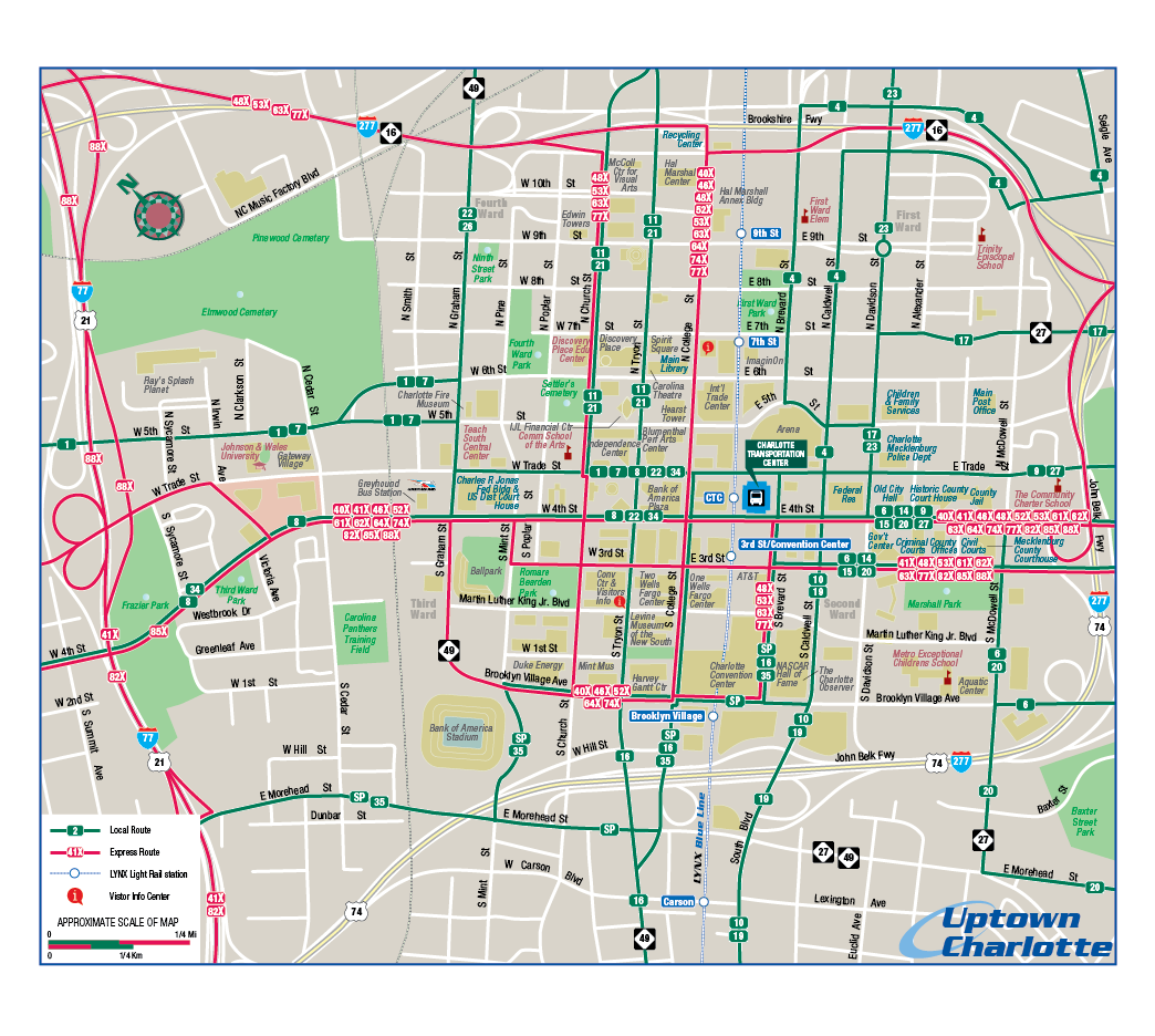
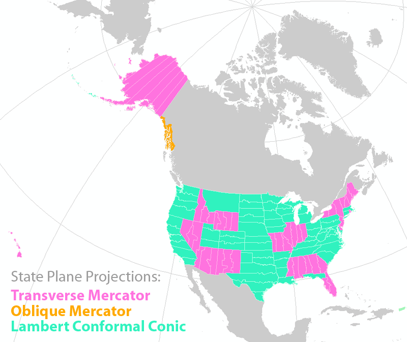
The “visual information-seeking mantra”, first proposed by computer scientist Ben Shneiderman, is frequently referenced by information designers: “Overview first, zoom and filter, and details-on-demand” (Shneiderman 1996). We will use the Portland Airbnb Tableau dashboard to explore this mantra in practice. First, in Figure 9.5.4, the starting view of the dashboard, which shows all of the listings in Portland: overview first.

From the starting view, the user can zoom in and/or pan around the map, and filter the map data by selecting a category of interest. The tool state in Figure 9.5.5 shows the view after the user has zoomed into the map and selected the "private room," room type. This data could be further filtered by selecting a property type, such as "hotel-like property." This is the second stage of the mantra: zoom and filter.

Figure 9.5.6 shows the view in 9.5.5 upon mouse hover of this hotel-like property near the river. ID numbers for the host and listing, as well as lat/long coordinates, are given in the tooltip. This is the final element of Shneiderman's mantra: details-on-demand.

Student Reflection
Play around with this Tableau Story, Airbnb Data in Portland —in addition to helping you understand the concepts presented in this lesson, it may give you ideas as you work on Lab 9.
Small snippets of text, such as tooltips, titles, weblinks, and error messages associated with your maps, will often be designed by you, the cartographer. Such text is often called microcontent, and despite its minimal nature, it can have a large impact on user interpretation of your visualizations. The Nielsen Norman Group provides a helpful reference on how to write such content here: Microcontent: A Few Small Words Have a Mega Impact on Business. Their site is also an informative reference for many aspects of usability and user experience design.
Recommended Reading
Shneiderman, B. 1996. “The Eyes Have It: A Task by Data Type Taxonomy for Information Visualizations.” Proceedings 1996 IEEE Symposium on Visual Languages, 336–343. doi:10.1109/VL.1996.545307.
When Not to Map
When Not to MapThe visual analytic tools we have explored thus far include both maps and graphs, and these different data visualization elements have been connected via coordinated views, permitting user filtering, zooming, and more. Given the limited space available in these dashboards—particularly if they are intended for viewing on small, mobile screens—an important question surfaces: do I need a map at all?
When designing data visualizations, maps often provide an invaluable source for insight generation. However, they are not necessarily always the best choice for your data—even if the data contain spatial information.
View the dashboard below in Figure 9.6.1.

This dashboard does not contain a map, and though it’s possible that adding one might provide additional information or interest, its current form gets across the core message: drug overdoses are increasing in Philadelphia, and this is being driven by opioids in general, and fentanyl in particular.
Given the increasing ubiquity of GPS and other location-based technologies, data that contains a geographic component (e.g., state, county, coordinates) is fairly easy to come by. Still, this does not mean that creating a map is always the answer. Imagine, for example, if you had collected data on the rate of Alzheimer's disease by state. Were you to map this data, popular retirement states such as Florida and Arizona would likely jump out—not because there is anything inherently unhealthy about those locations, but because their populations are significantly older. To eliminate the effect of this confounding variable, you could map age-adjusted Alzheimer's rates instead. It's important to consider, however, whether this would be the most informative way to visualize your data. If you were simply hoping to educate people about Alzheimer's, a graph or chart comparing Alzheimer's rates by gender, age, race, or socioeconomic status might serve your purposes just as well.
Conversely, there are many data visualizations that, unfortunately, treat space (i.e., geography) as just another variable. For example, view the dashboard in Figure 9.6.2 below. The designer of this dashboard chose to visualize states as a list of values, rather than to create a map. Though this is not inherently incorrect, it is a missed opportunity to provide the user with an at-a-glance understanding of spatial patterns in occupational data. Sure, the user could still pick out individual data values or compare average annual earnings state-to-state. But data visualization (cartography included) is about making complex data clear; if your visualization is no more useful than its source data table, then why design it at all?

Critique #5
Critique #5Critique #5 will be your fourth critique involving a peer review of a map created by someone in this class. In this activity, you will be assigned a colleague's map from this class to critique from Lab 8: Interactive Mapping.
Your peer review assignment includes writing up a 300+ word critique of one of your colleague’s Lesson 8 Lab.
In your written critique, please describe:
- Three (3) things about the map design that you think work well and why.
- Three (3) suggestions you have for improvement of the map design, and why these improvements would be helpful.
According to the two prompts above, a map critique is not just about finding problems, but about reflecting on a map in an overall context. Your critique should focus on the map design that works well as much as it does on suggestions for design improvements. In your discussion, you should connect your ideas back to what we learned in the previous lessons.
Remember, your critique should be as much about reflecting upon design ideas well done as it is about suggesting improvements to the design. In your discussion, connect your ideas to concepts from previous lessons where relevant.
You may find these two resources helpful as you write your critiques:
- Daniel Huffman’s 2020 blog post on how to “Critique with Empathy"
- Ordnance Survey’s (Wesson, Glynn, and Naylor, 2013) list of effective cartographic design principles
Grading Criteria
Registered students can view a rubric for this assignment in Canvas.
Submission Instructions
You will work on Critique #5 during Lesson 9 and submit it at the end of Lesson 9.
Step 1:
When a peer review has been assigned, you will see a notification appear in your Canvas Dashboard To Do sidebar or Activity Stream. Upon notification of the Peer Review (Critique), go to Lesson 8: Lab 8 Assignment. You will see your assignment to peer review one other colleague. (Note: You will be notified that you have a peer review in the Recent Activity Stream and the To-Do list. Once peer reviews are assigned, you will also be notified via email.)
Step 2:
Download/view your colleague's completed map.
Step 3:
- Write up your critique using the prompts above in a Word document.
- Please write the student's name of the map that you have been assigned to critique at the top of the page.
- Be sure to review the critique rubric in which you will be graded for more guidance on the expected content and format of your review.
- Save your Word document as a PDF.
- Use the naming convention outlined here:
YourLastName_LastNameOfColleagueCritiqued_C5.pdf
Step 4:
In order to complete the Peer Review/Critique, you must
- Add the PDF as an attachment in the comment sidebar in the assignment.
- Include a comment such as "here is my critique" in the comment area.
- PLEASE DO NOT complete the lesson rubric as your review, award points, or grade the map you are critiquing. Even though Canvas asks you to complete the rubric, PLEASE DO NOT COMPLETE THE RUBRIC OR ASSIGN POINTS/GRADE.
Step 5:
When you're finished, click the Save Comment button. Canvas may not instantly show that your PDF was uploaded. You may need to exit from the course, leave the page, refresh your browser, or some combination thereof to see that you've completed the required steps for the peer review. If in doubt, you can send a message to the instructor for them to check and confirm that your PDF was successfully uploaded.
Note: Again, you will not submit anything for a letter grade or provide comments in the lesson rubric.
Peer Review Canvas Help
Lesson 9 Lab
Lesson 9 LabNarrating Your Map Idea with StoryMaps
Your final lab assignment in this course is to design an interactive story about a chosen dataset using ArcGIS StoryMaps. While this lab draws heavily on concepts discussed in Lesson 9, you will be incorporating knowledge from throughout the course in your design.
Lab Objectives
- Use data from a source of your own choosing to create a geospatial narrative in StoryMaps form. The specific topic is up to your own preference.
- Integrate knowledge gained throughout the course to create engaging interactive maps and graphics.
- Examples for reference here (these are much more complex than is required):
Overall Lab Requirements
- Include the URL link to your StoryMaps in a PDF document in Canvas.
Specific Requirements
StoryMaps (Overall)
- Select a topic or idea that you wish to map (e.g., the influenza season in the U.S., changing enrollment trends in U.S. schools, trade imbalances in African countries, wildfire occurrences, etc.). Almost any "spatially-related topic" of interest will work for this assignment. You can focus anywhere in the world. However, as an fyi, datasets from the U.S. are more readily available than other locations.
- Using data from your chosen topic, you will use ArcGIS Online to create three maps. The maps should ideally reflect different datasets related to the topic of choice. These maps should explore different symbolization methods, color choices, data classification methods, and so forth, demonstrating the different elements learned throughout the term. Ultimately, the design decisions should reflect the data that you are mapping, what you wish to communicate about the data, and the stated purpose.
- These three maps will be integrated into a singular StoryMaps that will help tie together the maps and descriptive text in a unifying narrative.
- Create a StoryMaps which includes:
- At least three (3) interactive maps designed using ArcGIS Online. These maps should be embedded directly into your StoryMaps and will allow a level of user interactivity.
- Your 3 main maps cannot be Express Maps.
- Incorporate appropriate cartographic concepts and techniques that we have learned over the course of the semester.
- At least two (2) StoryMaps tools/functions (e.g., Swipe/Sideshow/Sidecar/Map Tour/etc.). These could incorporate images related to your narrative or additional maps (e.g., for the “Swipe” option), but the maps will not count towards the primary 3-map requirement.
- At least 300 words of explanatory text—including a brief introduction—that provides a useful and compelling narrative for your data.
- Use consistent look and feel throughout the StoryMaps; employ consistent/complementary colors and fonts in your StoryMaps narrative that align with the designs of your maps.
- You are encouraged—but not required—to include non-map supporting elements (images, videos, data visualizations, etc.) in addition to the required elements listed here.
- At least three (3) interactive maps designed using ArcGIS Online. These maps should be embedded directly into your StoryMaps and will allow a level of user interactivity.
- Your overall layout should not use a StoryMaps template – the overall design must be of your own creativity.
Lab Instructions
- Choose a spatially-related topic for Lab 9. There are no restrictions on the geographic area to be mapped. Once a suitable topic is selected and appropriate data is collected, download the required data.
- You should reach out to the instructor if you wish to discuss your topic, data appropriateness, and the topic/data suitability for this project before getting too far into the assignment.
- Log in to ArcGIS Online with your PSU email (you should have an active account– if not, contact your instructor).
- Complete the design of the three (3) maps using ArcGIS Online
- These pages will walk you through the process of creating a simple map in ArcGIS Online. You should complete this map-making process in AGOL before designing a StoryMap.
- Design and build a "story" of your chosen topic using the StoryMaps environment, including the three (3) maps you created with AGOL.
- Your StoryMaps must include descriptive text presenting the overall topic idea. Additionally, there should be descriptive text that discusses each map, its pattern, and how that information adds evidence to your overall topic.
- For assistance in creating StoryMaps, explore the Lab 9 Visual Guide and utilize these online tutorials and training materials, such as those listed below:
Grading Criteria
Registered students can view a rubric for this assignment in Canvas.
Submission Instructions
- Submit a URL link to your StoryMaps.
Ready to Begin?
Further instructions are available in the Lesson 9 Lab Visual Guide.
Lesson 9 Lab Visual Guide
Lesson 9 Lab Visual GuideLesson 9 Lab Visual Guide Index
- Project Data
- Introduction to ArcGIS Online (AGOL)
- Create Your Working Directory
- Adding Data to a Map
- Styling Your Map
- Creating a Choropleth
- Configuring Pop-Ups
- Sharing Your Map
- Creating a StoryMap
- Sharing Your StoryMap
1. Project Data
The following sections 2 - 7 illustrate the process of using ArcGIS Online to create an interactive map using a sample dataset. The dataset that is used to illustrate the process should not be selected for this assignment. You will need to collect your own data for this project.
2. Introduction to ArcGIS Online (AGOL)
To begin, open the Canada_COVID_19_022622.csv Excel file. This file has multiple fields (columns) of data for each province in Canada. It was created by selecting a group of records from a CSV file downloaded from the Public Health Agency of Canada (PHAC), and it contains data related to the number of COVID-19 cases and deaths for Canadian provinces as of February 26, 2022. Take note of the column header names. The column highlighted in the green box in Figure 9.1 is named “prname”, which stands for province name. ArcGIS Online needs to know the geography to locate your data on a map. For example, if you are mapping individual states of the United States, then you would need a column titled, for example, “states” that contains rows listing the different state names.
The most important component of this Excel sheet is the prname column– AGOL will automatically recognize and map several geographies, such as States, Countries, Zipcodes, and Coordinates (lat/long). You may choose to map another geography (e.g., counties, census tracts, block groups) for your own data, but using one of these other geographies will not be covered here.

3. Create Your Working Directory
Log in to AGOL using your PSU ID, then click Content on the navigation bar at the top of your screen. The Content environment appears. You will create an empty folder that will be used to organize all data and maps related to your StoryMaps project. To create a new folder, look in the upper left-hand corner of the Content environment. There is a Folders heading. Click on the small + folder icon to the right of the heading to create a new folder. Title this folder “GEOG486_StoryMap”.
4. Adding Data to a Map
Now that you have a place to store your data, click on the Map button on the navigation bar at the top. You should be taken to a screen that looks fairly similar to the Vector Tile Style Editor (VTSE) interface, but with only one map and different tools (shown below in Figure 9.3). This environment is called the Map Viewer (although you can use it to do a whole lot more than just view maps). Click on the + Add button on the left of your screen, then select Add layer from file and select your downloaded CSV.
Add it as a hosted feature layer (don’t worry about what this means for now), then on the next screen, make sure that all the fields are selected. After you confirm the fields that you want to include (all of them), change the Location Settings to Addresses or place names. AGOL can automatically extract location data from tables, but we need to specify which part of the world we’re concerned with or else we’ll have a map showing the cities of Yukon, Oklahoma, and Ontario, California. So, open Advanced location settings and change the Region to Canada. Under that, select Location information is in one field. Set the Address or Place field “prname” (Figure 9.2).

When you have successfully added the layer to the map, you’ll notice that your data is represented as a red dot at the center of each province (Figure 9.3).

5. Styling Your Map
Even though the data in our spreadsheet can potentially be represented as areas (i.e., as a choropleth map), we don’t currently have the correct data for us to map the provinces as areas. So for now, we will explore how to map the data as point symbols representing each province.
More specifically, we’ll be mapping the provinces using proportional circles. The following series of steps outlines this selection process. Along the right-hand side of the Map Viewer is a series of icons. The topmost icon is the Properties option that will allow you to alter the map properties. Click the Properties button if the panel isn’t open already. The Properties panel appears. Under the Symbology header, choose the Edit layer style option. Begin by choosing an attribute from the .csv spreadsheet to map. Under the Choose attributes header, click on the + Field button and select the “totalcases” attribute that contains the total number of COVID-19 cases by province. By now, you should understand why proportional symbolization rather than choropleth symbolization is appropriate to map total count data. To complete this step, select the Add button at the bottom (Figure 9.4).

Under the Pick a style header, select the Counts and Amounts (size) option. This option proportionally associates each province’s data value with a differently sized circle. Larger circles imply greater data values.
There are other symbol options that you can explore under the Style options button– feel free to explore them, but come back to Counts and Amounts (size) eventually. Click on Style options and experiment with the various options for changing the appearance of the symbols (Figure 9.5).

You’ve made some good progress at this point, so you should save your work. To save your map, click on the Save and open icon found along the left-hand listing of tools in the Map Viewer. On the options that appear, choose the Save As option. Make sure to give your map an informative title. Optionally, add some tags that will help others find your map, and give a short summary of the map. Make sure that you select the save location as your 486-StoryMap folder. Then, choose the Save button.
Figure 9.6 shows the final Canada COVID-19 map showing the total number of COVID-19 cases by province ending February 26, 2022. Note that there are several design changes I have made to the map. Try to replicate these changes on your own using the options found in the Properties panel, as well as other locations. The changes are as follows:
- Set the fill color of the proportional circles to semi-transparent red and added a contrasting outline color.
- Added province labels to the proportional circles.
- Added a different basemap style (the Human Geography helps to visually promote the appearance of the colored proportional circles).

6. Creating a Choropleth
In the previous section, even though you worked with area-based data (data assigned to a province), the map displayed proportional circles centered over each province. A CSV does not store the geometry of the dataset’s features (i.e., lines or polygons), so if you want to show your data as a line- or area-based symbol, you need to upload an additional file that includes the geography. Here, we will be using shapefiles.
Download the “Canada_Provinces.zip.” This zipped file contains the shapefile of the Canadian provincial boundaries that you’ll be using in this example. Return to the map that you made earlier and hide the proportional symbol layer by clicking the eye icon in the Layers pane (NOTE! it is important that you keep all your layers in the same map so that you’ll save time in a much later section of this tutorial). Add the .zip file the same way that you added the CSV earlier (you’ll probably want to include your initials at the end of the file name). Once you add the layer, it might take a few minutes to process, but you should eventually see the province polygons appear on your map (Figure 9.7).

Now, because we need to combine the shapefile and the CSV into a single file, we will perform what is known as a join operation. This process combines files that share at least one identical value in their attribute tables. Luckily, we have exactly what we need in the datasets you’ve added to the map so far (this isn’t always the case in real-world scenarios). Open the attribute table of the COVID case dataset by clicking on the context menu (the ellipsis) in the Layers panel, then click Show table. Note the values that you see in the “prname” field. Now, open the attribute table for your newly-added polygon layer and find the “name” field (Figure 9.8). These fields in each layer share identical values, so AGOL will match each row containing “Alberta” in the CSV with the row containing “Alberta” in the shapefile. In this way, our COVID data will be matched with the correct polygon feature.

This next part has to happen precisely as described here:
- To “join” your two data files, begin by selecting the Analysis button on the right of your screen.
- Click on the Tools icon, then choose Join Features.
- Figure 9.9 shows the files that are used to specify the target layer and the join layer. The target layer is a shapefile, while the join layer is the CSV that has the data value to join to the target layer.
- Sets the join to match on attributes from each file where the target field contains the province name found in the shapefile (“name”) while the join field contains the province name found in the CSV (prname).
- Specify the file name for the new map layer and its storage location (486_StoryMap).

Once you have completed setting all the options, choose the RUN button at the bottom. To complete the join, you may have to wait a few minutes for ArcGIS Online to process all the data.
Once the join process has completed, you can choose to map one of the COVID-19 attributes. To map your COVID-19 data, look in the Styles option (icon listing along the right-hand side of the map environment). In my case, I chose to map the “ratedeaths” attribute and display that variable as a series of blues where light blue represents high COVID-19 death rates and dark blue represents low COVID-19 death rates (Figure 9.10).

Now is a good time to save your work!
7. Configuring pop-ups
While we have a map that looks pretty good on its own, we should keep in mind that this is an interactive map, so users will be clicking on features. Go ahead and click on a province, and a window should appear that looks like the one in Figure 9.11.

There is a lot of information being presented here, and almost all of it is either confusing or not useful for most users. Fortunately, we can change what is displayed in these windows. For this next part, keep the pop-up window open.
Start by clicking the Pop-ups button on the right side of your screen. Double-check that you have pop-ups enabled and that you’re editing pop-ups for the correct layer (your join layer). You should see a section titled Fields list. This is one of two content fields in your pop-up window (the other one is Title, which we’ll get to in a minute). Note that it says “76/76 fields”. This means that each pop-up window is displaying all 76 attribute fields in your layer’s attribute table. This is not terribly useful, so click on the Fields list, and in the resulting section, click Select fields. Now, we don’t want to manually deselect all 76 layers, so the fastest way to do this is by clicking Select all, then Deselect all. All the fields in the open pop-up should disappear.

A pop-up with no information isn’t terribly useful either, so let’s add some fields back. The name of the selected province might be helpful, so select the field “name” as well as “name_fr” so that the French spelling of the province name is included as well. Another good field to include for propriety would be “date”. Next, all “totalcases”, “ratecases_total”, “numdeaths”, and “ratedeaths”. Your pop-up should now look like Figure 9.13. When finished, click Done.

The amount of information being displayed is now much more reasonable, but the formatting is not terribly appealing. “ratecases_total”, for example, would be much better displayed as “Case rate per 100,000”. We have two options to address this.
The first option is to edit the display name of the field itself. To do so, click the Fields button on the right, then locate the field whose display name you wish to change. Let’s start with “totalcases”. Click it, and edit the name in the Manage field pane that appears (Figure 9.14). Change it to “Total cases”. Then, change “ratecases_total” to “Case rate per 100,000”. While we’re at it, change Significant digits to 0 Decimal places to further simplify our pop-up (Figure 9.14). Finally, change “date” to “Date”, change the Date format to include the name of the month (e.g., February 25, 2022), and un-toggle Show time, as that information isn’t meaningful for our purposes. The advantages of changing field names via the Fields panel are that the field name will display consistently across various locations and that you can use the field table layout currently in your pop-up window.

The second option is to use an expression. I think that the names of provinces are better represented as standalone items rather than in a table with other items, so return to the Pop-ups pane, click on Fields again, and click the x next to “name” and “name_fr”. Next, close the Fields list, and click + Add content underneath. Choose Text. In the editor that appears, type “Province name / Nom de la province:”. Then hold Shift on your keyboard and press Enter/Return. With your cursor directly underneath the first line of text, click on the { } button, and choose “name”. Then type “ / “, then “name_fr”/ (Figure 9.15). (I also did some additional text formatting– see if you can replicate it on your own.) Click OK.

Repeat this process using “name_fr” and preceding it with “Nom de la province: “. Click on the 6 dots next to the “name” Text content, and drag it to the top, so that it’s underneath Title. Drag the “name_fr” Text under “name”. Finally, click on the Title component, delete the existing text, and replace it with “COVID-19 Data by Province” (Figure 9.16).

8. Sharing Your Map
Sharing your maps will allow you to show your work to others, but more importantly for this lab, it will allow you to embed them into your StoryMaps. To share your maps that you created, select the Share map icon along the left edge of the Map Viewer. The Share icon brings up the Share window (Figure 9.17) that allows you to specify how the map is shared. Presently, only share with this Organization (Penn State University).

When you click Save, you’ll probably see a window with a message that says “The shared item(s) reference other items that may not be visible…” While you changed the sharing permissions of your map, you still need to change the permissions for your data. Click Review sharing, then in the next window, click Update sharing to synchronize the sharing permissions for all of your layers. You can change their sharing status later via the Content section of the website.
You now have the basic skills to work in AGOL. Feel free to explore the additional style options, try uploading different data types, and run some additional analyses. AGOL is great for sharing data and making interactive maps, but it does have significant limitations when it comes to data management, symbolization, and analysis. So sometimes it makes more sense to create or edit data in ArcGIS Pro, then upload that data to ArcGIS Online for visualization and sharing– keep that in mind if you encounter a roadblock.
Remember that your StoryMap needs to include a minimum of 3 maps.
9. Creating a StoryMap
Once you feel comfortable with the Map Viewer interface, it’s time to move on to StoryMaps. Either on the AGOL homepage or in the Map Viewer, you’ll see a 3 x 3 matrix of dots in the upper-right corner of your screen. This opens the App Launcher. Click on ArcGIS StoryMaps. On the StoryMaps homepage, click on the green Create story button on the right, and select Start from scratch. This will open the Story Builder interface (Figure 9.18). You are now ready to start telling your story.

Every element of a StoryMaps can be custom-designed with typefaces, colors, background textures, etc. To access the design palette for any StoryMaps element, click on the Design button along the menu ribbon at the top of the StoryMaps environment. You have a few options here– let’s change the Cover to Top and the Theme to Slate. When you’re done, click the X at the top of the pane.
To add additional elements (called story blocks) to your StoryMap, scroll down and either click on Tell your story… to add text, or click the + button next to it in order to add a block. Choose the Map block (Figure 9.19).

You’ll be taken to a screen where you should see the Canada COVID map(s) that you made earlier. Choose the map that you want to insert into the story, then in the next screen (Figure 9.20), make any necessary adjustments regarding layer visibility and map functionality. If you notice some additional changes that you’d like to make, such as including an additional layer, changing layer draw order, or changing a layer’s symbolization, then you can click the Edit in ArcGIS button at the bottom-left of the screen. For now, hide all but one of the layers by clicking the eye icon next to their titles. If everything looks good, click Save.

The process for adding and editing additional blocks is fairly similar and straightforward. Definitely experiment with various different blocks and layout options, and take a look at tutorials to learn about more features. Of particular note is the Sidecar block. This allows you to have text and media scroll over a map or other media. This is a very common feature in StoryMaps, as well as other data journalism features, sometimes called “scrollytelling”.
Making your sidecar block transition between information seamlessly is pretty easy. To start, add a sidecar block to your StoryMap. I chose the Floating layout, but it doesn’t really matter for this. Near the top of the new sidecar block, click + Add, and choose Map. Select your Canada COVID map from earlier. You’ll see the same interface that you used to add a normal map a minute ago. As before, hide (the eye icon) all but the choropleth layer. Adjust the positioning of your data appropriately, then click Save. Now, at the bottom of the sidecar interface, click on the ellipsis button at the bottom-right of the first slide (which is at the bottom-left of the interface). Select Duplicate. You’ll get a second map slide with the exact same data and layout as the first slide. On this second slide, click Edit (pencil icon) at the top of the map. Now, hide the layer that you used in the first slide, and unhide your proportional symbol layer. Click Save.

Back in the Sidecar interface, click on the first slide and add some helpful text by clicking on Continue your story… Add some contextual information to the text box on the left. Then click on the second slide and do the same. Now, when you preview your map, scrolling down the page should result in a seamless transition between the two data views, with the text cards moving past on the left.

This is the basic process of working with sidecars, but you have a number of ways to mix up how your data is presented, like adding images, video, focusing on different areas of your maps, filtering the data of different layers, and so on.
Note the attribution footer at the bottom of the interface— you may want to use it in your project. Also, periodically check how your work looks by clicking the Preview button at the top of the screen. This will allow you to see how your layout looks to the people that you’ll share it with.
Some general guidance when designing your StoryMap: take the colors that you used in your map, and reuse them in some of your StoryMap elements. Not too much:
10. Sharing your StoryMap
Once you have completed your StoryMap design and are ready to submit it, you will need to Publish it. To publish your StoryMap, click Publish > at the top of the screen. Change “Who can see this…” to Organization, and if you’d like, edit the Story details accordingly, but this isn’t necessary for the assignment.
Summary and Final Tasks
Summary and Final TasksSummary
Congrats, you've made it to the end of the course! In this lesson, we discussed how the recent re-visioning of the map reader as a map user has changed the cartographic design process, as well as how we evaluate maps. We discussed many elements that may be integrated with maps, such as graphs, charts, and explanatory text, and explored the different mediums (e.g., interactive dashboards, data journalism) in which these elements are combined.
At the end of the lesson, we discussed when not to map, encouraging a practical approach to data visualization that views maps as a valuable tool but not a panacea. Relatedly, we note that much of cartographic design theory is widely applicable, and can be applied when designing other data visualizations or writing graphic-adjacent text—from microcontent to full articles.
In Lab 9, we designed an interactive map-based story using the visual analytics platform ArcGIS Online and StoryMaps. Though this lab focused heavily on concepts from Lessons 8 and 9, we also drew from concepts throughout the course—refining layouts, symbolizing data, color choices, and thinking critically about map audience and purpose. Your StoryMaps' narrative is now available on the web for you to share with others as a demonstration of your skills in map design and data visualization. You're now ready and able to create, analyze, critique, and share high-quality maps!
Reminder - Complete all of the Lesson 9 tasks!
You have reached the end of Lesson 9! Double-check the to-do list on the Lesson 9 Overview page to make sure you have completed all of the activities listed there. After that, you'll have finished the course!