Lesson 8 - Technical Analysis
Lesson 8 - Technical Analysis mjg8Lesson 8 Introduction
Lesson 8 IntroductionOverview
Thus far, we have addressed the fundamental factors that influence energy prices. We also established that there are two main groups that trade in the financial energy commodities markets, commercial and non-commercial. The latter group represents the “pure” traders or “speculators." These participants are only interested in price movement. The type of commodity does not matter to them. In order to make trading decisions, they use technical analysis as opposed to fundamental analysis.
Technical analysis involves the use of charts to track price movement, establish the current market trend, and determine the probability of prices moving in one direction or another. Simply put, technical or “day” traders are interested in market activity as illustrated by the resulting prices.
Since the prices that occur in the market are the result of human decision-making, technical analysis really examines the behavior of market participants. As such, patterns emerge that have a high probability of recurring. It is precisely these events that technical traders are looking for. But, make no mistake; fundamental events cause traders to react emotionally, the results of which are also reflected in the price action.
In technical analysis, traders must first establish what the current price trend is, up or down. Then, they must determine the probability of the trend lasting or changing direction. It is this information that guides their buy/sell decisions.
Learning Outcomes
At the successful completion of this lesson, students should be able to:
- distinguish the difference between technical and fundamental market analysis;
- identify different types of technical charts and their uses;
- recognize trend lines and market signals;
- analyze “momentum” indicators.
What is due for this lesson?
This lesson will take us one week to complete. The following items will be due Sunday at 11:59 p.m. Eastern Time.
- Lesson 8 Quiz
- Lesson 8 activities as assigned in Canvas
Questions?
If you have any questions, please post them to our General Course Questions discussion forum (not email), located under Modules in Canvas. The TA and I will check the discussion forum daily to respond. While you are there, feel free to post your own responses if you, too, are able to help out a classmate.
Reading Assignment: Lesson 8
Reading Assignment: Lesson 8Reading Assignment:
Seng - Chapter 10
Errera & Brown - Chapter 8
This text is available to registered students via the Penn State Library.
Key Points of Emphasis
- Technical analysis relies on the principles of probability and statistics.
- The (3) most popular technical charts are Line or "close only," Bar, and Candlestick.
- Line charts record only the daily closing price and are best used for long-term trending.
- Bar charts indicate the daily Open, High, Low, and Closing prices for the trading day.
- Candlestick charts also show the OHLC but do so in a fashion as to illustrate the market direction, up or down, for that day's trading.
- Identifying the current trend is the first step.
- Determining if the trend is going to change is the next step. This can be ascertained if the preponderance of the evidence indicates it will. Buy/sell decisions will then be made.
- Trend lines are used to indicate the trends.
- Various price patterns exist for traders to identify.
- Volume is a good indicator of market activity and can reinforce the day's price movement.
- Resistance is the price level at which sellers enter the market again. It establishes a "ceiling" price in the current market.
- Support is the price level at which buyers enter the market again. It establishes a "floor" price in the current market.
- Moving averages are good studies to utilize if you believe in the statistical premise of "reversion to the mean."
Charting Methods
Charting MethodsThere are several types of charting methods, but three of them are the most popular.
Bar Chart
In a bar chart, a vertical line is shown for each time increment selected. In the chart below, a “daily” chart is used to show the May NYMEX contract for natural gas. Each bar shows the price results for that day’s trading. The mark to the left of the bar represents the first trade of the day, or the “Open.” This is the price of the first trade that occurs right after the bell rings to start trading. The vertical line itself represents the full range of prices for the day, that is, the High and Low prices. And the mark to the right of the bar represents the final closing, or “Settlement” price for the day. This is often referred to as the "OHLC" chart (Open/High/Low/Close). Note that if the Open price is lower than the Close, the bar is green. If the Open price of the day is higher than the Close price, the bar is red. It shows the direction of the market movement; do prices tend to go up or down?

Chart reading part 1: Bar chart
So, I'm gonna click on the chart icon. This is the third column from the left, right beside the last, and we will focus on it. I click here to launch in a pop-up menu or a new window. This is May 2020 crude oil futures.
Okay, let me clean up the chart a little bit. I removed the information that we don't need for now. We'll add them later. So, this is the chart. As you can see, the vertical axis is the price. This is dollars per barrel of crude oil. You can change the limit of each of the axes. You can click on the axis, hold the click, and move it up and down, and it changes the range of the axis. It's the same for the horizontal axis, which is time. Click, hold, and move it to the left and to the right. You can also use these features: you can zoom in, you can zoom out, you can move to the left, you can move to the right, or you can refresh the page. You can restart the page. So, this updates. This is the real-time data. We can see this price changes quickly, and once in a couple of seconds, we'll get some new information.
Okay, I'm gonna zoom into more recent data, and we'll go through some of the... So, you are familiar with this type of chart. This is called a bar chart, and we have it. We can clearly see it here. This is... There are multiple pieces of information that are represented. These are presented by each of these bars. So, we should be able to read five pieces of information. Each bar should give us five pieces of information. So, what are those pieces of information? Open, close, high, low, and the trend, which is the color, right, on that day.
For example, let's start from one of these. Let me zoom a little bit to be able to see this. Let's, for example, talk about this. This is March 25th, 2020, and we can see this is a bar. There is this left little tick or little line here, there is one on the right. The bar has some lower part here and the bottom and top of the bar. So, what is the left? The left line, this is sticking to this bar, is the open, right? The right is the close, right? And the top part of each bar is the highest price being traded on that date, and of course, the lowest part is the low. So, if you move the pointer to any of these bars, you can see these numbers up here. They will get updated. For example, here, this is March 25th, and as you can see up there, open was $24.37, high is $25.24, low, close, and percentage change.
Okay, there is another piece of information that is being shown here, and that's the color of these bars. You can see that they come in two colors, green and red. What is the difference? As you can see, if the open on that day is lower than the close, or if the close is higher than the open, this bar is green. If the close is lower than the open, the bar is red. What does it tell us? It tells us the trend of the price on that day. For example, these are the last five business days. We can see it opened high, it closed low. Opened high, closed low. Opened high, closed low. And including today, open and close are fairly around the same value, but this is red. It is telling us that the close is lower than the open. So, if this close goes a little bit higher, if it passes the open, this bar will turn green.
So, the five pieces of information that we get from each of these bars are open, high, low, close, and the trend of the day.
Style of Charts
You can change the style of the chart and type of information that you want to be displayed by clicking on the Bar Style toolbar ![]() and selecting from the list of chart options which include things like bars, candles, line, area, and point & figure. The image below is an example of a “Line” or “Close Only” chart showing the same May natural gas contract. You will notice that it only shows the daily market closing (settlement) price. It provides much less information than the Bar chart and is mainly used for longer-term trend analysis.
and selecting from the list of chart options which include things like bars, candles, line, area, and point & figure. The image below is an example of a “Line” or “Close Only” chart showing the same May natural gas contract. You will notice that it only shows the daily market closing (settlement) price. It provides much less information than the Bar chart and is mainly used for longer-term trend analysis.

Candlestick Charts
Candlestick charts were developed by the Japanese centuries ago. They provide information similar to the Bar chart, but also indicate “up and down” days. That is, they clearly show the direction the market took on a daily basis. The top end of the “candle” still represents the "High" for the day, and the lower end represents the “Low,” but the “body” indicates the Open and Closing prices in relation to one another. For example, if the Open is higher than the Close, the Open price is at the top of the “body” of the candle and represents a day where prices fell (red candle). Conversely, if the Close is found on the top of the “body,” it represents an “up” day, and on the chart below, appears with a green “body.” As you can now see, the up-and-down days are easily visible on the Candlestick chart. By counting these, we can determine the current trend. For traders, the question is, when will it reverse course?
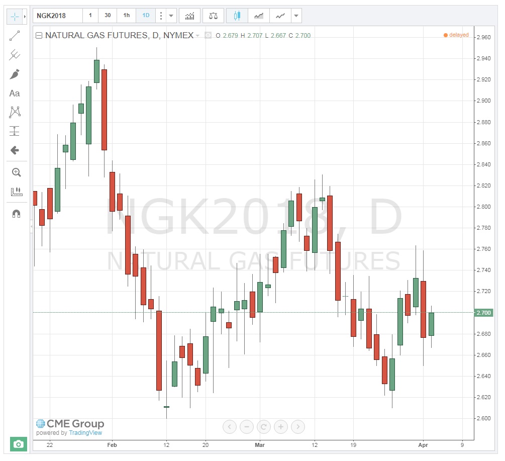
Chart reading part 2: Candlestick chart
Let's move to the next chart. How do we change the chart? So, up there, there is a chart icon. The next one is the second most common chart, the candlestick chart. On the top part of the chart, you can find them here. These are under chart options, and I select the candle. Okay, the candle is another type of chart. This is very common in finance. Again, this gives us each candle for each day. It gives us five pieces of information, but this one is a little bit tricky compared to the bar chart. Each bar is going to tell us five pieces of information: open, high, low, close, and the trend of the day.
But here, we don't have that left line and right line. We have the upper part of the candle, the lower part, and the actual candle top and bottom. So, these are four. So, how do we know which one is open and which one is close? That's indicated by the color. If the color of the candle is red, then the lower part of the candle is close, and the upper part is open. If the color of the candle is green, then the lower part is open, and the higher part is close. You can double-check that by moving the pointer to that candle. You should be able to read it up here. Let me move it to a pointed point on the candle, and you can read it from there.
So, on this day, March 23rd, the open is $22.52, the low is $20.80, the high, which is the very top part at the end of this line, is $24.70, and the close was $23.36. You move this pointer around. The lower part of the chart, the x-axis, shows you the day. You track this line, and you will see this is March 27. The right-hand side shows you the price. You move it to this top part, and you can see this is $23.30. This is around the high, which, sorry, this is the close that we can read from up there.
One of the biggest problems with this chart is it needs a color printer to be able to read the low and high because if you print this in black and white, these two will look the same. So, how do we know which one is open and which one is close if you need to know the open and close? There is another type of candle chart called the hollow candle. This is for the time that if you are going to print it in a black and white printer, if you have the hollow candle, it means that it's the same as the green color. So, if you have a hollow candle, it means that the trend that day was upward. So, the lower part of the candle is open, and the top part of the candle is close. If the candle is filled, in a black and white printer, it will look filled black. If that's black, then the trend is going to be downward. So, the top part of the candle is going to be open, and the bottom part is going to be close. This is the only difference, but this is a very common chart, and you just need to know when we read the open from the top and when we read the close from the bottom.
There is another chart that simplifies this. If you are not very interested in what happened that day and you want to have only one single price for that day, you will just add a line. You can add it by, and you're more than welcome to open the chart and do this with me. You go to the top part of the chart, from this little arrow, you pick the line. If you pick a line, you will get a single line for each day. How do we know which price this line is reflecting? Is it open, close, high, or low? By default, it is close.
Trendlines
TrendlinesTrend lines can be used to identify both long- and, short-term price trends. They are also used to indicate support and resistance prices and channels (covered later). A trend line only has significance if it touches at least two price points. The chart below shows an obvious long-term downtrend going back one year.
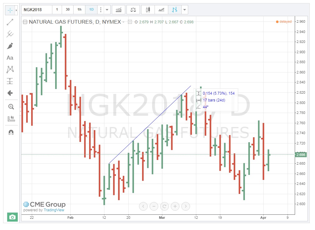
This next chart illustrates two short-term trendlines, one up and one down.

When one trendline connects two or more price points and another trendline connects two or more price points in parallel fashion, they form a “channel,” as shown below. Channels have significance in that traders look for prices to move above or below the confines of the channel. This is referred to as a “breakout,” and depending on the number of days that form the channel, this can occur with good momentum, resulting in a large price move in that direction.

Trend Indicators
Trend IndicatorsVolume
One of the simplest clues to the strength of price movement is that of the volume of contracts traded. If a price shows a large range or change in direction on a particular day, looking at the volume of contracts traded indicates how well-supported that move was by the market participants. A $0.10 movement up or down in natural gas is not very significant if a low volume of contracts is traded. On the other hand, when large volumes trade, that definitely reinforces the price action for the day. It’s as if those trading have agreed on the price outcome. The chart below is a Daily Bar Chart with volume for natural gas. Notice that on April 1st, prices traded in a $0.1 range and a very large amount of contracts exchanged hands, solidifying the move. Also, on March 27th, the second-highest volume for the contract traded. Both of these volumes add legitimacy to the price action for those days.
You can add the volume traded to the chart by clicking on “Indicators, …” ![]() on the toolbar and choosing the "Volume" from the resulting list.
on the toolbar and choosing the "Volume" from the resulting list.

Chart reading part 3: Volume
We'll see this FX function that you can use to add other features to the chart. One very important thing that you want to have in the chart is the volume being traded. This is in the chart by default, but you can add it or remove it. I removed it because I didn't want too much information. I'm going to add this back again just to show you how you can add it and remove it.
You click on FX, and this gives you a list of items that you can add to the chart. That was just the volume, volume trades, and this is volume. Just click that, and you can see it will be added directly to the chart, and you can see it at the bottom of the chart. This tells you the activity in the market, and this can be very helpful to see what is going on in the market. And again, as you can see, as soon as the price dropped, there were so many trades going on that day. The color of these columns is extracted from the color of the bar. So, if that day had a downward trend, you will see the red color. If the day had an upward trend, you can see the green.
So, what is the actual volume of trading that day? Going up to the top left-hand side of the chart, you should be able to see these numbers. For example, you move the pointer to one day. This is March 19. At the top left of the chart, you can see the volume of trade. Sorry, the volume of trade is 1.192 million trades. You can see these different days, and as you move it, you will see these there. You can add other indicators, or you can hide these.
Moving Averages (MA)
For those of you who have had statistics, you should be familiar with the term “reversion to the mean.” For those of you who have not, the concept hinges on the idea that all prices will eventually return to their average, despite dramatic movements up or down. I have found this to be especially true for energy commodities, at least in the short-term. Therefore, tracking commodity moving average prices can be a good signal for a change in the direction of a trend. The chart below shows that the Moving Average (MA) for May 2018, Natural Gas. If prices go up, there is a good probability that they will eventually fall towards the MA. It may be a gradual decline which also means the average will change, but as long as the MA is lower, prices will gravitate towards it. The exact opposite occurs when prices fall below the MA.
Note that the timeframe for the MA is set to the particular trader’s needs. I have set the MA at 5 days, as that represents a full week of trading (regular session, pit trading only occurs on weekdays). See how the prices, while moving above and below the MA, ultimately return to it. This is a key sign for making buy/sell decisions.
You can add the Moving Averages traded to the chart by clicking on “Indicators, …” ![]() on the toolbar and choosing the "Moving Average" from the resulting list.
on the toolbar and choosing the "Moving Average" from the resulting list.

Chart reading part 4: Moving Average (MA)
Moving average. You can add the moving average to the price, or you can add the moving average to the volume being traded. So, what is the moving average? This is simply the average of some days: five days, ten days, two weeks. It's up to you. You can decide how many days you include.
If some of you have done this before, you know that the moving average is you pick a window, you calculate the average of prices in that window, and you move this window every single day. You add the new price, you drop the oldest price from that window. We did this in the previous activity for the standard deviation. If you apply the average function, it will give you the moving average.
The idea behind moving averages is that the price tends to go back to the moving average. So, if the price goes above the moving average, it tends to go back to the moving average because every day we include that price and update the average for the new price. If the price is higher than the moving average, it can get back to the moving average. If it's lower, it tends to come back to the moving average.
We don't need to calculate that. We can just go and add it to the chart. For now, I'm going to just hide the volume, and we go to the moving average. I will add the volume back. I don't want too much information in your charts. I don't want it to be too complex. We go to the FX and we write "moving average." As you can see, there are many different types of moving averages. The simplest one is just the moving average. This moving average can be calculated exponentially or weighted, and so on. Let's skip that. We kind of learned about these weighted and exponential in previous lessons, but for now, let's keep things simple.
For now, I'm going to click on the moving average, simple moving average. As you can see, it is added to the chart. Closing it, and we can see, let me show it to you. Okay, so this is the moving average. How many days are being included in the moving average? The default of that is nine days. So, nine business days are included in each day's moving average, and this is the moving average tracking the price.
So again, as you can see here, for example, the price is below the moving average. Now we can see the price comes back to the moving average here. It is a price higher than the moving average, then it comes back to the moving average, and we can see the rest. So here, because the price drop is significant, the moving average is behind, but we can see the sharp drop in the moving average, and the price eventually will get back to the moving average. So, moving average includes the previous days, so you don't have any signal for the future. It tells you what has been the trend of the price in the last nine business days. So, by the time that these will go back to the price, the price will go back to the moving average. It means that the moving average will be updated with the new price data, and these two will merge.
Okay, things that you will need to do, and you don't need to calculate anything. We can just have the website do it for you. There are features in the moving average, not many but a few, that you can just conveniently use. Let's say you need nine days as a lot. You can just increase it or decrease it, and you can see, you can have it five days, you can have it for, let's say, 14 days. You can go up to as many days as you want. I think there was a max that, yeah, 100 days. I don't think you need that many averages, but in case you need, so the default is nine, and you can go with fewer days or more.
Okay, here are a few things that I want you to know. You can change this day, so this moving average is calculated based on the close price. You can change it to open, high, low, and any of those, or you can change it to the average of high and low divided by two, the average of high and low. This is the average of high, low, close divided by three, the average of these three. And this is the last one, the average of open, close, high, low divided by four. So, the chart provides these for you conveniently. You can just pick them from the chart. The default is close, and this is what everybody uses, but let's say for some project, for some reason, you need more, you need to include what happened during that day, so you can include that information as well.
You can also change the window that the moving average is calculated based on. You can increase it, or you can reduce the window. So, one thing that please pay attention to, what happens if I increase the number of days in the window, or if I shorten that to one day, right? What happens if the window is longer? If the window is wider, then the moving average is smoother, right? And it's kind of behind the price, right? It has a longer memory. The moving average has a longer memory. If you reduce it to fewer days, you can see it tracks the price closely because there are only two prices, today and yesterday, included in the moving average. So, it is not as smooth. It tracks the price very closely.
Relative Strength Index
Relative Strength Index (RSI) is a momentum oscillator that measures the speed and change of price movements. RSI oscillates between zero and 100. Traditionally, RSI is considered overbought when above 70 and oversold when below 30. RSI can also be used to identify the general trend. (Technical Indicators and Overlays - ChartSchool) Understanding the exact RSI calculation is not necessary to understand how to use this indicator. The next chart is a Daily Bar Chart with Volume, MA, and now, the RSI study. Note that the current RSI is over "70" which is considered “overbought". This could, therefore, be a signal to "sell."
You can add the Relative Strength Index traded to the chart by clicking on “Indicators, …” ![]() icon on the toolbar and choosing the "Relative Strength Index" from the list.
icon on the toolbar and choosing the "Relative Strength Index" from the list.
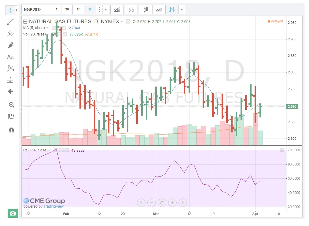
Chart reading part 5: Relative Strength Index (RSI)
There are so many other parameters and indicators that you can add to the chart. You don't need to calculate any of these; you can just see the trends and make your decision, interpret and make your decision about the numbers and the chart behavior that you can see. There are so many of them. Many of them need some statistical background, many of them don't. We don't go into how to calculate these. We learn how to add them, how to use them.
Okay, the other day in the previous lesson, we learned about the Relative Volatility Index. I will repeat that again, but before that, I'm going to talk about another important trend or common trend indicator that the chart gives us, and it is going to be the Relative Strength Index. So, you just type "relative" and this pops up in the list. You click on that, and you can see this is added to the chart. I'm gonna close this, and this is based on the price behavior and how to interpret this.
So, this RSI or Relative Strength Index, this is a number from 0 to 100. What does it tell us? And again, as you can see, you can play around with it, and you can see this kind of area that is selected between 70 and 30. So, it is very important the time that this RSI goes beyond this pink area. If this number being calculated is below this pink area, which is between 30 and 70, if this line goes below this 30, it gives us the signal that the situation is the commodity is oversold in the market. If this line goes above 70, if this line goes above this pink area, it tells us that the market is overbought.
So, let's look at the chart here. As we can see, when the price dropped, the market was very, very significantly bearish. So, everybody was selling, right? Because everyone was selling, we can see this sharp drop to below 30, and this is a signal that the market situation is oversold. And if it goes above 70, which there were some days here where we can see maybe in some very small incident here as overbought.
Chart reading part 6: Relative Volatility Index (RVI)
Index. How do I do that? I go to the indicator and I just write "Relative Volatility Index," click it, and it is added to the chart, or RVI. This is a number calculated from 0 to 100. We learned that if RVI is higher than 50, it is an indicator of volatility in the market. So, if this number is higher than 50, it gives us an indicator for a bullish market. So, the market is bullish, we buy. If this number is lower than 50, it is an indicator for a bearish market. If this number is higher than 70, it's a strong indicator of a bullish market, and if it's below 30, it's an indicator of a strong bearish market.
We can see it here when the price dropped in early March, this significant sharp drop. You can see this number is showing us that this number dropped below 30, and it is a signal that the market is bearish.
Price Signals
Price SignalsAs with trend analysis and market indicators, there are several types of price signals. We will deal with a few of the ones that are more common and easy to use.
Support & Resistance
As prices move up and down, traders make decisions as to when to continue to buy in an uptrend and when to sell in a downtrend; that is, they try to determine when the current trend will exhaust itself and change direction. One way to do this is to look at the “support” and “resistance” price levels. Support represents a price level at which buyers will step back into the market after a period of selling. This interest establishes a “floor” price. Traders find value at this level and start to buy-up the contracts again. In some cases, traders who have been selling contracts during the downtrend may be buying them back to take some profits. Resistance is the price level at which the market is no longer interested in buying contracts. The price is deemed to be too high and sellers re-enter the market, thus establishing a "ceiling" price.
So, how do we establish these pricing points? As the chart below (shifted to the right) shows, when we draw upper and lower trend lines, the lines continue through price points on the right, vertical axis. Where the upper trend line crosses the right axis is the resistance point, while the price where the lower trend line crosses the right axis is the support point. Theoretically, then, these represent both the maximum the market is willing to pay as well as the minimum at which it is willing to sell.

This chart indicates that resistance and support. Traders will now look to see if prices can trade above, or below, these levels. If they do, there will be a flurry of activity in the direction of the move.
Tops & Bottoms
Since we are on the subject of support and resistance, we can discuss price signals related to those concepts. As we have said, traders are interested solely in price movement. And support and resistance levels represent buying and selling interest. So, what happens when the buyers or sellers step in to halt the moves higher or lower? They are testing the points of support and resistance. If the sellers can’t break through support, it is a result of buyers stepping in. As mentioned above, that sets a “floor” or “bottom” price on that day. Likewise, if buyers test the resistance price and sellers step in to prevent a breach of that level, a “ceiling” or “top” is established.
While a one-day occurrence of these events is not a very strong indicator of a change in direction, the more a “bottom” or “top” is tested and holds, the more significant that price level becomes. Think about it this way. Let’s say natural gas Traders are trying to sell May contracts and push the price down to the $2.37 Support level on the chart above. Buyers step in at that price and the sell-off fails. The next day, Sellers again attempt to push prices down to $2.37, and again, the move fails.
Let's assume the market now begins to see $2.37 as a stronger Support price. We refer to this as a “double-bottom.” While this is still a good indicator of price levels, a third day, or “triple-bottom” is a strong indicator that prices could rally higher. Traders have no choice but to recognize the buying interest at $2.37 and thus will buy contracts until the Resistance, or “top” is tested. The same holds true for resistance levels, but in reverse. The more “tops” are established, the stronger the level at which sellers will step in and sell contracts.
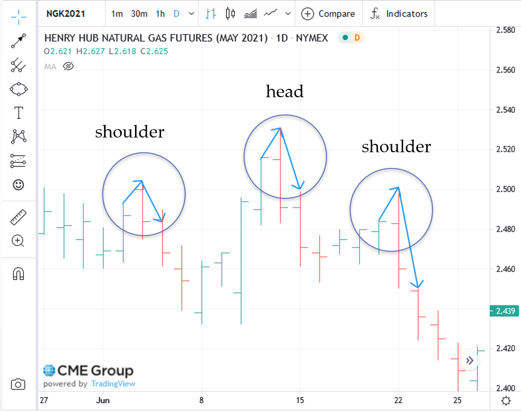
"Head-and-Shoulders" Reversal Patterns
Head and shoulder reversal patterns are identifiable, price patterns that signal a change in direction and can be used for long-term or short-term trend analysis. This consists of three trading days where the middle day’s High, or Low, is higher or lower than that of the other two days. The first day then represents the “left shoulder,” the second day is the “head,” and the third day is the “right shoulder.” Using the chart below without all the trend lines, we can see that on June 14th, the High for the day was higher than the 3rd. We are now looking for the completion of the pattern, the right shoulder. And on June 22nd, the High for the day was lower than the head. Now you can see the pattern whereby the 3rd is the “right shoulder,” the 14th is the “head,” and the 22nd is the “right shoulder.” The right shoulder “leans” in the direction of the price change. In this case, prices reversed from an uptrend to a downtrend. There are also “reverse” head-and-shoulders patterns. These occur in an upside-down fashion and signal a move from a downtrend to an uptrend.
"Consolidation” Patterns
When upper and lower trend lines are drawn and are parallel to one another and perpendicular to the Y-axis, they form a rectangular shape. The upper trendline does represent resistance, with the lower trend line indicating support. In this pattern, prices will move up-and-down within the rectangle. This “consolidation” is indicative of market indecision. Traders are not really sure what direction prices should take. It is a battle between buyers and sellers. The key here is the number of days this pattern continues to exist. The longer traders battle, the more momentum builds-up for when prices break-out of this range. Think of it as a spring that winds tighter and tighter for each day prices stay within the consolidation range. That means a very large price movement will occur in the direction of the breakout. A good illustration of this is the May 2021 crude oil contract, shown below. Starting in January, the contract bounded by a Low of about $52 for twenty-four straight days. The High was about $54 with the exception of attempted "break-outs". On February 2nd, prices broke-out to the upside with good momentum.

These are but a few of the methods in Technical Analysis used to try to determine when a greater probability exists of prices moving in one direction vs. another. Once determined, traders enter or exit the market at those price levels.
Summary and Final Tasks
Summary and Final TasksIn addition to my explanations, the definitions of terminology used in Technical Analysis can be found at:
Technical Indicators and Overlays - ChartSchool
Key Learning Points: Lesson 8
- Technical Analysis is mainly used by “day” traders, or speculators, to determine the greater probability of one thing happening over another (price direction).
- By plotting prices, technical charts actually record the behavior of the market participants. Technical analysts look for these patterns to repeat themselves.
- There are (3) main types of technical charts used:
- daily bar chart, which shows the “Open/High/Low/Close” prices;
- “close only” or line chart, which shows the settlement price for each time segment;
- candlestick chart, which shows the same information as the daily bar chart, but also indicates “up and down” days.
- Trend lines are used to identify current and past trends, but must touch-on at least two pricing points to have significance.
- Examples of simple trend indicators are:
- volume – this illustrates the amount of activity behind the price movement, which either reinforces it or fails to support it;
- moving averages – traders look to the statistical “regression to the mean” as a predictor of price direction;
- relative strength index – a momentum indicator that identifies both the speed and change in price with a resultant “overbought,” “oversold,” or “neutral” market condition.
- Examples of price signals are:
- support – the price level at which buyers will step in, establishing a “floor”;
- resistance – the price level at which sellers will step-in, establishing a “ceiling”;
- “tops and bottoms” – these are recurring Highs or Lows that “hold,” thus establishing strong support or resistance. Double or triple tops and/or bottoms are very strong indicators of a possible change in price direction;
- “head-and-shoulders” reversal pattern – a 3-day price pattern whereby the middle day’s High or Low is higher or lower than the other two, thus forming a “left shoulder,” “head,” “right shoulder” configuration. The right shoulder “leans” in the direction of the price change;
- “consolidation” – this represents several days of trading stuck within a certain High/Low range. It indicates price indecision by the market and a “battle” between buyers and sellers. The more days within the pattern, the greater the velocity of any “break-out” of the pattern.
In the next lesson, we will explore other, more advanced, financial derivatives that can also be used for hedging. Among these are "swaps", "spreads", and "options". They are mostly traded in the "over-the-counter" markets, that is, non-exchange traded. "OTC" encompasses electronic trading platforms as well as "voice" brokers where transactions occur over the phone.
Reminder - Complete all of the lesson tasks!
You have reached the end of this lesson. Double-check the list of requirements on the first page of this lesson to make sure you have completed all of the activities listed there before beginning the next lesson.